| y1 (Set 1) | y2 (Set 2) | y3 (Set 3) | y4 (Set 4) | |
|---|---|---|---|---|
| (Intercept) | 3.000 | 3.001 | 3.002 | 3.002 |
| (1.125) | (1.125) | (1.124) | (1.124) | |
| x1 | 0.500 | |||
| (0.118) | ||||
| x2 | 0.500 | |||
| (0.118) | ||||
| x3 | 0.500 | |||
| (0.118) | ||||
| x4 | 0.500 | |||
| (0.118) | ||||
| Notes: some notes... | ||||
Introduction
- Learning outcomes:
- Understand idea/aims/advantages/steps of interactive data analysis
- Understand basic structure of Shiny apps (components)
- Quick overview of Guerry data
- Discuss MVP and workflow
Sources: Bertini (2017), Wickham (2021) and Fay et al. (2021)
1 Interactive data analysis
- Part is almost exclusively based on Bertini (2017).
1.1 Why?
- “From Data Visualization to Interactive Data Analysis” (Bertini 2017)
- Main uses of data visualization: Inspirational, explanatory and analytical1
- “data analysis […] can help people improve their understanding of complex phenomena”
- “if I understand a problem better, there are higher chances I can find a better solution for it”
- Main goal of (interactive) data analysis: “understanding” something
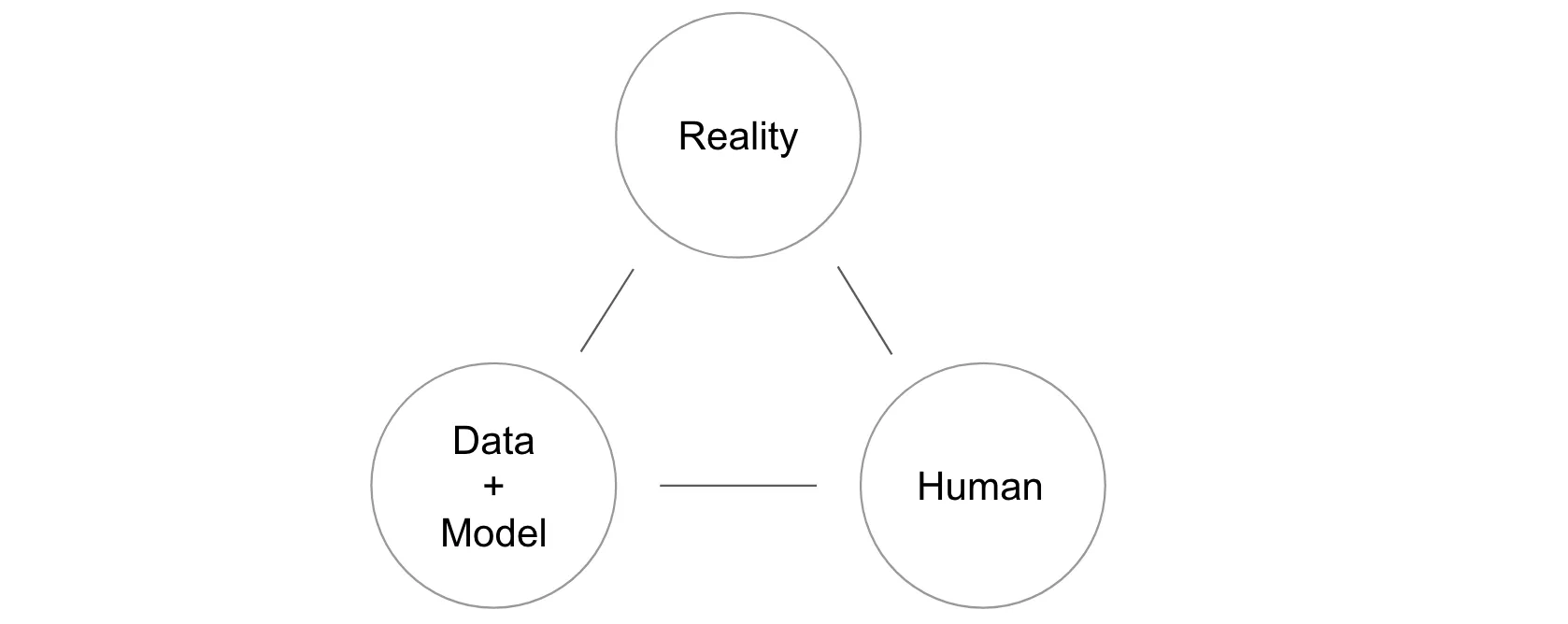
- Figure 1 outlines the relationship between reality, data/statistical models, human mental models
- Humans have a mental model of the reality and use data and models (= description of reality) to study this model and improve it
1.2 How Does Interactive Data Analysis Work?
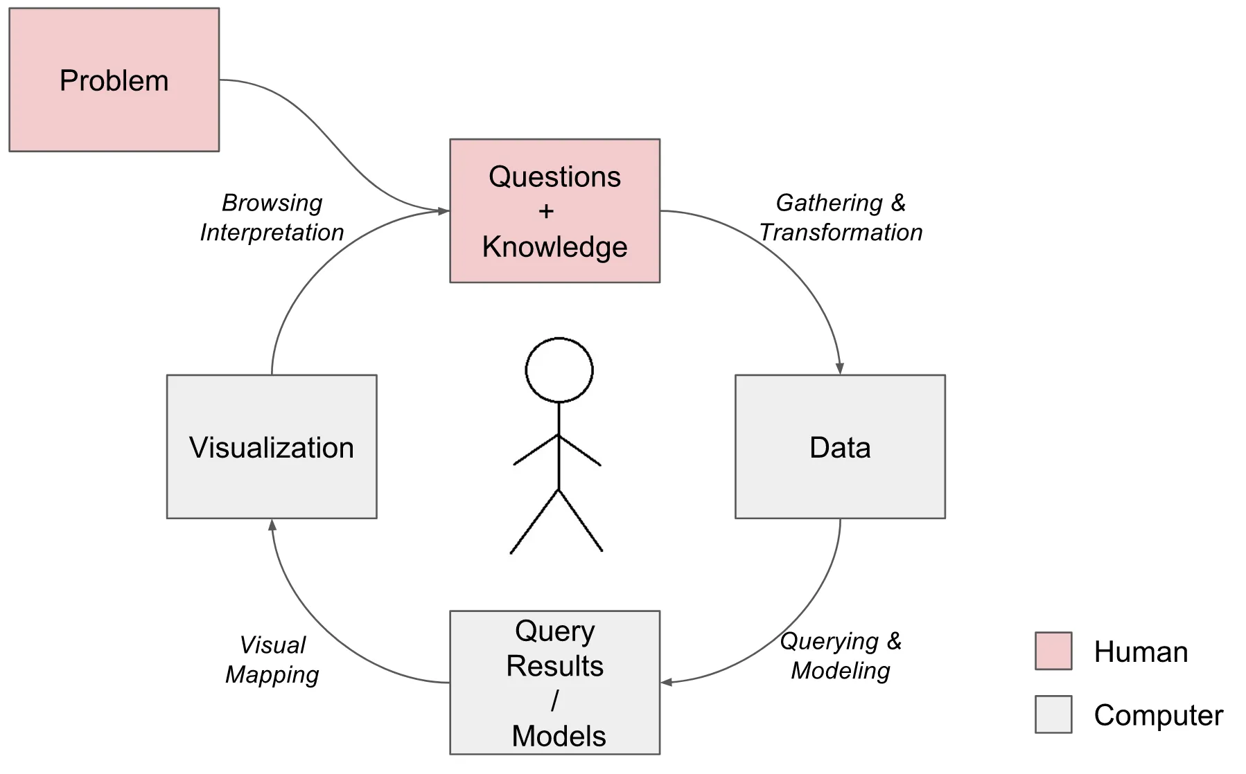
- Figure 2 outlines process underlying interactive data analysis
- Loop
- start with loosely specified goal/problem (Decrease crime!)
- translate goal into one or more questions (What causes crime?)
- gather, organize and analyze the data to answer these questions (Gather data on crime and other factors, model and visualize it)
- generate knowledge and new questions and start over
- Loop
1.3 Steps of interactive data analysis
- Defining the problem: What problem/goal are you trying to solve/reach through interactive data analysis?
- Generating questions: Translate high-level problem into number of data analysis questions
- Gathering, transforming and familiarizing with the data, e.g., often slicing, dicing and aggregating the data and to prepare it for the analysis one is planning to perform.
- Creating models out of data (not always): using statistical modeling and machine learning methods to summarize and analyze data
- Visualizing data and models: results obtained from data transformation and querying (or from some model) are turned into something our eyes can digest and hopefully understand.
- Simple representations like tables and lists rather than fancy charts are perfectly reasonable visualization for many problems.
- Interpreting the results: once results have been generated and represented in visual format, they need to be interpreted by someone (crucial step!)
- complex activity including understanding how to read the graph, understanding what graph communicates about phenomenon of interest, linking results to questions and pre-existing knowledge of problem (think of your audience!)
- Interpretation heavily influenced by pre-existing knowledge (about domain problem, data transformation process, modeling, visual representation)
- Generating inferences and more questions: steps above lead to creating new knowledge, additional questions or hypotheses
- Outcome: not only answers but also (hopefully better, more refined) questions
1.4 Important aspects of data analysis & Quo vadis interaction?
- Process not sequential but highly iterative (jumping back/forth between steps)
- Some activities exclusively human, e.g., defining problems, generating questions, etc.
- Visualization only small portion of process and effectiveness depends on other steps
- Interaction: all over the place… every time you tell your computer what to do (and she returns information)
- Gather and transform the data
- Specify a model and/or a query from the data
- Specify how to represent the results (and the model)
- Browse the results
- Synthesize and communicate the facts gathered
- Direct manipulation vs. command-Line interaction: WIMP interfaces (direct manipulation, clicks, mouse overs, etc.,) are interactive but so is command line
- You can let users type!
- Audience: what skills and pre-knowledge do the have? (domain knowledge, statistics, graphs)
1.5 Challenges of Interactive Visual Data Analysis
- Broadly three parts… (Bertini 2017)
- Specification (Mind → Data/Model): necessary to translate our questions and ideas into specifications the computer can read
- Shiny allows non-coders to perform data analysis, but requires R knowledge to built apps
- But even simpler tools out there
- Representation (Data/Model → Eyes)
- next step is to find a (visual) representation so users can inspect and understand them
- “deciding what to visualize is often equally, if not more, important, than deciding how to visualize it”
- “how fancy does a visualization need to be in order to be useful for data analysis?”
- “most visualization problems can be solved with a handful of graphs”
- really hard to use, tweak, and combine graphs in clever/effective/innovative ways
- Interpretation (Eyes → Mind)
- “what does one need to know in order to reason effectively about the results of modeling and visualization?”
- “Are people able to interpret and trust [your shiny app]?”
2 Why visualize?
2.1 Anscombes’s quartet (1)
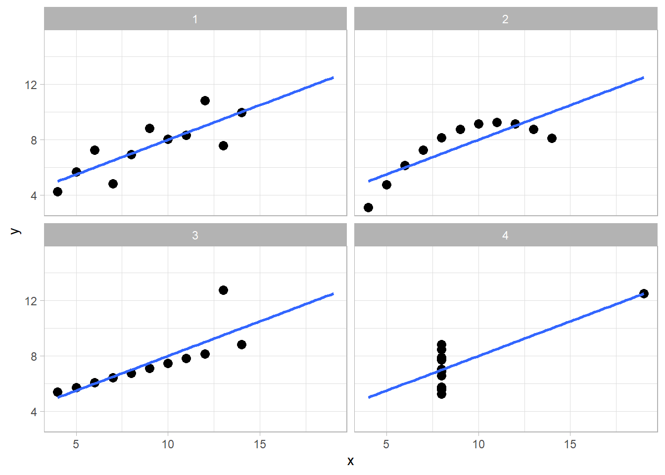
- Table 1 shows results from a linear regression based on Anscombe’s quartet (Anscombe 1973) often used to illustrate the usefulness of visualization
- Q: What do we find here?
2.2 Anscombes’s quartet (2)
- Table 2 displays Anscombe’s quartet (Anscombe 1973), a dataset (or 4 little datasets)
- Q: What does the table reveal about the data? Is it easy to read?
| x1 | y1 | x2 | y2 | x3 | y3 | x4 | y4 |
|---|---|---|---|---|---|---|---|
| 10 | 8.04 | 10 | 9.14 | 10 | 7.46 | 8 | 6.58 |
| 8 | 6.95 | 8 | 8.14 | 8 | 6.77 | 8 | 5.76 |
| 13 | 7.58 | 13 | 8.74 | 13 | 12.74 | 8 | 7.71 |
| 9 | 8.81 | 9 | 8.77 | 9 | 7.11 | 8 | 8.84 |
| 11 | 8.33 | 11 | 9.26 | 11 | 7.81 | 8 | 8.47 |
| 14 | 9.96 | 14 | 8.10 | 14 | 8.84 | 8 | 7.04 |
| 6 | 7.24 | 6 | 6.13 | 6 | 6.08 | 8 | 5.25 |
| 4 | 4.26 | 4 | 3.10 | 4 | 5.39 | 19 | 12.50 |
| 12 | 10.84 | 12 | 9.13 | 12 | 8.15 | 8 | 5.56 |
| 7 | 4.82 | 7 | 7.26 | 7 | 6.42 | 8 | 7.91 |
| 5 | 5.68 | 5 | 4.74 | 5 | 5.73 | 8 | 6.89 |
2.3 Anscombes’s quartet (3)
- Figure 3 finally visualizes the data underlying those data
- Q: What do we see here? What is the insight?
2.4 The Datasaurus Dozen
- Figure 4 displays the datasaurus dozen as animated by Tom Westlake (see here, original by Alberto Cairo)
- Q: What do we see here? What is the insight?
Warning: Paket 'gifski' wurde unter R Version 4.2.3 erstelltWarning: Paket 'datasauRus' wurde unter R Version 4.2.3 erstellt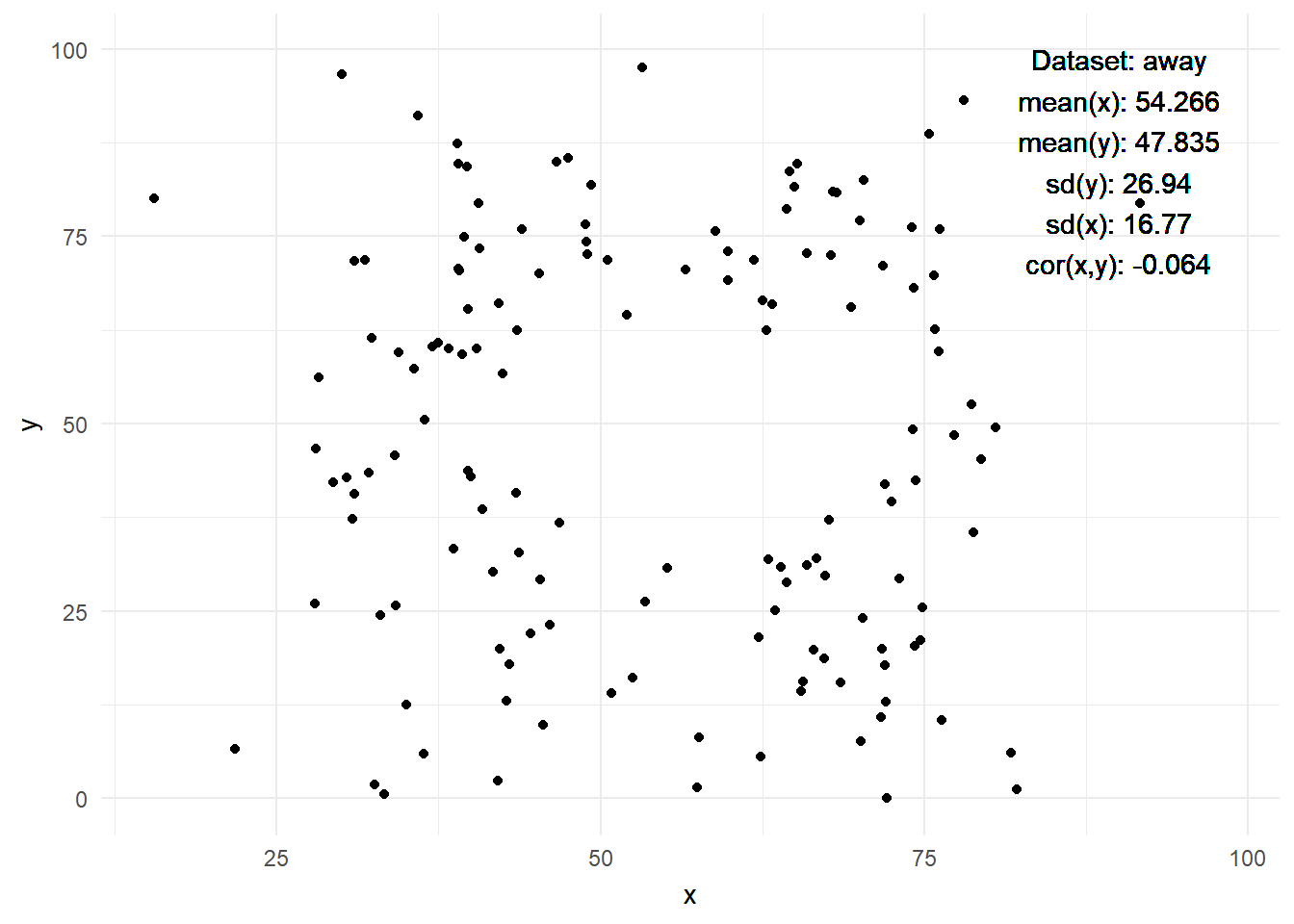
2.5 Interactivity data visualization
- “interactive data visualization enables direct actions on a plot to change elements and link between multiple plots” (Swayne 1999) (Wikipedia)
- Interactivity revolutionizes the way we work with and how we perceive data (cf. Cleveland and McGill 1984)
- Started ~last quarter of the 20th century, PRIM-9 (1974) (Friendly 2006, 23, see also Cleveland and McGill, 1988, Young et al. 2006)
- We have come a long way… John Tukey on prim9
- Interactivity allows for…
- …making sense of big data (more dimensions)
- …exploring data
- …making data accessible to those without background
- …generating interactive “publications”
3 Shiny
3.1 What is Shiny?
A web application framework for R to turn analyses into interactive web applications.. what does that mean?
- The userinterface is a webpage
- On this webpage you can manipulate things
- Behind the webpage there is a computer (your computer or a server)
- That computer/server runs R and the R script of the webapp
- When you change something on the webpage, the information is send to the computer
- Computer runs the script with the new inputs (input functions)
- Computer sends back outputs to the webpage (output functions)
- History of Shiny: Joe Cheng: The Past and Future of Shiny2
- Popularity: Shiny
- Comparison: Ggplot2
, dplyr
- Comparison: Ggplot2
3.2 Pro & contra Shiny
3.2.1 Pros of R Shiny:
- Fast Prototyping: Shiny is excellent for quickly turning ideas into applications, and is relatively easy to use even for those who aren’t seasoned programmers.
- Interactivity: Shiny lets you build interactive web apps, enhancing user engagement and experience (especially good for dashboards)
- Integration with R Ecosystem: Shiny integrates seamlessly with R’s vast open-source ecosystem (thousands of R packages, but also see shiny for python)
- Statistical Modeling and Visualization: Shiny allows you to apply complex statistical modeling and visualizations within your app (leveraging R’s strong capabilities)
- No Need for Web Development Skills: With Shiny, you can create web apps using R code alone. Knowledge of HTML, CSS, or JavaScript is not necessary but can help
- Reactivity: Shiny’s reactivity system is excellent. Fairly simple to create applications that automatically update in response to user inputs
- Sharing and Publishing: Shiny apps can be easily published and shared, either through RStudio’s Shiny server, Shinyapps.io, or embedding in R Markdown documents or websites.
3.2.2 Cons of R Shiny:
- Performance: Shiny apps run on top of R, an interpreted language, which can cause performance issues when handling large amounts of data or complex calculations.
- Single-threaded: R (and by extension Shiny) is single-threaded, which can also cause performance issues when dealing with many simultaneous users (see here).
- Complexity: While Shiny’s basics are easy to learn, mastering the intricacies of reactivity can be challenging.
- Limited Customization: While it is not hard to create a simple app from your R output, it can be challenging to get around more advanced R packages or even CSS or JavaScript when you require more sophisticated user interfaces.
- Data Gathering and Saving: It can be challenging to use Shiny for gathering and saving data to the database.
- Maintenance Cost: The cost of maintaining a Shiny application over time, including server costs and personnel time, can be high because Shiny maintenance requires some more unique skill sets.
- Software Dependencies: Certain Shiny applications may have many software dependencies, which can be challenging to manage and could potentially lead to issues down the line.
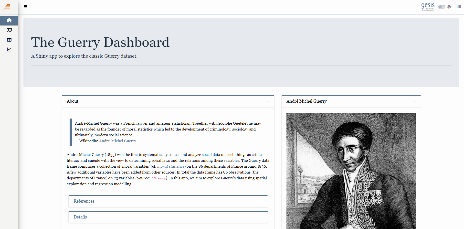
4 The Guerry Dashboard: The app we will build
- In the workshop we will built the Shiny app shown in Figure 5 together. Please explore this app here (5-10 minutes) and answer the following questions:
- What questions can we answer using the app?
- How can this app help us to understand and analyze the underlying data?
- What interactive elements can we identify in the app?
4.1 Data
- In our app we will analyze the “Guerry data”
?Guerry: data from A.-M. Guerry, “Essay on the Moral Statistics of France”Guerry::gfrance85contains map of France in 1830 + the Guerry data, excluding Corsica (Table 3 shows a subset)
Data preparation code of the app
library(shiny)
library(htmltools)
library(bs4Dash)
library(fresh)
library(waiter)
library(shinyWidgets)
library(Guerry)
library(sf)
library(tidyr)
library(dplyr)
library(RColorBrewer)
library(viridis)
library(leaflet)
library(plotly)
library(jsonlite)
library(ggplot2)
library(GGally)
library(datawizard)
library(parameters)
library(performance)
library(ggdark)
library(modelsummary)

# 1 Data preparation ----

## Load & clean data ----
variable_names <- list(
  Crime_pers = "Crime against persons",
  Crime_prop =  "Crime against property",
  Literacy = "Literacy",
  Donations = "Donations to the poor",
  Infants = "Illegitimate births",
  Suicides = "Suicides",
  Wealth = "Tax / capita",
  Commerce = "Commerce & Industry",
  Clergy = "Clergy",
  Crime_parents = "Crime against parents",
  Infanticide = "Infanticides",
  Donation_clergy = "Donations to the clergy",
  Lottery = "Wager on Royal Lottery",
  Desertion = "Military desertion",
  Instruction = "Instruction",
  Prostitutes = "Prostitutes",
  Distance = "Distance to paris",
  Area = "Area",
  Pop1831 = "Population"
)


# Import the 'gfrance85' data from the 'Guerry' package
data_guerry <- Guerry::gfrance85 %>%
  st_as_sf() %>% # Convert to a Simple Features (sf) object
  as_tibble() %>%  # Convert to a 'tibble'
  st_as_sf(crs = 27572) %>% # set the Coordinate Reference to 27572 System (CRS)
  mutate(Region = case_match( # Create new region column
    Region,
    "C" ~ "Central",
    "E" ~ "East",
    "N" ~ "North",
    "S" ~ "South",
    "W" ~ "West"
  )) %>%
  select(-c("COUNT", "dept", "AVE_ID_GEO", "CODE_DEPT")) %>% # drop columns
  select(Region:Department, where(is.numeric)) # select columns


kable(head(data_guerry[c(1,2,3,4,21,22)]))| Region | Department | Crime_pers | Crime_prop | Pop1831 | geometry |
|---|---|---|---|---|---|
| East | Ain | 28870 | 15890 | 346.03 | MULTIPOLYGON (((801150 2092... |
| North | Aisne | 26226 | 5521 | 513.00 | MULTIPOLYGON (((729326 2521... |
| Central | Allier | 26747 | 7925 | 298.26 | MULTIPOLYGON (((710830 2137... |
| East | Basses-Alpes | 12935 | 7289 | 155.90 | MULTIPOLYGON (((882701 1920... |
| East | Hautes-Alpes | 17488 | 8174 | 129.10 | MULTIPOLYGON (((886504 1922... |
| South | Ardeche | 9474 | 10263 | 340.73 | MULTIPOLYGON (((747008 1925... |
- Data is on the level of
85departments (N = 85)- Later on we also aggregate it to regions
geometry: variable that describes the geographic shape ofregions(sometimes we’ll have to exclude this column)- Advantages: Dataset is interesting, contains mapping data and is natively available in R
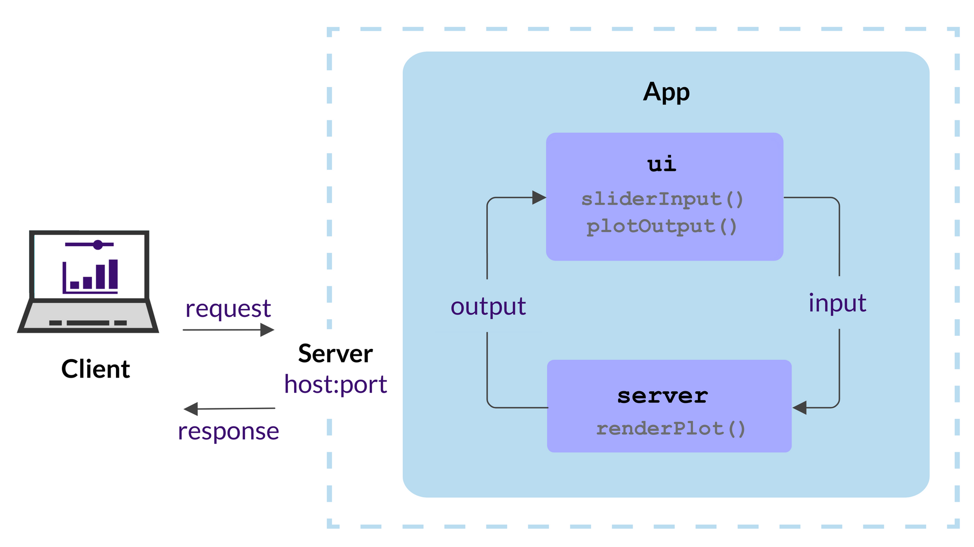
4.2 Components of a Shiny app
- As depicted in Figure 6, a Shiny app has two components, the user interface (UI) and the server, that are passed as arguments to the
shinyApp()which creates a Shiny app object from this ui/server pair
4.3 Your (first) Shiny app
- Below you will create you first app and we’ll use the opportunity to discuss the basic components of a shiny app (see analogous example here).
- Install the relevant packages:
- Create a directory with the name of your app “myfirstapp” in your working directory.
- Create an rscript file in Rstudio and save it in the working directory with the name
app.R. - Copy the code below and paste it into your
app.Rscript.
Code of the tabulate tab subset of the app
library(shiny)
library(htmltools)
library(bs4Dash)
library(fresh)
library(waiter)
library(shinyWidgets)
library(Guerry)
library(sf)
library(tidyr)
library(dplyr)
library(RColorBrewer)
library(viridis)
library(leaflet)
library(plotly)
library(jsonlite)
library(ggplot2)
library(GGally)
library(datawizard)
library(parameters)
library(performance)
library(ggdark)
library(modelsummary)

# 1 Data preparation ----

## Load & clean data ----
variable_names <- list(
  Crime_pers = "Crime against persons",
  Crime_prop =  "Crime against property",
  Literacy = "Literacy",
  Donations = "Donations to the poor",
  Infants = "Illegitimate births",
  Suicides = "Suicides",
  Wealth = "Tax / capita",
  Commerce = "Commerce & Industry",
  Clergy = "Clergy",
  Crime_parents = "Crime against parents",
  Infanticide = "Infanticides",
  Donation_clergy = "Donations to the clergy",
  Lottery = "Wager on Royal Lottery",
  Desertion = "Military desertion",
  Instruction = "Instruction",
  Prostitutes = "Prostitutes",
  Distance = "Distance to paris",
  Area = "Area",
  Pop1831 = "Population"
)

data_guerry <- Guerry::gfrance85 %>%
  st_as_sf() %>%
  as_tibble() %>%
  st_as_sf(crs = 27572) %>%
  mutate(Region = case_match(
    Region,
    "C" ~ "Central",
    "E" ~ "East",
    "N" ~ "North",
    "S" ~ "South",
    "W" ~ "West"
  )) %>%
  select(-c("COUNT", "dept", "AVE_ID_GEO", "CODE_DEPT")) %>%
  select(Region:Department, all_of(names(variable_names)))


## Prep data (Tab: Tabulate data) ----
data_guerry_tabulate <- data_guerry %>%
  st_drop_geometry() %>%
  mutate(across(.cols = all_of(names(variable_names)), round, 2))


# 3 UI ----

ui <- dashboardPage(
  title = "The Guerry Dashboard",

  ## 3.1 Header ----
  header = dashboardHeader(
    title = tagList(
      span("The Guerry Dashboard", class = "brand-text")
    )
  ),
  ## 3.2 Sidebar ----
  sidebar = dashboardSidebar(
    id = "sidebar",
    sidebarMenu(
      id = "sidebarMenu",
      menuItem(tabName = "tab_tabulate", text = "Tabulate data", icon = icon("table")),
      flat = TRUE
    ),
    minified = TRUE,
    collapsed = TRUE,
    fixed = FALSE,
    skin = "light"
  ),
  ## 3.3 Body ----
  body = dashboardBody(
    tabItems(
      ### 3.3.2 Tab: Tabulate data ----
      tabItem(
        tabName = "tab_tabulate",
        fluidRow(
          #### Inputs(s) ----
          pickerInput(
            "tab_tabulate_select",
            label = "Filter variables",
            choices = setNames(names(variable_names), variable_names),
            options = pickerOptions(
              actionsBox = TRUE,
              windowPadding = c(30, 0, 0, 0),
              liveSearch = TRUE,
              selectedTextFormat = "count",
              countSelectedText = "{0} variables selected",
              noneSelectedText = "No filters applied"
            ),
            inline = TRUE,
            multiple = TRUE
          )
        ),
        hr(),
        #### Output(s) (Data table) ----
        DT::dataTableOutput("tab_tabulate_table")
      )
    ) # end tabItems
  )
)


# 4 Server ----

server <- function(input, output, session) {

  ## 4.1 Tabulate data ----
  ### Variable selection ----
  tab <- reactive({
    var <- input$tab_tabulate_select
    data_table <- data_guerry_tabulate

    if (!is.null(var)) {
      data_table <- data_table[, c("Region", "Department",var)]
    }

    data_table
  })


  ### Create table----
  dt <- reactive({
    tab <- tab()
    ridx <- ifelse("Department" %in% names(tab), 3, 1)
    DT::datatable(
      tab,
      class = "hover",
      extensions = c("Buttons"),
      selection = "none",
      filter = list(position = "top", clear = FALSE),
      style = "bootstrap4",
      rownames = FALSE,
      options = list(
        dom = "Brtip",
        deferRender = TRUE,
        scroller = TRUE,
        buttons = list(
          list(extend = "copy", text = "Copy to clipboard"),
          list(extend = "pdf", text = "Save as PDF"),
          list(extend = "csv", text = "Save as CSV"),
          list(extend = "excel", text = "Save as JSON", action = DT::JS("
          function (e, dt, button, config) {
            var data = dt.buttons.exportData();

            $.fn.dataTable.fileSave(
              new Blob([JSON.stringify(data)]),
              'Shiny dashboard.json'
            );
          }
        "))
        )
      )
    )
  })

  ### Render table----
  output$tab_tabulate_table <- DT::renderDataTable(dt(), server = FALSE)


}

shinyApp(ui, server)- You can run and stop the app by clicking Run App (Figure 7) button in the document toolbar.

5 Minimum viable product (MVP)
- …useful concept when building apps (see Figure 8)!
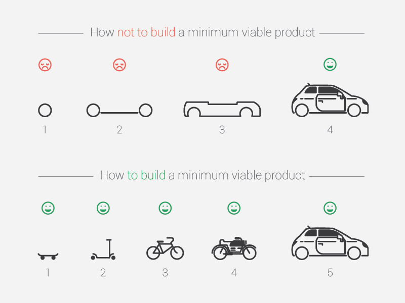
- “version […] with just enough features to be usable by early customers” to collect feedback (Wikipedia)
- “Making things work before working on low-level optimization makes the whole engineering process easier” (Fay et al. 2021)
- The “UI first” approach: often the safest way to go (Fay et al. 2021)
- Agreeing on specifications: helps everybody involved in the application to agree on what the app is supposed to do, and once the UI is set, there should be no “surprise implementation”
- Organizing work: “It’s much easier to work on a piece of the app you can visually identify and integrate in a complete app scenario”
- But…
- ..we “follow” same strategy, slowly building out our shiny app, adding features & complexity
6 Workflow: Development, debugging and getting help
- See discussions of workflow in Wickham (2021, Ch. 5, 20.2.1)
- Three important Shiny workflows:
- Basic development cycle of creating apps, making changes, and experimenting with the results.
- Debugging, i.e., figure out what’s gone wrong with your code/brainstorm solutions
- Writing reprexes, self-contained chunks of code that illustrate a problem (essential for getting others’ help)
- Below development WF, debugging later on
6.1 Development workflow
- Creating the app: start every app with the same lines of R code below (
Shift + Tabor in menueNew Project -> Shiny Web Application) - Seeing your changes: you’ll create a few apps a da (really?!?), but you’ll run apps hundreds of times, so mastering the development workflow is particularly important
- Write some code.3
- Launch the app with
Cmd/Ctrl + Shift + Enter. - Interactively experiment with the app.
- Close the app.
- Go to 1.
library(shiny)
ui <- fluidPage(

)
server <- function(input, output, session) {

}
shinyApp(ui, server)
Shiny applications not supported in static R Markdown documents
6.1.1 A few tips
- Controlling the view: Default is a pop-out window but you can also choose
Run in Viewer PaneandRun External. - Document outline: Use it for navigation in your app code (
Cntrl + Shift + O) - Using/exploring other apps: Inspect that app code, then slowly delete parts you don’t need
- Rerun app to see whether it still works after each deletion
- if only interested in UI, delete everything in within server function:
server <- function(input, output, session) {delete everything here} - Important: Search for dependencies (that can sometimes be delete), e.g., search for
wwwfolder- also image links with
srcorpng,jpg
- also image links with
6.2 Debugging workflow
- Guaranteed that something will go wrong at the start
- Cause is mismatch between your mental model of Shiny, and what Shiny actually does
- We need to develop robust workflow for identifying and fixing mistakes
- Three main cases of problems: (1) Unexpected error, (2) No error but incorrect values; (3) Correct values but not updated
- Use traceback and interactive debugger
- Use interactive debugger
- Problem unique to Shiny, i.e., R skills don’t help
- See Wickham (2021, Ch. 5.2, link) for explanations and examples
References
Anscombe, F J. 1973. “Graphs in Statistical Analysis.” Am. Stat. 27 (1): 17–21.
Bertini, Enrico. 2017. “From Data Visualization to Interactive Data Analysis.” https://medium.com/@FILWD/from-data-visualization-to-interactive-data-analysis-e24ae3751bf3.
Cleveland, William S, and Robert McGill. 1984. “Graphical Perception: Theory, Experimentation, and Application to the Development of Graphical Methods.” Journal of the American Statistical Association 79 (387): 531–54.
Fay, Colin, Sébastien Rochette, Vincent Guyader, and Cervan Girard. 2021. Engineering Production-Grade Shiny Apps. CRC Press.
Friendly, Michael. 2006. “A Brief History of Data Visualization.” In Handbook of Data Visualization, 15–56. Springer Handbooks Comp.statistics. Springer Berlin Heidelberg.
Swayne, Deborah. 1999. “Introduction to the Special Issue on Interactive Graphical Data Analysis: What Is Interaction?” Computational Statistics 14 (1): 1–6.
Wickham, Hadley. 2021. Mastering Shiny. " O’Reilly Media, Inc.".
Footnotes
Inspirational. The main goal here is to inspire people. To wow them! But not just on a superficial level, but to really engage people into deeper thinking, sense of beauty and awe. Explanatory. The main goal here is to use graphics as a way to explain some complex idea, phenomenon or process. Analytical. The main goal here is to extract information out of data with the purpose of answering questions and advancing understanding of some phenomenon of interest.↩︎
Joe Cheng is the Chief Technology Officer at RStudio and was the original creator of the Shiny web framework, and continues to work on packages at the intersection of R and the web.↩︎
Automated testing: allows you to turn interactive experiments you’re running into automated code, i.e., run tests more quickly and not forget them (because they are automated). Requires more initial investment.↩︎