Chapter 5 Bootstrapping and Advanced Plotting
5.1 Bootstrapping
In statistical methods, assumptions about data distributions are often necessary but not always accurate in real-world scenarios. Bootstrapping provides a flexible alternative by resampling data to estimate the sampling distribution of a statistic, useful when distribution assumptions are uncertain or sample sizes are small.
5.1.1 Practical Example: Estimating Mean Height
Imagine you want to determine the average body height of a student in Jena. Let’s assume the true distribution of the height of Jena students is a normal distribution with a mean of 165 cm and a standard deviation of 15 cm. Measuring all students is impractical, so you sample 100 students to approximate their mean height.
# Simulate 100 heights from a normal distribution
height <- rnorm(n = 100, mean = 165, sd = 15)

# Display histogram with sample mean
hist(height, breaks = seq(120, 200, by = 5))
abline(v = mean(height), col = "blue", lwd = 3)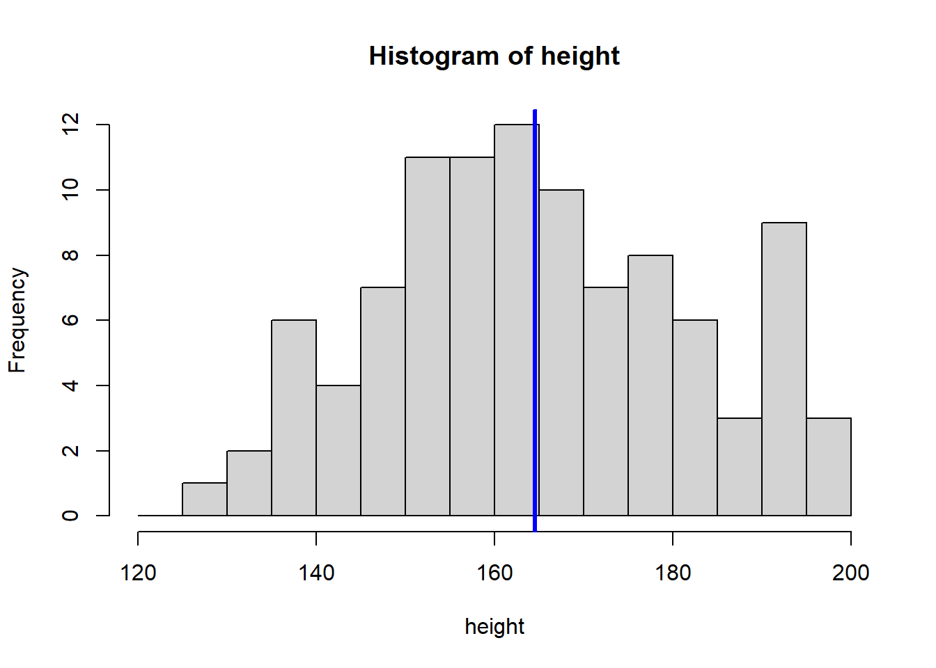
The sample mean height is approximately 164.54 cm. A friend asks you how certain you are about this estimate. To quantify your uncertainty, you can repeat your experiment multiple times to see how much the mean varies. In our simulation, this is easy to do by repeating the above code.
5.1.2 Repeated Sampling to Estimate Uncertainty
# Create a vector to store means from repeated samples
means <- c()

# Repeat the experiment 8 times
for (i in 1:8) {
  height_repeated <- rnorm(n = 100, mean = 165, sd = 15)
  hist(height_repeated, breaks = seq(110, 210, by = 5))
  abline(v = mean(height_repeated), col = "blue", lwd = 3)

  #store the sample mean
  means <- c(means, mean(height_repeated))
}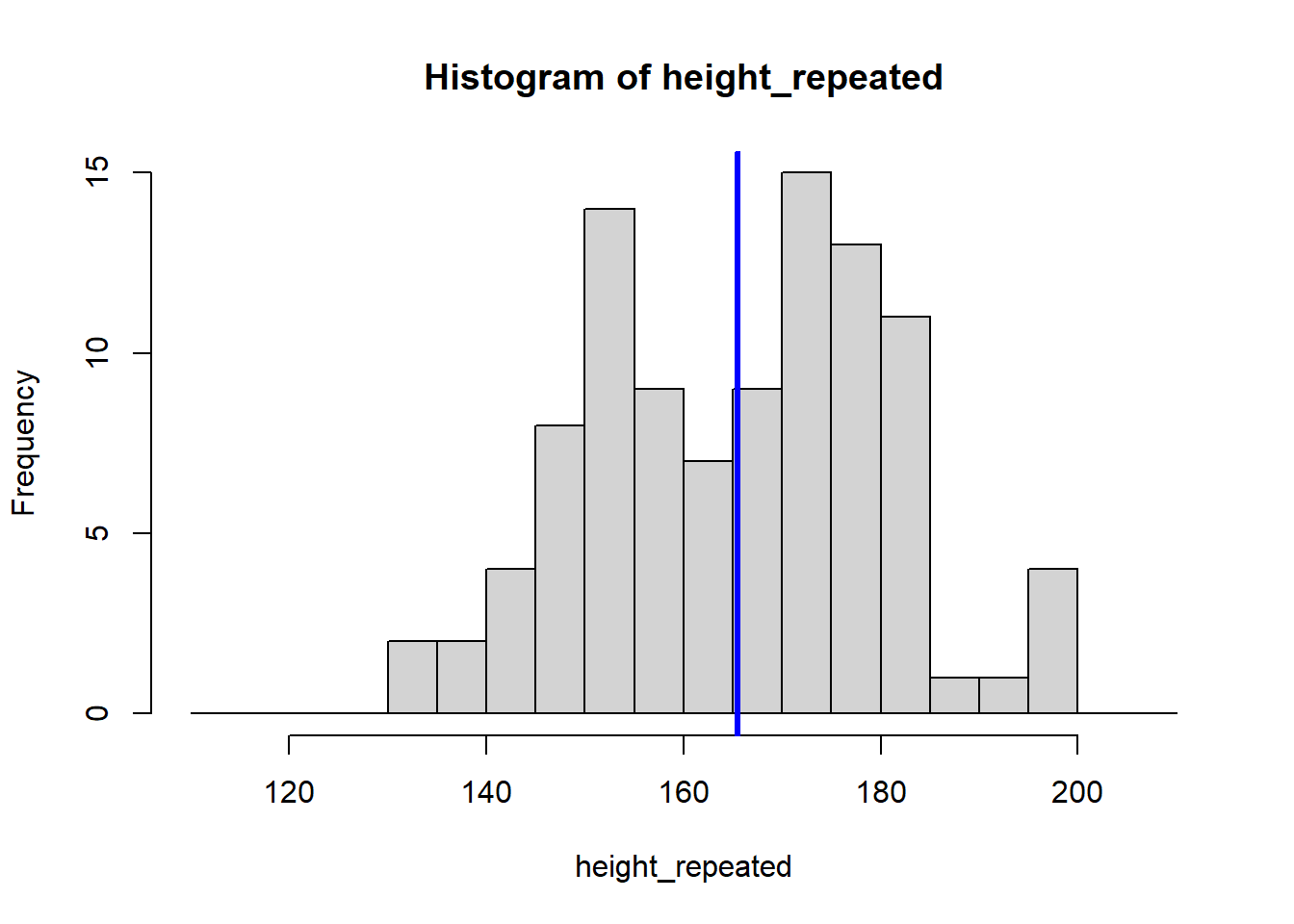
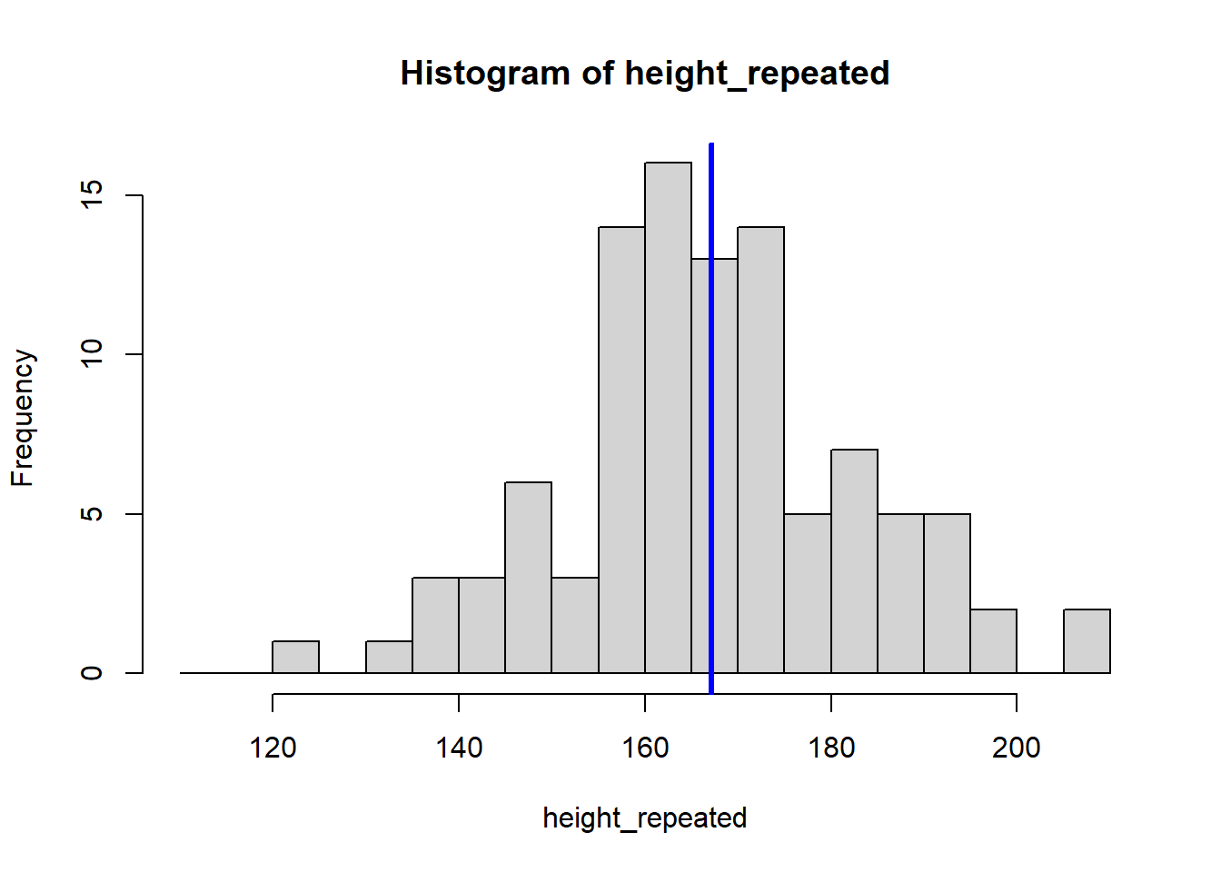
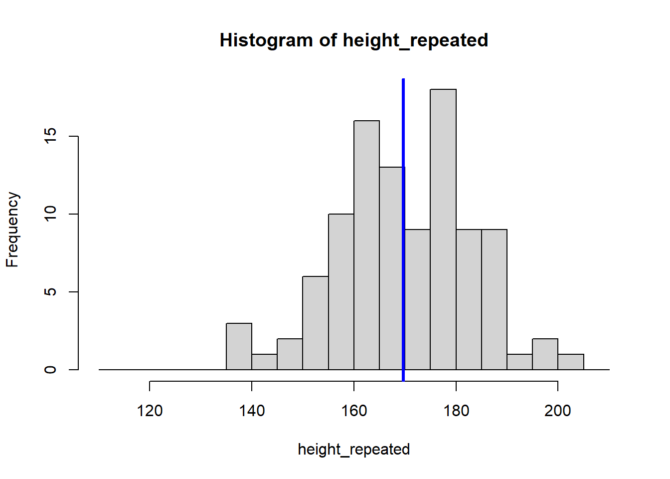
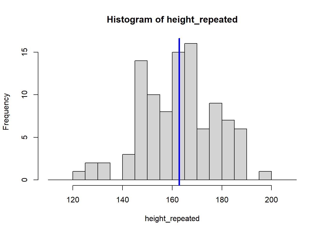
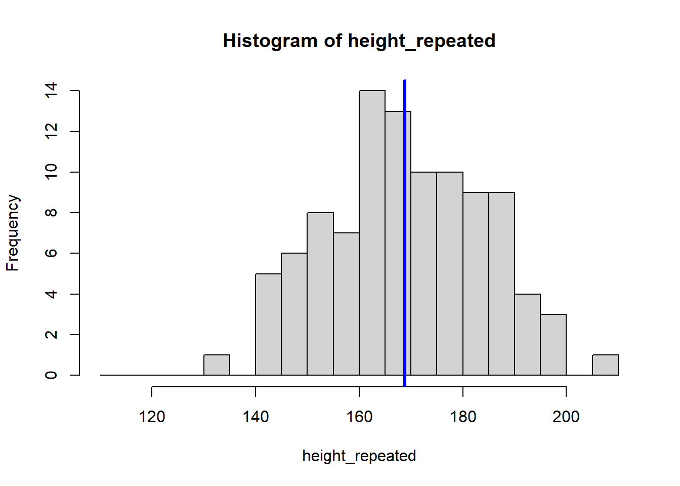
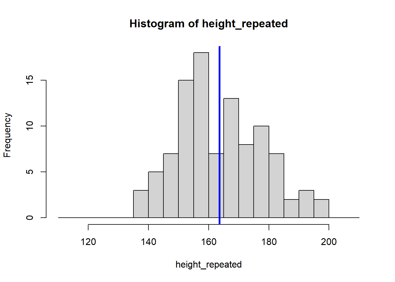
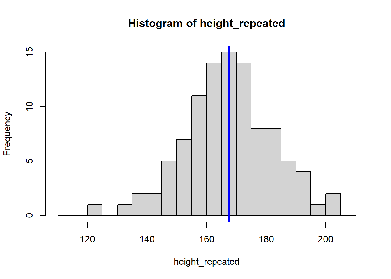
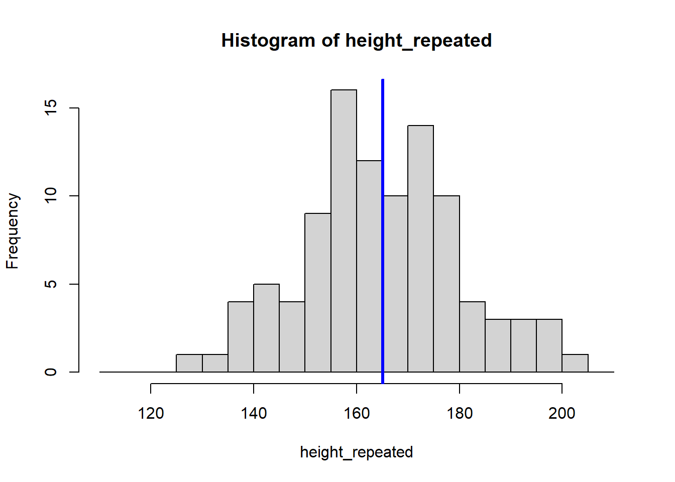
The for (i in 1:8) {} structure is called a loop, and it tells R to repeat the code inside the {} eight times, creating eight histograms. Each histogram represents a sample drawn from the population of students, showing how the sample mean can vary.
Because our sample is random, the eight calculated means vary:
[1] 165.4382 167.1440 169.7115 162.7937 168.7869 163.5957 167.5302 165.04955.1.3 Estimating Standard Error and Confidence Interval
Increasing the number of experiments to 10000 shows that the distribution of means converges to a normal distribution around the true population mean.
means <- c()

for (i in 1:10000) {
  height_repeated <- rnorm(n = 100, mean = 165, sd = 15)
  means <- c(means, mean(height_repeated))
}

hist(means)
abline(v = mean(means), col = "blue", lwd = 3)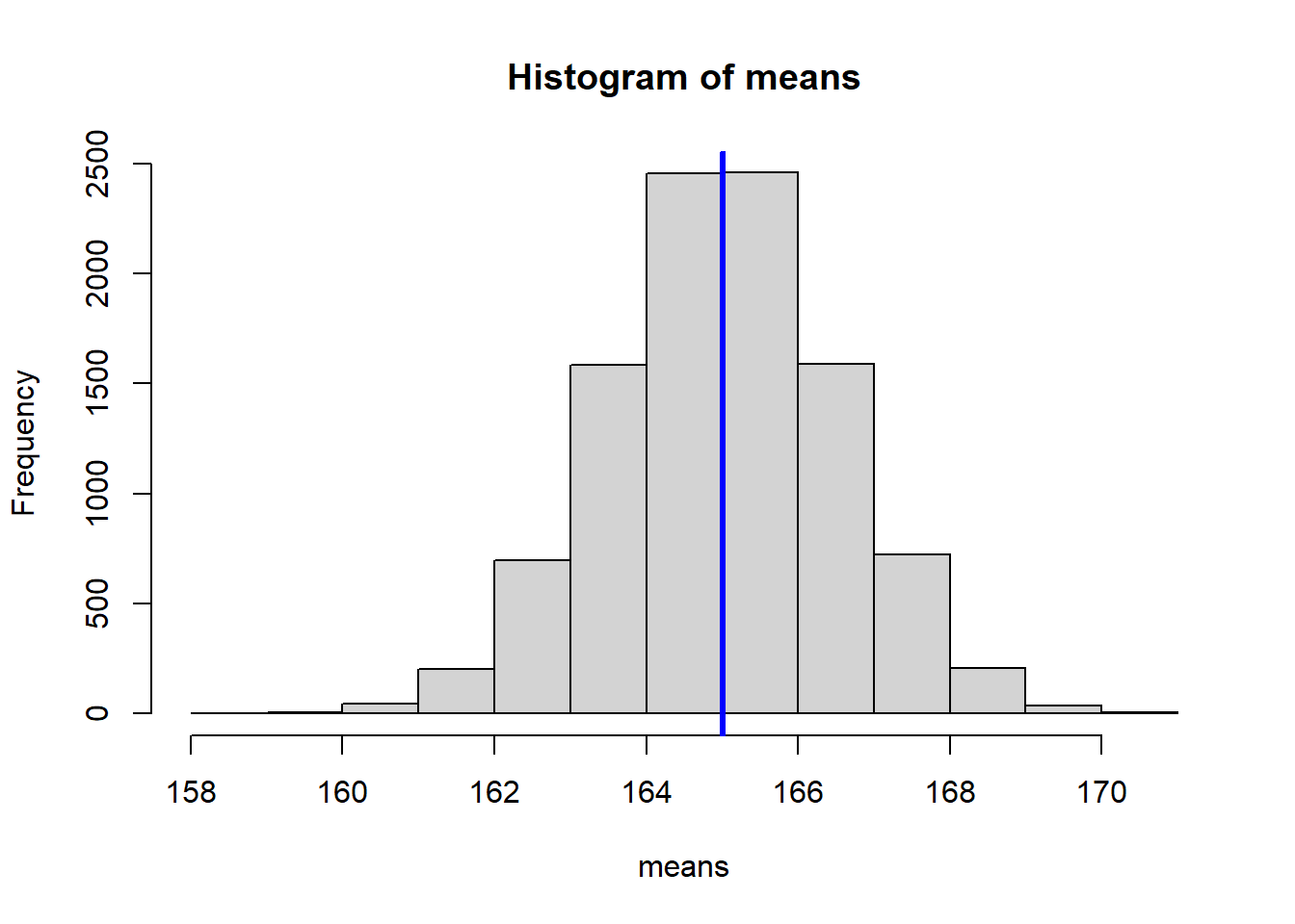
We can calculate the standard deviation of our means, which estimates the standard error of the mean:
[1] 1.524756For well-behaved statistics like the mean, we don’t have to actually repeat our experiment, because the standard error can be approximated from the data of the original sample:
[1] 1.740284Using the standard error, we can construct a 95% confidence interval:
[1] 161.1286 167.95055.1.4 Bootstrapping the median
Contrary to the mean, the median does not have a simple standard error formula. For statistics like the median, bootstrapping is an alternative.
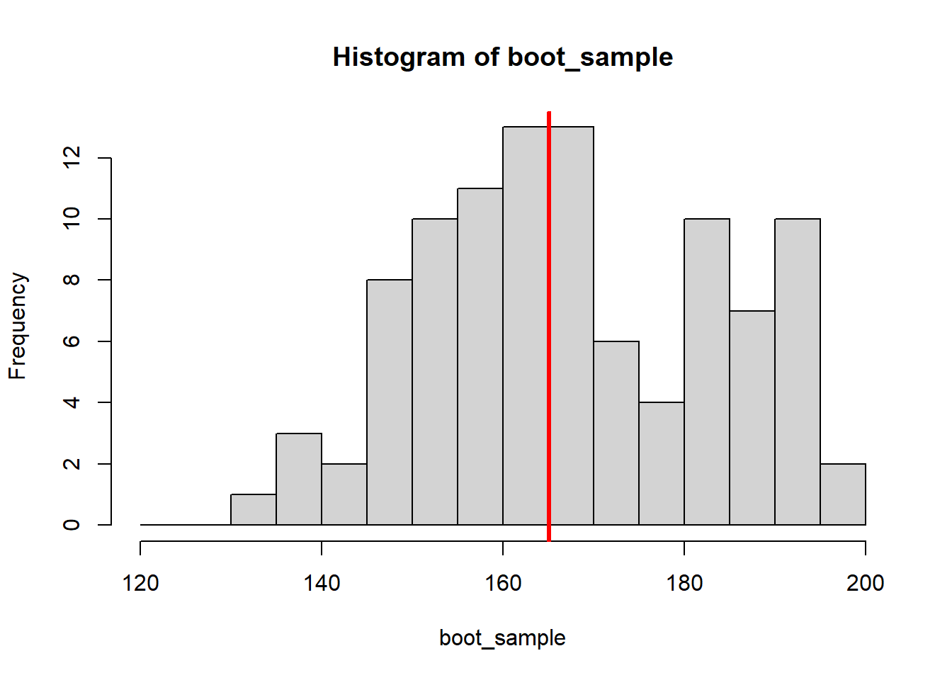
The bootstrap mimics conducting the experiment multiple times. Instead of resampling from the population by repeating the experiment, you repeatedly draw random samples (with replacement) from the data obtained in the single experiment you conducted (in this case, height).
# Create a vector to store bootstrap medians
boot_medians <- c()

# Draw 8 bootstrap samples
for (i in 1:8) {

    #draw 100 random samples with replacement
    #from the original height observations
    boot_sample <- sample(x = height, size = 100, replace = TRUE)

    #plot the bootstrap sample
    hist(boot_sample, breaks = seq(120,200, by = 5))
    abline(v = median(boot_sample), col="red", lwd=3)

    #save the median of the bootstrap sample
    boot_medians <- c(boot_medians, median(boot_sample))
}
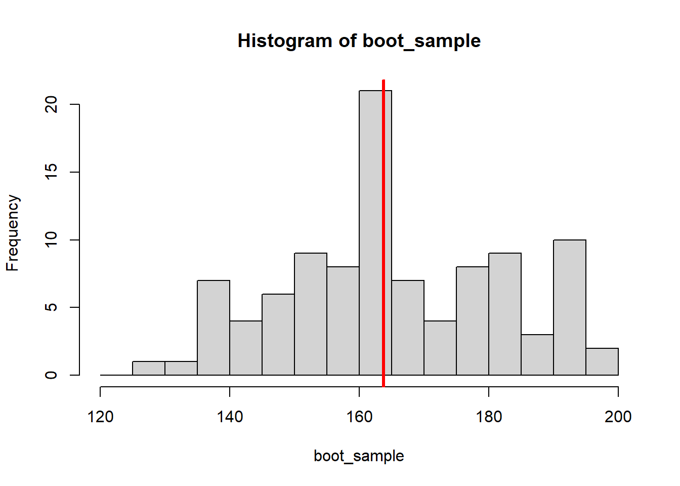
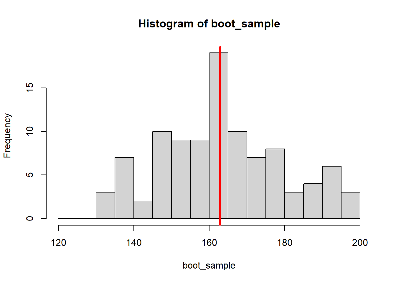
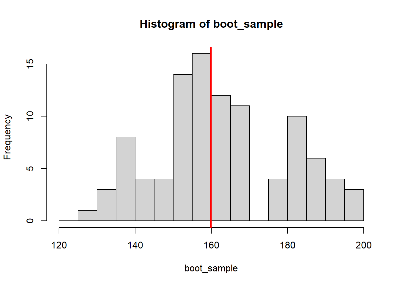
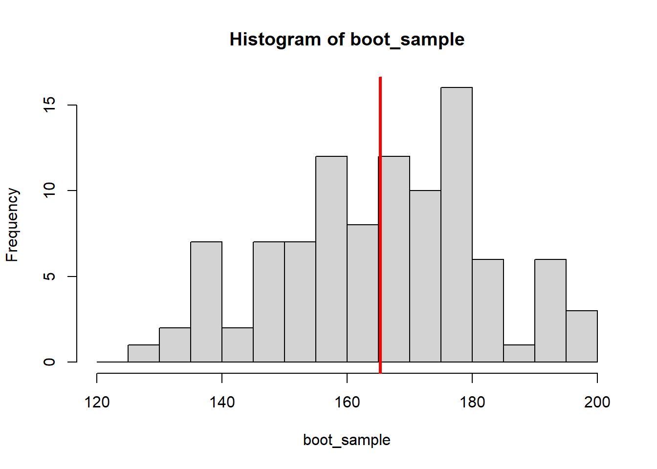
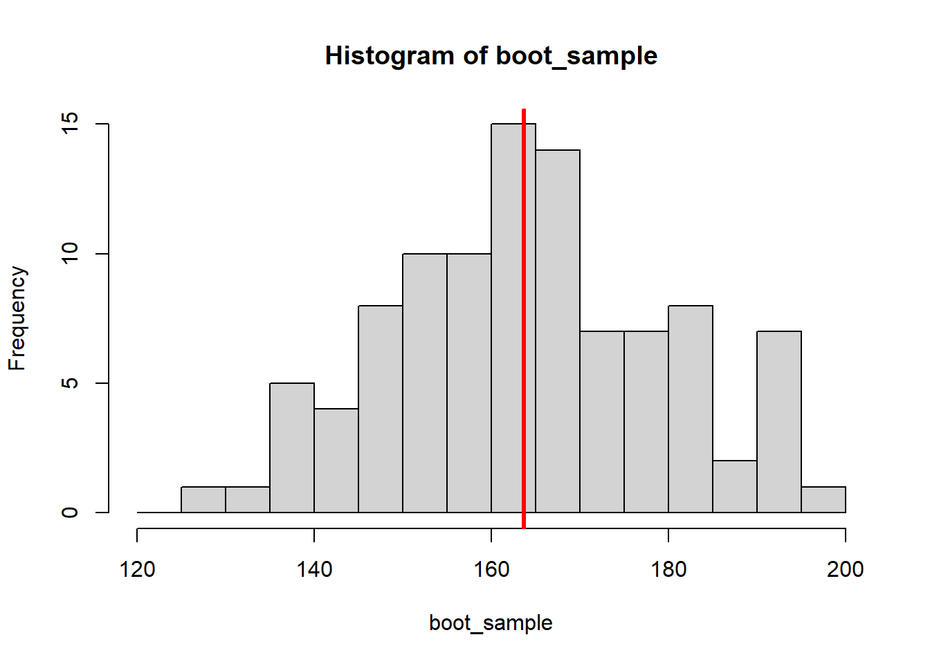
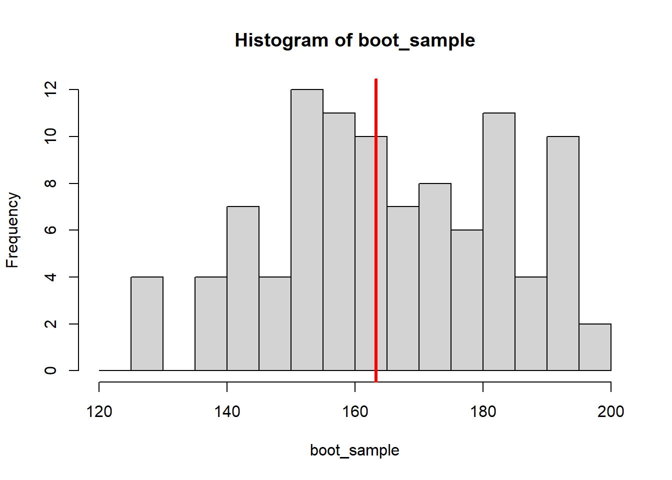
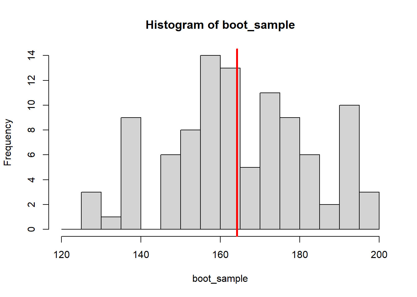
Since all the resampling is numbers on a computer, it is easy to draw a lot more samples than just eight, e.g. 10000 bootstrap samples:
boot_medians <- c()

for (i in 1:10000) {
  boot_sample <- sample(x = height, size = 100, replace = TRUE)
  boot_medians <- c(boot_medians, median(boot_sample))
}
We can plot the distribution of the 10000 resulting medians:
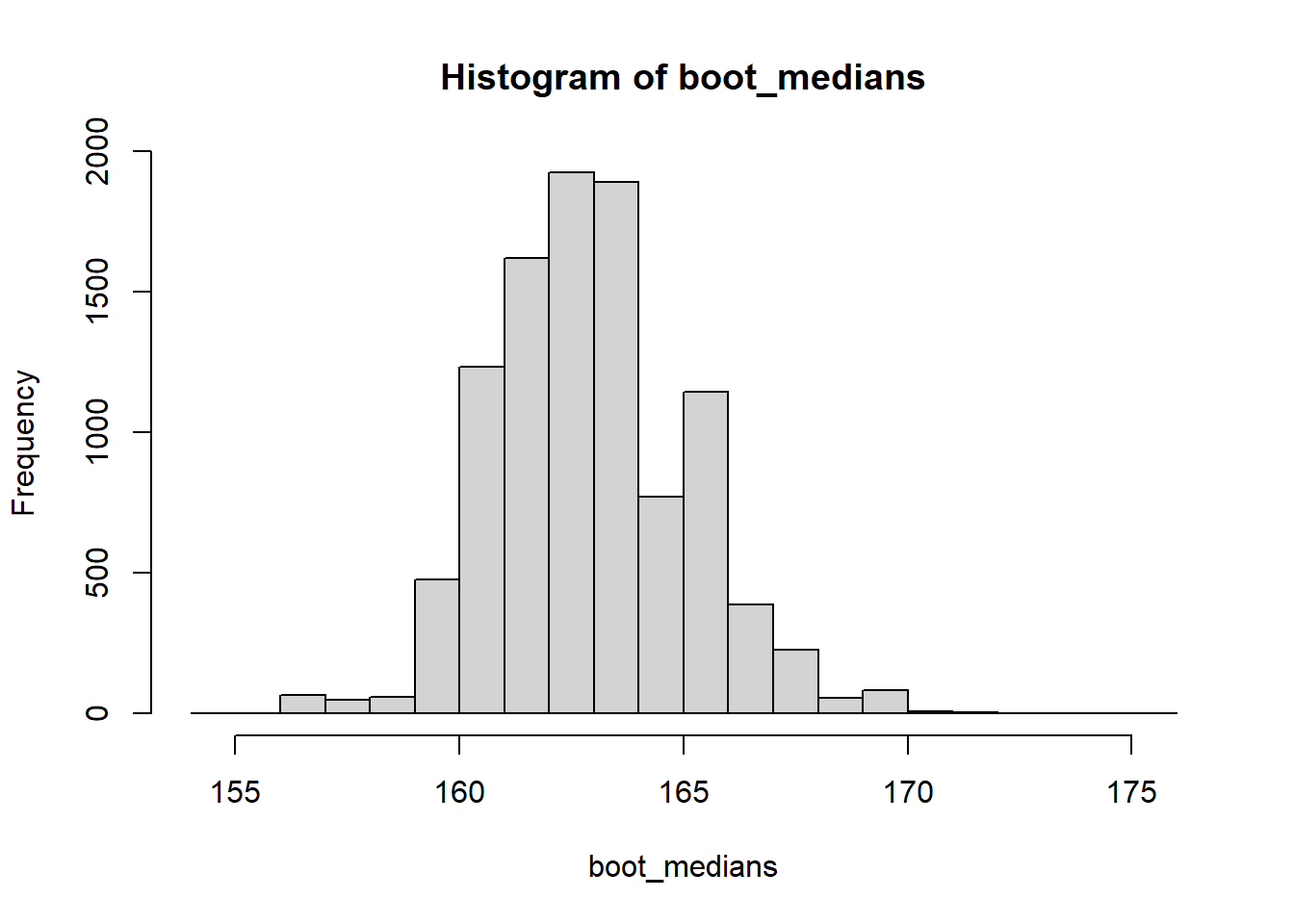
And we can use it to calculate a confidence interval in different ways. We can calculate the bootstrap standard error and apply the same formula we have used for the mean above (this is called a normal or wald-type CI):
# Bootstrap standard error
se <- sd(boot_medians)

# Normal (Wald) CI
median(height) + c(-1.96 * se, 1.96 * se)
[1] 158.6161 167.1772Or we can simply look at the middle 95% of the bootstrapped medians, by calculating the 0.025 and 0.975 percentiles (this is called a percentile CI):
    2.5%    97.5%
159.1527 167.3725
#Plot percentile CI
hist(boot_medians)
abline(v = quantile(boot_medians, c(0.025, 0.975)),
col="red", lwd=3)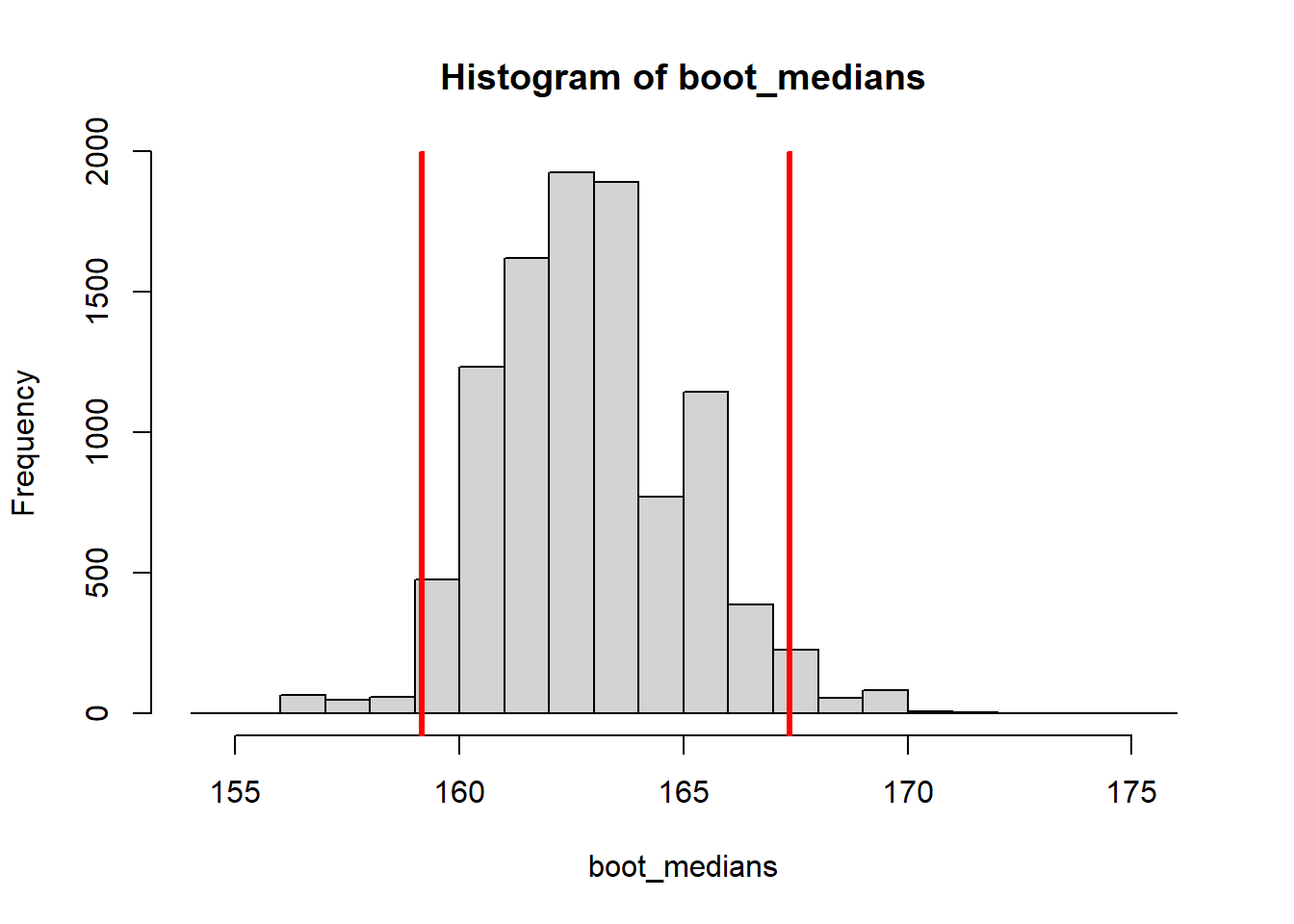
For skewed distributions or smaller samples, other CIs like the Bias-corrected and accelerated (BCa) CI are more appropriate. For those, we can use the boot() and boot.ci() functions from the boot package:
# Load boot package
library(boot)

#boot requires function taking the data and a vector of indices
#and returns the statistic of interest
my_median <- function(x, indices) { median(x[indices]) }

# Draw bootstrap samples
boot_samples <- boot(data = height, statistic = my_median,
                     R = 10000)

# Compute bootstrap CIs
boot.ci(boot_samples)
BOOTSTRAP CONFIDENCE INTERVAL CALCULATIONS
Based on 10000 bootstrap replicates
CALL :
boot.ci(boot.out = boot_samples)
Intervals :
Level Normal Basic
95% (158.7, 167.1 ) (158.4, 166.6 )
Level Percentile BCa
95% (159.2, 167.4 ) (159.2, 167.2 )
Calculations and Intervals on Original ScaleAs you can see, the normal and percentile CIs in this output are the same as the ones we computed by hand.
5.2 Graphics with ggplot
Throughout the preceding chapters we have used R’s basic plotting functionalities. Those are fine for quick visual analysis of data, but if you intend to publish your analyses, you will need more control over every aspect of you plots. One option for this is the package ggplot2 (Wickham et al. 2024), which is the most widely used graphics package in R because it gives you control over even the finest details of your graphics while simultaneously doing a lot of the work automatically for you. The syntax takes a bit of getting used to but the results are worth it!
This chapter only touches upon the most commonly used functions of ggplot2. For a comprehensive overview and more useful resources go to https://www.rdocumentation.org/packages/ggplot2.
5.2.1 Structure
In ggplot you build your graphics layer by layer as if you were painting a picture. You start by laying out a blank sheet (with the basic function ggplot()) upon which you add graphical elements (called geoms) and structural elements (like axis labels, colour schemes etc.).
To start, lets install the package and load the example data set again.
Starting with a simple graphic, we want to draw a scatterplot of the body weight at admission and at discharge. In ggplot, we build a graphics object and save it as a variable that is only actually drawn if we call it in the console. We start by laying out a white sheet and call our graphic my_plot:
In this function, we tell the graphic that our data comes from the data set d. But since we have not told ggplot what to draw yet, my_plot only produces a blank graph:

This changes if we add the geom for a scatterplot called geom_point().
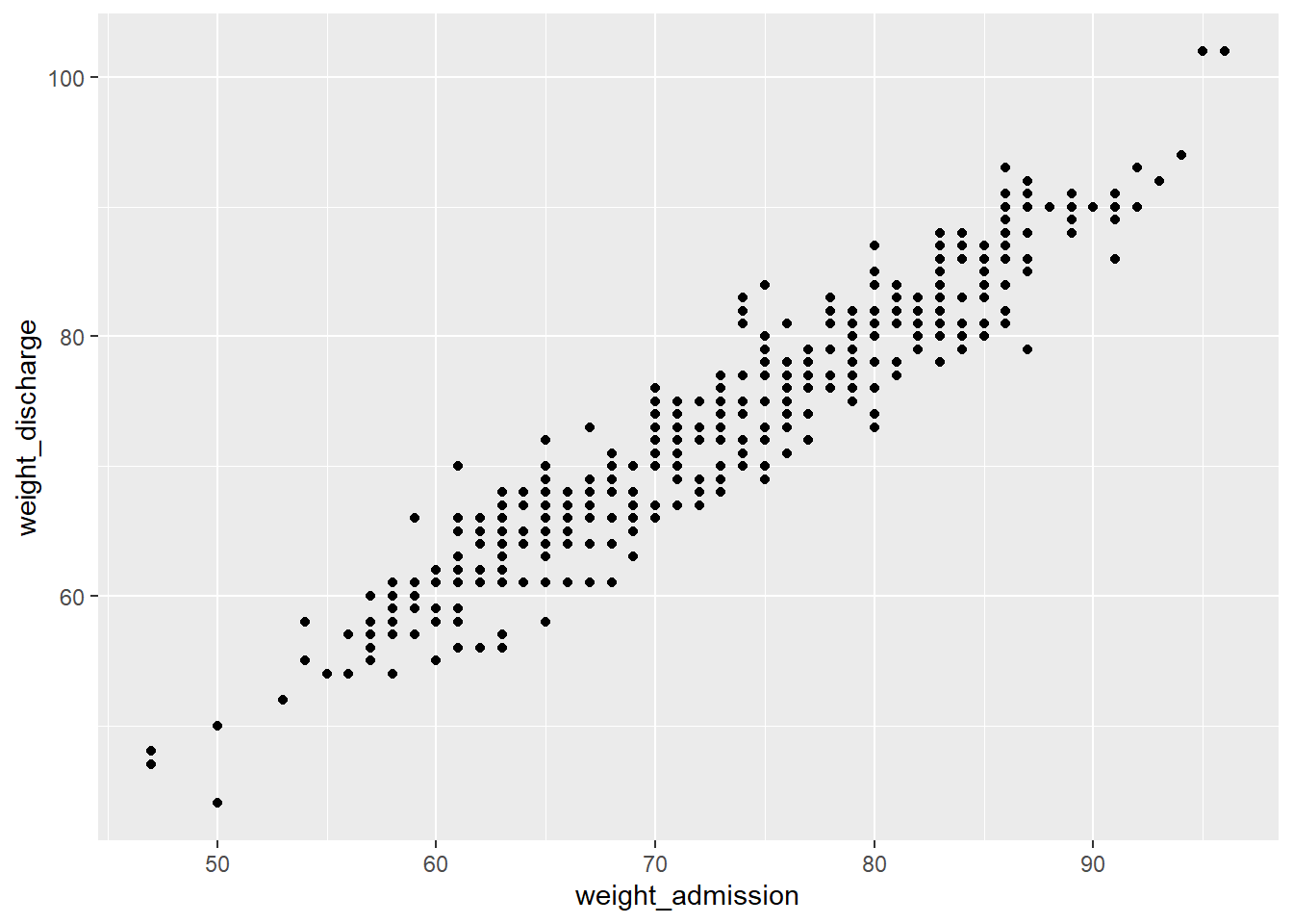
The aes() function is part of every geom, it is short for aesthetic and used to specify every feature of the geom that depends on variables from the data frame, like the definition of the x- and y-axis.
Within aes() we can for example set the color of geom_point() to depend on the gender:
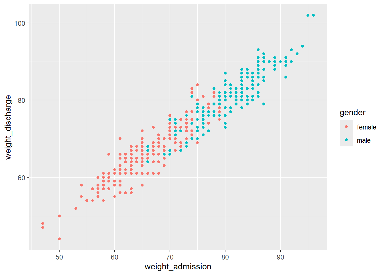
If you want to set a feature of the geom that does not depend on any of the variables (e.g. setting one color for all the points), this is done outside of the aesthetics argument:

You can also add more than one layer to the plot. For example, we could superimpose a (non-linear) regression line by simply adding the geom geom_smooth():
my_plot + geom_point(aes(x = weight_admission, y = weight_discharge, color = gender)) +
  geom_smooth(aes(x = weight_admission, y = weight_discharge))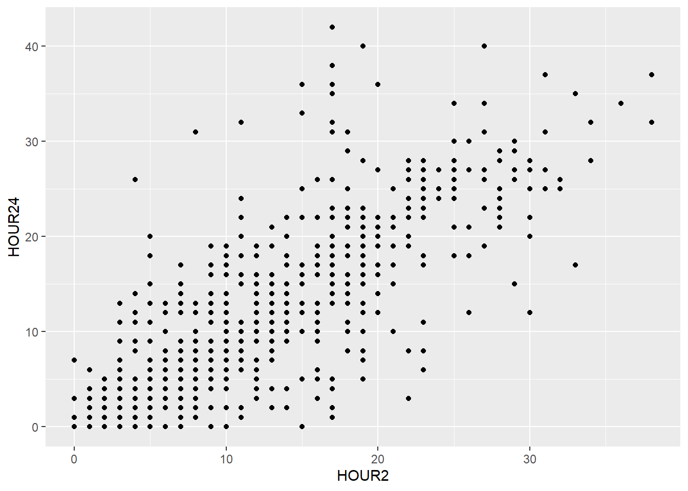
With more than one layer it is easier formatting the code with line breaks. These breaks don’t affect the functionality in any way aside from readability, just make sure you mark all the lines when executing the code. Note, that each line but the last has to end with a + for R to know that those lines belong together.
geom_smooth(), too, can be divided with color (e.g. by gender) if we specify it in the color argument of the aesthetics:
my_plot + geom_point(aes(x = weight_admission, y = weight_discharge, color = gender)) +
  geom_smooth(aes(x = weight_admission, y = weight_discharge, color = gender))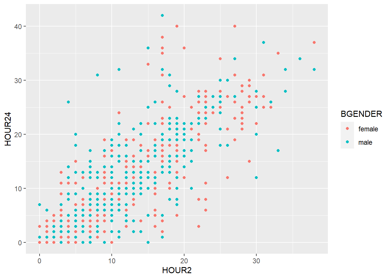
When several layers share the same aesthetics it can be useful to define these aesthetics in the basic plot produced by ggplot():
my_plot2 <- ggplot(data=d, aes(x = weight_admission, y = weight_discharge, color = gender))

my_plot2 + geom_point() + geom_smooth()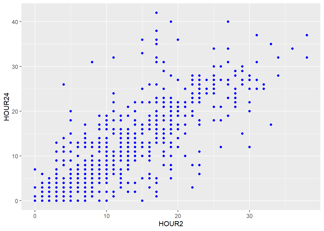
Instead of defining the aesthetics for each geom separately, geom_point() and geom_smooth() inherit the aesthetics of my_plot2 and the graphic looks exactly the same.
5.2.2 Labels
You can set the labels of your plot using labs().
my_plot2 +
    geom_point() +
    geom_smooth() +
    labs(title = "Scatterplot",
         x = "Body weight [kg] at admission",
         y = "Body weight [kg] at discharge")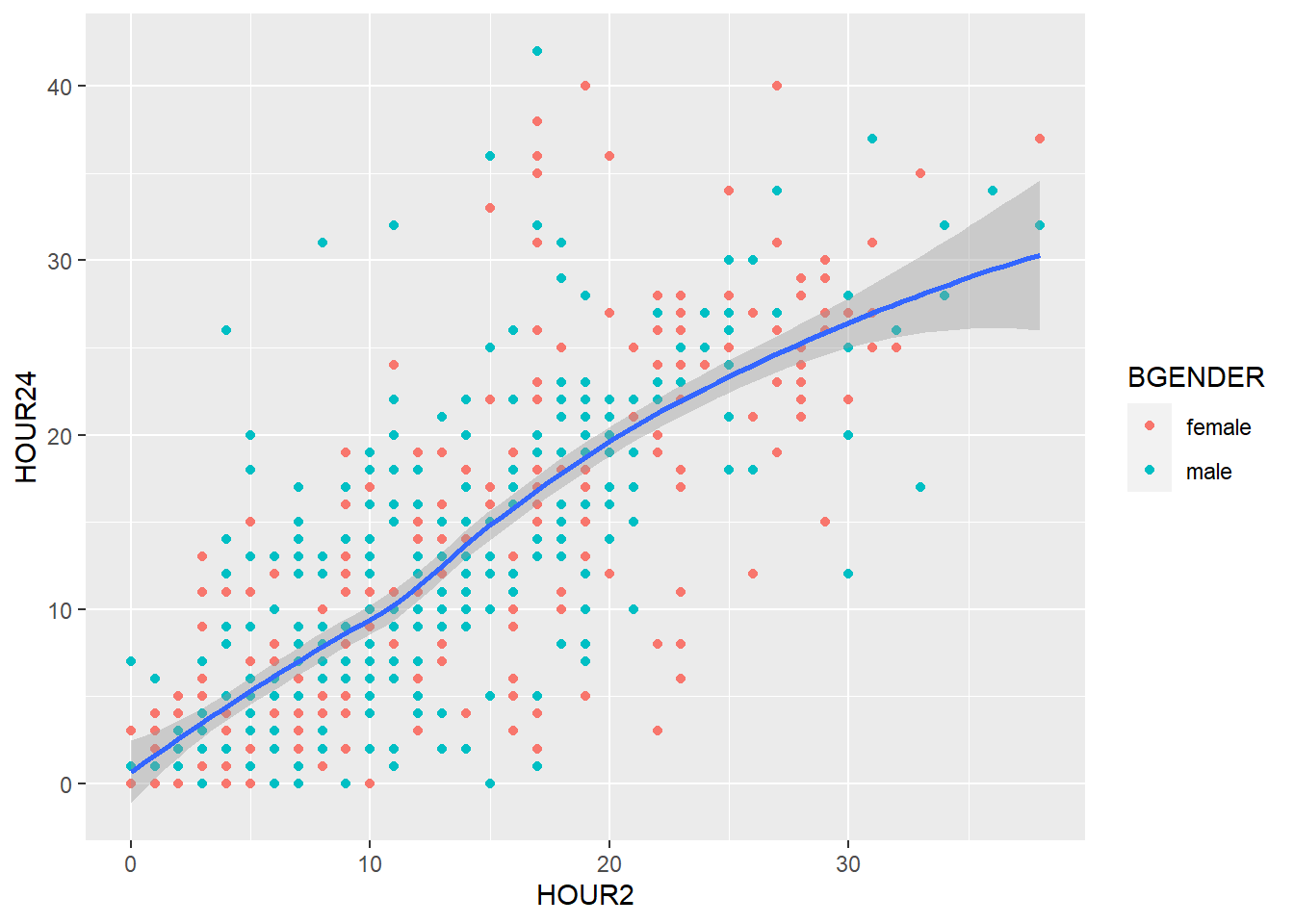
5.2.3 Facets
So far we have divided our graph using different colors. It is however also possible to split the graph according to a one or more variables in the data frame using facet_wrap(). To split the graph by treatment (treatment) we write:
my_plot2 +
    geom_point() +
    geom_smooth() +
    labs(title = "Scatterplot",
         x = "Body weight [kg] at admission",
         y = "Body weight [kg] at admission") +
    facet_wrap(~ treatment)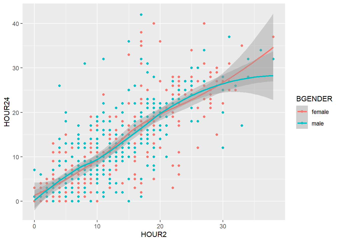
And if we want to split the graph by hospital, too, we simply add hospital:
my_plot2 +
    geom_point() +
    geom_smooth() +
    labs(title = "Scatterplot",
         x = "Body weight [kg] at admission",
         y = "Body weight [kg] at admission") +
    facet_wrap(~ treatment*hospital)
5.2.4 Theme
The theme of a ggplot can be used to change the default appearance of the entire plot or to change specific components of your plot. To find a list of complete themes, go to https://ggplot2.tidyverse.org/reference/ggtheme.html or install the package ggthemes which contains even more complete themes.
The default theme of ggplot is theme_grey, but we can change it like this:
my_plot2 +
    geom_point() +
    geom_smooth() +
    labs(title = "Scatterplot",
         x = "Body weight [kg] at admission",
         y = "Body weight [kg] at admission") +
    theme_bw()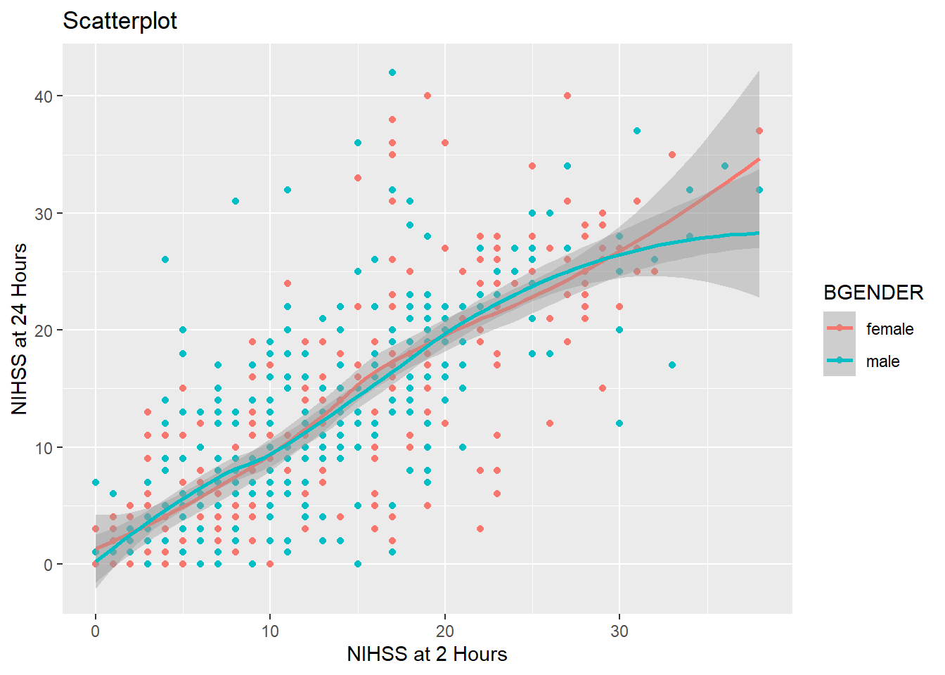
If on the other hand you want to change only certain elements, for example the font size or type of your axis labels, you use theme(), which allows you customize every element of your plot. To change text elements, you give an element_text() to the appropriate argument of theme(). Within element_text you can set the font size, font type, font color, font face and many more aspects. The arguments that take element_text() objects are for example axis.text for the numbers on the axes, axis.title for the axis labels and plot.title for the plot title :
my_plot2 +
    geom_point() +
    geom_smooth() +
    labs(title = "Scatterplot",
         x = "Body weight [kg] at admission",
         y = "Body weight [kg] at admission") +
    theme(axis.text.x = element_text(size=15),
          axis.text.y= element_text(size=10),
          axis.title = element_text(size=16, face="italic"),
          plot.title = element_text(size=18, face="bold"))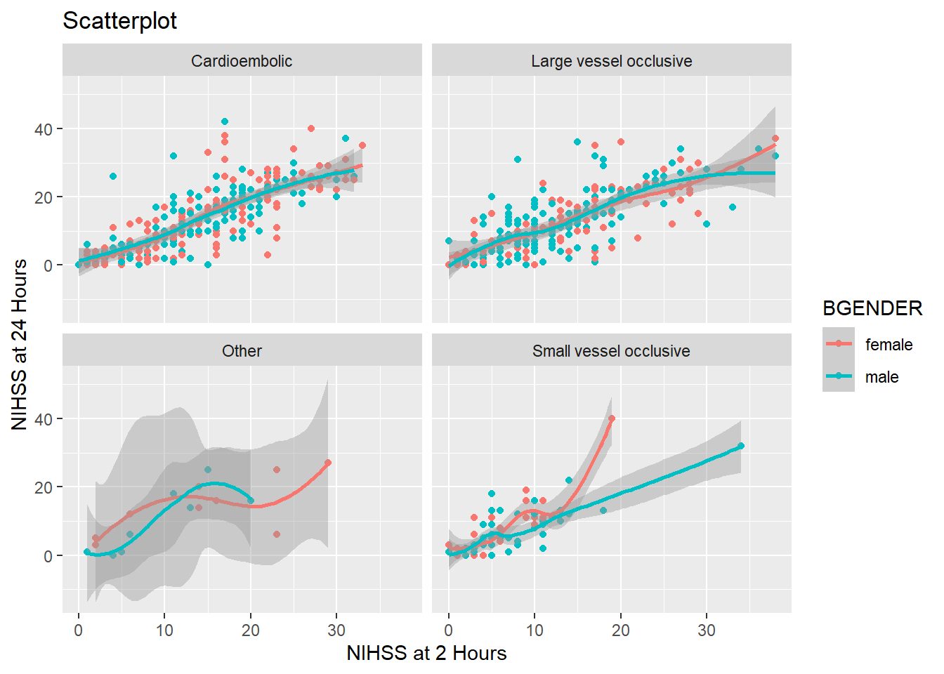
5.3 Further reading
This course aimed at introducing you to the basic ideas of how R works and how it can be of use to you. We have tried to find a balance between keeping it as easy as possible for you to start analyzing right away without omitting too much of the underlying concepts. However, we had to leave out a great deal of concepts to fit into these five sessions.
This seminar script has one more optional chapter that introduces the basic programming functions of R, e.g. how to write your own functions and how to use loops and conditional statements. This material will not be part of the active course work but may be taken as a reference in case you need it later on.
If you are interested in getting to know R better, there is a mountain of useful material. We will list a few in the following:
5.3.1 Webpages
- R for Data Science (Wickham, Çetinkaya-Rundel, and Grolemund 2023) available at https://r4ds.hadley.nz/, an online book with very clear and detailed introductions that focuses more on R and how to use it for data analysis and less on traditional statistics.
- Modern Dive (Ismay and Kim 2019) available at https://moderndive.com/, an online book giving an introduction to R but with a strong focus in statistical inference.
- STHDA (http://www.sthda.com/english/wiki/r-basics-quick-and-easy), a website with short, hands-on tutorials explaining how to do a number of statistical analysis including help with output interpretation.
- rdocumentation (https://www.rdocumentation.org/), a collection of the help pages to all the R packages and functions that is a bit more nicely formatted than the help pages within R.
5.3.2 Books
- R for Data Science and Modern Dive are also available as physical books
- Discovering Statistics Using R (Field, Miles, and Field 2012), an extensive but very accessible and entertaining introduction to statistics from the very basic to advanced statistical analyses with examples in R