15 Intro to anomaly detection
Anomaly detection, which is also known as outlier detection, is a machine learning process that is attempting to find data points that don’t fit with the rest. This winds up being a widely used process as we can thing of lots of times we want to spot ‘strange’ data points:
You might have a list of data coming in from a sensor and want to spot strange readings
You might want to spot strange spikes or decreases in sales
You want to detect attacks on your network or website that are indicated by a strange increase in web traffic
There are many, many other uses for anomaly detection, but the general point is that you’re looking for points that are substantially different from what’s expected. There are also many different methods for anomaly detection, and which one you use depends on the situation. We’re only going to look at a couple in this lesson, but I hope you walk away with a general idea of the process and goals involved in anomaly detection.
15.1 Understanding the past vs. flagging the current
It’s worth noting that similar to how we can use many of our supervised models to either understand the past or predict the future, anomaly detection can be used to detect and investigate issues that occurred in the past as well as flag present issues.
In this lesson we’ll be working with historic or fixed datasets that are all features. The general goal will be to understand which points differ greatly from the others so we can dig into them and start getting an idea why. Thus, spotting anomalies in the past is more oriented at preventing future problems and potentially providing ways to improve prediction.
But, anomaly detection is frequently used to predict/flag data in real-time. For example, credit card companies have a big interest in real-time anomaly detection. When a charge comes in they want to rapidly look at features such as charge amount, when the charge is occurring, where it’s occurring, what it’s for, etc. in order to determine if it’s anomalous from the typical charge for that user. If it is, it might be declined due to risk of it being fraudulent. If any of you have received a suspicious activity/charge email from a company about your account, that’s an anomaly detection algorithm!
15.1.1 Is this only unsupervised?
A fair question that might have popped into your heads based on my credit card example is if anomaly detection is only unsupervised in nature. The answer to that is very much no. You could easily build a dataset of transactions that are fraudulent and those that are not and use that to predict anomalous transactions. Thus, you can, and many companies do, make supervised anomaly detection models.
But, in this lesson we’ll be focusing on the unsupervised side of things. These are situations where you simply don’t have a target to work with, but still need to spot issues.
Enough talk, let’s get into it!
15.2 Return of DBSCAN
You probably thought you escaped DBSCAN after the last lesson, but no, here it is again! Turns out that not only is DBSCAN good at detecting clusters with strange shapes, it also is good at detecting anomalies. How does it do this? Well, you’ll remember that it defines clusters based on a starting number of points and a density. Basically every new point that maintains that density is considered to be a part of the same cluster. What about points that don’t fall into a cluster? They’re anomalies!
Let’s work thought an example. Below is that simulated dataset from last lesson looking at how age is related to income, but this time I’ve added some random data points. As before, we still have the clear clusters, but let’s identify which individuals don’t belong to a cluster, and thus are anomalies.
15.2.1 Importing and exploring
As before, two simple columns
ai <- read_csv("https://docs.google.com/spreadsheets/d/1-u9UDLcXqcHrxsmpltAqAAYAfeaG0ZSiqqL2HhyGHJc/gviz/tq?tqx=out:csv")Thse columns contain the age of a person and their income
## # A tibble: 6 x 2
##     age income
##   <dbl>  <dbl>
## 1  14.2 51912.
## 2  16.4 53149.
## 3  14.4 43959.
## 4  18.8 46167.
## 5  19.4 57103.
## 6  14.7 42523.
Plotting this we can see that we can still make out those general clusters as before, but we have some strange data points that don’t fit. Let’s see if we can use DBSCAN to maintain the primary clusters while identifying those that don’t belong.
ggplot(ai,
       aes(x = age, y = income)) +
  geom_point()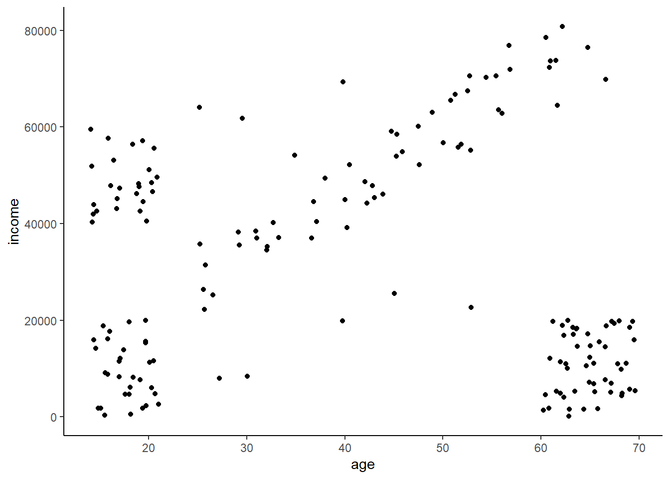
15.2.2 Applying DBSCAN
Let’s start by scaling our data.
ai_scaled <- data.frame(scale(ai))And now let’s fit out DBSCAN model. I’ve already done the work finding the density and minPts to cluster. We can see that’s it’s identified four clusters (groups 1-4), and 10 outliers (group 0).
ai_db <- dbscan(ai_scaled, eps = 0.3, minPts = 5)
ai_db
## DBSCAN clustering for 170 objects.
## Parameters: eps = 0.3, minPts = 5
## The clustering contains 4 cluster(s) and 10 noise points.
##
## 0 1 2 3 4
## 10 25 31 53 51
##
## Available fields: cluster, eps, minPtsLet’s extract the cluster assignments from the fitted model and then apply them back to original data as it’s easier to visualize on the raw, unscaled data.
#add cluster
ai$cluster <- ai_db$cluster
And take another step to convert anything that’s not in cluster 0, which DBSCAN uses to indicated an anomaly, as being a ‘no’ in an anomaly column.
# and if it's an outlier
ai$anomaly <- ifelse(ai$cluster == 0, 'yes', 'no')
Making the same plot as before, but this time coloring the points by if they’re an anomaly or not, we can see that it does a pretty good job of picking out the points that don’t fall in specific clusters. A couple might actually belong to a cluster, but it might be better to have some false positives than miss out on some true ones.
ggplot(ai,
       aes(x = age, y = income, color = anomaly)) +
  geom_point()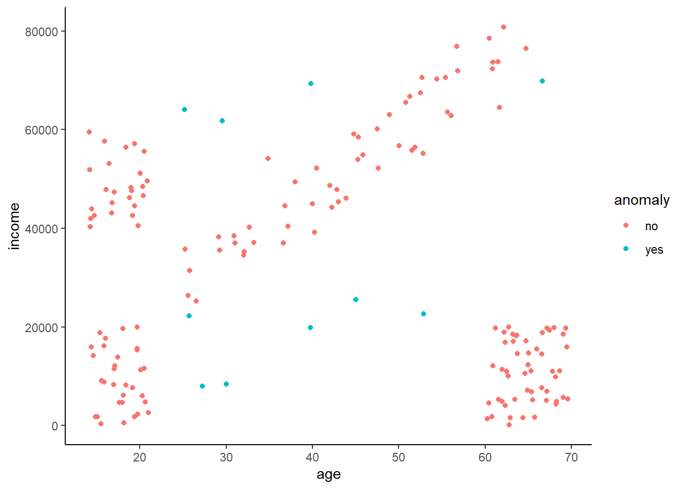
15.3 What if our data has order?
Lots of data that you want to detect anomalies in have order. Common examples include number of clicks/sales/visits per minute/hour/day for a website. Lots of sensors also are continuously take in data in a stream and thus are time series.
Why does it matter if it’s ordered? Well, with order frequently comes pattern. Temperatures rise and fall during the day and over the year. Amazon sales rise and fall with time of day, day of week, day in month, month in year, etc. Many anomaly detection algorithms work by classifying a point as being anomalous if it is some statistical difference, say being a certain distance from the median, from the rest of the points in the group. This distances is often related to the existing variation, and thus this would be hard to do if there was a natural cycle in the data. Let’s take a look at a simple series of examples to illustrate this and how to deal with this.
15.4 Identifying an anomaly in trendless data
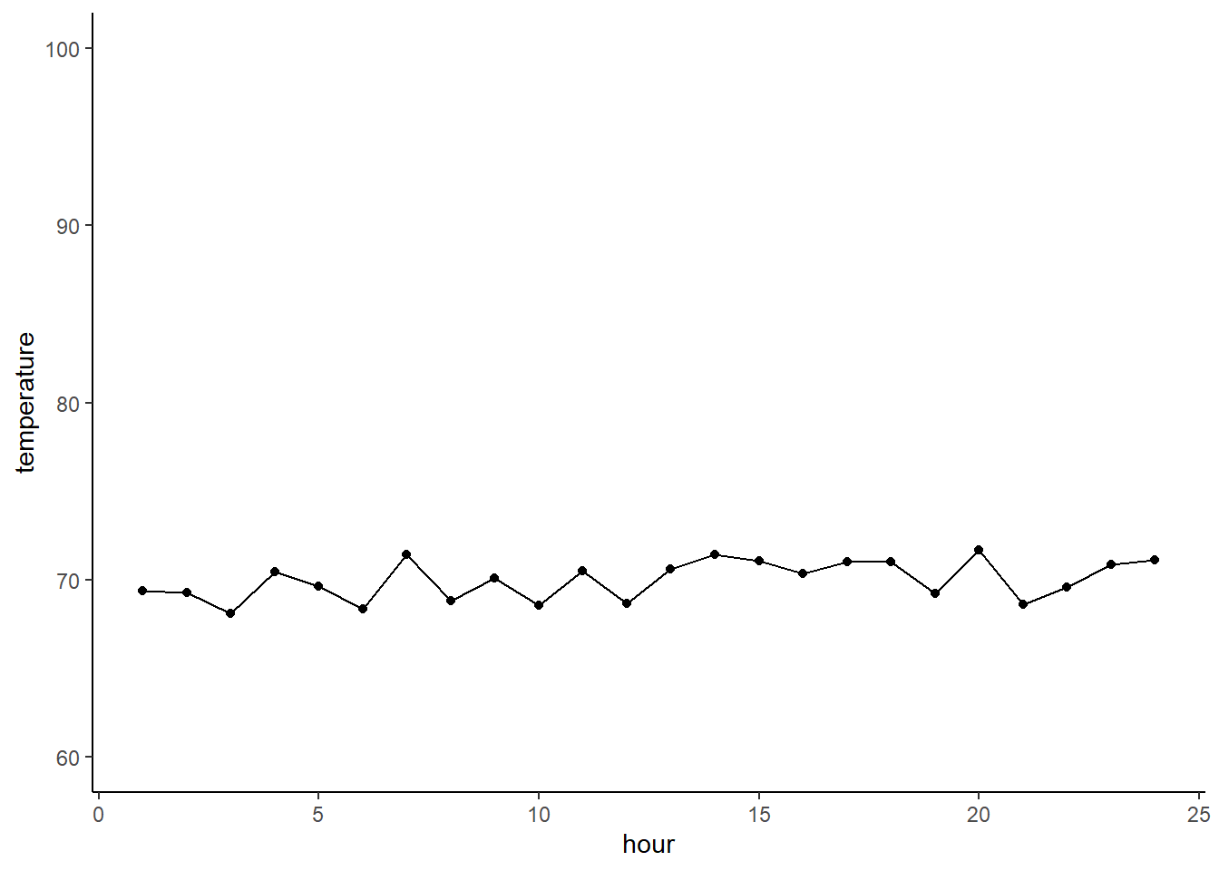
Imagine you have a simple temperature sensor that is set up to monitor the air temperature inside a cooling chamber of a big industrial bakery. Ideally the items go from the oven, after which they go into the cooling chamber to stay at a stable 70 degrees to cool them quickly.
First let’s make a datatset
temperature <- runif(n = 24, min = 68, max = 72)
hour <- c(1:24)
df <- data.frame(temperature, hour)
Given these data over the course of a day you would expect to see a graph of temperatures look like this.
A very basic way to gauge if any points are anomalies is to look at how their value relates to the interquartile range (IQR). A common definition of an outlier is if the point is more than 1.5 IQR’s above or below the quartile.
Let’s first look at our quartiles. We can see that the median is the 50% quartile, and thus the upper quartile is the 75% value, and the lower is the 25% value. The IQR is the 75% value minus the 25% value, or where 50% of your data falls around the median.
quantile(df$temperature)## 0% 25% 50% 75% 100%
## 68.11188 69.11391 70.23312 71.04627 71.71346We can quickly calculate an upper and lower boundary using the common definition of an outlier. The lower boundary will be the lower quartile minus 1.5 x the IQR (a measure of how much variation there is in the data), while the upper boundary is the upper 75% quartile plus 1.5 x the IQR.
upper_out_bound <- quantile(df$temperature)[4] + IQR(df$temperature)*1.5
lower_out_bound <- quantile(df$temperature)[2] - IQR(df$temperature)*1.5
We can graph the boundaries as the red horizontal lines. From this it is clear that our temperatures are good and none of the points are considered to be outliers
ggplot(df,
       aes(x = hour, y = temperature)) +
  geom_point() + geom_line() +
  geom_hline(yintercept = upper_out_bound, color = 'red') +
  geom_hline(yintercept = lower_out_bound, color = 'red') +
  ylim(c(60,100)) + xlim(c(1,24))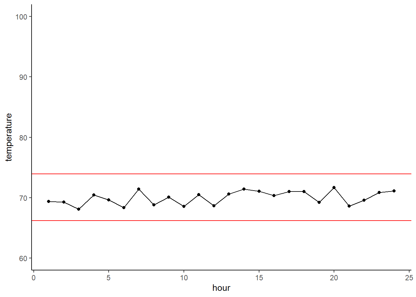
So, the above is all well and good, but what happens when you have a bad sensor reading and/or the temperature regulation fails? You might get something like this. It seems pretty obvious that it’s an outlier by eyeballing it, but using our statistical definition of outlier we can see that it clearly crosses the boundary and thus is indeed an anomaly.
df[7,1] <- 90 # insert anomaly
df$anomaly <- ifelse(df$temperature >= 90, 'yes', 'no') #IE for color coding
upper_out_bound <- quantile(df$temperature)[4] + IQR(df$temperature)*1.5
lower_out_bound <- quantile(df$temperature)[2] - IQR(df$temperature)*1.5ggplot(df,
aes(x = hour, y = temperature)) +
geom_point() + geom_line() +
geom_hline(yintercept = upper_out_bound, color = 'red') +
geom_hline(yintercept = lower_out_bound, color = 'red') +
geom_point(aes(x = 7, y = 90), color = 'red', size = 3) +
ylim(c(60,100)) + xlim(c(1,24))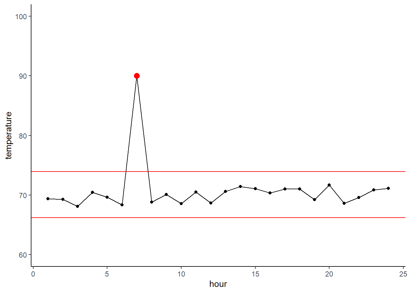
15.5 But what if there is a pattern?
OK, dealing with data that is supposed to be static over time is easy, but what if it changes with time. For example, let’s say that you have a temperature sensor to monitor the air temperature over the course of the day here in Tucson. That would look something like this for a summer day.
df$temperature_day  <- c(81, 79, 77, 75, 76, 80, 84, 87, 92, 94, 95, 97, 99, 100, 99, 98, 97, 95, 93, 92, 89, 87, 85, 83) # make a gross but real vector

ggplot(df,
       aes(x = hour, y = temperature_day)) +
  geom_point() + geom_line() +
  ylim(c(55,100)) + xlim(c(1,24))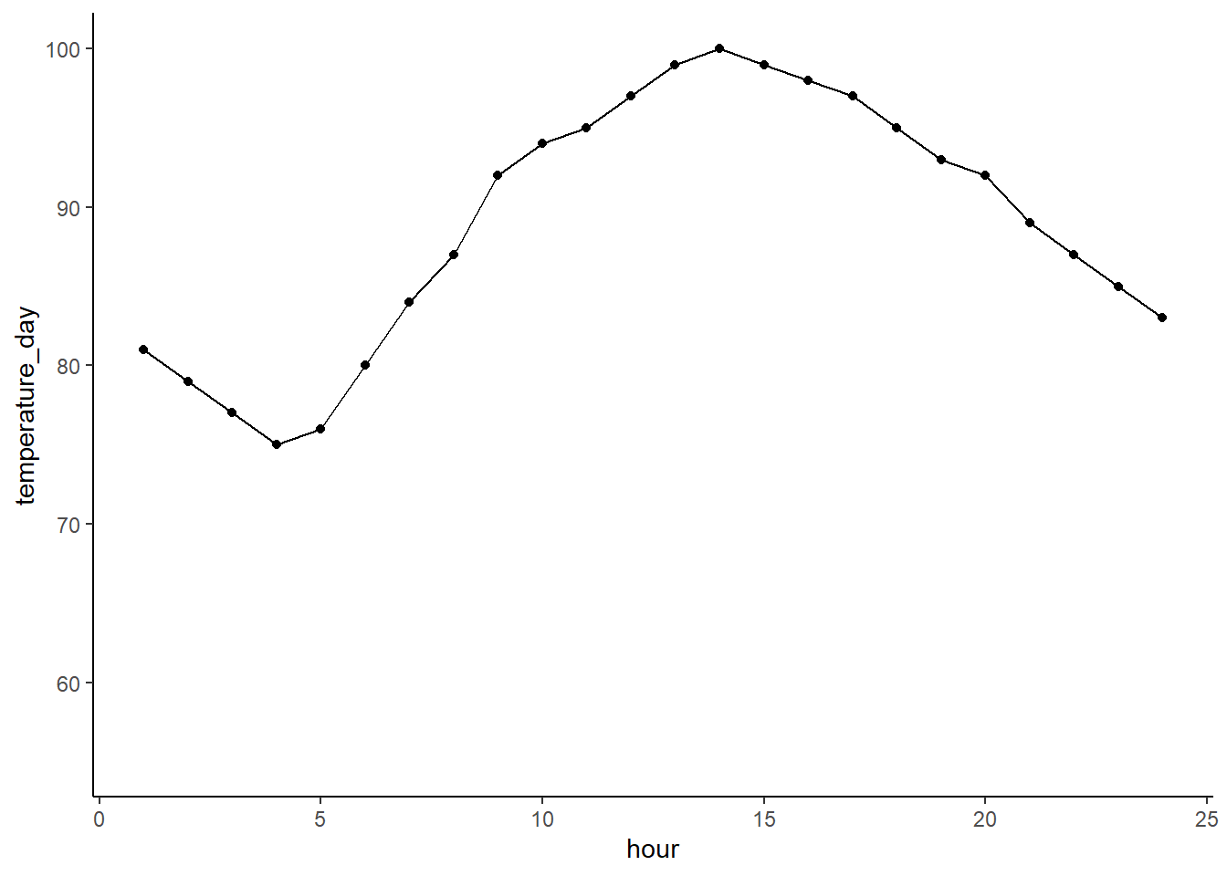
And we could encounter an error in a sensor reading like this. It looks pretty bad, but this would be hard to detect using just our regular outlier method as the IQR is wide, and thus the outlier boundary is wide. We can see that the outlier boundary falls below the clearly anomalous point.
df[15,'temperature_day'] <- 62 # add anomaly
upper_out_bound <- quantile(df$temperature_day)[4] + IQR(df$temperature_day)*1.5
lower_out_bound <- quantile(df$temperature_day)[2] - IQR(df$temperature_day)*1.5

ggplot(df,
       aes(x = hour, y = temperature_day)) +
  geom_point() + geom_line() +
  geom_point(aes(x = 15, y = 62), color = 'black', size = 3) +
  #geom_hline(yintercept = upper_out_bound, color = 'red') +
  geom_hline(yintercept = lower_out_bound, color = 'red') +
  ylim(c(55,100)) + xlim(c(1,24))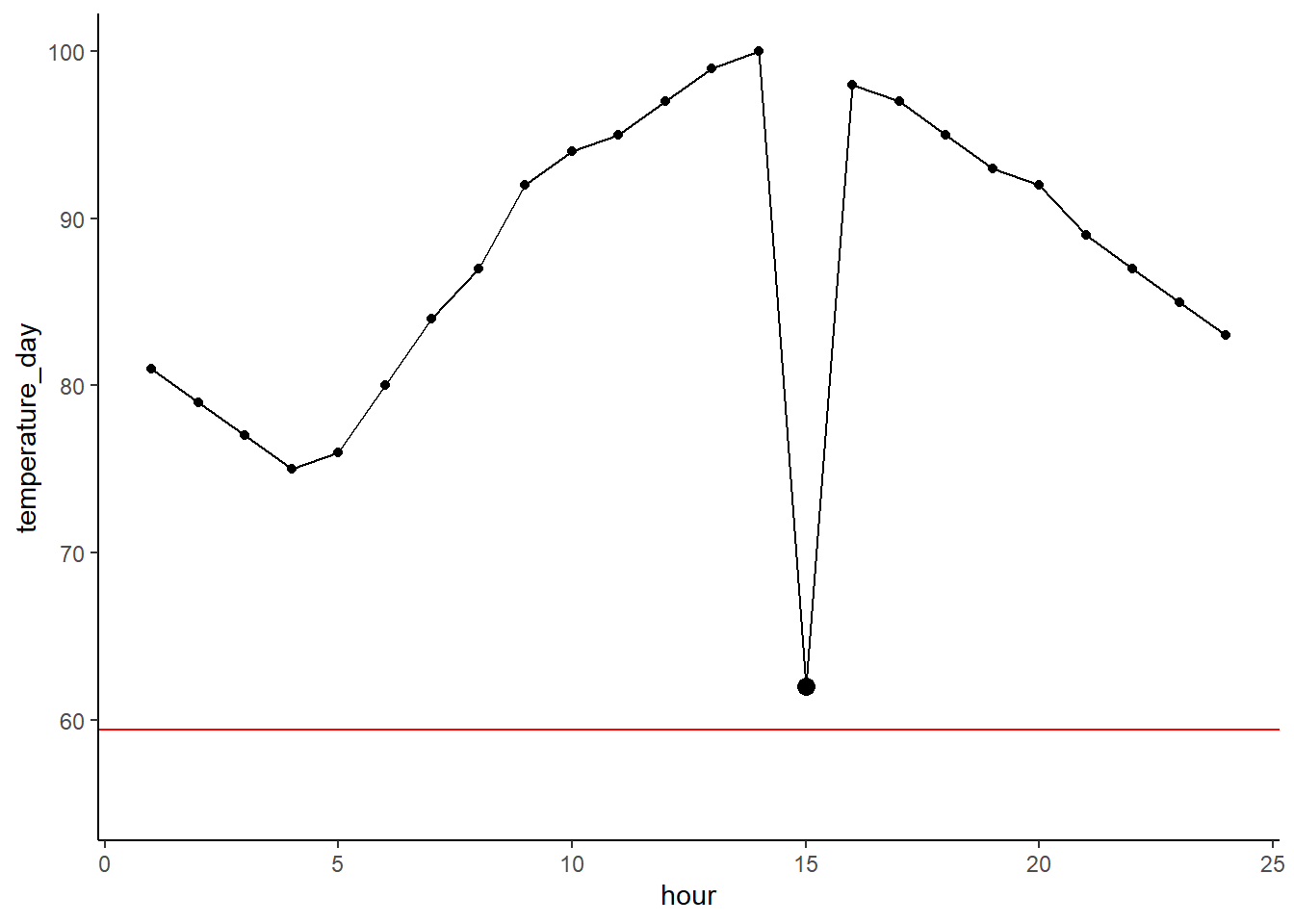
15.5.1 Getting a rolling boundary
So how do we deal with these patterns? One option is to make a rolling boundary that takes a ‘window’ or range of points and calculates the outlier boundary across it. So you could calculate it for say points 1 to 5, then 2 to 6, and so on. This allows you to look at how a point deviates relative to its neighbors rather than the whole dataset.
A quick loop can calculate a rolling outlier boundary for our temperatures. In this case it calculates the boundary +/- 2 points around the point of interest. As a result you don’t get boundaries around the start and end of the line.
for(i in 1:(nrow(df)-4)) {
  lower <- i
  upper <- i + 4
  boundary_index <- i + 2
  window_vals <- df[lower:upper,'temperature_day']
  lower_out_bound <- quantile(window_vals)[2] - IQR(window_vals)*1.5
  df[boundary_index, 'lower_out_bound'] <- lower_out_bound
}
Plotting this we can clearly see how the boundary is now much tighter as it’s related to just the ‘neighborhood’ of points and thus not influenced by the daily trend. As a result it easily spots the anomalous point.
ggplot(df,
       aes(x = hour, y = temperature_day)) +
  geom_point() + geom_line() +
  geom_line(aes(x = hour, y = lower_out_bound), color = 'red') +
  geom_point(aes(x = 15, y = 62), color = 'red', size = 3)+
  ylim(c(55,100)) + xlim(c(1,24))
## Warning: Removed 4 row(s) containing missing values (geom_path).
15.5.2 Removing the trend
Another way we can deal with is instead by ‘removing’ the trend. What I mean by this is you can fit a model that predicts the trend and then subtract that from he true value. The easiest way to do this is with a LOESS model (locally estimated scatterplot smoothing), which is sometimes known as local regression.
Let’s fit the model and then apply the predictions back to our dataframe.
loess_mod <- loess(temperature_day ~ hour, data = df, span = 0.5)
df$loess_trend <- predict(loess_mod)
And we can plot the predictions in blue. You can see it follows the curve pretty well. It dips a good bit in response to our outlier as we don’t have a ton of data so a single point can really influence the model.
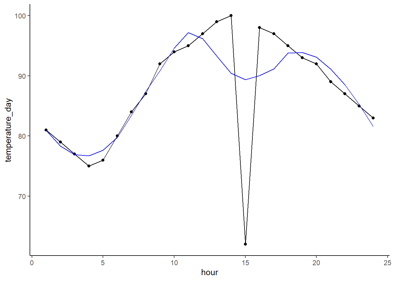
Now let’s subtract the smoothed values predicted by the LOESS model form the actual. This will give us the remainder of the target after removing the trend (the trend being the LOESS predictions). We can see that the temporal trend is now largely gone, but also that the outlier jumps out much more now.
df$remainder <- df$temperature_day - df$loess_trend

ggplot(df,
       aes(x = hour, y = remainder)) +
geom_point() + geom_line() 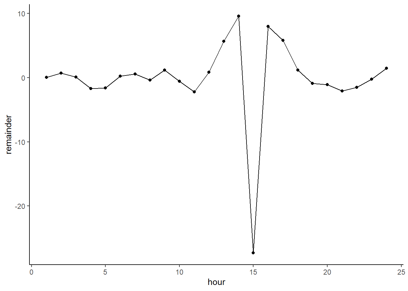
Just using the standard outlier boundary of the remainder makes it clear that this is indeed an anomaly.
lower_out_bound <- quantile(df$remainder)[2] - IQR(df$remainder)*1.5

ggplot(df,
       aes(x = hour, y = remainder)) +
  geom_point() + geom_line() +
  geom_point(aes(x = 15, y = df$remainder[15]), color = 'red', size = 3) +
  geom_hline(yintercept = lower_out_bound, color = 'red')
## Warning: Use of `df$remainder` is discouraged. Use `remainder` instead.
15.6 Working with some real data
Alright, I’ve dragged you through all these graphs and calculations to show you how we find anomalies. In the last part we actually did a really common temporal decomposition method. But, if it’s a common method that means there’s probably a package for it! We’re going to use the anomalize package to remove time series trends from our bikeshare data. So, go download it and get it ready to go.
For this part of the lesson we’re going to work with the Divvy bikeshare data. I’ve done the hard work of cleaning up and aggregating roughly 10 million observations into a dataset containing the daily number of rides taken in Chicago.
Let’s pull in our data. I’ll leave it to you to explore.
rides <- read_csv("https://docs.google.com/spreadsheets/d/1TICJaz0ZBIoc3TqF_xAJjODIZ0rbTUh2YMd4NBW0p0Q/gviz/tq?tqx=out:csv")## Parsed with column specification:
## cols(
## day = col_date(format = ""),
## num_rides = col_double()
## )Also get anomalize loaded and installed.
library(anomalize)15.6.1 What are the elements of timeseries data?
If we just plot our overall bikeshare data over time we can see a couple important elements. The obviously one is the seasonal fluctuations over time. These are the wavelike shapes that are easy to see.
ggplot(rides,
       aes(x = day, y = num_rides)) +
  geom_point() + geom_line()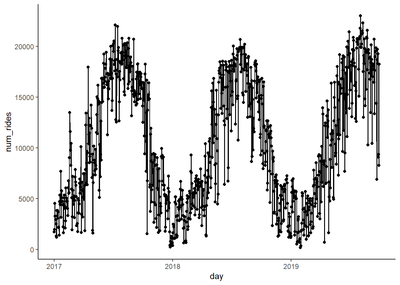
The other less obvious one is the trend. The trend is the average pattern over the course of the data. In this case it’s that the average number of rides goes up over time (which makes sense as its popularity increases). We can overlay a quick linear model which shows this.
ggplot(rides,
       aes(x = day, y = num_rides)) +
  geom_point() + geom_line() + geom_smooth(method = 'lm')
## `geom_smooth()` using formula 'y ~ x'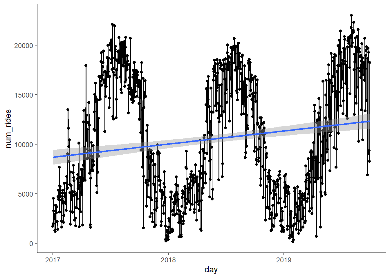
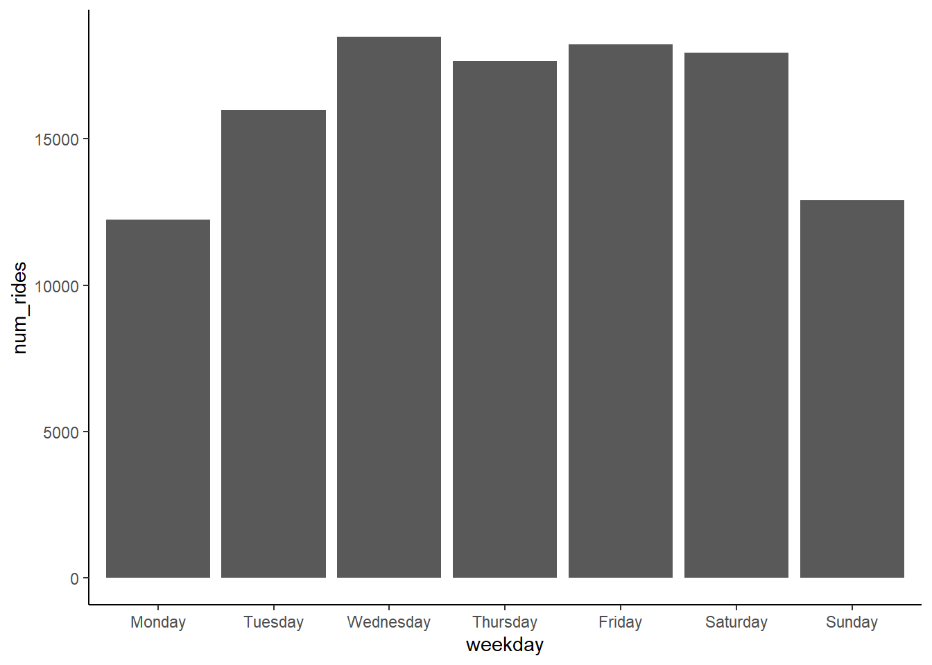
Finally we have the frequency, which is the fine-scale cycle such as within a day or week. These data are daily aggregates, so it makes sense that it cycles on a weekly basis. A quick bar graph of a random week’s number of rides on each weekday shows the general pattern. We want to know the frequency at which this pattern repeats. In this case it’s pretty obvious on a weekly basis given how people use bikeshare systems.
15.6.2 Decomposing our time series
Alright, so we got to decompose the trend, seasons, and frequency. Let’s use our anomalize package! First, we’re going to make a decomposed dataframe where we specify the trend and frequency.
NOTE - For some reason this package calls residuals remainders. I don’t know why they do this, but just remember that residual == remainder.
rides_decomp <- rides %>%
  time_decompose(num_rides, method = 'stl', frequency = '7 days', trend = '1 months')
A quick glance at our rides_decomp data shows that the time_decompose function calculated the seasonal and trend effects. The remainder column is simply the observed number of rides minus the seasonal and trend effects.
## # A time tibble: 1,003 x 5
## # Index: day
##    day        observed season trend remainder
##    <date>        <dbl>  <dbl> <dbl>     <dbl>
##  1 2017-01-01    1727. -1910. 2296.    1341.
##  2 2017-01-02    1960    467. 2379.    -887.
##  3 2017-01-03    4537    695. 2463.    1379.
##  4 2017-01-04    3269    698. 2547.      24.6
##  5 2017-01-05    2917    732. 2630.    -445.
##  6 2017-01-06    2516    374. 2720.    -578.
##  7 2017-01-07    1330. -1056. 2810.    -424.
##  8 2017-01-08    1193. -1910. 2899.     204.
##  9 2017-01-09    3816    467. 2989.     360.
## 10 2017-01-10    3310    695. 3083.    -468.
## # ... with 993 more rows
We can see how the remainder of rides after accounting for time patterns no longer has any cyclical pattern.
ggplot(rides_decomp,
       aes(x = day, y = remainder)) +
  geom_point() + geom_line()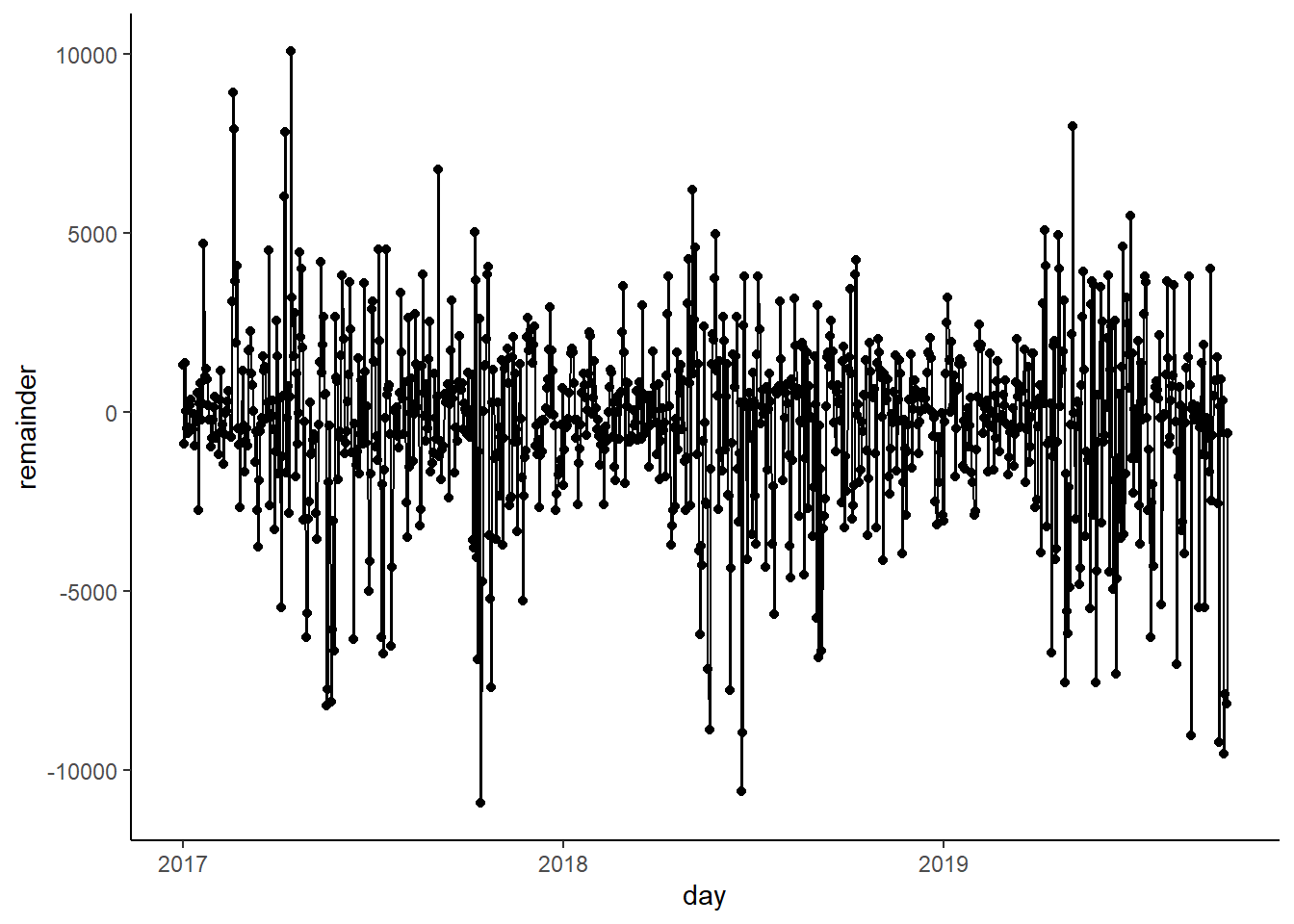
So the question now is which of these points are considered to be outliers! Let’s use a the anomalize() function in our package to do this. This creates a new dataframe called rides_anom to apply a statistical test to these datapoints to determine what points are anomalous. We can specify the alpha, the max proportion of points that can be considered anomalies, as well the method (which I won’t get into).
rides_anom <- rides_decomp %>%
  anomalize(remainder, method = 'gesd', alpha = 0.05, max_anoms = 0.2)
This new dataframe is pretty much the same as before, but it includes boundaries (remainder_l1 and remainder_l2) where if a remainder estimate falls outside it’s considered anomalous.
## # A time tibble: 1,003 x 8
## # Index: day
##    day        observed season trend remainder remainder_l1 remainder_l2 anomaly
##    <date>        <dbl>  <dbl> <dbl>     <dbl>        <dbl>        <dbl> <chr>
##  1 2017-01-01    1727. -1910. 2296.    1341.        -6537.        6514. No
##  2 2017-01-02    1960    467. 2379.    -887.        -6537.        6514. No
##  3 2017-01-03    4537    695. 2463.    1379.        -6537.        6514. No
##  4 2017-01-04    3269    698. 2547.      24.6       -6537.        6514. No
##  5 2017-01-05    2917    732. 2630.    -445.        -6537.        6514. No
##  6 2017-01-06    2516    374. 2720.    -578.        -6537.        6514. No
##  7 2017-01-07    1330. -1056. 2810.    -424.        -6537.        6514. No
##  8 2017-01-08    1193. -1910. 2899.     204.        -6537.        6514. No
##  9 2017-01-09    3816    467. 2989.     360.        -6537.        6514. No
## 10 2017-01-10    3310    695. 3083.    -468.        -6537.        6514. No
## # ... with 993 more rows
OK, let’s plot our boundaries and if points are considered to be anomalies!
ggplot(rides_anom,
       aes(x = day, y = remainder)) +
  geom_line(color = 'blue', alpha = 0.2) +
  geom_line(aes(x = day, y = remainder_l1), color = 'red') +
  geom_line(aes(x = day, y = remainder_l2), color = 'red') +
  geom_point(aes(x = day, y = remainder, color = anomaly))
15.6.3 Visualizing decomposition
Our anomaly package actually has a nice built-in plotting function to show how exactly the data was decomposed and what points are anomalies. We can see the observed plot which shows the raw data. We can then see the effects of season and trend. Finally we can see the remainder plot, which is the same plot I made above.
rides_anom %>% plot_anomaly_decomposition()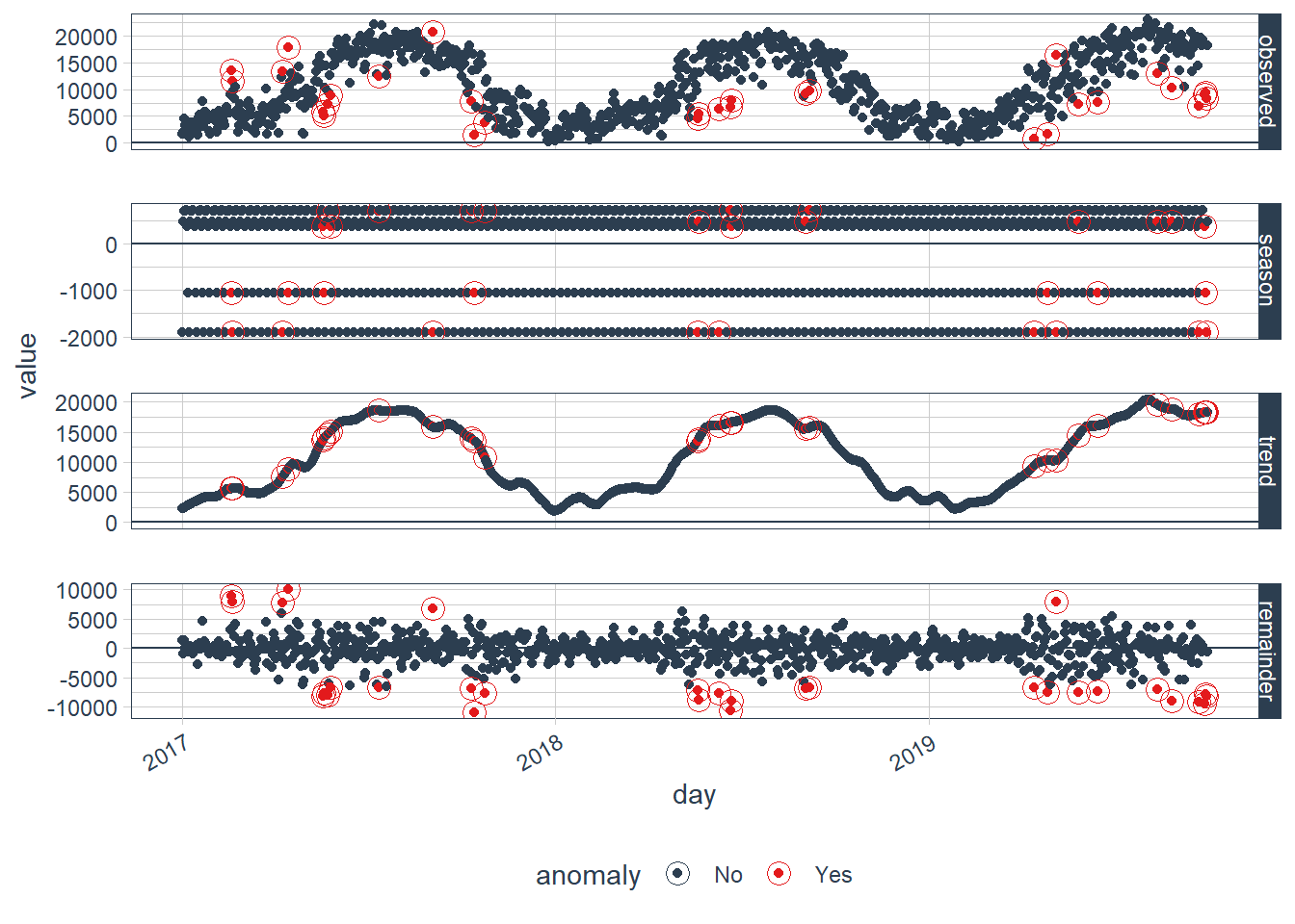
What days were considered to be anomalies? Let’s look at a quick filter.
rides_anom %>% filter(anomaly == 'Yes')## # A time tibble: 31 x 8
## # Index: day
## day observed season trend remainder remainder_l1 remainder_l2 anomaly
## <date> <dbl> <dbl> <dbl> <dbl> <dbl> <dbl> <chr>
## 1 2017-02-18 13481. -1056. 5602. 8935. -6537. 6514. Yes
## 2 2017-02-19 11604 -1910. 5613. 7901. -6537. 6514. Yes
## 3 2017-04-09 13431 -1910. 7504. 7837. -6537. 6514. Yes
## 4 2017-04-15 17942 -1056. 8911. 10086. -6537. 6514. Yes
## 5 2017-05-19 5823 374. 13638. -8188. -6537. 6514. Yes
## 6 2017-05-20 5119 -1056. 13904. -7729. -6537. 6514. Yes
## 7 2017-05-23 7152 695. 14549. -8092. -6537. 6514. Yes
## 8 2017-05-26 8802 374. 15081. -6653. -6537. 6514. Yes
## 9 2017-07-12 12539 698. 18581. -6740. -6537. 6514. Yes
## 10 2017-09-03 20709 -1910. 15836. 6783. -6537. 6514. Yes
## # ... with 21 more rows15.7 What’s the point?
Unsupervised learning is a pretty subjective process. You’re making a lot of assumptions of what defines an outlying point, and changes in those assumptions can really impact what you think is an anomaly or not. Still, this is a useful process that both provide insight into past events as well as help guide and refine predictive modeling.
If you dig into our anomalies above by google searching for holidays and weather on these days you’ll learn a lot. Really nice weather in the summer drives anomalously high points, while rainy weather in the summer drives low points. Holidays also can drive anomalies. This post-hoc analysis can be really useful to determine what likely caused a problem.
Such model can also be incorporated into real-time streaming data to send alerts to an administrator about a sensor failing, a credit card being stolen, or a website being attacked.
Finally, this is also useful for improving predictive models. Using just the number of rides over time and some sleuthing you’ve discovered that you likely want to have features relating to extreme weather and/or holidays in your predictive models.