14 Clustering
This lesson we’re going to get into the wonderfully ambiguous world of clustering and the larger topic of unsupervised learning. Briefly, clustering is a way of automatically finding groups (i.e. clusters) that share similar patterns in their features and features only. I say this is ambiguous as there often isn’t a 100% right answer… developing a good clustering model requires you to think deeply about the question, method being used, and then the results to see if they make sense. This is an obvious departure from the previous techniques we’ve learned where there is a clear target and goal we’re trying to achieve (e.g. minimize \(MSE\)).
14.1 What is unsupervised learning and how does clustering relate?
Clustering falls under the category of unsupervised learning. So far in this course we’ve only been doing supervised learning. Supervised learning is any form of model where you have a target that you’re trying to predict a using a feature or set of features. Linear regression models are the most basic of our supervised methods with our target \(y\) and feature \(x\). \[y = \beta_0 + \beta_1x + \epsilon\]
But, what if you don’t have any target to train your model on? Remember, all supervised models work by trying to minimize error between the predicted target value \(\hat{y}\) and the true known value of \(y\). But what if we just have a bunch of features \(x_i\)? How do we extract usable information from them if we don’t have a target to make sure our model is doing well against?
Clustering is a type of unsupervised learning. It works by finding relationships among features according to some rule. Points that are similar enough according to this rule are assigned to a cluster. You then assume that this cluster represents a unique subgroup in your data given all the points are similar according to your algorithm. Now, what this means exactly is often up to you. It requires domain knowledge to interpret and apply meaning to the clusters that arise.
There are lots of different clustering algorithms out there, each using their own rule on how to determine what sets of observations belong to what clusters. We’re going to focus on a couple different ones for this lesson that operate in fairly different ways. Specifically, we’ll be looking at k-means clustering and a density-based clustering method called DBSCAN (not covered in your book). There are lots of clustering algorithms out there, but I chose these two as they represent pretty distinct methods and each have some cool use cases.
14.2 When and why would you do unsupervised learning?
It’s a pretty fair question to ask how and when is unsupervised learning used. It seems abstract and not super rigorous. Indeed, a lot of the evaluation of a clustering model comes down to you understanding the data, the question, and asking if the clustering methods make sense. Still, there are plenty of situations where you want to extract patterns from features, even if they aren’t perfect.
One common place clustering is used is in consumer segmentation. Historically marketers would use ‘gut feeling’ to say that people who are say aged 30-39, have kids, and own a house likely form a group with similar buying habits and thus create ads targeted at them. Now, you can use clustering to figure out how people with known features (age, gender, kids, income, last purchase, etc.) group/cluster together. This allows for more fine-scaled segmentation for better targeting of ads.
Another place in retail clustering can be used is to figure out what groups of products are bought together. In this case each feature is a single product, and then each row is a consumer with a vector of 0’s and 1’s indicating what products they bought. You can use this information to find out what groups of things are typically bought together. For example, a cluster might show that tennis racquets and tennis balls are often clustered together. Thus if you run an online retail business and you see someone adds a racquet to their shopping cart, you might also want to suggest they buy tennis balls. Recommender systems in general often use these unsupervised methods.
Clustering isn’t just used to help sell people more stuff. Its use has grown in medicine where you have lots and lots of features (e.g. genetic sequences/genes; cell properties, etc.) and you want to find unique groupings among them. Finding unique groups doesn’t help diagnose anything, but it can help guide future experimental research. For example, if you find that a specific set of genes in a sample of cancer cells tends to cluster together, you might want to experimentally investigate the role of those genes.
14.2.1 Packages for this lesson
We’ll need a few new packages for this lesson please install and load up the following!
library(dbscan)
library(ggmap)
library(factoextra)
14.3 Clustering with k-means
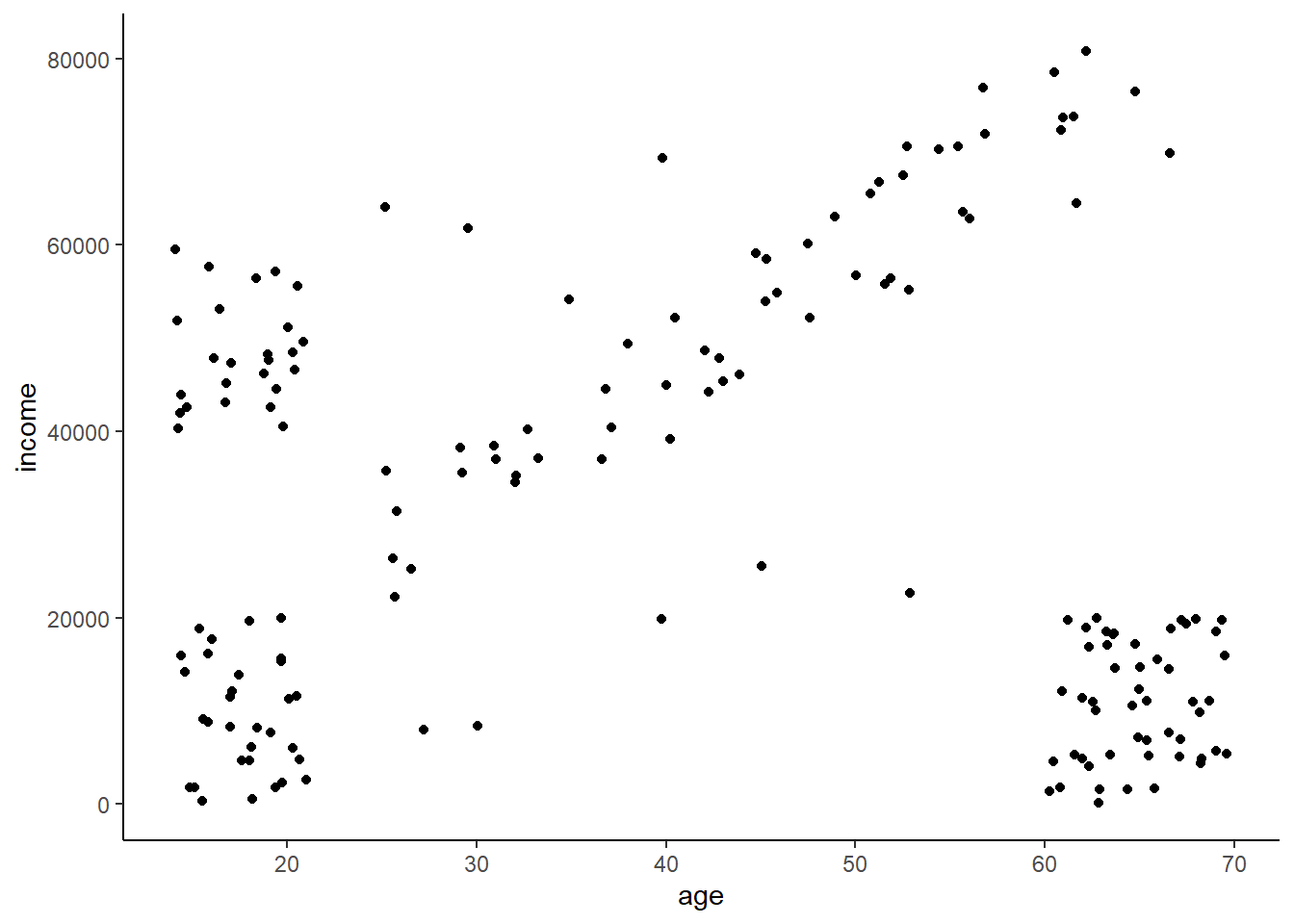
Let’s consider the age and income data we used in the last lesson. Imagine you’re a marketer trying to sell fancy stuff to college aged kids. This stuff is expensive (let’s say some hype-beast Supreme stuff)(‘hello, fellow kids’) (June 2022 update: This attempt a joke didn’t age well. I’ll stop trying to be funny - I’m too old for it.), so you don’t want to bother advertising to older people or young people who don’t have money. You were able to purchase income and age data from a variety of people that you want to segment so you can rapidly advertise to the targeted group.
The data looks like this. We can clearly see that some distinct segments exist, but eyeballing it like that only works when you have a couple features. Real data can have 10, 20, or hundreds of features and thus we need a computer to do this for us.
14.3.1 k-means - what does it mean?
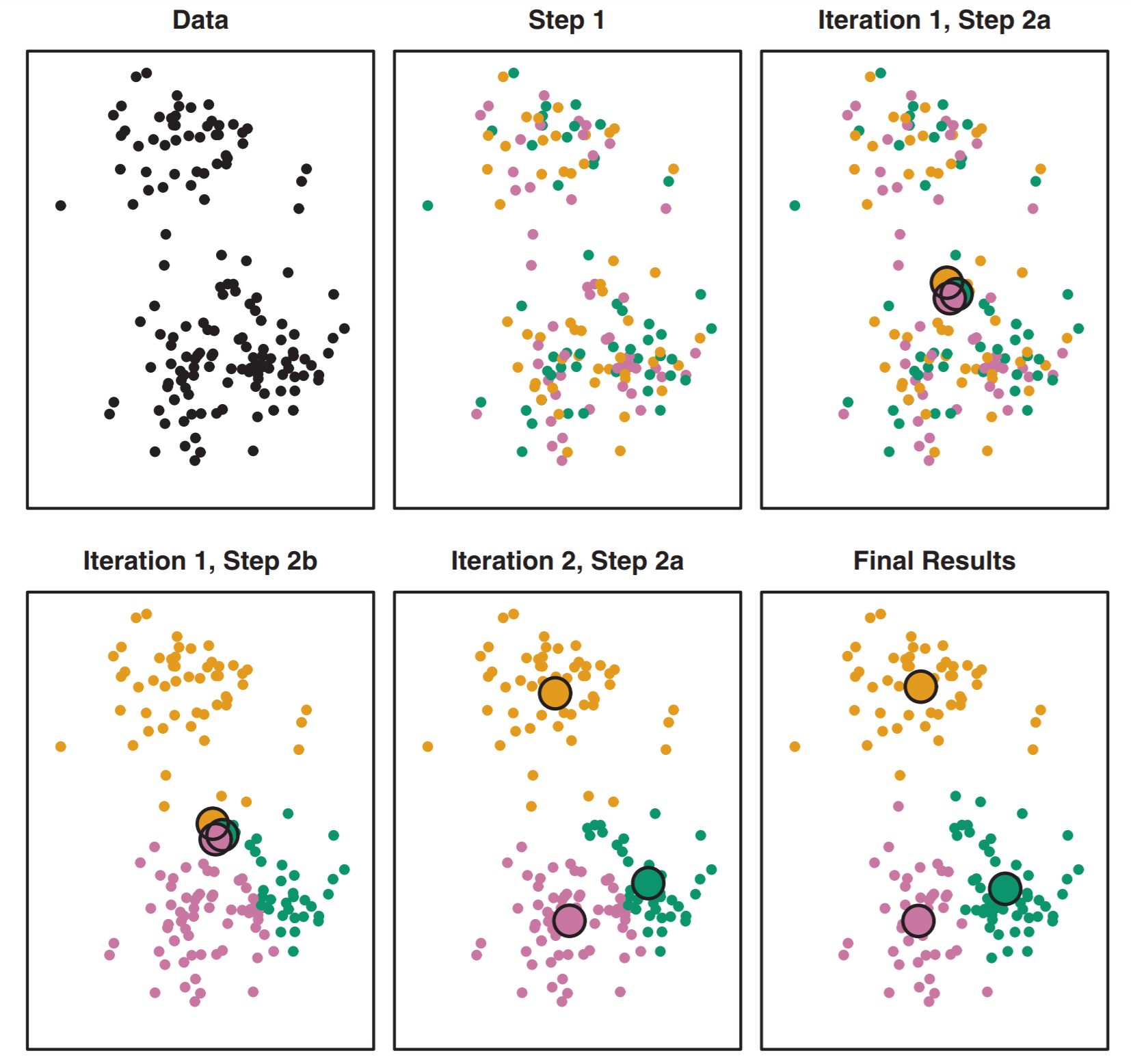
Our first stab at identifying specific clusters will use the k-means algorithm. K-means works by assigning \(k\) points, each of which will be a center (aka centroid) of a cluster. This is the first step of intuition needed as you need to think about how many clusters you should have. The steps of k-means are as follows:
The algorithm starts by randomly assigning each of your observations to only one of the \(k\) clusters.
With all points assigned to a cluster it computes the centroid of each cluster. The centroid is the mean feature values of all points in that cluster.
The algorithm then reassigns points to their nearest centroid. After that it calculates each centroid again. It then reassigns points to the nearest centroid again, recalculates the centroid… reassign, regulate, reassign, recalculate.
It stops when points stop changing what cluster their assigned to (because the centroid has found the local optimum).
This is illustrated well in figure 10.6 from the book.
14.3.2 Let’s cluster!
Let’s grab that income and age data from above. I’ll call it ai for age-income. I’m also going to make a scaled version that we’ll work with first.
ai <- read_csv("https://docs.google.com/spreadsheets/d/1jmFuMkjZ7BqUXCqJQgFVXtqkKrGRgvvnhONq3luZ38s/gviz/tq?tqx=out:csv")

ai_scaled <- data.frame(scale(ai))
We can use the kmeans() function to run the k-means algorithm. We also need to assign \(k\) using the centers = argument. Let’s start with \(k = 5\). We also specify nstart = 20 to have R choose 20 different starting points and using the best one. Play around without it and you’ll see that you cluster assignment can jump around due to the randomness.
Let’s call our km_scaled object right away. We can see that there’s a bunch of information in there such as the mean values in our clusters, the clustering vector (what clusters everything was assigned to), and within-cluster sum of squares.
ai_kmeans_scaled <- kmeans(ai_scaled, centers = 5, nstart = 20)We really want the cluster assignments. Let’s extract those and make them a factor so R recognizes them as distinct levels and not a continuous value. Let’s also add them back to our original unscaled data as the column cluster which we can then use to plot. We want to assign back to the original data so our plots make sense.
ai_kmeans_scaled_clusters <- factor(ai_kmeans_scaled$cluster) # extract from km_scaled object
ai$cluster <- ai_kmeans_scaled_clusters # add back to original data frame

# plot using color as cluster so it colors our points by cluster assignment
ggplot(ai,
       aes(x = age, y = income, color = cluster)) +
geom_point() 
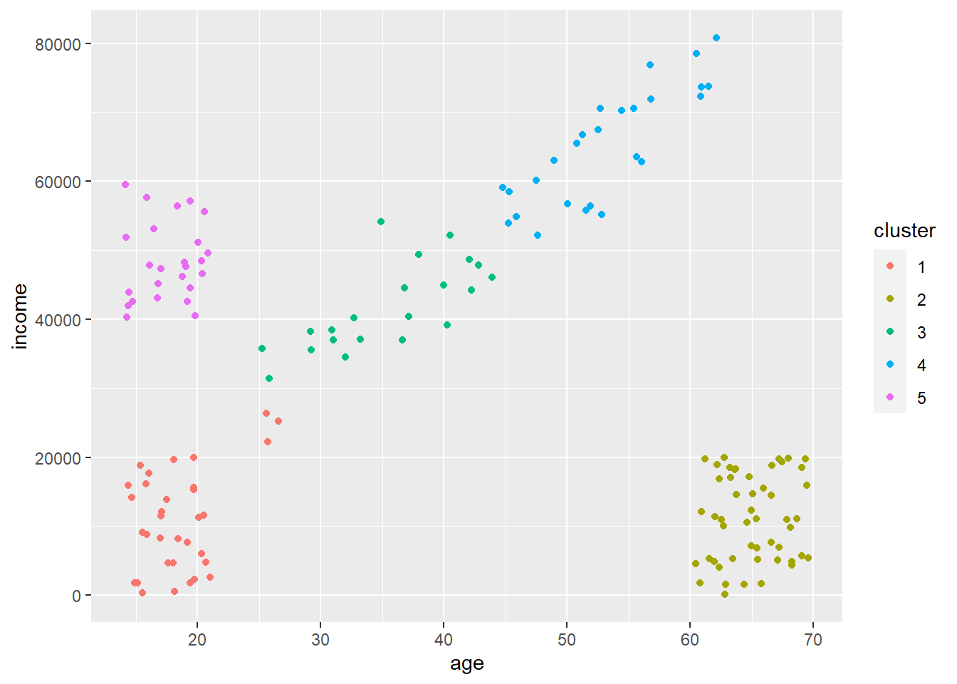
Cool! So our k-means algorithm did a pretty good job of assigning all points to unique clusters. You can see there are some point that are misassigned (few at the bottom left of the diagonal that are assigned to that box in the far bottom left). A couple things to note.
Notice how all points are assigned to a cluster. K-means will never discard points that don’t fit into a cluster, which can cause problems at times as crazy outlier data points must be assigned to something.
It split that diagonal into two clusters. It did this as we said \(k = 5\) even though there are visually four distinct groups. It used that extra cluster to split that diagonal into two clusters. This may not be a bad thing if you think or want these to be distinct. But, what if our cluster definitions are not as clear as above? Is there some way to figure out an optimal number of clusters?
14.3.3 Determining \(k\) via the ‘elbow’ method
The classic way of figuring out how many clusters \(k\) you should have is using something called the elbow method. This method calculates within-cluster variation across a variety of \(k\) values which you then plot. When you stop getting reductions in variation from adding more clusters, you have found your optimal \(k\).
Let’s take a minute and talk about our within-cluster variation. You’re familiar with the total sum of squares in a linear regression model \(TSS\) which is calculated as \(TSS = \sum_{i = 1}^{n}(y_i - \overline{y})^2\). \(TSS\) is just a way to measure how much variation exists in our population. We can calculate a similar measure within each cluster by summing how different each value in that cluster is from its mean value. Smaller within-cluster sum of squares indicate that the clusters are tightly formed and thus belong together. Large within-cluster sum of squares then indicate that there is a lot of spread among points within a cluster.
For example, the within-cluster sum of squares for when \(k = 5\) is:
print(ai_kmeans_scaled$withinss) # per cluster## [1] 4.064999 4.516052 3.003154 5.060892 1.786751print(ai_kmeans_scaled$tot.withinss) # or the total across clusters## [1] 18.43185Let’s compare that to if we just had two clusters. We’d have a figure like this.
We can see that both the within-cluster and sum of within-cluster sum of squares is much larger, suggesting the number of clusters is too few.
## [1] 54.37441 120.19073## [1] 174.5651So \(k = 2\) is clearly not enough, and \(k = 5\) seems good. But what about \(k = 4\) or \(k = 10\)? The way we figure out the optimal \(k\) is by calculating the total within-cluster sum of squares across a range of \(k\) values and then looking for when we stop reducing within-cluster variation dramatically by adding more clusters. Let’s use a for loop to do this!
k_means_df <- data.frame(matrix(ncol = 2, nrow = 10))
colnames(k_means_df) <- c('k', 'wi_ss')
for(i in 1:10) { #we'll run k from 1 to 10
  km <- kmeans(ai_scaled, centers = i) # to run k through the range
  wi_ss <- km$tot.withinss # get total within-cluster sum of squares
  k_means_df[i, 'k'] <- i
  k_means_df[i, 'wi_ss']  <- wi_ss
}
Plotting these values across our range of \(k\) values we see that we stop getting major reductions at \(k = 5\). Thus, we’ve hit our ‘elbow.’ This means that our clusters are not getting any ‘tighter’ if we keep adding more, and thus we’re probably just slicing up existing clusters. The key thing to remember is that you could also argue that there isn’t a major reduction after \(k = 3\). So how do you decide which is better? Well, that’s up to you! I’d say looking at the data and question it makes more sense to use \(k = 4\) as that’s clearly the point where the slope experiences it’s most dramatic shift towards zero.
ggplot(k_means_df,
       aes(x = k, y = wi_ss)) +
  geom_line() +
  labs(x = 'number of clusters', y = 'total within-cluster sum of squares') +
  theme_classic()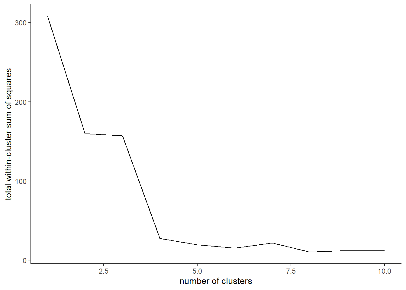
14.3.4 What can you do with this information?
Now that we have our clusters we could use this information to send out specific mailers or make a point to target adds towards everyone that falls into a certain cluster. This is visually obvious here using these clearly defined clusters, but it’s less obvious when you start clustering across many features as there would be no way to plot them and likely to be more noise.
14.3.5 Why scaling?
We scaled our features right off the bat, but is that really necessary? Well, it depends on the question. As we saw, k-means is going to assign points to the nearest centroid. The concept of ‘near’ then depends on what scale everything is on!
When all of our features are scaled to have the same range of values (remember the scale() function makes everything have a mean of 0 and SD of 1), then the distance between points will be independent of each feature scale and thus each feature will have equal importance when clustering. But, if you don’t scale your features then features with bigger values and more variation will dominate. For example, our unscaled mean income is 3.0282^{4} and the standard deviation is 2.279^{4}. But, our other feature age has a mean of 41 and a standard devaition of 21. These massively different scales mean that distances are not equal (1 SD away from the mean income is much further than 1 SD away from the mean age), which will cause our features to cluster by income only.
Would we ever want to not scale our features then? Yes, we might if we care about one thing much more than another. For example, if we care more about income and other features that are on a large scale and relate to buying power, we might be fine not scaling. These are rare situations, though, and generally you should scale your features.
Below is the cluster assignment when we use features that were not scaled. We can see that all the clustering happens in response to income which is why there are horizontal ‘bands’. Age is essentially ignored.
14.4 Density Based clustering
One of the cool things about clustering is that there are lots of different methods to do it. All these methods are based off different rules as to what defines a cluster. K-means above uses a rule saying ‘whenever point is as close as possible to the nearest centroid then they’re a cluster’ as a rule. But we could also use a rule such as ‘all points that maintain a specific density of a region are a cluster.’ Under such a rule we’d only add points to a cluster if they maintained a density criteria specified by the number of points per unit space. This is density based clustering (DBSCAN) which we’ll be exploring here.
14.4.1 Why all the methods?
All clustering methods have their pros and cons. K-means is great when you have clusters that may differ in terms of density, but may suffer as everything must be assigned to a cluster. This could cause clusters to become overly noisy. K-means also suffers when you have strange ‘shapes’ in your data. DBSCAN works well with shapes, though, as it groups not by distance but density. It can also ignore outlying points that don’t meet the density requirement which is useful if you are looking for something really specific.
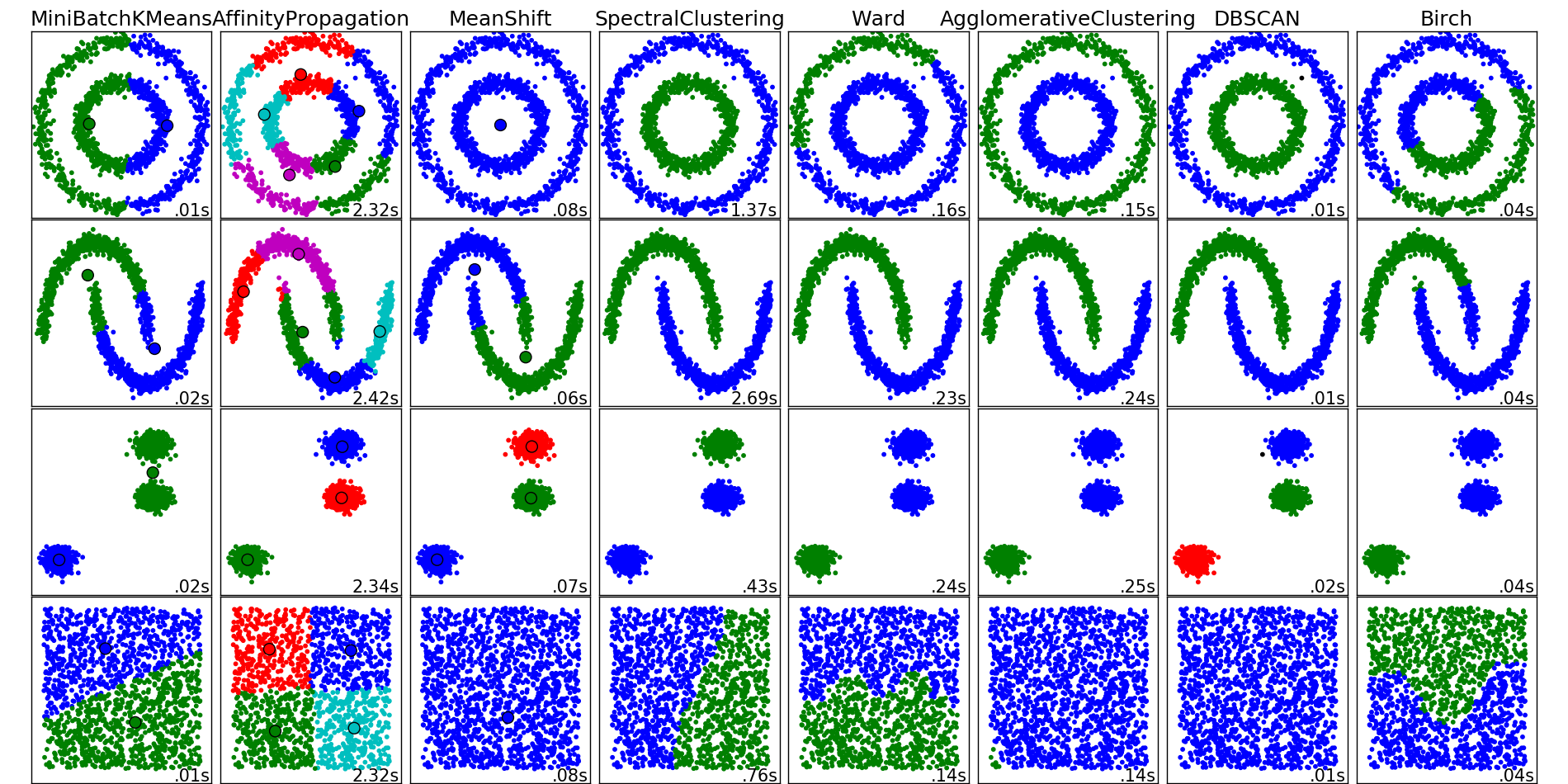
Below is a figure that illustrates how the different clustering methods work on different ‘shaped’ data. Each row represents different shaped data, and each column is a different clustering method. You can see that k-means is good at defining clusters (represented by colors) when they are well separated as in the 3rd row and our example above. But k-means fails when you have shapes because it’s using distance. DBSCAN does well with shaped clusters. You also don’t have to define how many clusters you need, where as in k-means you do.
14.4.2 A quick comparison between k-means and DBSCAN
Here’s a figure from some toy data from the factoextra package that’s meant for comparing clustering methods. We can see that there are obvious clusters, but given they are nested or stacked k-means might struggle to pull these apart as the centroids will often fall between clusters.
Indeed, using kmeans with \(k = 5\) gets us this. It splits those concentric ovals into three clusters given that results in the lowest within-cluster sum of squares. Clearly, the inner circle should be its own cluster independent from the outer.
Now, DBSCAN takes advantage of the dense groupings in these clusters to keep them together. You can see that using it we maintain the shapes as they all get assigned to their own unique clusters. We also see that outliers get assigned to cluster 0.
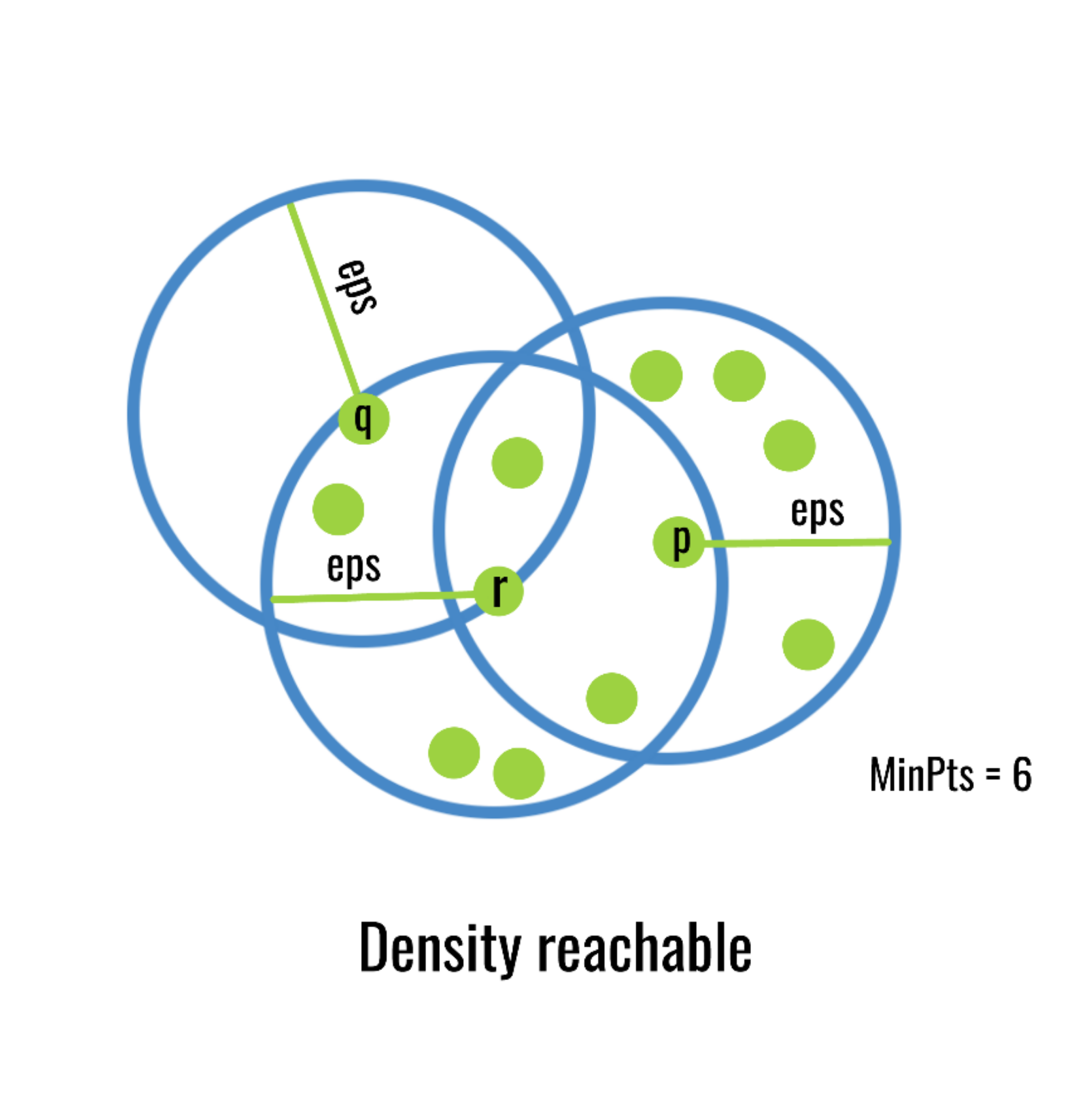
14.4.3 How does DBSCAN work?
DBSCAN uses the following algorithm:
Set a minimum points and radius requirement. For example, need a minimum of five points in a circle with a specific radius. This is a density as you have points per unit space, hence why it’s called density based.
Locate all groups of points that meet above requirements and they form their own clusters.
Redefine a cluster center using a point from your existing cluster. If points within a radius of that new center fall inside it, add to the cluster. If not, check other edge points.
Do this until all points have been added to cluster or rejected.
This figure does a good job illustrating the process. It starts with point p as the center as that cluster reached the minimum number of points in a given radius. It then uses one of the outer points r and check the radius around that and adds any points in that radius. In that newly expanded region it checks point q, but doesn’t find any new points in that radius, so it stops.
14.5 Using DBSCAN to identify hotspots in Tucson crime.
One place density based clustering can be useful is in automatically identify hotspots of activity on a map. For example, imagine you have access to all the latitude and longitude data of every instagram photo taken on the UA campus. You could plot these all and figure out which places were popular, but it would be a mess of points and you’d have to manually do that each time. Instead, you could say ‘I want to see all clusters of photo activity where there is at least 50 photos and at a density of 1 photo per square meter’. This would then create clusters that you could map and see where are popular places to take photos.
We’re going to do the same here but to map hotspots of crime activity. Imagine you want to make an app for students to locate low-crime areas around campus. Well, Tucson puts all their crime data online, so we can take that and cluster it by latitude and longitude and then map the clusters to see hotspots of crime.
14.5.1 First, our data
Let’s bring in our data. I’ve filtered it down to just latitude and longitude values. I’ve removed things like traffic stops from the data and only left in more violent crimes as that’s what you’d probably care about.
crime <- read_csv("https://docs.google.com/spreadsheets/d/1Trd7QR0owcy7crx_HkESxgsn-_yeeqDI2TnJbIfIzsY/gviz/tq?tqx=out:csv")
crime_scaled <- data.frame(scale(crime))
head(crime)
## # A tibble: 6 x 2
## latitude longitude
## <dbl> <dbl>
## 1 32.2 -111.
## 2 32.2 -111.
## 3 32.2 -111.
## 4 32.2 -111.
## 5 32.3 -111.
## 6 32.3 -111.We’re going to focus on just the area north of campus. You need to go here and download the R Workspace file https://drive.google.com/file/d/1YiaYXul-7sX2O24d4nC7JzK7fG0oJuNN/view?usp=sharing. You can then load the file using load(file.choose()) and selecting the file. You can also just provide the filepath instead of file.choose()
load(file = "north_of_campus.RData") # works for my local machine...
fig <- ggmap(map_UA)
fig
If we plotted our data on that map it’s just a mess of points! This isn’t surprising as there are 32227 crimes in just this area alone! The only reason it’s not a totally black is that cops typically report an intersection location for a crime so there are tons of overlapping points. So how can we figure out where our areas of high activity are?
fig + geom_jitter(aes(x = longitude, y = latitude), data = crime)## Warning: Removed 10027 rows containing missing values (geom_point).
14.5.2 Applying DBSCAN
We can use the dbscan() function in the dbscan package to fit the model. You just give it your features as the first argument. The minPts = argument is asking how many points at a given density are needed to start a cluster. The eps = argument is the radius you want to search. This needs to be tuned as too big of a density will turn everything into a giant cluster. Too small and you’ll have a segment up into too many clusters. It also interacts with minPts as increasing the number of points without altering the radius will increase the required density (and vice-versa)
Let’s fit and look at our object. You can see that a ton of points are in cluster 0, which are all considered to be outliers. This is a perk over k-means as it allows us to remove ‘noise.’ In this case that noise are crimes that although happened, don’t fall into a hotspot.
crime_db <- dbscan(crime_scaled,  minPts = 50, eps = 0.06,)
crime_db
## DBSCAN clustering for 32227 objects.
## Parameters: eps = 0.06, minPts = 50
## The clustering contains 107 cluster(s) and 10277 noise points.
##
## 0 1 2 3 4 5 6 7 8 9 10 11 12
## 10277 916 4492 93 283 90 66 84 328 108 526 350 308
## 13 14 15 16 17 18 19 20 21 22 23 24 25
## 713 282 420 125 98 223 68 126 1019 316 1077 458 75
## 26 27 28 29 30 31 32 33 34 35 36 37 38
## 160 67 246 120 118 239 233 302 294 654 120 178 231
## 39 40 41 42 43 44 45 46 47 48 49 50 51
## 125 108 466 67 56 99 52 126 117 144 71 60 179
## 52 53 54 55 56 57 58 59 60 61 62 63 64
## 58 52 80 115 177 84 93 110 66 130 56 98 58
## 65 66 67 68 69 70 71 72 73 74 75 76 77
## 121 96 69 68 276 125 148 126 53 101 85 53 57
## 78 79 80 81 82 83 84 85 86 87 88 89 90
## 59 94 490 56 51 70 108 59 74 69 62 70 83
## 91 92 93 94 95 96 97 98 99 100 101 102 103
## 63 54 64 3 49 51 32 58 52 70 26 61 52
## 104 105 106 107
## 50 18 20 51
##
## Available fields: cluster, eps, minPtsLet’s assign our clusters back to our original unscaled data and then remove the outliers. We’re going to make a copy of our original data as we’re going to do some filtering but will also want to cluster things again later.
# make a copy
crime_filtered <- crime

# access cluster, make factor, add to crime
crime_filtered$cluster  <- factor(crime_db$cluster)

# filter out cluster 0
crime_filtered <- crime_filtered %>%
  filter(cluster != 0)
Let’s look at our data again. We can see now that each row, which is a crime, is now assigned to a cluster. Each cluster is a region of high density crime.
head(crime_filtered, 10)## # A tibble: 10 x 3
## latitude longitude cluster
## <dbl> <dbl> <fct>
## 1 32.2 -111. 1
## 2 32.2 -111. 2
## 3 32.2 -111. 2
## 4 32.2 -111. 2
## 5 32.2 -111. 1
## 6 32.2 -111. 3
## 7 32.3 -111. 4
## 8 32.2 -111. 2
## 9 32.2 -111. 5
## 10 32.3 -111. 6Let’s plot these clusters on the map! Each color represents a unique cluster of high crime density. ggplot only has so many colors which is why there might be the same color but in a different space. Still, what’s great about this is that we can see that crime is much denser on the west side of Grant, and gets better as you travel east.
fig + geom_jitter(aes(x = longitude, y = latitude, color = cluster),
                  data = crime_filtered) + theme(legend.position = 'none')
## Warning: Removed 7230 rows containing missing values (geom_point).
14.5.3 Altering density
Let’s illustrate how cluster assignment changes as we alter our eps = argument to change the density. If we decrease the search radius (and thus increase the density), we expect more but smaller clusters. If we increase the radius, then the allowable density will be lower and then the clusters will start including larger and larger areas even if there isn’t much crime.
We see that if we increase eps just a little bit that we get fewer clusters and most everything falls into a cluster. This is because as the algorithm search radius is much higher, thus nearly everything keeps getting added to only a few clusters.
crime_db <- dbscan(crime_scaled,  minPts = 50, eps = 0.1,)
crime_filtered <- crime
crime_filtered$cluster  <- factor(crime_db$cluster)
crime_filtered <- crime_filtered %>%
  filter(cluster != 0)
fig + geom_jitter(aes(x = longitude, y = latitude, color = cluster),
                  data = crime_filtered) + theme(legend.position = 'none')
## Warning: Removed 9419 rows containing missing values (geom_point).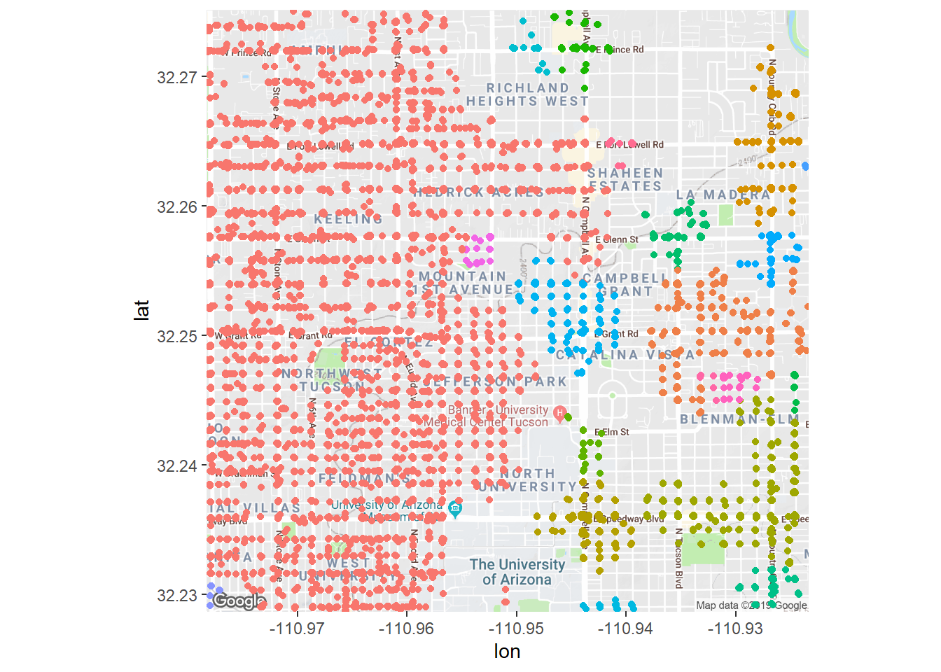
Now if we shrink eps to have a small radius we get back only the really high density spots of crime, and only points that are really close together will get added to a cluster.
crime_db <- dbscan(crime_scaled,  minPts = 50, eps = 0.01,)
crime_filtered <- crime
crime_filtered$cluster  <- factor(crime_db$cluster)
crime_filtered <- crime_filtered %>%
  filter(cluster != 0)
fig + geom_jitter(aes(x = longitude, y = latitude, color = cluster),
                  data = crime_filtered) + theme(legend.position = 'none')
## Warning: Removed 4454 rows containing missing values (geom_point).
14.5.4 How do you pick eps?
Picking a density measure really depends on your knowledge of the data and the question at hand and then you visually exploring the data. Here we knew we only wanted high density sets of points where lots of crime was occurring, so using a smaller eps made sense. Still, using something tiny such as the eps = 0.01 above was too much, so I backed off.
14.6 Wrapping up
I want to close by saying again that clustering is tricky. You can toss all sorts of clustering methods at a set of features, but any true interpretation of their outputs depends on you thinking about the clusters and asking 1) if you are using the right approach for this problem, and 2) do my clusters make sense given this problem. This is both why the job of data scientist is in demand but also why the job is hard. It takes more than just applying a model to data… it takes thinking about multiple different interacting aspects (data, programming, domain knowledge) and pulling out useful inference. Fun, for sure, but also challenging!