Chapter 3 Exploring Data
In this lab, we will first explore how to present the data visually, and then go more into the details of numeric investigation - i.e., descriptive statistics. To do so, we need to install and load two packages - the dplyr for investigating the data, and ggplot2 for visualising the data. Let’s install and load the packages first.
# Check if packages are already installed, otherwise install them
if("dplyr" %in% rownames(installed.packages()) == FALSE)
  {install.packages("dplyr", dependencies = TRUE)}
if("ggplot2" %in% rownames(installed.packages()) == FALSE)
  {install.packages("ggplot2", dependencies = TRUE)}

# Load the libraries
library(dplyr)
library(ggplot2)
Let’s start with data visualisation in the next topic!
3.1 Graphs in R
There are two major sets of tools for creating plots in R:
Note that other plotting facilities do exist (notably lattice), but base and ggplot2 are by far the most popular. I will now show you how both methods work.
3.1.1 The Data
For the following examples, we will be using a dataset called gapminder. Gapminder is a country-year dataset with information on life expectancy, among other things. Let’s load the data and view only the first 6 lines of the dataset by using head().
gapminder <- read.csv("http://bit.ly/2GxjYOB")
head(gapminder)
## country year pop continent lifeExp gdpPercap
## 1 Afghanistan 1952 8425333 Asia 28.801 779.4453
## 2 Afghanistan 1957 9240934 Asia 30.332 820.8530
## 3 Afghanistan 1962 10267083 Asia 31.997 853.1007
## 4 Afghanistan 1967 11537966 Asia 34.020 836.1971
## 5 Afghanistan 1972 13079460 Asia 36.088 739.9811
## 6 Afghanistan 1977 14880372 Asia 38.438 786.1134Now, we have loaded the data, let’s plot various graphs using the base and ggplot2 tools.
3.2 R Base Graphics
- The basic code for plotting a single variable is
plot(x=). Let’s plot the life expectancy variable now. Remember that you can call a variable from a dataset using a$sign.
plot(x = gapminder$lifeExp) 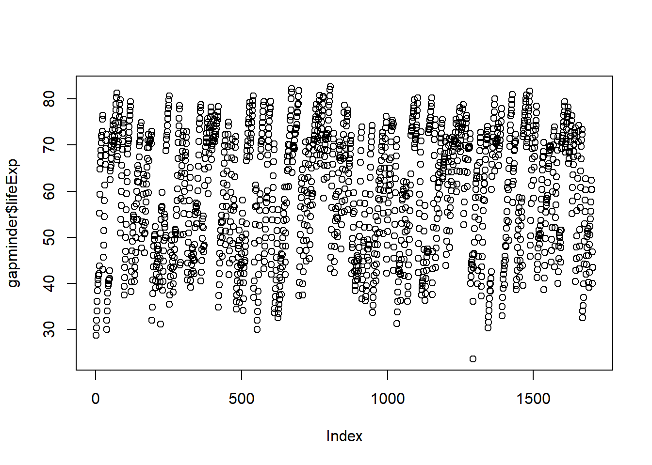
- The basic code for plotting two variables is
plot(x=, y=). Let’s plot how life expectancy varies with GDP:
plot(x = gapminder$gdpPercap, y = gapminder$lifeExp)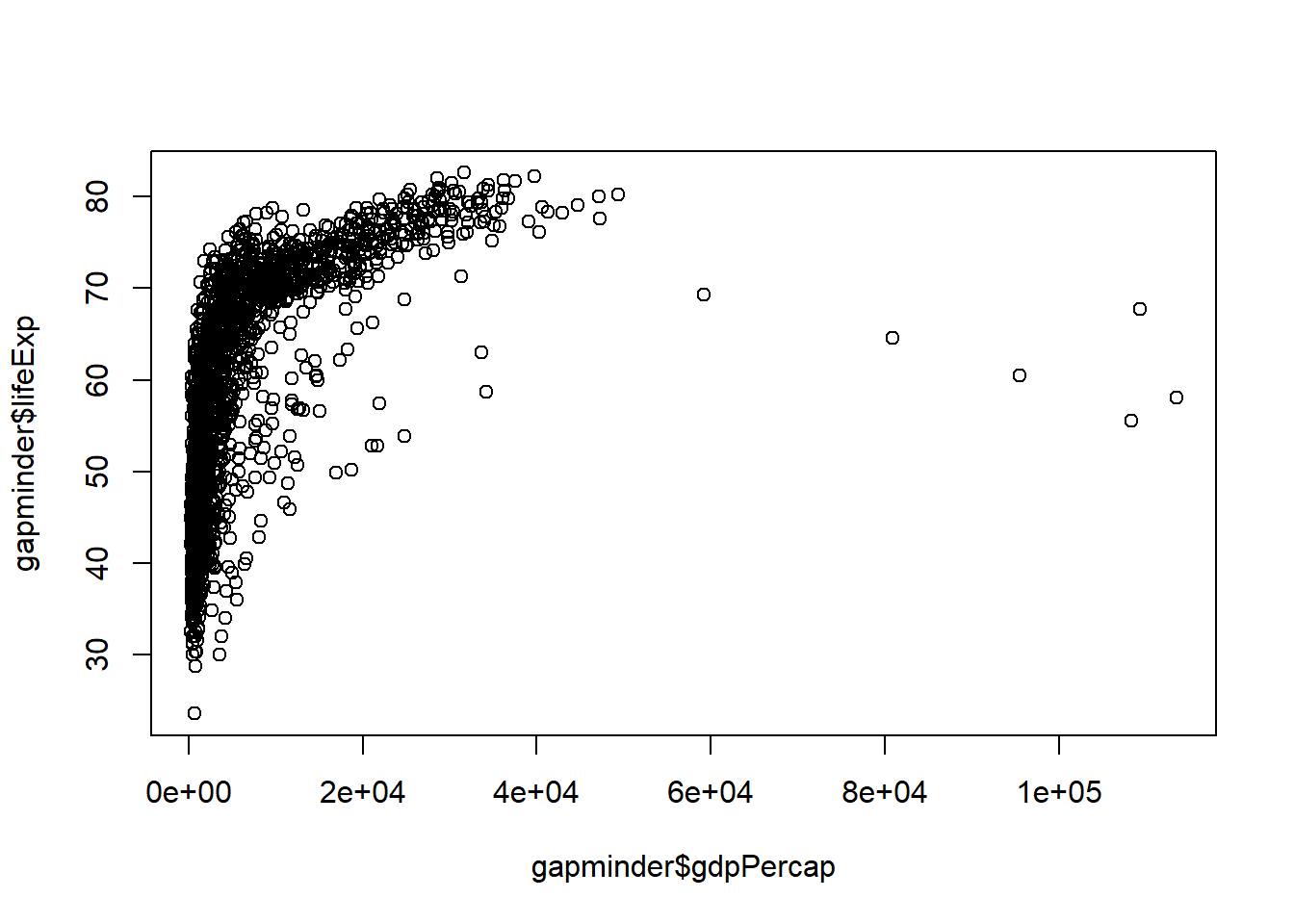
3.2.1 Scatter and Line Plots
To identify the type of plot, we use the type argument, which accepts the following character indicators:
- “p” – point/scatter plots (default plotting behaviour)
plot(x = gapminder$gdpPercap, y = gapminder$lifeExp, type = "p")
- “l” – line graphs
plot(x = gapminder$gdpPercap, y = gapminder$lifeExp, type = "l") 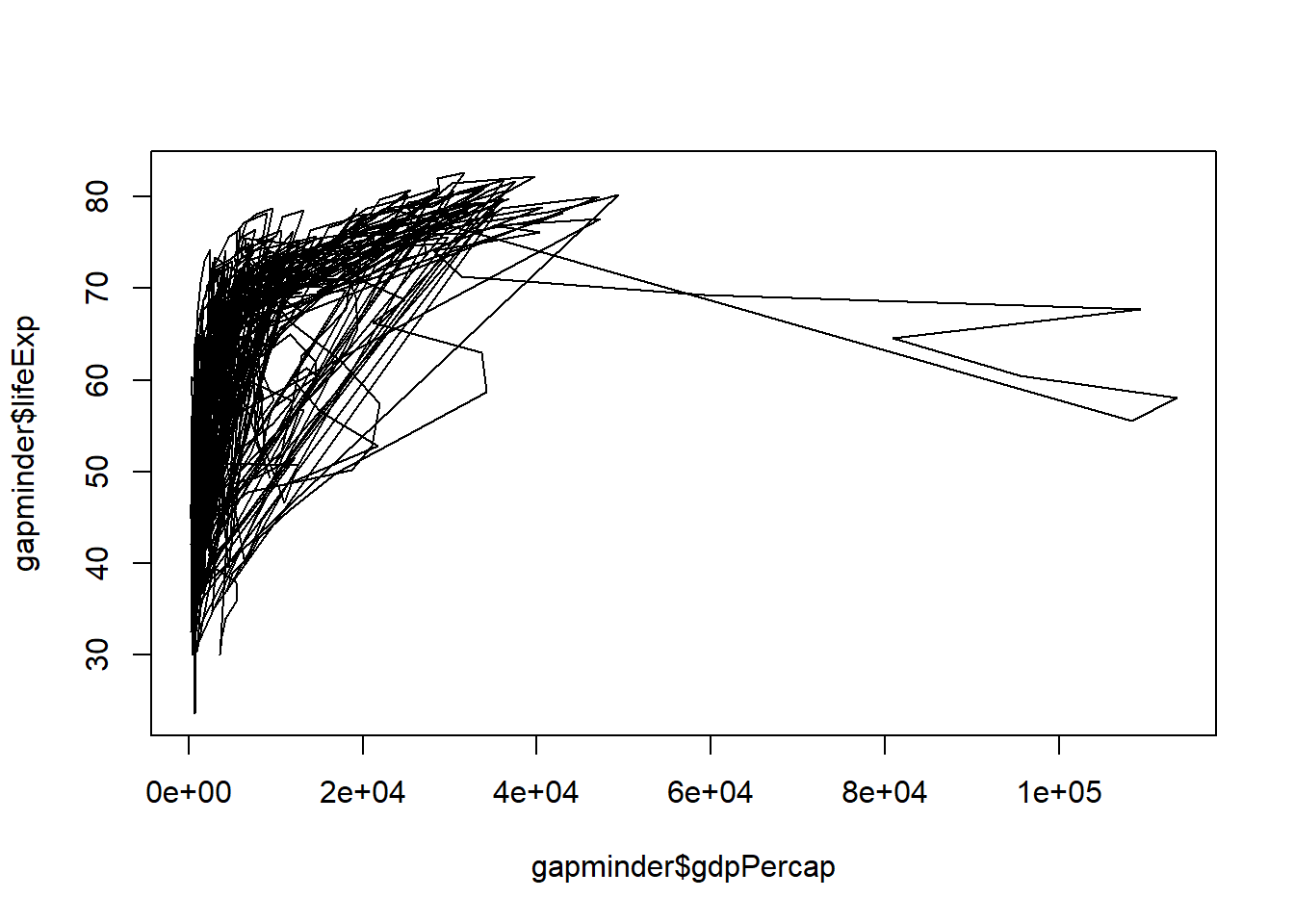
Note that “line” does not create a smoothing line, just connects the points.
- “b” – both line and point plots.
Your turn! Go to Rstudio and use “b” for type and see what happens.
3.2.2 Histograms, Boxplots and Density Plots
Certain plot types require different calls outside of the “type” argument
Example: Histograms
hist(x = gapminder$lifeExp)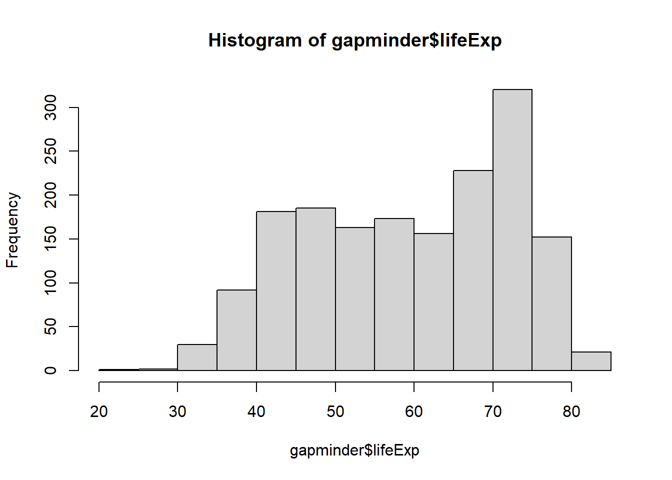
hist(x = gapminder$lifeExp, breaks = 5)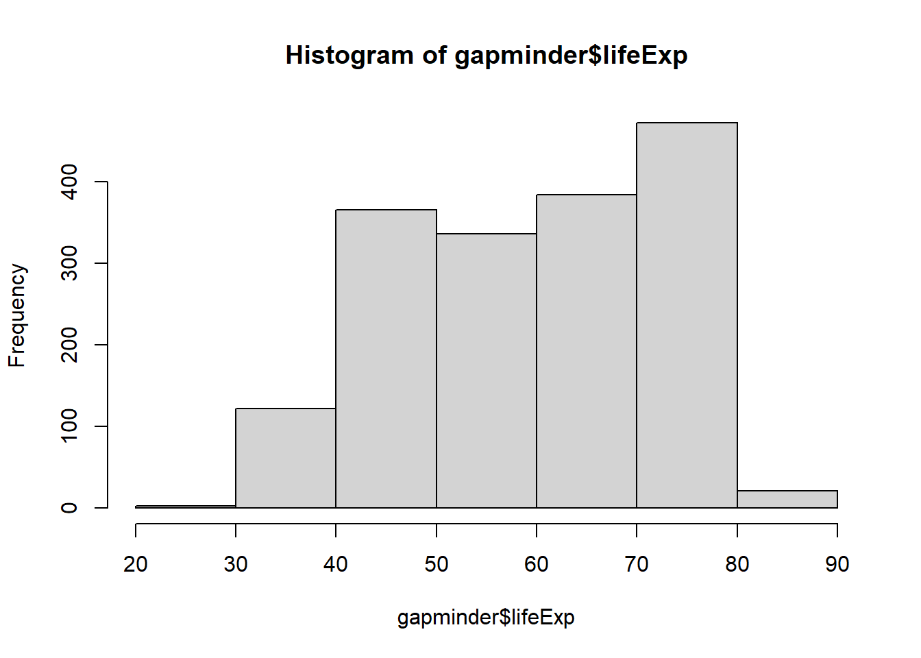
hist(x = gapminder$lifeExp, breaks = 50)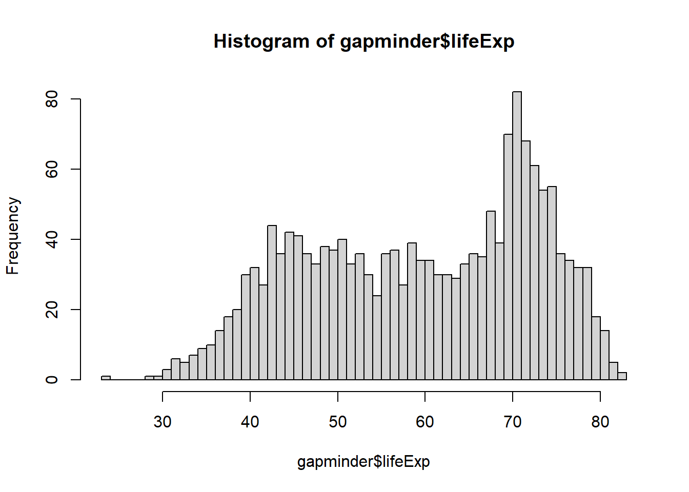
Have you noticed what has changed when you increase the number of breaks in the code from 5 to 50?
Example: Boxplot
boxplot(x = gapminder$lifeExp,
        main = "Boxplot of Life Expectancy",
        ylab = "Years",
        xlab = "Life Expectancy",
        col = "lightblue")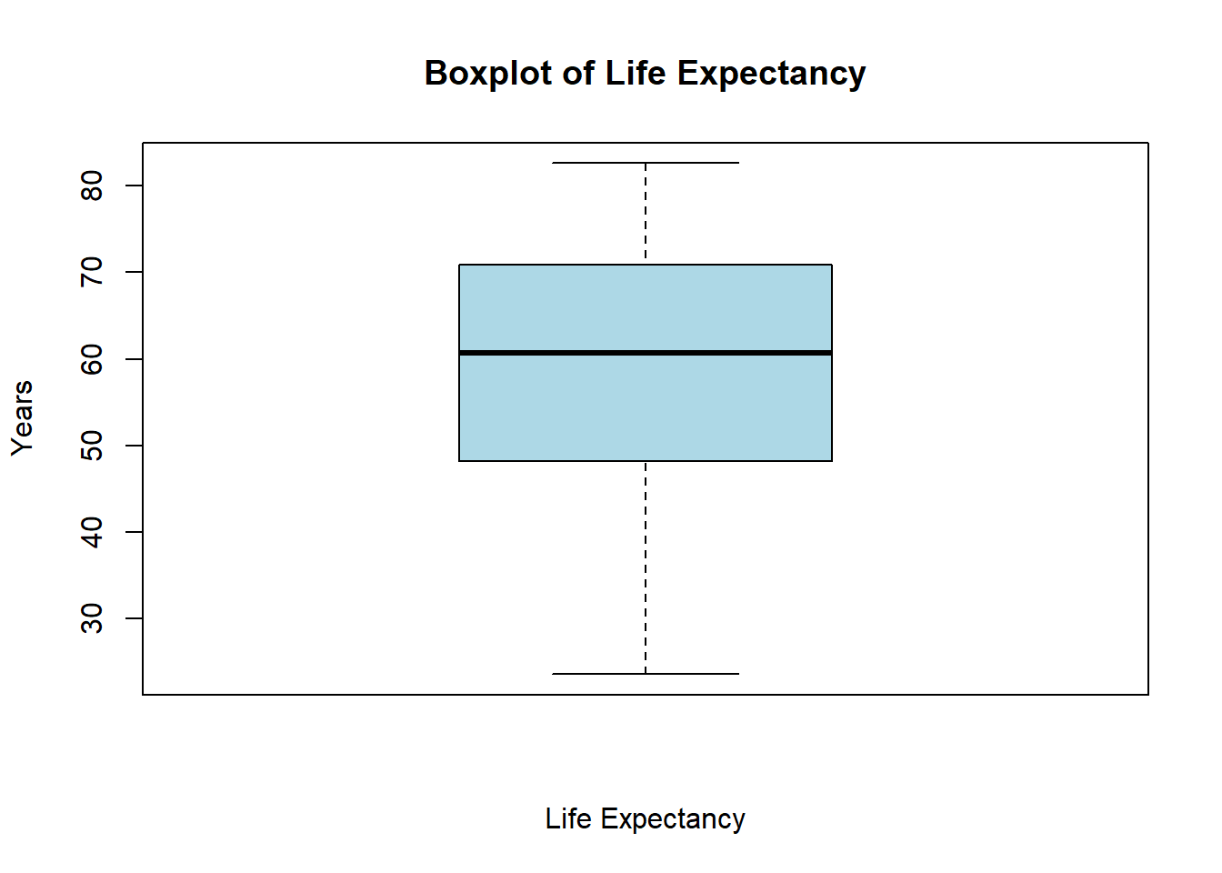
Example: Density plots
# Create a density object (NOTE: be sure to remove missing values by "na.rm=TRUE")
age.density <- density(x = gapminder$lifeExp, na.rm=TRUE)
# Check the class of the object
class(age.density)
## [1] "density"# View the contents of the object
age.density ##
## Call:
## density.default(x = gapminder$lifeExp, na.rm = TRUE)
##
## Data: gapminder$lifeExp (1704 obs.); Bandwidth 'bw' = 2.625
##
## x y
## Min. :15.72 Min. :0.000001
## 1st Qu.:34.41 1st Qu.:0.001079
## Median :53.10 Median :0.017034
## Mean :53.10 Mean :0.013364
## 3rd Qu.:71.79 3rd Qu.:0.020987
## Max. :90.48 Max. :0.034870# Plot the density object
plot(x = age.density)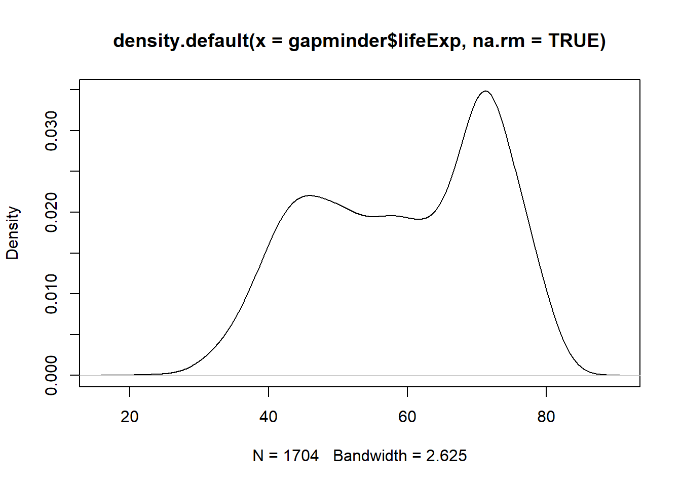
# Plot the density object, bandwidth of 0.5
plot(x = density(x = gapminder$lifeExp, bw = 0.5, na.rm = TRUE))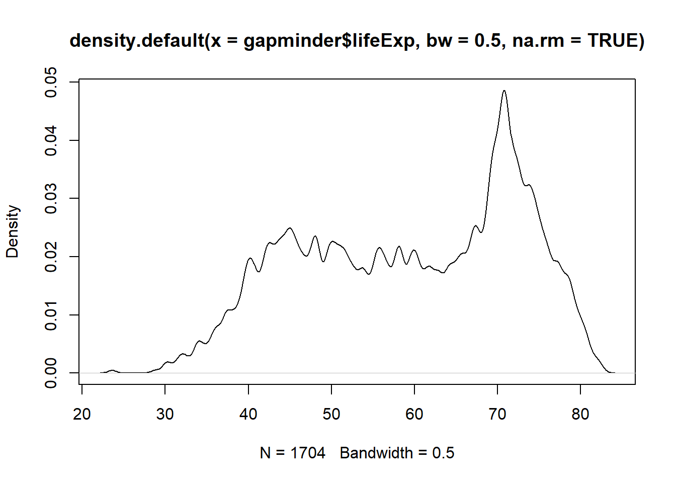
# Plot the density object, bandwidth of 2
plot(x = density(x = gapminder$lifeExp, bw = 2, na.rm = TRUE))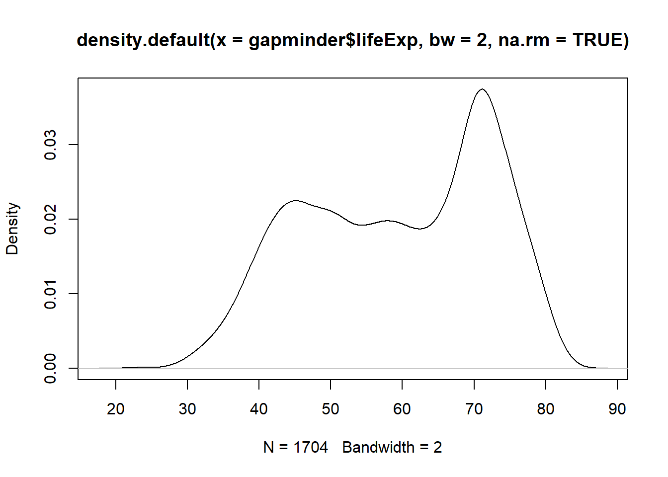
# Plot the density object, bandwidth of 6
plot(x = density(x = gapminder$lifeExp, bw = 10, na.rm = TRUE)) 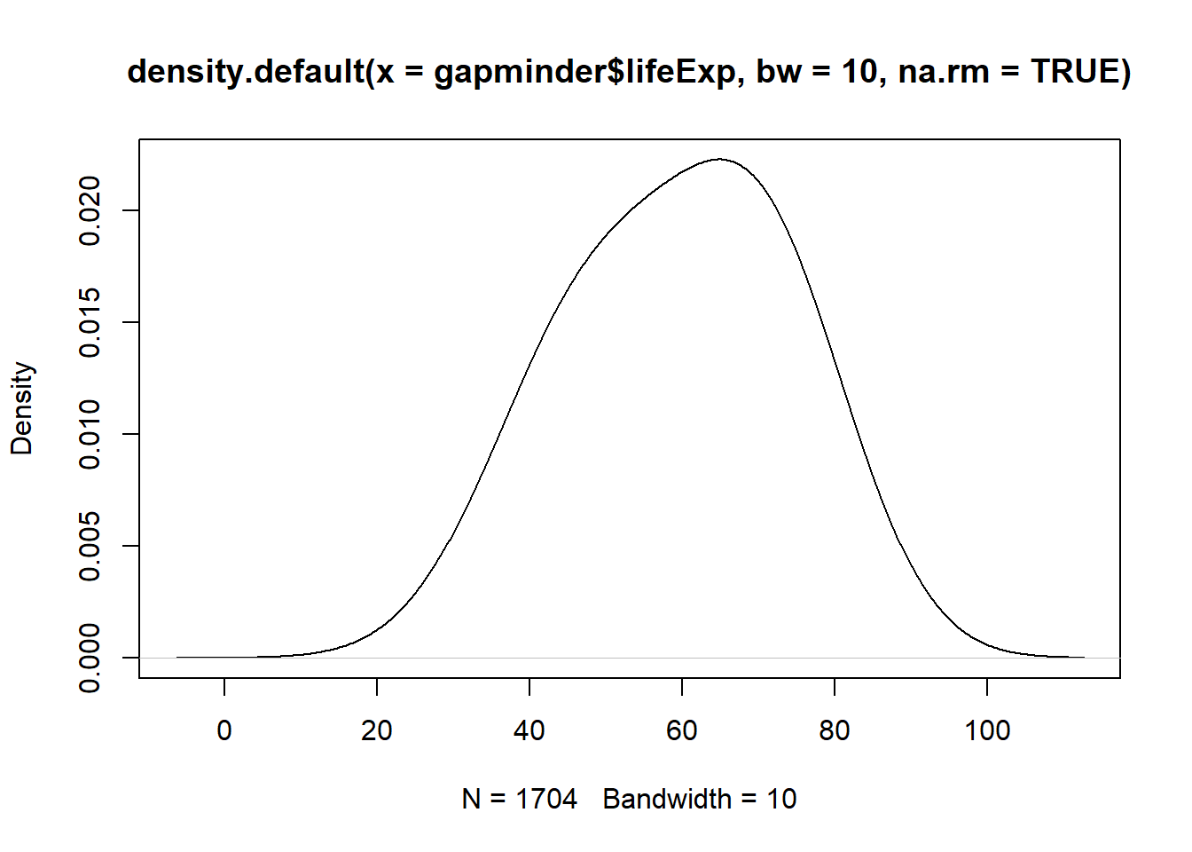
Have you noticed what has happened when you increased the bandwidth?
3.2.3 Labels
Labels are a fundamental component of any plot. Always make sure to include meaningful labels so that your graph can be easily understood.
After plotting graphs, we need to add some labels for the x- and y-axes and a title for the plot: plot(x=, y=, type="", xlab="", ylab="", main="").
Now, go to RStudio and graph a scatter plot of life expectancy vs GDP, and add labels for the axes and overall plot.
Solution:
plot(x = gapminder$gdpPercap, y = gapminder$lifeExp, type = "p",
     xlab = "GDP per capita (Int'l $)",
     ylab = "Life Expectancy",
main = "Life Expectancy ~ GDP") 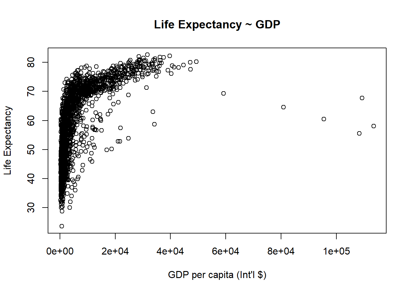
3.2.4 Axis and Size Scaling
Currently it’s hard to see the relationship between the points due to some strong outliers in GDP per capita. We can change the scale of units on the x axis using scaling arguments. The basic command is: plot(x=, y=, type="", xlim=, ylim=, cex=).
# Create a basic plot
plot(x = gapminder$gdpPercap, y = gapminder$lifeExp, type = "p",
     xlab = "GDP per capita (Int'l $)",
     ylab = "Life Expectancy",
     main = "Basic Plot")
# Limit gdp (x-axis) to between 1,000 and 20,000
plot(x = gapminder$gdpPercap, y = gapminder$lifeExp, xlim = c(1000,20000),
     xlab = "GDP per capita (Int'l $)",
     ylab = "Life Expectancy",
main = "Scatterplot - X axis cropped between 1,000 and 20,000") 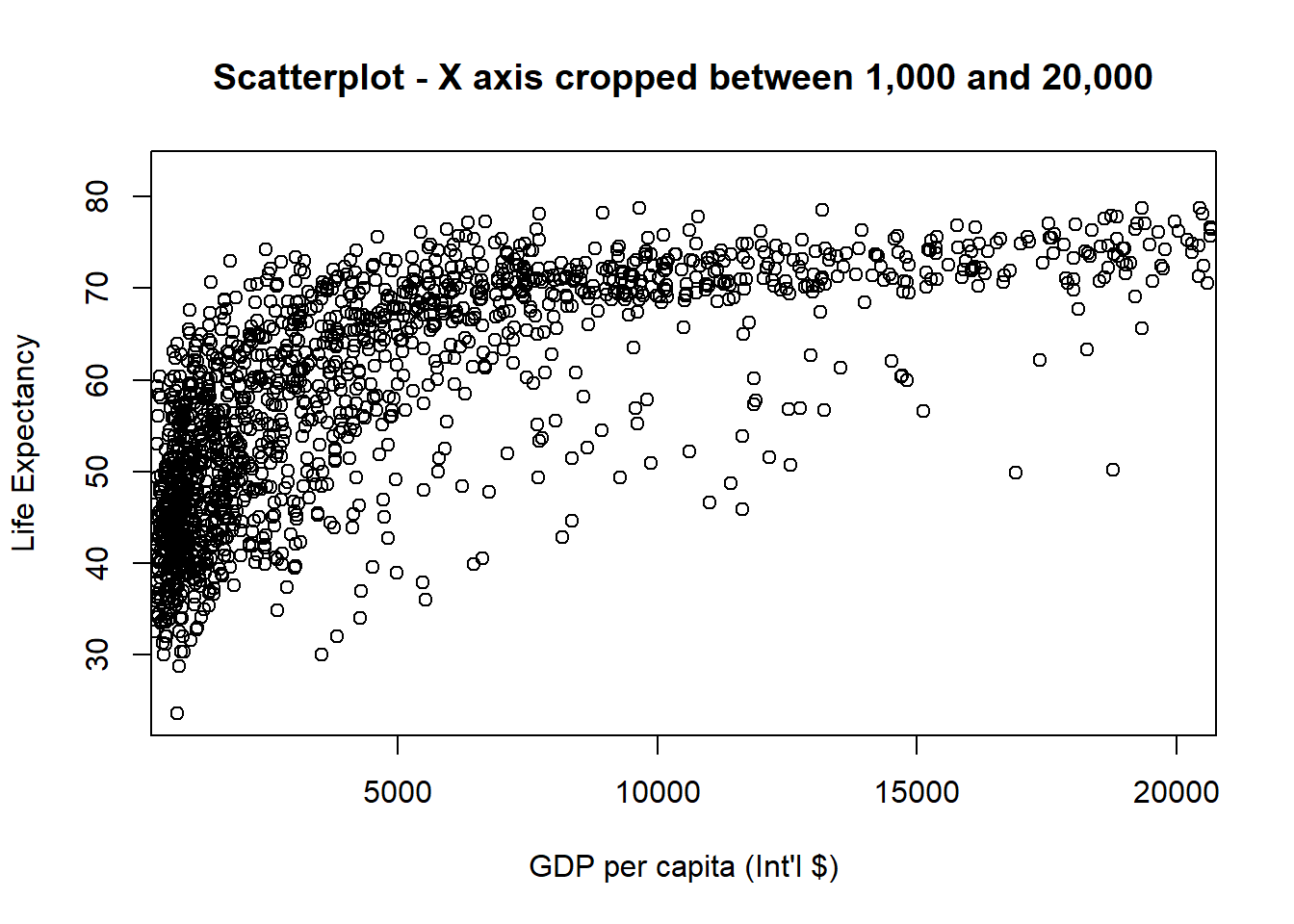
# Limit gdp (x-axis) to between 1,000 and 20,000, increase point size to 2
plot(x = gapminder$gdpPercap, y = gapminder$lifeExp, xlim = c(1000,20000), cex = 2,
     xlab = "GDP per capita (Int'l $)",
     ylab = "Life Expectancy",
main = "Scatterplot - X axis between 1,000 and 20,000 + increased points size") 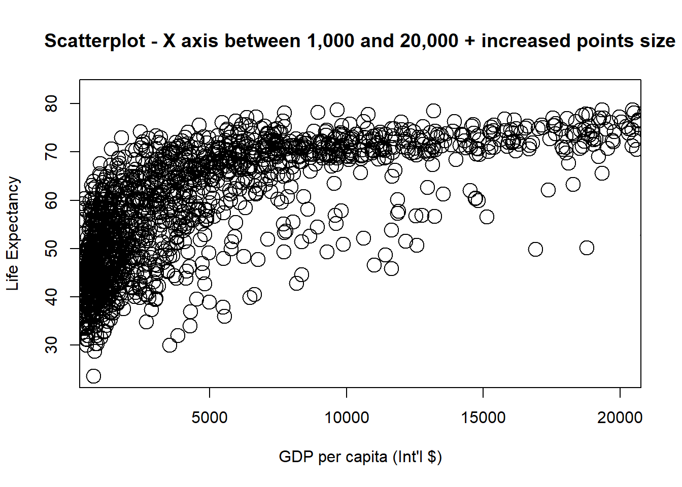
# Limit gdp (x-axis) to between 1,000 and 20,000, decrease point size to 0.5
plot(x = gapminder$gdpPercap, y = gapminder$lifeExp, xlim = c(1000,20000), cex = 0.5,
     xlab = "GDP per capita (Int'l $)",
     ylab = "Life Expectancy",
main = "Scatterplot - X axis between 1,000 and 20,000 + decreased points size") 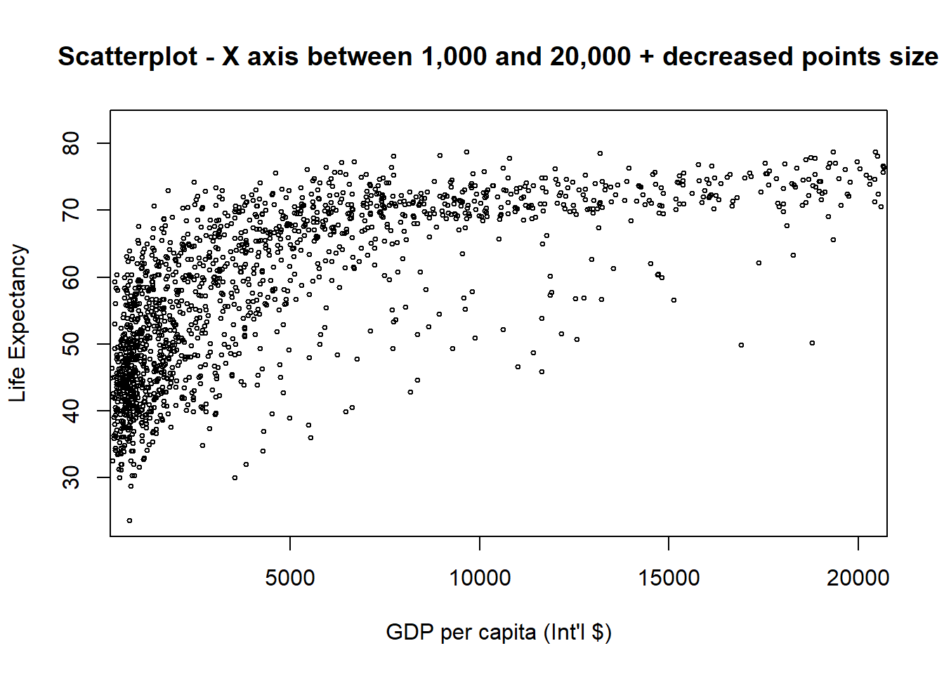
By default, any values outside the limits specified are replaced with NA. Be warned that this will remove data outside the limits and this can produce unintended results. For changing x or y axis limits without dropping data observations, see coord_cartesian(). You can have a look at some examples here.
3.2.5 Graphical Parameters
We can add some colours and change how the lines or dots look. The basic code is: plot(x=, y=, type="", col="", pch=, lty=, lwd=)
You can see all elements of the colour vector. The code is:
colours() # View all elements of the colour vector
colours()[179] # View specific element of the colour vector
Let’s see some examples using different colour options.
plot(x = gapminder$gdpPercap, y = gapminder$lifeExp, type = "p",
     col = colours()[145], # or col="gold3"
     xlab = "GDP per capita",
     ylab = "Life Expectancy",
     main = "Scatterplot - Setting a colour for points")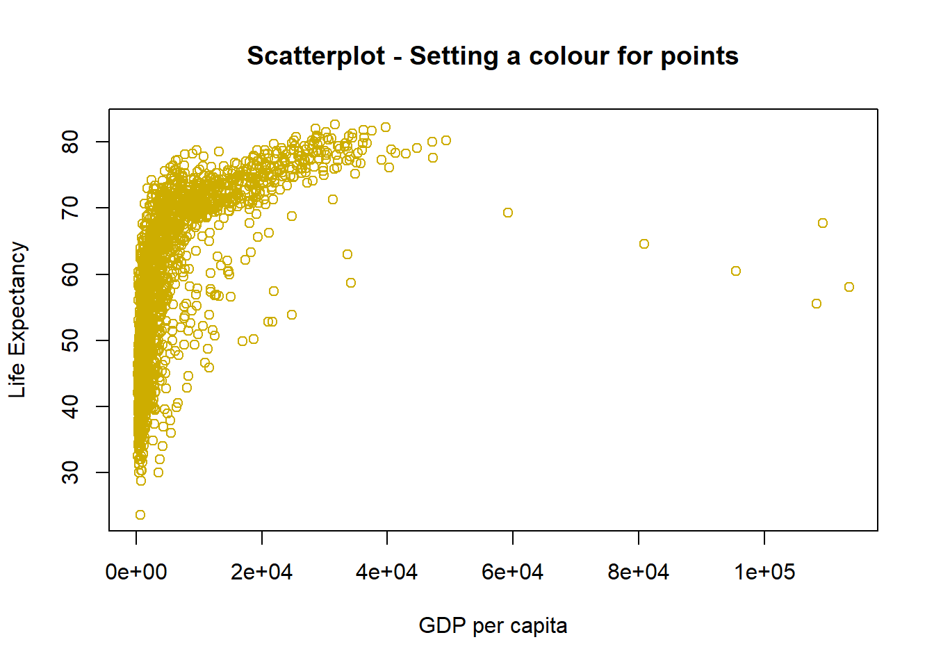
Play with the code above and choose different colours.
You can change the point styles and widths. See this Good Reference. Here you can see a couple of examples.
# Change point style to filled squares
plot(x = gapminder$gdpPercap, y = gapminder$lifeExp, type = "p",
     pch = 15 , # style of points
     xlab = "GDP per capita",
     ylab = "Life Expectancy",
main = "Scatterplot - points styled as filled squares") 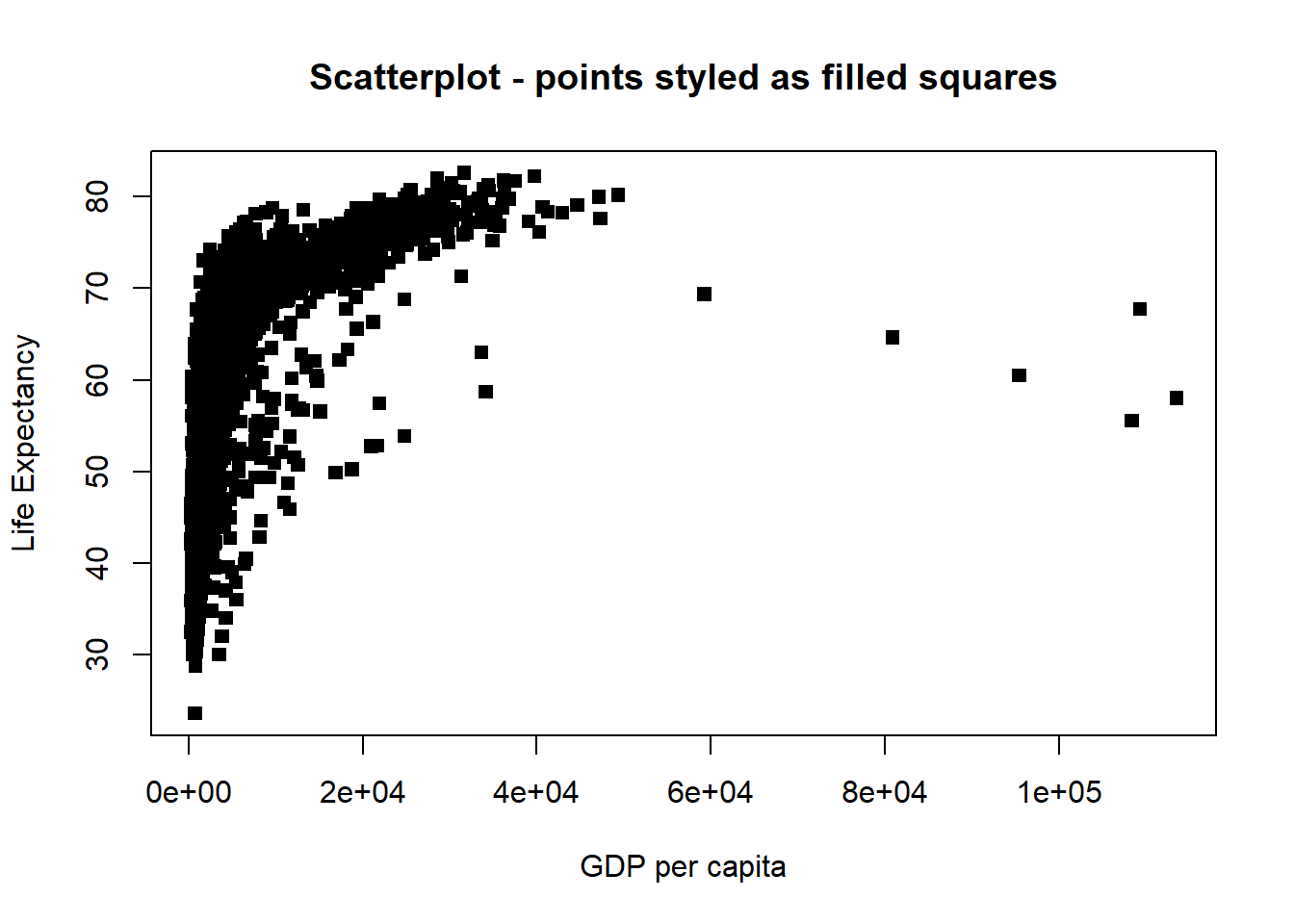
# Change point style to "$" and increase point size to 2
plot(x = gapminder$gdpPercap, y = gapminder$lifeExp, type = "p",
     pch = "$", cex = 2, #style and dimension of points
     xlab = "GDP per capita",
     ylab = "Life Expectancy",
main = "Scatterplot - points styled as $") 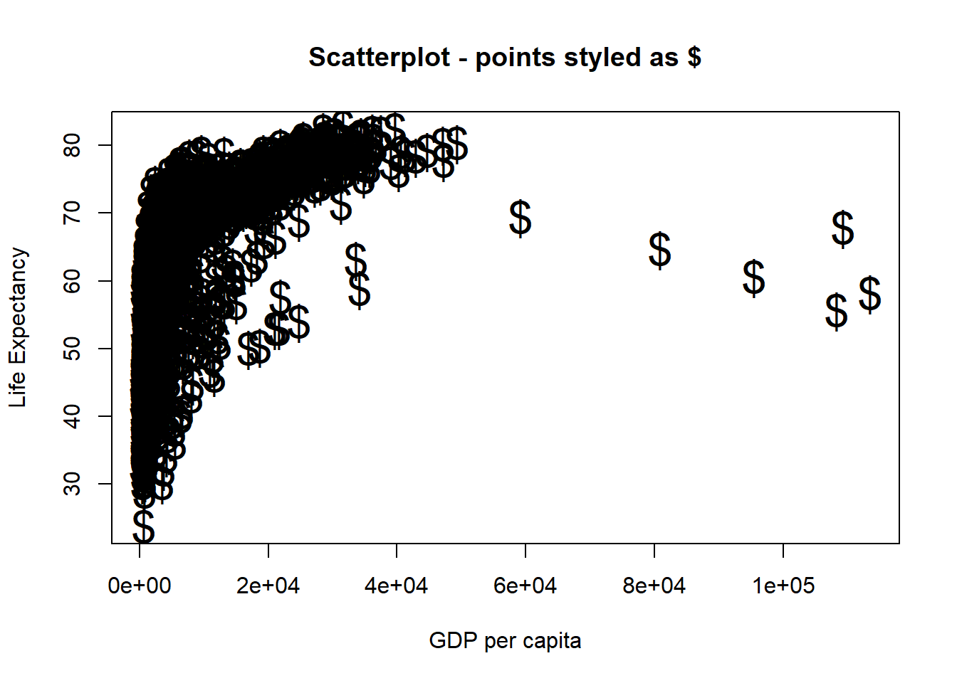
Line styles and widths can also be changed. Here are some examples:
# Line plot with solid line
plot(x = gapminder$gdpPercap, y = gapminder$lifeExp, type = "l", lty = 1)
# Line plot with medium dashed line
plot(x = gapminder$gdpPercap, y = gapminder$lifeExp, type = "l", lty = 2)
# Line plot with short dashed line
plot(x = gapminder$gdpPercap, y = gapminder$lifeExp, type = "l", lty = 3)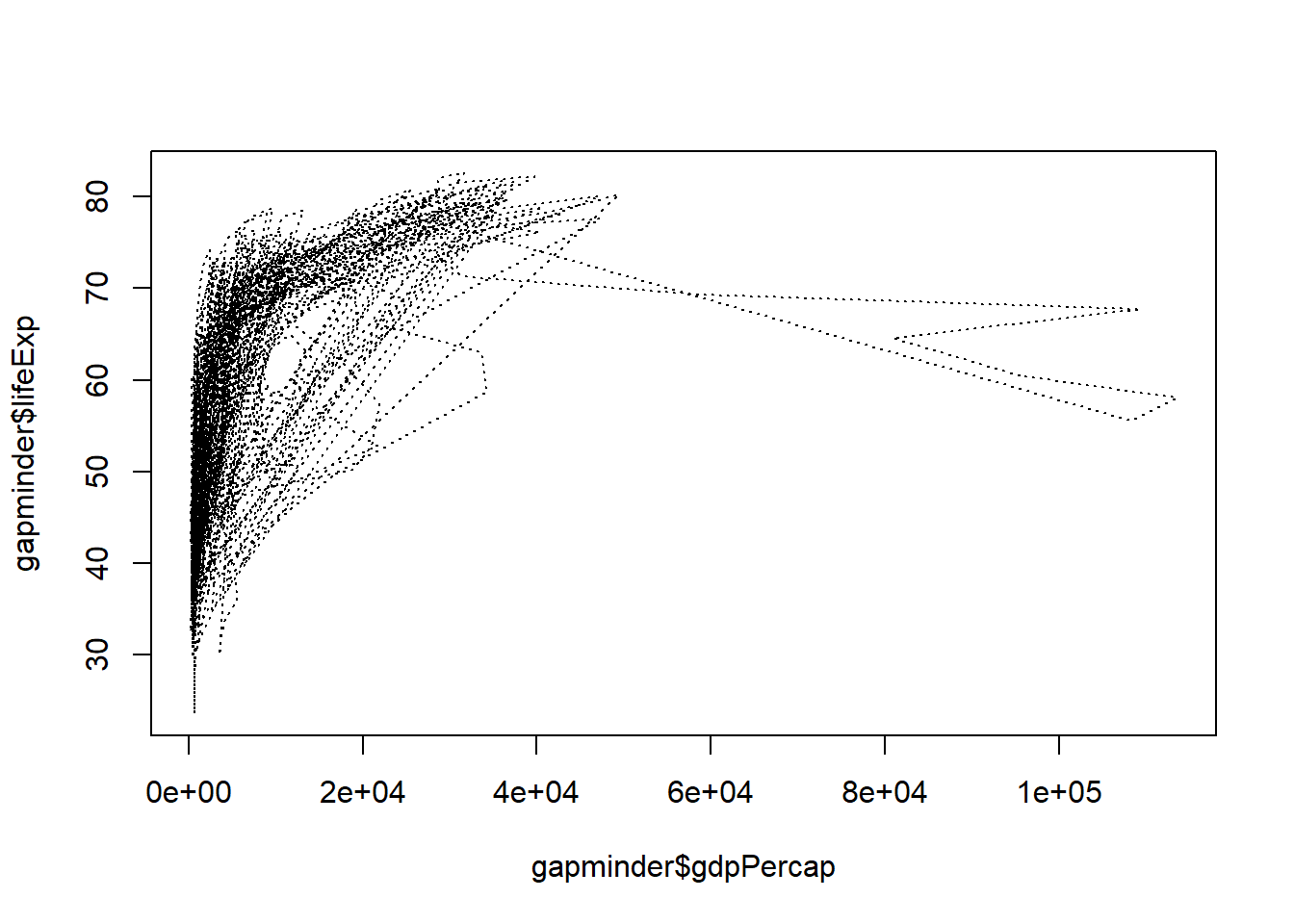
# Change line width to 2
plot(x = gapminder$gdpPercap, y = gapminder$lifeExp, type = "l", lty = 3, lwd = 2)
# Change line width to 5
plot(x = gapminder$gdpPercap, y = gapminder$lifeExp, type = "l", lwd = 5)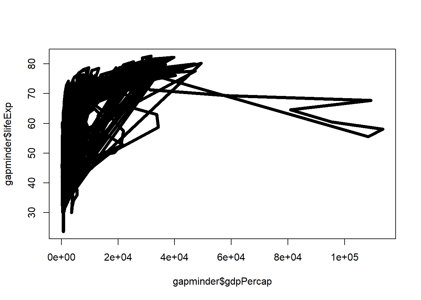
# Change line width to 10 and use dash-dot
plot(x = gapminder$gdpPercap, y = gapminder$lifeExp, type = "l", lty = 4, lwd = 10)
3.2.6 Annotations, Reference Lines, and Legends
You can include texts and reference lines to your plots.
- Text
# plot the line first
plot(x = gapminder$gdpPercap, y = gapminder$lifeExp, type = "p",
     xlab = "GDP per capita",
     ylab = "Life Expectancy",
     main = "Scatterplot - adding text inside plot")
# now add the label to certain point on the plot
text(x = 40000, y = 50, labels = "Evens Out", cex = 0.75)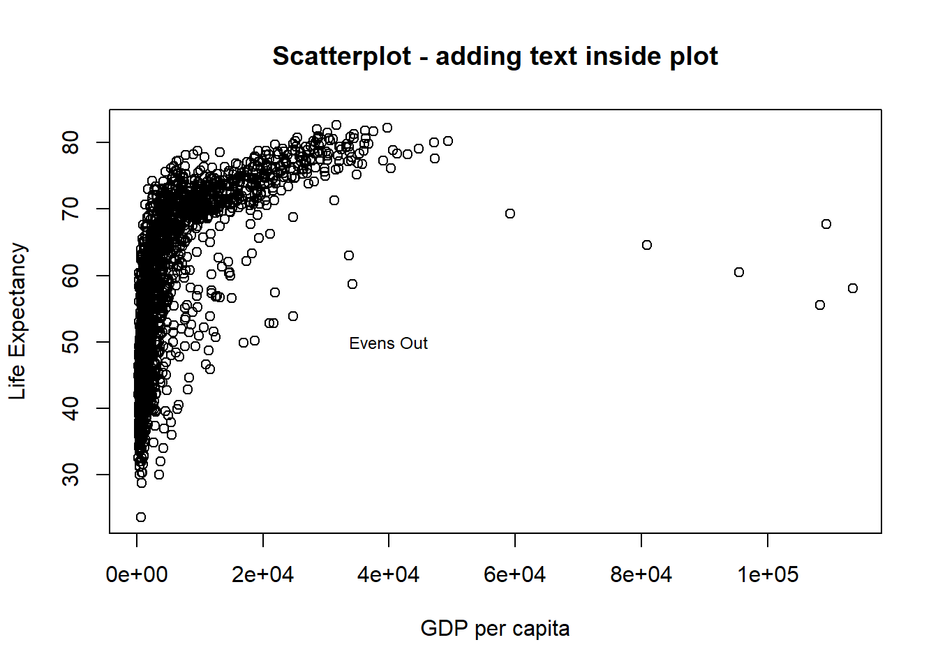
- Reference Lines You can reference lines either horizontal and vertical. In the plot below both lines are showed in red.
# plot the line
plot(x = gapminder$gdpPercap, y = gapminder$lifeExp, type = "p",
     xlab = "GDP per capita",
     ylab = "Life Expectancy",
     main = "Scatterplot - 1 vertical and 1 horizontal reference lines")
# now add the guides to horizontal and vertical axes.
abline(v = 40000, h = 75, lty = 2, col="red") # "v" is for vertical and "h" for horizontal.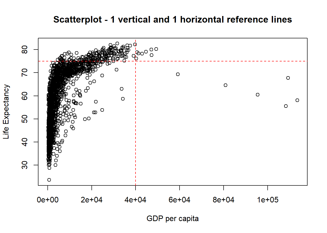
Before you move on to the next technique, ggplot, please practise the codes in the exercises and familiarise yourself with the concepts explored in this topic.
3.3 ggplot2
Why use ggplot to create graphics?
* ggplot offers more elegant and compact code than with base graphics.
* It is very powerful for exploratory data analysis.
* Just like any language, it follows a grammar. In this case, the grammar defines components in a plot.
3.3.1 Grammar
The general code for ggplot2 looks like this: ggplot(data=, aes(x=, y=), colour=, size=,) + geom_xxxx() + geom_yyyy(). If you are using this function first time in your RStudio, you need to install (install.packages("ggplot2")) and load (library(ggplot2)) it.
The grammar involves some basic components:
- Data: is a dataframe
- Aesthetics (aes): How your data are represented visually, aka “mapping.” Which variables are shown on x, y axes, as well as colour, size, shape, etc.
- Geometry (geom): The geometric objects in a plot. points, lines, polygons, etc.
The key to understanding ggplot2 is thinking about a figure in layers: just like you might do in an image editing program like Photoshop, Illustrator, or Inkscape.
Let’s look at an example using the gapminder dataset. Remember that we have loaded this dataset earlier (downloaded from http://bit.ly/2GxjYOB using gapminder <- read.csv("http://bit.ly/2GxjYOB")).
library(ggplot2)
ggplot(data = gapminder, aes(x = gdpPercap, y = lifeExp))
So the first thing we do is to call the ggplot function. This function lets R know that we’re creating a new plot, and any of the arguments we give the ggplot function are the global options for the plot: they apply to all layers on the plot.
We have provided two arguments to ggplot.
First, we tell ggplot what
datawe want to show on our figure, in this example thegapminderdata.For the second argument, we passed in the
aesfunction, which tellsggplothow variables in the data map to aesthetic properties of the figure, in this case the x and y locations. Here we toldggplotwe want to plot thelifeExpcolumn of the gapminder dataframe on the y-axis, and thegdpPercapcolumn on the x-axis. Notice that we didn’t need to explicitly passaesinto these columns (e.g.x = gapminder[, "lifeExp"]), this is because ggplot is smart enough to know to look in the data for that column!
By itself, calling ggplot isn’t enough to draw a figure. If you look at the plot created by the following code you can see that nothing is plotted other than the two axis:
ggplot(data = gapminder, aes(x = gdpPercap, y = lifeExp))
We need to tell ggplot how we want to visually represent the data, which we do by adding a new geom layer. In our example, we used geom_point, which tells ggplot that we want to visually represent the relationship between x and y as a scatterplot of points. Each layer is added by adding the sign+ followed by the code for the layer:
ggplot(data = gapminder, aes(x = gdpPercap, y = lifeExp)) + #use the + sign to add a layer
  geom_point() #layer for the visual representation of data using points. A scatterplot.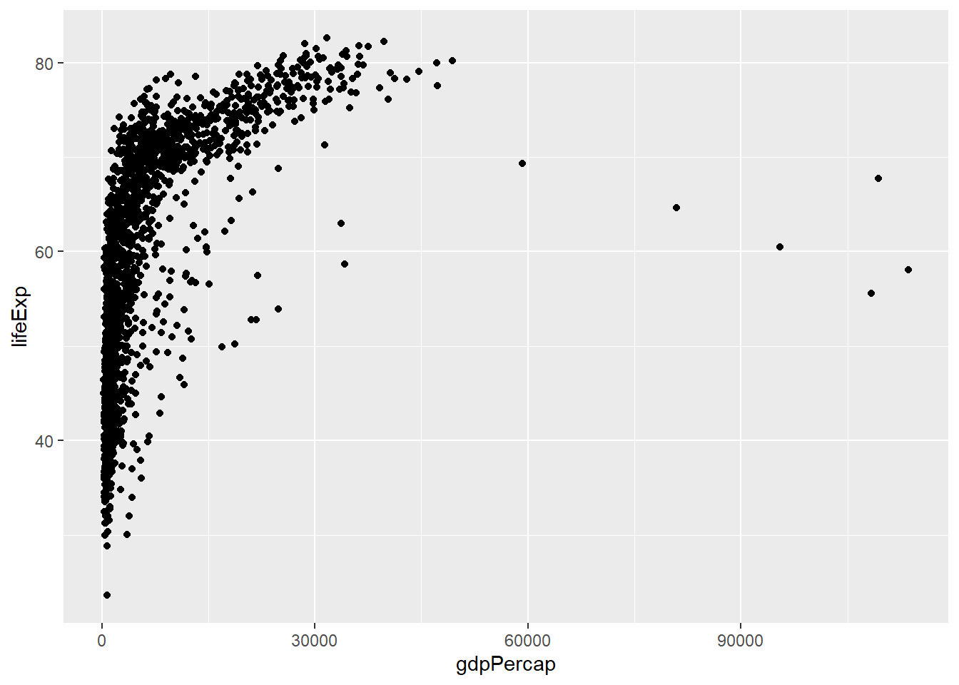
Challenge 1
In your R studio modify the example above so that the figure visualises how life expectancy has changed over time.
Hint: the gapminder dataset has a column called “year,” which should appear on the x-axis where the life expectancy appears on the y-axis.
3.3.2 Anatomy of aes
In the previous examples and challenge we’ve used the aes function to tell the scatterplot geom about the x and y locations of each point. Another aesthetic property we can modify is the colour of the points.
ggplot(data = gapminder, aes(x = gdpPercap, y = lifeExp, colour = continent)) + geom_point()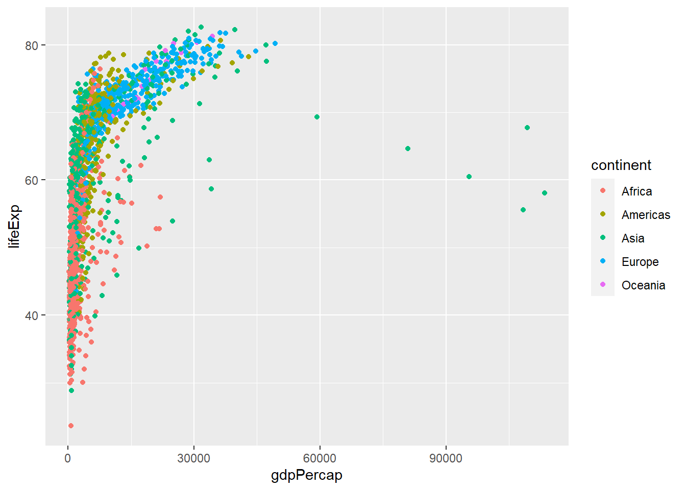
Here, we present the graph for different continents using different colours. Normally, specifying options like colour="red" or size=10 for a given layer results in its contents being red and quite large. Inside the aes() function, however, these arguments are given to entire variables whose values will then be displayed using different realisations of that aesthetic.
Colour isn’t the only aesthetic argument we can set to display variation in the data. We can also vary by shape, size, etc. ggplot(data=, aes(x=, y=, by =, colour=, linetype=, shape=, size=)).
3.3.3 Layers
In the previous challenge, you plotted life expectancy over time. Using a scatterplot probably isn’t the best for visualising change over time. Instead, let’s tell ggplot to visualise the data as a line plot:
ggplot(data = gapminder,
       aes(x = year, y = lifeExp, by = country, colour = continent)) +
  geom_line()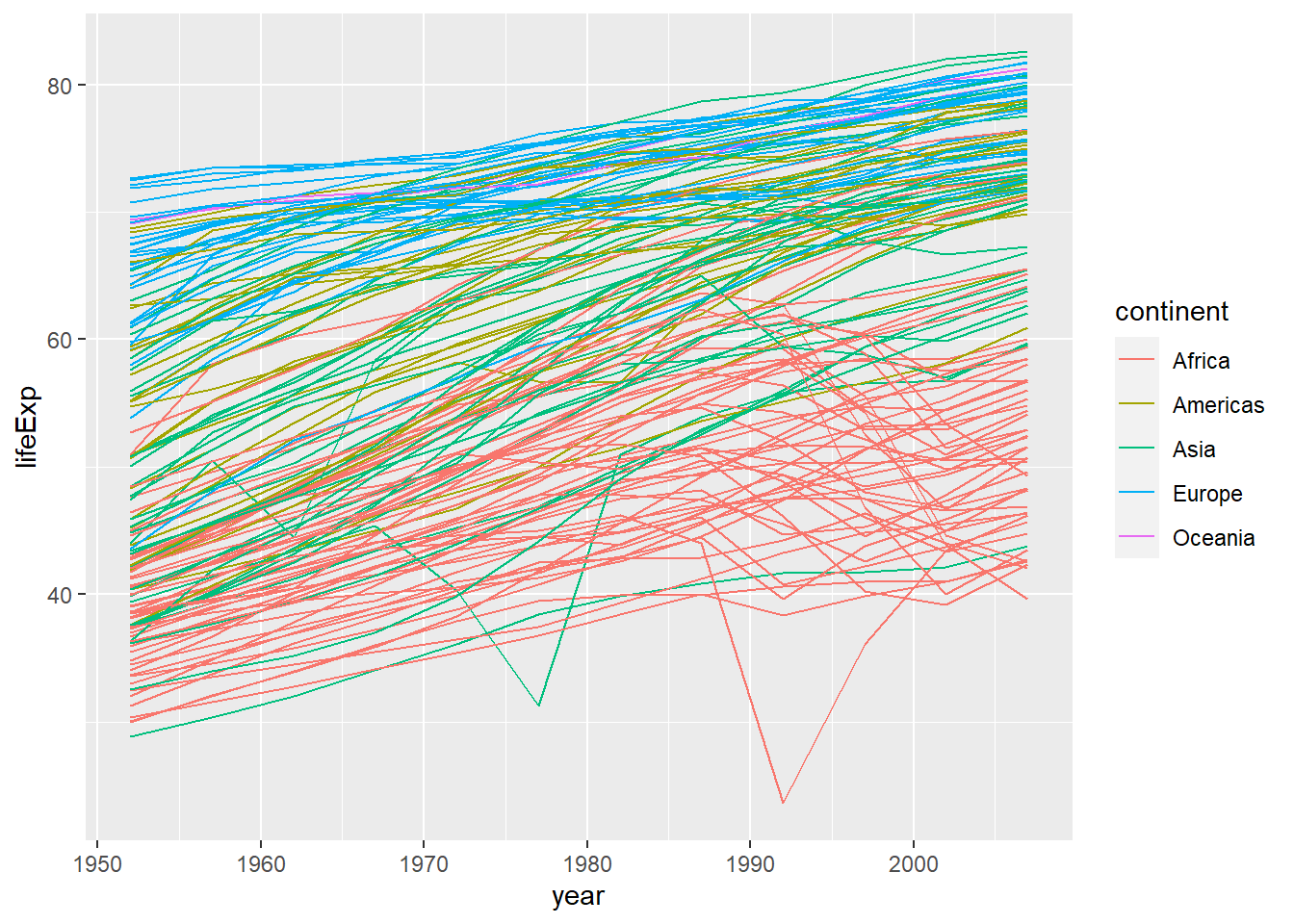
Instead of using the geom_point layer, we have used geom_line layer.
We have added the attribute by in aesthetic, which tells ggplot to draw a line for each country.
Furthermore, we have also added the attribute colour and specified to use the variable continent to create a legend for continents and assign a different random colour to each country in the same continent. In this case both these attributes are very important for this plot as without them the plot would make no sense. Try on your own to remove both of them of even one and see what happens.
The above code could be read as “from the dataset”gapminder" use the variable “year” to create the x-axis and the variable “lifeExp” (life expectancy) to create the y-axis. Group the data points by using the variable “country.” Assign a colour to each value of the variable “continent” and use them to colour all the observations and create a legend. Use a line plot to represent the data."
But what if we want to visualise both lines and points on the plot? We can simply add another layer to the plot:
ggplot(data = gapminder,
       aes(x = year, y = lifeExp, by = country, colour = continent)) +
  geom_line() +
  geom_point()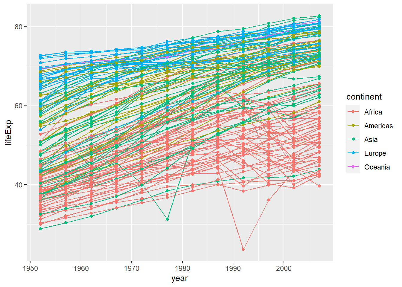
It is important to note that each layer is drawn on top of the previous layer. In this example, the points have been drawn on top of the lines. Here is a demonstration:
ggplot(data = gapminder,
       aes(x = year, y = lifeExp, by = country)) +
  geom_line(aes(colour = continent)) +
  geom_point()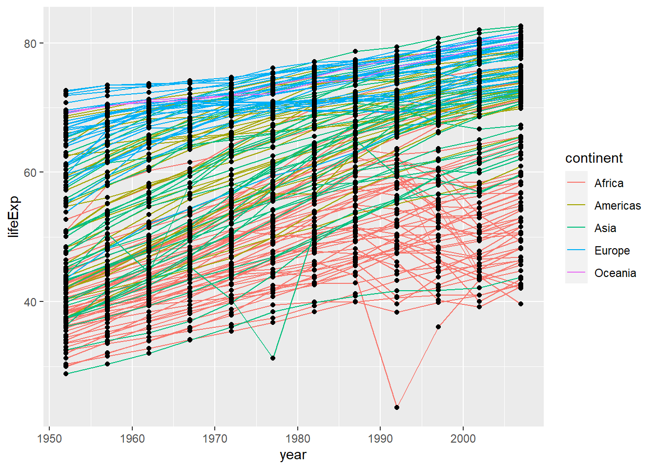
In this example, the aesthetic mapping of colour has been moved from the global plot options in ggplot to the geom_line layer so it no longer applies to the points. Now we can clearly see that the points are drawn on top of the lines.
Challenge 2
Switch the order of the point and line layers from the previous example. What happens?
3.3.4 Facets
Earlier we visualised the change in life expectancy over time across all continents in one plot. Alternatively, we can split this out over multiple panels by adding a layer of facet panels:
ggplot(data = gapminder,
       aes(x = year, y = lifeExp, by=country, colour = continent)) +
  geom_line() +
  facet_wrap( ~ continent) # Apply facets to create a separate plot for each continent.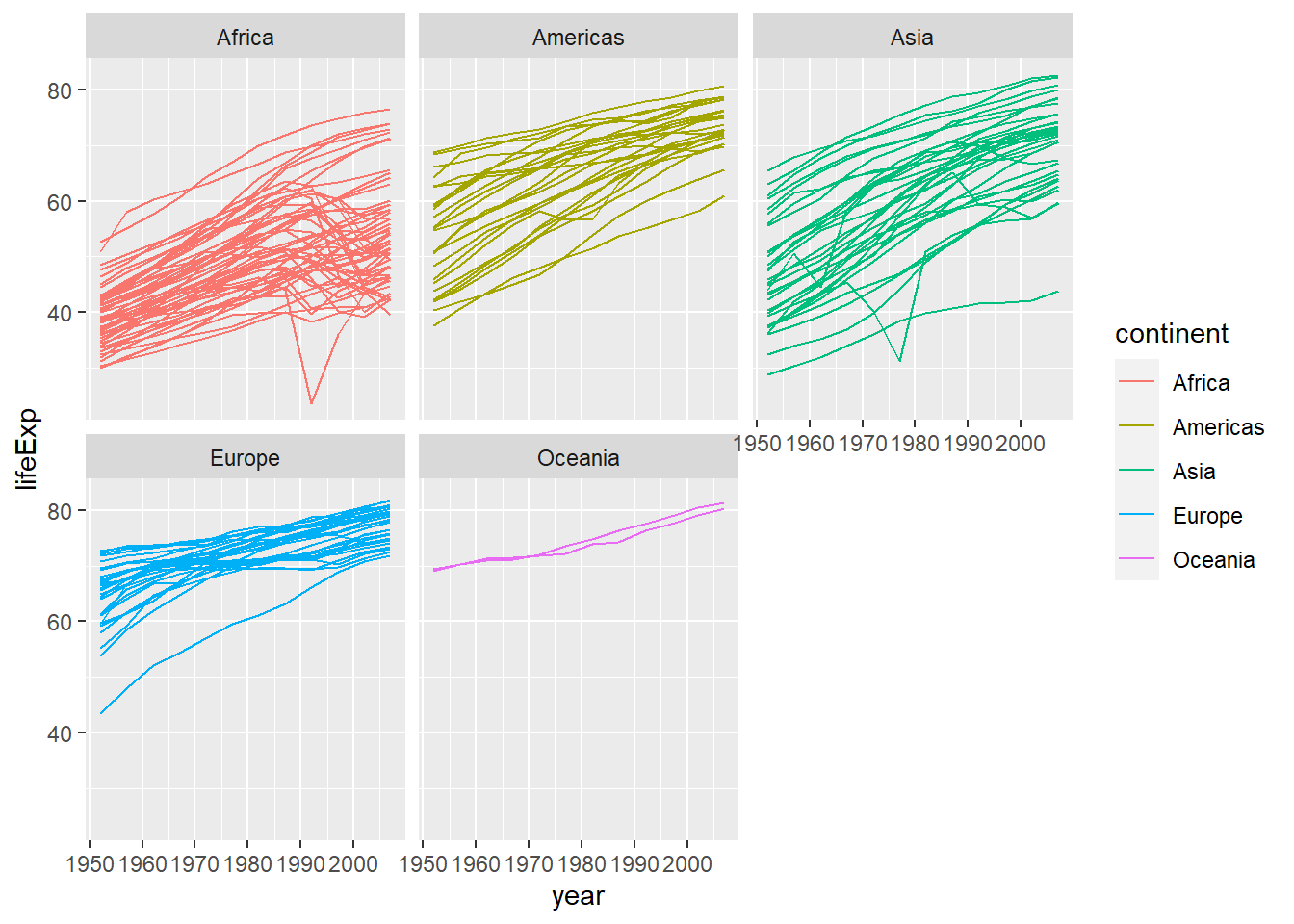
3.3.5 Labels
Labels are also considered to be their own layers in ggplot2. Until now we have seen that our plots had no title, and the labels on axis were just the name of the variables in the dataset gapminder. It is important that plots are well explained and for this we need a good use of labels.
# add x and y axis labels, as well as a title
ggplot(data = gapminder,
       aes(x = gdpPercap, y = lifeExp, colour = continent)) +
  geom_point() +
  xlab("GDP per capita (Int'l $)") + # add label to x-axis. Int'l$ = International dollars
  ylab("Life Expectancy") + # add label to y-axis
  ggtitle("Life expectancy vs GDP") #add title for the entire figure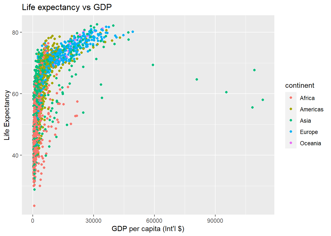
As we did by using R base plot functions, we can modify the x-axis scale to “zoom-in” a range of observations. In the plot above all observations are compressed on the left side, so we could specify a range from 1,000 to 20,000 $ of GDP per capita. But be careful, as by doing so, you are effectively removing all the observations that are outside the specified range.
# limit x axis from 1,000 to 20,000
ggplot(data = gapminder,
       aes(x = gdpPercap, y = lifeExp, colour = continent)) +
  geom_point() +
  xlab("GDP per capita (Int'l $)") + ylab("Life Expectancy") + ggtitle("My fancy graph") +
  xlim(1000, 20000) #Specify the boundaries of the x-axis.
## Warning: Removed 515 rows containing missing values (geom_point).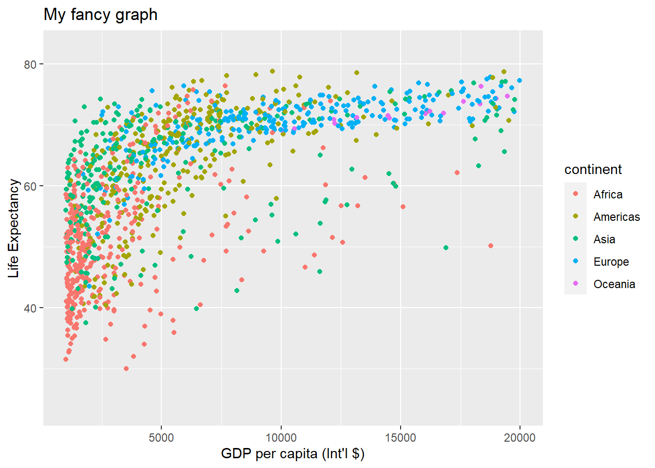
3.3.6 Transformations and Stats (Advanced optional topic)
ggplot also makes it easy to overlay statistical models over the data. To demonstrate we go back to an earlier example:
ggplot(data = gapminder,
       aes(x = gdpPercap, y = lifeExp, colour = continent)) +
  geom_point()+
  xlab("GDP per capita (Int'l $)") + ylab("Life Expectancy") + ggtitle("Scatterplot")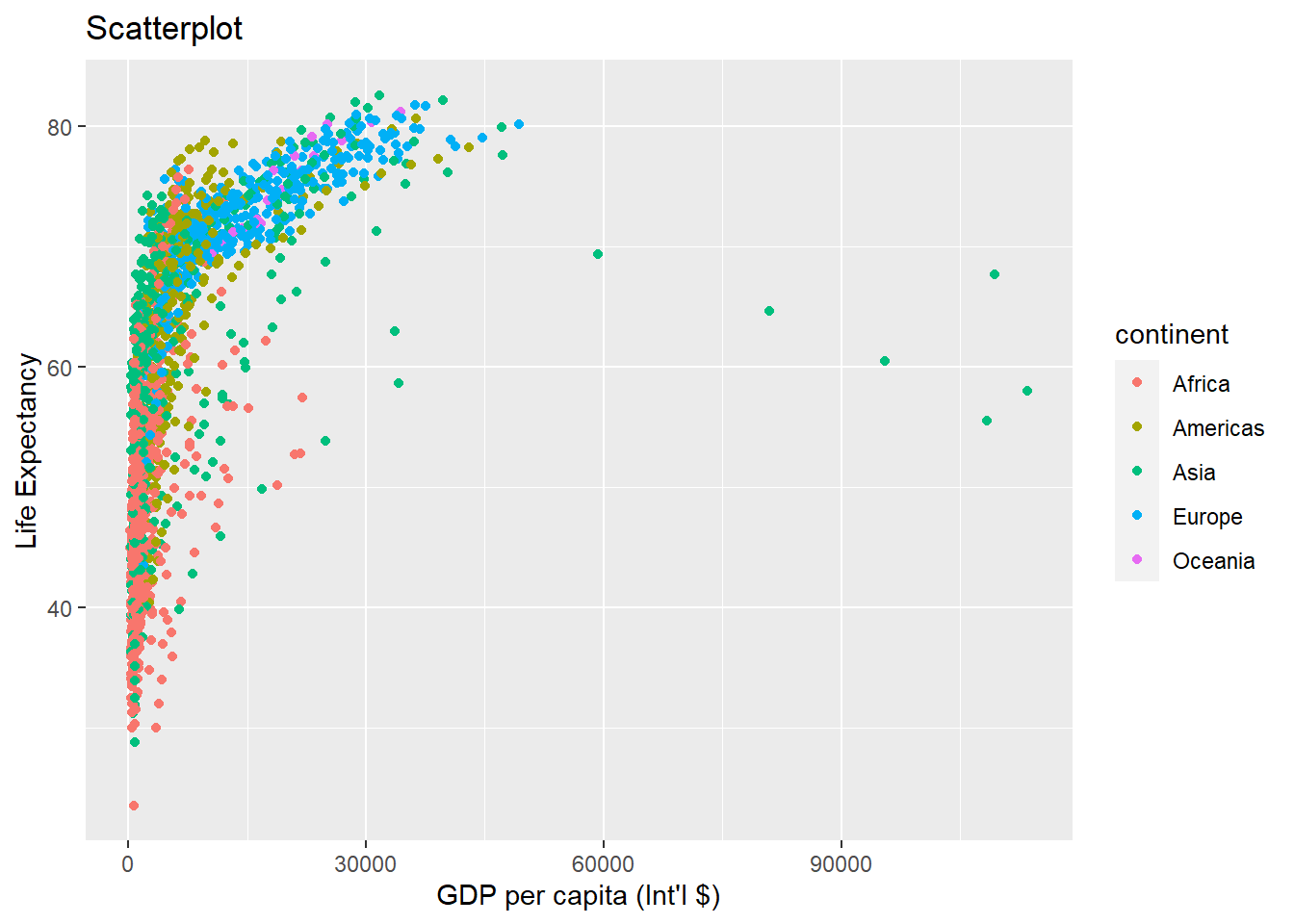
We can change the scale of units on the x-axis using the scale functions. These control the mapping between the data values and visual values of an aesthetic.
ggplot(data = gapminder, aes(x = gdpPercap, y = lifeExp, colour = continent)) +
  geom_point() +
  xlab("GDP per capita (Int'l $)") + ylab("Life Expectancy") +
  ggtitle("Scatterplot - x-axis log trasformation") +
  scale_x_log10() # apply a log10 transformation to values on the x-axis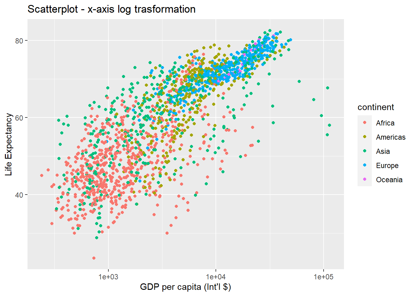
The log10 function applied a transformation to the values of the gdpPercap column before rendering them on the plot, so that each multiple of 10 now only corresponds to an increase in 1 on the transformed scale, e.g. a GDP per capita of 1,000 is now 3 on the y axis, a value of 10,000 corresponds to 4 on the x axis and so on. This makes it easier to visualise the spread of data on the x-axis.
We can fit a simple relationship to the data by adding another layer by geom_smooth. Don’t worry if you can’t follow this as we haven’t yet covered regression analysis yet. Just observe what is happening to the graph at this stage. We will revisit this in the next topic.
ggplot(data = gapminder, aes(x = gdpPercap, y = lifeExp, colour = continent)) +
  geom_point() +
  xlab("GDP per capita (Int'l $)") + ylab("Life Expectancy") +
  ggtitle("Scaterplot - regression lines") +
  scale_x_log10() +
  geom_smooth(method = "lm")
## `geom_smooth()` using formula 'y ~ x'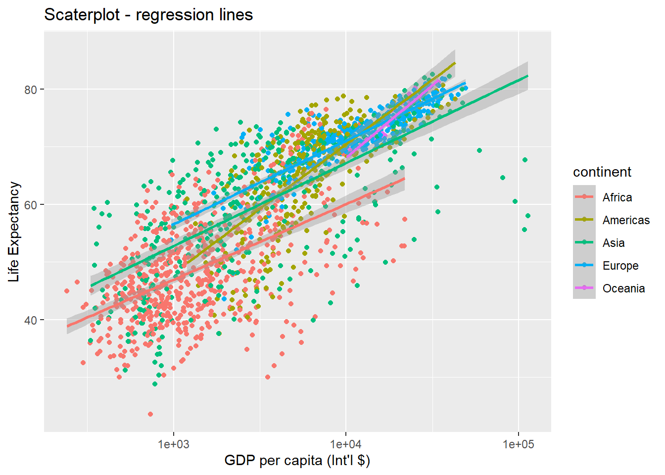
Note that we have 5 lines, one for each region, because the colour option is the global aes function. But if we move the attribute colour to another layer, we get different plot:
ggplot(data = gapminder, aes(x = gdpPercap, y = lifeExp)) +
  geom_point(aes(colour = continent)) + # moved attribute colour to geom_point

  xlab("GDP per capita (Int'l $)") + ylab("Life Expectancy") +
  ggtitle("Scatterplot - 'colour' aes moved to geom_point") +
  scale_x_log10() +
  geom_smooth(method = "lm")
## `geom_smooth()` using formula 'y ~ x'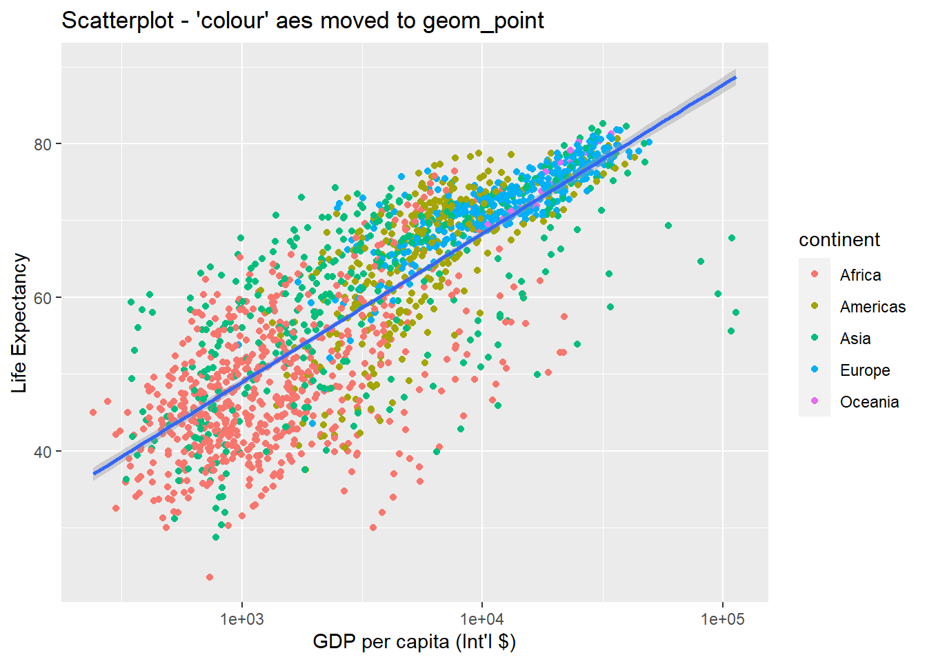
So there are two ways an aesthetic can be specified. Here we set the colour aesthetic by passing it as an argument to geom_point to specify that it needs to be applied only to the points and not globally to entire plot. Previously in the lesson we have used the aes function to define a mapping between data variables and their visual representation.
We can make the line thicker by setting the size aesthetic in the geom_smooth() layer:
ggplot(data = gapminder, aes(x = gdpPercap, y = lifeExp)) +
  geom_point(aes(colour = continent)) +
  scale_x_log10() +
  geom_smooth(method = "lm", size = 1.5)
## `geom_smooth()` using formula 'y ~ x'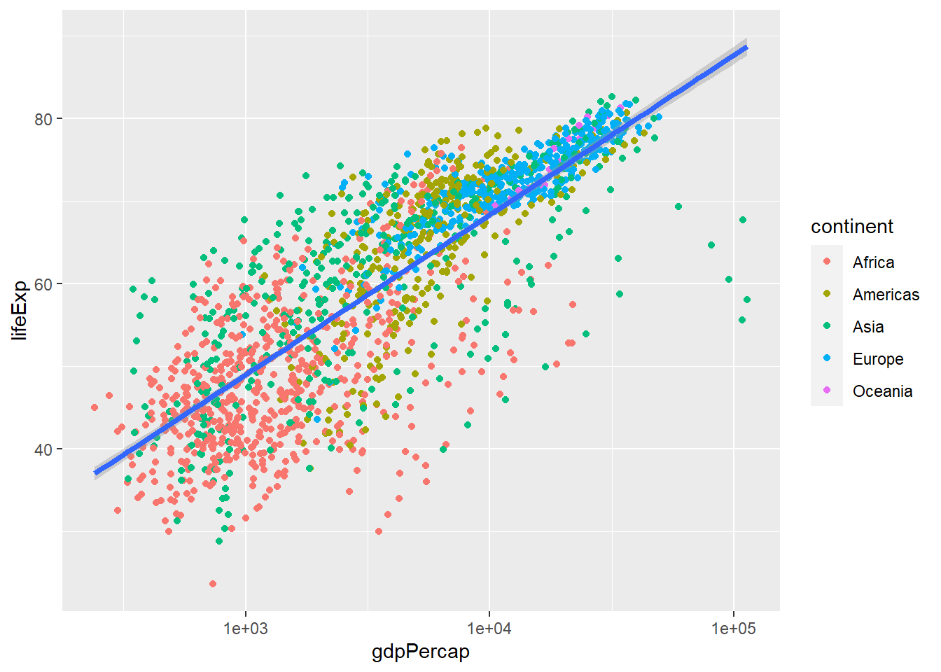
3.3.6.1 Challenge 3
Modify the colour and size of the points on the geom_point layer in the previous example so that they are fixed (i.e., not reflective of continent).
Hint: do not use the aes function.
3.3.7 Going further with ggplot2
This is just a taste of what you can do with ggplot2. RStudio provides a really useful cheatsheet for data visualisation. More extensive documentation is also available on the ggplot2 website. Finally, if you have no idea how to change something, a quick Google search will usually send you to a relevant question and answer on Stack Overflow with reusable code to modify!
Bar plots
# count of lifeExp bins
ggplot(data = gapminder, aes(x = lifeExp)) +
  geom_bar(stat = "bin")+ #geom_bar creates the bar chart
  xlab("Life Expectancy") + ggtitle("Bar chart of life expectancy")
## `stat_bin()` using `bins = 30`. Pick better value with
## `binwidth`.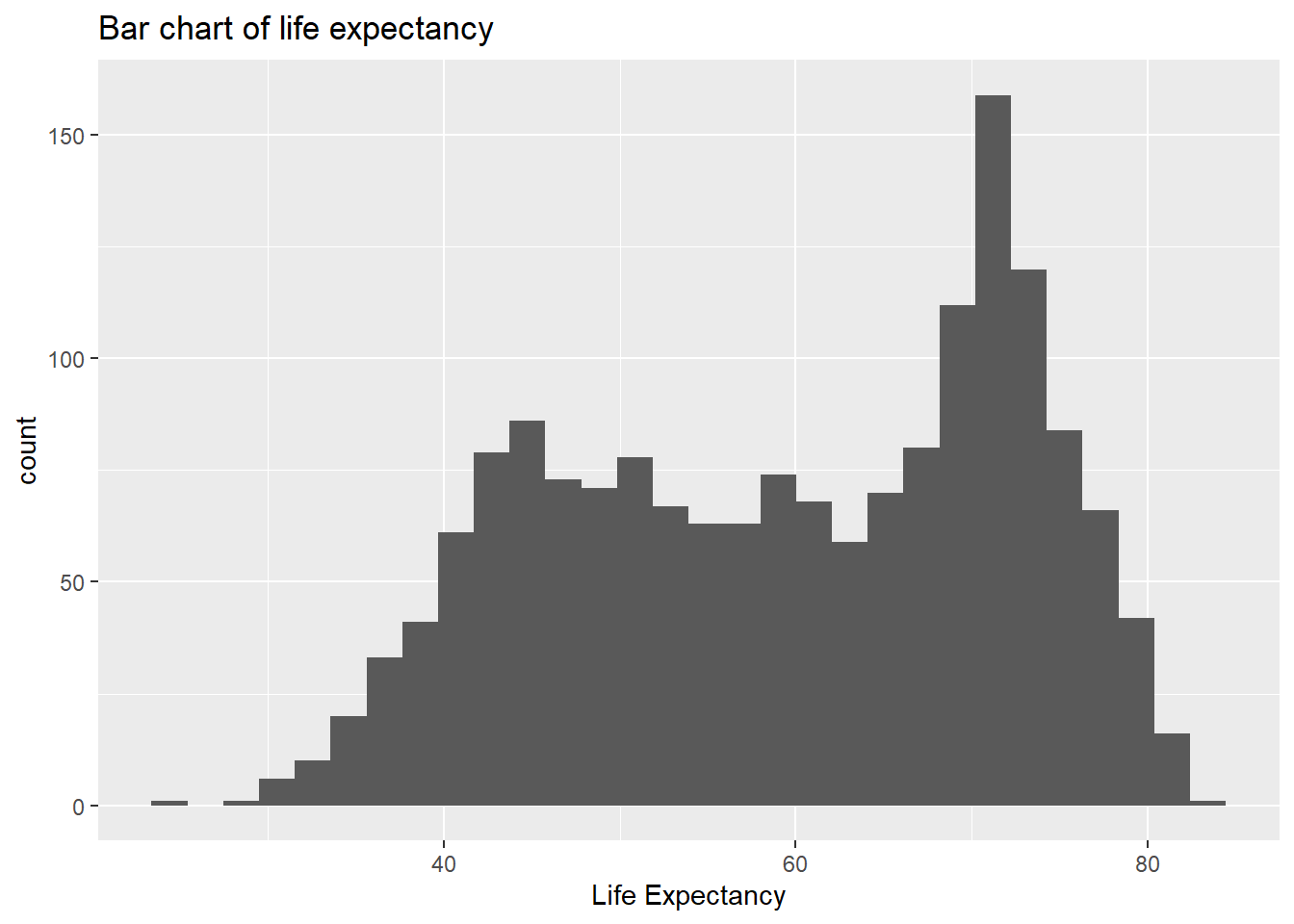
# with colour representing regions
ggplot(data = gapminder, aes(x = lifeExp, fill = continent)) +
  geom_bar(stat = "bin")+
  xlab("Life Expectancy") + ggtitle("Bar chart of life expectancy coloured by continent")
## `stat_bin()` using `bins = 30`. Pick better value with
## `binwidth`.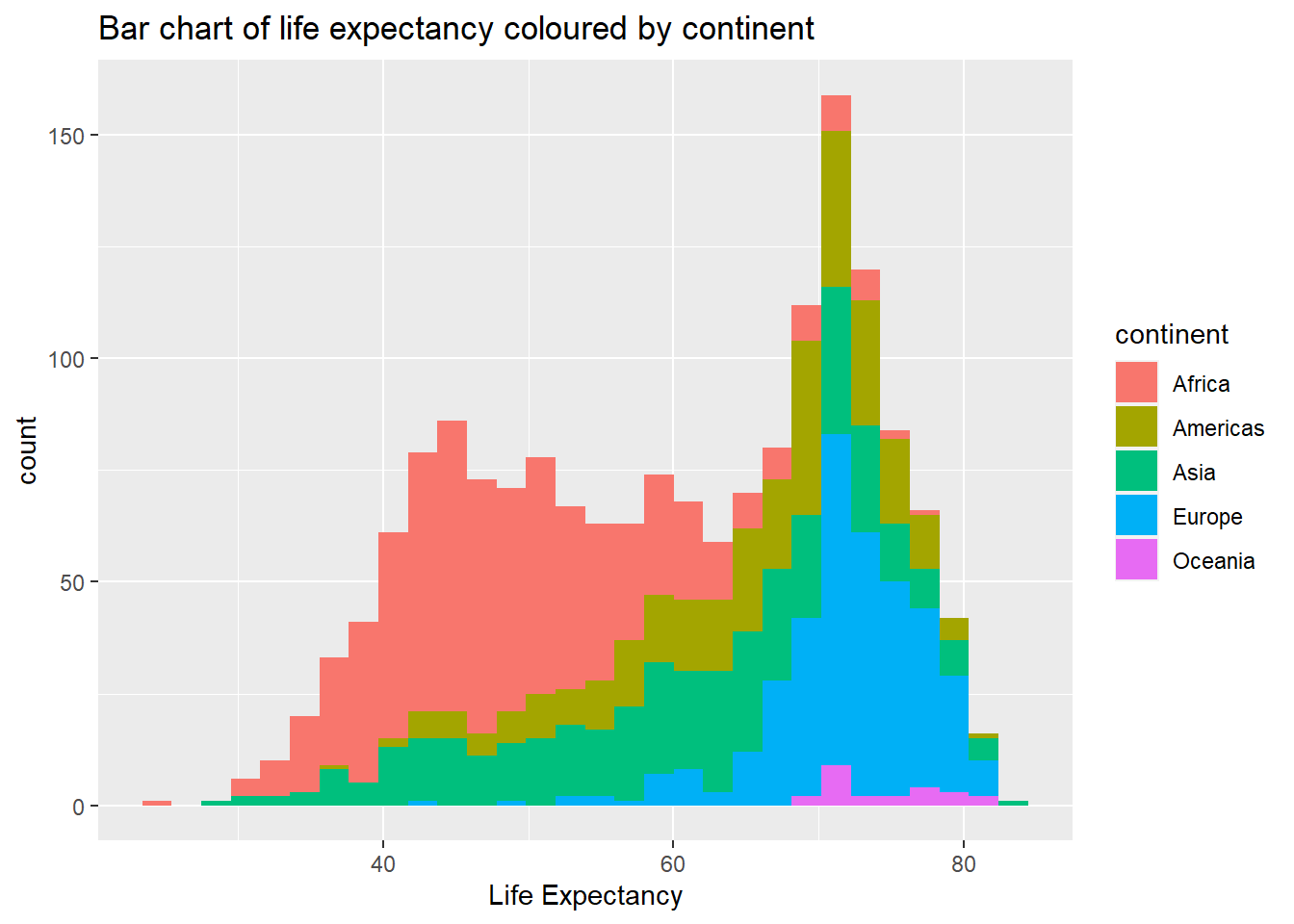
Box plots
ggplot(data = gapminder, aes(x = continent, y = lifeExp)) +
  geom_boxplot()+ # creates box plots
  xlab("Life Expectancy") +
  ggtitle("Box plots of life expectancy in different continents")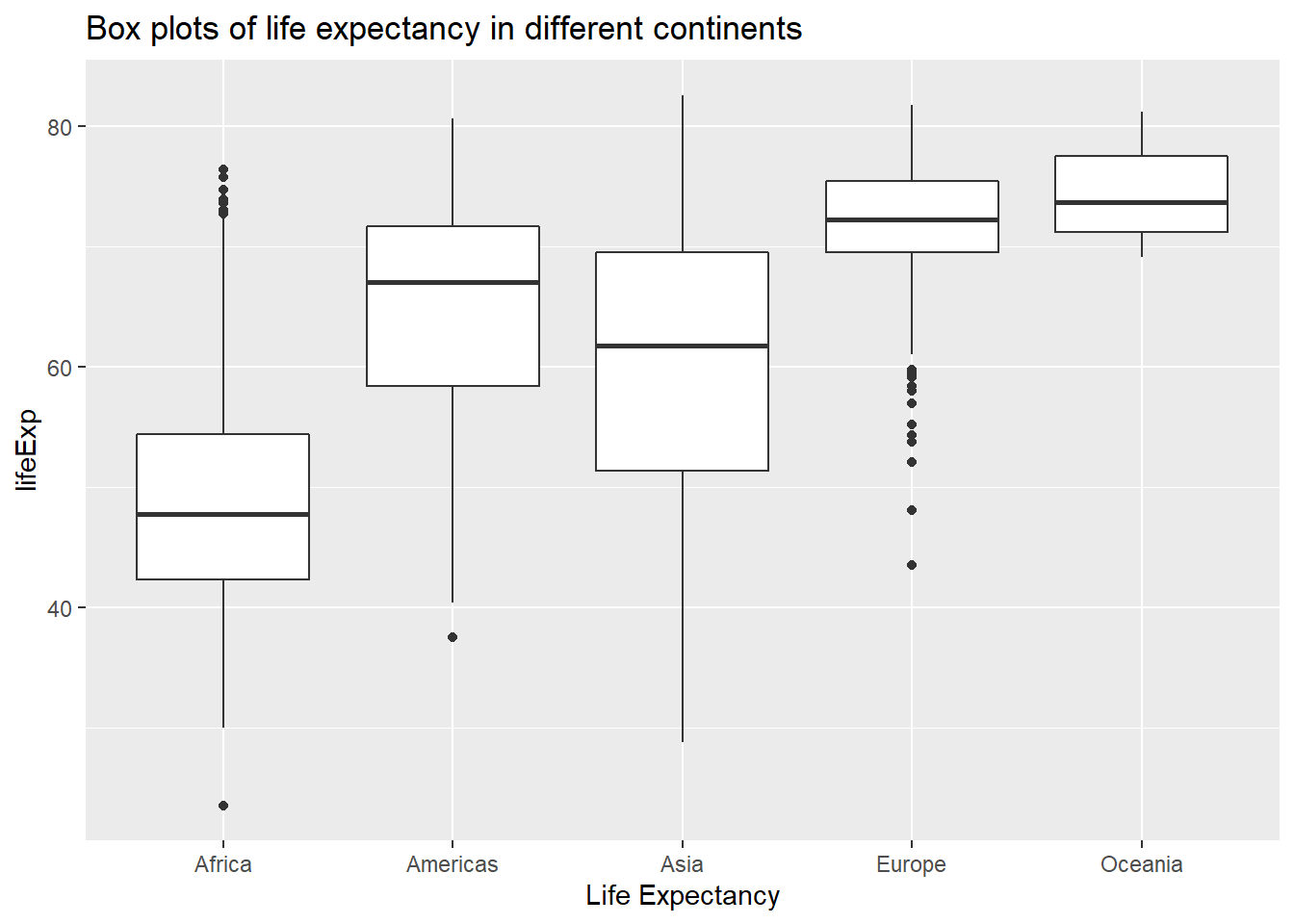
3.3.7.1 Challenge 4
Create a density plot of GDP per capita, filled by continent.
Advanced: - Transform the x-axis to better visualise the data spread. - Add a facet layer to panel the density plots by year.
3.4 Exporting plots
Let’s plot a histogram in base R and save the image in different format.
temperature <- c(77, 71, 71, 78, 67, 76, 68, 82, 64, 71, 81, 69, 63, 70, 77, 75, 76, 68)
hist(temperature, col = "red")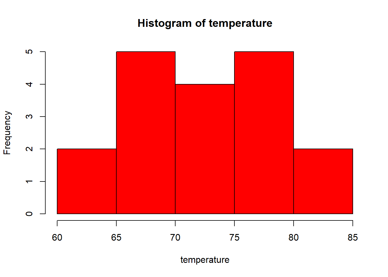
- Save as jpeg or png
jpeg(file = "plot1.jpeg")
hist(temperature, col = "darkgreen")
dev.off()png(file = "plot1.png")
hist(temperature, col = "darkgreen")
dev.off()Note: When you are done with your plotting commands, enter the dev.off() command. This is very important for base R plotting - without it you’ll get a partial plot or nothing at all.
- Save as pdf
pdf(file = "plot1.pdf")
hist(temperature, col = "violet")
dev.off()- Exporting with
ggplot
Assume we saved our plot in an object called example.plot:
ggsave(filename="example.pdf", plot=example.plot, scale=..., width=..., height=...)
ggplot(data = data.frame(temperature), aes(x = temperature)) +
  geom_histogram(color = "black", fill = "red", binwidth = 4)

#Now let's save using a separate command
ggsave(filename = "plot3.pdf", width = 20, height = 20)
Let’s have another example from the gapminder data.
ggplot(data = gapminder, aes(x = continent, y = lifeExp)) + geom_boxplot()

# Let's save the plot to your working directory.
ggsave(filename = "figure1.pdf", width=20, height = 20)
Note: This plot is saved to your working directory. If you don’t remember your working directory, just type getwd() and run. If you want to change this working directory, you can simply use: setwd("....."). Remember to put the new location of the working directory in parentheses. For example, if you have a folder called Statistics on your desktop, you can use: setwd("C:/Desktop/Statistics").
3.5 Descriptive Statistics
It is important to describe data quantitatively and summarise its features using its central tendency and variability measures. This is what we are going to practise in this session.
Remember, we use the dplyr package to investigate the data in the previous session. So, make sure you have it installed using install.packages("dplyr") and loaded by library(dplyr).
We can summarise the data using the summarise function of the dplyr package. We can calculate as many statistics as we want using this function, and just string along the results. Some of the functions below should be self explanatory (like mean, median, sd, IQR, min, and max). You can use them individually or combined, as in the example below.
A new function here is the quantile function which we can use to calculate values corresponding to specific percentile cutoffs in the distribution. For example quantile(x, 0.25) will yield the cutoff value for the 25th percentile (Q1) in the distribution of x. Finding these values are useful for describing the distribution, as we can use them for descriptions like “the middle 50% of the life expectancy”.
We will use the gapminder dataset again. Before summarising the data, let’s have a glimpse of it first:
glimpse(gapminder)## Rows: 1,704
## Columns: 6
## $ country <chr> "Afghanistan", "Afghanistan", "Afghanistan", ~
## $ year <int> 1952, 1957, 1962, 1967, 1972, 1977, 1982, 198~
## $ pop <dbl> 8425333, 9240934, 10267083, 11537966, 1307946~
## $ continent <chr> "Asia", "Asia", "Asia", "Asia", "Asia", "Asia~
## $ lifeExp <dbl> 28.801, 30.332, 31.997, 34.020, 36.088, 38.43~
## $ gdpPercap <dbl> 779.4453, 820.8530, 853.1007, 836.1971, 739.9~Now that we refreshed our knowledge about this dataset by briefly looking at the variables, we can summarise variables in this dataset. Let’s start with the variable called life expectancy.
gapminder %>%
  summarise(count = n(),
            mu = mean(lifeExp),
            pop_med = median(lifeExp),
            sigma = sd(lifeExp), pop_iqr = IQR(lifeExp),
            pop_min = min(lifeExp), pop_max = max(lifeExp),
            pop_q1 = quantile(lifeExp, 0.25),  # first quartile, 25th percentile
            pop_q3 = quantile(lifeExp, 0.75))  # third quartile, 75th percentile
## count mu pop_med sigma pop_iqr pop_min pop_max pop_q1
## 1 1704 59.47444 60.7125 12.91711 22.6475 23.599 82.603 48.198
## pop_q3
## 1 70.8455# OR just use:
summary(gapminder) ## country year pop
## Length:1704 Min. :1952 Min. :6.001e+04
## Class :character 1st Qu.:1966 1st Qu.:2.794e+06
## Mode :character Median :1980 Median :7.024e+06
## Mean :1980 Mean :2.960e+07
## 3rd Qu.:1993 3rd Qu.:1.959e+07
## Max. :2007 Max. :1.319e+09
## continent lifeExp gdpPercap
## Length:1704 Min. :23.60 Min. : 241.2
## Class :character 1st Qu.:48.20 1st Qu.: 1202.1
## Mode :character Median :60.71 Median : 3531.8
## Mean :59.47 Mean : 7215.3
## 3rd Qu.:70.85 3rd Qu.: 9325.5
## Max. :82.60 Max. :113523.1We can also find the descriptive statistics by a group variable. Let’s find the same summary statistics by continents for lifeExp and gdpPercap:
gapminder %>%
group_by(continent) %>%  # group by continent
summarise(count = n(),
            mu = mean(lifeExp),
            pop_med = median(lifeExp),
            sigma = sd(lifeExp), pop_iqr = IQR(lifeExp),
            pop_min = min(lifeExp), pop_max = max(lifeExp),
            pop_q1 = quantile(lifeExp, 0.25),  # first quartile, 25th percentile
            pop_q3 = quantile(lifeExp, 0.75))  # third quartile, 75th percentile
## # A tibble: 5 x 10
## continent count mu pop_med sigma pop_iqr pop_min pop_max
## <chr> <int> <dbl> <dbl> <dbl> <dbl> <dbl> <dbl>
## 1 Africa 624 48.9 47.8 9.15 12.0 23.6 76.4
## 2 Americas 300 64.7 67.0 9.35 13.3 37.6 80.7
## 3 Asia 396 60.1 61.8 11.9 18.1 28.8 82.6
## 4 Europe 360 71.9 72.2 5.43 5.88 43.6 81.8
## 5 Oceania 24 74.3 73.7 3.80 6.35 69.1 81.2
## # ... with 2 more variables: pop_q1 <dbl>, pop_q3 <dbl>gapminder %>%
group_by(continent) %>% # group by continent
summarise(count = n(),
mu = mean(gdpPercap),
pop_med = median(gdpPercap),
sigma = sd(gdpPercap), pop_iqr = IQR(gdpPercap),
pop_min = min(gdpPercap), pop_max = max(gdpPercap),
pop_q1 = quantile(gdpPercap, 0.25), # first quartile, 25th percentile
pop_q3 = quantile(gdpPercap, 0.75)) # third quartile, 75th percentile## # A tibble: 5 x 10
## continent count mu pop_med sigma pop_iqr pop_min pop_max
## <chr> <int> <dbl> <dbl> <dbl> <dbl> <dbl> <dbl>
## 1 Africa 624 2194. 1192. 2828. 1616. 241. 21951.
## 2 Americas 300 7136. 5466. 6397. 4402. 1202. 42952.
## 3 Asia 396 7902. 2647. 14045. 7492. 331 113523.
## 4 Europe 360 14469. 12082. 9355. 13248. 974. 49357.
## 5 Oceania 24 18622. 17983. 6359. 8072. 10040. 34435.
## # ... with 2 more variables: pop_q1 <dbl>, pop_q3 <dbl>Well done! You have now completed the Session 3 practical. Please go back to the lecture platform and take your R-practical test.