Chapter 7 Lab 5 - 25/10/2022
In this lecture we will learn two other dplyr verbs and the ggplot2 library which is used to produce very nice plots. The final part is dedicated to the import of data from an external csv file.
We will use the diamods data from the tidyverse package:
library(tidyverse)
head(diamonds)
## # A tibble: 6 × 10
## carat cut color clarity depth table price x y z
## <dbl> <ord> <ord> <ord> <dbl> <dbl> <int> <dbl> <dbl> <dbl>
## 1 0.23 Ideal E SI2 61.5 55 326 3.95 3.98 2.43
## 2 0.21 Premium E SI1 59.8 61 326 3.89 3.84 2.31
## 3 0.23 Good E VS1 56.9 65 327 4.05 4.07 2.31
## 4 0.29 Premium I VS2 62.4 58 334 4.2 4.23 2.63
## 5 0.31 Good J SI2 63.3 58 335 4.34 4.35 2.75
## 6 0.24 Very Good J VVS2 62.8 57 336 3.94 3.96 2.487.1 An alternative approach for getting a frequency distribution
In the previous lab we derived the absolute and percentage distribution by using the function n() combined with group_by:
diamonds %>%
  group_by(cut) %>%
  summarise(AbsFreq = n(), #absolute frequencies
            Perc = AbsFreq/nrow(diamonds)*100) #%
## # A tibble: 5 × 3
## cut AbsFreq Perc
## <ord> <int> <dbl>
## 1 Fair 1610 2.98
## 2 Good 4906 9.10
## 3 Very Good 12082 22.4
## 4 Premium 13791 25.6
## 5 Ideal 21551 40.0A shorter alternative for computing the frequency table is given by the count function which count the unique values of one or more variables. Basically, df %>% count(a, b) is equivalent to df %>% group_by(a, b) %>% summarise(n = n()). Here below we have an example:
diamonds %>%
  count(cut)
## # A tibble: 5 × 2
## cut n
## <ord> <int>
## 1 Fair 1610
## 2 Good 4906
## 3 Very Good 12082
## 4 Premium 13791
## 5 Ideal 215517.2 Verb 5: mutate
The verb mutate can be used to create new column in the data frame. For example, let’s create a new column containing the price per unit defined previously. Moreover, we want
this variable to be saved in the data frame (for this reason we create a new object named diamonds which substitutes its previous version):
diamonds = diamonds %>%
  mutate(priceunit = price/carat)
dim(diamonds)
## [1] 53940 11We now want to create a new categorical variables with two categories:
“Yes” if the price is < 1000$, “No” otherwise. For doing this we will make use of the
ifelse function, already introduced in Section 5.5. We will call the new column as pricecat and will save the new data frame (with one more column) in a new object named newdiamonds:
newdiamonds = diamonds %>%
  mutate(pricecat = ifelse(price < 1000, "Yes", "No"))
To derive the frequency distribution of pricecat we proceed as described above, computing also percentages by means of mutate:
newdiamonds %>%
  count(pricecat) %>%
  #summarise(perc=n/nrow(newdiamonds)*100)
  mutate(perc=n/nrow(newdiamonds)*100)
## # A tibble: 2 × 3
## pricecat n perc
## <chr> <int> <dbl>
## 1 No 39441 73.1
## 2 Yes 14499 26.97.3 Verb 6: arrange
The verb arrange can be used to sort observations with respect to the values of a given variable. For example, we can sort diamonds according to price (by default the ascending order is adopted):
diamonds %>%
  arrange(price) %>%
  tail
## # A tibble: 6 × 11
## carat cut color clarity depth table price x y z priceunit
## <dbl> <ord> <ord> <ord> <dbl> <dbl> <int> <dbl> <dbl> <dbl> <dbl>
## 1 2.29 Premium I SI1 61.8 59 18797 8.52 8.45 5.24 8208.
## 2 2 Very Good H SI1 62.8 57 18803 7.95 8 5.01 9402.
## 3 2.07 Ideal G SI2 62.5 55 18804 8.2 8.13 5.11 9084.
## 4 1.51 Ideal G IF 61.7 55 18806 7.37 7.41 4.56 12454.
## 5 2 Very Good G SI1 63.5 56 18818 7.9 7.97 5.04 9409
## 6 2.29 Premium I VS2 60.8 60 18823 8.5 8.47 5.16 8220.With the function tail we have a preview of the 6 bottom lines which contains, in this case, the diamonds with the highest price.
If we need to use a descending ordering we will use the - inside arrange:
diamonds %>%
  arrange(- price)
## # A tibble: 53,940 × 11
## carat cut color clarity depth table price x y z priceunit
## <dbl> <ord> <ord> <ord> <dbl> <dbl> <int> <dbl> <dbl> <dbl> <dbl>
## 1 2.29 Premium I VS2 60.8 60 18823 8.5 8.47 5.16 8220.
## 2 2 Very Good G SI1 63.5 56 18818 7.9 7.97 5.04 9409
## 3 1.51 Ideal G IF 61.7 55 18806 7.37 7.41 4.56 12454.
## 4 2.07 Ideal G SI2 62.5 55 18804 8.2 8.13 5.11 9084.
## 5 2 Very Good H SI1 62.8 57 18803 7.95 8 5.01 9402.
## 6 2.29 Premium I SI1 61.8 59 18797 8.52 8.45 5.24 8208.
## 7 2.04 Premium H SI1 58.1 60 18795 8.37 8.28 4.84 9213.
## 8 2 Premium I VS1 60.8 59 18795 8.13 8.02 4.91 9398.
## 9 1.71 Premium F VS2 62.3 59 18791 7.57 7.53 4.7 10989.
## 10 2.15 Ideal G SI2 62.6 54 18791 8.29 8.35 5.21 8740
## # … with 53,930 more rowsLet’s now use the arrange function in order to sort the categories of a factor (cut) according to the corresponding frequencies:
diamonds %>%
  group_by(cut) %>%
  summarise(freq = n()) %>%
  arrange(desc(freq))
## # A tibble: 5 × 2
## cut freq
## <ord> <int>
## 1 Ideal 21551
## 2 Premium 13791
## 3 Very Good 12082
## 4 Good 4906
## 5 Fair 1610It can be also useful to visualize a given number or proportion observations with the highest/lowest values of a given variable. The following code for example extract first the 10 observations with the highest values of carat (using slice_max) and among them the 50% of the observations with the lowest price (with slice_min):
diamonds %>%
  slice_max(carat, n=10) %>%
  slice_min(price, prop=0.5)
## # A tibble: 5 × 11
## carat cut color clarity depth table price x y z priceunit
## <dbl> <ord> <ord> <ord> <dbl> <dbl> <int> <dbl> <dbl> <dbl> <dbl>
## 1 3.65 Fair H I1 67.1 53 11668 9.53 9.48 6.38 3197.
## 2 3.5 Ideal H I1 62.8 57 12587 9.65 9.59 6.03 3596.
## 3 4.01 Premium I I1 61 61 15223 10.1 10.1 6.17 3796.
## 4 4.01 Premium J I1 62.5 62 15223 10.0 9.94 6.24 3796.
## 5 4 Very Good I I1 63.3 58 15984 10.0 9.94 6.31 39967.4 The ggplot2 library
The ggplot2 is part of the tidyverse collection of packages. The grammar of graphics plot (ggplot) is an alternative to standard R functions for plotting; see here for the ggplot2 website. In Figure 7.1-7.3 we have some examples of plot (simple scatterplot, scatterplot with legend and boxplots) produced using standard R code and the ggplot2 library.
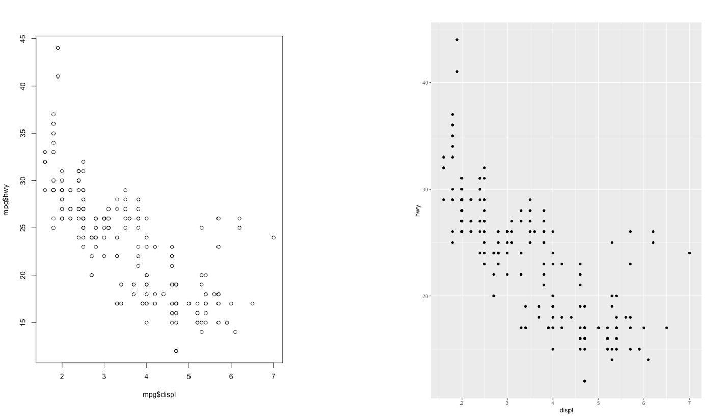
Figure 7.1: Comparison between standard and ggplot2 plots
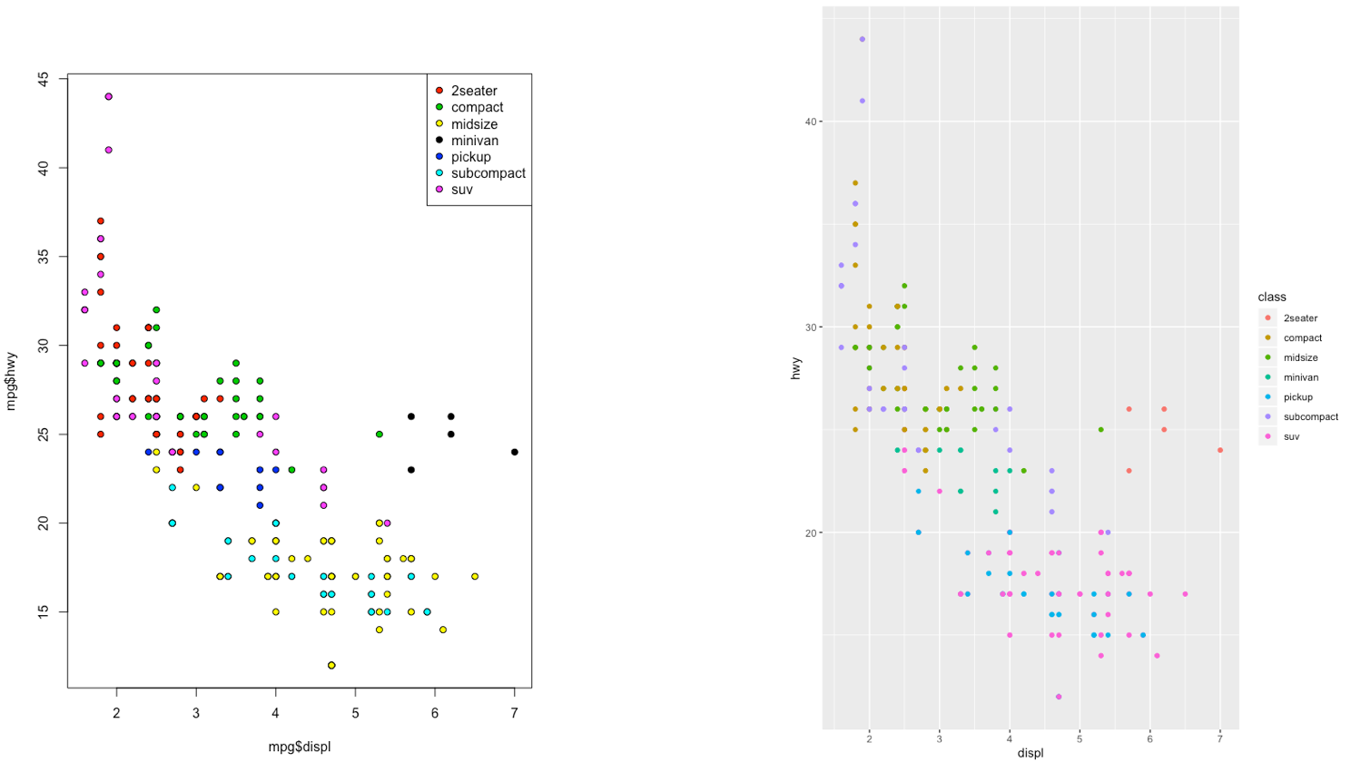
Figure 7.2: Comparison between standard and ggplot2 plots
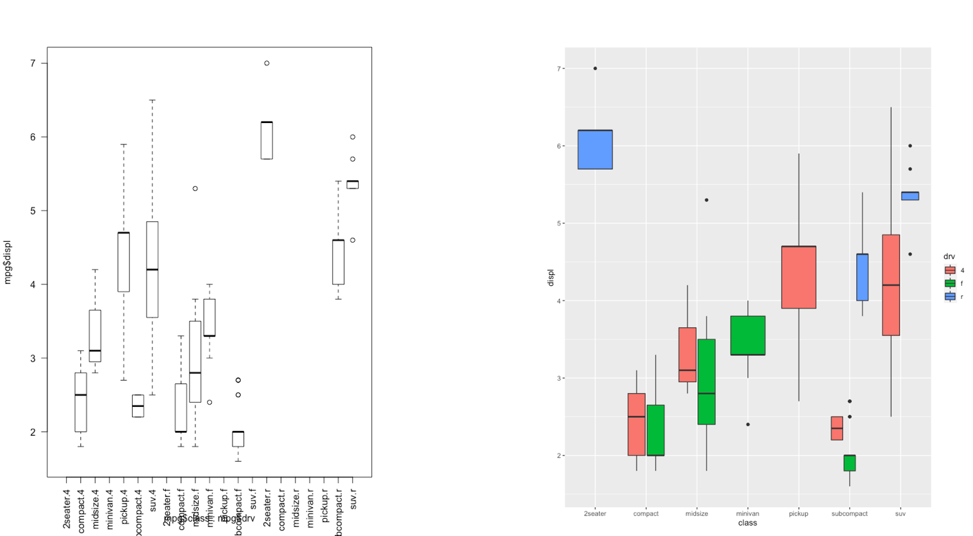
Figure 7.3: Comparison between standard and ggplot2 plots
With ggplot2 a plot is defined by several layers, as shown in Figure 7.4. The first layer specifies the coordinate system, then we can have several geometries each with an aesthetics specification.
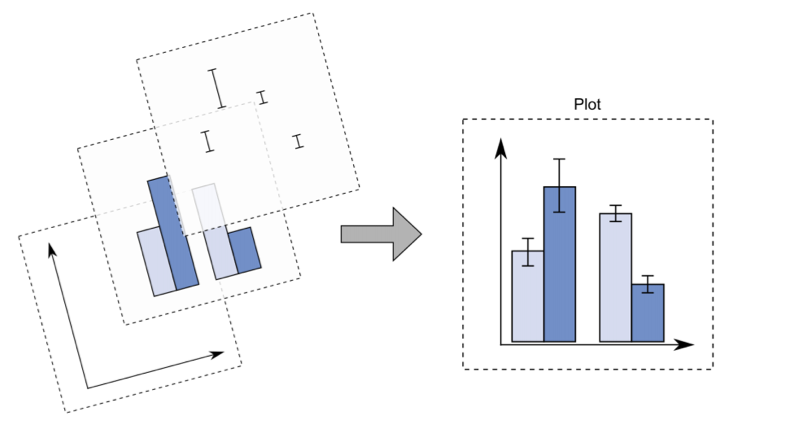
Figure 7.4: The layer structure of the ggplot2 plot
I suggest to download from here the ggplot2 cheat sheet.
7.5 Data subsetting and the ggplot function
Instead of working with the entire diamonds data set, as done in Lecture 4, we will create a smaller data set by sampling randomly 1% of the diamonds by means of the function slice_sample. As this is a random procedure we set, as usual, the seed in order to have a reproducible outcome. The new (smaller) data set will be called mydiamonds:
library(tidyverse)
set.seed(4)
mydiamonds = slice_sample(diamonds, prop=0.01)
glimpse(mydiamonds)
## Rows: 539
## Columns: 11
## $ carat <dbl> 0.72, 1.52, 0.32, 1.10, 1.34, 0.31, 0.26, 0.70, 0.36, 0.37, …
## $ cut <ord> Ideal, Good, Premium, Premium, Ideal, Very Good, Ideal, Prem…
## $ color <ord> E, J, G, J, H, G, I, G, E, D, I, H, E, D, G, I, G, G, E, H, …
## $ clarity <ord> VS2, VS2, SI1, VS2, SI1, VVS1, VS2, SI1, VS1, SI1, VS1, VS2,…
## $ depth <dbl> 62.8, 63.3, 61.0, 61.2, 62.4, 63.0, 62.0, 61.8, 60.9, 62.7, …
## $ table <dbl> 57, 56, 61, 57, 54, 56, 56, 59, 57, 58, 60, 61, 59, 56, 54, …
## $ price <int> 2835, 7370, 612, 3696, 7659, 710, 385, 2184, 782, 874, 6279,…
## $ x <dbl> 5.71, 7.27, 4.41, 6.66, 7.05, 4.26, 4.13, 5.68, 4.60, 4.58, …
## $ y <dbl> 5.73, 7.33, 4.38, 6.61, 7.08, 4.28, 4.09, 5.59, 4.63, 4.55, …
## $ z <dbl> 3.59, 4.62, 2.68, 4.06, 4.41, 2.69, 2.55, 3.48, 2.81, 2.86, …
## $ priceunit <dbl> 3937.500, 4848.684, 1912.500, 3360.000, 5715.672, 2290.323, …The most important function of the ggplot2 library is the ggplot function.
All ggplot plots begin with a call to ggplot supplying the data:
ggplot(data = …) +
  geom_function(mapping = aes(…))
where geom_function is a generic function for a geometry layer; see here for the list of all the available geometries.
For starting a new empty plot we can proceed by using one of the following codes:
ggplot(data=mydiamonds)
ggplot(mydiamonds) #the argument name can be omitted
mydiamonds %>%
  ggplot() #using the pipe
To add components and layers to the empty plot we will use the + symbol.
7.5.1 Scatterplot
We begin with a scatterplot displaying price on the y-axis and carat on the x-axis; the necessary geometry is implemented with geom_point:
mydiamonds %>%
ggplot() +
geom_point(mapping = aes(x=carat,y=price))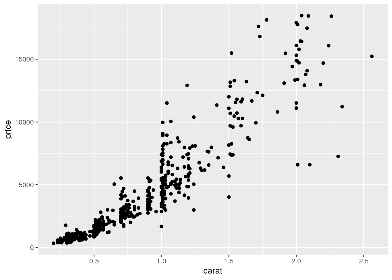 The argument
 mapping specifies the set of aesthetic mappings, created by aes, which describe the visual characteristics that represent the data, e.g. position, size, color, shape, transparency, fill, etc. Remember that the argument name can always be omitted. From the scatterplot we observe that a positive non linear relationship exists between carat and price.
It is also possible to specify a color for all the points as for example red:
mydiamonds %>%
ggplot() +
geom_point(aes(x=carat,y=price),
col="red")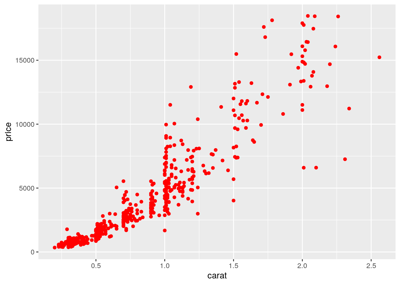 When the color is the same for all the points it is placed outside of
 aes() and is specified by quotes. A different case is when we have a different color for each point according, for example, to the corresponding category of the variable cut. In this case the color specification is included inside aes():
mydiamonds %>%
ggplot() +
geom_point(aes(x=carat,y=price,color=cut))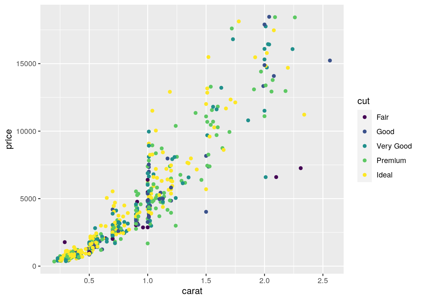 Note that automatically a legend is added that explains which level corresponds to each color. From the plot we do not observe a clear clustering of the diamonds according to their quality.
There is also the possibility to set the color according to a condition, e.g. cut == "Premium":
mydiamonds %>%
ggplot() +
geom_point(aes(x=carat, y=price,
color = (cut=="Premium")))+
labs(color = "Premium cut")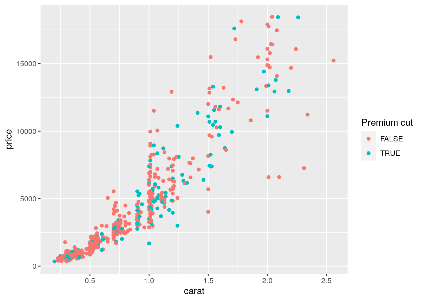 In this case the red color is used when the condition is false, and the blue (kind of) color when it is true.
It is also possible to set a different shape - instead of points - according to the categories of cut:
mydiamonds %>%
  ggplot() +
  geom_point(aes(x=carat,y=price,shape=cut),
             color="blue")
## Warning: Using shapes for an ordinal variable is not advised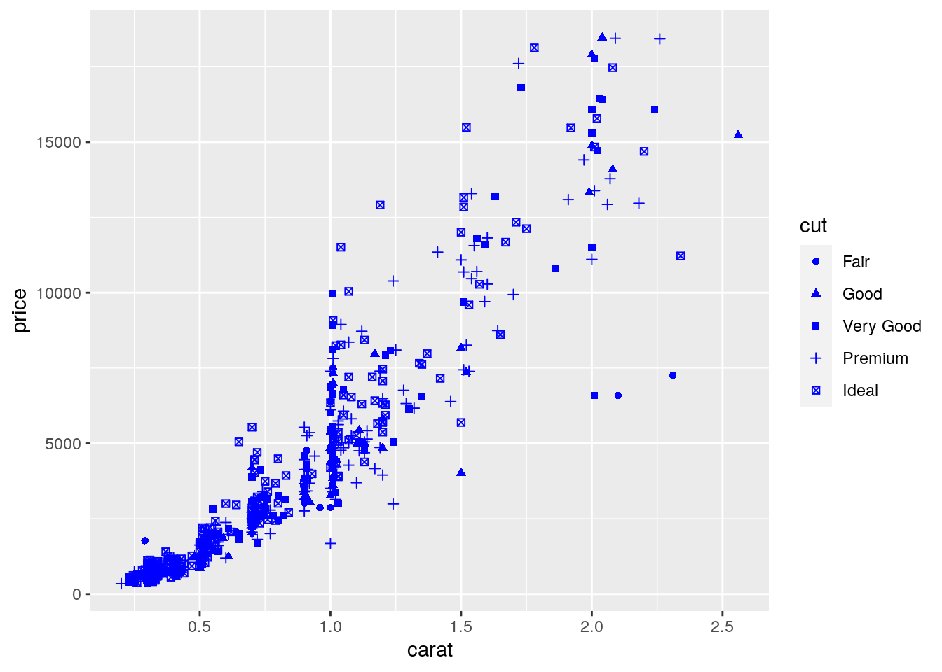
And it is also possible to use different sizes for each point according for example to the categories of clarity:
mydiamonds %>%
  ggplot() +
  geom_point(aes(x=carat, y=price, col=cut, size=clarity))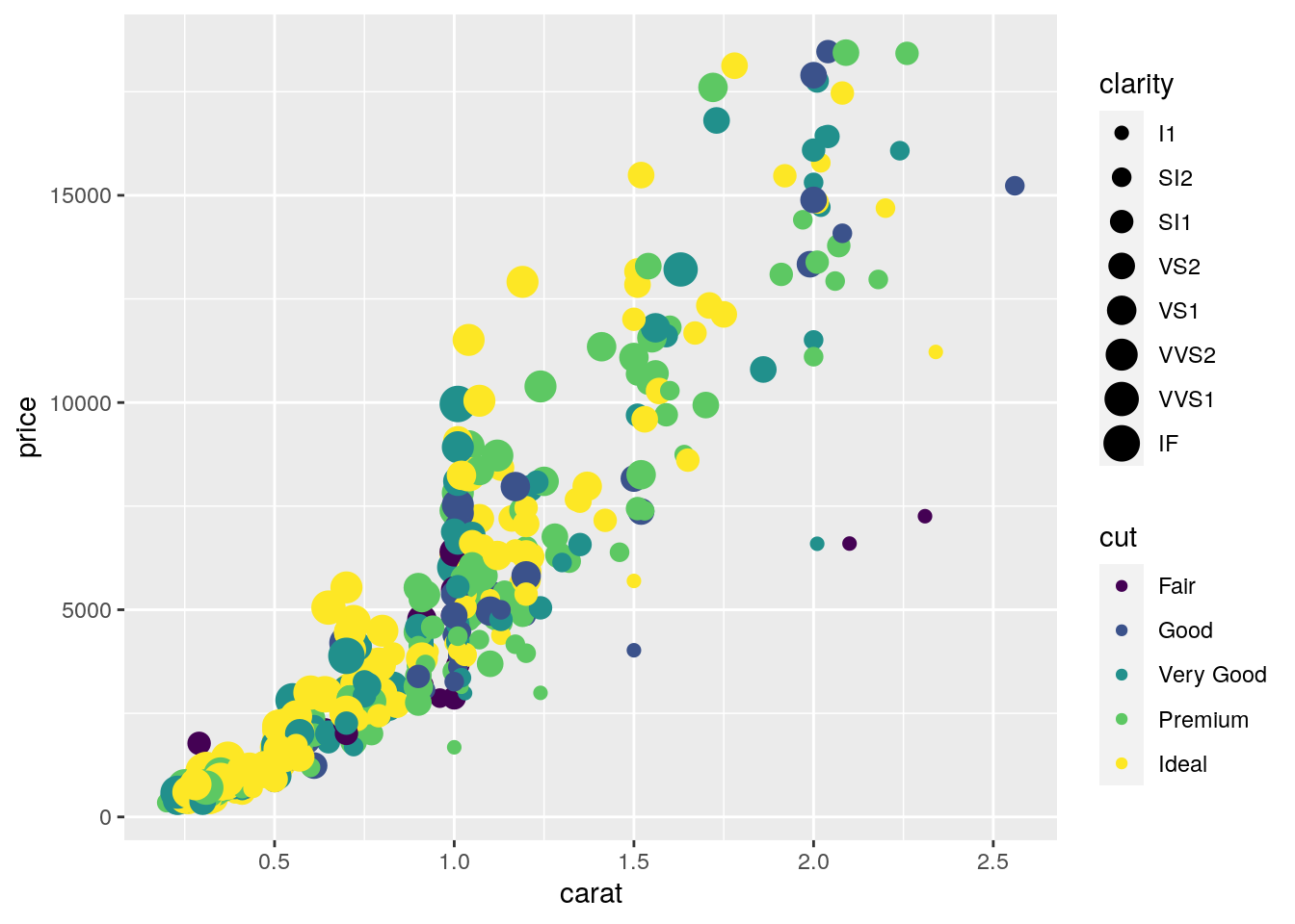
Finally, an alternative for considering the distribution of carat and price conditionally on cut is to produce 5 separate scatterplots according to the 5 categories of cut. In this case we use the facet which defines how data are split among panels. The default facet puts all the data in a single panel, while facet_wrap() and
facet_grid() allow you to specify different types of small multiple plot.
mydiamonds %>%
  ggplot() +
  geom_point(aes(x=carat,y=price)) +
  geom_smooth(aes(x=carat,y=price)) +
  facet_wrap(~cut)
## `geom_smooth()` using method = 'loess' and formula 'y ~ x'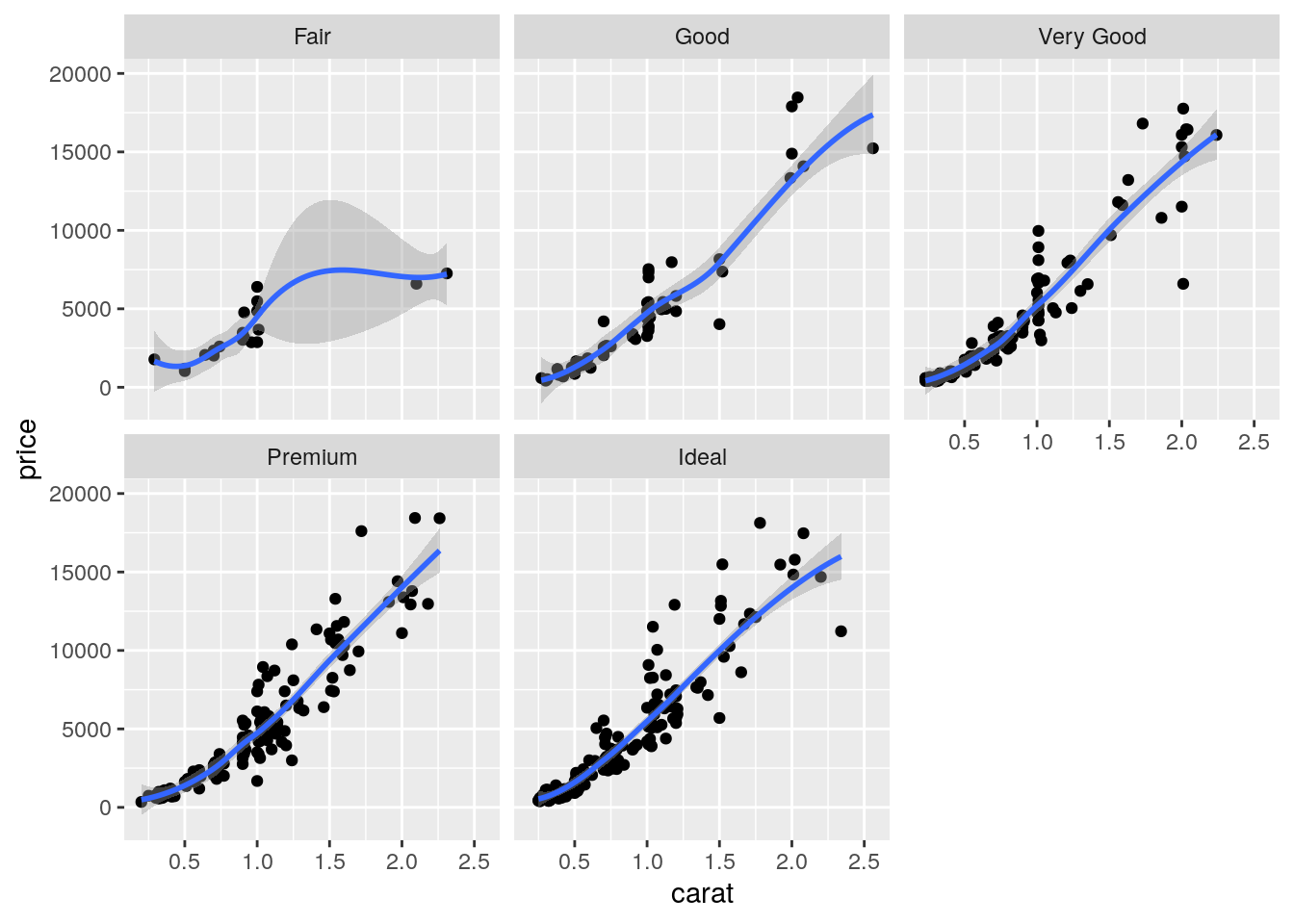
Note that in all the facets reported in the previous plot a new geometry (a new layer) has been included by means of geom_smooth, which adds in the plot a smooth line that can be ease the interpretation of the pattern in the plots. If we want to have a linear line we can use the input method="lm". Moreover, note that the two layers share the same aes() specification which can thus be provided once in the main ggplot() function:
mydiamonds %>%
  ggplot(aes(x=carat,y=price)) +
  geom_point() +
  geom_smooth(method="lm") +
  facet_wrap(~cut)
## `geom_smooth()` using formula 'y ~ x'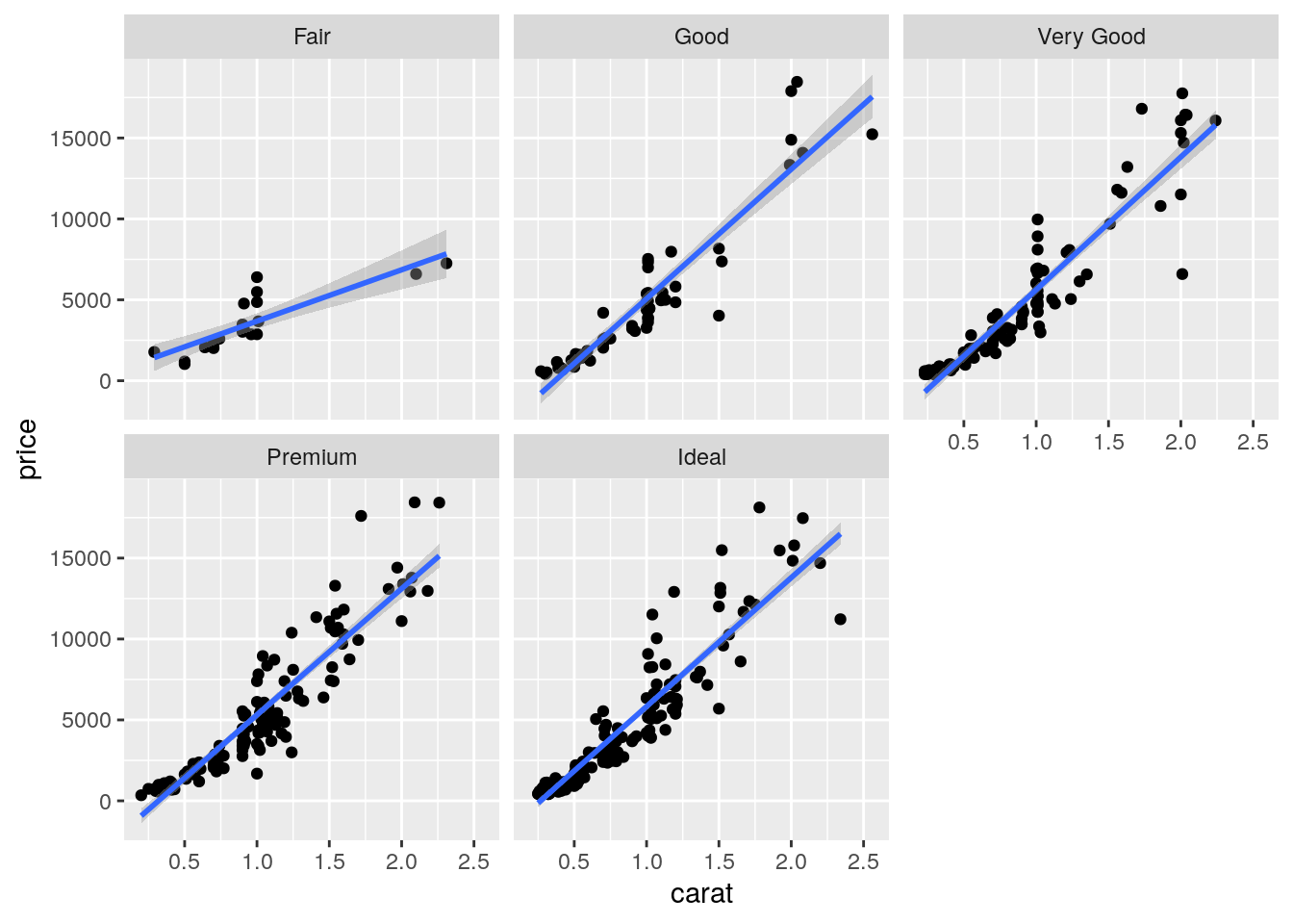
7.5.2 Boxplot
The boxplot can be used to study the distribution of a quantitative variable (e.g. price) conditioning on the categories of a factor (e.g. cut). It can be obtained by using the geom_boxplot geometry, where x is given by the qualitative variable (factor):
mydiamonds %>%
ggplot() +
geom_boxplot(aes(x=cut,y=price))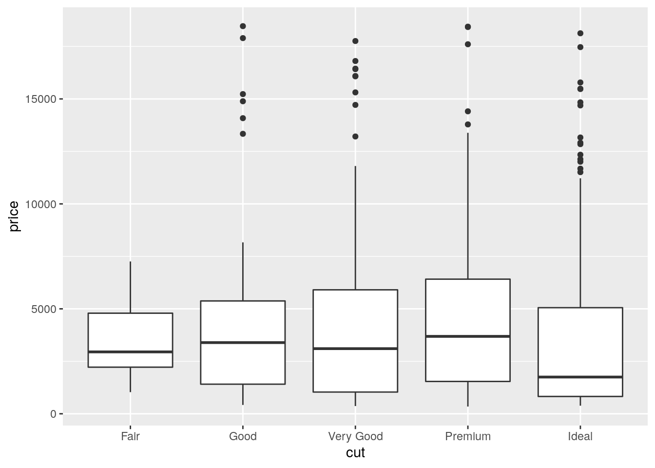 The quality category with highest (lowest) median price is Premium (Ideal). Fair quality diamonds are characterized by less variability in terms of price and are not characterized by extreme price values as happened for the other categories.
It is also possible to choose a different fill color and contour color for all the boxes by using fill and color:
mydiamonds %>%
  ggplot() +
  geom_boxplot(aes(x=cut,y=price),
               fill="orange",color="brown")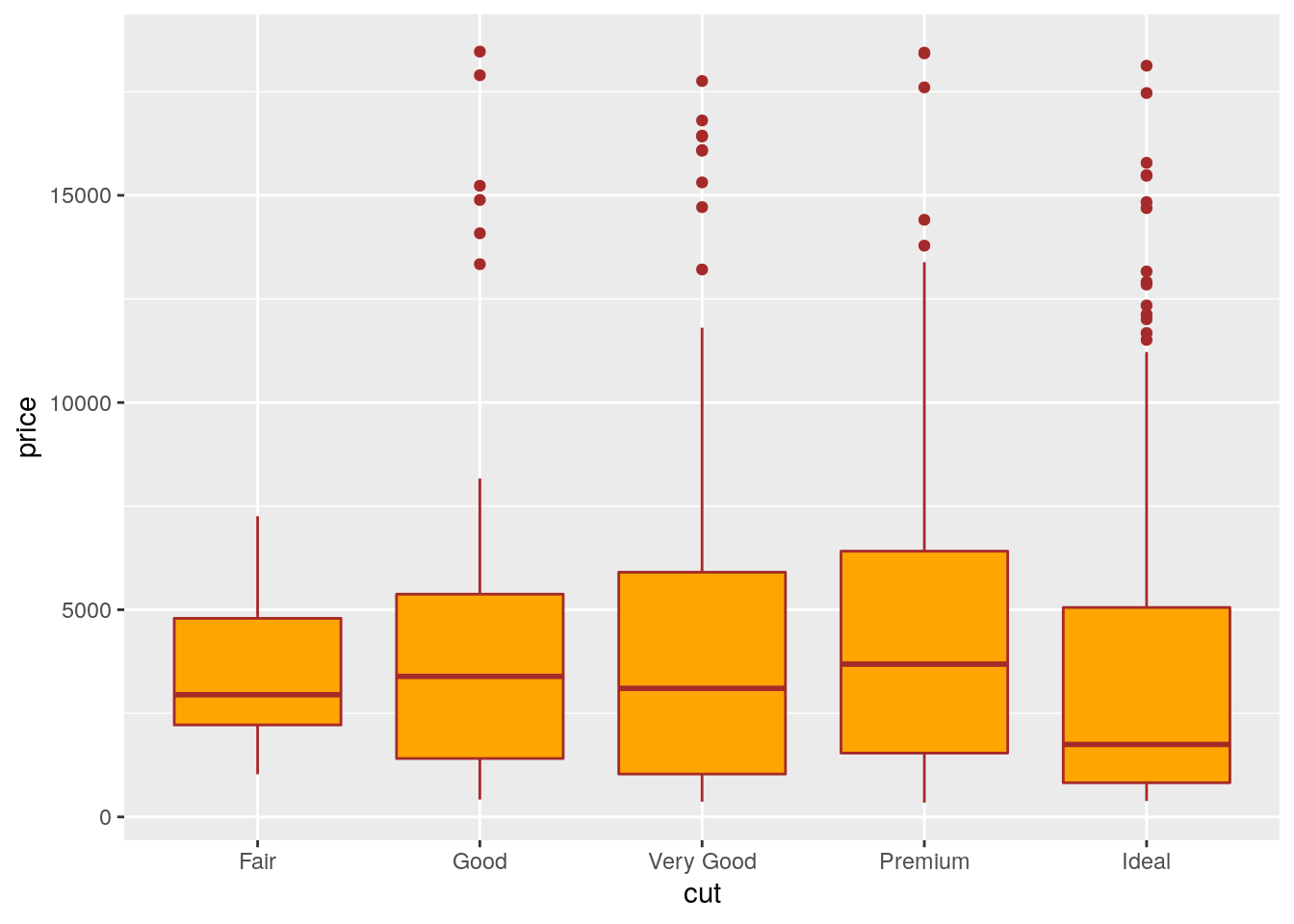
In the previous plot all the boxes are characterized by the same fill and contour color. If we instead interested in using different fill colors according to a variable (e.g.color) we have to specify the aesthetics with aes():
mydiamonds %>%
ggplot() +
geom_boxplot(aes(x=cut,y=price,fill=color),
col="brown")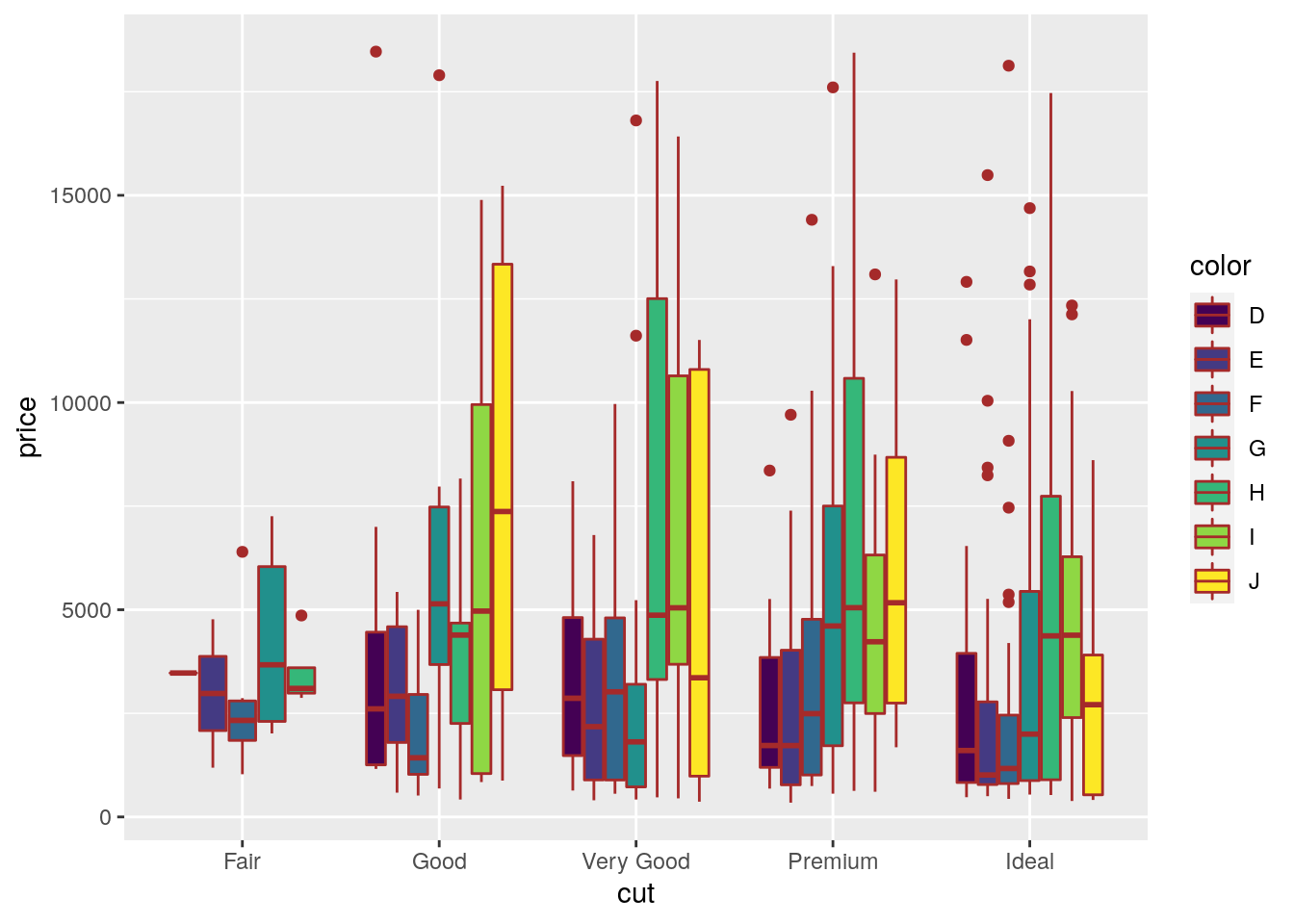 In this case for each
 cut category we have several boxplots (for the price distribution) according to the color categories.
7.5.3 Histogram and density plot
When the aim is the analysis of the distribution of a continuos variable like price an histogram can be used. This is implemented by using the geom_histogram geometry:
mydiamonds %>%
  ggplot() +
  geom_histogram(aes(x=price),
                 fill="lightblue",color="black")
## `stat_bin()` using `bins = 30`. Pick better value with `binwidth`.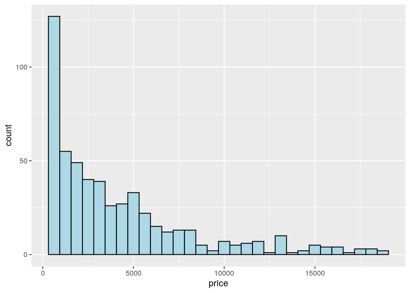 Note that in this case we need to specify only the
 x variable, while the y is computed automatically by ggplot and corresponds to the count variable (i.e. how many observations for each class of price values). This is given by the fact that every geometry has a default stat specification. For the histogram the default computation is stat_bin which uses 30 bins and computes the following variables:
count, the number of observations in each bin;density, the density of observations in each bin (percentage of total / bar width);x, the centre of the bin.
The histogram is a fairly crude estimator of the variable distribution. As an alternative it is possible to use the (non parametric) Kernel Density Estimation (see here) implemented in ggplot by geom_density (only x has to be specified):
mydiamonds %>%
ggplot() +
geom_density(aes(x=price))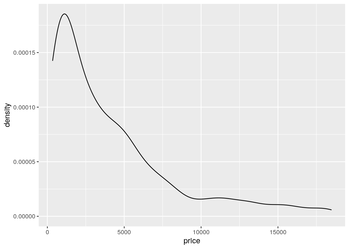 Note that the y-axis range is completely different with respect to the one of the histogram.
To combine together in a single plot the histogram and the density function, it is first of all necessary to produce an histogram which uses on the y-axis density instead of counts. The old approach to obtain density also in the y-axis of the histogram uses y=..density... A more modern approach adopts the function after_stat which refers to the generated variable density:
mydiamonds %>%
  ggplot() +
  geom_histogram(aes(x=price,y=after_stat(density)),
                 fill="lightblue",color="black") +
  geom_density(aes(x=price))
## `stat_bin()` using `bins = 30`. Pick better value with `binwidth`.
Note that the aes settings can be specified separately for each layer or globally in the ggplot function. See here below for a different specification (global now) of the previous plot:
mydiamonds %>%
  ggplot(aes(x=price)) + # your global specifications
  geom_histogram(aes(y=after_stat(density)),
                 fill="lightblue",color="black") +
  geom_density()
## `stat_bin()` using `bins = 30`. Pick better value with `binwidth`.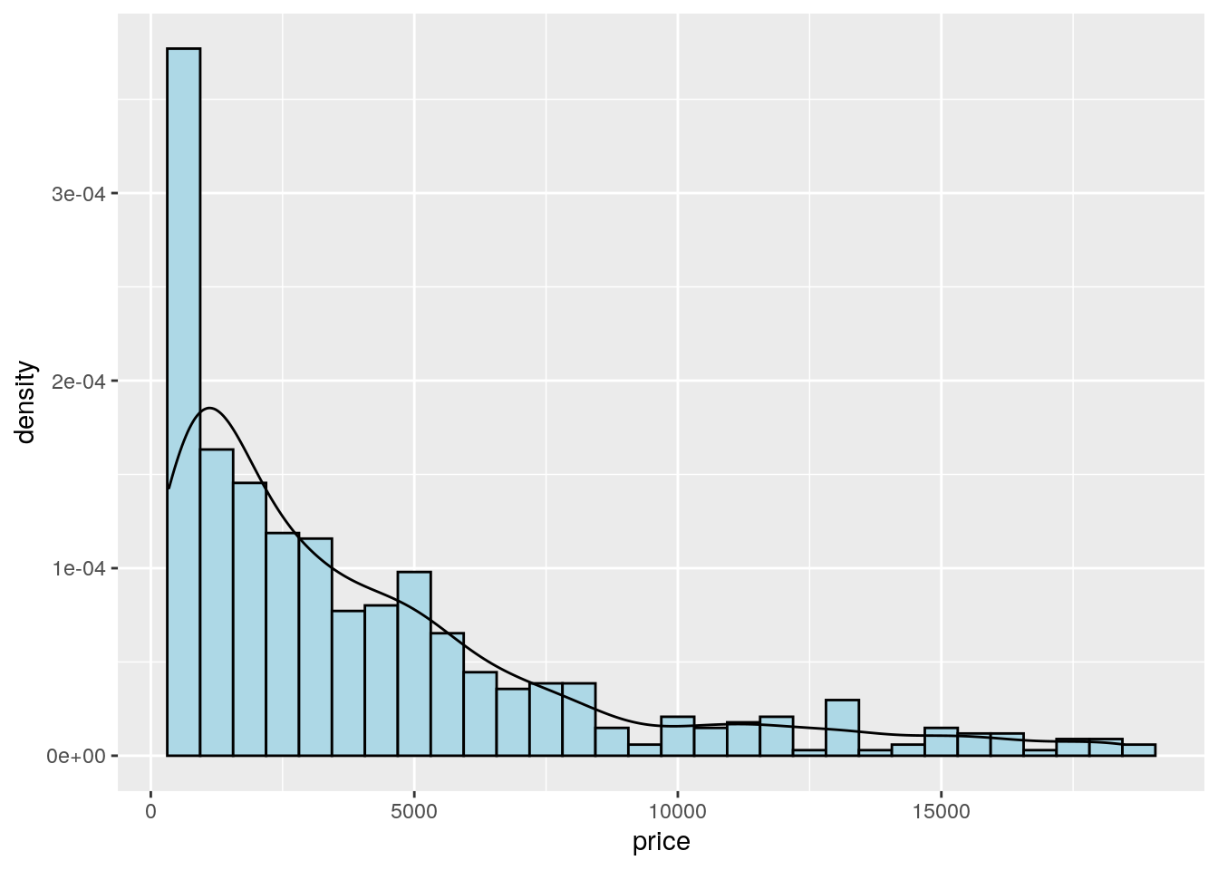
We can also display in the same plot several density estimates according to the categories of a factor like cut:
mydiamonds %>%
ggplot() +
geom_density(aes(x=price,fill=cut),
alpha = 0.5)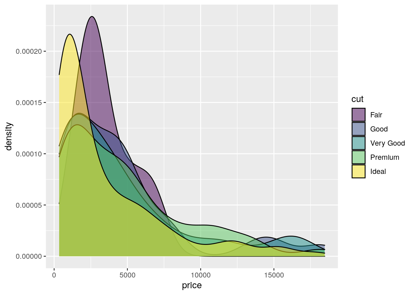 The option
 alpha which can take values between 0 and 1 specifies the level of transparency.
7.5.4 Barplot
The barplot can be used to represent the distribution of a categorical variable, such as for example cut. It can be obtained by using the geom_bar geometry:
mydiamonds %>% count(cut)## # A tibble: 5 × 2
## cut n
## <ord> <int>
## 1 Fair 20
## 2 Good 61
## 3 Very Good 106
## 4 Premium 140
## 5 Ideal 212mydiamonds %>%
ggplot() +
geom_bar(aes(x=cut))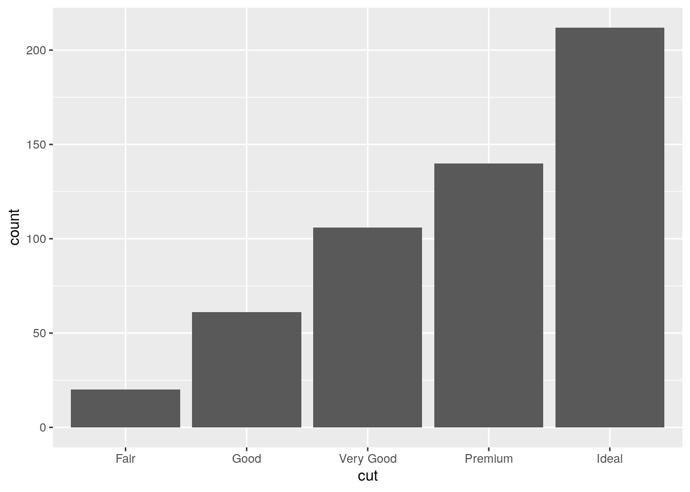 Similarly to the histogram, the y-axis is computed automatically and is given by counts (for
 geom_bar we have that stat="count"). If we are interested in percentages instead of absolute counts we can use two different approaches: one uses the geom_col geometry while the other uses the after_stat function. See here below.
Approach 1 (note that the first 3 lines of code computes the percentage distribution)
mydiamonds %>%
  count(cut) %>%
  mutate(perc = n/nrow(mydiamonds)*100) %>%
  ggplot() +
  geom_col(aes(x=cut,y=perc))
Approach 2
mydiamonds %>%
  ggplot() +
  geom_bar(aes(x=cut,
               y=after_stat(count/nrow(mydiamonds)*100)))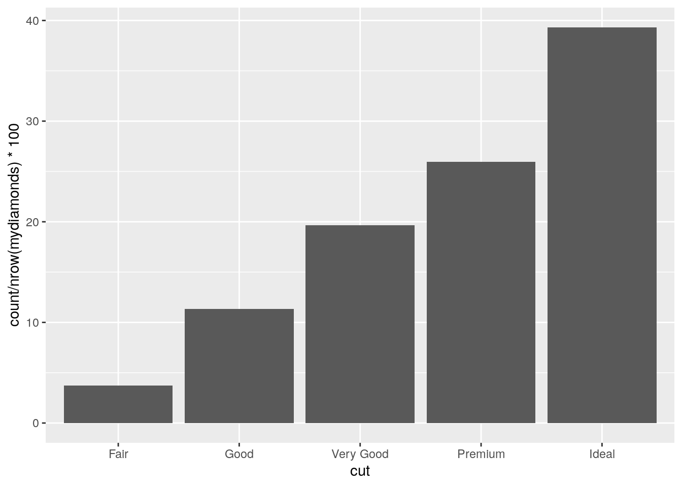
It is also possible to take into account in the barplot another qualitative variable such as for example color when studying their joint distribution:
mydiamonds %>%
  count(cut, color)
## # A tibble: 33 × 3
## cut color n
## <ord> <ord> <int>
## 1 Fair D 1
## 2 Fair E 2
## 3 Fair F 6
## 4 Fair G 7
## 5 Fair H 4
## 6 Good D 9
## 7 Good E 12
## 8 Good F 11
## 9 Good G 10
## 10 Good H 7
## # … with 23 more rowsIn particular color can be used to set the bar fill aesthetic:
mydiamonds %>%
ggplot() +
geom_bar(aes(x=cut, fill=color)) 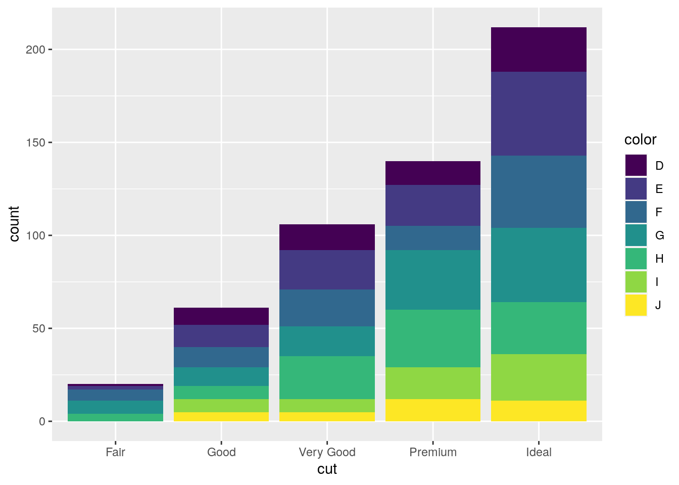 Note that the bars are automatically stacked and each colored rectangle represents a combination of
 cut and clarity. The stacking is performed automatically by the position adjustment given by the position argument (by default it is set to position = "stack"). Other possibilities are "dodge" and "fill":
#side by side bars
mydiamonds %>%
  ggplot() +
  geom_bar(aes(x=cut, fill=clarity),
position = "dodge") 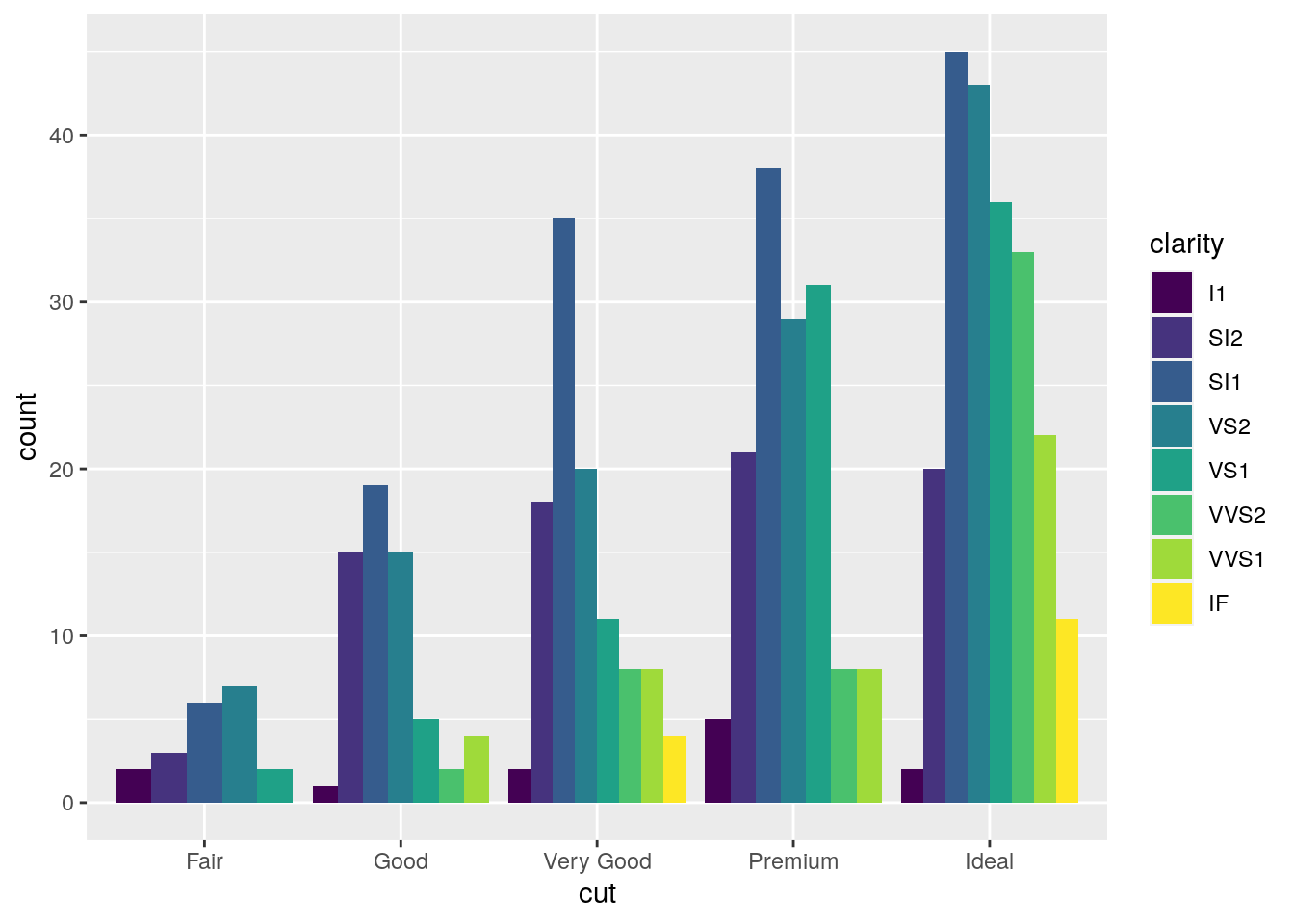
#stacked bar with the same height (100%)
mydiamonds %>%
ggplot() +
geom_bar(aes(x=cut, fill=clarity),
position = "fill") 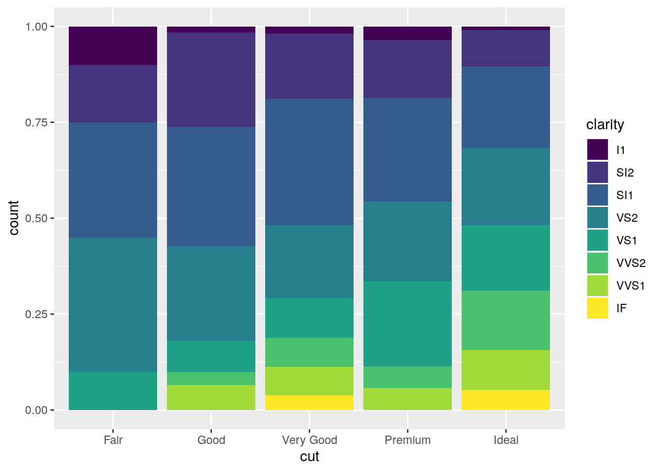 The option
 position = "fill" is similar to stacking but each set of stacked bars has the same height (corresponding to 100%); this makes the comparison between groups easier. The option position = "dodge" places the rectangles side by side.
An alternative consists in the use of facet_wrap that will create 8 separate plots (as the number of categories of clarity) each representing the conditional cut distribution:
mydiamonds %>%
  ggplot() +
  geom_bar(aes(x=cut, fill=color),
           position = "fill") +
  facet_wrap(~clarity)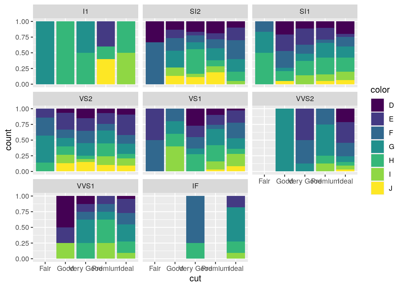
7.6 Data import
Assume we have some data available from a csv file (for example fev.csv). Note that a csv file can be open using a text editor (e.g. TextNote, TextEdit).
There are 3 things that characterize a csv file:
- the header: the first line containing the names of the variables;
- the field separator (delimiter): the character separating the information (usually the semicolon or the comma is used);
- the decimal separator: the character used for real number decimal points (it can be the full stop or the comma).
In the considered csv file (try to open it with a text editor):
- the header is given by a set of text strings:
- “,” is the field separator;
- “.” is the decimal separator.
All this information are required when importing the data in R by using the read.csv function, whose main arguments are reported here below (see ?read.csv):
file: the name of the file which the data are to be read from; this can also including the specification of the folder path (use quotes to specify it);header: a logical value (TorF) indicating whether the file contains the names of the variables as its first line;sep: the field separator character (use quotes to specify it);dec: the character used in the file for decimal points (use quotes to specify it).
The following code is used to import the data available in the fev.csv file. The output is an object named fevdata:
fevdata <- read.csv("files/fev.csv")The argument header=T, sep="," and dec="." are set to the default value (see ?read.csv) and they could be omitted.
Alternatively, it is possible to use the user-friendly feature provided by RStudio: read here for more information. The data import feature can be accessed from the environment (top-right) panel (see Figure 7.5). Then all the necessary information can be specified in the following Import Dataset window as shown in Figure 7.6.
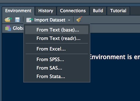
Figure 7.5: The Import Dataset feature of RStudio
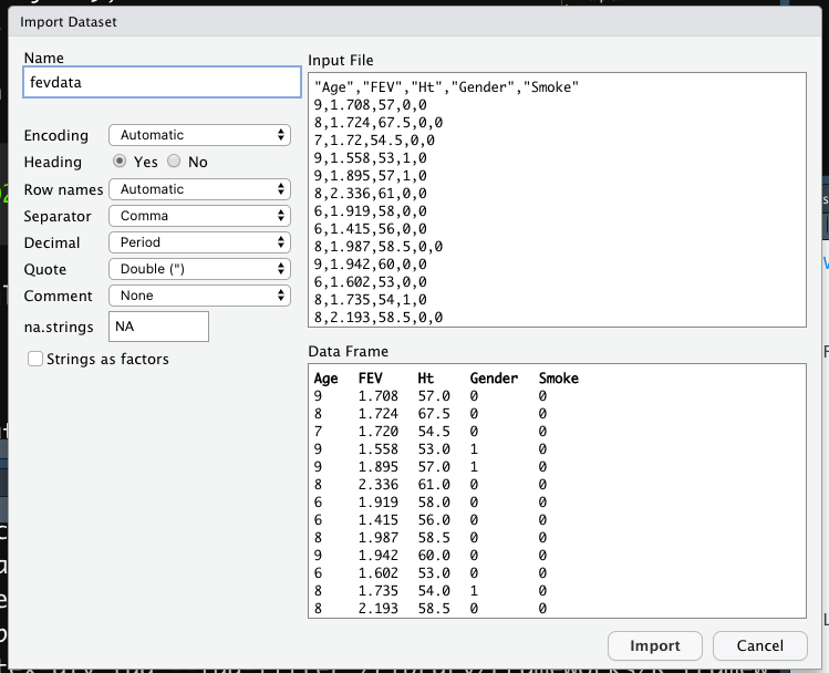
Figure 7.6: Specification of the csv file characteristics through the Import Dataset feature
After clicking on Import an object named fevdata will be created (essentially this RStudio feature makes use of the read.csv function).
The fevdata is an object of class data.frame:
class(fevdata)## [1] "data.frame"Data frames are matrix of data where you can find subjects (in this case each day) in the rows and variables in the column (in this case you have the following variables: dates, AAPL prices, etc.).
By using str or glimpse we get information about the type of variables included in the data frame:
str(fevdata)## 'data.frame': 654 obs. of 5 variables:
## $ Age : int 9 8 7 9 9 8 6 6 8 9 ...
## $ FEV : num 1.71 1.72 1.72 1.56 1.9 ...
## $ Ht : num 57 67.5 54.5 53 57 61 58 56 58.5 60 ...
## $ Gender: int 0 0 0 1 1 0 0 0 0 0 ...
## $ Smoke : int 0 0 0 0 0 0 0 0 0 0 ...glimpse(fevdata)## Rows: 654
## Columns: 5
## $ Age <int> 9, 8, 7, 9, 9, 8, 6, 6, 8, 9, 6, 8, 8, 8, 8, 7, 5, 6, 9, 9, 5, …
## $ FEV <dbl> 1.708, 1.724, 1.720, 1.558, 1.895, 2.336, 1.919, 1.415, 1.987, …
## $ Ht <dbl> 57.0, 67.5, 54.5, 53.0, 57.0, 61.0, 58.0, 56.0, 58.5, 60.0, 53.…
## $ Gender <int> 0, 0, 0, 1, 1, 0, 0, 0, 0, 0, 0, 1, 0, 1, 1, 1, 1, 0, 1, 1, 0, …
## $ Smoke <int> 0, 0, 0, 0, 0, 0, 0, 0, 0, 0, 0, 0, 0, 0, 0, 0, 0, 0, 0, 0, 0, …It is possible to get a preview of the top or bottom part of the data frame by using head or tail:
head(fevdata) #preview of the first 6 lines ## Age FEV Ht Gender Smoke
## 1 9 1.708 57.0 0 0
## 2 8 1.724 67.5 0 0
## 3 7 1.720 54.5 0 0
## 4 9 1.558 53.0 1 0
## 5 9 1.895 57.0 1 0
## 6 8 2.336 61.0 0 0tail(fevdata) #preview of the last 6 lines ## Age FEV Ht Gender Smoke
## 649 16 4.872 72.0 1 1
## 650 16 4.270 67.0 1 1
## 651 15 3.727 68.0 1 1
## 652 18 2.853 60.0 0 0
## 653 16 2.795 63.0 0 1
## 654 15 3.211 66.5 0 0Use the following alternative functions if you want to get information about the dimensions of the data frame:
nrow(fevdata) #number of rows## [1] 654ncol(fevdata) #number of columns## [1] 5dim(fevdata) #no. of rows and columns## [1] 654 57.7 Exercises Lab 5
7.7.1 Exercise 1
Consider the data available in the fev.csv file (use fevdata as the name of the data frame). The dataset examines if respiratory function in children was influenced by exposure to smoking at home. The included variables are:
AgeFEV: forced expiratory volume in liters (lung capacity)Ht: height measured in inchesGender: 0=female, 1=maleSmoke: exposure to smoking (0=no, 1=yes)
Import the data in
Rand check the type of variables contained in the dataframe (use theread.csvfunction by means of theImportfeature of RStudio in the top-right panel). Check the structure of the data.Compute the univariate and bivariate contingency table (with percentage frequencies) for
GenderandSmoke.Represent graphically height, age and FEV by histogram or barplot. Avoid using count on the y-axis. Comment the plots.
Using boxplots study the distribution of
Ageand thenHtconditioned onGender(in this case you need to transformGenderinto a factor withfactor(Gender)). Comment the plots.Using a scatterplot represent
FEVas a function ofHt. Use different colors according to the smoke information (usefactor(Smoke)). Comment.Produce different scatterplots representing
FEVas a function ofHtaccording to the gender categories (usefactor(Gender)). Include also in the plots a smooth line. Comment the plots.
7.7.2 Exercise 2
Consider the Titanic data contained in the file titanic_tr.csv. This is a subset (with 891 observations and 11 variables) of the original dataset. The included variables are the following:
pclass: passenger class (first, second or third)survived: survived (1) or died (0)name: passenger namesex: passenger sexage: passenger agesibSp: number of siblings/spouses aboardparch: number of parents/children aboardticket: ticket numberfare: fare (cost of the ticket)cabin: cabin idembarked: port of embarkation (S = Southampton, C = Cherbourg, Q = Queenstown)
- Import the data and explore them. Transform the variable
survived,pclassandsexinto factors using the following code (mydatais the name of the data frame):
mydata$pclass = factor(mydata$pclass)
mydata$survived = factor(mydata$survived)
mydata$sex = factor(mydata$sex)- Represent graphically the distribution of the variable
fare. Moreover, compute the average ticket price paid by passengers. Finally, compute the percentage of tickets paid more than 100$. - Represent graphically the distribution of the variable
age. Compute the average age. Pay attention to missing values. Consider the possibility of using thena.rmoption of the functionmean(see?mean). - Study the distribution of
sexby using a barplot. Derive also the corresponding table frequency distribution. - By using a graphical representation study the distribution of age conditionally on gender. Moreover, compute the mean age by gender.
- Compute the (absolute and percentage) bivariate distribution of
sexandsurvived(percentages should be computed with respect to the total sample size). Moreover, produce the corresponding plot which represents the two factors. - Derive the percentage distribution of
survivedconditioned onsex. Produce also the corresponding plot. - Filter by sex and consider only males and compute the frequency distribution of the variable
embarked. Produce the corresponding plot. - Create a new variable called
agecatwith two categories (minorif age < 18,majorotherwise). Then derive the frequency distribution ofagecat. - Produce a scatterplot with
ageon the x-axis andfareon the y-axis. Use a different point color according to gender. - Study the relationship between
ageandfare, as you did in the previous sub-exercise, producing sub-plots according toembarked.