4 Plotting
It’s almost always a good idea to plot your data and create figures before you implement other analyses. Figures can play at least three roles.
- Figures help you understand your data before you run your main analyses. What do correlations between key variables look like? Are there outliers? And so on.
- Figures are a particularly memorable way to communicate key results. “A picture is worth a thousand words.”
- Figures allow you to transparently communicate patterns in the raw data, without making strong assumptions about the form of an underlying relationship (e.g, without assuming linear relationships between dependent and independent variables).
So let’s learn how to make figures in R! As usual, R for Data Science is an excellent resource that goes into all of this in more detail.
4.1 ggplot concepts
ggplot2 is the main package used for plotting in R. The main advantages of ggplot are customizability (you can make almost any plot imaginable) and the elegance of its snytax. For beginners, this second benefit may not immediately resonate: there can be a learning curve to understanding how the package works, and the functions may seem confusing at first. But after a bit of practice, using ggplot will feel intuitive. You will be making hasty plots in a matter of seconds, and high-quality, presentatable plots in a matter of minutes.
Start by installing the ggplot2 and loading it as below. I also load a dataset from the fivethirtyeight package called nba_all_elo. This dataset contains historical “elo ratings” for all NBA basketball teams dating back to the 1940s. The elo rating is a measure of how strong a team is: when you beat a good team, your elo rating goes up, and when you lose to a bad team, your elo rating goes down. See their explanation if you’re interested in the details. We’ll just use the dataset to illustrate ggplot’s functionality.
# Run the line below in your console if you need to install the package.
# install.packages('ggplot2')
library(ggplot2)

library(dplyr)
library(fivethirtyeightdata)
data("nba_all_elo") # loads a data.frame from fivethirtyeight called 'nba_all_elo'

# restrict to relevant variables and to games in last 50 years
df_nba = nba_all_elo %>%
  filter(lg_id == 'NBA', year_id >= 1973) %>%
  select(team_id, year_id, date_game, is_playoffs, fran_id,
         pts, game_result, elo_i, elo_n, win_equiv)

head(df_nba) # prints the first 5 rows of nba_all_elo.
## # A tibble: 6 × 10
## team_id year_id date_game is_playoffs fran_id pts game_result elo_i elo_n win_equiv
## <fct> <dbl> <date> <lgl> <fct> <dbl> <fct> <dbl> <dbl> <dbl>
## 1 BUF 1973 1972-10-10 FALSE Clippers 109 L 1295. 1286. 23.2
## 2 CHI 1973 1972-10-10 FALSE Bulls 95 W 1564. 1566. 51.0
## 3 CLE 1973 1972-10-10 FALSE Cavaliers 90 L 1304. 1293. 23.7
## 4 NYK 1973 1972-10-10 FALSE Knicks 113 W 1551. 1560. 50.4
## 5 DET 1973 1972-10-11 FALSE Pistons 108 L 1335. 1327. 26.7
## 6 KCO 1973 1972-10-11 FALSE Kings 94 L 1428. 1414. 35.3Note that above, I use the dplyr verbs filter and select. I do a few more dplyr actions below. See Chapter 5 for more on these verbs.
You create a plot object by calling the ggplot() function. The first argument to ggplot() is typically the name of the dataset that you’ll be plotting from.

You can see that at first, ggplot() creates only an empty grey box. This is the base layer. You’re going to add all of your data visualization layers on top of it.
Let’s begin by plotting a histogram of home team elo scores.
4.2 Examples
4.2.1 Histogram
## `stat_bin()` using `bins = 30`. Pick better value with `binwidth`.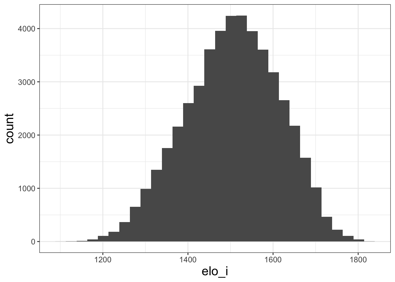
We only changed two things from the blank canvas, and now we have a figure!
First, we included an aes() argument in the ggplot() call. This is called an aesthetic. aes tells ggplot how variables map to visual properties. In this case, we’re saying that elo_i should be the x-axis of our plot.
Second, we added (literally, with the + operator) a geom_histogram() to the ggplot. ggplot has dozens of geoms that specify different plot types. Depending on the type of plot we want to make, we choose different geoms.
Histograms are almost always one of the first plots you should make. They help us understand the distribution of variables. We can see here that the modal elo rating is around 1500, with a fairly even split of teams that are better and worse than average. The range of elo is generally [1200,1800], with exceptions only for truly extraordinary teams like the 2017 Warriors.
4.2.2 Scatter plots
The data includes a variable win_equiv that explains how many games a team with rating elo_n would be expected to win over an 82-game NBA season. To get a sense of how (possibly abstract) elo ratings map into these more concrete win equivalents, let’s plot the two against each other.
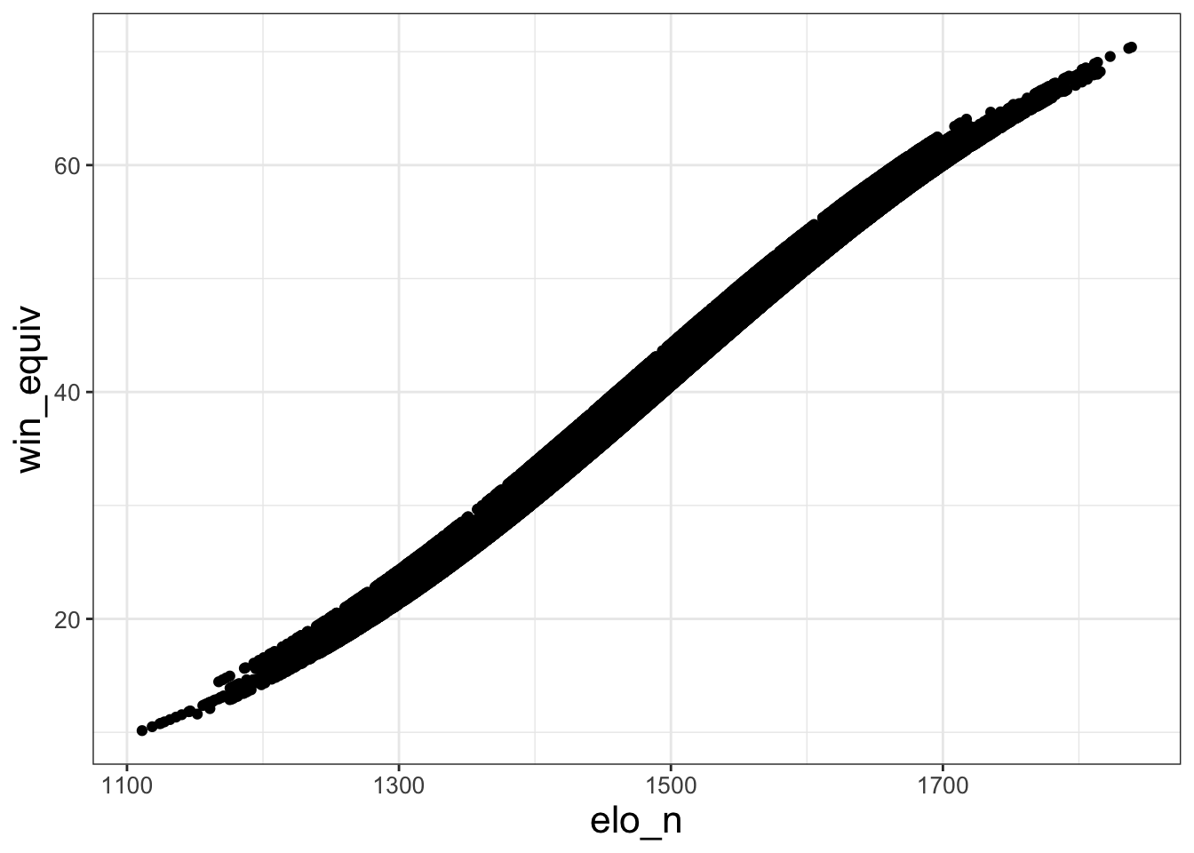
Unlike in the previous example, we now have both x and y within aes(). This is because scatter plots are inherently two-dimensional. And geom_point() tells R that we want a scatter plot, rather than something else like a line graph.
This plot is a little obscure – there are so many dots that you can’t really see any of them, especially in the regions of high elo rating density near the middle. Let’s see if we can make the plot more legible.
ggplot(data = df_nba, aes (x = elo_n, y = win_equiv)) +
  geom_point(size = 0.05, alpha = 0.1) +
  geom_smooth(method = 'lm', se = FALSE, linetype = 'dashed')
## `geom_smooth()` using formula = 'y ~ x'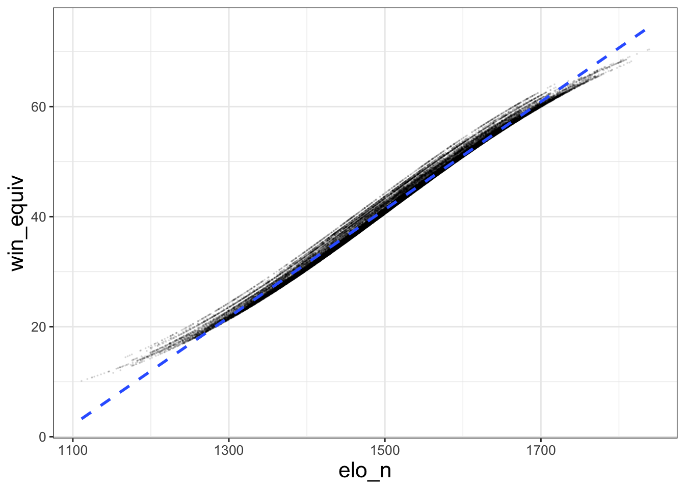
That’s a little better (though still not great). I made the points smaller (size) and more transparent (alpha) with the options to geom_point. Every geom has options like this, so it’s easy to alter this type of visual. And geom_smooth adds a line of best fit. I include options to make the fit linear (method - 'lm' – lm stands for “linear model”) and make the line dashed.
4.2.3 Line plots
Now, let’s look at two specific team’s outcomes over time.
df_warriors_bulls = df_nba %>% filter(fran_id == 'Warriors' | fran_id == 'Bulls')

ggplot(data = df_warriors_bulls,
       aes (x = date_game, y = elo_n, color = fran_id)) +
  geom_line(linewidth = 0.3) +
  labs(x = 'Time', y = 'Elo rating', color = 'Team')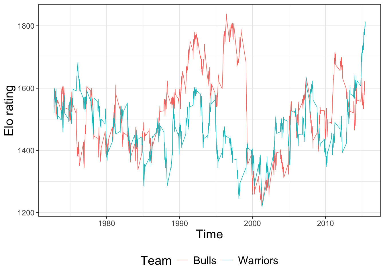
This plot highlights four new features.
geom_line()makes line graphs.- ggplot is able to take date variables as an
aes()dimension with no problems. This is often convenient. - We can map a third dimension of the data to a third visual dimension, color. The color and fill aesthetics are excellent for visualizing relationships that you expect to differ by group. For example, here, the Warriors and the Bulls have drastically different time trends.
- You can change the axis labels by adding
labs()
Substantively, you are seeing that the Bulls with Michael Jordan (in the 90s) and the Warriors with Steph Curry (in the late 2010s) were two of the most dominant basketball teams ever. Their elo ratings jump up over 1800 at their respective peaks.
4.2.4 Bar Plots
There are a couple of ways to make bar plots in R. One option is to use geom_bar(). I find the syntax of stat_summary() more straighforward for simple graphs.
barplot = ggplot(df_warriors_bulls, aes(x = fran_id, y = elo_n))  +
  stat_summary(fun = 'mean', geom = 'bar') +
  labs(x = 'Team' , y = 'Average elo rationg')
barplot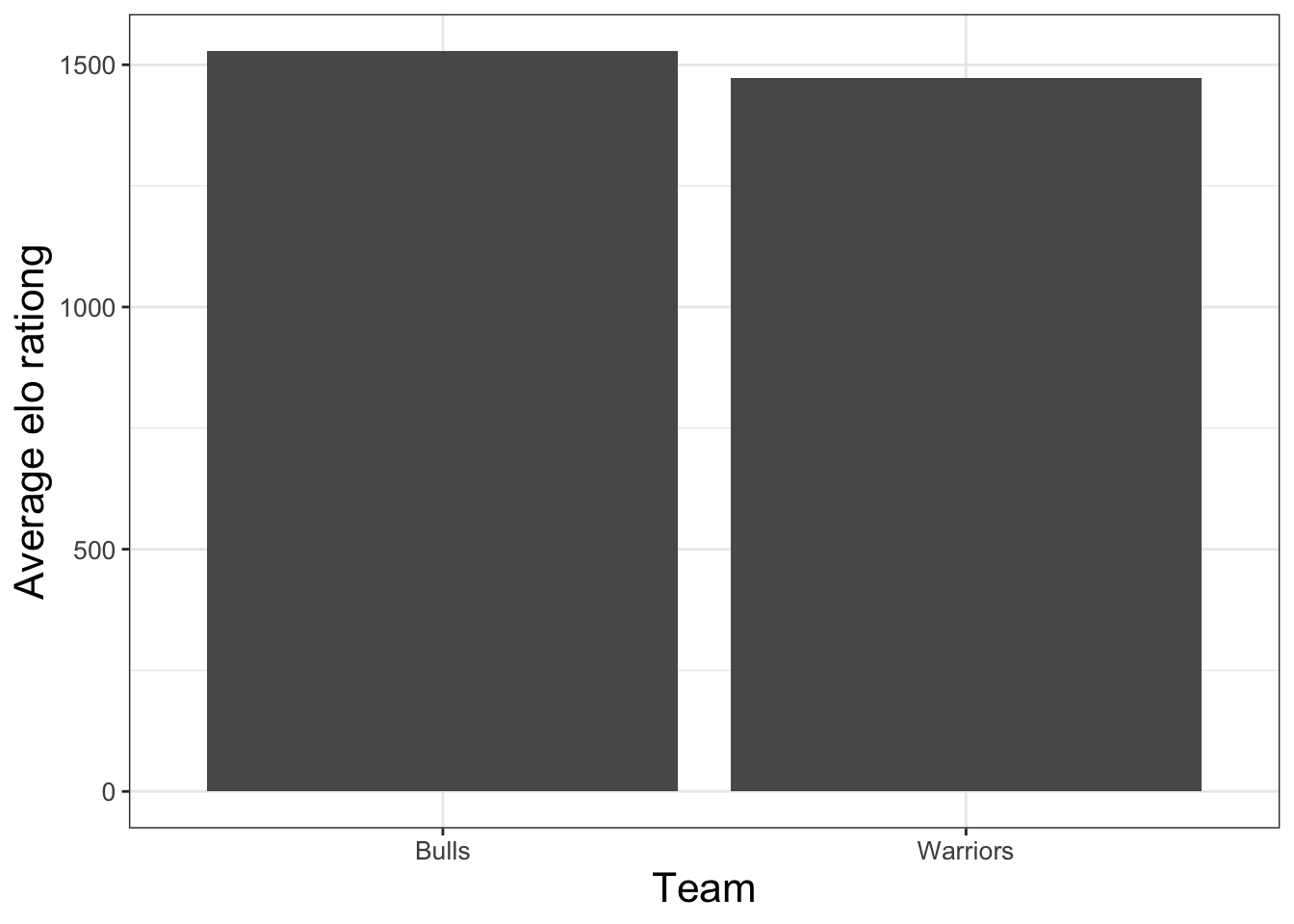
If you change the geom option within stat_summary(), you can make different looking plots. For example, it’s straightfowrard to make dotplots with error bars using stat_summary. Indeed, that is the default option!
## No summary function supplied, defaulting to `mean_se()`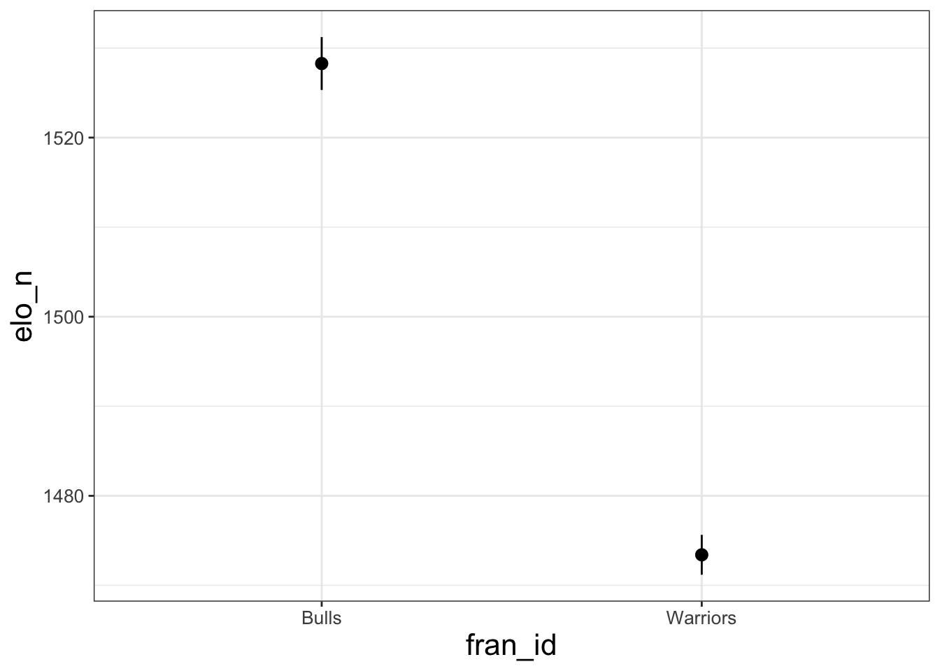
The opportunities with ggplot are endless. It is beyond scope for me to describe them here. I refer you to R for Data Science and the ggplot documentation for details.
4.2.5 Some theme options
There are many ways to alter the “look” of your ggplot. You can use the theme_set() function to define a default visual theme that will apply to all of your plots. I include my personal default theme for making quick visualizations below – the main change is to make axis text bigger. Your tastes may differ. I typically include this code chunk at the top of any script where I am making lots of plots.
theme_set(theme_bw() + theme(legend.position = 'bottom') +
            theme(axis.title=element_text(size = 16)) +
            theme(legend.title =element_text(size = 16)) +
            theme(strip.text = element_text(size = 14)) +
            theme(axis.text = element_text(size = 10)) +
            theme(legend.text = element_text(size = 14))
)
The code above defines a general theme for all plots. In practice, you may need to adjust these options to make plots more informative or easier to read. There are many guides to making plots readable: see here for one aimed at economists.
I have found that LLMs are VERY GOOD at changing the look of a ggplot. If you know how to make the core of your figure and you can describe you specific aesthetic goals clearly enough, iterating with an LLM is a great way to create attractive figures. You can upload the code that creates the plot, an image of the plot, tell the LLM exactly what you want changed, and it will often give you code that implements your change!
4.3 Special functions for binned scatter plots
4.3.1 Binsreg
Scatter plots are great, but sometimes they are hard to interpret.
The first problem is that sometimes your data has too many observations. If you try geom_point() with a dataset of 1 million observations, first your computer will crash since R is having trouble rendering all those points, and then if it doesn’t crash you will have a plot that is almost impossible to read because there are so many points (see, for example, the plot I made above!).
There are several ways around this first problem – it’s just a question of how to visualize the data. A second, deeper problem with scatter plots arises when we want to think about conditional relationships. Scatter plots are great at flexibly visualizing a relationship between an x and y. But we’re often interested in whether such a relationship persists after controlling for some other variables. If we think the relationship between x and y is linear, we can use regressions to control for other variables. But is there a way to create a visualization that captures nonlinear relationships like a scatter plot does, while accounting for controls like a regression does?
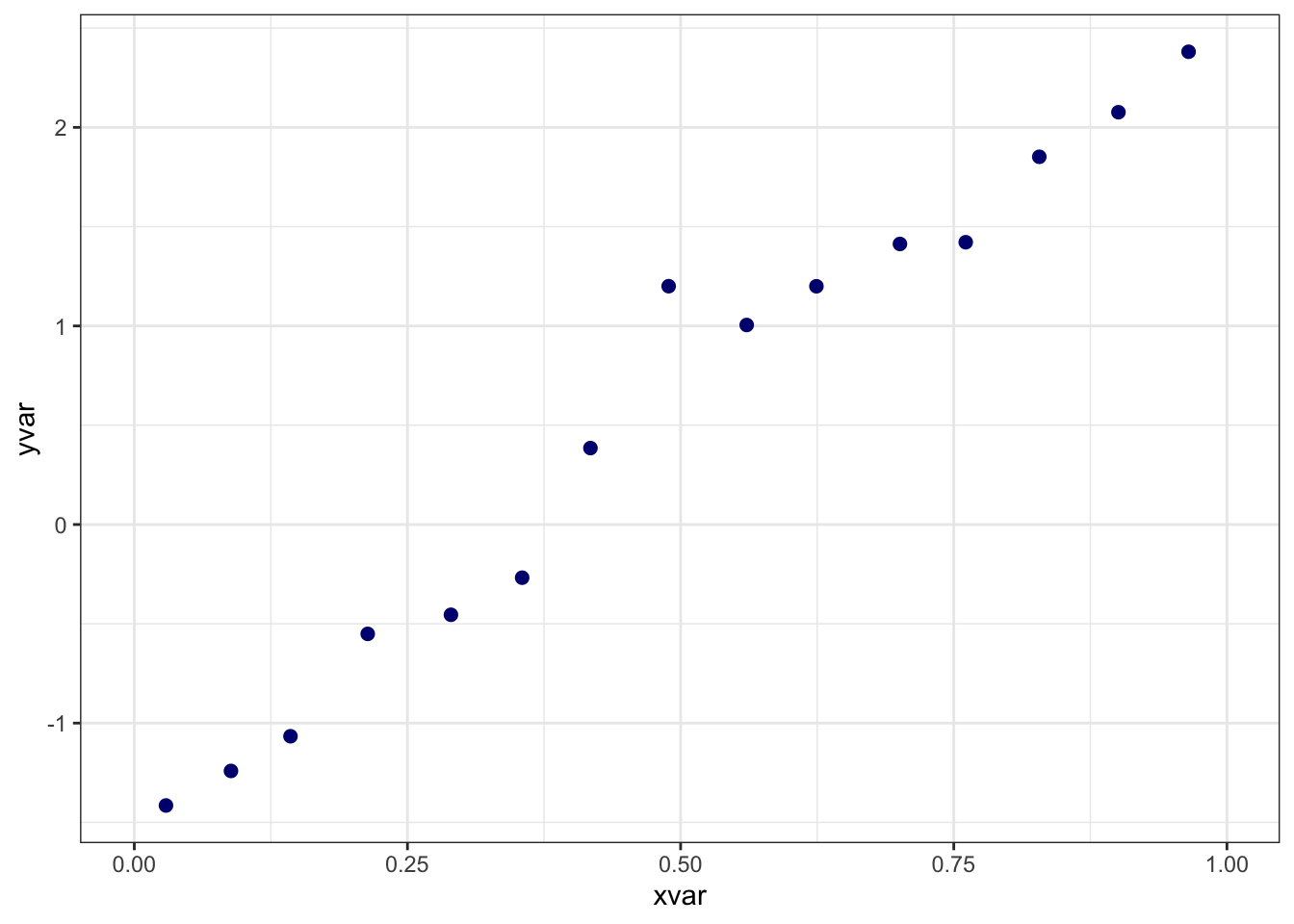
Cattaneo, Crunmp, Farrell, and Fang say that the answer is yes, and they provide a helpful implementation in their binsreg package. Their method plots the average value of the dependent variable for several bins of the independent variable, after removing the effects of any controls that you specify. I refer you to the paper for the details of their method (which are quite technical), and I provide an implementation below using a simulated dataset.
library(binsreg)
# download the sample dataset, stored here:
# https://github.com/nppackages/binsreg/blob/master/R/binsreg_sim.csv
df = read.csv('datasets/binsreg_sim.csv')

# This simulated dataset has variables "x", "y", and "w".
# I change them to provide clarity about how the binsreg syntax works.
df = df %>% rename(xvar = x, yvar = y, wvar = w)

binsreg(
  y = yvar, x = xvar, # y is the dependent variable, x is the independent variable.
  data = df, # the dataset containing the variables
  w = wvar, # the control variable
  nbins = 15 # an option specifying the number of bins
)
## Call: binsreg
##
## Binscatter Plot
## Bin/Degree selection method (binsmethod)  =  User-specified
## Placement (binspos)                       =  Quantile-spaced
## Derivative (deriv)                        =  0
##
## Group (by)                         =  Full Sample
## Sample size (n)                    =  1000
## # of distinct values (Ndist)       =  1000
## # of clusters (Nclust)             =  NA
## dots, degree (p)                   =  0
## dots, smoothness (s)               =  0
## # of bins (nbins)                  =  15
binsreg has many other options for customization – see their documentation here. You can customize your binsreg plots by saving them as objects like this X = binsreg(...). This command creates an X that contains (as datasets) all of the points that binsreg uses to in its plots. You can access them through objects like X$bins_plot. Using this raw data, you can make new plots where you apply your own themes or modifications.
4.3.2 Regression discontinuity plots
A regression discontinuity (RD) plot is a special case of a bin scatter for papers implementing an RD design. In a simple RD design, units for whom some “running variable” \(x\) exceeds a cutoff are considered “treated”, while units with \(x\) less than cutoff are the control. The idea is that for \(x\) near the cutoff, treatment is as-good-as randomly assigned. For the E3 class, Eberstein et al is an example of a paper that implemented an RD design where the running variable was “distance north of the Huai River,” the cutoff was zero, and the treatment was “exposure to the Huai River Policy.”
If the treatment causally effects some outcome \(y\), plotting \(x\) against \(y\) will yield a function with a discontinuity at the cutoff. The magnitude of this discontinuity is the magnitude of the treatment effect.
You can create an RD plot manually by creating the relevant binned scatterplot. Alternatively, the authors of binsreg also have an package specifically designed for RD plots, rdrobust. See the package’s website for details and ways to customize the plot further. Below, I create a minimal example of an RD plot using the sample data provided by the authors of the package. Don’t worry about why “vote” is the y-variable and “margin” is the x-variable – just substitute in the variables that make sense for the analysis that you want to run.
setwd('/Users/mattbrown/Documents/Teaching/EnvEconClass/bookdown-Rguide')
data = read.csv("datasets/rdrobust_senate.csv")
library(rdrobust)
y_example = data$vote # dependent variable (y axis)
x_example = data$margin # running variable (x axis)
c_example = 0 # cutoff: (location of discontinuity, separates treated from control)


# Note that for this function, we are specifying vectors (e.g, y = data$vote)
# rather than variables in a specified data.frame (e.g, data = data, y = vote)
plot1 = rdplot(y=y_example,x=x_example,c=c_example,
               x.label = 'X Label',
               y.label = 'Y Label',
               title = 'Title')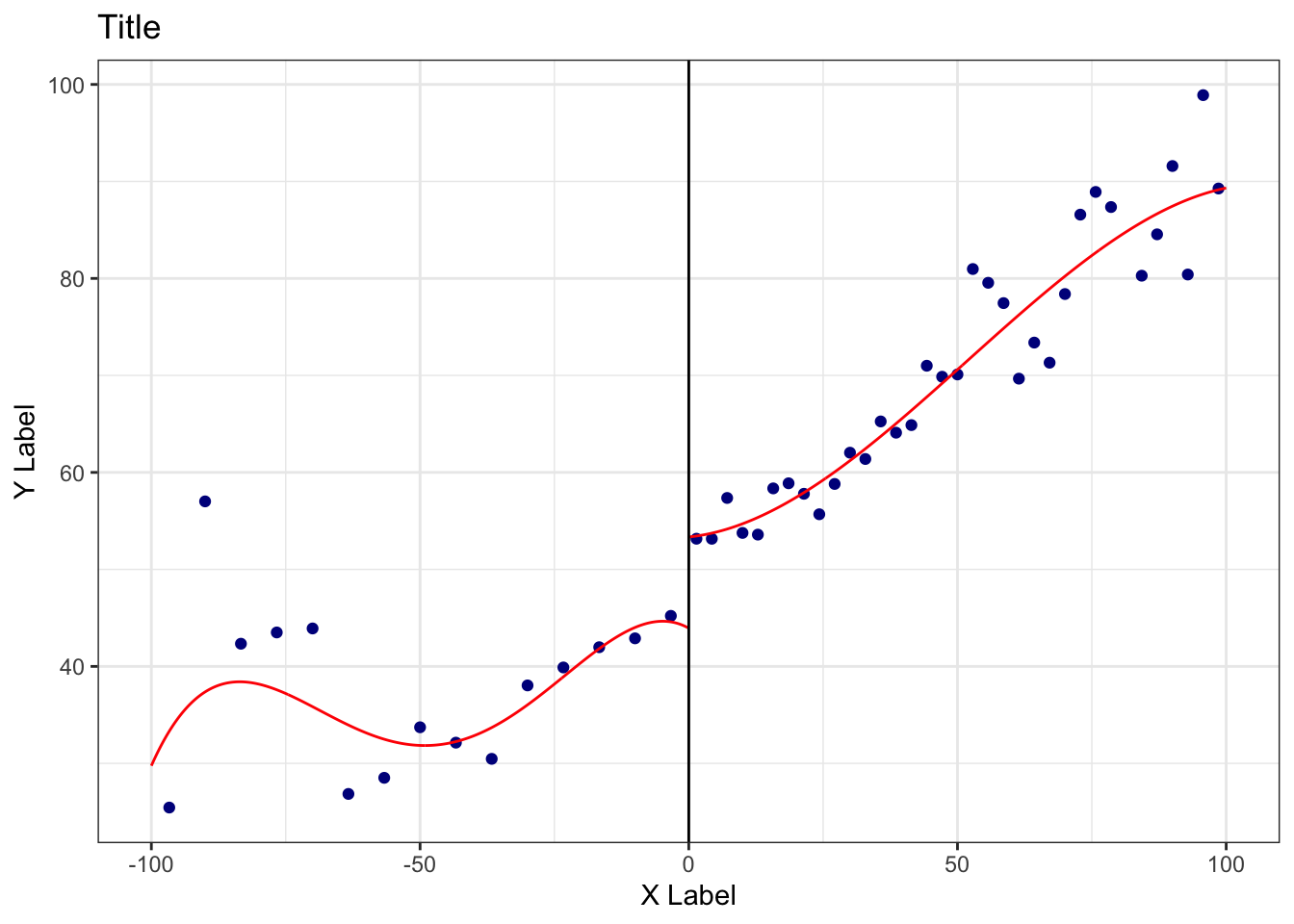
4.4 Maps
When you’re working with data that vary over geography, it’s often helpful to map your variables. For illustration, I’ll use data from the bad_drivers dataset in the fivethirtyeight package. I merge this dataset with a crosswalk (from the package crosswalkr) that contains the variable stfips. That variable is the State FIPS code, which is a standardized coding scheme for U.S. states. There are also county FIPS codes.
library(fivethirtyeight)
library(crosswalkr)

data(bad_drivers) # load drivers data from fivethirtyeight

### pre-processing
data(stcrosswalk) # load state-fips crosswalk data from crosswalkr
bad_drivers = bad_drivers %>% rename(stname = state) %>%
  left_join(stcrosswalk) %>%
  select(stname, stfips, insurance_premiums)
## Joining with `by = join_by(stname)`## # A tibble: 6 × 3
## stname stfips insurance_premiums
## <chr> <int> <dbl>
## 1 Alabama 1 785.
## 2 Alaska 2 1053.
## 3 Arizona 4 899.
## 4 Arkansas 5 827.
## 5 California 6 878.
## 6 Colorado 8 836.bad_drivers contains an average insurance premium variable. Let’s map these insurance premia across U.S. states.
Since mapping can be tricky, I provide a quick-and-dirty implementation for mapping variables in the U.S. with the usmaps package. For more complex maps or maps of other countries, you will have to find more flexible methods. usmaps requires an input dataset that contains a variable with name fips that contains the FIPS code at the geographic level of interest (state or county). I create this variable and then make the map.
library(usmap)

bad_drivers$fips = bad_drivers$stfips # create key FIPS variable

pl_map =
  plot_usmap(data = bad_drivers,
             regions = 'state', #change this to "county" if fips is at county level
             values = 'insurance_premiums' #name of variable that defines the colors
             )

print(pl_map)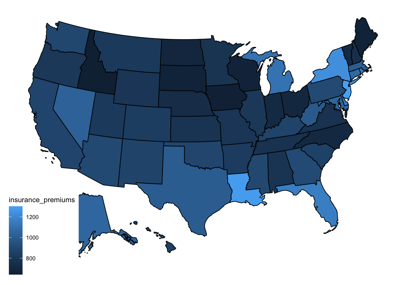
It’s hard to discern systematic patterns in this map. Maybe drivers from the upper midwest are particularly safe? But you get the idea – as long as you have a dataset with a fips variable, it’s straightforward to make a map.
The map is somewhat hard to read… I don’t love the blue-only color scale. Below, I demonstrate how to change color palettes.
# I'll use a color palette from the RColorBrewer package. See their website for # more options.
library(RColorBrewer)
pal = rev(brewer.pal(9, "RdBu"))
#9 is the number of discrete colors I want. RdBu is the name of the palatte.
# I use the rev() function to switch the order so that blue is for cheaper counties.

# Now I make the formatted map.
# I can start with the raw county map and just add ggplot modifiers to it.
pl_map_pretty = pl_map +
  # First modifier: define custom colors scale with scale_fill_gradientn()
  scale_fill_gradientn(
    colors = pal, na.value = "gray80",
    ) +
  # Second modifier: Make the scale label more informative
  labs(fill = 'Avg. Insurance Premium')

print(pl_map_pretty)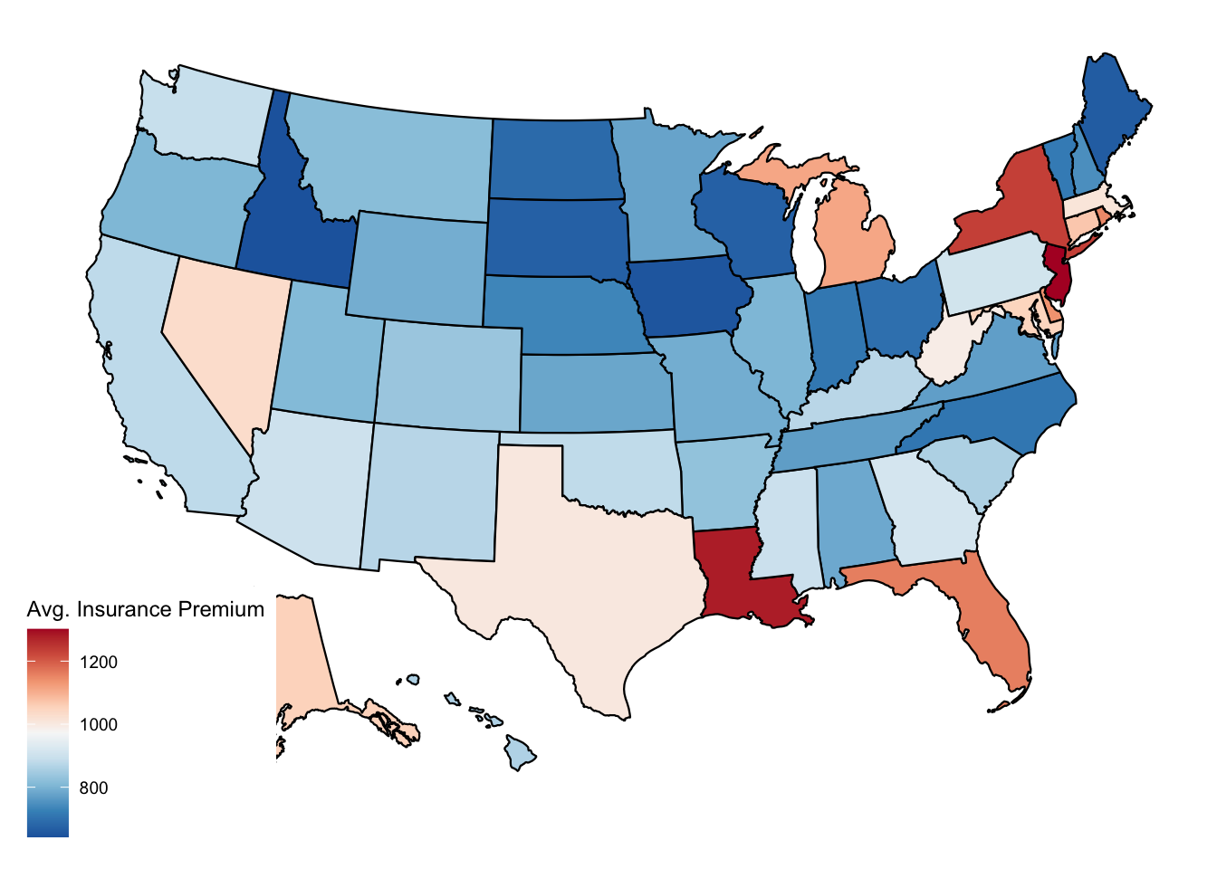
You probably don’t want to spend too much time on the look of your plots in the early stages of your analysis. But when you’re ready to present to others, a bit of effort can go a long way!