Chapter 4 Week 22: Statistical Tests and Significance
4.1 Overview and Introduction
This week we will look at samples in more detail and explore some methods to test the representativeness of the sample to the population.
This week we will look at some statistical tests to determine whether the trends and differences between groups that we observe in the data are statistically significant (i.e. meaningful).
We will explore this in terms of a formal definition of significance, that really describes the statistical surprisingness of the relationship, trend or difference. We will also extend your understanding and skills in working R by learning how to link data (in this case through the post-code attribute in the survey).
The main practical has 3 parts:
- applies some statistical tests to help us determine whether the patterns and groups differences we observed the data using EDA in Week 20 are statistically significant.
- is a recap on the assessment of samples through SE and Confidence Intervals, in order to help us answer the question How good is my Sample?
- describes how to link data tables in R.
There is also an optional 4th section that demonstrates some mapping techniques.
4.2 Preparation
In Windows Explorer, you should have already created a folder to do your R work in for this module on your M-Drive when you did the Week 19 self-directed practical, and have given it a name like GEOG1400. For this session, create a sub-folder (also known as a workspace) called Week22.
Download 2 data files (geog1400_data_2023.csv and pc_data.RData) and the R script (week22.R) from the VLE and move these to this folder. We have tried to stress the importance of this file management each week in the practicals.
Then, assuming you are using a University PC, open AppsAnywhere and start R before you launch RStudio.
The steps are:
- Search for “Cran” and R is listed under Cran R 4.2.0 x64.
- Click on Launch and then minimise the RGui window after it opens (NB this should be minimised and not closed).
- Search for RStudio which is listed under Rstudio 2022.
- Again click Launch and ignore any package or software updates.
Then open RStudio and in the File pane navigate to the folder you created, containing the CSV data file and the R script, and open the week22.R file.
4.2.1 Packages
For the first 3 parts of the practical you will need some packages to be installed in your implementation of R.R comes with base functionality (i.e. no packages required) and additional functionality can be accessed through packages as described in Section 1.7 of the self-directed practical in Week 19.
Recall that the syntax for installing a package is as follows (do not run this!):
install.packages("PackageName", dependencies = TRUE)You only need to install packages once on your computer and then, once installed, the package can be loaded into your R session using the library function. You have to do this for each R session (don’t run this either!).
library(PackageName)The code below runs a test to determine which packages are installed and then installs those that are missing:
# list required packages in a vector
packages <- c("tidyverse", "e1071", "sf", "maps", "tmap")
# determine which packages are not installed
not_installed <- packages[!packages %in% installed.packages()[, "Package"]]
# install missing packages
if (length(not_installed) > 0) {
  install.packages(not_installed, repos = "https://cran.rstudio.com/", dep = T)
}
# load the packages
library(tidyverse)  # for data wrangling and mapping
library(e1071)      # for some stats tools
library(sf)         # for spatial data
library(maps)       # for some map data
library(tmap)       # for mapping
# remove unwanted variables
rm(list = c("packages", "not_installed"))
4.2.2 Data
Recall that the survey data can be loaded into RStudio using the read.csv function.
Recall also that you will need to tell R where to get the data from. The easiest way to do this is to use the menu if the R script file is open. Go to Session > Set Working Directory > To Source File Location to set the working directory to the location where your week20.R script is saved. When you do this you will see line of code print out in the Console (bottom left pane) similar to setwd("SomeFilePath"). You can copy this line of code to your script and paste into the line above the line calling the read.csv function.
# use read.csv to load a CSV file
df = read.csv(file = "geog1400_data_2023.csv", stringsAsFactors = TRUE)
As a reminder the stringsAsFactors = TRUE parameter tells R to read any character or text variables as classes or categories and not as just text.
4.3 Statistical Tests of Difference
Hopefully you should have rattled through the preceding section. In this section we explore some of the statistical tests that were introduced in the lecture to help us determine whether the patterns and groups differences we observed the data using EDA in Week 20 are statistically significant.
A simple example of this is the group difference we observe between different Gender categories and the Height variable as in Figure @(fig:ch4fig1), and the mean height values for the groups.
As before we will remove the single record / observation of Non-binary in the Gender variable because low counts like this can be a problem. The code below filters this record out of df and resets the levels in the factor variable:
# remove record
df <- df[df$Gender != "Non-binary",]
# adjust the factor levels
df$Gender = factor(df$Gender, levels = c("Female", "Male"))
boxplot(Height ~ Gender, data=df, col=heat.colors(2), las=2,
        horizontal = T, ylab = "")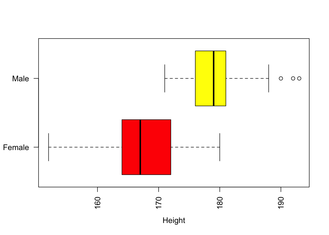
Figure 4.1: Boxplots of the distribution of the Height variable with Gender.
with(df, aggregate(Height, by=list(Gender) , FUN=mean))## Group.1 x
## 1 Female 166.5087
## 2 Male 179.6897There are obviously differences between these groups, but are these differences significant?
A key concept in all of this is the use of the word significant. In statistical terms, something is significant if it is statistically surprising - it not something that would be expected to happen by chance. Now surprising in this context often means would not be expected if data drawn at random were examined in the same way. And, is deeply linked to an expected distribution (such as a normal distribution) from which the data are drawn. We will keep coming back to this throughout the practical.
In this section, we undertake some more formal statistical evaluations. There are a number of reasons for doing this. For example you want to use a numeric variable in a model but you are concerned that its distribution may not be normal (often assumed by statistical models) and you want to check this. Alternatively, you are interested in developing a model to examine some phenomenon - let’s say the difference in GymHours for different OAC groups as above - but need a test to determine whether these differences are saying something statistically interesting.
This section describes a number of statistical tests to help with the formulation of analyses to answer questions such as those above (given some data). These relate to:
- Data distributions: how to assess and describe them?
- Pearson Correlations: are they significant (numeric to numeric)?
- Student’s t-test: are there significant differences in measured values between groups (categorical to numeric)?
- Chi-squared test: are there significant differences in counts between groups (categorical to categorical)?
The idea of significance being related to statistical surprisingness leads us to the Null Hypotheses! The Null Hypothesis is very simple: it states that there is no relationship between Factor 1 (e.g. Height) and Factor 2 (Gender), that there is no difference in measured values associated with Group X and Y, that Group X and Group Y have the same counts or stated preferences. The statistical tests of significance give us some idea of the number of times we would be able disprove the Null Hypothesis of No Relationship, if we repeatedly tested for the same relationship / difference in data drawn at random. A Significant relationship at the 95% level (a common statistical benchmark) indicates a relationship that would not be found by chance from data drawn at random 95 times out of a 100.
4.3.1 Analysing data distributions
Skewness measures describe the extent to which distributions are uneven (asymmetric) around the mean. And, as normal distributions are symmetrical around the mean, skewness measures describe how they are not normally distributed.
- Skewness can be right, or positively skewed, implying a small number of low value observations and large number of large value ones.
- Skewness can be left, or negatively skewed, implying a large number of low value observations and small number of large value ones.
Kurtosis measures describe the extent to which observations appear in the tails of a distribution. A normal distribution has a Kurtosis value of 0, distributions with Kurtosis > 0 have more values out in its tails than normal and distributions with Kurtosis < 0 have fewer values out in its tails than normal.
So Skewness and Kurtosis are related to each other, but they capture subtly different properties about a distribution.
We can easily determine the kurtosis and skew of any distributions using the skewness() and kurtoisis() functions in the e1071 package.
First examine the distributions of 3 variables through their histograms:
# Some quick plots
hist(df$GymHours)   # left skew
hist(df$Height)     # normal-ish
hist(df$Hand_Span)  # right skew
These have very different distributions. Now we can evaluate the skewness of these:
# Skewness Height
skewness(df$GymHours)
## [1] 0.6348993skewness(df$Height)## [1] 0.01477621skewness(df$Hand_Span)## [1] -2.116038What we see is that left skew have positive skew values (e.g. GymHours), normal distributions are around 0 (df$Height) and, right skewed data have negative skewness values (df$Hand_Span).
Kurtosis behaves in a similar way but measures different information: here we can see that GymHours has a few more observations out in the tails, that Height has fewer than might be expected, and that df$Hand_Span has a lot more than expected, although in the first 2 cases these are marginal calls!
# Kurtosis
kurtosis(df$GymHours)
## [1] 0.6158147kurtosis(df$Height)## [1] -0.2759687kurtosis(df$Hand_Span)## [1] 7.661625There are no hard and fast rules to skewness and kurtosis, and no absolutes. The idea is that you understand your data distributions before you start undertaking statistical analyses such as regression (Year 2 you will be glad to hear!), some of which have an assumption of normally distributed data.
Task 1.What is the skewness measure of the Piercings variable? Is it normally distributed?
4.3.2 Pearson Correlation tests (numeric to numeric)
We can examine correlations between pairs of numeric variables, for example the ShoeSize and Height variables with the cor function and a simple X, Y plot:
## Correlations
cor(df$ShoeSize, df$Height)
## [1] 0.7885624plot(df$ShoeSize, df$Height, pch = 19, cex = 0.6,
xlab = "Shoe Size", ylab = "Height")
# include a trend line
abline(lm(Height~ShoeSize, data = df), lwd = 2, col = "darkgreen", lty = 2)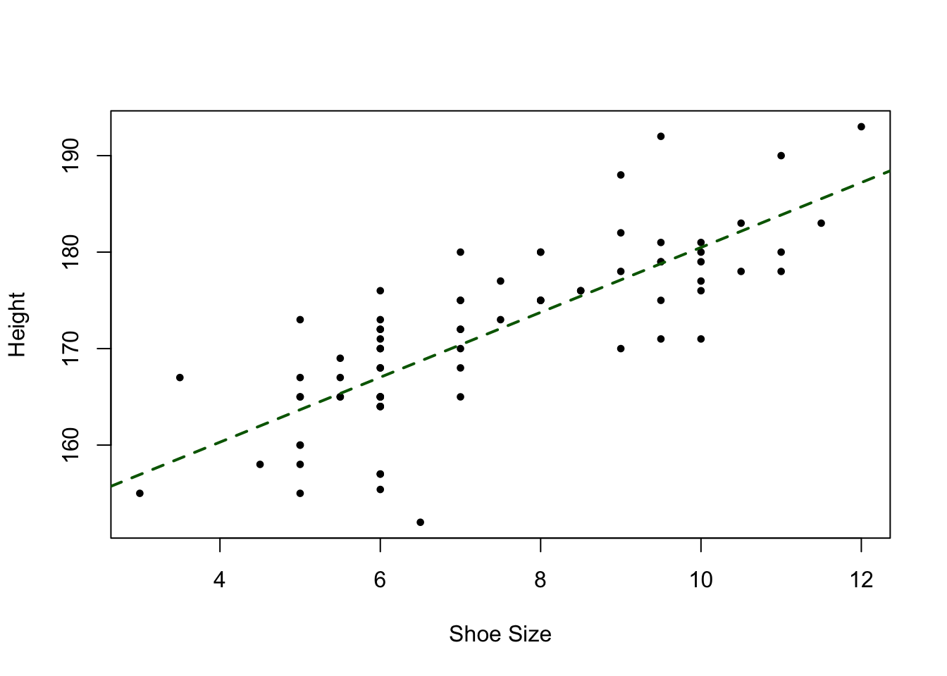
Figure 4.2: A plot of Shoe size against Height, with a trendline.
This shows, unsurprisingly that there is a strong relationship between these two variables. Now is this is significant? Is this surprising? Is this apparent co-variation, i.e. where changes (e.g. increases) in one variable are associated with changes in another, something that would be expected by chance or not?
We can test the Null Hypothesis that ShoeSize and Height are not related to each other using the cor.test function in R:
cor.test(df$ShoeSize, df$Height)##
## Pearson's product-moment correlation
##
## data: df$ShoeSize and df$Height
## t = 10.956, df = 73, p-value < 2.2e-16
## alternative hypothesis: true correlation is not equal to 0
## 95 percent confidence interval:
## 0.6840225 0.8613630
## sample estimates:
## cor
## 0.7885624Unsurprisingly this tells us to reject the Null Hypothesis of no relationship and to accept the alternative hypothesis, with a p-value (probability value) of near to 0. This correlation is so unlikely, that it would only occur once out of 22,000,000,000,000,000 randomly selected of data, and therefore extremely surprising!
The number above is very large. It is derived from 2.2-e16 which means \(2.2 \times 10^{-16}\) or \(\frac{2.2}{10,000,000,000,000,000}\) times. By convention significance levels are reported at the less than 95% level (found by chance less than 5 times out of /100 from data drawn at random…), less than 99% level (found by chance less than 1 time out a 100…) and the 99.9% (less than 1 out of 1000 times). These are some times reported over 1 and in nearly all statistical packages they reported over 1 such that 95% is 0.05, 99% is 0.01, 99.9% is 0.001. Some accessible summaries of significance levels can be found at the following links:
## [1] "statistic"   "parameter"   "p.value"     "estimate"    "null.value"
## [6] "alternative" "method"      "data.name"   "conf.int"
If we examine Height against GymHours the relationship is much weaker and not significant - the p-value is 1. This means that this correlation would be expected to be found 7/10 times from randomly selected data. In which case we would accept the Null Hypothesis of no relationship between these variables.
cor.test(df$GymHours, df$Height)##
## Pearson's product-moment correlation
##
## data: df$GymHours and df$Height
## t = 0.00033, df = 73, p-value = 0.9997
## alternative hypothesis: true correlation is not equal to 0
## 95 percent confidence interval:
## -0.2269252 0.2269985
## sample estimates:
## cor
## 3.862369e-05Task 2. What is the correlation value of Hand_Span with Height? Is this relationship significant? What do you think is explaining the answer?
4.3.3 Student’s t-test: differences in measured values between groups (categorical to numeric)
The Student’s t-test is used to analyse differences between groups where the data are numerical. It tests for group differences in measured data (or data on an interval scale), by comparing the responses over 2 treatment groups, student performance, scores, etc. It is referred to as a parametric test, meaning that the distribution of the data should be considered, and in this case it assumes that:
- the numerical data distributions are normal;
- the variances of the two samples are equal.
(NB ‘Student’ was the pseudonym for the statistician W. S. Gossett who discovered the test and the t-distribution.)
One of the key things is to determine whether to undertake a one-tailed or two-tailed test, as well as the level of significance. For example consider one and two tailed tests comparing Group X against Group Y with 95% confidence, with the Null Hypothesis that the mean of Group X is equal to / not significantly different from mean of Group Y:
- 2-tailed: tests whether the mean of Y is significantly greater than X AND is significantly less than X. It rejects the Null Hypothesis if the test statistic is in the top 2.5% OR bottom 2.5% of the probability distribution (i.e. at both ends of the distribution).
- 1-tailed: tests whether the mean of Y is significantly greater than X OR is significantly less than X. It rejects the Null Hypothesis if the test statistic is in the top 5% OR bottom 5% of the probability distribution (i.e. at one end of the distribution).
A 1-tailed Example: is a new drug better than existing one, where the aim is to maximize the ability to detect any improvement. A one-tailed test is chosen. BUT this fails to test if the new drug is less effective than existing drug. This is appropriate IF the consequences of missing an effect in the untested direction are negligible.
We can explore t-tests and how to think about the distribution tails using the Height and Gender variables. Here you would expect 2-tailed difference between the groups (2.5% in either direction), and 1-tailed differences in the top (taller) end of the Height distributions, but perhaps not at the 1-tailed lower (shorter) end. These are perfectly reflected in the following t-tests - examine their p-values:
## t-tests
# to re-examine the data visually, you could uncomment the 2 lines below
# boxplot(Height ~ Gender, data=df, col=c("red2", "dodgerblue"),
#        las=2, horizontal = T, ylab = "")
# 2-tailed
t.test(Height~Gender, data = df)
##
## Welch Two Sample t-test
##
## data: Height by Gender
## t = -9.4514, df = 67.159, p-value = 5.855e-14
## alternative hypothesis: true difference in means between group Female and group Male is not equal to 0
## 95 percent confidence interval:
## -15.96447 -10.39745
## sample estimates:
## mean in group Female mean in group Male
## 166.5087 179.6897# 1-tailed lower
t.test(Height~Gender, data = df, alternative = "less")##
## Welch Two Sample t-test
##
## data: Height by Gender
## t = -9.4514, df = 67.159, p-value = 2.927e-14
## alternative hypothesis: true difference in means between group Female and group Male is less than 0
## 95 percent confidence interval:
## -Inf -10.85496
## sample estimates:
## mean in group Female mean in group Male
## 166.5087 179.6897# 1-tailed upper
t.test(Height~Gender, data = df, alternative = "greater")##
## Welch Two Sample t-test
##
## data: Height by Gender
## t = -9.4514, df = 67.159, p-value = 1
## alternative hypothesis: true difference in means between group Female and group Male is greater than 0
## 95 percent confidence interval:
## -15.50696 Inf
## sample estimates:
## mean in group Female mean in group Male
## 166.5087 179.6897So what the above t-tests allow us to say is:
- 2 tailed test: the Null Hypothesis of no difference between groups can be rejected. In fact this difference would only be found once each \(8.8 \times 10^{12}\) times data was drawn at random. Thus we can reject the Null Hypothesis of no difference between groups and say that there is a significant difference between Height at the upper and lower end of the distributions of Height when grouped by Gender.
- 1 tailed test (lower): again the Null Hypothesis of no difference between groups can be rejected, with a similar level of statistical significance (confidence), \(4.4 \times 10^{-12}\). Here this is saying that that one of the means is significantly lower than the other (not just different).
- 1 tailed test (upper): this the Null Hypothesis of no difference between groups cannot be rejected (a p-value of 1).
More interestingly some of the other group / value combinations can be considered:
# no statistical difference: p-values greater than 0.05
t.test(SleepHours~Gender, data = df)
t.test(GymHours~Gender, data = df)
t.test(SleepHours~DrivingLicense, data = df)
t.test(SocialMediaHours~StateSecondary16, data = df)
t.test(Hand_Span~Gender, data = df)
t.test(Hand_Span~StateSecondary16, data = df)
#...etc
# significant statistical difference: p-values 0.05 or less
t.test(Piercings~Gender, data = df)
Task 3. I want to determine whether there are significant group differences in the time spent using social media amongst respondents who went to state secondary school up to 18 and those that did not. What t-test would I use and why? 1 or 2 tailed? And if 1-tailed which way?}
Just for interest, Table 4.1 summarises the p-values (significance) for a number of numeric to logical data types. There are mostly one or 2 statistically and potentially interesting significant group differences.
| Group | Variable | value |
|---|---|---|
| Gender | Hand_Span | 0.894 |
| Gender | Height | 0.000 |
| Gender | GymHours | 0.868 |
| Gender | SocialMediaHours | 0.446 |
| Gender | SleepHours | 0.105 |
| Gender | Piercings | 0.000 |
| Gender | Random1_20 | 0.260 |
| Gender | ShoeSize | 0.000 |
| Gender | Time | 0.094 |
| StateSecondary16 | Hand_Span | 0.088 |
| StateSecondary16 | Height | 0.786 |
| StateSecondary16 | GymHours | 0.724 |
| StateSecondary16 | SocialMediaHours | 0.823 |
| StateSecondary16 | SleepHours | 0.007 |
| StateSecondary16 | Piercings | 0.653 |
| StateSecondary16 | Random1_20 | 0.684 |
| StateSecondary16 | ShoeSize | 0.340 |
| StateSecondary16 | Time | 0.371 |
| StateSecondary18 | Hand_Span | 0.312 |
| StateSecondary18 | Height | 0.702 |
| StateSecondary18 | GymHours | 0.602 |
| StateSecondary18 | SocialMediaHours | 0.800 |
| StateSecondary18 | SleepHours | 0.073 |
| StateSecondary18 | Piercings | 0.928 |
| StateSecondary18 | Random1_20 | 0.992 |
| StateSecondary18 | ShoeSize | 0.698 |
| StateSecondary18 | Time | 0.393 |
| BloodDonor | Hand_Span | 0.482 |
| BloodDonor | Height | 0.957 |
| BloodDonor | GymHours | 0.799 |
| BloodDonor | SocialMediaHours | 0.497 |
| BloodDonor | SleepHours | 0.139 |
| BloodDonor | Piercings | 0.642 |
| BloodDonor | Random1_20 | 0.501 |
| BloodDonor | ShoeSize | 0.517 |
| BloodDonor | Time | 0.091 |
| DrivingLicense | Hand_Span | 0.670 |
| DrivingLicense | Height | 0.923 |
| DrivingLicense | GymHours | 0.993 |
| DrivingLicense | SocialMediaHours | 0.018 |
| DrivingLicense | SleepHours | 0.378 |
| DrivingLicense | Piercings | 0.010 |
| DrivingLicense | Random1_20 | 0.951 |
| DrivingLicense | ShoeSize | 0.489 |
| DrivingLicense | Time | 0.305 |
4.3.4 Chi-squared test: differences in counts and counts between groups (categorical to categorical)
The Chi-squared test is used to determine whether categorical counts (e.g. preferences expressed by a single group or by 2 groups) are statistically different from an expected distribution. he data must be counts / frequency data (and not percentages or proportions), the total number observations must be greater than 20 and the observations must be independent of one another.
Lets start with the simplest case for a Chi-squared test using the chisq.test function: counts for a single categorical variable, the Diet variable:
table(df$Diet)##
## meat pescatarian vegan vegetarian
## 61 4 3 7chisq.test(table(df$Diet))##
## Chi-squared test for given probabilities
##
## data: table(df$Diet)
## X-squared = 127.4, df = 3, p-value < 2.2e-16Here the test indicates that there are significant differences between the categories. However, this is not surprising, given that counts are so different. A perhaps more informative approach would be to compare the responses here with some expected distribution across the different categories. For example, the website https://www.finder.com/uk/uk-diet-trends has some numbers we can use to compare our distribution of counts with an expected distribution: Meat 86.4%, Vegetarian 6.5%, Pescatarian 4.5% and Vegan 2.5% (I had to change the meat value by 0.4% to makes this adds up to 100.0%!). These can be used in the same order as the tabulated data to indicate expected probabilities. The Chi-squared test will then determine whether the observed distributions are significantly different from the expected ones:
table(df$Diet)##
## meat pescatarian vegan vegetarian
## 61 4 3 7chisq.test(table(df$Diet), p = c(0.864, 0.045, 0.026, 0.065))## Warning in chisq.test(table(df$Diet), p = c(0.864, 0.045, 0.026, 0.065)):
## Chi-squared approximation may be incorrect##
## Chi-squared test for given probabilities
##
## data: table(df$Diet)
## X-squared = 1.8302, df = 3, p-value = 0.6084This tells us that our Diet count data are not significantly different from the expected proportions that we have used (the data on the website may of course not be correct!). It suggests that our population is similar to that used by the website.
We can also examine the frequency of counts between different groups using the Chi-squared test. Here it tests for differences in a correspondence table (a cross tabulation of counts). The code below illustrates significant and insignificant correspondences, examining the table in the first instance in both cases:
# significant differences
table(df$StateSecondary18, df$Handed)
##
## left right
## No 0 29
## Yes 8 38chisq.test(x = df$StateSecondary18, y = df$Handed, simulate.p.value = TRUE)##
## Pearson's Chi-squared test with simulated p-value (based on 2000
## replicates)
##
## data: df$StateSecondary18 and df$Handed
## X-squared = 5.6457, df = NA, p-value = 0.02399# insignificant differences
table(df$StateSecondary16, df$Diet)##
## meat pescatarian vegan vegetarian
## No 21 3 0 4
## Yes 40 1 3 3chisq.test(df$StateSecondary16, df$Diet, simulate.p.value = TRUE)##
## Pearson's Chi-squared test with simulated p-value (based on 2000
## replicates)
##
## data: df$StateSecondary16 and df$Diet
## X-squared = 5.6074, df = NA, p-value = 0.1249Note the use of the simulate.p.value = TRUE parameter. This tells R to simulate values if the number of observations is low (which it is for each these correspondences). You will get approximately the same results with and without this parameter. The results can be interpreted in a similar way as before, and the Null Hypothesis rejected or not.
4.4 Revision of Sample SE and CIs
Run the code below to define a population and a sample of 30 observation. You should see the data file appear in the File tab and again notice the use of read.csv with the stringsAsFactors = TRUE parameter.
# use read.csv to load a CSV file
pop = df$Hand_Span
# set.seed for reproducibility and sample
set.seed(-666)
sample.30 = sample(pop, 30)
If you wanted to you could have cheeky look at the distributions of the sample and the population. The code below shows how some of the plots for the lectures were generated.
# define a histogram of the pop
h = hist(pop, breaks = 10, plot = F)
# calculate some sample summary measures
sdev = sd(sample.30)
n = length(sample.30)
se = round(sdev/sqrt(n),2)
# create a title for the plot using the paste0 function
tit = paste0("Sample = 30\n SE = ", se)
# plot the pop hist
plot(h, col = "#BDD7E780", main = tit)
# add the sample - note the use of the add = T parameter
hist(sample.30,  breaks = h$breaks, add = T, col = "dodgerblue")
Recall from last week that the Standard Error or SE of the sample mean, tells us how variable the sample estimate of the mean is likely to be, and thus how accurate any estimate of the population mean is likely to be, if it is based on that sample. The smaller the Standard Error, the closer the sample is to the population.
Also recall from last week that using a larger sample improves the sample estimate and that as sample size increases, the sample estimate of a population mean becomes more reliable. To show this clearly, the code below generates a trend line plot showing the impact of sample size on Standard Errors. As the sample gets larger the SE gets smaller as the sample more closely represents the true population.
The code below defines a function to calculate SE from a population, pop, which was modified from the for loop, last week. You need to compile this by highlighting all the code and running it together, and then you should the function, se.from.sample pop up in your Environment pane:
# make sure you highlight all of the lines of code
# containing the function including the last curly bracket
se.from.sample = function(x) {
  # take a sample of size x from pop
  sample.i = sample(pop, x)
  # calculate the SE
  se.i = sd(sample.i)/sqrt(length(sample.i))
  # return the SE
  return(se.i)
}
You can then use the function, and apply it to X as defined below and then plot as before:
# create a vector of sample sizes
X = seq(10, 70, 5)
# aply the function to the sample size vector
SE = sapply(X, se.from.sample)
# plot the result
plot(x = X, y = SE,
     pch = 19, col = "dodgerblue",
     xlab = "Sample Size", ylab = "Standard Error",
     main = "Impact of sample size on Standard Error")
# add the trend line
lines(x = X, y = SE)
Note you may wish to run this block of code a few times to see the difference in the graphical outputs! This is because we did not use set.seed() as we did in the for loop last week. And this highlight a key issue: we can calculate the SE for any sample BUT each sample is different - this is random sampling after all! - AND we don’t really know how reliable it is relative to the usually unknown population. This is where Confidence Intervals come in.
Confidence Intervals use the idea of repeated sampling from the same population in order to get an estimation of the true population. This is done through the qnorm function to calculate the errors around the mean from the Standard Error of the sample mean, under an assumption of a normal population distribution:
m <- mean(sample.30)
std <- sd(sample.30)
n <- length(sample.30)
error <- qnorm(0.975)*std/sqrt(n)
lower.bound <- m-error
upper.bound <- m+error
lower.bound
## [1] 171.2187upper.bound## [1] 199.0479This is the 95% confidence interval (97.5% in two directions!)
In this case, because we used set.seed(-666) before we defined sample.30 at the start of this section, your sample is the same as this one. The error and the upper and lower bounds, which were calculated from a function that generates normal distributions, and our assumption that the true population (hand span) is normally distributed, allow us to make a few statements, as before:
- We are 95% confident that the mean Hand Span for the population is between 171.2 and 199;
- This does not mean that 95% of that all Hand Span values are between 171.2 and 199. It means that, statistically, 95% of all samples of size 30 from the Hand Span population should yield a sample mean within two upper and lower bounds of the population mean. That is, in repeated samples, 95% of the C.I.s should contain the true population mean.
And we can recreate the fancy histogram from these errors / CIs (in yellow}, with the standard deviations in tomato:
h <- hist(pop, breaks  = 15, plot = F)
## create a vector of colours
col = rep("tomato", length(h$breaks))
## colour the histogram yellow between the Confidence Intervals
index <- h$breaks > lower.bound & h$breaks < upper.bound
col[index] <- "#FFDC00" # this is a nice yellow!
## colour the histogram grey for values outside of Mean+St Dev and Mean-St Dev
index <-  h$breaks < m-std | h$breaks > m+std
col[index] <- "grey"
## now plot
plot(h, col = col,
    main = "Confidence Intervals (yellow) when n = 30\n(St Dev is tomator) ",
    xlab = "Height",
    border = NA)
Just to summarise this bit about samples, SEs and CIs:
- We often use a sample of the population and one of the key issues is how good (representative) the sample is.
- The Standard Error of the sample mean, provides a way of quantifying this but any sample is, by definition a random selection of observations, and samples of the same size may have very different properties.
- To overcome this Confidence Intervals use the idea of repeated sampling from the same population in order to get an estimation of the true population.
- This is done using a function that simulates perfect normal distributions to provides a level of confidence in our estimate of the population parameter (e.g. population mean) as derived from a sample.
4.5 Linking data tables in R
The survey data in df contains a geographical attribute that we can use to link to other data. The UK post-code is supported by what are called look up tables that contain a whole host of summary information about each post-code: the Index of Multiple Deprivation score, the census area it sits in, the Output Area Classification (OAC) label and the Rural and Urban Classification (RUC) label attached to that area.
Details of the OAC and its classes are in Gale et al (2016) and an interactive map is at https://maps.cdrc.ac.uk/#/geodemographics/oac11/. The OAC is a multilevel classification (see Table 4 in Gale et al, 2016) and the RUC (Bibby and Shepherd, 2004) is a bit more hierarchical, with classes group-able based on the their Rural and Urban codes (for example sparse areas) - see https://www.gov.uk/government/statistics/2011-rural-urban-classification and https://www.ons.gov.uk/file?uri=/methodology/geography/geographicalproducts/ruralurbanclassifications/2011ruralurbanclassification/rucoaleafletmay2015tcm77406351.pdf.
The deprivation data in this case is for 2019, and ranks each English lower super output area (LSOA - the second level census reporting unit, each containing ~300 households) from 1 (most deprived) to 32,844 (least deprived) - see https://www.gov.uk/government/collections/english-indices-of-deprivation for further information.
In this part of the practical we will very briefly link the df layer to a post-code look up table. This was downloaded from the ONS1, for February 2021 and has been trimmed from a 1.2GB CSV file, to contain just the UK postcodes in the survey data. Details of how this was done is in an Appendix on the VLE, but due to unmatched post-codes in the survey (Swiss ones, blank ones, zeros, partial ones, etc), some of the observations in df will be dropped.
Load the pc_data.RData file. This is a data table but saved in .RData format, that was introduced in Week 19. It contains an named R object and you should see pc_data pop up in your Environment pane. If you inspect the lookup table you will see that it contains a lot of information about each post-code.
load("pc_data.RData")
head(pc_data)
## pc oseast1m osnrth1m lat long imd ru11ind oac11 lsoa11
## 1 LE167LG 473462 288142 52.48626 -0.919597 32342 C1 6B2 E01025794
## 2 WD34HF 505703 195459 51.64800 -0.473629 30726 A1 5B1 E01023851
## 3 PE339LD 572032 309919 52.65970 0.542175 30587 D1 8A1 E01026644
## 4 SK38HD 389689 388674 53.39480 -2.156521 11192 A1 5B2 E01005804
## 5 SW151BG 523240 175653 51.46644 -0.227216 21436 A1 2D2 E01004605
## 6 ST200RL 379724 323132 52.80535 -2.302211 18661 F1 1A2 E01029708
## ruc oac
## 1 Urban city and town Suburban living
## 2 Urban major conurbation Ethnically diverse professionals
## 3 Rural town and fringe Countryside living
## 4 Urban major conurbation Industrious communities
## 5 Urban major conurbation Inner city cosmopolitan
## 6 Rural village and dispersed Countryside livingWe will use the pc attribute (first column) to link to df$PostCode. Postcodes that are exactly equal will be matched, which means the postcodes in both tables need to be formatted in the same way. The pc attribute in pc_data has all the white space removed as does the PostCode variable in df:
head(df$PostCode)## [1] LE167LG WD34HF WA4 PE339LD SK38HD
## 71 Levels: B312HZ BA16HB BA27UN BD184EP BN18FP BR36SD BS305PF ... WR111EUThen the two data tables can be joined using the inner_join function in dplyr (again part of tidyverse). There are lots of types of table join, and this one only returns matches from both inputs, but they all seek to link data tables through an attribute they have in common, like the VLOOKUP function in Excel. The code below does this and overwrites df with the result. Note that around 10 records with post-codes that could not be matched are lost in this process.
# check dimensions before the join
dim(df)
## [1] 75 24# do the join
df = inner_join(df, pc_data, by = c("PostCode" = "pc"))## Warning in inner_join(df, pc_data, by = c(PostCode = "pc")): Each row in `x` is expected to match at most 1 row in `y`.
## ℹ Row 43 of `x` matches multiple rows.
## ℹ If multiple matches are expected, set `multiple = "all"` to silence this
## warning.# and after!
dim(df)## [1] 73 34Have a look:
head(df)So, having a bit of locational information, such as a post-code, allows us to link survey responses to wealth of other information:
# set wide margins
par(mar = c(4,16,2,2))
# OAC class counts
barplot(sort(table(df$oac)), horiz = TRUE, las = 2)
# interactions between OAC class and Gym Hours
boxplot(GymHours ~ oac, data=df, col=rainbow(8), las=2,
        horizontal = T, ylab = "")
# put the margins back!
par(mar = c(4,4,2,2))
Task 4. Modify the above code to create a grouped boxplot of Height against OAC classes, using a different named colour palette. Hint: have look at the help for the rainbow() function.
4.6 Optional mapping fun (because I can’t help myself!)
Obviously all this stats is quite boring. However, I want in this section to start to show you how you really can do everything in R - it is an amazing environment to work, which is why I write books about it - to share the love.
As this is a Geography module, I thought that a bit of mapping would be interesting. You will need to make sure 3 packages are loaded into your R session: sf for spatial data, tmap for mapping and maps for data:
library(sf)
library(tmap)
library(maps)
The code below creates a point spatial layer of the locations of the post-code indicated in the survey.
# convert to sf
df_sf = st_as_sf(df, coords = c("long", "lat"),
                 crs = 4326, agr = "constant")
You can inspect the result:
df_sfAnd you should see that you have spatial point layer (df_sf) with all of the combined attributes from the original survey (df) and the post-code lookup table. Obviously this can be mapped with some tmap functions:
tm_shape(df_sf) +
  tm_dots(col = "blue", size = 0.2, alpha = 0.5)
But is it not very informative because we are just looking at dots, with a transparency term (the alpha parameter). However, tmap, allows us to generate interactive maps like the one in Figure 3. To do this we need to set the plot mode to view, and this time we will see the spatial distribution of the State Secondary 16 responses (in Geography it is ALL about spatial distributions in the end!). Note that the colour of the points (dots) is the variable StateSecondary16:
A second little example, because we have point data, to is create a density surface, a heat map. Again we will cover these more formally later in the degree programme. But in brief, Kernel Density Estimation (KDE) is a technique that creates a continuous representation of the distribution of a given variable. This 1-Dimensional approach can be extended to a 2D one, with the coordinates of observations, that were included in the post-code lookup table, now attached to our data.
The code below uses the geom_density_2d and geom_density_2d_filled functions from the ggplot2 package that was loaded as part of tidyverse to generate a KDE of survey respondents in Figure ?? . The result shows a probability of a survey respondent being found in different parts of the country based on the survey data.
# extract the coordinates
coords = data.frame(st_coordinates(df_sf))
# pass to ggplot
ggplot(data=coords, aes(x=X, y=Y)) +
  # points
  geom_point() +
  # surface
  geom_density_2d_filled(alpha = 0.5) +
  # contours
  geom_density_2d(size = 0.25, colour = "black") +
  # axis labels
  xlab("Lon") + ylab("Lat")
## Warning: Using `size` aesthetic for lines was deprecated in ggplot2 3.4.0.
## ℹ Please use `linewidth` instead.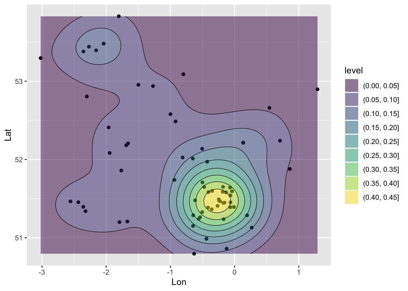
Figure 4.3: A ggplot generated KDE.
And this can be enhanced with a bit of context using data from the maps package. First, create a highly generalised map of the UK:
world <- st_as_sf(map("world", plot = FALSE, fill = TRUE))
UK = world[world$ID=="UK",]
You could examine this with a simple plot or with ggplot:
plot(st_geometry(UK))
ggplot(UK) + geom_sf()
Next, plot this with the KDE density surface above, to create Figure 4.4 To see what is going on try running with each additional line a step at a time, but remembering to leave out the final + on each occasion:
# plot the UK and set some plot limits
ggplot(UK) + geom_sf() + xlim(-7, 2) + ylim(50, 56) + xlab("") + ylab("") +
  # add the point layer BUT this time passing in the data & aes arguments in each line
  # points
  geom_point(data=coords, aes(x=X, y=Y)) +
  # surface
  geom_density_2d_filled(data=coords, aes(x=X, y=Y), alpha = 0.5) +
  # contours
geom_density_2d(data=coords, aes(x=X, y=Y), size = 0.25, colour = "black") 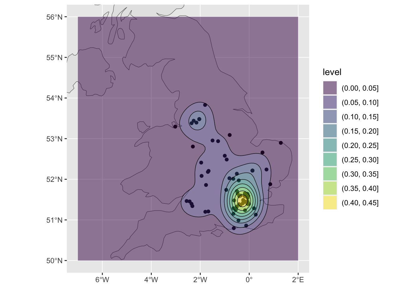
Figure 4.4: A ggplot density surface with some context.
So having created the heat map, what do you think this shows? Does this spatial pattern reflect your experiences?
Finally, please talk to me if you want to play with more of this stuff: I have tons: from scraping the Police website for crime data to generating sentiment analysis of Twitter data!
4.7 References
Bibby P, Shepherd J (2004). Developing a new classification of urban and rural areas for policy purposes–the methodology. London: Defra - see https://www.academia.edu/download/54884570/2001-rural-urban-definition-methodology-technical.pdf
Gale CG, Singleton AD, Bates AG, Longley PA (2016). Creating the 2011 area classification for output areas (2011 OAC). Journal of Spatial Information Science, 12:1-27 - see https://digitalcommons.library.umaine.edu/cgi/viewcontent.cgi?article=1076&context=josis