Chapter 2 Week 20: Introduction to R and the Module Survey
2.1 Overview and Introduction
This week’s session will cover the following:
- Loading and examining tabular data (like spreadsheets) into R
- Exploratory Data Analysis (or EDA) of data characteristics, properties and structure
- Saving data and loading data in different ways
2.2 Preparation
In Windows Explorer, you should have already created a folder to do your R work in for this module on your M-Drive when you did the Week 19 self-directed practical, and have given it a name like GEOG1400. For this session, create a sub-folder (also known as a workspace) called Week20.
Download the data (geog1400_data_2023.csv) and the R script (week20.R) from the VLE and move these to this folder. We have tried to stress the importance of this file management each week in the practicals.
Then, assuming you are using a University PC, open AppsAnywhere and start R before you launch RStudio.
The steps are:
- Search for “Cran” and R is listed under Cran R 4.2.0 x64.
- Click on Launch and then minimise the RGui window after it opens (NB this should be minimised and not closed).
- Search for RStudio which is listed under Rstudio 2022.
- Again click Launch and ignore any package or software updates.
Then open RStudio and in the File pane navigate to the folder you created, containing the CSV data file and the R script, and open the week20.R file.
2.3 Data and Analysis
2.3.1 Loading tabular data
The survey data can be loaded into RStudio using the read.csv function.
However, you will need to tell R where to get the data from. The easiest way to do this is to use the menu if the R script file is open. Go to Session > Set Working Directory > To Source File Location to set the working directory to the location where your week20.R script is saved. When you do this you will see line of code print out in the Console (bottom left pane) similar to setwd("SomeFilePath"). You can copy this line of code to your script and paste into the line above the line calling the read.csv function.
# use read.csv to load a CSV file
# this is assignment to an object called `df`
df = read.csv(file = "geog1400_data_2023.csv", stringsAsFactors = TRUE)
The stringsAsFactors = TRUE parameter tells R to read any character or text variables as classes or categories and not as just text.
You could inspect the help for the read.csv function to see the different parameters and their default values:
help(read.csv)
# or
?read.csv
Functions always return something and in this case read.csv() function has returned a tabular R object with 70 records and 24 fields. This has been assigned to df.
Finally in this section, lets have a look at the data. This can be done in a number of ways.
- you could look at the
dfobject by enteringdfin the Console. However this is not particular helpful as it simply prints out everything that is indfto the Console. - you could click on the
dfobject in the Environment pane and this shows the structure of the attributes in different fields. - you could click on the little grid-like icon next
dfin the Environment pane to get aViewof the data and remember to close the tab that opens!. - or you could use some code as in the examples below.
First, let’s have a look at the internal structure of the data using the str function:
str(df)The head function does this by printing out the first six records of the data table and you may need to scroll up and down in the Console pane to see all of what is returned.
head(df)Another way to explore the data is through the summary function:
summary(df)Here we can see that the data has one record / observation of Non-binary in the Gender variable. Low counts like this can be a problem. So for the moment we will filter this record out of df.
# remove record
df <- df[df$Gender != "Non-binary",]
# adjust the factor levels
df$Gender = factor(df$Gender, levels = c("Female", "Male"))
Task 1. Examine the help for the head function and write some code that returns the last 6 records in df.
Finally in this section, we come back to the dollar sign ($). This is used to refer to or extract an individual named field or variable in an R object, like df.
The code below prints out the Hand_Span attribute and generates a summary of its values:
# extract an individual variable
df$Hand_Span
## [1] 212 210 185 200 185 235 175 200 180 177 195 195 160 100 185 208 164 50 185
## [20] 240 200 180 185 210 160 150 160 150 170 195 150 205 152 185 160 190 190 190
## [39] 190 190 190 180 175 180 250 220 215 180 180 170 215 203 213 170 192 205 240
## [58] 240 187 193 210 200 210 130 200 160 180 220 220# generate a summary of an individual variable
summary(df$Hand_Span)## Min. 1st Qu. Median Mean 3rd Qu. Max.
## 50.0 175.0 190.0 187.4 205.0 250.0And of course we can use such operations to assign the result to new R objects. The code below extracts three variables from df, assigns them to x, y and z, and then uses the data.frame function to convert these into a new data.frame object called my_df:
# extract three variables, assigning them to temporary R objects
x = df$Hand_Span
y = df$Height
z = df$Piercings
# create a data.frame from these, naming the new variables
my_df = data.frame(hand = x,height = y,piercing = z)
You should have a look at what you have created:
head(my_df)## hand height piercing
## 1 212 165 5
## 2 210 160 6
## 3 185 171 3
## 4 200 171 0
## 5 185 183 0
## 6 235 193 0summary(my_df)## hand height piercing
## Min. : 50.0 Min. :152.0 Min. : 0.000
## 1st Qu.:175.0 1st Qu.:165.0 1st Qu.: 0.000
## Median :190.0 Median :172.0 Median : 2.000
## Mean :187.4 Mean :171.7 Mean : 2.971
## 3rd Qu.:205.0 3rd Qu.:178.0 3rd Qu.: 5.000
## Max. :250.0 Max. :193.0 Max. :12.000The temporary R objects can be removed from the Environment using the rm function and a combine vector function, c() that you encountered in Week 19, that takes a vector of object names (hence they are in quotes) as its arguments.
rm(list = c("x","y","z"))Task 2. Write some code to return the number of rows and the number of columns in my_df. Hint: have a look at the help for the functions dim and nrow.
2.3.2 Exploratory Data Analysis (EDA)
You have already examined the data in the df object in the Environment pane, have explored the structure of the data table using the str function and have examined it and head functions.
We can see that we have numeric data in integers (int) form (these are counts or whole numbers) and continuous (num) form, and the character variables (text) have been converted to factors.
For each of these data types we can generate numeric and visual summaries and we can also see how they interact with each other.
2.3.2.1 Numeric data (continuous, counts, etc)
Starting with the simplest case, the distribution of a single numeric variable whether continuous or count based can be examined numerically using the summary function, as above.
The code below does this for the Hand_Span and GymHours variables. The summary function provides a number of measures including central tendency (mean, median), spread (1st and 3rd quartiles) and range (max, min):
# hand span
summary(df$Hand_Span)
## Min. 1st Qu. Median Mean 3rd Qu. Max.
## 50.0 175.0 190.0 187.4 205.0 250.0# gym hours
summary(df$GymHours)## Min. 1st Qu. Median Mean 3rd Qu. Max.
## 0.000 3.000 5.000 5.006 7.000 15.000A visual approach is more intuitive. The code below plots histograms of the two variables, using the hist function:
# histograms
hist(df$Hand_Span, main = "Hand span", xlab = "mm")
hist(df$GymHours, main = "Histogram of Gym Hours", xlab = "Hours", col = "dodgerblue")
Of note here is that Hand_Span has a relatively normal, bell-shaped distribution whereas the GymHours variable is skewed with a Poisson distribution, that is classically associated with counts.
We can examine the how these distributions relate to central tendencies (mean, median) and spread, using standard deviations for means and the IQR for medians.
From the numeric summary above, the mean of df$Hand_Span is 187.4 mm. We can determine the spread around this value by calculating the standard deviation for our sample , as is returned by the sd function in R:
sd(df$Hand_Span)## [1] 31.19027Recall from the lecture 68% of the observations will have a value within 1 standard deviation from the mean, with 95% being within 2 standard deviations. So this suggest that 68% of the hand span values are within 31.2 mm of the mean of 187.4 mm (i.e. 156.2 mm and rhs_mean + hs_sd` mm).
We can augment the histogram of the Hand_Span variable with this information, using the abline function to add lines to create the figure below:
# histogram
hist(df$Hand_Span, col="salmon", main="Hand Span (with mean and std dev)",
     breaks = 15, xlab="mm")
# calculate and add the mean
mean_val = mean(df$Hand_Span)
abline(v = mean_val, col = "darkred", lwd = 3)
# calculate and add the standard deviation lines around the mean
sdev = sd(df$Hand_Span)
# minus 1 sd
abline(v = mean_val-sdev, col = "red", lwd = 3, lty = 2)
# plus 1 sd
abline(v = mean_val+sdev, col = "red", lwd = 3, lty = 2)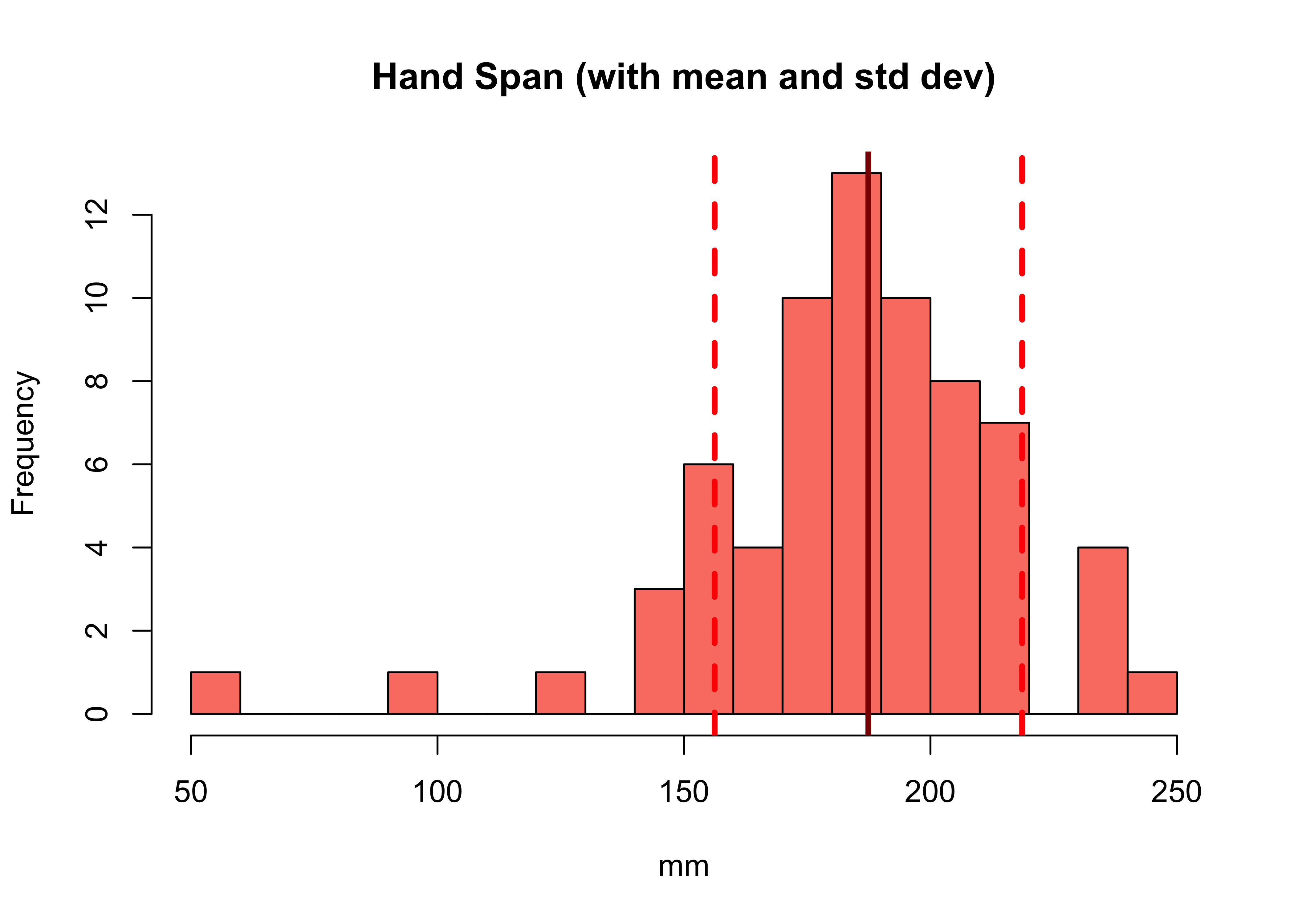
Figure 2.1: A histogram with the mean (solid line) and standard deviation (dashed lines).
NB In the call to abline above, note the specification of different line types (lty) and line widths (lwd). Later on, you could explore these as described here
white
Task 3. Write some code to plot a histogram of the Height variable in df, with lines showing the mean and the standard deviation around the mean.
Boxplots show the same information but here we can see a bit more of the nature of the distribution. The dark line is the median and the box indicates the 1st and and 3rd quartiles (the Inter-Quartile Range):
boxplot(df$Hand_Span,horizontal=TRUE, xlab='Handspan (mm)', col = "red")
boxplot(df$GymHours,horizontal=TRUE, xlab='Hours in the Gym', col = "tomato")
You should compare how the 2 kinds of distribution are shown in the histograms and the boxplots - with a trained eye it is possible to see the normal distribution of in the boxplot of Hand_Span and the skewed Poisson distribution represented in the boxplot of GymHours.
In summary, numeric variable distributions, of counts and continuous data, should be investigated as an initial step in any data analysis. There are a number of metrics and graphical functions (tools) for doing this including summary(), hist() and boxplot().
2.3.2.2 Categorical data
Some of the character variables could be considered as categorical, representing a grouping or classification of some kind, as described above. In these cases we are interested in the count or frequency of each class in the classification, which we can examine numerically or graphically.
The simplest way to examine classes is to put them into a table of counts. The table function is very useful and in the code below it is applied to one of the categorical variables in the survey data:
table(df$UniTravelMode)These can be made a bit more tabular in format with the data.frame function, which takes the table operation as its input:
data.frame(table(df$UniTravelMode))## Var1 Freq
## 1 Bicycle 2
## 2 Bus 3
## 3 On foot 49
## 4 Private car as a driver 3
## 5 Private car as a passenger 7
## 6 Train 5This can be enhanced with proportions. The code below separates this into a 3 stage operation, first creating tab, then proportions and then passing these to data.frame().
# assign the table vector to tab but naming it Mode
tab = table(Mode = df$UniTravelMode)
# calculate the proportions
prop = as.vector(tab/sum(tab))
# put into a data frame
data.frame(tab, Prop = round(prop, 3))
## Mode Freq Prop
## 1 Bicycle 2 0.029
## 2 Bus 3 0.043
## 3 On foot 49 0.710
## 4 Private car as a driver 3 0.043
## 5 Private car as a passenger 7 0.101
## 6 Train 5 0.072Categorical data can be visualised using bar plots of the tabularised data. The code below does this by creating a table, changing the names of the table and passing that to the barplot function:
# check the current names
names(tab)
# rename
names(tab) = c("Bike", "Bus", "On Foot", "Driver", "Carshare", "Train")
# standard barplot
barplot(tab)
# sort the table, make horizontal, set the angle of the text (las)
barplot(sort(tab), horiz = T, las = 2,
        col = c("darkred","red","tomato", "orangered", "palevioletred", "violetred"))
The plot can be enhanced by extending the margins as in the figure below.
# make the plot margins wider: order is bottom, left, top, right
par(mar = c(4,10,2,2))
# include a vector of 7 colours - enter 'colours()' to see these
barplot(sort(tab), horiz = T, las = 2,
        col = c("darkred","red","tomato","salmon","violetred","red2", "purple"))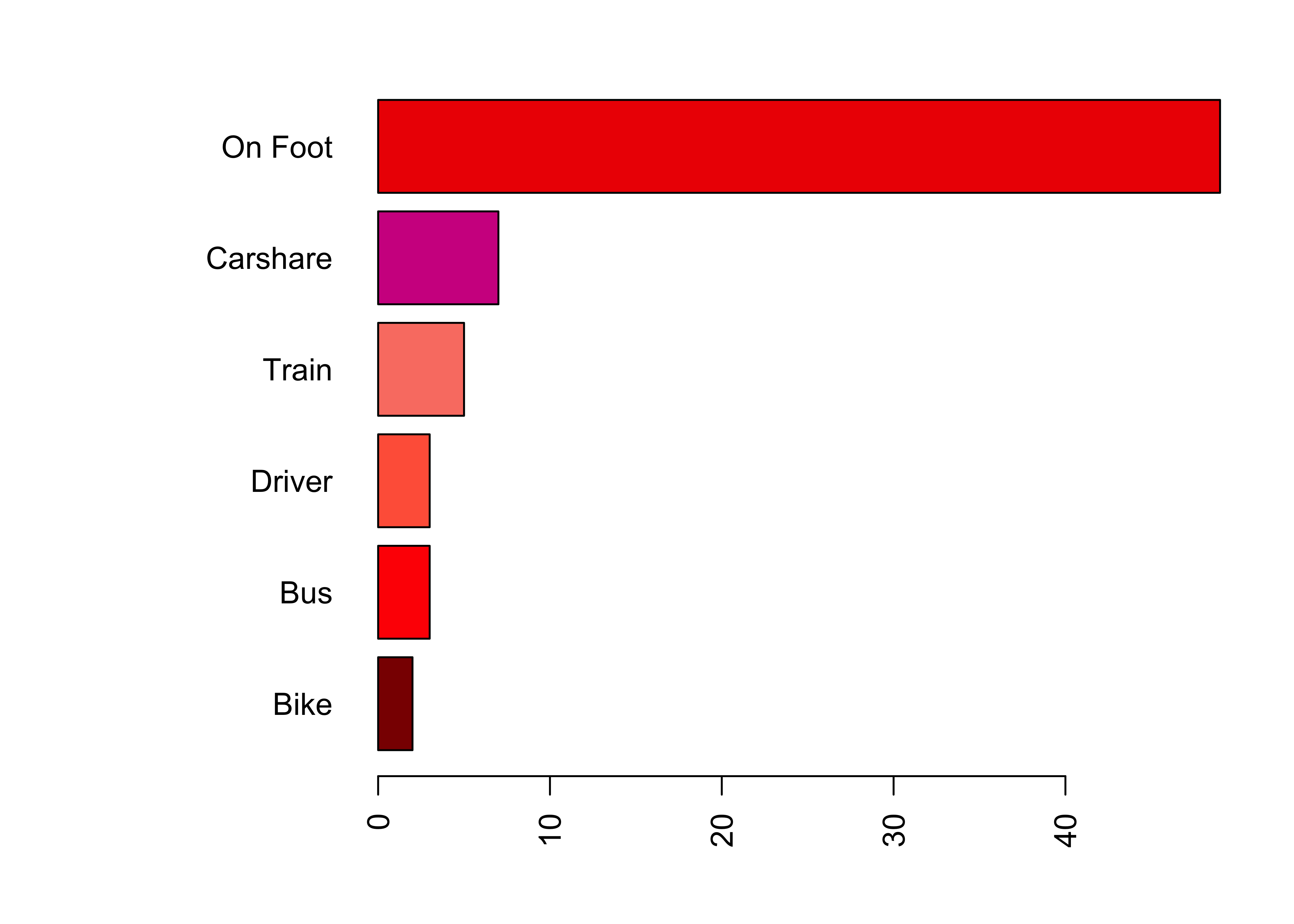
Figure 2.2: A barplot of travel modes with widened margins.
# put the margins back!
par(mar = c(4,4,2,2))
Task 4.Write some code to generate a 3 column data.frame of the different responses in the AlevelGeog variable, showing the class name, the count (frequency) and the proportion of the responses indicating each class (i.e. just as you did for UniTravelMode above).
white
Task 5.What proportion of survey responses indicated Did not study Geography?
2.3.3 Variable interactions
This final section on data variable examines how they interact. There are 3 basic kinds of pair-wise interactions:
- Continuous to Continuous
- Categorical to Categorical
- Continuous to Categorical
2.3.3.1 Continuous to Continuous
The simplest way of examining how pairs of continuous (numeric) variables relate to each other is through correlations for numeric summaries and scatterplots for visual ones. The code below examines the ShoeSize and Height variables using the cor function for the correlation and a simple X, Y scatter plot as in the figure below.
# Correlations
cor(df$ShoeSize, df$Height)
## [1] 0.7652841# Scatter Plot
plot(x = df$ShoeSize, y = df$Height, pch = 19, cex = 0.6)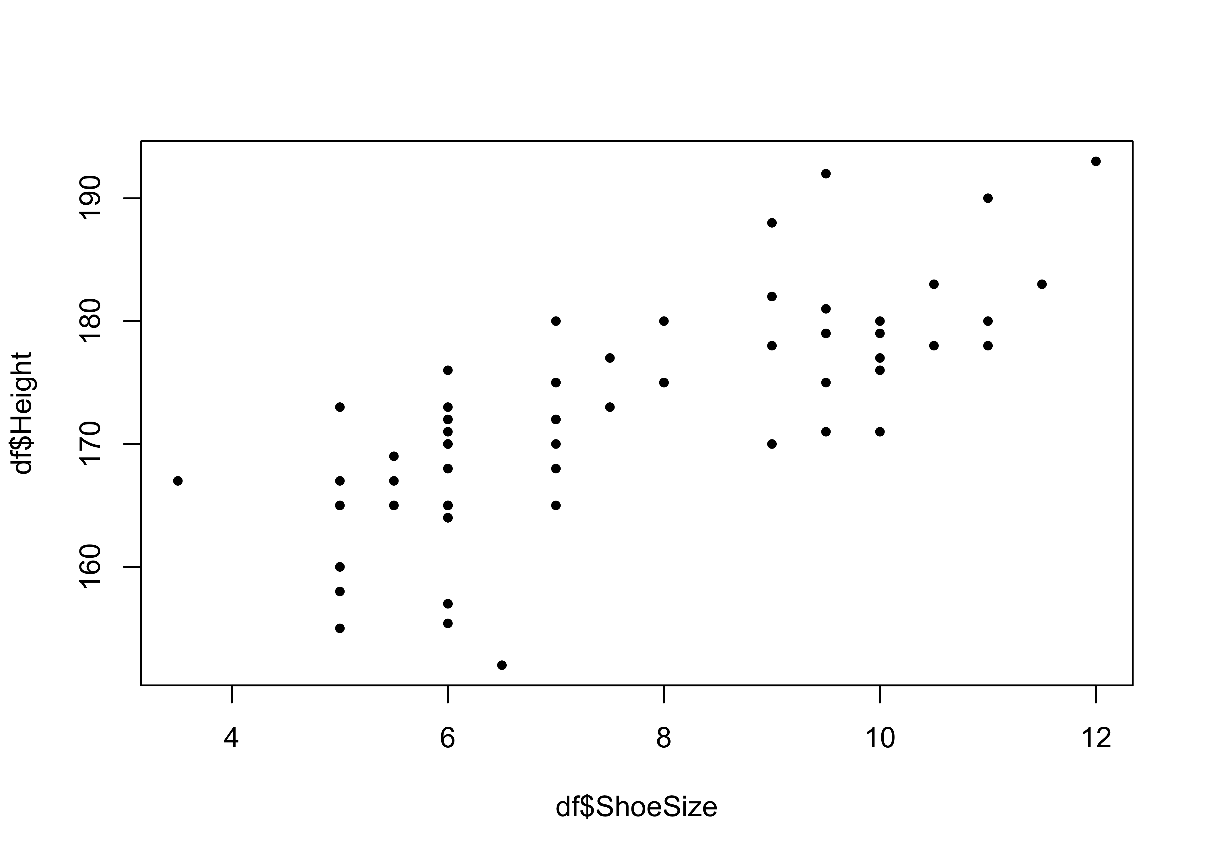
Figure 2.3: A simple scatter plot of correlations.
This shows, unsurprisingly that there is a strong relationship between these two variables.
It is possible to examine a number of pair-wise correlations together:
# correlation
cor_tab = cor(df[, c("ShoeSize", "Height", "Piercings")])
# examine, rounding to 3 significant figs
round(cor_tab, 3)
## ShoeSize Height Piercings
## ShoeSize 1.000 0.765 -0.646
## Height 0.765 1.000 -0.544
## Piercings -0.646 -0.544 1.000These can be plotted:
plot(df[, c("ShoeSize", "Height", "Piercings")])We can see that there are some possibly interesting relationships between height, shoe size and piercings, for example. Some may be more tenuous. We will examine correlations and methods to determine whether these relationships are significant (and what that means) in more detail later in the module.
Notice in the above lines of code how a vector of 3 variables names was used to extract the variables in df that were passed to the cor() plot() functions using square brackets.
[, c("ShoeSize", "Height", "Piercings")]This starts to hint at different ways that rows and columns can be extracted from data tables, that we was covered in detail in Section 1.5.6 in the Week 19 self-directed practical.
2.3.3.2 Categorical to Categorical
The relationship between two sets of classes or categories can be explored using correspondence tables created by the table function.
table(df$UniTravelMode, df$Gender)
table(df$Visual, df$Gender)
table(df$DrivingLicense, df$Gender)
Again, we will examine methods for determining whether the cross-tabulated counts and their differences are significant (i.e. would not be expected by chance) in later weeks.
2.3.3.3 Continuous to Categorical
We may also be interested in the exploring differences and similarities in the continuous variables associated with for each categorical class. This can be done using multiple boxplots.
# Height against Gender
boxplot(Height ~ Gender, data=df, col=c("red", "yellow3"), las=2, horizontal = T)
Here we can see, unsurprisingly that the Male group has a greater median height than Female. Other group distinctions are less obvious but none the less interesting. The code below using the same approach to examine height against blood donor (Yes or No):
# Height against Blood Donor
boxplot(Height ~ BloodDonor, data=df,
        col=c("red", "salmon"), las=2, horizontal = T, ylab = "Blood Donor")
In this case there are some differences in the distributions of typical heights across these group.
We can do this numerically as well, but it is a bit more convoluted using the with and aggregate functions. The code below compares the distribution of height values across the 2 groups of blood donors:
with(df, aggregate(Hand_Span, by=list(BloodDonor) , FUN=summary))## Group.1 x.Min. x.1st Qu. x.Median x.Mean x.3rd Qu. x.Max.
## 1 No 50.0000 175.0000 190.0000 186.9016 205.0000 250.0000
## 2 Yes 150.0000 181.2500 197.5000 191.2500 206.7500 213.00002.3.4 Saving and loading data in different ways
Finally, having loaded a .csv file at the start of this, this section demonstrates a few ways of saving your data and your workspace.
First, for any R session you can save all of the objects you have created so that you can come back to it at a later date. The code below saves everything to an .RData file in your current working directory:
save.image("week20.RData")You should see the file in your folder.
You may wish to chose to save just df. The code below does this in two ways: to a CSV file and to an RData file:
# CSV
write.csv(df, file = "df.csv", row.names = FALSE)
# RData file
save(list = c("df"), file = "df.RData")
Again, you should see these objects in your workspace folder. Notice how much more efficiently the .RData format saves data compared to standard encoding.
Or you could save multiple objects. The code below does this for cor_tab and tab:
save(list = c("cor_tab", "tab"), file = "myfile.RData")You can then load R objects in RData files in your workspace at a later date using the load function. This loads the R objects in the RData file to your R session. To test this you can remove all R objects from your session (watch the objects in the Environment pane disappear when you run the first line) and then reload them:
# remove all objects
rm(list = ls())
# load them back
load("week20.RData")
2.4 Examples of using distributions to generate probabilities
In the lecture, assumptions about the distributions of different variables were used to generate predictions of the probability of a particular measurement value being found. The lecture used the normal distribution of the Hand_Span variable and the Poisson distribution of the Piercings variable to infer a probability of a respondent having a greater or lesser measurement than some value.
The purpose of this section is to show how this was done.
2.4.1 Normal Distributions
Continuous data are where what is recorded can be an infinite / uncountable set of values and relate to some kind of measurement (186cm, 186.7cm, 186.73cm, etc). They typically have a normal distribution. R has functions for generating a random set of normally distributed data as do all stats packages. We can use these to see how well our data matches these expected distributions.
The code below uses the pnorm function and the mean and standard deviation for the Hand_Span variable to determine the probability of a respondent having a hand span of 110 mm or less and greater than 210 mm:
# less than 110 mm: lower.tail = TRUE
pnorm(110, mean = mean(df$Hand_Span), sd = sd(df$Hand_Span), lower.tail = TRUE)
## [1] 0.006537333# greater than 210 mm: lower.tail = FALSE
pnorm(210, mean = mean(df$Hand_Span), sd = sd(df$Hand_Span), lower.tail = FALSE)## [1] 0.2344104Note that lower.tail parameter indicates the less than and greater than, and that the values above can be converted to percentages by multiplying by 100.
Do these make sense? A quick look at the percentages and the distribution can help confirm:
- 110 mm or less of 0.7%
- greater than 210 mm of 23.4%
hist(df$Hand_Span)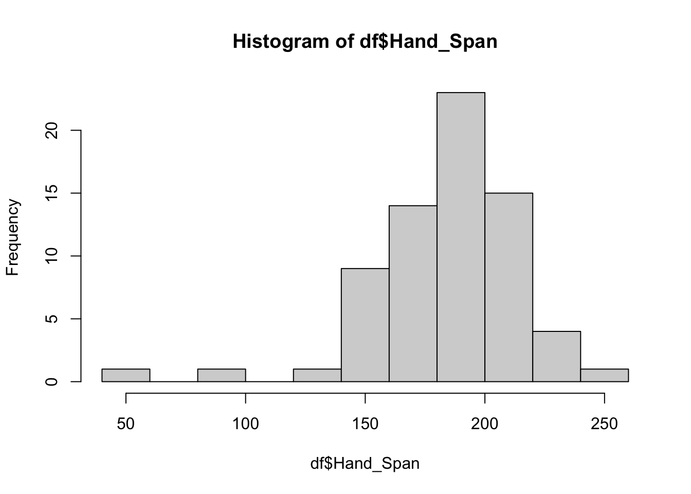
2.4.2 Poisson Distributions (counts)
Count data are data where what is being recorded is a finite or countable set of values. These typically have a Poisson distribution or Binomial distribution. Binomial distributions relating responses that have two outcomes: Fail/Success, True/False or Yes/No, etc. Generally count data typically represent integer values (0, 1, 2, 3, etc) from counting and Poisson probability distribution describes the occurrences of independent event in an interval.
For the count data, again we can use an expected Poisson distribution generated by the ppois function to determine probabilities from the data of 2 piercings or less, and 7 or more piercings:
# 2 piercings or less: lower.tail = TRUE
ppois(2, lambda=mean(df$Piercings), lower.tail = TRUE)
## [1] 0.4297153# 7 or more piercings: lower.tail = FALSE
ppois(6, lambda=mean(df$Piercings), lower.tail = FALSE) ## [1] 0.0320685This the probability in percentages of of a respondent having:
- 2 piercings or less of 43%
- 7 or more piercings of 3.2%
The above code snippets show how probabilities of an event or a measurement can be generated from a distribution. However they also serve to illustrate why understanding data distributions is important. This is especially the case as many statistical tools and tests are underpinned by some expected or assumed distribution and its associated probabilities (regression and significance, for example).
Answers to tasks
Task 1. Examine the help for the function head and write some code that returns the last 6 records in df.
tail(df)Task 2. Write some code to return the number of rows and the number of columns in my_df. Hint: have a look at the help for the function nrow.
# number of rows
nrow(my_df)
# number of columns
ncol(my_df)
# or both together: rows then columns
dim(my_df)
Task 3. Write some code to plot a histogram of the Height variable in df, with lines showing the mean and the standard deviation around the mean.
# histogram
hist(df$Height, col = "salmon", main = "Height", xlab = "cm")
# calculate and add the mean
mean_val = mean(df$Height, na.rm = T)
abline(v = mean_val, col = "darkred", lwd = 3)
# calculate and add the standard deviation lines around the mean
sdev = sd(df$Height, na.rm = T)
abline(v = mean_val-sdev, col = "red", lwd = 3, lty = 2)
abline(v = mean_val+sdev, col = "red", lwd = 3, lty = 2)
Task 4. Write some code to generate a 3 column data.frame of the different responses in the AlevelGeog variable, showing the class name, the count (frequency) and the proportion of the responses indicating each class (i.e. just as you did for UniTravelMode above.)}
# assign the table vector to tab
tab = table(Type = df$AlevelGeog)
# calculate the proportions
prop = as.vector(tab/sum(tab))
# put into a data frame
data.frame(tab, Prop = round(prop, 3))
## Type Freq Prop
## 1 A-level 65 0.942
## 2 Did not study Geography 3 0.043
## 3 International Baccalaureate 1 0.014Task 5. What proportion of survey responses indicated Did not study Geography?
# answer (from the the object created in Task 4)
prop[1]
## [1] 0.942029References
Brunsdon C and Comber A (2020). Big Issues for Big Data: challenges for critical spatial data analytics. Journal of Spatial Information Science, 21: 89–98, https://doi.org/10.5311/JOSIS.2020.21.625
Brunsdon C and Comber A (2020). Opening practice: supporting Reproducibility and Critical spatial data science. Journal of Geographical Systems, https://doi.org/10.1007/s10109-020-00334-2