Chapter 3 Exploratory Analyses
In the Chapter 1.3.3 discussion of the 5A Method, we describe three types of data analysis: exploratory, inferential, and predictive. The next three chapters of the text dive deeper into each of these analyses. Exploratory data analysis primarily seeks to describe the distributions within and associations between variables. Often we hope to generate hypotheses regarding the parameters of a distribution to be tested in an inferential analysis. In some cases, we wish to identify associations between variables for later use in a predictive analysis. Other times, the exploration is purely to describe the data at hand, without any intention of extending insights to a broader context. Regardless, we have a vast collection of methods and tools at our disposal to explore data.
Exploratory analyses rely heavily on the capacity to summarize variable values in numerical and visual form. Consequently, we open the chapter with an introduction to descriptive statistics and data graphics. We then apply numerical and visual methods to explore the distributions of both categorical and numerical variables. The chapter concludes with an exploration of both linear and nonlinear associations. In each section, we provide a brief introduction to the focus area before demonstrating the solution to an exemplar problem using the 5A Method. Let’s start exploring!
3.1 Data Summary
Many modern data sets consist of thousands, if not millions, of observations. With so many individual values, how could we possibly describe the distributions and associations of a given variable? The answer is that we summarize a variable’s values using statistics and visualizations. It is much easier for analysts and stakeholders to consume a few numerical values and visual graphics compared to a table with thousands of rows. Yet, certain statistics and graphics are better suited for particular variable types and applications. As a result, it is critical that data scientists choose the appropriate summary tools and avoid misleading conclusions.
3.1.1 Descriptive Statistics
In Chapter 2.3.2, we briefly introduced a few statistics to facilitate the use of the summarize() function. Now we dig deeper into the primary types of statistics and their use in exploratory analyses. Summary statistics are employed to describe the distribution of a variable’s values based on frequency, centrality, and dispersion. Statistics can also describe the association between two variables’ values based on conditional frequency and correlation. We define these characteristics below and present the most common statistics within each category.
Throughout the section we demonstrate statistics using the popular iris data set. The data was originally collected by Edgar Anderson in 1935 (Anderson 1935) and is included in the base R installation. It comprises petal and sepal measurements for three different species of iris flowers. We purposely suppress the code required to compute the descriptive statistics in order to focus on definitions and interpretations. The associated code and applications are reserved for the subsequent case studies.
Frequency
Frequency refers to how often particular variable values occur. For a categorical variable, frequency typically consists of counts of the number of observations within each category. For example, if we wanted to summarize the frequency of each iris species within our data set we might construct the table below.
| species | count |
|---|---|
| setosa | 50 |
| versicolor | 50 |
| virginica | 50 |
Rather than attempting to review 150 rows of data, Table 3.1 offers a quick summary of the species frequency. It is clear that there are an equal number of each iris species in the data. That fact would be difficult to discern without a summary statistic.
For continuous, numerical variables it is often not useful to summarize the frequency of individual values. Depending on the level of fidelity (i.e., decimal places), it’s possible that none of the values are repeated. Instead we determine the frequency within ranges of values. With the iris data, suppose we wanted to summarize the frequency of petal lengths (in centimeters). Table 3.2 displays the appropriate statistics.
| length | count | proportion |
|---|---|---|
| 1-1.9 | 50 | 0.33 |
| 2-2.9 | 0 | 0.00 |
| 3-3.9 | 11 | 0.07 |
| 4-4.9 | 43 | 0.29 |
| 5-5.9 | 35 | 0.23 |
| 6-6.9 | 11 | 0.07 |
Using the frequency table, we quickly determine that none of the flowers have petals between 2 and 2.9 centimeters. Without such a summary, we would be left to manually search the values for petal length. The table also shows another type of statistic for describing frequency, which is a proportion.
One downside to using counts as a frequency measure is that they only having meaning relative to a total. If we tell someone that 50 flowers have a petal length less than 2 centimeters, it is not clear whether that represents a lot or a little. If there are 1,000 flowers total, then 50 is not as significant compared to when there are only 150 flowers total. A proportion (i.e., relative frequency) does not suffer this problem. If we know that 33% of the flowers are less than 2 centimeters, then we can comprehend the significance without knowing the total.
Upon summarizing the frequency of particular variable values, we might be interested in knowing the most frequent value. The most frequent value (or range of values) for a variable is a statistic known as the mode. When a variable has a single mode, we refer to it as unimodal. In the unique case of all values occurring with equal frequency (i.e., uniform) we also label the variable unimodal. Table 3.1 is a clear example of this case, since all species occur with equal frequency. However, it is more often the case that unimodal variables have one distinct, most frequent value (or range of values) and all other values occur much less frequently.
If a variable has more than one distinct, most frequent value, then we refer to it as multimodal. To be clear, the frequencies of the multiple modes do not need to be exactly the same. There simply must exist a distinctly larger frequency among the other neighboring values. The petal length frequencies in Table 3.2 are a good example of this phenomenon. While lengths between 1 and 1.9 centimeters are the most common overall, lengths between 4 and 4.9 centimeters also stand out among adjacent values. For this bimodal variable, we would refer to a major mode (1-1.9 cm) and a minor mode (4-4.9 cm).
Centrality
Centrality, or central tendancy, refers loosely to the middle of a variable’s values. For some unimodal variables, the middle might coincide with the mode. In this case, we can think of a variable’s center as meaning its most common, or expected, value. However, this is not always the case. For bimodal variables in particular, the most commonly occurring values are not always in the literal middle. Even for unimodal variables, extreme values might skew the definition of middle. We investigate these concepts further with two well-known statistics.
The median of a variable is literally the middle value. In other words, half of the variable values are larger and half are smaller. However, this requires some sense of ordering to the values. Thus, for categorical variables, we can only compute the median when they are ordinal. For numerical variables, we compute the median by sorting the values in ascending order and selecting the middle value. Of course, if there are an even number of observations, then there is no middle value! After sorting the petal lengths for the 150 irises in our data set, the 75th value is 4.3 and the 76th value is 4.4. Which should we choose as the middle? In this case, we choose 4.35 since it is halfway between the two values.
The other most common statistic to describe centrality is the arithmetic mean. There is no sense of a mean for categorical variables, because the calculation requires summation and division. For numerical variables, we sum all of the values and divide by the number of values. The result is what we generally refer to as the average. The average value for a variable invokes the idea of the most common or expected value. However, we once again must be careful. The mean petal length for all 150 irises is 3.76 centimeters. Yet, we know that the modes are 1-1.9 and 4-4.9 centimeters. This apparent discrepancy is easily explained by splitting our statistics according to species.
| species | count | mean | median |
|---|---|---|---|
| setosa | 50 | 1.46 | 1.50 |
| versicolor | 50 | 4.26 | 4.35 |
| virginica | 50 | 5.55 | 5.55 |
Table 3.3 reveals that setosa irises have petals much shorter than the other two species. The 50 setosas “pull” the mean petal length below the median (middle) length of 4.35. When the mean and median of a variable differ greatly, we refer to the values as skewed. By contrast, when the mean and median are equal (or nearly equal) we describe the values as symmetric. In the case of a symmetric, unimodal variable it is possible for the mean, median, and mode to all be equal. Modality and skew are variable characteristics much more easily displayed in a graphic than described with a statistic. We demonstrate this extensively in future sections of the chapter. For now, we transition to the final type of descriptive statistic.
Dispersion
Dispersion, or spread, refers to how a variable’s values differ from one another. Are most of the values close to one another? Are they close to the center or accumulated near one (or both) of the extremes? These questions can be answered with a few common descriptive statistics.
The range of a variable is the difference between its maximum and minimum values. A larger range indicates a wider dispersion of values. Table 3.4 provides the range of petal lengths for each iris species.
| species | minimum | maximum | range |
|---|---|---|---|
| setosa | 1.0 | 1.9 | 0.9 |
| versicolor | 3.0 | 5.1 | 2.1 |
| virginica | 4.5 | 6.9 | 2.4 |
Versicolor and virginica irises display a broader range of petal lengths compared to setosas. Thus, the petal lengths for those two species appear to be more dispersed or spread out. One downside to describing dispersion with the overall range is its sensitivity to extreme values, which we call outliers. If one or two extraordinary flowers happen to have very long or short petals, then we may not want them to skew our overall perception of petal lengths for all flowers. A different statistic partially addresses this concern.
The interquartile range (IQR) describes the dispersion for the middle half of a variable’s values. Here we mean “middle half” literally. Rather than the difference between the maximum and minimum, IQR is the difference between the 75th percentile (3rd quartile) and 25th percentile (1st quartile). Since one-quarter of values are greater than the 75th percentile and one-quarter of values are less than the 25th percentile, the difference captures the middle half.
| species | Q1 | Q3 | IQR |
|---|---|---|---|
| setosa | 1.4 | 1.575 | 0.175 |
| versicolor | 4.0 | 4.600 | 0.600 |
| virginica | 5.1 | 5.875 | 0.775 |
Table 3.5 lists the dispersion for the middle half of petal lengths for each species. We still observe much less variability in petal lengths for setosas. But we can be more confident that this statistic is not driven by a few extreme flowers.
While ranges answer the question of how far values are from one another, they do not clearly indicate how far they are from the measures of center. A well-known statistic for this task is the standard deviation. We can think of the standard deviation as the average distance of each value from the mean. Thus, a larger standard deviation indicates a variable with values that tend to be further from center. Similar to the range, the standard deviation can be very sensitive to outliers. Table 3.6 provides all three types of descriptive statistics for the distribution of petal length: frequency, centrality, and dispersion.
| species | count | mean | stdev |
|---|---|---|---|
| setosa | 50 | 1.46 | 0.17 |
| versicolor | 50 | 4.26 | 0.47 |
| virginica | 50 | 5.55 | 0.55 |
We now have a clear summary of the distribution of petal lengths for the three species of iris. From a frequency standpoint, we know that the observations are evenly split between species. With regard to centrality, we observe that setosa irises tend to have petals much shorter than the other two species. Finally, we see that the variability in petal lengths is larger for versicolor and virginica irises. That said, the standard deviations are between 10 and 12% of the mean for all species. So, from a percentage standpoint, the dispersion of petal lengths is relatively similar.
Correlation
Descriptive statistics for frequency, centrality, and dispersion all offer valuable insights regarding the distribution of a single variable’s values. However, we are often interested in the association between the values of two variables. By association we mean a consistent relationship between changes in the value of one variable and the value of a second variable. Perhaps when one variable increases, the other variable tends to decrease. When such a relationship exists between two variables, we say they are correlated. We can measure the strength of this correlation using descriptive statistics.
The appropriate statistic for measuring correlation depends on the type of variables under consideration. If the two variables are categorical, then we cannot use the same statistics compared to when they are numerical. When one variable is categorical and the other is numerical, we require different metrics as well. Here we briefly introduce two common descriptive statistics and save a deeper discussion for the case studies.
When both variables are categorical, we can describe their correlation using a conditional proportion. Here we are trying to determine if the frequency of values for one variable changes across the values of the other variable. Suppose for a moment that the petal length variable had instead been presented as categorical with sizes small (1-2.9 cm), medium (3-4.9 cm), and large (5-6.9 cm). With this categorization, we can produce Table 3.7.
| species | small | medium | large |
|---|---|---|---|
| setosa | 50 | 0 | 0 |
| versicolor | 0 | 48 | 2 |
| virginica | 0 | 6 | 44 |
Now we ask the question, are species and petal length correlated with one another? We can answer this question by computing a proportion for each size conditioned on the species. For example, given an iris is one of the 50 virginicas the size proportions are 0% small, 12% medium, and 88% large. By contrast, the size proportions for the 50 setosas are 100% small, 0% medium, and 0% large. If there was no correlation between species and petal length, then we would expect the size proportions to be roughly the same. Instead, they are dramatically different across species. Consequently, we find that there is a strong correlation between species and petal length.
When both variables are numerical, we describe their association using a correlation coefficient. There are multiple types of coefficients for particular applications and we describe their differences further in the case studies. But a common feature among them is that their values must be between -1 and +1. A negative sign indicates a decreasing association. In other words, as one variable increases in value the other tends to decrease. A positive sign suggests an increasing association. As one variable increases in value the other also increases. The closer the coefficient is to 1 (in absolute value) the stronger the correlation. A coefficient near zero indicates there is no association between the two variables.
Referring to the iris data, we might be interested in the correlation between a petal’s length and its width. It makes intuitive sense that wider petals might tend to also be longer. We can describe this intuition in a quantitative manner using a correlation coefficient. The computation of correlation coefficients is a bit complex, so we reserve it for later discussion. For now, suffice it to say that the correlation coefficient between petal length and width is +0.96. Because this value is so close to 1, we label the association as very strong. Thus, as petals get wider there is a very strong tendancy for them to also get longer. A common categorization of correlation strength based on the coefficient’s absolute value is:
- Strong: 1 to 0.75
- Moderate: 0.75 to 0.50
- Weak: 0.50 to 0.25
- None: 0.25 to 0
An often-repeated phrase on this topic is that correlation does not imply causation. We are not claiming that a petal’s width is causing its length. In fact, in this case, both dimensions are likely caused by the biology of the flower. Instead, we are simply saying that we observe a tendancy for wider petals to also be longer.
In this subsection of the chapter we introduced a wide variety of descriptive statistics to help characterize the distributions of and associations between variables. While a collection of one-number summaries is informative, it is often more effective to depict concepts such as frequency, centrality, dispersion, and correlation in a visual graphic. Throughout the rest of the chapter, we demonstrate the use of visual summaries within case studies and indicate the most appropriate graphic for each application. Prior to that, we must first introduce the key features of data graphics in general.
3.1.2 Data Graphics
The use of data visualization is pervasive throughout the analysis process. Not only do analysts construct visual graphics for internal evaluation, but they also present them to stakeholders as part of the advising step of the 5A Method. We introduce a wide variety of such graphics in the case studies throughout this chapter. However, there are important overarching characteristics of all visualizations that warrant prior consideration. Specifically, we describe four key features of all graphics: visual cues, coordinate systems, scales, and context.
Once again, we demonstrate the concepts within the section using the iris data set and suppress the R code required to generate the visualizations. For now, the focus is on decomposing the key features of an existing graphic. In subsequent sections we provide the code to construct our own tailored graphics.
Visual Cues
Visual cues are the primary building blocks of data visualizations. We think of visual cues as the way a graphic transforms data into pictures. Some of the most common visual cues are position, height, area, shape, and color but there are many others. When constructing a data graphic, we assign each variable to an appropriate visual cue. Let’s begin our discussion with a simple bar chart that displays the number of irises of each species.
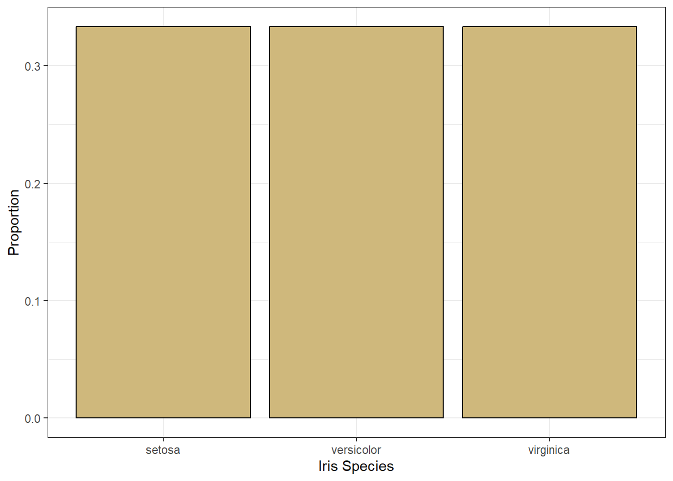
Figure 3.1: Bar Chart of Iris Species
Figure 3.1 suggests the data includes an equal number of irises of each species. There are two variables depicted in the bar chart: species and number (as a proportion). So, what visual cue is assigned to each of these variables? The cue for species is the position of the bar. The left-most bar is for setosa, the middle bar is for versicolor, and the right-most bar is for virginica. Meanwhile, the cue for number is the height of the bar. All of the bars are the same height, which indicates there is an equal number of each species.
Although the bar chart is the most common graphic for depicting frequency, it is not the only option. By choosing different visual cues, we obtain different graphics. Suppose we choose color as the cue for species and area as the cue for number (again as a proportion). In this case, we might construct the graphic in Figure 3.2.
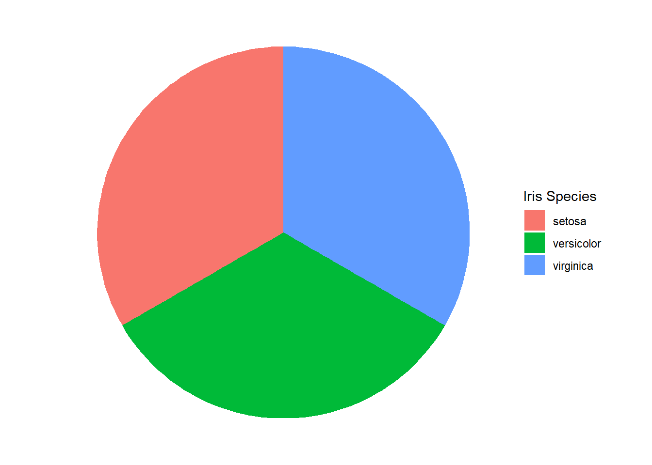
Figure 3.2: Pie Chart of Iris Species
Nothing changed about the data between the two graphics. Both represent the exact same variable values. However, the choice of visual cue dramatically changes the appearance of the graphic. Some would argue that it also changes the viewer’s capacity to interpret the associated data. In fact, research suggests that pie charts are inefficient and inaccurate in conveying frequency data compared to bar charts (Siirtola 2019). This is particularly true when the graphic summarizes a large number of categories.
Throughout the remaining chapters of the book, we suggest effective visual cues for different variable types. The simple example here demonstrates that the choice can be very important in terms of the information conveyed to the viewer. Another important choice in designing visual graphics is the coordinate system.
Coordinate Systems
The coordinate system defines how the data is organized within the graphic. The most common coordinate systems are Cartesian, polar, and geographic. The Cartesian coordinate system uses location in the standard \(x\)-\(y\) plane. Polar coordinates instead use angle and radius to place data points in the plane. Finally, geographic coordinates use latitude and longitude to locate data points.
Typically the type of data defines the appropriate coordinate system, but sometimes there are multiple options available. Our bar and pie charts of iris species provide a perfect example. The bar chart uses the Cartesian coordinate system. The position on the \(x\)-axis is used for the species, while the height along the \(y\)-axis is used for the number. By contrast, the pie chart uses the polar coordinate system. The angle and radius of the boundary lines define the area assigned to the number of irises. The fill color of that area determines the species.
The need for geographic coordinates is generally more obvious. When dealing with physical location data and maps, geographic coordinates are often the correct choice. However, even this is not a perfect rule. The Earth is (roughly) a sphere, so we can represent locations on its surface using polar coordinates rather than geographic. In some cases, the domain experts or stakeholders generating research questions have preferences for which coordinate system to employ. Thus, careful collaboration can assist with the choice of system.
As with visual cues, we present a variety of coordinate systems within the case studies and recommend appropriate choices. After choosing a coordinate system, options also exist for the scale with which we display values.
Scales
Scale is how a graphic converts data values into visual cues within the coordinate system. This conversion is generally driven by the type of variable: numerical or categorical. Numerical data appears on scales that are linear, logarithmic, or percentage. Special care must be afforded time-based numerical variables given the various units of measurement (seconds, hours, days, years, etc.) and cyclic nature. The scales for categorical variables align with their sub-types: nominal and ordinal.
In reference to Figure 3.1, the scale on the \(x\)-axis for the categorical variable is nominal because there is no natural order to the species. The scale on the \(y\)-axis for the numerical variable is percentage because a proportion is a ratio. That said, we can easily change the scale of the \(y\)-axis to linear.
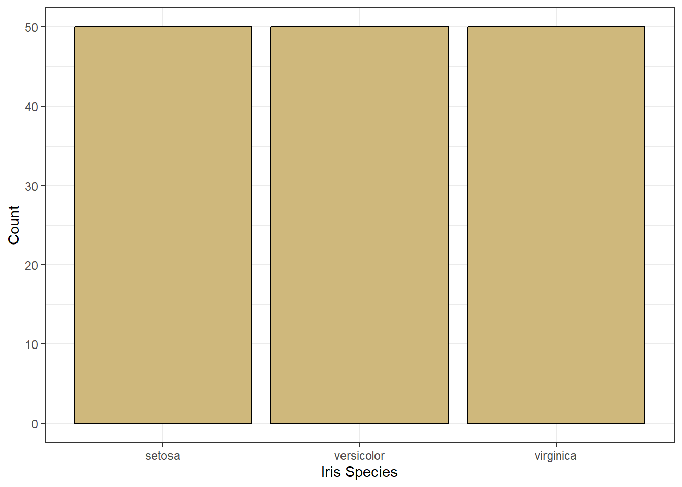
Figure 3.3: Bar Chart of Iris Species
Figure 3.3 uses the same visual cues and coordinate system, but a different scale for the number of irises. Now the scale is linear because a one unit increase in height (visual cue) suggests a one unit increase in the number of irises. This is not the case for a percentage scale. A one percentage-point increase in height is not the same as one additional iris (unless there happens to be exactly 100 of them!).
Logarithmic scales often occur in situations where we transform nonlinear relationships between variables to make them linear. A real-world example of a logarithmic scale is the Richter scale used to describe the intensity of earthquakes. With logarithmic scales, a one unit increase in visual cue suggests an order of magnitude increase in the variable value. Thus a two unit increase on the Richter scale represents an earthquake 100 times stronger (two orders of magnitude).
After selecting appropriate visual cues, coordinate systems, and scales our graphics are technically sound. However, they could be lacking in practical clarity without sufficient explanations of domain-specific information. We refer to such explanations as the context of the graphic and describe the implementation in the next subsection.
Context
Without proper context a viewer cannot extract meaningful insights from a graphic. Context refers to the real-world meaning of the data and the purpose for which the graphic was created. Graphic titles, labels, captions, and annotations (e.g., text or arrows) are common ways to clearly convey context to a viewer. However, when creating visualizations, we should always weigh context against cluttering up the graphic. Let’s construct a scatter plot of sepal length versus width for each species of iris.
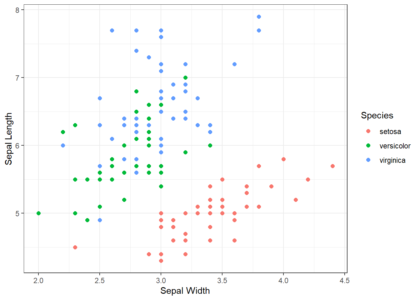
Figure 3.4: Scatter Plot of Sepal Length and Width
Prior to the discussion of context, we decompose the visual cues, coordinate system, and scales within Figure 3.4. There are three variables depicted in the graphic: sepal length, sepal width, and species. The visual cues for sepal width and length are position on the \(x\) and \(y\) axes, respectively. The visual cue for species is the color of the point. Given the use of \(x\) and \(y\) axes, we have employed the Cartesian coordinate system. The scale for both axes is linear because a one unit increase in distance along an axis represents a one unit increase in the sepal measurement. Finally, the color scale for species is nominal because there is no clear order to the color choice.
Although the scatter plot is comprised of clearly-defined cues, coordinates, and scales it lack a great deal of context. If we were to show this graphic to a viewer unfamiliar with the data, they might have a number of questions. What is a sepal? What sort of person, place, or thing has a sepal? What are the units of measurement? Where and when was this data collected and by whom? These questions are clear indicators that the graphic lacks context. Ideally, a data visualization should stand on its own with little-to-no human intervention of explanation. Let’s update the scatter plot to include context obtained from the help menu (?iris).
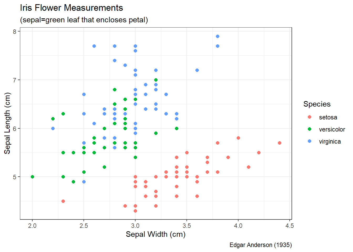
Figure 3.5: Scatter Plot of Sepal Length and Width
Figure 3.5 answers our viewer’s questions on its own. It is now clear that Edgar Anderson measured iris flowers in 1935. The part of the flower he measured (in centimeters) is the sepal, which is the green leaf that protects the petal. Regardless of species, it appears that irises with wider sepals also have longer sepals. This makes intuitive sense, because we would generally expect a larger flower to be larger in all dimensions.
Overall, this section provides a primer on the key features of all data visualizations. Clear and precise graphics include properly-matched visual cues, coordinate systems, and scales along with sufficient context for the viewer to independently draw valuable insights. For the remainder of the chapter we leverage descriptive statistics and data graphics to explore distributions and associations, and apply the terminology presented in this introduction to reinforce its importance.
3.2 Distributions
The term distribution broadly refers to the frequency, centrality, and dispersion of values for a variable. In other words, what values can a variable produce and how often do each of those values occur. In Chapter 2.2.3 we briefly introduced the concept of distributions in the context of simulated data. If the result of rolling a six-sided die is our variable, then the possible values are the integers 1 through 6 and each value occurs with equal frequency. For named distributions (e.g., Uniform) the possible values and their frequencies are clearly defined. However, not all variables follow a named distribution. In many cases, we must describe a distribution based on observed values of the variable. This is where visualization offers a stellar tool.
In the next seven sections, we introduce common graphics for exploring the distributions of variables. We begin with bar charts and word clouds for the distributions of categorical variables. Next, we present histograms and box plots for the distributions of numerical variables. Then we depict multi-variate distributions using heat maps and contour plots. This presentation includes a special type of geospatial heat map called a choropleth map. Each graphic is applied to a real-world example by following the 5A Method.
3.2.1 Bar Charts
We start our exploration with a discussion of distributions for categorical variables. In Chapter 2.1.1 we distinguish between types of categorical variables. Ordinal variables possess some natural order among the categories, while nominal variables do not. When categorical variables have a repeated structure that permits grouping, we often refer to them as factors. On the other hand, nominal variables are sometimes comprised of free text that does not easily permit grouping. For this case study, we focus on factors and save free text for the next section.
Figure 3.1 provides a simple example of a bar chart for a factor. The possible values of the factor are indicated by the individual bars: setosa, versicolor, and virginica. We refer to the values of a factor as the levels. In this case, the levels occur in equal frequency since the bars in the chart are all of equal height. Thus, a bar chart is a sensible graphic for depicting the distribution of a factor. The bars represent the possible values of the variable and their heights represent the frequency.
Given our focus on factors, we leverage functions from the forcats library throughout the case study. We also employ the dplyr library for wrangling and ggplot2 for visualization. All three of these packages are part of the tidyverse suite, so the associated functions are accessible after loading the library. Now let’s demonstrate an exploratory analysis involving factors using bar charts and the 5A Method.
Ask a Question
The National Research Opinion Center (NORC) at the University of Chicago has administered the General Social Survey (GSS) since 1972. The purpose of the survey is to monitor societal change and study the growing complexity of American society. Personal descriptors include age, race, sex, gender, marital status, income, education, political party, and religious affiliation among others. Suppose we are asked the following specific question: What was the distribution of marital status and income among those who responded to the GSS between 2000 and 2014?
This question has almost certainly already been answered! But for our academic purposes, we will pretend it has not. Based on a review of credentials at this link, the NORC appears to be a reputable source that makes its data openly available. Any time we are dealing with demographic or personally-identifiable information, we should be cognizant of ethical considerations regarding privacy and discrimination. So, we keep this in mind throughout the process.
Acquire the Data
The GSS website makes all of the survey data publicly available. So, we could access it directly. But the forcats library offers a built-in data set called gss_cat which includes GSS results between the years 2000 and 2014. Let’s load this easily-accessible data set and check its structure.
## tibble [21,483 × 9] (S3: tbl_df/tbl/data.frame)
##  $ year   : int [1:21483] 2000 2000 2000 2000 2000 2000 2000 2000 2000 2000 ...
##  $ marital: Factor w/ 6 levels "No answer","Never married",..: 2 4 5 2 4 6 2 4 6 6 ...
##  $ age    : int [1:21483] 26 48 67 39 25 25 36 44 44 47 ...
##  $ race   : Factor w/ 4 levels "Other","Black",..: 3 3 3 3 3 3 3 3 3 3 ...
##  $ rincome: Factor w/ 16 levels "No answer","Don't know",..: 8 8 16 16 16 5 4 9 4 4 ...
##  $ partyid: Factor w/ 10 levels "No answer","Don't know",..: 6 5 7 6 9 10 5 8 9 4 ...
##  $ relig  : Factor w/ 16 levels "No answer","Don't know",..: 15 15 15 6 12 15 5 15 15 15 ...
##  $ denom  : Factor w/ 30 levels "No answer","Don't know",..: 25 23 3 30 30 25 30 15 4 25 ...
##  $ tvhours: int [1:21483] 12 NA 2 4 1 NA 3 NA 0 3 ...
The data consists of a tidy data frame with 21,483 rows (observations) and 9 columns (variables). Each observation represents a person who answered the survey and the variables describe that person. Three of the variables are integers, while the remaining six variables are factors. The output provides the number of unique levels (categories) for each factor, some of which appear to be “No Answer”, “Don’t Know”, or “Other”. We’ll keep these non-answers in mind during the analysis step. As always, if we have questions about the variables included in the data, we simply call the help menu with ?gss_cat.
For the research question at hand, we reduce our focus to two of the factors using the select() function. We also remove any rows that are missing responses using the na.omit() function and then save the new data frame as gss_cat2. However, na.omit() only removes rows for which the response is literally blank (NA) and does not remove responses such as “No answer”. We address these non-answers separately.
#select two columns and omit rows with missing data
gss_cat2 <- gss_cat %>%
  select(marital,rincome) %>%
  na.omit()
Based on the manner in which the data was collected, there is no way for us to check for accidental duplicates. Ideally, each person would be assigned a unique identifier to distinguish between duplicated respondents and distinct respondents that happen to provide the same answers to the survey. Without unique identifiers, we are left to assume there are no duplicates. On the other hand, the lack of unique identifiers does help protect the identity of each respondent.
When dealing with factors, an important data cleaning procedure is to check the named levels (categories) for synonyms, misspellings, or other errors. For ordinal factors, we also want to check for proper ordering of the levels. We obtain a list of all the levels of a factor using the levels() function. Let’s begin with marital status.
## [1] "No answer"     "Never married" "Separated"     "Divorced"
## [5] "Widowed"       "Married"
There do not appear to be any mistaken repeats or other errors. The levels are unique and well-defined. We need not be concerned with order, because marital status is a nominal variable. There is no clear ordering to the levels. One might argue some sort of temporal ordering from never married, to married, to divorced, but where would we place separated and widowed? Since there is no obvious answer, we label the variable nominal. Next, we’ll investigate the reported income factor.
##  [1] "No answer"      "Don't know"     "Refused"        "$25000 or more"
##  [5] "$20000 - 24999" "$15000 - 19999" "$10000 - 14999" "$8000 to 9999"
##  [9] "$7000 to 7999"  "$6000 to 6999"  "$5000 to 5999"  "$4000 to 4999"
## [13] "$3000 to 3999"  "$1000 to 2999"  "Lt $1000"       "Not applicable"
What a mess! Some of the dollar levels have dashes and some have the word “to”. The range of dollar values within each level are not consistent and there are multiple non-answer levels. Additionally, income level is an ordinal variable that should be displayed ascending. Instead, the order is descending with non-answers mixed in. We remedy all of these issues using functions from the forcats library. Let’s begin by combining and renaming levels into sensible categories using the fct_collapse function.
#combine and rename income levels
gss_cat3 <- gss_cat2 %>%
  mutate(rincome2=fct_collapse(rincome,
                   missing=c("No answer","Don't know","Refused","Not applicable"),
                   under_5=c("Lt $1000","$1000 to 2999","$3000 to 3999","$4000 to 4999"),
                   from_5to10=c("$5000 to 5999","$6000 to 6999","$7000 to 7999","$8000 to 9999"),
                   from_10to15="$10000 - 14999",
                   from_15to20="$15000 - 19999",
                   from_20to25="$20000 - 24999",
                   over_25="$25000 or more")) %>%
  select(-rincome)

#show new levels of income
levels(gss_cat3$rincome2)
## [1] "missing" "over_25" "from_20to25" "from_15to20" "from_10to15"
## [6] "from_5to10" "under_5"We combine all of the non-answers into a single level called “missing”. We also combine and rename the dollar-value levels into consistent categories with a range of $5 thousand dollars each. After creating this new income variable rincome2, we remove the original rincome variable to avoid confusion. However, when we observe the new list of levels, we see they are still in descending order. For reordering, we employ the fct_relevel() function.
#reorder income levels
gss_cat4 <- gss_cat3 %>%
  mutate(rincome2=fct_relevel(rincome2,
                   c("missing","under_5","from_5to10","from_10to15","from_15to20",
                     "from_20to25","over_25")))

#show new categories of income
levels(gss_cat4$rincome2)
## [1] "missing" "under_5" "from_5to10" "from_10to15" "from_15to20"
## [6] "from_20to25" "over_25"Finally, we have sensible, ordered levels. Notice, we save a new data frame (gss_cat2, gss_cat3, gss_cat4) each time we change the data. This isn’t strictly necessary. We could overwrite the original table each time we make changes. But this can make it difficult to keep track of changes when learning. So, for educational purposes, we keep changes separated. That said, we now have a clean data set that is ready for analysis.
Analyze the Data
When conducting an exploratory analysis, a logical first step is simply to summarize the variables in tables. For factors, this consists of level counts that are easily obtained with the summary() function.
##           marital             rincome2
##  No answer    :   17   missing    :8468
##  Never married: 5416   under_5    :1183
##  Separated    :  743   from_5to10 : 970
##  Divorced     : 3383   from_10to15:1168
##  Widowed      : 1807   from_15to20:1048
##  Married      :10117   from_20to25:1283
##                        over_25    :7363
For marital status, only 17 respondents provided no answer. Of those who did respond, over 10,000 declared being married and less than 1,000 claimed separation. With regard to annual income, the most frequent answers were none at all or the highest income level. The remaining respondents were relatively equally-distributed across income levels.
Rather than raw counts, we might like to determine the distribution across levels as proportions. Counts can be converted to proportions using the following pipeline.
#compute income level percentages
gss_cat4 %>%
  group_by(rincome2) %>%
  summarize(count=n()) %>%
  mutate(prop=count/sum(count)) %>%
  ungroup()
## # A tibble: 7 × 3
## rincome2 count prop
## <fct> <int> <dbl>
## 1 missing 8468 0.394
## 2 under_5 1183 0.0551
## 3 from_5to10 970 0.0452
## 4 from_10to15 1168 0.0544
## 5 from_15to20 1048 0.0488
## 6 from_20to25 1283 0.0597
## 7 over_25 7363 0.343In this case, we group the data by annual income level and compute the counts using the n() function. Then we divide by the total count to obtain a proportion for each level. It is good practice to ungroup() data after achieving the desired results to avoid unintentionally-grouped calculations later on. With the counts in the form of proportions, it is much easier to provide universal insights that do not rely on knowledge of the total number of respondents. For example, we can convey that each of the income levels between $0 and $25 thousand captures around 5 to 6% of respondents. Whereas more than 34% of respondents are included in the greater than $25 thousand per year level.
While tables of counts and proportions certainly provide the distribution of respondents, they are not as easy to consume as visualizations. The most common visual graphic for counts of categorical data is the bar chart. The plot() function in the base R language automatically detects the variable type and chooses the appropriate graphic, as seen in Figure 3.6 below.
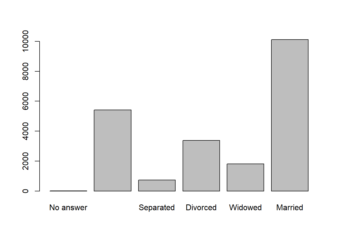
Figure 3.6: Basic Bar Chart of Marital Status
This basic plot leaves a lot to be desired in terms of clearly conveying insights. There are no titles, axis labels, units, or references, and the “Never Married” level is missing its label (likely due to spacing). For a quick, internal visualization, this might be fine. But for external presentation, the ggplot2 library offers much more control over the construction and appearance of graphics. Let’s create the same bar chart using ggplot2 layering.
#plot ggplot2 bar chart of marital status
ggplot(data=gss_cat4,aes(x=marital)) +
  geom_bar(color="black",fill="#CFB87C") +
  labs(title="General Social Survey (2000-2014)",
       x="Marital Status",
       y="Count of Respondents",
       caption="Source: University of Chicago (NORC)") +
  theme_bw()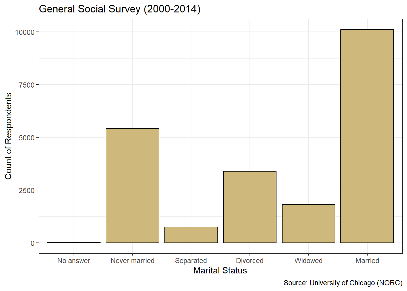
Figure 3.7: ggplot2 Bar Chart of Marital Status
Figure 3.7 is a dramatic improvement over the basic bar chart in terms of appearance. Within the ggplot() function, we specify the data location and the aesthetic connection between variable and axis using aes(). Then we pick the type of graphic and its coloring using the geom_bar() function. Colors can be listed by name (e.g., black) or using six-digit hex codes (e.g., #CFB87C). Next we assign labels for the chart, axes, and caption using the labs() function. Finally, we choose the black-and-white theme from among many different theme options. Each of these functions is layered onto the previous using the plus sign. We continue to add to our ggplot2 repertoire in future case studies, but this is a great start.
In Chapter 3.1 we describe key features of clear and precise data visualizations. To reinforce those concepts, we revisit them here. There are two variables depicted in the graphic: marital status and number of respondents. The visual cue for status is position on the \(x\)-axis, while the visual cue for number is height on the \(y\)-axis. Given the use of \(x\) and \(y\) axes, the coordinate system is Cartesian. The scale on the \(x\)-axis is nominal, while the scale on the \(y\)-axis is linear. Finally, sufficient context regarding the purpose and source of the data is provided in the title and caption.
Let’s construct a similar bar chart for the reported income factor using ggplot2 layering. However, for this graph we convert the \(y\)-axis to a proportion with an additional aesthetic declaration in the geom_bar() function.
#plot ggplot2 bar chart of income
ggplot(data=gss_cat4,aes(x=rincome2)) +
  geom_bar(aes(y=..prop..,group=1),
           color="black",fill="#CFB87C") +
  labs(title="General Social Survey (2000-2014)",
       x="Reported Income ($K)",
       y="Proportion of Respondents",
       caption="Source: University of Chicago (NORC)") +
  theme_bw()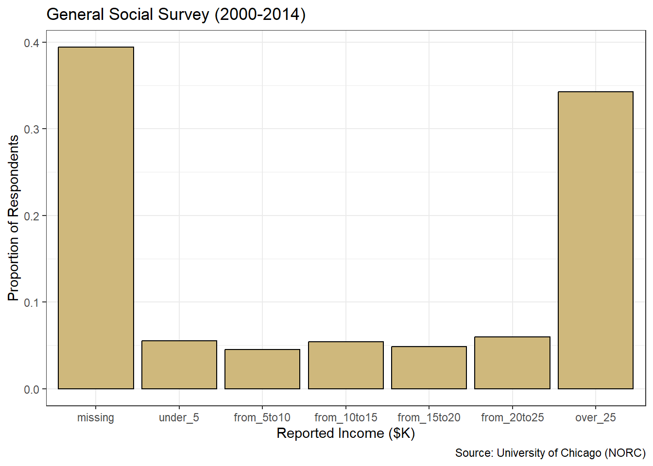
Figure 3.8: Proportions Bar Chart of Income
Figure 3.8 conveys the same insights as the table of level proportions, but in a format that is much easier to rapidly glean. The missing income level and the highest income level stand out dramatically at roughly 40% and 35%, respectively. It is also much easier to observe the equal-distribution around 5% of respondents across the remaining levels. The graphics generated with ggplot2 are well-suited for presentation to the stakeholder(s) who asked the original question.
Advise on Results
For the relatively simple question at hand, the process of advising stakeholders on analytic insights might just consist of providing and explaining the bar charts. Of course, our focus is on only two demographic variables considered one at a time. A more thorough analysis would include all of the variables and the associations between them. We’ll explore such concepts in future sections. The focus of this section is the summary and visualization of individual categorical variables.
The simplicity of this case study affords the opportunity to point out a few best practices and common pitfalls in constructing bar charts for stakeholders. One best practice for bar charts of nominal variables is to present the bars in ascending or descending order of frequency. Note, this is not the same as ordinal variable levels being naturally ordered based on innate characteristics. Instead, we order the levels based on the counts within them. We demonstrate this for marital status using the fct_infreq() function from the forcats library.
#plot descending bar chart of marital status
ggplot(data=gss_cat4,aes(x=fct_infreq(marital))) +
  geom_bar(color="black",fill="#CFB87C") +
  labs(title="General Social Survey (2000-2014)",
       x="Marital Status",
       y="Count of Respondents",
       caption="Source: University of Chicago (NORC)") +
  theme_bw()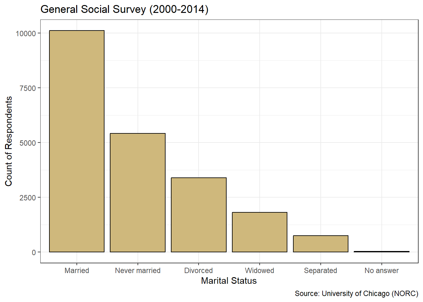
Figure 3.9: Descending Bar Chart of Marital Status
Nothing has changed about the data in Figure 3.9 compared to Figure 3.7. We simply made it easier for the viewer to quickly establish a precedence of frequency among the levels. Most respondents are married, then the next most have never been married, and so on. Ordering by frequency works well with nominal variables, but we should not sort the bars this way for ordinal variables. Otherwise we might disrupt the natural ordering of the levels and confuse the viewer.
A common pitfall with bar charts is the manipulation of the range of the \(y\)-axis. All of the bar charts we’ve presented so far begin at zero and extend beyond the highest frequency. Let’s look at the same bar chart as in Figure 3.8, but with the \(y\)-axis zoomed in on a smaller range of values using the coord_cartesian() function.
#plot misleading bar chart of income
ggplot(data=gss_cat4,aes(x=rincome2)) +
  geom_bar(aes(y=..prop..,group=1),
           color="black",fill="#CFB87C") +
  labs(title="General Social Survey (2000-2014)",
       x="Reported Income ($K)",
       y="Proportion of Respondents",
       caption="Source: University of Chicago (NORC)") +
  theme_bw() +
  coord_cartesian(ylim = c(0.04,0.06))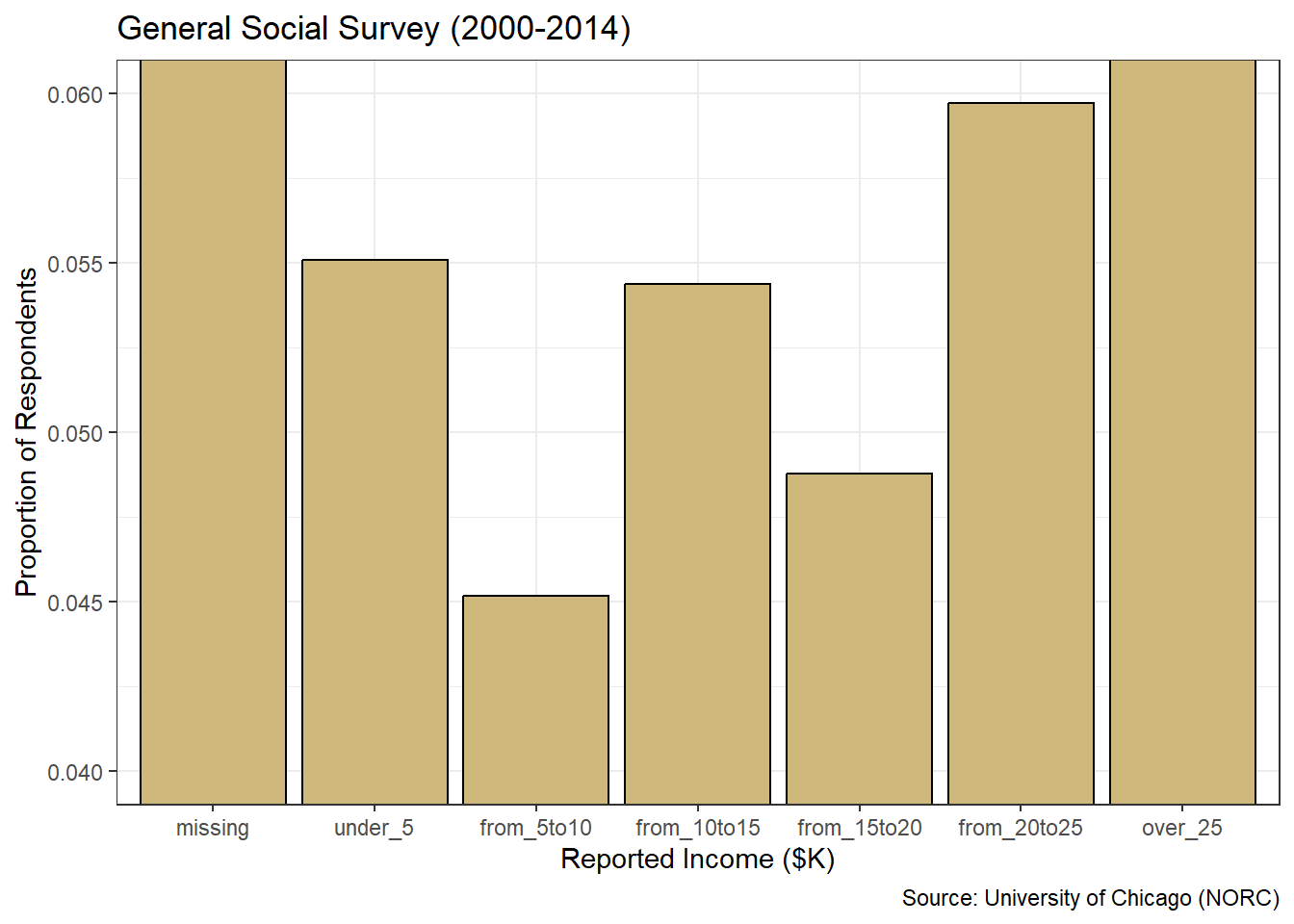
Figure 3.10: Misleading Bar Chart of Income
If our stakeholder were to ignore the \(y\)-axis labels and focus solely on the bar heights, they might draw the inaccurate conclusion that dramatically more people make between $20 and $25 thousand per year versus $5 to $10 thousand. The bar appears four times as tall! However, we know this is not true. It is an artifact of raising the minimum value on the \(y\)-axis. Similarly, the tops of the outer-most bars are cut off. For some viewers, this might lead to the conclusion that the over $25 thousand level is very similar in frequency to its adjacent level. But this too is far from the truth.
By zooming in on the \(y\)-axis, we created a very misleading graphic. It may be technically correct, given the \(y\)-axis is labeled, but it is poorly constructed and ethically questionable. Bar charts should always start at zero and extend beyond the most frequent level. With these best-practices in mind, we can finally answer the original research question.
Answer the Question
How should we describe the marital status and income level of the survey respondents? Based on Figure 3.9, we see that the vast majority of the people who answered the survey are married. Of those who are not married, most have never been married or are divorced. A relatively small number of respondents are separated or widowed. Referring to Figure 3.8, we see that roughly 40% of people did not report an income, while about 35% reported an income greater than $25 thousand per year. The remaining 25% of people were fairly evenly spread across the five income levels between $0 and $25 thousand.
In this presentation of bar charts, we explored the distributions of factors. However, not all categorical variables lend themselves to grouping into factor levels. In many cases, the values of a categorical variable are free text that may not be repeated. Moreover, our text data may not even be structured in a tidy format with observations and variables. In Chapter 3.2.6, we explore just such a case and introduce word clouds as another visualization tool.
When exploring categorical variables, bar charts and word clouds are valuable visualization tools. However, they should not be used to depict the distribution of numerical variables. In the next two sections, we introduce histograms and box plots as the appropriate graphical tools for exploring numerical variables.
3.2.2 Histograms
In Chapter 2.1.1 we distinguish between types of numerical variables. Discrete variables typically involve counting, while continuous variables involve measuring. Though the distinction between discrete and continuous variables may be clear in theory, it can be hazy in practice. Frequently, we discretize continuous variables via rounding to ease presentation. Other times we treat discrete variables as continuous in order to apply mathematical techniques that require continuity. In either situation, we should carefully consider and explain the implications of simplifying assumptions.
Often, continuous variables measure some sense of space or time. In other cases, they might measure efficiency based on proportions or percentages. Regardless, a continuous variable can (in theory) take on infinitely-many values. Between any two values we choose, there are infinitely more possible values. Thus, a traditional bar chart makes no sense because we could never have enough bars! We avoid this issue by allowing each bar to represent a range of possible values, while the height still indicates frequency. This special type of bar chart is known as a histogram.
Throughout this case study we employ the dplyr library for wrangling and ggplot2 for visualization. Since both of these packages are part of the tidyverse suite, we need only load one library. Now let’s demonstrate an exploratory analysis involving continuous variables using histograms and the 5A Method.
Ask a Question
Major League Baseball (MLB) has organized the sport of profession baseball in America since 1871. Consequently, baseball provides one of the oldest sources of sports data available. In fact, the sports analytics industry gained popularity largely due to the events described in Michael Lewis’s book Moneyball (Lewis 2004), which was later adapted into a major motion picture. As a brief introduction to such analyses, suppose we are asked the following question: What was the distribution of opportunity and efficiency among major league batters between 2010 and 2020?
The concepts of opportunity and efficiency are fundamental to sports analytics. Opportunity comprises the number of occasions a player or team has to perform. Efficiency refers to how well the player or team performs per occasion. For batters in baseball, opportunity is generally measured by the statistic at-bats. A common metric for performance in batting is hits. When we divide hits by at-bats, we obtain a popular measure of efficiency called the batting average. As with any sport, baseball is rife with unique terminology and abbreviations. A glossary of common baseball terms can be found at this link.
Opportunity and efficiency are of such great concern to baseball analysts, that our research question has likely been answered. However, we’re here to develop our problem solving skills based on a broad range of interesting questions and domains. So, we treat our question as unanswered. In terms of availability, MLB statistics have been dutifully collected for decades. The challenge is to find a single reliable source for the time frame of interest. We describe one such source in the next step of the problem solving process.
Acquire the Data
The Society of American Baseball Research (SABR) is a worldwide community of people with a love for baseball. One of its key leaders, Sean Lahman, maintains a massive database of publicly-available baseball statistics housed in the Lahman library in R. Let’s load the library and review the available data sets.
After executing the empty data() function, we obtain a tab in our work space called “R data sets”. This tab depicts all of the built-in data sets currently available, based on the loaded libraries. Scrolling down to the Lahman package, we see a wide variety of data tables. Given our focus on batting statistics, we import the Batting data table and inspect its structure.
## Rows: 112,184
## Columns: 22
## $ playerID <chr> "abercda01", "addybo01", "allisar01", "allisdo01", "ansonca01…
## $ yearID   <int> 1871, 1871, 1871, 1871, 1871, 1871, 1871, 1871, 1871, 1871, 1…
## $ stint    <int> 1, 1, 1, 1, 1, 1, 1, 1, 1, 1, 1, 1, 1, 1, 1, 1, 1, 1, 1, 1, 1…
## $ teamID   <fct> TRO, RC1, CL1, WS3, RC1, FW1, RC1, BS1, FW1, BS1, CL1, CL1, W…
## $ lgID     <fct> NA, NA, NA, NA, NA, NA, NA, NA, NA, NA, NA, NA, NA, NA, NA, N…
## $ G        <int> 1, 25, 29, 27, 25, 12, 1, 31, 1, 18, 22, 1, 10, 3, 20, 29, 1,…
## $ AB       <int> 4, 118, 137, 133, 120, 49, 4, 157, 5, 86, 89, 3, 36, 15, 94, …
## $ R        <int> 0, 30, 28, 28, 29, 9, 0, 66, 1, 13, 18, 0, 6, 7, 24, 26, 0, 0…
## $ H        <int> 0, 32, 40, 44, 39, 11, 1, 63, 1, 13, 27, 0, 7, 6, 33, 32, 0, …
## $ X2B      <int> 0, 6, 4, 10, 11, 2, 0, 10, 1, 2, 1, 0, 0, 0, 9, 3, 0, 0, 1, 0…
## $ X3B      <int> 0, 0, 5, 2, 3, 1, 0, 9, 0, 1, 10, 0, 0, 0, 1, 3, 0, 0, 1, 0, …
## $ HR       <int> 0, 0, 0, 2, 0, 0, 0, 0, 0, 0, 3, 0, 0, 0, 1, 0, 0, 0, 0, 0, 0…
## $ RBI      <int> 0, 13, 19, 27, 16, 5, 2, 34, 1, 11, 18, 0, 1, 5, 21, 23, 0, 0…
## $ SB       <int> 0, 8, 3, 1, 6, 0, 0, 11, 0, 1, 0, 0, 2, 2, 4, 4, 0, 0, 3, 0, …
## $ CS       <int> 0, 1, 1, 1, 2, 1, 0, 6, 0, 0, 1, 0, 0, 0, 0, 4, 0, 0, 1, 0, 0…
## $ BB       <int> 0, 4, 2, 0, 2, 0, 1, 13, 0, 0, 3, 1, 2, 0, 2, 9, 0, 0, 4, 1, …
## $ SO       <int> 0, 0, 5, 2, 1, 1, 0, 1, 0, 0, 4, 0, 0, 0, 2, 2, 3, 0, 2, 0, 2…
## $ IBB      <int> NA, NA, NA, NA, NA, NA, NA, NA, NA, NA, NA, NA, NA, NA, NA, N…
## $ HBP      <int> NA, NA, NA, NA, NA, NA, NA, NA, NA, NA, NA, NA, NA, NA, NA, N…
## $ SH       <int> NA, NA, NA, NA, NA, NA, NA, NA, NA, NA, NA, NA, NA, NA, NA, N…
## $ SF       <int> NA, NA, NA, NA, NA, NA, NA, NA, NA, NA, NA, NA, NA, NA, NA, N…
## $ GIDP     <int> 0, 0, 1, 0, 0, 0, 0, 1, 0, 0, 0, 0, 2, 0, 1, 2, 0, 0, 0, 0, 3…
The data is stored in the form of a data frame with 110,495 rows (observations) and 22 columns (variables). Each row represents a unique combination of player, season, and team. Each column provides descriptors and performance data for the player within the listed season and team. All of the performance data is labeled as integer because it counts discrete events such as games, at-bats, and hits. As with any sport, baseball statistics involve a lot of abbreviations! If we are unsure of the meaning for a given variable, we can call the help menu from the console with ?Batting.
The batting table includes far more information than we require to answer the research question, so some wrangling is in order. Let’s filter on the desired seasons and summarize the statistics of interest using functions from the dplyr library.
#wrangle batting data
Batting2 <- Batting %>%
  filter(yearID>=2010,yearID<=2020) %>%
  group_by(playerID,yearID) %>%
  summarize(tAB=sum(AB),
            tH=sum(H)) %>%
  ungroup() %>%
  filter(tAB>=80) %>%
  mutate(BA=tH/tAB)
In the first filter() we isolate the appropriate decade. Using group_by() and summarize() we obtain the total at-bats and hits per season for each player. With the second filter() we eliminate any players with fewer than 80 at-bats. Finally, we apply mutate() to create a new variable for batting average.
Why did we impose the requirement of 80 at-bats per season? Firstly, there are many players with zero at-bats in a season and we cannot have a zero in the denominator of the batting average calculation. Secondly, we are typically interested in the performance of players who had ample opportunity. Other than the oddity of the COVID-19 year, MLB teams played 162 games per season during the time frame of interest. So, we impose a somewhat arbitrary threshold of opportunity at about half of these games. In practice, stakeholders might request a threshold better tailored to their needs, but 80 is sufficient for our purposes here.
Before beginning an analysis, we address the issue of data cleaning. Without more intimate knowledge of the game of baseball, it may be difficult to identify unlikely or mistaken values in this data set. However, one obvious quality check is to compare the total at-bats and hits for each player and season combination. It’s not possible for a player to achieve more hits than at-bats. This would imply a batting average greater than one. We check for this error by summing the total occurrences.
## [1] 0The inequality within the parentheses returns TRUE (1) or FALSE (0), so summing results in the total number of observations for which the inequality is TRUE. The resulting total of zero suggests there are no cases where a player has more hits than at-bats. Though there could be more subtle errors that we are unaware of, at least this obvious error is not present. Let’s move on to an analysis of the resulting data.
Analyze the Data
As with categorical variables, a sensible place to start an exploratory analysis of numerical variables is with descriptive statistics. Measures of centrality attempt to capture the average or most common values for a variable. Central statistics include the mean and median. Measures of dispersion describe the variability of individual values from each other or the average. Dispersion statistics include standard deviation and interquartile range (IQR). For this case study, we spotlight the mean and standard deviation, and reserve median and IQR for the next section. Let’s compute the mean and standard deviation for at-bats.
## # A tibble: 1 × 3
##   count  mean stdev
##   <int> <dbl> <dbl>
## 1  4916  326.  168.
For the 4,916 players in the data set, the average number of at-bats (opportunity) per season is around 326. The standard deviation of at-bats is about 168. One way to think about standard deviation is how far individual values typically are from the mean value. In this case, individual players vary above and below the mean of 326 by about 168 at-bats, on average. Relatively speaking, that’s quite a bit of variation! Now let’s calculate the same statistics for batting average.
## # A tibble: 1 × 3
##   count  mean  stdev
##   <int> <dbl>  <dbl>
## 1  4916 0.250 0.0372
The mean batting efficiency over the time frame of interest is 25%. In other words, the average player achieved a hit on only one-quarter of their at-bats. Hitting a ball traveling at up to 100 miles-per-hour is difficult! The standard deviation for batting average is nearly 4 percentage-points. Over 100 at-bats, this represents only 4 additional (or fewer) hits compared to the mean. Intuitively, this seems like a relatively small variation.
In terms of visualization, a bar chart is not appropriate for numerical variables. There are no existing levels to depict counts. However, we can create our own categories (called “bins”) and display them in a histogram. As with bar charts, the base R language includes a function to produce simple histograms.
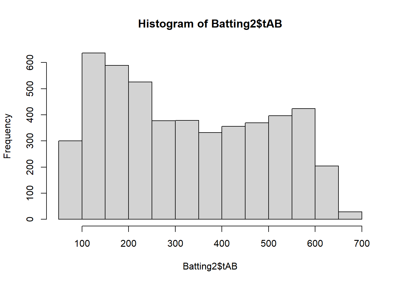
Figure 3.11: Basic Histogram of At-Bats
The hist() function quickly produces a simple histogram, but Figure 3.11 is not appropriate for external presentation. The titles are in coding syntax rather than plain language and we have no control over the categorization (binning). Let’s leverage ggplot2 layering to produce a much better graphic.
#plot ggplot2 histogram of at-bats
ggplot(data=Batting2,aes(x=tAB)) +
  geom_histogram(color="black",fill="#CFB87C") +
  labs(title="Major League Baseball (2010-2020)",
       x="Total At-Bats per Season",
       y="Count of Players",
       caption="Source: Sean Lahman (SABR)") +
  theme_bw()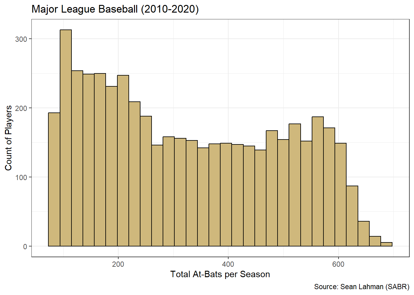
Figure 3.12: ggplot2 Histogram of At-Bats
Figure 3.12 remedies the issues with titles and labels. However, it is unclear what range of values is included in each bin (bar). The ggplot2 structure offers us complete control over the binning, but we must first decide how many bins or what bin width is appropriate. These choices can be as much art as science. That said, a good place to start for the number of bins is the square-root of the number of observations. We then evenly distribute the bins over the range of values for the variable. We execute this method for at-bats below.
#determine bin number
bins <- sqrt(nrow(Batting2))

#determine range of at-bats
range <- max(Batting2$tAB)-min(Batting2$tAB)

#determine bin widths
range/bins
## [1] 8.614518The nrow() function counts the observations in the data frame and then we determine the square root with sqrt(). The total range of at-bat values is computed as the difference between the maximum (max()) and minimum (min()) values. Finally, we calculate bin width as the ratio of the range and number of bins. A bin width of 8.6 is not very intuitive for a viewer. But this width is close to 10, which is broadly intuitive. So, we choose a bin width of 10 and add this to the geom_histogram() function below.
#create tailored histogram of at-bats
atbats <- ggplot(data=Batting2,aes(x=tAB)) +
  geom_histogram(binwidth=10,boundary=80,closed="left",
                 color="black",fill="#CFB87C") +
  labs(title="Major League Baseball (2010-2020)",
       x="Total At-Bats per Season",
       y="Count of Players",
       caption="Source: Sean Lahman (SABR)") +
  theme_bw() +
  scale_x_continuous(limits=c(80,700),breaks=seq(80,700,40)) +
  scale_y_continuous(limits=c(0,150),breaks=seq(0,150,25))

#display histogram
atbats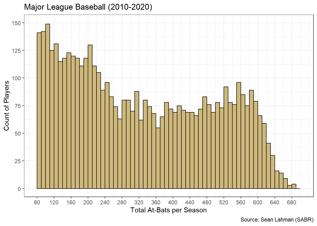
Figure 3.13: Tailored Histogram of At-Bats
We include a few other improvements besides the bin width. Within the geom_histogram() function, the boundary parameter sets the starting value for all bins and the closed parameter determines whether each bin includes its left or right endpoint. The scale_?_continuous() functions establish value limits and break-points for each axis. The result is a much more clear and precise graphic. Now we know, for example, that the first bin includes at-bat values between [80,90), the second bin includes [90,100), and so on.
How should we interpret the histogram in Figure 3.13? There appear to be two distinct “peaks” in the distribution. We refer to such distributions as bimodal. The first peak is at the far left where the chart begins. This is not uncommon in situations where we impose an artificial threshold. Recall that many batters had a small number of at-bats, if any at all, in a given season. This could be due to poor performance or injury. Regardless, the frequency is high for at-bat values below the threshold of 80 and decreases steadily until values around 360. The second peak occurs around 550 at-bats. These values likely represent players who stayed healthy and performed well enough to be included in the batting lineup for most games.
Just as with bar charts, the frequency in histograms can be represented as raw counts or proportions. When it includes proportions, we often refer to the graphic as a relative frequency histogram. Let’s construct a relative frequency histogram for batting average.
#create tailored histogram of batting average
batavg <- ggplot(data=Batting2,aes(x=BA)) +
  geom_histogram(aes(y=0.005*..density..),
                 binwidth=0.005,boundary=0,closed="left",
                 color="black",fill="#CFB87C") +
  labs(title="Major League Baseball (2010-2020)",
       x="Batting Average per Season",
       y="Proportion of Players",
       caption="Source: Sean Lahman (SABR)") +
  theme_bw() +
  scale_x_continuous(limits=c(0.1,0.4),breaks=seq(0.1,0.4,0.05)) +
  scale_y_continuous(limits=c(0,0.07),breaks=seq(0,0.07,0.01))

#display histogram
batavg
Figure 3.14: Tailored Histogram of Batting Average
Unlike at-bats, the batting average histogram in Figure 3.14 is unimodal. There is a single peak right at the average value of 25%. While batting opportunity seems to be split into two distinct groups, batting efficiency is well-represented by a single grouping. Based on the bin widths and the conversion to relative frequency, we know that over 6% of all players had a batting average between 25% and 25.5%. This is the highest frequency bin in the center. The remaining bins to the left and right decrease in frequency, creating a bell-shaped distribution. This is a very important shape in probability and statistics, and we investigate it much more in Chapter 4. For now, we move on to advising stakeholders on the insights offered by the histograms.
Advise on Results
When advising stakeholders on the distribution of numerical variables, it is important to appropriately blend the insights available from summary statistics and visual graphics. Sometimes the two types of exploratory tools are well-aligned and other times they are not. The histograms for batting opportunity and efficiency demonstrate these two different situations based on their dissimilar modality.
Given the bimodal nature of at-bats, the summary statistics and histogram tell different stories. If we solely reported summary statistics, stakeholders might believe that most players are afforded around 326 at-bats per season (based on the mean). But the histogram suggests this is not the case at all. Let’s overlay the mean (solid line) and standard deviations (dashed lines) on the at-bats histogram.
#display at-bats histogram with stats
atbats +
  geom_vline(xintercept=326,color="red",size=1) +
  geom_vline(xintercept=c(158,494),color='red',size=1,linetype="dashed")
Figure 3.15: Histogram and Stats for At-Bats
Figure 3.15 demonstrates why it is so important to include the full distribution of values in addition to summary statistics. While we often think of the mean as the average or most common value, this interpretation can be misleading. In this case, relatively few players were afforded the mean number of at-bats. Additionally, while many players were within one standard deviation of the mean, none of those players were included in the two peak frequencies on each end of the distribution. This is a result of the mathematics of the mean. The average of many low numbers and many high numbers is something in between.
When presenting a histogram like Figure 3.15 to stakeholders, it is important to describe the limitations of the mean as a metric for describing “common” behavior. The bimodal nature of the distribution limits the usefulness of the mean. That said, the at-bats histogram exemplifies an opportunity for collaboration with domain experts. A data scientist may not initially understand why the distribution is bimodal, but baseball experts might quickly identify the two distinct groups of low and high-performing players. In this case, the data scientist could gain as much insight as they offer!
In stark contrast to at-bats, when we overlay batting average statistics on the unimodal histogram we observe a more consistent story.
#display batting average histogram with stats
batavg +
  geom_vline(xintercept=0.25,color="red",size=1) +
  geom_vline(xintercept=c(0.21,0.29),color="red",size=1,linetype="dashed")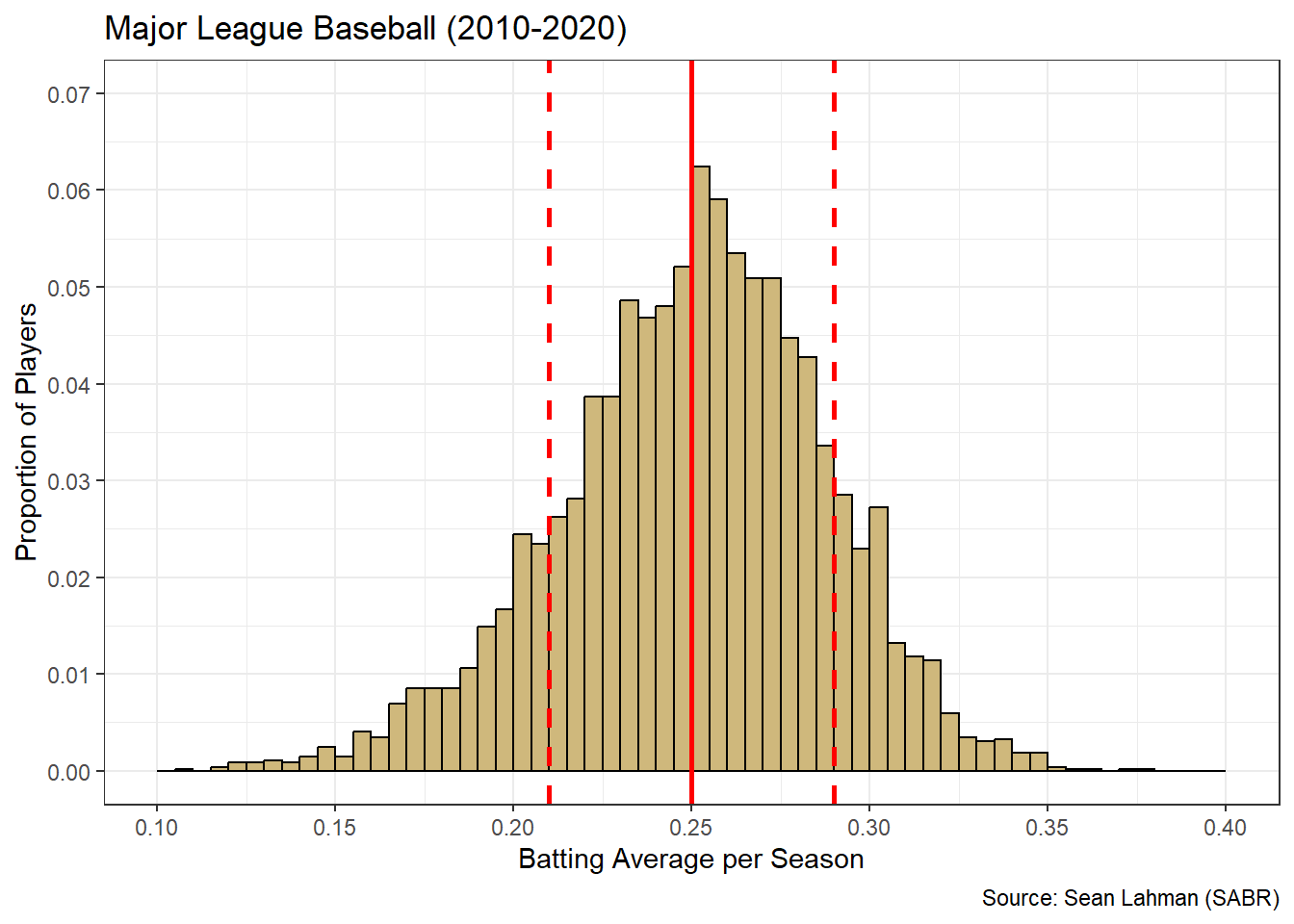
Figure 3.16: Histogram and Stats for Batting Average
The mean batting efficiency is coincident with the most frequent values. Also, most players are within one standard deviation of these most frequent values. Unlike the at-bats histogram, it is uncommon for a player to be outside one standard deviation of the mean batting efficiency. Thus, for batting efficiency, the summary statistics align well with the common understanding of “average” performance. As a result, Figure 3.16 is likely much easier to interpret for stakeholders. We are now prepared to answer the research question.
Answer the Question
How should we describe the batting opportunity and efficiency of MLB players? In terms of opportunity, there appears to be two distinct groups of batters. Either due to injury or poor performance, the first group of players are afforded relatively few at-bats. A second grouping appears to have stayed healthy and/or performed well enough to witness many at-bats. The peak frequency among this group is around 550 at-bats, spread over a 162 game season. With regard to efficiency, the mean batting average is 25% with lower or higher values being less and less frequent. Relatively few batters have a season with an efficiency below 20% or above 30%.
With two well-designed histograms and the thoughtful presentation of insights, we are able to answer an interesting question regarding batting opportunity and efficiency in Major League Baseball. When exploring continuous numerical variables, a histogram is the appropriate visualization tool. In the next section, we introduce box plots as a useful graphic for describing numerical variables grouped by the levels of a factor. We also discuss the identification and resolution of extreme values called outliers.
3.2.3 Box Plots
In Chapter 2.3.5 we briefly mention the identification of extreme of unlikely values as part of data cleaning. Such values are often referred to as outliers. If an outlying value is determined to be an error, due to poor collection practices or some other mistake, then it should be removed or corrected. However, not all outliers are mistakes. Some values are extreme but legitimate (i.e., possible) and their removal limits the broader understanding of the data. In general, we should not remove an outlying observation from the data frame unless it is a clear error. But how do we identify outliers in the first place?
In plain language, an outlier is any value that is “far away” from most of the other possible values. Of course, the context of the “other values” matters. A seven-foot tall person would almost certainly be considered an outlier in the general population. But among professional basketball players, it is not as uncommon to be seven feet tall. In that context, the person may not be an outlier. This distinction points toward the need to visualize the distribution of the data in question. Otherwise, there is no objective way to define “other values” and “far away”. Though histograms are an acceptable graphic for this purpose, box plot are specifically-designed to display outliers.
In this section, we continue to employ the dplyr and ggplot2 libraries from the tidyverse suite. Let’s explore the identification and resolution of outliers using box plots and the 5A Method.
Ask a Question
The Child Health and Development Studies (CHDS) have investigated how health and disease are passed between generations since 1959. Their researchers focus on not only genetic predisposition, but also social and environmental factors. As part of a long-term study, the CHDS collected the demographics and smoking habits of expectant parents. Suppose we are asked the following question: As part of the CHDS project, were there any extreme or unlikely birth weights for babies of mothers who did and did not smoke during pregnancy?
Since the existence of outliers is specific to a given data set, this question may or may not have been answered. That said, the impact of smoking on unborn children has been researched extensively. It is certainly of concern for obstetricians or those planning a pregnancy. Doctors and expectant parents should be aware of common minimum and maximum birth weights, as well as uncommon cases. The CHDS is a project of the Public Health Institute, which appears to be a trustworthy organization based on information at this link. They publish research funded by national institutes and make their data and results widely available. Thus, the question is likely answerable.
This inquiry does warrant special consideration in terms of ethics. On the one hand, it could be critically important to distinguish between common and uncommon birth weights for unborn children. On the other, if smoking is associated with uncommon birth weights, then there is the potential for parents in the study to be shamed or ostracized for such behavior. Depending on the form of the acquired data, we must carefully protect any personally-identifiable information to avoid unintentional disclosure.
Acquire the Data
While the data is likely available directly from the CHDS, the mosaicData package includes a related table named Gestation. We load the library, import the data, and review the structure of the table below.
#load library
library(mosaicData)

#import gestation data
data(Gestation)

#display structure of data
glimpse(Gestation)
## Rows: 1,236
## Columns: 23
## $ id <dbl> 15, 20, 58, 61, 72, 100, 102, 129, 142, 148, 164, 171, 175, …
## $ pluralty <chr> "single fetus", "single fetus", "single fetus", "single fetu…
## $ outcome <chr> "live birth", "live birth", "live birth", "live birth", "liv…
## $ date <date> 1964-11-11, 1965-02-07, 1965-04-25, 1965-02-12, 1964-11-25,…
## $ gestation <dbl> 284, 282, 279, NA, 282, 286, 244, 245, 289, 299, 351, 282, 2…
## $ sex <chr> "male", "male", "male", "male", "male", "male", "male", "mal…
## $ wt <dbl> 120, 113, 128, 123, 108, 136, 138, 132, 120, 143, 140, 144, …
## $ parity <dbl> 1, 2, 1, 2, 1, 4, 4, 2, 3, 3, 2, 4, 3, 5, 3, 4, 3, 3, 2, 3, …
## $ race <chr> "asian", "white", "white", "white", "white", "white", "black…
## $ age <dbl> 27, 33, 28, 36, 23, 25, 33, 23, 25, 30, 27, 32, 23, 36, 30, …
## $ ed <chr> "College graduate", "College graduate", "HS graduate--no oth…
## $ ht <dbl> 62, 64, 64, 69, 67, 62, 62, 65, 62, 66, 68, 64, 63, 61, 63, …
## $ wt.1 <dbl> 100, 135, 115, 190, 125, 93, 178, 140, 125, 136, 120, 124, 1…
## $ drace <chr> "asian", "white", "white", "white", "white", "white", "black…
## $ dage <dbl> 31, 38, 32, 43, 24, 28, 37, 23, 26, 34, 28, 36, 28, 32, 42, …
## $ ded <chr> "College graduate", "College graduate", "8th -12th grade - d…
## $ dht <dbl> 65, 70, NA, 68, NA, 64, NA, 71, 70, NA, NA, 74, NA, NA, NA, …
## $ dwt <dbl> 110, 148, NA, 197, NA, 130, NA, 192, 180, NA, NA, 185, NA, N…
## $ marital <chr> "married", "married", "married", "married", "married", "marr…
## $ inc <chr> "2500-5000", "10000-12500", "5000-7500", "20000-22500", "250…
## $ smoke <chr> "never", "never", "now", "once did, not now", "now", "until …
## $ time <chr> "never smoked", "never smoked", "still smokes", "2 to 3 year…
## $ number <chr> "never", "never", "1-4 per day", "20-29 per day", "20-29 per…The data frame comprises 1,236 observations (rows) and 23 variables (columns). According to information obtained from the help menu (?Gestation), each observation represents the live birth of a biologically male baby and each variable describes the baby and parents. It is unclear from the available information why the data only includes male births. The documentation states the parents participated in the CHDS in 1961 and 1962. Our variable of primary interest is the birth weight (wt), which is listed in ounces. We are also interested in the smoke variable, which indicates if the mother smoked during the pregnancy.
Upon review of the data, there appears to be a mismatch between the years listed in the documentation and the years shown in the output. The help menu says the years are 1961 and 1962, but we see 1964 and 1965 in the example values. Let’s check the bounds of the date variable.
## [1] "1965-09-10"## [1] "1964-09-11"In fact, this data frame only includes births between September 1964 to September 1965. The year of birth is not the focus of our research question, but this apparent mistake in documentation could be important. We should always divulge such issues when presenting results.
Given our limited focus, some wrangling is appropriate. We begin by reducing the variables to complete observations with a birth weight and smoking status. Birth weight is appropriately typed numeric, but we convert it from ounces to pounds since that is the commonly-reported unit. The smoking status includes repeated categorical values, so it should be a factor rather than character type. We convert smoking status to a factor and then review its levels.
#wrangle gestation data
Gestation2 <- Gestation %>%
  transmute(weight=wt/16,
            smoke=as.factor(smoke)) %>%
  na.omit()

#display smoke levels
levels(Gestation2$smoke)
## [1] "never" "now"
## [3] "once did, not now" "until current pregnancy"The levels are not perfectly exclusive. The “once did, not now” and “until current pregnancy” levels seem to have some logical overlap. The meaning of these levels is not crystal clear. Does “once” mean literally a single time or during a past time period? By contrast, “never” and “now” are much clearer and non-overlapping. With greater access to the CHDS researchers, we might be able to clarify the differences in status. For now, we leave the levels as they are and move on to the analysis.
Analyze the Data
The research question suggests exploring the data to determine if any birth weights are extreme or unlikely. We cannot do that until we understand what birth weights are likely. Thus, we must describe the centrality and dispersion of the data. A simple place to begin is with the summary() function.
##      weight                           smoke
##  Min.   : 3.438   never                  :544
##  1st Qu.: 6.812   now                    :484
##  Median : 7.500   once did, not now      :103
##  Mean   : 7.470   until current pregnancy: 95
##  3rd Qu.: 8.188
##  Max.   :11.000
The summary statistics for birth weight include what are known as quartiles. The 1st quartile comprises the smallest 25% of the data. In this case, 25% of birth weights are less than 6.812 pounds. The 2nd quartile, also known as the median, splits the data in half. Specifically, 50% of birth weights are less than 7.500 pounds. Finally, the 3rd quartile bounds the lower 75% of values. So, 75% of birth weights are less than 8.188 pounds.
The terms quartile, quantile, and percentile are all very closely related. For example, the 1st quartile, 0.25 quantile, and 25th percentile are all equivalent. Although not a common label, the minimum value is equivalent to the 0th quartile, the 0.00 quantile, and the 0th percentile. Similarly, the maximum value is equivalent to the 4th quartile, the 1.00 quantile, and the 100th percentile. If we want to compute any of these values individually, we apply the quantile() function.
##    25%
## 6.8125## 75%
## 8.1875Of course the minimum, median, and maximum all have their own unique functions (min(),median(),max()). But the quantile() function offers the flexibility to compute all five quartiles, as well as any other percentile (e.g., 35th percentile) we need.
The centrality of birth weights is well-represented by the median of 7.5 pounds. Half of babies weigh more and half weigh less. When applying quartiles, a common measure of dispersion is known as the interquartile range (IQR). One way to think about the IQR is that it measures the middle 50% of the data. Specifically, it is the difference between the 3rd and 1st quartiles. We compute this manually or with the IQR() function.
## [1] 1.375## [1] 1.375The middle 50% of birth weights are all within 1.375 pounds of one another. This provides a measure of how spread out (or not) birth weights tend to be. A relatively large IQR indicates values that are more spread out, while a small IQR indicates values that are more compressed.
What does all of this have to do with outliers? A popular metric for identifying outliers involves the IQR. By this metric, any value more than 1.5 times the IQR below the 1st quartile or above the 3rd quartile is labeled an outlier. This is easier to explain after computation.
##  25%
## 4.75## 75%
## 10.25Hence, any baby with a birth weight below 4.75 or above 10.25 pounds is considered an outlier. We know from the minimum and maximum values that outlying birth weights exist. The smallest baby is about 3.4 pounds and the largest is 11.0 pounds. How many total babies have birth weights outside of these thresholds?
## [1] 31There are 31 birth weights identified as outliers. While the computation of quartiles and outliers is valuable, a visualization is much more intuitive. A box plot (aka box-and-whisker plot) is specifically-designed for this purpose. Let’s construct a box plot using ggplot2 layering.
#display box plot of birth weight
ggplot(data=Gestation2,aes(x=weight)) +
  geom_boxplot(fill="#CFB87C") +
  labs(title="Child Health and Development Studies (CHDS)",
       subtitle="Live births between 1964-1965",
       x="Birth Weight (pounds)",
       caption="Source: Public Health Institute") +
  scale_x_continuous(limits=c(3,12),breaks=seq(3,12,0.5)) +
  theme_bw() +
  theme(axis.text.y=element_blank(),
        axis.ticks.y=element_blank())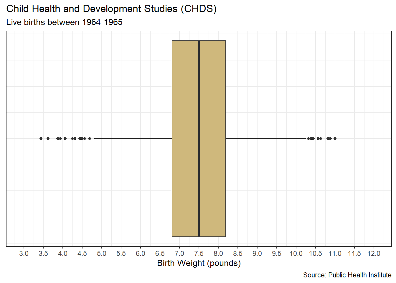
Figure 3.17: Boxplot of Birth Weights
The blue “box” in Figure 3.17 represents the middle 50% of birth weights. Thus, the width of the box is the IQR. The vertical line in the middle of the box is the median birth weight. The “whiskers” extend to the outlier thresholds. Any values outside the thresholds are depicted with a dot and labeled outliers. Comparing these visual representations to our previous calculations of quartiles, everything matches up. We cannot see all 31 outliers, because many overlap with the same value.
The box plot is a much easier tool for quickly perceiving the distribution of values and the existence of outliers. It is also a great way to address the second part of our research question. We have yet to discuss the impact of smoking status on birth weight. However, we can add the smoking factor as a variable on the \(y\)-axis of the box plot. When it includes a multi-level factor, we call the graphic a comparative box plot.
#display box plot of birth weight by smoking status
ggplot(data=Gestation2,aes(x=weight,y=smoke)) +
  geom_boxplot(fill="#CFB87C") +
  labs(title="Child Health and Development Studies (CHDS)",
       subtitle="Live births between 1964-1965",
       x="Birth Weight (pounds)",
       y="Mother's Smoking Status",
       caption="Source: Public Health Institute") +
  scale_x_continuous(limits=c(3,12),breaks=seq(3,12,0.5)) +
  theme_bw()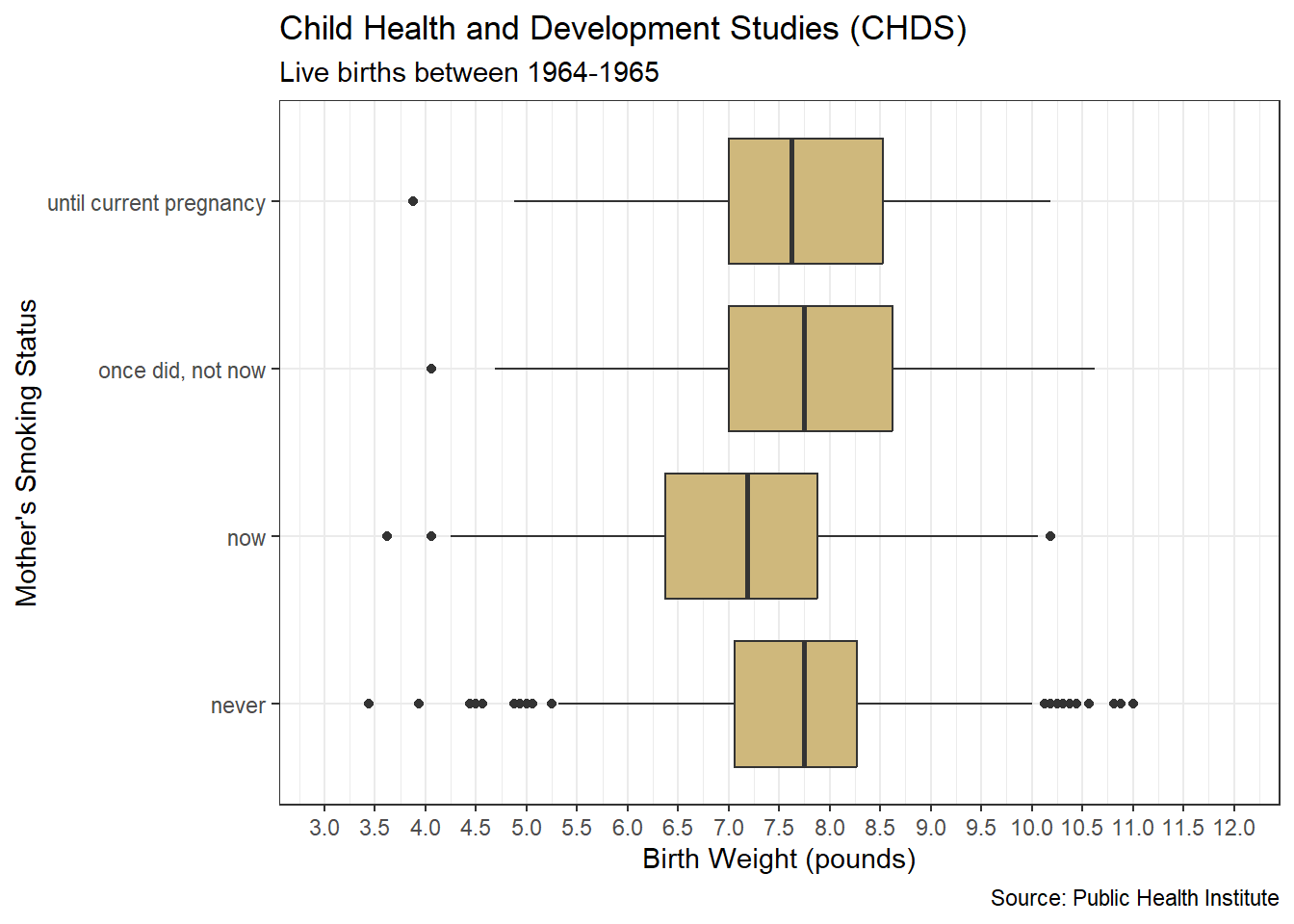
Figure 3.18: Comparative Boxplot of Birth Weights
Figure 3.18 splits all of the birth weights according to the levels of the smoking status variable. Thus, the quartiles, IQR, and outliers are based on the values within each level. Notice, the IQR for mothers who never smoked is smaller than that of the other three categories. In other words, there is less variability (dispersion) in birth weight for mothers who never smoked compared to those who did. With a smaller IQR, the thresholds for outliers are closer to the center of the data. As a result, the never-smoked category has more outliers than the others. A larger IQR indicates more variability in birth weights. For these categories, individual birth weights must be much further away from center before being labeled outliers. Using the comparative box plot, we proceed to advising stakeholders on the available insights.
Advise on Results
When advising stakeholders on the analytic insights available from a well-designed graphic, it is important to divulge any limitations. In the case of our CHDS data, we know the box plot regards male babies born in the mid-1960s. If biological sex is related to birth weight, then we would not want to use our results to speak to the health of female babies. Similarly, if there have been dramatic changes in smoking habits or prenatal care since the 1960s, then these data would not be appropriate for modern applications. For our academic purposes, the CHDS data affords a valuable opportunity to study outliers. However, it may be of limited real-world value given its age and scope.
In the previous case study on MLB performance, we discuss the limitations of the mean and standard deviation in bimodal distributions. These two statistics can also be misleading when a variable includes many outliers. When estimating centrality and dispersion, the median and IQR are much less sensitive to the existence of outliers than the mean and standard deviation. For demonstration purposes, let’s remove all of the outliers and compare the statistics to the original data.
#remove all outliers
Gestation2_wo <- Gestation2 %>%
  filter(weight>=4.75, weight<=10.25)

#compute median for both data sets
median(Gestation2$weight)
## [1] 7.5## [1] 7.5## [1] 7.469923## [1] 7.498431The median birth weight for data with and without outliers is exactly the same. The outliers have no impact because the “middle” remains the same after removing values from the extremes. The same is not true for the mean. When outliers are present, the mean birth weight is lower. We know from Figure 3.17 that there are more outliers on the lower end of birth weight and they are further from the center. These low outliers “pull” the mean in the negative direction due to the arithmetic of the mean. Now let’s do the same for the measures of dispersion.
## [1] 1.375## [1] 1.375## [1] 1.137723## [1] 1.031594As with the median, the IQR remains the same when the outliers are removed. The middle 50% of values do not change when we remove data from the outer ends. On the other hand, the standard deviation is greater when outliers are present. Since we interpret standard deviation as the average distance from the mean, its value increases when there are birth weights far from center.
Since we have multiple methods for measuring the centrality and dispersion of a distribution, data scientists must carefully choose the most appropriate options for the current data. When the distribution is unimodal, relatively symmetric, and has few outliers the mean and standard deviation are appropriate. But if the distribution is bimodal, skewed, and/or has many outliers, then the median and IQR are better options. Due to understandable differences in education and experience, stakeholders may be unaware of such distinctions.
A final point worthy of consideration when advising stakeholders about outliers is their plausibility. In other words, are the outlying values legitimate extreme points or obvious mistakes. Based on the available data, we identify outlying birth weights as low as 3.4 pounds and as high as 11.0 pounds. Are these birth weights plausible in reality? Without a more intimate knowledge of the process of child birth, we may not know the answer to this question.
We conduct some quick research on the Centers for Disease Control and Prevention (CDC) website at the following link. The associated tables are in units of kilograms, so we take care with conversions. Common male birth lengths are between 45-55 cm. Based on the CDC table, the 2nd percentile birth weight for a 45 cm baby is 2.04 kg (4.50 lbs). On the other end of the spectrum, the 98th percentile birth weight for a 55 cm baby is 5.43 kg (11.97 lbs). So, based on the CDC data, we should not be too skeptical of birth weights between 4.5 and 12 pounds.
Our data does not include any birth weights greater than 12 pounds, but there are births with weights below 4.5 pounds. We might suspect that these are premature births, so let’s look at the gestation period for the birth weights below 4.5 pounds. We need to return to the original data set to consult the gestation variable, which is in units of days.
Gestation %>%
  filter(wt/16 <4.5) %>%
  transmute(gestation_months=gestation/30) %>%
  na.omit() %>%
  arrange(gestation_months)
## # A tibble: 12 × 1
## gestation_months
## <dbl>
## 1 6.8
## 2 7.43
## 3 7.6
## 4 7.73
## 5 7.73
## 6 7.8
## 7 7.87
## 8 7.9
## 9 8.17
## 10 8.47
## 11 9.23
## 12 9.37A normal gestation period is about 9 months. The majority of these low weight births are at least a full month premature. However, there are two births that are beyond full term (over 9 months). So, for these two births, a weight below 4.5 pounds is rare. These two birth weights warrant even further investigation to resolve their legitimacy. That said, there are no outliers that appear to be obvious mistakes in record keeping. Consequently, we choose to leave all of them in the data set and finalize the problem solving process by answering the original question.
Answer the Question
Were there any extreme or unlikely birth weights for babies of mothers who did and did not smoke during pregnancy? In short, the answer to this question is yes. When ignoring smoking status, there are 31 birth weights identified as outliers. Values below 4.75 pounds and above 10.25 pounds are extreme compared to the central tendency of birth weights. When considering smoking status, birth weights are more consistent (less variation) for mothers who never smoked. As a result, any babies weighing less than about 5.25 pounds or more than 10.00 pounds are classified as outliers. Birth weights are lower, on average, for mothers who smoked during pregnancy but also less consistent (more variation). Thus, few birth weights are considered extreme for this subgroup.
Based on the limitations regarding time frame and scope, we might encourage stakeholders to extend this research to a broader and more current group of subjects. It would be tenuous at best to institute new health policies based on births of a single sex from more than half a century ago. In addition to parental smoking habits, stakeholders might also include other substances believed to negatively impact pregnancy and birth. Regardless, any additional studies involving human subjects must continue to safeguard their personal information and avoid knowingly subjecting them to harmful treatments.
So far we have explored the distributions of individual categorical and numerical variables. However, we often need to consider the joint distributions of multiple variables at the same time. In the next few sections, we explore visualizations for multivariate distributions.
3.2.4 Heat Maps
In Chapter 3.2.1 we employ bar charts to visualize the distribution of observations for a single categorical variable. With bar charts, the height of each bar represents the number (or proportion) of observations that reside within each level of a factor. But what if we are interested in the distribution across the levels of two factors? Standard bar charts are ill-equipped for such a visualization. We might be tempted to construct a three-dimensional graphic, but these also do a poor job of clearly conveying information. This is particularly true when the factors include a large number of levels. Instead, the preferred visualization for the distribution across the levels of two factors is a heat map.
Heat maps project a three-dimensional space onto a two-dimensional graphic. Rather than using the height of a bar as the visual cue for frequency, we use the color (or shade) of a square in a grid of levels. Each square represents the unique intersection of two levels (one for each factor) and the color indicates the frequency. Heat maps perform well even when both factors include a large number of levels. They also avoid many of the other issues associated with three-dimensional visualization. We explore these issues further in the Advise section of this chapter. But first, we pose an interesting question that can be answered using a heat map.
Ask a Question
In the year 2017, the mayor of Chicago introduced the Vision Zero Chicago initiative. According to the published action plan, the goal is to “eliminate traffic fatalities and serious injuries by 2026”. In collaboration with many other cities, Chicago hopes to use analyses of past traffic crash data to better understand when, where, how and why accidents occur. Consequently, imagine we are interested in the following question: What is the distribution of traffic crashes across days of the week and hours of the day in the city of Chicago?
This question is almost certainly of concern to those affiliated with the Vision Zero initiative. If we can identify high-frequency time periods within which a disproportionate number of crashes occur, then city planners and law enforcement could more-precisely target their safety efforts. From this point-of-view, it would be unethical to not answer this question. Of course, we want to protect any personally-identifiable information that may reside in police records of the crashes. But we should not ignore the life-saving insights that may be gained from the anonymized data. Thanks to the Chicago Police Department, this data is publicly available.
Acquire the Data
In Chapter 2.2.2 we introduced the Chicago Data Portal and used the platform to demonstrate the import of online data via an API. We also discussed the size limitations imposed by web developers to control API requests. Typically, a GET request only returns 1,000 observations. For a city the size of Chicago, this presents an important constraint because there could be thousands of crashes in a single month. In order to obtain a broader data set, spanning multiple months, we must execute multiple GET requests. But how do we ensure that we get different data each time?
Much like with data wrangling, API requests can include filters on variable values. The filter syntax is simply added to the end of the API endpoint preceded by a question mark. But, prior to filtering on a variable value, we must know the variable name within the database. Well-constructed sites offer this metadata in the same location as the endpoint. For our case study, descriptions of each variable (column) in the database are offered here. One of the variables is named crash_month with values between 1 and 12. In the code below, we filter on this variable to acquire crash data for the months January through May.
#load httr and jsonlite libraries
library(httr)
library(jsonlite)

#request data from API
crash_jan <- GET("https://data.cityofchicago.org/resource/85ca-t3if.json?crash_month=1")
crash_feb <- GET("https://data.cityofchicago.org/resource/85ca-t3if.json?crash_month=2")
crash_mar <- GET("https://data.cityofchicago.org/resource/85ca-t3if.json?crash_month=3")
crash_apr <- GET("https://data.cityofchicago.org/resource/85ca-t3if.json?crash_month=4")
crash_may <- GET("https://data.cityofchicago.org/resource/85ca-t3if.json?crash_month=5")

#parse response from API
crash_jan2 <- content(crash_jan,"text")
crash_feb2 <- content(crash_feb,"text")
crash_mar2 <- content(crash_mar,"text")
crash_apr2 <- content(crash_apr,"text")
crash_may2 <- content(crash_may,"text")

#transform json to data frame
crash_jan3 <- fromJSON(crash_jan2) %>%
  select(crash_day_of_week,crash_hour)
crash_feb3 <- fromJSON(crash_feb2) %>%
  select(crash_day_of_week,crash_hour)
crash_mar3 <- fromJSON(crash_mar2) %>%
  select(crash_day_of_week,crash_hour)
crash_apr3 <- fromJSON(crash_apr2) %>%
  select(crash_day_of_week,crash_hour)
crash_may3 <- fromJSON(crash_may2) %>%
  select(crash_day_of_week,crash_hour)

#combine data frames
crash_all <- crash_jan3 %>%
  rbind(crash_feb3,crash_mar3,
        crash_apr3,crash_may3) %>%
  na.omit()
Using functions from the httr and jsonlite libraries, we conduct five GET requests. For each month we add the appropriate filter to the endpoint. For example, the January request includes the filter ?crash_month=1. This tells the API to only return the 1,000 most-recent crashes in the month of January. The same is true for each of the other four months. After converting the data from JSON format, we limit the columns to the two variables of interest: day of the week and hour of the day. Finally, we combine all five months and obtain a data frame consisting of 5,000 traffic crashes.
Upon import, both the day and hour are listed as double-precision numerical data. Since our goal is to construct a heat map, these variables should be listed as factors or discrete (integer) numbers. Let’s complete the appropriate wrangling to achieve this result.
#wrangle crash data
crash_all2 <- crash_all %>%
  transmute(day=case_when(
    crash_day_of_week==1 ~ "Sunday",
    crash_day_of_week==2 ~ "Monday",
    crash_day_of_week==3 ~ "Tuesday",
    crash_day_of_week==4 ~ "Wednesday",
    crash_day_of_week==5 ~ "Thursday",
    crash_day_of_week==6 ~ "Friday",
    crash_day_of_week==7 ~ "Saturday"),
    day=fct_relevel(day,
                    c("Monday","Tuesday","Wednesday","Thursday",
                      "Friday","Saturday","Sunday")),
    hour=as.integer(crash_hour))

#review data structure
glimpse(crash_all2)
## Rows: 5,000
## Columns: 2
## $ day <fct> Wednesday, Wednesday, Wednesday, Wednesday, Wednesday, Wednesday,…
## $ hour <int> 23, 22, 22, 22, 22, 21, 21, 21, 21, 20, 20, 20, 20, 20, 20, 20, 2…We use the case_when() function to convert all of the numerical days of the week to the appropriate names. According to the Chicago Data Portal, the value of 1 is associated with Sunday. We could also do this with a nested if_else() statement, but that would get cumbersome with so many levels. Next, we convert the character strings for days of the week into a factor in the appropriate order. Lastly, we change the hours of the day data type to integer and review the resulting data frame. Our crash data is now prepared for analysis.
Analyze the Data
Our interest lies at the intersection of each day and hour. With 7 days of the week and 24 hours in the day, there are 168 such intersections. We would like to know how many crashes occurred within each of these time periods. In the code below, we execute a grouped summary and review the first few cases.
#summarize crash conditions
crash_summary <- crash_all2 %>%
  group_by(day,hour) %>%
  summarize(count=n()) %>%
  ungroup()

#review summary output
head(crash_summary,n=5)
## # A tibble: 5 × 3
## day hour count
## <fct> <int> <int>
## 1 Monday 0 10
## 2 Monday 1 14
## 3 Monday 2 6
## 4 Monday 3 5
## 5 Monday 4 7According to the summary, there were 10 crashes between midnight and 1am on Mondays. Similarly, there were 14 crashes between 1am and 2am on Mondays. Over the five months between January and May we now have similar counts for each combination of day and hour. However, reviewing a list of 168 day-hour combinations is a poor way to develop insights regarding traffic accident patterns. This is where we turn to a heat map and the geom_tile() function.
#construct heat map
ggplot(data=crash_summary,
       mapping=aes(x=hour,y=day,fill=count)) +
  geom_tile(color="black") +
  labs(title="Chicago Traffic Crashes",
       subtitle="January-May 2024",
       x="Hour of the Day",
       y="Day of the Week",
       fill="Crashes",
       caption="Source: Chicago Data Portal") +
  scale_x_continuous(breaks=seq(0,23,1),labels=0:23) +
  scale_y_discrete(limits=rev) +
  scale_fill_gradient(low="white",high ="red",
                      breaks=seq(0,90,15)) +
  theme_bw() +
  theme(panel.grid.major=element_blank(),
        panel.grid.minor=element_blank())
Figure 3.19: Heat Map of Crash Frequency by Day and Hour
The heat map in Figure 3.19 displays three variables. The visual cues for hour of the day and day of the week are positions on the \(x\) and \(y\) axes, respectively. The third variable is crash frequency and its visual cue is shade of red. Darker shades represent higher frequencies. We control the colors and display breaks within the scale_fill_gradient() function.
A wide variety of insights regarding the distribution of crashes are available from this heat map. The greatest number of crashes appear to occur Monday through Friday between 3pm and 5pm. This time period aligns well with the start of evening rush hour during the work week. For the same days, there is another high frequency period during morning rush hour (7-9am). However, morning rush hour appears to be worse on Tuesdays and Wednesdays while evening rush hour is worse on Mondays and Thursdays. This distribution of crashes generally follows common sense. With more cars on the road going to or returning from work, there is more likely to be a crash. In fact, if we consider the full work week (Monday-Friday) during day-time hours (7am-7pm), then we find 2,967 of the 5,000 crashes (59%).
#add crashes during work hours
crash_summary %>%
  filter(!day %in% c("Saturday","Sunday"),
         hour>=7,hour<19) %>%
  summarize(total=sum(count))
## # A tibble: 1 × 1
## total
## <int>
## 1 2967In general, there are far fewer crashes during the early morning and late night hours when we would expect most people to be asleep. The exception is late Saturday night leading into early Sunday morning. Perhaps a large number of drivers choose to stay out later on this weekend night and are impaired by tiredness or consumption. Collaboration with law enforcement would likely shed some light on this pattern. There also appears to be evidence in support of increased crashes on Sundays after 10am. Is this due to more citizens taking the so-called “Sunday drive” or some other day-specific phenomenon? Again, consultation with domain experts may provide a reasonable explanation.
Advise on Results
Despite the wide variety of valuable information available from the heat map, there are limitations. For simplicity, we limited our data to only five months from a single year. As a result, we might be missing important trends from other seasons. A more comprehensive analysis would consider every month across multiple years. We also include all traffic crashes, rather than just those that resulted in injury. It’s possible that the distribution differs for crashes that result in injury. All of the data exists to remedy these limitations.
Another matter to discuss with domain experts is the practical significance of differences in crash frequency. We arbitrarily chose to display changes in crash counts from 0 (white) to 90 (red) by increments of 15. This has the effect of minimizing (from a visual standpoint) any number of crashes below 30. That does not necessarily mean that 30 crashes during a particular hour are insignificant. For those involved in reality, each crash is almost certainly significant. Furthermore, a certain threshold of crash frequency may strain the capacity of first responders to react. That threshold may be well below the maximum value of 90 displayed here. Thus, it is critically important for the analyst to understand the real-world significance of each crash frequency.
In the introduction to this chapter, we alluded to the presentation downfalls of three-dimensional graphics. For most applications, they should be avoided when presenting to stakeholders. Figure 3.20 below helps illustrate why. Because R generally does not support three-dimensional graphics, we construct the bar chart using Microsoft Excel.
Figure 3.20: Three-Dimensional Bar Chart
The bar chart displays the exact same data as the heat map in Figure 3.19. However, the visual cue for crash frequency is height rather than color. The morning and evening rush hour spikes do stand out, as does the early Sunday morning surge. But many other aspects of the distribution are hidden or difficult to discern. Most of the early weekday morning bars are obscured by those for Sunday. Even for visible bars, it is difficult to evaluate the precise crash frequency due to perspective and the distance from the axis labels. While the heat map may not be as visually striking as the three-dimensional bar chart, it is far superior in terms of clearly and precisely displaying the distribution of the data.
Answer the Question
The distribution of car crashes in the city of Chicago does reveal some interesting patterns. In general, the hours between 7pm and 7am witness relatively few crashes. The one major exception to this rule is late Saturday night leading into early Sunday morning. The bulk of crashes (59%) appear to occur during the work week (Monday-Friday) between the hours of 7am and 7pm. During this time, there are noticeable spikes in the morning and afternoon when drivers are presumably traveling between home and work.
How should stakeholders act on these insights? A more detailed extension to this analysis may be necessary to support an effective action plan. One promising option is to dissect the crash data into geographic regions of the city. The original data does include spatial variables to locate each crash more precisely. With this information, we can explore the distribution of accidents over space in addition to time. In Chapter 3.2.7, we explore a special type of geographic heat map that serves this exact purpose.
3.2.5 Contour Plots
With heat maps, we project the value of a numerical variable onto a two-dimensional grid defined by the levels of two categorical variables. But if our two-dimensional space is defined by numerical variables, then a heat map is not a suitable choice. Instead, a contour plot projects the third variable value onto a continuous Cartesian coordinate system. Anyone who has used a topographical map is familiar with contour plots. Figure 3.21 displays a topographical map of Eldora, Colorado obtained from the United States Geological Survey (USGS) website.
Figure 3.21: Topographical Map of Eldora, Colorado
A topographical map is the geospatial version of a contour plot. A continuous two-dimensional space is defined by the longitude and latitude of a particular location, similar to the \(x\) and \(y\) Cartesian coordinates. However, we are also interested in the altitude of locations on a map. Rather than depicting this \(z\)-coordinate in three dimensions, we use contour lines. For example, in Figure 3.21, the number 21 appears in the lower-right of the map along a brown contour line labeled 8,800. That location, and all others along the same line, is 8,800 feet above sea level. With this convention, the three coordinates of longitude, latitude, and altitude are depicted in two dimensions.
Topographical maps are not the only application for contour plots. More and more frequently, sports surfaces are being depicted in the same manner. However, performance statistics replace altitude as the third dimension. In the case study below, we explore a sports application of contour plots using familiar functions from the tidyverse.
Ask a Question
Originally founded in 1946, the National Basketball Association (NBA) experienced various mergers and expansions before reaching its current membership of 30 teams. One of the most storied and successful teams in the history of the NBA is the Los Angeles Lakers. The team’s list of well-known Hall of Fame players includes Kareem Abdul-Jabbar, Magic Johnson, Shaquille O’Neal, and Kobe Bryant, not to mention future Hall-of-Famer Lebron James. Given the dizzying list of stars who have worn the Lakers jersey, it is not surprising that they won the second-most NBA Championships in league history (behind the Boston Celtics). Suppose we are asked the following question: What was the distribution of shot location and result for the Los Angeles Lakers in the 2008-2009 season?
By shot location, we mean the specific spot on the basketball court where a shot was taken. By shot result, we mean whether the shot was made or missed. The selection of the years 2008-2009 may appear random, but this was one of the Lakers’ championship seasons and Kobe Bryant won the NBA Finals Most Valuable Player (MVP) award. Thus, fans of the team would likely be very interested in this particular season. As we will soon see, the data for this season also happens to be easily accessible.
Acquire the Data
Similar to the maps package presented in the previous section, libraries already exist for displaying sports surfaces. A fantastic package which uses similar syntax as ggplot2 is called sportyR. Below, we load this library and display an NBA basketball court in Figure 3.22.
Figure 3.22: NBA Basketball Court
Imagine how difficult it would be to construct this complex graphic from scratch. With sportyR we simply list the name of the sport and league using the geom_ notation. On this coordinate system, the origin is located at center court and the units are in feet. The \(x\)-axis spans the length of the court from -47 on the left to +47 on the right. The \(y\)-axis ranges the width of the court from -25 on the bottom to +25 on the top. Thus, the full rectangular court is 94 feet by 50 feet. With the map in hand, we now need the shooting data.
Play-by-play data for NBA games are available from multiple online resources. However, the ease of import varies dramatically. One site that makes multiple seasons of NBA data publicly available is called Basketball Geek. In fact, the lubridate package within the tidyverse includes a data set called lakers drawn directly from the Basketball Geek site. This particular data regards the 2008-2009 season and includes play-by-play characteristics for every Lakers game. We import, wrangle, and review the data set in the code chunk below.
#import Lakers data
data(lakers)

#wrangle Lakers data
lakers2 <- lakers %>%
  filter(team=="LAL",
         etype=="shot") %>%
  transmute(type=as.factor(type),
            result=as.factor(result),
            x_coord=as.numeric(x),
            y_coord=as.numeric(y)) %>%
  na.omit()

#review data structure
glimpse(lakers2)
## Rows: 6,607
## Columns: 4
## $ type <fct> hook, layup, hook, pullup jump, jump, jump, jump, jump, drivin…
## $ result <fct> missed, missed, made, made, made, missed, made, missed, made, …
## $ x_coord <dbl> 23, 25, 25, 30, 15, 21, 39, 26, 25, 25, 15, 8, 25, 25, 25, 1, …
## $ y_coord <dbl> 13, 6, 10, 21, 17, 10, 9, 12, 6, 6, 23, 8, 6, 6, 6, 6, 6, 26, …Given our focus on shots taken by the Lakers, we limit the data to the appropriate team and event type. We then reduce the data set to only the type, result, and location of each shot. Shot type and result are factors, while the shot location coordinates are numerical. Over the course of the entire 2008-2009 season, the Lakers attempted 6,607 shots. According to the Basketball Geek site, the coordinate system treats the width of the court as the \(x\)-axis and the length of the court as the \(y\)-axis. This is the opposite of our map’s coordinate system! Furthermore, the origin lies at a corner of the court such that center court has the coordinates (25,47). So, in order to plot the shot location data, we must rotate the map and translate the origin.
#display court with terminology
geom_basketball(league="NBA",x_trans=-47,y_trans=25,
                rotation=270,display_range="offense") +
  geom_point(data=data.frame(x=25,y=5.25),aes(x=x,y=y),
             color="blue",size=4,shape="circle cross") +
  annotate(geom="text",x=25,y=10.25,label="Restricted",
           color="red") +
  annotate(geom="text",x=25,y=20,label="Free Throw",
           color="red") +
  annotate(geom="text",x=25,y=30,label="Three Point",
           color="red")
Figure 3.23: Rotated NBA Half Court
Within the geom_basketball() function we have parameters for translating the \(x\) and \(y\) axes to align the origin. Referring back to Figure 3.22, that implies moving the origin from center court to the upper-left corner. Thus, we move left (negative) 47 feet and up (positive) 25 feet. With the origin aligned, we then rotate the court clockwise 270 degrees to switch the \(x\) and \(y\) axes and properly place the offensive side of the ball. Now the coordinate system for the court in Figure 3.23 matches that of the shooting data. In particular, we note that the center of the basket (blue X) is located at (25,5.25).
Purely to achieve common ground with terminology, Figure 3.23 also displays three important distance markers on the court using the annotate() function. Starting closest to the basket, the restricted area is an arc drawn 4 feet from the center of the basket. This area limits what defenders can do and exists to reduce player collisions directly under the basket. The free throw line is placed 13.75 feet from the center of the basket. When an offensive player is fouled by a defender, they (sometimes) get to shoot from this line unimpeded. However, this analysis does not include free throws. Instead, we only focus on the non-free-throw shots called field goals. Finally, the three point line is a long arc that ranges between 22 feet (on the sides) and 23.75 feet (at the top) from the center of the basket. While closer field goals are only worth two points, these long distance shots are worth three. We are now prepared to analyze the locations and results of our shot data.
Analyze the Data
Prior to evaluating the precise locations of each shot on the court, we might be interested in the distribution of shot distance. Do the Lakers tend to take more shots close to the basket or further away. Although the original data does not include this variable, we can easily compute it using the Euclidean distance formula. Let’s add this variable to the data frame and then display its distribution using a density plot in Figure 3.24.
#compute shot distance
lakers3 <- lakers2 %>%
  mutate(distance=sqrt((x_coord-25)^2+(y_coord-5.25)^2))

#display shot distance distribution
ggplot(data=lakers3,mapping=aes(x=distance)) +
  geom_density(fill="#CFB87C") +
  geom_vline(xintercept=23.75,color="red",linetype="dashed") +
  geom_vline(xintercept=13.75,color="red",linetype="dashed") +
  geom_vline(xintercept=4,color="red",linetype="dashed") +
  labs(title="Los Angeles Lakers",
       subtitle="2008-2009 Season",
       x="Shot Distance (feet)",
       y="Density",
       caption="Source: basketballgeek.com") +
  annotate(geom="text",x=4,y=0.085,label="Restricted",
           color="red") +
  annotate(geom="text",x=13.75,y=0.085,label="Free Throw",
           color="red") +
  annotate(geom="text",x=23.75,y=0.085,label="Three Point",
           color="red") +
  scale_x_continuous(limits=c(0,36),breaks=seq(0,36,3)) +
  scale_y_continuous(limits=c(0,0.09),breaks=seq(0,0.09,0.01)) +
  theme_bw()
Figure 3.24: Density Plot of Shot Distance
Similar to a histogram, a density plot depicts the range and frequency of values for a numerical variable. However, bins are replaced with a smooth curve and frequency is replaced by density on the \(y\)-axis. The density values are selected such that the shaded area beneath the entire curve is equal to 1. This fact has important implications for probability theory which are beyond the scope of this course. Still, the visual interpretation is the same. Higher density values on the \(y\)-axis imply greater frequency for the values on the \(x\)-axis. With this in mind, the insights offered by the density plot are quite intuitive.
By far, the most frequent field goal distances are within the restricted area. However, there are three other modes at longer distances. These modes appear to occur between each of the markers highlighted in Figure 3.23. Outside the restricted area, shots grow more and more frequent as distance increases toward the three-point line. The density peaks just past the three-point before dramatically dropping off. Yet, the peak is far less than the density of shots within the restricted area. What’s more, these shots also frequently go in. Below we compute field goal attempts (FGA) and field goal percentage (FGP) within the restricted area.
#compute field goal percentage
lakers3 %>%
  filter(distance<4) %>%
  summarize(FGA=n(),
            FGP=mean(result=="made"))
## FGA FGP
## 1 2136 0.6198502Of the 6,607 shots taken by the Lakers, 2,136 (32%) of them were within the restricted area. These shots tend to be layups or dunks according to the shot type. Of those short-range shots around 62% of them resulted in a score (i.e., the shot was made). It is no wonder that attempts within the restricted area are often referred to as “high-percentage” shots. In terms of analyzing the distribution of shot location and result, attempts within the restricted area are not incredibly interesting. Teams take a lot of shots directly under the basket because they are likely to result in a score. Arguably, the more interesting analysis resides outside the restricted area. Thus, we further limit the shot data accordingly.
#remove shots within restricted area
lakers4 <- lakers3 %>%
  filter(distance>4)

#review data structure
glimpse(lakers4)
## Rows: 4,471
## Columns: 5
## $ type <fct> hook, hook, pullup jump, jump, jump, jump, jump, jump, jump, …
## $ result <fct> missed, made, made, made, missed, made, missed, missed, misse…
## $ x_coord <dbl> 23, 25, 30, 15, 21, 39, 26, 15, 8, 1, 41, 46, 14, 37, 30, 6, …
## $ y_coord <dbl> 13, 10, 21, 17, 10, 9, 12, 23, 8, 6, 26, 17, 23, 30, 11, 8, 5…
## $ distance <dbl> 8.003905, 4.750000, 16.524603, 15.429274, 6.209871, 14.493533…We now have 4,471 field goal attempts outside the restricted area that we would like to display on the court. But we are faced with a visualization challenge. Our problem is now three-dimensional! We have an \(x\)-coordinate, \(y\)-coordinate, and a density of shots. We might be tempted to construct a three-dimensional density plot, but that suffers from the same issues discussed in Chapter 3.2.4 regarding bar charts. Instead, we employ the numerical-variable analog to a heat map called a contour plot.
#display contour plot of shot location
geom_basketball(league="NBA",x_trans=-47,y_trans=25,
                rotation=270,display_range="offense") +
  stat_density_2d(data=lakers4,
                  mapping=aes(x=x_coord,y=y_coord,
                              fill=..level..),
                  geom="polygon",
                  alpha=0.3) +
  labs(fill="Density") +
  annotate(geom="text",
           x=c(25.5,13.75,36,2.5,12,40.5,47.5),
           y=c(12,21,20.5,6.75,27.5,26,6.75),
           label=c("1","2","3","4","5","6","7"),
           color="red") +
  scale_fill_gradient(low="#D0A465",high="#051094")
Figure 3.25: Contour Plot of Shot Location
Similar to heat maps, contour plots project a third dimension onto a two-dimensional coordinate system. In Figure 3.25, the third dimension is shot density and the visual cue is color. We could employ the geom_density_2d() function and achieve similar results. Instead, we take this opportunity to introduce the stat_density_2d() function. For nearly every plot we’ve demonstrated in this chapter, there is a stat_* alternative to the standard geom_* notation. So, what is the difference?
The primary difference between the two function types is which characteristic of the plot is fixed and which can be customized. With geom_* functions the geometry (e.g., bar, box, tile) of the graphic is fixed, but we can alter the statistic. We demonstrated this with bar charts when we changed the height variable from count to proportion. With stat_* functions the opposite is true. The displayed statistic is fixed, but we can change the geometry of the plot. In Figure 3.25 density is the statistic, but we select polygons as the display geometry. Alternative geometries include points, hexagons, or raster (pixels). Ultimately, the choice of which function depends on whether we want to control what is displayed (stat_*) or how it is displayed (geom_*).
Returning to the contour plot, we observe the same multimodal density that first revealed itself in Figure 3.24. Outside of the restricted area, there are three high-density distances for shots. But now we can see where those high-density locations exist on the court. The most frequent shot location (labeled 1) is just outside the restricted area directly in front of the basket. The next high-frequency areas are just beyond free-throw distance, but at a roughly 45-degree angle to the left (labeled 2) and right (labeled 3) of the basket. Finally, a relatively large proportion of shots are taken just beyond the three-point line. In particular, the Lakers appear to have favored shooting three-pointers at roughly 90-degree (labeled 4 and 7) and 45-degree (labeled 5 and 6) angles from the basket.
The contour plot depicts seven high-density areas for shots. One is close-range, two are mid-range, and four are long-range three pointers. But what is the success rate (i.e., FGP) for shots taken from each of these locations? To answer this we must isolate specific regions of the court and compute the proportion of made shots. The code below identifies each region using the court coordinates and then calculates the FGP. We arbitrarily define a three-foot by three-foot square centered at each region using the between() function. When the listed variable has a value between the two bounds, the function returns a logical TRUE.
#extract regions and compute FGP
lakers4 %>%
  mutate(region=case_when(
    between(x_coord,24,27) & between(y_coord,11,14) ~ "1",
    between(x_coord,12,15) & between(y_coord,20,23) ~ "2",
    between(x_coord,35,38) & between(y_coord,19,22) ~ "3",
    between(x_coord,1,4) & between(y_coord,5,8) ~ "4",
    between(x_coord,11,14) & between(y_coord,26,29) ~ "5",
    between(x_coord,39,42) & between(y_coord,25,28) ~ "6",
    between(x_coord,46,49) & between(y_coord,5,8) ~ "7",
    .default="Other"
  )) %>%
  group_by(region) %>%
  summarize(FGA=n(),
            FGP=mean(result=="made")) %>%
  ungroup()
## # A tibble: 8 × 3
## region FGA FGP
## <chr> <int> <dbl>
## 1 1 226 0.451
## 2 2 106 0.462
## 3 3 82 0.341
## 4 4 144 0.403
## 5 5 99 0.323
## 6 6 125 0.408
## 7 7 145 0.4
## 8 Other 3544 0.405Independent of deeper knowledge regarding basketball strategy, one would expect high-frequency shot regions to also have a higher success rate than other regions. Otherwise, why are players shooting more frequently from those locations? However, this only appears to be the case for three of the seven regions. The “Other” category represents the rest of the court and has a FGP of 0.405. In other words, when shooting from everywhere not within the seven high-frequency regions the Lakers made 40.5% of their shots. Only regions 1, 2, and 6 have a greater FGP. To understand why, we turn to domain experts.
Advise on Results
Our analysis of shot location and result revealed both intuitive and unintuitive insights. The Lakers attempted a large proportion of their field goals close to the basket and those shots were relatively successful. The team scored on 62% of their shots within the restricted area and 45% just outside the restricted area. Thus, it seems perfectly reasonable that those locations witnessed a higher shot density. However, for many other high-frequency regions, the Lakers performed worse than in the low-frequency regions. For example, in regions 3 and 5, they only made about one-third of the shots. So, why did they shoot here so frequently?
One possible answer to this question is that coaches design plays specifically to get uncontested shots at these locations. Alternatively, opposing teams may design their defensive schemes in such a way that players naturally find themselves open in these regions. Or it could simply be players’ preferences for particular locations on the court. Regardless, we must collaborate with domain experts (i.e., players and coaches) to determine if there are practical explanations for what we observe in the contour plot. If the high-density shot locations are intentional, then there could be a strategic reason beyond the understanding of the analyst.
Although it is critically important for analysts to understand the domain in which data exists, the opposite is true as well. Players and coaches should understand the quantitative impact of their chosen shot locations and results. One common way to explain this particular scenario is using expected value. For uncertain events, such as a basketball shot, the expected value is the product of likelihood and benefit. In other words, we multiply the proportion of events that result in a particular outcome by the value obtained from that outcome. Expected value allows us to compare the long-term benefits of various decisions by incorporating their likelihood.
As an example, a shot taken from Region 1 is worth two points. Such shots are made about 45% of the time. Thus, the expected value of a shot taken from Region 1 is 0.90 points (\(2\cdot0.45=0.90\)). By contrast, a shot taken from Region 6 is worth three points and goes in about 41% of the time. Hence, Region 6 shots have an expected value of 1.23 points (\(3\cdot0.41=1.23\)). Despite the lower likelihood of going in, the additional points offered by a Region 6 shot make it a more valuable chose than Region 1. In fact, any three-point shot with more than a 30% chance of going in is a more valuable choice than a Region 1 shot, in the long run. This might explain the frequency of shots from Region 5. Even though it has the lowest FGP, it is still a more valuable shot than Region 1.
Answer the Question
Based on over 6,600 shots taken during the 2008-2009 season, the Los Angeles Lakers have a clearly-defined distribution of shot location and result. Nearly one-third of all shots were taken within the restricted area and those shots were successful about 62% of the time. Outside the restricted area, there were seven high-density regions for field goal attempts with success percentages ranging between 32% and 46%. The most valuable shot location was within the restricted area, with an expected value of 1.24 points. However, three-point shots from the shooter’s left (Region 6) were a very close second with an expected value of 1.23 points.
Not only are such insights incredibly useful, but many teams have already taken action. In recent years, players and coaches have begun to incorporate expected value into their game strategy. Some teams have all but eliminated mid-range shooting between the restricted area and three-point line. Based on expected value, the shooting strategy is relatively clear. Players should either shoot directly under the basket or from behind the three-point line. On average, shots in between do not offer as much value.
3.2.6 Word Clouds
Free text sources, such as books, articles, emails, and social media posts are examples of unstructured data. In their natural form, they are not easily represented as rectangular tables of rows and columns. In other words, they are not tidy. That said, incredible insights are available from unstructured data. Thus, the skills associated with text mining are an important addition to the data scientist’s tool box.
Text mining, which is also referred to as text analytics, comprises the methods and tools for extracting valuable information from unstructured text. Typically these methods begin with parsing (separating) the text into a structured format according to a desired token. We can think of tokens as the unit of observation. For free text, this could be paragraphs, sentences, words, or characters,to name a few. After parsing, a wide variety of tools are available for exploring the structured text.
For introductory purposes, we focus on two common text mining concepts: word and sentiment frequency. The broader field of natural language processing (NLP) focuses on training computers to read and comprehend human language. Though very exciting, NLP is well beyond the scope of this book. Instead, we seek to demonstrate some of the prerequisite skills using functions from the tidyverse.
Ask a Question
For this case study, we examine the classic novel Alice’s Adventures in Wonderland by Lewis Carroll (Carroll 1865). Carroll, whose real name was Charles Lutwidge Dodgson, was a mathematician at University of Oxford in addition to being an author and poet. He worked primarily in the fields of geometry, linear algebra, and mathematical logic. However, he is best known for authoring the book that went on to inspire multiple animated and live action movies. Suppose we are asked: What is the distribution of word usage and sentiment in Alice’s Adventures in Wonderland?
We are reminded of Cleveland’s quote from Chapter 1 regarding the wider view of data science. Data science is not purely for statisticians! Here we have a research question of potential interest to authors, linguists, historians, and bibliophiles. Few applications better demonstrate the interdisciplinary nature of data science compared to text mining. Let’s jump down the rabbit hole!
Acquire the Data
The full text of Alice’s Adventures in Wonderland is freely available as part of Project Gutenberg at this link. Project Gutenberg seeks to encourage the creation and distribution of electronic books. After downloading the book from the site, we provide it as a raw text file named alice.txt. The read_delim() function from the readr library (part of the tidyverse) supports the import of space-delimited text files. We import the book and view its structure below.
#import text file
alice <- read_delim("alice.txt",delim=" ",col_names=FALSE)

#display text structure
glimpse(alice)
## Rows: 2,477
## Columns: 2
## $ X1 <chr> "CHAPTER", "Down", "Alice", "bank,", "the", "conversations", "“with…
## $ X2 <chr> "I.", "the Rabbit-Hole", "was beginning to get very tired of sittin…After import, the book is structured as a data frame with 2,477 rows and 2 columns. But it is not immediately obvious what the rows and columns represent. Upon comparison to the raw file, it is clear that each row is a line from the text. The first column captures the first word of each line and the second column captures the remaining words. As should be expected with free text, there are also a number of spacing and character (symbols) oddities throughout. Let’s conduct some data cleaning to convert the text to a more useful format.
#clean text file
alice2 <- alice %>%
  unite("text",X1:X2,sep=" ",na.rm=TRUE) %>%
  mutate(text=str_squish(text)) %>%
  filter(!str_detect(text,"\\*")) %>%
  transmute(line=1:2468,text)

#display structure of clean data
glimpse(alice2)
## Rows: 2,468
## Columns: 2
## $ line <int> 1, 2, 3, 4, 5, 6, 7, 8, 9, 10, 11, 12, 13, 14, 15, 16, 17, 18, 19…
## $ text <chr> "CHAPTER I.", "Down the Rabbit-Hole", "Alice was beginning to get…As part of the data cleaning, we first combine the two columns using the unite() function. We then remove any unnecessary additional spacing before, after, or between words using str_squish() from the stringr library. Next, we remove lines from the raw text that include the asterisk symbol (*) using the str_detect() function. There were a number of these in the original file used as some sort of separator within the text. Finally, we add line numbers to assist with keeping track of locations within the book. The result is a much cleaner data frame.
In its current form, the data frame treats “line” as the unit of observation from the book. Recall, we refer to the unit of observation as the token in text mining. However, our research question suggests “word” as the desired token. Hence, we need to parse the lines of text into words. Let’s pause for a moment to think about how tedious this task would be to complete manually. We need to extract every word nested within each line and create a new row for it! Luckily, the unnest_tokens() function from the tidytext package does this for us.
#load tidytext library
library(tidytext)

#tokenize text file by word
alice3 <- alice2 %>%
  unnest_tokens(output=word,input=text,token="words") %>%
  mutate(word=str_replace_all(word,
                              pattern="[^[:alnum:]]",
                              replacement=""))

#display tokenized structure
glimpse(alice3)
## Rows: 26,687
## Columns: 2
## $ line <int> 1, 1, 2, 2, 2, 2, 3, 3, 3, 3, 3, 3, 3, 3, 3, 3, 3, 3, 3, 3, 4, 4,…
## $ word <chr> "chapter", "i", "down", "the", "rabbit", "hole", "alice", "was", …The three parameters of the unnest_tokens() function specify the name of the new column to output, the name of the existing column to use as input, and the token unit to extract from the input column. Notice that the function reduces every word to lower case by default. This eases our frequency analysis because the same word will be grouped regardless of capitalization. However, if this is not helpful we can add to_lower=FALSE as an option.
We also remove all non-alphanumeric characters from the resulting words using the str_replace_all() function. Throughout the text there are cases of attached underscores, quotes, and apostrophes that are not important to our analysis. Thus, we replace every occurrence of such characters with nothing (i.e., we remove them). For this task, and previously when we removed the asterisks, we use what is known as a regular expression. Regular expressions simply match specified patterns in text. In this case, the “pattern” is all non-alphanumeric characters. The syntax for regular expressions can appear a bit cryptic, but there are many online resources for looking up desired patterns.
Our text is now clean and structured. We’ve converted free text to a tidy data frame with 26,687 observations (rows) and 2 variables (columns). Each observation is a word and the variables describe the line and spelling of the word. With this structure, we are ready to analyze the distribution of word usage and sentiment.
Analyze the Data
A simple starting point to examine word frequency in Alice’s Adventures in Wonderland is a count of unique words.
## # A tibble: 10 × 2
##    word      n
##    <chr> <int>
##  1 the    1643
##  2 and     872
##  3 to      729
##  4 a       632
##  5 she     541
##  6 it      530
##  7 of      514
##  8 said    462
##  9 i       410
## 10 alice   386
Not surprisingly, “the” is the most common word in the book, followed by “and”, “to”, and “a”. For most applications, this is not useful information. Knowing that “the” is the most common word tells us little about the characters or themes in the book. Articles, prepositions, and conjunctions are necessary for clear communication within complete sentences. However, these “stop words” convey little information on their own. So, we remove them from the analysis using a collection of stop words included in the tidytext library.
#load stop words
data(stop_words)

#remove stop words
alice4 <- alice3 %>%
  anti_join(stop_words,by="word")

#count frequency without stop words
alice4 %>%
  count(word,sort=TRUE) %>%
  head(n=10)
## # A tibble: 10 × 2
## word n
## <chr> <int>
## 1 alice 386
## 2 time 71
## 3 queen 68
## 4 dont 61
## 5 king 61
## 6 im 59
## 7 turtle 57
## 8 mock 56
## 9 gryphon 55
## 10 hatter 55First we import the stop_words data table. Then we remove any matching stop words from the Alice text using anti_join(). Recall, when we anti join two tables we only keep the rows that do not share a common key. In this case, the common key is stop words. The resulting word count only include non-stop words. Whether or not we are familiar with the Alice story, this word frequency table provides some indication of the characters and themes. Of course, Alice is the most common word used because she is the title character. But we also see that time is an important theme and that a queen and king are heavily involved.
As with the summary of other categorical variables, a visualization is generally better than a table. Let’s create a bar chart of the Top 15 most common words. In addition to removing the stop words, we remove Alice’s name from the graphic simply to focus on non-title characters and themes.
#plot bar chart of word frequency
alice4 %>%
  filter(word!="alice") %>%
  count(word,sort=TRUE) %>%
  head(n=15) %>%
ggplot(aes(x=reorder(word,-n),y=n)) +
  geom_bar(color="black",fill="#CFB87C",
           stat="identity") +
  labs(title="Alice in Wonderland",
       subtitle="by Lewis Carroll",
       x="Word",
       y="Count",
       caption="Source: Project Gutenberg") +
  theme_bw()
Figure 3.26: Bar Chart of Word Frequency
For Figure 3.26 we completed the word count prior to creating the bar chart. But the dplyr and ggplot2 functions are seamlessly connected with the pipe operator (%>%). When we want the height of the bars to be determined by a specified \(y\)-axis variable, we simply include stat="identity" in the geom_bar() function. Now the prevalence of time compared to other themes is much more obvious to the viewer. Similarly, the queen appears to be the most commonly-referenced non-Alice character in the book.
Another popular graphic for the distribution of text is the word cloud. Let’s create a word cloud of the Top 100 words using functions from the wordcloud package.
#load word cloud library
library(wordcloud)

#create word cloud of frequencies
alice4 %>%
  filter(word!="alice") %>%
  count(word,sort=TRUE) %>%
  with(wordcloud(words=word,freq=n,
          max.words=100,random.order=FALSE))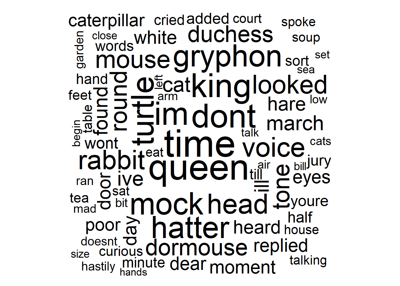
Figure 3.27: Word Cloud for Alice in Wonderland
The wordcloud() function does most of the work here. With word clouds, higher frequency words are depicted with larger text. In Figure 3.27, we plot the 100 most common words (again excluding Alice). For those familiar with the book, the appearance of characters such as gryphon, rabbit, turtle, cat, mouse, and hatter is not surprising. For those unfamiliar with the story, the word cloud provides a primer for the range of characters they might expect to find in the book.
In addition to word frequency, our research question alludes to word sentiment. The sentiment of a word describes the emotion invoked by its usage. At the simplest level, words can represent positive or negative sentiments. However, more detailed analyses might further divide sentiments into levels, such as fair, good, great, and outstanding for the positive case. Much like stop words, the tidytext library includes tables of sentiments pre-assigned to words. Although there can be some disagreement regarding sentiment assignments, these built-in lexicons offer a means to demonstrate the analysis process. We’ll use a built-in sentiment lexicon called “bing”, which assigns purely positive or negative sentiments to words.
#import sentiment data
sentiments <- get_sentiments("bing")

#join sentiments to words
alice5 <- alice4 %>%
  inner_join(sentiments,by="word")

#summarize sentiments
alice5 %>%
  group_by(sentiment) %>%
  summarize(count=n()) %>%
  ungroup()
## # A tibble: 2 × 2
## sentiment count
## <chr> <int>
## 1 negative 736
## 2 positive 338After joining the sentiment assignments to the non-stop words in the Alice story, there are a little over 1,000 common words between the two tables. After summarizing the words by sentiment, we find an overwhelming majority are negative. This might be surprising for a book that was adapted into an animated children’s movie! Although (SPOILER ALERT!) the story does involve chopping off heads, so perhaps the negativity should not be surprising. In fact, the word “head” is in our Top 15 in Figure 3.26.
Not all of the negative sentiment words in the story are unique. Perhaps a small number of negative words are repeated many times? Let’s construct a word cloud of the negative word frequencies.
#create word cloud of negative word frequencies
alice5 %>%
  filter(sentiment=="negative") %>%
  count(word,sort=TRUE) %>%
  with(wordcloud(words=word,freq=n,
          max.words=100,random.order=FALSE))
Figure 3.28: Negative Word Frequency in Alice in Wonderland
Figure 3.28 indicates there are in fact many unique negative words. Foremost among them are mock, poor, and hastily. In the next step of the 5A Method we discuss important considerations for conveying these visualizations to stakeholders.
Advise on Results
Though word clouds may be visually pleasing, they receive valid criticism from a technical standpoint. One significant limitation of word clouds is the perception of relative frequency. For example, the word “gryphon” appears 55 times, while the word “cat” appears 35 times. So, an accurate graphic would depict “gryphon” with roughly 1.6 times the frequency of “cat”. However, in the word cloud “gryphon” occupies at least 5 times the area as “cat”. The word length is working against the font size to mask the true relative frequency. As a result, “gryphon” appears disproportionately more prevalent compared to “cat”.
Bar charts may not be as intriguing as word clouds, but they tend to be a more accurate reflection of relative frequency. When one category is 1.6 times the frequency of another, the bar is 1.6 times as tall. Of course, it would be difficult to consume a bar chart with 100 categories, so there are trade-offs. Regardless, we should prefer an accurate depiction of the data over artistic style. While stakeholders may desire the more visually pleasing option, data scientists have a professional obligation to explain the pros and cons.
Another important consideration when interpreting the results of text mining is context. Our sentiment analysis suggests an overwhelmingly negative tone throughout the book. By far, the most common negative word in the Alice story is “mock”. This word is assigned the negative sentiment by the built-in lexicon. Mocking someone means to tease them in a spiteful manner. A mock object is fake or inauthentic. So, the assignment of negative sentiment is sensible. However, a domain expert would quickly point out that a character in the Alice story is the Mock Turtle. It’s not a coincidence that the words “mock” and “turtle” appear side-by-side in Figure 3.26. The word “mock” primarily appears when in reference to the Mock Turtle. So, should it be considered negative in this context? Some collaboration with domain experts may be necessary to answer this question.
The primary point of the Mock Turtle example is that context matters. Our analysis may need to push beyond individual words and consider proximity to other words and phrases to accurately assign sentiment. That said, even individual words express opposite sentiment depending on the context. Words such as “bad”, “sick”, and “wicked” are used to express negative sentiment in some situations and positive in others. We have a variety of powerful text mining tools available to us, but language is complex and subtle. The wider field of natural language processing (NLP) attempts to resolve these challenges. With a few well-designed graphics and some thoughtful collaboration with stakeholders, we are prepared to answer the question regarding word usage and sentiment in the Alice story.
Answer the Question
Based on the frequency of meaningful words in Alice’s Adventures in Wonderland, significant focus is understandably placed on the title character. Beyond Alice, the text references a wide variety of additional characters. These include the queen, king, turtle, gryphon, hatter, rabbit, and mouse. Significant themes in the book appear to be time, voice, and sight (looked). The book also seems to frequently reference the head. For those familiar with the story, this is due to the queen’s obsession with decapitation!
In terms of sentiment, the book is significantly more negative than positive. That said, we should reproduce the sentiment analysis with other lexicons (besides “bing”) to ensure the overwhelmingly negative theme is consistent. We could also extend the analysis to more-detailed lexicons that describe sentiment beyond purely positive and negative. Other extensions could include multi-word and phrase analysis using more powerful NLP tools. Follow-on work such as this might resolve lingering confusion by revealing adjacent words such as “Mock Turtle” and “Off with their heads”.
3.2.7 Choropleth Maps
Continuous numerical variables often measure some aspect of space or time. Space can refer to length, area, or volume, for example, depending on the number of dimensions under consideration. When space metrics are associated with physical geographic locations, we typically choose to incorporate that information into the analysis and presentation of results. Maps and diagrams can be incredibly insightful and provide important context when solving location-based problems. Collectively, the process of solving geographic problems involving data is known as geospatial analysis.
For visualization purposes, spatial analyses generally leverage geographic coordinate systems composed of longitude, latitude, and altitude (elevation). Tailored Geographic Information System (GIS) software exists for depicting data using geographic scales. However, we present methods and tools for conducting spatial analyses with RStudio and the tidyverse instead. Let’s use the 5A Method to solve an interesting geographic problem.
Ask a Question
The mission of the United States Census Bureau (USCB) is to “serve as the nation’s leading provider of quality data about its people and economy”. The USCB website lists the various data collected by the Bureau, some of which is required by the Constitution. In the context of resident population, suppose we are asked the following question: What is the distribution of population count and density in the contiguous United States (US)?
The contiguous US is often referred to as the “lower 48 States” and it excludes Alaska and Hawaii. Population density is a metric often reported in units of people per square mile and it attempts to account for varying sizes between States. If a resident currently lives in one of the most densely populated States (or regions) in the country, they may be interested in the location of the least densely populated States. Perhaps a vacation with “peace and quiet” is in order! If so, the answer to this research question would certainly be of interest. Thus, we progress to acquiring and analyzing the data necessary to obtain an answer.
Acquire the Data
The maps package in R includes all of the data necessary to depict maps of the world and of select countries. For the United States, map data exists at the State and county levels. The map_data() function converts the geographic boundaries into a data frame suitable for ggplot2 layering. Let’s import boundary data for the lower 48 States of the USA and plot them on a geographic coordinate system using functions from the tidyverse.
#load maps library
library(maps)

#import USA map data
state_map <- map_data("state")

#plot USA map
ggplot(data=state_map,aes(x=long,y=lat,group=group)) +
  geom_polygon(color="black",fill="white") +
  labs(title="Lower 48 States of the USA",
       x="Longitude",
       y="Latitude",
       caption="Source: maps package") +
  theme_bw()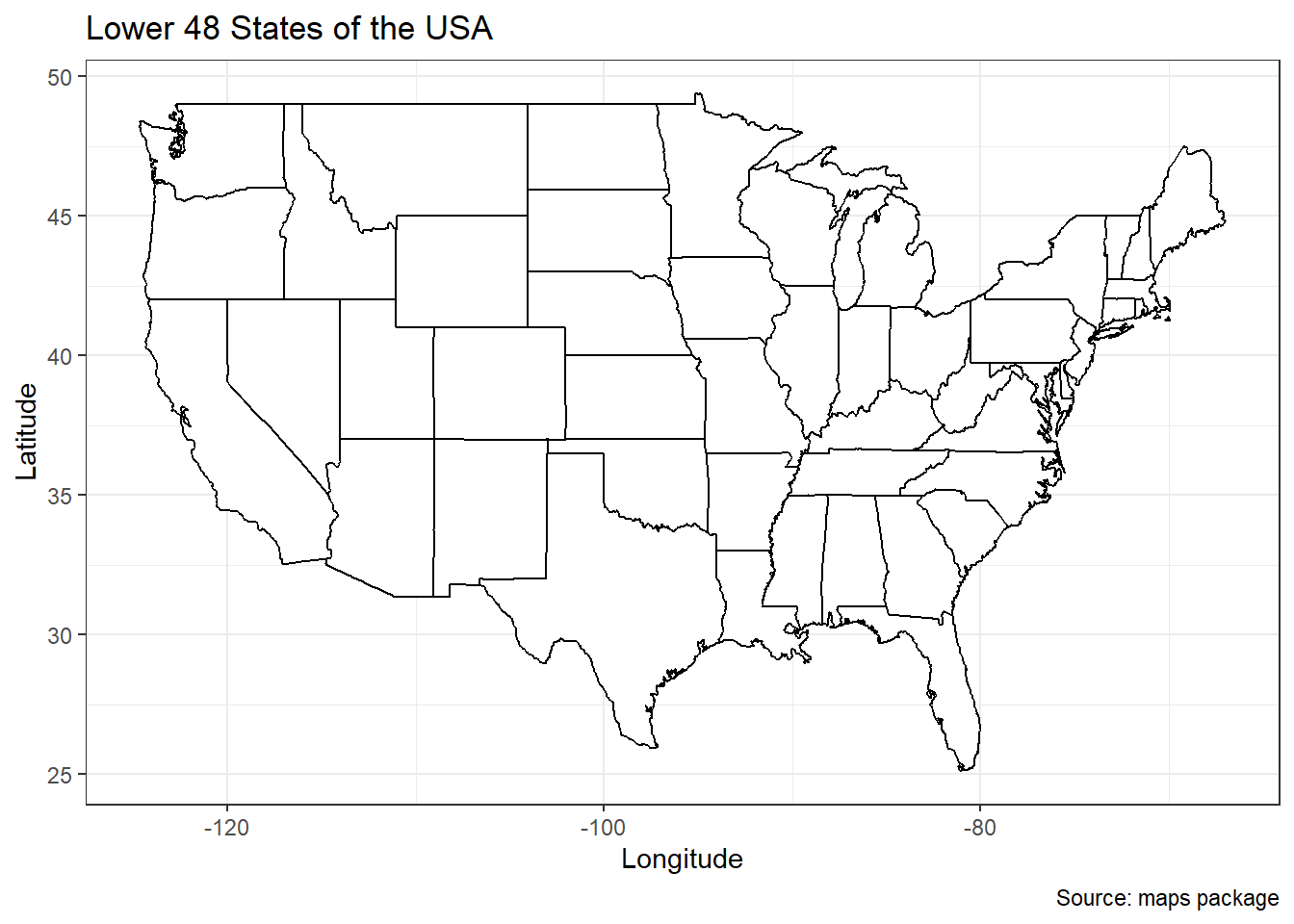
Figure 3.29: Map of Contiguous United States
The state_map data frame includes longitude and latitude values grouped by State name. These values define the boundary of each State. Some States require more boundary values than others, depending on their complexity. For example, Colorado requires fewer than 100 boundary values while Texas requires over 1,000. Figure 3.29 includes the coordinate system (geographic), scales (longitude and latitude), and context for the data. However, we have yet to obtain any variable values and assign visual cues.
In order to analyze the population density of each State, we need two separate pieces of information: population and area. Current population estimates are available from the USCB website. But the 2019 US Census is readily available in the state_census data frame from the covidcast package. We import and review the data below.
#load covidcast library
library(covidcast)

#import census data
data(state_census)

#display data structure
glimpse(state_census)
## Rows: 57
## Columns: 9
## $ SUMLEV <dbl> 10, 40, 40, 40, 40, 40, 40, 40, 40, 40, 40, 40, 40, …
## $ REGION <chr> "0", "3", "4", "4", "3", "4", "4", "1", "3", "3", "3…
## $ DIVISION <chr> "0", "6", "9", "8", "7", "9", "8", "1", "5", "5", "5…
## $ STATE <dbl> 0, 1, 2, 4, 5, 6, 8, 9, 10, 11, 12, 13, 15, 16, 17, …
## $ NAME <chr> "United States", "Alabama", "Alaska", "Arizona", "Ar…
## $ POPESTIMATE2019 <dbl> 328239523, 4903185, 731545, 7278717, 3017804, 395122…
## $ POPEST18PLUS2019 <int> 255200373, 3814879, 551562, 5638481, 2317649, 306175…
## $ PCNT_POPEST18PLUS <dbl> 77.7, 77.8, 75.4, 77.5, 76.8, 77.5, 78.1, 79.6, 79.1…
## $ ABBR <chr> "US", "AL", "AK", "AZ", "AR", "CA", "CO", "CT", "DE"…The data frame includes information for 57 States and territories, including the estimated population from 2019 in the POPESTIMATE2019 column. This variable provides data for the “count” portion of our research question. Next we need the area of each State in order to compute the “density” portion of the question. The state package includes a variety of data that describe characteristics of each State. However, they are all stored as separate vectors. So, we combine the state.name and state.area vectors into a single data frame.
#import State data
data(state)

#create land area data frame
state_area <- data.frame(region=state.name,
                         area=state.area)

#display data structure
glimpse(state_area)
## Rows: 50
## Columns: 2
## $ region <chr> "Alabama", "Alaska", "Arizona", "Arkansas", "California", "Colo…
## $ area <dbl> 51609, 589757, 113909, 53104, 158693, 104247, 5009, 2057, 58560…Now we have the area (in square miles) of each State in a data frame named state_area. To compute the population density, we must join the census and area tables together.
#join and wrangle census and area data
state_density <- state_census %>%
  transmute(region=NAME,
            count=POPESTIMATE2019) %>%
  inner_join(state_area,by="region") %>%
  transmute(region,count,density=count/area) %>%
  filter(!region %in% c("Alaska","Hawaii"))

#display data structure
glimpse(state_density)
## Rows: 48
## Columns: 3
## $ region <chr> "Alabama", "Arizona", "Arkansas", "California", "Colorado", "C…
## $ count <dbl> 4903185, 7278717, 3017804, 39512223, 5758736, 3565287, 973764,…
## $ density <dbl> 95.00639, 63.89940, 56.82819, 248.98529, 55.24126, 711.77620, …We use an inner join because we only want to include States (regions) that have both a population and an area. We then calculate the density and filter out Alaska and Hawaii, since our analysis only pertains to the contiguous United States. The result is a clean data frame of population counts and densities for all 48 States. But the geographic data and the population data are still in separate tables. In order to depict count and density on the map, we must join the two tables. We need to be careful, however, because the State names are all lower-case in the map table and capitalized in the density table. The tolower() function resolves the mismatch.
#change State name to lower case
state_density <- state_density %>%
  mutate(region=tolower(region))

#join density table to map table
state_popmap <- state_map %>%
  left_join(state_density,by="region")
Finally, after a variety of wrangling tasks all of our data resides in a single table. We can now proceed to the analysis step of the 5A Method.
Analyze the Data
In the previous subsection, we observe that Figure 3.29 has no visual cues assigned to variables. Our variables of interest are the population count and density of each State, so what should we choose as the visual cue? Count and density are numerical variables, so the scale should match the variable type. A popular option for this application is to use the shade of fill color within each State as the cue. When we use color or shade as the visual cue for characteristics of a geographic region, the graphic is referred to as a choropleth map. Let’s construct a choropleth map for population count.
#create choropleth map of count
countmap <- ggplot() +
  geom_polygon(data=state_popmap,
               aes(x=long,y=lat,group=group,fill=count/1000000),
               color="black") +
  labs(title="Estimated Population Count of Contiguous US in 2019",
       fill="Residents\n(millions)",
       caption="Source: United States Census Bureau") +
  theme_void()

#display choropleth map
countmap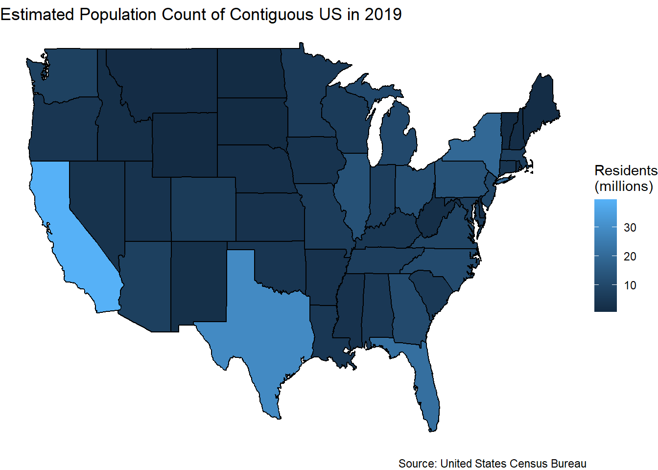
Figure 3.30: Choropleth Map of US Population Count
According to the legend in Figure 3.30, lighter shades of blue indicate a greater population. Although count is a discrete numerical variable, we treat it as continuous here since we converted the value to millions of people. As expected, we see that States with a larger area (e.g., California and Texas) tend to have a greater population. Unfortunately, it is difficult to distinguish between many of the States that have similar counts. Shades of a single color might be too subtle for this data. One solution is to employ shades between two opposing colors. The viridis library offers a number of pre-made color palettes for this purpose.
#load viridis library
library(viridis)

#display opposing color choropleth
countmap +
scale_fill_viridis(option="C")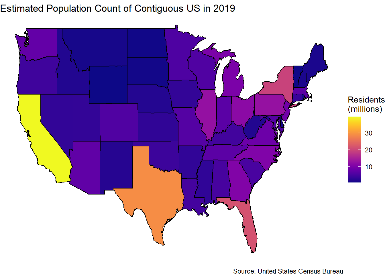
Figure 3.31: Choropleth Map of US Population Count
Given the new color palette in Figure 3.31, population differences stand out much more than before. The change is an issue of scale. In both maps, the visual cue for count is fill color shade. However, the scale that converts data values to cues is different. Arguably, the opposing colors scale is an improvement over the single color scale. Subtle differences in count are easier to perceive in the second map.
We now have an insightful depiction of the relative population counts of the lower 48 States. The population is geographically distributed such that larger States (in terms of area) tend to have more people. There are exceptions (e.g., Montana), but in general the population distribution is intuitive. But the research question also asks for the distribution of population density. Thus, we create a choropleth map for that variable as well.
#create choropleth map of density
densmap <- ggplot() +
  geom_polygon(data=state_popmap,
               aes(x=long,y=lat,group=group,fill=density),
               color="black") +
  labs(title="Estimated Population Density of Contiguous US in 2019",
       fill="Residents\nper\nSquare\nMile",
       caption="Source: United States Census Bureau") +
  scale_fill_viridis(option="D") +
  theme_void()

#display choropleth map
densmap
Figure 3.32: Choropleth Map of US Population Density
In Figure 3.32 we employ a different color palette via the option="D" parameter simply to demonstrate the variety of choices. The insights available from this graphic are arguably much more striking. New Jersey is one of the smallest States by land area, but has the greatest density (yellow) by far. Meanwhile, larger States such as California and Texas have smaller densities similar to many other States. Now we have two incredibly insightful graphics to present to stakeholders.
Advise on Results
When presenting multicolored graphics to stakeholders, an important consideration is color blindness. According to the National Eye Institute website, the most common type of color blindness makes it difficult for people to distinguish red from green. But another form makes it hard for people to tell the difference between blue and yellow. For viewers with this second form of color blindness, our maps may be very difficult to decipher. There are a number of packages for R that include color-blind friendly palettes (e.g., viridis and RColorBrewer). However, to benefit from these resources, the data scientist must collaborate with stakeholders to determine the vision limitations of the target audience. Not only does this demonstrate professional courtesy, but it also improves the technical accuracy of the graphic for those viewers.
As another consideration when advising stakeholders, we acknowledge the practical significance of our results. From the perspective of someone living in a State (e.g., New Jersey) with over 1,000 people per square mile, visiting a State (e.g., Wyoming) with only 6 people per square mile would seem like a dramatic decrease in density. But would it feel all that different from a State with 12 or 24 people per square mile? In all cases, the reduction in density is multiple orders of magnitude. So, if the purpose of finding a lower density State is to experience significantly less crowding, then other States could be sufficient. Let’s list the 10 lowest density States.
##          region   count   density
## 1       wyoming  578759  5.910891
## 2       montana 1068778  7.263780
## 3  north dakota  762062 10.784151
## 4  south dakota  884659 11.482069
## 5    new mexico 2096829 17.234305
## 6         idaho 1787065 21.387376
## 7      nebraska 1934408 25.048338
## 8        nevada 3080156 27.864628
## 9        kansas 2913314 35.414203
## 10         utah 3205958 37.754463
South Dakota, Nebraska, and Kansas all have very low population densities and are closer to New Jersey than Wyoming. Might these options provide the same perceived reduction in crowding while decreasing the travel distance? The answer is up to the stakeholder to decide, but the presentation of such options is the responsibility of the data scientist. In terms of statistical significance, Wyoming has the minimum population density. That said, there are closer States that may provide practically identical results in terms of perceived population density.
Answer the Question
The raw population count of US residents is distributed as most people would expect. States with larger areas tend to also have more people. That said, the population does appear to be greater along coastal areas and less within the interior, regardless of State area. In terms of density, the population is much more densely distributed in the northeast near the original US colonies. Among the northeastern States, New Jersey is the most densely populated with 1,134 residents per square mile. Many of the lowest density States are along the Rocky Mountain corridor, including Wyoming, Montana, and New Mexico. Wyoming is the minimum, with only 6 residents per square mile.
Two logical extensions to this work come to mind. The first is to secure more current data. While the areas of each State have likely remained unchanged since 2019, the populations have almost certainly fluctuated. Notably, the population data was gathered prior to the COVID-19 pandemic. The second extension to our case study regards the level of fidelity. Populations are not equally distributed over the areas of a given State. Generally, densities are greater near urban centers. Thus, it would be informative to reproduce the choropleth maps at the County rather than State level. Of course, this requires mapping and population data at the finer level of fidelity. Alternatively, we might choose to eliminate boundaries all together and display population density continuously across the entire country using a contour plot.
Throughout Chapter 3.2 we focus on exploring distributions of categorical and numerical variables. We also introduce various descriptive statistics, such as proportions, means, and ranges, that characterize the frequency, centrality, and variability of the distributions. In Chapter 4 we further develop the concept of statistics in the context of inference. But first we explore another important form of exploratory analysis. Namely, the associations between variables.
3.3 Associations
The term association refers to the relationship between two or more variables. In other words, do changes in the value of one variable tend to consistently coincide with changes in another variable? When there is no association between two variables we say they are independent (uncorrelated). By contrast, when there is some association between variables we label them as dependent (correlated). Of course, there are varying levels of dependence. Just as statistics help describe distributions, we have various metrics to describe the associations between variables. However, because individual metrics seldom tell the whole story, we typically present associations with visual graphics.
In the next seven sections, we introduce common graphics for exploring the associations between variables. For categorical variables, we often leverage contingency tables to display the associations across levels of two factors. By far the most common graphic for detecting associations between numerical variables is the scatter plot. But the shapes of associations can vary from linear to nonlinear to clustered. Thus, we offer examples of many different plots. When observations occur in a chronological order, we refer to the data as a time series. In this case, we often “connect the dots” in a line graph. Finally, we explore the associations between many variables using a biplot. Each graphic is applied to a real-world example using the 5A Method for problem solving.
3.3.1 Contingency Tables
What would it mean for two categorical variables to be associated with one another? One answer is that certain values of one variable tend to occur more frequently in conjunction with certain values of the other variable. Given this definition, association only makes sense in the context of factors. Thus, the concept of “frequency” alludes to counting the intersections of levels between the two factors. Often we depict such summaries in a contingency table.
A contingency table displays the frequency of intersecting levels for two factors. As a simple example, imagine we visit a kennel with 40 dogs and we are interested in the distribution of sex and size among them. Table 3.8 provides the hypothetical summary.
| sex | small | medium | large |
|---|---|---|---|
| Male | 7 | 4 | 11 |
| Female | 8 | 6 | 4 |
Notice the levels of the sex factor are displayed across the rows, while the levels of the size factor are shown across the columns. When considering the factors separately, we can only state that there are 22 males and 18 females. Similarly, there are 15 small, 10 medium, and 15 large dogs. However, with the contingency table we dig deeper into the intersections of factor levels. We know, for example, that among the large dogs there are far more males. Among the female dogs, the most common size is small. The detailed summary provided by joint distributions unlocks more interesting insights, such as the association between variables.
Building on this simple illustration of contingency tables, we return to the General Social Survey (GSS) data set to answer another compelling question. As before, we use the dplyr and ggplot2 libraries from the tidyverse suite for wrangling and visualization.
Ask a Question
Using data from the GSS, we previously explored the individual distribution of marital status among Americans. However, we might also be interested in the relationship between marital status and other demographic factors. Imagine we receive this follow-on question to our previous analysis: Is there an association between marital status and political party among those who responded to the GSS between 2000 and 2014?
Who might be concerned with such a question? One concerned stakeholder could be the campaign manager for a politician. Targeted messaging is a key objective for political campaigns and married voters might have distinct concerns compared to single voters. If marital status is completely independent of political party, then perhaps there is no need to tailor messaging. On the other hand, if one status is more common within a certain party then it could be important for a campaign team to be aware. Let’s find out!
Acquire the Data
We once again leverage the gss_cat data set included in the base R download. We import the data and review the levels of the two factors of interest below.
## [1] "No answer"     "Never married" "Separated"     "Divorced"
## [5] "Widowed" "Married"## [1] "No answer" "Don't know" "Other party"
## [4] "Strong republican" "Not str republican" "Ind,near rep"
## [7] "Independent" "Ind,near dem" "Not str democrat"
## [10] "Strong democrat"If we want to examine the association between marital status and political party, then we need observations that provide a definitive status for both factors. Consequently, we choose to remove any non-answers from our data frame. Additionally, some aggregation of levels simplifies the analysis. For marital status, we reduce the levels to never married (Never), previously married (Before), and currently married (Now). For political party, we combine the strength levels into solely Democrat, Independent, and Republican. The following code completes all of these wrangling tasks and summarizes the resulting data frame.
#wrangle GSS data
gss_cat2 <- gss_cat %>%
  select(marital,partyid) %>%
  na.omit() %>%
  filter(marital != "No answer",
         !partyid %in% c("No answer","Don't know","Other party")) %>%
  transmute(marital=case_when(
      marital=="Married" ~ "Now",
      marital %in% c("Separated","Divorced","Widowed") ~ "Before",
      marital=="Never married" ~ "Never"),
    political=case_when(
      partyid %in% c("Strong republican","Not str republican") ~ "Republican",
      partyid %in% c("Ind,near rep","Independent","Ind,near dem") ~ "Independent",
      partyid %in% c("Strong democrat","Not str democrat") ~ "Democrat")) %>%
  mutate(marital=as.factor(marital),
         political=as.factor(political))

#summarize data frame
summary(gss_cat2)
## marital political
## Before:5774 Democrat :7177
## Never :5264 Independent:8403
## Now :9885 Republican :5343We use the case_when() function to create and assign new factor levels. With mutually exclusive levels, it is much more straight-forward to summarize the factors individually. Among the nearly 21,000 respondents, close to half are currently married. The most common political affiliation is Independent, but Democrat is not far behind. But we are interested in the joint distribution of both variables. We want to know, for example, whether Democrats or Republicans are more likely to be married (or not). To address such concerns, we transition to the analysis stage and construct a contingency table.
Analyze the Data
Conveniently, the table() function automatically produces joint frequency counts across two factors. The result is a contingency table with a structure similar to the dog kennel example in Table 3.8.
##
##          Democrat Independent Republican
##   Before     2252        2237       1285
##   Never      1975        2406        883
##   Now        2950        3760       3175
The rows (marital status) and columns (political party) of the table sum to the same values produced by the summary() function in the previous subsection. The Democrat column sums to 7,177, the Independent column sums to 8,403, and the Republican column sums to 5,343. The same is true for the rows representing marital status. The benefit of the contingency table is that we see how these totals are distributed across the opposing factor.
Counts are often transformed into proportions as a more insightful metric for the frequency of events. In the context of contingency tables, there are three types of proportions: joint, marginal, and conditional. Joint proportions describe the intersection of factor levels. For example, 883 out of 20,923 respondents identify as both Republican and never married. This represent roughly 4% of respondents. Thus, joint proportions indicate the frequency of intersecting variable values (factor levels) out of the total.
When focused on the frequency of a single variable’s values, we compute marginal proportions. Marginal proportions ignore the opposing factor when describing frequencies. To achieve this, we sum the rows or columns of the contingency table. In other words, we return to the results of the summary() function from the previous subsection. For example, 5,264 of the 20,923 respondents have never been married. This comprises about 25% of the total, which is a marginal proportion.
Finally, conditional proportions hold one factor level constant while examining the distribution across the opposing factor. According to the table, 2,950 (41%) of the 7,177 Democrats are currently married. Said another way, given a respondent is a Democrat there is a 41% chance they are currently married. One way to think about the arithmetic is that the “given” level (Democrat) goes in the denominator of the fraction, while the “chance” level (currently married) goes in the numerator. Similar calculations indicate that 45% of Independents and 59% of Republicans are currently married.
When computing conditional proportions the order matters! Let’s reverse the order of Democrat and currently married. Given a respondent is currently married there is a 30% chance they are a Democrat. Among the 9,885 (denominator) who are currently married, only 2,950 (numerator) are Democrats. Similarly, 38% of never married and 39% of previously married respondents identify as Democrats.
Conditional proportions play an important role in determining the association between two categorical variables. If two factors are independent (not associated), then the marginal and conditional proportions for the levels should be roughly equal. Whereas if the factors are dependent (associated), then the marginal and conditional proportions should be clearly different. As an example, the marginal proportion of currently married respondents is 47% (9,885/20,923). But the conditional proportions given political party are 41%, 45%, and 59% for Democrats, Independents, and Republicans, respectively. Republicans appear to be married at a higher frequency than the population at large. This suggests marital status and political party have some association (dependence).
Based on our frequency analysis, it seems there is some evidence for an association between marital status and political party. The distribution of marital status differs according to political party and vice-versa. How might we convey this insight to our stakeholders?
Advise on Results
Although the contingency table is a valuable summary of factor level frequencies, a visual graphic is often a better tool for communicating results to stakeholders. In a previous section, we visualized individual categorical variables using a bar chart. We expand on this with the introduction of the stacked bar chart.
#create stacked bar chart
ggplot(data=gss_cat2,aes(x=political,fill=marital)) +
  geom_bar() +
  labs(title="General Social Survey (2000-2014)",
       x="Political Party",
       y="Count",
       fill="Marital Status",
       caption="Source: University of Chicago (NORC)") +
  theme_bw()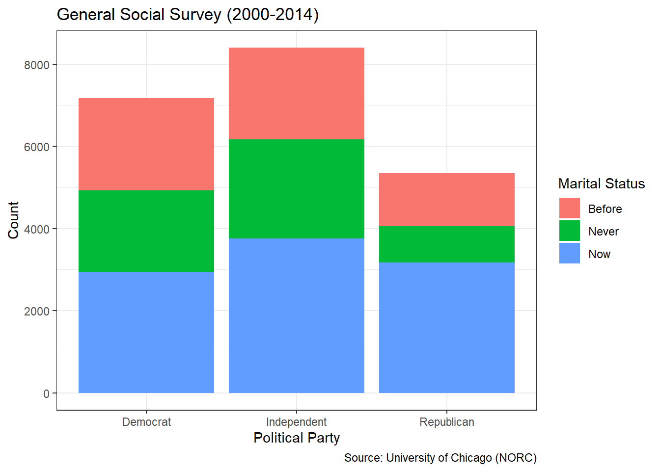
Figure 3.33: Stacked Bar Chart of Marital and Political Status
In Figure 3.33, we depict two categorical variables at the same time using the fill aesthetic. The default metric is raw counts, just as with the contingency table. The height of the bars indicate that Independents or most common and Republicans are least common in the GSS data. Within each political party, the fill colors indicate that being married (Now) is most common. However, given the differences in bar heights, it is difficult to identify any association (or lack thereof) between the variables. We remedy this issue by standardizing the stacked bar charts with a transformation to proportions.
#create standardized stacked bar chart
ggplot(data=gss_cat2,aes(x=political,fill=marital)) +
  geom_bar(position="fill") +
  labs(title="General Social Survey (2000-2014)",
       x="Political Party",
       y="Proportion",
       fill="Marital Status",
       caption="Source: University of Chicago (NORC)") +
  theme_bw()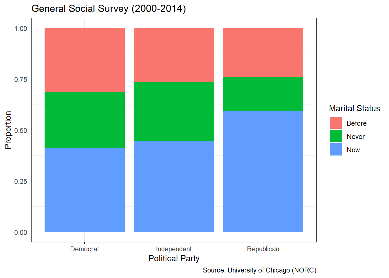
Figure 3.34: Standardized Stacked Bar Chart of Marital and Political Status
Standardizing with position="fill" fixes the bar heights at 100% within each political party. Now the heights of each color (marital status) in Figure 3.34 represent conditional proportions. If marital status and political party are truly independent of one another, then the heights for each color should be the same. Instead, the graphic clearly depicts the higher frequency of marriage among Republicans compared to the other two parties. This provides visual evidence of an association between the two factors. We draw the same conclusion by reversing the visual aesthetic (\(x\)-axis versus fill color) used for each factor.
#create standardized stacked bar chart
ggplot(data=gss_cat2,aes(x=marital,fill=political)) +
  geom_bar(position="fill") +
  labs(title="General Social Survey (2000-2014)",
       x="Marital Status",
       y="Proportion",
       fill="Political Party",
       caption="Source: University of Chicago (NORC)") +
  theme_bw()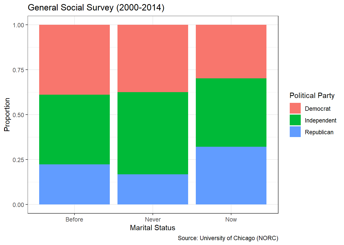
Figure 3.35: Standardized Stacked Bar Chart of Political and Marital Status
As before, Figure 3.35 suggests an association between marital status and political party. Those who are currently married appear to have a different distribution of political party than those who are not. A stakeholder, such as a campaign manager, might find such results unsurprising. Republicans tend to be associated with more conservative values that might encourage marriage and discourage separation or divorce. If that is the case, then these results provide supporting evidence. What might be surprising is the similarity between Independents and Democrats. When it comes to issues of marriage, there do not appear to be strong differences between these two parties. That information might be of great value to a campaign manager looking to attract fringe voters.
Answer the Question
For those who responded to the GSS between 2000 and 2014, there does appear to be a relationship between marital status and political party. A higher proportion of Republicans are currently married compared to the other two parties. On the other hand, the distribution of marital status appears to be roughly the same for Independents and Democrats. Viewed from the opposite perspective, those who are currently married appear to be more frequently Republican than those who are not married (or never have been). Either way we view it, the two factors are associated.
Our answer is well-aligned with the original question, if the scope remains restricted to the time period of 2000 to 2014. However, changes in political climate, social norms, and economic factors could alter the results of our analysis. Consequently, our advice could dramatically change. For the manager of a contemporary political campaign, access to the most current guidance is critical. Provided modern responses to the same survey questions, we could easily repeat our analysis and deliver fresh insights.
While contingency tables and stacked bar charts are great options for displaying the associations between factors, they are poor choices for continuous numerical variables. Because such variables can take on infinitely-many values, we would need a table with infinite rows and columns or a chart with infinite bars and fill colors. Instead, we explore the associations between numerical variables using scatter plots.
3.3.2 Scatter Plots (Linear)
When two numerical variables are associated (dependent), that association is typically visualized in a scatter plot. Scatter plots employ location on the Cartesian coordinate system as the visual cue for the variable values of each observation. The points represented by each observation create a “cloud” that can take on many forms. Typically, we describe the “cloud” (association) based on its shape, direction, and strength.
The shape of association between variables can be linear or nonlinear. Figure 3.36 depicts a linear (Panel A) and nonlinear (Panel B) association between two numerical variables \(x\) and \(y\).
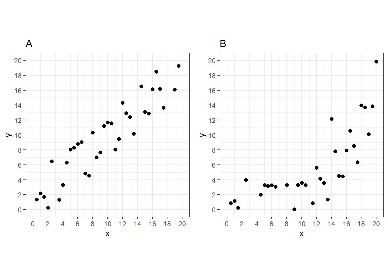
Figure 3.36: Scatter Plots with Linear (A) and Nonlinear (B) Associations
In Panel A, the association between \(x\) and \(y\) appears constant. As \(x\) increases, \(y\) increases at a constant (linear) rate. By contrast, the rate of change in \(y\) is not constant in Panel B. As \(x\) increases, \(y\) increases at a greater and greater (nonlinear) rate. In this section of the chapter, we focus on linear associations and save nonlinear for the next section.
In addition to shape, we are also interested in the direction of association between variables. Associations can be positive or negative. Despite the differences in shape, Panels A and B both depict a positive (increasing) association. As one variable increases, the other also generally increases. Figure 3.37 illustrates the opposite case. Panels C and D both indicate a negative (decreasing) association. As \(x\) increases, \(y\) generally decreases.
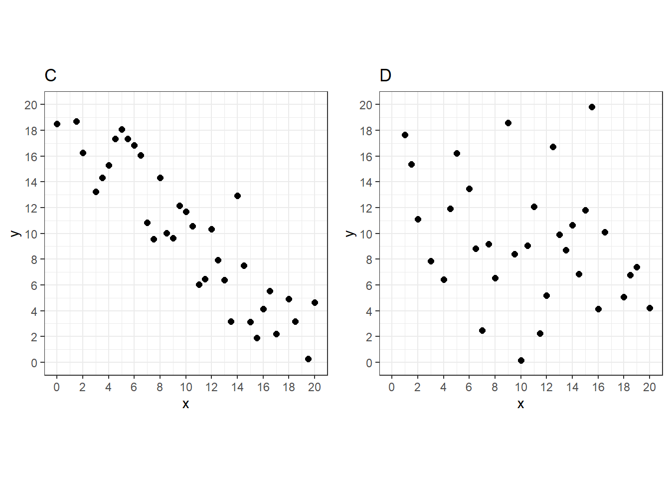
Figure 3.37: Scatter Plots with Strong (C) and Weak (D) Associations
The final characteristic used to describe the association between numerical variables is strength. The strength indicates how closely the points in the scatter plot follow the shape and direction of association. Panels C and D both have linear, decreasing associations, but it is much stronger in Panel C. The association in Panel D is so weak that it is difficult to even discern the shape. The assessment of strength based purely on visual indicators can be subjective. Consequently, we typically rely on an objective metric called a correlation coefficient.
The term correlation refers to the interdependence between two variables. If the variables are correlated, then they are dependent. If they are uncorrelated, then the variables are independent. Coefficients measure the strength (and direction) of correlation and there are many types. The Pearson coefficient, named after famed statistician Karl Pearson, is designed to measure linear correlation. The Pearson coefficient is always between -1 and 1, with the sign indicating positive or negative correlation. An absolute value of 1 suggests perfect correlation, while a value of 0 indicates a complete lack of correlation. Absolute values in between are commonly categorized as follows:
- Strong: 1 to 0.75
- Moderate: 0.75 to 0.50
- Weak: 0.50 to 0.25
- None: 0.25 to 0
In the case study that follows, we demonstrate the assessment of the shape, direction, and strength of association between two variables. We also introduce a method known as linear regression used to find the trend line that best fits the association observed in a scatter plot. As usual, we employ functions from the tidyverse to assist with wrangling and visualization.
Ask a Question
The Palmer Station Long Term Ecological Research (LTER) Program studies the polar marine biome along the Palmer Archipelago in Antarctica. The Program’s objectives, research initiatives, and publications are available at this link. One such initiative includes studying biological characteristics of the local penguin population. Imagine we are asked the following question: What is the association, if any, between a Palmer penguin’s flipper length and its body mass?
Marine biologists involved with the LTER Program likely know the answer to this question. However, the answer could not be found without carefully-collected and analyzed data. Let’s imagine we had the opportunity to be a part of this original analysis. The research team might be concerned with this research question for a variety of reasons. Perhaps flipper length can be used to predict the average body mass of a penguin. It may be easier to measure a penguin’s flipper than to weigh its whole body. Alternatively, an association might be used to identify under or over-weight penguins compared to others with similar flipper lengths. The answer may simply be of interest to better understand the body structure (morphology) of Palmer penguins.
For the vast majority of the population, this question would not be answerable without outside assistance. Most of us will never travel to Antarctica, let alone capture a penguin! Luckily, the Palmer Station researchers are already there. However, the issue of “capture” does raise potential ethical concerns. Can the researchers provide body measurements of live penguins without injuring them? How might the presence of the research team impact the natural habitat of the penguin population? What will the data be used for? Domain experts and data scientists alike should carefully consider the answers to these questions before acquiring the data.
Acquire the Data
The Palmer Station LTER Program provides access to a variety of research data on their website. But some of it is also easily accessible via the palmerpenguins library for R. A member of the Palmer team named Dr. Kristen Gorman provides the measurement data we need in a table called penguins. Let’s load the library and import the data.
#load Palmer library
library(palmerpenguins)

#import penguin data
data(penguins)

#display structure of penguin data
glimpse(penguins)
## Rows: 344
## Columns: 8
## $ species <fct> Adelie, Adelie, Adelie, Adelie, Adelie, Adelie, Adel…
## $ island <fct> Torgersen, Torgersen, Torgersen, Torgersen, Torgerse…
## $ bill_length_mm <dbl> 39.1, 39.5, 40.3, NA, 36.7, 39.3, 38.9, 39.2, 34.1, …
## $ bill_depth_mm <dbl> 18.7, 17.4, 18.0, NA, 19.3, 20.6, 17.8, 19.6, 18.1, …
## $ flipper_length_mm <int> 181, 186, 195, NA, 193, 190, 181, 195, 193, 190, 186…
## $ body_mass_g <int> 3750, 3800, 3250, NA, 3450, 3650, 3625, 4675, 3475, …
## $ sex <fct> male, female, female, NA, female, male, female, male…
## $ year <int> 2007, 2007, 2007, 2007, 2007, 2007, 2007, 2007, 2007…The data frame includes 344 observations (rows) described by 8 variables (columns). Each observation represents an individual penguin and the variables describe its species, home island, body measurements, and other features. The two variables we need to answer the research question are flipper length (in millimeters) and body mass (in grams). Let’s isolate those two variables and remove any observations with missing values.
#wrangle penguins data
penguins2 <- penguins %>%
  select(flipper_length_mm,body_mass_g) %>%
  na.omit()

#summarize penguin data
summary(penguins2)
## flipper_length_mm body_mass_g
## Min. :172.0 Min. :2700
## 1st Qu.:190.0 1st Qu.:3550
## Median :197.0 Median :4050
## Mean :200.9 Mean :4202
## 3rd Qu.:213.0 3rd Qu.:4750
## Max. :231.0 Max. :6300We compute a summary of the two variables to check for any unrealistic outlying values. Without some expertise in marine biology, it may be difficult to detect errors. Collaboration with domain experts is one solution to the problem. Short of that, we can conduct our own online research or rely on our limited intuition. For example, the maximum flipper length is 231 mm, which is equivalent to a little over 9 inches. Based on seeing penguins at the zoo or on television, this does not seem unreasonable. If the largest flipper was 9 feet, we might be concerned! Similarly, the maximum body mass (6,300 g) is equivalent to nearly 14 pounds. Were this 14 tons, even those without a biology degree would know it is an error.
After importing and cleaning the data, we are prepared for an analysis of the association between flipper length and body mass. What is the shape, direction, and strength of association?
Analyze the Data
As with other common graphics, the base R installation can produce scatter plots via the plot() function. Figure 3.38 displays a simple scatter plot appropriate for internal use by a data scientist.
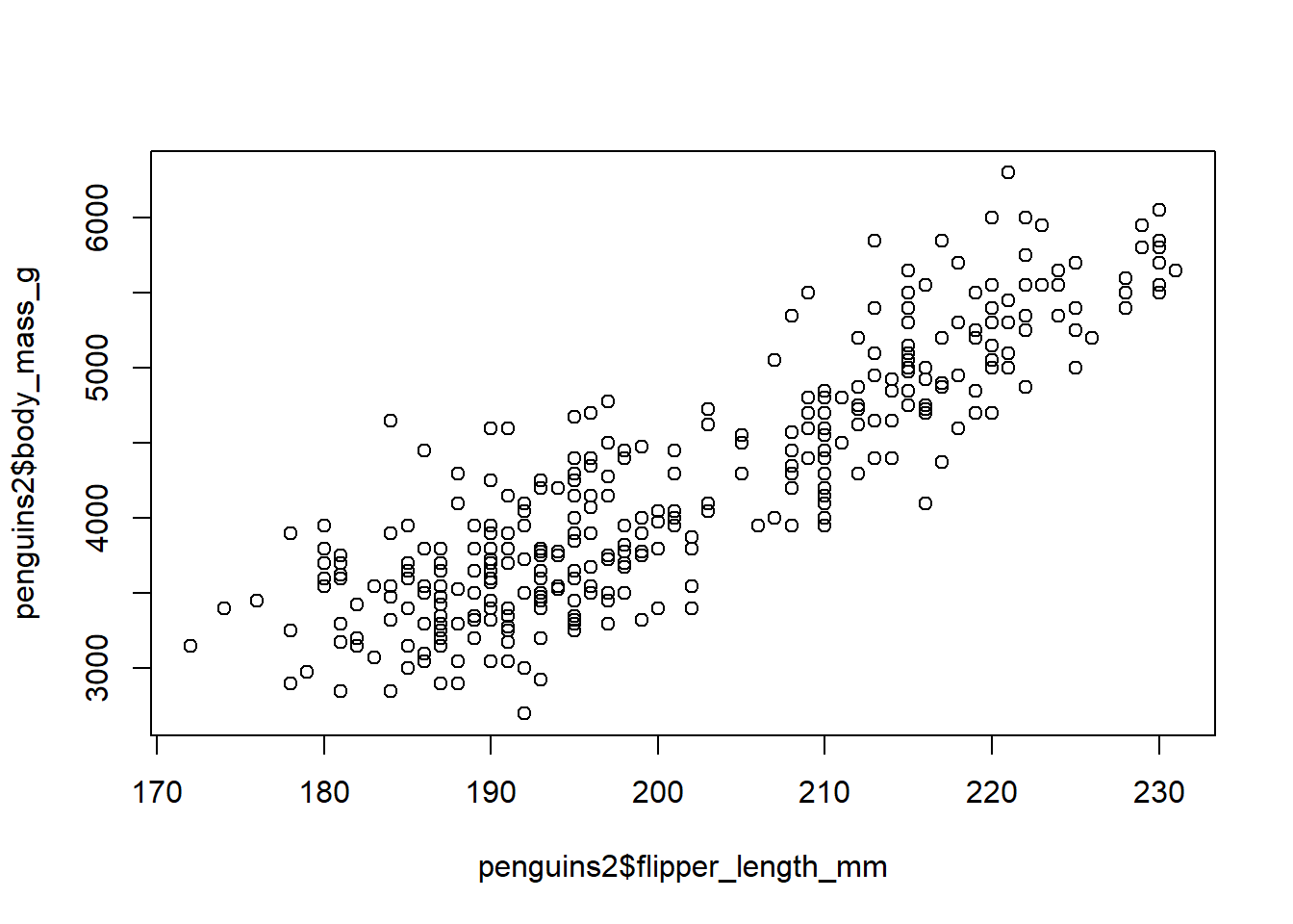
Figure 3.38: Basic Scatter Plot of Penguin Measurements
Although this basic plot supports the assessment of association between the variables, it leaves a lot to be desired in terms of precision and clarity. We should not present such a graphic to stakeholders. Thus, we once again employ the ggplot2 package to construct an improved visualization in Figure 3.39.
#create ggplot scatter plot
scatter <- ggplot(data=penguins2,
                  aes(x=flipper_length_mm,y=body_mass_g)) +
  geom_point() +
  labs(title="Palmer Archipelago (Antarctica)",
       subtitle="Penguin Measurements",
       x="Flipper Length (mm)",
       y="Body Mass (g)",
       caption="Source: Palmer Station LTER Program") +
  theme_bw()

#display scatter plot
scatter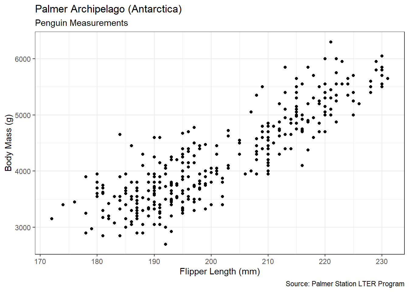
Figure 3.39: ggplot2 Scatter Plot of Penguin Measurements
For this improved graphic, we use position on the \(x\) and \(y\) axes as the visual cue for flipper length and body mass. The coordinate system is Cartesian with linear scales for both axes. We provide context via titles, labels, and captions. With the control available via ggplot2 layering, we achieve greater precision and clarity compared to the basic plot. Now we can address the association between the variables.
In terms of shape, the association between flipper length and body mass appears linear. The “cloud” of points follow a relatively straight line, with little-to-no visable curvature. The underlying linear shape is also oriented in a positive direction. As flipper length increases, body mass also generally increases. Does this make intuitive sense? On average, will penguins with longer flippers also be larger in other dimensions and thus have greater mass? The answer is almost certainly yes. Imagine if it were in the other direction. Tiny penguins with huge flippers might be humorous, but they are unlikely.
With regard to strength, the points seem to follow the linear, increasing association quite closely. However, we need not guess at the strength based on subjective visual assessments. Instead, we compute the Pearson correlation coefficient using the cor() function.
#compute Pearson correlation coefficient
cor(penguins2$flipper_length_mm,
    penguins2$body_mass_g,
    method="pearson")
## [1] 0.8712018Following the guidelines in the introduction to the section, a correlation of 0.87 is classified as “strong”. The positive sign of the coefficient also confirms the association is positive, just as we observed in the scatter plot. All told, we find that there is a strong, positive, linear association between a penguin’s flipper length and its body mass. Said another way, a penguin’s body mass is dependent on its flipper length.
Now that we have confirmed an underlying linear trend between the two variables, we might like to describe it in greater detail. Lines are typically characterized by an intercept and slope. The general equation for a line is shown in Equation (3.1).
\[\begin{equation} y = \beta_0+\beta_1 x \tag{3.1} \end{equation}\]
The intercept (\(\beta_0\)) dictates where the line crosses the \(y\)-axis and the slope (\(\beta_1\)) determines how steeply the line increases or decreases. We desire the intercept and slope for a trend line that “best fits” the cloud of points in the scatter plot. But what do we mean by “best”? Let’s begin to answer this question by comparing a few options for the best-fit line.
#display best fit line
scatter +
  geom_smooth(method="lm",formula=y~x,se=FALSE) +
  geom_abline(slope=50,intercept=-4500,
              color="red",linetype="dashed") +
  geom_abline(slope=25,intercept=-1500,
              color="red",linetype="dashed")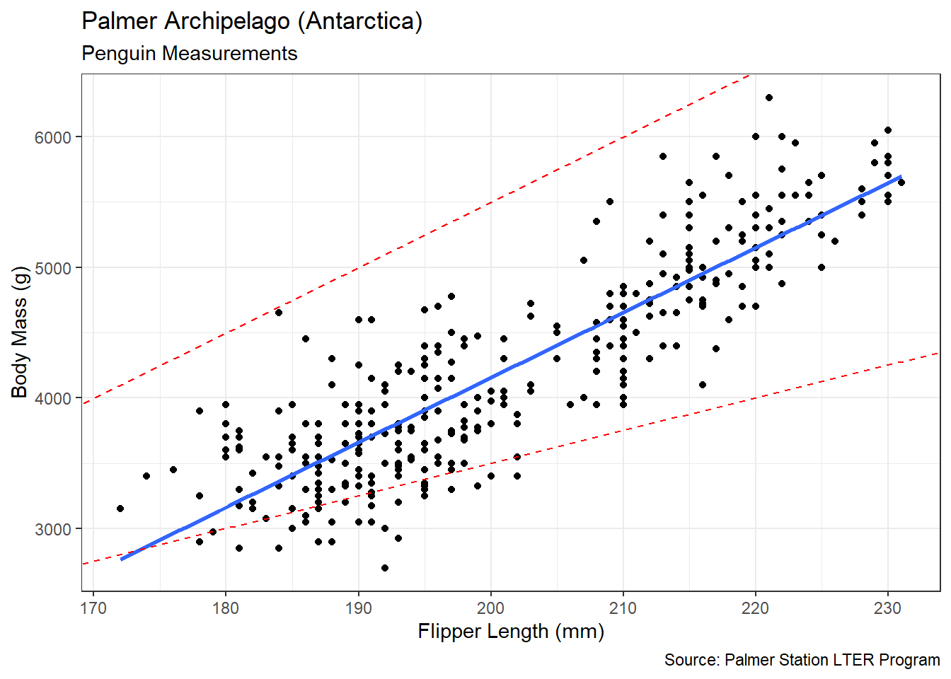
Figure 3.40: Best Fit (blue) Line to Scatter Plot
The dashed red line above the cloud of points is a poor fit primarily due to its intercept. The positive slope of this line represents the increasing trend well, but the intercept positions the line far away from most of the points. On the other hand, the dashed red line below the cloud poorly represents the trend due to its slope. This line starts out within the cloud of points, but then falls out as flipper length increases. Only the solid blue line starts out and stays within the cloud of points. This line includes a well-chosen slope and intercept.
In Figure 3.40 the geom_smooth() function depicts the best-fit (blue) line on the scatter plot. The method="lm" and formula=y~x options indicate we want to represent \(y\) as a function of \(x\) using a linear model. Behind the scenes, the function finds the slope and intercept of the best linear model using a method known as regression. In more common usage, the term “regression” refers to a return to a previous state. In data science, regression implies a return to an underlying average trend. Despite random variability, the points in the scatter plot follow the trend, on average. Though there are many types of regression modeling, our blue trend line is determined using linear regression.
In order to estimate the values for the intercept (\(\beta_0\)) and slope (\(\beta_1\)) parameters, the linear regression method applies an optimization algorithm known as least squares. The algorithm finds the line that minimizes the sum of squared errors. By “error” we mean the vertical distance between each point and the line. If we add up all of the squared errors for the dashed red lines in Figure 3.40, the total is greater than that of the best-fit blue line. At the aggregate level, the red lines are “further away” from the cloud of points than the blue line. In RStudio we execute the least squares algorithm using the lm() function.
#build linear model
linear_model <- lm(body_mass_g~flipper_length_mm,data=penguins2)

#extract linear model coefficients
coefficients(summary(linear_model))
## Estimate Std. Error t value Pr(>|t|)
## (Intercept) -5780.83136 305.814504 -18.90306 5.587301e-55
## flipper_length_mm 49.68557 1.518404 32.72223 4.370681e-107Within the lm() function, we define the \(y\)-axis variable first and the \(x\)-axis variable second. Then we provide the data frame in which to find the variables. In order to see the results of the least squares algorithm, we extract the coefficients from the summary output. For now, we are only concerned with the values in the Estimate column. In Chapter 4 we discuss the other columns.
Based on the output from the linear model, the best-fit line has an intercept of -5780.83 and a slope of 49.69. No other intercept or slope values could provide a better fit to the data. These values are optimal in terms of minimizing error. Hence the word “best” when referring to the trend line. With both visual and numerical measures of the association between flipper length and body mass, we are prepared to advise our stakeholders.
Advise on Results
When interpreting the association between two variables, it is critical we heed the often repeated phrase “correlation does not imply causation”. Our analysis indicates a strong correlation between a penguin’s flipper length and its body mass. This does not mean that longer flippers cause a penguin to have a greater body mass. Instead there is a third confounding variable that influences both flipper length and body mass. Namely, genetic and/or environmental factors cause a penguin to be larger or smaller overall. Perhaps a penguin’s parents are relatively large, causing it to have both longer flippers and greater body mass. Alternatively, a penguin might be chronically malnourished, causing its entire body to be relatively smaller. In either case, there is an outside factor (i.e., confounder) driving the correlation between flipper length and body mass.
Another consideration when presenting the results of a regression analysis is the proper interpretation of the intercept and slope of the trend line. In mathematics in general, the intercept of a line represents the value of \(y\) when \(x\) is equal to zero. But this explanation does not make sense for our case study. It is equivalent to asking for the body mass of a penguin with no flippers! Even if we find an unfortunate penguin with no flippers, the estimated body mass is negative. Thus, in general, the intercept of a trend line provides little insight. By contrast, the slope is incredibly valuable from an interpretation stand point. Slope indicates the change in \(y\) given a one unit increase in \(x\). In our case, every additional millimeter of flipper length is expected to coincide with a 49.69 gram increase in body mass. We dig much deeper into the statistical significance of the slope parameter in Chapter 4.
A final potential pitfall when interpreting linear association is known as Simpson’s Paradox. Though named after British codebreaker and statistician Edward Simpson, most agree that the concept was described much earlier by Karl Pearson. Simpson’s Paradox recognizes that the direction of association between two variables can reverse depending on how the data is grouped. As an example, imagine we are asked about the association between bill depth (rather than flipper length) and body mass. We repeat the previous analysis and generate the scatter plot and best-fit trend line in Figure 3.41.
#display misleading best fit line
ggplot(data=penguins,
       aes(x=bill_depth_mm,y=body_mass_g)) +
  geom_point() +
  geom_smooth(method="lm",formula=y~x,se=FALSE) +
  labs(title="Palmer Archipelago (Antarctica)",
       subtitle="Penguin Measurements",
       x="Bill Depth (mm)",
       y="Body Mass (g)",
       caption="Source: Palmer Station LTER Program") +
  theme_bw()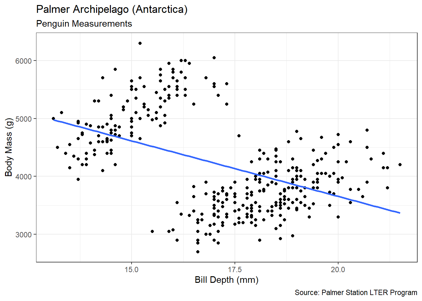
Figure 3.41: Misleading Best Fit Line
The best-fit line suggests a negative association between bill depth and body mass. Does this make intuitive sense? Does it seem likely that penguins with thicker (deeper) bills have smaller bodies? Based on what we observed with flipper length, this direction of association does not make sense. Yet, the negatively sloped line is the legitimate result of the linear regression. The issue is that there are two separate clouds of points. The association between the clouds is negative, but the association within each cloud appears positive. It turns out the clouds are defined by species. Let’s recreate the scatter plot and trend line using color as the visual cue for penguin species in Figure 3.42.
#display multiple best fit lines
ggplot(data=penguins,
       aes(x=bill_depth_mm,y=body_mass_g,color=species,group=species)) +
  geom_point() +
  geom_smooth(method="lm",formula=y~x,se=FALSE) +
  labs(title="Palmer Archipelago (Antarctica)",
       subtitle="Penguin Measurements",
       x="Bill Depth (mm)",
       y="Body Mass (g)",
       color="Species",
       caption="Source: Palmer Station LTER Program") +
  theme_bw()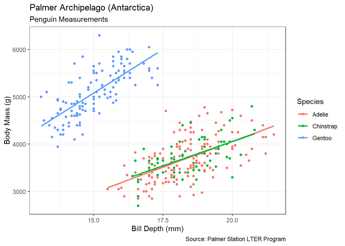
Figure 3.42: Multiple Best Fit Lines
Within each species, the association between bill depth and body mass is positive. This is the reversal suggested by Simpson’s Paradox. When grouping all penguins together the association appears negative, even though it is positive within each species. While this example of a paradox is relatively easy to decipher, that may not always be the case. Domain experts and stakeholders provide valuable insight in this regard. Had we advised that penguins with thicker bills tend to be smaller, a marine biologist would likely raise an eyebrow. After collaborating on this apparent mistake, the data scientist and domain expert have a better chance of discovering the grouping issue. Namely, that Gentoo penguins tend to have thinner bills overall compared to the other two species. Once we identify confounding variables, carefully interpret the characteristics of the trend line, and resolve any counter-intuitive associations, we are ready to answer the research question.
Answer the Question
Based on the measurement of over 300 penguins on the Palmer Archipelago, there appears to be a strong, positive, linear association between the length of a penguin’s flippers and its body mass. Specifically, we expect a penguin’s body mass to increase by about 50 grams, on average, for every one millimeter increase in flipper length. This association is consistent across all three species.
Now that we have discovered an apparent correlation between variables, a logical extension to the exploratory analysis is an inferential analysis. Though we save the details for Chapter 4, an inferential analysis tests the significance of our exploratory discoveries. For data with a high level of natural variability, we sometimes find apparent associations simply due to chance. Though unlikely for our case study, given the strong correlation, it is possible to obtain a non-zero slope from the least squares algorithm even though the two variables are independent. Inferential methods such as hypothesis testing and confidence intervals help us identify these cases.
In this section, we found a clearly linear association between two numerical variables. Consequently, a linear trend line was appropriate. However, many real-world associations between variables are not linear. In the next section, we describe options for cases that involves nonlinear association.
3.3.3 Scatter Plots (Nonlinear)
In the previous section, our analysis focused on linear associations between two numerical variables. In fact, estimates of the linear regression model in Equation (3.1) are only valid if the association between variables is linear. However, many variables in real-world data sets are related in a nonlinear manner. Figure 3.43 depicts two common types of nonlinear association.
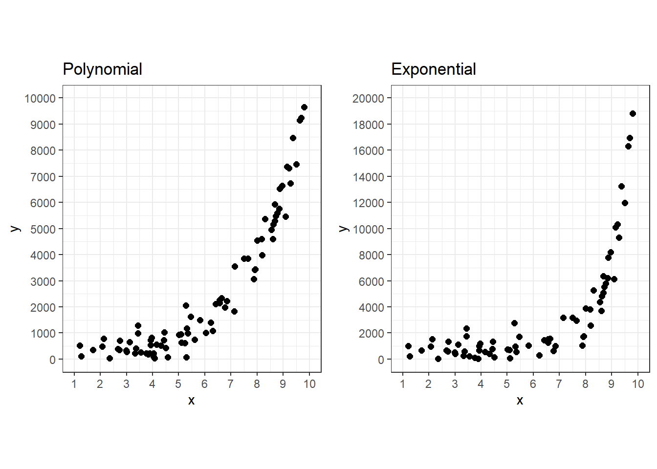
Figure 3.43: Common Concave-Up Functions
The polynomial (\(x^4\)) and exponential (\(e^x\)) functions in the scatter plots depict a concave-up association. With concave-up functions the rate of increase in \(y\) gets greater as \(x\) gets larger. By contrast, concave-down functions display a diminishing rate of increase in \(y\) as \(x\) gets larger. Figure 3.44 depicts two of the most common concave-down functions.
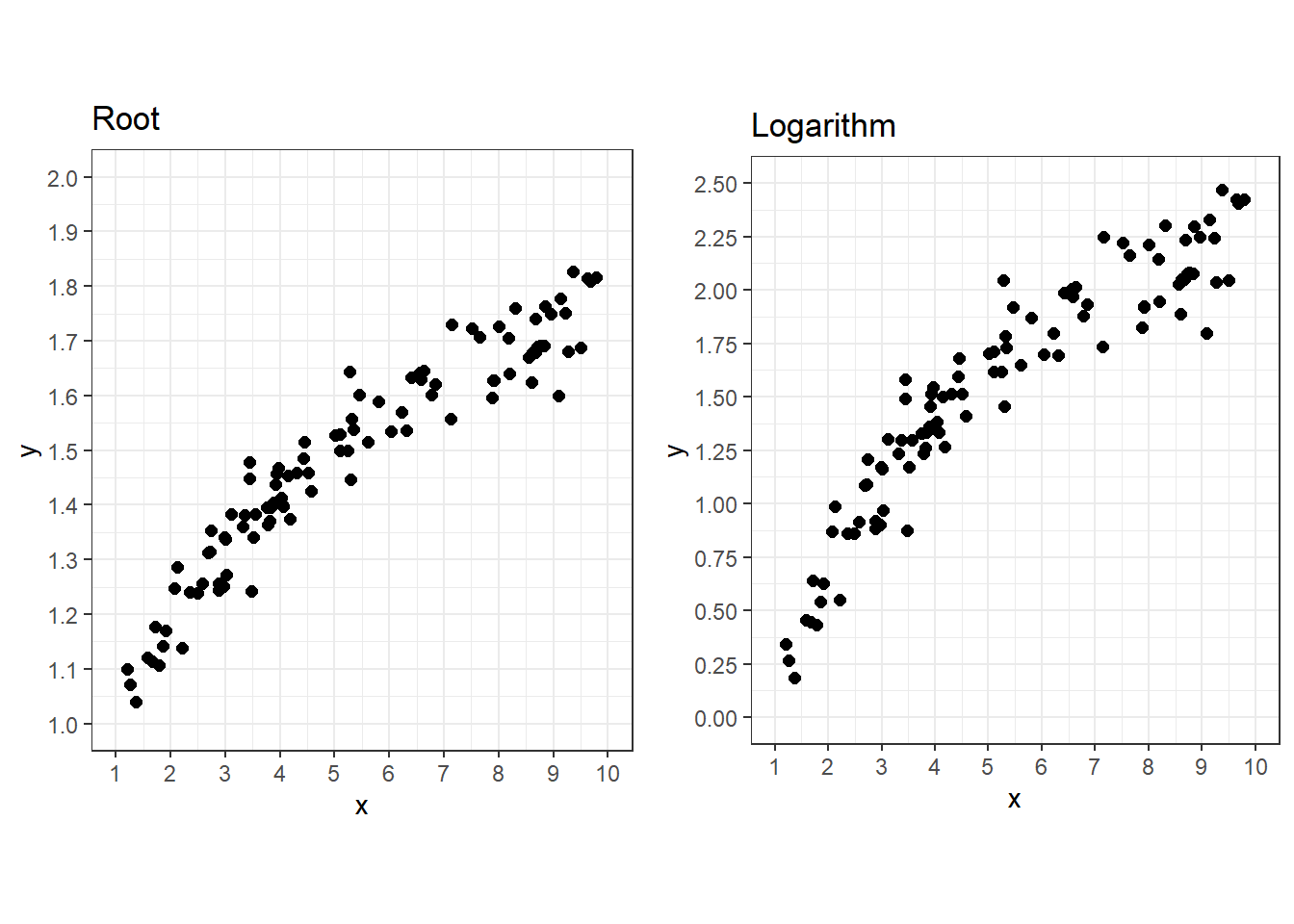
Figure 3.44: Common Concave-Down Functions
Roots (\(\sqrt[4]{x}\)) and logarithms (\(\ln(x)\)) represent inverse functions with respect to polynomials and exponentials. In a sense, they “undo” the nonlinear behavior displayed by their complementary function. For example, suppose \(x\) is related to \(y\) in a quadratic manner. We can apply the inverse function (square-root) to linearize the association.
\[ \begin{aligned} y &= x^2 \\ \sqrt{y} &= \sqrt{x^2} \\ \sqrt{y} &= x \end{aligned} \]
After transforming the function, we find that \(x\) is related to \(\sqrt{y}\) in a linear manner. It would not be appropriate to estimate a linear model for any of the four cases shown in the scatter plots. But we can estimate linear models after transforming the association with an inverse function. We demonstrate this linearization technique in a case study using functions from the tidyverse.
Ask a Question
As another biological application, we now consider the body measurements of fish. Specifically, we are interested in various species caught in Lake Langelmavesi, Finland in 1917 (Brofeldt 1917). In addition to being an interesting historical case, this application exemplifies a common place for nonlinear association. Suppose we are asked the following question: What is the association, if any, between a fish’s length and its weight?
Ichthyologists (fish biologists) and those who fish recreationally would likely be interested in the answer to this question. Not only does it speak to the growth rate of fish, but it could also be used to plan for the strength of fishing line. Of course, we must be careful with the level of specificity. Because our data is over 100 years old and collected from a single lake in Finland, any association we detect may not be valid for other bodies of water.
Acquire the Data
Despite its age, the Brofeldt data remains publicly available through various online sources (e.g., Kaggle). We provide the data in the file fish.csv. Import, wrangle, and summarize the data using the code below.
#import fish data
fish <- read_csv("fish.csv") %>%
  transmute(Weight,
            Length=Length3) %>%
  na.omit()

#summarize data
summary(fish)
## Weight Length
## Min. : 0.0 Min. : 8.80
## 1st Qu.: 116.2 1st Qu.:22.50
## Median : 246.0 Median :28.35
## Mean : 360.0 Mean :29.13
## 3rd Qu.: 617.5 3rd Qu.:38.30
## Max. :1100.0 Max. :46.60The data frame includes three different length measurements, depending on which part of the tail is used. We will employ Length3, which measures from the fish’s nose to the end of its tail. Since our goal is to explore the association between a fish’s body weight (grams) and its length (centimeters), we limit the data to these two variables. However, the summary reveals an issue. Namely, the minimum weight in the data is zero grams! This could be a mistake or an artifact of rounding to one decimal place. Since it is no longer possible to resolve this with the original researchers, we simply remove the associated observation.
The remaining 141 fish reflect the wide variety of sizes found in a lake that spans 51 square miles. With a clean data set, we are prepared to analyze the association between weight and length.
Analyze the Data
As demonstrated in Chapter 3.3.2, a scatter plot is the appropriate visual graphic for the association between numerical variables. How should we describe the shape, direction, and strength of association between the variables in Figure 3.45?
#create scatter plot
scatter2 <- ggplot(data=fish2,aes(x=Length,y=Weight)) +
  geom_point(size=2) +
  labs(title="Measurements of fish in Lake Langelmavesi, Finland",
       x="Length (cm)",
       y="Weight (g)",
       caption="Source: Brofeldt (1917)") +
  theme_bw()

#display scatter plot
scatter2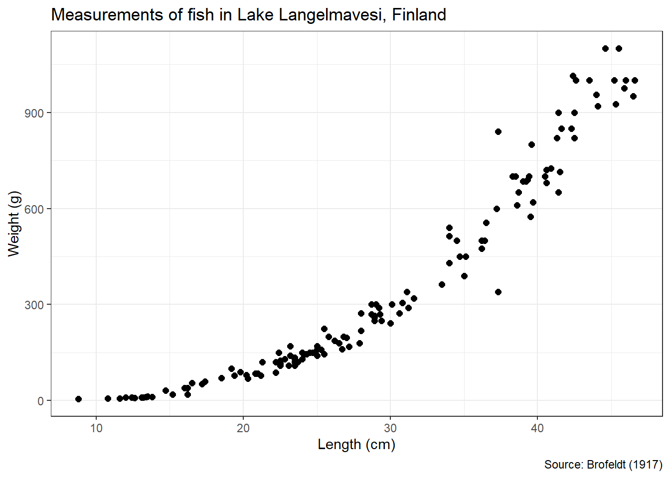
Figure 3.45: Scatter Plot of Fish Length (cm) versus Weight (g)
The shape of association between the variables is clearly nonlinear (concave up). The relationship is also increasing (positive). Thus, as fish get longer and longer their weight increases at a greater and greater rate. This association is also relatively strong based on the close proximity of the points to one another.
Given the nonlinear association visible in the scatter plot, a linear equation would not capture the appropriate concavity. However, there exist a variety of functions that demonstrate concave-up behavior. We introduced higher-order polynomials and exponential functions as common options. Below we compare the fit of a cubic function to that of a line.
#display best fit curves
scatter2 +
  geom_smooth(method="lm",formula=y~x,se=FALSE,color="red") +
  geom_smooth(method="lm",formula=y~poly(x,3),se=FALSE,color="blue")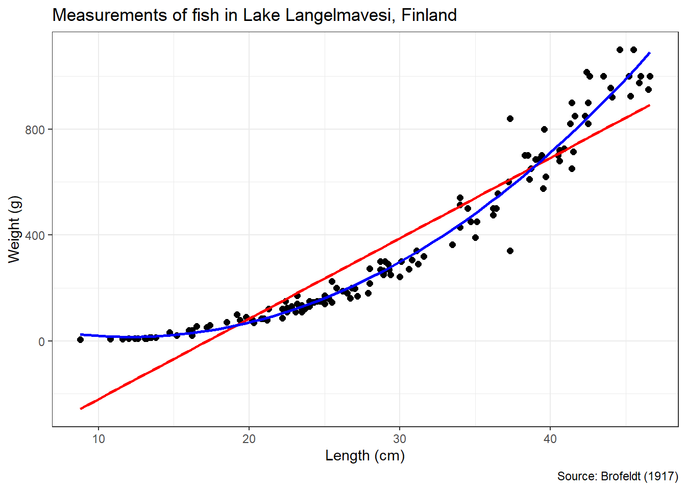
Figure 3.46: Best-Fit Linear and Cubic Functions
Based on Figure 3.46, the cubic function fits the data much more closely than the line. In fact, the linear function suggests negative weights for fish below a length of about 17 cm! When faced with a nonlinear association such as this, we could choose to estimate the parameters of a nonlinear equation. For example, we might fit the cubic function in Equation (3.2).
\[\begin{equation} y = \beta_0+\beta_1 x +\beta_2 x^2 + +\beta_3 x^3 \tag{3.2} \end{equation}\]
A common alternative is to transform one of the variables using the inverse function in order to achieve a linear association. If the association is cubic (\(y=x^3\)), then we use the cube root (\(\sqrt[3]{y}=x\)). Let’s apply a cube-root transformation to our fish data and plot the results in Figure 3.47.
#display tranformed scatter plot
ggplot(data=fish2,aes(x=Length,y=Weight^{1/3})) +
  geom_point(size=2) +
  geom_smooth(method="lm",formula=y~x,se=FALSE,color="blue") +
  labs(title="Measurements of fish in Lake Langelmavesi, Finland",
       x="Length (cm)",
       y="Cube-root Weight (g)",
       caption="Source: Brofeldt (1917)") +
  theme_bw()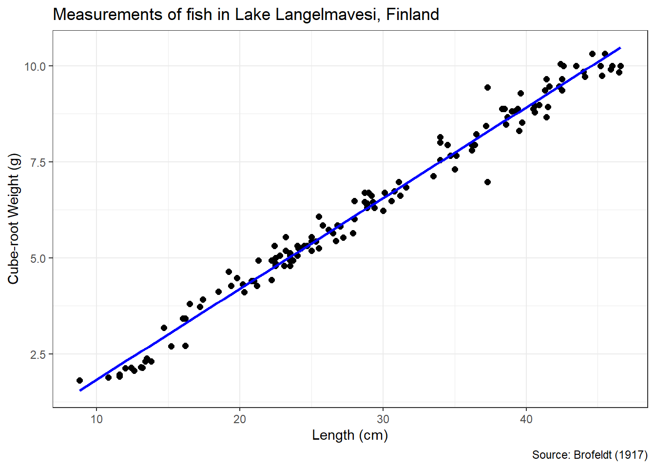
Figure 3.47: Scatter Plot of Fish Length (cm) versus Cube-Root Weight (g)
Notice the relationship between length and cube-root weight now appears linear, increasing, and strong. We can even apply the Pearson correlation coefficient to measure the strength of the linear association.
## [1] 0.9908756Thus, the association between a fish’s length and the cube root of its weight is very strong. The best-fit line shown in Figure 3.47 estimates the parameters of the function in Equation (3.3).
\[\begin{equation} \sqrt[3]{y} = \beta_0+\beta_1 x \tag{3.3} \end{equation}\]
As demonstrated in the previous section, we estimate the slope and intercept of the linear model using the lm() function.
#estimate linearized model
linearized_model <- lm(Weight^(1/3)~Length,data=fish2)

#extract coefficients of model
coefficients(summary(linearized_model))
## Estimate Std. Error t value Pr(>|t|)
## (Intercept) -0.5338695 0.084037917 -6.352722 2.815836e-09
## Length 0.2364412 0.002727857 86.676529 7.103161e-123Based on the summary output, our best estimates for the intercept and slope of Equation (3.3) are -0.534 and 0.236, respectively. After linearizing the association between variables and estimating the best-fit line, we are prepared to advise stakeholders on our results.
Advise on Results
When advising experts on the results of a linearized regression model, all of the same pitfalls of interpretation exist as those presented in the previous section. We must carefully distinguish correlation from causation, precisely explain the meaning of each parameter estimate, and avoid issues such as Simpson’s Paradox. However, in the case of linearization, we bear the additional burden of justifying the chosen inverse function. From a technical perspective, we choose the cube root because it produces a strong correlation coefficient in the linear model. But how do we explain the practical reason that the cube root is appropriate?
Fish are not one-dimensional creatures! When a fish grows in length it also grows in height and width. Thus, the weight of a fish is not proportional to its length. Weight is proportional to volume and volume is a cubic phenomenon. As a result, a fish’s weight is related to the cube of its length. Equivalently, length is related to the cube root of weight. When interpreting complex associations to domain experts, common language explanations such as this help bolster the technical value of the model. It’s possible that other nonlinear transformations (i.e., square root or logarithm) also produce reasonably-linear models. However, they might not offer the straight-forward practical explanation afforded by the cube root.
Answer the Question
Based on the measurements of 141 fish from Lake Langelmavesi in Finland, there appears to be a very strong, increasing, cubic relationship between length and weight. More precisely, for every one centimeter increase in a fish’s length we expect the cube root of its weight (in grams) to increase by 0.236. Given all of the fish in this analysis were caught in the same lake, it may not be appropriate to extend these results to other locations. Further research in multiple locations is required to confidently apply the identified relationship between length and weight.
3.3.4 Scatter Plots (Logistic)
Previously, we explored the associations between two categorical variables (using contingency tables) and two numerical variables (using linear regression). For certain applications we might like to mix variable types. In other words, we might be interested in the association between a numerical variable and a categorical variable. As an introduction to this concept, we consider a factor with only two levels. We treat this factor as a binary indicator and plot the association in a scatter plot. As with previous sections, the visualization helps us determine the shape, direction, and strength of association.
For reasons that will become apparent later in this section, the shape of association between numerical and binary variables is nonlinear. The direction of association for nonlinear shapes involves more than the assignment of increasing or decreasing. The direction can be monotonic or nonmonotonic. Nonmonotonic associations change direction, while monotonic associations do not. Figure 3.48 depicts a monotonic (Panel A) and nonmonotonic (Panel B) association between numerical variable \(x\) and binary variable \(y\).
Figure 3.48: Scatter Plots with Monotonic (A) and Nonmonotonic (B) Associations
Panel A demonstrates a monotonic, increasing (positive) association between variables. As \(x\) increases, a greater proportion of \(y\) values are equal to 1 rather than 0. By contrast, Panel B shows a nonmonotonic association. As \(x\) increases, \(y\) values initially increase to 1. However, the \(y\) values eventually reverse direction and return to 0 when \(x\) crosses a certain threshold. In this text, we focus solely on monotonic associations and reserve nonmonotonic for more advanced texts.
Monotonic associations can also be decreasing (negative), as depicted in Panel C of Figure 3.49. In this scatter plot, larger values of \(x\) result in a smaller proportion of \(y\) values equal to 1 rather than 0. The association in Panel D is also decreasing, but it is much weaker.
Figure 3.49: Scatter Plots with Strong (C) and Weak (D) Associations
The strength of association between a numerical and binary variable is largely driven by the amount of separation between the two categories in terms of numerical variable values. In Panel C, the \(y=1\) observations are relatively compact in terms of \(x\) value and exhibit clear separation from the \(y=0\) observations. On the other hand, the \(y=1\) and \(y=0\) categories are more spread out in terms of \(x\) value in Panel D. There is much more overlap in \(x\) values between the two \(y\) categories, which weakens the association.
A more objective metric for the strength of association in this case is known as the point-biserial correlation coefficient. This statistic is specifically designed to measure the strength of association between a continuous variable and a dichotomous (two-category) variable. However, when we convert the two levels of the categorical variable to binary numerical values of 0 and 1, the point-biserial correlation coefficient is mathematically equivalent to the Pearson coefficient we described in Chapter 3.3.2. Thus, we can apply the same classifications of strength for coefficient values between -1 and 1.
In the case study that follows, we demonstrate the assessment of the shape, direction, and strength of association between a numerical and binary variable. We also introduce a method known as logistic regression used to find the nonlinear curve that best fits the association observed in a scatter plot. As usual, we employ functions from the tidyverse to assist with wrangling and visualization.
Ask a Question
Research by Murat Koklu et al. seeks to distinguish between two varieties of pumpkin seed using digital imagery coupled with machine learning algorithms (Koklu et al. 2021). The authors apply various measurements (e.g., length, width, and area) obtained from the imagery as predictors for seed type. Ultimately, their models are capable of distinguishing seed type with between 87-89% accuracy, based purely on measured dimensions. Suppose we are asked the following question: What is the association, if any, between a pumpkin seed’s length and its type?
In terms of the specificity of our research question, we must carefully define what we mean by “length” and “type”. Considering the roughly elliptical shape of pumpkin seeds, the authors define major axis length and minor axis length. The major and minor axes refer to the longer and shorter lengths, respectively, of the ellipse. For our purposes, we use the longer (major) axis for the measurement of seed length. In terms of type, the authors focus on two common Turkish varieties: Urgup Sivrisi and Cercevelik. Though there are many other varieties, we assume our interest is only in the same two as the authors.
The research question is certainly answerable, given access to sufficient pumpkin seeds. But is it of concern to anyone? On the surface it may not seem like the most interesting question to the general population. When and why would we need to identify a pumpkin seed by its length? Our ability to answer this question might be limited by our subject matter expertise within the domain. Though the question may be of limited interest to a data scientist, it could be incredibly important to biologists, geneticists, farmers, or other experts in the field. Thoughtful collaboration with domain experts often reveals motivations beyond our initial understanding.
Acquire the Data
Given enough time and resources, we could collect the requisite data first hand. Imagine dumping out bags of hundreds of pumpkin seeds and carefully measuring the length of each one. The process would be time consuming, but achievable. However, this is not necessary because the data already exists. We can use the data collected by the authors of the research. The measurements for 2,500 pumpkin seeds are provided in a file named pumpkin_seeds.csv. Let’s import the data and review its structure.
#import pumpkin seed data
pumpkin <- read_csv("pumpkin_seeds.csv")

#display structure of data
glimpse(pumpkin)
## Rows: 2,500
## Columns: 13
## $ Area <dbl> 56276, 76631, 71623, 66458, 66107, 73191, 73338, 696…
## $ Perimeter <dbl> 888.242, 1068.146, 1082.987, 992.051, 998.146, 1041.…
## $ Major_Axis_Length <dbl> 326.1485, 417.1932, 435.8328, 381.5638, 383.8883, 40…
## $ Minor_Axis_Length <dbl> 220.2388, 234.2289, 211.0457, 222.5322, 220.4545, 23…
## $ Convex_Area <dbl> 56831, 77280, 72663, 67118, 67117, 73969, 73859, 704…
## $ Equiv_Diameter <dbl> 267.6805, 312.3614, 301.9822, 290.8899, 290.1207, 30…
## $ Eccentricity <dbl> 0.7376, 0.8275, 0.8749, 0.8123, 0.8187, 0.8215, 0.79…
## $ Solidity <dbl> 0.9902, 0.9916, 0.9857, 0.9902, 0.9850, 0.9895, 0.99…
## $ Extent <dbl> 0.7453, 0.7151, 0.7400, 0.7396, 0.6752, 0.7165, 0.71…
## $ Roundness <dbl> 0.8963, 0.8440, 0.7674, 0.8486, 0.8338, 0.8480, 0.88…
## $ Aspect_Ration <dbl> 1.4809, 1.7811, 2.0651, 1.7146, 1.7413, 1.7535, 1.64…
## $ Compactness <dbl> 0.8207, 0.7487, 0.6929, 0.7624, 0.7557, 0.7522, 0.77…
## $ Type <chr> "A", "A", "A", "A", "A", "A", "A", "A", "A", "A", "A…The data includes a wide variety of seed measurements and each is described in the original article. Currently, we are only interested in two variables: major axis length and type. Since the measurements are obtained from digital imagery, the units of length are in pixels. The type of seed is simplified to A and B. For our purposes, the mapping of type to the technical variety names is unimportant. But the domain experts will certainly need to decipher this mapping for their own work. Next, we wrangle the pumpkin seed data to isolate the variables of interest and remove any incomplete observations.
#wrangle pumpkin seed data
pumpkin2 <- pumpkin %>%
  transmute(Length=Major_Axis_Length,
            Type=as.factor(Type)) %>%
  na.omit()

#summarize pumpkin seed data
summary(pumpkin2)
## Length Type
## Min. :320.8 A:1300
## 1st Qu.:415.0 B:1200
## Median :449.5
## Mean :456.6
## 3rd Qu.:492.7
## Max. :661.9The data includes 1,300 Type A seeds and 1,200 Type B seeds, so there were no missing lengths or types in the original 2,500 observations. The lengths vary from about 321 pixels to 662 pixels, with a median value of 450 pixels. Without deeper knowledge of pumpkin seed dimensions and the conversion of pixels to more common units (e.g., millimeters), it is difficult to detect errors in the data from the summary alone. However, we investigate outliers during the analysis phase, so potential mistakes in data collection may be revealed there.
Analyze the Data
Since our goal is to explore any association between length and seed type, it is useful to group the length statistics. Otherwise we cannot determine whether one type is longer or shorter than the other. Let’s compute measures of centrality and dispersion for both types.
#summarize stats by type
pumpkin2 %>%
  group_by(Type) %>%
  summarize(count=n(),
            average=mean(Length),
            stdev=sd(Length)) %>%
  ungroup()
## # A tibble: 2 × 4
## Type count average stdev
## <fct> <int> <dbl> <dbl>
## 1 A 1300 426. 37.2
## 2 B 1200 489. 54.9It appears Type B seeds are longer, on average, than Type A. But the length of Type B seeds also exhibits greater variability, based on the standard deviation. So, there is likely to be some overlap in length between the two types. This is much easier to diagnose visually in the box plot in Figure 3.50.
#display box plot of length by type
ggplot(data=pumpkin2,aes(x=Length,y=reorder(Type,-Length))) +
  geom_boxplot(color="black",fill="#CFB87C") +
  labs(title="Pumpkin Seed Classification",
       subtitle="(based on digital imagery)",
       x="Major Axis Length (pixels)",
       y="Seed Type",
       caption="Source: Koklu et al. (2021)") +
  scale_x_continuous(limits=c(300,700),breaks=seq(300,700,50)) +
  theme_bw()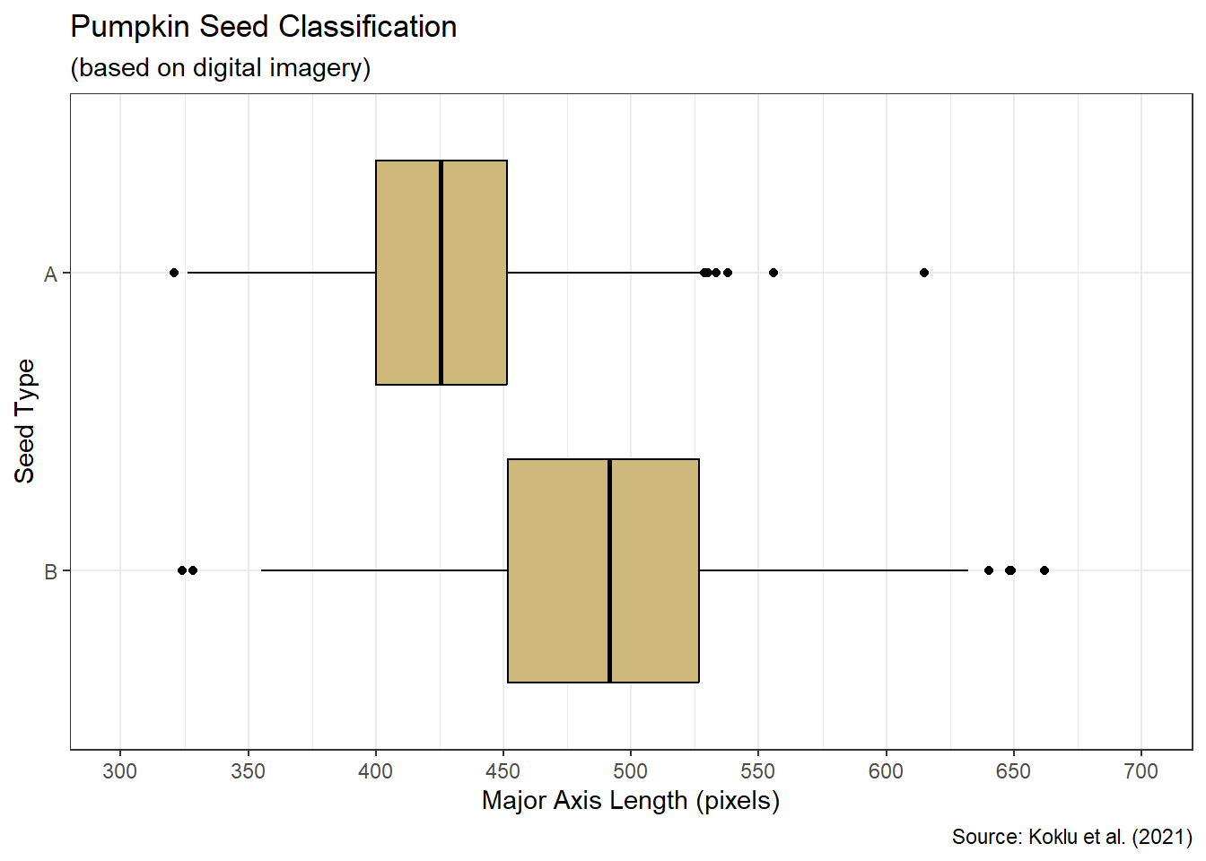
Figure 3.50: Box Plot of Seed Length by Type
There are a few outliers within each seed type, but none of the values appear to be obvious mistakes. Based on the quartiles displayed in the box plot, the upper 75% of Type B lengths are greater than the lower 75% of Type A lengths. This is relatively strong evidence of an association between length and seed type. However, we would like to describe the shape, direction, and strength of association in a manner similar to that of the previous section on linear association. As a step in that direction, we construct a scatter plot of length versus type. Since scatter plots are intended for two numerical variables, we convert the type factor into a binary indicator that is equal to 1 for Type A and 0 for Type B.
#create scatter plot of length versus type
bin_scatter <- ggplot(data=pumpkin2,aes(x=Length,y=ifelse(Type=="A",1,0))) +
  geom_jitter(width=0,height=0.05,alpha=0.2) +
  labs(title="Pumpkin Seed Classification",
       subtitle="(based on digital imagery)",
       x="Major Axis Length (pixels)",
       y="Proportion that are Type A",
       caption="Source: Koklu et al. (2021)") +
  scale_x_continuous(limits=c(300,700),breaks=seq(300,700,50)) +
  scale_y_continuous(limits=c(0,1),breaks=seq(0,1,0.1)) +
  theme_bw()

#display scatter plot
bin_scatter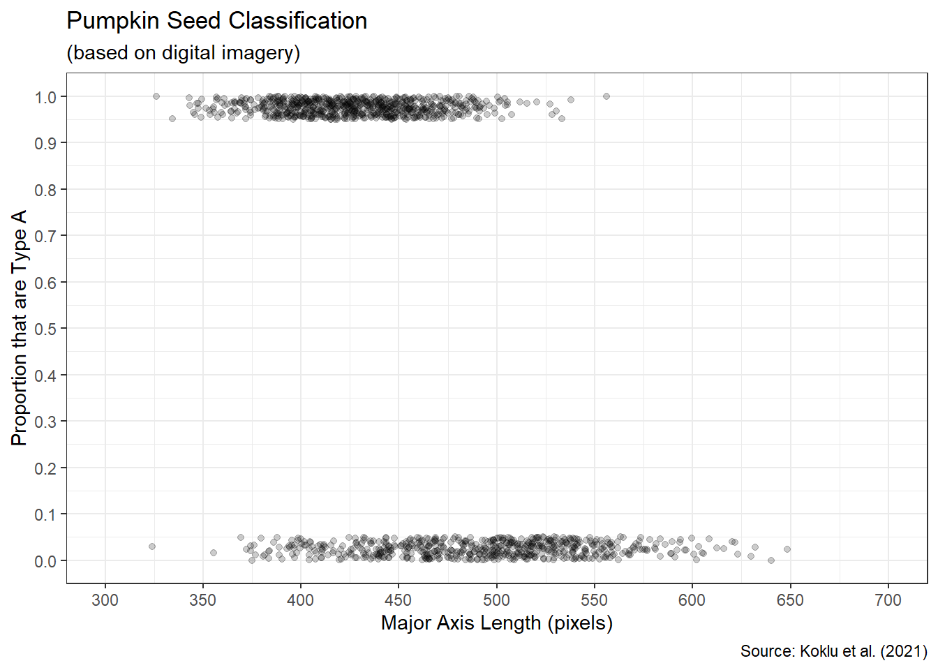
Figure 3.51: Scatter Plot of Type Proportions
All of the observations at the top of Figure 3.51 are Type A with a binary value of 1. The observations at the bottom of the plot are Type B with a binary value of 0. We vertically spread out the points using the geom_jitter() function to avoid overlap and thus better visualize the distribution of lengths. The conversion to a binary indicator affords us an interesting interpretation of the seed type variable. For a given length, we can estimate the proportion of such seeds that will be Type A. For example, a length of 400 pixels suggests a larger proportion of Type A. There are many more Type A seeds with a length of 400 than Type B. Similarly, a length of 500 pixels indicates a lower proportion of Type A, since there are so many more Type B seeds with that length.
Since we have a continuous numerical variable (length) and a binary numerical variable (type), we can compute a point-biserial correlation coefficient to determine the strength and direction of association. As mentioned previously, this statistic is a special case of the Pearson correlation and can be computed using the same cor() function.
#compute Pearson correlation coefficient
cor(x=pumpkin2$Length,
    y=pumpkin2$Type=="A",
    method="pearson")
## [1] -0.5614578A correlation coefficient of \(-0.56\) suggests a moderate, decreasing association. In other words, as the length of a seed increases the likelihood of being classified as Type A decreases. But what about the shape of association? In the introduction to this section, we alluded to the shape being nonlinear. Why is that the case? Suppose we attempted to model the shape as linear in Figure 3.52.
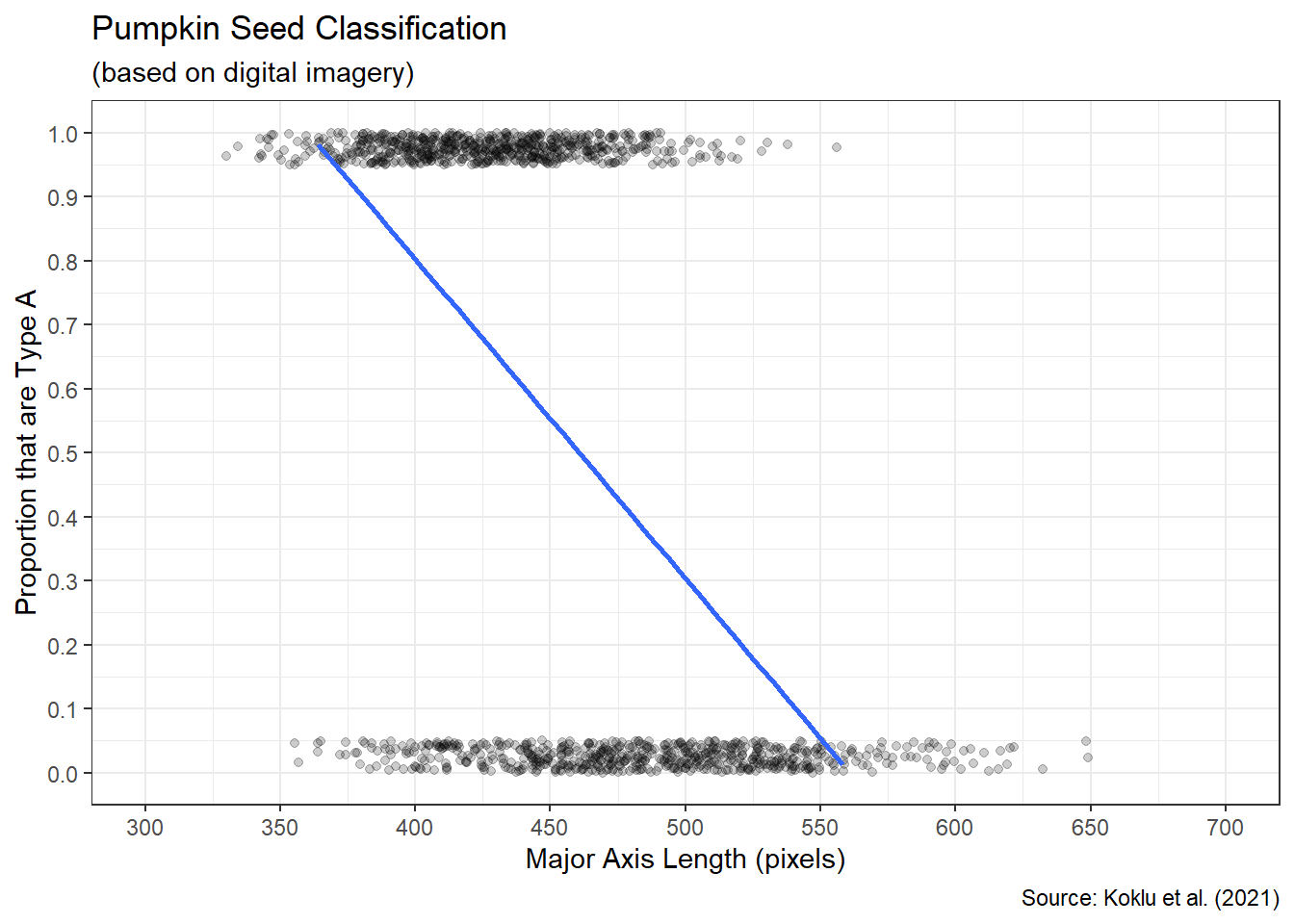
Figure 3.52: Best Fit Line to Scatter Plot
Although the blue line correctly represents the decreasing association, it reveals a major issue. What proportion of Type A seeds does the linear shape suggest for a length of 350 pixels? How about for 600 pixels? Extending the line beyond the range of the \(y\)-axis, we see that a length of 350 pixels is associated with a proportion greater than 1. Similarly, a length of 600 pixels suggests a proportion less than 0. That is not possible! Proportions must remain between 0 and 1. This is why the shape of association must be modeled as nonlinear. Consider the shape in Figure 3.53.
#display sigmoid curve on scatter plot
bin_scatter +
  geom_smooth(method="glm",formula=y~x,se=FALSE,
              method.args=list(family="binomial"))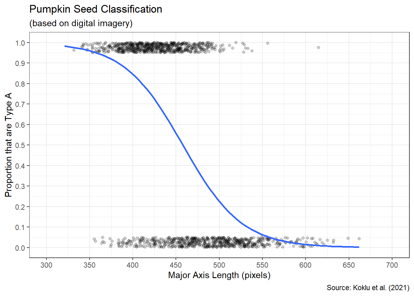
Figure 3.53: Best Fit Logistic Curve to Scatter Plot
This S-shaped curve is known as a logistic, or sigmoid, curve. The benefit of this particular shape is that it has a maximum of 1 and a minimum of 0, while still correctly modeling the direction of association. Specifically, the association is nonlinear and decreasing. The logistic function for the proportion \(p\) of “successes” given a particular value of \(x\) is shown in Equation (3.4). For our example, a “success” is arbitrarily defined as a Type A seed and the input variable is length.
\[\begin{equation} p = \frac{1}{1+e^{-(\beta_0+\beta_1 x)}} \tag{3.4} \end{equation}\]
In the case of linear regression, we estimate the slope and intercept of the best fit line using the least squares algorithm. In a similar fashion, logistic regression estimates the two parameters (\(\beta_0\) and \(\beta_1\)) in the logistic function. But instead of least squares, we use the method of maximum likelihood. This algorithm finds the logistic curve which maximizes the likelihood of obtaining the observed data. For example, the optimal curve suggests that pumpkin seeds with a length of 400 pixels will be approximately 85% Type A. This aligns well with the proportion we observe in the scatter plot. A curve with different parameters, and thus a different shape, might suggest a proportion that is poorly aligned with the observed data. We find the parameter values for the logistic curve using the glm() function.
#build logistic model
logistic_mod <- glm(Type=="A"~Length,data=pumpkin2,
                    family="binomial")

#extract logistic model coefficients
coefficients(summary(logistic_mod))
## Estimate Std. Error z value Pr(>|z|)
## (Intercept) 13.43589960 0.561415083 23.93220 1.415952e-126
## Length -0.02935021 0.001234749 -23.77019 6.794587e-125While the lm() function is designed solely for linear regression, the glm() function is more general and allows for other algorithms. Consequently, we must define the family of algorithm to apply. For binary response variables, we use the Binomial family. This is directly related to the Binomial distribution from Chapter 2.2.3, because “success” and “failure” represent a binary outcome. Based on the summary output of the glm() function, we estimate \(\beta_0\) as 13.436 and \(\beta_1\) as -0.029. Although the \(\beta_1\) parameter isn’t exactly a slope, its sign behaves the same way. The negative sign indicates a decreasing association. With both visual and numerical measures of association, we are prepared to advise our stakeholders.
Advise on Results
Pervasive in the exploration of a binary response variable (e.g. seed type) is the concept of “likelihood”. We model the binary response as a proportion, which is often treated as synonymous to a probability. We employ an optimization algorithm known as maximum likelihood. We speak to the commonality or rarity of outcomes given particular input values. Interpreting these ideas of likelihood for domain experts can be challenging. It helps to have multiple methods of explanation at hand. In terms of likelihood, one alternative is to present proportions (or probabilities) in terms of odds.
The odds of an event occurring can be represented numerically in many different forms (e.g., fractional versus decimal). One common form is the odds ratio, which divides the proportion of “successes” by the proportion of “failures”. For example, 52% of our pumpkin seeds are Type A (“successes”) and 48% are Type B (“failures”). If we blindly draw a seed from the total, the odds in favor of obtaining a Type A seed are 1.08 (0.52/0.48). Odds greater than 1 suggest success is more likely than failure. The larger the odds in favor of success, the more likely it is to occur. When the odds are exactly 1, success and failure are equally likely. Odds less than 1 indicate failure is more likely than success.
For some domain experts, it may prove useful to refer to odds as “\(s\)-to-1”. This interpretation implies we can expect \(s\) successes out of \(s+1\) attempts. For odds of 10-to-1, we expect 10 successes for every 11 attempts. In terms of pumpkin seeds, we expect 1.08 Type A for every 2.08 seeds selected. Said another way, if we randomly select 208 seeds, we expect 108 of them to be Type A. We must always be careful to include the qualifier “in favor of” or “against” when referring to odds. In certain contexts, it is more common to report odds against success.
The concept of odds also facilitates an alternative representation of the logistic function in Equation (3.4). By applying the natural logarithm to the odds ratio, we obtain a linear model.
\[\begin{equation} \log \left(\frac{p}{1-p}\right) = \beta_0+\beta_1 x \tag{3.5} \end{equation}\]
This version of the logistic function is referred to as the log-odds, or logit, function. While the proportion of successes is nonlinear, the log-odds of success are linear. That is why we are able to apply the glm() function for generalized linear models. The subtleties of this alternate interpretation may not be of interest to many domain experts. But it is important for data scientists to understand the inherently linear nature of logistic regression.
As with linear regression, the proper interpretation of the log-odds coefficients in vital. The intercept term (\(\beta_0\)) provides little contextual value since it is related to an \(x\)-value of zero. In our case, this refers to a non-existent pumpkin seed with a major axis length of zero! The slope term (\(\beta_1\)), on the other hand, provides valuable domain-specific insights. The sign of the slope suggests the direction of association between the explanatory variable and the log-odds (i.e., likelihood) of success. The slope estimate of -0.029 for our pumpkin seed data indicates we expect a 0.029 unit decrease in the log-odds of being Type A for every one pixel increase in length. While the units of log-odds are not incredibly intuitive, most domain experts will find the interpretation of increasing or decreasing likelihood useful. After offering alternative metrics for likelihood and interpreting the nonlinear trend line in the context of the problem, we are prepared to answer the research question.
Answer the Question
Upon analyzing 2,500 pumpkin seeds, we find a moderate, negative, nonlinear association between a pumpkin seed’s major axis length and its type. Specifically, Type B seeds are generally longer than Type A seeds. As a result, the likelihood of a seed being Type A decreases as the length of the seed increases.
A common extension to exploratory discoveries such as these is an inferential analysis. Though the slope parameter in our logistic function is non-zero, there is a chance that this is simply due to variability in biological processes. A more thorough investigation of statistical significance using methods revealed in Chapter 4 can remedy this concern. We might also search for more valuable predictors of seed type beyond just major axis length. Perhaps additional information, such as minor axis length or perimeter, could increase the explanatory capacity of our model. We discuss the construction of multiple logistic regression models in Chapter 5. With multiple explanatory variables, we might achieve an increased ability to predict seed type.
In the previous three sections, we explored associations that could be described with a function. Whether linear or nonlinear, the relationships between two variables were estimated with an equation. However, in some cases the association we observe in a scatter plot does not follow a set equation. In Chapter 3.3.6, we explore the concept of clustered association.
After an extensive exploration of scatter plots, we transition to a numerical variable that requires special care. When one of the variables in an association represents the passage of time, we refer to the data as a time series. Time series data introduces additional complexity that we describe in the next section.
3.3.5 Line Graphs
Time series analysis deals with variable values that change over time. On the surface, this appears to be another example of association between two numerical variables. However, we must proceed with caution when time is involved. Not only is time measured in a variety of units, but it also has a variety of modalities (e.g., length of time versus time of day). When applied in its temporal sense, a time-based variable implies a chronological sequence of events. For these reasons, time series data requires unique considerations when compared to other data types.
Although we could arguably use a scatter plot for time series data, it is far more common to use a line graph. Visually, a line graph simply involves “connecting the dots” of a scatter plot. However, the meaning of these connections is significant. By connecting two points with a line, we imply a sequential order of occurrence and a continuous transition from one observation to the next. For most non-time-series data, such a connection is nonsense. Data does not generally occur in the sequential order of variable values on the \(x\)-axis. The clear exception is when the variable on the \(x\)-axis is time. Thus, a line graph displays sequential changes in the value of the \(y\)-axis variable over time.
In our exploration of time series data we employ functions from the lubridate package to assist with the unique challenges of time-based variables. As with many other libraries, this package is already included in the tidyverse. Let’s explore a time series!
Ask a Question
The Boston Athletic Association (BAA) was established in 1887 and has organized the prestigious Boston Marathon since 1897. Each year thousands of runners complete the 26.2 mile course, including world-class professional athletes competing to be crowned champion of the world’s oldest annual marathon. Further information on the history of the event can be found here. Imagine we are asked the following question: What historical trend, if any, exists for the winning time of the Boston Marathon?
This question may or may not have been answered by other researchers, but it is certainly of concern to the running community. Novices and professionals alike consider the Boston Marathon to be the pinnacle of competitive running. Even qualifying for the privilege to register for the race is an annual challenge for many. Consequently, the question is likely interesting to a broad community of runners and sports enthusiasts alike. The question is also answerable given the BAA’s reliable record-keeping of race champions, as we will soon discover when acquiring the data.
Acquire the Data
The BAA posts all of the historical winning times for the men’s and women’s races, both on foot and in wheelchairs, on their website. Sadly, women were not permitted to officially compete for the first 75 years of the race. So, there is less data available for the associated divisions. In order to maximize the available data, we focus on the winning times for the men’s race in all 127 official runnings. There was no race in 2020 due to the pandemic. Using web scraping tools from the rvest package, we extract the winning times directly from the BAA site.
#load rvest library
library(rvest)

#import full html webpage
boston <- read_html("https://www.baa.org/races/boston-marathon/results/champions")

#extract tables from html webpage
boston_tabs <- html_nodes(boston,"table")

#isolate men's winning times
boston_men <- html_table(boston_tabs[[1]])
As a refresher on the rvest library, the read_html() function imports all of the components of the specified webpage. The html_nodes() function isolates the desired components, which are tables for our purposes. Finally, the html_table() function converts a selected table into a data frame. The historical results for the men’s race happen to be in the first table.
## Rows: 127
## Columns: 4
## $ X1 <dbl> 2024, 2023, 2022, 2021, 2019, 2018, 2017, 2016, 2015, 2014, 2013, 2…
## $ X2 <chr> "Sisay Lemma", "Evans Chebet", "Evans Chebet", "Benson Kipruto", "L…
## $ X3 <chr> "Ethiopia", "Kenya", "Kenya", "Kenya", "Kenya", "Japan", "Kenya", "…
## $ X4 <chr> "2:06:17", "2:05:54", "2:06:51", "2:09:51", "2:07:57", "2:15:58", "…
After reviewing the structure of the data frame, we see it consists of all 127 offerings of the race. For each offering (observation) of the race, there are four features (variables): year, winner, country of origin, and finishing time. Based on the research question, we are only interested in year and finishing time. However, we notice the finishing time is incorrectly typed as a character string. Let’s wrangle the data and remedy this issue.
#wrangle Boston data
boston_men2 <- boston_men %>%
  transmute(Year=as.integer(X1),
            Time=hms(X4))

#display data structure
glimpse(boston_men2)
## Rows: 127
## Columns: 2
## $ Year <int> 2024, 2023, 2022, 2021, 2019, 2018, 2017, 2016, 2015, 2014, 2013,…
## $ Time <Period> 2H 6M 17S, 2H 5M 54S, 2H 6M 51S, 2H 9M 51S, 2H 7M 57S, 2H 15M …We employ the hms() function from the lubridate package to change the data type for finishing time. This function converts the character string into hours, minutes, and seconds and assigns the time period data type. The data type affords us much more flexibility for analyzing time-based variables in the proper units.
Our data is now seemingly prepared for analysis, but there is another lurking issue that is not so obvious. The race has not always been the same distance! According to the BAA website, the Boston Marathon was 24.5 miles from its inception until 1924. Only since then has the race been aligned with the Olympic standard of 26.2 miles. This obscure detail highlights the importance of researching the problem context and collaborating with domain experts. If we are to fairly represent trends in performance in the race, it seems appropriate to account for the difference in distance. Thus we convert finishing time to average time per mile (i.e. pace) and use the resulting value as our performance metric.
#compute minute per mile pace
boston_men3 <- boston_men2 %>%
  mutate(Miles=ifelse(Year<1924,24.5,26.2),
         Minutes=period_to_seconds(Time)/60,
         Pace=Minutes/Miles) %>%
  select(Year,Pace) %>%
  arrange(Year)

#display data structure
glimpse(boston_men3)
## Rows: 127
## Columns: 2
## $ Year <int> 1897, 1898, 1899, 1900, 1901, 1902, 1903, 1904, 1905, 1906, 1907,…
## $ Pace <dbl> 7.149660, 6.612245, 7.127891, 6.519728, 6.097279, 6.661224, 6.591…In addition to creating the pace variable, we sort the race years ascending for reasons that will become clear in the next subsection. After importing, organizing, and cleaning the data we are finally prepared to analyze any time-based trends that may exist in the winning pace for the Boston Marathon.
Analyze the Data
When visualizing the values of a numerical variable over a time period, it is common to use a line graph rather than a scatter plot. This is intended, in part, to acknowledge the continuity of time and the logical precedence of sequential moments in time. Without “connecting the dots” it can be difficult to discern the changes in value from one year to the next. Let’s display the winning race pace over time in a line graph.
#display line graph
ggplot(data=boston_men3,aes(x=Year,y=Pace)) +
  geom_line(color="blue") +
  labs(title="Boston Marathon Winning Pace",
       subtitle="(no race in 2020)",
       x="Year",
       y="Winning Pace (min/mile)",
       caption="Source: Boston Athletic Association") +
  scale_x_continuous(limits=c(1897,2024),breaks=seq(1897,2024,14)) +
  scale_y_continuous(limits=c(4.5,7.25),breaks=seq(4.5,7.25,0.25)) +
  theme_bw()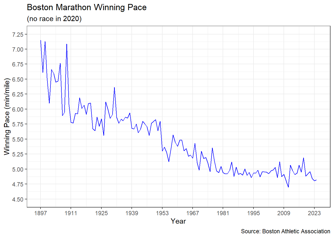
Figure 3.54: Line Graph of Boston Marathon Pace
Despite annual fluctuations, Figure 3.54 displays an obvious decreasing trend in winning pace over time. In other words, the winners appear to be getting faster and faster. The winning pace has dropped by more than two minutes per mile since the first race. That said, the pace does seem to level off at some point around the 1980s. It may be that athletes are reaching the limits of human performance. If so, large reductions in winning pace will now be more difficult to achieve.
How should we model this trend? The initial inclination may be to seek a best-fit line, similar to linear regression, to capture the underlying association between year and pace. However, time series data requires careful consideration due to a property known as autocorrelation. Sometimes referred to as serial correlation, autocorrelation occurs when consecutive observations are correlated with (dependent on) one another. In our case, this means the winning pace in one year is associated with the winning pace in the previous year. Variable values from previous time periods are referred to as lags. For example, last year’s winning pace is the first lag, two years ago is the second lag, and so on. If a given year’s winning pace is correlated with any lags, then autocorrelation exists. We can visually check for autocorrelation by plotting winning pace values against their lags. Note, it is important that the data frame is sorted ascending by time period prior to computing lags. Luckily, we already sorted the boston_men3 data frame during the acquisition phase.
#create ggplot scatter plot
ggplot(data=boston_men3,aes(x=lag(Pace,1),y=Pace)) +
  geom_point() +
  geom_smooth(method="lm",formula=y~x,se=FALSE) +
  labs(title="Boston Marathon Winning Pace",
       subtitle="(no race in 2020)",
       x="First Lag of Winning Pace (min/mile)",
       y="Winning Pace (min/mile)",
       caption="Source: Boston Athletic Association") +
  theme_bw()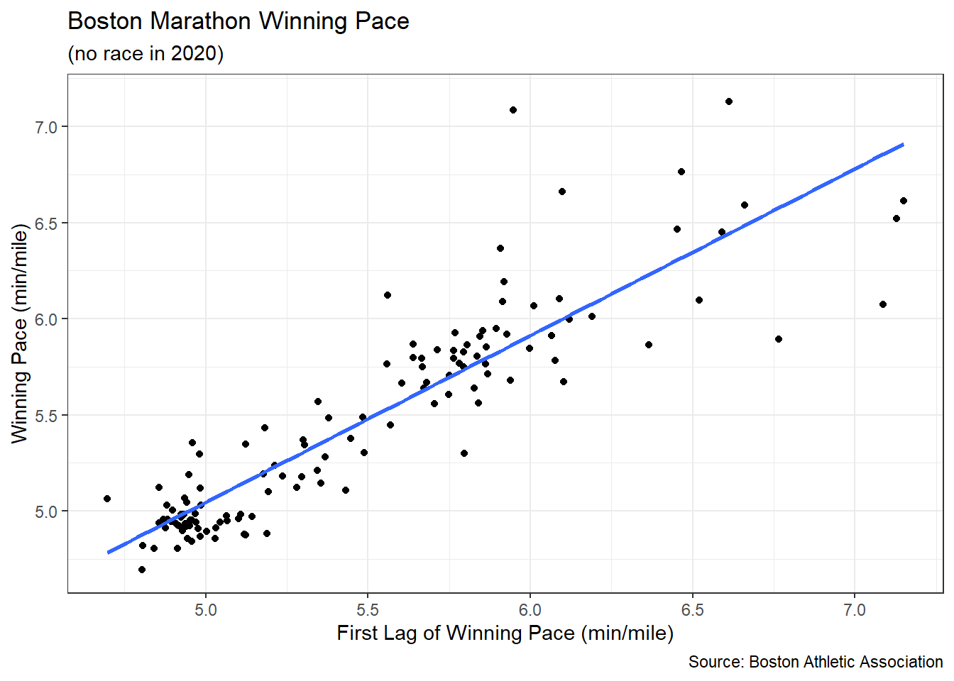
Figure 3.55: Scatter Plot of Winning Pace versus First Lag
The lag() function determines the lagged values for a given variable and number of lags. Figure 3.55 plots winning pace values against the previous year’s values (i.e., first lag) and we clearly observe a strong, positive, linear association. Why do we see a positive (increasing) association between time periods when the trend is decreasing? The positive association means past and present move in the same direction. As past winning paces get faster, present winning paces also tend to get faster. This behavior produces a decreasing trend in pace over time. A negative association would produce oscillatory behavior. In other words, faster winning paces in the past would be associated with slower winning paces in the present. The equation of the best-fit (blue) line to the association between winning pace and its first lag can be written as:
\[\begin{equation} y_t = \beta_0 + \beta_1 y_{t-1} \tag{3.6} \end{equation}\]
The \(t\) subscript represents a given time period and \(t-1\) represents the previous time period. Notice there is no \(x\) variable in the equation. Instead, the first lag of the \(y\) variable acts as the explanatory variable. Equation (3.6) is the general form of a first order autoregression. The qualifier “first order” indicates the first lag is the explanatory variable. Autoregression means that the response variable is correlated with previous values of itself. Thus, we have a special case of linear regression and we estimate the parameter values (\(\beta_0\) and \(\beta_1\)) using the same least squares algorithm.
#build lagged model
lag_model <- lm(Pace~lag(Pace,1),data=boston_men3)

#extract lagged model coefficients
coefficients(summary(lag_model))
## Estimate Std. Error t value Pr(>|t|)
## (Intercept) 0.7102826 0.2144318 3.312394 1.212378e-03
## lag(Pace, 1) 0.8671108 0.0388998 22.290881 3.368203e-45The optimal estimates for \(\beta_0\) and \(\beta_1\) suggest a first order autoregressive model of \(y_t=0.710+0.867 y_{t-1}\). So, if last year’s winning pace was 6 minutes per mile (\(y_{t-1}=6\)), then the model suggests this year’s winning pace will be about 5.9 minutes per mile (\(y_t=5.9\)). By applying the autoregressive model to the actual data, we obtain the estimated trend represented by the dashed red line in Figure 3.56.
#compute lagged model trend
boston_men4 <- boston_men3 %>%
  mutate(Trend=0.7102826+0.8671108*lag(Pace,1))

#display trend on line graph
ggplot(data=boston_men4,aes(x=Year)) +
  geom_line(aes(y=Pace),color="blue") +
  geom_line(aes(y=Trend),color="red",linetype="dashed") +
  labs(title="Boston Marathon Winning Pace",
       subtitle="(blue=actual and red=predicted)",
       x="Year",
       y="Winning Pace (min/mile)",
       caption="Source: Boston Athletic Association") +
  scale_x_continuous(limits=c(1897,2024),breaks=seq(1897,2024,14)) +
  scale_y_continuous(limits=c(4.5,7.25),breaks=seq(4.5,7.25,0.25)) +
  theme_bw()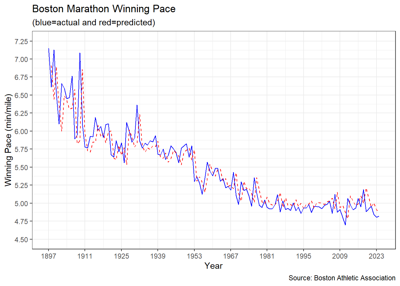
Figure 3.56: Line Graph of Predicted Boston Marathon Pace
Based purely on the previous year’s values, the autoregression does a relatively good job of modeling the trend in winning pace over time. But we do notice a consistent overestimation of the pace beginning in the 1980s. This is the same threshold at which we previously observed a leveling off of the decreasing trend. Did some systematic change in the race occur around this time period that would lead to overestimating winning pace? We may need to collaborate with domain experts in the next step of the 5A Method to answer this question.
Advise on Results
While interpreting analytic results for domain experts is a critical part of conveying insights, the benefits of collaboration go both ways. The data scientist also gains important insights regarding domain-specific factors that affect the practical significance of the analysis. This is particularly true for time series analyses that rely on the future behaving like the past. Real-world systems often experience breaks at discrete points in time that fundamentally change the behavior of a variable. For example, one break in the history of the Boston Marathon is the distance increase in 1924. We attempt to account for this break by converting the response variable to pace. Perhaps there is another break in the 1980s that impacts the winning pace thereafter. If so, what caused it and how do we address it?
By collaborating with experts in the history of the Boston Marathon, we would learn about some exciting events in the 1980s. In 1982, Alberto Salazar and Dick Beardsley competed in one of the most epic duels in the history of the race, which was later immortalized in a book by John Bryant (Brant 2007). In 1983, Joan Benoit added to the race’s notoriety by setting a women’s marathon world record. By 1986, the Boston Marathon had gained so much prestige that financial backers started offering prize money to the winner. All of the greatest distance runners in the world began flocking to the annual event. This time period represents a break in the history of the race. The future no longer behaved like the past. With the fastest runners in the world competing each year, there is now little room for dramatic decreases in pace. Hence the leveling off of the trend. This also helps explain why the autoregressive model overestimates the pace after the break. The model parameters are estimated using data from the entire history of the race. Though the estimated values are optimal for the entire history, they may not be optimal for each separate time interval before and after the break. One option is to simply split the analysis into two separate periods, but how do we decide what year to use? Advanced courses in time series analysis introduce a variety of methods for identifying and overcoming breaks. However, they are beyond the scope of this text.
The existence of breaks highlights the risk of forecasting trends into the future. In general, forecasting means predicting response variable values beyond the existing range of explanatory variable values. This is sometimes referred to as extrapolation. For our case study, this means predicting winning pace values beyond the year 2024. If the future continues to behave like the past, then such predictions may prove accurate. On the other hand, if a break occurs then such predictions could be wildly inaccurate. Suppose we lived in the 1970s, prior to the break in the 1980s, and attempted to predict future winning pace values. Our predictions would likely be poor given our inability to anticipate the impending break caused by prize money. As a result, we might advise domain experts of a continued decreasing trend rather than a leveling off. Thus, we should always be cognizant of the potential for breaks and the limitations of forecasting trends.
On a completely separate note, we must also be careful with the construction of visualizations when presenting trends to domain experts. Similar to our previous discussion with bar charts, the range of values selected for the \(y\)-axis is critical. With bar charts we found it misleading to zoom in too far and not include zero on the access. For line graphs, we must be careful not to zoom out too far. Otherwise we lose the capability to discern the trend. Consider the trend line displayed in Figure 3.57.
#display misleading line graph
ggplot(data=boston_men3,aes(x=Year,y=Pace)) +
  geom_line(color="blue") +
  labs(title="Boston Marathon Winning Pace",
       subtitle="(no race in 2020)",
       x="Year",
       y="Winning Pace (min/mile)",
       caption="Source: Boston Athletic Association") +
  scale_x_continuous(limits=c(1897,2024),breaks=seq(1897,2024,14)) +
  scale_y_continuous(limits=c(0,60),breaks=seq(0,60,10)) +
  theme_bw()
Figure 3.57: Misleading Line Graph of Boston Marathon Pace
A domain expert could understandably interpret this graphic as there being almost no change in the winning pace at the Boston Marathon. The trend line appears relatively flat despite being based on the exact same data as Figure 3.54. The only difference is the change in the range of values on the \(y\)-axis. This design is inefficient because it wastes a great deal of space on irrelevant coordinates that convey no information. It is also misleading because it suggests no trend, when the reality is a significant decreasing trend. When depicting trends with line graphs, we should make efficient use of space by only including relevant values on the \(y\)-axis. After collaborating with domain experts to clarify potential breaks, discuss the risks of forecasting, and present visual trends, we are finally ready to answer the research question.
Answer the Question
Over the 127 year history of the Boston Marathon there is a clear decreasing trend in the average running pace of the race winner. Consequently, the finishing times of race winners have been decreasing from one year to the next. That said, the rate of decrease began leveling off in the 1980s after newly-available prize money attracted the best runners in the world. Since then, finishing times have seemingly approached the limits of human performance and dramatic decreases are much less common.
Three potential extensions to the exploratory analysis immediately come to mind. Firstly, a more careful treatment of the two known breaks (race distance and prize money) is likely in order. By accounting for these systematic changes in the race, we might discover more accurate models for the trends between breaks. Secondly, we could extend the exploration to an inferential analysis. Though the detailed reasons are beyond the scope of this text, it is important that the slope parameter of a first order autoregression is less than 1 in absolute value. Our best estimate of the slope is 0.867, but we have not provided the margin of error for the estimate. Based on natural variability around the underlying trend, it is possible that the true slope is equal to 1 (or greater). In Chapter 4, we learn to compute the margin of error for estimates and to assess their statistical significance. As a final extension, we might develop a more complex predictive model with additional lags or other explanatory variables. Such models are referred to multiple (versus simple) linear regression models, because they include multiple variables. Chapter 5 introduces the construction of multiple linear regression models.
3.3.6 Scatter Plots (Cluster)
When exploring the association between two numerical variables, we are often able to estimate the relationship with a mathematical function. Other times, there is no clear and consistent functional relationship between the variables. Consider the scatter plot in Figure 3.58.
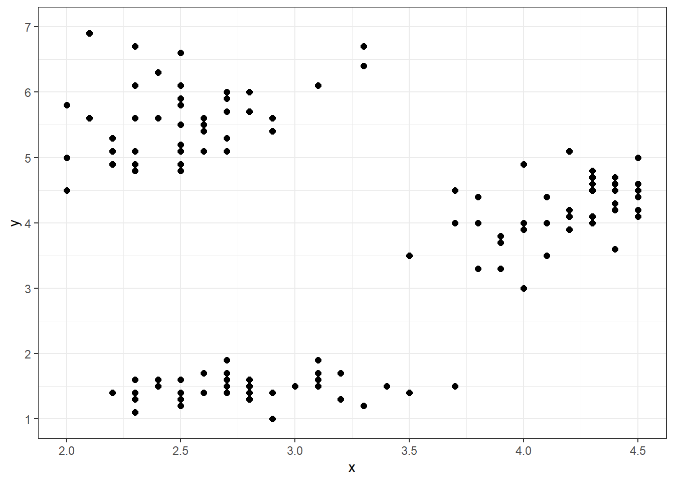
Figure 3.58: Scatter Plot of Clusters
It would be difficult to construct a function that captures the relationship between \(x\) and \(y\) in this graphic. Rather than following some trend, the points appear to be clumped into three separate groupings. We refer to these groupings as clusters. In many cases, clusters are defined by some other excluded or unknown variable. For example, there could be some factor associated with both \(x\) and \(y\), and the clusters are connected to its levels. Perhaps each of the three clusters represents a brand, category, species, or location. Regardless, the clustered association between \(x\) and \(y\) is driven by a third variable.
In Figure 3.58, the appropriate clusters are relatively obvious. The three groupings are well separated and relatively compact. However, this will not always be the case. For less obvious applications, we hope to find appropriate groupings among the observations. Cluster analysis seeks to identify these groupings with the data. In this section, we explore a specific type of cluster analysis known as K-means clustering. The K in K-means refers to the number of clusters we hope to identify among the observations. The “means” portion of K-means refers to the average variable values within each grouping. As with previous methods of exploratory analysis, we demonstrate K-means clustering in a case study using functions from the tidyverse.
Ask a Question
Arguably, the most important position in Major League Baseball (MLB) is the pitcher. Every play in baseball begins with a pitcher throwing the ball toward an opposing player, in hopes of preventing that player from achieving a hit. In order to avoid hits, most major league pitchers must master a wide variety of pitch types. Fastballs, curveballs, and sliders are just a few of the pitch types in the pitcher’s arsenal. Further information on pitch types, along with exemplar videos, can be found here. The primary factors that determine pitch type are the speed and spin rate of the ball as it leaves the pitcher’s hand. Suppose we are asked the following question: What is the association between speed and spin rate for MLB pitches?
This question is of significant concern for baseball players and coaches who hope to succeed as pitchers or trainers. Without knowledge of the physics of pitched ball movement, at least in general terms, it would be difficult to master particular pitch types. At the very least, pitchers must know that Pitch A requires more or less speed (spin) than Pitch B. Given the importance of these factors, MLB analysts have almost certainly answered this question. However, the particulars of speed and spin rate may not be well-known at the lower levels of the sport. At these levels it may not be feasible to obtain ball speed and spin rate, due to the cost of the requisite equipment. But at the major league level, such equipment is common and the associated data is openly available.
A point worth considering is the specificity of the question, in terms of individual pitchers. Though there are common characteristics among pitch types, every pitcher is unique. Some pitchers are capable of throwing the ball much faster or with greater spin than others. Thus, it might prove difficult to definitively answer the question for all pitchers. Instead, we choose to acquire data for an individual pitcher as an exemplar for the methodology.
Acquire the Data
MLB stadiums leverage a technology known as Statcast to record the release speed and spin rate of pitched balls, among many other statistics. Historical data from this system is available on the Baseball Savant website at this link. As a direct subsidiary of the MLB, this is the most reliable source available. To ease the extraction of the appropriate data, we provide statistics from Baseball Savant for Colorado Rockies pitcher German Marquez from the 2018 and 2019 seasons in the file pitching.csv. Let’s import and review the structure of this data.
## Rows: 4,612
## Columns: 13
## $ game_date         <chr> "6/8/2018", "6/8/2018", "6/8/2018", "6/8/2018", "6/8…
## $ at_bat_number     <dbl> 1, 1, 1, 1, 1, 1, 2, 2, 2, 3, 4, 4, 5, 5, 5, 6, 6, 6…
## $ pitch_number      <dbl> 1, 2, 3, 4, 5, 6, 1, 2, 3, 1, 1, 2, 1, 2, 3, 1, 2, 3…
## $ stand             <chr> "L", "L", "L", "L", "L", "L", "R", "R", "R", "L", "L…
## $ pitch_type        <chr> "FF", "FT", "KC", "KC", "CH", "FF", "FF", "SL", "FF"…
## $ pitch_name        <chr> "Fastball", "Fastball", "Curveball", "Curveball", "C…
## $ release_speed     <dbl> 96.4, 96.3, 84.1, 82.3, 89.5, 97.4, 97.2, 84.4, 97.8…
## $ effective_speed   <dbl> 95.6, 94.9, 82.3, 80.4, 89.3, 96.3, 96.1, 83.8, 97.2…
## $ release_spin_rate <dbl> 2246, 2230, 2819, 2761, 1917, 2342, 2317, 2458, 2257…
## $ description       <chr> "called_strike", "foul", "ball", "ball", "ball", "sw…
## $ launch_speed      <chr> "null", "null", "null", "null", "null", "null", "nul…
## $ launch_angle      <chr> "null", "null", "null", "null", "null", "null", "nul…
## $ events            <chr> "null", "null", "null", "null", "null", "strikeout",…
The data frame consists of 4,612 pitches (observations) described by 13 different characteristics (variables). Notice that two of the variables are pitch_type and pitch_name. So we actually already know which combinations of speed and spin rate produce each pitch type. However, for this academic exercise we imagine the pitch names are not available. Our purpose is to try and identify pitch types based solely on the release speed and spin rate. Later in the section we return to the real pitch types to check our work. For now we wrangle the data to isolate the two variables of interest.
#wrangle pitching data
pitches2 <- pitches %>%
  transmute(Speed=release_speed,
            Spin=release_spin_rate)

#summarize pitching data
summary(pitches2)
## Speed Spin
## Min. :75.10 Min. :1280
## 1st Qu.:85.80 1st Qu.:2187
## Median :93.00 Median :2277
## Mean :90.71 Mean :2336
## 3rd Qu.:95.50 3rd Qu.:2464
## Max. :99.90 Max. :3210The range of pitch speeds is between about 75 and 100 miles per hour. For spin rate, the range is between 1,280 and 3,210 revolutions per minute. Without a more intimate knowledge of pitching in baseball, it may be difficult to resolve the plausibility of these ranges. Consultation with a domain expert could quickly establish their validity. That said, nothing immediately stands out as an obvious mistake. So we proceed to the analysis stage.
Analyze the Data
When investigating clusters among numerical variables, a useful place to start is with a scatter plot. Figure 3.59 depicts pitch speed versus spin rate.
#display scatter plot of pitches
ggplot(data=pitches2,aes(x=Speed,y=Spin)) +
  geom_point(alpha=0.2) +
  labs(title="German Marquez Pitches",
       subtitle="(2018-2019 Seasons)",
       x="Speed (mph)",
       y="Spin Rate (rpm)",
       caption="Source: Baseball Savant") +
  scale_x_continuous(limits=c(75,100),breaks=seq(75,100,2.5)) +
  scale_y_continuous(limits=c(1250,3250),breaks=seq(1250,3250,250)) +
  annotate(geom="text",x=84,y=2750,label="A",color="red",size=8) +
  annotate(geom="text",x=86.5,y=2350,label="B",color="red",size=8) +
  annotate(geom="text",x=87.5,y=1850,label="C",color="red",size=8) +
  annotate(geom="text",x=95.5,y=2200,label="D",color="red",size=8) +
  theme_bw()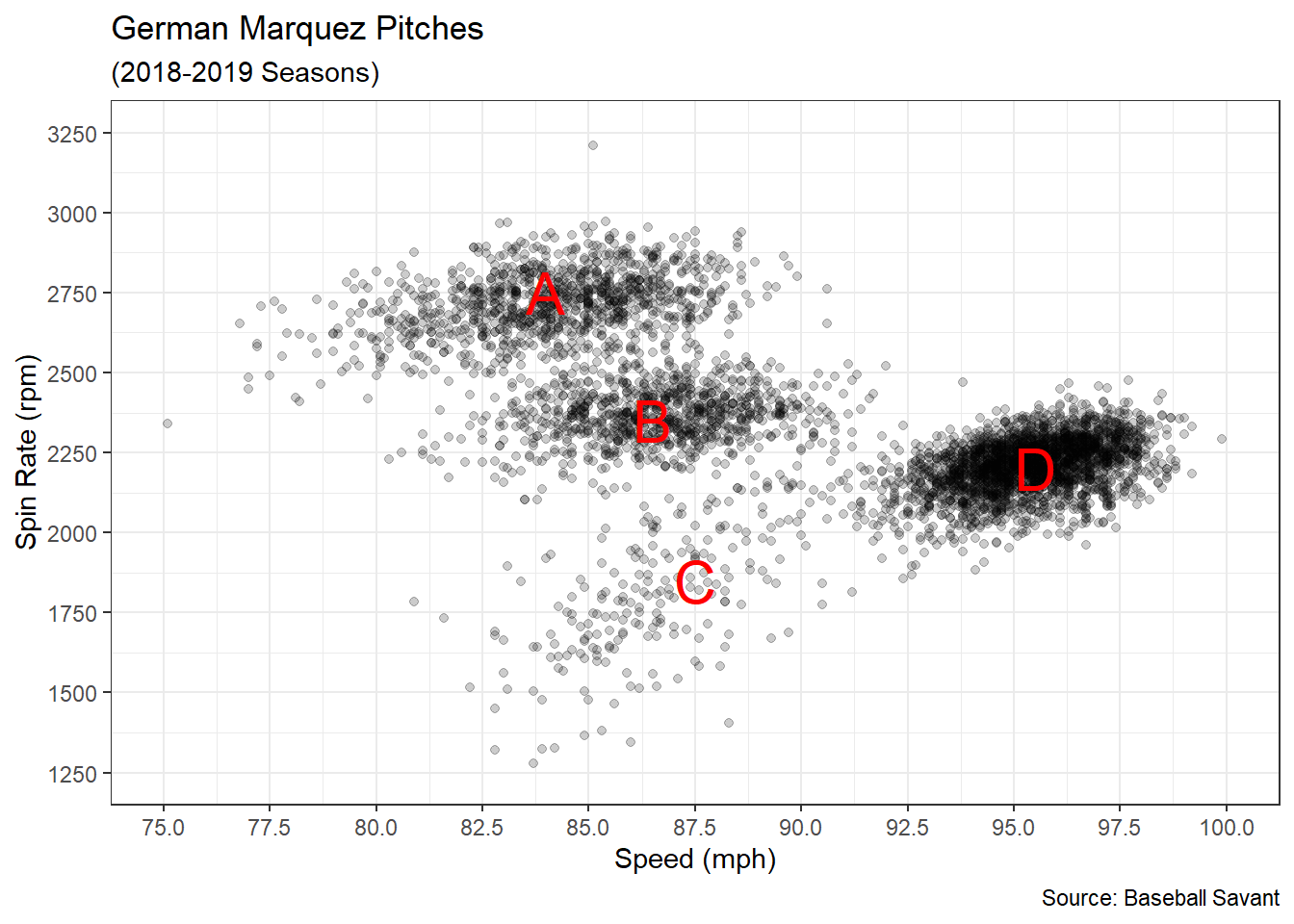
Figure 3.59: Scatter Plot of Speed versus Spin Rate
We add transparency to the points with the alpha parameter to better depict densities within each cloud of data. The plot reveals four distinct clusters among pairings of speed and spin rate. For this particular data, we could make reasonable assignments of observations to clusters (A, B, C, and D) based purely on the visualization. However, not all data has such distinct groupings and our ability to visualize them is limited by the number of explanatory variables (i.e., dimensionality). Furthermore, it is difficult to visually assign group labels to points on the periphery between clusters. Luckily, we have objective algorithms for precisely this purpose.
The K-means clustering algorithm groups observations that are “close” to one another in terms of explanatory variable values. Specifically, “closeness” is defined by the distance between each point and the center of its assigned cluster. So if we imagine the lettered labels in Figure 3.59 are at the center of each cluster, then we assign each observation to its closest letter. For the K-means algorithm, the center of each cluster is defined by the mean value for each explanatory variable. Then each observation is assigned to the closest center in terms of Euclidean distance (sum of squared deviations). By the end of the algorithm, K-means selects cluster assignments that minimize the total distance of all points from their cluster center.
The use of Euclidean distance highlights an important issue regarding the units of measurement for each variable. The numerical values for speed are in tens, while those for spin rate are in thousands. Such differences in order of magnitude make it unfair to compare distances in one dimension to those of the other. In our case, the algorithm will unfairly prefer to avoid deviations in the spin rate dimension simply because of the units of measurements. We remedy this issue by standardizing all of the variable values.
Standardizing is achieved by shifting and scaling the values of each variable such that they have a mean of zero and a standard deviation of one. Arithmetically, we standardize by subtracting the mean and dividing by the standard deviation.
#compute mean and stdev for each variable
mean_speed <- mean(pitches2$Speed)
stdev_speed <- sd(pitches2$Speed)

mean_spin <- mean(pitches2$Spin)
stdev_spin <- sd(pitches2$Spin)

#standardize variables
pitches3 <- pitches2 %>%
  transmute(std_Speed=(Speed-mean_speed)/stdev_speed,
            std_Spin=(Spin-mean_spin)/stdev_spin)
After standardizing, we re-create the same scatter plot as before but in standard units on both axes.
#display standardized scatter plot of pitches
ggplot(data=pitches3,aes(x=std_Speed,y=std_Spin)) +
  geom_point(alpha=0.2) +
  labs(title="German Marquez Pitches",
       subtitle="(2018-2019 Seasons)",
       x="Standardized Speed",
       y="Standardized Spin Rate",
       caption="Source: Baseball Savant") +
  scale_x_continuous(limits=c(-4,4),breaks=seq(-4,4,1)) +
  scale_y_continuous(limits=c(-4,4),breaks=seq(-4,4,1)) +
  coord_fixed(ratio=1) +
  theme_bw()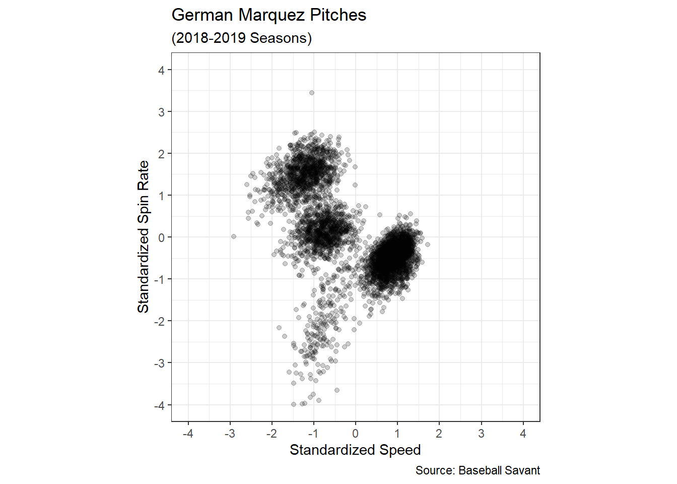
Figure 3.60: Standardized Scatter Plot of Speed versus Spin Rate
In Figure 3.60 both variables are centered on zero with a standard deviation of one. Thus, speed and spin rate are now both measured in units of standard deviations. A distance of one unit for speed is the same as a distance of one unit for spin rate. Now we are prepared to execute the K-means algorithm, since distances in all dimensions can be fairly compared. We call the algorithm using the kmeans() function.
#execute K-means algorithm
set.seed(303)
pitch_clusters <- kmeans(x=pitches3,centers=4)

#review cluster assignments
head(pitch_clusters$cluster,n=10)
## [1] 4 4 2 2 1 4 4 3 4 4The K-means algorithm is initiated by randomly assigning observations to clusters before iterating toward an optimal assignment. Due to this random initialization, we set a randomization seed to make our work repeatable. The two required parameters for the kmeans() function are the standardized data frame and the number of cluster centers. We choose four centers because our visual inspection suggests that is appropriate. After executing the algorithm, we extract the cluster assignments from the list of output and view the first ten assignments. The clusters are assigned by numbers, one through four. Let’s use these assignments, along with the unstandardized scatter plot, to depict the results of the 4-means clustering algorithm. We use the unstandardized scatter plot purely for the visual benefit of domain experts.
#display scatter plot of pitches
pitches2 %>%
  cbind(cluster=as.factor(pitch_clusters$cluster)) %>%
ggplot(aes(x=Speed,y=Spin,color=cluster)) +
  geom_point(alpha=0.3) +
  labs(title="German Marquez Pitches",
       subtitle="(2018-2019 Seasons)",
       x="Speed (mph)",
       y="Spin Rate (rpm)",
       color="Cluster",
       caption="Source: Baseball Savant") +
  scale_color_manual(values=c("#B8DE29FF","#33638DFF","#440154FF","#29AF7FFF")) +
  scale_x_continuous(limits=c(75,100),breaks=seq(75,100,2.5)) +
  scale_y_continuous(limits=c(1250,3250),breaks=seq(1250,3250,250)) +
  theme_bw()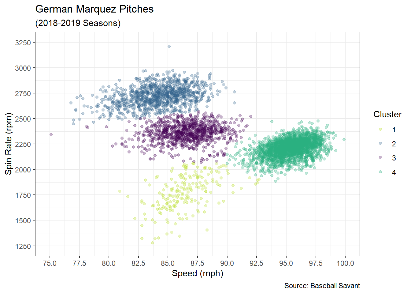
Figure 3.61: Clustered Pitches based on Speed versus Spin Rate
Each pitch in Figure 3.61 is now assigned to a cluster, along with other similar pitches. For example, all of the pitches assigned to the yellow cluster (1) exhibit a similar speed and spin rate. However, the combination of speed and spin rate for the yellow cluster is distinguishable from those of the other clusters (2-4). With these assignments of observations to clusters, the 4-means algorithm minimizes the total distance between points and cluster centers. The cluster assignments appear similar to what is suggested by the lettered assignments in Figure 3.59. But now there is no need to guess the assignments for observations along the periphery.
We now have an objective grouping of pitches displayed in an intuitive visualization suitable for external presentation. Yet we do not know the names of the pitches associated with each grouping. Which cluster represents fastballs? What about curveballs? To answer these questions we move to the next step of the 5A Method and consult with domain experts.
Advise on Results
This case study provides a great example of the need for data scientists and domain experts to collaborate. While a data scientist understands the algorithmic approach necessary to group pitches by speed and spin rate, they may not know the formal names associated with these pitches. On the other hand, the domain expert may not understand optimization algorithms but they will know which named pitches require more or less speed (spin) than others. For example, a domain expert may review Figure 3.61 and immediately recognize the green cluster (4) as fastballs since their speed dominates all of the other pitches. Similarly, they may identify the blue cluster (2) as curveballs since they have the highest spin rate (which causes balls to curve in flight).
In lieu of access to a domain expert, we consult the pitch names included with the original data set. Let’s recreate the scatter plot and color each observation according to its named pitch.
#display scatter plot of named pitches
ggplot(data=pitches,aes(x=release_speed,y=release_spin_rate,
                        color=as.factor(pitch_name))) +
  geom_point(alpha=0.3) +
  labs(title="German Marquez Pitches",
       subtitle="(2018-2019 Seasons)",
       x="Speed (mph)",
       y="Spin Rate (rpm)",
       color="Pitch",
       caption="Source: Baseball Savant") +
  scale_color_manual(values=c("#B8DE29FF","#33638DFF","#29AF7FFF","#440154FF")) +
  scale_x_continuous(limits=c(75,100),breaks=seq(75,100,2.5)) +
  scale_y_continuous(limits=c(1250,3250),breaks=seq(1250,3250,250)) +
  theme_bw()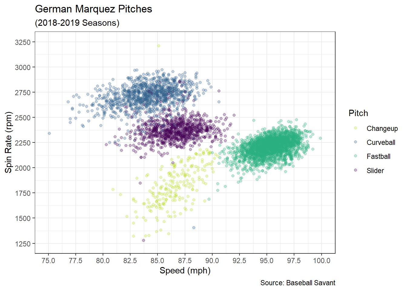
Figure 3.62: Named Pitches based on Speed versus Spin Rate
In Figure 3.62, there is no clustering algorithm involved. Each individual observation is colored according to the recorded pitch name in the original data. Yet the coloring produces clusters that are strikingly (pun!) similar to the results of the 4-means algorithm. As suspected, the green cluster represents fastballs and the blue cluster depicts curveballs. But we also see the distinction between sliders and changeups. Comparing the 4-means clusters to the actual pitch names, the alignment is not perfect but it appears very close. This close agreement is strong evidence of the fact that pitch types are primarily determined by the combination of speed and spin rate. It is also strong support for the value of the K-means approach in the absence of known grouping labels.
As noted previously in the section, there are limitations to the insights available from our analysis due to the specificity of the question. The pitch clusters for German Marquez may not be exactly the same as those of another pitcher. These potential differences impact the implementation of our model. For example, our analysis suggests that Marquez’s curveball has a speed between about 77 and 90 mph with a spin rate between about 2,500 and 3,000 rpm. Opposing batters and coaches might use this information to prepare for a future game against Marquez. However, that same insight may not help prepare for other pitchers. That said, our cluster analysis could be repeated for other pitchers, as needed.
There exist two other important limitations directly related to the K-means algorithm itself. The first is that the algorithm requires us to choose the number of clusters (K) ahead of time. We chose four clusters because the scatter plot seemed to indicate four was appropriate. However, this may not always be so obvious. In general, it is valuable to consult with a domain expert when deciding on the number of clusters to pursue. For our case, a baseball coach or scout might know that German Marquez only throws four pitches. If a different pitcher is only capable of throwing three pitches, then four clusters would be inappropriate.
The second limitation of the K-means algorithm is related to the random initialization that assigns observations to clusters. Had we not set a randomization seed, anyone attempting to replicate our work would obtain a different initial assignment of clusters. When the initial assignment is different there is no guarantee that the final cluster assignments will be the same. This is what we call a locally optimal solution. In other words, the algorithm finds the best answer it can given where it started. This may not be the same answer as the globally optimal solution. So by only executing the algorithm once, there is a chance we get a poor assignment of clusters purely by bad luck. One way to overcome this issue is by running the algorithm many times and choosing the clustering with the lowest objective value (total distance). The kmeans() function includes an optional nstart parameter that does exactly that. This causes kmeans() to re-run the algorithm the specified number of times, each with a different random starting point. Then the function provides only the best (in terms of total distance) assignment of clusters as output. We always recommend the use of the nstart parameter with many restarts. With a more reliable solution, we are finally prepared to answer the question.
Answer the Question
Given sufficient data for a pitcher of interest, the K-means algorithm provides a method to estimate the combinations of speed and spin rate that produce particular pitch types. We need only assess the bounds of each cluster. For example, German Marquez’s fastball exhibits speeds between about 90 and 100 mph with spin rates between around 1,900 and 2,400 rpm. We can similarly determine combinations for the other three pitches. Another valuable insight is that Marquez’s curveball, slider, and changeup vary much more by spin rate than by speed. This is especially apparent in the standardized scatter plot.
From a game preparation standpoint, the insights offered by the clustering analysis are clearly actionable. This is particularly true when comparing clusters across multiple pitchers. When coaching batters, a domain expert might point out that Marquez’s changeup is slower (or faster) than Pitcher X. Or perhaps Marquez’s curveball achieves more (or less) spin, and thus curve, than Pitcher Y. Even further, it could be that Marquez’s pitching repertoire looks just like Pitcher Z. In any case, the cluster analysis provides a valuable resource to gain a competitive advantage.
By setting randomization seeds, we’ve ensured our answer is reproducible. But it is also extendable to predictive modeling. Just as linear and logistic regression models are predictive extensions to identified associations, K-means clusters set the foundation for classification models. One such approach is the K-Nearest Neighbors (KNN) method. With a KNN model, we have the capacity to predict the pitch type given the speed and spin rate. Such a model could replace the need for visually determining which pitches are thrown and automate the record-keeping process.
3.3.7 Biplots
A final approach for exploring the associations between variables is known as dimension reduction. In this context, the dimension refers to the number of rows and columns in the tidy data frame. With modern methods of data collection, we are capable of collecting not only a massive number of observations (rows) but also a plethora of descriptive variable values (columns). While we might like to gather as many different variables as possible, some inferential and predictive approaches require the number of observations to exceed the number of variables. Otherwise, the associated algorithms cannot determine a solution. Thus, we sometimes need to reduce the dimension of the data by decreasing the number of variables. But how do we do this without losing valuable information about the observations?
A method known as principle components analysis (PCA) combines multiple variables into a single new variable by leveraging their associations. This approach effectively reduces the dimension of the data. The benefit of combining, rather than deleting, variables is that we lose far less information about the observations. We dig much deeper into the PCA process in the analysis section, but the method relies on identifying and combining correlated variables. When variables are correlated, there is overlap in the information they offer. Given this overlap, we lose relatively little information by combining the variables in a particular manner. In certain use cases, this dimension reduction unlocks analytic algorithms that would otherwise be impossible to employ. The basic tools we need to execute PCA are already included in the tidyverse.
Ask a Question
In a paper by Keith W. Penrose and others, the authors explore the body composition of adult biological males between the ages of 22 and 81 years (Penrose et al. 1985). The goal of the research is to develop a predictive model for lean body weight based on various measurements (e.g., chest, abdomen, and thigh circumference) of the human subjects. Imagine the researchers want to combine some of the measurements in order to reduce the dimensionality of the data. In fact, their objective is to explain the variation in body composition among adult males with as few variables as possible. Specifically, we consider the following question: What combination of measurements provides the greatest explanation of variability in the body composition of adult males?
This question could be of interest to a wide variety of scientific fields and commercial industries. Biologists, physiologists, and human factors scientists are likely interested in understanding which dimensions exhibit the least and greatest variation among adults in order to better understand how the human body develops. More specifically, scientists might like to understand which body dimensions are more prone to variation as a result of environmental factors (e.g., exercise and diet) versus biological factors (e.g., genetics and evolution). In addition to scientists, commercial companies such as clothing manufacturers are certainly interested in how the size of the human body varies. When producing a wide range of clothing sizes to meet the needs of a diverse population, companies need a detailed understanding of the variability in body dimensions.
Any time we plan to analyze data gathered from human subjects, we must carefully consider potential ethical concerns. Can the data be obtained in a manner that does not physically or emotionally harm the subjects? Do we have the capacity to protect the anonymity of our subjects and their data? Will the insights and applications of the subsequent analytic results impose negative consequences for the study subjects or others? If the answer to any of these questions is yes, then we should likely not conduct the study. In our current case study, the data includes measurements that can be obtained without causing harm. The observations are completely anonymous and our purpose is simply to better understand the variability in the human body. Consequently, there do not appear to be any obvious ethical concerns with the use of the data. That said, we should be careful with the interpretation of any insights from the data in terms of biological sex. The available data only includes biological males, so it would not be appropriate to extrapolate our discoveries to females.
Acquire the Data
Continuing on the theme of ethics, responsible researchers make their work repeatable by offering access to the study data. The Penrose research is no exception, as the body composition data is publicly available. In the file bodycomp.csv all measurements are in centimeters (cm). With the exception of height, every variable represents the circumference of the listed body part. We import the data and review its structure below.
#import body composition data
bodycomp <- read_csv("bodycomp.csv")

#display data structure
glimpse(bodycomp)
## Rows: 251
## Columns: 11
## $ Height <dbl> 174.6, 162.6, 173.4, 176.5, 186.7, 177.2, 176.5, 193.0, 184.8,…
## $ Neck <dbl> 43.2, 41.2, 38.8, 40.4, 42.1, 40.9, 40.2, 41.8, 41.3, 38.4, 38…
## $ Chest <dbl> 128.3, 119.8, 119.6, 114.9, 117.0, 121.6, 117.6, 115.2, 115.8,…
## $ Abdomen <dbl> 126.2, 122.1, 118.0, 115.9, 115.6, 113.9, 113.8, 113.7, 113.4,…
## $ Hip <dbl> 125.6, 112.8, 114.3, 111.9, 116.1, 107.1, 111.8, 112.4, 109.8,…
## $ Thigh <dbl> 72.5, 62.5, 61.3, 74.4, 71.2, 63.5, 63.4, 68.5, 65.6, 61.9, 60…
## $ Knee <dbl> 39.6, 36.9, 42.1, 40.6, 43.3, 40.3, 41.1, 45.0, 46.0, 38.3, 37…
## $ Ankle <dbl> 26.6, 23.6, 23.4, 24.0, 26.3, 21.8, 22.3, 25.5, 25.4, 21.9, 21…
## $ Biceps <dbl> 36.4, 34.7, 34.9, 36.1, 37.3, 34.8, 35.1, 37.1, 35.3, 32.0, 31…
## $ Forearm <dbl> 32.7, 29.1, 30.1, 31.8, 31.7, 30.7, 29.6, 31.2, 29.8, 29.8, 27…
## $ Wrist <dbl> 21.4, 18.4, 19.4, 18.8, 19.7, 17.4, 18.5, 19.9, 19.5, 17.0, 18…The data frame consists of 251 observations (human subjects) described by 11 variables (body dimensions). There is no name or even unique identifier for each subject, so the data is truly anonymous in its current form. Given each variable represents a theoretically-continuous numerical value, the double-precision data type is appropriate. However, for practical purposes the values are rounded to a single decimal place. In order to better illustrate the analytic process of dimension reduction, we limit the available variables to only height, neck, chest, abdomen, and thigh circumference. Let’s summarize the values for those variables and identify any outlying data points.
#wrangle data
bodycomp2 <- bodycomp %>%
  select(Height,Neck,Chest,Abdomen,Thigh)

#summarize data
summary(bodycomp2)
## Height Neck Chest Abdomen
## Min. :162.6 Min. :31.10 Min. : 79.3 Min. : 69.40
## 1st Qu.:173.4 1st Qu.:36.40 1st Qu.: 94.3 1st Qu.: 84.55
## Median :177.8 Median :38.00 Median : 99.6 Median : 90.90
## Mean :178.6 Mean :37.94 Mean :100.7 Mean : 92.33
## 3rd Qu.:183.5 3rd Qu.:39.40 3rd Qu.:105.3 3rd Qu.: 99.20
## Max. :197.5 Max. :43.90 Max. :128.3 Max. :126.20
## Thigh
## Min. :47.20
## 1st Qu.:56.00
## Median :59.00
## Mean :59.29
## 3rd Qu.:62.30
## Max. :74.40The height of male subjects varies between about 163 and 198 cm. This is equivalent to a range between 5 foot, 4 inches and 6 foot, 6 inches. Based on our real-world knowledge of male height, this range seems reasonable. Similarly, the neck circumference variable has minimum and maximum values of 31 and 44 cm, respectively. In imperial units, this is equivalent to about 12 and 17 inches. Considering common neck measurements offered on collared shirts, this range of values appears acceptable. Similar investigations of the other variables does not raise any concerns for outliers or for obvious errors in collecting the data. Hence, we proceed to the analysis stage of the 5A Method.
Analyze the Data
Currently, our data set consists of five variables describing the composition of the male body. The process of dimension reduction seeks a smaller number of variables that can explain close to as much of the variation in body composition as the five variables. In large part, dimension reduction relies on variables being correlated with one another. Put simply, if two variables are highly correlated then we gain little information by using both of them individually. In Chapter 3.3.2, we discussed the concept of correlation and built visual intuition via scatter plots. The pairs() function facilitates this process for multiple pair-wise scatter plots.
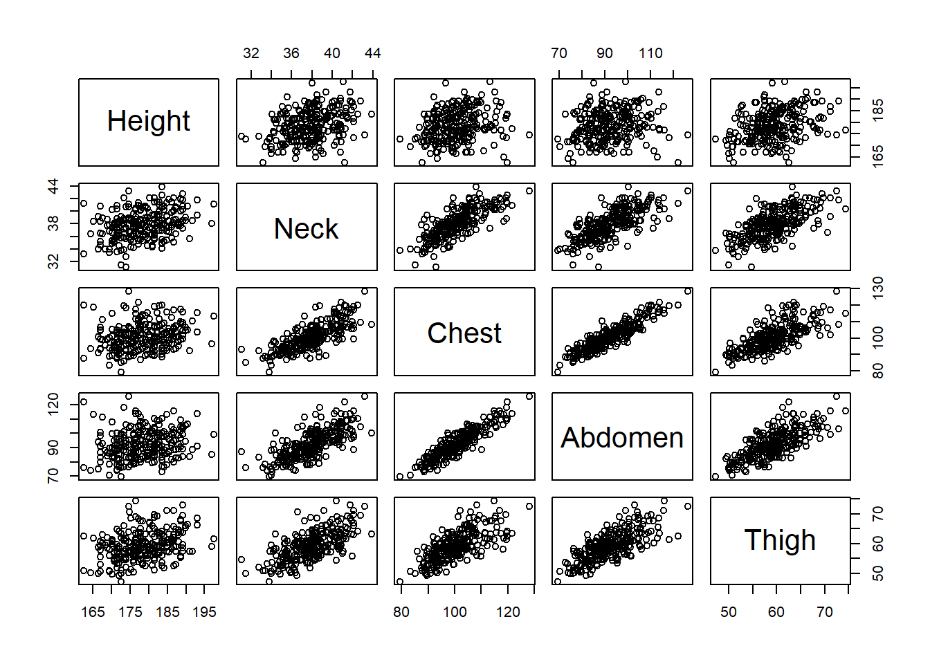
Figure 3.63: Paired Scatter Plots of Body Measurements
At the intersection of each row and column in Figure 3.63 we obtain the scatter plot that associates the relevant variables. The plots in the lower and upper diagonal are redundant in the sense that they only reverse which variable is placed on the \(x\) and \(y\) axes. This reversal has no impact on the interpretation of the correlation between variables. In either case we see a moderate or strong, increasing, linear association between a person’s neck, chest, abdomen, and thigh circumferences. In other words, if a person has a larger neck then we expect them to also have a larger chest, abdomen, and thigh. This makes intuitive sense, because the human body tends to get larger or smaller in certain proportions. However, we do not see this association when it comes to height. At best there is a weak correlation between height and the other measurements. The scatter plots along the top row of the graphic are much more dispersed than the others. This suggests a person’s height does not necessarily get larger or smaller in proportion to the other dimensions. In general, adults do not get taller or shorter when other parts of the body increase or decrease in size.
The associations depicted in the scatter plots begin to reveal the important dimensions in the data. If a person’s neck, chest, abdomen, and thigh circumferences are all so strongly correlated, then do we really need to consider all of them separately? Is there a way we could combine the information contained in all four variables into a single variable? The answer is yes and the analytic process for doing so is known as principle components analysis (PCA). The principle components of a data set represent the dimensions across which the observations vary the most. Practically speaking, a principle component is a new variable computed as a linear combination of the existing variables. For example, the first principle component (PC1) for body composition can be written as in Equation (3.7).
\[\begin{equation} \text{PC1} = \phi_1 \text{Height}+\phi_2 \text{Neck}+\phi_3 \text{Chest}+\phi_4 \text{Abdomen}+\phi_5 \text{Thigh} \tag{3.7} \end{equation}\]
The coefficients (\(\phi\)) for each variable are referred to as the loadings for the principle component. When we compute the sum-product of loadings and variable values, we obtain the score for the first principle component. We refer to the first principle component, because there are multiple principle components for a given data set. The first principle component represents the dimension across which the observations vary the most. The second principle component reflects the dimension with the next highest variation, but it must be perpendicular to the first dimension. The third component must be perpendicular to the first two and so on. The total number of principle components depends on the number of original variables, but often the first two principle components are of greatest interest. We compute the loadings for the first two principle components using the prcomp() function below.
#determine the principle components
princ_comps <- prcomp(bodycomp2,scale=TRUE)

#display components loadings
princ_comps$rotation[,c(1,2)]
## PC1 PC2
## Height 0.2182916 -0.946161017
## Neck 0.4753626 -0.002160275
## Chest 0.5053531 0.204847620
## Abdomen 0.5012293 0.247045815
## Thigh 0.4687928 -0.042195738Similar to cluster analysis, it is important in PCA that we standardize the variables to have a mean of zero and standard deviation of one. Otherwise, we obtain nonsense when combining variable values of different units. In this particular problem, all of the variables are in the same units but this will typically not be the case. Standardizing is achieved with the scale parameter within the prcomp() function. We then extract the loading values from the rotation element of the output. The values listed in the PC1 column represent the assigned coefficients (\(\phi\)) for each variable in Equation (3.7). The PC2 column provides similar coefficients for the second principle component. Using PCA, we have reduced the dimensions of our body composition data from five down to two (i.e., PC1 and PC2). However, the interpretation of these dimensions is much easier to extract from a visual graphic called a biplot.
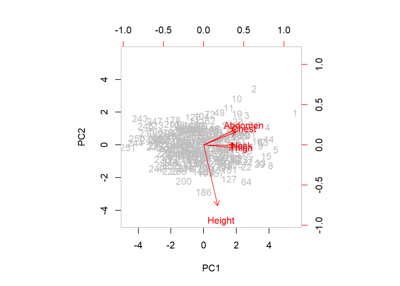
Figure 3.64: First Two Principle Components of Body Composition
The light grey numbers in Figure 3.64 represent the individual observations (i.e., human subjects). The observations are placed according to their PC1 and PC2 scores on the bottom and left axes, respectively. The red arrows represent the PC1 and PC2 loadings for each original variable according to the top and right axes. For example, we know the PC1 and PC2 loadings for height are 0.218 and -0.946. This is the location of the head of the red arrow for height in the graphic. Let’s interpret the dual aspects (scores and loadings) of the biplot separately.
The PC1 score for each observation represents the numerical result of Equation (3.7). Recall that the first principle component represents the dimension across which the observations have the greatest variation. Visually this appears as the wide range of scores beyond -4 and +4 along the bottom (PC1) axis. The second principle component is the perpendicular dimension with the next highest variation. These scores have a smaller range between about -3 and +3 along the left (PC2) axis. The PC1 and PC2 axes are perpendicular and the variability of the scores along the PC1 axis is greater than that of the PC2 axis.
In terms of the loadings, height appears to be very different than the other four body measurements. Based on our previous correlation analysis, this should not be surprising. Referring to the top axis in the graphic, height has a smaller PC1 loading than the other four measurements. Meanwhile, the PC1 loadings for neck, chest, abdomen, and thigh circumference are very similar. By contrast, the PC2 loading for height is much larger (in absolute value) than the other four, as indicated by the right axis in the graphic. All told, we see that the first principle component emphasizes neck, chest, abdomen, and thigh circumference while the second principle component focuses on height. In effect, we are grouping the circumferences into one dimension and height into a separate dimension.
According to the data, a biological male displays the greatest variation in body composition across a dimension that aggregates neck, chest, abdomen, and thigh circumferences. But how much of the variability in body composition is explained by this artificial dimension? From a statistical standpoint, variance is computed as the square of standard deviation. Thus, we calculate the proportion of total variance for each principle component as follows.
#determine the variance
pc_var <- princ_comps$sdev^2

#determine proportion of explained variance
(pc_var/sum(pc_var))[c(1,2)]
## [1] 0.6746579 0.1840150Here we extract the proportion of variance explained by the first two principle components. Based on the results, we can explain 67.5% of the variance in body composition using a principle component that combines neck, chest, abdomen, and thigh circumferences. We can explain an additional 18.4% of the variance using a principle component that focuses on height. Thus, with only two dimensions (PC1 and PC2) we are able to explain nearly 86% of the variability in body composition for adult males. The technical results confirm our initial real-world intuition. The adult male body varies much more according to circumference measurements of various body parts than it does according to height. Neck, chest, abdomen, and thigh circumferences vary together due to their high levels of correlation and thus can be grouped into a single dimension (PC1). On the other hand, height has little correlation with the circumferences and must be considered as a separate dimension.
Compared to other analysis techniques, PCA can prove more difficult to explain to an audience without a strong background in statistics. We often need to incorporate a greater level of creativity in order to convey the key insights. In the next subsection, we explore ways to advise stakeholders on more challenging methodologies that may not be immediately intuitive.
Advise on Results
When interpreting complex technical concepts to a broad audience it is often helpful to employ diagrams and analogies. Diagrams assist more visually-oriented audience members, while analogies present concepts in more approachable contexts. For our example of the principle components of body composition, we might choose to present the results using the analogy of a cylinder. Figure 3.65 offers a diagram of this analogy.

Figure 3.65: Principle Components of Human Cylinder
In our analysis, the first principle component (PC1) emphasized neck, chest, abdomen, and thigh circumferences. When considering the human body as a cylinder, each of these measurements is related to the radius of the cylinder. Due to their geometric connection, increases in circumference require increases in radius. This comparison also illustrates the correlation between the four body composition measurements. When the body radius increases in one part (e.g., neck) of the cylinder, it also increases in other parts (e.g., abdomen) of the cylinder. By contrast, the second principle component (PC2) of height is largely disconnected from the radius of the cylinder. The same height cylinder can have a variety of radii.
The benefit of establishing this analogy lies in the description of the principle components and the variance explained. By virtue of being the first component, we know that the adult male body varies much more in its radius than its height. Perhaps due to diet and exercise, which impact weight, changes in body composition primarily impact the radius dimension. In fact, abut 67.5% of the variation in body composition is explained by this dimension. On the contrary, height is driven by genetics and largely constant throughout adulthood. Hence, there is much less variability in terms of height across adult males. Only an additional 18.4% of variance in body composition is explained by the height dimension.
Though not strictly necessary, analogies and diagrams such Figure 3.65 often ease the presentation of complex analyses. However, we should always include domain-specific terminology when appropriate. For example, the medical community refers to the PC1 dimension as the transverse plane and the PC2 dimension as the frontal plane. Were we to present this analysis to biologists, physiologists, or human factors scientists, we might leverage such terminology to establish credibility and connection to the audience. This example further highlights the importance of advisement being a collaborative effort. Data scientists may learn just as much regarding the problem context from domain experts as those experts learn about analysis from the scientists.
Beyond creative interpretations and presentations, data scientists must also carefully delineate the limitations of their analyses. Previously, we discussed the limitations associated with the data only including measurements for adult males. It is not appropriate to apply this analysis to the body composition of biological females or to children. Additionally, we limited the body measurements included in the PCA. Though this simplification helped illustrate the target concepts, a more thorough analysis would include all of the available data. It is possible that additional principle components provide valuable explanatory power.
Answer the Question
The research question seeks the combination of measurements that provides the greatest explanation of variability in body composition. Based on our analysis, the combination of neck, chest, abdomen, and thigh circumferences explains 67.5% of the variance in an adult male’s body. Far less body composition variability is explained by height. Using anatomical terminology, the adult male body varies much more in the transverse plane than the frontal plane. Given that measurements in the transverse plane can be largely driven by body weight, we might also offer the following insight: The adult male body varies more in weight than in height.
How might a domain expert put such insight into action? In the case of clothing manufacturers, the results of this analysis suggest sizes should vary more in width (radius) than in height. For example, pant sizes should be offered in a greater range of waist circumferences than inseam (leg) lengths. Shirt sizes likely need to vary more in shoulder width than in torso length. By focusing on width differences, companies could save time, money, and effort not manufacturing an unnecessary range of size differences related to a low-variability dimension (i.e., height).
In terms of extending this analysis, PCA is often used to identify valuable features for building predictive models. This is particularly true for data sets with a large number of explanatory variables relative to the number of observations. A predictive method known as principle components regression is a logical extension to this exploratory analysis. Though we introduce predictive modeling in Chapter 5, this advanced approach is outside the scope of this text.
3.4 Resources: Exploratory Analyses
Below are the learning objectives associated with this chapter, as well as exercises to evaluate student understanding. Afterward, we provide recommendations for further study on the topic of exploratory analysis.
3.4.1 Learning Objectives
After completing this chapter, students should be able to:
- Identify the correct variable types and associated visual cues in a data graphic.
- Recognize the coordinate systems, scales, and units for variables in a data graphic.
- Interpret the context in data graphics based on labels, captions, and annotations.
- Identify and avoid (or resolve) common pitfalls in the visual presentation of data.
- Summarize the distributions of variables using common measures of center and dispersion.
- Interpret the distributions of categorical variables using bar charts and heat maps.
- Interpret the distributions of words and sentiment in free text using word clouds.
- Interpret the geospatial distributions of bounded regions using choropleth maps.
- Interpret the distributions of numerical variables using histograms and contour plots.
- Identify and resolve statistical outliers based on common statistics and box plots.
- Summarize associations between factors with contingency tables and stacked bar charts.
- Compute and interpret joint, marginal, and conditional proportions from a table.
- Interpret the shape, direction, and strength of associations using scatter plots.
- Apply linear transformations to nonlinear associations identified in a scatter plot.
- Estimate and interpret the functional parameters for an identified association.
- Identify and describe clustered associations between variables in a scatter plot.
- Characterize time-based associations between variable values using line graphs.
- Leverage associations between variables to reduce the dimensions of a data set.
3.4.3 Further Study
In this chapter we survey the most common forms of exploratory analysis and data visualization. A data scientist could arguably spend years studying the finer details of the methods and tools introduced here. Below we suggest additional resources regarding exploratory data analysis.
Given the heavy emphasis on data visualization in exploratory analyses, Winston Chang’s R Graphics Cookbook is a great resource (Chang 2012). The author provides much greater detail regarding the design of the canonical graphics introduced in this chapter. The book also includes additional visualizations beyond our scope.
A coding language-agnostic option for graphical design is Storytelling with Data: A Data Visualization Guide for Business Professionals by Cole Nussbaumer Knaflic (Knaflic 2015). When considering the “advise” step of the 5A Method, well-designed graphics that tell a compelling story are invaluable. In this book, the author focuses on the audience for which the graphic is constructed and provides fantastic advice on effective presentation.
A seminal text on data visualization is Edward Tufte’s The Visual Display of Quantitative Information (Tufte 2001). With a focus on effective and efficient design, Tufte introduces an array of historical graphics along with their virtues and shortfalls. The book also describes methods for avoiding misleading or unethical visualizations.
A comprehensive textbook to consider is Ronald K. Pearson’s Exploratory Data Analysis using R (Pearson 2018). From graphics to text analysis to regression to storytelling, this book covers it all and more. All applications are completed in R, so there is also the added benefit of gaining additional coding expertise.
Perhaps more out of historical interest, data science buffs may be interested in Exploratory Data Analysis by John W. Tukey (Tukey 1977). Yes, the author is the same Tukey whose quote appeared at the beginning of our book. Many of the summaries and visualizations are hand-drawn by the author and can be reconstructed with a simple calculator.