Chapter 17 Principal Component Analysis
Hello! In this tutorial, we will be learning about principal component analysis (PCA). PCA is considered a “data reduction” variable: it is used when researchers have a large number of variables that they want to represent with a smaller number of variables (called “[principal] components”). The idea behind this strategy is that researchers can represent their data using a linear combination of variables (i.e., a weighted average). The goal of the PCA algorithm is to identify those optimal weights.
To learn more about PCA, let’s use some survey data. PCA is often used in survey data to test whether indicies are meaningful together or to try and group multiple questions. This helps to reduce dimensionality (and, by extension, multicollinearity issues).
17.1 Set Up
Let’s set our data up by bringing in tidyverse. Because of the popularity of PCA, base R contains substantial support for conducting a PCA.
library(tidyverse)

survey_data <- read_csv("data/survey_2020-10_kaiser_voting_31118013.csv")
colnames(survey_data)
## [1] "id" "d1" "rvote" "q1a"
## [5] "q1b" "q1c" "q1d" "q1e"
## [9] "q1f" "q1g" "q2" "q3a"
## [13] "q3b" "q3c" "q3d" "q3e"
## [17] "q3f" "q3g" "q3h" "q4"
## [21] "q5a" "q5b" "q5c" "q5d"
## [25] "q5e" "q5f" "q5g" "q5h"
## [29] "aca" "m4all" "publicoption" "publicop2"
## [33] "lvote" "voted1" "swing" "swing2"
## [37] "voted2" "voted2ot" "vote2020" "swingvoter"
## [41] "undecided" "bidenvoter" "trumpvoter" "q6"
## [45] "q7" "q8" "q9" "q10"
## [49] "q11" "q12" "q13" "q14a"
## [53] "q14b" "q15" "q16" "q17"
## [57] "q18" "q19" "q20a" "q20b"
## [61] "q21" "age" "age2" "recage"
## [65] "recage2" "recage3" "recage4" "recage5"
## [69] "child" "marital" "trumpapprove" "trumpapprove2"
## [73] "inclosstotal" "employ" "recemploy" "delayedcare"
## [77] "chroniccovid" "coverage" "agecov" "covtype"
## [81] "agecovtype" "prexa" "rsex" "gendervar"
## [85] "party" "partylean" "party3" "party5"
## [89] "ideology" "educ" "receduc" "receduc2"
## [93] "receduc3" "hispanic" "race" "racethn"
## [97] "nativity" "racethn2" "income" "recincome"
## [101] "cell" "hhcell" "landline" "curlangx"
## [105] "hhadults" "int" "length" "cstate"
## [109] "cregion" "density" "intvwdate" "sample"
## [113] "userdata" "sstate" "sregion" "sdivision"
## [117] "stz" "exchangstat" "stateexpmedi" "gvnrexpmedi"
## [121] "reprostat" "waiver" "wt1" "weight"
## [125] "standwt" "weight_ssrs" "lang" "Division"
## [129] "changesex" "iphoneuse" "hphoneuse" "SAMPLE_TYPE"
## [133] "chroniccovid2" "lvote2" "state1" "state"
## [137] "USR"To use this data, we need to select the variables we want to focus on and clean them. While saving the variables as characters or factors is useful for human interpretation, PCA takes numeric variables specifically, so likert scales and other variables must be converted.
In this tutorial, we will focus on a few public opinion questions related to COVID and partisanship.
survey_data_trim <- survey_data %>% select(q1a, q1e, aca, m4all, publicoption,
                                           q13, trumpapprove, party5, swing)
survey_data_trim <- lapply(survey_data_trim, as.factor) %>% as.data.frame()
Now, let’s convert the factors into numeric (if you are unfamiliar with this process, please go back to the first 2 weeks’ tutorials).
levels(survey_data_trim$q1a) ## [1] "Don't know" "Not at all important" "Not too important"
## [4] "Refused" "Somewhat important" "Very important"survey_data_trim <- survey_data_trim %>%
mutate_at(c("q1a", "q1e"), funs(recode(., `Don't know` = NaN,
`Not at all important` = 1,
`Not too important` = 2,
`Refused` = NaN,
`Somewhat important` = 3,
`Very important` = 4)))## Warning: `funs()` was deprecated in dplyr 0.8.0.
## Please use a list of either functions or lambdas:
##
## # Simple named list:
## list(mean = mean, median = median)
##
## # Auto named with `tibble::lst()`:
## tibble::lst(mean, median)
##
## # Using lambdas
## list(~ mean(., trim = .2), ~ median(., na.rm = TRUE))
## This warning is displayed once every 8 hours.
## Call `lifecycle::last_lifecycle_warnings()` to see where this warning was generated.levels(survey_data_trim$aca)## [1] "Don't know" "Refused" "Somewhat favorable"
## [4] "Somewhat unfavorable" "Very favorable" "Very unfavorable"survey_data_trim <- survey_data_trim %>%
mutate_at(c("aca"), funs(recode(., `Don't know` = NaN,
`Somewhat favorable` = 3,
`Somewhat unfavorable` = 2,
`Refused` = NaN,
`Very unfavorable` = 1,
`Very favorable` = 4)))
levels(survey_data_trim$m4all) #publicoption## [1] "Don't know" "Refused" "Somewhat favor" "Somewhat oppose"
## [5] "Strongly favor" "Strongly oppose"survey_data_trim <- survey_data_trim %>%
mutate_at(c("m4all", "publicoption"), funs(recode(., `Don't know` = NaN,
`Somewhat favor` = 3,
`Somewhat oppose` = 2,
`Refused` = NaN,
`Strongly oppose` = 1,
`Strongly favor` = 4)))
survey_data_trim <- survey_data_trim %>%
mutate_at(c("q13"), funs(recode(., `Don't know` = NaN,
`Not at all worried` = 1,
`Not too worried` = 2,
`Refused` = NaN,
`Somewhat worried` = 3,
`They or a family member has already gotten sick from coronavirus (Vol.)` = 5,
`Very worried` = 4)))
survey_data_trim <- survey_data_trim %>%
mutate_at(c("trumpapprove"), funs(recode(., `Don't know` = NaN,
`Somewhat approve` = 3,
`Somewhat disapprove` = 2,
`Refused` = NaN,
`Strongly disapprove` = 1,
`Strongly approve` = 4)))
levels(survey_data_trim$party5)## [1] "DEMOCRAT" "INDEPENDENT LEAN REP" "INDEPENDENT/DON'T LEAN"
## [4] "INDEPENDENT/LEAN DEM" "REPUBLICAN" "UNDESIGNATED"survey_data_trim <- survey_data_trim %>%
mutate_at(c("party5"), funs(recode(., `DEMOCRAT` = 1,
`INDEPENDENT/LEAN DEM` = 2,
`INDEPENDENT/DON'T LEAN` = 3,
`INDEPENDENT LEAN REP` = 4,
`REPUBLICAN` = 4,
`UNDESIGNATED` = 4)))
levels(survey_data_trim$swing)## [1] "Definitely going to vote for Donald Trump"
## [2] "Definitely going to vote for Joe Biden"
## [3] "Don't know"
## [4] "Don't plan to vote (VOL.)"
## [5] "Probably going to vote for Donald Trump"
## [6] "Probably going to vote for Joe Biden"
## [7] "Refused"
## [8] "Undecided (VOL.)"
## [9] "Vote for someone else (VOL.)"survey_data_trim <- survey_data_trim %>%
mutate_at(c("swing"), funs(recode(., `Refused` = NaN, `Vote for someone else (VOL.)` = NaN,
`Undecided (VOL.)` = NaN, `Don't plan to vote (VOL.)` = NaN,
`Definitely going to vote for Joe Biden` = 1,
`Probably going to vote for Joe Biden` = 2,
`Don't know` = 3,
`Probably going to vote for Donald Trump` = 4,
`Definitely going to vote for Donald Trump` = 5)))Our variable names are not super clear (what does “q1a” mean?!), so let’s rename those. This will be especially helpful once we are interpreting our PCA results.
colnames(survey_data_trim)## [1] "q1a" "q1e" "aca" "m4all" "publicoption"
## [6] "q13" "trumpapprove" "party5" "swing"colnames(survey_data_trim) <- c("healthcare", "covid",
#"q3a", "q3b", "q3c", "q3d", "q3f", "q3g", "q3h",
"aca op", "medicare4all op", "publicoption op",
"getting_covid worry", "trump approval", "party affiliation", "swing vote")Finally, we will remove data rows with missing observations. Traditional PCA does not support missing data, but there are PCA variants (like bpca, or Bayesian Principal Component Analysis) that can handle missing data (for bpca, I recommend using the pcaMethods package, which you can learn about here). We can subset our data to focus on the rows with all their responses using complete.cases().
survey_data_trim[survey_data_trim == "NaN"] <-  NA

survey_complete <- survey_data_trim[complete.cases(survey_data_trim),]
17.1.1 Centering
In some instances (i.e., when you are using variables with different levels of analysis), it is often helpful to center the variables.
#apply(survey_complete, 2, var) #use this line to calculate the variance of each variable
#?scale #use scale() center columns of a numeric matrix
scaled_df <- apply(survey_complete, 2, scale)
head(scaled_df)
## healthcare covid aca op medicare4all op publicoption op
## [1,] 0.6204177 0.7071210 1.1858042 1.272978 0.9965220
## [2,] 0.6204177 0.7071210 0.3725092 1.272978 0.9965220
## [3,] 0.6204177 0.7071210 0.3725092 1.272978 0.1378169
## [4,] 0.6204177 -0.2924741 -1.2540808 -1.110178 0.1378169
## [5,] 0.6204177 0.7071210 1.1858042 -1.110178 -1.5795934
## [6,] 0.6204177 0.7071210 1.1858042 1.272978 0.9965220
## getting_covid worry trump approval party affiliation swing vote
## [1,] 0.04671529 -0.9400459 -0.4556816 -0.9657426
## [2,] 0.99270000 -0.9400459 -0.4556816 -0.9657426
## [3,] 0.99270000 -0.9400459 -1.1880271 -0.9657426
## [4,] 0.04671529 -0.9400459 1.0090093 1.1342615
## [5,] 0.04671529 -0.9400459 0.2766638 -0.9657426
## [6,] 0.99270000 -0.9400459 -1.1880271 -0.9657426Now that our data are prepared, let’s look at this data further.
17.2 Descriptive Analysis
PCA is especially effective when the variables are highly correlated (0.3 or higher). If the variables are not strongly correlated, they will be difficult to combine into an index (“component”).
To identify how strongly correlated these variables are, we will use cor():
cor(scaled_df)## healthcare covid aca op medicare4all op
## healthcare 1.0000000 0.5172761 0.3727401 0.3623699
## covid 0.5172761 1.0000000 0.5592800 0.4552223
## aca op 0.3727401 0.5592800 1.0000000 0.5897551
## medicare4all op 0.3623699 0.4552223 0.5897551 1.0000000
## publicoption op 0.3001756 0.3692709 0.5571996 0.6161029
## getting_covid worry 0.3821695 0.5268061 0.5065814 0.4290578
## trump approval -0.3748919 -0.5680005 -0.7462633 -0.6337187
## party affiliation -0.3702194 -0.5406364 -0.7098436 -0.6309199
## swing vote -0.3971961 -0.5909306 -0.7687464 -0.6615734
## publicoption op getting_covid worry trump approval
## healthcare 0.3001756 0.3821695 -0.3748919
## covid 0.3692709 0.5268061 -0.5680005
## aca op 0.5571996 0.5065814 -0.7462633
## medicare4all op 0.6161029 0.4290578 -0.6337187
## publicoption op 1.0000000 0.3781266 -0.5985296
## getting_covid worry 0.3781266 1.0000000 -0.5337963
## trump approval -0.5985296 -0.5337963 1.0000000
## party affiliation -0.5636586 -0.5070547 0.8054024
## swing vote -0.6012049 -0.5595182 0.9307602
## party affiliation swing vote
## healthcare -0.3702194 -0.3971961
## covid -0.5406364 -0.5909306
## aca op -0.7098436 -0.7687464
## medicare4all op -0.6309199 -0.6615734
## publicoption op -0.5636586 -0.6012049
## getting_covid worry -0.5070547 -0.5595182
## trump approval 0.8054024 0.9307602
## party affiliation 1.0000000 0.8577843
## swing vote 0.8577843 1.0000000It looks like quite a few of our variables are strongly correlated, so let us proceed with our analysis!
17.3 PCA Basics
In this tutorial, I will walk through two processes for conducting a PCA. The first approach is the “older” coding approach: we will calculate eigenvalues/eigenvectors from a covariance matrix and use this to identify the optimal number of components as well as to construct our components. In the newer coding approach, we use prcomp, which is great for PCA analysis and is especially useful for the interpretation of data. At this point, prcomp is the more popular approach, but the emphasis on data visualizations can obfuscate the back-end math, which is why I also discuss the older method.
PCA takes the following steps: (1) Calculate eigenvalues from covariance matrix, (2) determine the optimal number of components, and then (3) plot the data based on these components.
17.3.1 (1) Eigenvalues/vectors
This process of identifying our data’s eigenvalues and eigenvectors is fairly straightforward: we use cov() to calculate the covariate matrix and then eigen() to calculate eigenvectors/eigenvalues. Recall from our class that eigenvectors are used to represent (matrix) data because some vectors contains special properties that, in the case of PCA, are useful for aggregating multiple variables. Learn more about eigenvectors and eigenvalues here.
eigen_survey <- cov(scaled_df) %>%
  eigen() #create eigenvalues and eigenvectors
str(eigen_survey)
## List of 2
## $ values : num [1:9] 5.522 0.94 0.646 0.534 0.406 ...
## $ vectors: num [1:9, 1:9] -0.232 -0.306 -0.358 -0.328 -0.303 ...
## - attr(*, "class")= chr "eigen"eigen_survey## eigen() decomposition
## $values
## [1] 5.52161151 0.94012115 0.64574873 0.53405495 0.40570744 0.37766993 0.30914056
## [8] 0.20447243 0.06147329
##
## $vectors
## [,1] [,2] [,3] [,4] [,5] [,6]
## [1,] -0.2322819 0.6879990 -0.5025235 0.1961465 0.42314001 -0.02581401
## [2,] -0.3064725 0.4527208 0.1477466 0.1470315 -0.78353529 -0.08894525
## [3,] -0.3582808 -0.1034354 0.1320531 0.1683197 -0.04298236 -0.22228942
## [4,] -0.3282251 -0.1906726 -0.3960119 -0.2026765 -0.21529899 0.76785078
## [5,] -0.3030322 -0.3106979 -0.5269786 -0.3858399 -0.12526933 -0.58179843
## [6,] -0.2878171 0.3058085 0.4407230 -0.7600088 0.22194386 0.04006322
## [7,] 0.3843618 0.1751561 -0.1697185 -0.2124015 -0.16280239 0.04524986
## [8,] 0.3711244 0.1714224 -0.1444620 -0.2363776 -0.20114047 -0.10027836
## [9,] 0.3948270 0.1566176 -0.1725134 -0.2074233 -0.16404348 -0.01473779
## [,7] [,8] [,9]
## [1,] 0.04032234 -0.01825591 0.005120717
## [2,] -0.18730293 0.02657986 0.006593680
## [3,] 0.87004643 0.08011221 0.022530580
## [4,] 0.13238145 -0.06401541 0.020924031
## [5,] -0.16640810 0.05360789 -0.017668055
## [6,] 0.01697665 0.01925869 0.016406055
## [7,] 0.21276607 0.56586826 -0.594675668
## [8,] 0.28090920 -0.77286139 -0.171462631
## [9,] 0.19138142 0.26014993 0.78445201017.3.2 (2) Component selection
Next, we will need to determine the number of components we want in our analysis. To figure this out, it is helpful to calculate the proportion of variance explained (PVE). The goal of PVE is to have as much of the variance explained by as few components as possible (because what’s the point of reducing a 28-variable dataset to 28 components? hint: there isn’t one). One straightforward way to calculate the PVE of each component is to simply divide the eigenvalue by the sum of all the eigenvalues.
pve <- eigen_survey$values / sum(eigen_survey$values)
round(pve, 2)
## [1] 0.61 0.10 0.07 0.06 0.05 0.04 0.03 0.02 0.01Note that, in our data, the first 2 variables explain 71%+ of the data, so let’s focus on these (the percent explained drops considerably after this). we’ll talk about whether this is really the right approach at the end.
To visualize how meaningful this PCA is, it is often helpful to include a visual about how the data are reduced. To do this, we’ll
Notably, R reverses the numbers (https://uc-r.github.io/pca), so you need to flip it back, which we do in the first line of this chunk. Each statistical software varies in whether they reverse the numbers or not, so it may be helpful to look into what other softwares use. For interpretability, we will also add variable names to our matrix to make this easier to interpret.
components <- -(eigen_survey$vectors[,1:2]) #negate
row.names(components) <- colnames(survey_complete) #save the variable names
colnames(components) <- c("PC1", "PC2")
components
## PC1 PC2
## healthcare 0.2322819 -0.6879990
## covid 0.3064725 -0.4527208
## aca op 0.3582808 0.1034354
## medicare4all op 0.3282251 0.1906726
## publicoption op 0.3030322 0.3106979
## getting_covid worry 0.2878171 -0.3058085
## trump approval -0.3843618 -0.1751561
## party affiliation -0.3711244 -0.1714224
## swing vote -0.3948270 -0.1566176Based on this data we can tell that PC1 seems to distinguish strongly between variables like covid, aca opinion, medicare4ll opinion, and opinions about a public option for healthcare and variables such as approval of Trump, party affiliation and swing vote. PC2 distinguishes between the healthcare variable and the covid variable and opinions about a public option for healthcare. We’ll explore this distinction further.
17.3.3 (3) Plotting
To plot the results of our PCA, let’s calculate the principal component score for each observation (in this case, for each participant).
PC1 <- as.matrix(scaled_df) %*% components[,1]
PC2 <- as.matrix(scaled_df) %*% components[,2]

PC <- data.frame(Participant = row.names(survey_complete), PC1, PC2)
head(PC)
## Participant PC1 PC2
## 1 1 2.4306562 0.30775355
## 2 2 2.4115389 -0.06566013
## 3 3 2.4231149 -0.20691763
## 4 4 -1.1650037 -0.79325829
## 5 6 0.5960078 -1.07258285
## 6 7 2.9747182 0.14400379We can then use this data to plot the poll data on a two-dimensional scale using the principal components as axes (i.e., using the eigenvectors as directions in a feature space):
ggplot(PC, aes(PC1, PC2)) +
modelr::geom_ref_line(h = 0) +
modelr::geom_ref_line(v = 0) +
geom_text(aes(label = Participant), size = 3) +
xlab("First Principal Component") +
ylab("Second Principal Component") +
ggtitle("First Two Principal Components of Poll Data")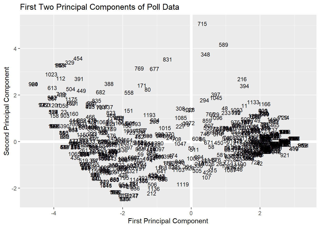 As you can see, when we plot our two-dimensional space, we able able to see that the first principal component is especially effective at distinguishing two groups of participants (presumably: people who are concerned about COVID and want public health policies vs. people who approve highly of Trump or identify as Republicans). But this figure is somewhat difficult to interpret. This is a big reason why folks have move onto more advanced and interpretable visualizations for showing their principal component analysis.
17.4 PCA, Intermediate
17.4.1 (1) Eigenvectors/values
Using the function prcomp(), we can also calculate the eigenvectors/eigenvalues. We will set scale == TRUE to scale the data as well.
df_pca <- prcomp(survey_complete, scale = TRUE)
df_pca
## Standard deviations (1, .., p=9):
## [1] 2.3498110 0.9695984 0.8035849 0.7307906 0.6369517 0.6145486 0.5560041
## [8] 0.4521863 0.2479381
##
## Rotation (n x k) = (9 x 9):
## PC1 PC2 PC3 PC4 PC5
## healthcare -0.2322819 -0.6879990 -0.5025235 0.1961465 -0.42314001
## covid -0.3064725 -0.4527208 0.1477466 0.1470315 0.78353529
## aca op -0.3582808 0.1034354 0.1320531 0.1683197 0.04298236
## medicare4all op -0.3282251 0.1906726 -0.3960119 -0.2026765 0.21529899
## publicoption op -0.3030322 0.3106979 -0.5269786 -0.3858399 0.12526933
## getting_covid worry -0.2878171 -0.3058085 0.4407230 -0.7600088 -0.22194386
## trump approval 0.3843618 -0.1751561 -0.1697185 -0.2124015 0.16280239
## party affiliation 0.3711244 -0.1714224 -0.1444620 -0.2363776 0.20114047
## swing vote 0.3948270 -0.1566176 -0.1725134 -0.2074233 0.16404348
## PC6 PC7 PC8 PC9
## healthcare 0.02581401 -0.04032234 0.01825591 0.005120717
## covid 0.08894525 0.18730293 -0.02657986 0.006593680
## aca op 0.22228942 -0.87004643 -0.08011221 0.022530580
## medicare4all op -0.76785078 -0.13238145 0.06401541 0.020924031
## publicoption op 0.58179843 0.16640810 -0.05360789 -0.017668055
## getting_covid worry -0.04006322 -0.01697665 -0.01925869 0.016406055
## trump approval -0.04524986 -0.21276607 -0.56586826 -0.594675668
## party affiliation 0.10027836 -0.28090920 0.77286139 -0.171462631
## swing vote 0.01473779 -0.19138142 -0.26014993 0.78445201017.4.2 (2) scree plots
While PCE is great for some straightforward numbers, it sometimes also helps to visualize the PVE to show how meaningful each component is. We can use factoextra (which is a separate library) to plot such a visualization (this is called a scree plot).
#install.packages("factoextra")
library(factoextra) #for visualization
## Welcome! Want to learn more? See two factoextra-related books at https://goo.gl/ve3WBafviz_eig(df_pca) As we saw in the first analysis, the first component. explains a majority of the variance, and the second component explains a little more.
factoextra also has a useful function, get_eigenvalue(), for creating a dataframe of eigenvalue information.
eig.val <- get_eigenvalue(df_pca)
eig.val
## eigenvalue variance.percent cumulative.variance.percent
## Dim.1 5.52161151 61.3512390 61.35124
## Dim.2 0.94012115 10.4457905 71.79703
## Dim.3 0.64574873 7.1749859 78.97202
## Dim.4 0.53405495 5.9339439 84.90596
## Dim.5 0.40570744 4.5078605 89.41382
## Dim.6 0.37766993 4.1963325 93.61015
## Dim.7 0.30914056 3.4348952 97.04505
## Dim.8 0.20447243 2.2719159 99.31696
## Dim.9 0.06147329 0.6830366 100.0000017.4.3 (3) factoextra visualizations
We can also use factoextra to visualize the meaningfulness of our components “more elegantly.” In factoextra, there is a great visualization called fviz_pca that can help you plot the participants (similar to what we did above), the variables, or both. Since you already know how to visualize the participants, let’s focus on the variables.
fviz_pca_var(df_pca,
             col.var = "contrib", # Color by contributions to the component
             gradient.cols = c("#00AFBB", "#E7B800", "#FC4E07"),
             repel = TRUE)
We can also visualize this using
 ggfortify, which adds additional support to ggplot2 for visualizing PCA results. One advantage of this method is that you have much more control of your visualization.
#install.package()
library(ggfortify)
ggplot2::autoplot(df_pca, data = survey_complete,
shape = TRUE, #if you set this to false, it will show you the participant id's
loadings.colour = 'blue', loadings = TRUE, #style of variable arrows
loadings.label.colour = 'red', loadings.label = TRUE, loadings.label.size = 3, #style of variable names
loadings.label.repel=T) + #this is the eqivalent of repel in fviz_pca_var
theme_minimal()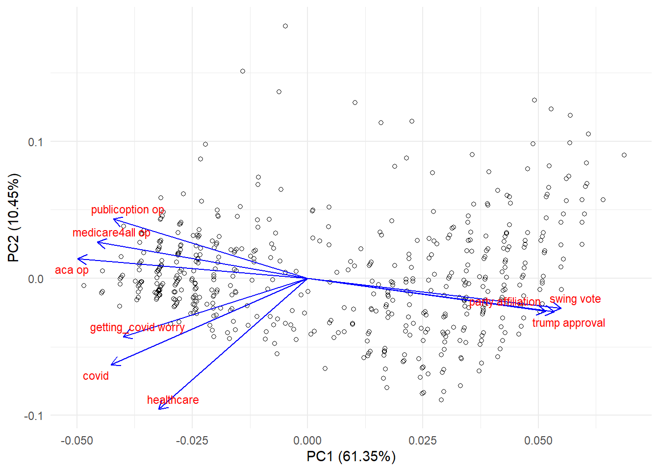 More Resources:
1. PCA tutorial which has great information about how to report on a PCA.
2. PCA tutorial using state data (this helps with the interpretation of individual data points since you’d be using state names rather than participant numbers, as we had).
3. PCA tutorial; I like the way this one is written.
4. More on prcomp()
5. If you want to use this sort of approach on categorical variable, I encourage you to look into factor analysis.
6. If you want to use this approach on mixed data (categorical or numeric), look into factor analyses of mixed data.
+ Note: sometimes, you’ll see categorical variables be called “qualitative” and numeric variables called “quantitative” in this literature.