C Reach for the Stars
Needed packages
library(dplyr)
library(ggplot2)
library(knitr)
library(dygraphs)
library(nycflights13)
C.1 Sorted barplots
Building upon the example in Section 3.8:
flights_table <- table(flights$carrier)
flights_table
   9E    AA    AS    B6    DL    EV    F9    FL    HA    MQ    OO    UA    US
18460 32729   714 54635 48110 54173   685  3260   342 26397    32 58665 20536
   VX    WN    YV
 5162 12275   601
We can sort this table from highest to lowest counts by using the sort function:
sorted_flights <- sort(flights_table, decreasing = TRUE)
names(sorted_flights)
[1] "UA" "B6" "EV" "DL" "AA" "MQ" "US" "9E" "WN" "VX" "FL" "AS" "F9" "YV" "HA"
[16] "OO"It is often preferred for barplots to be ordered corresponding to the heights of the bars. This allows the reader to more easily compare the ordering of different airlines in terms of departed flights (Robbins 2013). We can also much more easily answer questions like “How many airlines have more departing flights than Southwest Airlines?”.
We can use the sorted table giving the number of flights defined as sorted_flights to reorder the carrier.
ggplot(data = flights, mapping = aes(x = carrier)) +
  geom_bar() +
  scale_x_discrete(limits = names(sorted_flights))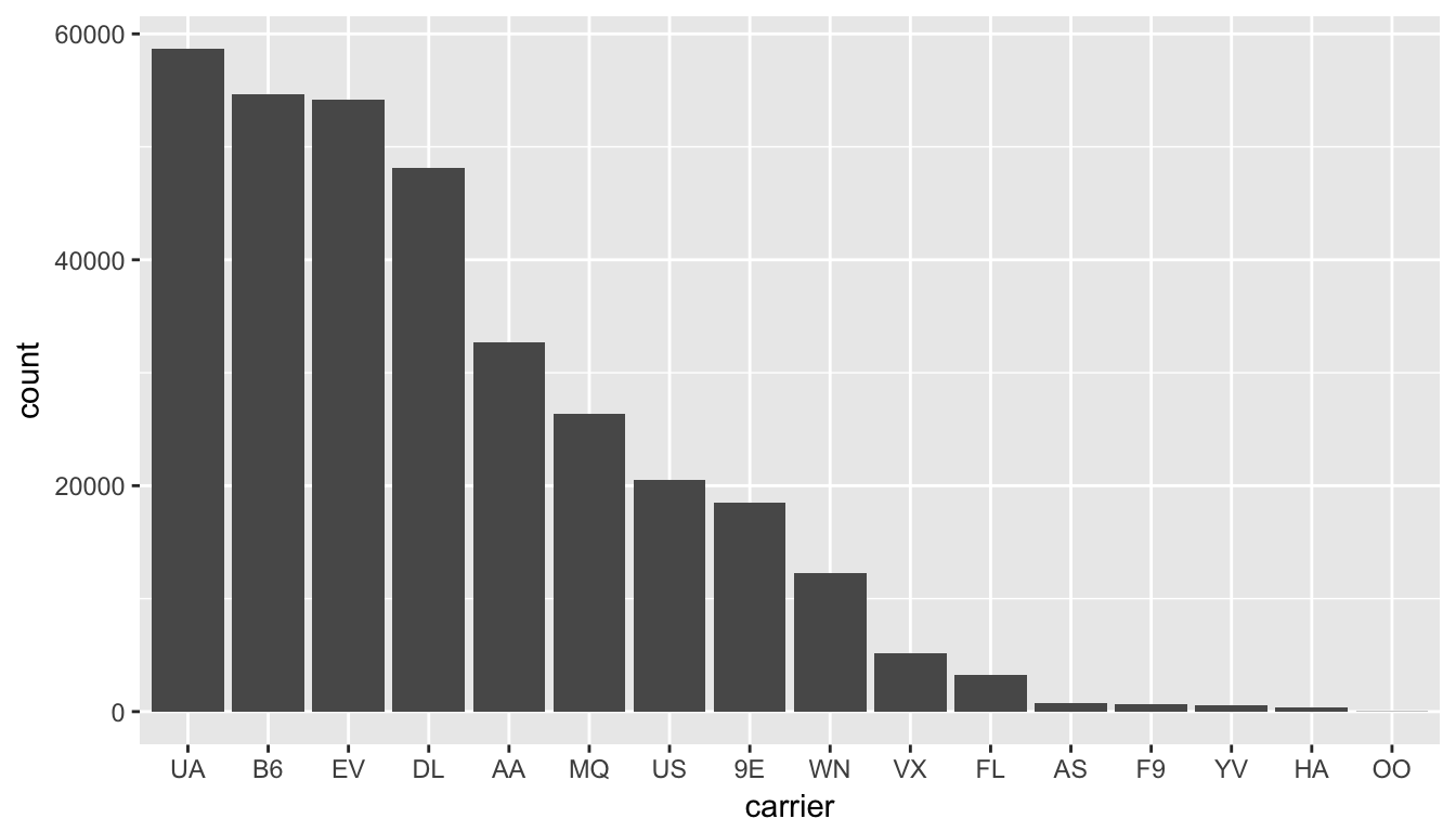
Figure C.1: Number of flights departing NYC in 2013 by airline - Descending numbers
The last addition here specifies the values of the horizontal x axis on a discrete scale to correspond to those given by the entries of sorted_flights.
C.2 Interactive graphics
C.2.1 Interactive linegraphs
Another useful tool for viewing linegraphs such as this is the dygraph function in the dygraphs package in combination with the dyRangeSelector function. This allows us to zoom in on a selected range and get an interactive plot for us to work with:
library(dygraphs)
flights_day <- mutate(flights, date = as.Date(time_hour))
flights_summarized <- flights_day %>%
  group_by(date) %>%
  summarize(median_arr_delay = median(arr_delay, na.rm = TRUE))
rownames(flights_summarized) <- flights_summarized$date
flights_summarized <- select(flights_summarized, -date)
dyRangeSelector(dygraph(flights_summarized))
The syntax here is a little different than what we have covered so far. The dygraph function is expecting for the dates to be given as the rownames of the object. We then remove the date variable from the flights_summarized data frame since it is accounted for in the rownames. Lastly, we run the dygraph function on the new data frame that only contains the median arrival delay as a column and then provide the ability to have a selector to zoom in on the interactive plot via dyRangeSelector. (Note that this plot will only be interactive in the HTML version of this book.)