6 Data Modeling using Regression via broom
Now that we are equipped with data visualization skills from Chapter 3, data wrangling skills from Chapter 5, and an understanding of the “tidy” data format from Chapter 4, we now proceed to discuss once of the most commonly used statistical procedures: regression. Much as we saw with the Grammar of Graphics in Chapter 3, the fundamental premise of (simple linear) regression is to model the relationship between
- An outcome/dependent/predicted variable \(y\)
- As a function of a covariate/independent/predictor variable \(x\)
Why do we have multiple labels for the same concept? What’s their root? Regression, in its simplest form, can be viewed in two ways:
- For Prediction: You want to predict an outcome variable \(y\) based on the information contained in a set of predictor variables. You don’t care so much about understanding how all the variables relate and interact, but so long as you can make good predictions about \(y\), you’re fine.
- For Explanation: You want to study the relationship between an outcome variable \(y\) and a set of explanatory variables, determine the significance of any found relationships, and have measures summarizing these.
In this chapter, we use the flights data frame in the nycflights13 package to look at the relationship between departure delay, arrival delay, and other variables related to flights. We will also discuss the concept of correlation and how it is frequently incorrectly implied to also lead to causation. This chapter also introduces the broom package, which is a useful tool for summarizing the results of regression fits in “tidy” format.
Needed packages
Let’s load all the packages needed for this chapter (this assumes you’ve already installed them). If needed, read Section 2.3 for information on how to install and load R packages.
library(nycflights13)
library(ggplot2)
library(dplyr)
library(broom)
library(knitr)
6.1 Data: Alaskan Airlines delays
Say you are junior airlines analyst, charged with exploring the relationship/association of departure delays and arrival delays for Alaska Airlines flights leaving New York City in 2013. You however, don’t have enough time to dig up information on all flights, and thus take a random sample of 50 flights. Is there a meaningful relationship between departure and arrival delays? Do higher departure delays lead to higher arrival delays? Most of us would assume so. Let us explore the relationship between these two variables using a scatterplot in Figure 6.1.
# The following ensures the random sample of 50 flights is the same for anyone
# using this code
set.seed(2017)

# Load Alaska data, deleting rows that have missing departure delay
# or arrival delay data
alaska_flights <- flights %>%
  filter(carrier == "AS") %>%
  filter(!is.na(dep_delay) & !is.na(arr_delay)) %>%
  # Select 50 flights that don't have missing delay data
  sample_n(50)

ggplot(data = alaska_flights, mapping = aes(x = dep_delay, y = arr_delay)) +
   geom_point()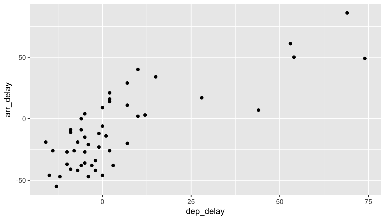
Figure 6.1: Departure and Arrival Flight Delays for a sample of 50 Alaskan flights from NYC
Note how we used the dplyr package’s sample_n() function to sample 50 points at random. A similarly useful function is sample_frac(), sampling a specified fraction of the data.
Learning check
(LC6.1) Does there appear to be a linear relationship with arrival delay and departure delay? In other words, could you fit a straight line to the data and have it explain well how arr_delay increases as dep_delay increases?
(LC6.2) Is there only one possible straight line that fits the data “well”? How could you decide on which one is best if there are multiple options?
6.2 Correlation
One way to measure the association between two numerical variables is measuring their correlation. In fact, the correlation coefficient measures the degree to which points formed by two numerical variables make a straight line and is a summary measure of the strength of their relationship.
Definition: Correlation Coefficient
The correlation coefficient measures the strength of linear association between two variables.
Properties of the Correlation Coefficient: It is always between -1 and 1, where
- -1 indicates a perfect negative relationship
- 0 indicates no relationship
- +1 indicates a perfect positive relationship
We can look at a variety of different datasets and their corresponding correlation coefficients in the following plot.
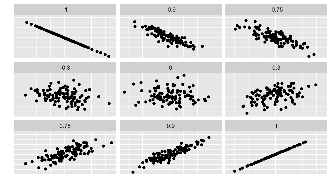
Figure 6.2: Different Correlation Coefficients
Learning check
(LC6.3) Make a guess as to the value of the correlation coefficient between arr_delay and dep_delay in the alaska_flights data frame.
(LC6.4) Do you think that the correlation coefficient between arr_delay and dep_delay is the same as the correlation coefficient between dep_delay and arr_delay? Explain.
(LC6.5) What do you think the correlation between temperatures in Fahrenheit and temperatures in Celsius is?
(LC6.6) What do you think the correlation is between the number of days that have passed in a calendar year and the number of days left in a calendar year? For example, on January 3, 2017, two days have passed while 362 days remain.
We can calculate the correlation coefficient for our example of flight delays via the cor() function in R
alaska_flights %>%
  summarize(correl = cor(dep_delay, arr_delay))
# A tibble: 1 x 1
correl
<dbl>
1 0.7908The sample correlation coefficient is denoted by \(r\). In this case, \(r = 0.7908\).
Learning check
(LC6.7) Would you quantify the value of correl calculated above as being
- strongly positively linear,
- weakly positively linear,
- not linear,
- weakly negatively linear, or
- strongly positively linear?
Discuss your choice and what it means about the relationship between dep_delay and arr_delay.
If you’d like a little more practice in determining the linear relationship between two variables by quantifying a correlation coefficient, you should check out the Guess the Correlation game online.
6.2.1 Correlation does not imply causation
Just because arrival delays are related to departure delays in a somewhat linear fashion, we can’t say with certainty that arrival delays are caused entirely by departure delays. Certainly it appears that as one increases, the other tends to increase as well, but that might not always be the case. We can only say that there is an association between them.
Causation is a tricky problem and frequently takes either carefully designed experiments or methods to control for the effects of potential confounding variables. Both these approaches attempt either to remove all confounding variables or take them into account as best they can, and only focus on the behavior of a outcome variable in the presence of the levels of the other variable(s).
Be careful as you read studies to make sure that the writers aren’t falling into this fallacy of correlation implying causation. If you spot one, you may want to send them a link to Spurious Correlations.
Learning check
(LC6.8) What are some other confounding variables besides departure delay that we could attribute to an increase in arrival delays? Remember that a variable is something that has to vary!
6.3 Simple linear regression
As suggested both visually and by their correlation coefficient of \(r = 0.7908\), there appears to be a strong positive linear association between these delay variables where
- The dependent/outcome variable \(y\) is
arr_delay - The independent/explanatory variable \(x\) is
dep_delay
What would be the “best fitting line”?. One example of a line that fits the data well can be computed by using simple linear regression. In Figure 6.3 we add the simple linear regression line by adding a geom_smooth() layer to our plot where lm is short for “linear model.”
ggplot(data = alaska_flights, mapping = aes(x = dep_delay, y = arr_delay)) +
  geom_point() +
  geom_smooth(method = "lm", se = FALSE, color = "red")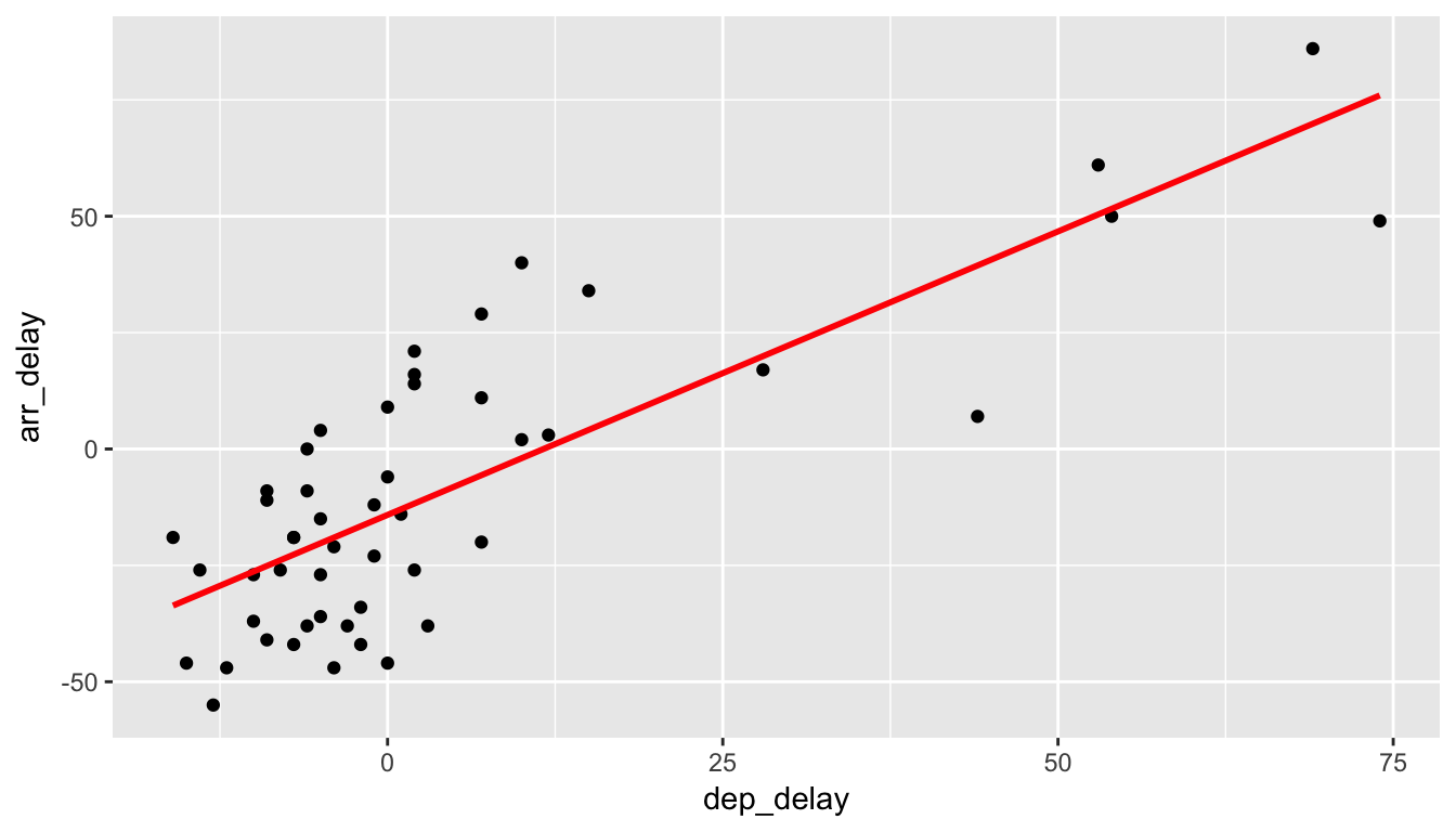
Figure 6.3: Regression line fit on delays
6.3.1 Best fitting line
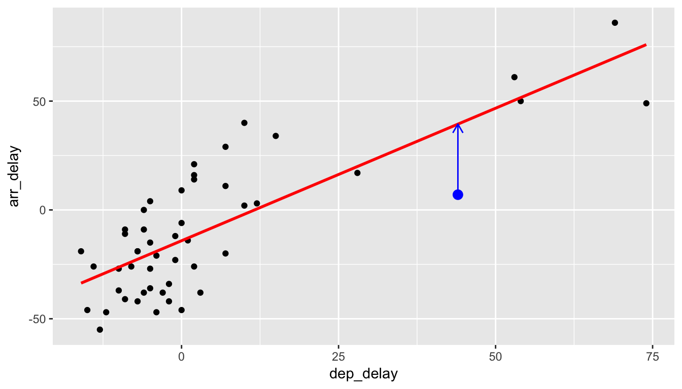
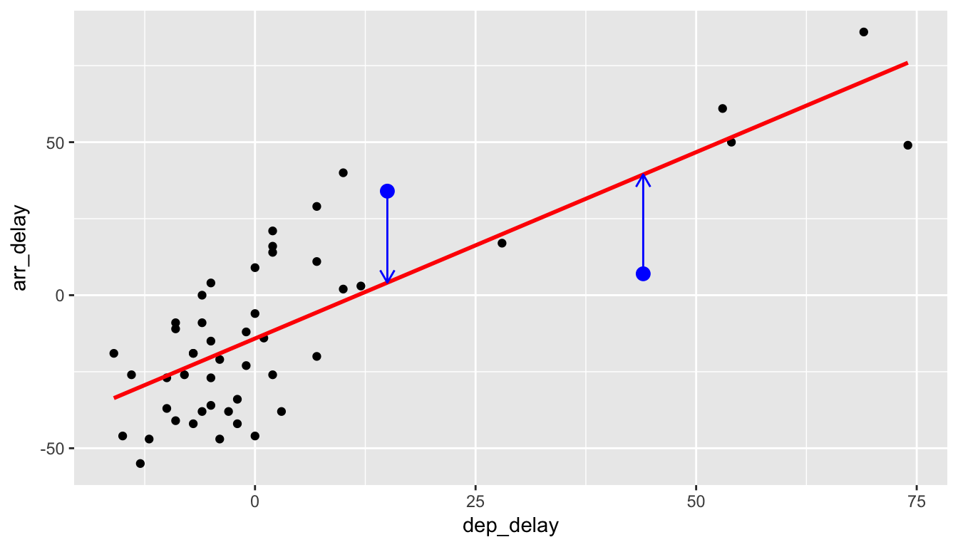
We now unpack one possible criterion for a line to be a “best fitting line” to a set of points. Let’s choose an arbitrary point on the graph and label it the color blue:
Now consider this point’s deviation from the regression line.
Do this for another point.
And for another point.
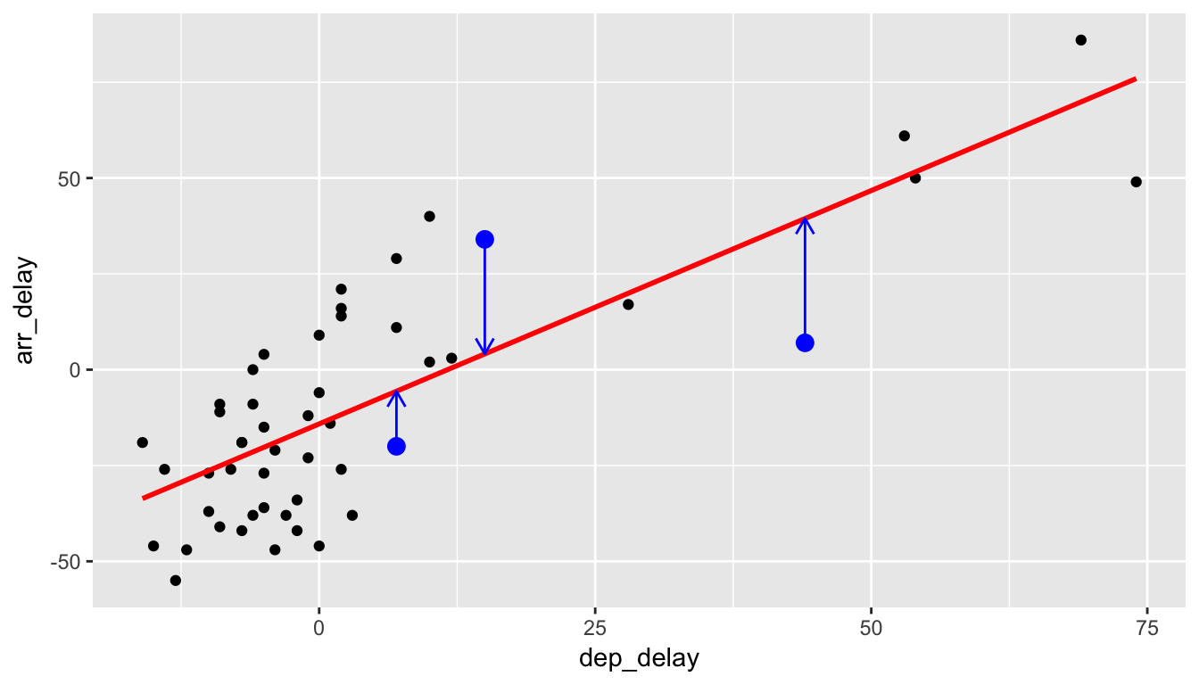
We repeat this process for each of the 50 points in our sample. The pattern that emerges here is that the least squares line minimizes the sum of the squared arrow lengths (i.e., the least squares) for all of the points. We square the arrow lengths so that positive and negative deviations of the same amount are treated equally. That’s why alternative names for the simple linear regression line are the least-squares line and the best fitting line. It can be proven via calculus and linear algebra that this line uniquely minimizes the sum of the squared arrow lengths.
Definitions:
For \(i\) ranging from 1 to \(n\) (the number of observations in your dataset), we define the following:
- Observed Value \(y_i\)
- The vertical position of the black dots.
- Fitted/Predicted Value \(\widehat{y}_i\)
- The vertical position of the corresponding value on the red regression line. In other words, the blue arrow tips.
- Residual \(\widehat{\epsilon}_i = y_i - \widehat{y}_i\)
- The length of the blue arrows.
Some observations on residuals:
- As suggested by the word residual (left over), residuals represent the lack of fit of a line to a model, in other words the model’s error.
- Note the order of the subtraction. You start at the actual data point \(y_i\) (blue dot) and then subtract away the fitted value \(\widehat{y_i}\) (the tip of the blue arrow).
- If the observed value is exactly equal to the fitted value, then the residual is 0.
- Of all possible lines, the least squares line minimizes the sum of all n residuals squared.
They play an important part in regression analysis; we will revisit the topic in Subsection 8.10.2.
6.4 Equation of the line
Figure 6.3 displayed the fitted least squares line in red, which we now define as
\[\widehat{y} = b_0 + b_1 x\]
where \(b_0\) and \(b_1\) are the computed \(y\)-intercept and slope coefficients. We first use R’s lm() function to fit a linear regression model (which we save in delay_fit) and then use the tidy() function in the broom package to display the \(b_0\) and \(b_1\) coefficients and further information about them in a regression output table. Almost any statistical software package you use for regression will output results that contain the following information.
delay_fit <- lm(formula = arr_delay ~ dep_delay, data = alaska_flights)
tidy(delay_fit) %>%
kable()| term | estimate | std.error | statistic | p.value |
|---|---|---|---|---|
| (Intercept) | -14.155 | 2.809 | -5.038 | 0 |
| dep_delay | 1.218 | 0.136 | 8.951 | 0 |
We see the regression output table has two rows, one corresponding to the \(y\)-intercept and the other the slope, with the first column “estimate” corresponding to their values. Thus, our equation is \[\widehat{y} = -14.155 + 1.218 \, x.\] It is usually preferred to actually write the names of the variables instead of \(x\) and \(y\) for context, so the line could also be written as \[\widehat{arr\_delay} = -14.155 + 1.218 \, dep\_delay.\]
For the remainder of this section, we answer the following questions:
- How do we interpret these coefficients? Subsection 6.4.1
- How can I use the regression model to make predictions of arrival delay if I know the departure delay? Subsection 6.4.2
6.4.1 Coefficient interpretation
After you have determined your line of best fit, it is good practice to interpret the results to see if they make sense. The intercept \(b_0=-14.155\) can be interpreted as the average associated arrival delay when a plane has a 0 minute departure delay. In other words, flights that depart on time arrive on average -14.155 early (a negative delay). One explanation for this is that Alaska Airlines is overestimating their flying times, and hence flights tend to arrive early. In this case, the intercept had a direct interpretation since there are observations with \(x=0\) values, in other words had 0 departure delay. However, in other contexts, the intercept may have no direct interpretation.
The slope is the more interesting of the coefficients as it summarizes the relationship between \(x\) and \(y\). Slope is defined as rise over run or the change in \(y\) for every one unit increase in \(x\). For our specific example, \(b_1=1.218\) that for every one minute increase in the departure delay of Alaskan Airlines flights from NYC, there is an associated average increase in arrival delay of 1.218 minutes. This estimate does make some practical sense. It would be strange if arrival delays went down as departure delays increased; in this case the coefficient would be negative. We also expect that the longer a flight is delayed on departure, the more likely the longer a flight is delayed on arrival.
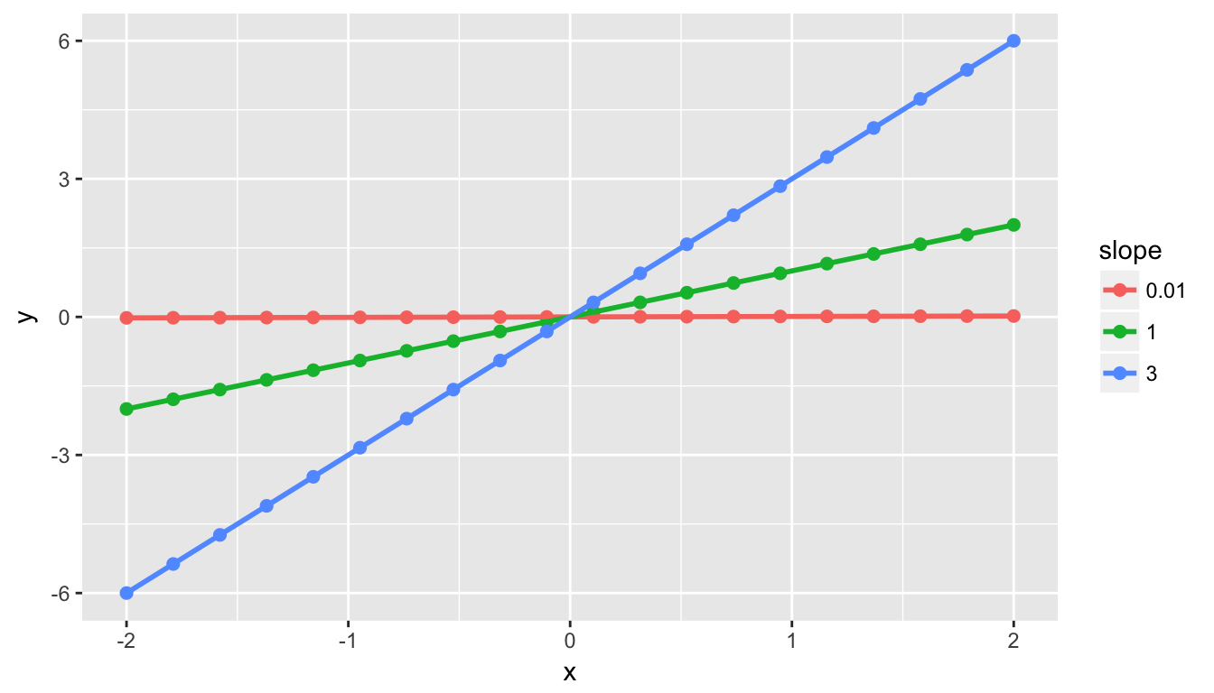
Important note: The correlation coefficient and the slope of the regression line are not the same thing, as the correlation coefficient only measures the strength of linear association. They will always share the same sign (positive correlation coefficients correspond to positive slope coefficients and the same holds true for negative values), but otherwise they are not equal. For example, say we have 3 sets of points (red, green, blue) and their corresponding regression lines. Their regression lines all have different slopes, but the correlation coefficient is \(r = 1\) for all three. In other words, all three groups of points have a perfect (positive) linear relationship.
6.4.2 Predicting values
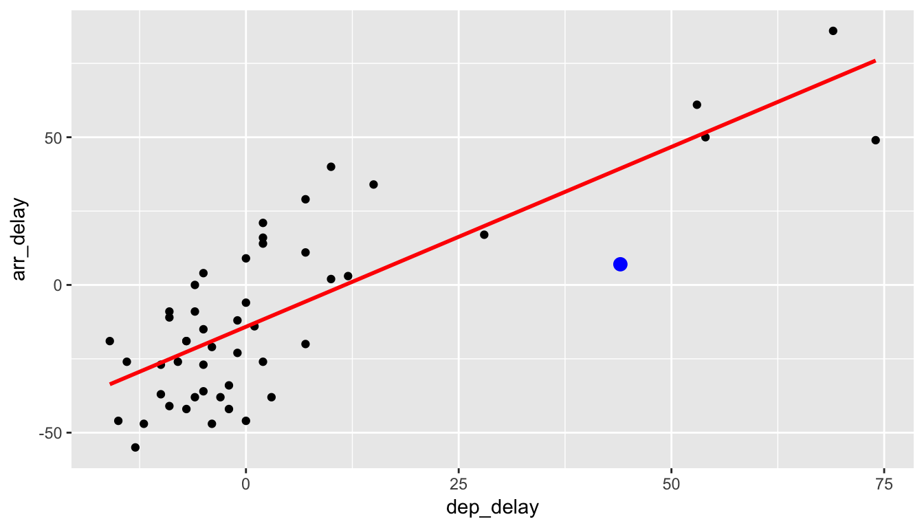
Let’s say that we are waiting for our flight to leave New York City on Alaskan Airlines and we are told that our flight is going to be delayed 25 minutes. What could we predict for our arrival delay based on the least squares line in Figure 6.1? In Figure 6.4, we denote a departure delay of \(x = 25\) minutes with a dashed black line. The predicted arrival time \(\widehat{y}\) according to this regression model is \(\widehat{y} = -14.155 + 1.218\times 25 = 16.295\), indicated with the blue dot. This value does make some sense since flights that aren’t delayed greatly from the beginning do tend to make up time in the air to compensate.
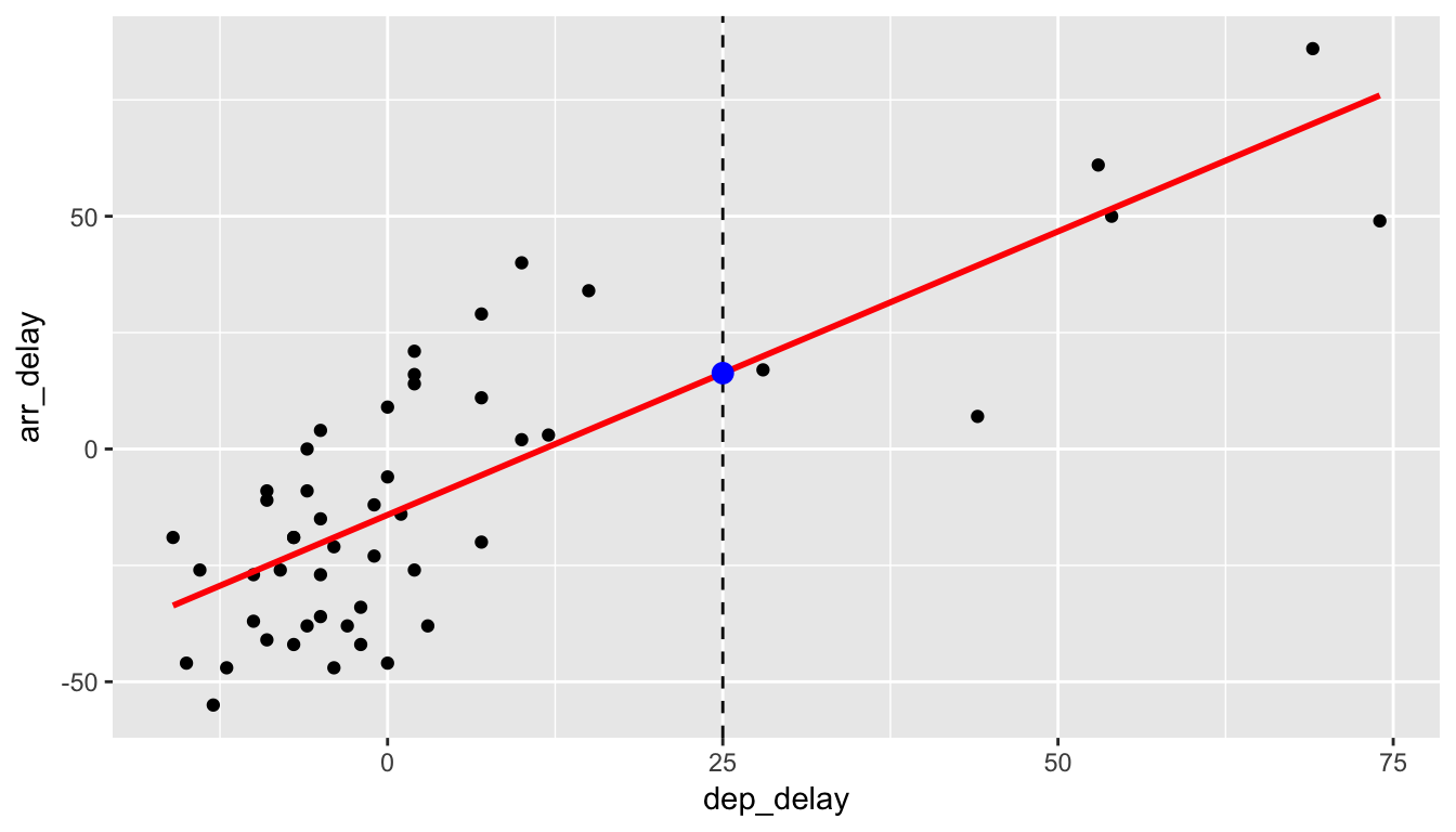
Figure 6.4: Predicting Arrival Delay when Departure Delay is 25m
Instead of manually calculating the fitted value \(\widehat{y}\) for a given \(x\) value, we can use the augment() function in the broom package to automate this. For example, we automate this procedure for departure delays of 25, 30, and 15 minutes. The three fitted \(\widehat{y}\) are in the .fitted column while .se.fit is a measure of the uncertainty associated with the prediction (more on this topic when we study confidence intervals in Chapter ??).
new_alaskan_flight <- data_frame(dep_delay = c(25, 30, 15))
delay_fit %>%
  augment(newdata = new_alaskan_flight) %>%
kable()| dep_delay | .fitted | .se.fit |
|---|---|---|
| 25 | 16.29 | 3.967 |
| 30 | 22.38 | 4.482 |
| 15 | 4.11 | 3.135 |
6.5 Conclusion
6.5.1 What’s to come?
This concludes the Data Exploration via the tidyverse unit of this book. You should start feeling more and more confident about both plotting variables (or multiple variables together) in various datasets and wrangling data as we’ve done in this chapter. You’ve also been introduced to the concept of modeling with data using the powerful tool of regression. You are encouraged to step back through the code in earlier chapters and make changes as you see fit based on your updated knowledge.
In Chapter 7, we’ll begin to build the pieces needed to understand how this unit of Data Exploration can tie into statistical inference in the Inference part of the book. Remember that the focus throughout is on data visualization and we’ll see that next when we discuss sampling, resampling, and bootstrapping. These ideas will lead us into hypothesis testing and confidence intervals.
6.5.2 Script of R code
An R script file of all R code used in this chapter is available here.