Chapter 3 The tidyverse (LPA, DDM)
This section provides an overview of the tidyverse, a collection of packages for manipulating and exploring data that are primarily used in the Leading with People Analytics course.
To load all packages within the tidyverse, we can load the full tidyverse package:
Alternatively, we can inividually load the tidyverse packages that we need; here we will primarily use dplyr for wrangling the data and ggplot2 for visualizing the data, so we could load these packages inidivually:
Examples in this section will be shown with the employee data introduced in the previous section, which contains information about employees at a software company. The first few rows of this data set are shown below.
##     ID                Name Gender Age Rating      Degree Start_Date Retired
## 1 6881  al-Rahimi, Tayyiba Female  51     10 High School  2/23/1990   FALSE
## 2 2671       Lewis, Austin   Male  34      4        Ph.D  2/23/2007   FALSE
## 3 8925   el-Jaffer, Manaal Female  50     10    Master's  2/23/1991   FALSE
## 4 2769       Soto, Michael   Male  52     10 High School  2/23/1987   FALSE
## 5 2658 al-Ebrahimi, Mamoon   Male  55      8        Ph.D  2/23/1985   FALSE
## 6 1933      Medina, Brandy Female  62      7 Associate's  2/23/1979    TRUE
##      Division  Salary
## 1  Operations $108804
## 2 Engineering $182343
## 3 Engineering $206770
## 4       Sales $183407
## 5   Corporate $236240
## 6       Sales    <NA>
3.1 Wrangling Data with dplyr
3.1.1 Manipulating data
The tidyverse offers many different useful functions for manipulating data:
arrange()- sorting datafilter()- filtering data based on specified conditionsselect()- selecting specific variablesmutate()- creating new varialbes
These functions can be applied individually to our data set. For example, the code below uses the arrange() function to sort the employee data by age:
##     ID                  Name Gender Age Rating      Degree Start_Date Retired
## 1 7068          Dimas, Roman   Male  25      8 High School  2/23/2017   FALSE
## 2 5464      al-Pirani, Rajab   Male  25      3 Associate's  2/23/2016   FALSE
## 3 7910        Hopper, Summer Female  25      7  Bachelor's  2/23/2017   FALSE
## 4 6784 al-Siddique, Zaitoona Female  25      4    Master's  2/23/2015   FALSE
## 5 3240        Steggall, Shai Female  25      7    Master's  2/23/2017   FALSE
## 6 1413          Tanner, Sean   Male  25      2 Associate's  2/23/2016   FALSE
##          Division  Salary
## 1      Operations  $84252
## 2      Operations  $37907
## 3     Engineering $100688
## 4 Human Resources $127618
## 5      Operations $117062
## 6      Operations  $61869
These functions can also be combined using an operator known as the pipe (%>%). The pipe allows the user to chain multiple operations together in a single statement. For example, imagine that we wanted to (1) filter to only those employees in the operations department; (2) select the Salary and Name columns; and (3) sort the remaining employees from highest to lowest salary. We could use the pipe to combine all of these operations as follows:
operationsSalarySorted <- data %>%
                            filter(Division == "Operations") %>%
                            select(Salary, Name) %>%
                            arrange(desc(Salary))

head(operationsSalarySorted)
## Salary Name
## 1 $99898 Phillips, Rick
## 2 $99828 Martin, Benny
## 3 $99024 Leon, Shaelynn
## 4 $98985 al-Hashmi, Mushtaaqa
## 5 $98405 Rediros, Chris
## 6 $98405 Topete, Eriberto3.1.2 Fixing variable types
If we view the structure of our data set, we can see that several variables are stored incorrectly. The Gender and Division variables should be stored as factors, Start_Date should be stored as a date, and Salary should be stored as an integer.
## 'data.frame':    1000 obs. of  10 variables:
##  $ ID        : int  6881 2671 8925 2769 2658 1933 3570 7821 3256 6222 ...
##  $ Name      : chr  "al-Rahimi, Tayyiba" "Lewis, Austin" "el-Jaffer, Manaal" "Soto, Michael" ...
##  $ Gender    : chr  "Female" "Male" "Female" "Male" ...
##  $ Age       : int  51 34 50 52 55 62 47 43 27 30 ...
##  $ Rating    : int  10 4 10 10 8 7 8 8 7 6 ...
##  $ Degree    : chr  "High School" "Ph.D" "Master's" "High School" ...
##  $ Start_Date: chr  "2/23/1990" "2/23/2007" "2/23/1991" "2/23/1987" ...
##  $ Retired   : logi  FALSE FALSE FALSE FALSE FALSE TRUE ...
##  $ Division  : chr  "Operations" "Engineering" "Engineering" "Sales" ...
##  $ Salary    : chr  "$108804" "$182343" "$206770" "$183407" ...
We can fix these with the parse_factor(), parse_date(), and parse_number() functions from the tidyverse. For example, we can use parse_number() to fix the Salary variable:
## 'data.frame':    1000 obs. of  10 variables:
##  $ ID        : int  6881 2671 8925 2769 2658 1933 3570 7821 3256 6222 ...
##  $ Name      : chr  "al-Rahimi, Tayyiba" "Lewis, Austin" "el-Jaffer, Manaal" "Soto, Michael" ...
##  $ Gender    : chr  "Female" "Male" "Female" "Male" ...
##  $ Age       : int  51 34 50 52 55 62 47 43 27 30 ...
##  $ Rating    : int  10 4 10 10 8 7 8 8 7 6 ...
##  $ Degree    : chr  "High School" "Ph.D" "Master's" "High School" ...
##  $ Start_Date: chr  "2/23/1990" "2/23/2007" "2/23/1991" "2/23/1987" ...
##  $ Retired   : logi  FALSE FALSE FALSE FALSE FALSE TRUE ...
##  $ Division  : chr  "Operations" "Engineering" "Engineering" "Sales" ...
##  $ Salary    : num  108804 182343 206770 183407 236240 ...
We could apply the same procedure to the Gender and Division variables using the parse_factor() function. Alternatively, we could use the code below to convert all the character variables in our data set to factors at once. However, we probably would not want to do this with our current data set, because we do not want the Name variable to be converted to a factor.
3.1.3 Summarizing data
The summarise() function from the tidyverse can be used to quickly summarize the variables of a data set. Within summarise(), we specify whichever summary statistics we would like to calculate. For example, imagine we wanted to calculate all of the following from our data:
- The average salary at the company
- The standard deviation of salary
- The minimum age of the employees
- The maximum age of the employees
We could calculate all of these summary statistics with one call to summarise():
data %>% summarise(meanSalary = mean(Salary, na.rm=TRUE),
                    sdSalary = sd(Salary, na.rm=TRUE),
                    minAge = min(Age),
                    maxAge = max(Age))
## meanSalary sdSalary minAge maxAge
## 1 156486 39479.84 25 65The summarise() function becomes even more powerful when we combine it with group_by(), which allows one to calculate summary statistics within defined groups. For example, imagine we wanted to calculate the above summary statistics broken up by department and gender. We could do this with the following code:
data %>%
      group_by(Division, Gender) %>%
      summarise(meanSalary = mean(Salary, na.rm=TRUE),
                  sdSalary = sd(Salary, na.rm=TRUE),
                  minAge = min(Age),
                  maxAge = max(Age))
## `summarise()` has grouped output by 'Division'. You can override using the `.groups` argument.## # A tibble: 12 x 6
## # Groups: Division [6]
## Division Gender meanSalary sdSalary minAge maxAge
## <chr> <chr> <dbl> <dbl> <int> <int>
## 1 Accounting Female 166890. 40432. 31 65
## 2 Accounting Male 178310. 27365. 28 65
## 3 Corporate Female 171836. 30429. 27 65
## 4 Corporate Male 187075. 33075. 25 65
## 5 Engineering Female 176150. 33988. 25 64
## 6 Engineering Male 184677. 30324. 27 65
## 7 Human Resources Female 150481. 34752. 25 65
## 8 Human Resources Male 163937. 33381. 26 64
## 9 Operations Female 124099. 30146. 25 65
## 10 Operations Male 127963. 35057. 25 65
## 11 Sales Female 147558. 31588. 25 65
## 12 Sales Male 160471. 33151. 26 643.2 Visualizing Data with ggplot2
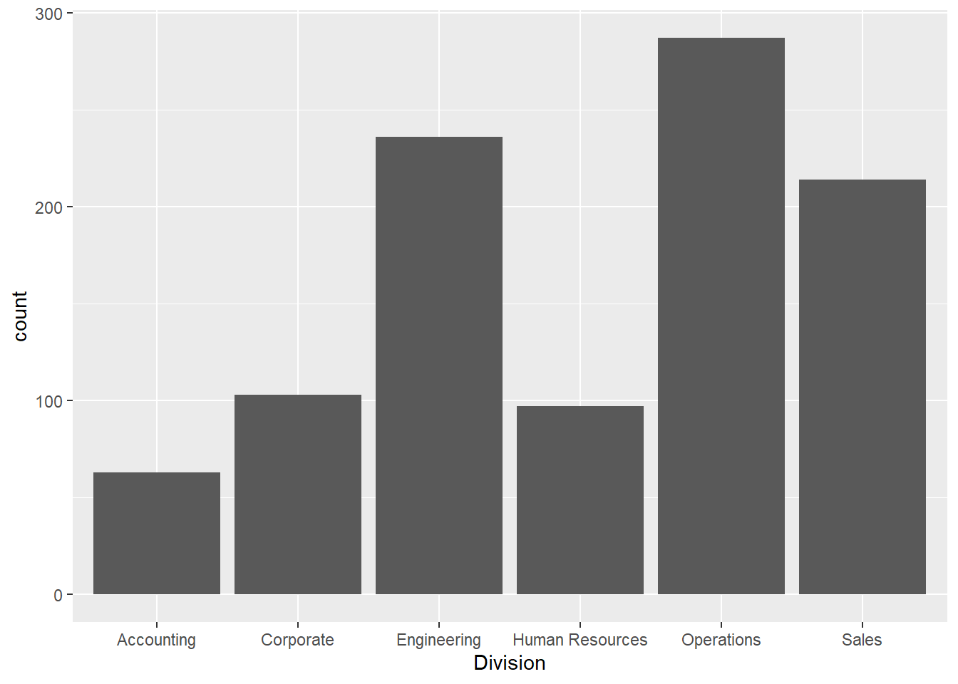
The tidyverse comes with a popular ecosystem for visualizing data known as ggplot. In general, visualizations made with ggplot begin with the ggplot() function, which is used to specify the variables we want to visualize. Then, additional parameters for the plot are specified using the + operator (see the examples below).
3.2.1 Quantitative variables
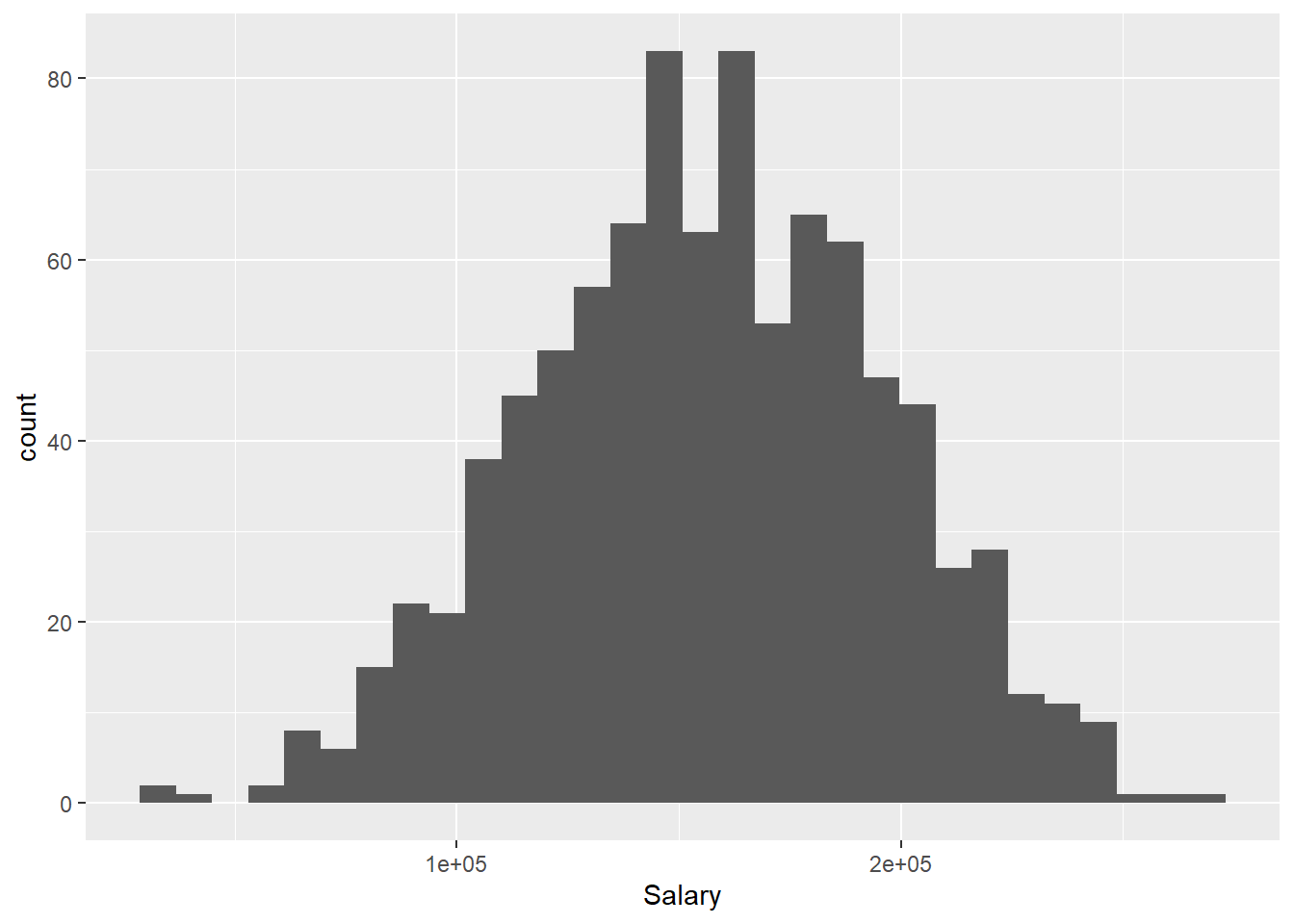
3.2.1.1 Histogram
First let’s create a histogram of a single quantitative variable, Salary. Within ggplot() the first argument we specify is the name of the data frame (data). The second argument is used to set the “aesthetic mappings” of the plot using the aes() function; this essentially describes how the variables in the data set should be mapped onto different properties of the plot. Here we are only working with a single variable (Salary), so within aes() we simply specify x = Salary. We will see more complicated calls to aes() in later examples.
To create a histogram, we combine our call to ggplot() with + geom_histogram():
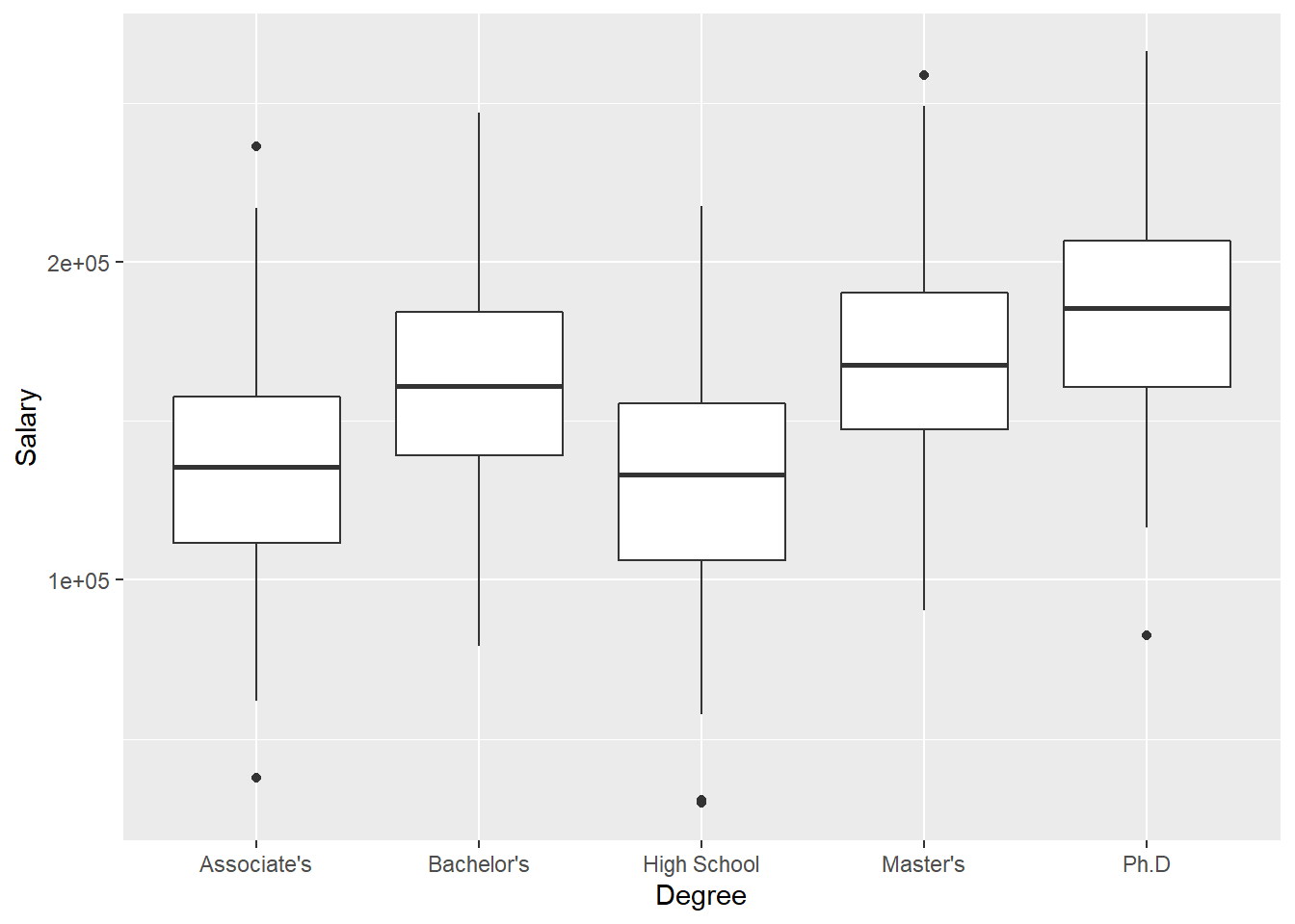
3.2.1.3 Side-by-side boxplot
Now imagine we wanted to compare the distribution of a quantitative variable over the values of a categorical variable. For example, we may want to visualize how Salary differs by Degree. To do this, we set y = Salary and x = Degree within our call to aes(), which indicates that Salary should be treated as the y-variable and Degree should be treated as the x:
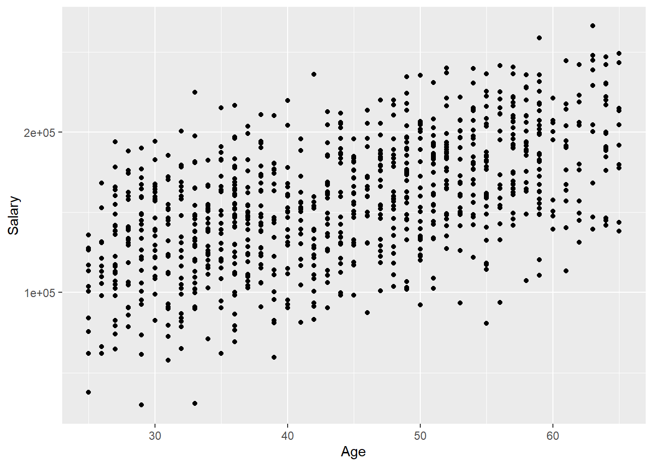
3.2.1.4 Scatter plot
Finally, imagine we wanted to create a scatter plot depicting the relationship between two quantitative variables, Salary and Age. To do this, we set y = Salary and x = Age within our call to aes(), which indicates that Age should be plotted on the x-axis and Salary should be plotted on the y-axis. To create a scatter plot, we then use geom_point():