3.4 Starting to Plot
Let’s explore further the relationship between the Gini index with TB incidence. Let’s explore this visually. Here we are going to introduce the ggplot2() package.
In R, we will often build our analyses step by step, appending small chunks of code together to complete larger tasks. It is the same concept with visualisation. Consider this like painting: we combine elements like line and shape and color together into a cohesive whole.
Let’s start with a very basic plot:
#--- Our first scatterplot
ggplot(data = sdg, aes(x = gini, y = tb)) +
  geom_point()
## Warning: Removed 103 rows containing missing values (geom_point).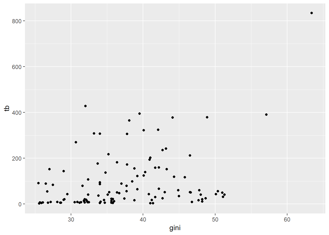
Let’s unpack the code here. The ggplot() function is the one that builds the plot. We tell it that we want to use the sdg dataset we loaded in. We also need to tell ggplot how to map the various attributes of the plot to attributes of the data. We do that mapping with the aes() command, standing for aesthetics. We tell ggplot() that on our x axis we want the Gini coefficient and on the Y axis we want TB incidence. Note the handy warning that we’ve got missing data that hasn’t been plotted!
Now we have to tell ggplot what type of graph we want – we do this with geom_point(), which tells ggplot to produce a scatterplot.