4.7 Integrating Summarising and Visualising
We can use the data we have summarised directly in a call to ggplot() to graph our newly summarised data. We are going to construct a concentration curve using some summarised data.
Each of the steps is outlined as followed:
- We select only the columns we need: GDP and TB (and country for info)
- We drop any variables that are missing either of these values
- We use mutate to generate a new variable representing the cumulative amount of GDP, that is, if we lined all the countries up from lowest GDP to highest GDP, this tells us what proportion of GDP we have accounted for as we move along.
- We use mutate to generate a new variable representing the cumulative amount of TB incidence.
- We plot that data, with cumulative GDP on the x axis and cumulative TB on the y axis.
- We add points to each country.
- We connect those points with a line.
- We add a diagonal line down the middle.
- We add a vertical line crossing the x axis at the value .10
- We add labels
- We remove the grey background.
#--- Plot a concentration curve
sdg %>% select(country, gdp, tb) %>%
  drop_na() %>%
  mutate(cumul.gdp = cumsum(gdp)/sum(gdp)) %>%
  mutate(cumul.tb = cumsum(tb)/sum(tb)) %>%
  ggplot(aes(x = cumul.gdp, y = cumul.tb)) +
  geom_point(color = "red") +
  geom_line() +
  geom_abline(color = "forestgreen") +
  geom_vline(xintercept = .10, color = "blue") +
  labs(title = "Concentration Curve: TB vs GDP",
       x = "Cumulative % of GDP",
       y = "Cumulative % of TB") +
  theme_bw()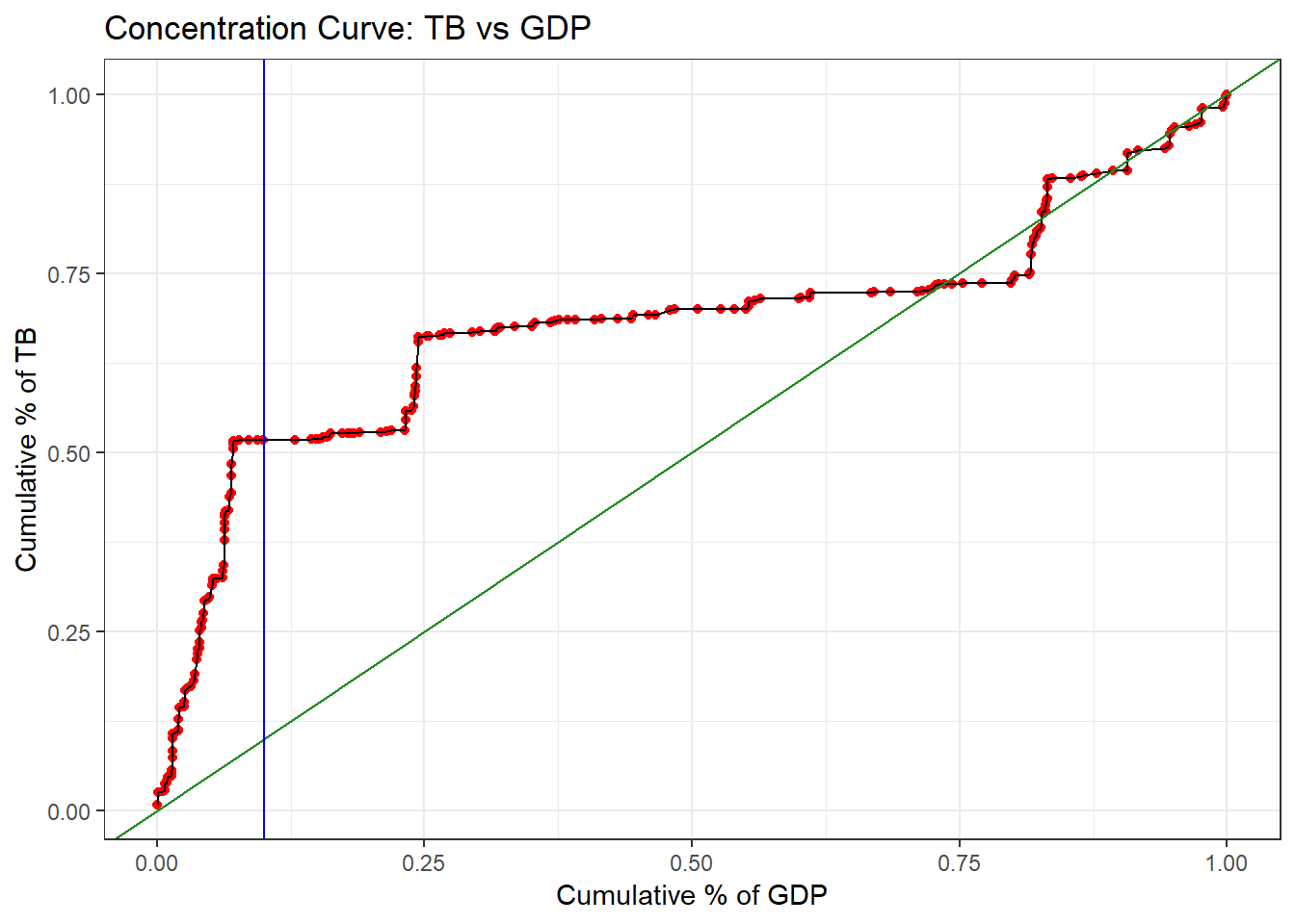
Voila - a beautiful plot! It is clear that countries that make up a small cumulative percentage of GDP account for a large cumulative percentage of TB cases. We can clearly see from our vertial line that the countries making up the lowest 10% of GDP account for about 50% of all total TB cases.