3.5 A bit more detail…
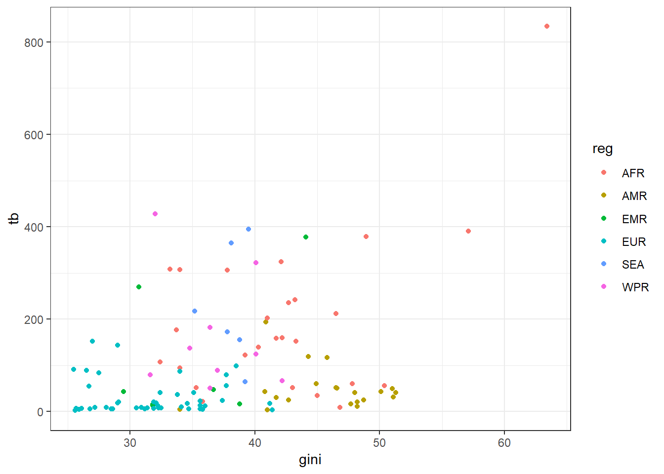
We might want to make our graph a bit prettier and convey some more information, so we add a new mapping: we tell ggplot to color the points by the WHO region of interest. To make our points clear, we change the ‘theme’ of our plot using theme_bw() – there are several default plot themes inbuilt into R.
#--- Colour the points and remove the background grey
ggplot(data = sdg, aes(x = gini, y = tb, color = reg)) +
  geom_point() +
  theme_bw()
## Warning: Removed 103 rows containing missing values (geom_point).