3.6 …Much more detail
What if we wanted to convey even more information from this plot? Let’s add the population of each country as a size element. We’ll also give our plot a title and change the labels.
#--- Add titles and add size aesthetic
ggplot(data = sdg, aes(x = gini, y = tb, color = reg, size = pop)) +
  geom_point() +
  theme_bw() +
  labs(title = "Income Inequality vs TB Incidence",
       x = "Gini Coefficient",
       y = "TB Incidence (cases per 100,000)",
       color = "WHO Region",
       size = "Population")
## Warning: Removed 103 rows containing missing values (geom_point).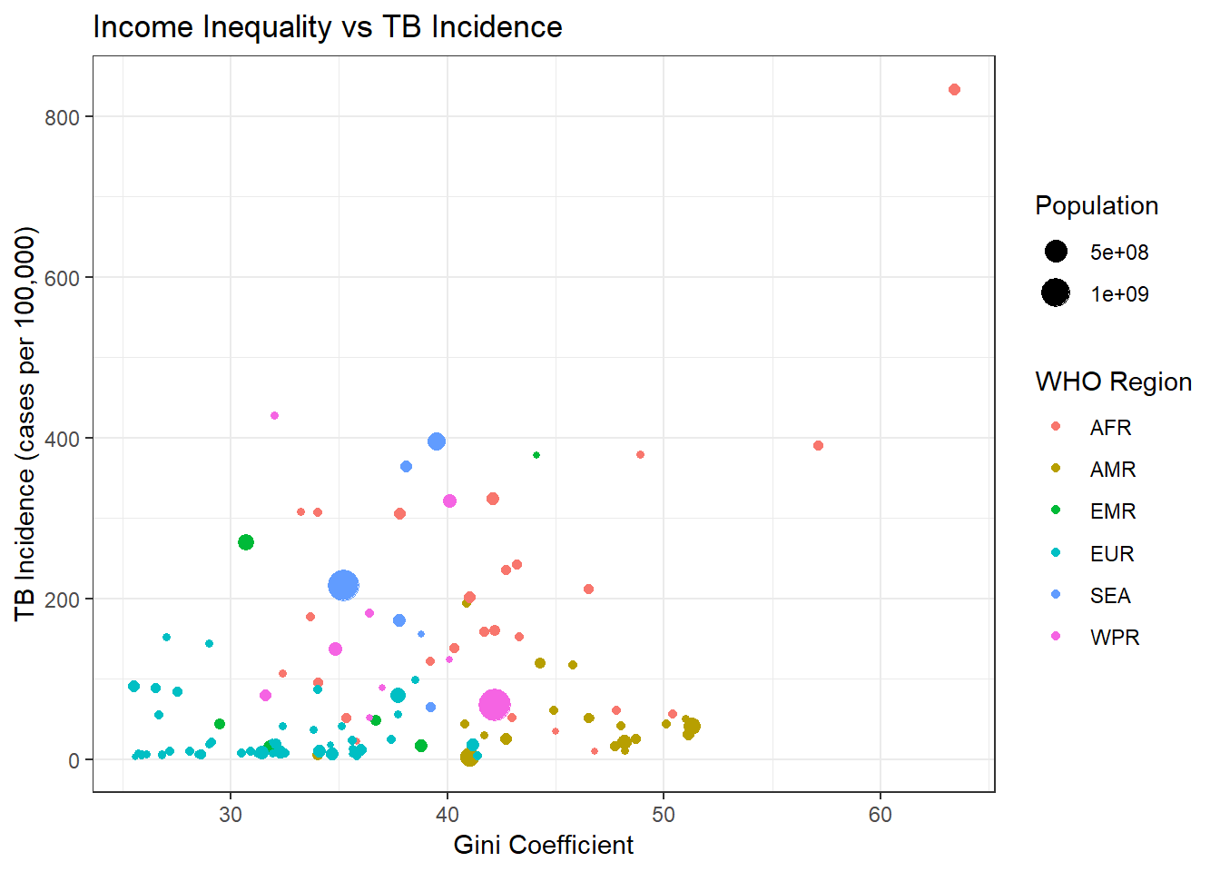
EXERCISE: Create a similar plot to the above, but looking at the relationship between TB and the proportion who live in slums. Give the variable coding categorised GDP (low/medium/high income countries) as the color and the TB case detection rate as the size
EXERCISE: Modify the same plot to show categorised GDP with a shape parameter instead of a color parameter. Label the plot.
CHALLENGE EXERCISE: Add a smoothed line to the plot to display the relationship between TB and the proportion who live in slums.
CHALLENGE EXERCISE: Use geom_label and ggrepel to produce a similar plot that uses the country names instead of the points.