12 Comparing groups
Social Sciences is about the study of human beings and their interactions. As such, we frequently want to compare two or more groups of human beings, organisations, teams, countries, etc., with each other to see whether they are similar or different from each other. Sometimes we also want to track individuals over time and see how they may have changed in some way or other. In short, comparing groups is an essential technique to make inferences and helps us better understand the diversity surrounding us.
If we want to perform a group comparison, we have to consider which technique is most appropriate for our data. For example, some of it might be related to the type of data we have collected, and other aspects might be linked to the distribution of the data. More specifically, before we apply any statistical technique, we have to consider at least the following:
missing data (see Chapter 7.7),
outliers (see Chapter 9.5), and
the assumptions made by analytical techniques about our data.
While we covered missing data and outliers in previous chapters, we have yet to discuss assumptions. For group comparisons, there are three main questions we need to answer:
Are the groups big enough to be compared, i.e. are they comparable?
Is my data parametric or non-parametric? (see Chapter 9)
How many groups do I wish to compare?
Are these groups paired or unpaired?
In the following, we will look at group comparisons for parametric and non-parametric data in each category and use the wvs_nona dataset, i.e. the wvs data frame after we performed imputation (see also Chapter 7.7.3). Since we already covered how to test whether data is parametric or non-parametric, we will forgo this step out of pure convenience and remain succinct. We also ignore any potential outliers. The case studies at the end of the book provide complete examples of performing group comparisons with a new set of data from start to finish (see Chapter ??). Thus, parametric and non-parametric tests will be demonstrated with the same dataset and the same variables.
12.1 Comparability: Apples vs Oranges
Before we can jump into group comparisons, we need to make ourselves aware of whether our groups can be compared in the first place. ‘Comparability’ should not be confused with ‘are the groups equal’. In many cases, we don’t want groups to be equal in terms of participants, e.g. between-subject studies. On the other hand, we might wish for groups to be perfectly equal when we perform within-subject studies. Thus, asking whether groups are comparable is unrelated to whether the subjects in our study are the same. Instead, we are looking at the characteristics of our groups. Some commonly considered features include:
Size: Are the groups about equally large?
Time: Was the data collected around the same time?
Exogenous variables: Is the distribution of characteristics we are not interested in approximately the same across groups?
When we compare groups, we want to minimise the systematic differences that are not the primary focus of our study. Using the right sampling technique can help with this matter. For example, using a random sample and performing a random allocation to groups can help achieve comparable groups and remove systematic differences in a way no other sampling strategy can. However, there is still no guarantee that they will be comparable Berger (2006). Besides, we also face the challenge that in Social Sciences, we do not always have the option of random sampling. For example, International Business studies heavily rely on lists provided by others (e.g. the European Union, Fortune 500, etc.), personal judgement and convenience sampling. Only a small proportion perform probability sampling (Yang et al., 2006). In short, there is no reason to worry if your sampling technique is not random. However, it emphasises the need to understand your sample and your groups thoroughly. To inspect characteristics of groups we wish to compare, we can use descriptive statistics as we covered them in Chapter 8. However, this time, we apply these techniques to subsets of our data and not the entire dataset.
For example, we might wish to compare female and male Egyptians (see Chapter 12.2.1). If we wanted to make sure these two groups can be compared, we might have to check (among other characteristics) whether their age is distributed similarly. We can use the functions we already know to create a plot to investigate this matter and apply the function facet_wrap() at the end.
# Only select participants from 'Egypt'
comp <-
  wvs_nona %>%
  filter(country == "Egypt")

# Plot distribution using facet_wrap()
comp %>%
  ggplot(aes(x = age)) +
  geom_density() +
  facet_wrap(~ gender)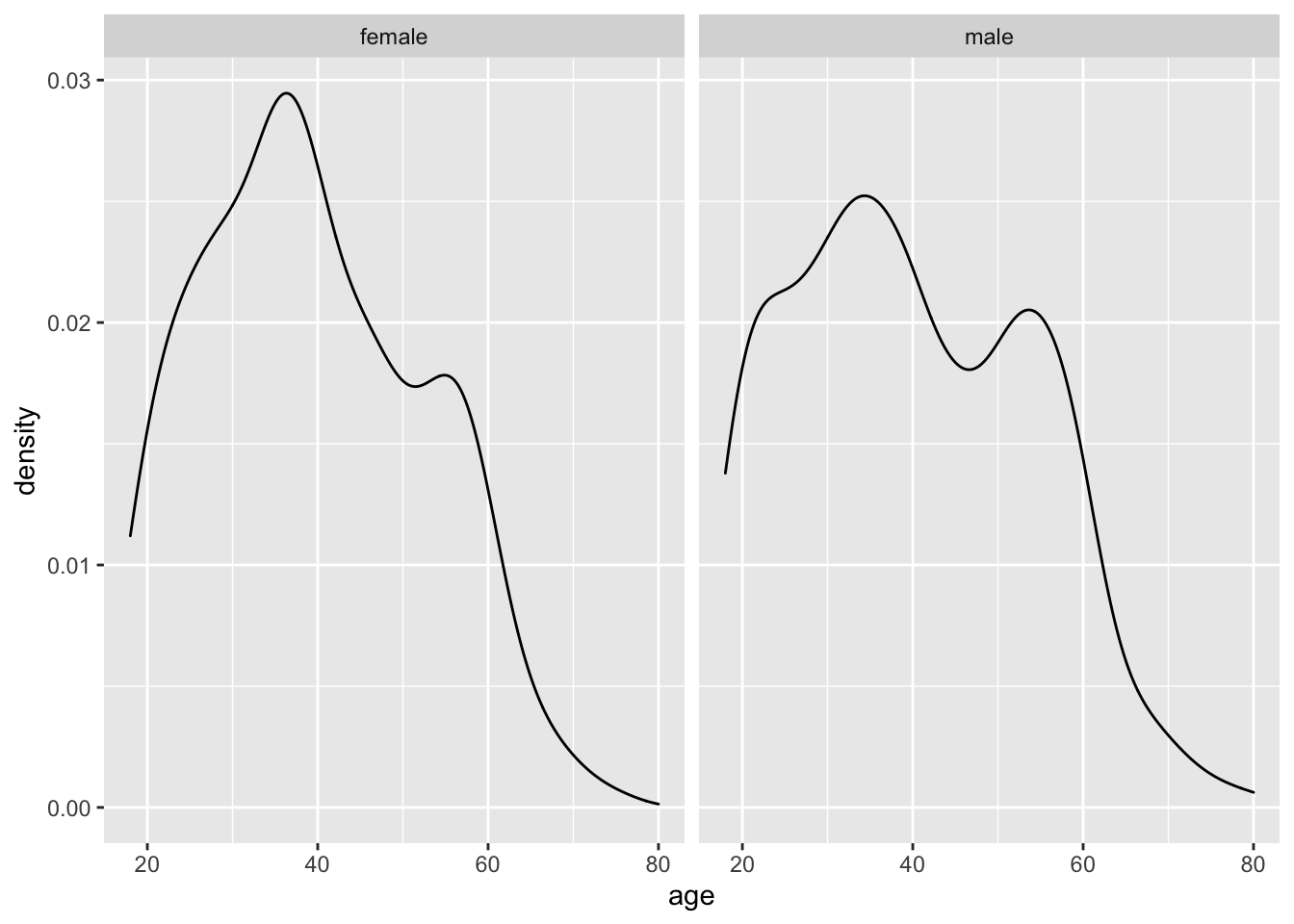
The function facet_wrap(~ gender) allows us to create two plots based on a grouping variable, i.e. gender. We have to use a tilde (~) to indicate the group. This character is related to writing formulas in R, which we will cover in more detail in the following chapters. Being able to place plots next to each other can be very beneficial for comparison. This way, inspecting the normality across multiple groups can be done within seconds. On the other hand, creating separate plots for each group can take a long time, for example, comparing 48 countries.
Alternatively, we could also create density plots using the ggridges package, which puts all the plots onto the same x-axis, making it even easier to see the differences across groups.
# Plot distributions
comp %>%
  ggplot(aes(x = age,
             y = gender,
             fill = gender)) +
  ggridges::geom_density_ridges(bandwidth = 4)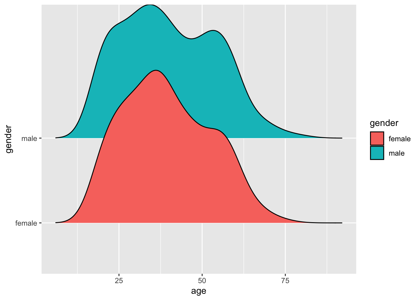
In light of both data visualisations, we can conclude that the distribution of age across both gender groups is fairly similar and likely not different between groups. Of course, we could also statistically explore this using a suitable test before performing the main group comparison. However, we first have to understand how we can perform such tests.
In the following chapters, we will primarily rely on the package rstatix, which offers a pipe-friendly approach to using the built-in functions of R to perform our group comparisons. However, you are welcome to try the basic functions, which you can find in Appendix A.
12.2 Comparing two groups
The simplest of comparisons is the one where you only have two groups. These groups could either consist of different people (unpaired) or represent two measurements of the same individuals (paired). We will cover scenarios in the following chapter because they require slightly different computational techniques.
12.2.1 Two unpaired groups
An unpaired group test assumes that the observations in each group are not related to each other, for example, observations in each group are collected from different individuals.
Our first comparison will be participants from Egypt, and we want to understand whether male and female citizens in this country perceive their freedom_of_choice differently or equally.
We first can compare these two groups using our trusty geom_boxplot() (or any variation) and use different fill colours for each group.
# Compute the mean for and size of each group
group_means <-
  comp %>%
  group_by(gender) %>%
  summarise(mean = mean(freedom_of_choice),
            n = n())

group_means
#> # A tibble: 2 × 3
#>   gender  mean     n
#>   <fct>  <dbl> <int>
#> 1 female  6.21   579
#> 2 male    6.82   621
# Create our data visualisation
comp %>%
ggplot(aes(x = gender, y = freedom_of_choice, fill = gender)) +
geom_boxplot() +
# Add the mean for each group
geom_point(data = group_means,
aes(x = gender, y = mean),
shape = 3,
size = 2)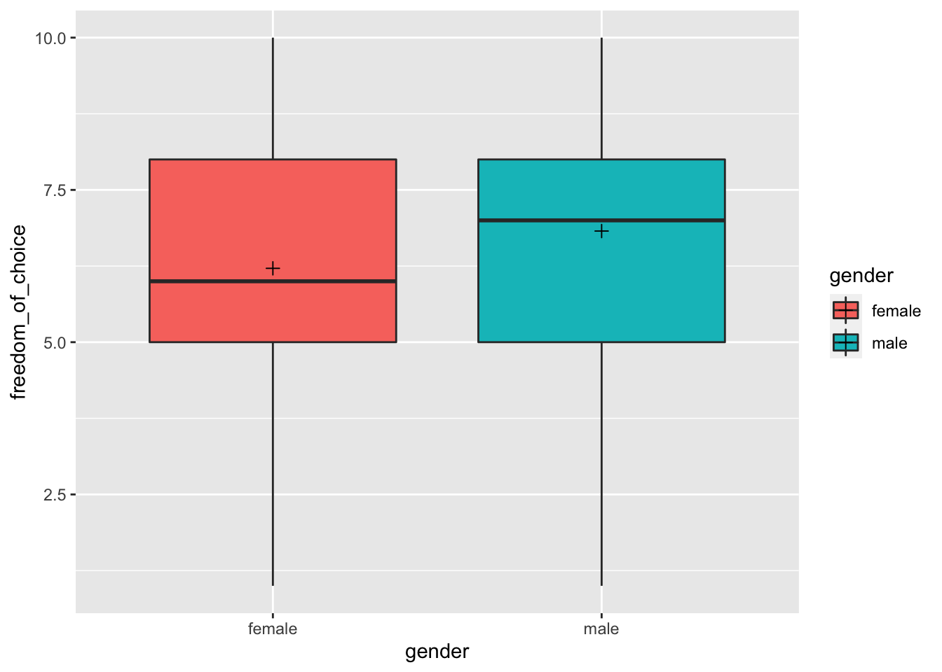
While the distribution looks similar, we notice that the median and the mean (marked by the cross inside the boxplot) are slightly higher for male participants. Thus, we can suspect some differences between these two groups, but we do not know whether these differences are significant or not. Therefore, to consider the significance (remember Chapter 10.3) and the effect size (see Table 10.2), we have to perform statistical tests.
Table 12.1 summarises the different tests and functions to perform the group comparison computationally. It is important to note that the parametric test compares the means of two groups, while the non-parametric test compares medians. All of these tests turn significant if the differences between groups are large enough. Thus, significant results can be read as ‘these groups are significantly different from each other’. Of course, if the test is not significant, the groups are considered to be not different. For parametric tests, i.e. t_test(), it is also essential to indicate whether the variances between these two groups are equal or not. Remember, the equality of variances was one of the assumptions for parametric tests. The Welch t-test can be used if the variances are not equal, but all other criteria for normality are met. By setting var.equal = TRUE, a regular T-Test would be performed. By default, t_test() assumes that variances are not equal. Make sure you test for homogeneity of variance before making your decision (see Chapter 9.4).
| Assumption | Test | Function | Effect size | Function |
|---|---|---|---|---|
| Parametric | T-Test Welch T-Test |
|
Cohen’s d | cohens_d() |
| Non-parametric | Mann-Whitney U | wilcox_test(paired = FALSE) |
Wilcoxon R | wilcoxonR() |
With this information in hand, we can start comparing the female Egyptians with the male ones using both the parametric and the non-parametric test for illustration purposes only. By setting detailed = TRUE, we can obtain the maximum amount of information for certain comparisons. In such cases, it is advisable to use glimpse(). This will make the output (a tibble) easier to read because each row presents one piece of information, rather than having one row with many columns.
# T-Test
comp %>% t_test(freedom_of_choice ~ gender,
                var.equal = TRUE,
                detailed = TRUE) %>%
  glimpse()
#> Rows: 1
#> Columns: 15
#> $ estimate    <dbl> -0.6120414
#> $ estimate1   <dbl> 6.212435
#> $ estimate2   <dbl> 6.824477
#> $ .y.         <chr> "freedom_of_choice"
#> $ group1      <chr> "female"
#> $ group2      <chr> "male"
#> $ n1          <int> 579
#> $ n2          <int> 621
#> $ statistic   <dbl> -4.75515
#> $ p           <dbl> 2.22e-06
#> $ df          <dbl> 1198
#> $ conf.low    <dbl> -0.864566
#> $ conf.high   <dbl> -0.3595169
#> $ method      <chr> "T-test"
#> $ alternative <chr> "two.sided"
# Welch t-test (var.equal = FALSE by default)
comp %>% t_test(freedom_of_choice ~ gender,
var.equal = FALSE,
detailed = TRUE) %>%
glimpse()
#> Rows: 1
#> Columns: 15
#> $ estimate <dbl> -0.6120414
#> $ estimate1 <dbl> 6.212435
#> $ estimate2 <dbl> 6.824477
#> $ .y. <chr> "freedom_of_choice"
#> $ group1 <chr> "female"
#> $ group2 <chr> "male"
#> $ n1 <int> 579
#> $ n2 <int> 621
#> $ statistic <dbl> -4.756287
#> $ p <dbl> 2.21e-06
#> $ df <dbl> 1193.222
#> $ conf.low <dbl> -0.8645067
#> $ conf.high <dbl> -0.3595762
#> $ method <chr> "T-test"
#> $ alternative <chr> "two.sided"# Mann-Withney U test
comp %>%
wilcox_test(freedom_of_choice ~ gender,
detailed = TRUE) %>%
glimpse()
#> Rows: 1
#> Columns: 12
#> $ estimate <dbl> -0.999948
#> $ .y. <chr> "freedom_of_choice"
#> $ group1 <chr> "female"
#> $ group2 <chr> "male"
#> $ n1 <int> 579
#> $ n2 <int> 621
#> $ statistic <dbl> 149937.5
#> $ p <dbl> 4.97e-07
#> $ conf.low <dbl> -0.9999694
#> $ conf.high <dbl> -5.79946e-05
#> $ method <chr> "Wilcoxon"
#> $ alternative <chr> "two.sided"You might notice that the notation within the functions for group tests looks somewhat different to what we are used to, i.e. we use the ~ (‘tilde’) symbol. This is because some functions take a formula as their attribute, and to distinguish the dependent and independent variables from each other, we use ~. A more generic notation of how formulas in functions work is shown below, where DV stands for ‘dependent variable’ and IV stands for ‘independent variable’:
function(formula = DV ~ IV)
Even for multiple groups, group comparisons usually only have one independent variable, i.e. the grouping variable. Grouping variables are generally of the type factor. In the case of two groups, we have two levels present in this factor. For example, our variable gender contains two levels: female and male. If there are multiple groups, the factor comprises various levels, e.g. the variable country includes levels of 48 countries.
No matter which test we run, it appears as if the difference is significant. However, how big/important is the difference? The effect size provides the answer to this. The interpretation of the effect size follows the explanations in Chapter 10, where we looked at the strength of the correlation of two variables. However, different analytical techniques require different effect size measures, implying that we have to use different benchmarks. To help us with the interpretation, we can use the effectsize package and their set of interpret_*() functions (see also Indices of Effect Sizes). Sometimes, there are even more than one way of computing the effect size. For example, we can choose between the classic Wilcoxon R or the rank-biserial correlation coefficient for the Mann-Whitney test. In practice, you have to be explicit about how you computed the effect size. The differences between the two measures are often marginal and a matter of taste (or should I say: Your reviewers’ taste). Throughout this chapter, I will rely on the effect sizes most commonly found in Social Sciences publications. However, feel free to explore other indices as well, especially those offered in the effectsize package.
# After parametric test
(d <-
    comp %>%
    cohens_d(freedom_of_choice ~ gender,
             var.equal = TRUE,
             ci = TRUE))
#> # A tibble: 1 × 9
#>   .y.               group1 group2 effsize    n1    n2 conf.low conf.high magnitude
#> * <chr>             <chr>  <chr>    <dbl> <int> <int>    <dbl>     <dbl> <ord>
#> 1 freedom_of_choice female male -0.275 579 621 -0.39 -0.17 small# After non-parametric test
(wr <-
comp %>%
wilcox_effsize(freedom_of_choice ~ gender,
ci = TRUE))
#> # A tibble: 1 × 9
#> .y. group1 group2 effsize n1 n2 conf.low conf.high magnitude
#> * <chr> <chr> <chr> <dbl> <int> <int> <dbl> <dbl> <ord>
#> 1 freedom_of_choice female male 0.145 579 621 0.08 0.2 small
effectsize::interpret_r(wr$effsize)
#> [1] "small"
#> (Rules: funder2019)Looking at our test results, the female Egyptians perceive freedom_of_choice differently from their male counterparts. This is in line with our boxplots. However, the effect sizes tend to be small, which means the differences between the two groups is marginal. Similar to correlations, group comparisons need to be analysed in two stages, answering two questions:
Is the difference between groups significant?
If it is significant, is the difference small, medium or large?
Combining both analytical steps gives us a comprehensive answer to our research question and enables us to derive meaningful conclusions. This applies to all group comparisons covered in this book.
12.2.2 Two paired groups
Sometimes, we are not interested in the difference between subjects, but within them, i.e. we want to know whether the same person provides similar or different responses at two different times. Thus, it becomes evident that observations need to be somehow linked to each other. Paired groups are frequently used in longitudinal and experimental studies (e.g. pre-test vs post-test). For example, if we look at our imdb_top_250 dataset, we can see that some directors have more than one movie in the top 250. Therefore, we could be curious to know whether earlier movies of directors have been significantly more successful than their later ones.
# Number of movies directed by a particular person
imdb_top_250 %>%
  group_by(director) %>%
  summarise(n = n()) %>%
  arrange(desc(n))
#> # A tibble: 155 × 2
#>    director              n
#>    <fct>             <int>
#>  1 Christopher Nolan     7
#>  2 Martin Scorsese       7
#>  3 Stanley Kubrick       7
#>  4 Akira Kurosawa        6
#>  5 Alfred Hitchcock      6
#>  6 Steven Spielberg      6
#>  7 Billy Wilder          5
#>  8 Charles Chaplin       5
#>  9 Hayao Miyazaki        5
#> 10 Ingmar Bergman        5
#> # … with 145 more rows
For this investigation, we use the modified dataset dir_mov, which only contains movies of directors who have two or more movies listed in the IMDb Top 250s. Where directors had more than two movies, I randomly sampled two movies. Thus, there is a certain limitation to our dataset.
We can use boxplots to compare earlier movies (i.e. 1) with later movies (i.e. 2) across all directors. Thus, each director is reflected in both groups with one of their movies. Therefore, the same directors can be found in each group. As a measure of success, we use the imdb_rating.
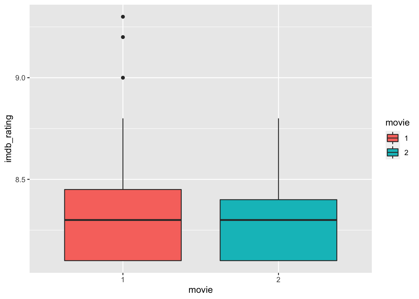
The boxplots look almost identical, suggesting that the ratings of movies in both groups have not changed significantly. However, the boxplot can only show a summary statistic for each group. Thus, it only implies that the movies in group 1 have about the same ratings as those in group 2. If we want to visualise how the ratings have changed for each director from the first to the second movie, we can create a point plot and draw lines with geom_line() to connect the movies in each group. A line that moves up indicates that the second movie was rated higher than the first one for a particular director and vice versa.
dir_mov %>%
  ggplot(aes(x = movie, y = imdb_rating, col = director)) +
  geom_point() +
  geom_line(aes(group = director)) +

  # Remove the legend
  theme(legend.position = "none")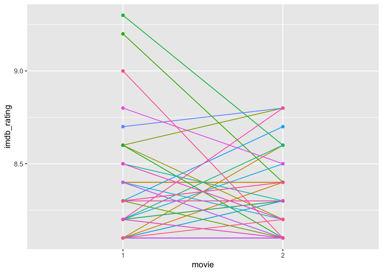
Based on this plot, we have to revise our interpretation slightly. Directors who received exceptionally high ratings on their first movie (i.e. the top 3 in group 1) scored much lower on the second movie. First, we can notice from our boxplots that these movies count as outliers, and second, obtaining such high scores on a movie is tough to replicate. Very highly rated movies are rare (unfortunately). Needless to say, all these movies are rated as very good; otherwise, they would not be on this list. It is worth noting that the way the y-axis is scaled emphasises differences. Thus, a difference between a rating of 9 and 8.5 appears large. If we change the range of the y-axis to ‘0-10’, the differences appear marginal, but it reflects (1) the possible length of the scale (IMDb ratings range from 1-10) and (2) the magnitude in change relative to the full scale. More often than not, this ‘zoom-in’ effect is sometimes used to create the illusion of significant differences where there are none. Be aware when you present your findings not to develop visualisations that could be misleading. Similarly, always pay attention to the axis in visualisations presented by others.
dir_mov %>%
  ggplot(aes(x = movie, y = imdb_rating, col = director)) +
  geom_point() +
  geom_line(aes(group = director)) +

  # Remove the legend
  theme(legend.position = "none") +

  # Manuall define the y axis range
  ylim(0, 10)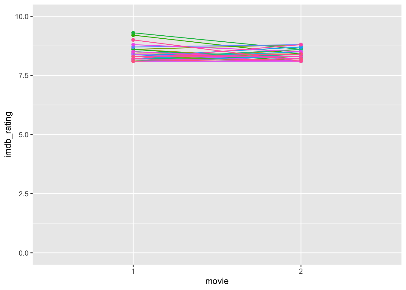
Considering the revised plot, we likely can predict what the statistical test will show, i.e. no significant results. Table 12.2 summarises which tests and functions need to be performed when our data is parametric or non-parametric. In both cases, the functions are the same as those of the unpaired group comparisons, but we need to add the attribute paired = TRUE. Still, the interpretations between the unpaired and paired tests remain the same. Also, be aware that some tests have changed in name, e.g. the Mann-Whitney U test has become the Wilcoxon Signed Rank Test. Even though we use the same functions as before, by changing the attribute paired to TRUE, we also change the computational technique to obtain the results. Thus, remember that the same function can perform different computations which are not comparable.
| Assumption | Test | Function | Effect size | Function |
|---|---|---|---|---|
| Parametric | T-Test | t_test(paired = TRUE) |
Cohen’s d | cohens_d() |
| Non-parametric | Wilcoxon Signed Rank Test | wilcox_test(paired = TRUE) |
Wilcoxon r | wilcoxonPairedR() |
Let’s apply these functions to find out whether the differences we can see in our plots matter.
# Paired T-Test
dir_mov %>% t_test(imdb_rating ~ movie,
                   paired = TRUE,
                   var.equal = TRUE,
                   detailed = TRUE) %>%
  glimpse()
#> Rows: 1
#> Columns: 13
#> $ estimate    <dbl> 0.04186047
#> $ .y.         <chr> "imdb_rating"
#> $ group1      <chr> "1"
#> $ group2      <chr> "2"
#> $ n1          <int> 43
#> $ n2          <int> 43
#> $ statistic   <dbl> 0.8717132
#> $ p           <dbl> 0.388
#> $ df          <dbl> 42
#> $ conf.low    <dbl> -0.05504967
#> $ conf.high   <dbl> 0.1387706
#> $ method      <chr> "T-test"
#> $ alternative <chr> "two.sided"
# Wilcoxon Signed Rank Test
dir_mov %>% wilcox_test(imdb_rating ~ movie,
paired = TRUE) %>%
glimpse()
#> Rows: 1
#> Columns: 7
#> $ .y. <chr> "imdb_rating"
#> $ group1 <chr> "1"
#> $ group2 <chr> "2"
#> $ n1 <int> 43
#> $ n2 <int> 43
#> $ statistic <dbl> 278
#> $ p <dbl> 0.562As expected, the paired tests reveal that the differences in rating between the first and second movies are not significant. Usually, there would be no reason to follow this up with the computation of effect sizes because we only need to do this if the differences are statistically significant. However, nothing can stop us from doing so (for demonstration purposes).
## After T-Test
d <- cohens_d(imdb_rating ~ movie,
               data = dir_mov,
               paired = TRUE,
               var.equal = TRUE)

glimpse(d)
#> Rows: 1
#> Columns: 7
#> $ .y.       <chr> "imdb_rating"
#> $ group1    <chr> "1"
#> $ group2    <chr> "2"
#> $ effsize   <dbl> 0.132935
#> $ n1        <int> 43
#> $ n2        <int> 43
#> $ magnitude <ord> negligible# After Wilcoxon Signed Rank Test
wr <-
dir_mov %>%
wilcox_effsize(imdb_rating ~ movie,
paired = TRUE, ci = TRUE)
glimpse(wr)
#> Rows: 1
#> Columns: 9
#> $ .y. <chr> "imdb_rating"
#> $ group1 <chr> "1"
#> $ group2 <chr> "2"
#> $ effsize <dbl> 0.04477211
#> $ n1 <int> 43
#> $ n2 <int> 43
#> $ conf.low <dbl> 0.0038
#> $ conf.high <dbl> 0.33
#> $ magnitude <ord> smallAs expected, the effect sizes are tiny, irrespective of whether we treat our data as parametric or non-parametric. After all, being a successful director ranked in the IMDb top 250 seems to imply that other movies are equally successful, but remember the limitations of our dataset before drawing your final conclusions.
12.3 Comparing more than two groups
Often we find ourselves in situations where comparing two groups is not enough. Instead, we might be faced with three or more groups reasonably quickly. For example, the wvs_nona dataset allows us to look at 48 different countries, all of which we could compare very effectively with just a few lines of code. In the following chapters, we look at how we can perform the same type of analysis as before, but with multiple unpaired and paired groups using R. Similarly to the two-samples group comparison, we cover the parametric and non-parametric approaches.
12.3.1 Multiple unpaired groups
Have you ever been wondering whether people in different countries are equally satisfied with their lives? You might have a rough guess that it is not the case because the social, economic and political environment might play an important role. For example, if you live in a country affected by social conflicts, one’s life satisfaction might be drastically lower. In the following, we take a look at three countries Iraq, Japan and Korea. I chose these countries out of personal interest and because they nicely demonstrate the purpose of the chapter, i.e. finding out whether there are differences in the perception of satisfaction across three countries. At any time, feel free to remove the filter() function to gain the results of all countries in the dataset, but prepare for slightly longer computation times. We first create the dataset, which only contains the three desired countries.
Similar to before, we can use the ggridges package to draw density plots for each group. This has the added benefit that we can compare the distribution of data for each group and see whether the assumption of normality is likely met or not. On the other hand, we lose the option to identify any outliers quickly. You win some, and you lose some.
mcomp %>%
  group_by(country) %>%
  ggplot(aes(x = satisfaction,
             y = reorder(country, satisfaction),
             fill = country)) +
  ggridges::stat_density_ridges(bandwidth = 0.6,
                                quantile_lines = TRUE,   # adds median indicator
                                quantiles = (0.5)) +
  # Remove legend
  theme(legend.position = "none")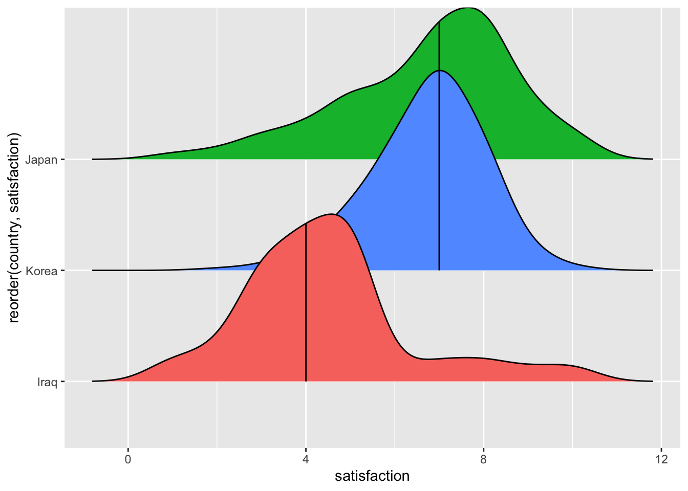
The plot shows us that Japan and Korea appear to be very similar, if not identical (based on the median), but Iraq appears to be different from the other two groups. When performing a multiple group comparison, we can follow similar steps as before with two groups, i.e.
perform the comparison,
determine the effect size, and
interpret the effect size.
Table 12.3 summarises which test needs to be chosen to compare multiple unpaired groups and their corresponding effect size measures.
| Assumption | Test | Function for test | Effect size | Function for effect size8 |
|---|---|---|---|---|
| Parametric | ANOVA |
|
Eta squared | eta_squared() |
| Non-parametric | Kruskall-Wallis test | kruskal_test() |
Epsilon squared (rank) | rank_epsilon_squared() |
Let’s begin by conducting the group comparison. As you will notice, rstatix currently does not support a parametric test where var.equal = FALSE. Therefore we need to fall back to the underlying function oneway.test(var.equal = FALSE)
# ANOVA
## equal variances assumed
mcomp %>%
  anova_test(satisfaction ~ country,
              detailed = TRUE)
#> ANOVA Table (type II tests)
#>
#>    Effect      SSn      SSd DFn  DFd       F         p p<.05   ges
#> 1 country 4258.329 11314.68   2 3795 714.133 5.74e-264     * 0.273
## Equal variances not assumed
(oneway_test <- oneway.test(satisfaction ~ country,
data = mcomp,
var.equal = FALSE))
#>
#> One-way analysis of means (not assuming equal variances)
#>
#> data: satisfaction and country
#> F = 663.17, num df = 2.0, denom df = 2422.8, p-value < 2.2e-16# Kruskall-Wallis test
mcomp %>% kruskal_test(satisfaction ~ country)
#> # A tibble: 1 × 6
#> .y. n statistic df p method
#> * <chr> <int> <dbl> <int> <dbl> <chr>
#> 1 satisfaction 3798 1064. 2 1.11e-231 Kruskal-WallisWhile anova_test() does provide the effect size automatically, i.e. generalised eta squared (ges), this is not the case for the other two approaches. Therefore, we have to use the effectsize package to help us out. Packages often can get you a long way and make your life easier, but it is good to know alternatives if a single package does not give you what you need.
# After ANOVA with var.equal = FALSE
effectsize::eta_squared(oneway_test)
#> Warning: `var.equal = FALSE` - effect size is an approximation.
#> # Effect Size for ANOVA
#>
#> Eta2 |       95% CI
#> -------------------
#> 0.35 | [0.33, 1.00]
#>
#> - One-sided CIs: upper bound fixed at (1).
# effect size rank epsilon squared
effectsize::rank_epsilon_squared(mcomp$satisfaction ~ mcomp$gender)
#> Epsilon2 (rank) | 95% CI
#> ------------------------------
#> 2.12e-03 | [0.00, 1.00]
#>
#> - One-sided CIs: upper bound fixed at (1).The results show that there is a significant and large difference between these groups. You might argue that this is not quite true. Considering our plot, we know that Japan and Korea do not look as if they are significantly different. Multiple group comparisons only consider differences across all three groups. Therefore, if one group differs from the other groups, the test will turn significant and even provide a large enough effect size to consider it essential. However, these tests do not provide information on which differences between groups are significant. To gain more clarification about this, we need to incorporate another step called ‘post-hoc tests’. These tests compare two groups at a time, which is why they are also known as ‘pairwise comparisons’. Compared to regular two-sample tests, these perform corrections of the p-values for multiple testing, which is necessary. However, there are many different ‘post-hoc’ tests you can choose. Field (2013) (p.459) nicely outlines the different scenarios and provides recommendations to navigate this slightly complex field of post-hoc tests. Table 12.4 provides an overview of his suggestions.
| Equal sample size | Equal variances | Post-hot tests | Functions in R |
|---|---|---|---|
| YES | YES |
|
|
| NO (slightly different) | YES |
|
|
| YES | YES |
|
|
| NO (not ideal for small samples) | NO |
|
|
You might be surprised to see that there are also post-hoc tests for parametric group comparisons when equal variances are not assumed. Would we not have to use a non-parametric test for our group comparison instead? Well, empirical studies have demonstrated that ANOVAs tend to produce robust results, even if the assumption of normality (e.g. Blanca Mena et al., 2017) is not given, or there is some degree of heterogeneity of variance between groups (Tomarken & Serlin, 1986). In other words, there can be some lenieancy (or flexibility?) when it comes to the violation of parametric assumptions. If you want to reside on the save side, you should ensure you know your data and its properties. If in doubt, non-parametric tests are also available.
If we want to follow up the Kruskal-Wallis test, i.e. the non-parametric equivalent to the one-way ANOVA, we can make use of two post-hoc tests:
- Dunn Test:
rstatix::dunn_test()(Dinno, 2015) - Pairwise comparison with Bonferroni (and other) correction:
pairwise.wilcox.test().
Below are some examples of how you would use these functions in your project. However, be aware that some of the post-hoc tests are not well implemented yet in R. Here, I show the most important ones that likely serve you in 95% of the cases.
# POST-HOC TEST FOR PARAMETRIC DATA
# Bonferroni
pairwise.t.test(mcomp$satisfaction,
                mcomp$country,
                p.adjust.method = "bonferroni")
#>
#>  Pairwise comparisons using t tests with pooled SD
#>
#> data:  mcomp$satisfaction and mcomp$country
#>
#>       Iraq   Japan
#> Japan <2e-16 -
#> Korea <2e-16 1
#>
#> P value adjustment method: bonferroni
# Tukey
mcomp %>% tukey_hsd(satisfaction ~ country)
#> # A tibble: 3 × 9
#> term group1 group2 null.value estimate conf.low conf.high p.adj
#> * <chr> <chr> <chr> <dbl> <dbl> <dbl> <dbl> <dbl>
#> 1 country Iraq Japan 0 2.29 2.13 2.45 0.0000000141
#> 2 country Iraq Korea 0 2.26 2.10 2.43 0.0000000141
#> 3 country Japan Korea 0 -0.0299 -0.189 0.129 0.898
#> # … with 1 more variable: p.adj.signif <chr># Games-Howell
mcomp %>% games_howell_test(satisfaction ~ country)
#> # A tibble: 3 × 8
#> .y. group1 group2 estimate conf.low conf.high p.adj p.adj.signif
#> * <chr> <chr> <chr> <dbl> <dbl> <dbl> <dbl> <chr>
#> 1 satisfaction Iraq Japan 2.29 2.11 2.47 0 ****
#> 2 satisfaction Iraq Korea 2.26 2.11 2.42 5.92e-11 ****
#> 3 satisfaction Japan Korea -0.0299 -0.178 0.118 8.84e- 1 ns# POST-HOC TEST FOR NON-PARAMETRIC DATA
mcomp %>% dunn_test(satisfaction ~ country)
#> # A tibble: 3 × 9
#> .y. group1 group2 n1 n2 statistic p p.adj p.adj.signif
#> * <chr> <chr> <chr> <int> <int> <dbl> <dbl> <dbl> <chr>
#> 1 satisfaction Iraq Japan 1200 1353 29.2 4.16e-187 1.25e-186 ****
#> 2 satisfaction Iraq Korea 1200 1245 27.6 8.30e-168 1.66e-167 ****
#> 3 satisfaction Japan Korea 1353 1245 -1.02 3.10e- 1 3.10e- 1 ns# or
pairwise.wilcox.test(mcomp$satisfaction,
mcomp$country,
p.adjust.method = "holm")
#>
#> Pairwise comparisons using Wilcoxon rank sum test with continuity correction
#>
#> data: mcomp$satisfaction and mcomp$country
#>
#> Iraq Japan
#> Japan < 2e-16 -
#> Korea < 2e-16 0.00093
#>
#> P value adjustment method: holmAs we can see, no matter which function we use, the interpretation of the results remain the same on this occasion. This is, of course reassuring to know, because it implies that the method chosen does not change the outcome.
12.3.2 Multiple paired groups
When comparing multiple paired groups, matters become slightly more complicated. On the one hand, our groups are not really groups anymore because our data refer to the same group of people, usually over an extended period of time. In experimental studies, this can also refer to different ‘treatments’ or ‘conditions’. This is similar to comparing two paired groups. On the other hand, we also have to deal with yet another assumption: Sphericity.
12.3.2.1 Testing the assumption of sphericity
Sphericity assumes that the variance of covariate pairs (i.e. any combination of the groups/treatments) are roughly equal. This might sound familiar to the assumption of homogeneity of variance in between-subject ANOVAs, only that we look at differences between pairs and not between two different participant groups. Thus, it seems less surprising that the parametric test to compare multiple paired groups is also called ‘repeated measures ANOVA’.
To illustrate the concept of sphericity, let’s look at an example. Assume we conduct a longitudinal study that involves five university students who started their studies in a foreign country. We ask them to complete a survey that tests their level of integration into the local community at three points in time: month 1 (m1), month 4 (m4) and month 8 (m8). This gives us the following data set:
acculturation
#> # A tibble: 5 × 4
#>   name        m1    m4    m8
#>   <chr>    <dbl> <dbl> <dbl>
#> 1 Waylene      2     3     5
#> 2 Nicole       1     3     6
#> 3 Mikayla      2     3     5
#> 4 Valeria      1     3     5
#> 5 Giavanni     1     3     5
If each month measured a different group of participants, we would compare the differences between each month regarding homogeneity. However, since we look at paired data, we need to consider the differences in pairs of measures. In this study, the following combinations are possible:
m1andm4m4andm8m1andm8
Let’s add the differences between measures for each participant based on these pairs and compute the variances across these values using the function var().
# Compute the differences across all three pairs of measurements
differences <-
  acculturation %>%
  mutate(m1_m4 = m1 - m4,
         m4_m8 = m4 - m8,
         m1_m8 = m1 - m8)

differences
#> # A tibble: 5 × 7
#>   name        m1    m4    m8 m1_m4 m4_m8 m1_m8
#>   <chr>    <dbl> <dbl> <dbl> <dbl> <dbl> <dbl>
#> 1 Waylene      2     3     5    -1    -2    -3
#> 2 Nicole       1     3     6    -2    -3    -5
#> 3 Mikayla      2     3     5    -1    -2    -3
#> 4 Valeria      1     3     5    -2    -2    -4
#> 5 Giavanni     1     3     5    -2    -2    -4
# Compute the variance for each pair
differences %>%
summarise(m1_m4_var = var(m1_m4),
m4_m8_var = var(m4_m8),
m1_m8_var = var(m1_m8))
#> # A tibble: 1 × 3
#> m1_m4_var m4_m8_var m1_m8_var
#> <dbl> <dbl> <dbl>
#> 1 0.3 0.2 0.7We can tell that the differences across groups are relatively small when comparing m1_m4_var and m4_m8_var. However, the value for m1_m8_var appears bigger. So, how can we be sure whether the assumption of sphericity is violated or not? Similar to many of the other assumptions we covered, a significance test provides the answer to this question. For multiple paired groups, we use Mauchly’s Test of Sphericity. If the test is significant, the variances across groups are not equal. In other words, a significant Mauchly test implies a violation of sphericity. The rstatix package includes Mauchly’s Test of Sphericity in its anova_test(). Thus, we get both with one function. However, our data in this example is not tidy (remember the definition from Chapter 7.2), because there are multiple observation per row for each individual and the same variable. Instead, we need to ensure that each observation for a given variable has its own row. In short, we first need to convert it into a tidy dataset using the function pivot_longer(). Feel free to ignore this part for now, because we will cover pivoting datasets in greater detail in Chapter 12.4.
# Convert into tidy data
acc_long <-
  acculturation %>%
  pivot_longer(cols = c(m1, m4, m8),
               names_to = "month",
               values_to = "integration")

acc_long
#> # A tibble: 15 × 3
#>    name     month integration
#>    <chr>    <chr>       <dbl>
#>  1 Waylene  m1              2
#>  2 Waylene  m4              3
#>  3 Waylene  m8              5
#>  4 Nicole   m1              1
#>  5 Nicole   m4              3
#>  6 Nicole   m8              6
#>  7 Mikayla  m1              2
#>  8 Mikayla  m4              3
#>  9 Mikayla  m8              5
#> 10 Valeria  m1              1
#> 11 Valeria  m4              3
#> 12 Valeria  m8              5
#> 13 Giavanni m1              1
#> 14 Giavanni m4              3
#> 15 Giavanni m8              5
# Perform repeated-measures ANOVA
# plus Mauchly's Test of Sphericity
acc_long %>%
rstatix::anova_test(dv = integration,
wid = name,
within = month,
detailed = TRUE)
#> ANOVA Table (type III tests)
#>
#> $ANOVA
#> Effect DFn DFd SSn SSd F p p<.05 ges
#> 1 (Intercept) 1 4 153.6 0.4 1536 2.53e-06 * 0.987
#> 2 month 2 8 36.4 1.6 91 3.14e-06 * 0.948
#>
#> $`Mauchly's Test for Sphericity`
#> Effect W p p<.05
#> 1 month 0.417 0.269
#>
#> $`Sphericity Corrections`
#> Effect GGe DF[GG] p[GG] p[GG]<.05 HFe DF[HF] p[HF] p[HF]<.05
#> 1 month 0.632 1.26, 5.05 0.000162 * 0.788 1.58, 6.31 3e-05 *Not only do the results show that the differences across measures are significant, but that our Mauchly’s Test of Sphericity is not significant. Good news on all fronts.
The output from anova_test() also provides information about Sphericity Corrections. We need to consider these scores if the sphericity assumption is violated, i.e. Mauchly’s Test of Sphericity is significant. We commonly use two methods to correct the degrees of freedom in our analysis which will change the p-value of our tests: Greenhouse-Geisser correction (Greenhouse & Geisser, 1959) and Huynh-Field correction (Huynh & Feldt, 1976). Field (2013) explains that if the Greenhouse-Geisser estimate (i.e. GGe) is greater than 0.74, it is advisable to use the Huynh-Field correction instead. For each correction, the anova_test() provides corrected p-values. In our example, we do not have to worry about corrections, though. Still, it is very convenient that this function delivers the corrected results as well.
12.3.2.2 Visualising and computing multiple paired group comparisons
So far, we blindly assumed that our data are parametric. If our assumptions for parametric tests are violated, we can draw on a non-parametric equivalent called Friedman Test. Table 12.5 summarises the parametric and non-parametric tests as well as their respective effect sizes.
| Assumption | Test | Function | Effect size | Function |
|---|---|---|---|---|
| Parametric | Repeated measures ANOVA | anova_test() |
Eta squared | eta_squared() |
| Non-parametric | Friedman Test | friedman_test() |
Kendall’s R | kendalls_w() |
Instead of using a fictional example as we did in the previous chapter, let’s draw on real observations using the dataset wvs_waves. This dataset contains similar data to wvs but offers multiple measures as indicated by the variable wave for several countries. For example, we might be interested to know whether satisfaction changed over the years. This time, our unit of analysis is not individuals, but countries. Therefore, we compare the same countries (not individuals) over time.
Let’s start by visualising the data across all time periods using geom_boxplot(). I also added the mean for each wave since this is what we will eventually compare in our repeated-measures ANOVA.
# Compute the mean for each wave
wave_means <-
  wvs_waves %>%
  group_by(wave) %>%
  summarise(w_mean = mean(satisfaction))

wave_means
#> # A tibble: 7 × 2
#>   wave  w_mean
#>   <fct>  <dbl>
#> 1 w1      7.14
#> 2 w2      6.83
#> 3 w3      7.11
#> 4 w4      7.46
#> 5 w5      7.54
#> 6 w6      7.44
#> 7 w7      7.60
# Plot the boxplots
wvs_waves %>%
ggplot(aes(x = wave,
y = satisfaction,
fill = wave)) +
geom_boxplot() +
# Add the means
geom_point(data = wave_means,
aes(x = wave,
y = w_mean),
shape = 4)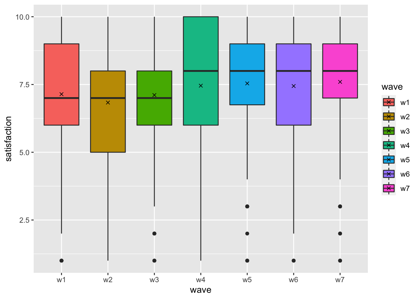
In total, we plotted seven boxplots that represent each wave of data collection. We can tell that satisfaction with life has improved slightly, especially from wave 3 (w3) to wave 4 (w4).
Next, we would have to check the assumptions for parametric tests. Since we have covered this in Chapter 9, we only consider Mauchly’s Test of Sphericity by running anova_test().
# Compute repeated measures ANOVA and
# Mauchly's Test of Sphericity
wvs_waves %>%
  rstatix::anova_test(dv = satisfaction,
                      wid = id,
                      within = wave)
#> ANOVA Table (type III tests)
#>
#> $ANOVA
#>   Effect DFn  DFd     F        p p<.05   ges
#> 1   wave   6 1794 5.982 3.33e-06     * 0.015
#>
#> $`Mauchly's Test for Sphericity`
#>   Effect     W     p p<.05
#> 1   wave 0.903 0.067
#>
#> $`Sphericity Corrections`
#>   Effect   GGe        DF[GG]    p[GG] p[GG]<.05   HFe        DF[HF]   p[HF]
#> 1   wave 0.968 5.81, 1736.38 4.57e-06         * 0.989 5.94, 1774.66 3.7e-06
#>   p[HF]<.05
#> 1         *
We first look at the sphericity assumption which we did not violate, i.e. \(p > 0.05\). Thus, using the ANOVA test is appropriate. Next, we inspect the ANOVA test results and find that the differences are significant as well, i.e. \(p < 0.05\). Still, the effect size ges is small.
From our plot, we know that some of the waves are fairly similar, and we need to determine which pair of waves are significantly different from each other. Therefore, we need a post-hoc test that allows us to perform pairwise comparisons. By now, this should sound familiar (see also Table 12.4).
Since we assume our data is parametric and the groups are equally large for each wave (\(n = 300\)), we can use T-Tests with a Bonferroni correction.
pairwise.t.test(wvs_waves$satisfaction,
                wvs_waves$wave,
                p.adjust.method = "bonferroni",
                paired = TRUE)
#>
#>  Pairwise comparisons using paired t tests
#>
#> data:  wvs_waves$satisfaction and wvs_waves$wave
#>
#>    w1      w2      w3      w4      w5      w6
#> w2 1.00000 -       -       -       -       -
#> w3 1.00000 1.00000 -       -       -       -
#> w4 1.00000 0.01347 0.78355 -       -       -
#> w5 0.30433 0.00033 0.11294 1.00000 -       -
#> w6 1.00000 0.00547 0.68163 1.00000 1.00000 -
#> w7 0.05219 0.00023 0.03830 1.00000 1.00000 1.00000
#>
#> P value adjustment method: bonferroni
Based on these insights, we find that mainly w2 shows significant differences with other waves. This is not a coincidence because w2 has the lowest mean of all waves. Similarly, w7, which reports the highest mean for satisfaction, also reports several significant differences with other groups.
Given the above, we can confirm that our people’s satisfaction with life in each country has changed positively, but the change is minimal (statistically).
To finish this chapter, I want to share the non-parametric version of this test: the Friedman test and its function friedman_test() from the rstatix package.
# NON=PARAMETRIC COMPARISON
wvs_waves %>% rstatix::friedman_test(satisfaction ~ wave | id)
#> # A tibble: 1 × 6
#>   .y.              n statistic    df            p method
#> * <chr>        <int>     <dbl> <dbl>        <dbl> <chr>
#> 1 satisfaction   300      43.4     6 0.0000000966 Friedman test
# Effect size
(kw <- effectsize::kendalls_w(satisfaction ~ wave | id,
data = wvs_waves))
#> Kendall's W | 95% CI
#> --------------------------
#> 0.02 | [0.01, 1.00]
#>
#> - One-sided CIs: upper bound fixed at (1).
effectsize::interpret_kendalls_w(kw$Kendalls_W)
#> [1] "slight agreement"
#> (Rules: landis1977)The non-parametric test confirms the parametric test from before. However, the interpretation of the effect size Kendall's W requires some explanation. First, the effect size for Kendall’s W can range from 0 (small effect size) to 1 (large effect size). Usually, this effect size is considered when comparing inter-rater agreement, for example, the level of agreement of a jury in ice skating during the Olympic games. Thus, the interpretation offered by the function interpret_kendalls_w() follows this logic. As such, it is worth considering a slightly amended interpretation of Kendall’s W if our data is not based on ratings. This is shown in Table 12.6 based on Landis & Koch (1977) (p. 165). Thus, we could report that the effect size of the significant differences is ‘very small’.
| Kendall’s W | Interpretation (Landis & Koch, 1977) | Alternative interpretation |
|---|---|---|
| 0.00-0.02 | Slight agreement | Very small |
| 0.21-0.40 | Fair agreement | Small |
| 0.41-0.60 | Moderate agreement | Moderate |
| 0.61-0.80 | Substantial agreement | Large |
| 0.81-1.00 | Almost perfect agreement | Very large |
12.4 Comparing groups based on factors: Contingency tables
So far, our dependent variable was always a numeric one. However, what if both independent and dependent variables are categorical? In such cases, we can only count the number of occurrences for each combination of the categories.
For example, we might recode our previous dependent variable satisfaction into a dichotomous one, i.e. participants are either happy or not. This is also known as a binary/logical variable (see Chapter 7.4). Since the original scale ranges from 1-10, we assume that participants who scored higher than 5 are satisfied with their lives, while those who scored lower are categorised as unsatisfied.
# Create a dichotomous/binary variable for satisfaction
wvs_nona <-
  wvs_nona %>%
  mutate(satisfaction_bin = as_factor(ifelse(satisfaction > 5,
                                             "satisfied",
                                             "unsatisfied"))
         )
Your first intuition is likely to ask: Are there more satisfied or unsatisfied people in my sample?
wvs_nona %>% count(satisfaction_bin)
#> # A tibble: 2 × 2
#>   satisfaction_bin     n
#>   <fct>            <int>
#> 1 satisfied        52587
#> 2 unsatisfied      16991
The results reveal that considerably more people are satisfied with their life than there are unsatisfied people. In the spirit of group comparisons, we might wonder whether gender differences might exist among the satisfied and unsatisfied group of people. Thus, we want to split the satisfied and unsatisfied responses into male and female groups. We can do this by adding a second argument to the function count().
wvs_nona %>% count(satisfaction_bin, gender)
#> # A tibble: 4 × 3
#>   satisfaction_bin gender     n
#>   <fct>            <fct>  <int>
#> 1 satisfied        female 27677
#> 2 satisfied        male   24910
#> 3 unsatisfied      female  8833
#> 4 unsatisfied      male    8158
This tibble reveals that there are more female participants who are satisfied than male ones. However, the same is true for the category unsatisfied. Using absolute values is not very meaningful when the sample sizes of each group are not equal. Thus, it is better to use the relative frequency instead and adding it as a new variable.
ct <-
  wvs_nona %>%
  count(satisfaction_bin, gender) %>%
  group_by(gender) %>%
  mutate(perc = round(n / sum(n), 3))

ct
#> # A tibble: 4 × 4
#> # Groups:   gender [2]
#>   satisfaction_bin gender     n  perc
#>   <fct>            <fct>  <int> <dbl>
#> 1 satisfied        female 27677 0.758
#> 2 satisfied        male   24910 0.753
#> 3 unsatisfied      female  8833 0.242
#> 4 unsatisfied      male    8158 0.247
The relative frequency (perc) reveals that female and male participants are equally satisfied and unsatisfied. In other words, we could argue that gender does not explain satisfaction with life because the proportion of male and female participants is almost identical.
A more common and compact way to show such dependencies between categorical variables is a contingency table. To convert our current table into a contingency table, we need to map the levels of satisfaction_bin as rows (i.e. satisfied and unsatisfied), and for gender, we want each level represented as a column (i.e. male and female). This can be achieved with the function pivot_wider(). It turns our ‘long’ data frame into a ‘wide’ one. Therefore, we basically perform the opposite of what the function pivot_longer() did earlier. However, this means that our data is not ‘tidy’ anymore. Let’s take a look at the output first to understand better what we try to achieve.
ct %>% pivot_wider(id_cols = satisfaction_bin,
                   names_from = gender,
                   values_from = perc)
#> # A tibble: 2 × 3
#>   satisfaction_bin female  male
#>   <fct>             <dbl> <dbl>
#> 1 satisfied         0.758 0.753
#> 2 unsatisfied       0.242 0.247
The resulting tibble looks like a table as we know it from Excel. It is much more compact than the long format. However, what are the different arguments I passed to the function pivot_wider()? Here is a more detailed explanation of what we just did:
id_colsrefers to one or more columns that define the groups for each row. In our case, we wanted to group observations based on whether these reflect the state ofsatisfiedorunsatisfied. Thus, each group is only represented once in this column. The underlying concept is comparable to using the functiongroup_by()together withsummarise(), which happens to be the same as usingcount().names_fromdefines which variable should be translated into separate columns. In other words, we replace the columngenderand create a new column for each level of the factor, i.e.maleandfemale.values_fromrequires us to specify which variable holds the values that should be entered into our table. Since we want our percentages included in the final output, we useperc.
It is essential to note that we did not change any values but rearranged them. However, we lost one variable, i.e. n. Where has it gone? When using pivot_wider() we have to make sure we include all variables of interest. By default, the function will drop any other variables not mentioned. If we want to keep n, we can include it as another variable that is added to values_from.
ct %>% pivot_wider(id_cols = satisfaction_bin,
                   names_from = gender,
                   values_from = c(perc, n))
#> # A tibble: 2 × 5
#>   satisfaction_bin perc_female perc_male n_female n_male
#>   <fct>                  <dbl>     <dbl>    <int>  <int>
#> 1 satisfied              0.758     0.753    27677  24910
#> 2 unsatisfied            0.242     0.247     8833   8158
The table has become even wider because we have two more columns to show the absolute frequency per gender and satisfaction_bin.
As you already know, there are situations where we want to turn a ‘wide’ data frame into a ‘long’ one. We performed such a step earlier and there is an in-depth example provided in Chapter 13.2.1.5. Knowing how to pivot dataset is an essential data wrangling skill and something you should definitely practice to perfection.
Contingency tables are like plots: They provide an excellent overview of our data structure and relationships between variables. However, they provide no certainty about the strength of relationships. Therefore, we need to draw on a set of statistical tests to gain further insights.
Similar to previous group comparisons, we can distinguish between paired and unpaired groups. I will cover each comparison in turn and allude to plotting two or more categories in a ggplot().
12.4.1 Unpaired groups of categorical variables
In the introduction to this chapter, we covered a classic example of an unpaired comparison of two groups (male and female) regarding another categorical variable, i.e. satisfaction_bin. The tables we produced offered detailed insights into the distribution of these categories. However, it is always helpful to have a visual representation. Plotting two categorical variables (i.e. factors) in ggplot2 can be achieved in many different ways. Three commonly used options are shown in Figure 12.1.
# Plot with absolute frequencies (stacked)
absolute_stacked <-
  wvs_nona %>%
  ggplot(aes(x = satisfaction_bin,
             fill = gender)) +
  geom_bar() +
  ggtitle("Stacked absolute frequency") +
  theme(legend.position = "none")

# Plot with absolute frequencies (grouped)
absolute_grouped <-
  wvs_nona %>%
  ggplot(aes(x = satisfaction_bin,
             fill = gender)) +
  geom_bar(position = "dodge") +
  ggtitle("Grouped absolute frequency") +
  theme(legend.position = "none")

# Plot with relative frequencies
relative <-
  wvs_nona %>%
  ggplot(aes(x = satisfaction_bin,
             fill = gender)) +
  geom_bar(position = "fill") +
  ggtitle("Relative frequency") +
  theme(legend.position = "none")

# Plot all three plots with 'patchwork' package
absolute_stacked + absolute_grouped + relative + plot_spacer()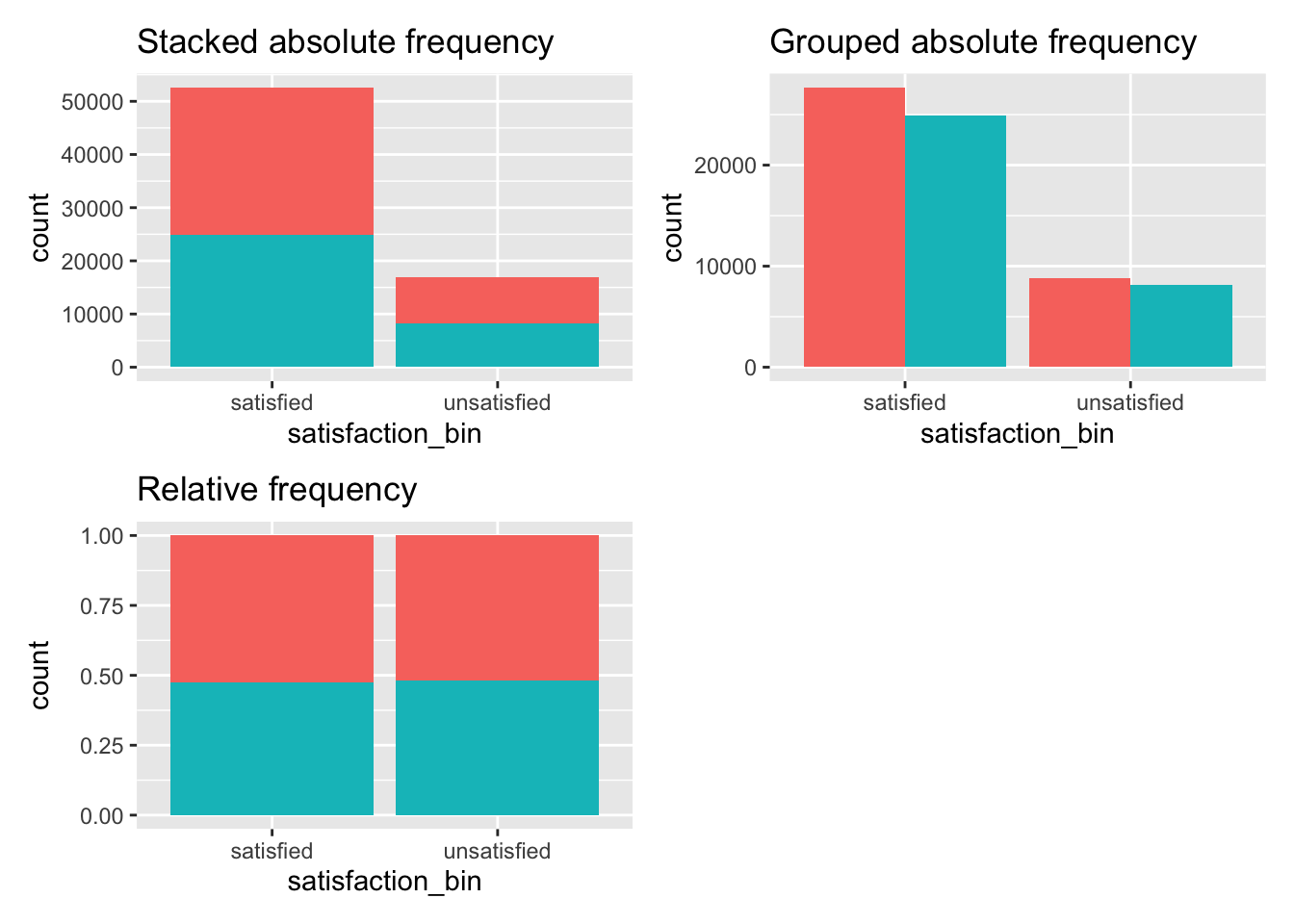
Figure 12.1: Three ways to plot frequencies
A more elegant and compact way of visualising frequencies across two or more categories are mosaic plots. These visualise relative frequencies for both variables in one plot. For example, consider the following mosaic plot created with the package ggmosaic and the function geom_mosaic().
library(ggmosaic)
wvs_nona %>%
  ggplot() +
  geom_mosaic(aes(x = product(satisfaction_bin, gender),
                            fill = gender)) +
  theme_mosaic()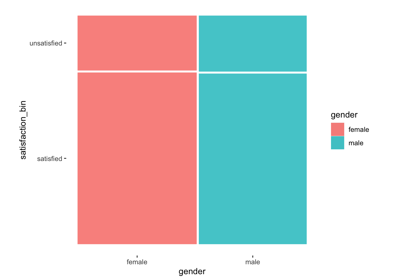
Figure 12.2: A mosaic plot which visualises the relationship of two categorical variables
It might not be evident from our data, but frequencies of each variable determine the bars’ height and width. In other words, the width of the bars (i.e. x-axis) is determined by the relative frequency of female and male participants in our sample. On the other hand, the height of each bar (i.e. the y-axis) is specified by the relative frequency of satisfied and unsatisfied. This results in a square block that is divided by the respective relative distributions. Let me share an example where it is more apparent what a mosaic plot aims to achieve.
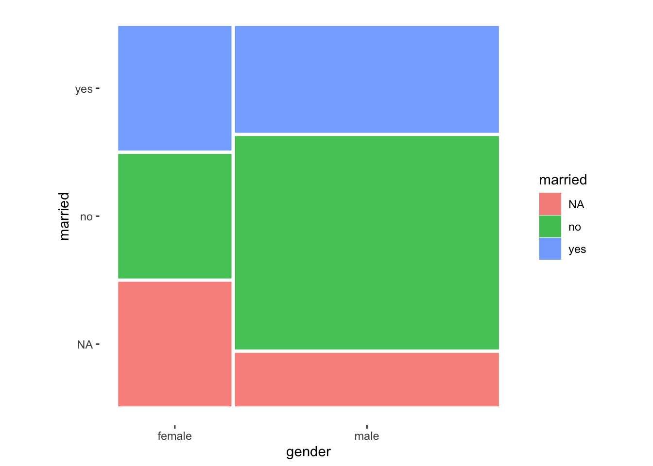
In this example, we can tell that there were more male participants than females because the bar for male is much wider. Apart from that, we notice that female participants have more missing values NA for the variable married. However, more female participants reported that they are married, i.e. answered with yes. While mosaic plots make for impressive visualisations, we must be mindful that more complex visualisations are always more challenging to understand. Thus, it is wise to plan the usage of such plots carefully depending on your audience.
Throughout the remaining chapters, I will use the mosaic plot to illustrate distributions. The main difference to regular bar plots is the function product(), which allows us to define different variables of interest instead of using x and y in the aes() of ggplot(). It is this function that enables a mosaic visualisation. Apart from that, the same ggplot2 syntax applies.
When it comes to the computational side of things, we have to distinguish whether our two variables create a 2-by-2 matrix, i.e. both variables only have two levels. Depending on which scenario applies to our analysis, a different statistical test has to be performed. For some tests, a minimum frequency for each value in our contingency table (i.e. cells) also needs to be achieved. This is usually a matter of sample size and diversity in a sample. Table 12.7 provides an overview of the different scenarios and indicates the functions we have to use to conduct our analysis in R.
| Matrix | Condition | Test | Function in R | Effect size |
|---|---|---|---|---|
| 2x2 | < 10 obs. | Fisher’s Exact Test | fisher.test() |
phi() |
| 2x2 | > 10 obs. | Chi-squared Test with Yate’s Continuity Correction | infer::chisq_test(correct = TRUE)10 |
phi() |
| n x n | > 5 obs. (80% of cells) | Chi-squared Test | infer::chisq_test() |
cramers_v() |
To cut a long story short, we only need to be worried about 2x2 contingency tables where the values in some (or all) cells are lower than 10. In those cases, we need to rely on the Fisher’s Exact Test. In all other cases, we can depend on the Pearson Chi-squared Test to do our bidding. The function infer::chisq_test() is based on the function chisq.test(), which automatically applies the required Yate’s Continuity Correction if necessary.
For every test that involves two categorical variables, we have to perform three steps:
Compute a contingency table and check the conditions outlined in Table 12.7.
Conduct the appropriate statistical test.
If the test is significant, compute the effect size and interpret its value.
Considering our example from the beginning of the chapter, we are confronted with a 2x2 table that has the following distribution:
ct %>% pivot_wider(id_cols = satisfaction_bin,
                   names_from = gender,
                   values_from = n)
#> # A tibble: 2 × 3
#>   satisfaction_bin female  male
#>   <fct>             <int> <int>
#> 1 satisfied         27677 24910
#> 2 unsatisfied        8833  8158
We easily satisfy the requirement for a regular Chi-squared test with Yate’s Continuity Correction because each row has at least a value of 10. However, for demonstration purposes, I will show how to compute both the Chi-squared test and the Fisher’s Exact test for the same contingency table.
# Fisher's Exact Test
fisher.test(wvs_nona$satisfaction_bin, wvs_nona$gender) %>%
  # Make output more readable
  broom::tidy() %>%
  glimpse()
#> Rows: 1
#> Columns: 6
#> $ estimate    <dbl> 1.026182
#> $ p.value     <dbl> 0.1448926
#> $ conf.low    <dbl> 0.991099
#> $ conf.high   <dbl> 1.062486
#> $ method      <chr> "Fisher's Exact Test for Count Data"
#> $ alternative <chr> "two.sided"
## Effect size
(phi <- effectsize::phi(wvs_nona$satisfaction_bin, wvs_nona$gender))
#> Phi | 95% CI
#> -----------------------
#> 5.54e-03 | [0.00, 1.00]
#>
#> - One-sided CIs: upper bound fixed at (1).
effectsize::interpret_r(phi$phi, rules = "cohen1988")
#> [1] "very small"
#> (Rules: cohen1988)# Chi-squared test with Yate's continuity correction
wvs_nona %>% infer::chisq_test(satisfaction_bin ~ gender,
correct = TRUE)
#> # A tibble: 1 × 3
#> statistic chisq_df p_value
#> <dbl> <int> <dbl>
#> 1 2.11 1 0.146## Effect size
(cv <- effectsize::cramers_v(wvs_nona$satisfaction_bin, wvs_nona$gender))
#> Cramer's V | 95% CI
#> -------------------------
#> 5.54e-03 | [0.00, 1.00]
#>
#> - One-sided CIs: upper bound fixed at (1).
effectsize::interpret_r(cv$Cramers_v, rules = "cohen1988")
#> [1] "very small"
#> (Rules: cohen1988)Both tests reveal that the relationship between our variables is not significant (\(p > 0.05\)), and the effect sizes are very small. This result aligns with our visualisation shown in Figure 12.2 because everything looks very symmetrical.
Contingency tables do not always come as 2x2 matrices. Therefore, it makes sense to look at one more example where we have a much larger matrix. Bear in mind that the larger your matrix, the larger your dataset has to be to produce reliable results.
Let’s explore an example for a contingency table that is a 6x2 matrix. Imagine yourself at a soirée11, and someone might raise the question: Is it true that men are less likely to be married than women? To give you an edge over others at this French evening party, we can take a closer look at this matter with our wvs_nona dataset. We can create a mosaic plot and contingency table which feature relationship_status and gender.
As usual, let’s start with a plot first. We create a mosaic plot to visualise all six levels of the factor relationship_status against the two levels of gender.
wvs_nona %>%
  ggplot() +
  geom_mosaic(aes(x = product(relationship_status, gender),
                  fill = relationship_status)) +
  theme_mosaic()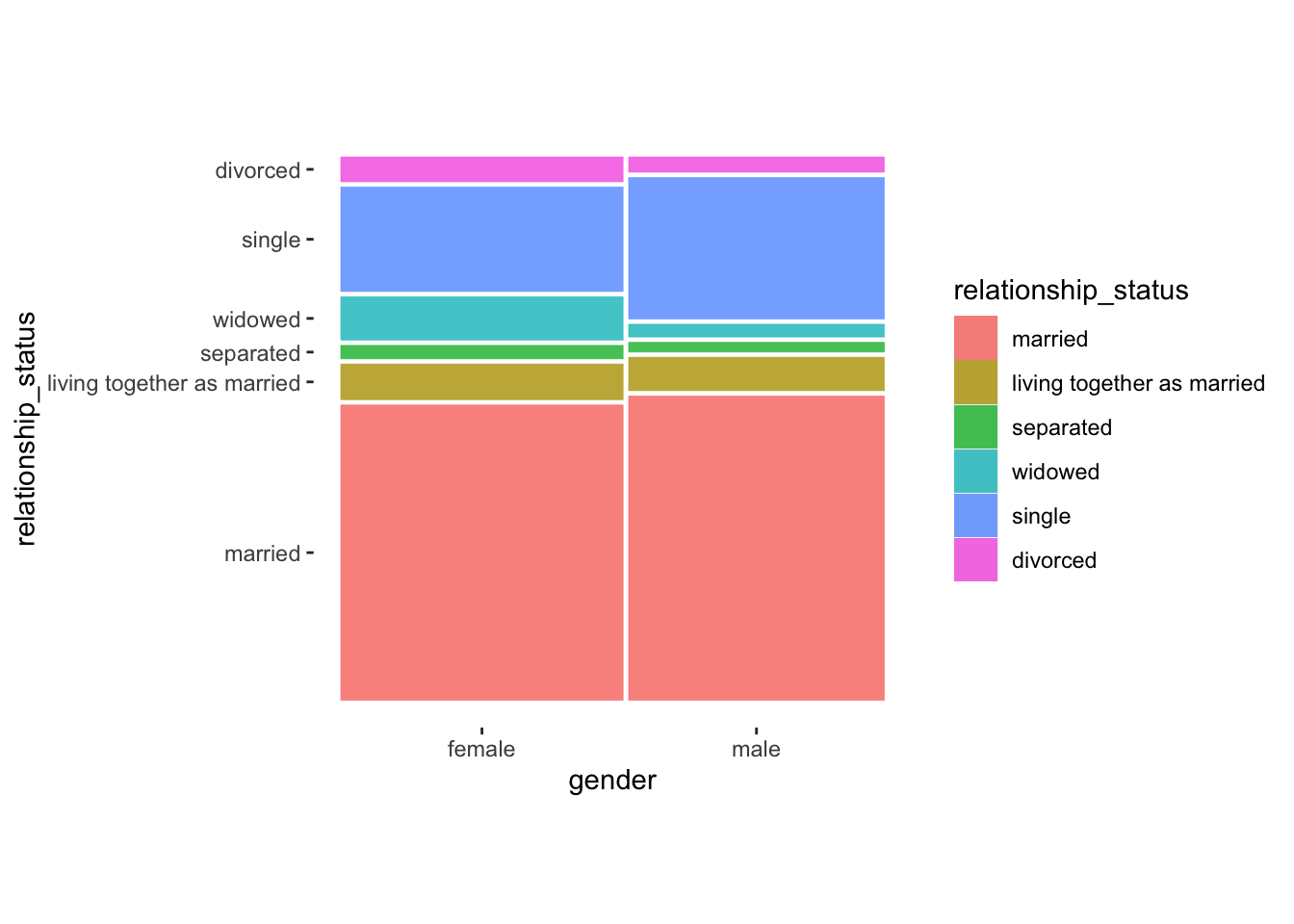
While this plot is a lot more colourful than our previous ones, it still suggests that differences across categories are not particularly large. Especially the category married seems to indicate that male and female participants do not differ by much, i.e. their relative frequency is very similar. The only more considerable difference can be found for widowed and single. Apparently, female participants more frequently indicated being widowed while more male participants indicated that they are single.
Next, we compute the numbers underpinning this plot, comparing the absolute distribution to check our conditions and the relative distribution to interpret the contingency table correctly.
# Check whether we fulfill the criteria
rel_gen <-
  wvs_nona %>%
  count(relationship_status, gender)

rel_gen
#> # A tibble: 12 × 3
#>    relationship_status        gender     n
#>    <fct>                      <fct>  <int>
#>  1 married                    female 20840
#>  2 married                    male   19454
#>  3 living together as married female  2520
#>  4 living together as married male    2138
#>  5 separated                  female   953
#>  6 separated                  male     626
#>  7 widowed                    female  3067
#>  8 widowed                    male     822
#>  9 single                     female  7373
#> 10 single                     male    9049
#> 11 divorced                   female  1757
#> 12 divorced                   male     979
# Compute relative frequency
rel_gen %>%
group_by(gender) %>%
mutate(perc = round(n / sum(n), 3)) %>%
pivot_wider(id_cols = relationship_status,
names_from = gender,
values_from = perc)
#> # A tibble: 6 × 3
#> relationship_status female male
#> <fct> <dbl> <dbl>
#> 1 married 0.571 0.588
#> 2 living together as married 0.069 0.065
#> 3 separated 0.026 0.019
#> 4 widowed 0.084 0.025
#> 5 single 0.202 0.274
#> 6 divorced 0.048 0.03The contingency table with the relative frequencies confirms what we suspected. The differences are very minimal between male and female participants. In a final step, we need to perform a Chi-squared test to see whether the differences are significant or not.
# Perform Chi-squared test
wvs_nona %>% infer::chisq_test(relationship_status ~ gender)
#> # A tibble: 1 × 3
#>   statistic chisq_df p_value
#>       <dbl>    <int>   <dbl>
#> 1     1669.        5       0
# Compute effect size
(cv <- effectsize::cramers_v(wvs_nona$relationship_status,
wvs_nona$gender))
#> Cramer's V | 95% CI
#> -------------------------
#> 0.15 | [0.15, 1.00]
#>
#> - One-sided CIs: upper bound fixed at (1).
effectsize::interpret_r(cv$Cramers_v, rules = "cohen1988")
#> [1] "small"
#> (Rules: cohen1988)The statistical results further confirm that the relationship between relationship_status and gender is weak but significant. Therefore, at your next soirée, you can confidently say: “This is bogus. The World Value Survey, which covers 48 different countries, shows that such a relationship is weak considering responses from over 69,000 individuals.” #cheers-to-that
12.4.2 Paired groups of categorical variables
Similar to paired group comparisons, contingency tables may show paired data. For example, we could be interested in knowing whether an intercultural training we delivered improved participants skills (or at least their personal perception of having improved).
The dataset ic_training looks at participants’ confidence in communication with people from diverse cultural backgrounds before and after an intercultural training session. Thus, we might be curious to know whether the training was effective. The dataset contains multiple versions of the same variable measured in different ways. Let’s begin with the variable communication2, which measures improvement as a factor with only two levels, i.e. yes and no. We can start by plotting a mosaic plot.
ic_training %>%
  ggplot() +
  geom_mosaic(aes(x = product(test, communication2),
                  fill = test)) +
  theme_mosaic()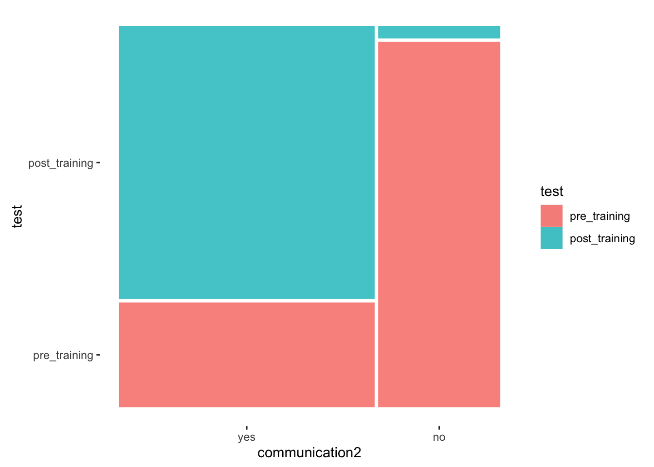
The mosaic plot shows that more participants indicate to be more confident in communicating with culturally others post-training. There were only very few participants who indicated that they have not become more confident.
In the next step, we want to compute the contingency table. However, there is one aspect we need to account for: The responses are paired, and therefore we need a contingency table of paired responses. This requires some modification of our data. Let’s start with a classic contingency table as we did for unpaired data.
# Unpaired contingency table
ic_training %>%
  count(test, communication2) %>%
  group_by(test) %>%
  pivot_wider(id_cols = test,
              names_from = communication2,
              values_from = n) %>%
  mutate(across(where(is.double), round, 2))
#> # A tibble: 2 × 3
#> # Groups:   test [2]
#>   test            yes    no
#>   <fct>         <int> <int>
#> 1 pre_training     18    30
#> 2 post_training    47     1
This contingency table reflects the mosaic plot we created, but it does not show paired answers. If we sum the frequencies in each cell, we receive a score of 96, which equals the number of observations in ic_training. However, since we have two observations per person (i.e. paired responses), we only have 48 participants. Thus, this frequency table treats the pre and post-training group as independent from each other, which is obviously incorrect.
The current dataset includes two rows for each participant. Therefore, if we want to create a contingency table with paired scores, we first need to convert our data so that each participant is reflected by one row only, i.e. we need to make our data frame wider with pivot_wider().
# Creating data frame reflecting paired responses
paired_data <-
  ic_training %>%
  pivot_wider(id_cols = name,
              names_from = test,
              values_from = communication2)

paired_data
#> # A tibble: 48 × 3
#>    name                       pre_training post_training
#>    <chr>                      <fct>        <fct>
#>  1 Hamlin, Christiana         no           no
#>  2 Horblit, Timothy           no           yes
#>  3 Grady, Justin              no           yes
#>  4 Grossetete-Alfaro, Giovana no           yes
#>  5 Dingae, Lori               no           yes
#>  6 el-Sabir, Saamyya          no           yes
#>  7 Reynolds, Tylor            no           yes
#>  8 Aslami, Andrew             no           yes
#>  9 Alexander, Kiri            no           yes
#> 10 Guzman Pineda, Timothy     no           yes
#> # … with 38 more rows
In simple terms, we converted the column communication2 into two columns based on the factor levels of test, i.e. pre-training and post-training. If we now use these two columns to create a contingency table and mosaic plot, we understand of how the paired distributions between pre-training and post-training look like.
# Contignency table with paired values
ct_paired <-
  paired_data %>%
  count(pre_training, post_training) %>%
  pivot_wider(names_from = post_training,
              names_prefix = "post_training_",
              values_from = n,
              values_fill = 0) # fill empty cells with '0'
ct_paired
#> # A tibble: 2 × 3
#>   pre_training post_training_yes post_training_no
#>   <fct>                    <int>            <int>
#> 1 yes                         18                0
#> 2 no                          29                1
# Contigency table with paired percentage values
ct_paired %>%
mutate(post_training_yes = post_training_yes / nrow(paired_data),
post_training_no = post_training_no / nrow(paired_data)) %>%
mutate(across(where(is.double), round, 2))
#> # A tibble: 2 × 3
#> pre_training post_training_yes post_training_no
#> <fct> <dbl> <dbl>
#> 1 yes 0.38 0
#> 2 no 0.6 0.02# Mosaic plot with paired values
paired_data %>%
ggplot() +
geom_mosaic(aes(x = product(pre_training, post_training),
fill = post_training)
) +
theme_mosaic()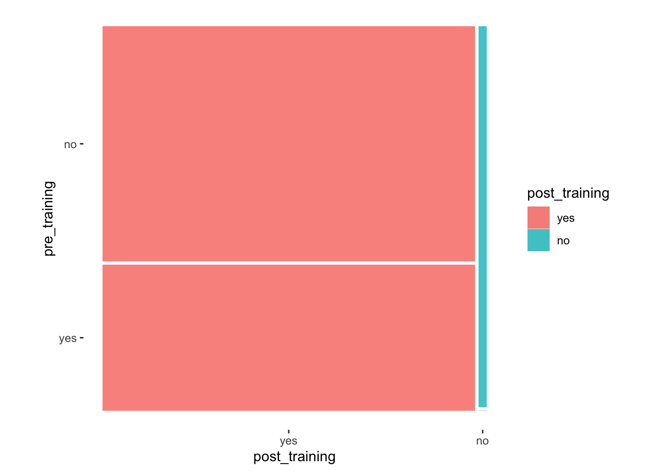
With these insights, we can refine our interpretation and state the following:
There were 19 participants (40%) for whom the training caused no change, i.e. before and after the training their response was still
yesorno.However, for the other 29 participants (60%), the training helped them change from
notoyes. This is an excellent result.We notice that no participant scored
noafter the training was delivered, which is also a great achievement.
Lastly, we need to perform a statistical test to confirm our suspicion that the training significantly impacted participants. For paired 2x2 contingency tables, we have to use McNemar’s Test, using the function mcnemar.test(). To determine the effect size, we have to compute Cohen’s g and use the function cohens_g() from the effectsize package to compute it. Be aware that we have to use the paired_data as our data frame and not ic_training.
#McNemar's test
mcnemar.test(paired_data$pre_training, paired_data$post_training)
#>
#>  McNemar's Chi-squared test with continuity correction
#>
#> data:  paired_data$pre_training and paired_data$post_training
#> McNemar's chi-squared = 27.034, df = 1, p-value = 1.999e-07
# Effect size
effectsize::cohens_g(paired_data$pre_training, paired_data$post_training)
#> Cohen's g | 95% CI
#> ------------------------
#> 0.50 | [0.38, 0.50]To correctly interpret the effect size J. Cohen (1988) suggest the following benchmarks:
\(g < 0.05 = negligible\),
\(0.05 \leq g < 0.15 = small\),
\(0.15 \leq g < 0.25 = medium\),
\(0.25 \leq g = large\).
Thus, our effect size is very large, and we can genuinely claim that the intercultural training had a significant impact on the participants. Well, there is only one flaw in our analysis. An eager eye will have noticed that one of our cells was empty, i.e. the top-right cell in the contingency table. The conditions to run such a test are similar to the Chi-squared test. Thus, using the McNemar test is not entirely appropriate in our case. Instead, we need to use the ‘exact McNemar test’, which compares the results against a binomial distribution and not a chi-squared one. More important than remembering the name or the distribution is to understand that the exact test produces more accurate results for smaller samples. However, we have to draw on a different package to compute it, i.e. exact2x2 and its function mcnemar.exact().
library(exact2x2)
mcnemar.exact(paired_data$pre_training, paired_data$post_training)
#>
#>  Exact McNemar test (with central confidence intervals)
#>
#> data:  paired_data$pre_training and paired_data$post_training
#> b = 0, c = 29, p-value = 3.725e-09
#> alternative hypothesis: true odds ratio is not equal to 1
#> 95 percent confidence interval:
#>  0.0000000 0.1356472
#> sample estimates:
#> odds ratio
#> 0Even after using a more robust computation for our data, the results are still significant. Thus, there is no doubt that the intercultural training helped participants to improve.
There are many other combinations of contingency tables. For example, the McNemar test can be extended to a 3x3 or higher matrix, but the rows and columns must be the same length. If you want to compare multiple categorical variables which do not follow a square matrix, it would be necessary to look into a loglinear analysis. While this book does not cover this technique, an excellent starting point is provided by Field (2013) (p. 732ff).
12.4.3 A final remark about comparing groups based on categorical data
Admittedly, I hardly ever find studies in the field of Social Sciences which work with primarily categorical data. Political Science might be an exception because working, for example, with polling data often implies working with categorical data. A reason you likely will not find yourself in the situation to work with such data and analytical techniques is measurement accuracy. If you look at the dataset ic_training, the variable communication2 was artificially created to turn numeric data into a factor. This is usually not good practice because you lose measurement accuracy, and it can exaggerate differences between groups. Consider the following plots:
p1 <-
  ic_training %>%
  ggplot(aes(x = communication)) +
  geom_bar() +
  ggtitle("Full scale")

p2 <-
  ic_training %>%
  ggplot(aes(x = communication3)) +
  geom_bar() +
  ggtitle("Category with 3 levels")

p3 <-
  ic_training %>%
  ggplot(aes(x = communication2)) +
  geom_bar() +
  ggtitle("Category with 2 levels")

# Create plot with 'patchwork' package
p1 + p2 + p3 + plot_spacer()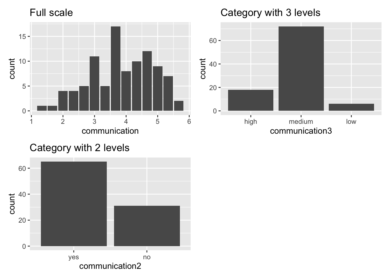
The more we aggregate the data into fewer categories, the more likely we increase differences between groups. For example, the plot Category with 3 levels shows that most participants fall into the category medium. However, reducing the categories to two, some participants are classified as yes and some as no. Thus, some respondents who were classified as medium are now in the no category. In reality, we know from our non-categorical measures that several participants will still have improved in confidence but are considered with those who have not improved. This is a major problem because it seems more people are not confident about communicating with people from different cultural backgrounds than there actually are. The accuracy of our measurement scale is poor.
In short, I recommend to only use the techniques outlined in this chapter if your data is truly categorical in nature. Thus, when designing your data collection tool, you might also wish to abstain from measuring quantitative variables as categories, for example age, which is a very popular choice among my students. While it might be sometimes more appropriate to offer categories, it is always good to use multiple categories and not just two or three. Every additional level in your factor will increase measurement accuracy and provides access to more advanced analytical techniques. Remember, it is always possible to convert numeric data into a factor, but not the other way around.
12.5 Reviewing group comparisons
In Social Sciences, we often compare individuals against each other or with themselves over time. As such, understanding how to compare groups of participants is an essential analytical skill. The techniques outlined in this chapter merely provide a solid starting point and likely cover about 90% of the datasets you will encounter or collect. For the other 10% of cases, you might have to look further for more niche approaches to comparing groups. There is also more to know about these techniques from a theoretical and conceptual angle. However, as far as the computation in R is concerned, you should be able to tackle your research projects confidently.
References
These functions are taken from the
effectsizepackage.↩︎In order to use this package, it is necessary to install a series of other packages found on bioconductor.org↩︎
inferis an R package which is part oftidymodels.↩︎A fancy way of saying ‘evening party’ in French.↩︎