2.6 Graphs
We’ll make graphs of the data of the ten most populated cities in Belgium. If you have the full Airbnb dataset in your memory (check the Environment pane), you can just filter it:
airbnb.topten <- airbnb %>%
  filter(city %in% c("Brussel","Antwerpen","Gent","Charleroi","Liege","Brugge","Namur","Leuven","Mons","Aalst")) # remember that you need to load the Hmisc package to use the %in% operator
If you’ve just started a new R session, you can also re-read the .csv file by running the code in section the previous section.
2.6.1 Scatterplot
Let’s create a scatterplot of price per city:
ggplot(data = airbnb.topten, mapping = aes(x = city, y = price)) +
  geom_point()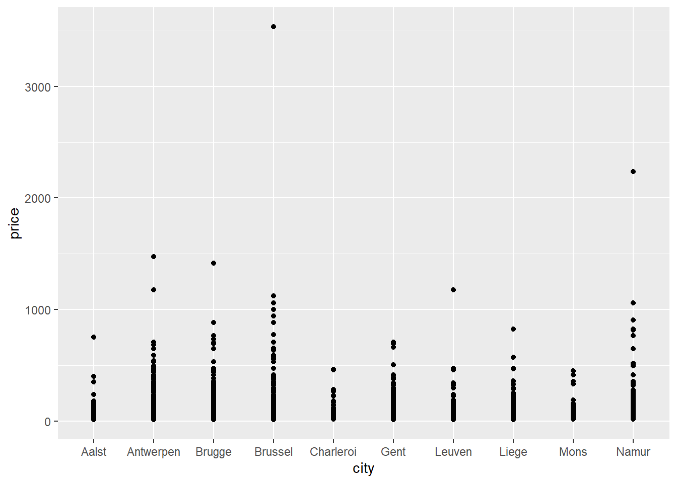
If all goes well, a plot should appear in the bottom right corner of your screen. Figures are made with the ggplot command. On the first line, you tell ggplot which data it should use to create a plot and which variables should appear on the X-axis and the Y-axis. We tell it to put city on the X-axis and price on the Y-axis. Specification of the X-axis and the Y-axis should always come as arguments to an aes function which itself is then provided as an argument to the mapping function. On the second line you tell ggplot to draw points (geom_point). When you are creating a plot, remember to always add a + at the end of each line of code that makes up the graph, except for the last one (adding the + at the beginning of a line won’t work).
The graph is not very informative because many points are drawn over each other.
2.6.2 Jitter
Let’s add jitter to our points:
ggplot(data = airbnb.topten, mapping = aes(x = city, y = price)) +
  geom_jitter() # Same code as before but now we replace geom_point with geom_jitter.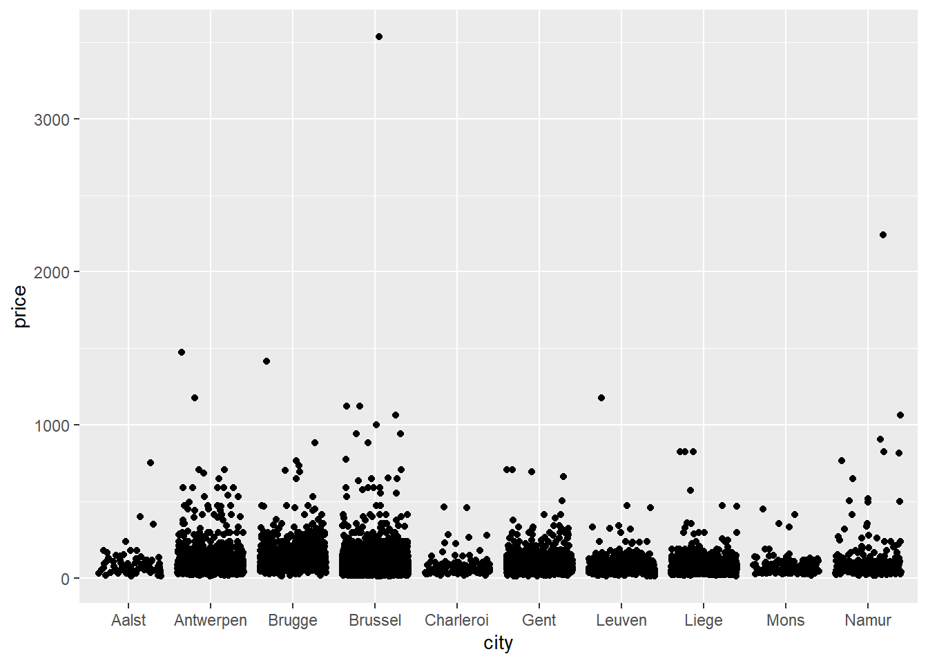
Instead of asking for points with geom_point(), we’ve now asked for points with added jitter with geom_jitter(). Jitter is a random value that gets added to each X and Y coordinate such that the data points are not drawn over each other. Note that we do this just to make the graph more informative (compare it to the previous scatterplot where many data points are drawn over each other); it does not change the actual values in our dataset.
2.6.3 Histogram
Still not clear though. It seems that the distribution of price is right-skewed. This means that the distribution of price is not normal. A normal distribution has two key features. A first feature is that there are more values close to the mean than there are values far away from the mean. In other words, extreme values don’t occur very often. A second feature is that the distribution is symmetrical. In other words, the number of values below the mean is equal to the number of values above the mean. In a skewed distribution, there are extreme outliers on only one side of the distribution. In case of right-skew, this means that there are extreme outliers on the right side of the distribution. In our case, this means that there are some Airbnb listings with very high prices. This inflates the mean of the distribution such that the listings are not normally distributed around the mean anymore.
Let’s draw a histogram of the prices:
ggplot(data = airbnb.topten, mapping = aes(x = price)) + # Notice that we don't have a x = city anymore. Price should be on the X-axis and the frequencies of the prices should be on the Y-axis
  geom_histogram() # Y-axis = frequency of values on X-axis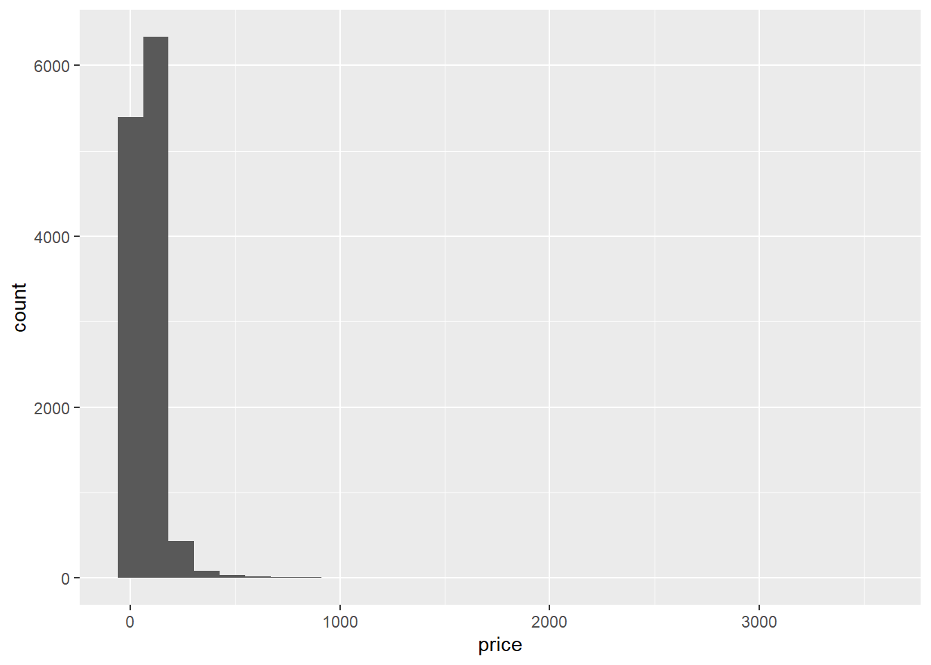
Indeed, there are some extremely high prices (compared to the majority of prices), so prices are right-skewed. Note: the stat_bin() using bins = 30. Pick better value with binwidth warning in the console can safely be ignored.
2.6.4 Log-transformation
Given that the price variable is right-skewed, we could log-transform it to make it more normal:
# On the Y-axis we now have log(price, base=exp(1)) instead of price. log(price, base=exp(1)) = take the natural logarithm, i.e., the logarithm with base = exp(1) = e.

ggplot(data = airbnb.topten, mapping = aes(x = city, y = log(price, base=exp(1)))) +
geom_jitter()![]()
2.6.5 Plot the median
Let’s get a better idea of the median price per city:
ggplot(data = airbnb.topten, mapping = aes(x = city, y = price)) +
  geom_jitter() +
  stat_summary(fun.y=median, colour="tomato3", size = 4, geom="point")
## Warning: `fun.y` is deprecated. Use `fun` instead.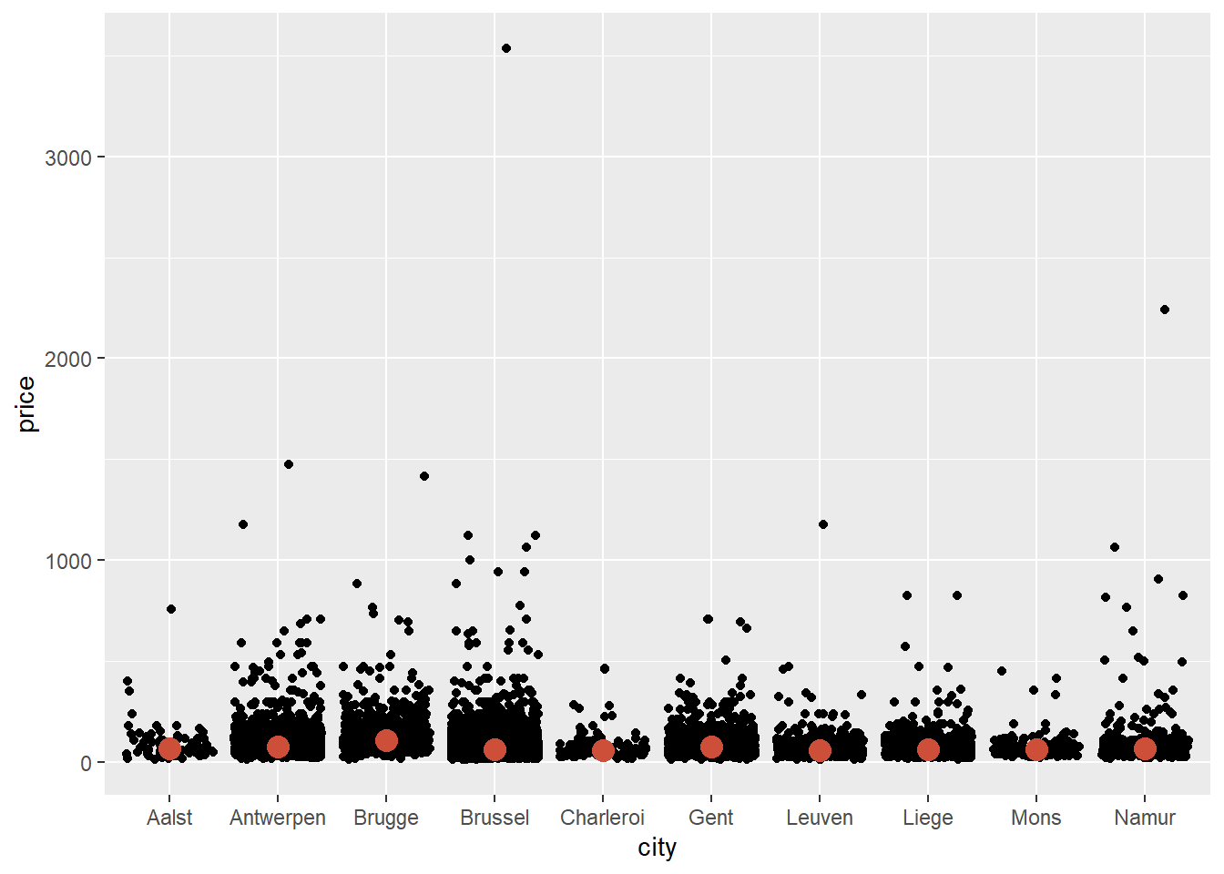
The line of code to get the median can be read as follows: stat_summary will ask for a statistical summary. The statistic we want is the median in a colour named "tomato3", with size 4. It should be represented as a "point".
We see that Brugge is the city with the highest median price. It’s much easier to see this when we log-transform price:
ggplot(data = airbnb.topten, mapping = aes(x = city, y = log(price, base = exp(1)))) +
  geom_jitter() +
  stat_summary(fun.y=median, colour="tomato3", size = 4, geom="point")
## Warning: `fun.y` is deprecated. Use `fun` instead.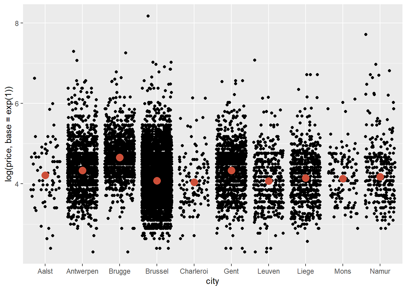
2.6.6 Plot the mean
Let’s add the mean as well, but in a different colour and shape than the mean:
ggplot(data = airbnb.topten, mapping = aes(x = city, y = log(price, base = exp(1)))) +
  geom_jitter() +
  stat_summary(fun.y=median, colour="tomato3", size = 4, geom="point") +
  stat_summary(fun.y=mean,   colour="green",   size = 4, geom="point", shape = 23, fill = "green")
## Warning: `fun.y` is deprecated. Use `fun` instead.
## Warning: `fun.y` is deprecated. Use `fun` instead.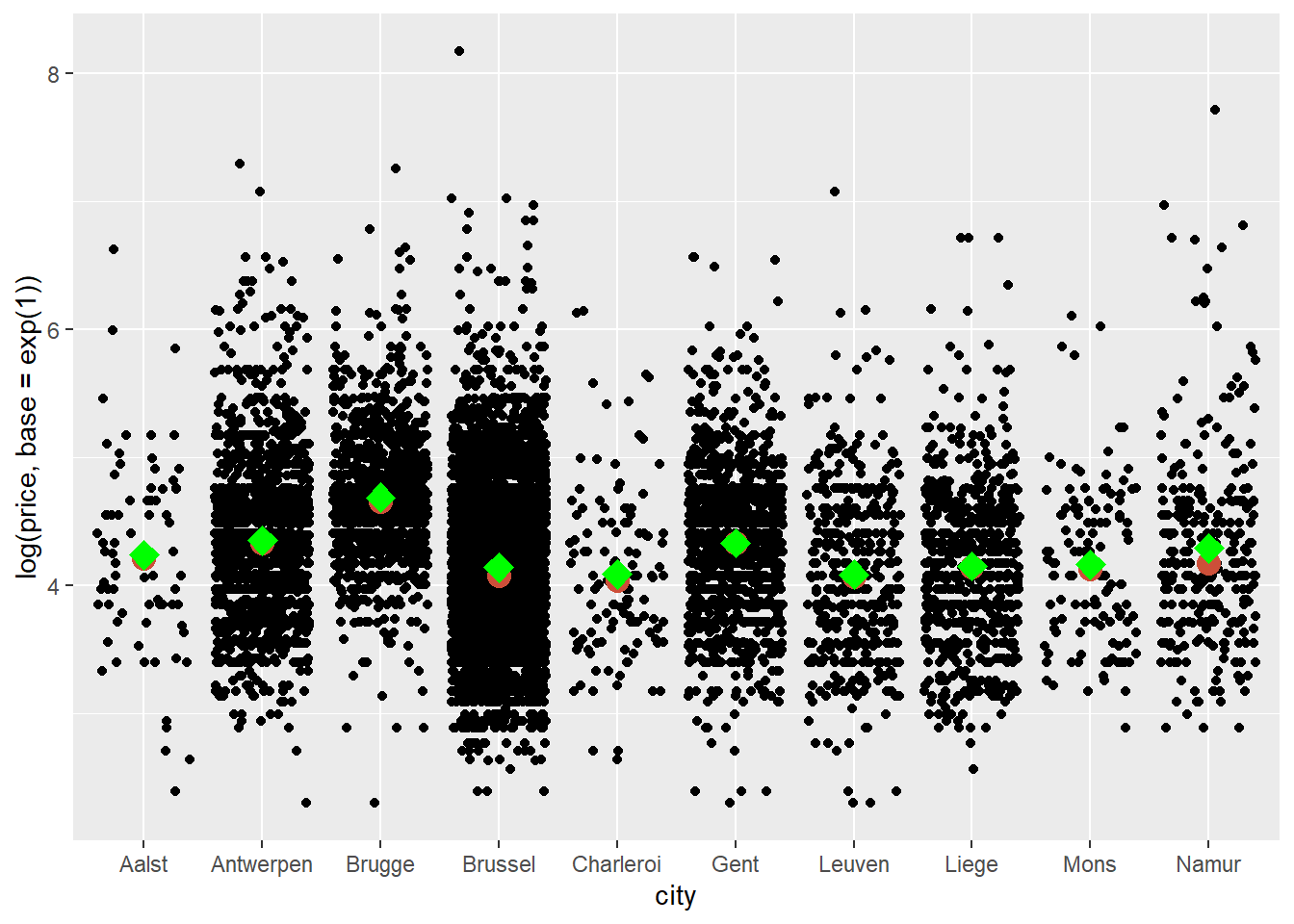
The code to obtain the mean is very similar to that used to obtain the median. We’ve simply changed the statistic, colour, and added shape = 23 to get diamonds instead of circles and fill = "green" to fill in the diamonds. We see that the means and medians are quite similar.
2.6.7 Saving images
We may want to save this plot on our hard drive. To do this click on Export/Save as Image. If you don’t change the directory, the file will be saved in your working directory. You can resize the plot and you should also give it a meaningful file name — Rplot01.png won’t be helpful when you try to find the file later.
A different (reproducible) way to save your file is to wrap the code in the png() and dev.off() functions:
png("price_per_city.png", width=800, height=600)
# This will prepare R to save the plot that will follow.
# Provide a filename and dimensions for the width and height of the picture in pixels.

ggplot(data = airbnb.topten, mapping = aes(x = city, log(price, base = exp(1)))) +
  geom_jitter() +
  stat_summary(fun.y=mean, colour="green", size = 4, geom="point", shape = 23, fill = "green") # I've only kept the mean here

dev.off() # This will tell R that we are done plotting and that it should save the plot to the hard drive.
Even though R has a non-graphical interface, it can create very nice graphs. Practically every little detail on the graph can be adjusted. Many of the graphs that you see in ‘data journalism’ (e.g., on https://www.nytimes.com/ or on http://fivethirtyeight.com/) are made in R.