3 Bivariate Statistics – Case Study United States Presidential Election
3.1 Introduction
Studying the results of the 2020 US presidential election holds profound relevance in terms of understanding contemporary American politics, as well as research on electoral behavior. Analyzing the voting patterns unveils the interplay of demographics, ideology, and socio-economic factors shaping political preferences. Such insights not only inform electoral strategies but also deepen our comprehension of societal divisions and cleavages. The 2020 election also stands out through an effort to overturn the election result by Donald Trump and co-conspirators. This has caused turmoil and abet the January 6 United States Capitol attack (e.g., see https://www.britannica.com/event/January-6-U-S-Capitol-attack and https://statesuniteddemocracy.org/resources/doj-charges-trump/).

Source: https://unsplash.com/de/s/fotos/us-election
Before the election, a team of researchers from the American National Election Study (ANES) conducted a large representative survey (based on a random sample of the US population) to study voting intentions. We will work with these data in this case study. We are particularly interested in which individuals are more likely to support Donald Trump compared to Joe Biden. In doing so, we will present data in the form of cross tabulations. We will also take a closer look at the topic of correlation analysis by investigating the relationship between average education and average Trum support across US states.
3.2 Data overview and descriptive analyses
The data are read from a CSV file (comma-separated values). By using the “head” command, the first six lines of the data are displayed.
data_us <- read.csv("data/data_election.csv")
knitr::kable(head(data_us, 10), booktabs = TRUE,  caption = 'A table of the first 10 rows of the vote data.') %>%
  kable_paper() %>%
scroll_box(width = "100%", height = "100%")| vote | trump | education | age |
|---|---|---|---|
| trump | 1 | 3 | 46 |
| other | NA | 2 | 37 |
| biden | 0 | 1 | 40 |
| biden | 0 | 3 | 41 |
| trump | 1 | 4 | 72 |
| biden | 0 | 2 | 71 |
| trump | 1 | 3 | 37 |
| trump | 1 | 1 | 45 |
| refused / don’t know | NA | 3 | 43 |
| biden | 0 | 1 | 37 |
We can see from this that the following variables are included in the dataset:
vote = voting intention in the 2020 United States presidential election: “trump”, “biden”, “other”, “refused or don’t know”.
trump = numerical recode of the vote variable. 1=“trump”, 0=“biden”, NA=“other / refused / don’t know”.
education = respondent’s highest educational qualification: 1=no degree or high school, 2=some collage, 3=Associate or Bachelor’s degree, 4=Master’s or postgraduate degree, NA=not specified
age = age of respondent in years.
Question: What is the scale of measurement (nominal, ordinal, metric) of each variable?
Your answer:
Solution:
vote and trump –> nominal (i.e., information on if something is either the case or not, categories cannot be ranked and have no numerical meaning) education –> ordinal (i.e., categories (or variable values) can be ranked, information on whether a variable value is “higher”/“more” or “lower”/“less”) age –> metric (i.e., interval between ranked variable values can be compared; e.g., moving up 2 years from 20 to 22 is equivalent to moving up from 52 to 54) 3.2.1 Frequency tables
The following table shows the observed frequencies of the values of the variable vote.
dim(data_us) #total number of cases## [1] 7272 4
table(data_us$vote)##
## biden other refused / don't know
## 3759 274 223
## trump
## 3016We can see that 3,016 respondents chose Trump, whereas 3,759 opted for Biden. A difference of a couple of hundred responses. For a variable with only a few categories, looking at absolute numbers of observations might be informative. However, using relative frequencies in terms of proportions is typically more informative. Let’s get to it!
prop.table(table(data_us$vote))##
## biden other refused / don't know
## 0.51691419 0.03767877 0.03066557
## trump
## 0.41474147The relative difference between the group of Trump supporters and Biden supporters seems to be quite marginal in terms of percentage points. To be able to compare the figures from the survey data with the official vote result, we need to exclude the categories “refused (e.g., because respondent stated not going to vote) / don’t know”. To do so, we assign this category as “missing values,”
data_us$vote[data_us$vote == "refused / don't know"] <- NA # Set "refused / don't know" to NA (i.e., missing), so that this category is no longer displayed in the table command

prop.table(table(data_us$vote))
##
## biden other trump
## 0.53326713 0.03887076 0.42786211Question: How well did the results from the survey predict the actual election outcome? Can we conclude from that whether or not the sample is representative?
Your answer:
Solution:
In the 2020 US presidential election, Biden won the popular vote against Trump by 51.3% to 46.9%. The survey results indicate that at the time the survey was conducted, 53.3% would have voted for Biden (compared to 42.8% for Trump). While the survey correctly predicted Biden as the winner, the result deviated from the actual election outcome by about 2 percentage points. Inferring from samples to the underlying population is always subject to some uncertainty. We can quantify margins of uncertainty, and we will do so in the case study on statistical inference. Beyond the role of statistical uncertainty, several further factors (e.g., political campaigning or situational circumstances on voting day) might have contributed to the outcome of the election result and possibly account for the difference between the survey results and the actual vote.
We will below also exclude the category “other candidates” that could have chosen in the survey and the election (together these candidates gathered less than 2% of the votes in the election). We will show later on how to recode variables. In the meantime, we can rely on the variable trump in which the categories “refused/don’t know” and “other” have already been set to NA (not available which is equal to missing values in terms of data analysis).
prop.table(table(data_us$trump))##
## 0 1
## 0.5548339 0.44516613.2.2 A note on missing data and missing values
In survey data, missing data can occur through deliberate non-response of participants or other processes (e.g., a person has moved to a new address or is not eligible to vote). If the process that generated missing values is not known, this can potentially lead to biased results. A useful vignette on how to deal with missing data can be found here: https://cran.r-project.org/web/packages/finalfit/vignettes/missing.html
Regarding how to deal with missing values in data analyses, remember that in the variable trump the category “won’t vote” was recoded to NA, which means declaring to the program to not include these cases in the statistical analysis. Note that for some functions in R, it is necessary to explicitly exclude missing values (e.g., using the option “na.rm=TRUE”). Other functions do this automatically.
For example, the table command excludes missing values automatically, and if you want to display the frequency of missing values, you have to specify “exclude=NULL”. The mean command, however, does not exclude missing values automatically and therefore we have to specify the option “na.rm=TRUE” (i.e., “NA remove = TRUE”).
3.3 “Who supports Trump?” - Delving into bivariate statistics
In the following, we are interested in which groups of people were more likely to support Trump in the US presidential election. To do so, we focus on respondents’ education and age. Education is measured with a few categories. Hence, setting up a cross tabulation or cross tab (= a table involving two variables) is appropriate. In contrast, age is measured in years and thus comprises many more categories. This would make a cross tab involving age rather cumbersome. We could recode age into a few age categories and use them in a cross tab or we could compare age distributions across voting intentions. Below, we will explore both options.
3.3.1 Education and Trump vote
First, we are interested in whether or not people’s vote choice differs across education groups. If this is the case, we could state that education and voting intentions are statistically related or associated with each other. If not, both would be independent. Following conventions, the “variable to be explained” (a.k.a. outcome or dependent variable) is represented by the rows of the cross tab and the “explanatory variable” (a.k.a. causal factor or independent variable) by the columns. We calculate column percentages for the interpretation (i.e., the number of observations for each cell divided by the total number of observations for each column. Hence, adding all proportions per column adds up to 100%).
In our case, the causal order is quite clear. We have good reason to believe that (if anything) education determines voting intentions (trump) and not the other way around (i.e., voting intentions would cause higher or lower education). Note that in many other cases, the causal order is not as clear and we can freely choose which variable goes in the rows and which in the columns.
tab_xtab(var.row = data_us$trump, var.col = data_us$education, show.col.prc = TRUE, show.obs = TRUE, show.summary = FALSE) #show.col.prc = TRUE displays column percentages| trump | education | Total | |||
|---|---|---|---|---|---|
| 1 | 2 | 3 | 4 | ||
| 0 |
567 45.2 % |
687 50.1 % |
1483 55.4 % |
974 70.5 % |
3711 55.5 % |
| 1 |
687 54.8 % |
685 49.9 % |
1195 44.6 % |
407 29.5 % |
2974 44.5 % |
| Total |
1254 100 % |
1372 100 % |
2678 100 % |
1381 100 % |
6685 100 % |
For column percentages, the interpretation begins by picking two categories (adjacent or extreme) of the explanatory variable and then comparing a relevant category of the outcome.
Interpretation: Among those with low formal education (education=1), 54.8% of respondents support Trump, while in the highly educated group (education=4) only 29.5% support Trump. From this comparison, we can already conclude that education and Trump support are strongly related. The higher the education, the lower the preference for Trump, on average.
Note that in the case of no systematic relationship between variables, the difference between two adjacent or opposite column values would be zero or close to zero (both values would closely correspond to the total proportion of 44.5%).
Important additions to the made interpretation would be (1) to quantify the strength of the empirical relationship (e.g., weak, medium, strong) and (2) to make a statement about how confident we can be that the empirical relationship found in the sample reflects the properties of the population the sample has been drawn from. There are procedures for both purposes, to which we will return to at the end of this case study. Before that, however, let’s go back to cross tabs for a moment. Here, we see the same cross tab as above but with row percentages instead.
tab_xtab(var.row = data_us$trump, var.col = data_us$education, show.row.prc = TRUE, show.obs = TRUE, show.summary = FALSE) #show.row.prc = TRUE displays row percentages| trump | education | Total | |||
|---|---|---|---|---|---|
| 1 | 2 | 3 | 4 | ||
| 0 |
567 15.3 % |
687 18.5 % |
1483 40 % |
974 26.2 % |
3711 100 % |
| 1 |
687 23.1 % |
685 23 % |
1195 40.2 % |
407 13.7 % |
2974 100 % |
| Total |
1254 18.8 % |
1372 20.5 % |
2678 40.1 % |
1381 20.7 % |
6685 100 % |
Question: Which conclusions can be drawn from a cross tab with row percentages?
Your answer:
Solution:
Row percentages are the number of observations for each cell is divided by the total number of observations for each row (adding all proportions per row adds up to 100%). The interpretation would be similar to before, except that we now focus on comparing different categories of the row variable for one selected value of the column variable. Let’s select education = 1: Among those who do not support Trump (= Biden supporters), 15.3% have a low education profile, while among Trump supporters 23.1% have a low education profile. The difference of 7.8 percentage points suggests that Trump support and low education are systematically associated. Hence, the conclusion from the cross tab analysis with row percentages is equivalent to that one from column percentages (given that we adjust the interpretation scheme). Moreover, row percentages in this case also show the descriptive distribution of the education variable within each category of the vote variable. However, it is often not easy to compare the distributions at one glance.
As a third possibility, below a cross tab with total percentages:
tab_xtab(var.row = data_us$trump, var.col = data_us$education, show.cell.prc = TRUE, show.obs = TRUE, show.summary = FALSE) #show.cell.prc = TRUE displays cell or total percentages| trump | education | Total | |||
|---|---|---|---|---|---|
| 1 | 2 | 3 | 4 | ||
| 0 |
567 8.5 % |
687 10.3 % |
1483 22.2 % |
974 14.6 % |
3711 55.6 % |
| 1 |
687 10.3 % |
685 10.2 % |
1195 17.9 % |
407 6.1 % |
2974 44.5 % |
| Total |
1254 18.8 % |
1372 20.5 % |
2678 40.1 % |
1381 20.7 % |
6685 100 % |
Question: Which conclusions can be drawn from a cross tab with cell percentages?
Your answer:
Solution:
Total percentages are the number of observations for each cell divided by the total number of observations. This shows the relative frequency of each combination of values of the two variables. The goal is a descriptive understanding of the distribution of cases. (Note: This is rarely used in applied research.)
3.3.2 Age and Trump vote
Due to the ‘age’ variable being recorded in years and thus having a large number of categories, a cross tab would be quite cumbersome and thus less informative. Therefore, we first create histograms displaying the distribution of the age variable for both categories of trump and then compare them with each other.
histogram( ~ age | trump ,
           breaks = 10,
           ylim=c(0,12),
           type = "percent",
           main = "Left: trump=0 (in support of Biden), Right: trump=1 (in support of Trump)",
           ylab = "Percent of observations",
           xlab = "Age in years",
           layout = c(2,1),
           scales = list(relation="free"),
           col = 'grey',
           data = data_us)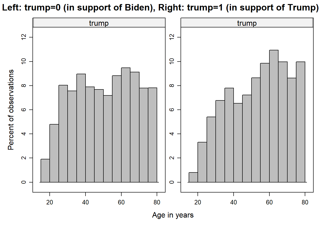
Question: What can be inferred from the graphs?
Your answer:
Solution:
The age distribution of the respondents supporting Biden (left-hand) is a bit more even than the distribution of those supporting Trump (right-hand side). The latter is also more skewed to the left and its center is more on the right, which indicates that respondents who support Trump are older, on average, than those who support Biden.
In addition, here are the means and standard deviations of age by vote group.
Age mean, median, and standard deviation for Biden supporters:
mean(data_us$age[data_us$trump == 0], na.rm=TRUE)## [1] 51.22253
median(data_us$age[data_us$trump == 0], na.rm=TRUE)## [1] 52
sd(data_us$age[data_us$trump == 0], na.rm=TRUE)## [1] 17.22161Age mean, median, and standard deviation for Trump supporters:
mean(data_us$age[data_us$trump == 1], na.rm=TRUE)## [1] 54.2871
median(data_us$age[data_us$trump == 1], na.rm=TRUE)## [1] 56
sd(data_us$age[data_us$trump == 1], na.rm=TRUE)## [1] 16.51148By comparing the mean and median values of both groups, we find that the Trump-supporting group is older than the group that supports Biden. The standard deviation (which can be thought of as the average deviation between the age of respondents and the mean) in the Biden group is slightly larger (17.2 years) than the standard deviation of the Trump group (16.5 years). This means that the age of respondents in the Biden group is slightly more dispersed than in the Trump group.
In the next step, we recode the age variable into the categories “young” (1), “middle-aged” (2), and “old” (3). We then use a cross tab with column percentages.
data_us <- data_us %>%
  mutate(age_cat =
           case_when(age <= 35 ~ 1,
                     age > 36 & age <= 59 ~ 2,
                     age > 59 ~ 3))


tab_xtab(var.row = data_us$trump, var.col = data_us$age_cat, show.col.prc = TRUE, show.obs = TRUE, show.summary = FALSE)| trump | age_cat | Total | ||
|---|---|---|---|---|
| 1 | 2 | 3 | ||
| 0 |
838 63.1 % |
1373 55.7 % |
1375 52.4 % |
3586 55.9 % |
| 1 |
491 36.9 % |
1092 44.3 % |
1250 47.6 % |
2833 44.1 % |
| Total |
1329 100 % |
2465 100 % |
2625 100 % |
6419 100 % |
Question: Interpret the cross tab. What can be concluded? Why don’t we always go straight to categorizing metric variables and using the recoded variable in a cross tab?
Your answer:
Solution:
Looking at the category of young respondents (age_cat = 1), 36.9% prefer Trump as president, whereas among old respondents (age_cat = 3), 47.6% opt for Trump. This difference of 10.7 percentage points indicates a systematic (positive) empirical relationship between age and Trump support: Older respondents tend to prefer Trump more than younger voters.
Here is a way to visualize a cross tab with stacked bar charts. The first figure corresponds to a cross tab with column percentages and the second figure relates to a cross tab with row percentages.
# Age variable will be subdivided into the three dummy variables "young", "middle-aged", and "old"
data_us <- data_us %>%
  mutate(age_cat_nom =
           case_when(age <= 35 ~ "young",
                     age > 36 & age <= 59 ~ "middle-aged",
                     age > 59 ~ "old"))

data_us$age_cat_nom  <- factor(data_us$age_cat_nom, levels=c('young', 'middle-aged', 'old'))

# Recoding of electoral participation
data_us <- data_us %>%
  mutate(trump_nom =
           case_when(trump == 0 ~ "Favoring Biden",
                     trump == 1 ~ "Favoring Trump"))

data_us_counted <- data_us  %>%  count(age_cat_nom, trump_nom)
data_us_counted <- subset(data_us_counted, !is.na(data_us_counted$age_cat_nom)) # removal of missing values
data_us_counted <- subset(data_us_counted, !is.na(data_us_counted$trump_nom)) # removal of missing values


ggplot(data_us_counted, aes(fill=trump_nom, y=n, x=age_cat_nom)) +
    geom_bar(position="fill", stat="identity") +
    scale_y_continuous(labels = scales::percent) +
    labs(x = "Age groups",
       y = "Shares",
       fill = "Voting intention US presidential election") +
    theme_minimal()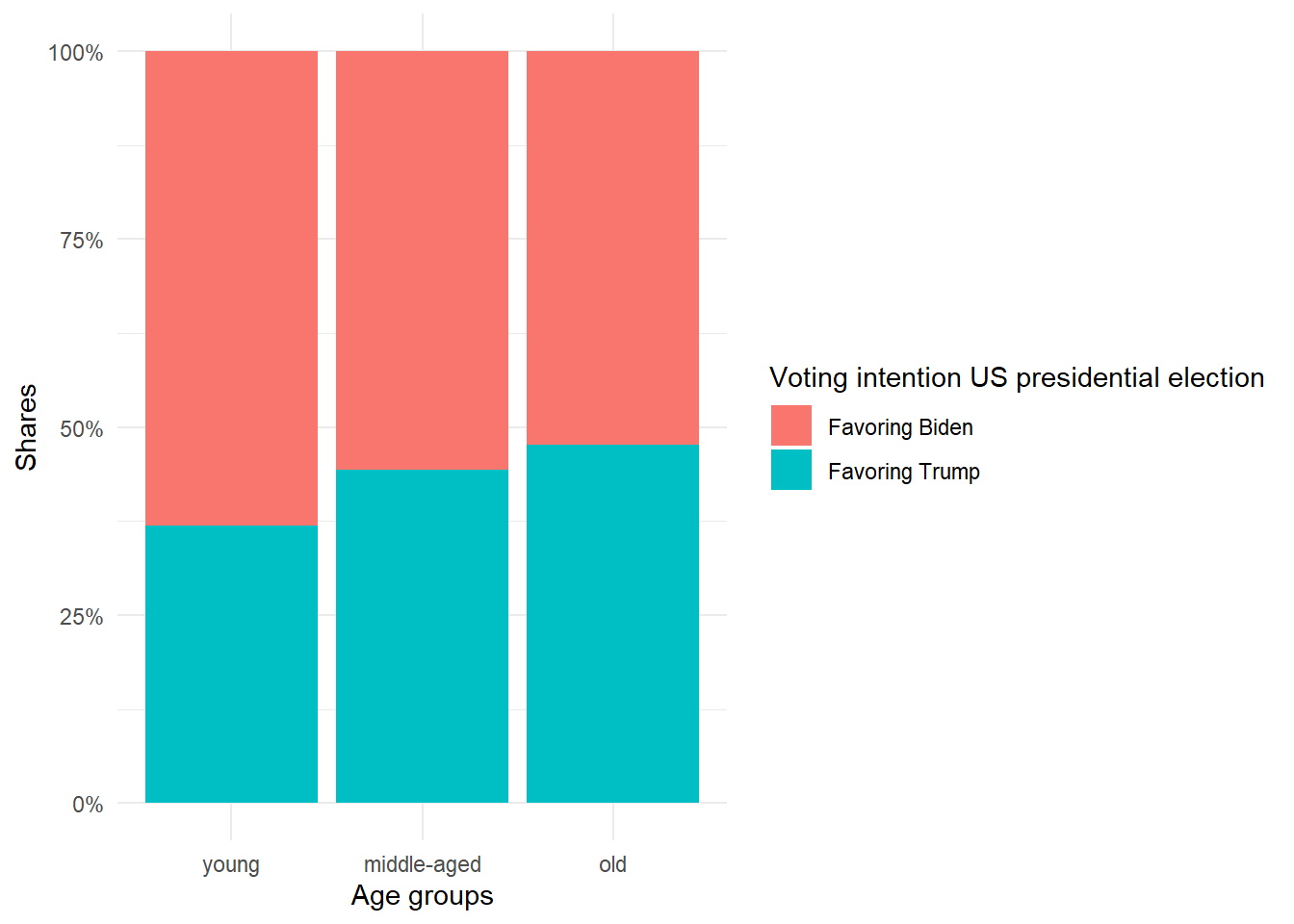
ggplot(data_us_counted, aes(fill=age_cat_nom, y=n, x=trump_nom)) +
    geom_bar(position="fill", stat="identity") +
    scale_y_continuous(labels = scales::percent) +
    coord_flip() +
    labs(x = "Voting intention US presidential election",
       y = "Shares",
       fill = "Age groups") +
    theme_minimal()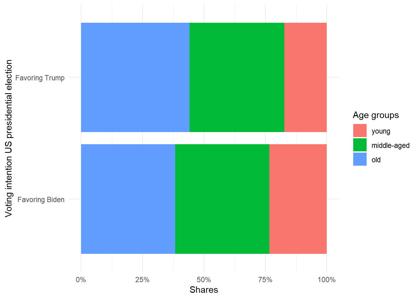
3.4 Scatter plot and correlation
Scatter plots and correlation are suitable for showing relationships between two variables. In the following, we use the average approval of Trump across US states in % (perc_trump) as the variable to be explained (a.k.a. the outcome or dependent variable). State-specific variations in voting patterns are illustrated in the following map. As an explanatory variable, we use the proportion of people in the state who have a high level of education (Master’s or postgraduate) in % (perc_higheducation). Both variables originate from individual-level data of the ANES study and have been aggregated to the state level (i.e., the means per region were stored in a new dataset).
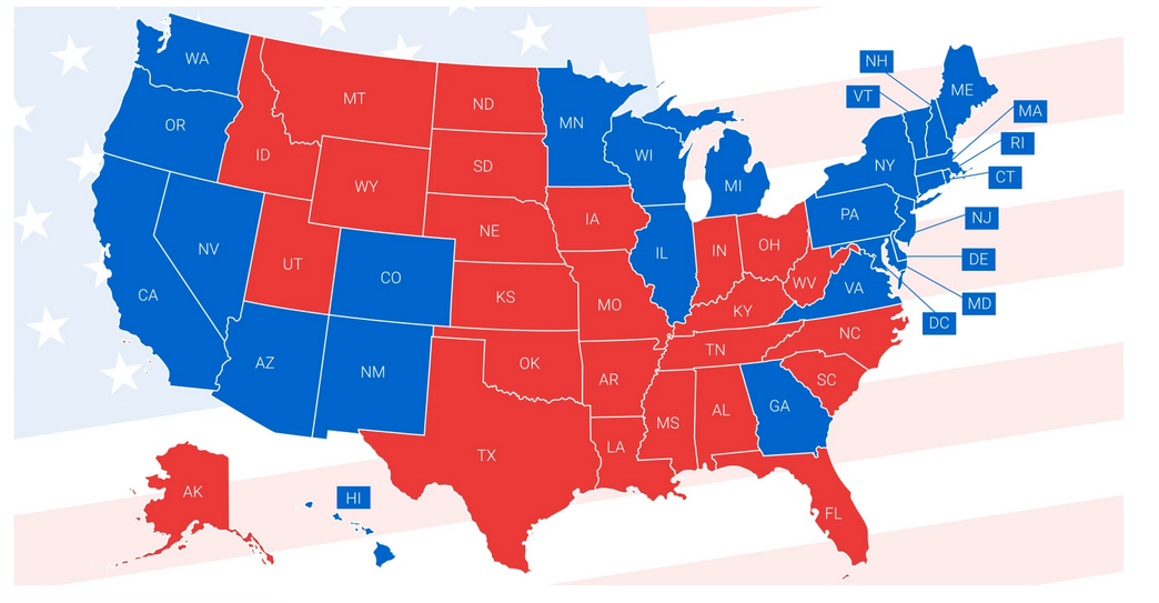
Source: https://www.governing.com/assessments/what-painted-us-so-indelibly-red-and-blue
Next, the data are read and the first six rows are displayed:
data_states <- read.csv("data/data_states.csv")
knitr::kable(
  head(data_states, 10), booktabs = TRUE,
  caption = 'A table of the first 10 rows of the regional vote data.') %>%
  kable_paper() %>%
scroll_box(width = "100%", height = "100%")| state | perc_trump | perc_higheducation |
|---|---|---|
|
0.7333334 | 0.0588235 |
|
0.5416667 | 0.0816327 |
|
0.5000000 | 0.0840336 |
|
0.7619048 | 0.0869565 |
|
0.5238095 | 0.0869565 |
|
0.7142857 | 0.1132075 |
|
0.6022728 | 0.1170213 |
|
0.5031056 | 0.1180124 |
|
0.7500000 | 0.1250000 |
|
0.5526316 | 0.1250000 |
The variable state identifies the region.
3.4.1 Scatter plot
To get a first impression of the empirical relationship between both variables, we use a scatter plot. Each point represents one of the 50 US states and Washington D.C. Note that it is a convention that the dependent variable is shown on the y-axis, whereas the independent variable is shown on the x-axis.
sc1 <- ggplot(data=data_states, aes(x = perc_higheducation, y = perc_trump)) +
  geom_point() +
  xlab("Share of highly-educated persons in %") +
  ylab("Support of Trump in %") +
  scale_y_continuous(labels = scales::percent) +
  scale_x_continuous(labels = scales::percent)

sc1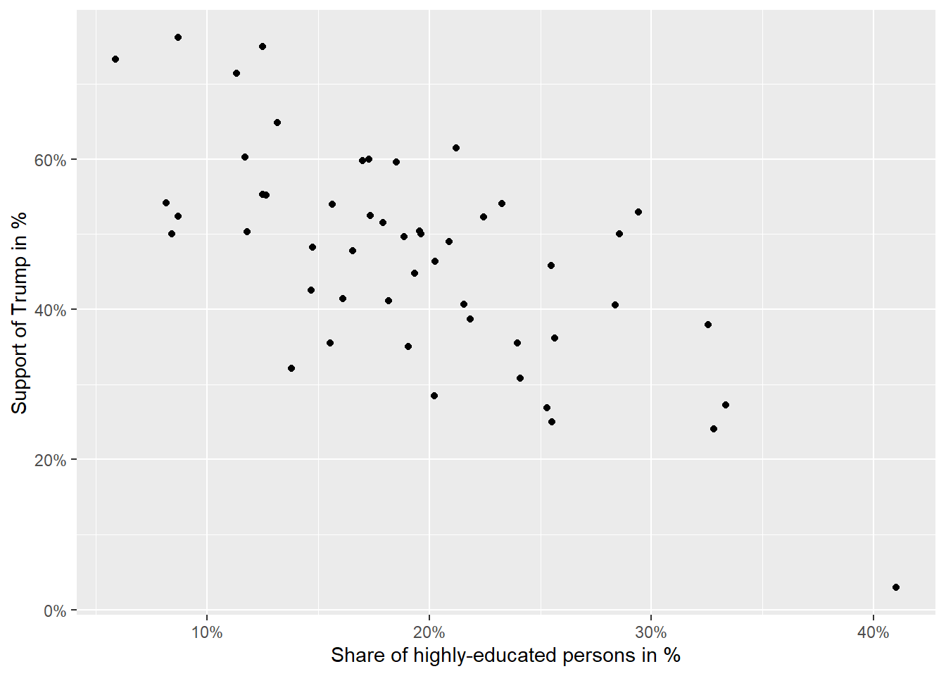
Question: What can be inferred from the figure?
Your answer:
Solution:
The pattern indicates a negative relationship between the two variables. If the proportion of highly educated people in a region increases (moving to the right on the x-axis), we see that this is related to lower support for Trump (lower scores on the y-axis).
3.4.2 Correlation
In the next step, we will take a graphical approach to how a correlation is determined. For this, we plot a vertical and a horizontal line that represents the mean of the variables through the cloud of observations represented by the black dots. We see that the dots are mainly in the upper-left quadrant (= low proportion of high education AND high Trump approval) and the lower-right quadrant (= high proportion of high education AND low Trumo approval). This indicates that higher average education tends to be associated with lower average Trump approval. In other words: The correlation is negative.
#Obtaining means for each variable
mean(data_states$perc_trump, na.rm=TRUE)
## [1] 0.470922
mean(data_states$perc_higheducation, na.rm=TRUE)## [1] 0.1927645
#Scatter plot using percentages as scale units
sc2 <- ggplot(data=data_states, aes(x = perc_higheducation, y = perc_trump)) +
  geom_point() +
  xlab("Share of highly-educated persons in %") +
  ylab("Support of Trump in %") +
  scale_y_continuous(labels = scales::percent) +
  scale_x_continuous(labels = scales::percent) +
  geom_hline(yintercept=0.470922, linetype="dashed", color = "red", size=1) +
  geom_vline(xintercept=0.1927645, linetype="dashed", color = "red", size=1)
sc2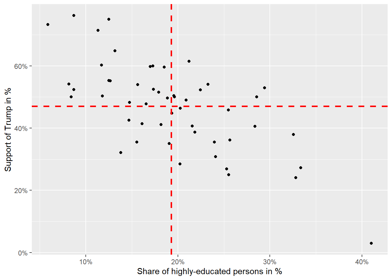
To quantify the relationship, we can calculate the covariance and subsequently the correlation (= standardized covariance fitted into the value range of -1 to +1). The widely used Pearson’s correlation coefficient is given as:
\(r=\frac{Covariance(x,y)}{SD(x)*SD(y)}\)
\(r=\frac{\sum_{i=1}^{n}(x_i-\bar{x})(y_i-\bar{y})}{\sqrt{\sum_{i=1}^{n}(x_i-\bar{x})^2}\sqrt{\sum_{i=1}^{n}(y_i-\bar{y})^2}}\)
The numerator \({\sum_{i=1}^{n}(x_i-\bar{x})(y_i-\bar{y})}\) is particularly important. It represents the covariance, which is an unstandardized measure of association between x and y because its value heavily depends on the scales x and y are measured. At the same time, it serves to determine the direction of the empirical association. To do so, the classification of observations into above/below the mean quadrants is useful again. Observations that are above both means (i.e., upper right corner) have a positive sign and contribute as a product to a “positive” covariance or correlation. The same is true for observations in the lower left quadrant because here both differences have a negative sign, which again contributes as a product to a positive covariance (and thus correlation). In contrast, observations in the upper left and lower right quadrants contribute to a negative covariance (and thus correlation). If observations are evenly distributed across all quadrants, positive and negative products cancel each other out, which would lead to a zero covariance (and thus correlation). The step from covariance to correlation is that the covariance is standardized by the standard deviation of x and y which removes the scale units covariance is measured on and transforms the measure to range between -1 and +1.
Here is an overview of possible scenarios in the correlation coefficient:
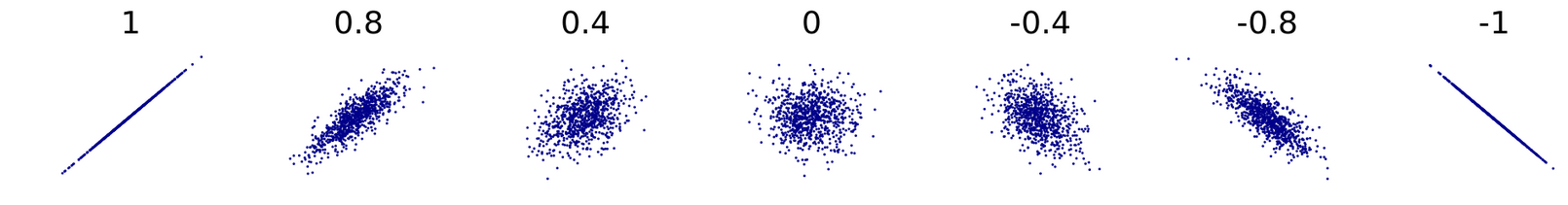
Source: https://en.wikipedia.org/wiki/Correlation#/media/File:Correlation_examples2.svg
Scatter plots showing correlations (from left to right) of -1, -0.8, -0.4, 0, 0.4, 0.8 and 1.
In the next step, the correlation between the share of highly educated people and the share of Trump supporters is calculated and a line representing their relationship is plotted. The line essentially depicts the bivariate association in the form of a regression slope, which always runs in the direction of the correlation. However, its interpretation differs from correlation.
sc3 <- ggplot(data=data_states, aes(x = perc_higheducation, y = perc_trump)) +
  geom_point() +
  xlab("Share of highly-educated persons in %") +
  ylab("Support of Trump in %") +
  scale_y_continuous(labels = scales::percent) +
  scale_x_continuous(labels = scales::percent) +
  geom_smooth(method = lm, se = FALSE)
sc3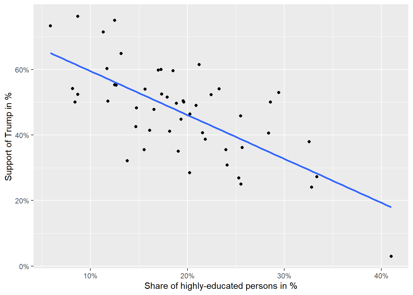
vars <- c("perc_higheducation", "perc_trump")
cor.vars <- data_states[vars]
rcorr(as.matrix(cor.vars))
## perc_higheducation perc_trump
## perc_higheducation 1.00 -0.69
## perc_trump -0.69 1.00
##
## n= 51
##
##
## P
## perc_higheducation perc_trump
## perc_higheducation 0
## perc_trump 0In the case of correlation and regression coefficients, the interpretation always begins with mentioning x (or the independent variable) which exerts an effect on y (or the dependent variable).
Correlation coefficient: “If x increases, then y increases / decreases (depending on the sign of the correlation coefficient), on average. The magnitude of the correlation coefficient r indicates a weak/moderate/strong empirical association.” (Rule of thumb: +/- 0.1 weak, +/- 0.3 moderate, +/- 0.5 or higher strong association)
Regression coefficient: “If x increases by one unit, then y increases / decreases (depending on the sign of the regression coefficient) by coefficient units, on average.” The specific coefficient estimate that is referred to, is given in the regression output. To what extent the empirical relationship is strong, moderate, or weak can be determined by a standardization of the regression coefficients. Note that the details of regression analysis and its interpretation are covered in the case study on regression analysis.
Correlation is a standardized form of covariance, which comes with the advantage of being intuitively interpretable (-1 to +1) without any reference to the underlying scale the two variables are measured. However, the price to pay is that it conceals the magnitude by which y changes if x changes by one unit (rather it represents how dense observations cluster together in forming a linear relationship). Bivariate regression quantifies the expected increase in y if x increases by 1. We thus need to standardize (or “correct”) the covariance between x and y for the scale on which x is measured. This is achieved by dividing the covariance by the variance of x: \(b=\frac{Covariance(x,y)}{Var(x)}\)
Interpretation of the correlation coefficient from the example: The correlation between the proportion of people with high education and Trump support is negative. If the share of people with high education increases, then Trump support decreases, on average. The correlation coefficient of -0.69 indicates a strong empirical relationship between both variables.
3.5 Chi-square and Cramér’s V
Now we return to cross tabs and how to make a statement about whether there is a correlation between the displayed variables and if so, how strong it is. To do so, we once again revisit the individual-level survey data and display the cross tab between education and trump.
tab_xtab(var.row = data_us$trump, var.col = data_us$education, show.col.prc = TRUE, show.obs = TRUE, show.summary = TRUE) #setting show.summary = TRUE displays summary statistics at the bottom of the table| trump | education | Total | |||
|---|---|---|---|---|---|
| 1 | 2 | 3 | 4 | ||
| 0 |
567 45.2 % |
687 50.1 % |
1483 55.4 % |
974 70.5 % |
3711 55.5 % |
| 1 |
687 54.8 % |
685 49.9 % |
1195 44.6 % |
407 29.5 % |
2974 44.5 % |
| Total |
1254 100 % |
1372 100 % |
2678 100 % |
1381 100 % |
6685 100 % |
χ2=196.388 · df=3 · Cramer’s V=0.171 · p=0.000 |
It has already become quite clear that low-educated people were more likely to support Trump compared to high-educated people (who were more in favor of Biden). To quantify the empirical association, we can calculate Cramér’s V. This measure quantifies empirical relationships if a nominal variable is involved (here: trump). It is based on a chi-square test for independence. The chi-square value indicates how strongly the real observations deviate from a theoretical distribution, wherein all observations are equally distributed (relative to marginal distribution) across the cells of the cross tab. The more the measured observations deviate from the theoretical distribution, the higher the chi-square value and subsequently Cramér’s V gets, which is normalized for the table size and ranges between 0 (= no association) and 1 (= exceedingly strong association).
The formula for the chi-square test for cross tabs is the following: \(\chi^2= \sum{\frac{(O-E)^2}{E}}\)
\(O\) refers to the observed frequencies and \(E\) to the expected ones. The expected frequencies are obtained by multiplying the marginal frequencies (“total”) for each cell, divided by the total number of cases (\(E = \frac{R\times C}{n}\)). For the first cell in the table above, this would be (1254*3711)/6685=696.12. Thus, 696 observations would be theoretically expected in the first cell and 567 were observed. Quite different. This is done (usually through statistical software) for each cell and summed up according to the formula.
Cramér’s V is a measure based on chi-square and adjusted for different-sized cross tabs. It is given by the formula: \(V=\sqrt{\frac{\chi^2}{n\times (m-1)}}\), where \(n\) is the number of observations and \(M\) is the number of categories (or variable values) of the variable with the fewer categories (here trump with 2).
Regarding interpretation, the following guidelines apply:
- Cramér’s V ranges from 0 to 1, with no negative values possible
- Hence, Cramér’s V provides no information on whether the association is positive or negative, we have to figure this out from the table (e.g., by calculating percentage differences between column values –> see above)
- Rules of thumb regarding the size of the relationship:
- In a small table (e.g., 2x2): between 0.1 and 0.3 –> weak, more than 0.3 and less than 0.5 –> moderate, more than 0.5 –> strong association
- In a large table (e.g., 5x5): between 0.05 and 0.15 –> weak, more than 0.15 and less than 0.25 –> moderate, more than 0.25 –> strong association
In R, chi-square and Cramér’s V can be calculated with the following commands:
chisq.test(data_us$trump, data_us$education)##
## Pearson's Chi-squared test
##
## data: data_us$trump and data_us$education
## X-squared = 196.39, df = 3, p-value < 2.2e-16
cramerV_tabelle <- table(data_us$trump, data_us$education)
cramerV(cramerV_tabelle)
## Cramer V
## 0.1714Question: How can Cramér’s V be interpreted in this case?
Your answer:
Solution:
Interpretation: There is an association between the variableseducationandtrump. Given the rule of thumb for small tables, the association of 0.17 is weak. In our case, we know from the interpretation above that the association is negative (the higher the education, the lower the approval of Trump, on average).
Question: Why didn’t we calculate the Pearson’s correlation coefficient instead?
Your answer:
Solution:
Pearson’s correlation coefficient requires (quasi-)metric variables with several categories. For ordinal variables, we have tools such as Kendall’s Tau or Spearman’s correlation coefficient (see here for more on different correlation types: https://ademos.people.uic.edu/Chapter22.html). If nominal variables are involved, we use coefficients such as Cramér’s V.