5 Graphics
R is widely considered the best programming language for producing high-quality, often complex graphics of data and model outputs. Unlike Python, R is full of useful built in graphical features. Moreover, R has several libraries that extend these graphical resources further than almost any other programming language. In this section we will discuss the base plotting tools in R and discuss how to create more complex graphics using the libraries ggplot2 and plotly. I will also provide some other extensions and libraries for R that you might find useful in the future.
5.1 Subset and Merge Data
Before we dig into graphics, first let’s quickly discuss how to do basic subsets and mergers of your data.
In Base R there are many ways to subset data. Here are two quick examples that will be most useful:
# Subset a data frame v1
df.sub <- subset(df, Var1 == "Cat1")
  # this will return all rows where Var1 is Cat1
  # and all columns for these rows from the frame

df.sub <- droplevels(df.sub)
  # often you will want to drop levels from the df
  # that are no longer present in the subset data


# Subset a data frame v2
df.sub <- df[1:200,c(1,4:5,10)]
  # this will return the first 200 rows
  # and the 1st, 4th, 5th, and 10th columns
We can also use the dplyr package and its powerful data handling tools to subset and rearrange data. This is helpful for all sorts of analysis and modeling (which we will cover later), but can be especially useful when you are trying to tell a story, graphically, using your data.
library(dplyr)

df.sub <- df %>% filter(Var1 == "Cat1")
  # the 5>% is known as a 'pipe' and is used by dplyr
  # to tie one command to the next in a string or 'pipe'
You will also often times need to merge or join two or more data sets together. There is a base R version of this as well as a dplyr version.
# Base R
df.merge <- merge(df1, df2, by = "uniqueId")
  # the 'uniqueId' variable would be an identification
  # variable for each row and would be in both data sets

# dplyr
df.merge <- left_join(df1, df2, by = c("uniqueId" = "uid", "date" = "exposure"))
5.2 Base R plot Functionality
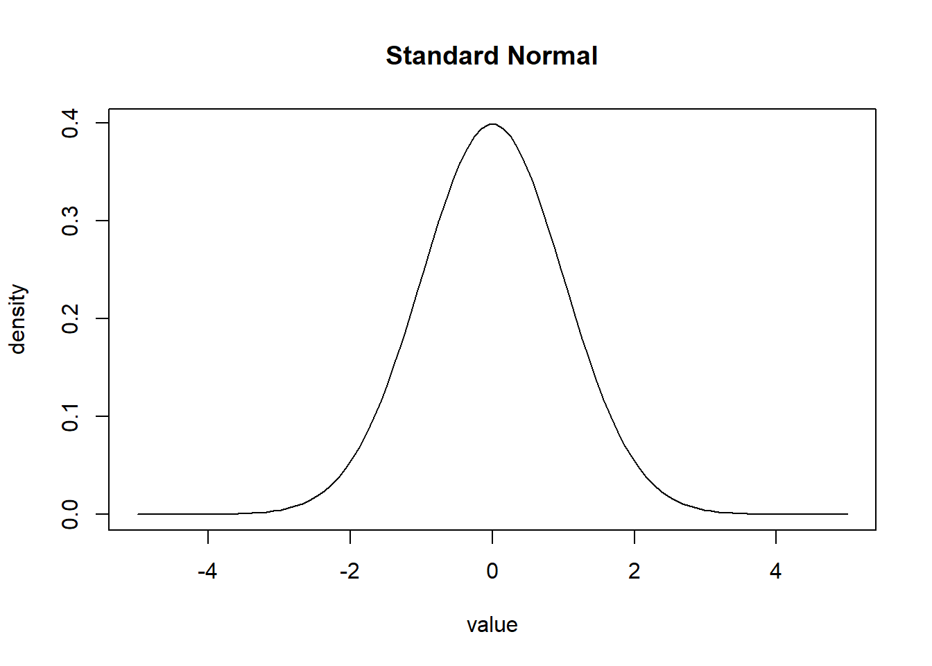
The base R plot function is an extremely powerful graphics engine and is useful for producing quick graphics of nearly any type of data or model output. While not the prettiest, it can be used to produce graphics for internal reports or preliminary research/design studies. To call the plotting function we will simply start with a bit of data, and call the plotting function.
# Plot of Normal Distribution
x <- seq(-5,5,length=100)
y <- dnorm(x)
plot(x, y)

# Make plot a line
plot(x, y, type="l")

# Add labels to the plot
plot(x, y, type="l", ylab="density", xlab="value", main="Standard Normal")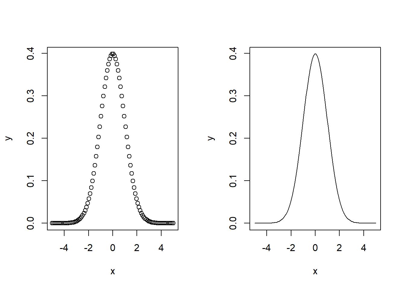
In base R there are also histogram and density plots built into the base plotting function.
# Simulate random numbers from normal distribution
y <- rnorm(1000)
d <- density(y)

par(mfrow=c(1,2))
plot(d, main="Density Plot")
hist(y, main="Histogram")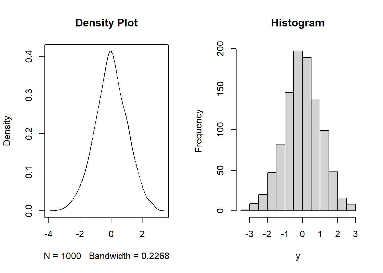
#dev.off()We can also plot other, more complicated data structures like residuals from a regression model or time series data simply by calling to the plot function.
Linear Model Example
data("mtcars")
plot(mtcars$disp, mtcars$mpg,
     xlab = "disp", ylab = "mpg")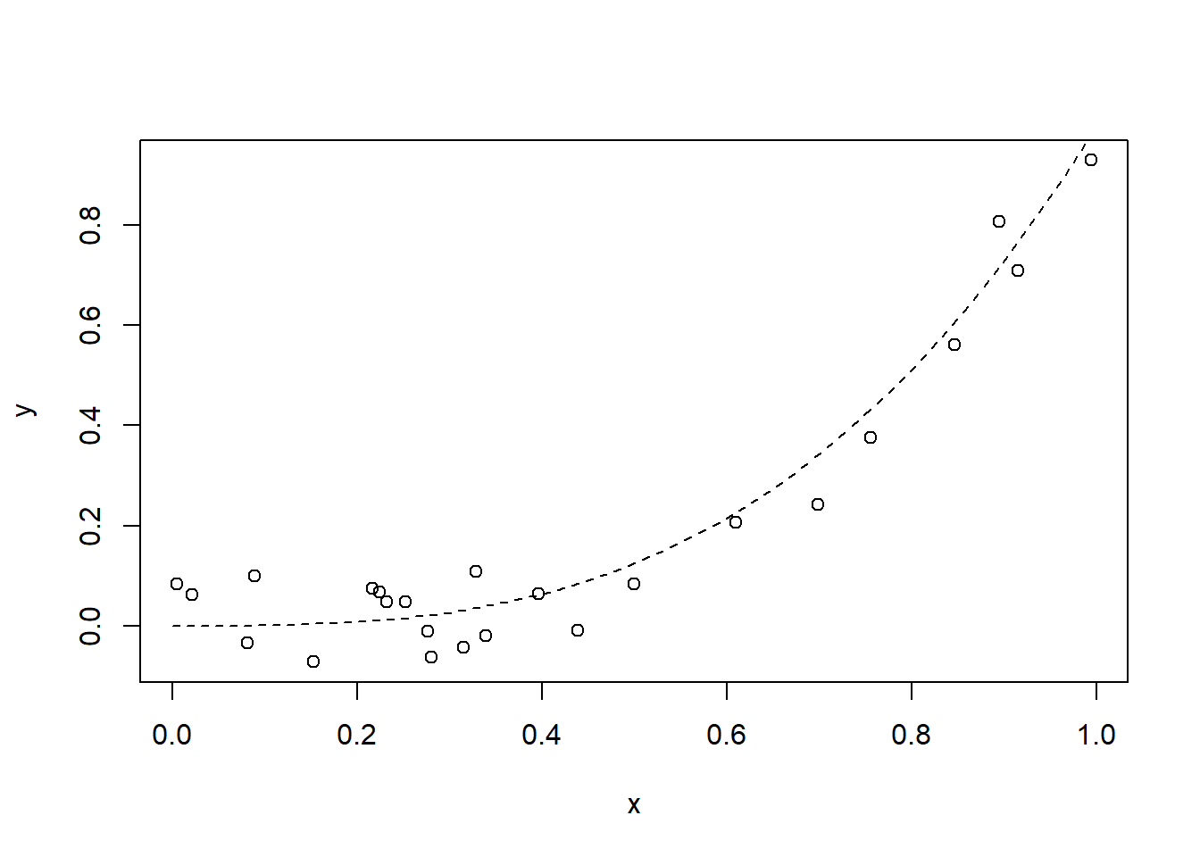
# fit linear model
lm.fit <- lm(mpg ~ disp, data = mtcars)

# plot lm output
par(mfrow = c(2,2))
plot(lm.fit)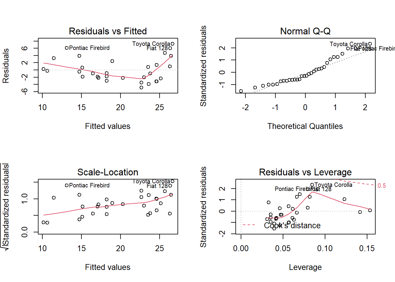
Time-Series Example
library(forecast)## Warning: package 'forecast' was built under R version 4.1.3data("AirPassengers")
# Plot the data
plot(AirPassengers)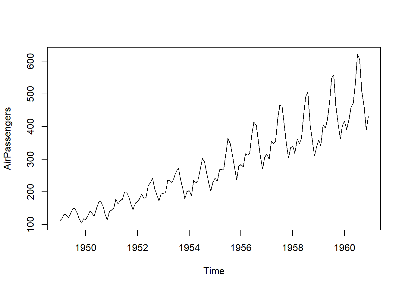
# Turn data into time-series data type
tsdata <- ts(AirPassengers, frequency = 12)

# Decompose the data
decdata <- decompose(tsdata, "multiplicative")

# Plot decomposed data
plot(decdata)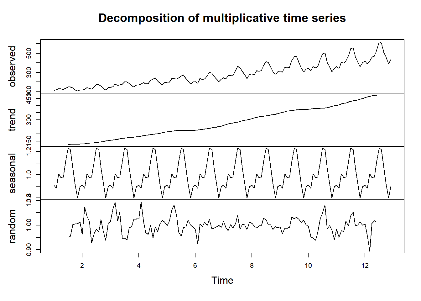
boxplot(AirPassengers~cycle(AirPassengers, xlab="Date",
                            ylab = "Passenger Numbers (1000's)",
                            main = "Monthly air passengers boxplot from 1949-1960"))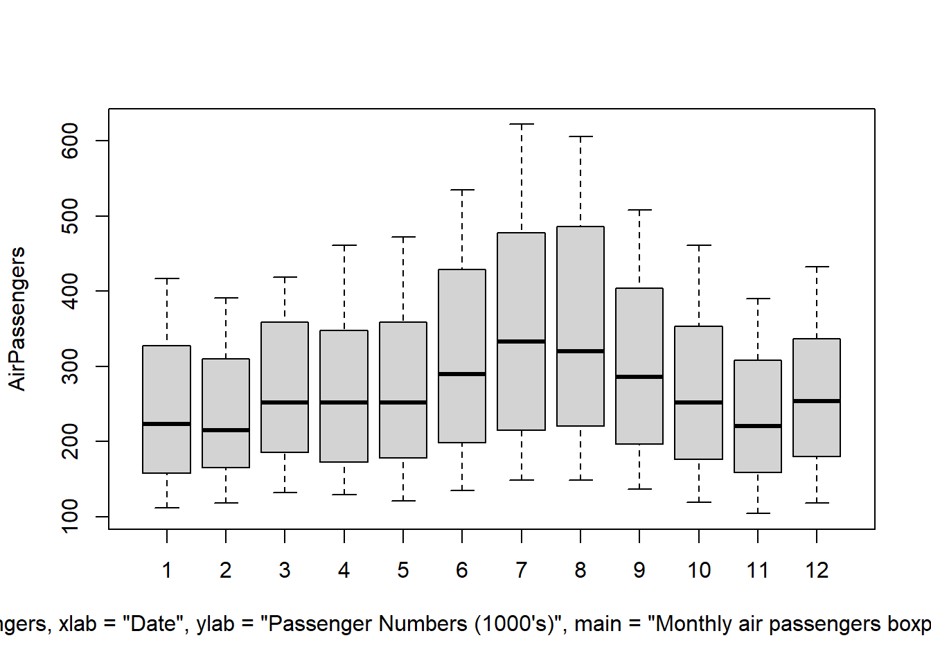
# ARIMA Model

fit <- auto.arima(AirPassengers)
fit
plot.ts(fit$residuals)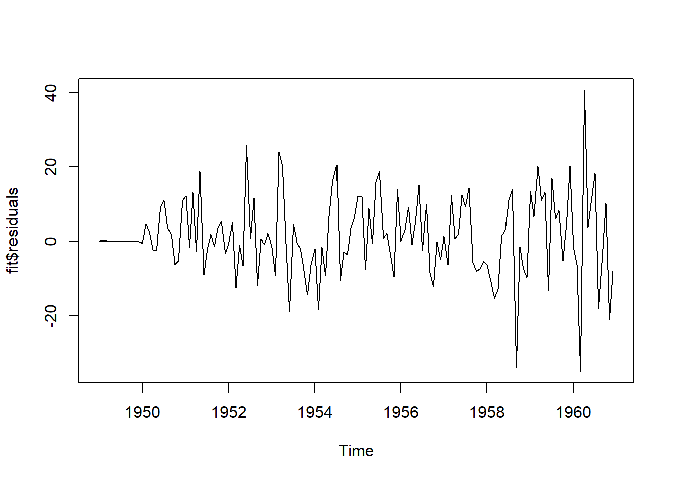
pred <- forecast(fit, level=c(95), h=10*12)
plot(pred)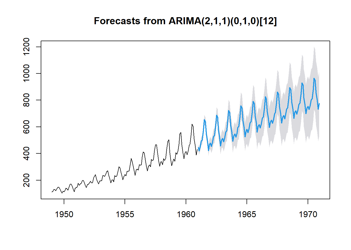
5.3 ggplot2: The Good Stuff
The ggplot2 library is one of the best graphics libraries for any computer language available today. The ggplot2 package can be used to produce any number of publication-quality graphics for your research. In this section I will quickly outline the basic syntax structure of the ggplot function and provide you with resources for reference. It should be noted, that unlike many other areas in R where you will eventually remember deep syntactic structures, graphics is often where you will continue to go back to the reference material to remember bits and pieces you have not used in a long time. This is OK!
Some useful websites for ggplot2 syntax reference:
- https://ggplot2.tidyverse.org/
- https://r-graph-gallery.com/ggplot2-package.html
- https://ggplot2-book.org/
- https://www.rdocumentation.org/packages/ggplot2/versions/3.3.6 — complete syntax reference
Basic Syntax
library(ggplot2)
data(iris)

# all ggplots start with a call to the ggplot function
p <- ggplot(iris, aes(x=Sepal.Length))
  # 'aes' stands for the aesthetic you want to plot

# you can then add to this plot 'p'
p <- p + geom_density(adjust = 1/4, fill=NA)
  # this makes the graphic a density plot of the data

# we can then call this plot by its name
p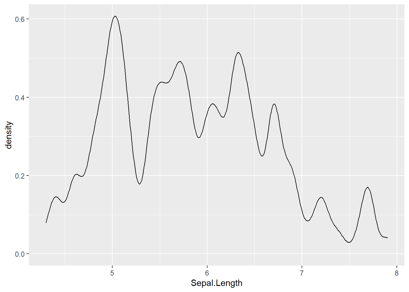
We can also extend this plot to look very different by changing the themeing, adding data points, giving the plot labels, subsetting the data direction in the plotting, and much much more.
More Complicated Syntax
Using the same data we will:
- plot the density of
Sepal.Length - filter the data to be only \(\geq 5\)
- group and color the data by the
Speciesof the iris - add main and axis labels to the chart
- set our own color scheme
- change the overall theme of the plot
library(ggplot2)
library(dplyr)

data("mtcars")
data("iris")

myColors <- c("navy","goldenrod3","red")

# mtcars example
ggplot(filter(mtcars, mtcars$hp >= 100),
       aes(x=disp, y=mpg,
           colour=factor(cyl), group=factor(cyl),
           shape=factor(cyl))) +
  geom_point() +
  theme_bw() +
  scale_color_manual(values = myColors) +
  ggtitle("More Complex ggplot Syntax") +
  xlab("Displacement") +
  ylab("Miles Per Gallon") +
  geom_text(label = row.names(filter(mtcars, mtcars$hp >= 100)),
            nudge_x = 1, nudge_y = 0.5,
            check_overlap = T)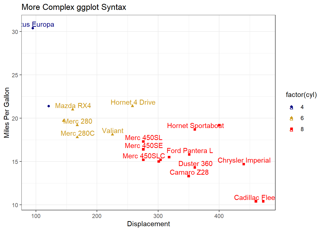
# iris example
ggplot(filter(iris, iris$Sepal.Length >= 5),
       aes(x=Sepal.Length, colour=Species, group=Species, fill=Species)) +
  geom_density(adjust=1/5, alpha = 0.1) +
  theme_bw() +
  scale_color_manual(values = myColors) +
  scale_fill_manual(values = myColors) +
  ggtitle("More Complex ggplot Syntax") +
  xlab("Sepal.Length") +
  ylab("Relative Density")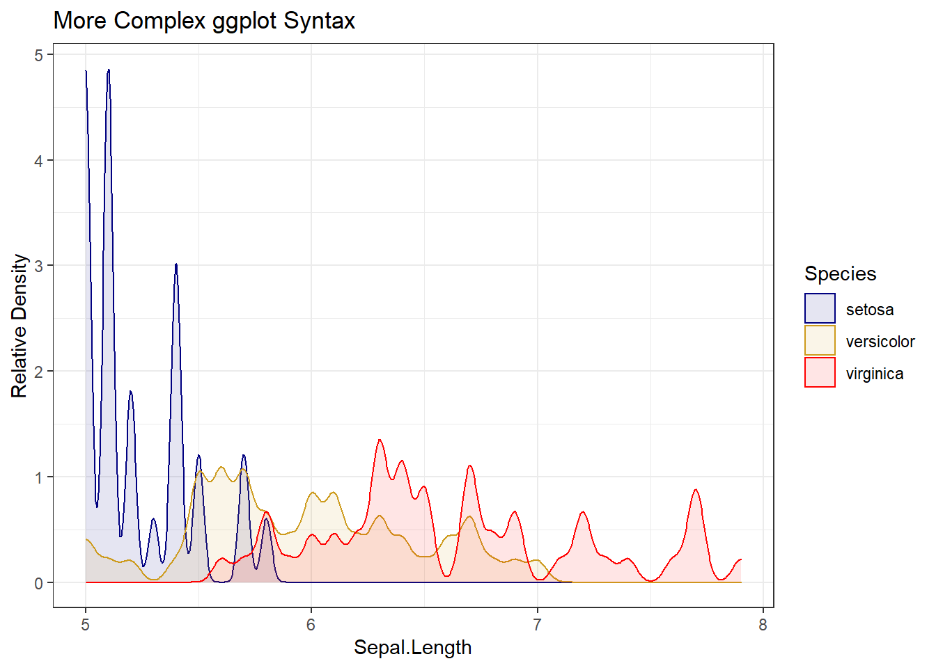
5.4 Other Useful Packages
There are a few other general graphics packages. Moreover, there are many other useful packages specifically designed to create graphics for different types of data and model outputs. These packages are a bit more specialized than ggplot2 and are therefore a bit less useful overall, but if/when you are building a model of the type the package is designed for, these are much more useful than the general graphics libraries.
ggvis: general graphics package likeggplot2lattice: for multivariate data and modelingplotly: allows for interactive plots in applicationscolourpicker: allows you to pick colors for your plotsrgl: 3D plotsgclust: cluster plotsdiagrammeR: graphs/flowchartsigraph: networks and graph modelscartography: maps/GIS dataleaflet: maps/GIS databayesplot: for plotting MCMC models
The list goes on and on…