5 以 ggplot2 進行資料視覺化
本部分(第 5、7、8 章)要談的是資料探索。本章為 Wickham and Grolemund (2016) 第 1 章內容。
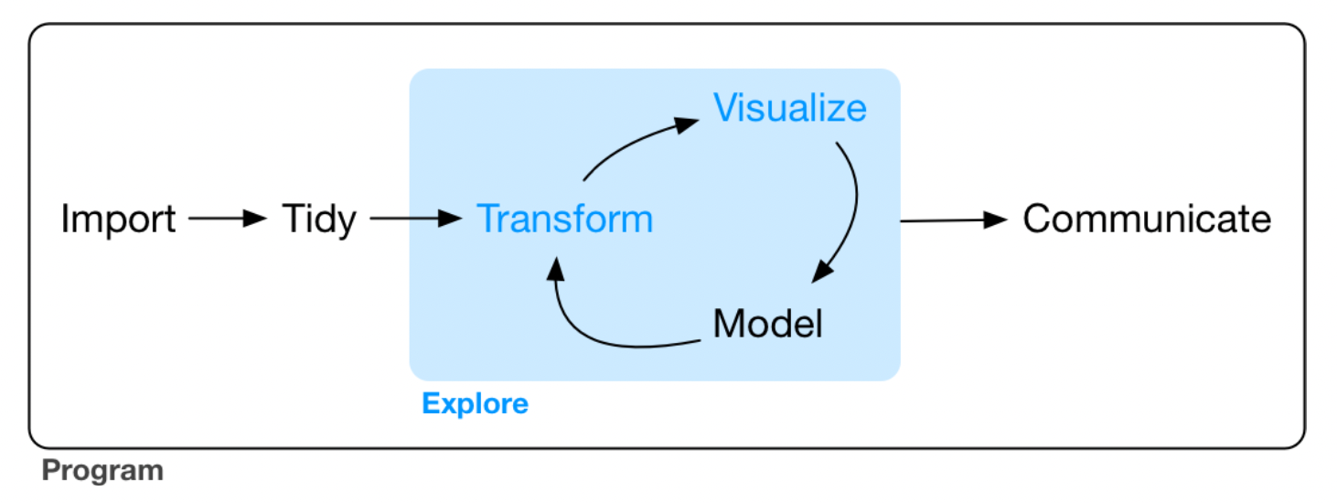
Figure 5.1: Data exploring.
前置作業
此章的目的則是要學習以 ggplot2 進行簡單的資料視覺化。我們先要載入 tidyverse,其包含了 ggplot2。在 Console 輸入:
library(tidyverse)## ── Attaching packages ─────────────────────────────────────── tidyverse 1.3.1 ──## ✓ ggplot2 3.3.5 ✓ purrr 0.3.4
## ✓ tibble 3.1.3 ✓ dplyr 1.0.7
## ✓ tidyr 1.1.3 ✓ stringr 1.4.0
## ✓ readr 2.0.1 ✓ forcats 0.5.1## ── Conflicts ────────────────────────────────────────── tidyverse_conflicts() ──
## x dplyr::between() masks data.table::between()
## x dplyr::filter() masks stats::filter()
## x dplyr::first() masks data.table::first()
## x purrr::flatten() masks jsonlite::flatten()
## x readr::guess_encoding() masks rvest::guess_encoding()
## x dplyr::lag() masks stats::lag()
## x dplyr::last() masks data.table::last()
## x purrr::transpose() masks data.table::transpose()5.1 創建一個 ggplot
引擎大的車子相較於引擎小的車子使用更多的汽油嗎?
我們可以使用 tidyverse 中 mpg 這個 data frame 來嘗試回答這個問題。
mpg## # A tibble: 234 × 11
## manufacturer model displ year cyl trans drv cty hwy fl class
## <chr> <chr> <dbl> <int> <int> <chr> <chr> <int> <int> <chr> <chr>
## 1 audi a4 1.8 1999 4 auto… f 18 29 p comp…
## 2 audi a4 1.8 1999 4 manu… f 21 29 p comp…
## 3 audi a4 2 2008 4 manu… f 20 31 p comp…
## 4 audi a4 2 2008 4 auto… f 21 30 p comp…
## 5 audi a4 2.8 1999 6 auto… f 16 26 p comp…
## 6 audi a4 2.8 1999 6 manu… f 18 26 p comp…
## 7 audi a4 3.1 2008 6 auto… f 18 27 p comp…
## 8 audi a4 quattro 1.8 1999 4 manu… 4 18 26 p comp…
## 9 audi a4 quattro 1.8 1999 4 auto… 4 16 25 p comp…
## 10 audi a4 quattro 2 2008 4 manu… 4 20 28 p comp…
## # … with 224 more rows其中,displ 為引擎的大小,單位是公升數;hwy 為汽車在高速公路上的燃油效率,以每加侖英里(miles per gallon, mpg)為單位,較低的話代表同樣的里程得要使用更多的油。
我們可以把 displ 放在 \(x\) 軸,而把 hwy 放在 \(y\) 軸,創建一個 ggplot:
ggplot(data = mpg) + geom_point(mapping = aes(x = displ, y = hwy))
ggplot() 可以創造一個座標系統,而我們可以在上面加上圖層。其中,第一個引數為此圖所要使用的 dataset,例如此處為 ggplot(dataset=mpg),但這時候不會得到任何東西,只有一張空白的圖。而我們可以再加上其他圖層,如使用 geom_point(),可以用來繪製散佈圖(scatterplot)。而 geom_point() 函數有引數 mapping,與 aes() 搭配使用,可以讓我們指定 \(x\) 軸與 \(y\) 軸分別要是什麼變數。
此外,從此圖看起來,引擎大小與燃油效率呈現負向關係,即引擎更大的車,使用更多油。
5.2 The Layered Grammar of Graphics
ggplot2 的語法大致如下,層層堆疊各種函數。在 geom 中,除了 mapping=aes(),我們還可以加上其他種類的 stat 與 “position adjustment”;若有需要,也可以加上不同的「座標系統」與 “facet function”。
ggplot(data = <DATA>) +
  <GEOM_FUNCTION>(
    mapping = aes(<MAPPINGS>),
    stat = <STAT>,
    position = <POSITION>)+
    <COORDINATE_FUNCTION> +
    <FACET_FUNCTION>
以下將逐一簡介這些參數(以 <> 包圍的字串)的使用方式。
5.3 Aesthetic Mappings
我們可以新增第三個變數,例如 mpg 中的 class 到兩向度的散佈圖,讓上面的點映射到 aesthetic。Aesthetic 是一種物件的視覺性質,包含了點的 color、size、shape 等。使用 aesthetic 在 aes() 中使用 aesthetic.name = variable.name 即可,而如果我們不想要旁邊的圖例,可以使用 show.legend = FALSE,如:
# ggplot(data = mpg) +
#   geom_point(mapping = aes(x = displ, y = hwy, color = class), show.legend = FALSE)
ggplot(data = mpg) + geom_point(mapping = aes(x = displ, y = hwy, color = class))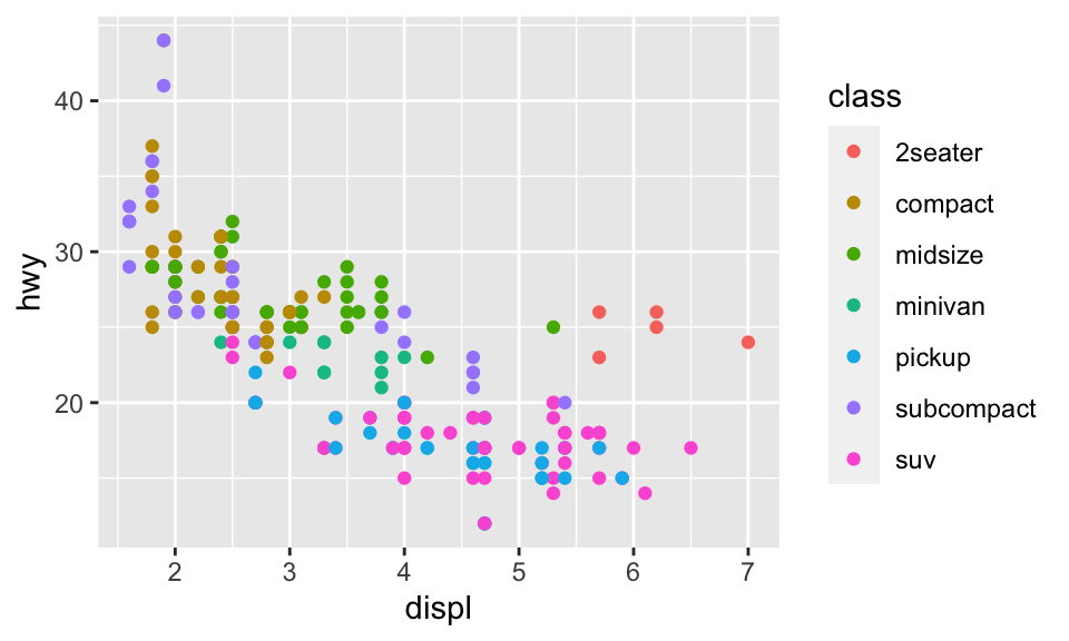
此外,如果我們映射 color 到一個邏輯條件,則如:
ggplot(data = mpg) + geom_point(mapping = aes(x = displ, y = hwy, color = displ < 5))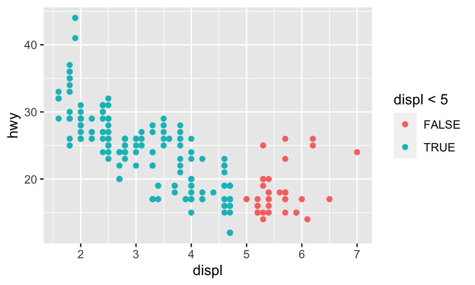
我們也可以使用 size = class。但要注意的是此時會出現 Warning,因為把一個無序的變數 class 映射到一個有序的 aesthetic size 並不是一個好方法:
ggplot(data = mpg) + geom_point(mapping = aes(x = displ, y = hwy, size = class))## Warning: Using size for a discrete variable is not advised.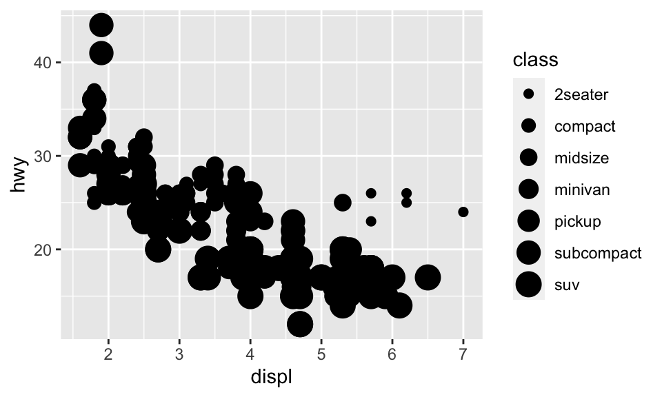
我們也可以映射 class 到 alpha 或 shape,分別代表透明度與形狀,但也都會出現 Warning:
ggplot(data = mpg) + geom_point(mapping = aes(x = displ, y = hwy, alpha = class))## Warning: Using alpha for a discrete variable is not advised.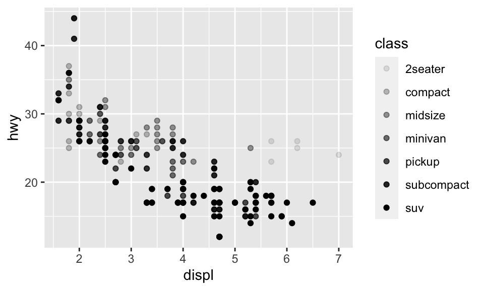
ggplot(data = mpg) + geom_point(mapping = aes(x = displ, y = hwy, shape = class))## Warning: The shape palette can deal with a maximum of 6 discrete values because
## more than 6 becomes difficult to discriminate; you have 7. Consider
## specifying shapes manually if you must have them.## Warning: Removed 62 rows containing missing values (geom_point).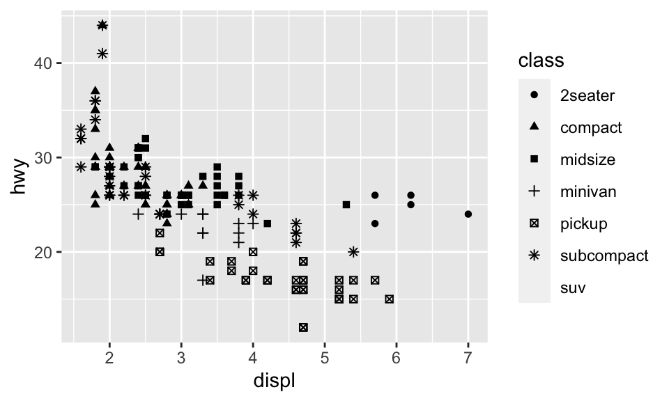
我們也可以從 geom 手動選擇 aesthetic properties,例如我們可以在 geom() 中加上 color = "blue",讓所有點都變成藍色:
ggplot(data = mpg) + geom_point(mapping = aes(x = displ, y = hwy), color = "blue")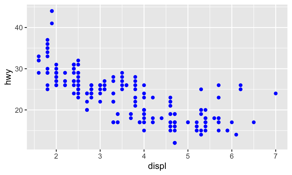
這樣的話,就只是改變顏色,顏色並未傳達更多資訊。不過,事實上 ggplot2 也可以手動設置 aesthetic,不過此處從略。
5.4 Facets
注意:類別變數才能繪製成 facets!
除了把變數映射到 aesthetics,我們也可以把類別變數繪製成 facets,即分別繪製資料不同的子集。要繪製 facets,我們可以使用 facet_wrap(),其第一個引數是一個 formula,即 ~ 變數名稱。此外,也可以 nrow 或 ncol 來指定要有幾個 rows 或 columns。如我們要根據 class 來繪製 facets,而排成兩個 rows 的形式,即:
ggplot(data = mpg) +
      geom_point(mapping = aes(x = displ, y = hwy)) +
      facet_wrap(~ class, nrow = 2)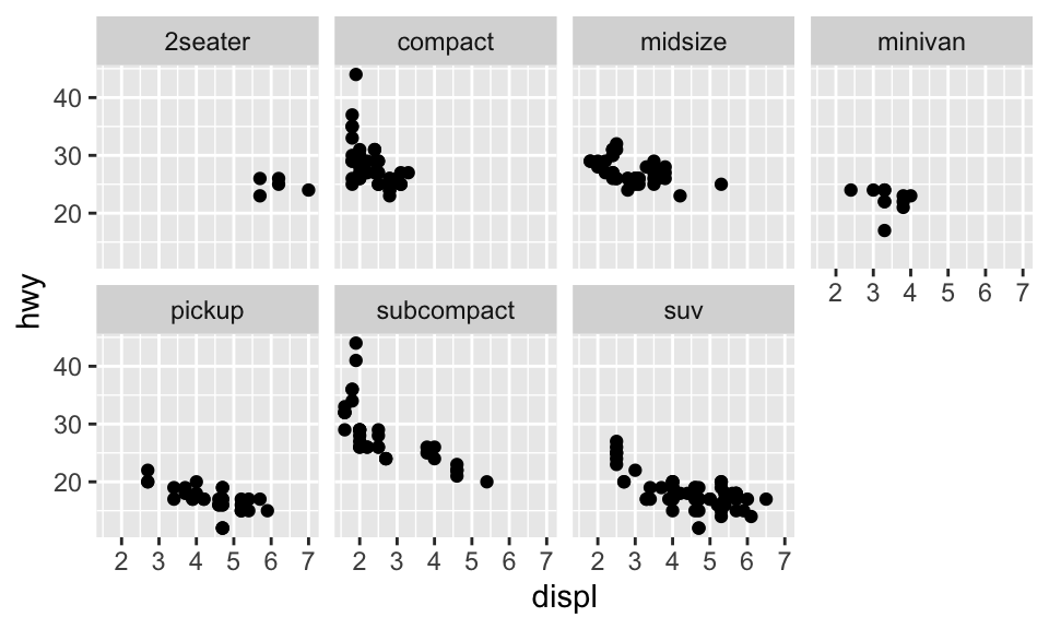
如果我們要把 facets 畫成兩個變數的組合,那就必須使用 facet_gird(),其語法如 facet_grid(row ~ col)。以下的例子,因為 drv 共有三種值:4、f、r,而 cyl 共有四種值:4、5、6、8,所以:
ggplot(data = mpg) +
      geom_point(mapping = aes(x = displ, y = hwy)) +
      facet_grid(drv ~ cyl)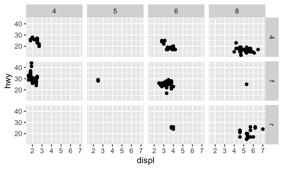
如果 row 或 column 其中一者不想要有變數,可以使用 facet_grid()。
5.5 幾何物件
Geom 是一種圖用來表示資料的幾何物件。例如,bar charts 使用 bar geoms,line charts 使用 line geoms,boxplots 使用 boxplot geoms 等。
要改變圖的 geom,即改變 ggplot() 所加的 geom function,例如我們把剛剛的 geom_point() 改成 geom_smooth 的話將會得到:
# 對於 geom_smooth() 中的 method 與 formula 用法可見其文檔
ggplot(data = mpg) +
      geom_smooth(mapping = aes(x = displ, y = hwy), method = 'loess', formula = 'y ~ x')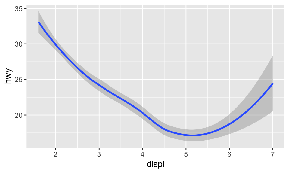
我們也可以設置 aesthetic。雖然不能設置線的 shape,但可以設定線的 linetype。例如,我們可以根據變數 drv 來繪製三條不同的線:
ggplot(data = mpg) +
  geom_smooth(mapping = aes(x = displ, y = hwy, linetype = drv),
              method = "loess", formula = "y ~ x")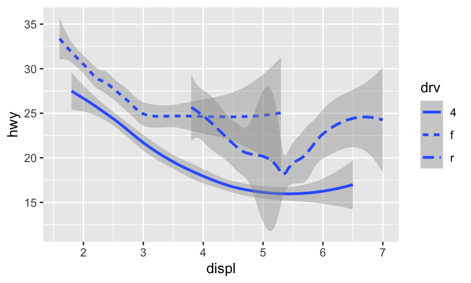
或者也可以疊加兩種 geom:
ggplot(data = mpg) +
  geom_smooth(mapping = aes(x = displ, y = hwy, color = drv, linetype = drv),
              method = "loess", formula = "y ~ x") +
  geom_point(mapping = aes(x = displ, y = hwy, color = drv))
如果把引數放在 ggplot() 中,則會被視為 global mapping,將會套用到圖中的所有 geom;而放在 geom() 中則會被視為 local mapping,只會套用到該 geom。所以上述的程式碼也可以簡化為:
ggplot(data = mpg, mapping = aes(x = displ, y = hwy, color = drv)) +
  geom_smooth(aes(linetype = drv), method = "loess", formula = "y ~ x") +
  geom_point()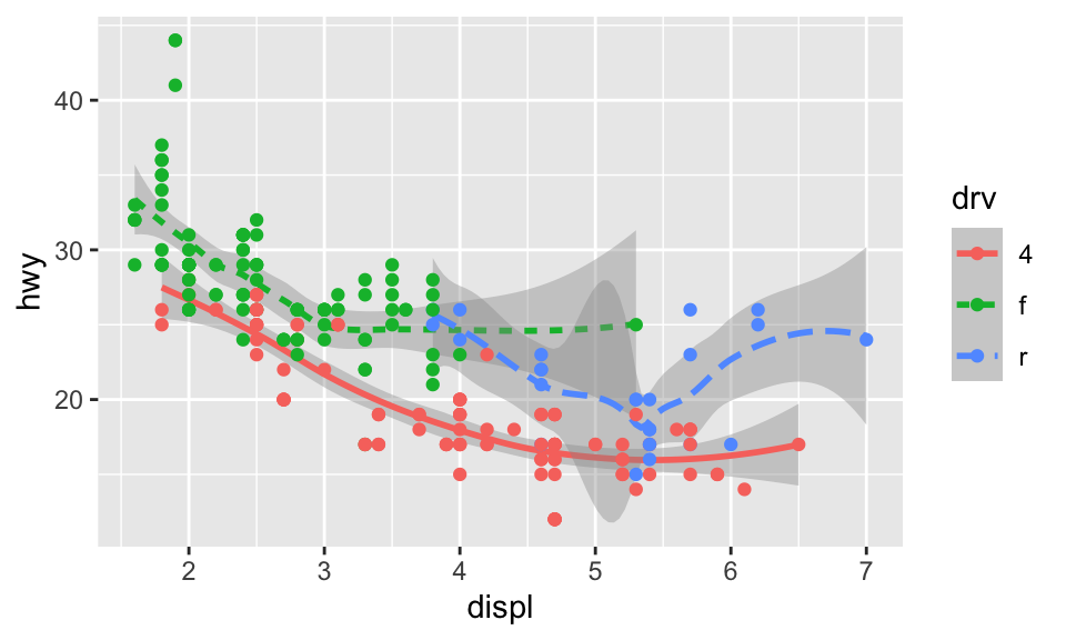
5.6 統計轉換
diamonds 是 ggplot2 中的一個 dataset,約有 54000 顆鑽石的資料,包含 carat、cut、color、clarity、depth、table、price 等變數。使用 geom_bar() 可以依據某個變數畫出長條圖(bar chart),例如我們想要知道各種 cuts 到底有分別有多少鑽石,可以:
ggplot(data = diamonds) + geom_bar(mapping = aes(x = cut))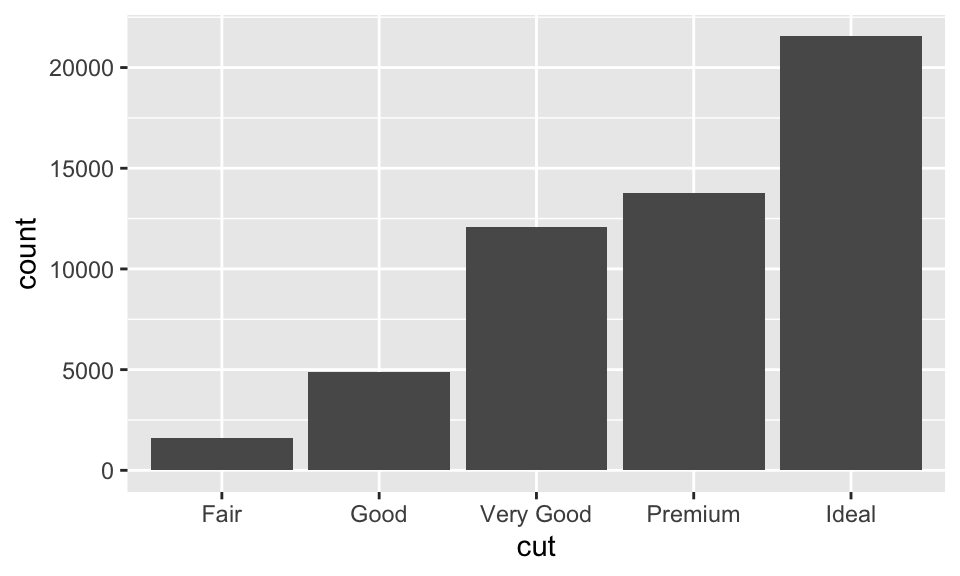
在此,\(x\) 軸為 cut,是 diamonds 中的變數;\(y\) 軸為 count,並非 diamonds 中的變數,而是自動計算在各個 cut 中鑽石的數量。某些圖會計算新的變數然,例如:
- 長條圖、直方圖(histogram)或 frequency polygons 都會計算個數。
- Smoothers 會適配模型然後畫出預測。
- Boxplots 會計算分佈。
用來計算新的值的演算法稱之為 stat,為 statistical transformation 的簡稱。例如以 ?geom_bar 查看 geom_bar() 的幫助頁面,會發現其使用 stat_count()。因為每個 geom 都有一個預設的 stat,反之亦然,所以我們可以把 geom 與 stat 交換使用。也因此,如果把上圖的 geom_bar() 換成 stat_count() 也會到相同的結果。
什麼時候需要明確地使用 stat 呢?
想要替換預設的 stat 的時候。
想要換原本的 mapping 時。
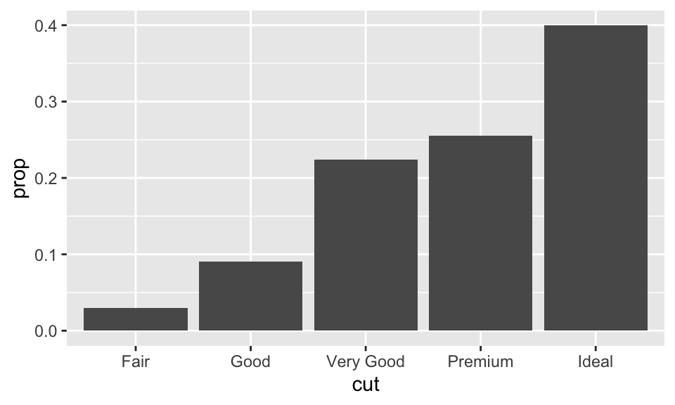
ggplot(data = diamonds) +
  geom_bar(
    mapping = aes(x = cut, y = ..prop.., group = 1)
  )
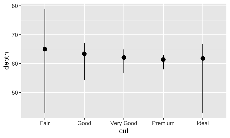
- 想要使用其他的 statistical transformation 的時候。例如使用
stat_summary(),其會對每個x都 summarizes 其y。
ggplot(data = diamonds) +
  stat_summary(
    mapping = aes(x = cut, y = depth),
    fun.min = min,
    fun.max = max,
    fun = median
  )
5.7 Position Adjustment
想要為長條圖著色,除了使用 color,還可以使用 fill,兩者的效果也不同:
ggplot(data = diamonds) +
  geom_bar(mapping = aes(x = cut, color = cut))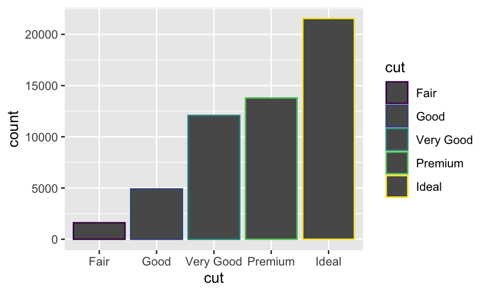
ggplot(data = diamonds) +
  geom_bar(mapping = aes(x = cut, fill = cut))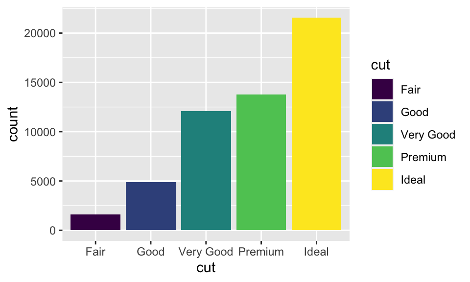
如果 fill 指定為另一個變數的話,就會自動變成「堆疊」的形式,如:
ggplot(data = diamonds, mapping = aes(x = cut, fill = clarity)) +
  geom_bar()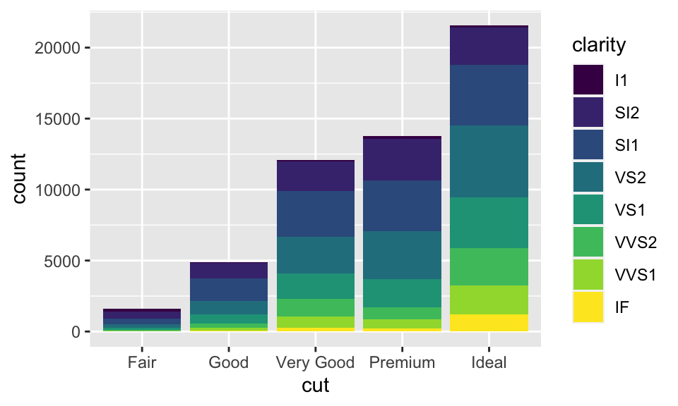
這種堆疊是透過位置調整(position adjustment)進行的。position 預設為 position="stack",而我們還能把 position 指定成其他三種選項:identity、dodge 與 fill:
position = "identity":用在 bar chart 上效果有點像stack,但差別在調整透明度後可以看出來(即alpha = 1/5);雖然還是不明顯,但差別在identity的各個物件是會相互堆疊的。例如在下圖中,調整透明度明明應該所有物件的透明度都相同,但越靠下的部分透明度顯然越低,這就是因為越靠下的部分有越多個物件重疊在一起,使得圖形顯得較不透明。
ggplot(data = diamonds, mapping = aes(x = cut, fill = clarity)) +
  geom_bar(alpha = 1/5, position = "identity")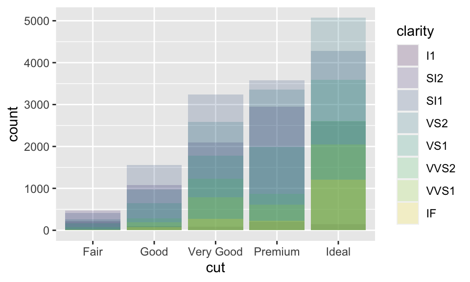
position = "fill":依據指定的變數(此數為clarity)堆疊,差別在高度相同,所以便於我們比較組間的比例差別。
ggplot(data = diamonds, mapping = aes(x = cut, fill = clarity)) +
  geom_bar(position = "fill")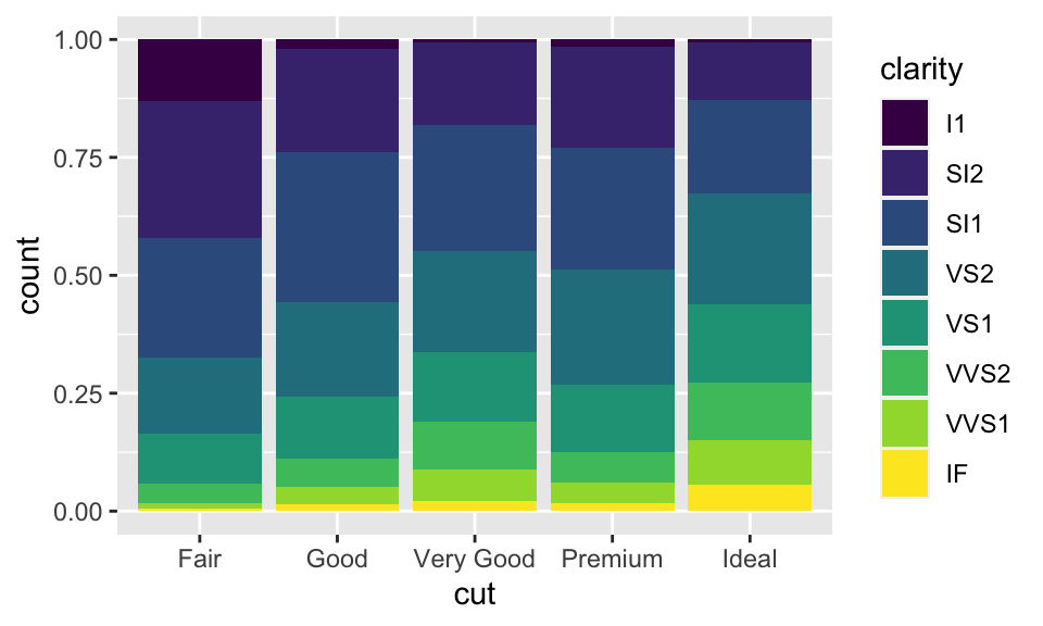
position = "dodge":以此例而言,即是對於每個不同的cut,都分別把其各個clarity展現在逐一呈現,而非用堆疊的方式。
ggplot(data = diamonds, mapping = aes(x = cut, fill = clarity)) +
  geom_bar(position = "dodge")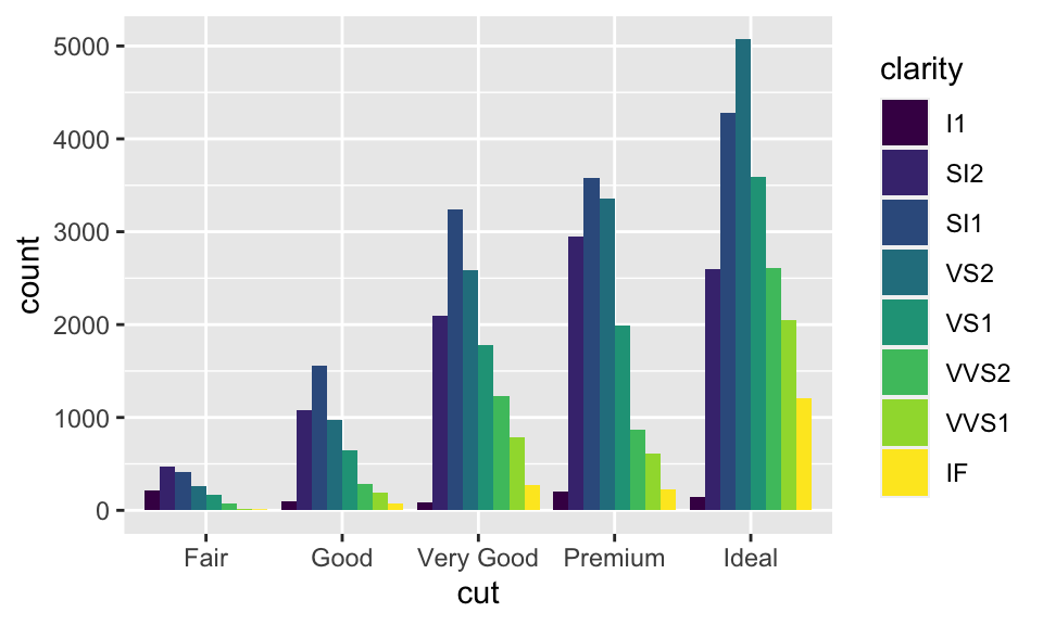
此外,當然還有其他 position 的引數可用,例如 position = "jitter",其在 bar chart 中沒什麼用,但在散佈圖中有大用。回憶節 5.1 的散佈圖:
ggplot(data = mpg) + geom_point(mapping = aes(x = displ, y = hwy))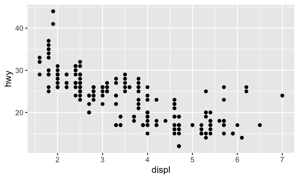
事實上,mpg 明明有 234 個觀察值,如:
str(mpg)
# tibble [234 × 11] (S3: tbl_df/tbl/data.frame)
# ...
但上面的散佈圖卻只有顯示 126 個點,為什麼?因為 overplotting!有些點的座標相同,所以相互覆蓋了。設置 position = "jitter" 可以解決這個問題,這會在每個點加入一點點 random noise,排除 overplotting 的問題。
ggplot(data = mpg, mapping = aes(x = displ, y = hwy)) +
  geom_point(position = "jitter")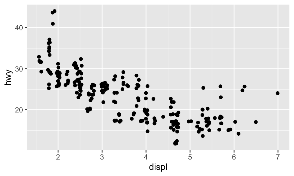
5.8 座標系統
除了前面使用的笛卡兒座標系統,還有其他有用的座標系統:
coord_flip():繪製旋轉 90 度的直角坐標,如:
ggplot(data = mpg, mapping = aes(x = class, y = hwy)) + geom_boxplot()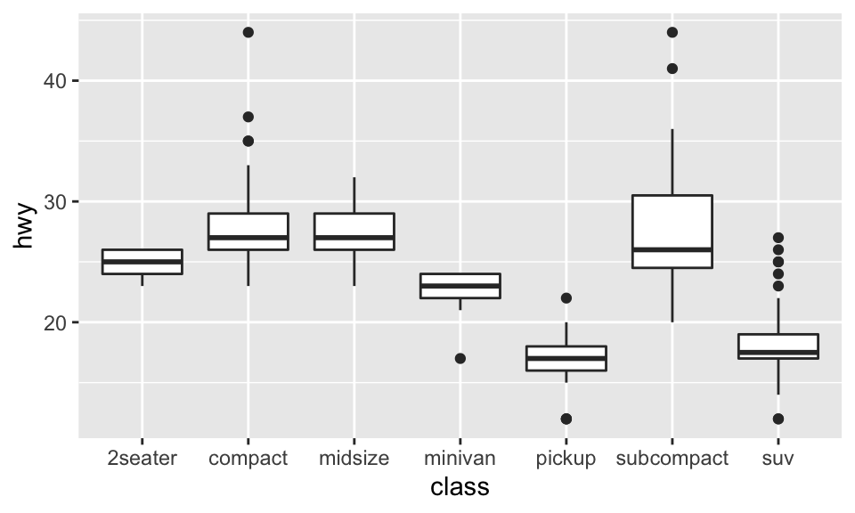
ggplot(data = mpg, mapping = aes(x = class, y = hwy)) + geom_boxplot() + coord_flip()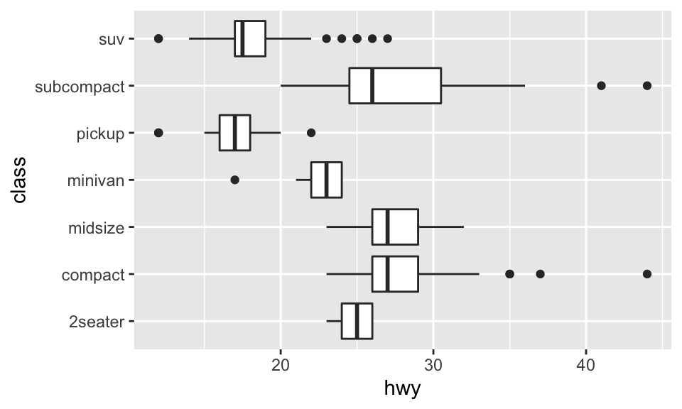
coord_quickmap():繪製有正確方位比例的地圖4,如:
nz <- map_data("nz")

ggplot(nz, aes(long, lat, group = group)) +
  geom_polygon(fill = "white", color = "black")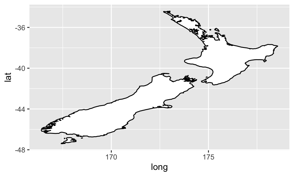
ggplot(nz, aes(long, lat, group = group)) +
  geom_polygon(fill = "white", color = "black") + coord_quickmap()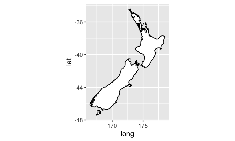
coord_polar():繪製極座標圖(polar coordinates),結合 bar char 與 Coxcomb chart,如:
bar <- ggplot(data = diamonds) +
  geom_bar(mapping = aes(x = cut, fill = cut), show.legend = FALSE, width = 1) +
  theme(aspect.ratio = 1) + labs(x = NULL, y = NULL)

bar + coord_polar()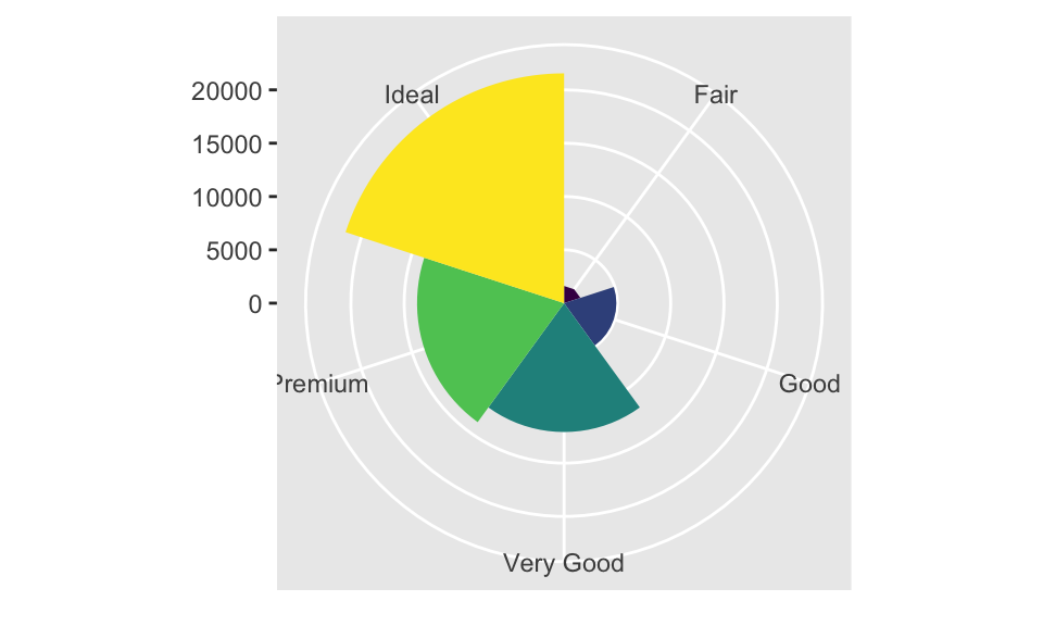
coord_fixed:因為人對與 45 度線的差異感受最明顯,而coord_fixed()可以讓geom_abline()(用以產生 reference lines 的 geom)產生的線為 45 度,如:
p <- ggplot(data = mpg, mapping = aes(x = cty, y = hwy)) +
  geom_point() + geom_abline()

p + coord_fixed()  # 如果不加 coord_fixed(),比例將會跑掉。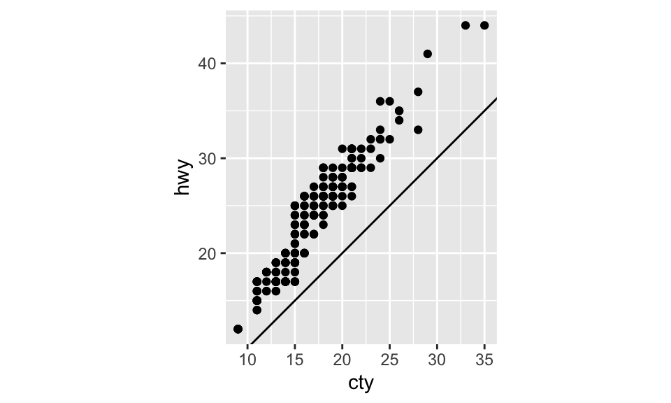
5.9 標籤
labs() 能使我們為圖加上標題、註解或更改 x 軸、y 軸的名稱,如:
ggplot(data = mpg, mapping = aes(x = class, y = hwy)) +
  geom_boxplot() +
  coord_flip() +
  labs(y = "Highway MPG",
       x = "Class",
       title = "Highway MPG by car class",
       subtitle = "1999-2008",
       caption = "Source: http://fueleconomy.gov")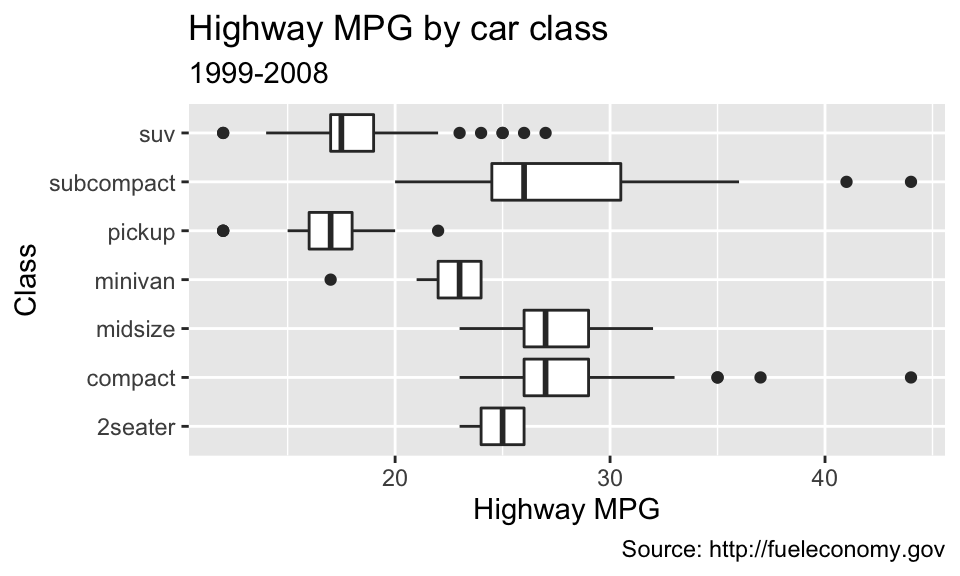
參考文獻
另有
coord_map(),功能與coord_quickmap()類似。coord_map()預設使用麥卡托投影法(Mercator projection)。而兩者的差別在coord_quickmap為coord_map()的近似,忽略了地球在不同經緯度比例的曲度差異,因此運行速率較快,但也稍微不準確。↩︎