Chapter 5 Chapter 5: Introduction to Statistics in R
install.packages("ggplot2",  repos = "https://cran.us.r-project.org")
install.packages("dplyr",  repos = "https://cran.us.r-project.org")
install.packages("ggfortify", repos = "https://cran.us.r-project.org")library(ggplot2)
library(dplyr)
library(ggfortify)lady <- read.csv("/Users/peteapicella/Documents/R_tutorials/GSwR/ladybirds_morph_colour.csv", header = TRUE)View data structure:
str(lady)## 'data.frame': 20 obs. of 4 variables:
## $ Habitat : chr "Rural" "Rural" "Rural" "Rural" ...
## $ Site : chr "R1" "R2" "R3" "R4" ...
## $ morph_colour: chr "black" "black" "black" "black" ...
## $ number : int 10 3 4 7 6 15 18 9 12 16 ...5.1 \(\chi\)\(^{2}\) contingency table analysis
Create new dataframe, totals:
totals <- lady %>% #working with this dataframe
  group_by(Habitat, morph_colour) %>% #we want to represent these groups in the dataframe
  summarise(total.number = sum(number)) #add up the numbers of each group using the new object total.number
## `summarise()` has grouped output by 'Habitat'. You can override using the
## `.groups` argument.totals## # A tibble: 4 × 3
## # Groups: Habitat [2]
## Habitat morph_colour total.number
## <chr> <chr> <int>
## 1 Industrial black 115
## 2 Industrial red 85
## 3 Rural black 30
## 4 Rural red 70Create bar chart:
base_plot<-ggplot(totals, aes(x=Habitat, y=total.number,
                  fill = morph_colour)) + #fill is used when there is something like a bar that can be filled with color
                                          #if this were color = morph_colour, then the argument would affect the bar's outline
  geom_bar(
    stat = 'identity', #this tells ggplot not to calculate anything from the data and just display the data as they are in the dataframe
    position = 'dodge' #this is request to put the two bars in each Habitat group next to each other
                       #if it's not used, a stacked barplot would be printed
  )
base_plot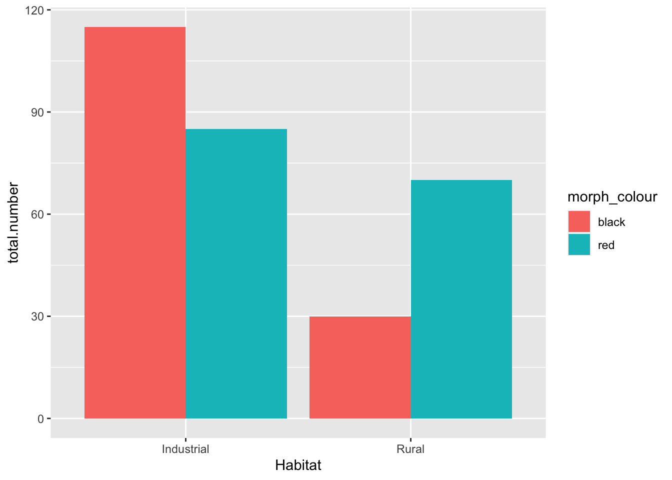
base_plot +
scale_fill_manual(values = c(black = "black", red = "red")) #the text in "" are the colors we are instructing R to fill the bars with 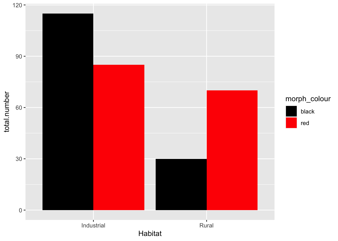
- Null hypothesis: there is no association between the color of the birds and their habitat
- My opinion: data suggest that there is a higher proportion of colored birds in the industrial habitat. We should reject the null hypothesis (pre-stats)
- to rigorously test this, a chi-squared test must be performed
5.2 Making the \(\chi\)\(^{2}\) Test
Use xtabs() function to generate a contingency table:
lady.mat <-xtabs(                     #function converts dataframe into a matrix, which is different from a dataframe
                  number ~ Habitat + morph_colour, #cross-tabulate the number of column counts in the dataframe by the Habitat and morph_colour variables
                 data = lady)
lady.mat
## morph_colour
## Habitat black red
## Industrial 115 85
## Rural 30 70Perform a \(\chi\)\(^{2}\) test on the matrix:
lady.chi<-chisq.test(lady.mat) #chi squared test function performed on matrix
lady.chi
##
## Pearson's Chi-squared test with Yates' continuity correction
##
## data: lady.mat
## X-squared = 19.103, df = 1, p-value = 1.239e-05- the p value is 0.00001239 - this is the probability that the pattern arose by chance.
- It is lower than 0.05, so we can reject the null hypothesis
names(lady.chi) #can examine all of the parts of the test mechanics ## [1] "statistic" "parameter" "p.value" "method" "data.name" "observed"
## [7] "expected" "residuals" "stdres"5.3 Two-sample t-test
- The two-sample t-test compares the means of two groups of numeric values
- It is appropriate when the sample sizes of these two groups is small
- The analysis makes the following assumptions about the data:
- The data are normally distributed
- The variances of the data are equivalent
ozone <- read.csv("/Users/peteapicella/Documents/R_tutorials/GSwR/ozone.csv")
glimpse(ozone)
## Rows: 20
## Columns: 3
## $ Ozone <dbl> 61.7, 64.0, 72.4, 56.8, 52.4, 44.8, 70.4, 67.6, 68.8, …
## $ Garden.location <chr> "West", "West", "West", "West", "West", "West", "West"…
## $ Garden.ID <chr> "G1", "G2", "G3", "G4", "G5", "G6", "G7", "G8", "G9", …5.3.1 The first step: Plot your data
Create histograms of the data, by Garden.location variable:
ggplot(ozone, aes(x=Ozone))+ #since this is a histogram, x must be a continuous variable; cannot be categorical
  geom_histogram(binwidth=10) +
  facet_wrap(~Garden.location, #Divide data up into groups by this variable
            ncol=1 ) +  #stacks the graphs on top of each other - 1 column
  theme_bw()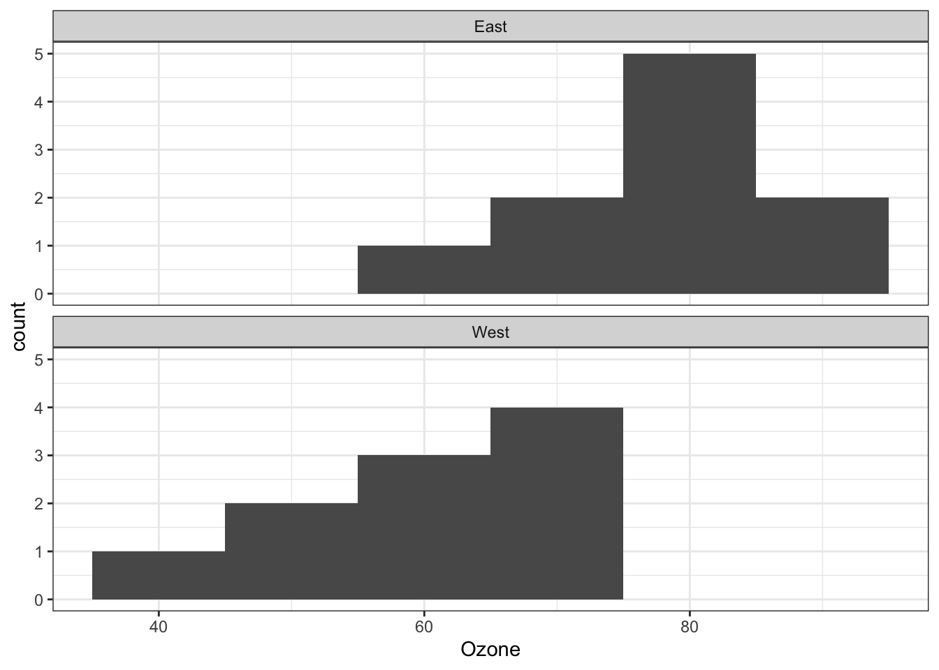
- graph shows that assumptions of normality and equality of variance are met
- R has functions to evaluate these aspects more rigorously too
Count the number of observations when variable is ‘East’:
x<-sum(with(ozone, Garden.location == "East"))
x
## [1] 10summary<-ozone %>%
group_by(Garden.location) %>%
summarise(mean = mean(Ozone), SE = (sd(Ozone))/sqrt(x))
summary## # A tibble: 2 × 3
## Garden.location mean SE
## <chr> <dbl> <dbl>
## 1 East 77.3 2.49
## 2 West 61.3 2.87Plot the ozone data as a barplot:
OzBrP<-ggplot(summary, aes(x = Garden.location, y = mean)) + #x defined as grazing treatment, y as fruit production
  geom_col() +
  geom_errorbar(aes(x=Garden.location, ymin=mean -SE, ymax=mean*1+SE, width=.2),
                                            position = 'dodge')
OzBrP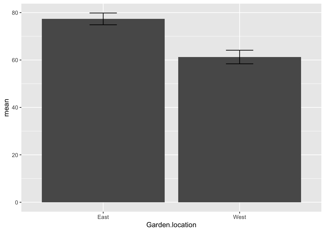
Plot the ozone data as a boxplot:
OzBxP <-ggplot(ozone, aes(x = Garden.location, y = Ozone)) +
  geom_boxplot()
OzBxP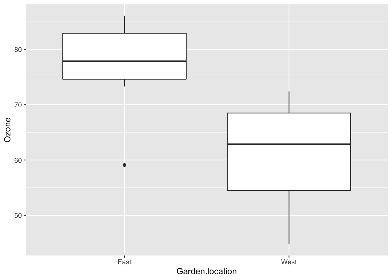
- null hypothesis: there is no difference in ozone levels between the East and West garden locations
- my opinion based on the boxplot - reject the null hypothesis
5.3.2 Two sample t-test analysis
Perform two sample t-test on the ozone dataset:
t.test(Ozone ~ Garden.location, #expression means do ozone levels vary as a function of location? That's how the ~ reads
       data = ozone)
##
## Welch Two Sample t-test
##
## data: Ozone by Garden.location
## t = 4.2363, df = 17.656, p-value = 0.0005159
## alternative hypothesis: true difference in means between group East and group West is not equal to 0
## 95 percent confidence interval:
## 8.094171 24.065829
## sample estimates:
## mean in group East mean in group West
## 77.34 61.26- the default of this two sample t-test is the Welch’s version
- In Welch version, the assumption about equal variance is relaxed and allows that you do not have to test for equal variance
- The GSwR authors suggest not testing for equal variance
- note regarding the Confidence interval (CI): the line about the 95% CI is 8.1-24.1. Since this range does not include 0 says that the means are statistically different from each other. This is congruent with the p value of the t-test
5.4 Linear models
- Linear models are a class of analyses that include regression, multiple regression, ANOVA, and ANCOVA
- they are centered around a similiar framework of ideas such as a common set of assumptions about the data like the idea that the data are normally distributed
5.5 Simple linear regression
- This section focuses on a dataset that compares plant growth rates to soil moisture content
- The response (dependent) variable is that of plant growth rate
- Plant growth rate is plotted against the explanatory (independent) variable, soil moisture content
- This variable is a continuous, numeric variable which does not have categories
Read and view structure of the data:
plant_gr <- read.csv("/Users/peteapicella/Documents/R_tutorials/GSwR/plant.growth.rate.csv", header = TRUE)
glimpse(plant_gr) #two continuous (numeric) variables. they have no categories
## Rows: 50
## Columns: 2
## $ soil.moisture.content <dbl> 0.4696876, 0.5413106, 1.6979915, 0.8255799, 0.85…
## $ plant.growth.rate <dbl> 21.31695, 27.03072, 38.98937, 30.19529, 37.06547…5.5.1 Getting and plotting the data
Plot the plant growth (pg) data:
ggplot(plant_gr,
       aes(x=soil.moisture.content, y=plant.growth.rate)) +
  geom_point()+
  ylab("Plant Growth Rate (mm/week)") +
  theme_bw()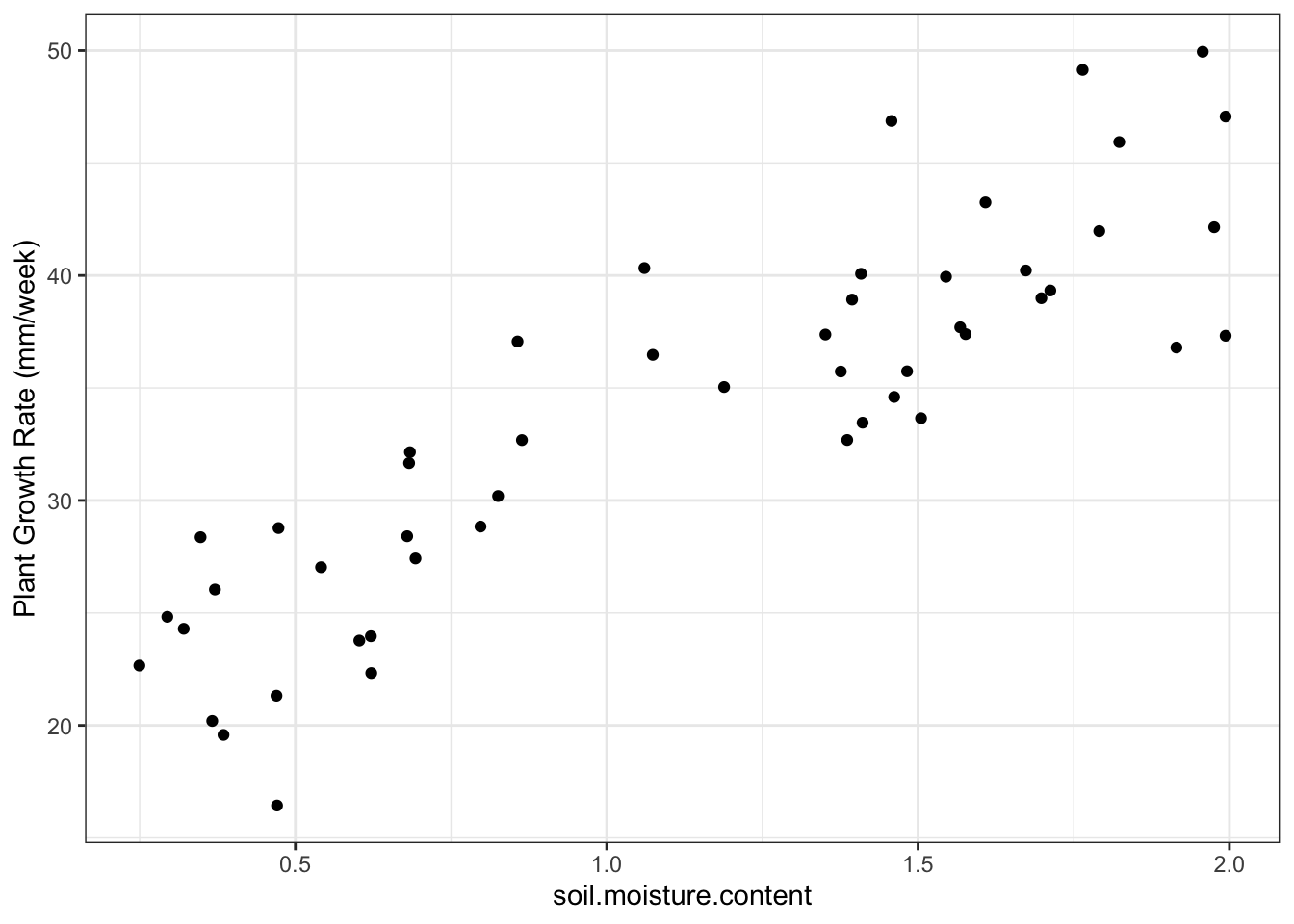
- Plot shows that there is a probably a positive linear relationship between the two variables
- There is a slope of about 15 mm/week
- preliminary analysis: probably will reject the null hypothesis that soil moisture does not affect plant growth
5.5.2 Making a simple linear regression happen
Create a linear model:
model_pgr <- lm(plant.growth.rate ~ soil.moisture.content, data = plant_gr) #plant growth rate is a function of soil moisture content
model_pgr
##
## Call:
## lm(formula = plant.growth.rate ~ soil.moisture.content, data = plant_gr)
##
## Coefficients:
## (Intercept) soil.moisture.content
## 19.35 12.755.5.3 Assumptions first
Check assumptions with ggfortify:
autoplot(model_pgr,
         smooth.colour = NA)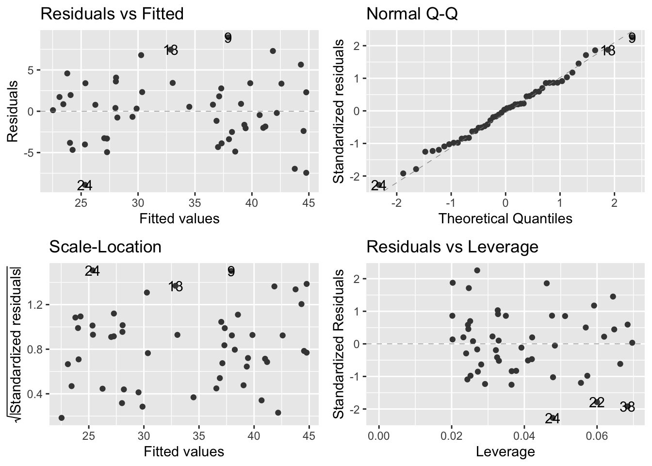
- ggfortify plots:
- Top left - informs us on whether the line is an appropriate fit to the data; flat line means model is a good fit. Humps/valleys -> poor fit
- Top right - dots = residuals; dashes line = expectation under normal distribution. Better tool than histogram to assess normal distribution
- Bottom left - evaluates assumption of equal variance. linear models assume that variance is constant over all predicted values of the response variable. There should be no pattern
- Bottom right - evaluates leverage. Used to detect influential datapoints that will shift the gradient more than expected + also for outliers
- null hypothesis: soil moisture has no effect on plant growth
5.5.4 Now the interpretation
Produce a sum of squares table:
anova(model_pgr)## Analysis of Variance Table
##
## Response: plant.growth.rate
## Df Sum Sq Mean Sq F value Pr(>F)
## soil.moisture.content 1 2521.15 2521.15 156.08 < 2.2e-16 ***
## Residuals 48 775.35 16.15
## ---
## Signif. codes: 0 '***' 0.001 '**' 0.01 '*' 0.05 '.' 0.1 ' ' 1- Output:
- Large F value indicates that error variance is small relative to the variance attributed to the explanatory variable
- This leads to the tiny p value.
- Both are good indications that the effect seen in the data isn’t the result of chance
- This leads to the tiny p value.
Produce a summary table:
summary(model_pgr) ##
## Call:
## lm(formula = plant.growth.rate ~ soil.moisture.content, data = plant_gr)
##
## Residuals:
## Min 1Q Median 3Q Max
## -8.9089 -3.0747 0.2261 2.6567 8.9406
##
## Coefficients:
## Estimate Std. Error t value Pr(>|t|)
## (Intercept) 19.348 1.283 15.08 <2e-16 ***
## soil.moisture.content 12.750 1.021 12.49 <2e-16 ***
## ---
## Signif. codes: 0 '***' 0.001 '**' 0.01 '*' 0.05 '.' 0.1 ' ' 1
##
## Residual standard error: 4.019 on 48 degrees of freedom
## Multiple R-squared: 0.7648, Adjusted R-squared: 0.7599
## F-statistic: 156.1 on 1 and 48 DF, p-value: < 2.2e-16- produces table of estimates of the coefficients of the line that is the model
- the slope that is associated with the explanatory variable (soil moisture) - the values of which are associated with the differences in plant growth rate
Superimpose linear model onto plot:
ggplot(plant_gr,
       aes(x=soil.moisture.content, y=plant.growth.rate)) +
  geom_point()+
  geom_smooth(method = 'lm') + #put a linear-model fitted line and the standard error of the fit using flash transparent gray onto graph
  ylab("Plant Growth Rate (mm/week)") +
  theme_bw()
## `geom_smooth()` using formula 'y ~ x'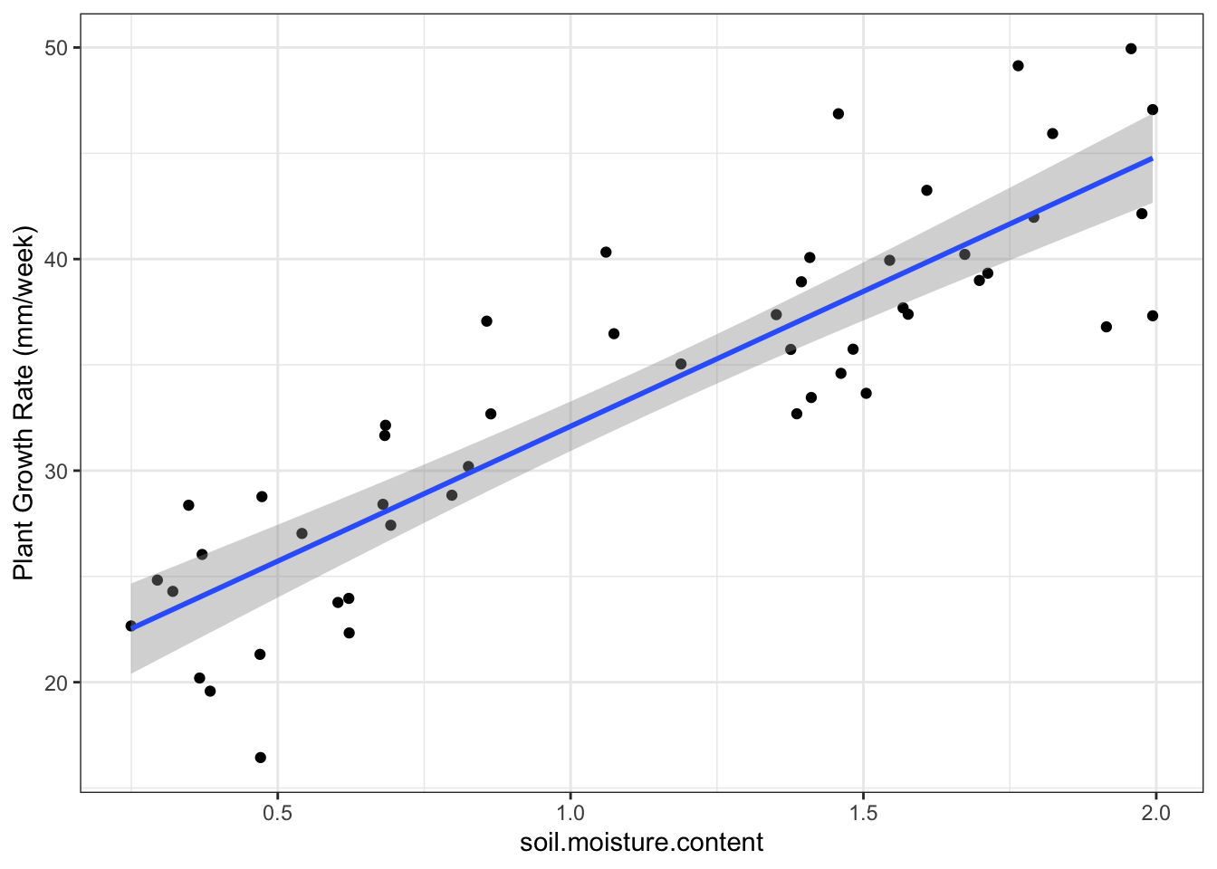
5.6 Analysis of variance: the one-way ANOVA
- the one-way ANOVA is similiar to the previous example and the two-sample t-test with one key difference:
- the explanatory variable in the one-way ANOVA is a categorical variable (factor)
- waterflea dataset - we ask:
- whether parasites alter waterflea growth rates
- whether each of three parasittes reduces growth rates relative to a control in which there was no parasite
daphnia <- read.csv("/Users/peteapicella/Documents/R_tutorials/GSwR/Daphniagrowth.csv", header = TRUE)
glimpse(daphnia)
## Rows: 40
## Columns: 3
## $ parasite <chr> "control", "control", "control", "control", "control", "co…
## $ rep <int> 1, 2, 3, 4, 5, 6, 7, 8, 9, 10, 1, 2, 3, 4, 5, 6, 7, 8, 9, …
## $ growth.rate <dbl> 1.0747092, 1.2659016, 1.3151563, 1.0757519, 1.1967619, 1.3…Plot daphnia data:
ggplot(daphnia, aes(x = parasite, y=growth.rate)) +
  geom_boxplot() +
  theme_bw() +
coord_flip() #flips the orientation of the graph 90˚ to the right 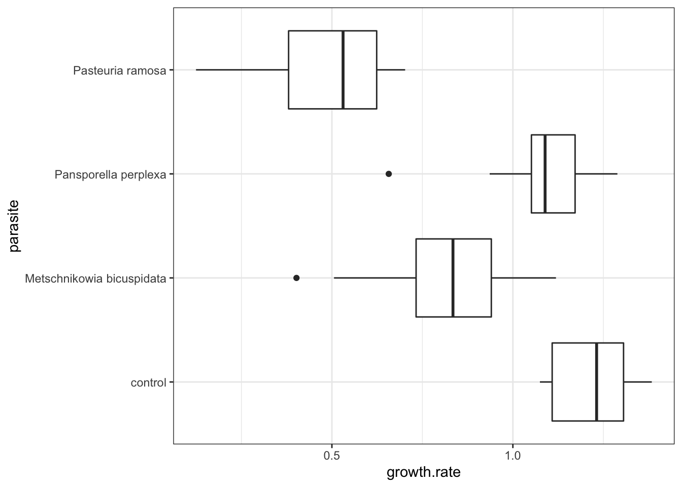
- Visualization takeaways:
- There is substantial variation among the parasite groups
- The control group has the highest growth rate
- There is likely to be an overall effect of parasites on growth rate
- There may be an order in the impacts different parasites have on growth rates: P. ramosa < M. bicuspidata < P. perplexa
Create a model:
model_grow <- lm(growth.rate ~ parasite, data = daphnia)
model_grow
##
## Call:
## lm(formula = growth.rate ~ parasite, data = daphnia)
##
## Coefficients:
## (Intercept) parasiteMetschnikowia bicuspidata
## 1.2139 -0.4128
## parasitePansporella perplexa parasitePasteuria ramosa
## -0.1376 -0.7317Check the assumptions:
autoplot(model_grow,
         smooth.colour = NA)
- assumption-checking plots:
- The figures suggest that the assumptions are fine
- Even the upper right plot, the Q-Q plot, is within the bounds of expected variation
Produce anova table for model:
anova(model_grow)## Analysis of Variance Table
##
## Response: growth.rate
## Df Sum Sq Mean Sq F value Pr(>F)
## parasite 3 3.1379 1.04597 32.325 2.571e-10 ***
## Residuals 36 1.1649 0.03236
## ---
## Signif. codes: 0 '***' 0.001 '**' 0.01 '*' 0.05 '.' 0.1 ' ' 1- For a one-way anova, the null hypothesis is that all of the groups come from populations with (statistically) the same mean
- The F-value quantifies how likely this is to be true
- F value is the ratio between the between group variation: within group variation
- A large F value means that the between group variation is much larger
- F value is the ratio between the between group variation: within group variation
- The F-value quantifies how likely this is to be true
summary(model_grow)##
## Call:
## lm(formula = growth.rate ~ parasite, data = daphnia)
##
## Residuals:
## Min 1Q Median 3Q Max
## -0.41930 -0.09696 0.01408 0.12267 0.31790
##
## Coefficients:
## Estimate Std. Error t value Pr(>|t|)
## (Intercept) 1.21391 0.05688 21.340 < 2e-16 ***
## parasiteMetschnikowia bicuspidata -0.41275 0.08045 -5.131 1.01e-05 ***
## parasitePansporella perplexa -0.13755 0.08045 -1.710 0.0959 .
## parasitePasteuria ramosa -0.73171 0.08045 -9.096 7.34e-11 ***
## ---
## Signif. codes: 0 '***' 0.001 '**' 0.01 '*' 0.05 '.' 0.1 ' ' 1
##
## Residual standard error: 0.1799 on 36 degrees of freedom
## Multiple R-squared: 0.7293, Adjusted R-squared: 0.7067
## F-statistic: 32.33 on 3 and 36 DF, p-value: 2.571e-10- Output:
- table of coefficients:
- What is labelled as ‘(Intercept)’ is the control
- R tends to list things in alphabetical order
- Of the levels of the explanatory variable, ‘control’ is the first alphabetically
- In this context, we can assume that (Intercept) refers to the first level in alphabetical order - control - in this case
- Treatment contrasts report the differences between the reference level (the control in this case) and the other levels
- So -0.41275 is the difference between the control level and the parasiteMetschnikowia bicuspidata level
- In other words, the differences are the distances between the colored diamonds and the dotted black line in figure 6.1 below
Determine the means for each level:
sumDat <- daphnia %>%
  group_by(parasite) %>%
  summarise(meanGR = mean(growth.rate))
sumDat
## # A tibble: 4 × 2
## parasite meanGR
## <chr> <dbl>
## 1 control 1.21
## 2 Metschnikowia bicuspidata 0.801
## 3 Pansporella perplexa 1.08
## 4 Pasteuria ramosa 0.482Manually determine the difference between control and other levels:
0.8011541 -1.2139088 ## [1] -0.41275471.0763551 - 1.2139088## [1] -0.13755370.4822030 - 1.2139088## [1] -0.7317058ggplot(daphnia, aes(x = parasite, y=growth.rate, color = parasite)) +
geom_point(size =2) +
geom_point(data = sumDat, aes( x = parasite, y = meanGR), shape = 18, size = 5) +
geom_hline(yintercept = sumDat$meanGR[1],
lwd=1,
linetype = 'dotted',
colour="black") +
geom_hline(yintercept = sumDat$meanGR[1],
lwd=1,
linetype = 'dotted',
colour="black") +
xlab("")+
theme_bw() +
coord_flip() 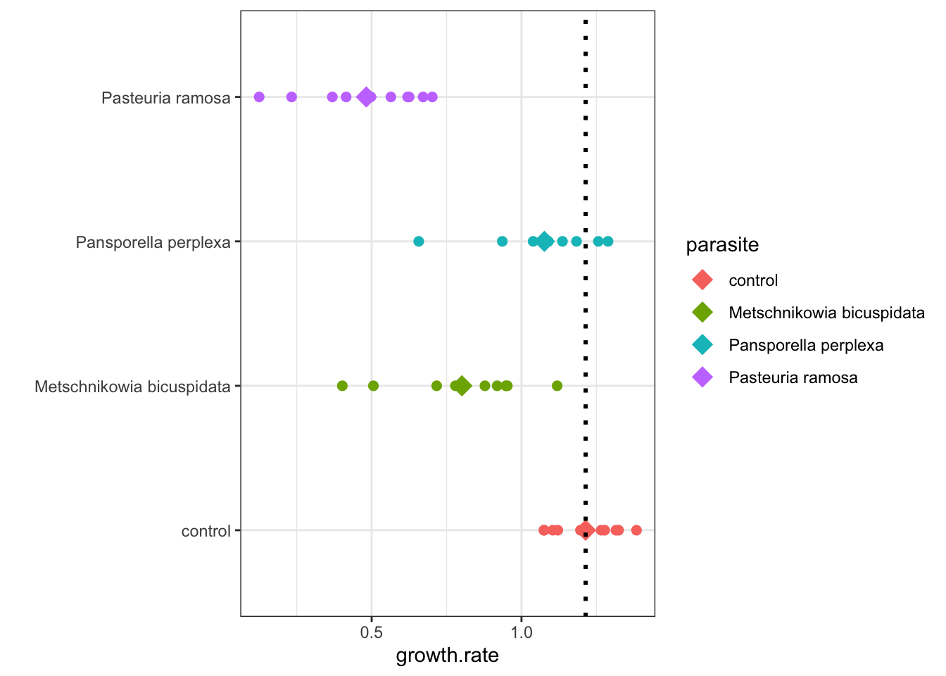
Figure 5.1: Daphnia Treatment Differences