7 Data relations
After analyzing each column, we get a much better idea about the data and we can now thus take a look at various relations in our data set that would be helpful and insightful for our research question. For this purpose we can pre-screen the variables in our data set and plot them to get a better overview about which variable relations could be the most relevant for further analysis.
plot_data_column <- function (data, column, target) {
  if(is.factor(data[[target]])){
    if(is.numeric(data[[column]])){
      plotlimbox <- quantile(data[[column]],c(0.1,0.9),na.rm=TRUE)
      ggplot(data, aes_string(x=target, y=column)) +
        geom_boxplot(outlier.shape = NA) +
        scale_y_continuous(limits = plotlimbox) +
        theme(legend.position = "none")
    }else{
      ggplot(data,aes_string(x=column,fill=target)) +
        geom_bar(position="fill") +
        theme(legend.position = "none")
    }
  }else{
    if(is.numeric(data[[column]])){
      plotlimscalex <- ifelse(min(data[[column]])==0,quantile(data[[column]],c(0,0.9999),na.rm=TRUE),quantile(data[[column]],c(0.0001,0.9999),na.rm=TRUE)) # as we have often data which starts with 0 and has a lot of 0's
      plotlimscaley <- ifelse(min(data[[target]])==0,quantile(data[[target]],c(0,0.9999),na.rm=TRUE),quantile(data[[target]],c(0.0001,0.9999),na.rm=TRUE))
      ggplot(data,aes_string(x=column,y=target)) +
        geom_point() +
        scale_y_continuous(limits = plotlimscaley) +
        scale_x_continuous(limits = plotlimscalex) +
        theme(legend.position = "none")

    }else{
      plotlimbox <- quantile(data[[target]],c(0.1,0.9),na.rm=TRUE)
      ggplot(data, aes_string(x=column, y=target)) +
        geom_boxplot(outlier.shape = NA) +
        scale_y_continuous(limits = plotlimbox) +
        theme(legend.position = "none")
    }
  }
}
Here we use clean_names() function to handle problematic variable names.
data <- clean_names(data)7.1 Research Question 1
Which financial and economic features in the data set have the highest importance regarding the mortgage purchase?
There are a number of possible features that can potentially lead to the increased sum of mortgage and lower interest rate:
- high/low annual income of borrower;
- the ratio of the borrower’s (or borrowers’) annual income to the area median family income for the reporting year;
- high/low property value etc.
Therefore, we need to research these factors in order to understand whether the correlation between them and mortgage purchase exists.
As a target value we decided to choose maximum note amount and minimum interest rate and as a selected financial and economic variables - local_area_median_income, annual_income, borrower_income_ratio, purpose_of_loan, occupancy_code, loan_to_value_ratio_ltv, debt_to_income_ratio and property value etc.
Let’s start examining the relationship between amount of loan, income and purpose of loan.
data %>% na.omit() %>% ggplot(aes(y = note_amount, x= borrower_income_ratio, fill = purpose_of_loan)) +
  geom_boxplot() +
  scale_y_continuous(labels = scales::number_format(accuracy = 1)) +
  ggtitle("Relationship between loan amount and purpose of loan") +
  labs(x = "Borrower Income Ratio", y = "Note Amount", fill = "Purpose of Loan") +
theme(legend.position="bottom") 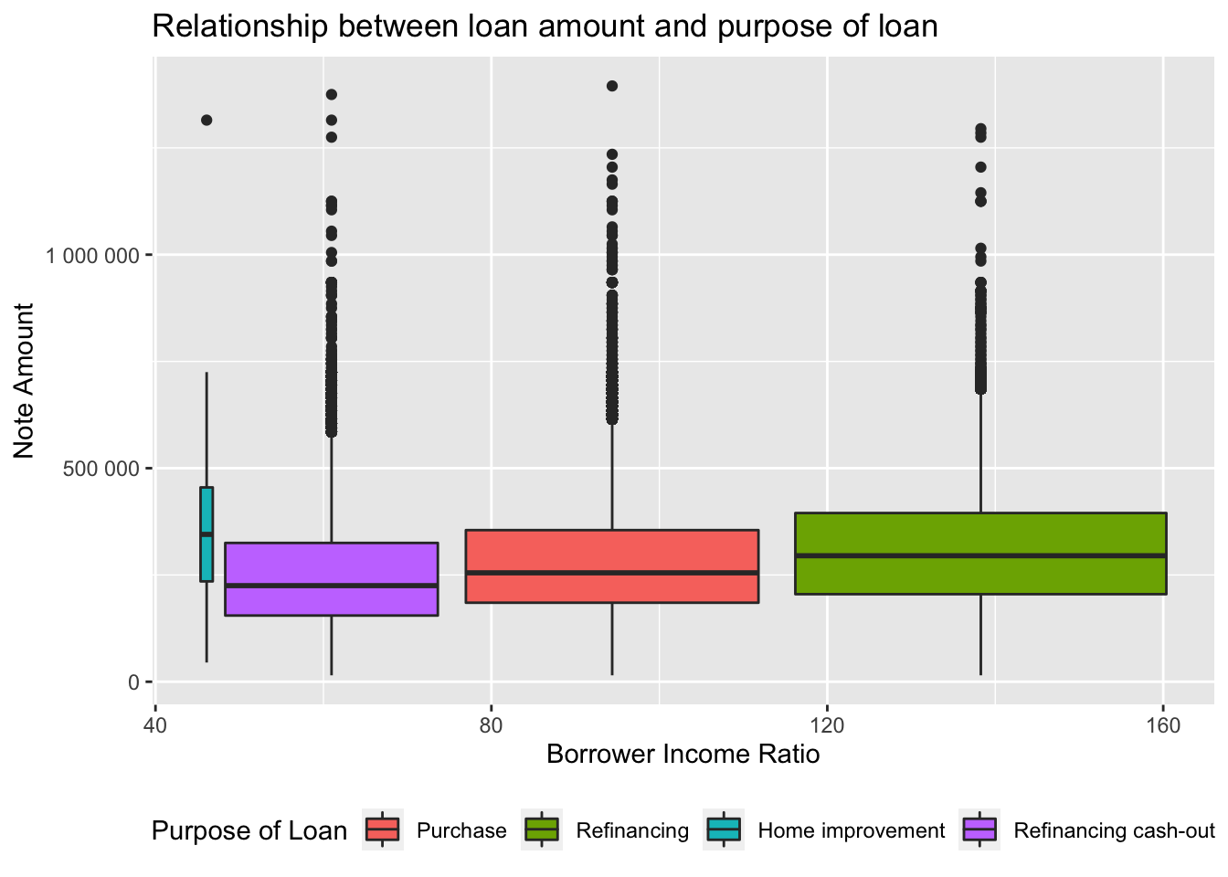
Results: high note_amount was generally given to Americans whose loan purpose was home improvement and whose annual income was the lowest - around 50% of the area median family income. This was followed by people with exceptionally high proportion of their personal income to the area median family income (120%-160%) and who got a new mortgage loan to replace their current loan. However, there are certainly many outliers.
Here we want to see some dependencies between our target value note_amount and the rest of the observed columns:
target <- "note_amount"
myplots <- lapply(colnames(data)[-which(colnames(data)==target)], plot_data_column, data = data, target=target)

n_plots <- length(myplots)
ncol <- floor(sqrt(n_plots))
do.call("grid.arrange", c(myplots, ncol=ncol)) 
After having a look on this complex structure of different plots the dependency between loan amount and occupation can be observed, therefore, we may look at this particular graph:
subset1 <- data %>% na.omit() %>%
  ggplot(aes(x = occupancy_code, y = note_amount)) +
  geom_boxplot(width = 0.4) +
  labs(x = "Occupancy Code", y = "Note Amount") +
  scale_x_discrete(labels = wrap_format(width = 20)) +
  scale_y_continuous(labels = unit_format(unit = "K", scale = 1e-3))


subset2 <- data %>% na.omit() %>%
  ggplot(aes(x = occupancy_code, y = interest_rate_at_origination)) +
  geom_boxplot(width = 0.4) +
  labs(x = "Occupancy Code", y = "Interest Rate, %") +
  scale_x_discrete(labels = wrap_format(width = 20))

grid.arrange(subset1, subset2, ncol = 2)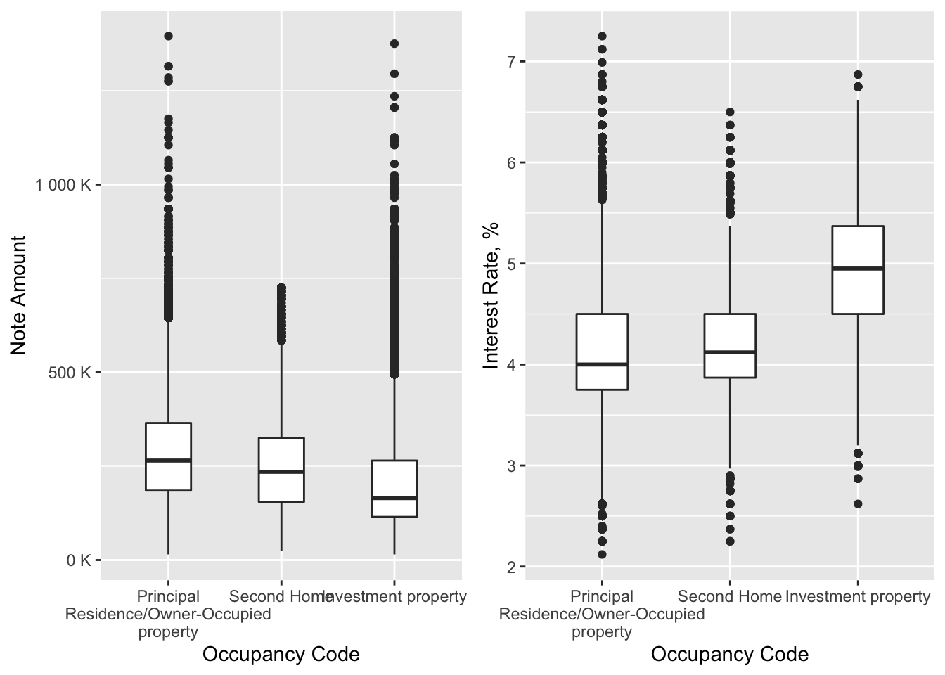
From these boxplots we may see a strong economic factor towards increased note amount and decreased interest rate: people who got mortgage for themselves had a higher amount and lower interest rate than those who was interested in investment.
Now let’s look at those people who had better chances to get high mortgage with low interest rate from the economic and financial prospective.
For this purpose we want to filter borrowers, whose loan purpose is purchase and whose occupancy code - principal residence/owner-occupied property as these subsets are already known to have the best loan terms.
Relationship between interest rate and income of the borrower
subset3 <- data %>% na.omit() %>%
  filter(purpose_of_loan == 'Purchase') %>%
  filter(occupancy_code == "Principal Residence/Owner-Occupied property") %>%
  subset(note_amount < 800000) %>%
  ggplot(aes(x = high_opportunity_area, y = note_amount, fill = high_opportunity_area)) +
  geom_boxplot(width = 0.4) +
  scale_x_discrete(breaks=NULL) +
  scale_y_continuous(labels = unit_format(unit = "K", scale = 1e-3)) +
  theme(legend.position = "bottom") +
  labs(x = "", y = "Note Amount", fill = "High Opportunity Area")

subset4 <- data %>% na.omit() %>%
  filter(purpose_of_loan == 'Purchase') %>%
  filter(occupancy_code == "Principal Residence/Owner-Occupied property") %>%
  subset(note_amount < 800000) %>%
  ggplot(aes(area_of_concentrated_poverty, note_amount, fill = area_of_concentrated_poverty)) +
  geom_boxplot(width = 0.4) +
  scale_x_discrete(breaks=NULL) +
  scale_y_continuous(labels = unit_format(unit = "K", scale = 1e-3)) +
  theme(legend.position = "bottom") +
  labs(x = "", y = "Note Amount", fill = "Area of Concentrated Poverty")

grid.arrange(subset3, subset4, ncol=2)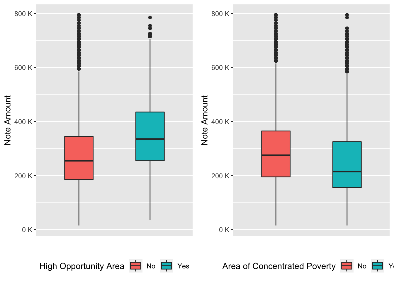
So, here we see that area with no concentrated poverty and high opportunity zone is more appropriate for a higher mortgage amount.
To understand another possible financial and economic factor that highly influence loan amount we may create the following function as the majority of needed data is of class numeric:
numeric_cols <- which(lapply(data,class)=="numeric")
cors <- cor(data[complete.cases(data),numeric_cols])
PlotCorr(cors)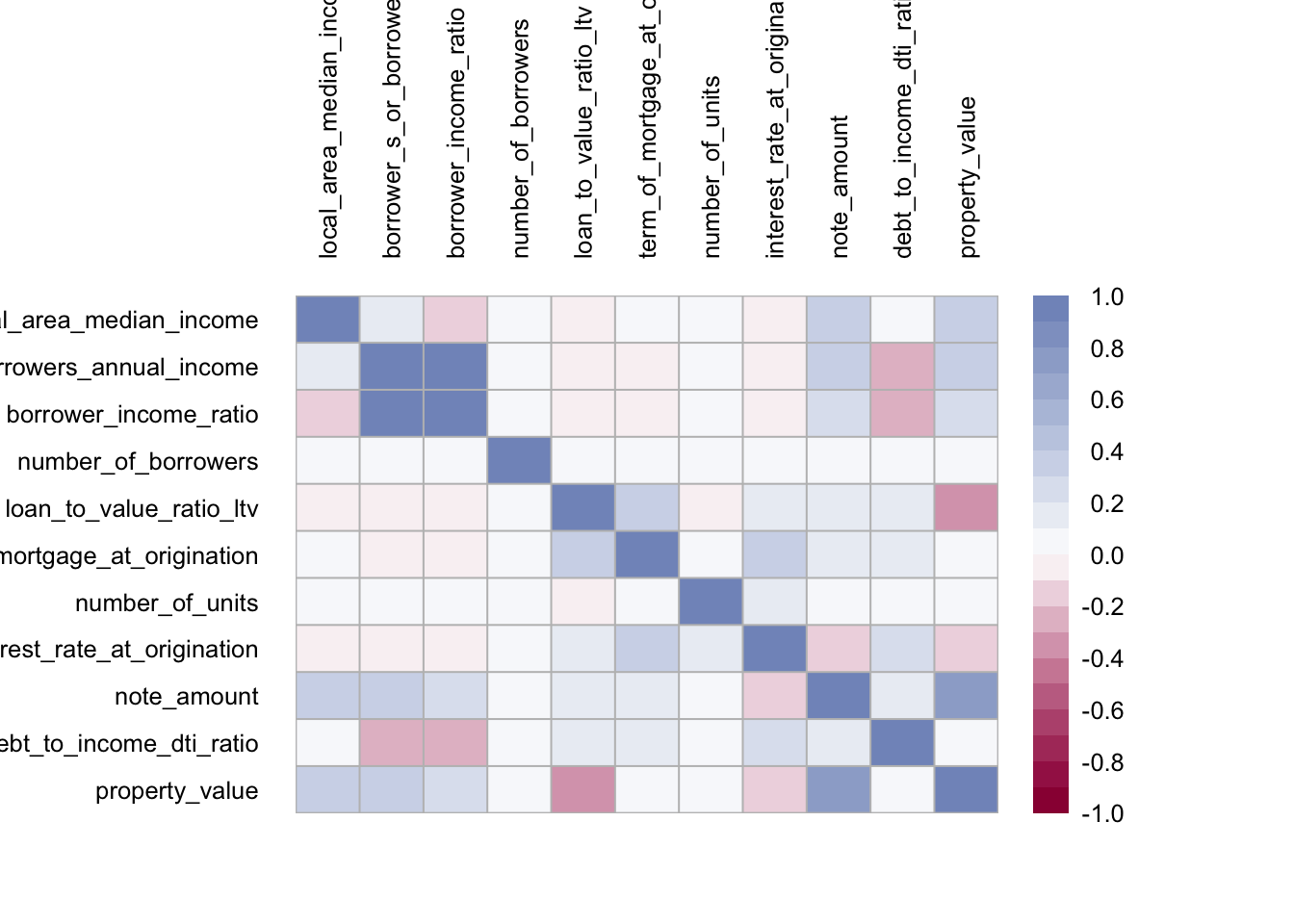
In the illustration we can see the correlations between all numeric variables of the data. We see that many variables are either not related or slightly positively related.
However, there are some strong positive relationships:
- Borrower’s annual income and Borrower’s income ratio (obvious because the latter is proportion of the former);
- Note amount and property value
Negative relationships are quite scarce, but can be found for the property value and loan-to-value ratio, which is also of no surprise, as the later uses the former in the proportion.
inc <- seq(quantile(data$borrower_s_or_borrowers_annual_income,0.1), quantile(data$borrower_s_or_borrowers_annual_income,0.9), length.out = 100)
loan <- seq(quantile(data$note_amount,0.1, na.rm = TRUE), quantile(data$note_amount,0.9, na.rm = TRUE), length.out = 100)
inc_loan <- expand.grid(borrower_s_or_borrowers_annual_income=inc,note_amount=loan)

m <- loess(interest_rate_at_origination ~ borrower_s_or_borrowers_annual_income + note_amount + borrower_s_or_borrowers_annual_income*note_amount, degree = 2, data = data[1:10000,])
int_fit <- as.numeric(predict(m, inc_loan))

inc_loan_int <- inc_loan %>% mutate(interest_rate_at_origination=int_fit)

ggplot(inc_loan_int, aes(borrower_s_or_borrowers_annual_income, note_amount,z=interest_rate_at_origination)) +
  geom_contour_filled() +
  scale_x_continuous(labels = unit_format(unit = "K", scale = 1e-3)) +
  scale_y_continuous(labels = unit_format(unit = "K", scale = 1e-3)) +
  labs(x = "Borrower's Annual Income", y = "Note Amount")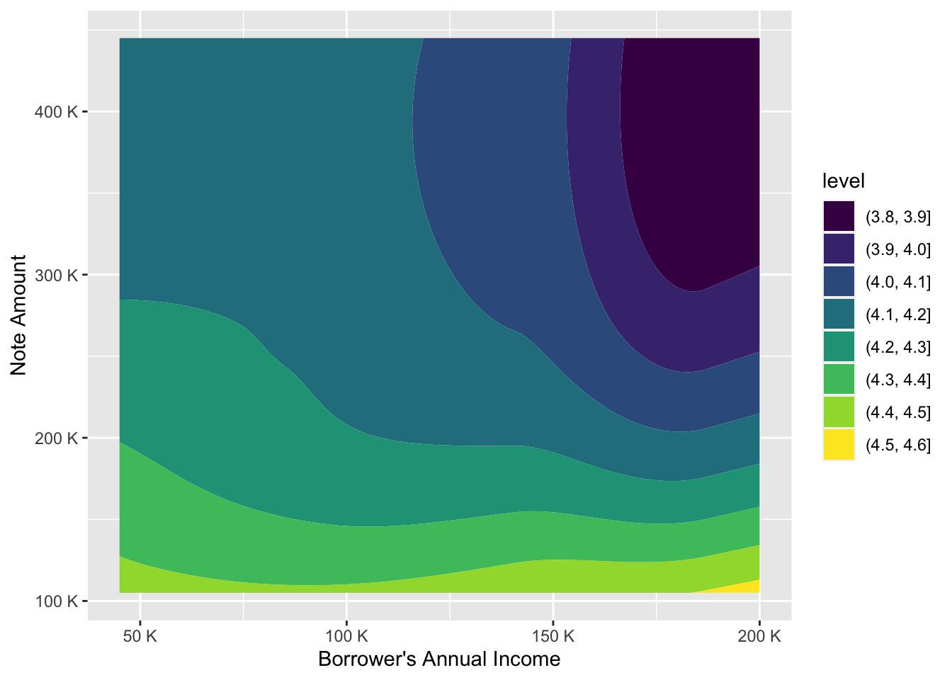
This plot gives information on the level of of a numeric variable, e.g. interest rate given two other numerics, e.g. loan amount and annual income. We can clearly see here, that the influence of annual income on loan amount clearly stays when controlled for interest rate. The higher the annual income, the higher the loan amount is true for every level interval of interest rate.
Summary
From all these findings we may deduct the following conclusions regarding the financial and economic contributors to the increase in loan amount:
Although there were many financial and economic factors indicated in the original data set, only few of them proved to be economically and financially significant and predominantly these factors led to increased loan amount and decreased interest rate These factors are the following ones:
purpose of loan- home improvement as a factor increased the given sum;occupancy code- principal residence / owner-occupied territory code decreased the interest rate and at the same time contributed towards loan increase;area- high opportunity area was seen as another loan amount magnifier;borrower's income- extremely high income gave either very high interest rate (with very low loan amount) or low interest rate when the amount was up to maximal.
From all these findings we can already describe the personality and figure out who theoretically could obtain the loan on the most attractive terms.
7.2 Research Question 2
Does the borrower’s race had an impact on eventual sum of loan given and respective interest rate? What other social factors have influenced the Enterprises’ decisions?
To answer this comprehensive question we need to determine all variables which can be considered social factors for the companies. These variables are: first_time_home_buyer, borrower_race, borrower_gender, age_of_borrower, co_borrower_race, co_borrower_gender, age_of_co_borrower, area_of_concentrated_poverty and high_opportunity_area. We will focus more on the 4 first features and analyse these variables in relation to loan amount, interest rate and LTV ratio as well as use multivariate techniques to see how other above mentioned social factors may have influenced company’s decisions.
So let’s have a quick glance at the relations of aforementioned features with other variables in our data set and among themselves. For this purpose we use a function plot_data_column, which gives us an overall understanding of the data.
Overview of social factors
First-time Home Buyer
target <- "first_time_home_buyer"
myplots <- lapply(colnames(data)[-which(colnames(data)==target)], plot_data_column, data = data, target=target)

n_plots <- length(myplots)
ncol <- floor(sqrt(n_plots))
do.call("grid.arrange", c(myplots, ncol=ncol)) 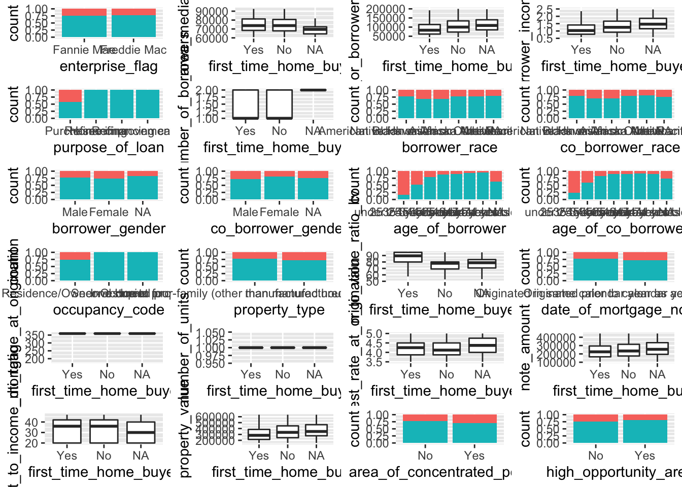
We can see some correlation with loan-to-value (LTV) ratio, note amount given and interest rate.
Borrower Race
target <- "borrower_race"
myplots <- lapply(colnames(data)[-which(colnames(data)==target)], plot_data_column, data = data, target=target)

n_plots <- length(myplots)
ncol <- floor(sqrt(n_plots))
do.call("grid.arrange", c(myplots, ncol=ncol)) 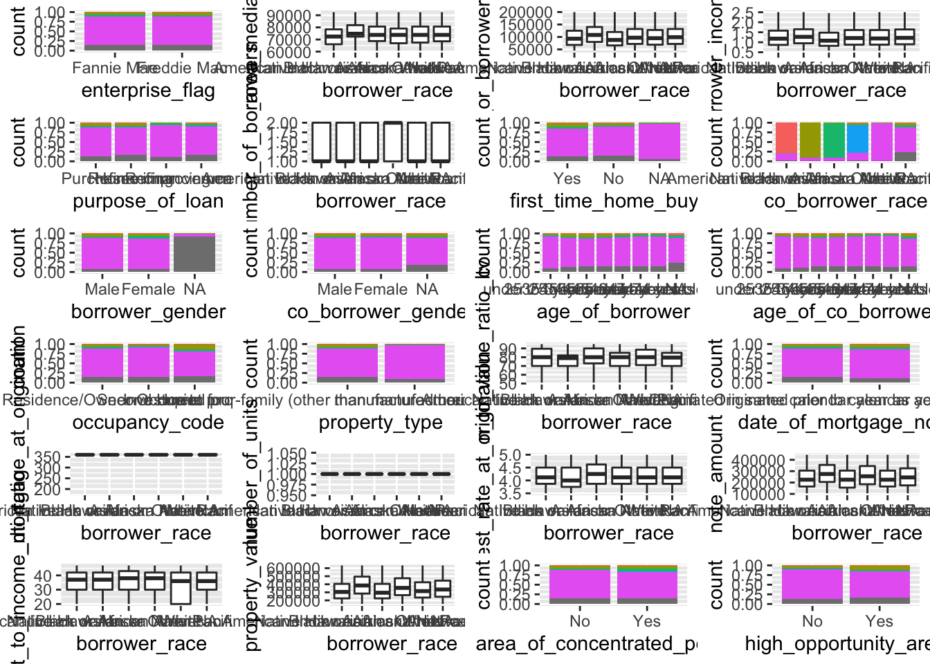
We can notice that borrower_race variable has a relation to co-borrower race as well as a slight correlation with note amount and interest rate.
Borrower Gender
target <- "borrower_gender"
myplots <- lapply(colnames(data)[-which(colnames(data)==target)], plot_data_column, data = data, target=target)

n_plots <- length(myplots)
ncol <- floor(sqrt(n_plots))
do.call("grid.arrange", c(myplots, ncol=ncol)) 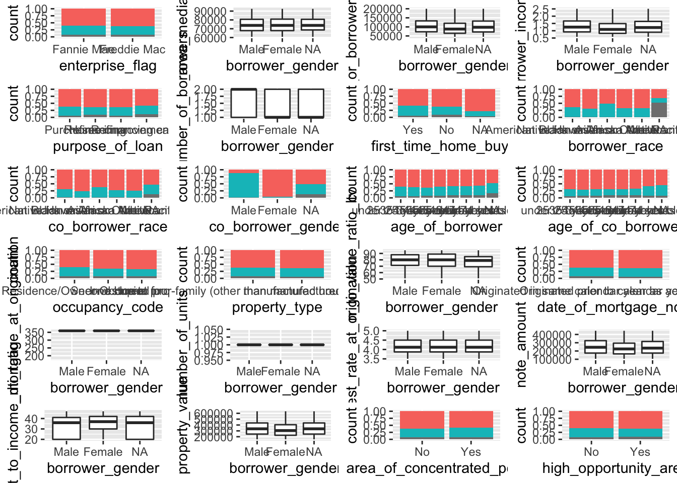
We can conclude that borrower_gender feature has a relation to co-borrower gender as well as a slight correlation with note amount and interest rate
Age of Borrower
target <- "age_of_borrower"
myplots <- lapply(colnames(data)[-which(colnames(data)==target)], plot_data_column, data = data, target=target)

n_plots <- length(myplots)
ncol <- floor(sqrt(n_plots))
do.call("grid.arrange", c(myplots, ncol=ncol)) 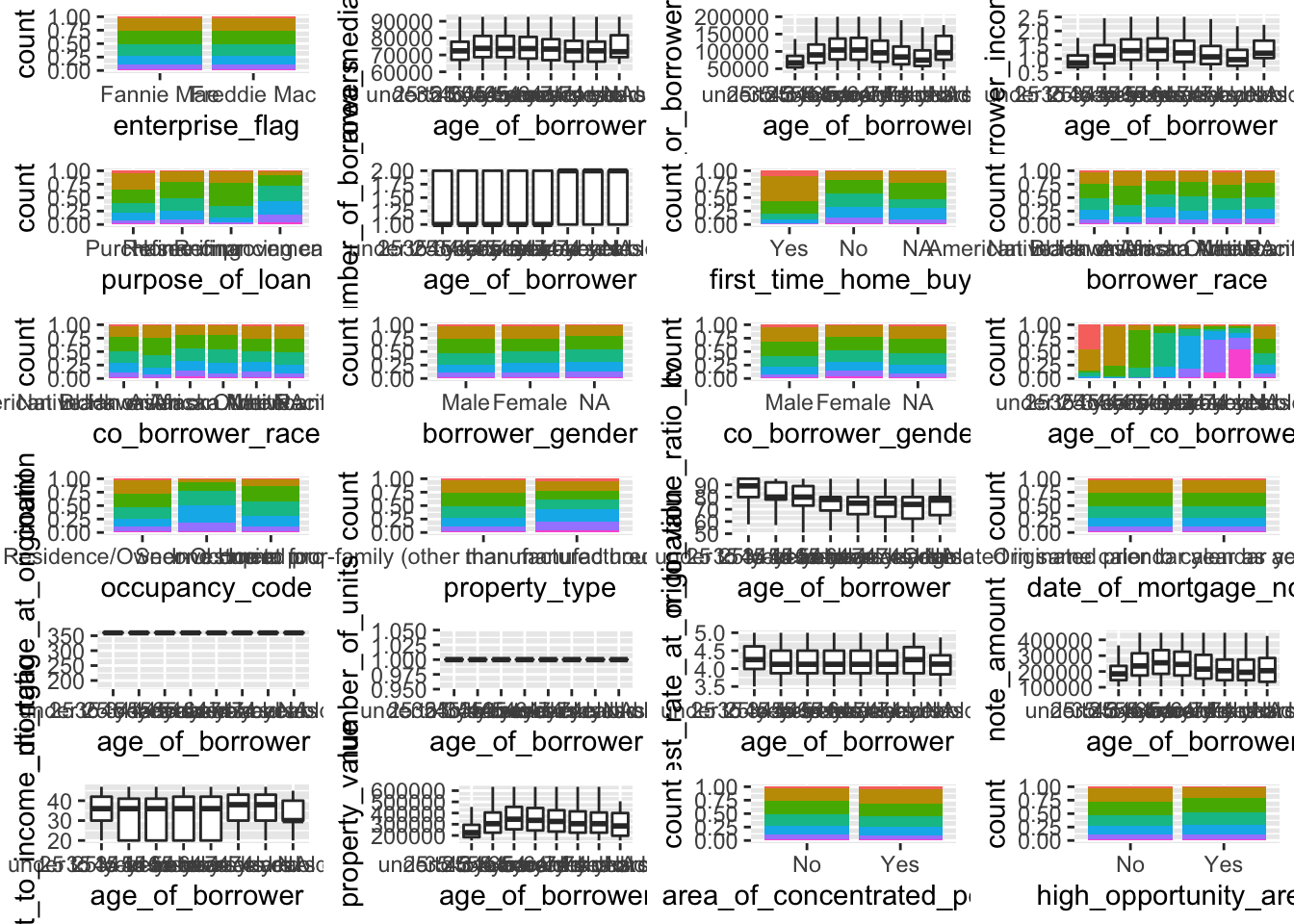
We can see that age_of_borrower column has a relation to first_home_time_buyer column as well as a slight correlation with note amount, interest rate and LTV ratio.
Having seen an overview of our targeted variables, we can now move on to the closer exploration of them. Let’s start with first_time_home_buyer feature, as there are some interesting interrelations.
Let’s take a closer look at the loan-to-value ratio among people, who are first-time buyers and who are not, and do the same to assess property value and note amount.
LTV comparison among first-time home buyers and those who were already granted a mortgage
data %>%
  na.omit() %>%
  subset(loan_to_value_ratio_ltv < 300) %>% # remove outliers for a better picture
  ggplot(aes(x = first_time_home_buyer, y = loan_to_value_ratio_ltv, fill = first_time_home_buyer)) +
  geom_boxplot(width = 0.5) +
  labs(x = "First-time Home Buyer", y = "Loan to Value Ratio (LTV)") +
  theme(legend.position = "None")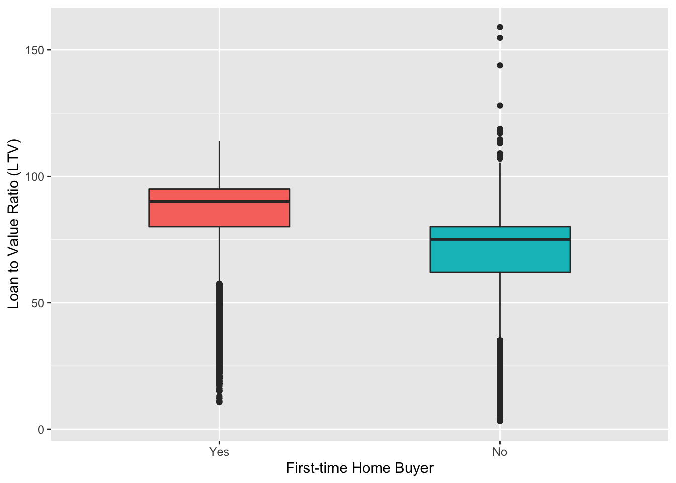
Now it is clearly seen that first-time home buyers LTV ratio made up around 90%, which was 15% higher than that of not first-time home buyers.
Property value comparison among first-time home buyers and those who were already granted a mortgage
data %>%
  na.omit() %>%
  subset(property_value < 1000000) %>% # remove outliers for a better picture
  ggplot(aes(x = first_time_home_buyer, y = property_value, fill = first_time_home_buyer)) +
  geom_boxplot(width = 0.2) +
  scale_y_continuous(labels = unit_format(unit = "K", scale = 1e-3)) +
  labs(x = "First-time Home Buyer", y = "Property Value") +
  theme(legend.position = "None")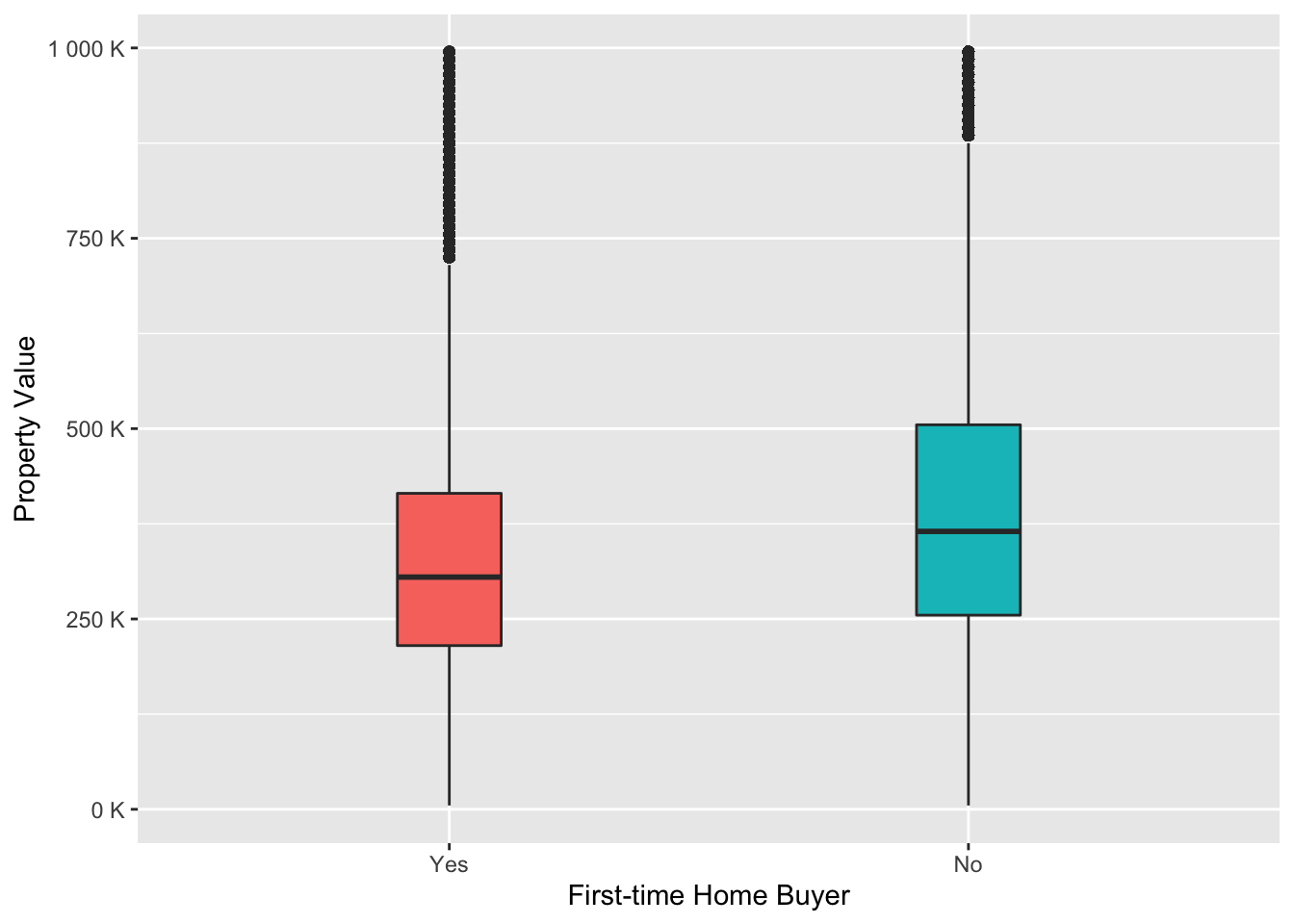
From this graph we can say that people who are not first-time home buyers wanted to buy a more expensive property than “newcomers”.
Note Amount comparison among first-time home buyers and those who were already granted a mortgage
data %>%
  na.omit() %>%
  subset(note_amount < 750000) %>% # remove outliers for a better picture
  ggplot(aes(x = first_time_home_buyer, y = note_amount, fill = first_time_home_buyer)) +
  geom_boxplot(width = 0.2) +
  scale_y_continuous(labels = unit_format(unit = "K", scale = 1e-3)) +
  labs(x = "First-time Home Buyer", y = "Note Amount") +
  theme(legend.position = "None")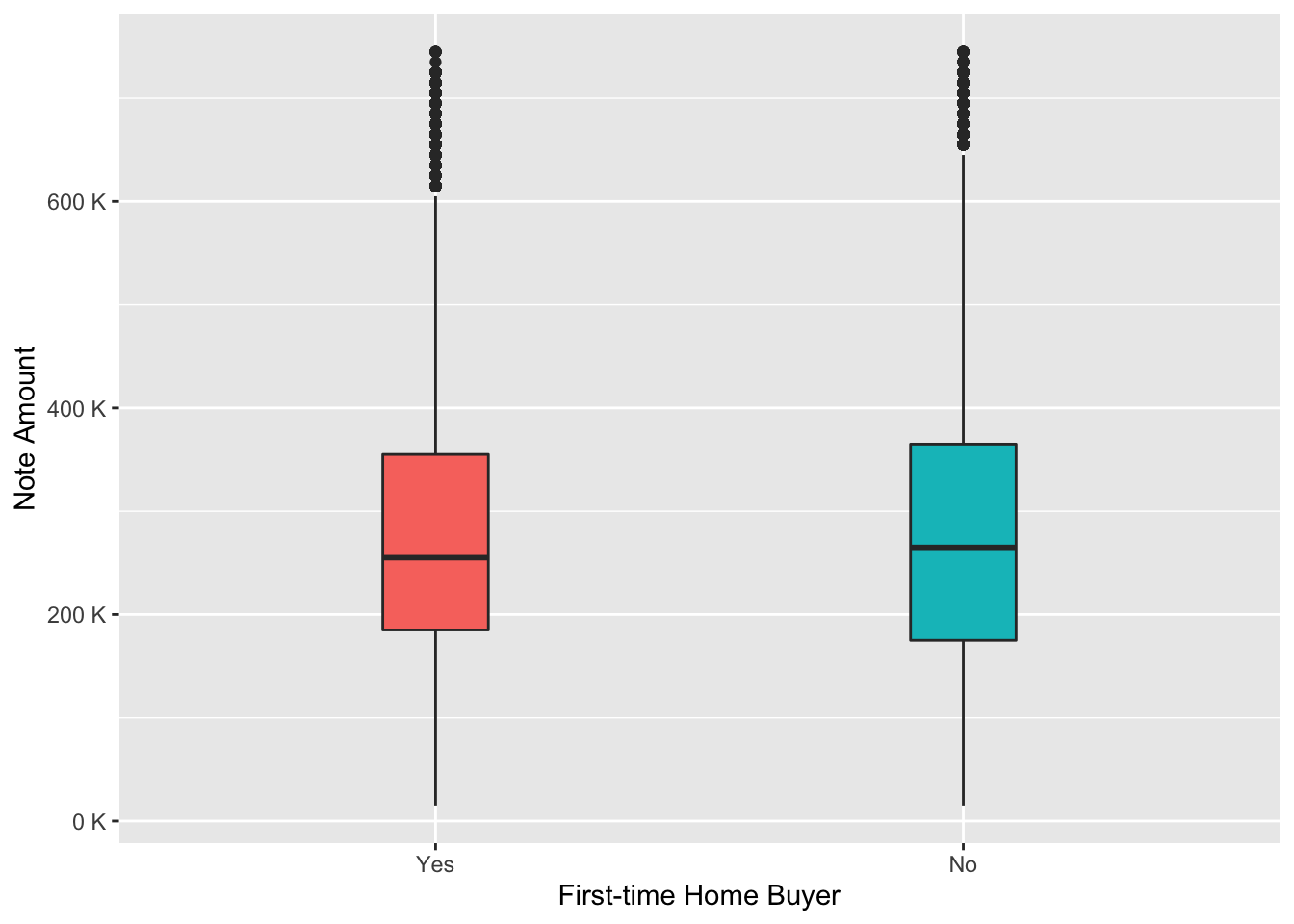
From the boxplot above we can clearly see that the note amount was equal among 2 considered groups. So we can make a conclusion that the majority of first-time home buyers received a note amount, which was almost the same as the property value they wanted to buy, while the majority of people who are not “newcomers” received around 75% of the property value as loan, although the property value was on average higher.
Relation between Note Amount and LTV among first-time home buyers and those who were already granted a mortgage
data %>%
  na.omit() %>%
  subset(loan_to_value_ratio_ltv < 300) %>% # remove outliers for a better picture
  ggplot(aes(x = note_amount, y = loan_to_value_ratio_ltv, color = first_time_home_buyer)) +
  geom_point(alpha = 0.6) +
  scale_x_continuous(labels = scales::unit_format(unit = "K", scale = 1e-3)) +
  labs(x = "Note Amount", y = "Loan-to-Value Ratio (LTV)", color = "First-time Home Buyer")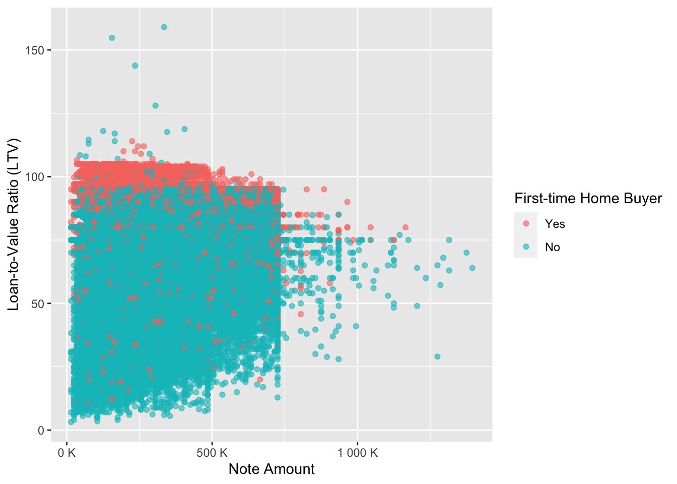
From the scatter plot above we can confirm our finding, that first-time home buyers’ LTV ratio was higher than that of individuals who are not first-time home buyers, therefore “newcomers” received a better value for money.
Let’s now move on to the next social factor - Borrower Race
At first let’s look at the proportion of borrowers to co-borrowers by race.
Relative proportion of co-borrower races to borrower races
data %>%
  na.omit() %>%
  ggplot(aes(x = co_borrower_race, fill = borrower_race)) +
  geom_bar(position = "fill") +
  scale_y_continuous(labels = unit_format(unit = "%", scale = 1e+2)) +
  scale_x_discrete(labels = wrap_format(15)) +
  labs(x = "Co-Borrower Race", y = "Percent", fill = "Borrower Race")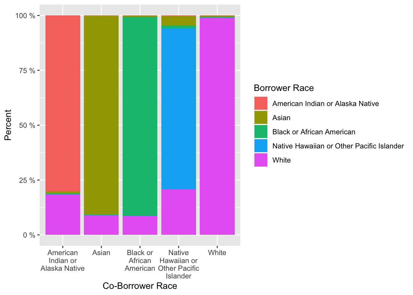
The bar chart gives us a good understanding, that the majority of borrowers of a certain race were together with co-borrower with the same race. Therefore, we will not focus on co-borrowers features later.
Distribution of note amount by borrower race
data %>%
  na.omit() %>%
  subset(note_amount < 800000) %>% # remove outliers for a better picture
  ggplot(aes(x = borrower_race, y = note_amount, fill = borrower_race)) +
  geom_boxplot(width = 0.4) +
  scale_y_continuous(labels = unit_format(unit = "K", scale = 1e-3)) +
  scale_x_discrete(labels = wrap_format(25)) +
  labs(x = "Borrower Race", y = "Note Amount") +
  theme(legend.position = "None")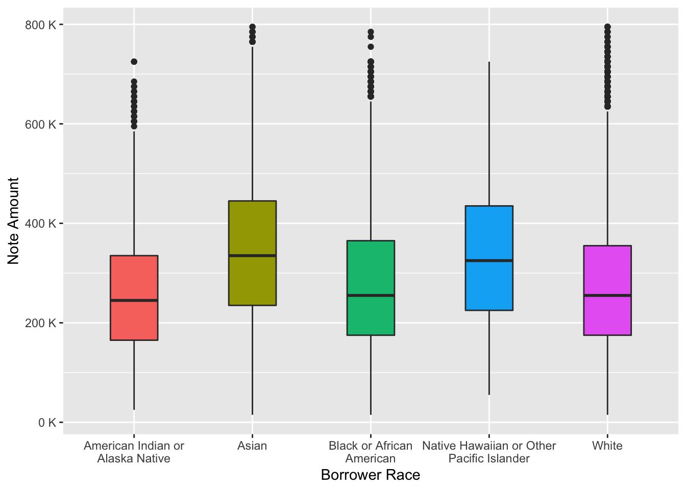
From the boxplot we can conclude that Asians and Native Hawaiian or Other Pacific Islander received on average a bigger sum of money.
Distribution of interest rate by borrower race
data %>%
  na.omit() %>%
  ggplot(aes(x = borrower_race, y = interest_rate_at_origination, fill = borrower_race)) +
  geom_boxplot(width = 0.3) +
  scale_x_discrete(labels = wrap_format(25)) +
  labs(x = "Borrower Race", y = "Interest Rate, %") +
  theme(legend.position = "None")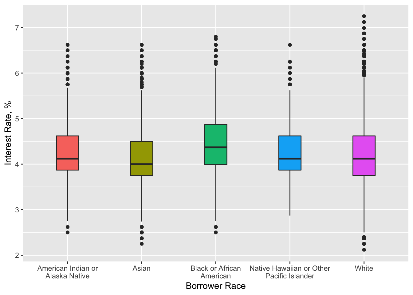
This boxplot suggests that Asians got the lowest interest rate among all other races, however the difference is quite small.
Interrelation of note amount and interest rate by borrower race and area of concentrated poverty
data %>%
  na.omit() %>%
  subset(note_amount < 800000) %>% # remove outliers for a better picture
  ggplot(aes(x = note_amount, y = interest_rate_at_origination)) +
  geom_point() +
  facet_grid(rows = vars(borrower_race), cols = vars(area_of_concentrated_poverty),
             labeller = labeller(borrower_race = label_wrap_gen(width = 10))) +
  scale_x_continuous(labels = unit_format(unit = "K", scale = 1e-3)) +
  labs(x = "Note Amount", y = "Interest Rate, %")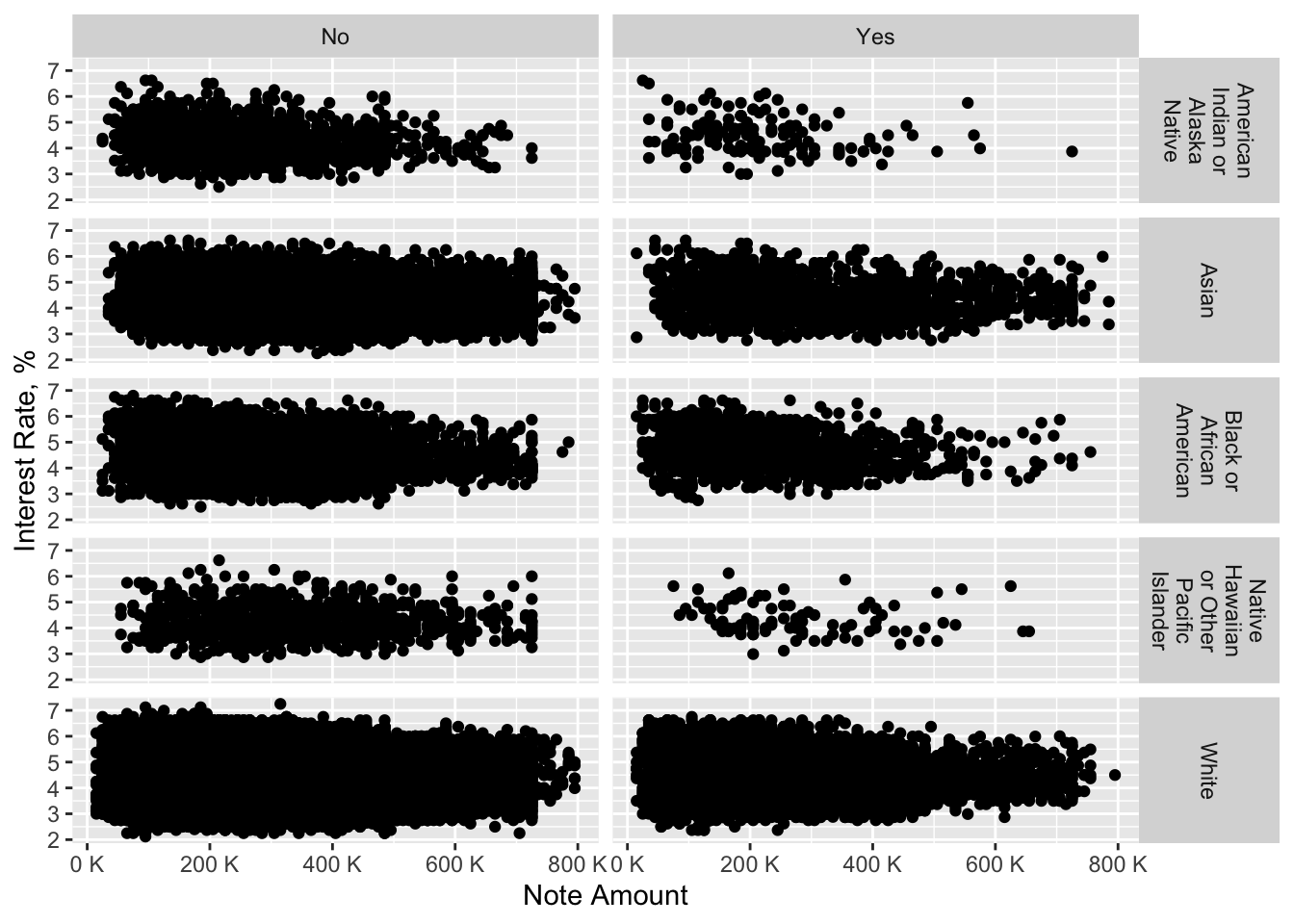
From this complex chart, we may see that people who aimed at purchasing a property not at area of concentrated poverty received comparable loan amount as well as interest rate, while we cannot say the same about the other group of people. It is noticeable that American Indians or Alaska Natives and Native Hawaiians or Other Pacific Islanders who were looking to buy a property at an area of concentrated poverty received a lower note amount than other races. The quantity of this people is much lower in our data set, however, this pattern is clearly seen.
Now we will go on to the next interesting social factor of borrower gender.
At first let’s look at the proprotion of borrowers to co-borrowers by gender.
Relative proportion of co-borrower genders to borrower genders
data %>%
  na.omit() %>%
  ggplot(aes(x = co_borrower_gender, fill = borrower_gender)) +
  geom_bar(width = 0.4, position = "fill") +
  scale_y_continuous(labels = unit_format(unit = "%", scale = 1e+2)) +
  labs(x = "Co-Borrower Gender", y = "Percent", fill = "Borrower Gender")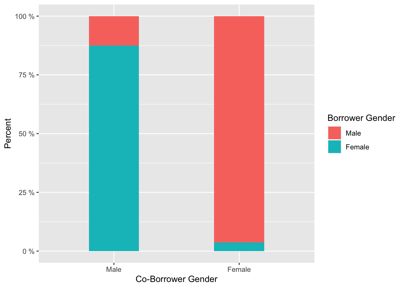
From the bar chart we can admit that the majority of borrowers of a certain gender were together with co-borrower the other gender. Therefore, we will not focus on co-borrower gender later.
Distribution of note amount by borrower race and age
data %>%
  na.omit() %>%
  subset(note_amount < 750000) %>% # remove outliers for a better picture
  ggplot(aes(x = age_of_borrower, y = note_amount, fill = borrower_gender)) +
  geom_boxplot() +
  scale_y_continuous(labels = scales::unit_format(unit = "K", scale = 1e-3)) +
  scale_x_discrete(labels = wrap_format(10)) +
  labs(x = "Age of Borrower", y = "Note Amount", fill = "Borrower Gender")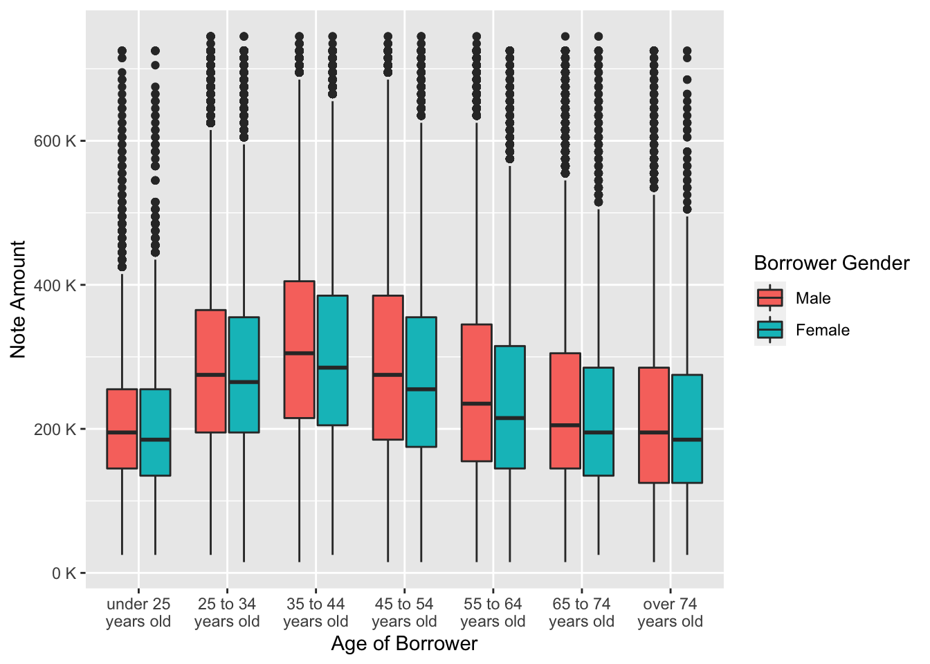
On the grouped boxplot we can see that females of each age grouped received a lower loan amount than males. It is notable that starting from 45 years old and till the last age group both males and females started receiving lower loan amount.
Distribution of interest rate by borrower race and age
data %>%
  na.omit() %>%
  ggplot(aes(x = age_of_borrower, y = interest_rate_at_origination, fill = borrower_gender)) +
  scale_x_discrete(labels = wrap_format(10)) +
  geom_boxplot() +
  labs(x = "Age of Borrower", y = "Interest Rate, %", fill = "Borrower Gender")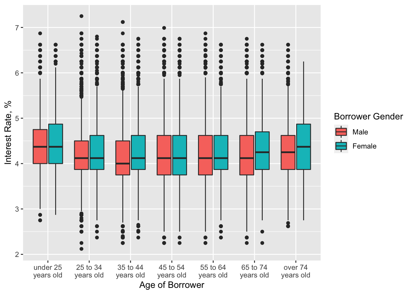
Unlike the loan amount, interest rate in almost every age group was on average the same for men and women. However, for the elderly females the interest rate was a little higher, despite the amount of money they received was lower than that of males.
Interrelation of note amount and interest rate by borrower race and borrower gender
data %>%
  na.omit() %>%
  subset(note_amount < 800000) %>% # remove outliers for a better picture
  ggplot(aes(x = note_amount, y = interest_rate_at_origination)) +
  geom_point() +
  scale_x_continuous(labels = scales::unit_format(unit = "K", scale = 1e-3)) +
  facet_grid(rows = vars(borrower_race), cols = vars(borrower_gender),
             labeller = labeller(borrower_race = label_wrap_gen(width = 10))) +
  labs(x = "Note Amount", y = "Interest Rate, %") +
  theme(panel.spacing.x = unit(1, "lines"))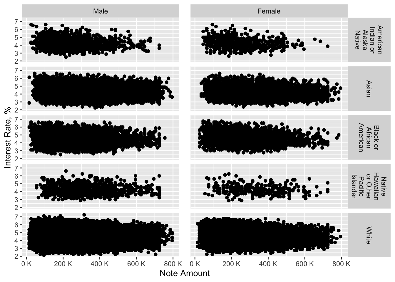
This complex graph gives us an understanding that overall both genders of almost every race were treated similarly. However, it is noticeable that Black American or Alaska Native females received slightly lower loan amount than males of this race. Furthermore, the majority of women who are either Black American or Alaska Native or Native Hawaiian ot Other Pacific Islander received lower loan amount than other females of other races.
Let’s now consider the next social feature which is age of borrower
Firstly let’s look at the proportion of first-time home buyers in each age group.
Relative proportion of first-time home buyers in each age group
data %>%
  na.omit() %>%
  ggplot(aes(x = age_of_borrower, fill = first_time_home_buyer)) +
  geom_bar(width = 0.7, position = "fill") +
  scale_y_continuous(labels = unit_format(unit = "%", scale = 1e+2)) +
  scale_x_discrete(labels = wrap_format(10)) +
  labs(x = "Age of Borrower", y = "Percent", fill = "First-time Home Buyer")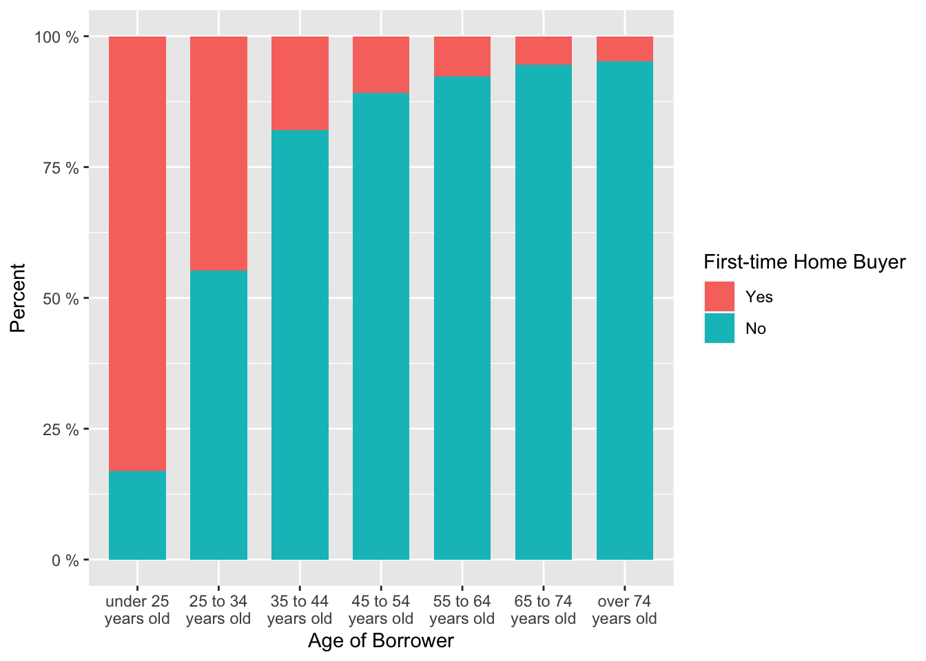
From this bar chart we can clearly see that the proportion of first-time home buyers was the largest in the youngest and second youngest age groups. Thus, we may assume that the majority of young people were “newcomers” and therefore their LTV ratio was higher.
Distribution of note amount by area of concentrated poverty in each age group
data %>%
  na.omit() %>%
  subset(note_amount < 800000) %>% # remove outliers for a better picture
  ggplot(aes(x = age_of_borrower, y = note_amount, fill = area_of_concentrated_poverty)) +
  geom_boxplot() +
  scale_y_continuous(labels = unit_format(unit = "K", scale = 1e-3)) +
  scale_x_discrete(labels = wrap_format(10)) +
  labs(x = "Age of Borrower", y = "Note Amount", fill = "Area of Concentrated Poverty")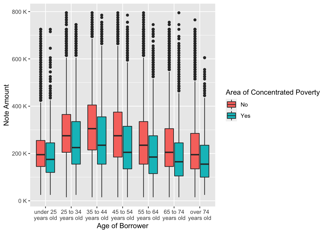
From the grouped boxplot we can conclude that people who wanted to purchase a property in an area of concentrated poverty received much lower loan amount. The reason for this is that the property in poverty regions costs lower.
Distribution of interest rate by area of concentrated poverty in each age group
data %>%
  na.omit() %>%
  ggplot(aes(x = age_of_borrower, y = interest_rate_at_origination, fill = area_of_concentrated_poverty)) +
  geom_boxplot() +
  scale_x_discrete(labels = wrap_format(10)) +
  labs(x = "Age of Borrower", y = "Interest Rate, %", fill = "Area of Concentrated Poverty")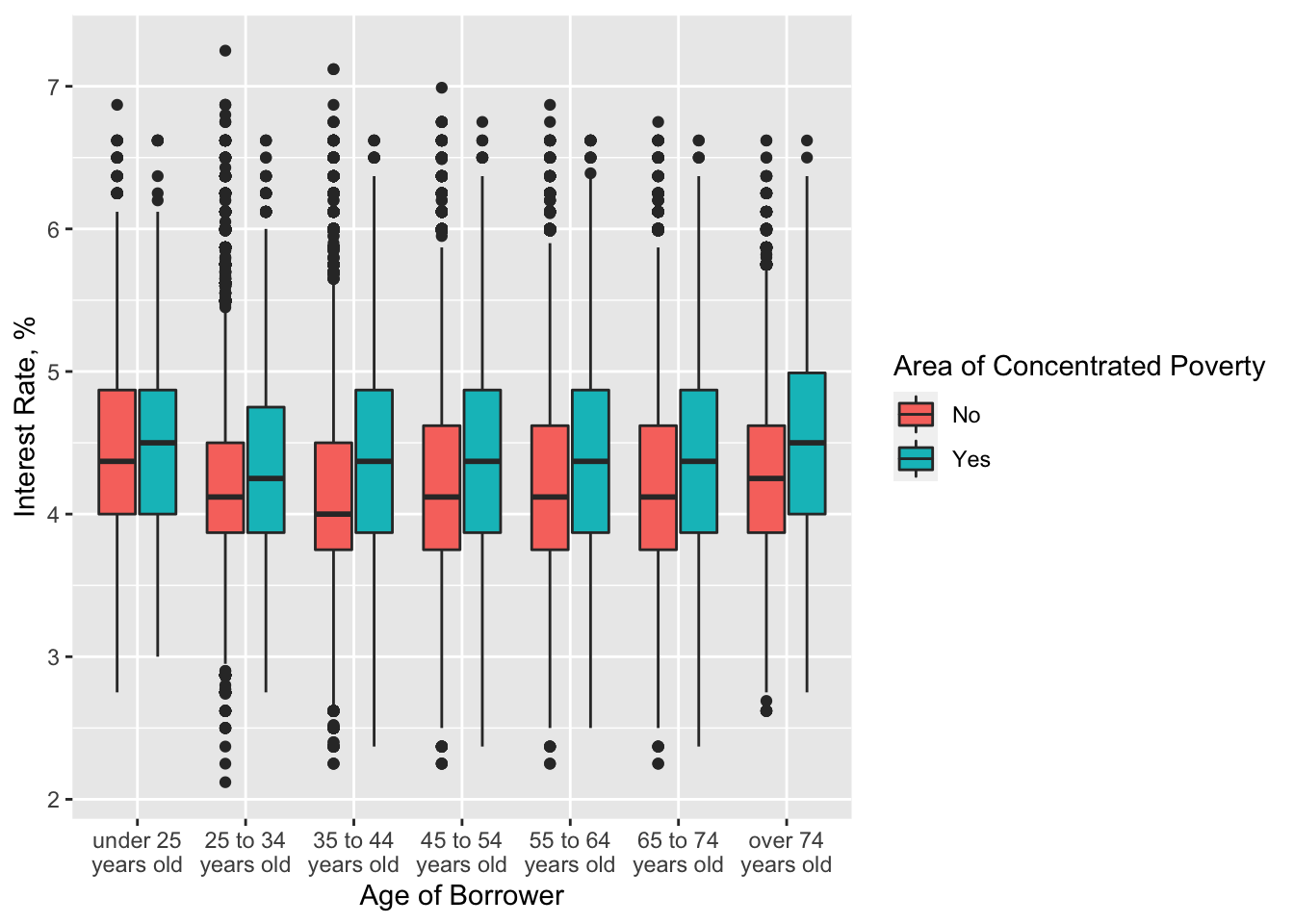
This boxplot tells us that people who wanted to purchase a property in an area of concentrated poverty received much higher interest rate.
Distribution matrix of LTV ratio by age group
borrower_age_clean <- c('<25', '25-34', '35-44', '45-54', '55-64', '65-74', '74>')

sum_data <- data %>% na.omit() %>% group_by(age_of_borrower) %>%
  summarise(ltv = mean(loan_to_value_ratio_ltv), n=n())

sum_data$age_of_borrower <- as.character(borrower_age_clean)

ggplot(sum_data, aes(area = n, fill = ltv, label = age_of_borrower)) +
  treemapify::geom_treemap() +
  treemapify::geom_treemap_text(fontface = "bold", colour = "white", place = "centre",
                    grow = TRUE) +
  scale_fill_viridis_c(name = "LTV Ratio")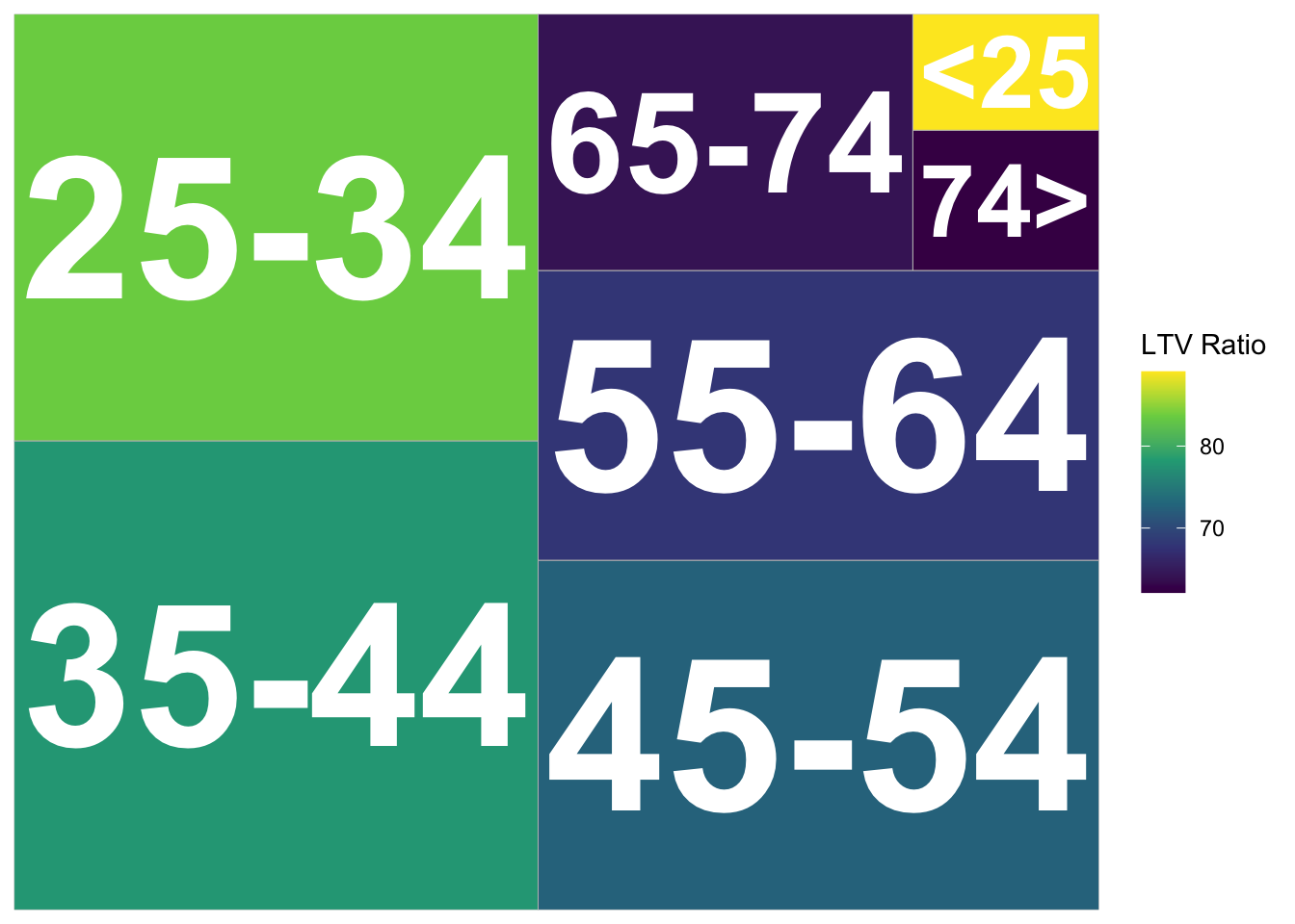
From the treemap above we can confirm our assumption that young people had the highest loan-to-value ratio among all age groups. We now can claim that young people, who were “newcomers” received a loan amount which was comparable with the property they wanted to purchase. In turn, the oldest age group had the lowest LTV ratio.
Summary
After analyzing a number of social factors in the data set we can formulate the following statements:
- Overall there was not any discrimination by the mortgage companies against borrowers of different races; however, a subtle discrimination pattern is seen for American Indian or Alaska Native and Native Hawaiian or Other Pacific Islander borrowers, who wanted to purchase a property in an area of concentrated poverty, as they received lower loan amount than borrowers of other races.
- Regarding the borrower gender we can claim that there was not any biased decision, although American Indian or Alaska Native and Native Hawaiian or Other Pacific Islander women were granted a lower loan amount than males of these races as well as females and males of other races considered in the data set.
- We also noticed a pattern that with the age the loan amount given to the borrowers is getting lower while the interest rate increases. It is a logical behavior of mortgage companies, as they do not want to lose a lot of money.
- Another interesting finding is that young people (under 25) had the greatest loan-to-value ratio - that is that they were granted a loan amount which was a little lower or the same as the property they wanted to buy. The same pattern is valid for first-time home buyers - on average they had a higher LTV ration than people who are not first-time home buyers.
7.3 Research Question 3
Did people with higher annual income receive a higher interest rate for the mortgage?
Summary
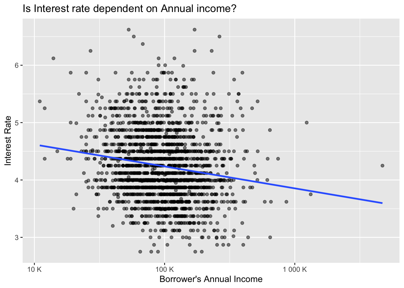
At first sight, there seems to be no strong linear relationship between the Annual income and the Interest rate as for example somebody with 10 000 of annual income get receive an interest rate ranging from 3% till 6.9%. The same counts for any other individual with a different income. However, after performing mathematical linearity, there seems to be even a weak negative correlation, meaning that average Interest rate slightly decreases as the Annual income increases.
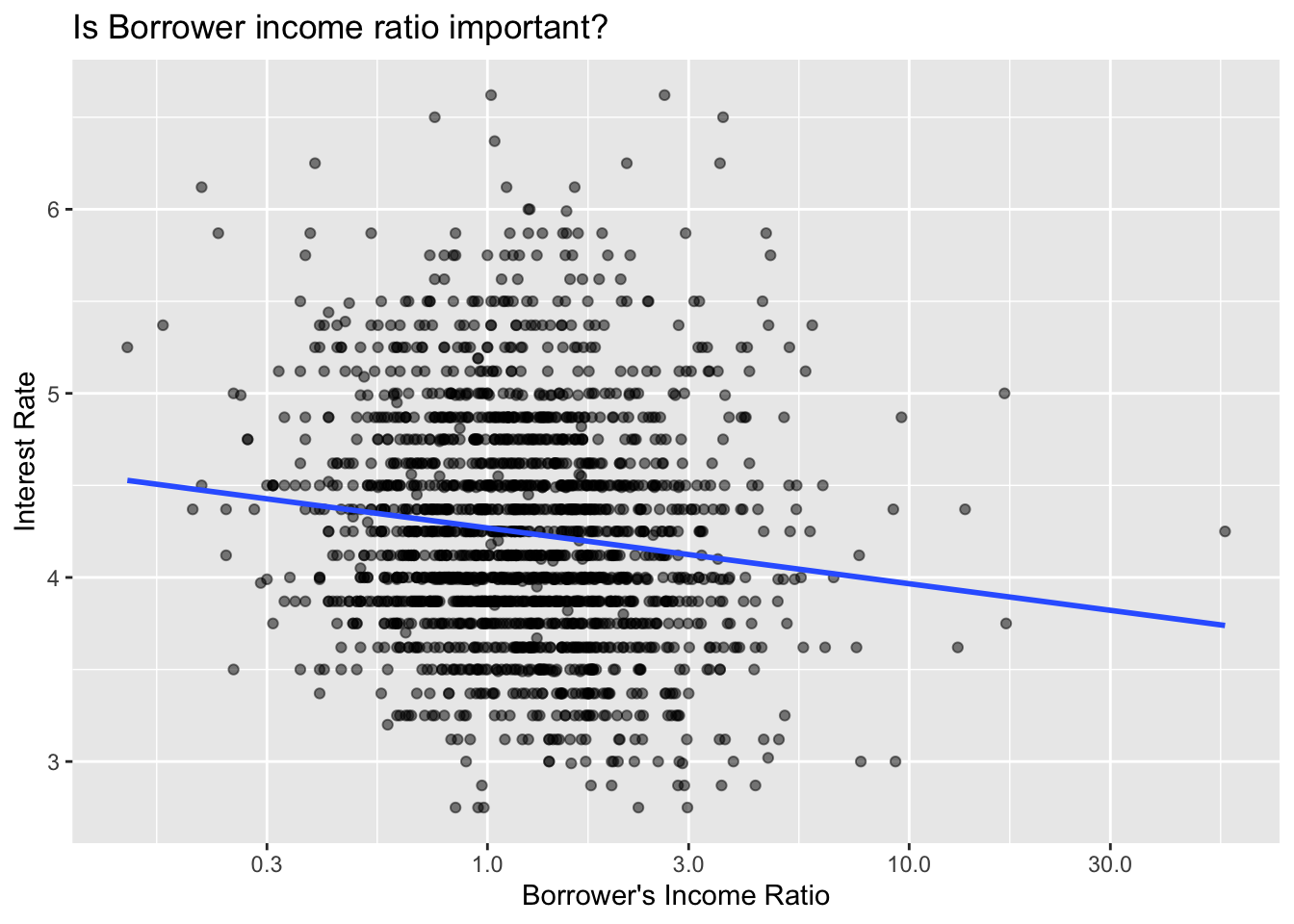
Looking into the Income ratio, we can observe that the data is relatively dispersed and it seems that the Income ratio plays only a small role in determining the Interest rate. However, there again is a mildly weak negative correlation between the two variables. Increasing Income ratio results in lower Interest rate. The showcased data have been greatly reduced in order to keep transparency, however, the relationship still holds true.
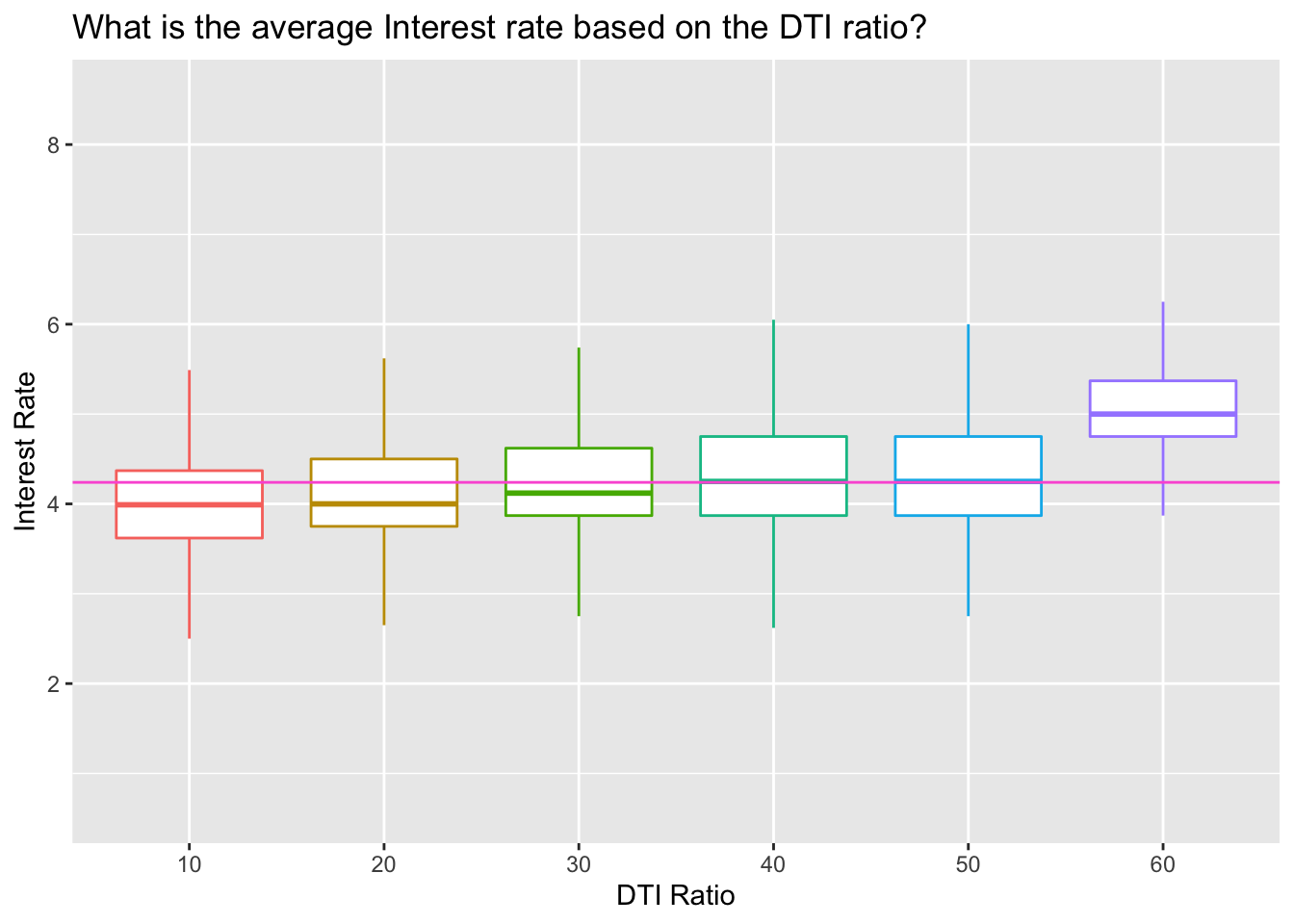
DTI ratio does seems to be a bit more positively correlated indicator of an interest rate as the Interest rate increases slightly with each Debt-to-income ratio. The “40”(36% till 49% of debt-to-income) and “50”(50%-60% of debt-to-income) DTI groups tend to receive average Interest rate, while “60” (over 60% of debt-to-income) results in the over-average interest rate. We have to vary, however, since the groups are not equally distributed.