4 Underwater
This brief practical application has two goals. First, I want to make sure that you are comfortable with the R and RStudio environment. Second, I want everyone to make some plots using ggplot. You can find lots of examples in Chapter 3 of R for Data Science.
We begin with the fundamental building blocks of R and RStudio: the interface, reading in data, and basic plots.
4.1 Setting Up Our R Environment
The top portion of your R Markdown file (between the three dashed lines) is called the YAML. It stands for “YAML Ain’t Markup Language”. It is a human friendly data serialization standard for all programming languages. All you need to know is that this area is called the YAML and that it contains meta information about your document.
If you haven’t already, let’s do the following:
- Create a folder for this class a folder called
elon-r-datacamp. - Go to the upper-right of R Studio and click the dropdown project menu. Create a new project in this folder called elon-r-datacamp
- Inside this folder, create a folder called
data. Go to our course Github page and grab the Zillow data file. It’s the one with the really long name. Save it in theelon-r-datacampfolder. - Use RStudio to create a new R Notebook inside of the
elon-r-datacampfolder. Remember, an R Notebook is where you can mix your R code and written text. You format that text using the markdown syntax. Currently, your new notebook is called Untitled1, or something like that. Save your notebook as “underwater-lastname” in yourelon-r-datacampfolder. Use your last name, of course!
The code generated when creating a new R Notebook is there to provide some syntax guidance.
In the YAML header, add lines for author: and date: underneath title:. Put your name for author and today’s date. Then, hit the preview button.
If you look in the folder that contains underwater-lastname.rmd, the R Markdown file you are coding in, you’ll now see a file called underwater-lastname.nb.html. This is the HTML notebook file that gets generated when you do a preview. This is the formatted file that you can share with people, like you would a Word .doc or PDF. You can save the notebooks as Word .docs or PDFs, actually!
4.1.1 Installing and Loading Packages
We will work with the tidyverse packages, a collection of packages for doing data analysis in a “tidy” way. In particular, we will make use of ggplot2 and just two pieces of dplyr. We are also going to use the here package to navigate folders when loading in our data.
Install these packages by running the following in the console, or by finding and installing the packages manually in the lower-right window. No need to put this in your R Notebook document. If you’ve already installed the tidyverse, then you can skip this step.
install.packages("tidyverse")Now, let’s get started with some code in the R Notebook. Go ahead and delete the code below the YAML header that you get every time you create a new R Notebook. Then, insert a new R chunk. You can name each chunk and put some options in between the curly brackets. The top line of your R chunk should look like ```{r set-up}. I like to call my first chunk set-up and then put things like my library() statements in there. Add code to load the tidyverse library. Remember, you need to do this in every R Notebook where you want to use something from the tidyverse. As you write more code, your set-up chunk will include more things.
I left the name of the file the way it was when downloaded for a reason. If you change your file names, you are not be able to trace back your raw data to the source. You can read more about research by Zillow in this NPR interview.
Finally, use read_csv, part of the tidyverse, to load in the Zillow file. You can download the data directly from my Github page. The read_csv function from readr in the tidyverse package can understand URLs. Note that this will not save anything to your computer. We can do that later.
library(tidyverse)
uw <- read_csv("https://raw.githubusercontent.com/aaiken1/elon-r-datacamp/main/data/zestimatesAndCutoffs_byGeo_uw_2017-10-10_forDataPage.csv")
Make sure that you’ve run the code chunk that loads the tidyverse library and brings in our data. Do you see the cryptic message underneath? That will appear in your document if you don’t get rid of messages. This is an option for that you can add to each code chunk that you create. Go back and change the top line in that code chunk to read ```{r set-up, echo=TRUE, message=FALSE}
This means that the code will go into your document, but the messages R gives you about what happened will not. Any output, like plots, will still appear, however.
Finally, remember to re-run your chunks every time you change part of it. The output won’t appear in the HTML file unless you’ve run the chunk yourself. They same is true if you change an input into a chunk in another chunk. Run your chunks!
4.2 Data
You can find many different Zillow data sets here. The “uw” here stands for “under water” in a very literal sense. I first thought they were talking about mortgages!
The data frame we will be working with today contains data from Zillow.com, the housing web site, on the number of homes, the median value of homes, etc. at-risk for flooding due to rising sea levels.
Let’s take a glimpse at our data. The glimpse function comes from the tibble package. I am using the package::function method here, just to make it clear where glimpse is coming from. You can’t run glimpse without the tibble package installed. You get tibble as part of the tidyverse.
tibble::glimpse(uw)
#> Rows: 2,610
#> Columns: 24
#> $ RegionType                   <chr> "Nation", "State", "S…
#> $ RegionName                   <chr> "United States", "Ala…
#> $ StateName                    <chr> NA, "Alabama", "Calif…
#> $ MSAName                      <chr> NA, NA, NA, NA, NA, N…
#> $ AllHomes_Tier1               <dbl> 35461549, 546670, 306…
#> $ AllHomes_Tier2               <dbl> 35452941, 520247, 307…
#> $ AllHomes_Tier3               <dbl> 35484532, 491300, 316…
#> $ AllHomes_AllTiers            <dbl> 106399022, 1558217, 9…
#> $ UWHomes_Tier1                <dbl> 594672, 2890, 8090, 4…
#> $ UWHomes_Tier2                <dbl> 542681, 2766, 14266, …
#> $ UWHomes_Tier3                <dbl> 725955, 5046, 17783, …
#> $ UWHomes_AllTiers             <dbl> 1863308, 10702, 40139…
#> $ UWHomes_TotalValue_Tier1     <dbl> 122992000000, 3659866…
#> $ UWHomes_TotalValue_Tier2     <dbl> 195513000000, 6291769…
#> $ UWHomes_TotalValue_Tier3     <dbl> 597449000000, 2583039…
#> $ UWHomes_TotalValue_AllTiers  <dbl> 915954000000, 3578203…
#> $ UWHomes_MedianValue_AllTiers <dbl> 310306.0, 270254.0, 8…
#> $ AllHomes_Tier1_ShareUW       <dbl> 0.016769487, 0.005286…
#> $ AllHomes_Tier2_ShareUW       <dbl> 0.015307080, 0.005316…
#> $ AllHomes_Tier3_ShareUW       <dbl> 0.020458351, 0.010270…
#> $ AllHomes_AllTiers_ShareUW    <dbl> 0.017512454, 0.006868…
#> $ UWHomes_ShareInTier1         <dbl> 0.3191485, 0.2700430,…
#> $ UWHomes_ShareInTier2         <dbl> 0.2912460, 0.2584564,…
#> $ UWHomes_ShareInTier3         <dbl> 0.3896055, 0.4715007,…
The first thing to note about this data is that there are several tiers. Some numbers are at the national level, some at the region, some at the state, and some at the MSA. tidydata refers to one row, one observation, across different variables (columns) and, possibly, across time. When you have multiple observations of the same firm, state, person, etc. over time, we call that panel data. Panel data is tidy too.
This data isn’t tidy! Note that some RegionTypes (e.g. Nation, State) are actually summaries of other rows. This is bit confusing, but we will work with it as is.
MSA stands for Metropolitan Statistical Area.
Finally, let’s think about the variable definitions a bit. Zillow places homes into three tiers based on the home’s estimated market value, with Tier3 being the highest value. AllHomes refers to all homes in that tier or across all tiers. UWHomes refers to homes that are at risk for flooding. Note that there are some variables that are counts, some that are dollar values, and others that are percentages.
4.3 Data visualization and summary
With your data loaded and an R Markdown notebook ready to go, let’s make some plots. You can include all of your R code and output in this single R Notebook.
See our notes for how to use filter and %>%. This is the only dplyr that you need for this exercise.
- In your own R Markdown notebook, change the title in the YAML at the top and delete the auto text in the notebook. Click Preview. You should see the preview in the right pane. Just the title should be there.
Now, make sure that you’ve imported the Zillow data from my Github page. You should see it in your Environment pane.
Finally, use glimpse to see what you’ve got.
Select just RegionType and show a list of
distinctvalues that this variable can take. Use%>%. Notice that this doesn’t save the output to your computer, but it will display them in your document.Do a
countof the values for each RegionType. Notice how this is different fromdistinct.Start with the full set of house data and use
filterand%>%to keep only the RegionType observations that are equal to “MSA”. Then, create a scatter plot of UWHomes_Tier1 on the x axis and UWHomes_TotalValue_Tier1 on the y. Do all of this in one R chunk. You will then run that code together in the chunk in your notebook. The resulting plot should appear below.
How would you create a new data set with just the MSA RegionType observations? If you do that, you won’t need to do the filter and %>% each time.
An important note: You’ll note that sometimes people put the mapping = aes() inside of ggplot() and other times they put it inside of the geom_() statement. The R for Data Science text tends to put them inside of the geom_x() statement. ggplot() gets a data =. See Section 3.2.3 of the book. But, when you are using pipes, you don’t need the data = inside ggplot(). The data gets “passed through” the pipe.
You can put mapping = aes() inside the geom_x() with other options following after a comma, like in the textbook. You could also put mapping = aes() inside ggplot().
It is important to get use to seeing the same thing done several ways. There’s never just one way to code something. This will become very clear when you search for help online.
That looks OK, I guess. Go back and add some appropriate labels for the X and Y axis. Give your chart a title. Let’s use the
labsoption, the anx, ay, and atitle. Finally, usegeom_smoothto add a linear trend line. You can do all of this in the original chunk. No need to write the same code again.Who are those outliers? Do any of the top values surprise you?
4.4 Other Items
- Resize your figures:
Click on the gear icon in on top of the R Markdown document, and select “Output Options…” in the dropdown menu. In the pop up dialogue box go to the Figures tab and change the height and width of the figures, and hit OK when done. Then, preview your document and see how you like the new sizes. Change and preview again and again until you’re happy with the figure sizes. Note that these values get saved in the YAML at the top of your Notebook.
You can also use different figure sizes for different figures. To do so click on the gear icon within the chunk where you want to make a change. Changing the figure sizes added new options to these chunks: fig.width and fig.height. You can change them by defining different values directly in your R Markdown document as well.
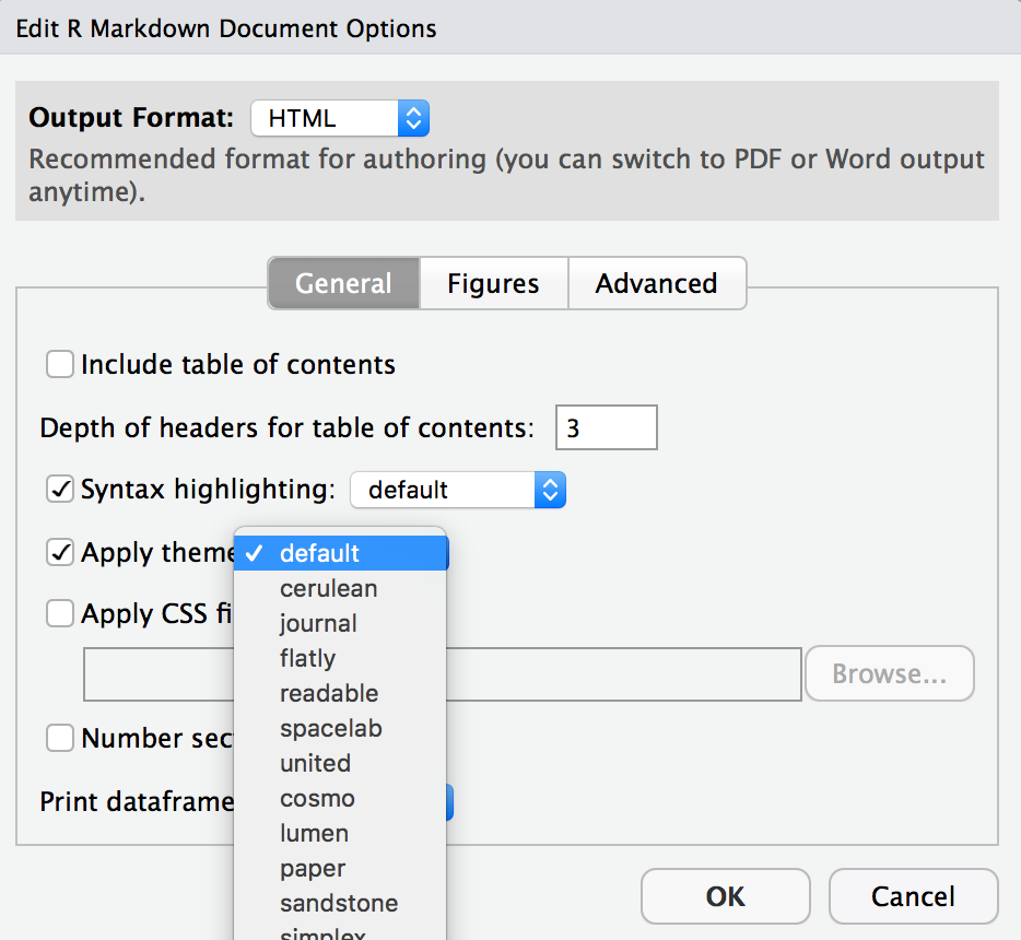
- Change the look of your report:
Once again click on the gear icon at the top of the R Markdown document and select “Output Options…” in the dropdown menu. In the General tab of the pop up dialogue box, try out different Syntax highlighting and theme options. Hit OK and preview your document to see how it looks. Play around with these until you’re happy with the look.
- Remember to run your chunks!
Getting weird output in your final document? Did you remember to add message=FALSE to your R chunk options?
The output in your final document will only reflect the last run for each chunk. Note that there is an option to run all chunks above or below your cursor under the Run menu.