3 Data Visualization and ggplot
Data visualization is the creation and study of the visual representation of data.There are many tools for visualizing data (R is one of them), and many approaches/systems within R for making data visualizations. ggplot2 is the most popular.
I have several recommendations for learning more about ggplot2. Chapter 3 of R For Data Science has a complete set of examples by the author of ggplot2.
Chapters 3-5 of Data Visualization by Prof. Kieran Healy is also a great place to start.
My notes below are based on the wonderful Data Science in a Box course developed by RStudio and Prof. Mine Çetinkaya-Rundele. Like Prof. Healy, Prof. Çetinkaya-Rundele is also affiliated with Duke.
You can find the ggplot2 cheat sheet here.
3.1 The Grammar of Graphics
ggplot2 is the tidyverse data visualization package. The gg in “ggplot2” stands for Grammar of Graphics and is inspired by the book The Grammar of Graphics by Prof. Leland Wilkinson, who recently passed away.
A grammar of graphics is a tool that enables us to concisely describe the components of a graphic, such as the data being plotted, the aesthetics of the plot, the scale being used, whether there are any subplots, or facets, and the coordinate system used.
These components are the language of the graph and lead us to the idea of layers. Essentially, we will build each graph by adding new layers and ideas on top of the existing ones. This gives us a consistent way to think about all of our data visualization.
](img/03-gg.png)
Figure 3.1: The major elements of the grammar of graphics. Source: Towards Data Science
This language and layering system is used in ggplot2. In fact, we are going to see the + operator in ggplot2 functions. This operator adds a layer to our graph. This means you create the plot in layers, separated by +.
Note that + n’est pas une pipe, %>%, and is used this way only with ggplot2.
3.2 Getting to know our data
Let’s open up a new R Notebook to work in. We could do this in an R Script as well. Let’s use some new data called palmerpenguins just to get a sense for how ggplot2 works. We’ll need to install and load the palmerpenguin package to do this.
Remember, you only need to install a package once on your computer. But, you need to load the package/library each time. I’ve commented out my install, since I already have it.
# install.packages("palmerpenguins")
library(palmerpenguins)
library(tidyverse)
#> ── Attaching packages ─────────────────── tidyverse 1.3.2 ──
#> ✔ ggplot2 3.3.6      ✔ purrr   0.3.4
#> ✔ tibble  3.1.8      ✔ dplyr   1.0.10
#> ✔ tidyr   1.2.1      ✔ stringr 1.4.1
#> ✔ readr   2.1.2      ✔ forcats 0.5.2
#> ── Conflicts ────────────────────── tidyverse_conflicts() ──
#> ✖ dplyr::filter() masks stats::filter()
#> ✖ dplyr::lag()    masks stats::lag()
We should start by looking at our penguin data. There are actually two data sets in the package. We’ll work with penguins.
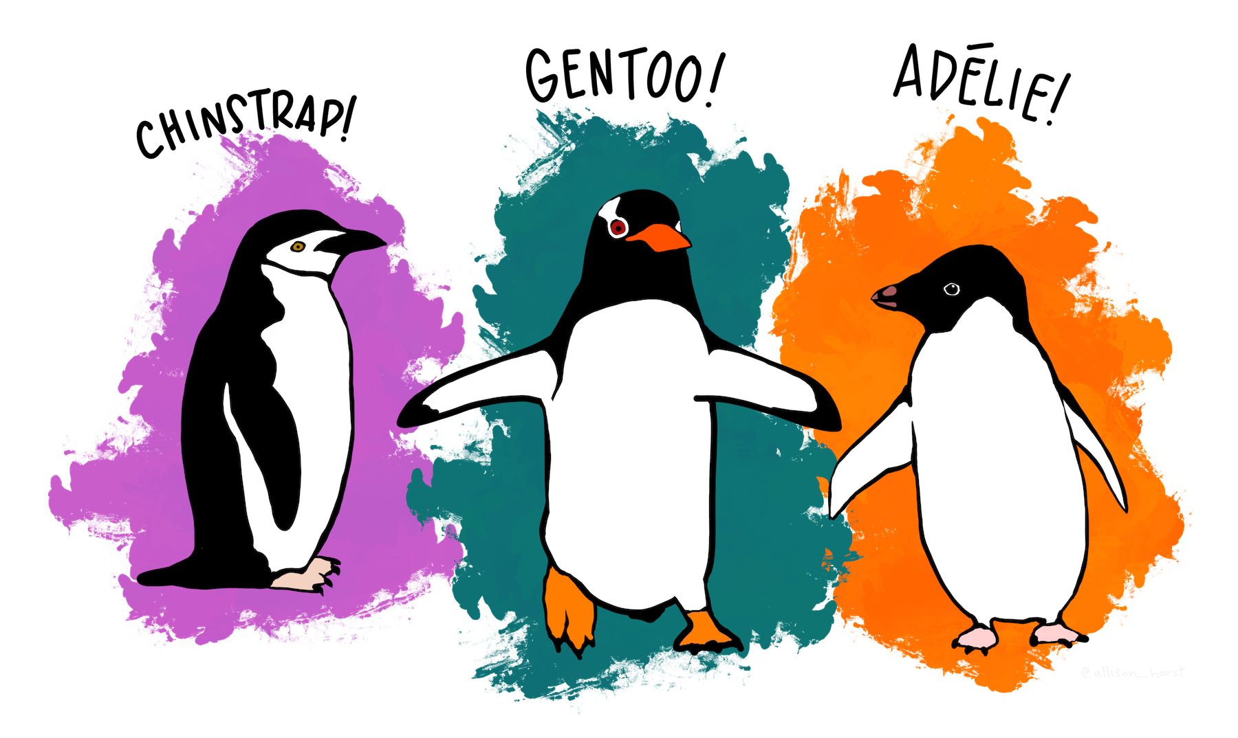
Figure 3.2: Meet our penguins! Artwork by Allison Horst.
I like to look at a summary first. head and str are also useful for seeing what we have.
summary(penguins)
#>       species          island    bill_length_mm
#>  Adelie   :152   Biscoe   :168   Min.   :32.10
#>  Chinstrap: 68   Dream    :124   1st Qu.:39.23
#>  Gentoo   :124   Torgersen: 52   Median :44.45
#>                                  Mean   :43.92
#>                                  3rd Qu.:48.50
#>                                  Max.   :59.60
#>                                  NA's   :2
#>  bill_depth_mm   flipper_length_mm  body_mass_g
#>  Min.   :13.10   Min.   :172.0     Min.   :2700
#>  1st Qu.:15.60   1st Qu.:190.0     1st Qu.:3550
#>  Median :17.30   Median :197.0     Median :4050
#>  Mean   :17.15   Mean   :200.9     Mean   :4202
#>  3rd Qu.:18.70   3rd Qu.:213.0     3rd Qu.:4750
#>  Max.   :21.50   Max.   :231.0     Max.   :6300
#>  NA's   :2       NA's   :2         NA's   :2
#>      sex           year
#>  female:165   Min.   :2007
#>  male  :168   1st Qu.:2007
#>  NA's  : 11   Median :2008
#>               Mean   :2008
#>               3rd Qu.:2009
#>               Max.   :2009
#>
Some variables are categorical, others are quantities. We can see that we do have some missing values (NAs).
Let’s use head to see just the first part of the data.
head(penguins)
#> # A tibble: 6 × 8
#> species island bill_…¹ bill_…² flipp…³ body_…⁴ sex year
#> <fct> <fct> <dbl> <dbl> <int> <int> <fct> <int>
#> 1 Adelie Torge… 39.1 18.7 181 3750 male 2007
#> 2 Adelie Torge… 39.5 17.4 186 3800 fema… 2007
#> 3 Adelie Torge… 40.3 18 195 3250 fema… 2007
#> 4 Adelie Torge… NA NA NA NA <NA> 2007
#> 5 Adelie Torge… 36.7 19.3 193 3450 fema… 2007
#> 6 Adelie Torge… 39.3 20.6 190 3650 male 2007
#> # … with abbreviated variable names ¹bill_length_mm,
#> # ²bill_depth_mm, ³flipper_length_mm, ⁴body_mass_gFinally, lets get a bit more detail about the structure of our data with str.
str(penguins)
#> tibble [344 × 8] (S3: tbl_df/tbl/data.frame)
#>  $ species          : Factor w/ 3 levels "Adelie","Chinstrap",..: 1 1 1 1 1 1 1 1 1 1 ...
#>  $ island           : Factor w/ 3 levels "Biscoe","Dream",..: 3 3 3 3 3 3 3 3 3 3 ...
#>  $ bill_length_mm   : num [1:344] 39.1 39.5 40.3 NA 36.7 39.3 38.9 39.2 34.1 42 ...
#>  $ bill_depth_mm    : num [1:344] 18.7 17.4 18 NA 19.3 20.6 17.8 19.6 18.1 20.2 ...
#>  $ flipper_length_mm: int [1:344] 181 186 195 NA 193 190 181 195 193 190 ...
#>  $ body_mass_g      : int [1:344] 3750 3800 3250 NA 3450 3650 3625 4675 3475 4250 ...
#>  $ sex              : Factor w/ 2 levels "female","male": 2 1 1 NA 1 2 1 2 NA NA ...
#>  $ year             : int [1:344] 2007 2007 2007 2007 2007 2007 2007 2007 2007 2007 ...
Three way to get similar information. We can see a few things right away. First, we have a tibble data.frame. So, we’re in the tidyverse. There are 344 observations and 8 variables. Some of the data are numbers and other data are integers. Three variables are these things called Factors. This is the R way of dealing with categorical data. You’ll want to learn about those. Our categorical variables are species, island, and sex.
We can also use some tidyverse ideas to explore our data. We can get a simple count by species, one of our categorical variables.
penguins %>%
  count(species)
#> # A tibble: 3 × 2
#>   species       n
#>   <fct>     <int>
#> 1 Adelie      152
#> 2 Chinstrap    68
#> 3 Gentoo      124
We can also summarize all of the numeric data. Let’s find the mean value for each numeric variable by species.
penguins %>%
group_by(species) %>%
summarize(across(where(is.numeric), mean, na.rm = TRUE))
#> # A tibble: 3 × 6
#> species bill_length_mm bill_dept…¹ flipp…² body_…³ year
#> <fct> <dbl> <dbl> <dbl> <dbl> <dbl>
#> 1 Adelie 38.8 18.3 190. 3701. 2008.
#> 2 Chinstrap 48.8 18.4 196. 3733. 2008.
#> 3 Gentoo 47.5 15.0 217. 5076. 2008.
#> # … with abbreviated variable names ¹bill_depth_mm,
#> # ²flipper_length_mm, ³body_mass_gTo do this, I’m starting with the penquins data. I’m “piping” %>% this into group_by, so we’ll do everything by species. Then, I’m using summarize, but with a few new ideas. First, there is across. This function lets you do operations across different columns. In this case, we want to take means across all of our numeric columns.
But, how do you tell it to only summarize and take means of columns with numeric data? That’s the where(is.numeric) part. So, summarize, across our columns, where our variable is numeric. We then see the mean and that we are removing all missing values from our calculation. Remember, if you don’t take out the missings, one NA value in a column makes the summary variable, like a mean, missing as well.
Now that we’ve looked at our data a bit, let’s save a new data set to our global environment that only has observations with a full set of variables. I’ll use the function drop_na to do this. This function is part of the tidyverse and comes from the tidyr package. I’ll call this new data set new_penquins. We’ll graph these.
new_penguins <- penguins %>%
drop_na()
new_penguins
#> # A tibble: 333 × 8
#> species island bill_le…¹ bill_…² flipp…³ body_…⁴ sex
#> <fct> <fct> <dbl> <dbl> <int> <int> <fct>
#> 1 Adelie Torgersen 39.1 18.7 181 3750 male
#> 2 Adelie Torgersen 39.5 17.4 186 3800 fema…
#> 3 Adelie Torgersen 40.3 18 195 3250 fema…
#> 4 Adelie Torgersen 36.7 19.3 193 3450 fema…
#> 5 Adelie Torgersen 39.3 20.6 190 3650 male
#> 6 Adelie Torgersen 38.9 17.8 181 3625 fema…
#> 7 Adelie Torgersen 39.2 19.6 195 4675 male
#> 8 Adelie Torgersen 41.1 17.6 182 3200 fema…
#> 9 Adelie Torgersen 38.6 21.2 191 3800 male
#> 10 Adelie Torgersen 34.6 21.1 198 4400 male
#> # … with 323 more rows, 1 more variable: year <int>, and
#> # abbreviated variable names ¹bill_length_mm,
#> # ²bill_depth_mm, ³flipper_length_mm, ⁴body_mass_gYou should now see new_penguins in the global environment, with 333 observations and 8 variables.
3.3 Using ggplot
Let’s look at a few examples. I’m borrowing these from Prof. Thomas Love and Prof. Allison Horst. As we look at the code, let’s ask ourselves:
- What are the functions doing the plotting?
- What is the data set being plotted?
- Which variable is on the x-axis and which variable is on the y-axis?
- What additional layers are being added?
Here’s a simple one.
ggplot(new_penguins, aes(x = body_mass_g, y = flipper_length_mm)) +
geom_point() 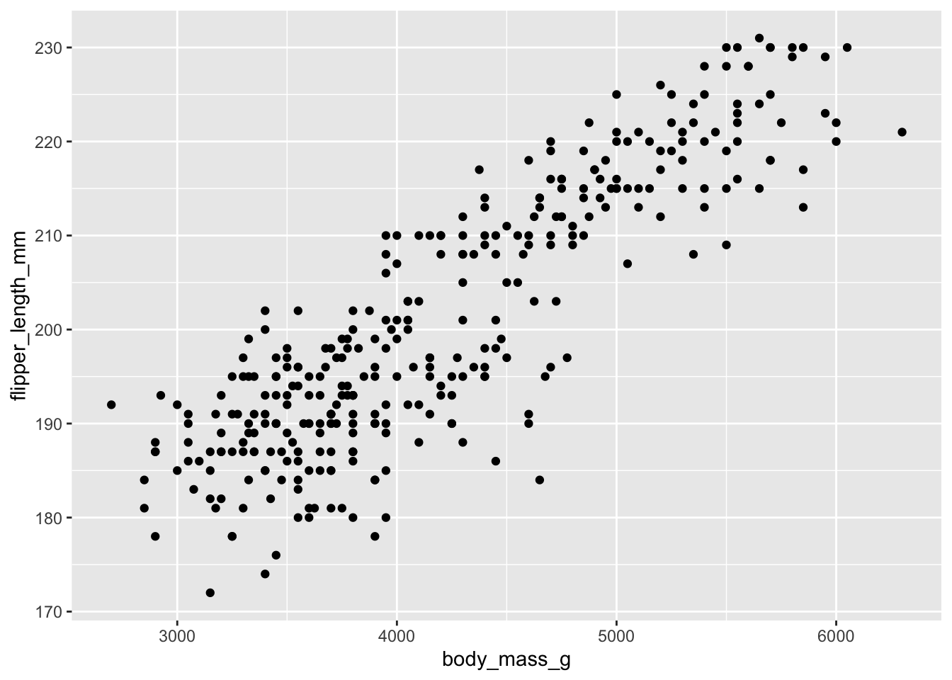
I think that this relationship makes some sense! How about this one?
ggplot(new_penguins, aes(x = body_mass_g, y = flipper_length_mm)) +
    geom_point() +
    geom_smooth(method = "lm", formula = y ~ x,
                col = "red", se = FALSE) +
    labs(title = "Relationship Between Flipper Size and Body Mass for 333 Palmer Penguins",
       x = "Body Mass (g)", y = "Flipper Length (mm)")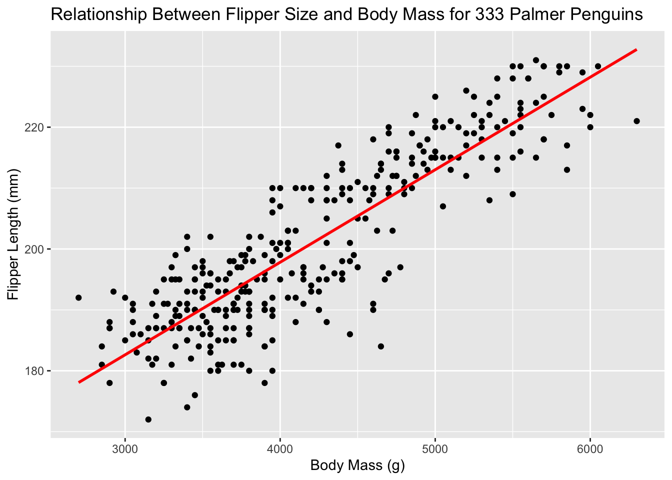
What does geom_smooth() do? What else changed between the previous plot and this one? Doesn’t this already look nicer than the standard Excel graph?
ggplot() is the main function in ggplot2 and, as we can see with that +, we are constructing these plots in layers.
The structure of the code for plots can often be summarized as
ggplot(data = [dataset], mapping = aes(x = [x-variable], y = [y-variable])) +
   geom_something() +
   other options
You first need to tell ggplot where to look for your data. Then, you tell it what sort of “aesthetics” or aes to use. This is where you can tell it the x and y variables. geom_something() tells ggplot what type of graph to make. The + builds the layers.
One common problem when creating ggplot2 graphics is to put the + in the wrong place: it has to come at the end of the line, not the start.
You can layer multiple plot types on top of each other. If you want all of them to have the same mappings, you can put mapping into the ggplot part. If the plots get different mappings, you can put the mappings into the specific plot types (e.g geom_point).
Best way to figure this out? Try lots of examples.
3.3.1 Aesthetics and geoms
An aesthetic, or aes, is a visual property of the objects in your plot. Aesthetics include things like the size, the shape, or the color of your points. You can display a point (like the one below) in different ways by changing the values of its aesthetic properties. Since we already use the word “value” to describe data, let’s use the word “level” to describe aesthetic properties.
colorsizeshape-
alpha(transparency)
Let’s add a third aesthetic to our plot, where the three species get different colors. Now, we have continuous variables, like flipper length and penguin weight, and discrete variables, like species, all on the same graph. If the variable is categorical, we can determine if it is ordinal based on whether or not the levels have a natural ordering.
ggplot(new_penguins, aes(x = body_mass_g, y = flipper_length_mm, col = species)) +
    geom_point() +
    labs(title = "Relationship Between Flipper Size and Body Mass for 333 Palmer Penguins",
       x = "Body Mass (g)", y = "Flipper Length (mm)")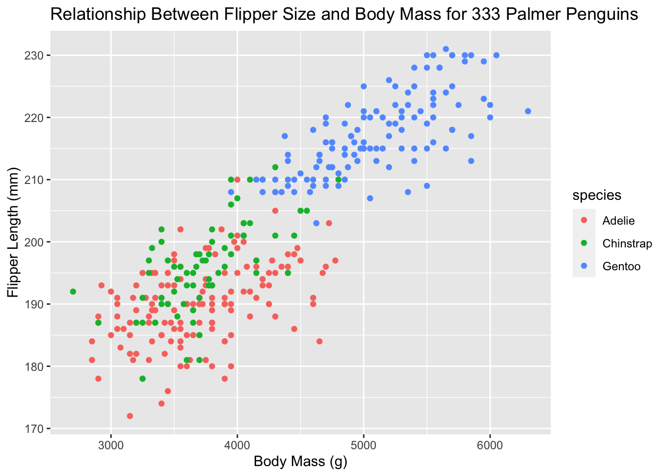
Aesthetics are different from just changing the style of the graph. In the gg world, aesthetics give us more information. Let’s increase the size of all points not based on the values of anything in the data. Let’s just make them smaller. See how that option goes into geom_point()? There are many, many ways to customize your plots!
ggplot(new_penguins, aes(x = body_mass_g, y = flipper_length_mm)) +
geom_point(size = 1) +
labs(title = "Relationship Between Flipper Size and Body Mass for 333 Palmer Penguins",
x = "Body Mass (g)", y = "Flipper Length (mm)")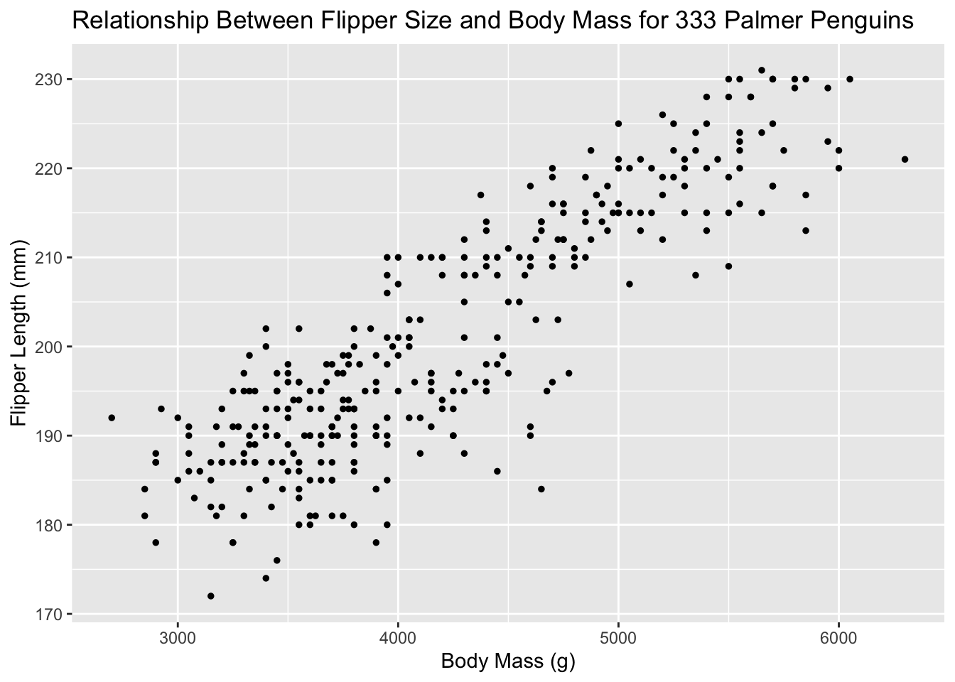 Use aesthetics for mapping features of a plot to a variable, define the features in the
 geom for customization not mapped to a variable. Here’s a brief summary for how to think about aesthetics in ggplot and what type of variable gets what type of aesthetic:
| aesthetics | discrete | continuous |
|---|---|---|
| color | rainbow of colors | gradient |
| size | discrete steps | linear mapping between radius and value |
| shape | different shape for each | shouldn’t (and doesn’t) work |
But what about geoms? A geom is the geometrical object that a plot uses to represent data. People often describe plots by the type of geom that the plot uses. For example, bar charts use bar geoms, line charts use line geoms, box plots use box plot geoms, and so on. Different geoms are going to be useful for different types of data. Every geom function in ggplot2 takes a mapping argument. However, not every aesthetic works with every geom.
It can take some trial-and-error to get use to all of this.
3.3.2 Facets
Facets are smaller plots that display different subsets of the data. They are particularly useful when you have discrete categories, and for exploring conditional relationships and large data. Let’s try the facet_wrap option
ggplot(new_penguins, aes(x = body_mass_g, y = flipper_length_mm,
                         col = species)) +
    geom_point() +
    facet_wrap(~ sex) +
    labs(title = "Relationship Between Flipper Size and Body Mass for 333 Palmer Penguins",
       x = "Body Mass (g)", y = "Flipper Length (mm)")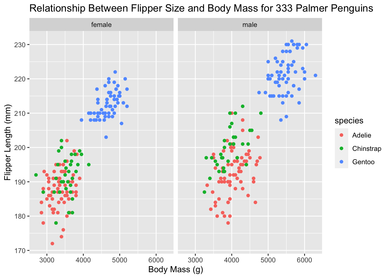
facet_wrap(~ sex) simply says to split the data up by sex and make the graph. That’s a lot of information on one graph now! Let’s clean things up even more.
ggplot(new_penguins, aes(x = body_mass_g, y = flipper_length_mm,
                         col = species)) +
    geom_point(size = 2, alpha = 0.5) +
    geom_smooth(method = "loess", formula = y ~ x,
                se = FALSE, size = 1.5) +
    facet_wrap(~ sex) +
    theme_bw() +
    labs(title = "Flipper Length and Body Mass, by Sex & Species",
         subtitle = paste0(nrow(new_penguins), " of the Palmer Penguins"),
         x = "Body Mass (g)",
         y = "Flipper Length (mm)")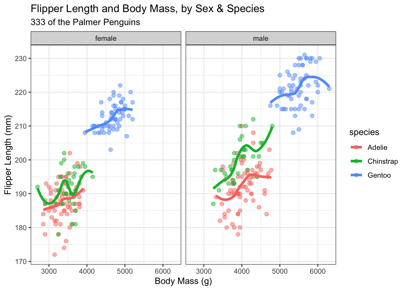
This example adds quite a bit. We’ve changed the geom_point size and added an alpha, or transparency, setting. geom_smooth is getting us a fitted curve to each relationship within species. theme_bw() adds a theme to the graph. In this case, a simple one that gets rid of some of the background colors. Themes are quick ways to get your graphs to all have the same look and feel. Some are pre-installed with ggplot and there are many, many packages available with custom ggplot themes. Finally, we have a title and a subtitle, where the subtitle is actually counting the number of rows in the data set and putting the number into the graph. This way, if the data set changes, we don’t have to update the graph with the new number of observations.
Once you have your graph looking exactly the way you want, you can always just copy and paste the code.
We’ve just seen facet_wrap() There is also facet_grid(). Let’s split up the data by both sex and species.
ggplot(new_penguins, aes(x = body_mass_g, y = flipper_length_mm)) +
    geom_point(size = 2, alpha = 0.5) +
    geom_smooth(method = "loess", formula = y ~ x,
                se = FALSE, size = 1.5) +
    facet_grid(sex ~ species) +
    theme_bw() +
    labs(title = "Flipper Length and Body Mass, by Sex & Species",
         subtitle = paste0(nrow(new_penguins), " of the Palmer Penguins"),
         x = "Body Mass (g)",
         y = "Flipper Length (mm)")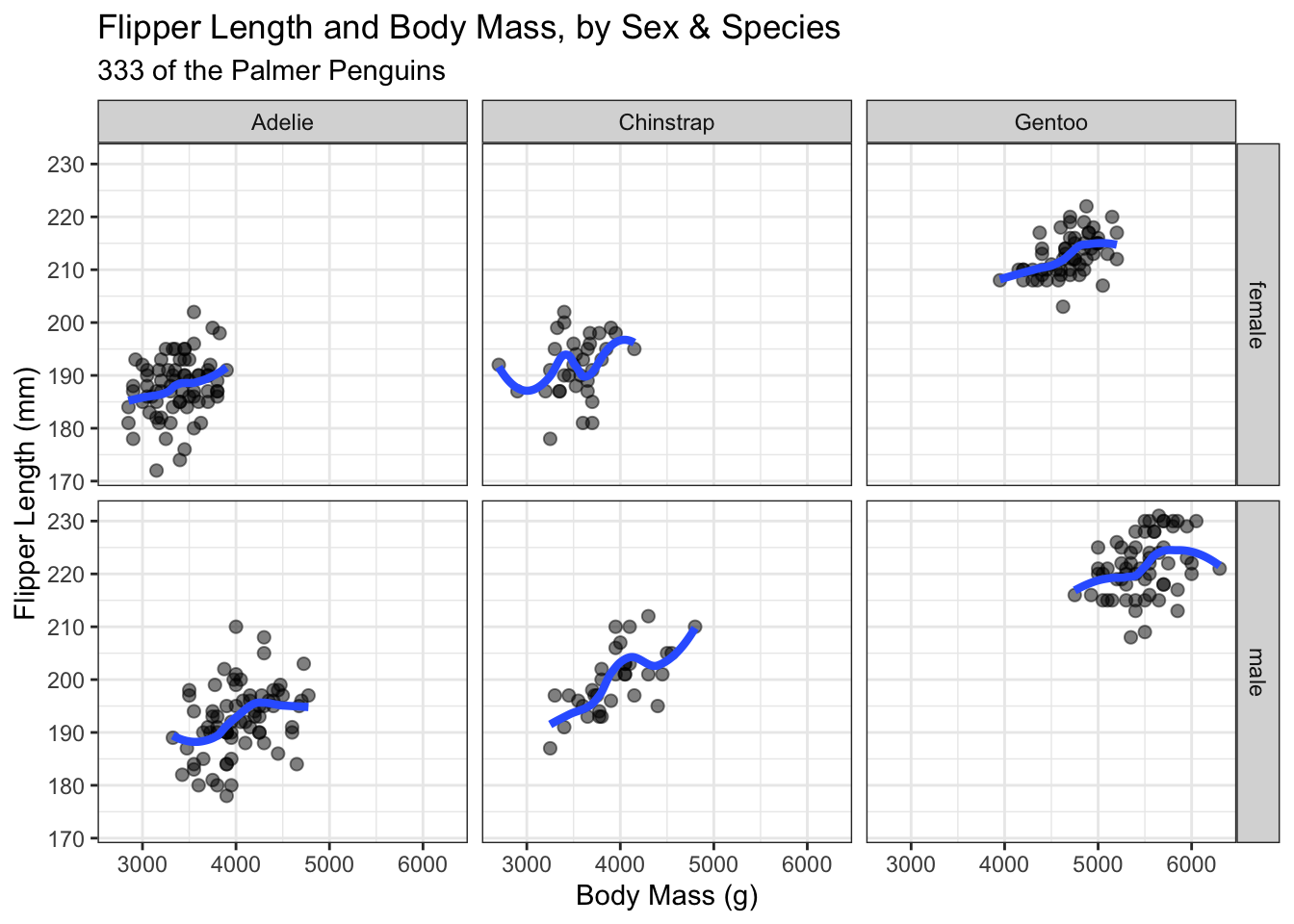
In short, there are two ways to split your data into categories.
-
facet_wrap(): 1d ribbon wrapped into 2d -
facet_grid():- 2d grid
rows ~ cols- use
.for no split
To facet your plot by a single variable, use facet_wrap(). The first argument of facet_wrap() should be a formula, which you create with ~ followed by a variable name (here “formula” is the name of a data structure in R, not a synonym for “equation”). The variable that you pass to facet_wrap() should be discrete.
To facet your plot on the combination of two variables, add facet_grid() to your plot call. The first argument of facet_grid() is also a formula. This time the formula should contain two variable names separated by a ~.
3.3.3 Many graph types
We’ve seen geom_point for scatter plots and geom_smooth to add the best fit lines so far. What about other graph types for different data? For example, we can make a geom_histogram of flipper length to get a better sense of the distribution. Note that there is only one aesthetic, an x-axis variable. geom_histogram is actually doing a data transformation to create counts and puts frequency on the y-axis for us.
Let’s do an easy one first. A histogram of flipper length in our data.
ggplot(data = new_penguins, aes(x = flipper_length_mm)) +
  geom_histogram()
#> `stat_bin()` using `bins = 30`. Pick better value with
#> `binwidth`.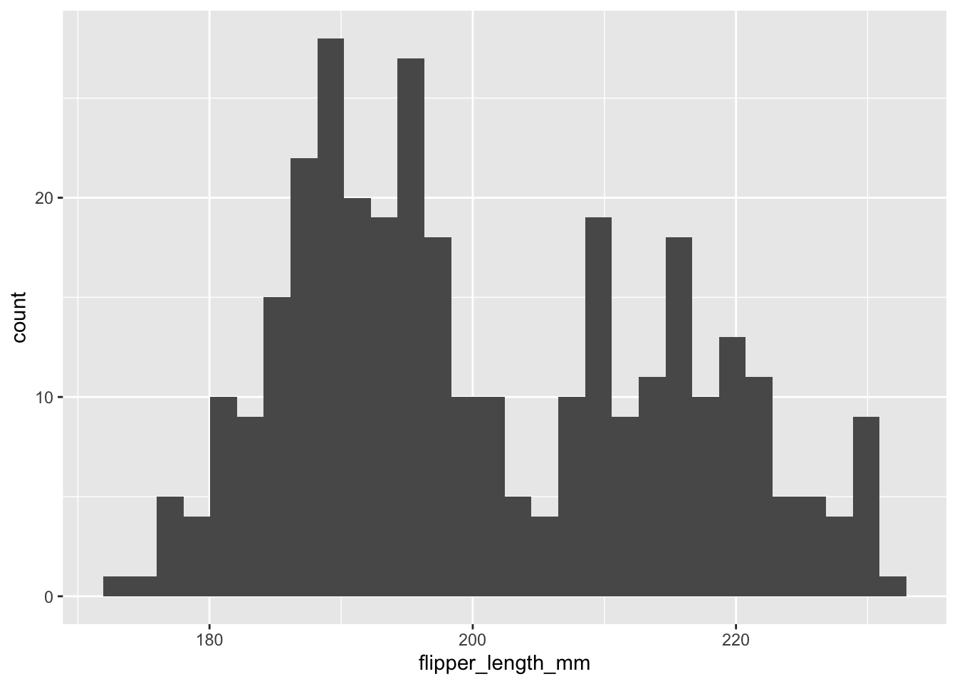
That is all flipper lengths across all species. Let’s add more layers. What about a separate distribution for each species, but plotted on the same graph? This means adding an aesthetic directly to geom_histogram. We can also add some labels.
ggplot(data = new_penguins, aes(x = flipper_length_mm)) +
geom_histogram(aes(fill = species)) +
labs(x = "Flipper length (mm)",
y = "Frequency",
title = "Penguin flipper lengths")
#> `stat_bin()` using `bins = 30`. Pick better value with
#> `binwidth`.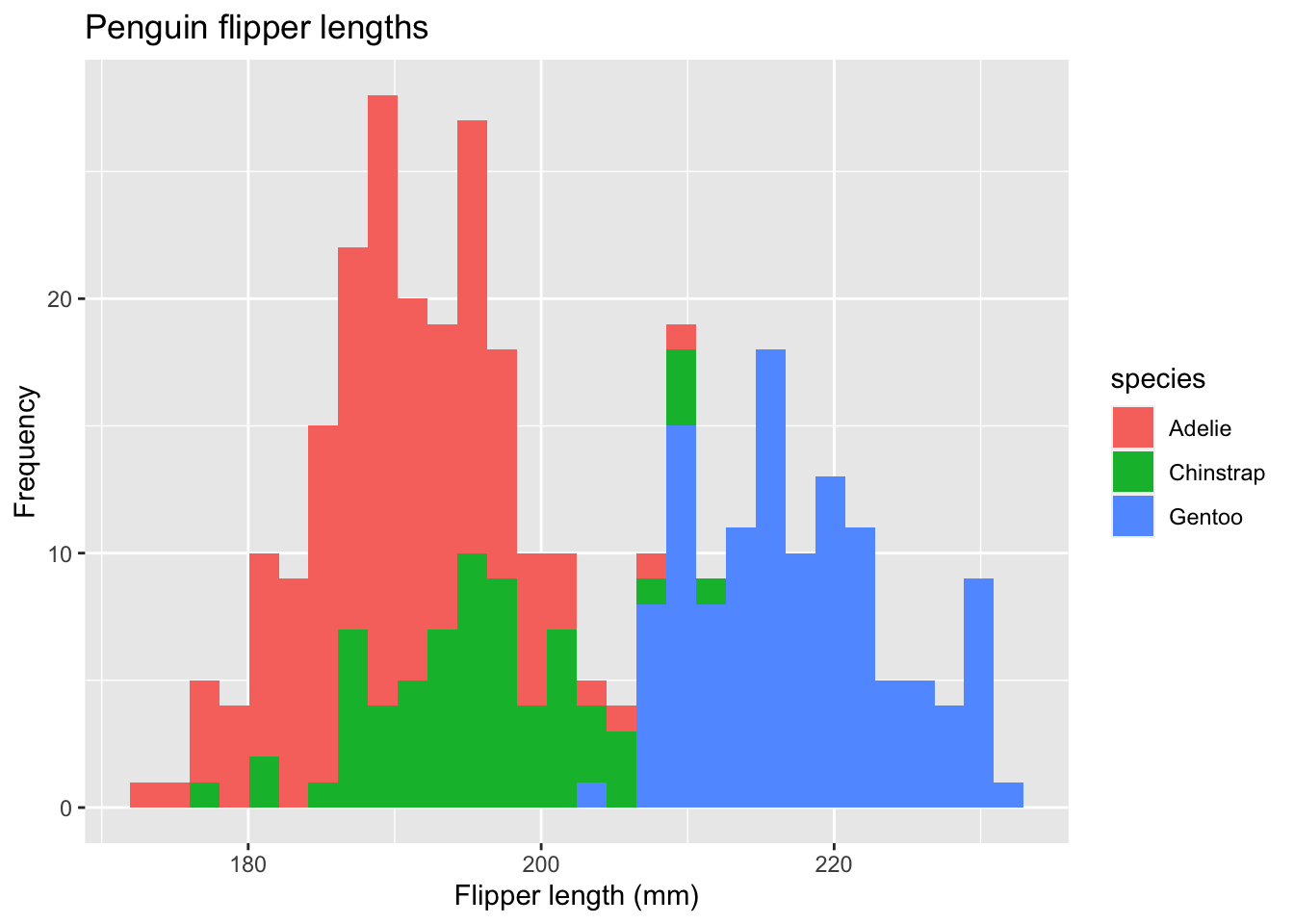 In this case, each histogram gets its own aesthetic fill based on species. We can do better.
ggplot(data = new_penguins, aes(x = flipper_length_mm)) +
geom_histogram(aes(fill = species),
alpha = 0.5,
position = "identity") +
scale_fill_manual(values = c("darkorange","purple","cyan4")) +
theme_minimal() +
labs(x = "Flipper length (mm)",
y = "Frequency",
title = "Penguin flipper lengths")
#> `stat_bin()` using `bins = 30`. Pick better value with
#> `binwidth`.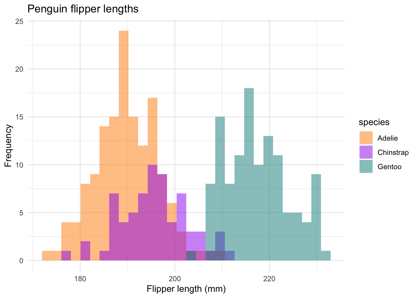 We are using the
 scale_fill_manual option to change the colors to something a little less bright. theme_minimal is another built-in ggplot2 theme that cleans things up a bit. The position = "identity" option plots values as they appear in the data set.
The c is “combining” together the three color names into one vector of names called values. scale_fill_manual knows to take these colors and use them in order.
We could even do this with a facet_grid, where each histogram gets its own plot within the larger plot.
ggplot(data = new_penguins, aes(x = flipper_length_mm)) +
geom_histogram(aes(fill = species),
alpha = 0.5,
position = "identity") +
facet_grid(~species) +
scale_fill_manual(values=c("darkorange","purple","cyan4")) +
theme_minimal() +
labs(x = "Flipper length (mm)",
y = "Frequency",
title = "Penguin flipper lengths")
#> `stat_bin()` using `bins = 30`. Pick better value with
#> `binwidth`.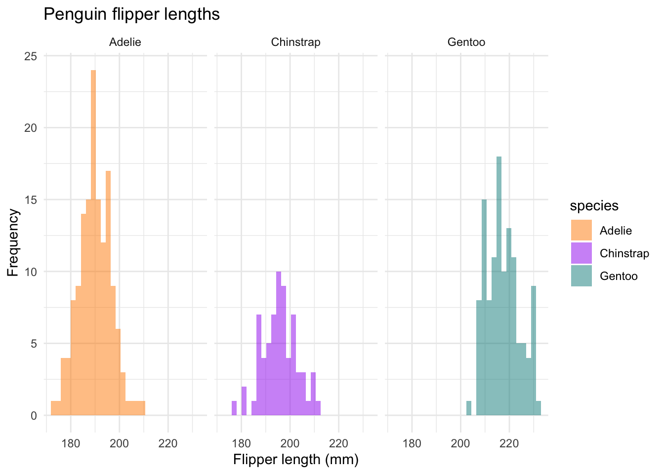 So many ways to customize.
Next, let’s look at a box plot with species on the x-axis and the distribution of flipper length on the y-axis.
ggplot(data = new_penguins, aes(x = species, y = flipper_length_mm)) +
  geom_boxplot(aes(color = species), width = 0.3, show.legend = FALSE) +
  labs(x = "Species",
       y = "Flipper length (mm)")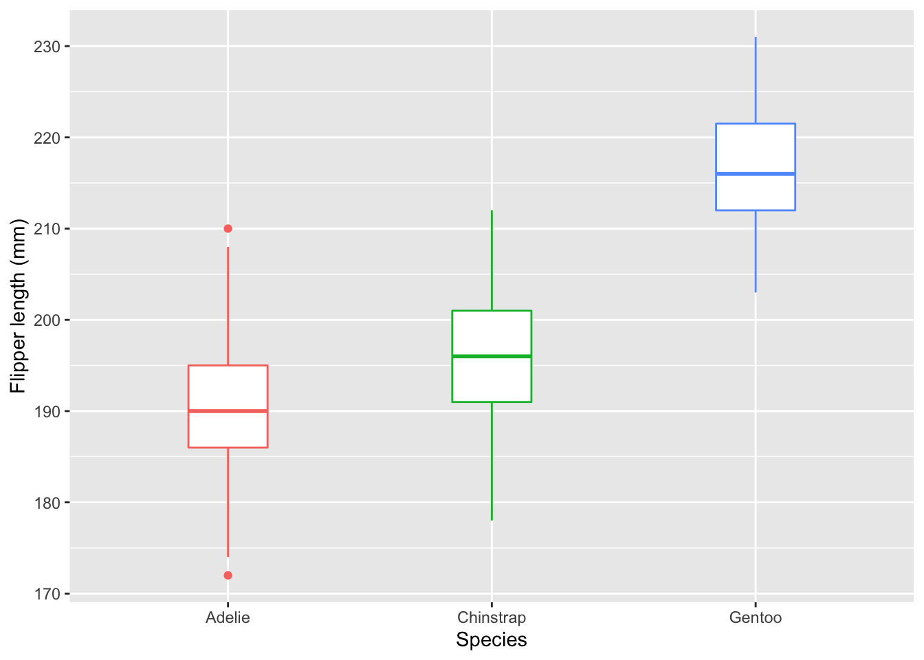
Again, we can add more layers and customization. I like to start simply - what am I trying to show and why? Then, I’ll add the options and layers that make it easier to get my point across.
ggplot(data = new_penguins, aes(x = species, y = flipper_length_mm)) +
geom_boxplot(aes(color = species), width = 0.3, show.legend = FALSE) +
geom_jitter(aes(color = species), alpha = 0.5, show.legend = FALSE, position = position_jitter(width = 0.2, seed = 0)) +
scale_color_manual(values = c("darkorange","purple","cyan4")) +
theme_minimal() +
labs(x = "Species",
y = "Flipper length (mm)")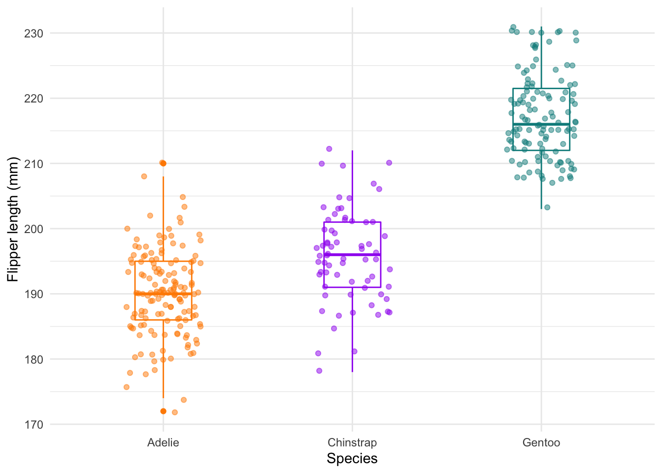 The
The geom_jitter layer adds the dots.
There’s also a geom_density, which is a bit like a histogram.
ggplot(data = new_penguins, aes(x = flipper_length_mm)) +
  geom_density()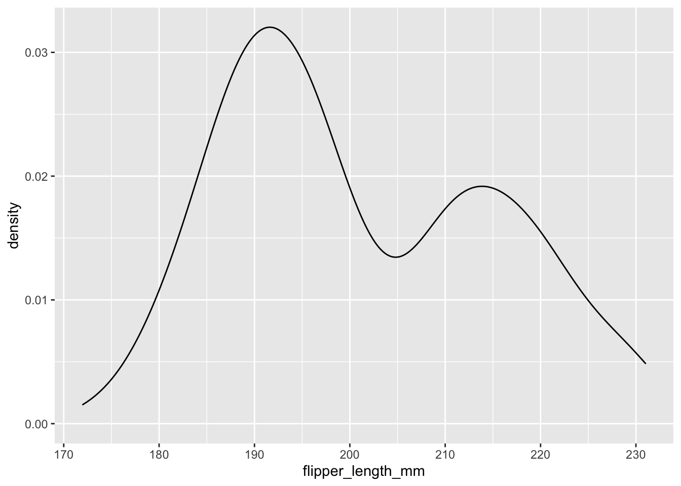
And something nicer. This is just the geom_histogram code from above, but with geom_density instead.
ggplot(data = new_penguins, aes(x = flipper_length_mm)) +
  geom_density(aes(fill = species),
                 alpha = 0.5,
                 position = "identity") +
  scale_fill_manual(values = c("darkorange","purple","cyan4")) +
  theme_minimal() +
  labs(x = "Flipper length (mm)",
       y = "Frequency",
       title = "Penguin flipper lengths")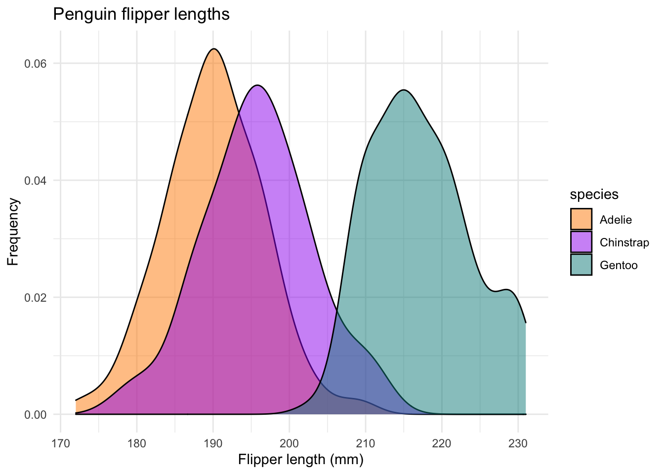
3.3.4 Customization and saving
Here’s an example of some custom colors from the wesanderson package. Seems fitting to use Life Aquatic for Palmer Penguins.
library(wesanderson)
ggplot(data = new_penguins, aes(x = flipper_length_mm)) +
  geom_density(aes(fill = species),
                 alpha = 0.5,
                 position = "identity") +
  scale_fill_manual(values=wes_palette(name="Zissou1")) +
  theme_minimal() +
  labs(x = "Flipper length (mm)",
       y = "Frequency",
       title = "Penguin flipper lengths")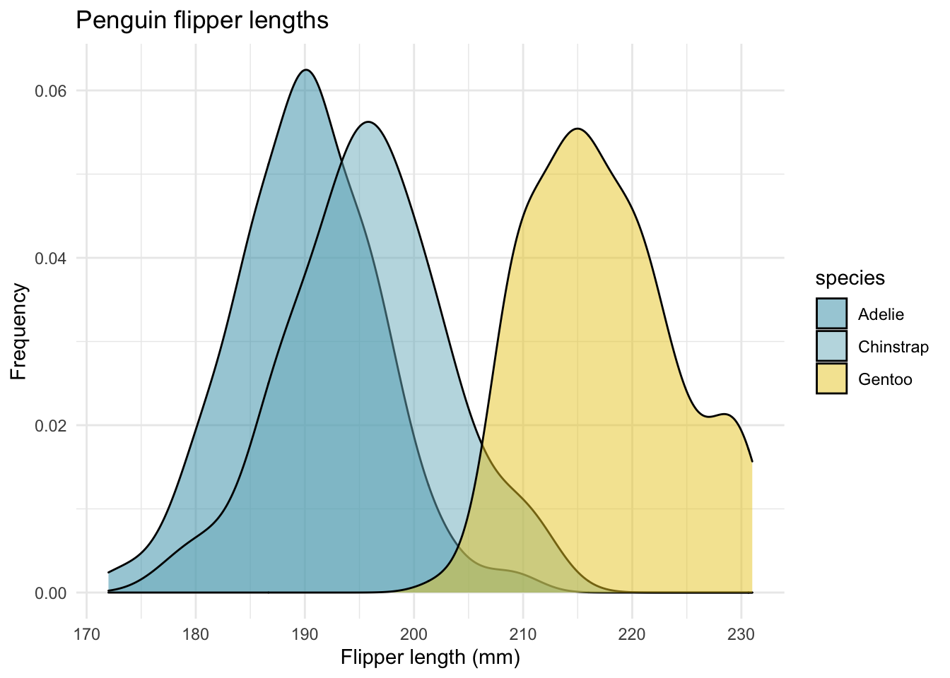
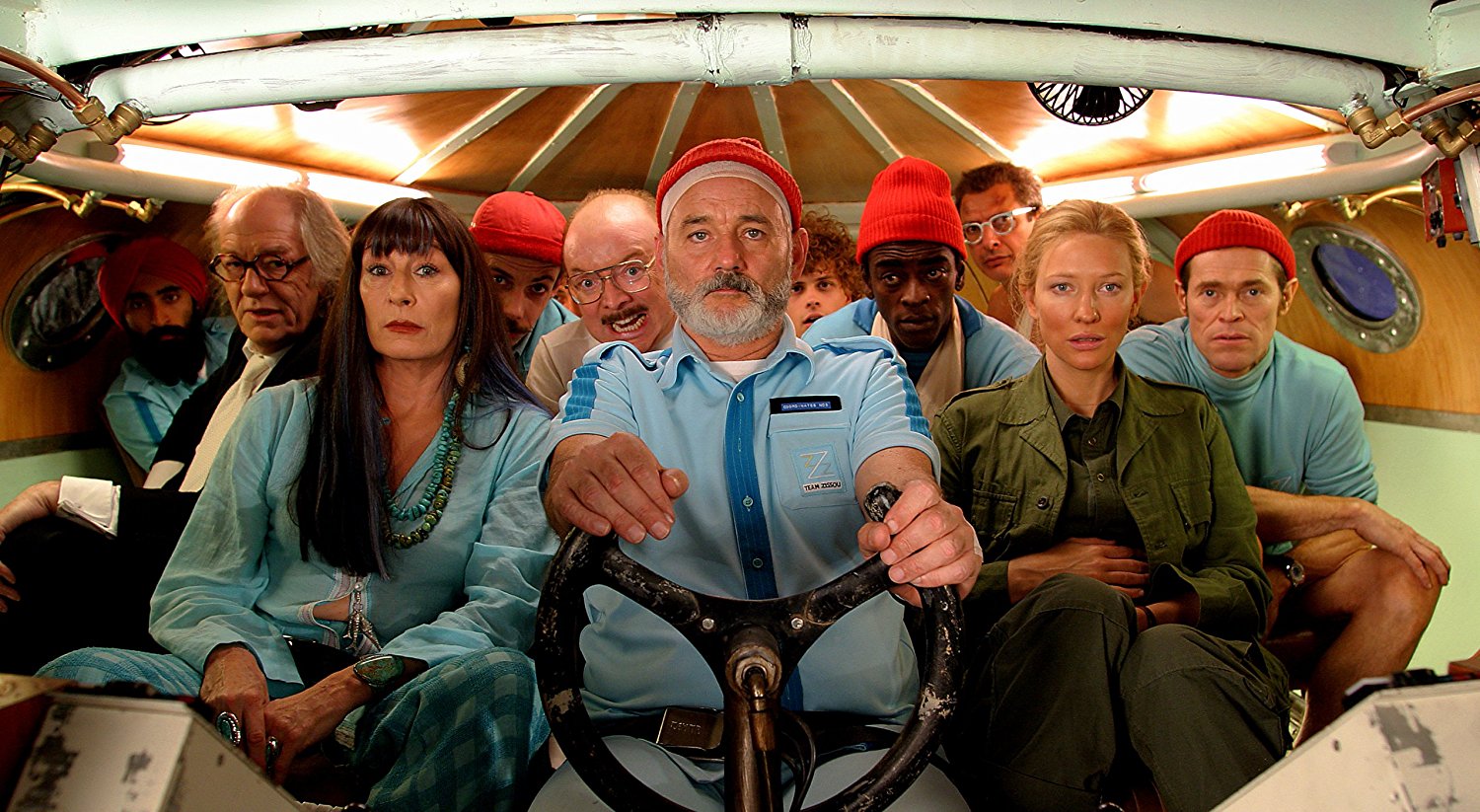
Figure 3.3: Source: The Life Aquatic with Steve Zissou by Wes Anderson
You can use the assignment operator <- to save your graphs to the global environment. This allows you to work on your graphs in steps, rather than all at once.
aquatic <- ggplot(data = new_penguins, aes(x = flipper_length_mm)) +
  geom_density(aes(fill = species),
                 alpha = 0.5,
                 position = "identity") +
  scale_fill_manual(values=wes_palette(name="Zissou1")) +
  theme_minimal() +
  labs(x = "Flipper length (mm)",
       y = "Frequency",
       title = "Penguin flipper lengths")
Finally, you can save your graph using ggsave.
ggsave("aquatic.png", plot = aquatic)
#> Saving 7 x 5 in image
This will save the file to my root project directory.
3.4 Even more resources
The ggplot2 page is a great place to start.
The cheat sheet will give you a sense of what is possible. You can then Google-around for examples.
Want to make animated graphics? Check out gganimate.
Jenny Bryan is part of the RStudio team and has some amazing resources.Scroll down for links to different tutorials. Here is one example: her demo for themes