18 Visualization
In this chapter, we introduce how to create graphs using the package ggplot2, also a member of tidyverse.
We discuss three basic types of charts: bar charts, line charts, and scatter plots. We will explore when to use each type of plot, as well as how to create these plots using ggplot2. Additionally, we will delve into common visualization tasks, such as creating grouped graphs, overlaying multiple graphs, and reshaping data frames for visualization purposes. We also touch upon the style.
18.1 Plot types
When selecting a plot type, a common question that arises is which plot type is appropriate for the data at hand.
To answer this question, we should first identify the specific data relationship or function that we intend to describe from our dataset. This could be a correlation, a temporal change, a distribution, or a spatial relationship, among others. Once this data relationship or function is clear to us, we can select a plot type that effectively describes that relationship or function.
For example, if we aim to summarize a continuous variable and display its central tendency and outliers, we may consider using a box plot. On the other hand, if we want to visualize the relationship between two continuous variables, a scatter plot may be more appropriate. Ultimately, the choice of plot type should depend on the specific characteristics of the data and the insights we aim to convey.
We may refer to Financial Times’s guide Visual Vocabulary to help us decide the data relationship and chart type most appropriate for our data. The R Graph Gallery provides rich examples for various plot types with sample code.
18.2 ggplot2
In the sections below, we introduce common tasks in creating graphs and three plot types: bar graphs, line graphs, scatter plots.
We will use the package ggplot2.
When we use ggplot2 functions, we start with the function ggplot(). The first argument is always data, which sets the dataset to use for plot.
The next step is aesthetic mapping with the function aes(), which specifies the variable on the x-axis and the variable on the y-axis, color of the graph elements, and the grouping variable etc.
ggplot(data = , mapping = aes())Then we can add layers to it using the + sign. For instance, if it’s a line plot, we add geom_line(); if it’s a scatter plot, we add geom_plot().
ggplot(data = , mapping = aes()) +
geom_line()
Then we may specify extra features such as facets, scales, or coordinate systems using +.
18.3 Bar graph
Bar graphs are commonly utilized to illustrate numerical values across various categories. The categorical variable is usually plotted on the x-axis, while the numeric values are represented on the y-axis.
If we use a continuous variable instead of a categorical variable on the x-axis, the resulting plot is a histogram. Histograms are particularly useful for visualizing the distribution of continuous variables, as they allow us to see how the data is distributed across different intervals or bins.
- We first create a basic bar graph, where the bar height represents values.
When creating a bar graph, the height of each bar can represent either the actual numerical values of the variable or the frequency/count of the cases for that variable.
Let’s use the sample dataset sp500, which is the merged dataset of the Yahoo Finance dataset and Wikipedia dataset. We focus on the company Amazon and visualize the close prices for each date.
The layer geom_bar() produces a bar chart. stat = "identity" sets the height to represent the values, instead of counts.
library(ggplot2)
library(tidyverse)

sp500 %>%
  filter(symbol %in% c("AMZN")) %>%
  ggplot(aes(x = date, y = close)) +
    geom_bar(stat = "identity")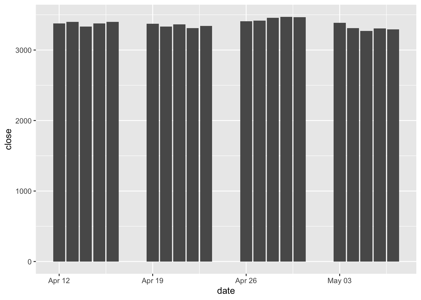
- We can group bars by a second variable.
Now we create a new subset where we have Amazon, Apple, and Facebook stocks, and create a new bar chart that groups the data by symbol. Visually the groups will be differentiated by color. That’s what the argument fill does.
Ingeom_bar(), stat = "identity" indicates that the height is the value, and position = "dodge" sets bars to sit side by side in groups.
sp500 %>%
  filter(symbol %in% c("AMZN", "AAPL", "FB")) %>%
  ggplot(aes(x = date, y = volume, fill = symbol)) +
    geom_bar(stat = "identity", position = "dodge")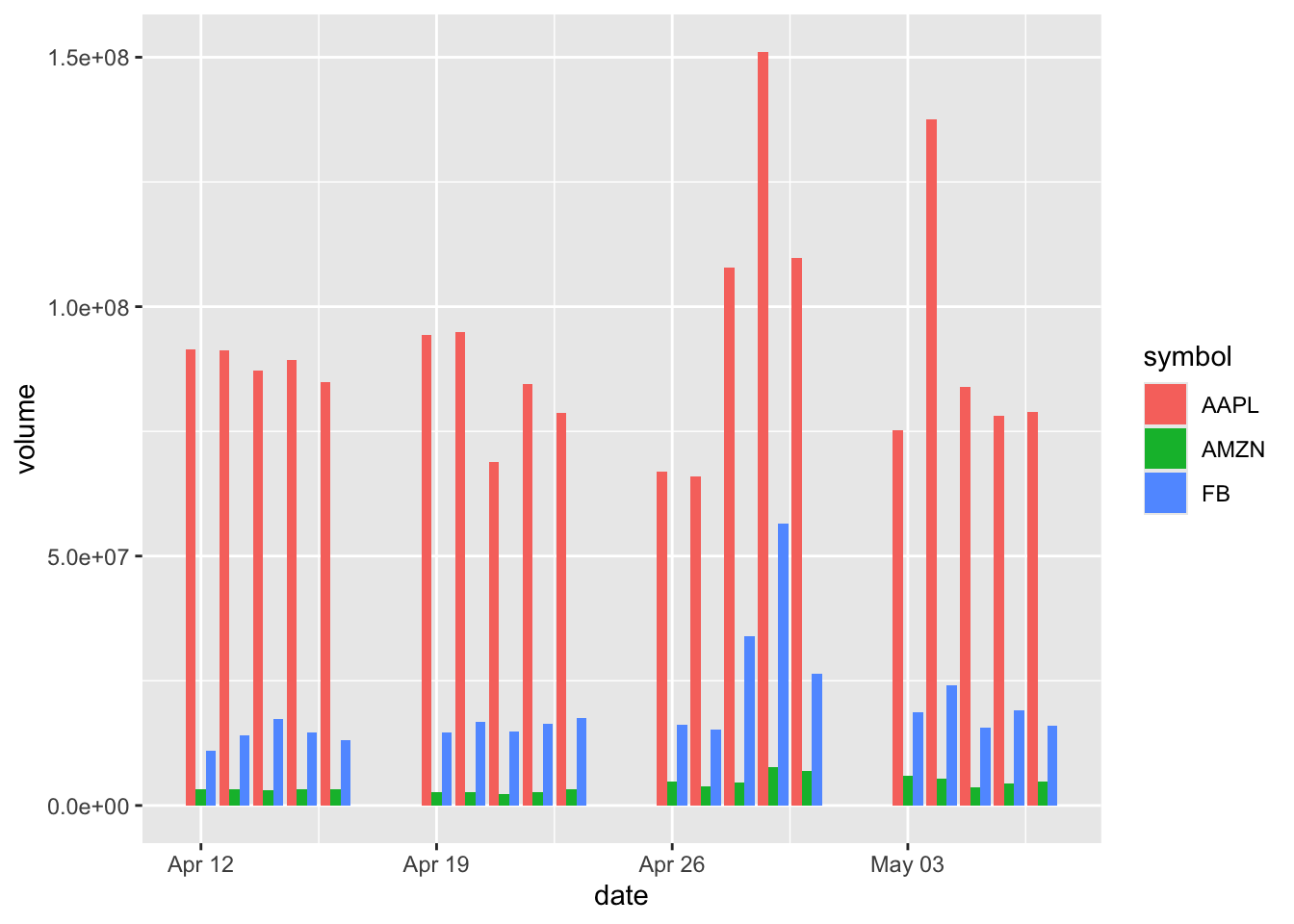
We can also improve this graph by adding aesthetic elements, such as an outline of the bars, or using another color palette pre-installed in R.
sp500 %>%
  filter(symbol %in% c("AMZN", "AAPL", "FB")) %>%
  ggplot(aes(x = date, y = volume, fill = symbol)) +
  geom_bar(stat = "identity", position = "dodge",colour = "black") +
  scale_fill_brewer(palette = "Paired")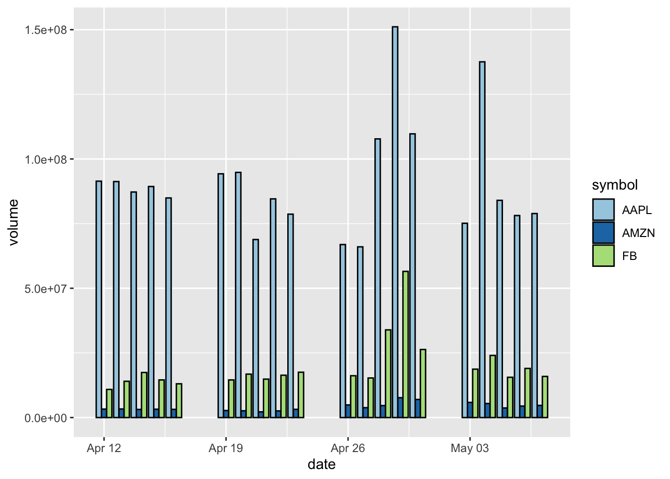
- In addition to using colors to indicate groups, we can use facets to group the data and to plot the subsets of data in separate panels.
Here we add a facets layer facet_grid.
sp500 %>%
  filter(symbol %in% c("AMZN", "AAPL", "FB")) %>%
  ggplot(aes(x = date, y = volume)) +
  geom_bar(stat = "identity", position = "dodge") +
  facet_grid(symbol ~ .)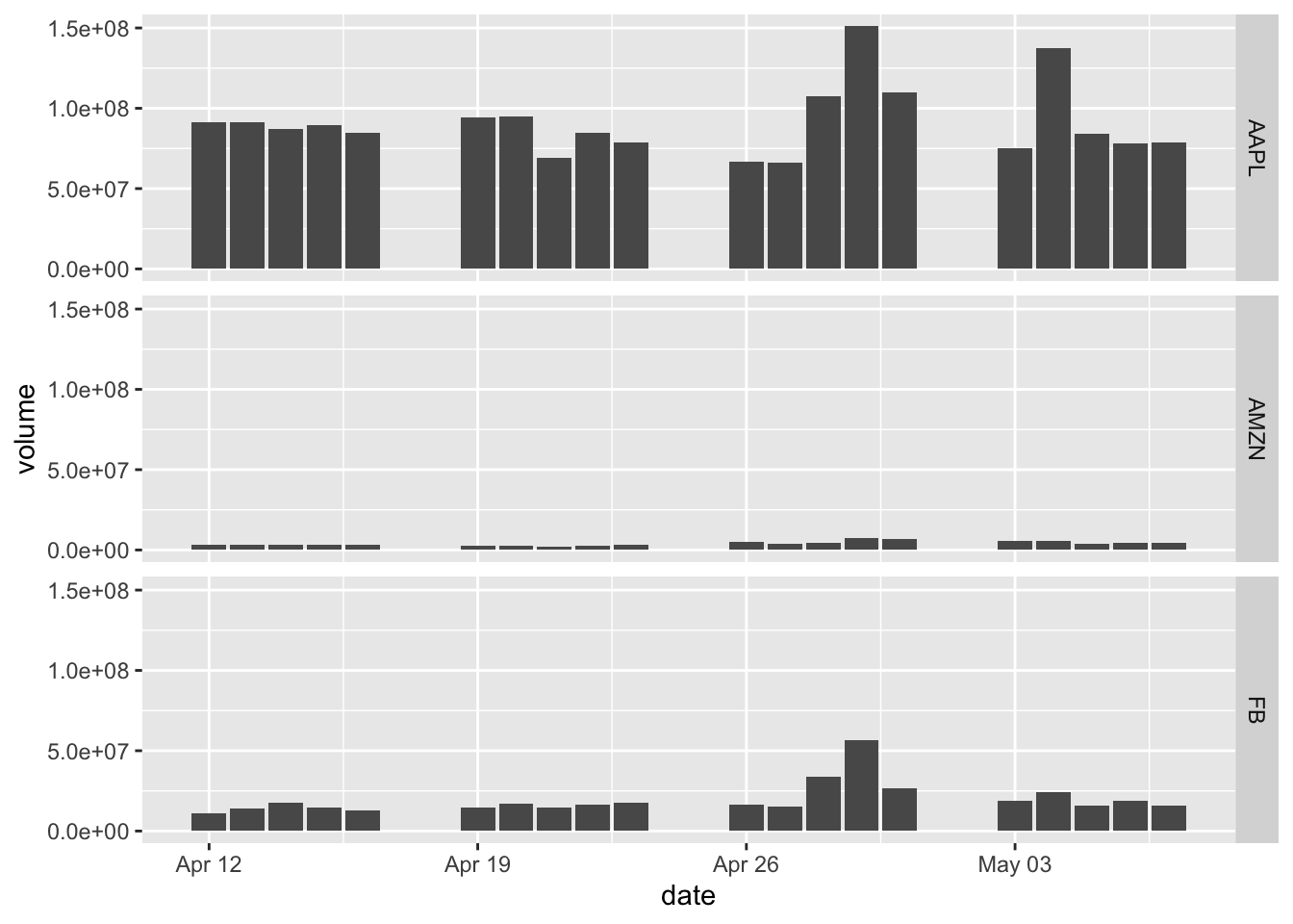
- Setting the bar height to represent counts of cases.
The sector of the company GICS Sector is a categorical variable, so it makes sense to count the cases.
sp500 %>%
  ggplot(aes(x = `GICS Sector`)) +
  geom_bar() +
  theme(axis.text.x = element_text(size = 12, angle = 90, hjust = 1))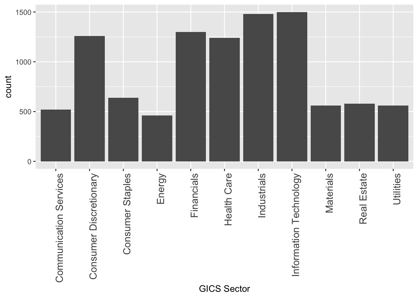
Note that the labels on the x-axis would be too wide to layout horizontally. We can add a theme() layer to fix it by setting the size of the texts on the x-axis and setting the angle to be vertical instead of horizontal. hjust = 1 means the labels would be right-justified.
- Filling negative and positive bars with different colors.
Here we created a new variable two-day momentum Momentum_2, and we work on the subset of the company MMM.
In order for the bars to show different colors, we added another indicator variable flag. The positive values would be TRUE and negative values would be FALSE. Then we use those values to fill the colors.
library(tidyquant)

sp500 %>%
  mutate(Momentum_2 = momentum(close, n = 2)) %>%
  filter(symbol == "MMM") %>%
  mutate(flag = Momentum_2 >= 0) %>%
  filter(!is.na(Momentum_2)) %>%
  ggplot(aes(x = date, y = Momentum_2, fill = flag)) +
geom_bar(stat = "identity", position = "identity") 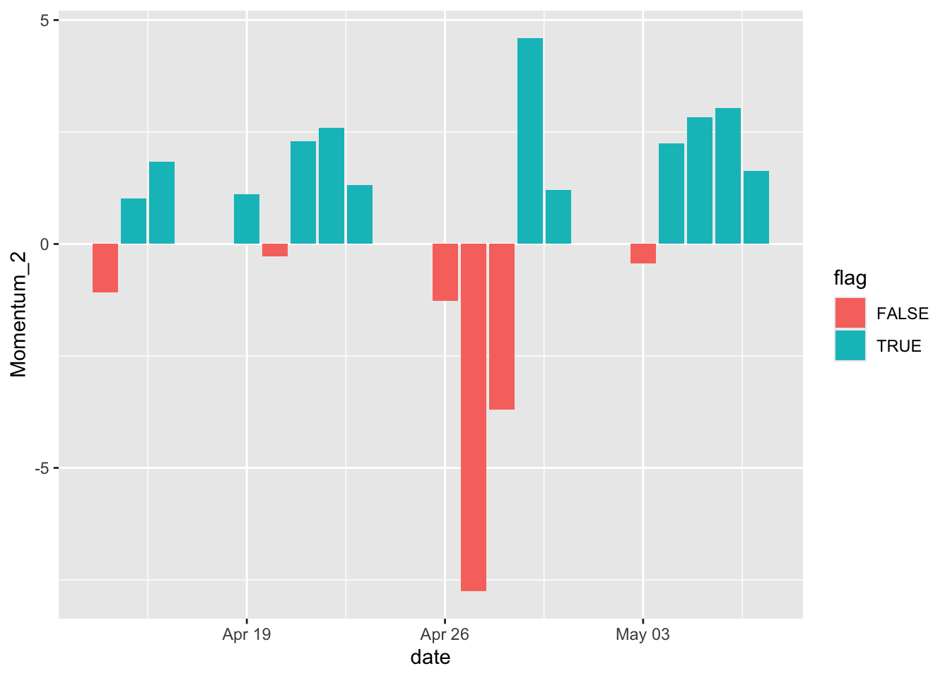
We can also specify the colors using our own color scheme, change the width of the bars, and add a black outline to it.
sp500 %>%
  mutate(Momentum_2 = momentum(close, n= 2)) %>%
  filter(symbol == "MMM") %>%
  mutate(flag = Momentum_2 >= 0) %>%
  filter(!is.na(Momentum_2)) %>%
  ggplot(aes(x = date, y = Momentum_2, fill = flag)) +
    geom_bar(stat = "identity", position = "identity", width = 0.5, colour = "black", size = 0.25) +
    scale_fill_manual(values = c("#CCEEFF", "#FFDDDD"))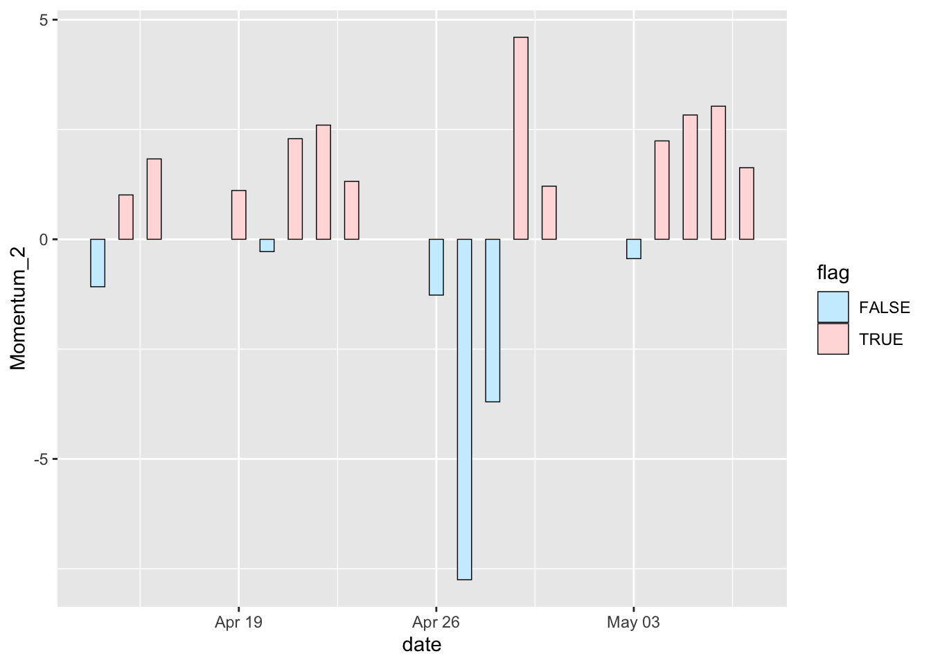
18.4 Line graph
Line graphs are typically used for visualizing how one continuous variable, on the y-axis, changes in relation to another continuous variable, on the x-axis. Often the x variable represents time.
- Basic line graph using
geom_line().
sp500 %>%
    mutate(Momentum_2 = momentum(close, n = 2)) %>%
    filter(symbol == "MMM") %>%
    ggplot(aes(x = date, y = Momentum_2)) +
      geom_line()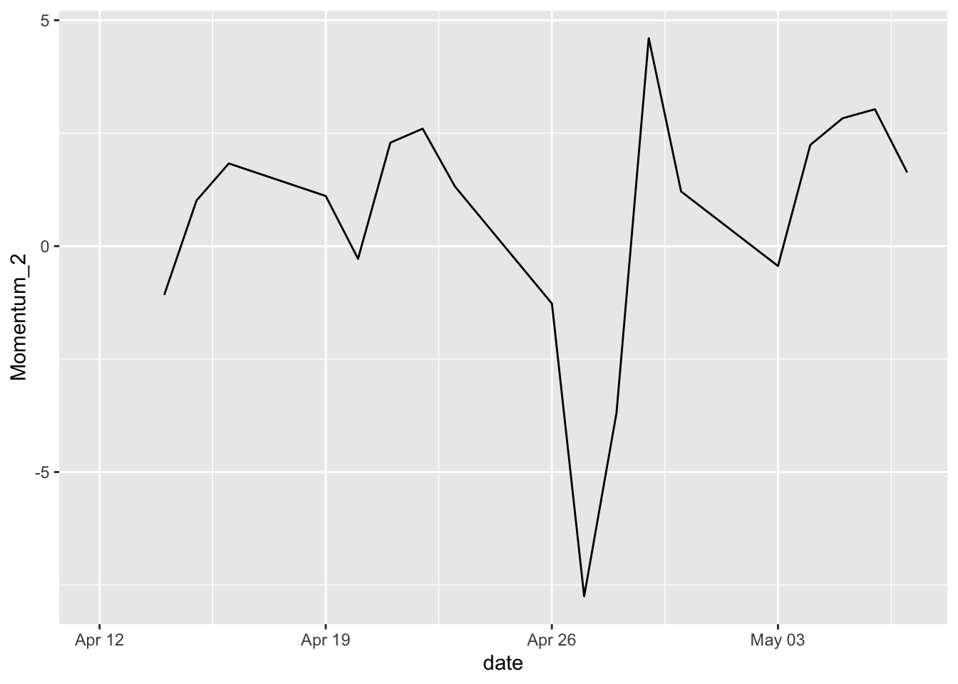
- Adding points to indicate each data point on a line graph.
This is helpful when the density of observations is low, or when the observations do not happen at regular intervals.
We can do that by simply adding a new layer geom_point().
sp500 %>%
    mutate(Momentum_2 = momentum(close, n = 2)) %>%
    filter(symbol == "MMM") %>%
    ggplot(aes(x = date, y = Momentum_2)) +
      geom_line() +
      geom_point()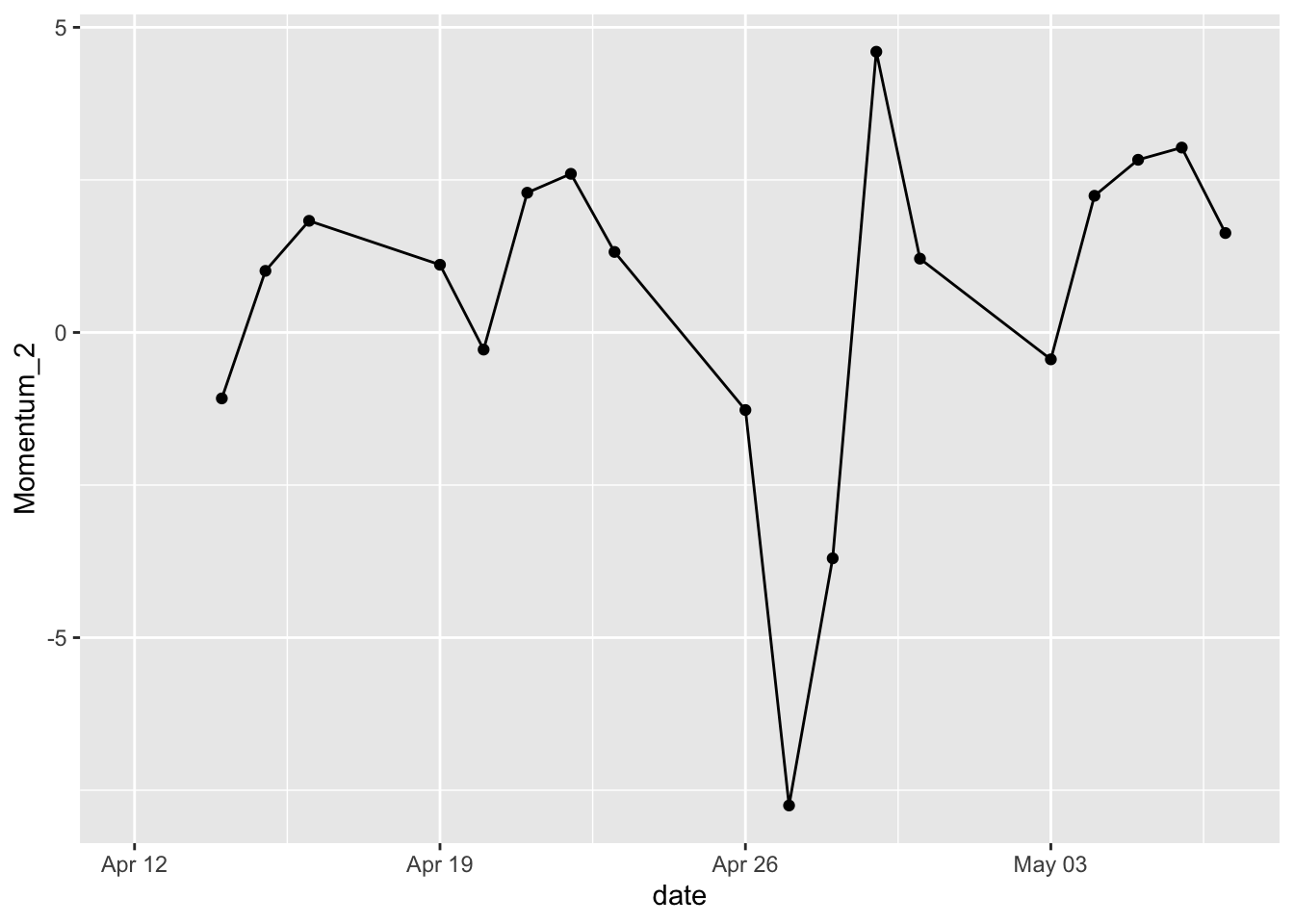
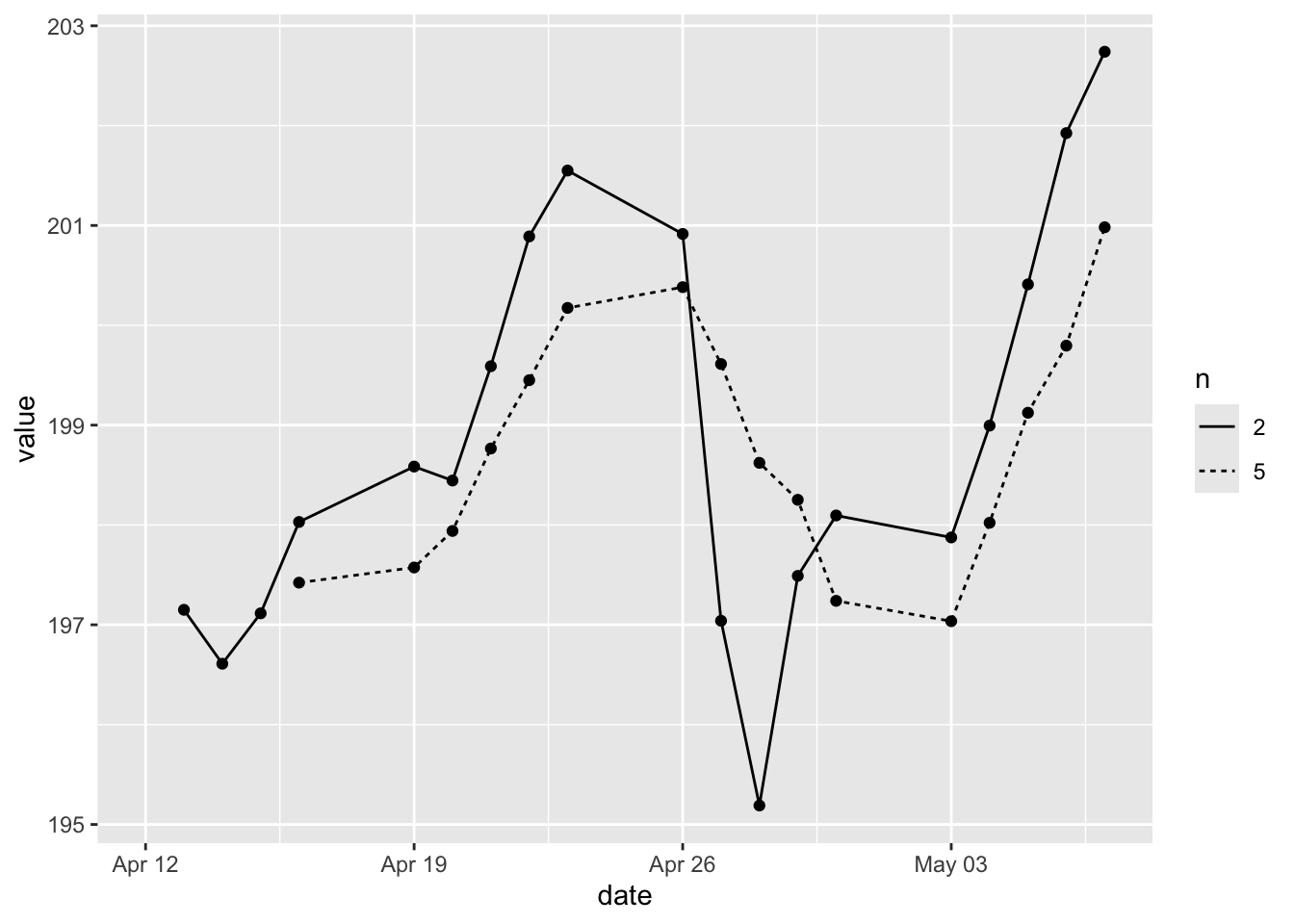
- Multiple lines by group.
Here we want to create a line graph with a long-term simple moving average and a short-term simple moving average. Typically a short-term moving average would be around 50 days and the long term moving average would be around 200 days. Our dataset does not support that time period since it’s just one month’s dataset. But we’ll pretend that the two-day would be the short-term and the five-day would be the long-term.
Here we have two simple moving averages in MMM subset. We reshape it to the long format to create the grouping variable n. We use color to differentiate the groups with colour = n.
# create a subset
library(tidyr)
MMM_SMA <- sp500 %>%
  mutate(SMA_2 = SMA(close, n = 2)) %>%
  mutate(SMA_5 = SMA(close, n = 5)) %>%
  filter(symbol == "MMM") %>%
  select(symbol, date, SMA_2, SMA_5) %>%
  pivot_longer(cols = SMA_2:SMA_5,
               names_to = c("SMA", "n"),
               names_pattern = "(.)_(.)")

# create a line graph
MMM_SMA %>%
  ggplot(aes(x = date, y = value, colour = n)) +
    geom_line() +
    geom_point()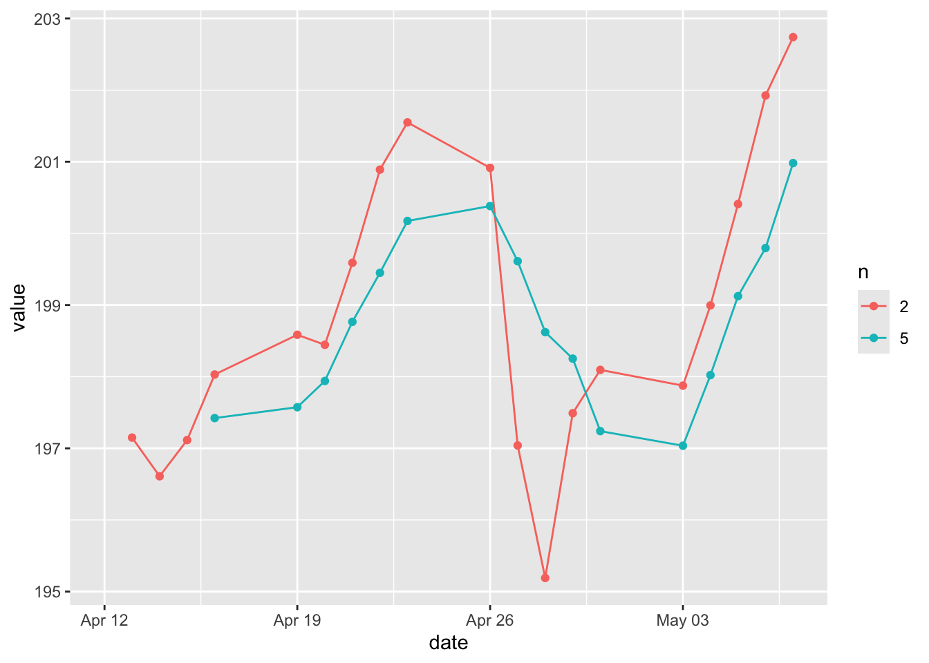
This graph is supposed to send trading signals. Buy signal would arise when a short-term moving average crosses above a long-term moving average. Sell signals would arise when the short-term moving average crosses below a long-term moving average.
In addition to using color to differentiate the groups, we can also use different types of lines to indicate the group.
- Overlaying multiple lines.
Furthermore, we can create a line graph with multiple lines. But these lines are not differentiated by groups but overlaid on the same graph. For instance, we want to overlay the close price with the simple moving average together with the exponential moving average. The reason is that moving averages can also be used to generate signals with price crossovers. A bullish signal is generated when prices move above the moving average. And a bearish signal is generated when prices move below the moving average.
MMM_SMA_EMA <- sp500 %>%
  mutate(SMA_5 = SMA(close, n = 5)) %>%
  mutate(EMA_5 = EMA(close, n = 5)) %>%
  filter(symbol == "MMM") %>%
  select(symbol, date, close, SMA_5, EMA_5)
To overlay the lines, we simply add multiple geom_line() layers.
MMM_SMA_EMA %>%
  ggplot(aes(x = date)) +
    geom_line(aes(y = close), color = "#D1A827") +
    geom_line(aes(y = SMA_5), color = "#709FB0") +
    geom_line(aes(y = EMA_5), color = "#6c1f55")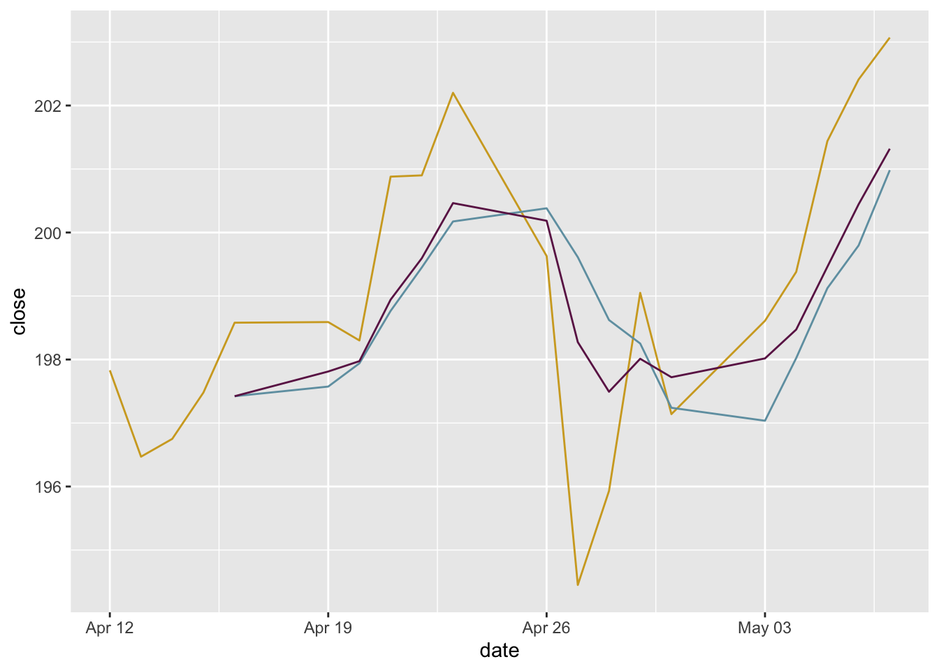
By overlaying multiple lines, we don’t get a automatically generated legend. We can manually add a legend.
MMM_SMA_EMA %>%
  ggplot(aes(x = date)) +
    geom_line(aes(y = close, color = "Close")) +
    geom_line(aes(y = SMA_5, color = "SMA_5")) +
    geom_line(aes(y = EMA_5, color = "EMA_5")) +
    scale_color_manual(
      name = "Legend",
      values = c("Close" = "#D1A827", "SMA_5" = "#709FB0", "EMA_5" = "#6c1f55"),
      labels = c("Close", "SMA_5", "EMA_5"))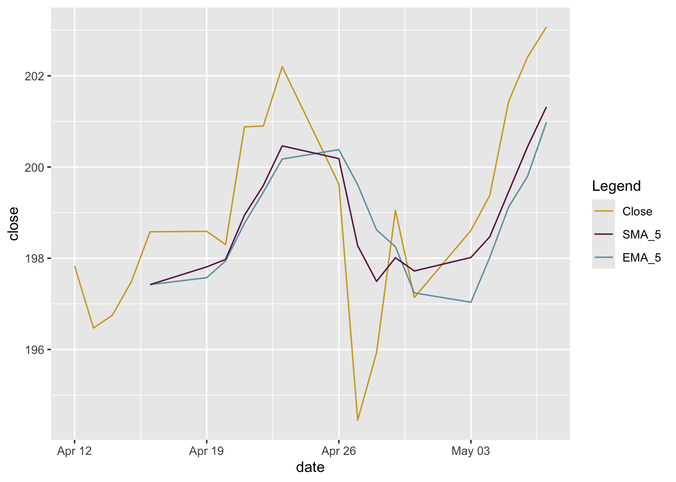
Moving averages smooth the price data to form a trend following indicator. A rising moving average shows that prices are generally increasing. A falling moving average indicates that prices, on average, are falling. A rising long-term moving average reflects a long-term uptrend. A falling long-term moving average reflects a long-term downtrend.
18.5 Scatter plot
Scatter plots are used to display the relationship between two continuous variables. In a scatter plot, each observation in a data set is represented by a point.
- A basic scatter plot.
Founded1 is the most current year that the company was founded. 2021 - Founded1 calculates how long that company has existed. We’re guessing if the volume would be related to the history or not. It doesn’t look like there’s a significant relationship there.
sp500 %>%
  mutate(years = 2021 - Founded1) %>%
  filter(date == as.Date("2021-05-05")) %>%
  ggplot(aes(x = years, y = volume)) +
    geom_point()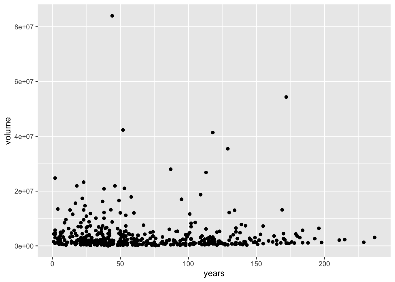
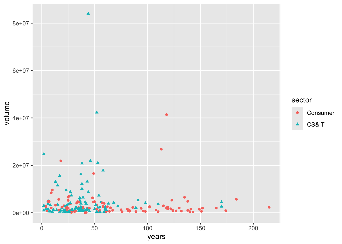
- By groups.
Same as the bar charts and line charts, we can break groups for the scatter plots. Here we’re using the two subsectors that we recoded earlier from the larger sector. What’s new here is that we are adding two new dimensions shape and colour to indicate the groups.
sp500 %>%
  mutate(years = 2021 - Founded1) %>%
  filter(date == as.Date("2021-05-05")) %>%
  filter(sector %in% c("CS&IT", "Consumer")) %>%
  ggplot(aes(x = years, y = volume, shape = sector, colour = sector)) +
    geom_point()