3.2 UI
UI is de facto an HTML file.
In building ui.R file, what we really do is to construct an HTML file with R functions. To see so by typing fluidPage() in the R console and you’ll see this function returns an HTML div tag <div class="container-fluid"></div>. So of course you can build your entire UI with HTML.
By default, Shiny uses bootstrap(has nothing to do with bootstrap method in statistics), the most popular HTML, CSS, and JS framework for developing responsive, mobile first projects on the web.
3.2.2 Layout
Shiny implemented the layout features availabe in Bootstrap. You can speed up your development by choosing appropriate layout style.
Panels
Panel functions are used to put a group of elements together into a single ‘panel’.
There are several panel functions defined in shiny:
absolutePanel()
conditionalPanel()
fixedPanel()
headerPanel()
inputPanel()
mainPanel()
navlistPanel()
sidebarPanel()
tabPanel()
tabsetPanel()
titlePanel()
wellPanel()
Most of the panel functions return div tags with some class attributes defined in Bootstrap. For example, if you type wellPanel in the R console, you’ll get <div class="well"></div>, which is the well class in Bootstrap.
Layouts
Layout functions are used to organize panels and elements into an existing layout.
There are several layout functions defined in shiny:
fluidRow(),column(): based on the bootstrap [grid system] (http://v4-alpha.getbootstrap.com/layout/grid/). See?fluidRowfor more details.flowLayout(): Lays out elements in a left-to-right, top-to-bottom arrangement.sidebarLayout(): Create a layout with a sidebar and main area. (Most commonly used layout.)splitLayout(): Lays out elements horizontally, dividing the available horizontal space into equal parts (by default).verticalLayout(): Create a container that includes one or more rows of content.
Figure 3.2.2 gives a graphical demenstration.
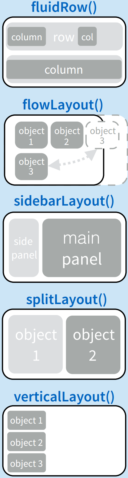
Figure 3.1: Shiny UI layouts
For more details please look at Application layout guide
sidebarLayout is perhaps the most useful layout. We’ll take it as example here to show the usage of UI layout functions.
See the help document of the sidebarLayout function for detail: ?sidebarLayout
Exercise 3: sidebarLayout
Modify ui.R in 01-hello folder as follows and run the App again:
library(shiny)
fluidPage(
  titlePanel("Hello Shiny!"),
  sidebarLayout(
    sidebarPanel(HTML('<p>
         <label>A numeric input:</label><br />
         <input type="number" name="n" value="7" min="1" max="30" />
         </p>')),
    mainPanel(
      p(strong("bold font "), em("italic font")),
      p(code("code block")),
      a(href="http://www.google.com", "link to Google"))
  )
)
3.2.3 Inputs (control widgets)
Wigets are web elements that users can interact with. Widgets provide a way for your users to send messages to the Shiny app. Shiny widgets collect values from the user. When a user changes the widget, the value will change as well.
In Exercise 3, we used HTML code to add a numeric input (a kind of ‘widget’) to the sidebar panel, but over using HTML code will make the code quite messy and hard to manage for large projects. Shiny comes with a family of pre-built widgets, each created with a transparently named R function, which makes the widgets easier to create and look better(using bootstrap style).
The standard Shiny widgets are:
| function | widget |
|---|---|
| actionButton | Action Button |
| checkboxGroupInput | A group of check boxes |
| checkboxInput | A single check box |
| dateInput | A calendar to aid date selection |
| dateRangeInput | A pair of calendars for selecting a date range |
| fileInput | A file upload control wizard |
| helpText | Help text that can be added to an input form |
| numericInput | A field to enter numbers |
| radioButtons | A set of radio buttons |
| selectInput | A box with choices to select from |
| sliderInput | A slider bar |
| submitButton | A submit button |
| textInput | A field to enter text |
Figure ?? gives a graphical demenstration.
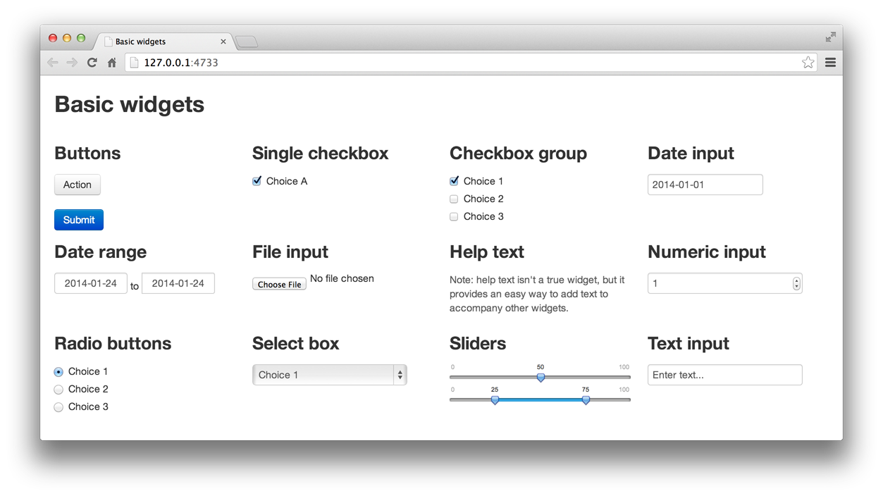
Figure 3.2: Control Widgets.
See examples of widgets: http://shiny.rstudio.com/gallery/widget-gallery.html
Adding widgets
Each widget function requires several arguments. The first two arguments for each widget are
A Name for the widget. The user will not see this name, but you can use it to access the widget’s value. The name should be a character string.
A label. This label will appear with the widget in your app. It should be a character string, but it can be an empty string “”.
The remaining arguments vary from widget to widget, depending on what the widget needs to do its job. Now let’s improve our example by using numericInput instead of HTML code.
Exercise 4: widgets
Modify ui.R in 01-hello folder as follows and run the App again:
library(shiny)
fluidPage(
  titlePanel("Hello Shiny!"),
  sidebarLayout(
    sidebarPanel(
      numericInput("numInput", "A numeric input:", value = 7, min = 1, max = 30)
    ),
    mainPanel(
      p(strong("bold font "), em("italic font")),
      p(code("code block")),
      a(href="http://www.google.com", "link to Google"))
  )
)