8 Tutorial 8: Visualizing results
After working through Tutorial 8, you’ll…
- understand how to visualize descriptive statistics using R
Important:
In this tutorial, I’ll only introduce you to the mere basics of visualizing data in R.
The goal is for you to be proficient enough to create basic graphs using R (not SPSS or Excel). However, please be aware that there are many, many more options for visualizing data than the ones I’ll talk about in Tutorial 8.
In particular, if you have any questions about visualizing data in R, do rely on the following two great tutorials/guides:
- Chang, W. R (2021) R Graphics Codebook. Practical Recipes for Visualizing Data. Link
- Wickham, H., Navarro, D., & Pedersen, T. L. (2021). ggplot2: elegant graphics for data analysis. Online, work-in-progress version of the 3rd edition. Link
Data
We again load the data frame data_combined which we created in Tutorial 5: Matching survey data & data donations.
You will find this R environment via Moodle under the folder “Data for R” (“tutorial6.RData”).
Use the load() command to load it to your working environment.
Let’s remember what this data contained:
- Our automated content analysis of YouTube search queries:
- Anonymous ID for each participant: external_submission_ID
- Share of news-related searches: share
- Our survey data:
- Anonymous ID for each participant: ID
- Sociodemographic characteristics: Age, Gender, Education
- Political Interest: PI1, PI2, PI3, PI4, PI5
- Social Media Use: Use_FB, Use_TWI, Use_INST, Use_YOU, Use_TELE, Use_WHATS
- Trust in News Media: Trust
We include some preparation for the survey data. These are all steps we already learned about in Tutorial 6: Preparing survey data:
- We create a dichotomous variable University indicating whether participants have a university degree (1) or not (0)
- We create a mean index of Political Interest consisting of the variables PI1, PI2, PI3, PI4, and PI5.
library("tidycomm")
library("tidyverse")
data_combined <- data_combined %>%

  ###Create new variable "University ##
  mutate(University = Education,
         University = replace(University,
                              Education != "University Degree",
                              "No University Degree")) %>%

  ##Create new mean index "Political Interest"
    add_index(PoliticalInterest,
            starts_with("PI"),
            type = "mean",
            cast.numeric = T)
This is how our data set looks like:
## # A tibble: 1 × 19
##   external_submission_id share   Age Gender Education   PI1   PI2   PI3   PI4   PI5 Use_FB Use_TWI Use_INST Use_YOU
##                    <int> <dbl> <int> <chr>  <chr>     <int> <int> <int> <int> <int>  <int>   <int>    <int>   <int>
## 1                   3861     0    18 Male   A-levels      3     1     2     2     2      1       2        4       3
## # ℹ 5 more variables: Use_TELE <int>, Use_WHATS <int>, Trust <int>, University <chr>, PoliticalInterest <dbl>
8.1 The basic logic of ggplot2
In this tutorial, we’ll work with the ggplot2 package.
While you can also visualize data using base R, the ggplot2 package makes this so much easier that I won’t teach you the “base R” version of visualizing data.
The package is part of the tidyverse, so related to other packages like dplyr.
The ggplot2 package is based on an underlying logic.9 Understanding this underlying logic will help you to create graphs in a flexible and quick way.
Drawing mainly on Wickham et al. (2021), visualizing data with ggplot2 follows a simple logic. To create a graph, we use existing data and tell R how this data should be mapped:
“A graphic maps the data to the aesthetic attributes (colour, shape, size) of geometric objects (points, lines, bars).” Wickham et al., 2021, no page; bold words inserted by author
This is, indeed, a very brief description of all the things possible with ggplot2. In short, you have to specify the following three components to create a ggplot graph with the ggplot() command:
- data, i.e., the data that should be visualized
- aesthetics, i.e., which data (for instance variables) should be mapped to which visual elements using aes()
- geometrics, i.e., the type of graph that should be created
However, you can specify far more details, for instance the…
- scales of your graph, for instance how the x and y axis should be presented and scaled
- themes of your graph, for instance using a predefined set of backgrounds
(and many more - but these are the things we’ll cover in Tutorial 8).
Before doing anything else, install the ggplot2 package and activate it.
Our goal for today: We want to reproduce the following graph which visualizes respondents’ use of YouTube for news across sociodemographic variables, here their education.

8.2 Data
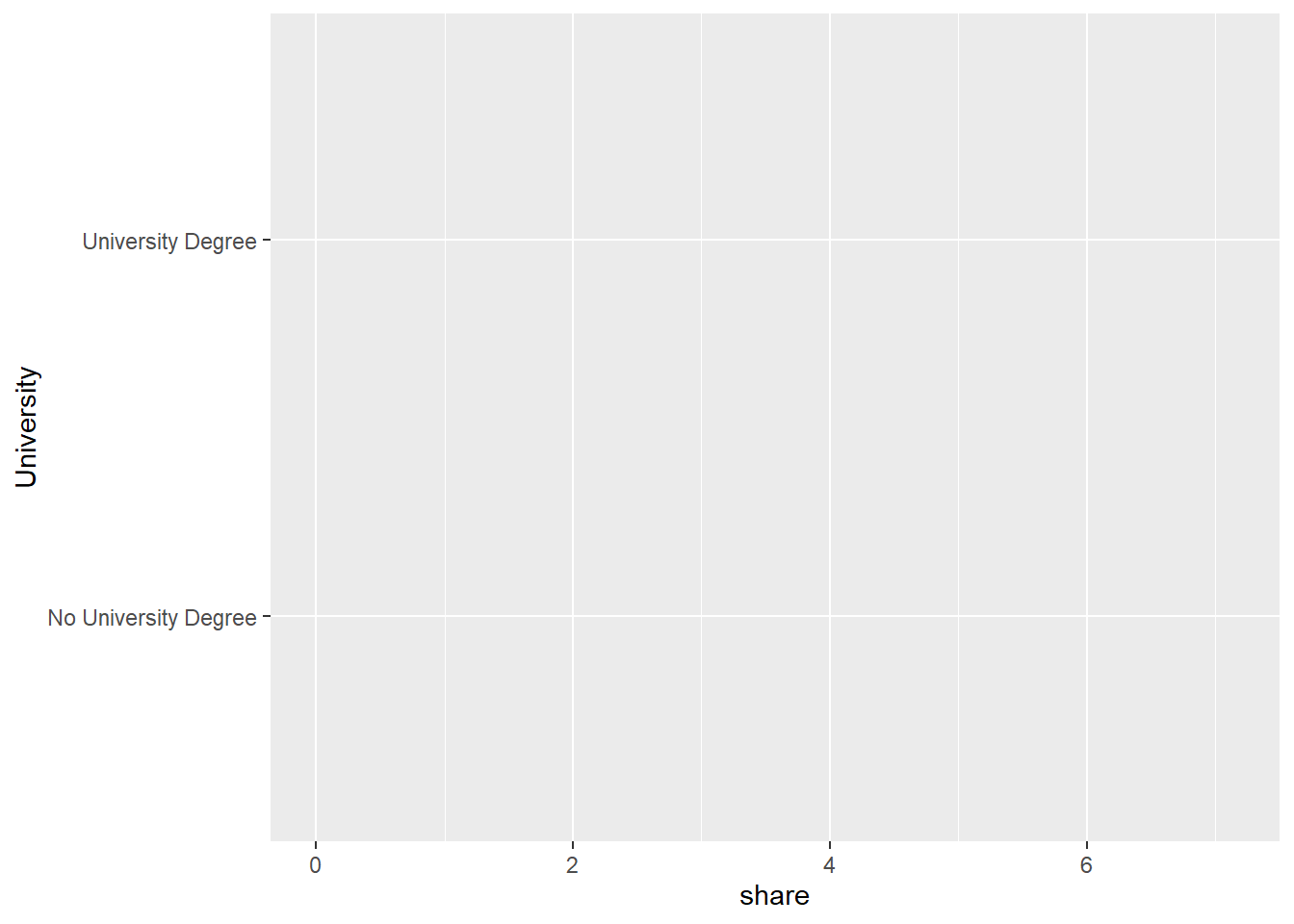
Let’s start with the most basic step: Telling R which data to use to create a graph with the ggplot() command.
Specifying the data is a necessary argument for the ggplot() function, meaning that you have to tell R which data to use.
Here, we want to plot the distribution of news-related searches on YouTube - share - across different educational degrees of participants - University.
We’ll start by plotting this data with ggplot() by simply “handing the data set data_combined over to the function. As a result, we see that not much happened: R does not give us an error message, but only creates an”empty” graph.
The reason: We haven’t specified which variables should be visualized and how (i.e., the other 2 necessary components for creating a graph).

8.3 Aesthetics
Next, we need to pass values to the aesthetics component.
This is a necessary component, meaning that you have to tell R which data (for instance variables) should be mapped to which visual elements using aes().
In aes(), you can for instance pass values to the following arguments:
- x: the variable that should be mapped to the x axis
- y: the variable that should be mapped to the y axis
- fill: the variable that should be used for filling a geometric object with a specific color
(and many more - but these are the things we’ll cover in Tutorial 8).
Let’s set the x for our plot first:
We want the x axis to depict values of news-related searches by participants on YouTube. Thus we set x = share via aes().
We also want the x axis to depict these values based on education degrees of participants, i.e., University. Thus we set y = University via aes().
If we run the following command, we see that R now knows which variable should be mapped to the x axis - share and the y axis University.
However, the graph does not show us any results yet - remember that we haven’t defined the geometrics part as the last necessary component, i.e., the type of graph that should be created.
8.4 Geometrics
Lastly, we need to define the geometric component as the last necessary component: You have to tell R which type of graph should be created.
You can, for instance, use the following commands to create different graphs (simply type in geom in the script and R Studio will automatically propose a lot options to you, including:
- geom_bar() to create a bar chart
- geom_line() to create a line graph
- geom_point() to create a scatter plot
- geom_boxplot() to create a box plot
(and many more - but these are the things we’ll cover in Tutorial 8).
Here, we want to create a more complex plot using the geom_density_ridges() function from the ggridges package.
In short, the function plots density estimates, i.e., representations of the distributions of a numeric variable. It enables us to not only see frequenty values share takes on (i.e., that many participants have 0 news-related searches) but also the skewness of the variables (i.e., how frequently different values of share occur).
Again, we simply add the graph we want to create, here geom_density_ridges(), to our function as a new layer using a + sign:
library("ggridges")
data_combined %>%
  ggplot(., aes(x = share, y = University)) +
  ## add the geometric component ##
  geom_density_ridges()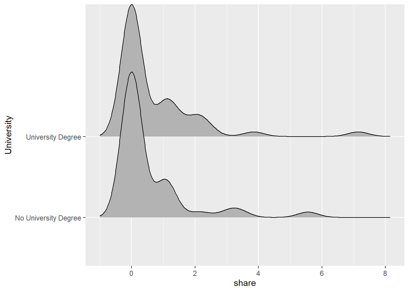
Great: this worked! We have created the first graph bearing some resemblance to the one in the beginning.
Adding color
We later want graphs for each unique value of University (i.e., “No University Degree”, “University Degree”) to have a separate color. This facilitates the interpretation of the graph.
Thus, we set fill = University via aes().
data_combined %>%
  ## use fill to add color ##
  ggplot(., aes(x = share, y = University, fill = University)) +
  geom_density_ridges()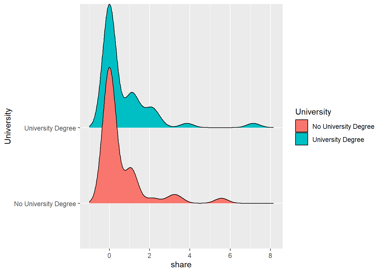
For now, please ignore that the colors are not the ones used in the final graph - we will change this in a bit.
To make our graph look more like the graph at the beginning of the Tutorial, we’ll now have to work on the presentation of our x- and y-axis.
8.5 Scales
Scales are the first component we deal with that you do not have to specify to create a graph.
Still, you will often use your own setting to make your graph more understandable, thereby changing existing scales.
You can for example change:
- Scaling of different axes (we won’t do that here!)
- Titles of different axes (and, relatedly, the legend)
- Colors of different axes (and, relatedly, the legend)
8.5.1 Changing titles of axes
We will now assign our graph a clear title. We will also change the titles for the x and y axis (which are now simply labelled using names assigned to variables in data_combined).
You should always assign clear titles to graphs, axes, legends, etc. for readers to understand what type of data graphs visualize and which variables they contain.
We can add a title for the graph as well as both axes using the labs() command.
Here, we decide to assign the graph a title - News-related searches across educational degrees - and indicate which values are shown on the x-axis News-related searches. Since the different values of the y-axis - University - are already included, we decide to surpress a title for this axis.
data_combined %>%
  ggplot(., aes(x = share, y = University, fill = University)) +
  geom_density_ridges() +
  ## add graph and axes titles ##
  labs(title = "News-related searches across educational degrees",
       x = "News-related searches",
       y = "")
8.5.2 Changing the colors used in the plot
Next, we may want to change the colors of our plot. As for now, R has automatically chosen colors. However, you may want to change this - for instance, to create a graph in black/white only or to only use colorblind-friendly colors.
There are a lot of different colors in R, as you can for instance see in this overview. Moreover, there are nice color palettes including a range of colors that work well together for data visualization, as you can see in this overview. Of particular popularity here is, for example, the RColorBrewer package offering some really nice palettes for visualization.
For our graph, we want to work with other colors. You can tell R for which value of a variables which color should be used. To do so, use scale_fill_manual().
We now add these new colors (remember that you need two here, one for each unique value of University!) using scale_fill_manual():
data_combined %>%
  ggplot(., aes(x = share, y = University, fill = University)) +
  geom_density_ridges() +
  labs(title = "News-related searches across educational degrees",
       x = "News-related searches",
       y = "") +
  ## change colors ##
  scale_fill_manual(values = c("#58B753", "#3AD3F3"))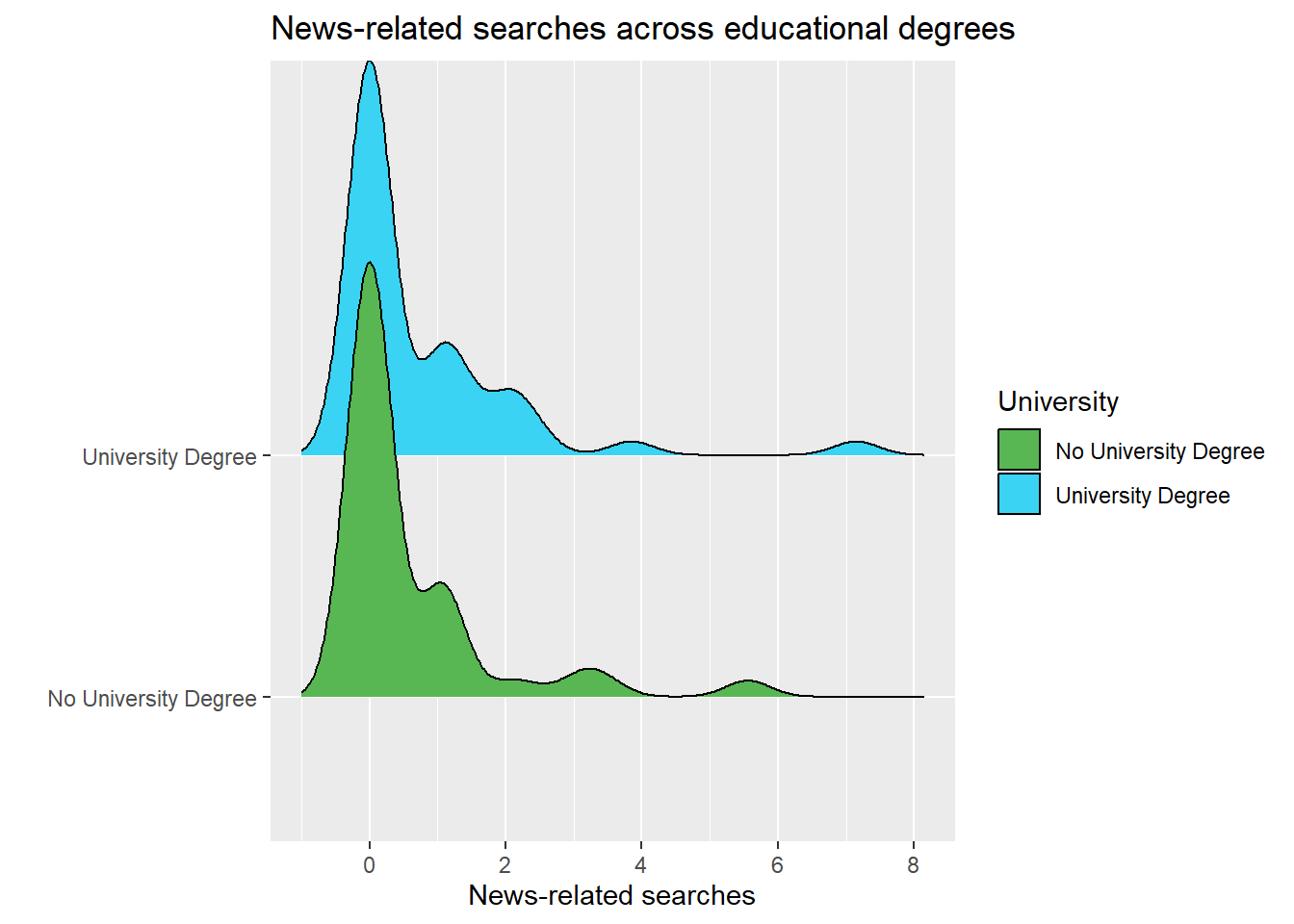
8.5.3 Adapting the legend
Here, we may also want to change the depiction of the legend. For instance, you may want to add the mean value of share across different groups, i.e., University Degree and No University Degree so readers can, right away, understand how they differ.
In short, we want to change the labels of the legend by adding the mean of each group behind the value (e.g., “University Degree, Mean = XY”).
To do that, we first have to create a new data frame means containing these labels.
means <- data_combined %>%
  #group data by education
  group_by(University) %>%
  #create grouped means
  summarize(mean = mean(share)) %>%
  #create labels based on mean
  mutate(mean = round(mean, 2),
         label = paste0(University, " (M = ", mean, ")"))

#check results
means
## # A tibble: 2 × 3
## University mean label
## <chr> <dbl> <chr>
## 1 No University Degree 0.57 No University Degree (M = 0.57)
## 2 University Degree 0.71 University Degree (M = 0.71)We can now add this text vector means$labels to scale_fill_manual() to assign new labels to each unique value depicted in the legend like so:
data_combined %>%
  ggplot(., aes(x = share, y = University, fill = University)) +
  labs(title = "News-related searches across educational degrees",
       x = "News-related searches",
       y = "") +
  geom_density_ridges() +
  scale_fill_manual(values = c("#58B753", "#3AD3F3"),
                    ## change legend titles ##
                    labels = means$label)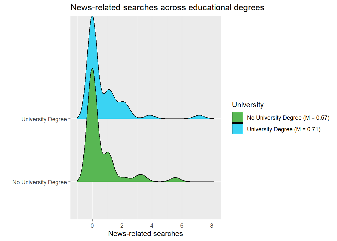
8.6 Themes
Themes are the next component we deal with that you do not have to specify to create a graph - but oftentimes, you will because setting a theme allows you to create more beautiful graphs.
The creators of ggplot2 have come up with some nice visual settings for graphs. Best check out this overview here.
If you type in theme and wait for R to auto-complete your search, you will see some of these themes, for instance the light theme theme_light(), which we can add again as a new layer using the + symbol:
data_combined %>%
  ggplot(., aes(x = share, y = University, fill = University)) +
  labs(title = "News-related searches across educational degrees",
       x = "News-related searches",
       y = "") +
  geom_density_ridges() +
  scale_fill_manual(values = c("#58B753", "#3AD3F3"),
                    labels = means$label) +
  ## change theme ##
  theme_light()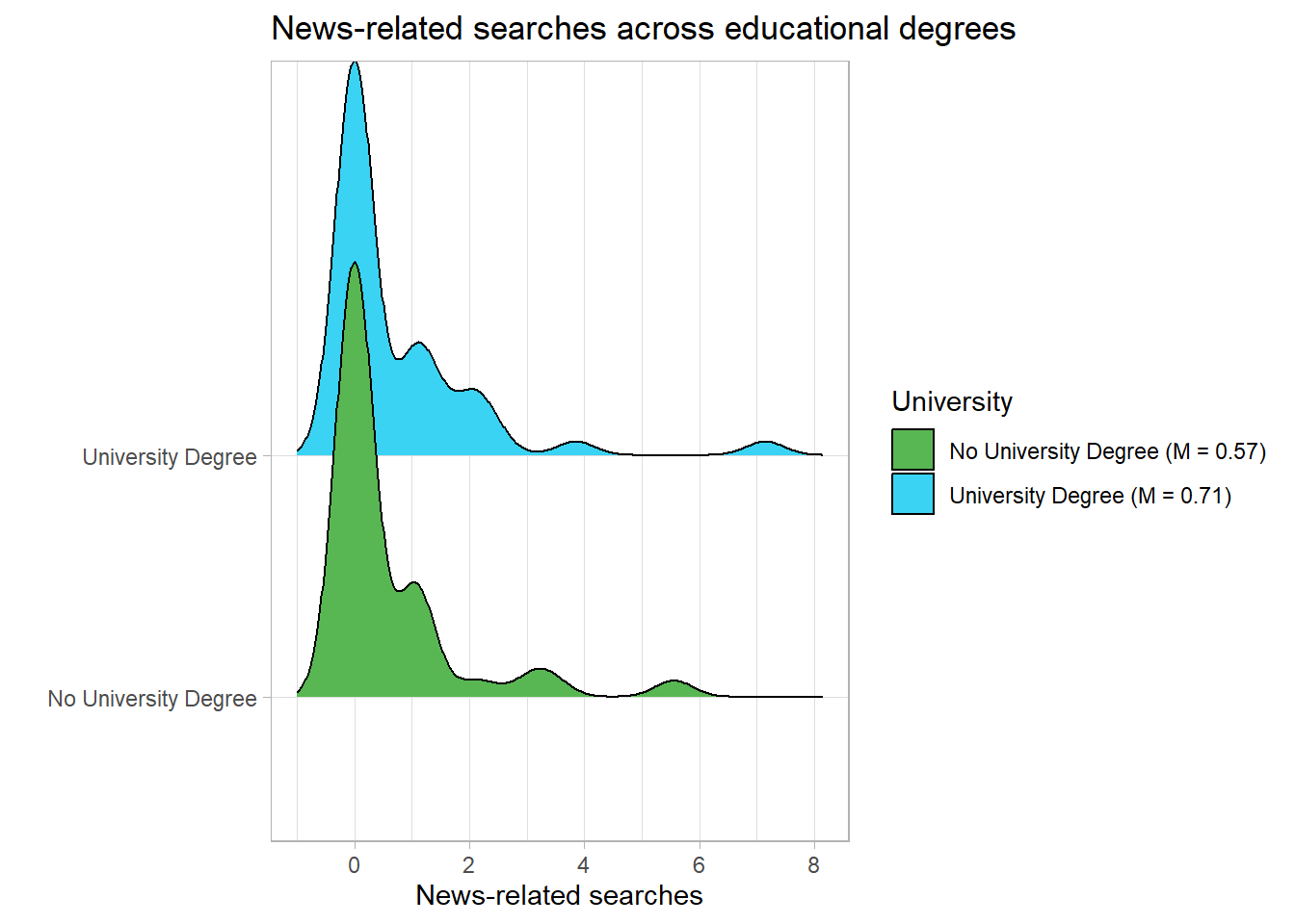
… or a dark theme using theme_dark():
data_combined %>%
  ggplot(., aes(x = share, y = University, fill = University)) +
  labs(title = "News-related searches across educational degrees",
       x = "News-related searches",
       y = "") +
  geom_density_ridges() +
  scale_fill_manual(values = c("#58B753", "#3AD3F3"),
                    labels = means$label) +
  ## change theme ##
  theme_dark()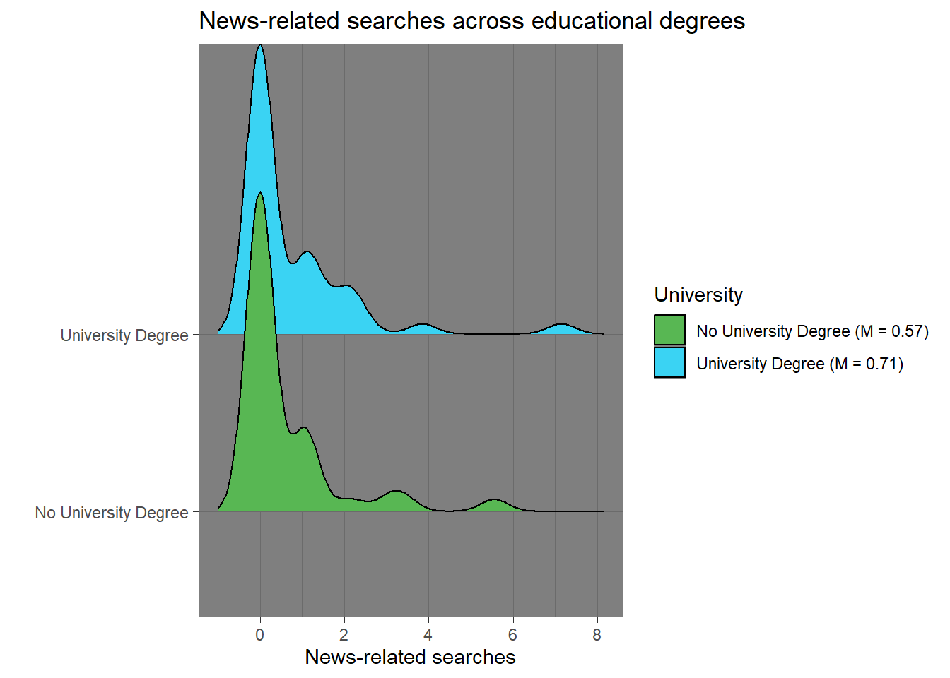
I went with the theme_classic() for the graph depicted at the beginning of Tutorial 8:
data_combined %>%
  ggplot(., aes(x = share, y = University, fill = University)) +
  labs(title = "News-related searches across educational degrees",
       x = "News-related searches",
       y = "") +
  geom_density_ridges() +
  scale_fill_manual(values = c("#58B753", "#3AD3F3"),
                    labels = means$label) +
  ## change theme ##
  theme_classic()
That’s it - we have recreated our graph, nice work!
8.7 Saving images
Lastly, you may want to save your graph externally to later use the image for reports or seminar papers, for instance.
To do so, you can simply use the ggsave() command:
Save the plot in an object - here the object plot. Next, save it to your computer using ggsave().
Important: Make sure to specify the correct name of your image, including in what format it should be used. I went for a jpeg image here as indicated by the name “myplot.jpeg”:
data_combined %>%
  ggplot(., aes(x = share, y = University, fill = University)) +
  labs(title = "News-related searches across educational degrees",
       x = "News-related searches",
       y = "") +
  geom_density_ridges() +
  scale_fill_manual(values = c("#58B753", "#3AD3F3"),
                    labels = means$label) +
  theme_classic()

## sve image ##
ggsave(filename = "myplot.jpeg")
8.8 Take Aways
- Creating a graph: ggplot()
- Mapping data to visuals: aes(x, y, fill, etc.)
- Choosing the type of graph to be created: geom_bar(), geom_line(), geom_point(), geom_boxplot(), geom_density_ridges() (for example)
- Adding titles: labs() (for example)
- Assigning colors to values: scale_fill_manual() (for example)
- Setting a graph’s theme: theme_classic(), theme_light(), theme_bw() (for example)
- Saving images: ggsave()
8.9 More tutorials on this
You still have questions? The following tutorials & papers can help you with that:
- Chang, W. R (2021) R Graphics Codebook. Practical Recipes for Visualizing Data. Link
- Wickham, H., Navarro, D., & Pedersen, T. L. (2021). ggplot2: elegant graphics for data analysis. Online, work-in-progress version of the 3rd edition. Link
- Hehman, E., & Xie, S. Y. (2021). Doing Better Data Visualization. _Advances in Methods and Practices in Psychological Science__. DOI: 10.1177/25152459211045334 Link
- R Codebook by J.D. Long and P. Teetor, Tutorial 10
see here for further information: http://vita.had.co.nz/papers/layered-grammar.pdf↩︎