Chapter 4 Text Analysis Tools Part 2, Sentiment
In this section, we take our analysis of text data a bit further, looking into the sentiment of language.
4.1 Cape Town Water Crisis
Between 2015 and 2018, Cape Town experienced a severe water crisis that threatened its residents with the possibility of “Day Zero,” when city taps would be shut off.
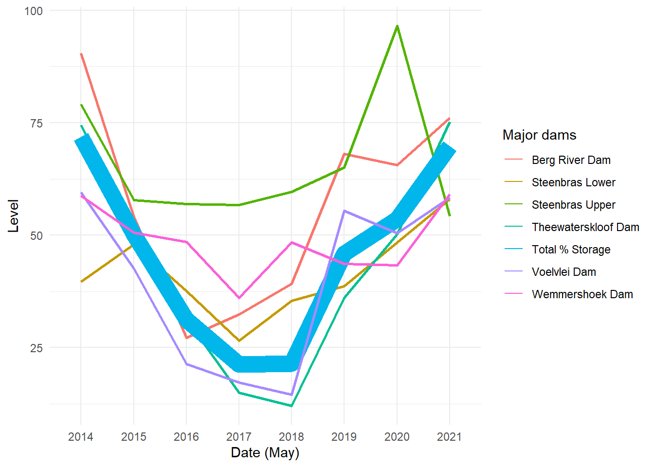
The above data, from Wikipedia, show water levels at various dams around Cape Town, as well as for the city as a whole. We can see that in 2017 and 2018, water levels became extremely low, inducing a series of water regulations from the Cape Town government with the possibility of taps ultimately shutting off and residents having to collect water at public points.
The Cape Town Water Crisis is a useful case to look at as we think about our global climate crisis. In some ways, this event can be looked at as a microcosm of our climate challenges: volatility in weather patterns, which climate change contributes to, caused long droughts and unpredictable rainfall in the region surrounding Cape Town. The solution to the water crisis required dramatic changes in water consumption, and people were unable to make these changes in a way that responded quickly enough to the ongoing drought. Governments encouraged residents to consume less and began to ration water, but these policies came too late to have the needed impacts on the reservoirs, and were nearly not enough to prevent catastrophe.
What ultimately spared Cape Town was a combination of policies, communication, and rainfall. A city government report highlights the strategies that officials took, including “steep tariff increases,” in particular for the largest water consumers, and messaging across various types of media encouraging residents to limit their usage. These tactics had success: the average resident in March 2015 used 1,100 MegaLiters of water per day, compared to 500 in March 2018. The drought also ended in 2018 when Cape Town had near-average rainfall, restoring dam levels much closer to pre-crisis levels.
Other cities around the world will soon surely experience droughts and water crises of their own, and we cannot expect that these other places always have the luck of fortuitous rainfalls. Therefore, we can potentially learn a lot from how the Cape Town Water Crisis unfolded. We know roughly what happened in terms of water levels, consumption, and government messaging. But we know less about how people felt and reacted to these changes. In this chapter, we will investigate some different ways to analyze sentiment around climate change and the water crisis.
4.2 Using Reddit Data
In the Week 2 Problem Set, you learned a bit more about using APIs in R. Hopefully this was a good experience, and you are ready for more! Here, we’ll learn how to pull information from the social media site Reddit.
You are first going to want to install and library the RedditextractoR package.
We can now do things like pull all the subreddits about specific topics, like climate change:
Great! If we want to extract the comments in these subreddits, we first find the urls of the above pages, and then plug these into the get_thread_content() function. Let’s see what we get in return. There are two ways to find the urls, either by searching the subreddits or the keywords themselves. With the former approach, you can only search one subreddit at a time. The latter generally returns more results, since it includes lots of different subreddits. However, getting the urls this way sometimes returns NA, so you may want to use the subreddit method. Both methods are shown below.
# get urls of the climate subreddit
climate_urls <- find_thread_urls(subreddit = "climate",
                                 period = "all")

# alternatively, we can find urls of all pages related to climate change
climate_urls <- find_thread_urls(keywords = "climate change")

# extract comments from these pages
climate_comments <- get_thread_content(climate_urls$url)

# take a look
climate_comments$threads

climate_comments$comments
## # A tibble: 242 × 15
## url author date timestamp title text subreddit score upvotes
## <chr> <chr> <date> <dbl> <chr> <chr> <chr> <dbl> <dbl>
## 1 https://www.… Kingk… 2023-06-07 1.69e9 "Ele… "I (… unpopula… 400 400
## 2 https://www.… Down-… 2023-06-20 1.69e9 "Thi… <NA> Conserva… 395 395
## 3 https://www.… iamon… 2023-06-07 1.69e9 "I m… "Hey… dataanal… 391 391
## 4 https://www.… eric-… 2023-06-03 1.69e9 "It'… <NA> alberta 388 388
## 5 https://www.… Relat… 2023-06-15 1.69e9 "The… "1. … unitedst… 386 386
## 6 https://www.… TheCo… 2023-06-16 1.69e9 "I H… <NA> autismme… 385 385
## 7 https://www.… Velve… 2023-06-10 1.69e9 "Hel… "Hi … TwoBestF… 391 391
## 8 https://www.… Carel… 2023-06-24 1.69e9 "EU … "Con… neoliber… 387 387
## 9 https://www.… Alan_… 2023-06-19 1.69e9 "Onl… <NA> newjersey 379 379
## 10 https://www.… Femal… 2023-06-21 1.69e9 "It\… "US … HVAC 379 379
## # ℹ 232 more rows
## # ℹ 6 more variables: downvotes <dbl>, up_ratio <dbl>,
## # total_awards_received <dbl>, golds <dbl>, cross_posts <dbl>, comments <dbl>## # A tibble: 34,361 × 10
## url author date timestamp score upvotes downvotes golds comment
## <chr> <chr> <date> <dbl> <dbl> <dbl> <dbl> <dbl> <chr>
## 1 https://ww… AutoM… 2023-06-07 1.69e9 1 1 0 0 "Pleas…
## 2 https://ww… rogd1… 2023-06-08 1.69e9 18 18 0 0 "Cost …
## 3 https://ww… davek… 2023-06-08 1.69e9 6 6 0 0 "That …
## 4 https://ww… Gamem… 2023-06-08 1.69e9 4 4 0 0 "The r…
## 5 https://ww… soft_… 2023-06-08 1.69e9 0 0 0 0 "Home …
## 6 https://ww… b1ue_… 2023-06-08 1.69e9 130 130 0 0 "The p…
## 7 https://ww… Suita… 2023-06-08 1.69e9 41 41 0 0 "If yo…
## 8 https://ww… Abase… 2023-06-08 1.69e9 55 55 0 0 "If yo…
## 9 https://ww… BobDe… 2023-06-08 1.69e9 31 31 0 0 "But w…
## 10 https://ww… Turbo… 2023-06-08 1.69e9 10 10 0 0 "Yeah …
## # ℹ 34,351 more rows
## # ℹ 1 more variable: comment_id <chr>Let’s look at the comments first. We’ll want to use the unnest_tokens() function to put the data in tidytext format. We can also remove the stop words.
library(dplyr)
library(tidytext)

tidy_comments <- climate_comments$comments %>%
   unnest_tokens(word, comment) %>%
  anti_join(stop_words)

# look at words and timestamps
tidy_comments %>%
  select(timestamp, word)
## # A tibble: 512,800 × 2
## timestamp word
## <dbl> <chr>
## 1 1686181081 remember
## 2 1686181081 subreddit
## 3 1686181081 unpopular
## 4 1686181081 opinion
## 5 1686181081 civil
## 6 1686181081 unpopular
## 7 1686181081 takes
## 8 1686181081 discussion
## 9 1686181081 uncivil
## 10 1686181081 tos
## # ℹ 512,790 more rowsNow that we have the data in tidytext format, we can start to look at the sentiments.
4.3 What is Sentiment Analysis?
Sentiment analysis is just what is sounds like - analyzing the emotions and feelings that language conveys. The tidytext package comes with three general-purpose sentiment lexicons. Let’s explore these three a little bit. Note that before you can view these lexicons, you may need to install packages such as textdata and answer some prompts in R.
## # A tibble: 2,477 × 2
##    word       value
##    <chr>      <dbl>
##  1 abandon       -2
##  2 abandoned     -2
##  3 abandons      -2
##  4 abducted      -2
##  5 abduction     -2
##  6 abductions    -2
##  7 abhor         -3
##  8 abhorred      -3
##  9 abhorrent     -3
## 10 abhors        -3
## # ℹ 2,467 more rows## # A tibble: 6,786 × 2
## word sentiment
## <chr> <chr>
## 1 2-faces negative
## 2 abnormal negative
## 3 abolish negative
## 4 abominable negative
## 5 abominably negative
## 6 abominate negative
## 7 abomination negative
## 8 abort negative
## 9 aborted negative
## 10 aborts negative
## # ℹ 6,776 more rows## # A tibble: 13,872 × 2
## word sentiment
## <chr> <chr>
## 1 abacus trust
## 2 abandon fear
## 3 abandon negative
## 4 abandon sadness
## 5 abandoned anger
## 6 abandoned fear
## 7 abandoned negative
## 8 abandoned sadness
## 9 abandonment anger
## 10 abandonment fear
## # ℹ 13,862 more rowsLet’s take a look at what emotions from the NRC lexicon show up in our dataset of climate change comments.
# join nrc with tidy comments
tidy_comments %<>%
  inner_join(get_sentiments("nrc"))

# take a look
tidy_comments %>%
  select(word, sentiment)
## # A tibble: 283,239 × 2
## word sentiment
## <chr> <chr>
## 1 unpopular disgust
## 2 unpopular negative
## 3 unpopular sadness
## 4 civil positive
## 5 unpopular disgust
## 6 unpopular negative
## 7 unpopular sadness
## 8 discussion positive
## 9 subject negative
## 10 ban negative
## # ℹ 283,229 more rows##
## anger anticipation disgust fear joy negative
## 22362 24768 15598 29491 20057 47168
## positive sadness surprise trust
## 57283 21224 10982 34306We can also look at the sentiments in the form of a graph.
library(ggplot2)
ggplot(tidy_comments, aes(y = sentiment))+
  geom_bar(aes(fill = sentiment))+
  theme_minimal()+
  labs(title = "Sentiments in Climate Change Reddit Posts")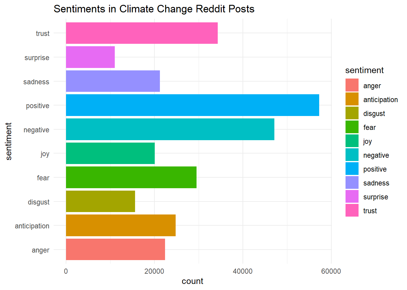
Is this surprising at all? Perhaps, but it is a little difficult to know what to make of this analysis without a good comparison. We can first look at how sentiments in comment threads compare to the original posts.
To do so, we are going to first perform the same analysis on the threads dataset.
# now turn to threads
tidy_threads <- climate_comments$threads %>%
   unnest_tokens(word, text) %>%
  anti_join(stop_words)

# join nrc with tidy threads
tidy_threads %<>%
  inner_join(get_sentiments("nrc"))
Now we have a tidy_comments dataset and a tidy_threads dataset. But if we simply bind them together, will we know which observations came from which? We should first make sure we label each with the same variable. We’ll call this type.
# add identifier for thread/comment
tidy_comments %<>%
  mutate(type = "comment")

tidy_threads %<>%
  mutate(type = "thread")
Lastly, we will bind the relevant variables from each dataset together using bind_rows().
# bind threads and comments (want to select the same columns in each)
tidy_comments_threads <-
  bind_rows(select(tidy_comments, word, timestamp, score, sentiment, type),
            select(tidy_threads, word, timestamp, score, sentiment, type))
And now we can make a similar graph to the one before, but where we compare across comments and threads.
library(ggplot2)

ggplot(tidy_comments_threads, aes(y = sentiment))+
  geom_bar(aes(fill = sentiment))+
  theme_minimal()+
  labs(title = "Sentiments in Climate Change Reddit Posts")+
  facet_grid(cols = vars(type), scales = "free_x")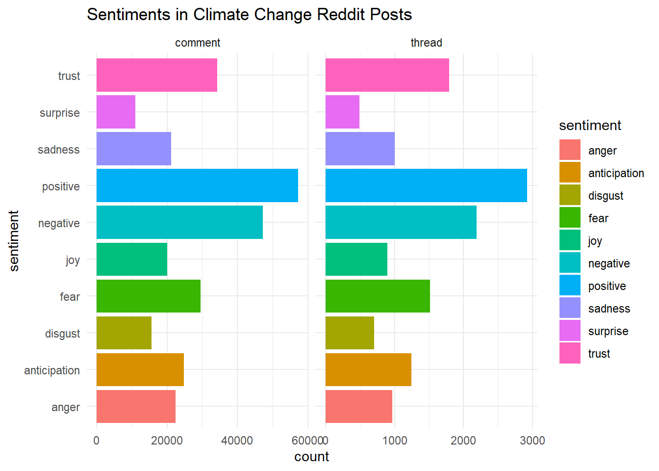
One feature of the Reddit data is that comments and posts have “scores” which denote their number of upvotes minus their number of downvotes. It could be that the sentiments of these climate change-related comments and posts are related to whether they receive upvotes or downvotes. Let’s do some investigating.
# create dataset with one row for each sentiment
sentiments_scores <- tidy_comments_threads %>%
  group_by(sentiment) %>%
  summarise(mean_score = mean(score, na.rm = T))
Let’s pause for a moment. What did we just do? We used the group_by() to organize our dataset by the sentiment categories (running group_by() on its own doesn’t change the structure of your data, but it will change how other operations affect your data). When we calculate the mean score, R does this for each group. That is, we know the average score of a joyful comment, for example. We specify na.rm = T so that the mean will just be calculated with non-missing entries. What if we had grouped by another variable instead, like type?
For now, we will stick with the sentiments_scores dataset we just created, and use this to produce another visualization.
# look at the scores of different sentiments
ggplot(sentiments_scores, aes(x = sentiment, y = mean_score))+
  coord_flip()+
  geom_point(aes(col = sentiment), size = 2)+
  theme_minimal()+
  theme(legend.position = "none")+
  labs(title = "Sentiments in Climate Change Reddit Posts, by Average Scores")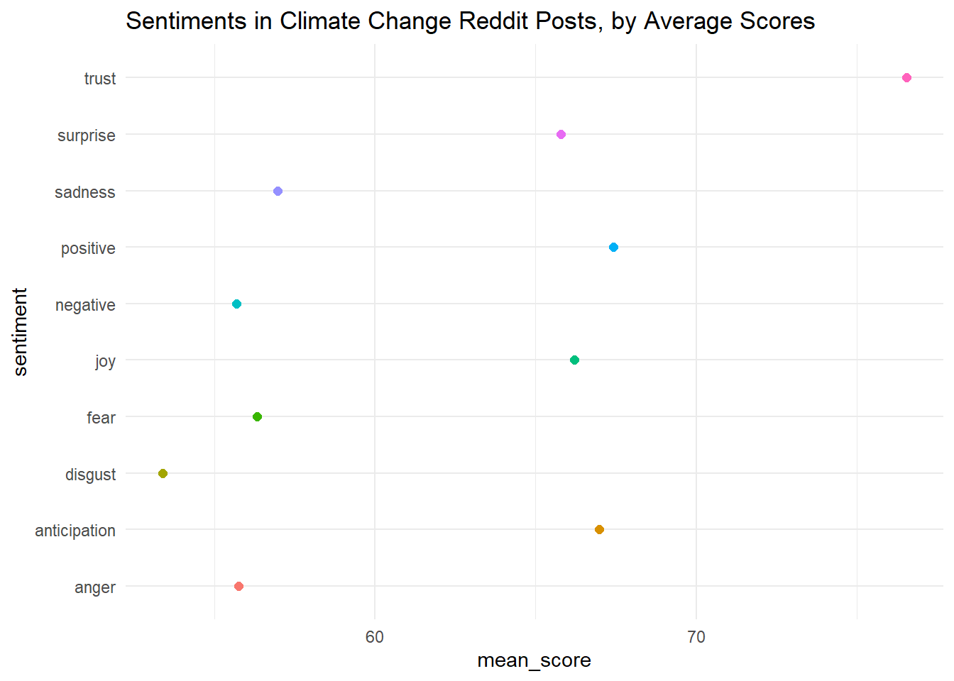
The graph is a little hard to read. Can we alter it so that the points are ranked by value, not alphabetically based on sentiment? We’ll do this manually by changing the levels in the factor() command.
# manually change order
sentiments_scores %<>%
  mutate(sentiment = factor(sentiment,
                            levels = c("disgust",
                                       "anger",
                                       "negative",
                                       "fear",
                                       "sadness",
                                       "surprise",
                                       "joy",
                                       "anticipation",
                                       "positive",
                                       "trust")))
Great. Now let’s look at the plot again.
# look at the scores of different sentiments
ggplot(sentiments_scores, aes(x = sentiment, y = mean_score))+
  coord_flip()+
  geom_point(aes(col = sentiment), size = 2)+
  theme_minimal()+
  theme(legend.position = "none")+
  labs(title = "Sentiments in Climate Change Reddit Posts, by Average Scores")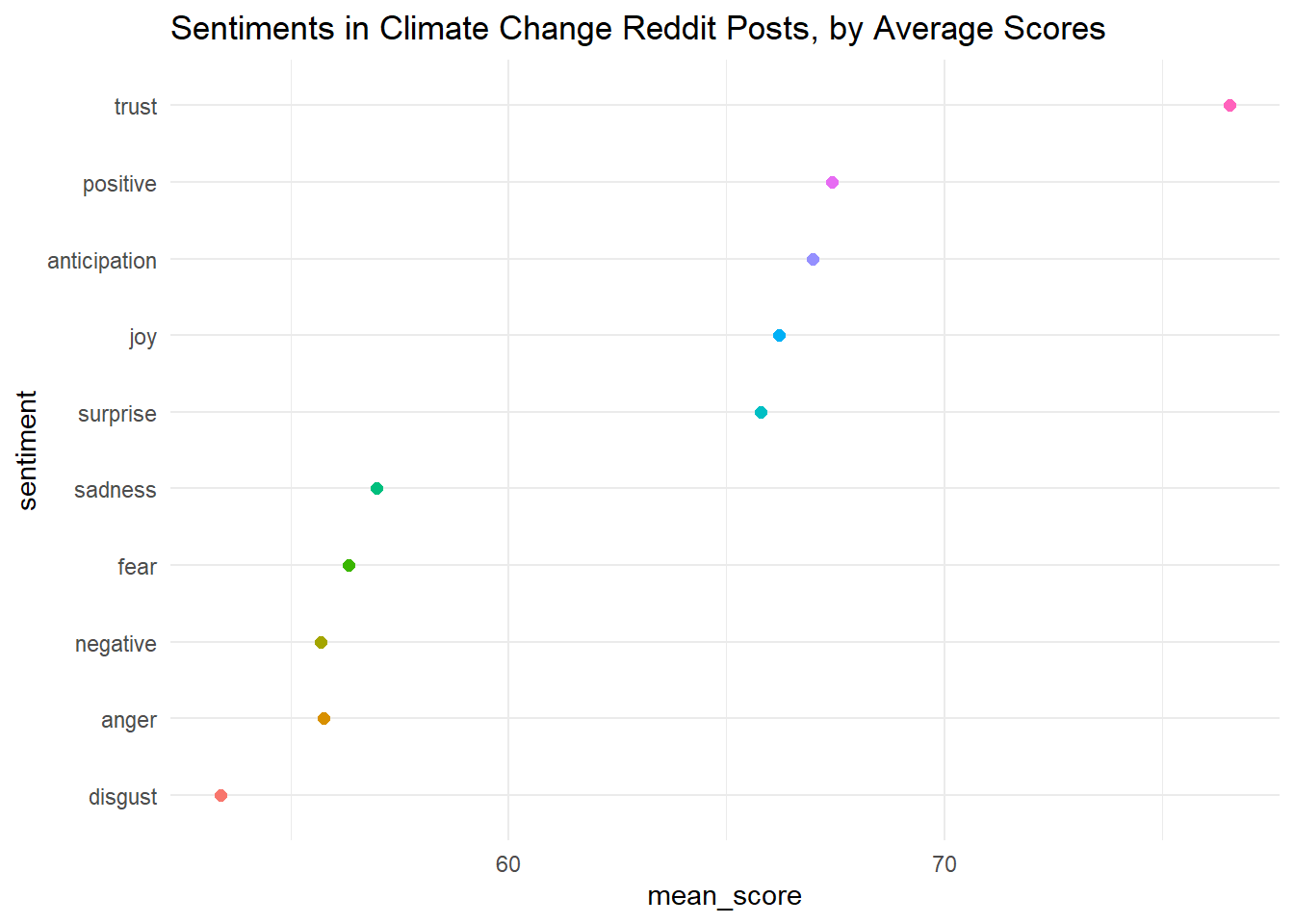
This is a bit easier to read! It looks like anger and disgust score the lowest, while trust, positive emotions, and anticipation score the highest. Are we surprised?
4.4 Examining Sentiment Over Time
Next, we might want to look at sentiment over time. Unfortunately, when we pull data from the Reddit API through RedditextractoR, we only receive data for the previous two weeks. This might be enough time to analyze a specific issue (for example, a wildfire or other event that just happened), but it is probably not enough time to analyze change in language around climate issues.
Lucky for us, someone has already aggregated all the Reddit comments and threads that mention “climate change” through September 2022. We can download that dataset on Kaggle, which is a great resource for open source data. We’ll start with the posts.
# read all time climate change posts
cc_alltime_reddit <- read_csv("Data/the-reddit-climate-change-dataset-posts.csv")
Once again, we will unnest the tokens (words) and remove stop words.
# tidytext format
tidy_cc <- cc_alltime_reddit %>%
   unnest_tokens(word, title)

# now remove stop words
tidy_cc %<>%
  anti_join(stop_words)
We can now look at sentiment over time. We’ll start with the afinn dictionary, which ranges from -5 to 5. Our time indicator is the variable created_utc, which is measured in seconds since January 1 1970 (as a side note, you can use this website to convert unix timestamps to human dates and times). We probably want to measure time in a larger unit, like days or weeks. Let’s see how many seconds are in a week.
## [1] 604800Ok great, so there are 604800 seconds in a week. We use %/% to perform integral division on created_utc. That is, we want the result to be in integer form so that we can group the time periods by weeks.
afinn <- tidy_cc %>%
  inner_join(get_sentiments("afinn")) %>%
  group_by(index = created_utc %/% 604800) %>%
  summarise(sentiment = sum(value)) %>%
  mutate(method = "AFINN")

afinn
## # A tibble: 661 × 3
## index sentiment method
## <dbl> <dbl> <chr>
## 1 2087 -92 AFINN
## 2 2088 -115 AFINN
## 3 2089 -32 AFINN
## 4 2090 -87 AFINN
## 5 2091 -72 AFINN
## 6 2092 -143 AFINN
## 7 2093 -170 AFINN
## 8 2094 -130 AFINN
## 9 2095 -87 AFINN
## 10 2096 -45 AFINN
## # ℹ 651 more rowsGreat! Now we can plot our result.
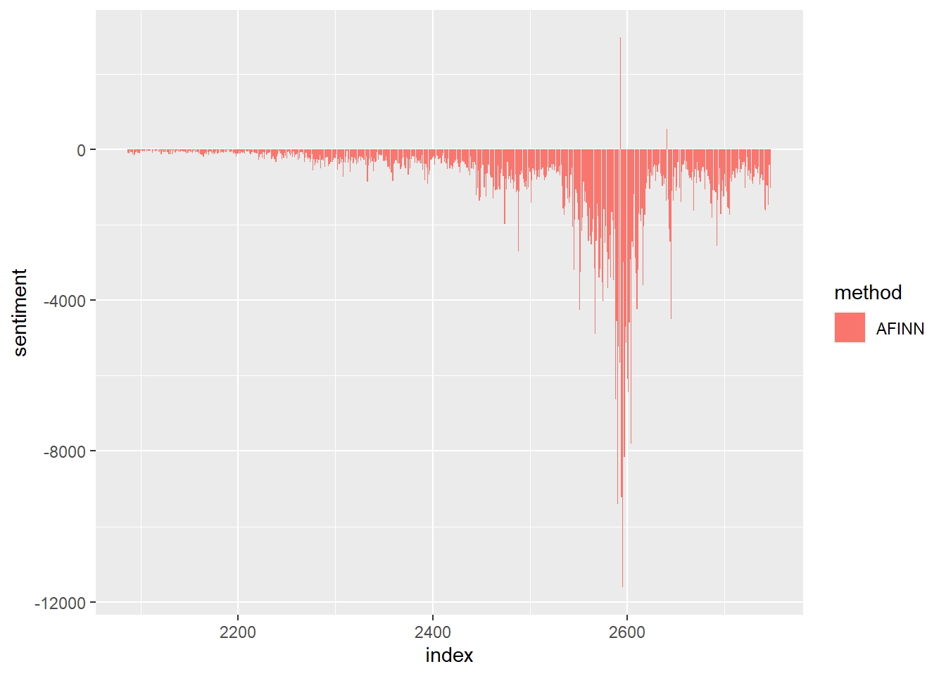
Interesting! Any guesses for why the sentiment became so negative around 2600? (This is October 2019).
We notice that the plot is mostly negative. This could be a function of the topic or the forum. But we might want to check that this is not due to the lexicon dictionary that we are using. So let’s try with the “bing” and “nrc” dictionaries as well, and see if we get the same result.
library(tidyr)
# try with the bing dictionary
bing <- tidy_cc %>%
  inner_join(get_sentiments("bing")) %>%
  mutate(method = "Bing et al.") %>%
   count(method, index = created_utc %/% 604800, sentiment) %>%
   pivot_wider(names_from = sentiment,
              values_from = n,
              values_fill = 0) %>%
  mutate(sentiment = positive - negative)

bing
## # A tibble: 661 × 5
## method index negative positive sentiment
## <chr> <dbl> <int> <int> <int>
## 1 Bing et al. 2087 83 19 -64
## 2 Bing et al. 2088 103 26 -77
## 3 Bing et al. 2089 55 38 -17
## 4 Bing et al. 2090 98 36 -62
## 5 Bing et al. 2091 84 38 -46
## 6 Bing et al. 2092 118 35 -83
## 7 Bing et al. 2093 134 71 -63
## 8 Bing et al. 2094 96 34 -62
## 9 Bing et al. 2095 104 35 -69
## 10 Bing et al. 2096 53 31 -22
## # ℹ 651 more rows# try with the nrc dictionary
nrc <- tidy_cc %>%
inner_join(get_sentiments("nrc") %>%
# only get positive and negative sentiments
filter(sentiment %in% c("positive", "negative"))) %>%
mutate(method = "NRC") %>%
count(method, index = created_utc %/% 604800, sentiment) %>%
pivot_wider(names_from = sentiment,
values_from = n,
values_fill = 0) %>%
mutate(sentiment = positive - negative)
nrc## # A tibble: 661 × 5
## method index negative positive sentiment
## <chr> <dbl> <int> <int> <int>
## 1 NRC 2087 71 82 11
## 2 NRC 2088 91 111 20
## 3 NRC 2089 58 83 25
## 4 NRC 2090 67 109 42
## 5 NRC 2091 116 92 -24
## 6 NRC 2092 95 102 7
## 7 NRC 2093 126 137 11
## 8 NRC 2094 88 76 -12
## 9 NRC 2095 121 109 -12
## 10 NRC 2096 68 108 40
## # ℹ 651 more rowsNow we can bind these together (using the bind_rows() function) and create a plot that summarizes all three.
And now we can plot all three!
ggplot(all_three, aes(index, sentiment, fill = method)) +
  geom_col(aes(fill = method))+
  facet_wrap(~method, ncol = 1, scales = "free_y")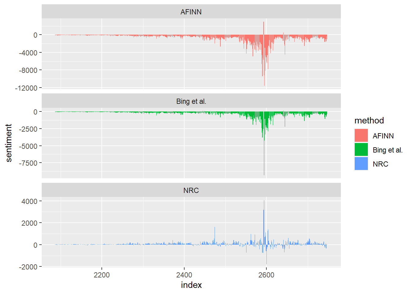
We notice some similarities between the first two dictionaries, but the third one is a bit different. Why might this be?
4.5 Sentiments and Language Around the Cape Town Water Crisis
Let’s now turn back to the Cape Town Water Crisis. We might wonder how discourse around this crisis evolved on social media sites such as Reddit. We can limit the Reddit posts on climate change to just those mentioning Cape Town with the following code:
# limit to data with mention of cape town water crisis
cape_town_words <- c("Cape Town", "water crisis", "Water Crisis",
                     "cape town")

# limit to posts that include any cape town or water crisis related words
cape_town_posts <- cc_alltime_reddit %>%
  filter(str_detect(title, paste(cape_town_words, collapse = "|")))

# make tidytext
tidy_cape_town <- cape_town_posts %>%
  unnest_tokens(word, title) %>%
  anti_join(stop_words)
We can also look at lists of the most common positive and negative words in the language used by Reddit posts on the Cape Town Water Crisis.
bing_word_counts <- tidy_cape_town %>%
  inner_join(get_sentiments("bing")) %>%
  count(word, sentiment, sort = TRUE) %>%
  ungroup()


bing_word_counts
## # A tibble: 103 × 3
## word sentiment n
## <chr> <chr> <int>
## 1 crisis negative 187
## 2 drought negative 41
## 3 horrifying negative 25
## 4 blame negative 14
## 5 threatening negative 9
## 6 breaking negative 8
## 7 crowded negative 8
## 8 sinking negative 8
## 9 worse negative 8
## 10 critical negative 5
## # ℹ 93 more rowsWe can also plot the results.
bing_word_counts %>%
  group_by(sentiment) %>%
  slice_max(n, n = 10) %>%
  ungroup() %>%
  mutate(word = reorder(word, n)) %>%
  ggplot(aes(n, word, fill = sentiment)) +
  geom_col(show.legend = FALSE) +
  facet_wrap(~sentiment, scales = "free_y") +
  labs(x = "Contribution to sentiment",
       y = NULL)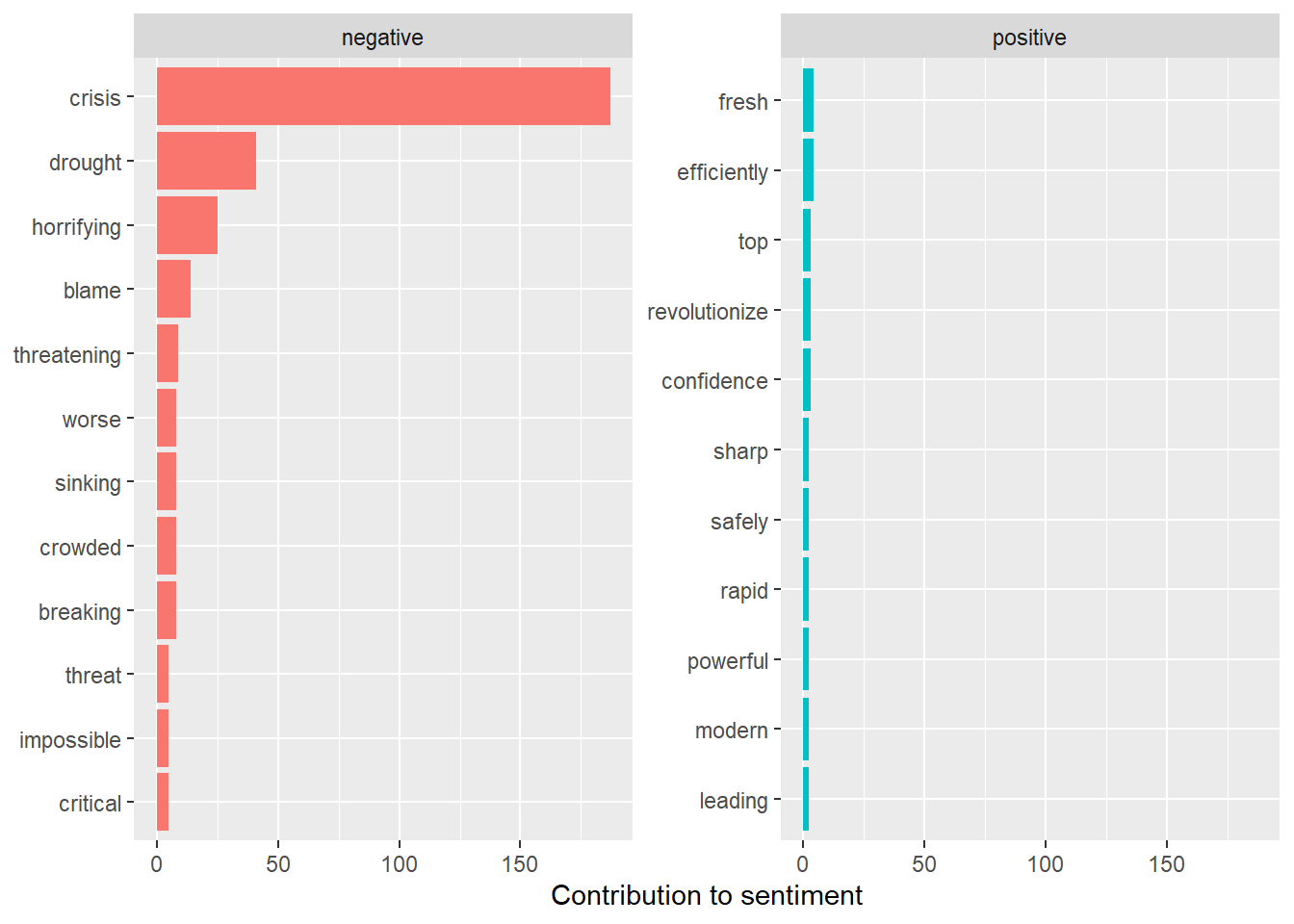
Perhaps unsurprisingly, the frequencies of negative words are much larger than those of positive words. The words “crisis” and “drought” contribute the most to negative sentiments. The next two words, however, are perhaps not so obvious: “horrifying” and “blame.” These give us a fuller picture of the sentiments that appeared, at least on the social media site Reddit, as people discussed this topic.
We can also look at sentiment over time. We’ll try using the Bing Lexicon, and aggregating the sentiment for periods of years (we note that each year has 31556926 seconds).
# create bing sentiment dataframe for cape town posts, each observation is a year
bing_ct <- tidy_cape_town %>%
  inner_join(get_sentiments("bing")) %>%
  mutate(method = "Bing et al.") %>%
   count(method, index = created_utc %/% 31556926, sentiment) %>%
   pivot_wider(names_from = sentiment,
              values_from = n,
              values_fill = 0) %>%
  mutate(sentiment = positive - negative,
         year = as.numeric(index + 1970))
Now we can plot the results for Cape Town.
# plot sentiment over time for cape town posts
ggplot(bing_ct, aes(year, sentiment, fill = method)) +
  geom_col()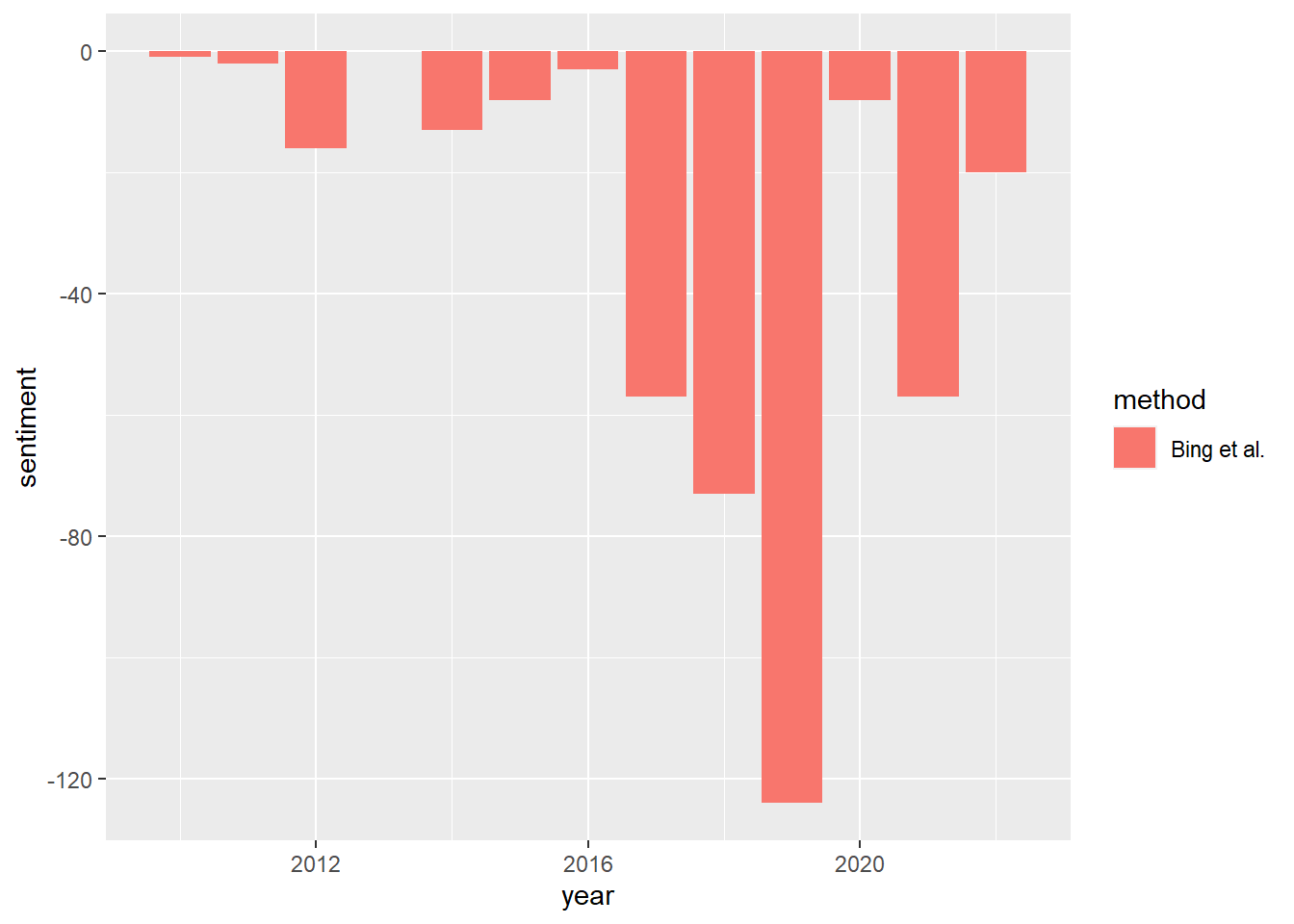
Does this chart remind us of anything? The trend in sentiment is lowest around 2017 and 2018, right when water levels were lowest and the crisis was at its most extreme. We might be interested in plotting both the water levels and the Reddit sentiments. We can do this in ggplot2! But it will take a bit of work. If you’re curious, this page has some useful information on how to set up a chart with two separate y-axes.
# create dataset for overlayed plot
combined_plot <- cape_town_table %>%
              mutate(year = as.numeric(as.character(Date))) %>%
              filter(total == 1.5 & !is.na(total)) %>%
                       left_join(bing_ct)

# plot both results
ggplot(combined_plot, aes(x = year, y = (Level-80)*2, group = `Major dams`))+
  geom_col(aes(year, sentiment), fill = "orangered")+
  geom_line(lwd = 5, col = "turquoise4")+
  scale_y_continuous(name = "Sentiment",
                     sec.axis = sec_axis(trans = ~./2+80,
                                         name = "Level"))+
  labs(x = "Year")+
  guides(lwd = FALSE)+
  theme_minimal()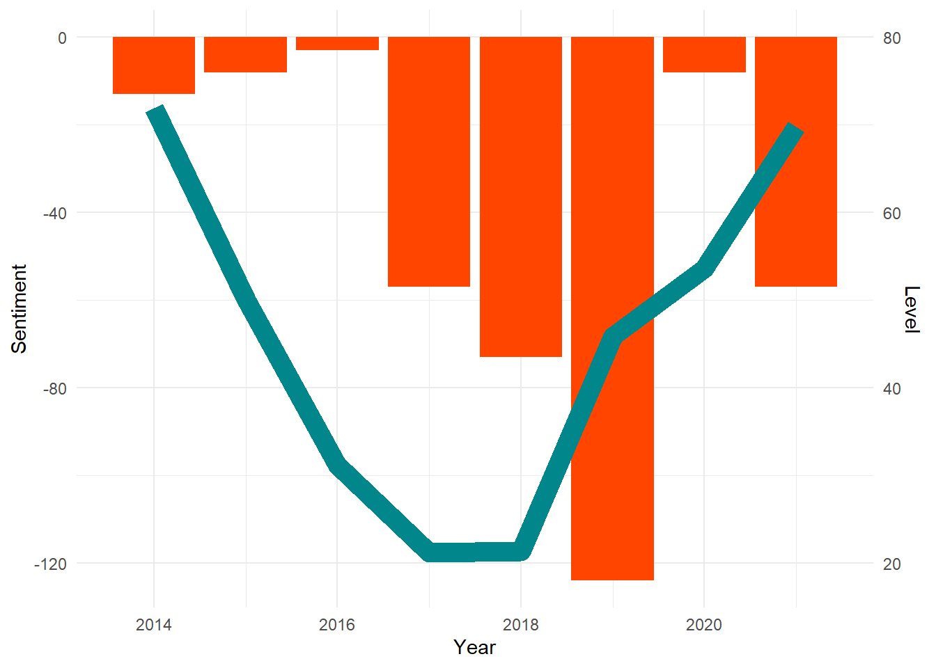
4.6 Problem Set 4
Recommended Resources:
Text Mining with R: A Tidy Approach
Choose a topic related to climate change. Use the
RedditextractoRpackage to get the thread content of posts related to this topic. Put your data intidytextformat, and show the first 6 rows of the threads and comments, separately.Using the NRC lexicon, create a chart of sentiment for your comments or threads, similar to the one in section 4.3. BONUS: try comparing the sentiment of your comments and threads!
Now, download the Reddit Climate Change dataset from Kaggle here. Read in the data and create the
tidy_ccdataset that we created in section 4.4. Then, choose a lexicon (Bing, NRC, or AFINN), and graph the post sentiments according to their scores (similarly to what we did in section 4.3). What do you find?Limit the climate change Reddit posts in some way (for example, you can filter them to posts about Cape Town, or some other place or event, such as the IPCC, or Australian Wildfires). Choose a lexicon (Bing, NRC, or AFINN), and plot the sentiment over time. Can you explain the volatility? BONUS: Plot all three dictionaries. Do you find differences between them?
Considering disasters such as the Cape Town Water Crisis and Hurricane Katrina, reflect on the implications of people’s sentiments for broader social behaviors. What can we learn by analyzing the sentiments of what people say? Describe another source of text data for which you would like to analyze sentiment related to a disaster, and explain why this would be interesting. Could governments or other organizations benefit from the analysis you describe?