Chapter 1 Getting Started with Data Science in a Changing Climate
In this section, we will start to introduce ourselves to data science, programming languages such as R, and conceptual frameworks on climate change.
1.1 Some Definitions
What is social data science? What is climate change? Why combine these topics in a single class?
There are many possible answers to these questions, and we could probably spend the entire class debating the merits of each. Still, it is worth constructing some general definitions.
Data science is essentially statistics. For our purposes, it is also the same as computational social science. It is the study of working with data, whether these are counts or texts or any other form that can be captured by machines, usually with the purpose of drawing inferences and producing visualizations or other findings.
Climate change is a newer term for global warming and the associated planetary changes. Increases in pollution and depleting of earth’s resources have lead to a steady increase in average temperatures, as well as more volatile and severe weather patterns. These changes have become sufficiently extreme, and pose sufficient threats to our existence, that many have opted to use terms such as “global heating” or “climate crisis.”
This course provides an introduction to data science, with a substantive focus on climate change, for a few reasons. First, the changing climate presents massive challenges for societies everywhere, and it is important that we understand the environmental and social responses to these changes. Second, data science skills are increasingly needed to communicate across fields and domains. Third, the tools from data science may actually help us to understand and communicate the variegated influences of a changing climate on societies across the globe.
1.2 Data Science By Hand?
In order to be a data scientist, one must learn to think like a data scientist. Thinking like a data scientist means considering what your data represent, and what you want to communicate with these data. The data can be millions and millions of observations, or just a few. They might be digital traces, survey results, or hand-written notes. Our goal is simply to look for the truth in our data, and to communicate this as clearly as possible.
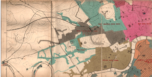
We begin with a classic example from statistics and epidemiology. John Snow, a London doctor, investigated an outbreak of cholera in London’s Soho district in 1954. By analyzing where deaths were occurring in relation to the town’s water sources, he was able to pinpoint the source of epidemic, and help the city end it. Below is a map of the city’s water sources at the time. The full map can be viewed here, and more information on the cholera outbreak can be found here.
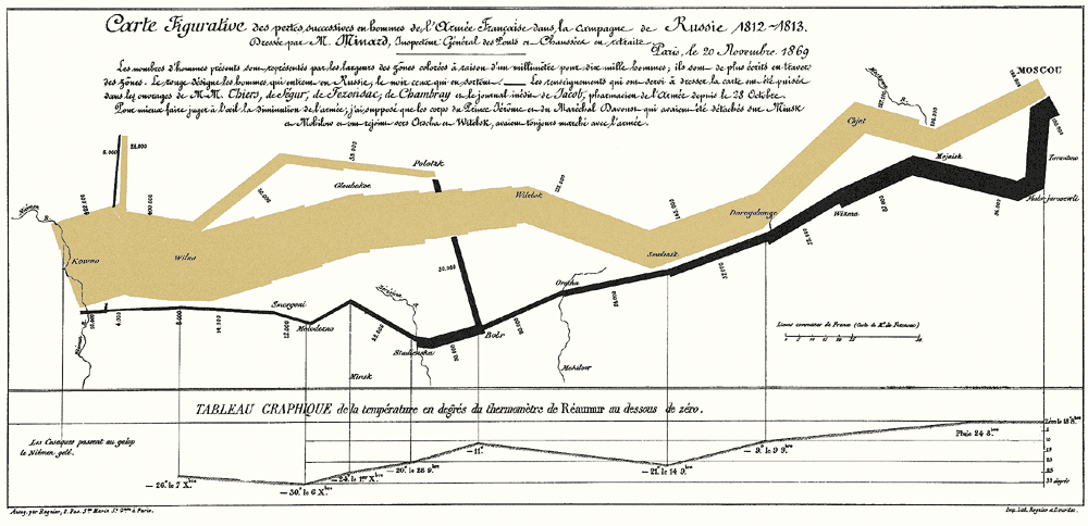
We next turn to another classic example of data visualization. The following graphic is a representation of Napoleon’s “March on Moscow” from 1812-1813. It was created in 1869 by Charles Minard, and it is one of the most popular data visualizations out there, even being called “the best graphic ever produced” (you can decide whether you agree or not). Tufte interprets the chart as an anti-war message, as it clearly shows the massive loss of lives during this campaign.
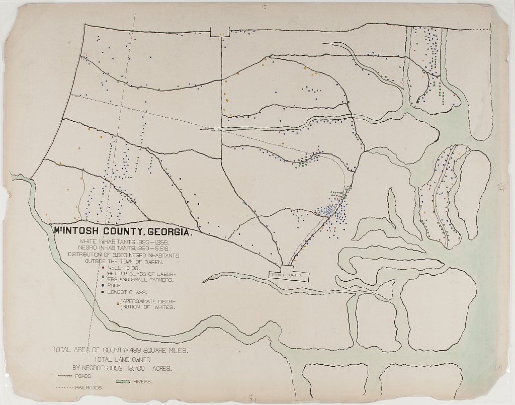
Next, we consider a couple examples the sociologist W.E.B. Du Bois. The 1900 Paris Exhibition was a world fair that showcased humanity’s progress, challenges and possibilities at the turn of the millennium. A building was dedicated to issues of ``social economy.” Du Bois described his goal at this exhibition as follows:
“In this exhibit there are, of course, the usual paraphenalia for catching the eye — photographs, models, industrial work, and pictures. But it does not stop here; beneath all this is a carefully thought-out plan, according to which the exhibitors have tried to show: (a) The history of the American Negro. (b) His present condition. (c) His education. (d) His literature.”
– The American Negro at Paris. American Monthly Review of Reviews 22:5 (November 1900): 576.
In the first, the geography of residence by race and class is shown for a McIntosh County in Georgia. This highlights the social station of Black residents outside the town of Daren, as well as their proximity to White residents. We can compare this to demographic dot maps from recent years.
The second image shows taxable property for Black Americans in an exceptionally creative way. This shows growth in assets between 1875-1890, with little change afterward.
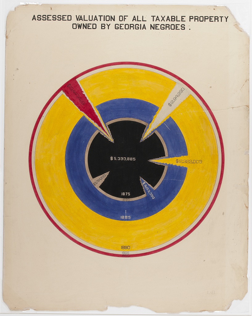
Considering all these examples together, we notice that each data scientist had a distinct purpose. Snow sought to convey the relationship between water service and cholera deaths. Minard showed the casualties of war. Du Bois illustrated the conditions of Black Americans in the U.S. to the rest of the world. It’s useful to remember, no matter how complicated your data are, the best data scientists are often able to reduce this information to a simple message.
1.3 Getting Started with R (or Python)
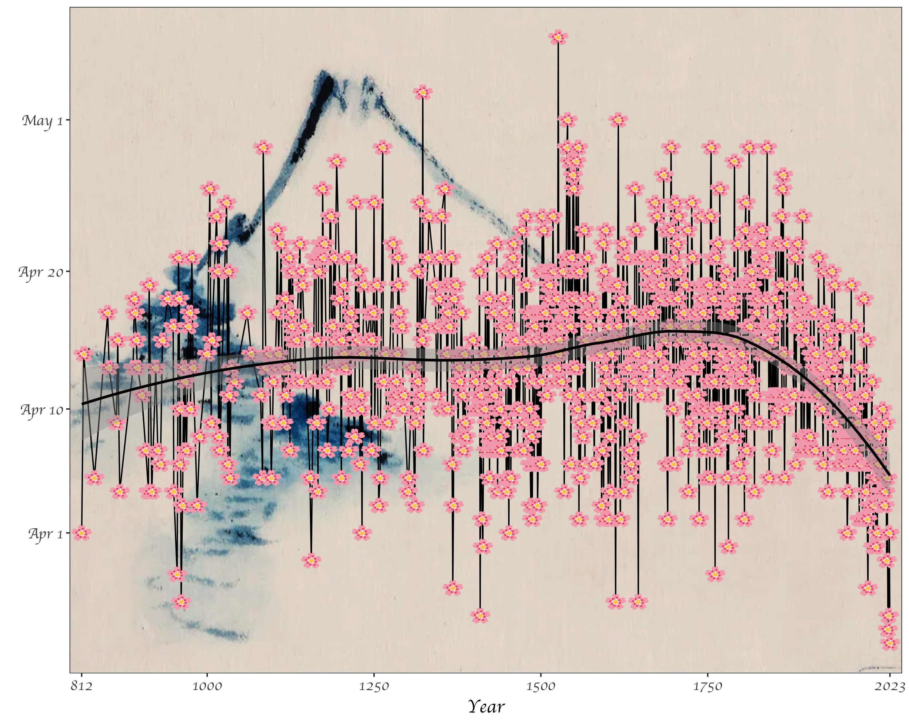
We can do some data science by hand, but statistical tools can help make our lives easier. Software such as R or Python are useful for efficiently analyzing cleaning data, analyzing data, and visualizing results. While you probably could make the plot of cherry blossom bloom times below by hand, it would take a really long time. Once you know R, you’ll be able to recreate this graph relatively easily. (As a side note, notice what this image is conveying: the trend toward earlier and earlier cherry blossom blooms as the planet warms. More on this later.)
You can install R here. Just click on the appropriate link (Mac/Windows/Linux) and follow the instructions. Even if you’ve installed R previously, you may be able to update your version by re-installing it.
Next, you’re going to want to install RStudio here. Again, you’ll have to select the right version for your machine. RStudio is the preferred integrated development environment (IDE) for most R users.
We will focus most of this course on examples using R and RStudio, but there are other good alternatives for doing data science out there! I’ll just note a few
In terms of programming, Python is an extremely popular and flexible option. It was designed and is used mostly by computer scientists, whereas R is mostly used by statisticians. The two languages therefore have lots of subtle differences in the way that one uses them, although, today it is possible to do most tasks in either. You can find instructions to see if your computer has Python installed (and download it if it does not) here.
In terms of IDEs, Anaconda is commonly used with Python. You can install Anaconda here. Anaconda gives you the option to utilize many programs, including RStudio and Jupyter Notebooks, which are another great way to share code and analysis.
Lastly, a relative newcomer in the social data science scene is a programming language called Julia. Currently, there seems to be a lot of enthusiasm about Julia due to its speed, intuitiveness, and the ability to incorporate other languages in Julia code as well. Julia allegedly combines the statistical prowess of R with the flexibility of Python. We won’t code in Julia in this class, but this is something to keep an eye on if you continue to do data science! This video might be a good place to start if you want to learn more.
1.4 Opening RStudio
When you open RStudio, you’ll have the option to start a new project. I recommend creating a project just for this class. You’ll be asked to place the project in a directory (can be new or existing). I recommend putting it in a folder just for this class (e.g. C:/Users/tyler/Documents/Soc128D/).
To start coding, you are going to want to create a new script. The script is essentially your instructions for what R should do. You can also run these directly in the command line (to the bottom of the screen with the > symbol), but it’s better to run them from the script so that you can save and edit your commands.
At the top of the script, create a header like the one below. This will help keep scripts organized as you make more of them. It’s also a good idea to save your script with a simple but descriptive name (e.g. “week1.R”). Notice all the # signs. These simply tell R that the text following them are notes rather than instructions. In a well-written script, there should be lots of # with notes explaining what the code is doing! The goal is to make it easy for your reader to understand.
1.5 Working in Base R
Now that you have your script open and a header written, it’s time to try some lines of code. We can begin with numbers and simple arithmetic. Notice that we use * for multiplication, and / for division.
## [1] 2## [1] 3## [1] 7## [1] 106## [1] 72These cases all return a singular number, but sometimes we want series of numbers or characters. These are called arrays or vectors. We can make these by using c().
## [1] 2 3 7 106 72In R, we can also assign values to labels. This will be useful as we begin to work with more and more data. To do so, we use <-. This is a bit different than other languages, such as Python, which simply use =. For the most part, you can use = in R and it will not change your output, but there are a few cases where it could matter.
# assign "sum" to the sum of a few numbers
penguin <- c(2, 3, 4+3, 53*2, 90*4/5)

# now take a look at the result
penguin
## [1] 2 3 7 106 72In the previous code, each output starts with a [1]. Why is this? It is to show that our output has one row. We could also represent these same data as a \(5 \cdot 1\) matrix:
##      [,1]
## [1,]    2
## [2,]    3
## [3,]    7
## [4,]  106
## [5,]   72
Another form that R handles are lists! We probably won’t use lists for a bit, but these can be helpful in cases where we have multiple vectors, especially if they are differing lengths.
## [[1]]
## [1] 2 3 7
##
## [[2]]
## [1] 106
##
## [[3]]
## [1] 72
It is worth noting that all of the data that we have entered so far are numeric. Other common data types include character, logical, and integer. You can try manipulating your data with functions like as.character(). For instance, what happens when you run as.logical(1) and as.logical(0)?
Another quick note here - if you are ever unsure of exactly what a function does, you can use the ? command to access the help page. For instance, ?as.integer tells us what arguments this function takes, and what output it will provide us with.
Next, we’ll try using a function. You can think about a function as a recipe. If you were telling someone how to make pancakes, you could go through each step of mixing eggs, milk, flour, and so on, or you could just say “follow this recipe” and give them the entire list of instructions. R knows some recipes/functions already. If we want to sum all the components in a vector, we don’t have to tell R to do each step, we can just tell it to do the sum() function:
## [1] 190As an exercise, you can try writing your own function.
Let’s see if it worked:
## [1] 4It worked! But why? When we assigned the action x+y to the function addition, we are telling R that given an x and a y inside addition’s parentheses, we want R to perform this task. Try writing a few functions on your own! The syntax is very important, so change this around a bit until you have an idea about what works and what doesn’t.
Another important action that we can perform in R or any other coding language is the loop. Let’s say that we want R to perform an action repetitively, rather than just once. For example, maybe we want to print each of 10 numbers.
## [1] 1
## [1] 2
## [1] 3
## [1] 4
## [1] 5
## [1] 6
## [1] 7
## [1] 8
## [1] 9
## [1] 10
Using this example of a sequence from 1 to 10, we can observe what happens when we try to manipulate a vector.
## [1] 2 3 4 5 6 7 8 9 10 11Finally, we’ll just take a brief look at using apply. Specifically, we look at sapply, which applies a function over a list or vector. In this case, we get the same result as above, so the sapply method actually makes our code a bit more complicated. But it’s a good idea to remember this option, because it will be useful as our functions get more complicated.
## [1] 2 3 4 5 6 7 8 9 10 11A note on coding: when we learn to write code, we are learning a language! We will start by writing small bits, and there will be lots of moments when we don’t understand our computer (or it does not understand us, or both). This is all ok.
What is important is that we clearly annotate our coding decisions so that our code can be legible to both humans and machines. So use the # sign often!!
1.6 A Climate Example
At this point, you might find yourself wondering how we get data from the real world into R (or Python). For most of what we do with R, we will use functions from online packages. Most of the time, we can install packages with the following command install.packages(). You will then insert the name of the package you want to install in quotes. To call this package into use in your R session, you will then use the command library(), again with your package name in the middle. If it helps to continue the recipe analogy, we can think of packages as cookbooks. When we install them, it’s like we are buying them for the first time (typically, we just need to do this once). When we call the library command, it’s like we are pulling it off the shelf so we’re ready to use it.
# first, we want to install the readr package
# note that i have commented out the following line,
# but you want to uncomment it the first time you run this code
#install.packages("readr")
# read as csv
library(readr)
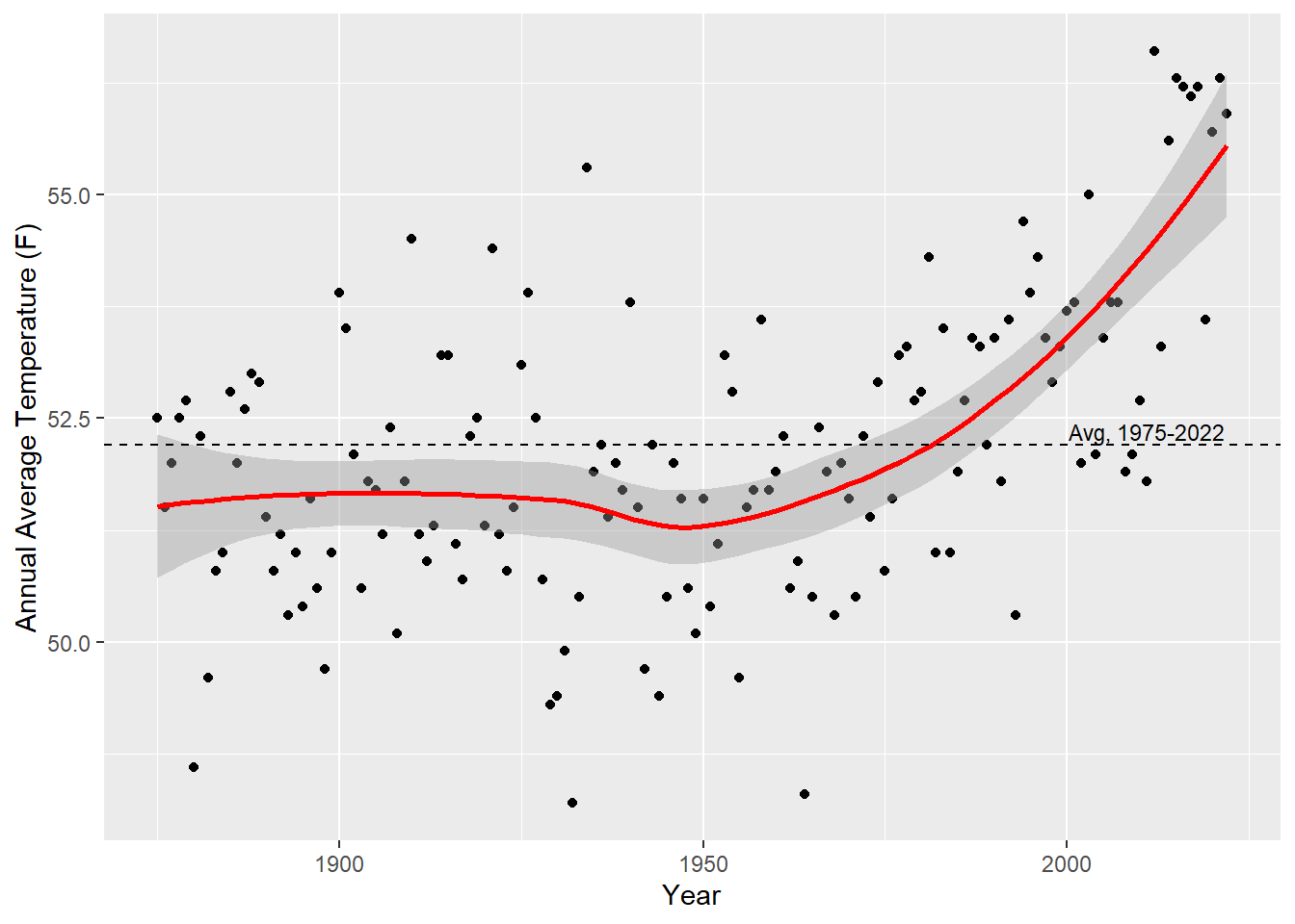
temps <- read_csv("Data/temps.csv")Great! We’ve used the readr package here to load in a csv file! Let’s check out the data. We can view the first 20 rows of the table here:
| Year | Annual Average Temperature (F) |
|---|---|
| 1875 | 52.5 |
| 1876 | 51.5 |
| 1877 | 52.0 |
| 1878 | 52.5 |
| 1879 | 52.7 |
| 1880 | 48.6 |
| 1881 | 52.3 |
| 1882 | 49.6 |
| 1883 | 50.8 |
| 1884 | 51.0 |
| 1885 | 52.8 |
| 1886 | 52.0 |
| 1887 | 52.6 |
| 1888 | 53.0 |
| 1889 | 52.9 |
| 1890 | 51.4 |
| 1891 | 50.8 |
| 1892 | 51.2 |
| 1893 | 50.3 |
| 1894 | 51.0 |
In your version, you can look at the table with the View() command (you’ll want to put “temps”, or whatever you have named the file, inside the parentheses).
With a bit of practice, we’ll be able to take data like this temperature information and create visuals like the one below. You’ll get a chance to do this on the problem set for this week.
1.7 A Climate Framework
So, we’ve seen that temperatures are rising, on average, and that we can visualize this using data science tools like R. In this class we’ll look at a lots of these “stylized facts,” or tidbits of information regarding the environment. However, it’s difficult to understand these pieces of information together without a broader theory of the environment and society.
First, some definitions. The Holocene is the period of roughly 12,000 years of planetary stability, which largely defines earth’s conditions as we know them. The Anthropocene is the current period, in which human activity is the primary driver of planetary changes on earth. Formally, the Anthropocene can be defined as “a time interval marked by rapid but profound and far-reaching change to the Earth’s geology, currently driven by various forms of human impact.” There is some debate over the exact start of the Anthropocene, with the most recent consensus identifying a period of “Great Acceleration,” in terms of population, economy, energy, and industrialization in the 1900’s. Importantly, this period is not the first time that humans have had substantial impacts on earth’s ecology (this has been the case since the days of early humans), but rather the scale of current human impacts, and the fact that these will change stratigraphic patterns (rock layers), mark the necessity of a new geological period.
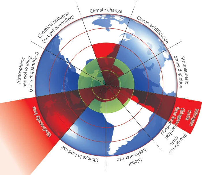
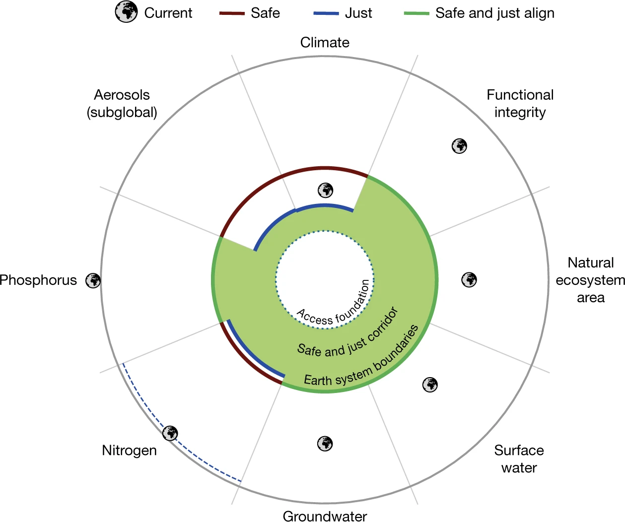
Scholars in the natural sciences are beginning to understand these changes through lenses of planetary bounds, and it may be useful to consider how these boundaries relate to our safety and functioning as societies. In 2009, a now-famous paper noted that climate change is one of multiple planetary bounds, including two others that have already crossed “safe” thresholds: biodiversity loss and interference with the nitrogen cycle. The following graphic illustrates these boundaries visually:
Still, these planetary bounds do not say much about how climate may affect social organizations. One of the most prevalent terms for understanding climate and society is environmental justice. The environmental justice movement emerged from a dispute over the racialized form of pollutant siting and dumping in North Carolina in the 1980’s. Specifically,
“the initial environmental justice spark sprang from a Warren County, North Carolina, protest. In 1982, a small, predominately African-American community was designated to host a hazardous waste landfill. This landfill would accept PCB-contaminated soil that resulted from illegal dumping of toxic waste along roadways. After removing the contaminated soil, the state of North Carolina considered a number of potential sites to host the landfill, but ultimately settled on this small African-American community.” (Source)
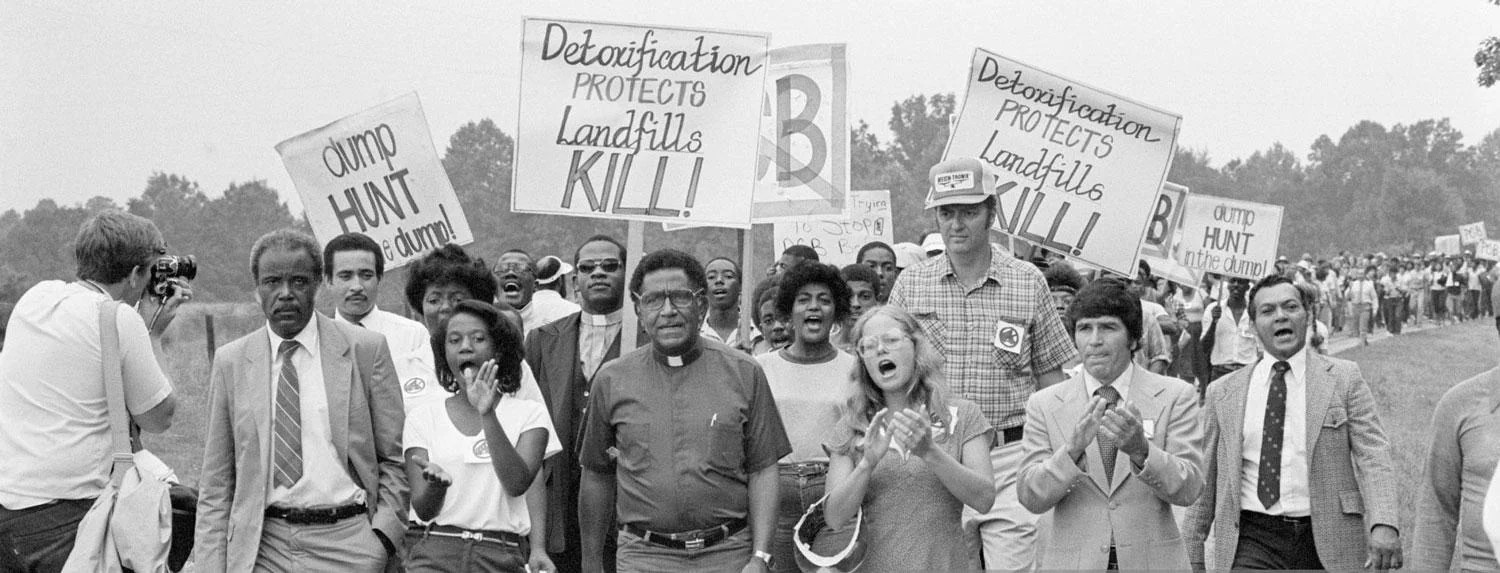
This “initial spark” fueled by protesters from the NAACP and the US House of Representatives, and combined with an already-growing EJ movement, led to our current conception of EJ. Scholars define EJ as “equitable exposure to environmental good and harm.” Today, you can find statements on EJ everywhere from Patagonia to The White House. I do want to note that this institutional prevalence of language around environmental fairness is not incredibly recent: the Department of Energy notes that in 1992, Bush Sr. created an Environmental Equity Working Group in response to the EJ movement.
So what can data science contribute to environmental justice? Several analyses conducted by the Governmental Accountability Office (GAO) were instrumental in supporting claims of the EJ activists and gaining government offices and support. Remember that the best data science simplifies vast and messy data into clearer patterns and meanings. The EJ Atlas is a great example of this: the authors compile a list of conflicts related to environmental justice globally, enough events that one could probably fill a book with all the information, and display it clearly on a world map. The viewer can zoom in on different sections and learn more about conflicts without being too overwhelmed by all the information. It’s a great resource, and can serve as a tool for activists, educators, policymakers, and more.
As climate change accelerates, the hazards that communities face are not only from acute pollutants and planned actions. Returning to the earth system boundaries framework, scientists have updated this theoretical model to include boundaries for “just” systems, as well as new categories and data from the most recent decade. The paper notes that “At 1.0°C global warming, tens of millions of people were exposed to wet bulb temperature extremes (Fig. 2), raising concerns of inter- and intragenerational justice. At 1.5°C warming, more than 200 million people, disproportionately those already vulnerable, poor and marginalized (intragenerational injustice), could be exposed to unprecedented mean annual temperatures, and more than 500 million could be exposed to long-term sea-level rise.” They therefore establish the “just” boundary for global warming at 1.0°C, and the “safe” boundary at 1.5°C. According to this new framework, there are seven areas where we surpass the just threshold, and six where we surpass both safe and just thresholds.
Lastly, I want to note that our role as data scientists is not simply to point out all the bad news. While much of the information regarding climate and society can be frustrating, anxiety-inducing, or entirely dismal, we can and should still do data science with the purpose of instilling hope during challenging times. Borrowing a term from education scholars, we might do our work with “critical hope.” This type of hope recognizes the reality that we live in, and recognizes the work that we need to do, but nonetheless refuses to burn out, or sell out, or peddle misinformation.
1.8 Problem Set 1
Due: July 5th, 2023
Recommended Resources:
Getting Started with R Markdown
R Markdown Section from R for Data Science
A note: this homework will be a bit different than the other in that I will accept many forms of submission. Future assignments should be turned in as PDF or HTML files generated from R Markdown or Jupyter Notebook files.
Prior to beginning: Install R and RStudio on your computer. Open RStudio, start a new project, and start a new script called “HW1_yourname.R” or something similar. Give your script a heading like the following:
#####################################################
## title: first problem set!
## author: you!
## purpose: to try out R
## date: today's date
#####################################################

# you can start coding below- Add the following code to the script, and run it:
Try writing a function that multiplies each number in vec by 2. Label this as a new vector. You can display the output with print() (add the name of your output vector in the parentheses).
Let’s put the two vectors together in a dataframe! For this, you are going to want to install and library the
dplyrpackage. You can use thebind_cols()function to combine the two vectors. Then print the dataframe!Now, name the two columns in the dataframe
xandy, and create a plot using the data! You can try the following first:
# plot your dataframe
# note that you will have to define df
# in this case, df is the binded columns of vec and vec multiplied by 2

names(df) <- c("x", "y")

plot(df$x, df$y)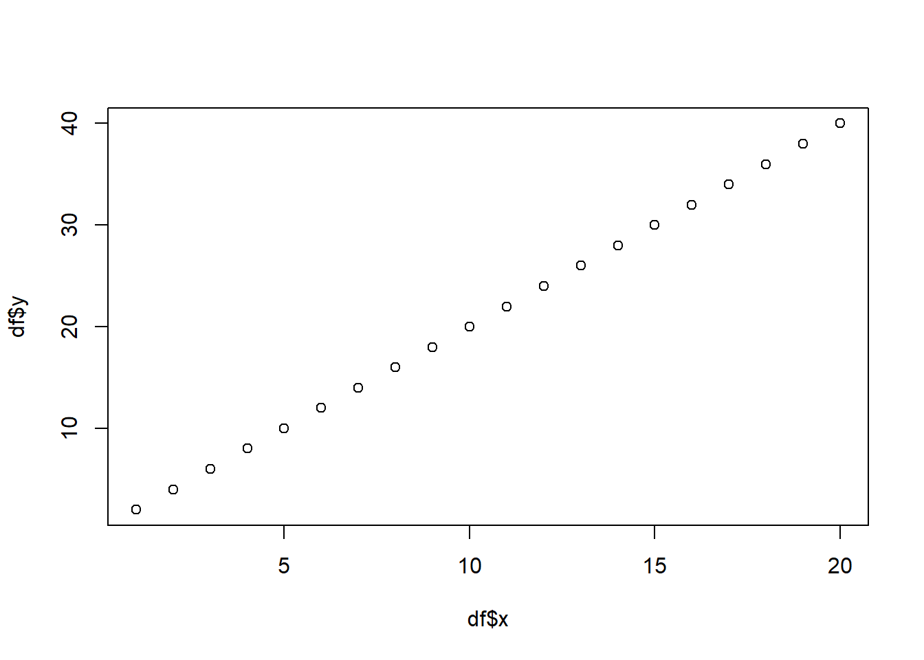
Next, can you use ggplot() from the ggplot2 package to make a more beautiful plot?
Read the temperature data from canvas (temps.csv) into your R session using the
read_csv()function from thereadrpackage. Can you produce a plot like the one from section 1.6? Can you make the plot more interesting in any ways?Discuss the importance of your plot using some frameworks for understanding climate change (e.g. environmental justice). The week 1 readings may be helpful for this question. Note that there are two ways to submit this answer:
- First, you could submit the other answers as an R script, and submit this answer as a word document. But this is a bit clunky and requires me to run your R script to see your results. (I will still accept this format for this week, but not for future homeworks!)
- Second, you can combine script, output, and written responses using R Markdown. Remember that our main task as data scientists will be to communicate effectively, so this option is much preferred!! I recognize that getting started with R Markdown can take a lot of effort, so please be patient with yourself, and reach out to myself or your classmates if you are stuck.