第 4 章 stat functions
4.1 直方圖
4.1.1 間斷變數
geom_bar():用來呈現不同x類別的樣本個數。- 樣本個數會自動計算,呈現在y軸。
geom_col():用來呈現不同x類別下y值高度。- data frame要提供y值。

圖 4.1: Britain may soon have one of the highest minimum wages in the world
4.1.2 geom_col
aes_y是由資料給定
初任人員平均經常性薪資
範例:geom_col
初任人員平均經常性薪資:工業
startSalaryTopCat<- read_csv("https://raw.githubusercontent.com/tpemartin/github-data/master/startSalaryTopCat.csv")

startSalaryTopCat$大職業別[2:7] %>% str_c(.,collapse="','")
[1] “工業部門’,‘礦業及土石採取業’,‘製造業’,‘電力及燃氣供應業’,‘用水供應及污染整治業’,’營造業”
startSalaryTopCat %>% filter(
  大職業別 %in% c('工業部門','礦業及土石採取業','製造業','電力及燃氣供應業','用水供應及污染整治業','營造業')
) -> startingSalary_industrial

graphList <- list()
startingSalary_industrial %>%
filter(大職業別 !='工業部門') -> startingSalary_industrial_sub
startingSalary_industrial_sub %>%
ggplot(aes(x=大職業別))+
geom_col(aes(y=`經常性薪資-薪資`))-> graphList$經常薪資_col0
graphList$經常薪資_col0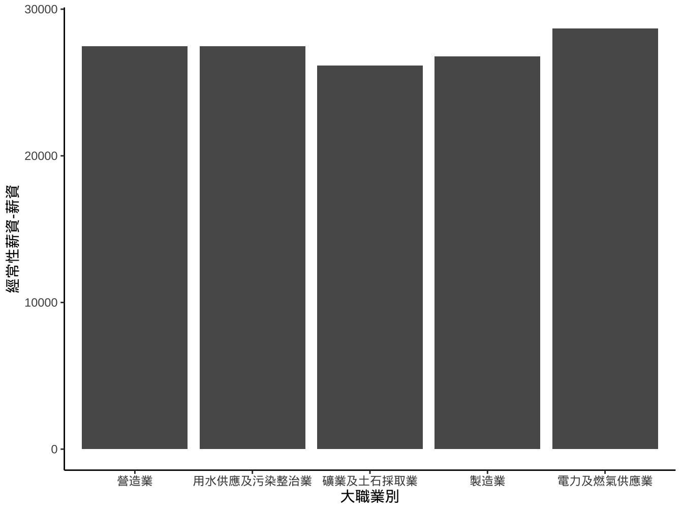
4.1.2.1 改變排序
作法1
- 作法1: 將大職業別改成facotr, 其levels以經常性薪資-薪資排序。
startingSalary_industrial_sub %>%
  mutate(
    大職業別ordered=reorder(大職業別,
                    `經常性薪資-薪資`,order=T) # order=T才會輸出成ordered factor
  ) -> startingSalary_industrial_sub

startingSalary_industrial_sub %>%
  ggplot()+
  geom_col(
    aes(x=大職業別ordered,y=`經常性薪資-薪資`)
  ) -> graphList$經常薪資_x有排序ed_col0

graphList$經常薪資_x有排序ed_col0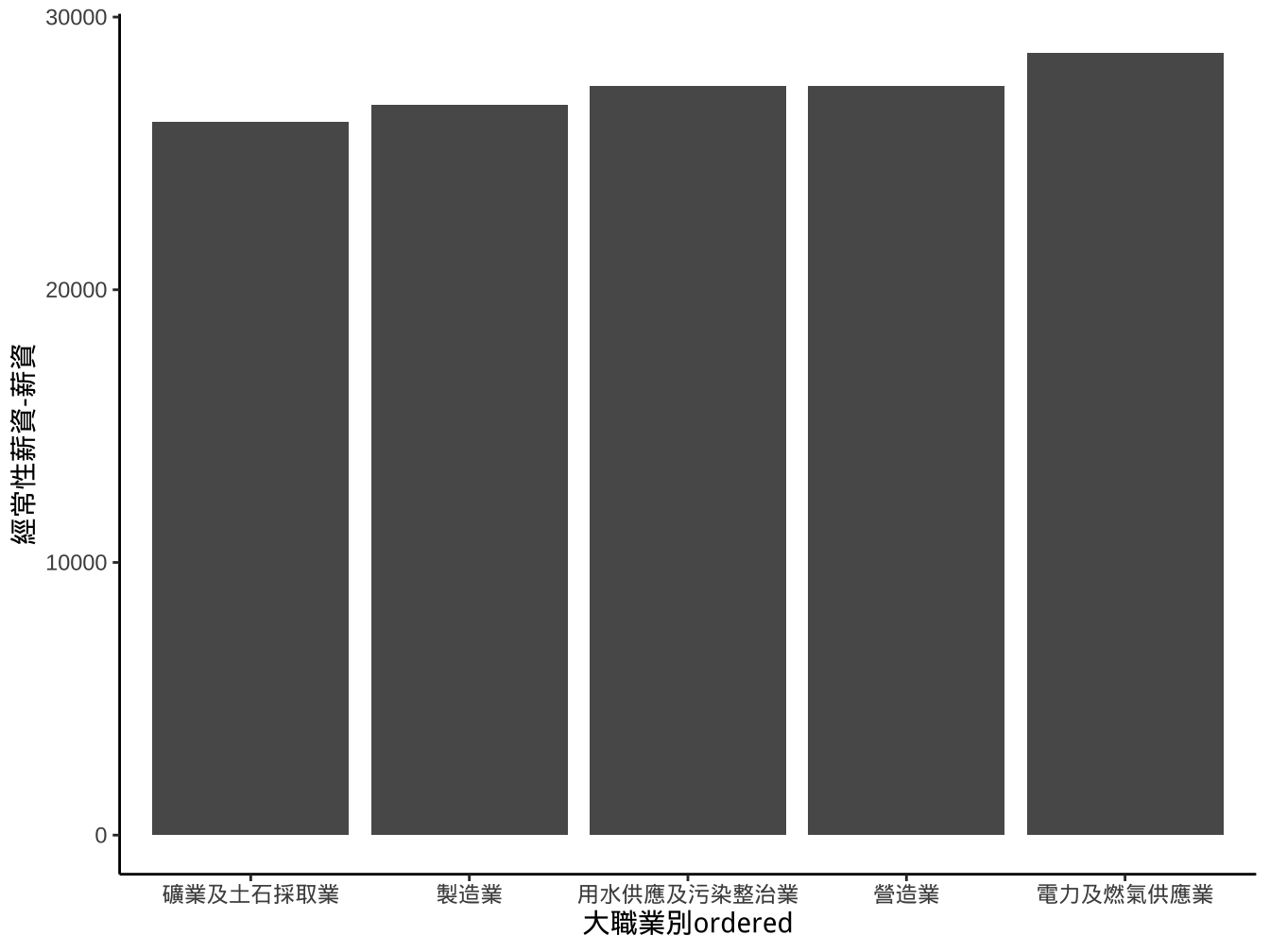
另一個更簡潔的寫法:
startingSalary_industrial_sub %>%
  ggplot()+
  geom_col(
    aes(x=reorder(大職業別,`經常性薪資-薪資`,order = T),y=`經常性薪資-薪資`)
  ) -> graphList$經常薪資_x有排序ed_col1

graphList$經常薪資_x有排序ed_col1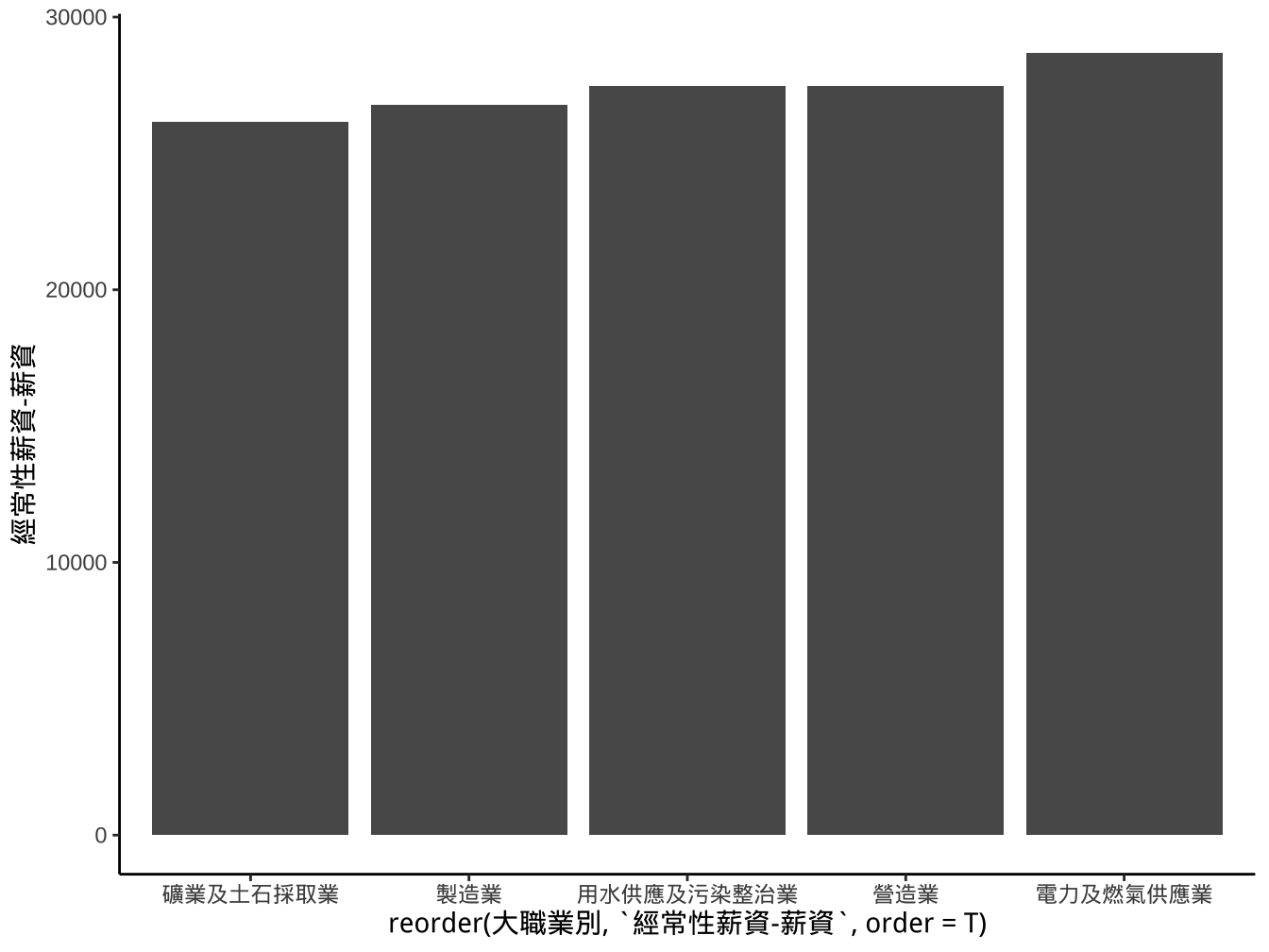
作法2
- 作法2: 使用
scale_x_...中的limits設定調整。
breaks_order <- levels(startingSalary_industrial_sub$大職業別ordered)
startingSalary_industrial_sub %>%
  ggplot()+
  geom_col(
    aes(x=大職業別,y=`經常性薪資-薪資`)
  )+
  scale_x_discrete(
    limits=breaks_order
  ) -> graphList$經常薪資_x有排序ed_scaleLimits_col0

graphList$經常薪資_x有排序ed_scaleLimits_col0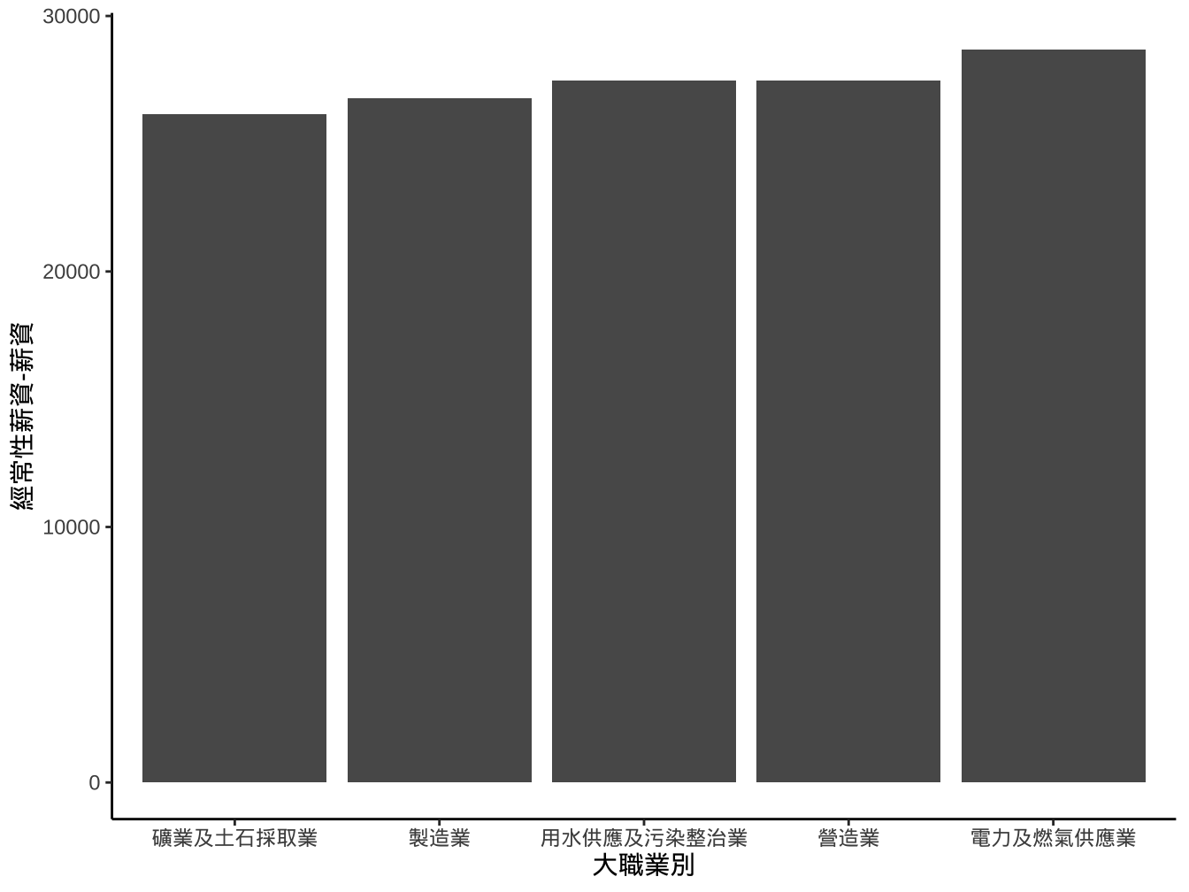
改變width
startingSalary_industrial_sub %>%
  ggplot(aes(x=大職業別ordered,y=`經常性薪資-薪資`))+
  geom_col(width=0.7)+
  scale_x_discrete(
    limits=breaks_order
  ) -> graphList$經常薪資_x有排序ed_scaleLimits_geomWidth_col0

graphList$經常薪資_x有排序ed_scaleLimits_geomWidth_col0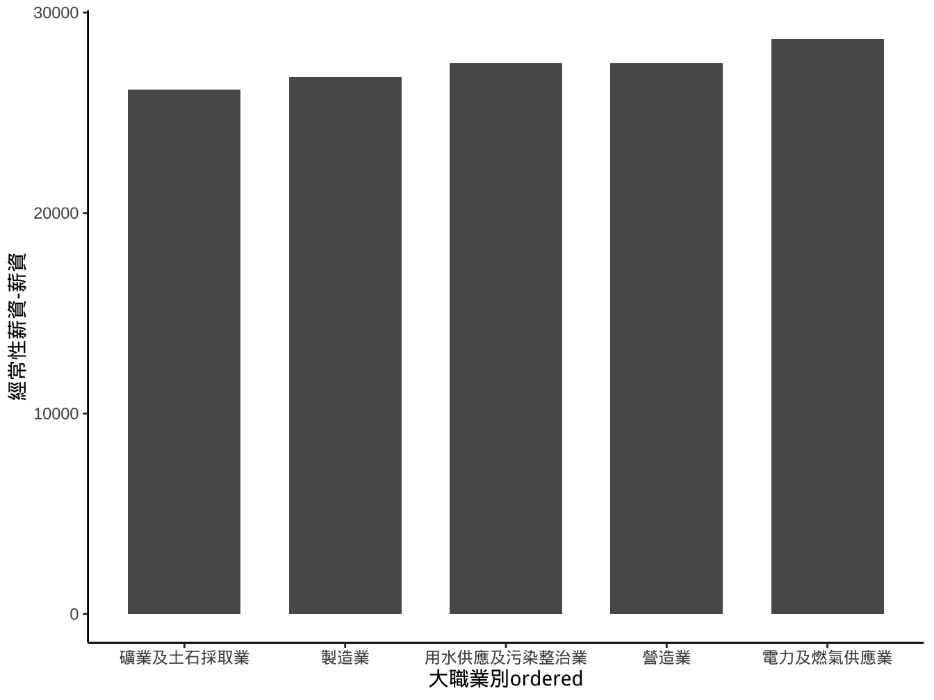
上面我們將aes(x=大職業別ordered,y=由經常性薪資-薪資)geom_col()移到ggplot(),這樣在後面進行layer疊加時,若使用相同aes可以省略不寫。
也可以先建立一個基本ggplot方便後面疊加
改變高寬比例aspect.ratio
graphList$經常薪資_x有排序ed_scaleLimits_geomWidth_col0+
  theme(aspect.ratio = 1/1.3) ->
  graphList$經常薪資_x有排序_scalLimits_gmWidth_asp0_col0

graphList$經常薪資_x有排序_scalLimits_gmWidth_asp0_col0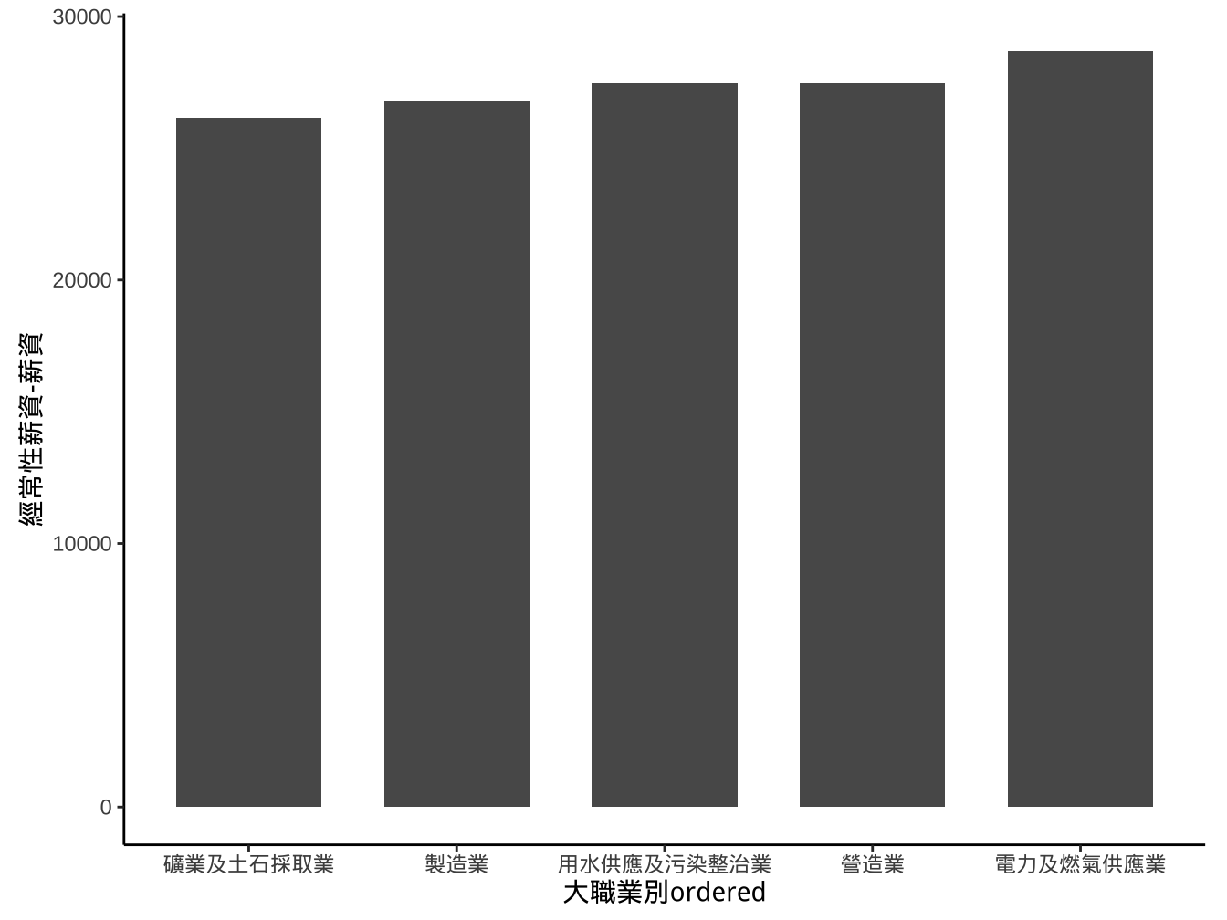
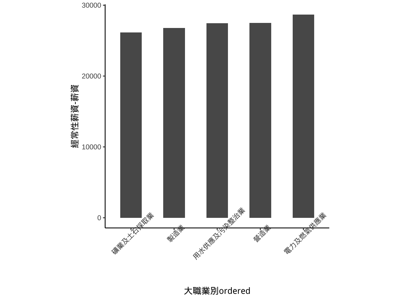
X軸字體重疊在一起可以透過theme() layer去調整axis.text.x值:
theme(axis.text.x= <參數值> )其中
<參數值>設定為一個list元素,其內容設定複雜,一般透過element_text()函數來生成。element_text(angle=... , hjust=... , vjust=...)
graphList$經常薪資_x有排序ed_ggplotOnly +
  geom_col(width=0.5) +
  scale_x_discrete(limits=breaks_order)+
  theme(aspect.ratio = 1)->
  graphList$經常薪資_x有排序_scalLimits_gmWidth_asp1_col0

graphList$經常薪資_x有排序_scalLimits_gmWidth_asp1_col0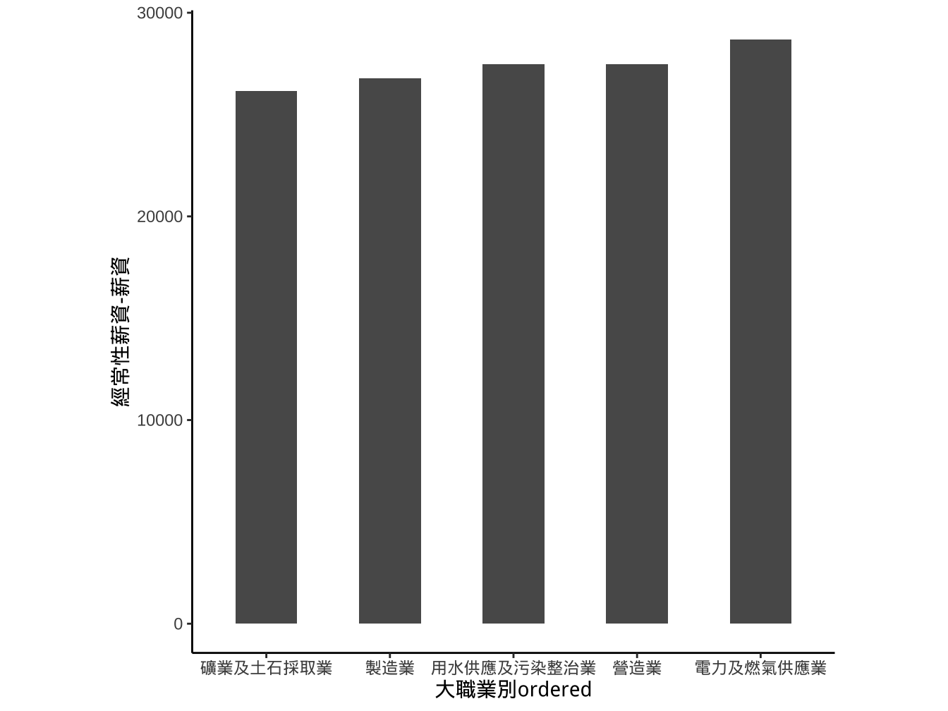
字轉45度
字轉45度,水平調整為1
graphList$經常薪資_x有排序_scalLimits_gmWidth_asp1_col0 +
  theme(
    axis.text.x=element_text(angle=45, hjust=1)
    ) -> graphList$經常薪資_x有排序_scalLimits_Width_asp_textAdj_col0

graphList$經常薪資_x有排序_scalLimits_Width_asp_textAdj_col0
座標旋轉coord_flip
graphList$經常薪資_x有排序_scalLimits_gmWidth_asp1_col0 +
  coord_flip() -> graphList$經常薪資_x有排序_sclLimits_width_asp_flip_col0

graphList$經常薪資_x有排序_sclLimits_width_asp_flip_col0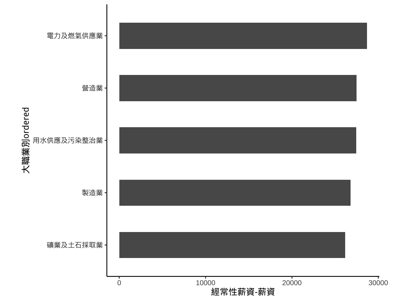
請試著產生如下圖形:
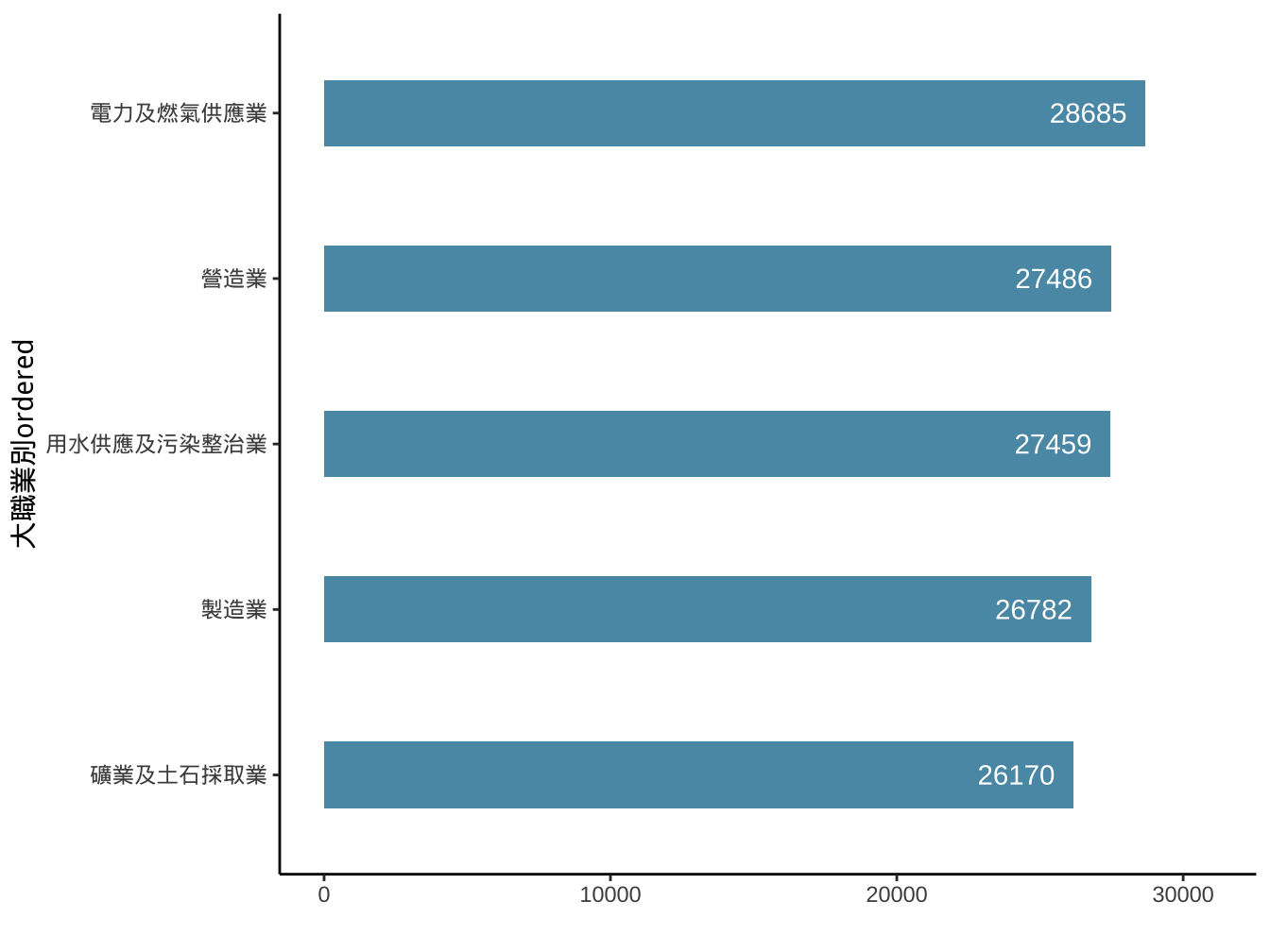
長條圖顏色: #5A99B3
文字使用
geom_text(aes(x=..,y=..,label=...))並更改color及nudge_y(可以有正負值,表示文字所放位置所對應y值要+或-多少)
4.1.3 geom_bar
aes y mapping是由geom_bar去呼叫stat_count函數計算count(數個數)。
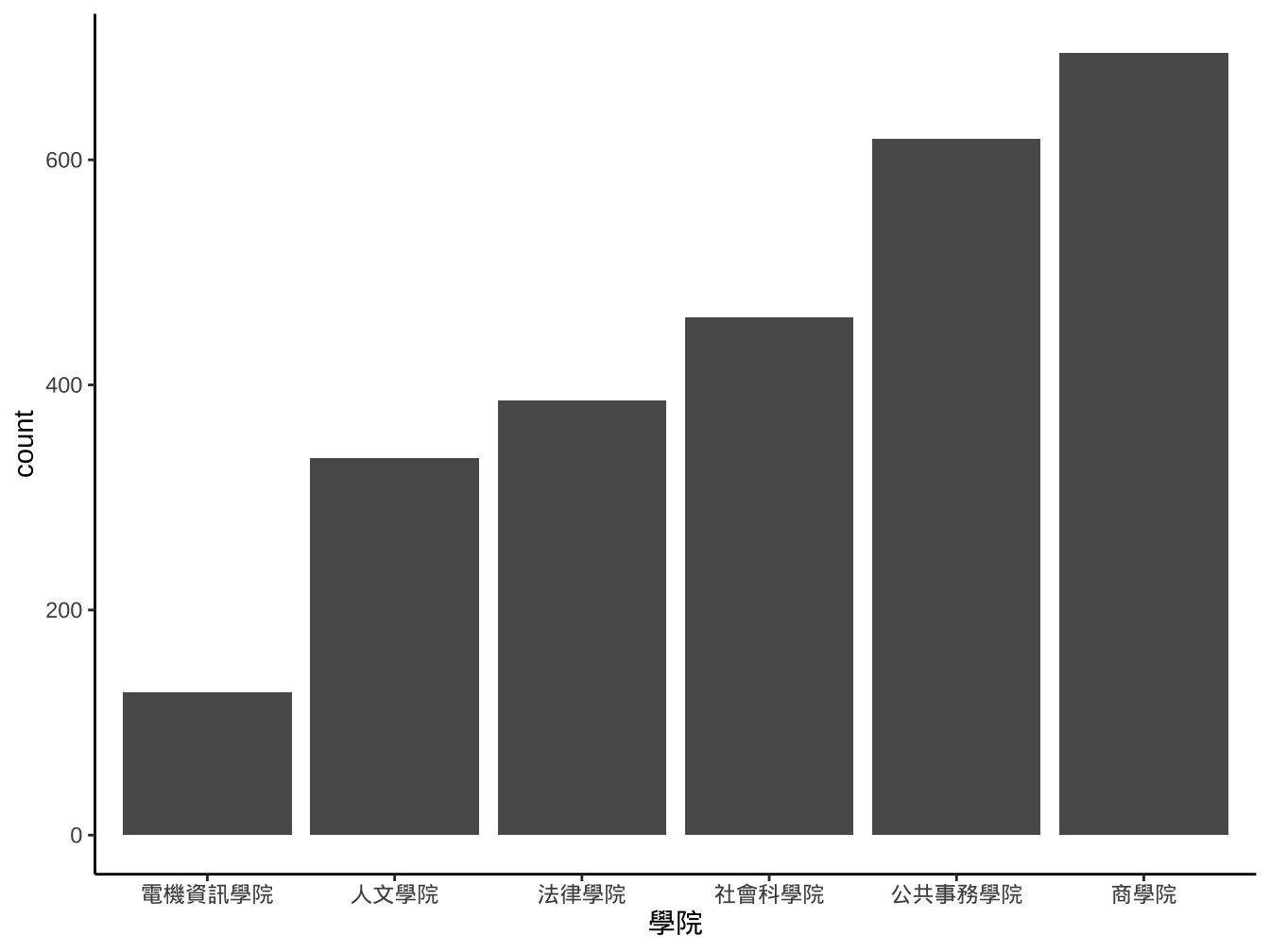
4.1.3.1 圖書借閱資料
library(readr)
library100_102 <- read_csv("https://www.dropbox.com/s/wuo5o6l55lk68l6/library100_102.csv?dl=1")library100_102 %>%
mutate(
借閱日期=date(ymd_hms(借閱時間)),
借閱年=year(借閱日期)
) -> library100_102
library100_102 %>%
filter(
借閱日期 %>% between(ymd("2014-09-01"),ymd("2015-06-30"))
) -> library2014
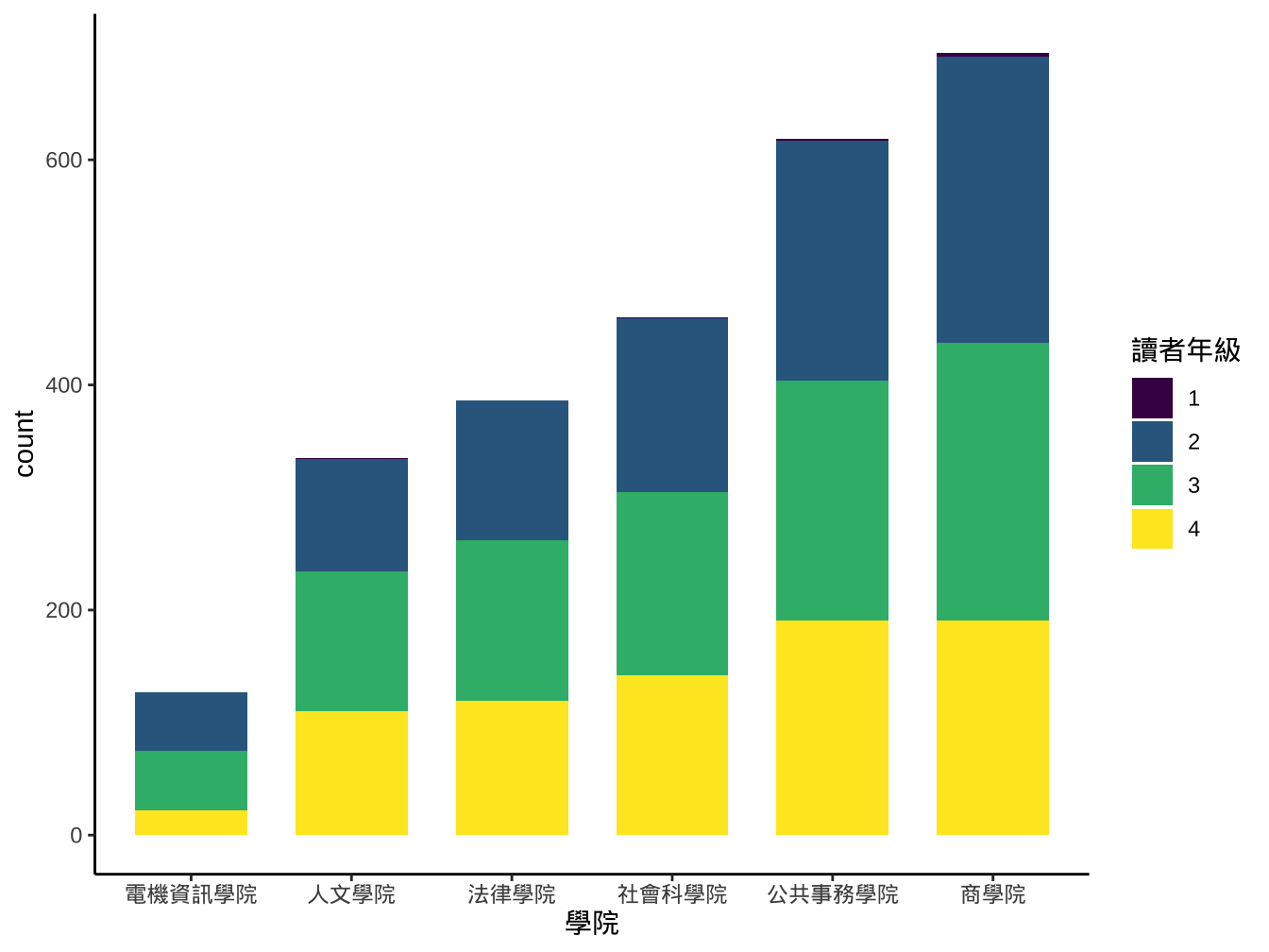
library2014 %>%
group_by(學號) %>%
summarise(
學院=last(學院),
讀者年級=max(讀者年級)
) %>%
ungroup() %>%
mutate(
讀者年級=as.factor(讀者年級)
)-> library2014 library2014 %>%
mutate(
學院=reorder(學院,學號,length,order=T)
) -> library2014
library2014 %>%
ggplot()-> graphList$圖書_ggplotOnly
graphList$圖書_ggplotOnly+
geom_bar(
aes(x=學院), fill="#5A99B3", width=0.7
)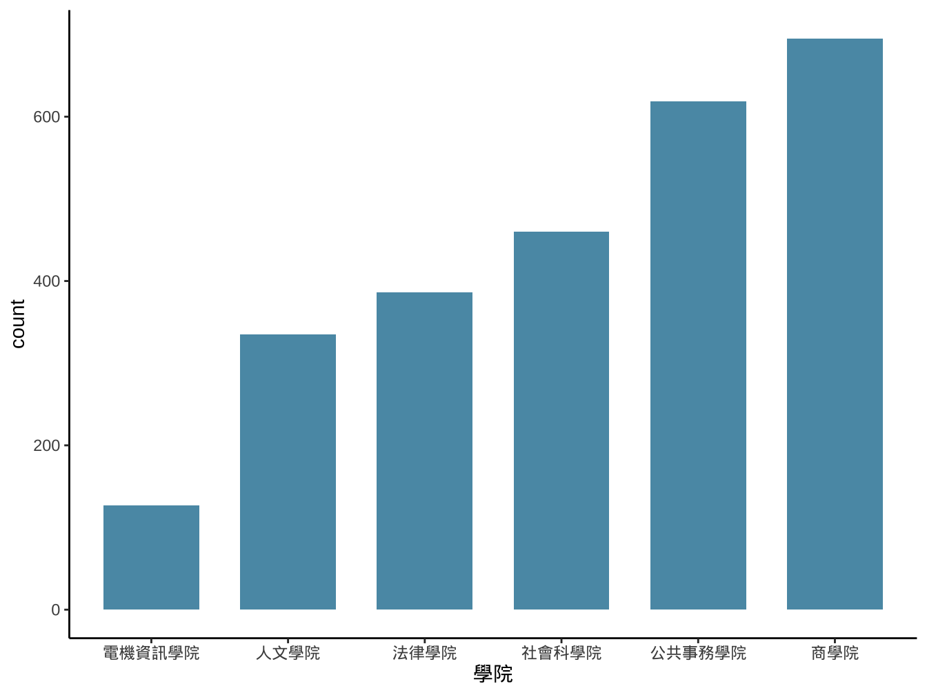
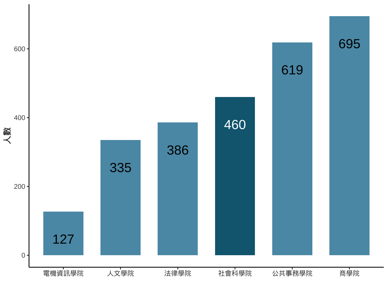
試著做出類似下圖:
4.1.4 連續變數
直方圖的另一個常見用法是將連續變數:
(一)先切成一段段不重疊的數值區間: 稱為binning,每個區間稱為bin。
(二)以每個bin為長條圖x軸的類別變數進行作圖
[1] 0.7385 -0.5148 -1.6402 0.9160 -1.2675 0.7382
[1] “[-2.26,-1.65]” “(-1.65,-1.04]” “(-1.04,-0.426]”
[4] “(-0.426,0.186]” “(0.186,0.799]” “(0.799,1.41]”
[7] “(1.41,2.02]” “(2.02,2.64]”
[1] (0.186,0.799] (-1.04,-0.426] (-1.65,-1.04] [4] (0.799,1.41] (-1.65,-1.04] (0.186,0.799] 8 Levels: [-2.26,-1.65] … (2.02,2.64]
ggplot2::cut_interval(x,n=8): 將連續資料x分成n個區間,並將x值各別對應該所屬區間(形成x_interval)
df_x <- data.frame(
  x=x,
  x_interval=x_interval
)

df_x %>%
  group_by(x_interval) %>%
  summarise(
    interval_count=n()
  ) %>%
  ungroup() %>% #View
  ggplot(aes(x=x_interval))+
  geom_col(
    aes(y=interval_count)
  )
4.1.5 geom_histogram

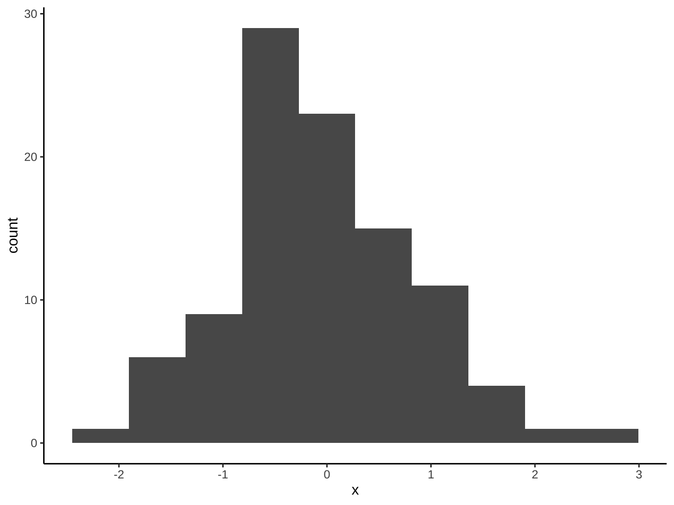
「geom_bar, geom_col」和geom_historgram最大的不同是長條間有沒有留空隙。連續型x變數應使用geom_histogram以正確保留其連續意涵。
4.1.6 optimal bins
原則上「樣本越大」、「資料越集中」則bin數目越多。有不少決定bins或binwidth的公式,大致上大同小異。這裡我們使用grDevices::nclass.FD(), 依Freedman-Diaconis法則選bins數。
[1] 10
4.2 stat function
以
stat_<計算方式>命名的函數。會自動計算某些aes mapping的geom, 其背後都有對應的
stat_函數在背後進行計算,如geom_bar,geom_histogram的aes(y=...)mapping內定是使用stat_count,stat_bin來計算。
4.2.1 stat_count與geom_bar
stat_count(): it counts the number of cases at each x position- aes x一定要有mapping設定。
- 這裡aes可以不寫,因為
graphList$圖書_ggplotOnly已有x=學院設定。geom內定會繼承ggplot這個top level的data及aes mapping設定。

4.2.2 stat_bin與geom_histogram
stat_bin(): 計算x mapping在各bin的出現次數。- aes x一定要有mapping設定。
- x只適合連續型變數。
- 內定30個bins。
- aes x一定要有mapping設定。

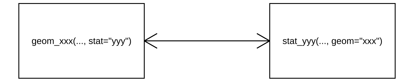
4.2.3 stat與geom
ggplot的幾個stat函數均有內定和某個geom相呼應,可互相替換使用:
stat_count vs. geom_bar
stat_bin vs. geom_histogram
但在stat函數你可以把計算值用在其他geom上(即ggplots reference由所指的override)。
4.2.3.1 怎麼讀stat用法
計算一定要有的aes mapping是什麼?
stat_count一定要x它可以產生的computed values是什麼?
stat_count的computed values: count(內定), propcomputate values要拿來當aes mapping變數時可以
stat(<computed value name>)方式指定。
4.2.4 override geom
graphList$圖書_ggplotOnly +
  geom_bar(
    aes(x=學院)
  )+
  stat_count(
    aes(x=學院,y=stat(count),label=stat(count)), geom="text"
  )
改成比例使用prop這個computed value.
graphList$圖書_ggplotOnly +
  geom_bar(
    aes(x=學院,y=stat(prop))
  )+
  stat_count(
    aes(x=學院,y=stat(prop),label=stat(prop)), geom="text"
  )
stat_count的prop定義為groupwise proportion:
內定group=x,此時會去算不同x值在不同x群的比例,最後只有1或0(0圖面看不出來)
要算在全體資料下的prop可以設定group=某固定值(值的type不重要,重點是固定)。
graphList$圖書_ggplotOnly +
  geom_bar(
    aes(x=學院, y=stat(prop), group="全校")
  )+
  stat_count(
    aes(
      x=學院,
      y=stat(prop), group="全校",
      label=round(stat(prop),digits=2)),
    geom="text",
    color="white", nudge_y=-0.5
  )+
  labs(
    title="各院借閱人次佔總人次比",x="",y=""
  )
4.2.5 override stat
前面的圖在stat_count下無法進行nudge_y設定,而只有geom_text才可以。我們可以改使用geom_text,但override它的stat。
graphList$圖書_ggplotOnly +
  geom_bar(
    aes(x=學院, y=stat(prop), group="全校")
  )+
  geom_text(
    aes(
      x=學院,
      y=stat(prop), group="全校",
      label=round(stat(prop),digits=2)),
    stat="count",
    color="white",nudge_y=-0.03
  )+
  labs(
    title="各院借閱人次佔總人次比",x="",y=""
  )
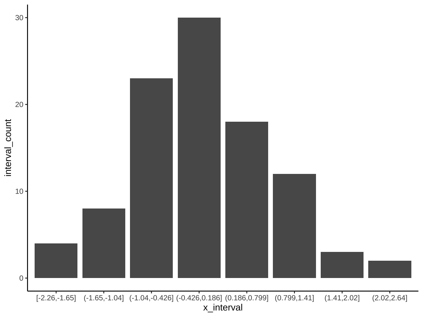
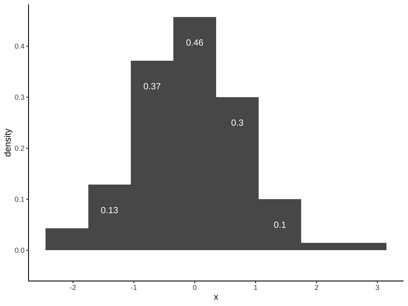
請以df_x完成下圖(bins=8):

請以df_x完成下圖(bins=8):
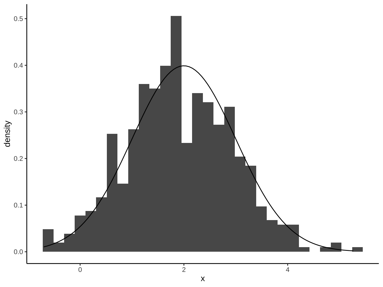
4.3 自創stat函數
This stat makes it easy to superimpose a function on top of an existing plot. The function is called with a grid of evenly spaced values along the x axis, and the results are drawn (by default) with a line.
stat_function(mapping = NULL, data = NULL, geom = "path",
  position = "identity", ..., fun, xlim = NULL, n = 101,
  args = list(), na.rm = FALSE, show.legend = NA,
inherit.aes = TRUE)說明:https://ggplot2.tidyverse.org/reference/stat_function.html
fun:
Function to use. Either 1) an anonymous function in the base or rlang formula syntax (see rlang::as_function()) or 2) a quoted or character name referencing a function; see examples. Must be vectorised.n: Number of points to interpolate along
args:
List of additional arguments to pass to fun
df_x <- data.frame(
  x=rnorm(500,mean=2,sd=1)
)
df_x %>%
  ggplot(aes(x=x))+
  geom_histogram(
    aes(y=stat(density))
  )+
  stat_function(
    fun=dnorm, args = list(mean=2, sd=1) # dnorm 為常態分配density函數
  )
4.4 直方圖的position
geom_bar(position="XXX")其中XXX有以下選擇:
- dodge:躲避
- fill:填滿(標準化成同高度,呈現比重變化用)
- stack:疊上
4.4.1 stack:堆疊
強調各大類總額差別
及各大類總額的次類組成份子大小


4.4.2 dodge:平行排列
比較各大項內的小項差異
也比較各小項在各大項內的差異


4.4.3 fill:百分比成份拆解
- 強調組成份子比例的變化。

disposableIncome <- read_csv("https://www.dropbox.com/s/z80sbjw94cjex8x/disposableIncome.csv?dl=1",
locale = locale(encoding = "BIG5"), skip = 4)

disposableIncome %>%
slice(c(25:43)) ->disposableIncome

colnames(disposableIncome) <-c("西元年份","平均每戶可支配所得","最低所得組平均","次低所得組平均","中間所得組平均","次高所得組平均","最高所得組平均")

disposableIncome %>%
mutate(
最低所得對平均所得 = 最低所得組平均/平均每戶可支配所得,
次低所得對平均所得 = 次低所得組平均/平均每戶可支配所得,
中間所得對平均所得 = 中間所得組平均/平均每戶可支配所得,
次高所得對平均所得 = 次高所得組平均/平均每戶可支配所得,
最高所得對平均所得 = 最高所得組平均/平均每戶可支配所得,
) ->disposableIncome

names(disposableIncome)
[1] “西元年份” “平均每戶可支配所得”
[3] “最低所得組平均” “次低所得組平均”
[5] “中間所得組平均” “次高所得組平均”
[7] “最高所得組平均” “最低所得對平均所得”
[9] “次低所得對平均所得” “中間所得對平均所得”
[11] “次高所得對平均所得” “最高所得對平均所得”
disposableIncome %>%
gather(
contains("對平均所得"),key = "對平均所得",value = "比例",

) -> disposableIncomeGather

names(disposableIncomeGather)
[1] “西元年份” “平均每戶可支配所得”
[3] “最低所得組平均” “次低所得組平均”
[5] “中間所得組平均” “次高所得組平均”
[7] “最高所得組平均” “對平均所得”
[9] “比例”