4.1 Generation of Population
Our toy world bases on population census data from the German Federal Statistical Office [2] (https://www.destatis.de/EN/Home/_node.html). This data entails continous population counts on a 100m * 100m grid. For our project we reduce the population count to a third to mimic the process of receiving data from an MNO provider - therefore we assume that the population count resembles the number of mobile phones in this area. For computational reasons, this version will only focus on a subset of the tiles located in the state of Bavaria, which is situated in the south-east of Germany. We chose this area because it comprises a high diversity of urban, suburban, and rural areas.
Terminology used in this project: Due to various definitions out there, it is imperial to define the different terminologies used in this project before going further to reduce unnecessary confusion. - When we talk about tiles, we mean any square on the regular 100 * 100 m2 grid. - An antenna is a device facilitating between radio transmission and reception. Specifically in our case, an antenna transmits and receives cell phone signals. This is also known as a cell. - A (radio) tower or commonly referred to as a cell tower, cellular site, or cellular base station is a tower equipped with antennas.
# change accordingly
knitr::opts_knit$set(root.dir = normalizePath("/Users/tonyhung/OneDrive - Vysoká škola ekonomická v Praze/YAY"))
knitr::opts_chunk$set(fig.width = 9)
knitr::opts_knit$set(eval.after = "fig.cap")library(tidyverse)
library(sf)
library(raster)
library(Matrix)
library(knitr)
library(kableExtra)
library(ggthemes)
library(cowplot)
library(transformr)
library(gganimate)
set.seed(762)
census.de.100m.tile <- readRDS("working objects/census.tile.final.rds") Throughout this project, we are going to analyze the area of South Bavaria. Consequently in Figure 1, the interested area in highlighted with a red rectangle. More specifically, this zone is identified by a longitude between 4400000 and 4500000 and a latitude between 2700000 and 2900000. Moreover, the coordinates are transformed and converted so that it is possible to use the same convention through the entire research.
# Bounding box of focus area
bb.focus.dat <- data.frame(xmin = 4400000, xmax = 4500000,
                           ymin = 2700000, ymax = 2900000)
bb.focus.vec <- c(xmin = 4400000, xmax = 4500000,
                  ymin = 2700000, ymax = 2900000)
# Download data from : https://gadm.org/download_country_v3.html --> R(sf) level 1
germany.raw <- readRDS("working objects/gadm36_DEU_1_sf.rds")
germany <- germany.raw %>%
  st_transform(crs = 3035)
focus.area.plot <- germany %>%
  ggplot() +
  geom_sf() +
  geom_rect(data = bb.focus.dat, aes(ymin = ymin, ymax = ymax,
                                      xmin = xmin, xmax = xmax,
                                     color = "red"),
            size = 1, fill = "transparent") +
  ggtitle("") +
  scale_color_identity(name = "",
                       labels = c("Focus area"),
                       guide = "legend") +
  labs(x = NULL, y = NULL,
       title = "")

plot_grid(focus.area.plot,
          labels = "Fig.1: Focusing on a part of South Bavaria",
          hjust = -0.1, label_size = 13)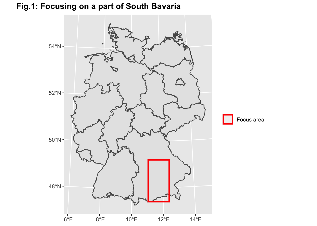
(#fig:focus area)We will only focus on a subset of the tiles located in the state of Bavaria because it comprises both urban, suburban, and rural areas
As mentioned above, this area is very heterogeneous in urban-rural intensity. Knowing the location of urban centers is very important for the corresponding radio cell network as there are differences in cell coverage between these different area kinds. We are aiming at developing a 3-category classification for each tile: Rural, Suburban and Urban. Based on the census data on the tile level we cannot locate urban centers just yet. Classifying tiles on such a low spatial resolution into one of these categories independent from each other (i.e. based on their population numbers) would not lead to the true location of urban centers; in fact, we need to take spatial dependence into consideration in order to identify urban centers. Therefore we apply a spatial clustering algorithm to account for the spatial dependence. We aimed at having 4 different categories: Uninhabited, Rural, Suburban and Urban. In order to run the clustering algorithm, the original census population is first divided into tiles above and below 15 people per tile. Tiles below 15 are either classified as Uninhabited or Rural, from the start (uninhabited corresponds to the tiles with 0 population). The clustering is then done on the tiles that are above 15 people per tile. Based on the results of the clustering, we define urban areas as clusters that have an agglomeration of more than 100 tiles. Suburban areas are defined as clusters that have more than 50 and less than or equal to 100 tiles. The remaining clusters are considered as Rural areas and therefore result in the same classification as the tiles from above, which had less than 15 people. We started with the definition of the data necessary for the Empirical Complementary Cumulative Distribution Function (ECCDF). This function is going to be further explained in Figure 3.
The plots below present our classification results:
# Since there is a large percentage of zeros in the tiles, we added 1 to every tile to receive valid values for the log transformation
# ECCDF of population distribution
census.de.100m.tile <- readRDS("working objects/census.tile.final.rds")
ECCDF.pop.data <- census.de.100m.tile %>%
  # sample_n(1000) %>%
  mutate(pop.plot = pop + 1) %>%
  arrange(pop.plot) %>%
  mutate(prob = 1 / n()) %>%
  mutate(cum.prob = cumsum(prob)) %>%
  mutate(log10.cum.prob.comp = log10(1 - cum.prob)) %>%
  mutate(log10.pop = log10(pop.plot)) %>%
  mutate(cum.prob.comp = 1 - cum.prob) %>%
  mutate(pop.area.kind = case_when(pop == 0 ~ "Uninhabitated",
                                   TRUE ~ pop.area.kind))
## Warning: Problem with `mutate()` input `log10.cum.prob.comp`.
## ℹ NaNs produced
## ℹ Input `log10.cum.prob.comp` is `log10(1 - cum.prob)`.## Warning in mask$eval_all_mutate(dots[[i]]): NaNs producedprop.class <- data.frame(
class = c("Rural","Suburban", "Uninhabitated","Urban"),
n = summary(as.factor(ECCDF.pop.data$pop.area.kind)),
prop = round(summary(as.factor(ECCDF.pop.data$pop.area.kind)) / length(census.de.100m.tile$internal.id), digits = 4) * 100) %>%
mutate(class = factor(class)) %>%
arrange(desc(class)) %>%
mutate(lab.ypos = cumsum(prop) - 0.5 * prop)
tile.prop.plot <- prop.class %>%
ggplot(aes(x = "", y = prop, fill = class)) +
geom_bar(width = 1, stat = "identity", color = "white") +
scale_fill_ptol(breaks = c("Uninhabitated", "Rural", "Suburban", "Urban")) +
geom_text(aes(y = lab.ypos, label = paste0(prop, "%")), color = "black") +
labs(x = "Class", y = "Number of tiles", title = "",
subtitle = "Fig. 2b: Tile proportion") +
theme(plot.title = element_text(size = 10, face = "bold", hjust = 0.5),
plot.subtitle = element_text(size = 9, hjust = 0.5))
cluster.plot <- census.de.100m.tile %>%
filter(pop.area.kind %in% c("Suburban", "Urban")) %>%
ggplot() +
geom_sf(aes(col = factor(pop.area.kind)), show.legend = F) +
ggtitle("", subtitle = "Clustering Results") +
theme(plot.margin = unit(c(0, 0, 0, 0), "mm")) +
scale_color_manual(breaks = c("Suburban", "Urban"), values = c("#117733", "#CC6677")) +
labs(subtitle = "Fig. 2a: Clustering results") +
theme(plot.title = element_text(size = 10, face = "bold", hjust = 0.5),
plot.subtitle = element_text(size = 9, hjust = 0.5))
plot_grid(cluster.plot, tile.prop.plot, labels = "Fig.2 : Population Classification",
hjust = -0.1, label_size = 14, rel_widths = c(0.8, 1)) 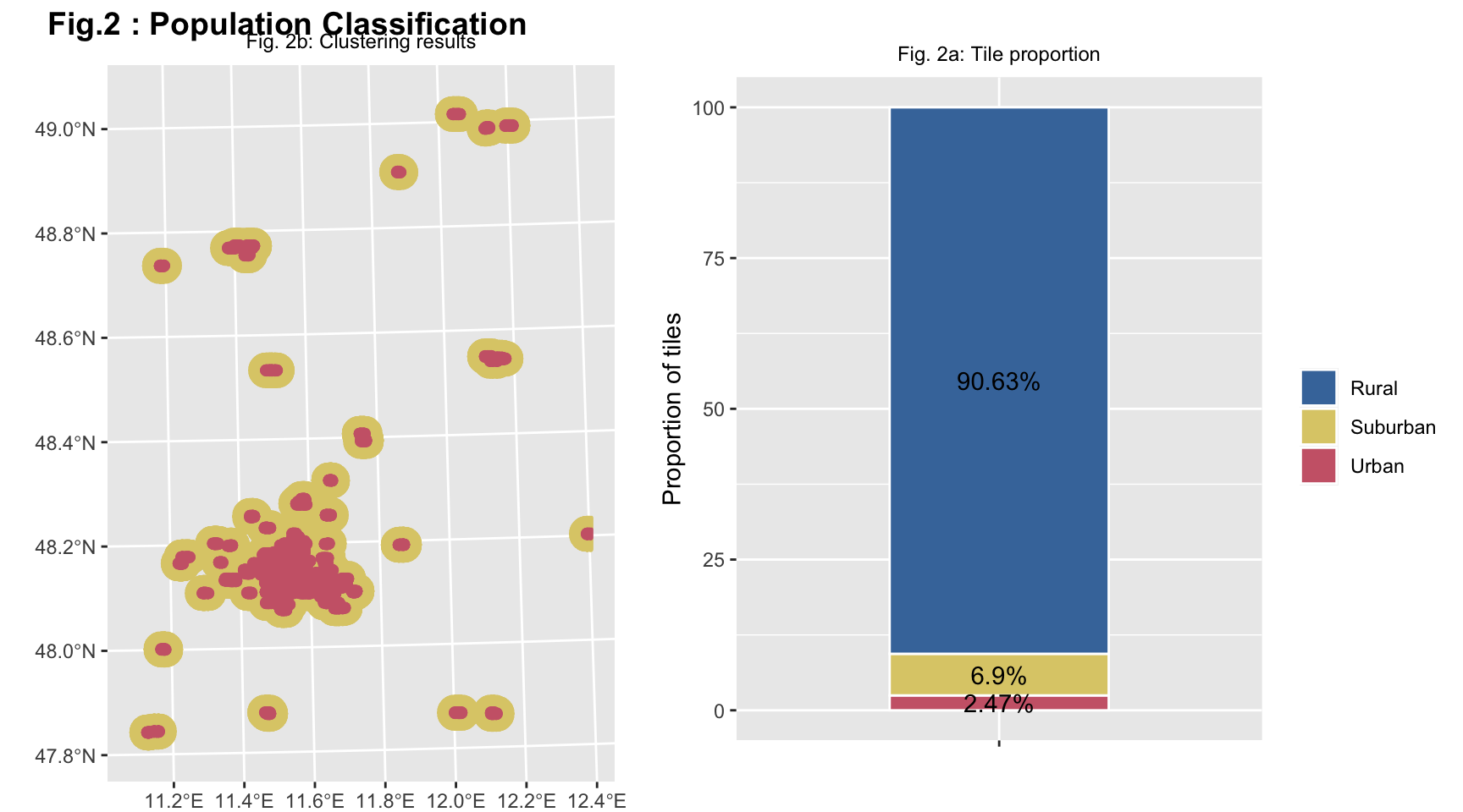
(#fig:pop distribution 1)Figure 2a shows the classification results from the clustering algorithm and the proportion of people in the area categories.While Figure 2b shows the distribution of the four different categories of tiles obtained throught spatial clustering.
In Figure 2a, only the Suburban and Urban categories of tiles are represented and the transition from one category to another is highlighted thanks to the different colors used. It is possible to notice that there is an agglomeration of Urban tiles in correspondence to the important cities of South Bavaria, such as Munich. The Suburban tiles surround perfectly the Urban ones.
The Figure 2b is a the stacked bar plot, that shows the proportions of the tiles according to the four categories. Based on our clustering algorithm, 1.49% of the tiles are urban areas. 71.35% of the tiles are uninhabited areas. 2.29% of the tiles are suburban areas, and 24.87% of the tiles are rural areas. As we can see, the largest percentage of tiles is inhabited.
pop.dist.map.plot <- ECCDF.pop.data %>%
  # sample_n(1000) %>%
  ggplot() +
  geom_sf(aes(color = pop.area.kind), show.legend = F) +
  scale_color_ptol(breaks = c("Uninhabitated", "Rural", "Suburban", "Urban")) +
  ggtitle("", subtitle = " Fig. 3a : Geographic distribution") +
  theme(plot.margin = unit(c(0, 0, 0, 0), "mm"), axis.text.x=element_text(angle=90, hjust=1))

ECCDF.pop.plot <- ECCDF.pop.data %>%
  ggplot() +
  geom_point(aes(x = log10.pop, y = log10.cum.prob.comp,
                 color = pop.area.kind)) +
  geom_hline(yintercept = -0.3010300, linetype = "dotted") +
  geom_hline(yintercept = -1, linetype = "dotted") +
  geom_text(x = 1.5, y = -0.2, label = "50% of the data") +
  geom_text(x = 1.5, y = -0.9, label = "90% of the data") +
  scale_color_ptol(breaks = c("Uninhabitated", "Rural", "Suburban", "Urban")) +
  ggtitle("", subtitle = "Fig. 3b: Empirical cumulative complementary\ndistribution function") +
  labs(y = "log10(Prob(Y > x))", x = "log10(Mobile phones)",
        colour = "") +
  ylim(-7, 0) +
  theme(legend.position = "bottom")

ECDF.pop.plot <- ECCDF.pop.data %>%
  ggplot() +
  geom_point(aes(x = pop.plot, y = cum.prob.comp, color = pop.area.kind)) +
  scale_color_ptol(breaks = c("Uninhabitated", "Rural", "Suburban", "Urban"), guide = FALSE, expand = c(0, 0)) +
  xlim(0, 30) +
  labs(y = "", x = "") +
  theme(plot.title = element_text(size = 10, face = "bold", hjust = 0.5),
        plot.subtitle = element_text(size = 9, hjust = 0.5),
        axis.title.x = element_blank(),
        axis.title.y = element_blank())

pop.dist.ecdf.insert <- ECCDF.pop.plot +
  annotation_custom(ggplotGrob(ECDF.pop.plot),
                    xmin = 0, xmax = 1.5,
                    ymin = -7, ymax = -3)
## Warning: Removed 8923 rows containing missing values (geom_point).plot_grid(pop.dist.map.plot, pop.dist.ecdf.insert, labels = "Fig. 3: Mobile phone density per tile",
hjust = -0.1, label_size = 14, rel_widths = c(0.8, 1))## Warning: Removed 1 rows containing missing values (geom_point).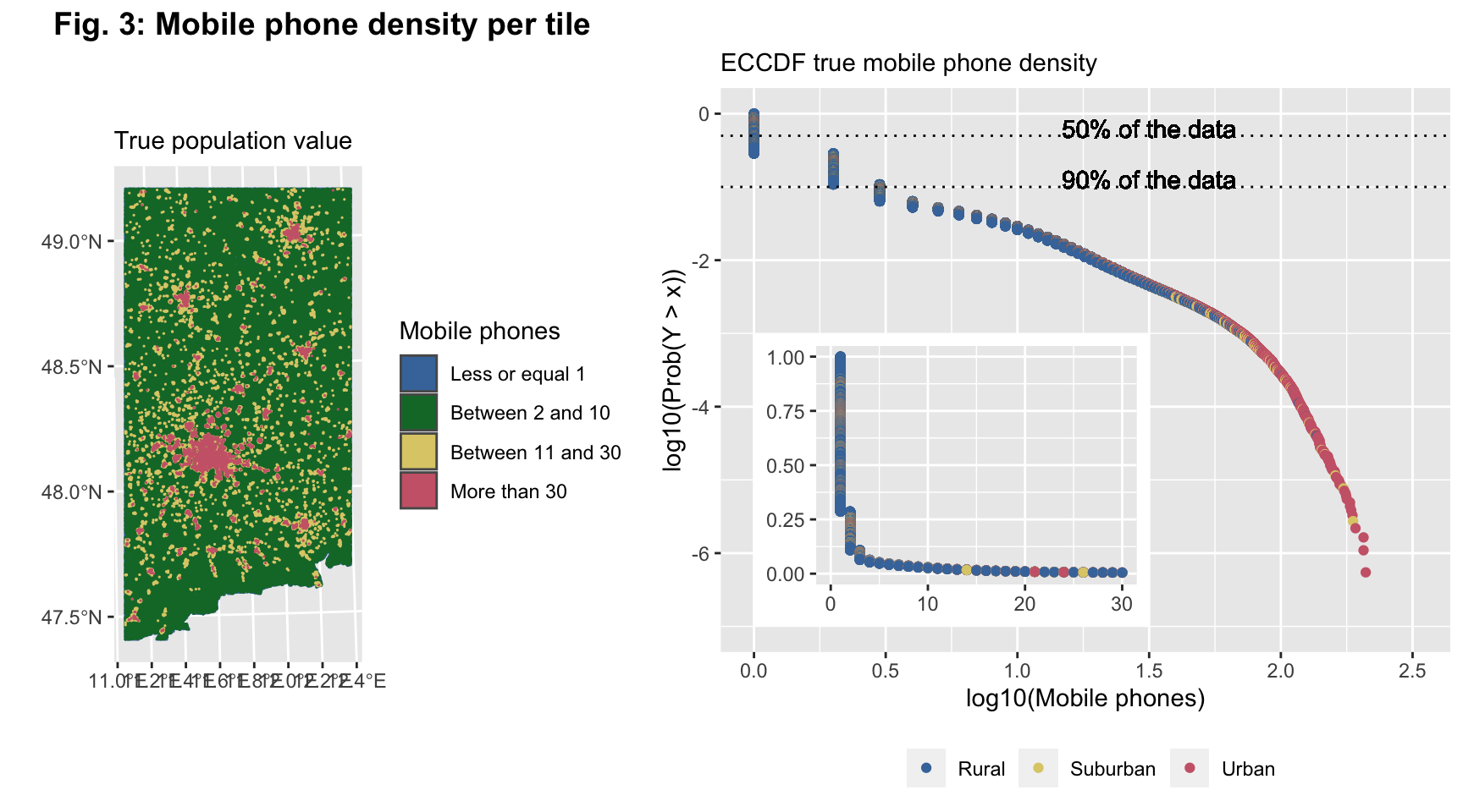
(#fig:pop distribution 2)The Figure 3a shows the geographical distribution of the tiles classified thought the clustering algorithm of the population. In Figure 3b there is rapresented the logarithm of ECCDF of the population data and the graph inside the figure 3b is the linear ECCDF.
Figure 3 shows the mobile phone density per tile in the focus area. In particular, we have 4 different colors representing the clusters: Uninhabited, Rural, Suburban and Urban. Figure 3a confirms what we have written previously, in fact, the majority of the figure is yellow, which represents the Inhabitant tiles. It is possible to see the Urban tiles, which are red. But it is not possible to clearly distinguish Suburban and Rural tiles. Anyway, in Figure 2a, we have seen the detail of Urban and Suburban tiles. The Rural tiles are more distributed.
However, as we have already said, to have a deeper look of the mobile phone density per tile, we choose to represent the data with an empirical cumulative complementary distribution function (ECCDF) (using a log base 10 transformation).
The ECCDF is a step function with jumps i/n at observation values, where i is the number of tied observations at that value. Moreover, missing values are ignored and the objective “complementary” means that we need to subtract 1 - the cumulative probability. It is commonly used with variables that have a highly skewed distribution. We can see that this is the case - the population on this low spatial resolution is heavily right skewed.
As Figure 3b suggests with the presentation of the ECCDF, 50% of the data are represented by uninhabited tiles with no phones; furthermore, 90% of the tiles contain less than half of the mobile phones in our focus area. One can also see the tiles’ classification based on the clustering results. Some tiles classified as Rural have higher values for their mobile phone population - this is because they are not considered as an Urban or Suburban cluster, as mentioned above. 10% left are tiles both Urban and Rural containing 0.5 and above mobile phones.