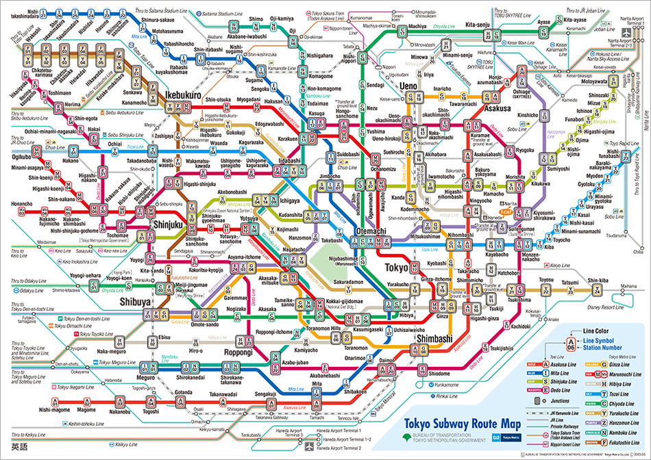
Introduction to Cartography
Cartography is the study and practice of creating charts and maps based on geographical layout.
It combines science and art to represent reality (or an imagined reality) so that spatial information can be communicated effectively.
Cartography is most often associated with the paper map, but it may also refer to the creation of globes, and increasingly it refers to the use of digital computers to display of geographic information.
History
Before jumping into the art of map making, let’s explore the history of cartography through some notable maps.
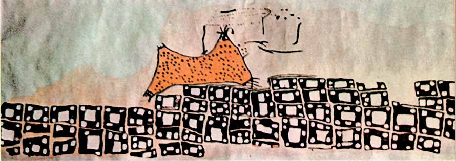
Çatalhöyük Map
The oldest existing map was created around 6200 BC in Turkey. It may depict a volcanic eruption 8,900 years ago.
Babylonian Map of the World
The Babylonian Map of the World or Imago Mundi is a Babylonian clay tablet containing a labelled illustration of the known world dated to roughly the 6th century BC.

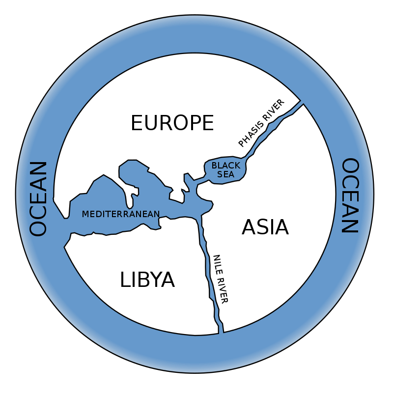
Anaximander map
This map was one of the first maps of the world which was circular in form and showed the known lands grouped around the Aegean Sea at the center, surrounded by the ocean.
Ptolemy map
Ptolemy’s world map represents how the world was known to the Hellenistic society in the 2nd century. Ptolemy’s book Geographica was written around the year 150 AD and contains the first reference to the latitude and longitude system which had a significant impact on the work of later cartographers.

Tabula Rogeriana
Tabula Rogeriana is a world map created by the Arab geographer Muhammad al-Idrisi in 1154. The map was later used by Christopher Columbus and Vasco Da Gama for their voyages in America and India.

Mappa mundi
Mappa mundi is the largest and most elaborately drawn and coloured medieval map. It is displayed at Hereford Cathedral in England.

Cantino planisphere
Made by an anonymous cartographer, this map depicts the world as it became known to the Europeans after the great exploration voyages at the end of the 15th and beginning of the 16th century.

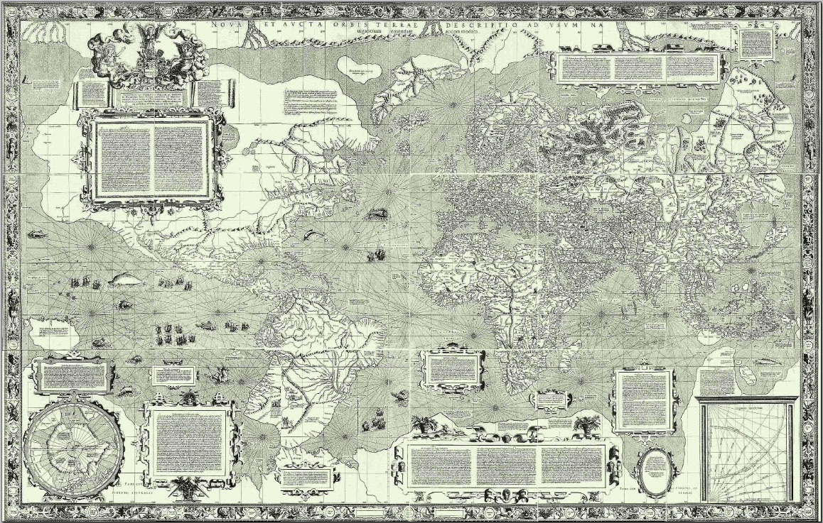
Mercator map
The Mercator map was created by Flemish geographer and cartographer Gerardus Mercator in 1569. This was the first attempt to project Earth on a flat surface.
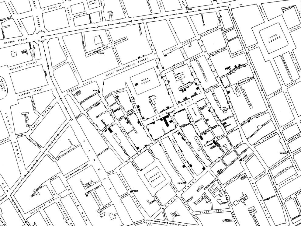
John Snow’s map
In 1854 Doctor John Snow mapped the cases of the deadly cholera epidemic in London’s Broad Street region and was able to trace the cholera outbreak to a single infected water pump. Snow’s research was the first example of combining public health research and geography.
Hurricane map
Thanks to the advance of computer technology since the 1970s, maps nowadays are predominantly made with computer software. The map below was made using one of the ArcGIS products. It shows all the hurricane tracks since 1851, symbolised as fireflies, utilising lightsaber colours. (Find out more about how this map was made here.)
Interactive story maps
The use of interactive maps to tell stories is increasingly common, especially in journalism. The interactive story map below was made by The New York Times and it tells the story of how the SARS-CoV-2 virus got out of Wuhan, China.
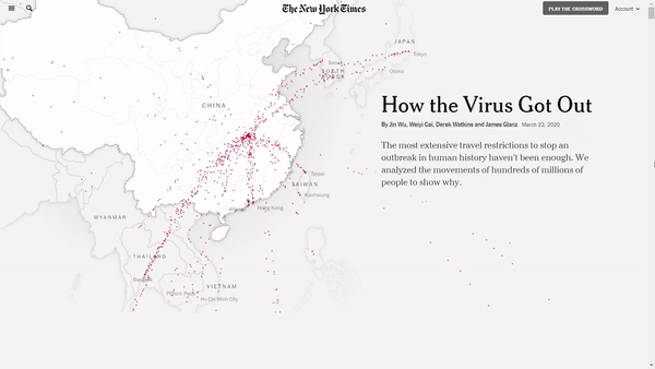
Click on the image to see the map
Real-time maps
Earth Wind Map
The Earth Wind Map was developed by Cameron Beccario in 2013. It combines computer science and cartography to visualise real-time data.
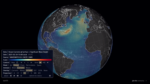
Click on the image to see the map
Surfers Against Sewage
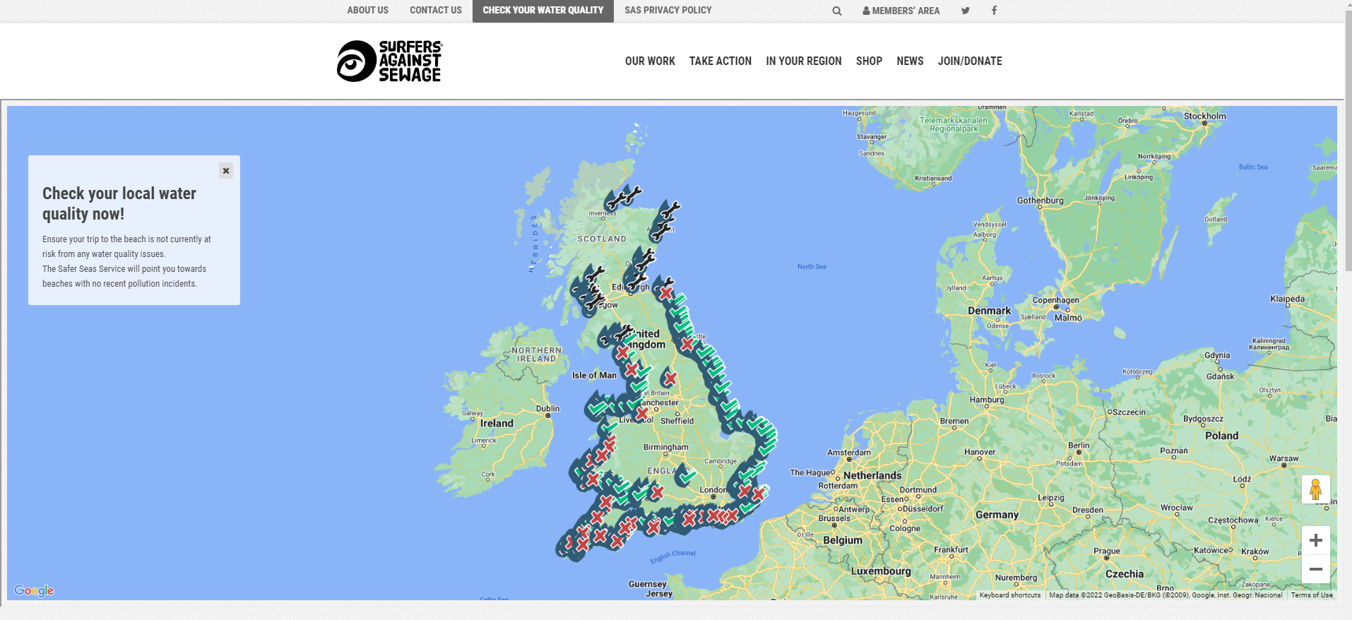
Click on the image to see the map
The Rivers Trust
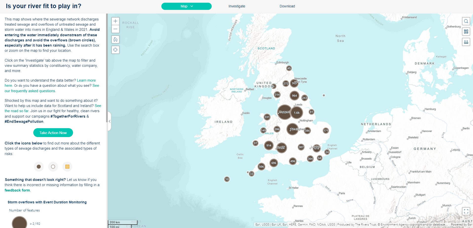
Click on the image to see the map
Map making process
Let’s now think about the process of making maps and some of the things that should be considered.
Purpose of the map: Why am I making this map? What is the story that I want to tell?
Audience: Who is it for? Novices? Experts? Why are they interested?
Map type: What do I want to show with the map? What kind of data am I using?
Map design: Is my map easy to read and interpret? Am I using visual variables and hierarchy in a right way? Is my map the right scale?
Also, keep in mind that maps act as a communication tool so it is very important to remain truthful and impartial during the map making process.
Terminology:
Map: A map is a graphic summary of the world around us. A map is scaled down, simplified and the objects are presented as symbols.
Mapping: Mapping refers to all of the processes of producing a map: collecting data, designing and preparing for distribution in hardcopy or for the Internet.
Cartography: Cartography is a broader discipline than mapping as it also includes the study of the philosophical and theoretical bases of the rules for mapmaking. Many cartographers now prefer the term geovisualisation and many GIS professionals consider themselves expert in the design of maps.
Map types
There are many different types of maps, which are usually classified according to what kind of information they want to show.
General or reference maps
Reference maps are for a general audience to emphasise a variety of natural and man-made features. It is used for a wide variety of activities.
Thematic maps
Thematic maps highlight features, data (qualitative, quantitative or both) or concepts related to single subject.
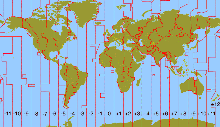
- Qualitative maps show the spatial distribution of single theme of nominal data (e.g. time zones).
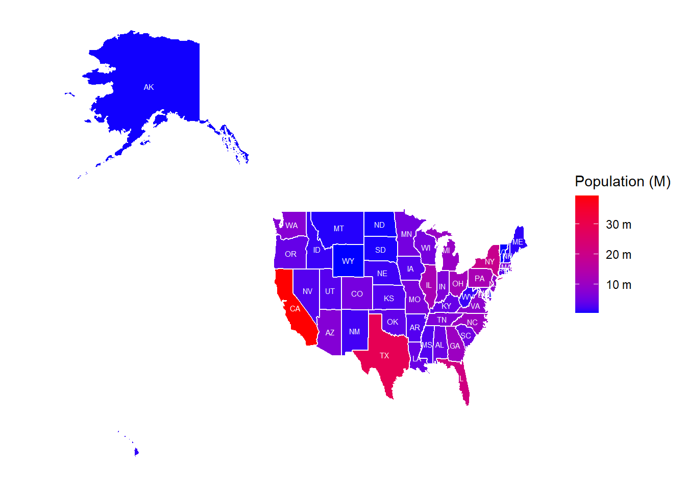
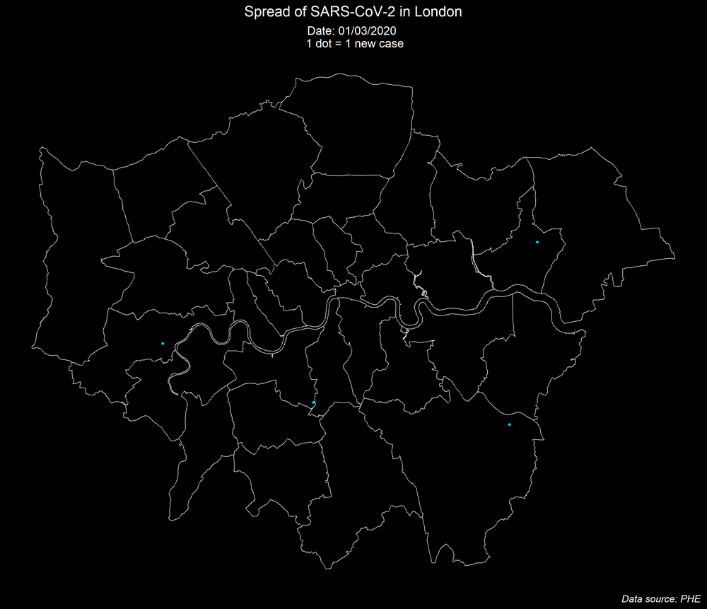
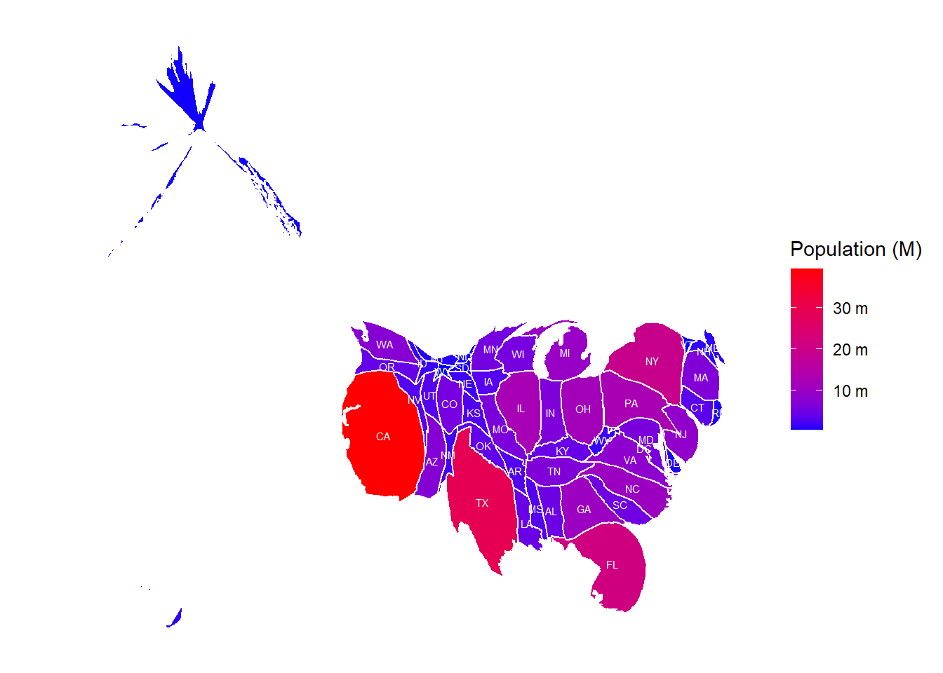
- Quantitative maps display the spatial aspects of numerical data (single, multiple). These can be choropleth and isopleth maps (for showing continuous data), dot density and proportional/graduated symbol maps (for showing discrete data).
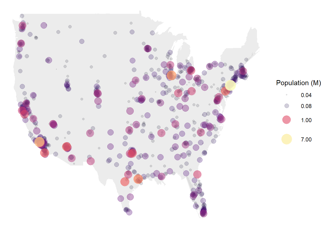
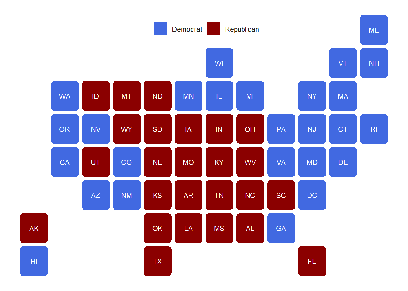
Cartogram is a type of thematic map (a variant of the proportional/graduated symbol maps) where data is mapped by altering the shape and size of an area based on the data associated with the area.
Other cartogram types include gridmap, dorling and tilegram.
Flow map is also a type of thematic map that uses linear symbols to represent movement.
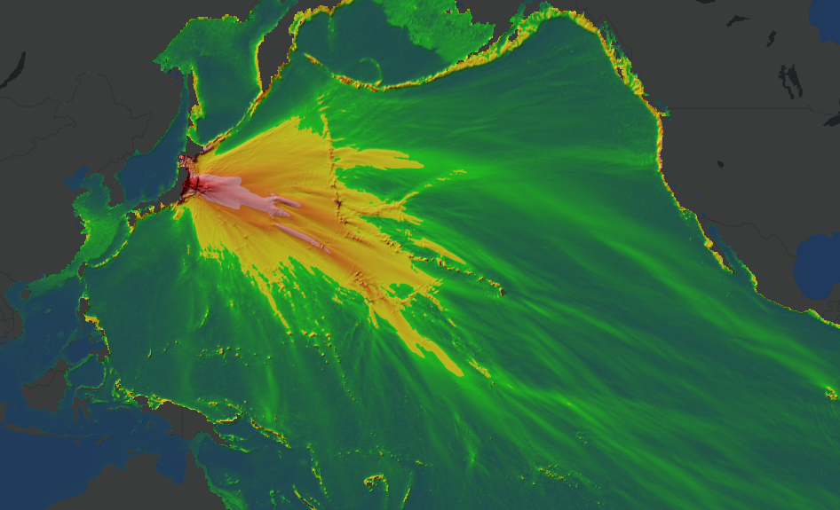
Heat maps help answer questions about your data, such as “How is it distributed?”. Heat maps are used to show point density.
:format(webp)/cdn.vox-cdn.com/uploads/chorus_image/image/58509939/Screen_Shot_2018_01_30_at_2.15.54_PM.0.png)
Topographic maps
Maps that show a topographic description of an area with the use of contour lines or shades to show elevation.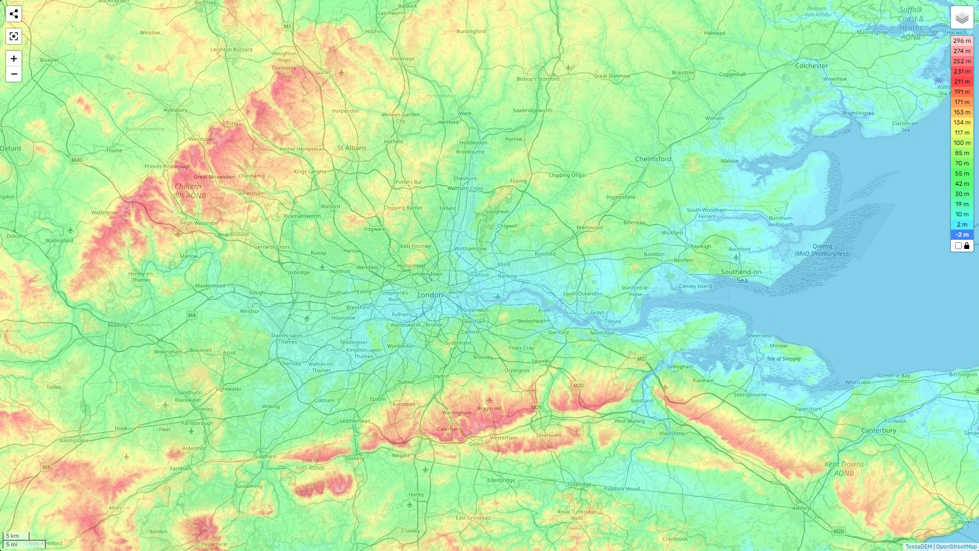
Map design
When it comes to designing a map there is no one formula for a good design, however, key things needs to be considered. These include projection, symbology, scale, legend, titles and additional text, labelling and layout.
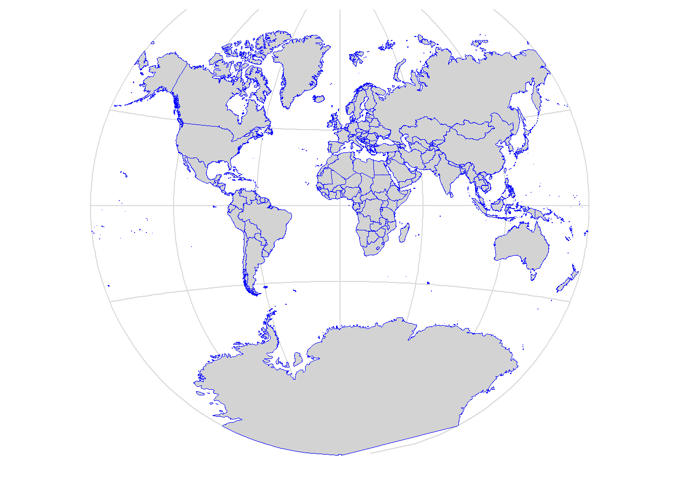
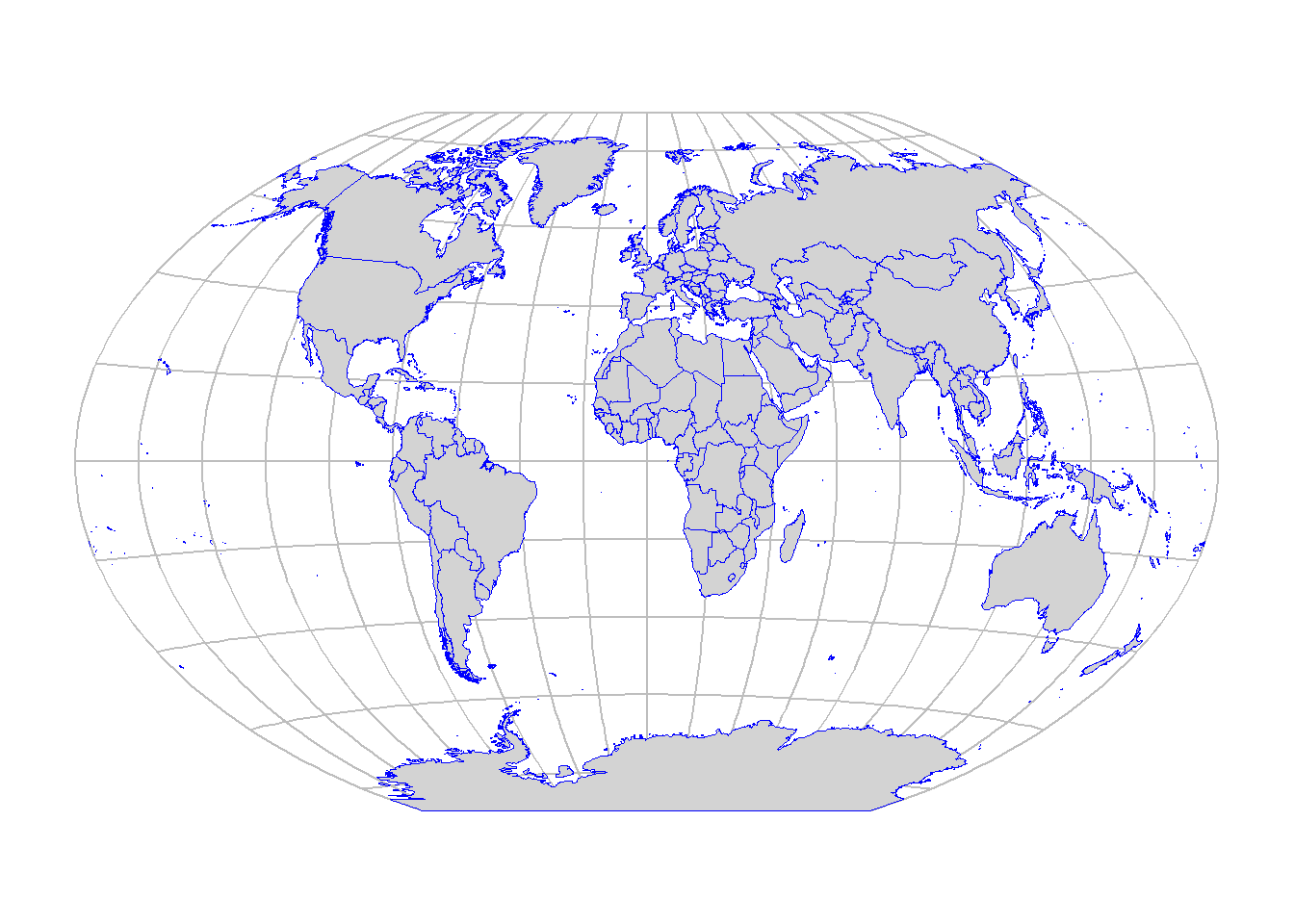
Projection
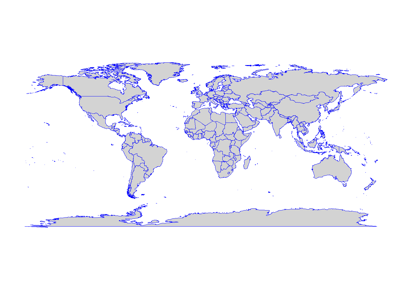
Before we talk about how map projections work, let’s imagine the Earth (3D) flattened out (2D).
Notice that the shape and size of the continents is different. This distortion occurs because the curved surface becomes flat subsequently affecting shape, area, distance and direction. The different types of projections will preserve and/or distort different attributes.
Projection is the process of converting the three-dimensional spherical Earth onto a two-dimensional flat surface (e.g. map, chart or computer screen).
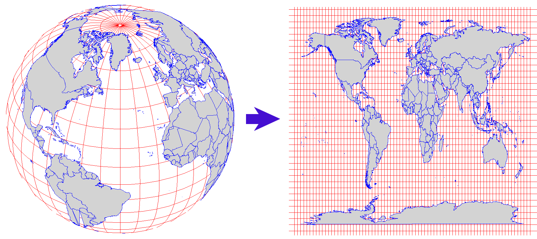
The type of projection can be based on the projection surface (i.e. where the flat surface is placed on the surface of the globe) and the properties that the projection preserves.
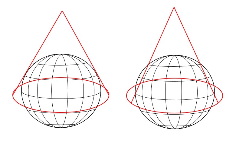
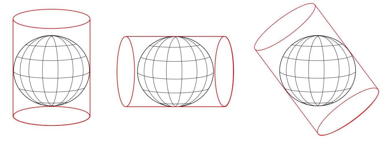
Projections by surface
1, Planar/Azumithal: A plane is placed over the globe.
Depending on the position of the plane this can be either polar, equatorial or oblique.
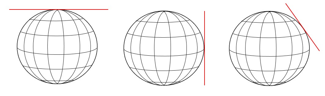
The polar projection has three different perspectives.
Gnomonic: Projection point from the centre of the globe.
Stereographic: Projection point from the opposite side of the globe.
Orthographic: It shows a hemisphere of the globe as it appears from outer space.
2, Conical: A cone is placed over the globe. Conic projection can be either tangent or secant.
During conic tangent projection, the cone is only touching the surface along a latitude line, while during conic secant projection, the cone is cutting into the surface along two latitude lines, which will produce a more accurate projection.
3, Cylindrical: A cylinder is placed over the globe that can touch either along a latitude line (normal), a longitude line (transverse) or another line (oblique).
Projections by preservation of metric property
Equal-area projections preserve areal relationships.
Conformal projections preserve local angles.
Azimuthal projections are planar projections on which correct directions from the center of the map to any other point location are maintained.
Equidistant projections displays the true distance from one or two points on the map to any other point on the map or along specific lines.
Compromise projections do not entirely preserve any property but instead provide a balance of distortion between the various properties.
Note
Tissot’s indicatrix is a method developed to illustrate and quantify distortion across a map. The small ellipses placed on the surface of a reference globe will be distorted depending on the type of projection. The example maps below show how the ellipses vary in shape and size depending on the projection used.
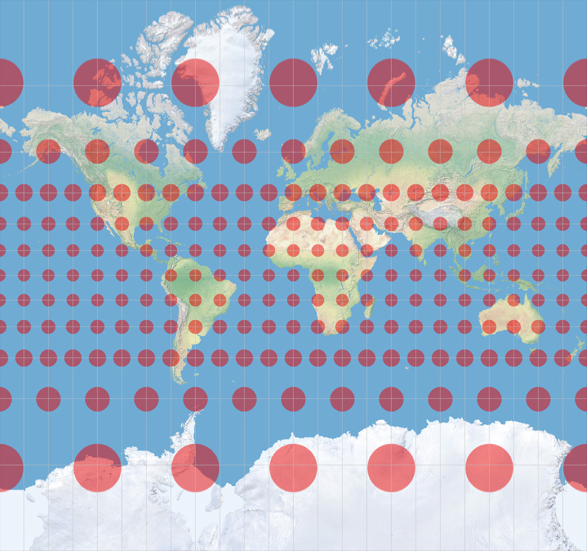
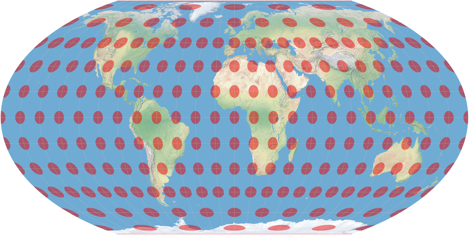
The more enlarged the ellipses, the more exaggerated the areas of the land masses, or the more distorted the ellipses, the more distorted the shapes of the land masses.
This website also illustrates different map projections and distortions using the Tissot’s indicatrix and the Gedymin faces.
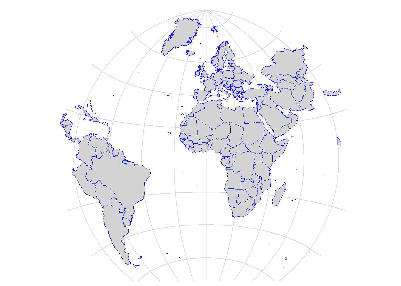
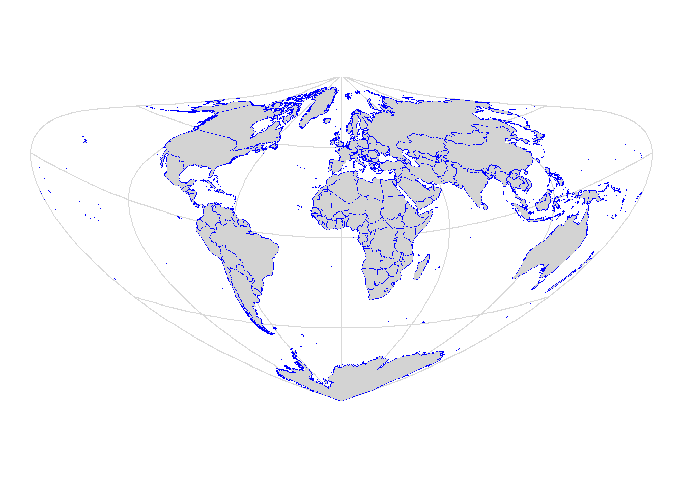
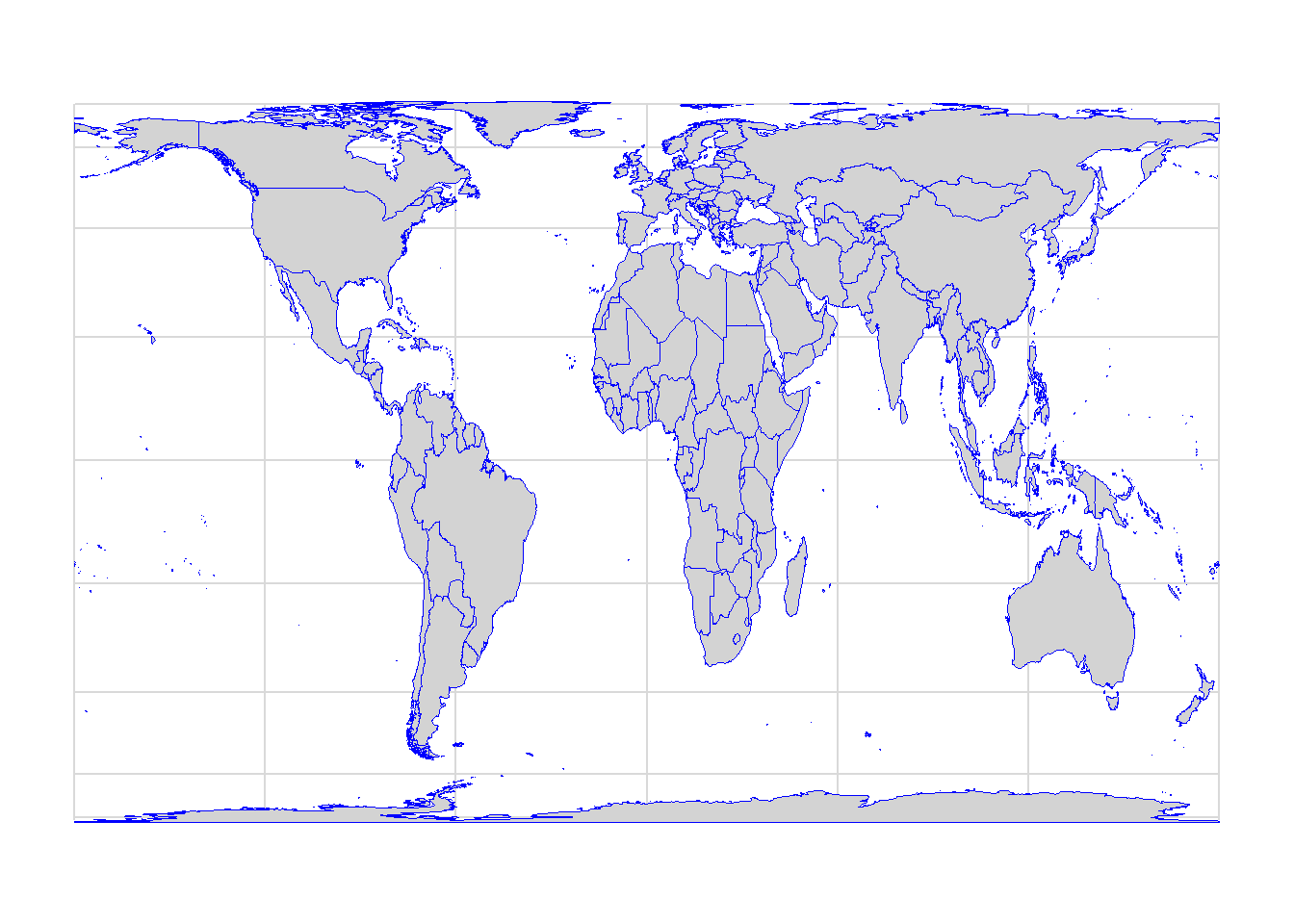
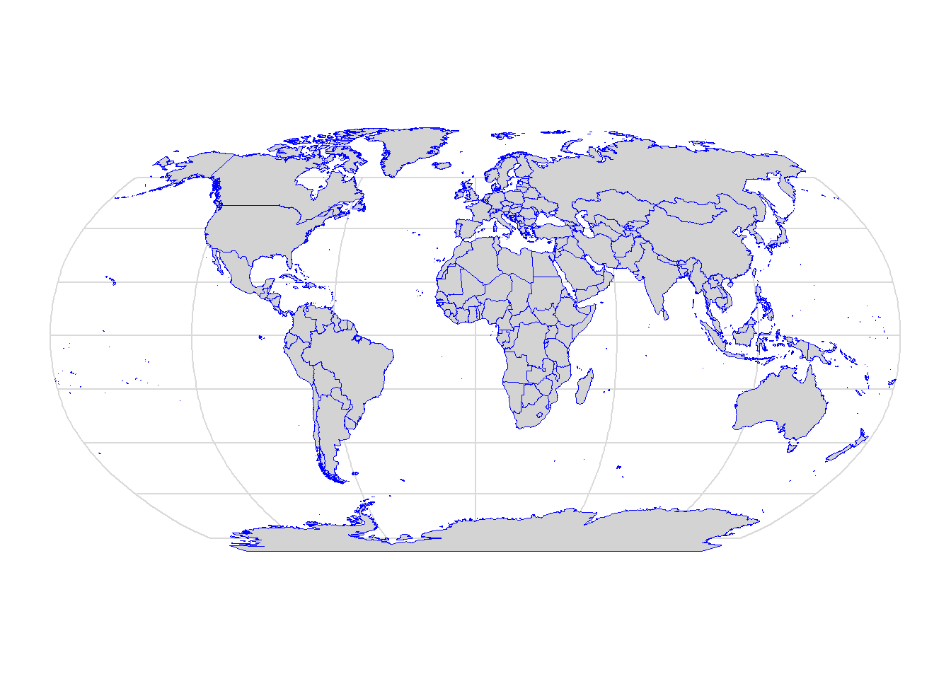
A few projection examples
Airy
This azimuthal projection minimises shape and area error. It was described by the British Astronomer Royal, George Biddell Airy, in an 1861 paper.
Bonne
This is a pseudoconical equal-area projection. It maintains accurate shapes of areas along the central meridian and the standard parallel, but progressively distorts away from those regions.
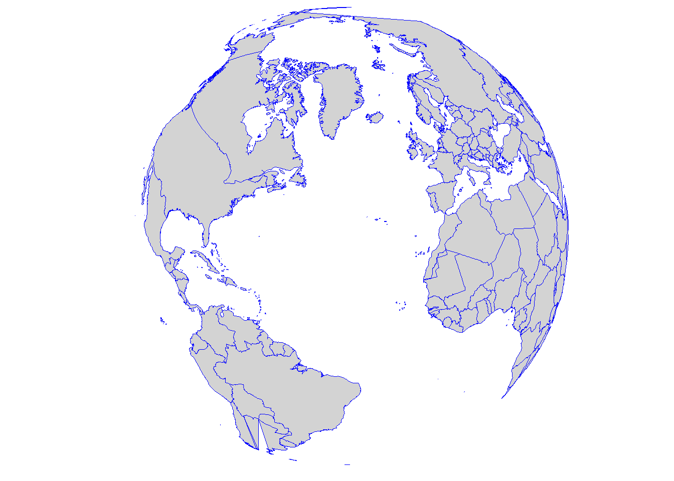
Gall-Peters
This projection maps all areas in their correct sizes relative to each other, however, it distorts their shapes.
Robinson
The Robinson projection was created to show the whole globe on a flat image.
Van der Grinten
This projection is neither equal area (preserves the area of displayed features) nor conformal (preserves the local shape of small areas); it shows the globe on a circle with distorted polar regions.
Winkel Tripel
This projection has the lowest area distortions among compromise projections for small-scale mapping. It has been used by the National Geographic Society since 1998 for general world maps.
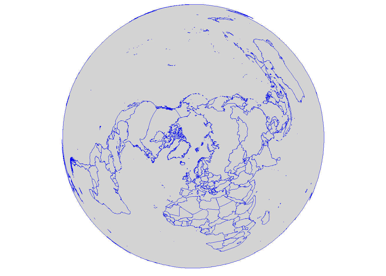
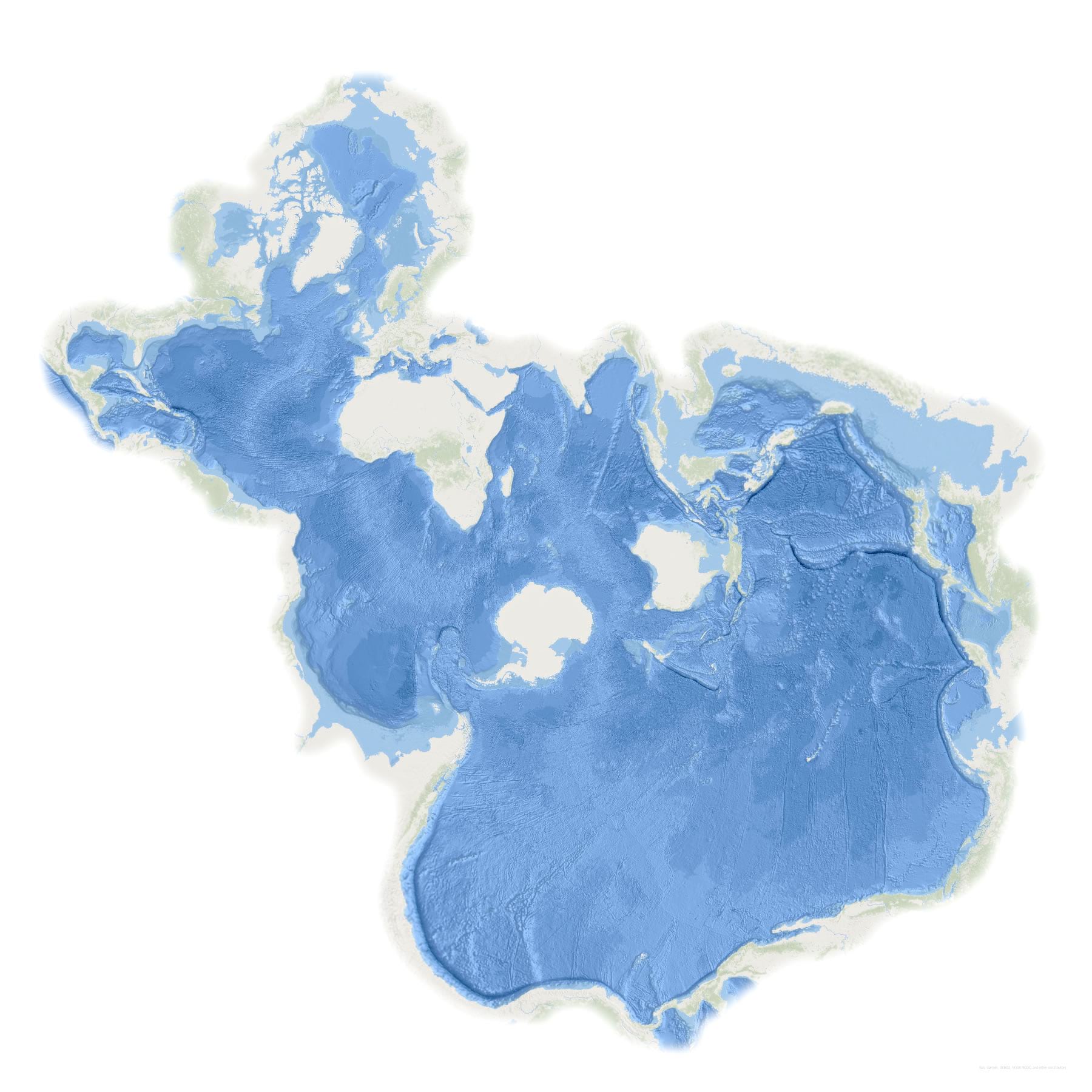
Spilhaus
This projection was authored by Athelstan F. Spilhaus, a South African-American geophysicist and oceanographer, in 1942. It centers around Antarctica presenting the ocean as one body of water.
The Spilhaus projection is becoming more and more popular and it is being used to highlight that the planet is covered by one ocean (see Drop the S for more detail).
It is important to keep in mind that when a map is made distortion will always occur. It is either area or shape that can be preserved, not both. Thus, the projection type used should be considered based on the data type and how the final map will be presented.
Tip
External links to visit and a videos to watch:
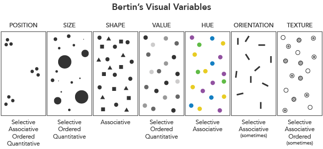
Symbology
Location and properties are represented by symbols with different size, shape, colour, and pattern. Map symbol design relies heavily on the proper use of the visual variables shown below.
Colours
“Colour is a sensory response to electromagnetic radiation in a narrow part of the wavelength spectrum between roughly 380 and 700 nanometres, called the”visible band.”

Things around us appear to have different colours because they either absorb and reflect them or transmit them. For example, objects will absorb colours: a blue shirt looks blue because the dye molecules in the fabric have absorbed the wavelengths of light from the violet/blue end of the spectrum, and blue light is the only light that is reflected from the shirt. TV and computer screens on the other hand will transmit colours.
During the map making process, colours will have an important role in emphasising qualitative and quantitative data. Colour is also one of the first components noticed by end-users.
Colours are specified by mixing additive or subtractive colours.
Additive colours
RGB: Red, green and blue produce the colour white when added together.

Modern computers can display over 16 million different colours using 255 shades of each red, green and blue. The possibilities for mixing these three colours together can be represented as a three dimensional coordinate plane with the values for red, green and blue on each axis. This coordinate plane yields the RGB colour space.

If all three colours are zero, it means that no light is emitted and the resulting colour is black (0, 0, 0). If all three colours are set to their maximum values, the resulting colour is white (255, 255, 255).
Two alternative representations of the RGB colour space were developed for computers to allow map makers (and designers) to mix colours more intuitively and work directly with visual variables such as hue, saturation, value/light.
HSY/HSL values are given on a cylindrical coordinate systems:
Hue: Angle around the central vertical axis.
Saturation/chroma: Distance from the central axis.
Value/Lightness: Distance along the central axis.

Hue is the shade or tint of a colour and it is used to identify qualitative differences. For example blue hues are used to illustrate ocean depth.
Saturation/chroma refers to the intensity of colour. As the saturation increases, the colours appear to be more pure, while as the saturation decreases, the colours appear to be more pale. Saturation can be used to make otherwise unseen features come to the viewer’s attention.
Value (light) gives how light or dark the colour us. It is used to represent numerical difference on a quantitative scale (e.g. ranking). For example, a choropleth map that shows population density across states or countries.

Subtractive colours
CMYK: Cyan, magenta, yellow and black (key) are the subtractive colours. Each one absorbs one of additive colours: cyan absorbs red, magenta absorbs green and yellow absorbs blue. Adding two subtractive colours together will transmit one of the primary colours. This kind of colour model is used in printing.

Note
When a map is designed, the colour space should be chosen depending on whether the map will be used on the screen (e.g. interactive map) or will be printed (e.g. hardcopy map).
Selecting colours
All GIS software will allow the user to select colours using the HSV and RGB colour space.
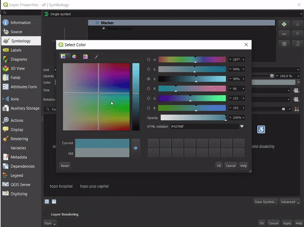
Html notation
Other then the RGB and HSL values used to pick a colour, web pages also use Html notations in hexadecimal format to display a colour.
The binary counting system uses only two symbols, 0 and 1, to represent numerical information. The hexadecimal numbering system on the other hand contains 16 sequential numbers as base units, including 0. This is a convenient way to express binary numbers in modern computers as one hexadecimal digit can represent the arrangement of four binary digits, while two hexadecimal digits can represent eight binary digits.

A HEX colour is expressed as a six-digit combination of numbers and letters defined by its mix of red, green and blue (RGB). For example: red = #FF0000, black = #000000, white = #FFFFFF.
See the interactive colour picker widget below for more HEX colour options.
Click into the rectangle
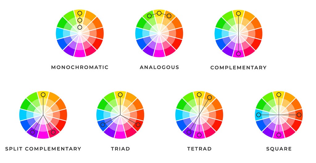
Colour schemes
When selecting colours, it is also important to consider colour combinations so that the final map is aesthetically pleasing. The examples below are based on colours arranged on the colour wheel according to their chromatic relationships.
Monochromatic colour scheme is made up from one colour with lighter and darker variations of that colour.
Analogous colour scheme is made up of colours directly adjacent to the base colour.
Complementary colour scheme is made up of colours opposite from each other.
Split complementary colour scheme use two adjacent colours from the base complementary.
Triadic colour scheme is made up from three, equidistant colours.
Tetradic colour scheme is made up from two sets of complementary colours spaced out in a shape of a triangle.
Square colour scheme is similar to the tetradic scheme but it is composed of four colours.
Tip
The list of websites below can help find the right colours for a map.
60-30-10 rule: When selecting colours it is best to choose them in a 60% (dominant hue) + 30% (secondary colour) + 10% (accent colour) proportion. This will give balance and will also be more comfortable for the map viewers’ brains.
When a map is made, the colours can be structured in different ways to reflect the quantitative and qualitative character of the data.
- Sequential: Vary lightness to show ordered or numeric data (less > more).
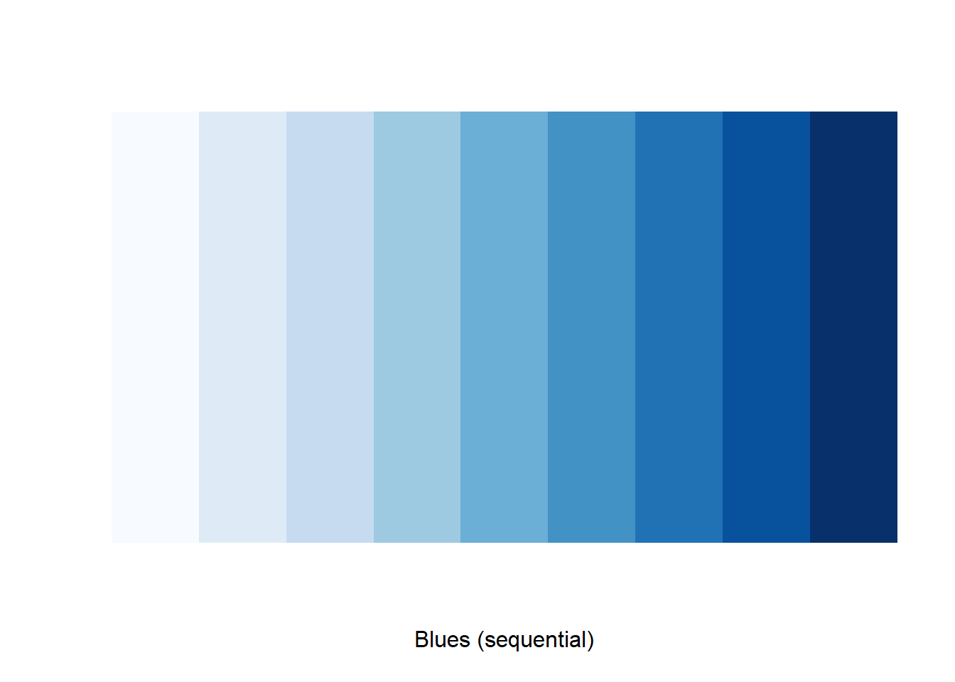
- Diverging: Used when the data have different extremes with a mid-point (above / below).
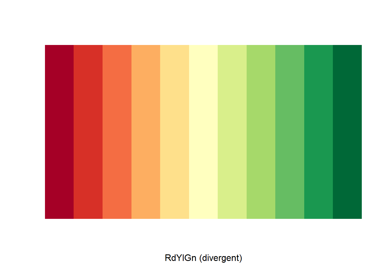
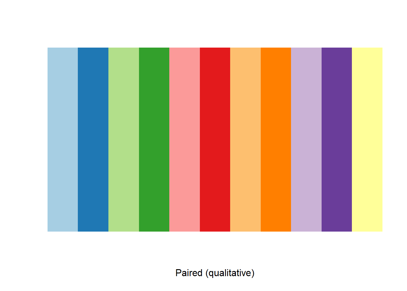
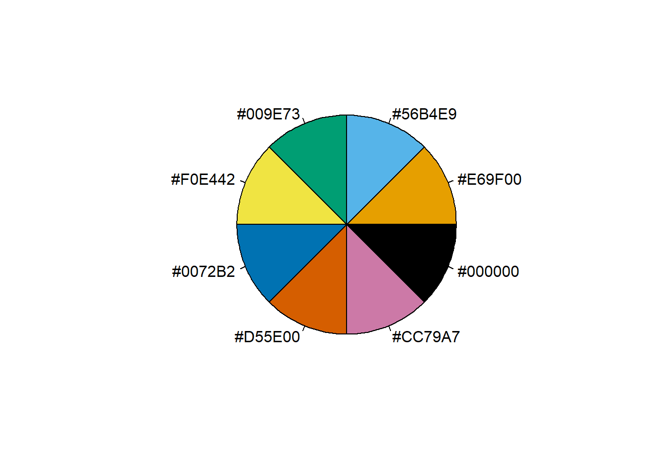
- Qualitative: Used to represent differences between map features (categories).
Scale
When choosing a symbology, map scale (how distance is shown) should also be considered. Scale is a map’s representative fraction, expressed as a ratio of the map distance to the ground distance. For example, a scale of 1:10 means that one map unit represents 10 of the same units on the ground. So if two points located 10 km apart are shown 1 cm apart on a map, then the scale of the map is 1 cm to 10 km.
Scale is presented either as a word statement, ratio, fraction or scale bar.
In terms of scale, there are also distinctions between a small scale and a large scale maps.
Large scale maps have scales of 1:24,000 or larger. They show an area with more detail.
Small scale maps have scales of 1:500,000 or smaller. They show an area with less detail.
Legend
Legend or key is a visual explanation of the symbols used on the map. It includes a sample of each symbol and a short description of what the symbol means. A clear and concise legend is critical for conveying the distinctive characteristics of the map.
Labelling
Labelling helps recognise map features so it should be designed and positioned well to be effective. Good labelling considers order, placement, colours, font styles, type effect and sizing.
Titles and additional text
Title and subtitle should include information about the topic of the map, the geographic area and temporal information.
North arrow and inset map
The north arrow along with a small inset map can help the audience maintain a geographical frame of reference.
Layout
When considering the placement of elements (map, titles, additional text, scale, legend, north arrow and so on), it is important to take into account visual balance (vertical and horizontal alignment of the elements) and visual hierarchy (arrangement of elements) so that it is aesthetically pleasing and also signifies their order.
Summary
Cartography is the study and practice of creating charts and maps based on geographical layout.
Mapping refers to all of the processes of producing a map: collecting data, designing and preparing for distribution in hardcopy or for the Internet.
Map types are reference, thematic, topographic, topological and cartometric.
Map projection is the process of converting the spherical Earth to a flat surface. The classification of projection can be either by surface and by preservation of property.
Map symbology relies heavily on the proper use of visual variables.
Colours have an important role in emphasising qualitative and quantitative data presented on a map.
Scale refers to the spatial extent of the area on a map.
Labelling helps recognise map features and provides clarity.
The final map output should be balanced, clear, logical, with the map elements aligned (title, subtitle, legend, scale, north arrow, additional text, credit) in the right order.
Case studies
This 1 map shows off something I often advise: labeling thematic data in situ, so that people don't need to check the legend. When you can, tell people what the map symbols mean, right there.
— Daniel P. Huffman (2) February 17, 2021
There's no advantage to making the reader work for it.https://t.co/JFj7zw9MD8 pic.twitter.com/bJRopmbToD
For last few briefings the govt has used a colour palette called 'viridis' for its maps.
— James Cheshire (3) December 30, 2020
The package also has an 🔥inferno🔥 option.
Just saying, now might be the time to crack that out…. pic.twitter.com/vsJghRcL0F
Reference resources
Other
- Cartography Guide
- Common pitfalls of color use
- Compare Map Projections
- Culture of Insight
- information is beautiful
- Intro to Mapping and GIS: How cartographers use color
- MapMaker Interactive
- Map-making, sharing space, and Masking Multitudes
- Sewage alerts: the long history of using maps to hold water companies to account
- World Mapper