1 Lost in translation: the challenge of reading figures
In research, we often talk about figure reading as though it were a straightforward, one-step path to understanding data.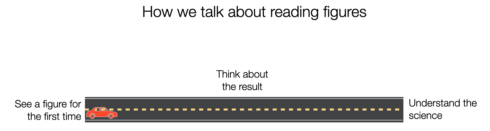
Figure 1.1: Looks pretty easy.
But the reality is much more challenging. The first time you look at a figure can be severely overwhelming, because it’s often not clear how to even understand what information is being presented, let alone how to understand or interpret it. It’s easy to get distracted, settle for a partial understanding, or give up at this step.
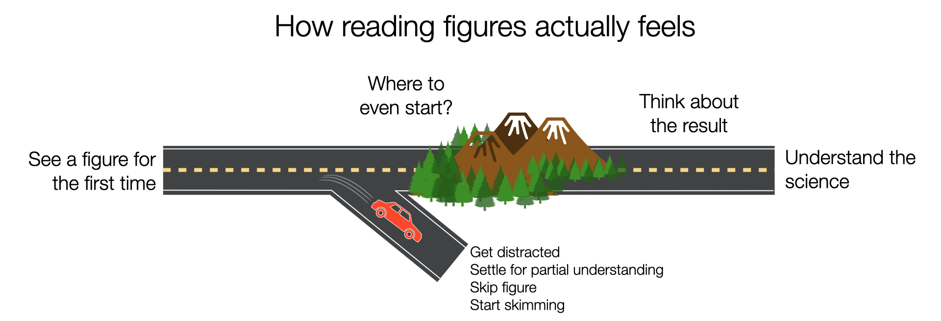
Figure 1.2: The reality is much more challenging.
That’s because understanding scientific figures is actually a two-step process:
Step 1. Decode: figure out what information is actually being displayed
Step 2. Learn: figure out what that displayed information means
There is a very specific set of skills and habits required to “decode” the infomation in a figure, before you can learn or interpret the result. This decoding process is different for every figure, but the decoding skills themselves stay the same.
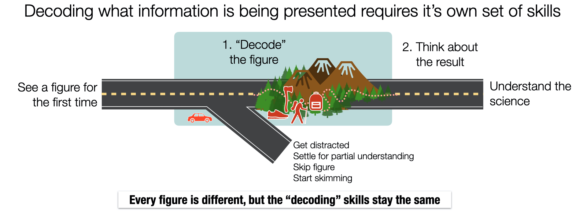
Figure 1.3: Decoding a figure is it’s own, important step.
To understand a figure, these steps have to happen in order, and they have to happen every time. This is one of the few skills that every scientist needs and uses regularly, from the youngest students to the most experienced professors. Sometimes (maybe even usually?) step 1 is as hard or harder than step 2.
This workshop is meant to help you learn how to break down step 1 (decode) into managable pieces for almost any figure you might come across.
To make the difference between step 1 (decode) and step 2 (learn) more clear, check out the following example.
We’ll take a piece of information that is easy to understand–it was cloudy in the inner sunset on saturday–and turn it into a scientific figure, step-by-step. For most people, the figure at the end would take some time to understand; not because they’re stuck on step 2 (they know what a cloudy day is), but because they’re overwhelmed and stuck at step 1 (decoding the visualization).
Figure 1.4: A cloudy day in San Francisco
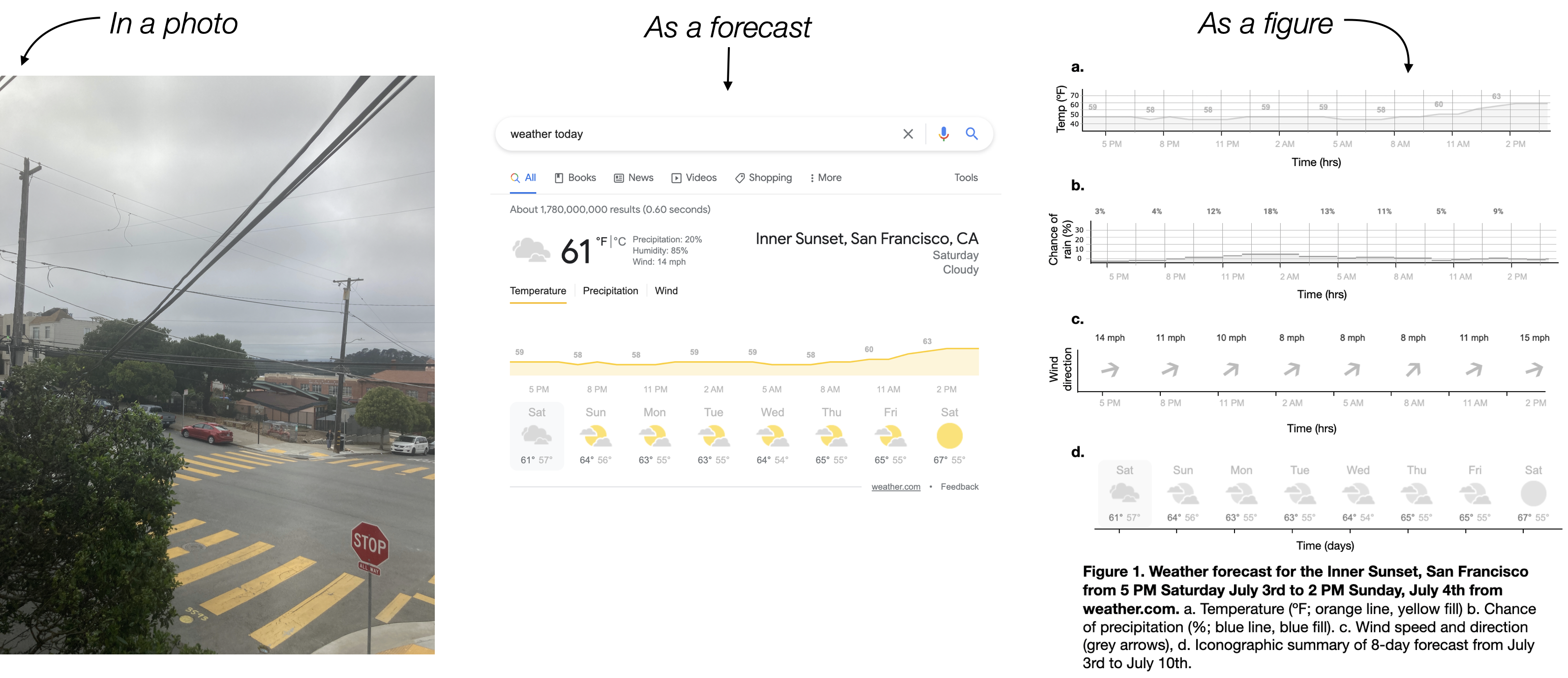
Figure 1.5: A cloudy day in a picture, forecast, and figure.

Figure 1.6: Screen shot of a weather report.
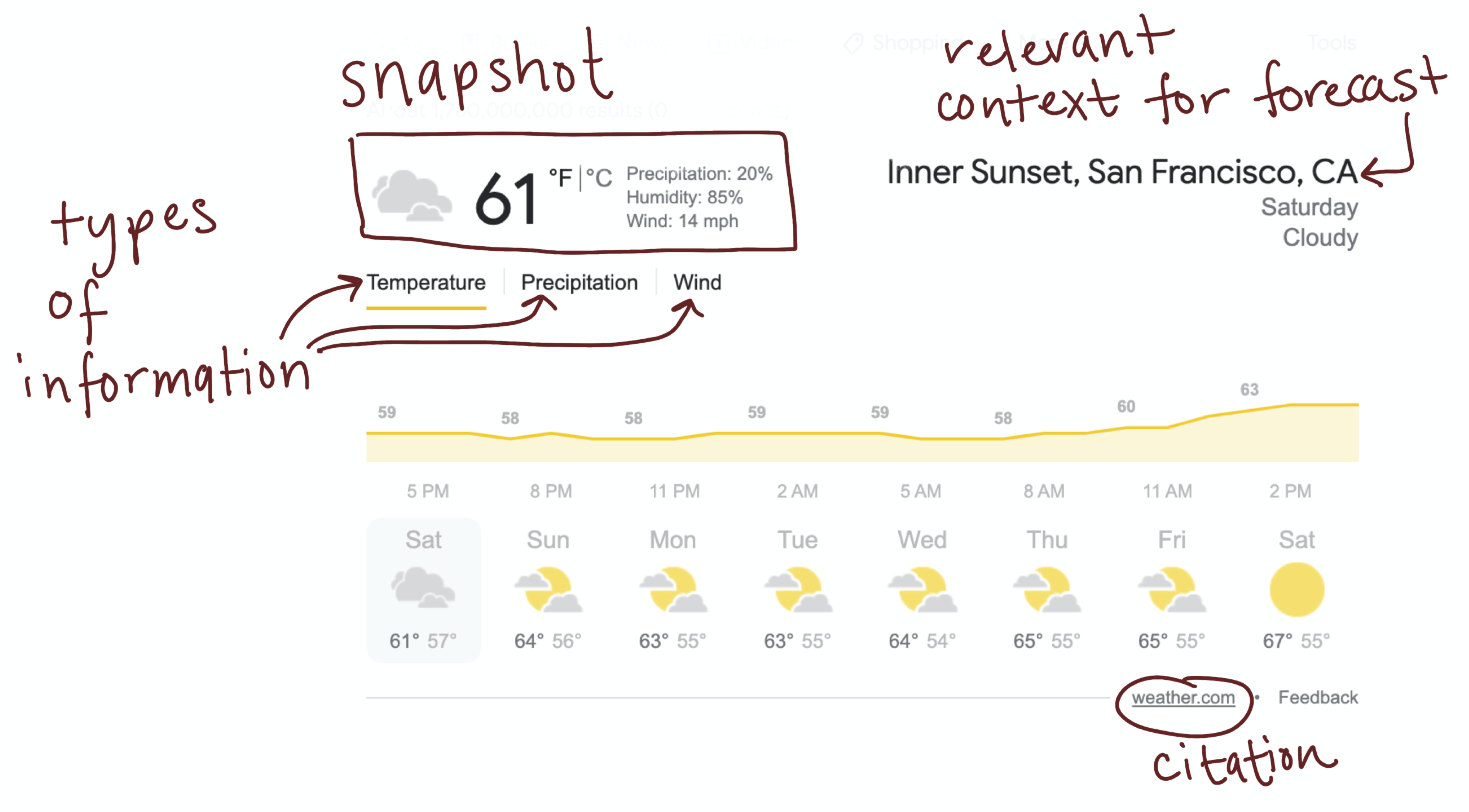
Figure 1.7: Helpful details included in the google weather forecast visualization
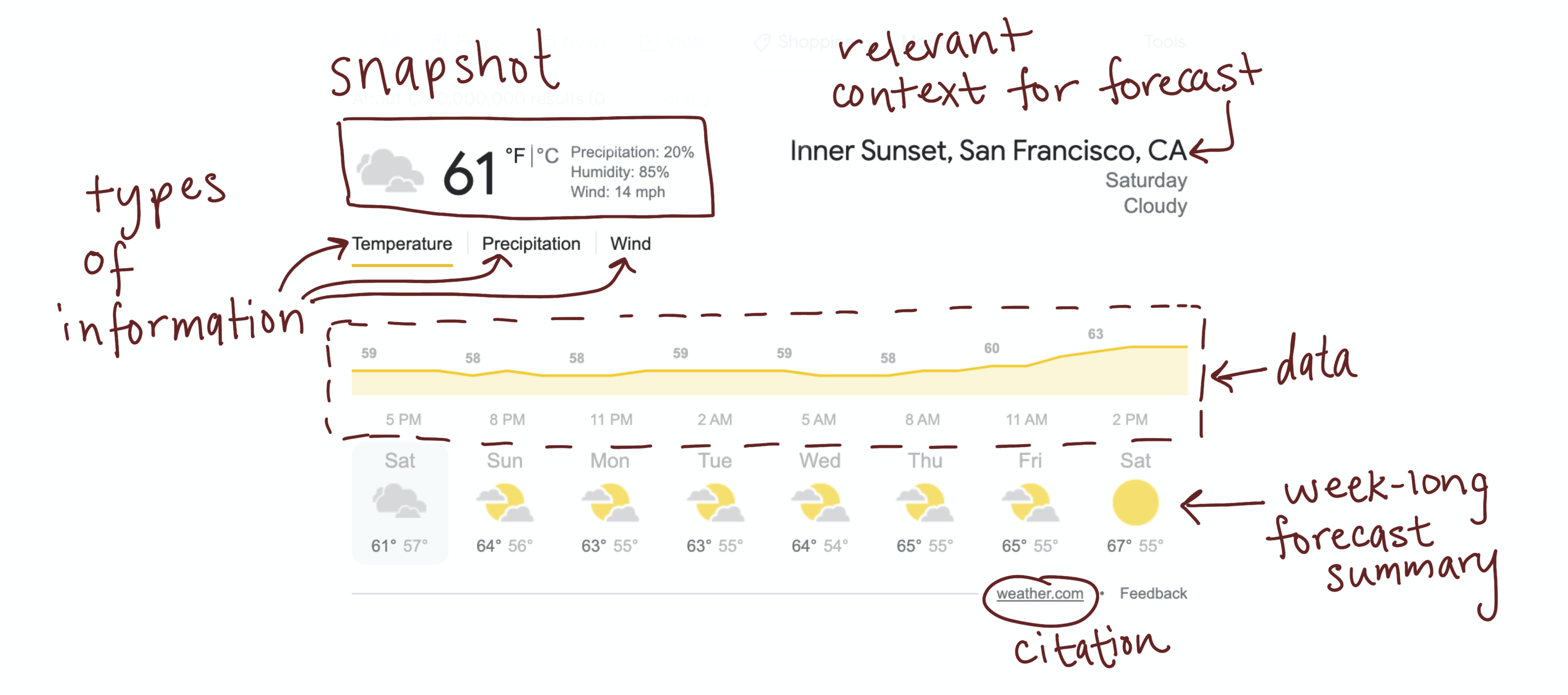
Figure 1.8: The forecast data, right in the middle.
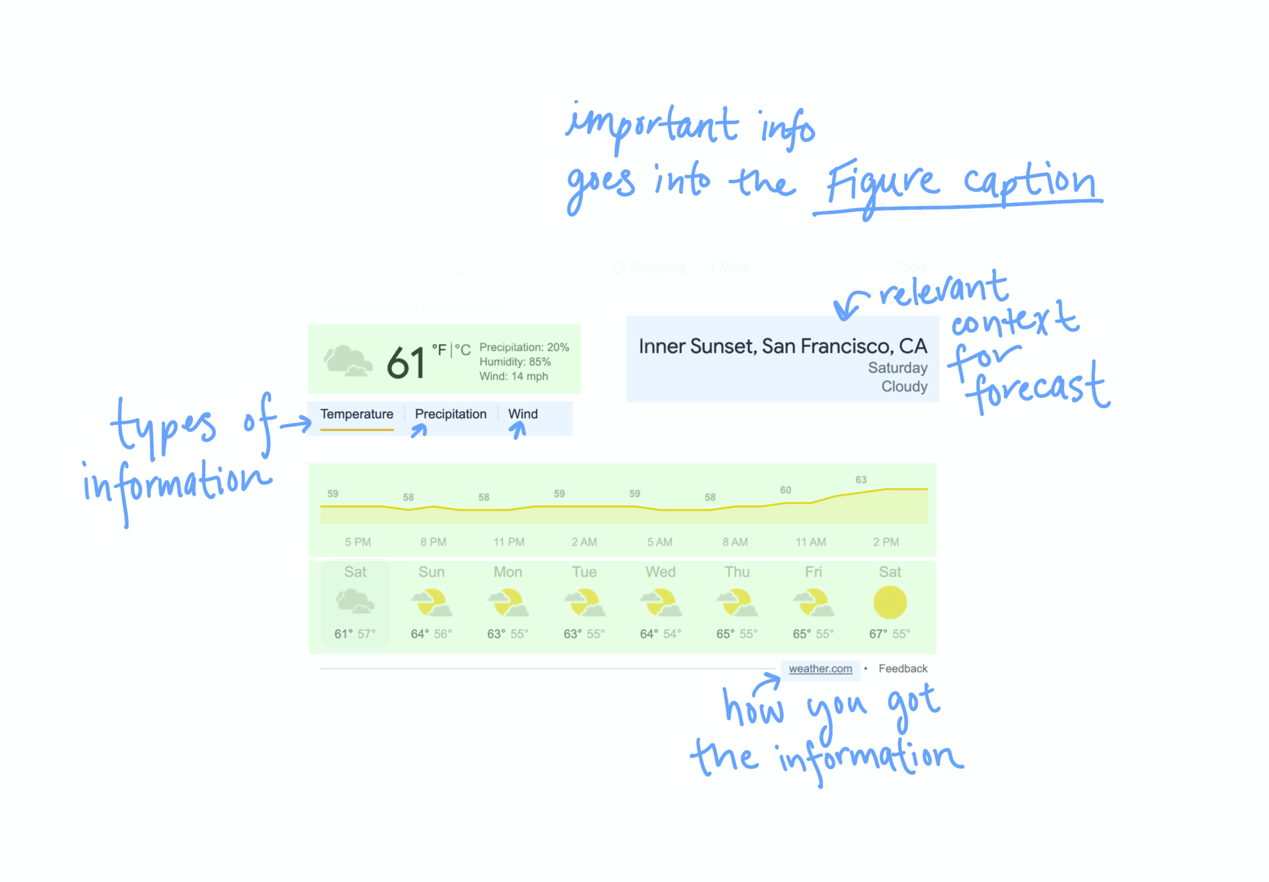
Figure 1.9: These details will end up in the caption of our figure
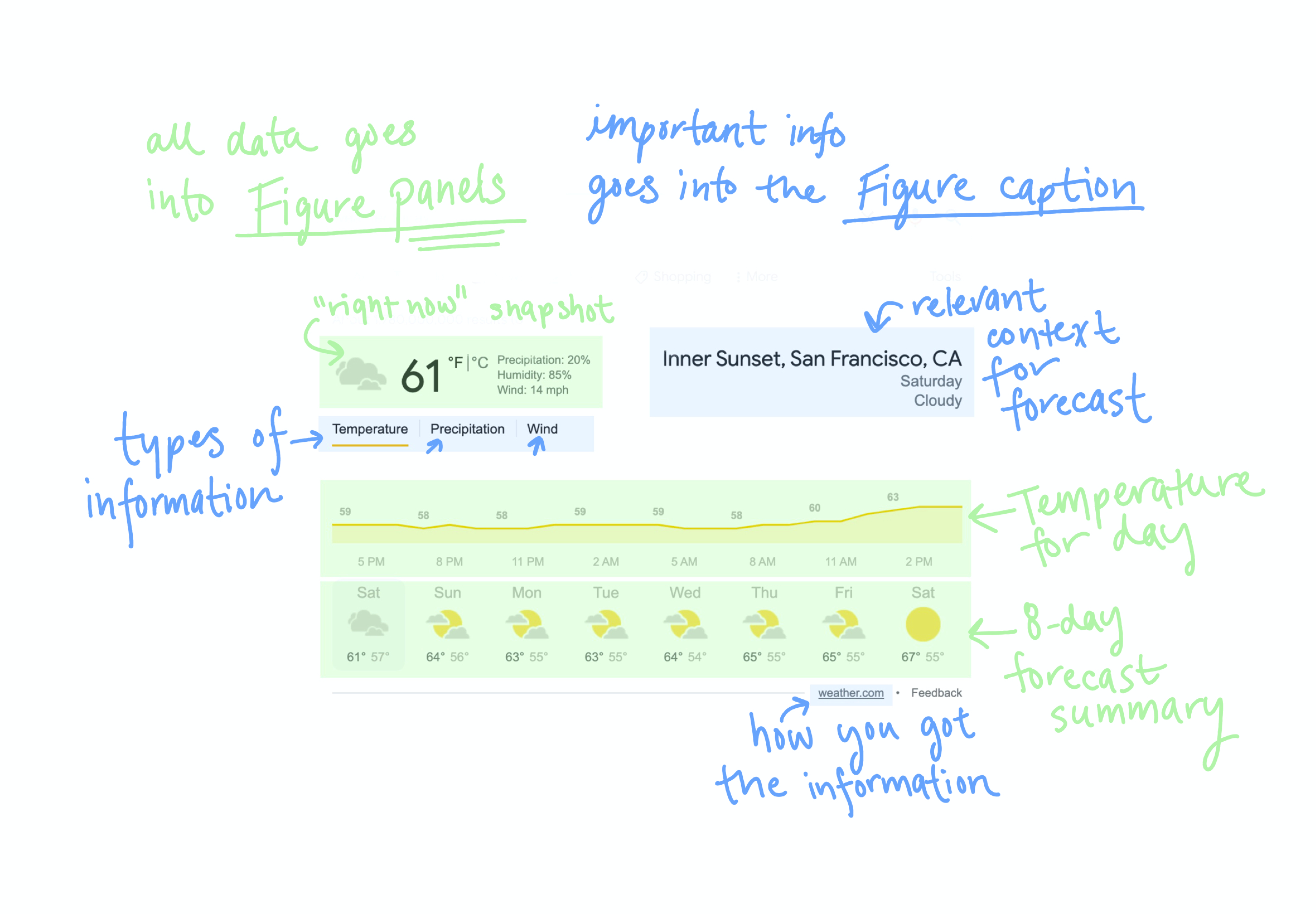
Figure 1.10: Data, to become panels
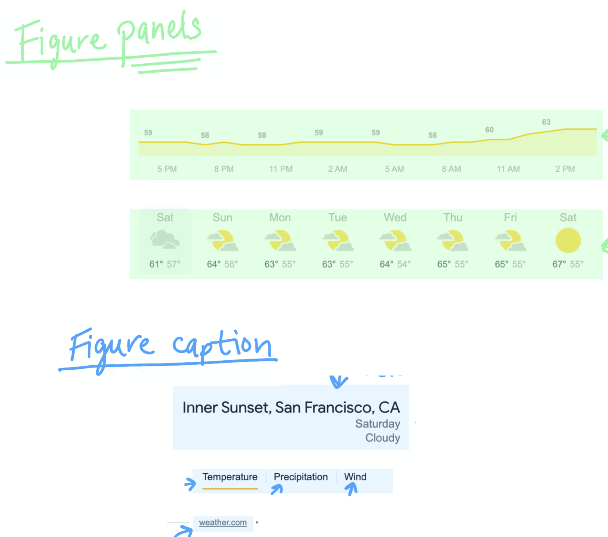
Figure 1.11: Data and helpful information, arranged into panels and caption
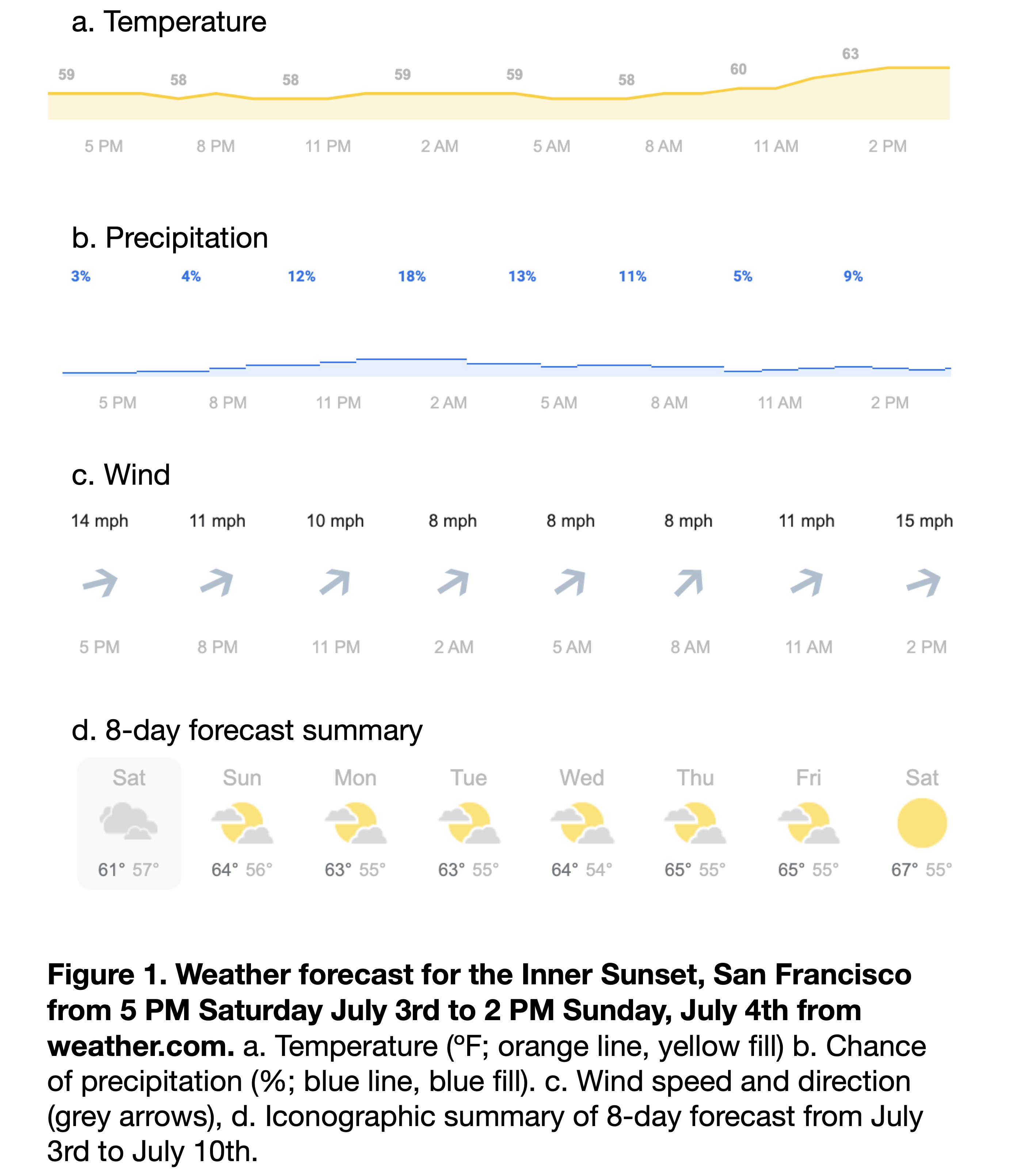
Figure 1.12: Starting to look more like a figure
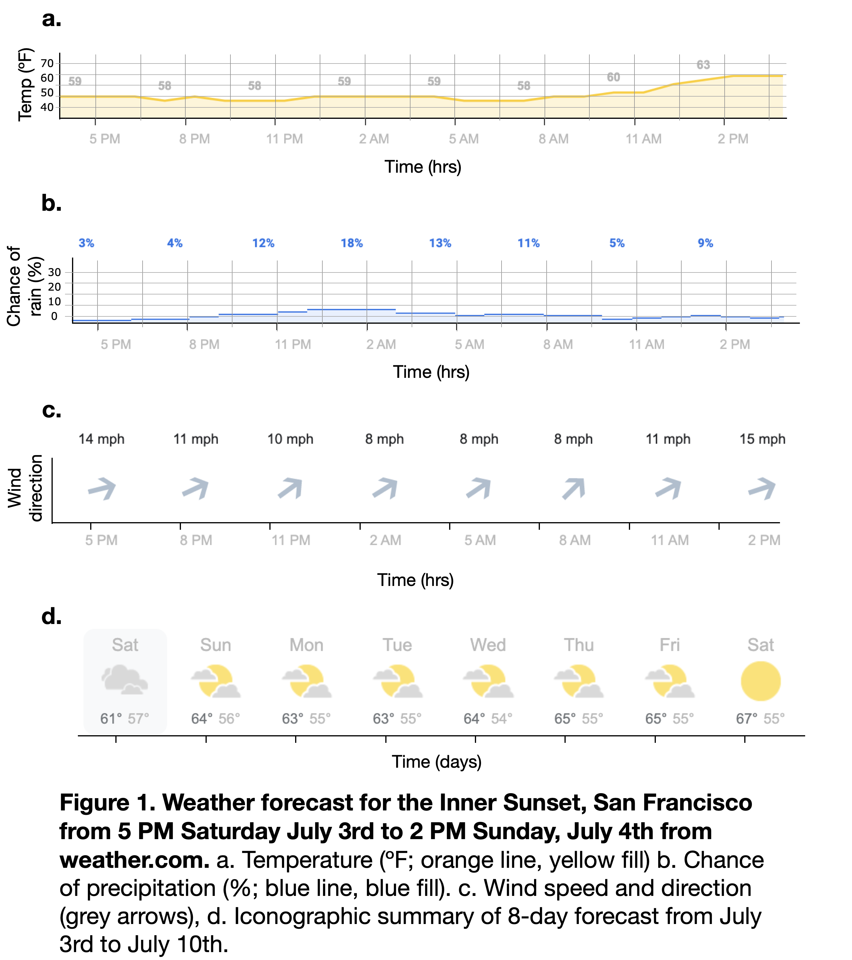
Figure 1.13: Getting closer . . .
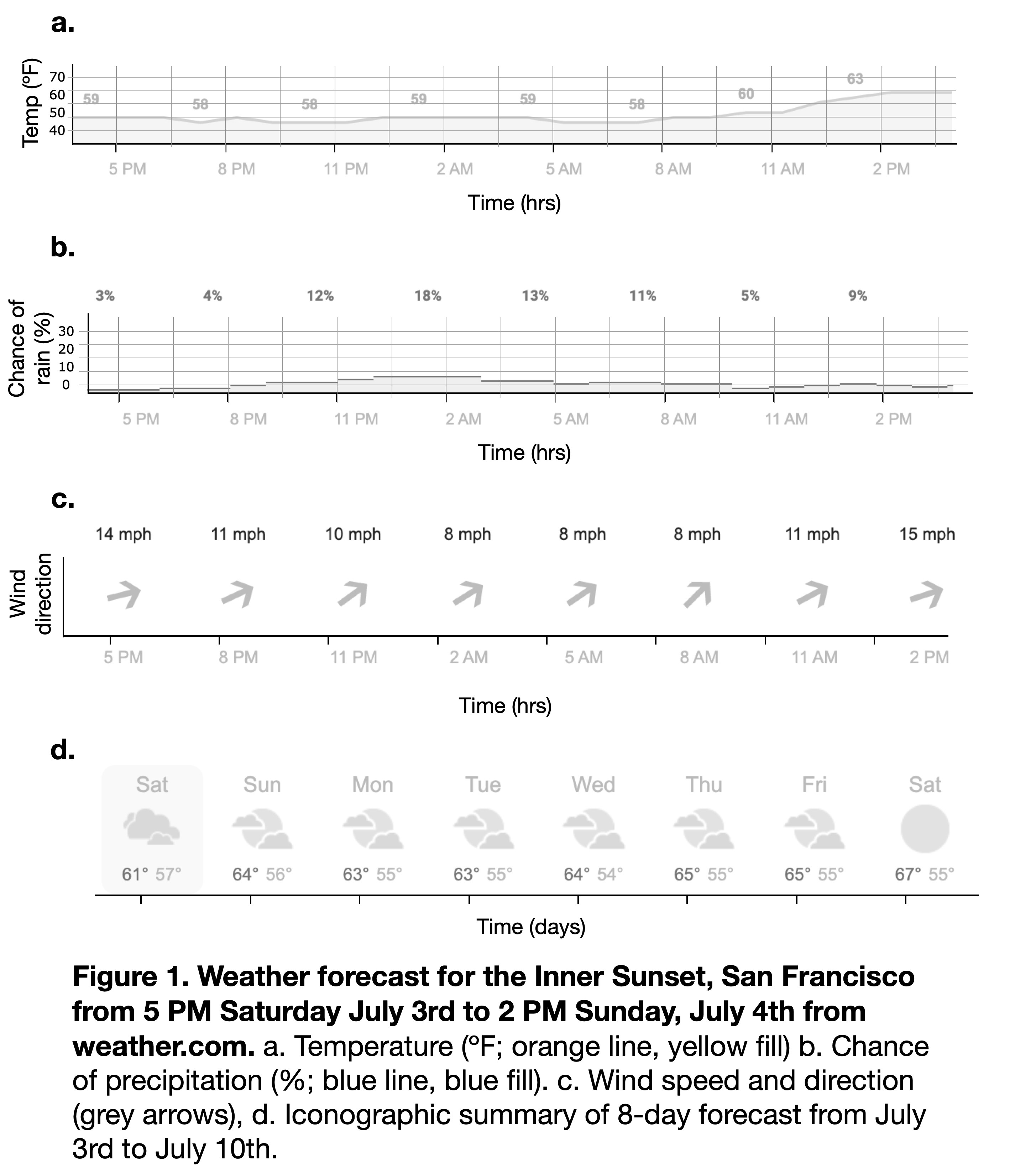
Figure 1.14: This is pretty close to how a figure with this forecast might look in a scientific paper.
Now imagine that you’ve never heard of weather before.
This is the position that we often are in when looking at a figure for the first time.
With all of the weather-specific words now in webdings, this figure looks really overwhelming. Even though it technically contains the same information, it feels a long way off from the original photo, and even farther from the memory you might have of the weather last weekend.
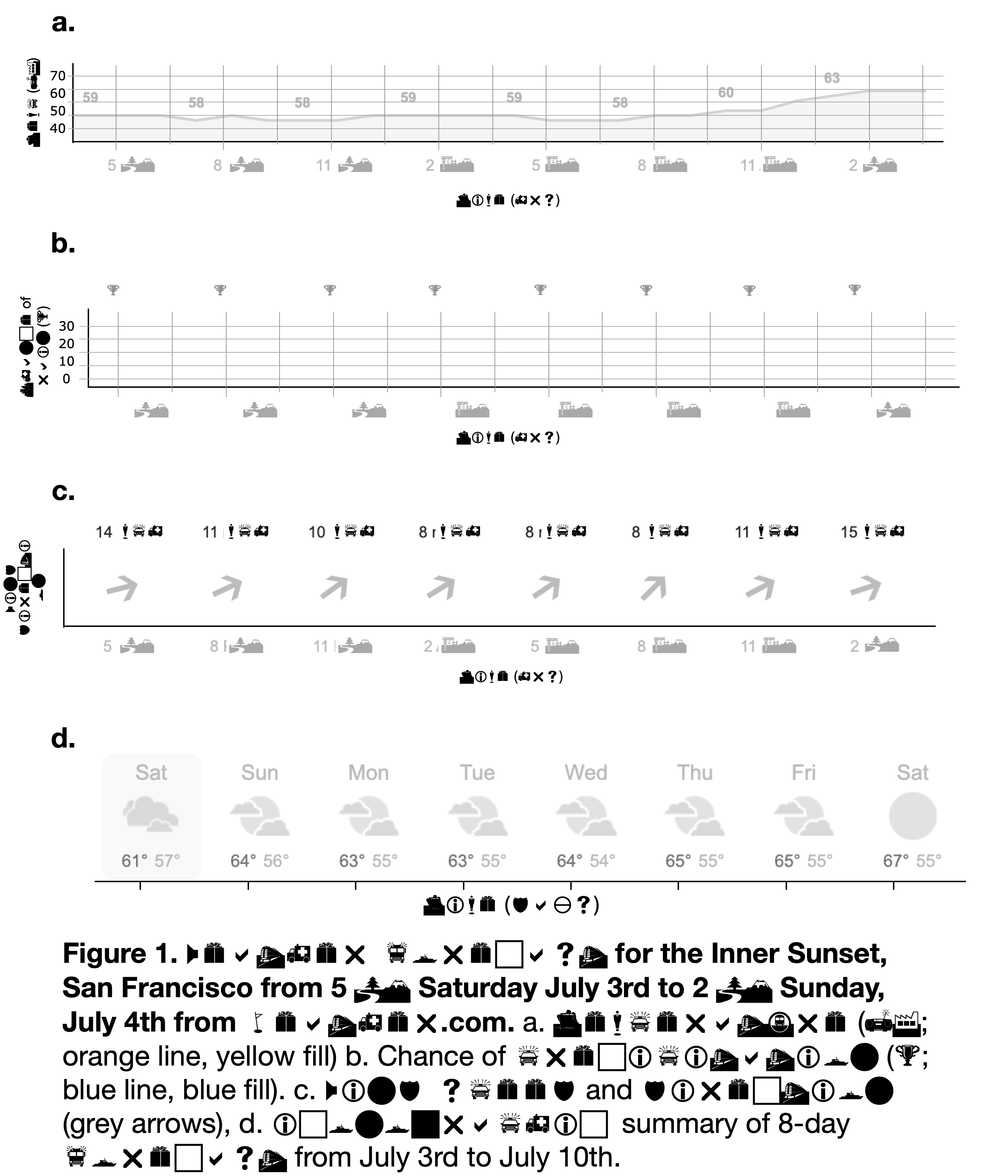
Figure 1.15: Yikes!
So why even make figures in the first place, if our final product is less appealing and harder to understand than the original photo?
For most research questions, taking a picutre isn’t an option.
The figure is presents much more precise information than the photo. For most scientific purposes, this level of precision is necessary.
Most importantly, though, visualization is a part of the discovery process. In research, you often won’t understand your results until after you’ve visualized them. How well you understand your results is directly related to how well you visualize them. That’s where this cloudy day analogy totally breaks down. If it was in a research context, you’d be starting with temperature, precipitation, and wind measurements, and working towards discovering “weather” as a thing.