4 Data Representation
Data representation refers to the process of presenting data in a visual or graphical format that makes it easier to understand and interpret. It is crucial to effectively represent data to communicate research findings, identify trends, and explore relationships between variables.
Examples of data representation techniques in educational psychology might include creating line graphs to show changes in student performance over time, using pie charts to compare student achievement across different demographic groups, or using scatter plots to explore the relationship between two or more variables in a study.
ggplot2 is a powerful data visualization package in R, created by Hadley Wickham. It is based on the Grammar of Graphics, a framework that allows you to build complex and customizable plots by layering components. ggplot2 enables the creation of a wide variety of visually appealing and informative graphics with a relatively concise and consistent syntax.
4.1 Loading your data
You can import or load your data as we discussed in Chapter 3. In these examples, we will be loading gapminder data set which is available as a package in R.
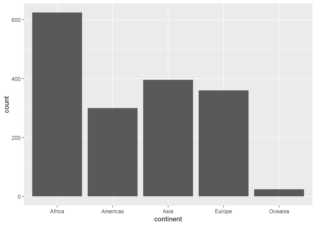
4.2 Frequency Tables
A frequency table displays the number of occurrences (frequencies) for each category or value in a data set. It is particularly useful for summarizing categorical data or discrete numerical data.
#> Warning: package 'ggplot2' was built under R version 4.2.3#> Warning: package 'gapminder' was built under R version
#> 4.2.3
# Create a frequency table for continent
continent_freq <- table(gapminder$continent)
continent_freq
#>
#> Africa Americas Asia Europe Oceania
#> 624 300 396 360 244.3 Histograms:
Histograms are used to visualize the distribution of continuous or discrete numerical data. They display the data using intervals (bins) along the x-axis and the frequency of observations within each bin on the y-axis.
# Histogram for life expectancy using ggplot2
ggplot(gapminder, aes(x = lifeExp)) + geom_histogram(binwidth = 5) + xlab("Life Expectancy") + ylab("Frequency")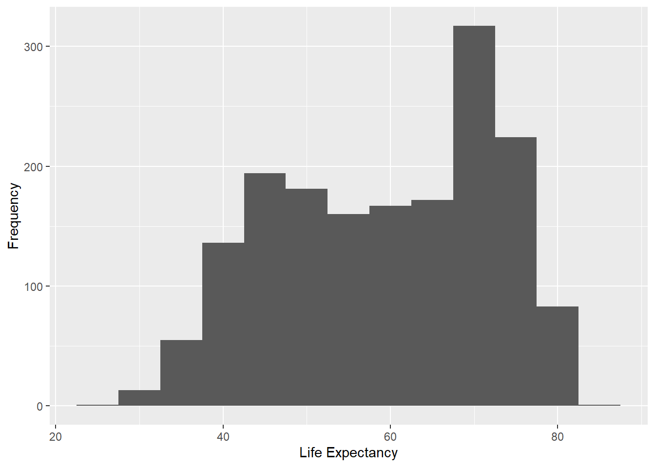
The
aes()function sets the aesthetic mappings for the plot. In this case, the x-axis is mapped to the lifeExp variable from the dataset, which represents life expectancy.
geom_histogram(binwidth = 5)adds a histogram layer to the plot. The binwidth parameter is set to 5, which means that the data will be divided into bins of width 5. The height of each bar in the histogram represents the frequency (count) of data points within each bin.
xlab("Life Expectancy")adds a label to the x-axis, naming it “Life Expectancy”.
ylab("Frequency")adds a label to the y-axis, naming it “Frequency”.
4.4 Bar Graphs:
Bar graphs are used for displaying categorical data. Each category is represented by a bar, and the height (or length) of the bar indicates the frequency or count of that category.
4.5 Pie Charts:
Pie charts represent categorical data as slices of a circle. The size of each slice is proportional to the frequency of each category. Pie charts are useful for visualizing relative proportions of categories. Drawing piechart in ggplot2 package requires transforming a bar plot to polar coordinates, however, its much easier with plotrix package. You can install this package using install.packages(plotrix).
# Load necessary package
library(plotrix)

# Pie chart for continents
pie3D(table(gapminder$continent), labels = names(table(gapminder$continent)), main = "Proportion of Continents")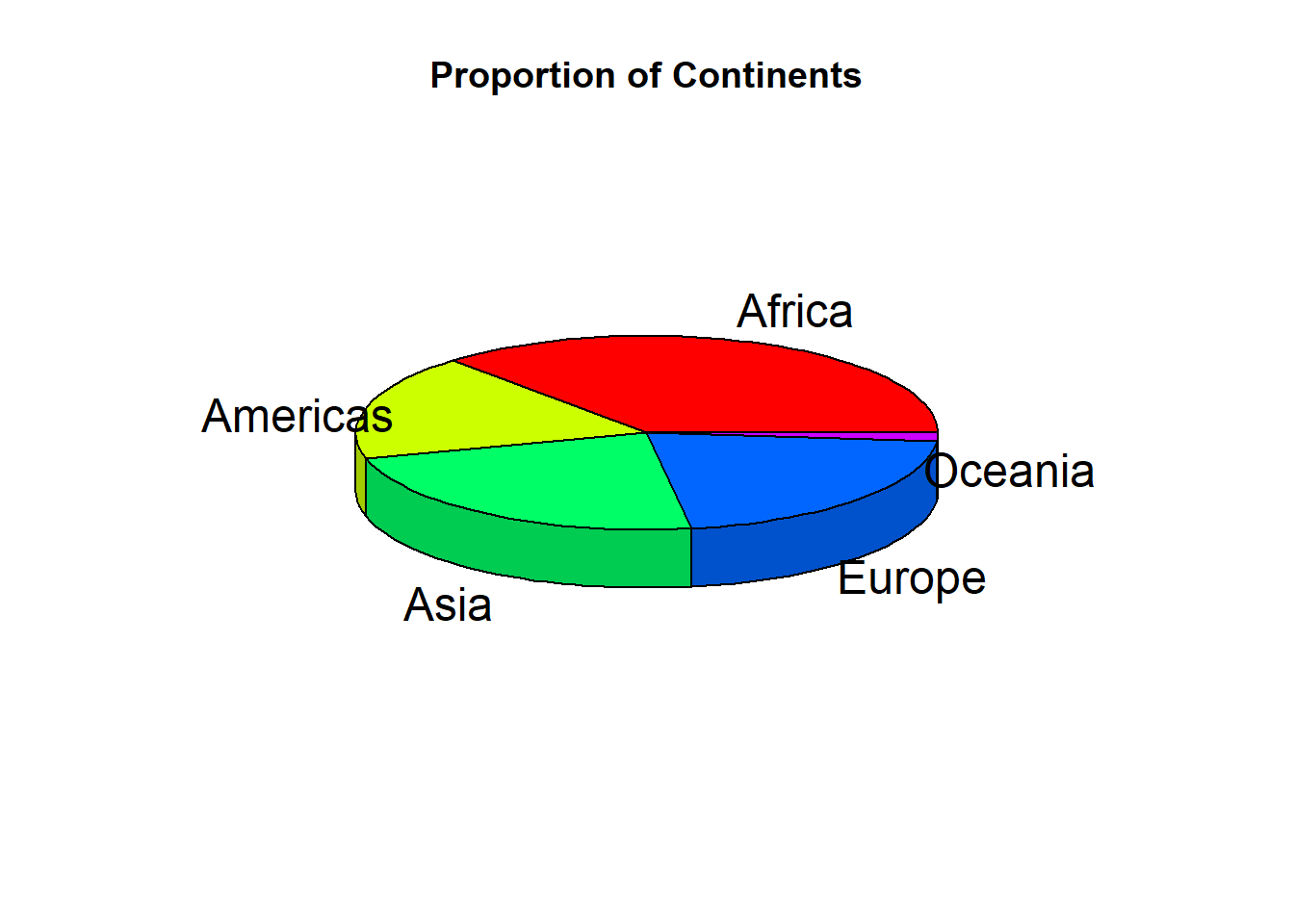
4.6 Box Plots:
Box plots are used for visualizing the distribution of continuous or discrete numerical data. They show the median, quartiles, and outliers of the data, providing a compact and informative representation of the data distribution.
# Box plot of life expectancy by continent using ggplot2
ggplot(gapminder, aes(x = continent, y = lifeExp)) + geom_boxplot()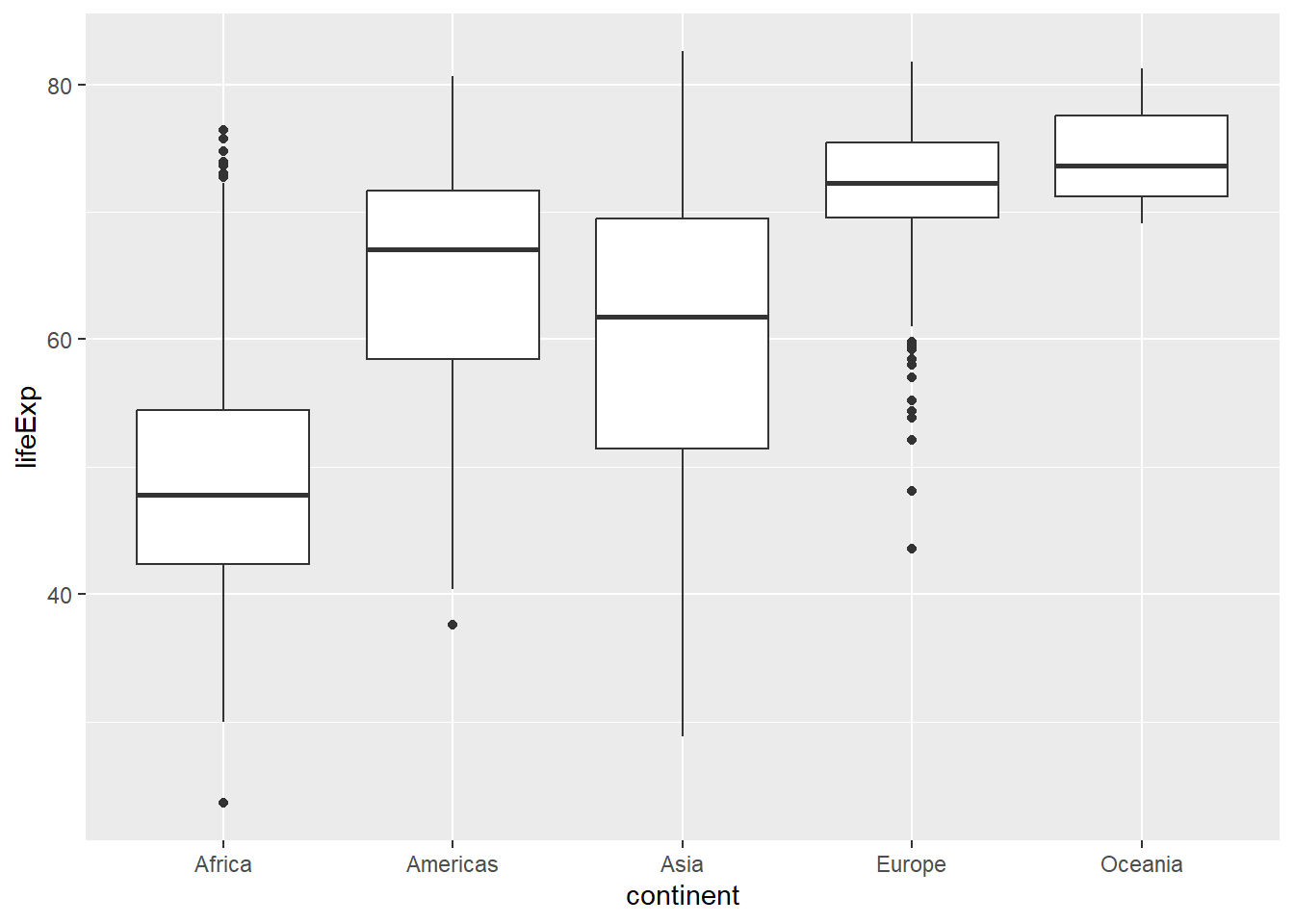
4.7 Scatter Plots
Scatter plots are used to display the relationship between two continuous variables. They can be particularly helpful in identifying trends, correlations, and potential outliers in the data.
# Scatter plot of life expectancy vs. GDP per capita using ggplot2
ggplot(gapminder, aes(x = gdpPercap, y = lifeExp)) + geom_point() + scale_x_log10()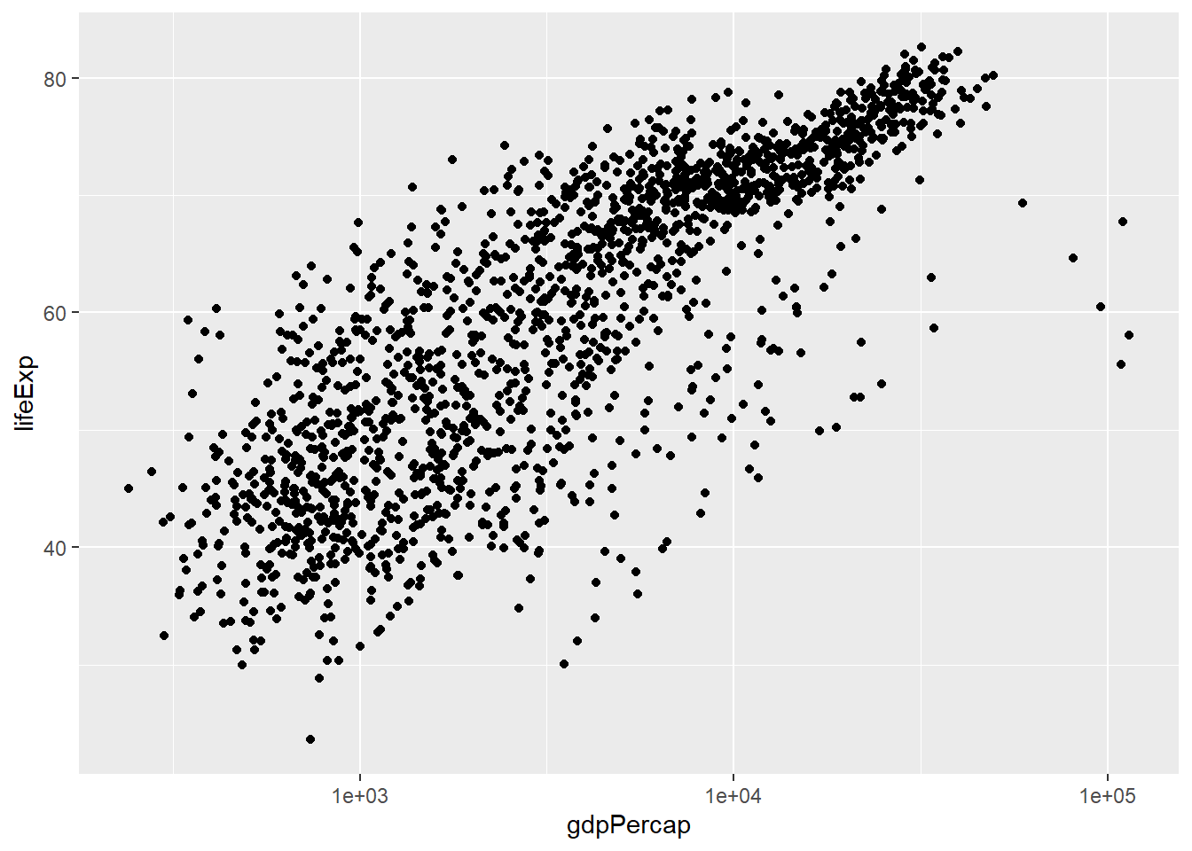
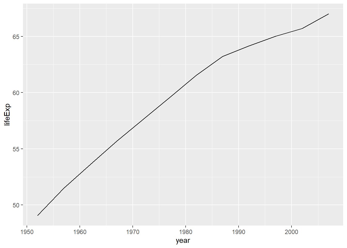
4.8 Line Graphs
Line graphs are used to display the relationship between a continuous variable and a discrete or ordinal variable, often representing change over time. They can be particularly useful for identifying trends and patterns in time-series data.
# Line graph of average life expectancy over time using ggplot2
gapminder_agg <- aggregate(lifeExp ~ year, data = gapminder, mean)
ggplot(gapminder_agg, aes(x = year, y = lifeExp)) + geom_line()