Chapter 4 HTE I: Binary treatment
Source RMD file: link
In the previous chapter, we learned how to estimate the effect of a binary treatment averaged over the entire population. However, the average may obscure important details about how different individuals react to the treatment. In this chapter, we will learn how to estimate the conditional average treatment effect (CATE), \[\begin{equation} \tag{4.1} \tau(x) := \mathop{\mathrm{E}}[Y_i(1) - Y_i(0) | X_i = x], \end{equation}\] which is a “localized” version of the average treatment effect conditional on a vector of observable characteristics.
It’s often the case that (4.1) is too general to be immediately useful, especially when the observable covariates are high-dimensional. It can be hard to estimate reliably without making strong modeling assumptions, and hard to summarize in a useful manner after estimation. In such situations, we will instead try to estimate treatment effect averages for simpler groups \[\begin{equation} \tag{4.2} \mathop{\mathrm{E}}[Y_i(1) - Y_i(0) | G_i = g], \end{equation}\] where \(G_i\) indexes subgroups of interest. Below you’ll learn how to estimate and test hypotheses about pre-defined subgroups, and also how to discover subgroups of interest from the data. In this tutorial, you will learn how to use estimates of (4.1) to suggest relevant subgroups \(G_i\) (and in the next chapters you will find out other uses of (4.1) in policy learning and evaluation).
We’ll continue using the abridged version of the General Social Survey (GSS) (Smith, 2016) dataset that was introduced in the previous chapter. In this dataset, individuals were sent to treatment or control with equal probability, so we are in a randomized setting. However, many of the techniques and code shown below should also work in an observational setting provided that unconfoundedness and overlap are satisfied (these assumptions were defined in the previous chapter).
# The causalTree package is not in CRAN, the most common R repository.
# To install it, uncomment the next lines as appropriate.
# install.packages("devtools")  # if you don't have this installed yet.
# devtools::install_github('susanathey/causalTree')
library(causalTree)

# use e.g., install.packages("grf") to install any of the following packages.
library(grf)
library(rpart)
library(glmnet)
library(splines)
library(MASS)
library(lmtest)
library(sandwich)
library(ggplot2)
library(stringr)
As with other chapters in this tutorial, the code below should still work by replacing the next snippet of code with a different dataset, provided that you update the key variables treatment, outcome, and covariates below. Also, please make sure to read the comments as they may be subtle differences depending on whether your dataset was created in a randomized or observational setting.
# Read in data
data <- read.csv("https://docs.google.com/uc?id=1AQva5-vDlgBcM_Tv9yrO8yMYRfQJgqo_&export=download")
n <- nrow(data)

# Treatment: does the the gov't spend too much on "welfare" (1) or "assistance to the poor" (0)
treatment <- "w"

# Outcome: 1 for 'yes', 0 for 'no'
outcome <- "y"

# Additional covariates
covariates <- c("age", "polviews", "income", "educ", "marital", "sex")
4.1 Pre-specified hypotheses
We will begin by learning how to test pre-specified null hypotheses of the form \[\begin{equation} \tag{4.3} H_{0}: \mathop{\mathrm{E}}[Y(1) - Y(0) | G_i = 1] = \mathop{\mathrm{E}}[Y(1) - Y(0) | G_i = 0]. \end{equation}\]
That is, that the treatment effect is the same regardless of membership to some group \(G_i\). Importantly, for now we’ll assume that the group \(G_i\) was pre-specified – it was decided before looking at the data.
In a randomized setting, if the both the treatment \(W_i\) and group membership \(G_i\) are binary, we can write \[\begin{equation} \tag{4.4} \mathop{\mathrm{E}}[Y_i(W_i)|G_i] = \mathop{\mathrm{E}}[Y_i|W_i, G_i] = \beta_0 + \beta_w W_i + \beta_g G_i + \beta_{wg} W_i G_i \end{equation}\]
When \(W_i\) and \(G_i\) are binary, this decomposition is true without loss of generality. Why?
This allows us to write the average effects of \(W_i\) and \(G_i\) on \(Y_i\) as \[\begin{align} \tag{4.5} \mathop{\mathrm{E}}[Y(1) | G_i=1] &= \beta_0 + \beta_w W_i + \beta_g G_i + \beta_{wg} W_i G_i, \\ \mathop{\mathrm{E}}[Y(1) | G_i=0] &= \beta_0 + \beta_w W_i, \\ \mathop{\mathrm{E}}[Y(0) | G_i=1] &= \beta_0 + \beta_g G_i, \\ \mathop{\mathrm{E}}[Y(0) | G_i=0] &= \beta_0. \end{align}\]
Rewriting the null hypothesis (4.3) in terms of the decomposition (4.5), we see that it boils down to a test about the coefficient in the interaction: \(\beta_{xw} = 0\). Here’s an example that tests whether the treatment effect is the same for “conservative” (polviews < 4) and “liberal” (polviews \(\geq\) 4) individuals.
# Only valid in randomized settings

# Suppose this group was defined prior to collecting the data
data$conservative <- factor(data$polviews < 4)  # a binary group
group <- 'conservative'

# Recall from last chapter -- this is equivalent to running a t-test
fmla <- formula(paste(outcome, ' ~ ', treatment, '*', group))
ols <- lm(fmla, data=data)
coeftest(ols, vcov=vcovHC(ols, type='HC2'))
##
## t test of coefficients:
##
## Estimate Std. Error t value Pr(>|t|)
## (Intercept) 0.4792818 0.0049623 96.584 < 2.2e-16 ***
## w -0.3759905 0.0057083 -65.867 < 2.2e-16 ***
## conservativeTRUE -0.1546559 0.0091815 -16.844 < 2.2e-16 ***
## w:conservativeTRUE 0.1130758 0.0102858 10.993 < 2.2e-16 ***
## ---
## Signif. codes: 0 '***' 0.001 '**' 0.01 '*' 0.05 '.' 0.1 ' ' 1
Interpret the results above. The coefficient \(\beta_{xw}\) is denoted by w:conservativeTRUE. Can we detect a difference in treatment effect for conservative vs liberal individuals? For whom is the effect larger?
Sometimes there are many subgroups, leading to multiple hypotheses such as \[\begin{equation} \tag{4.6} H_0: \mathop{\mathrm{E}}[Y(1) - Y(0) \ | \ G_i = 1] = \mathop{\mathrm{E}}[Y(1) - Y(0) \ | \ G_i = g] \qquad \text{for many values of }g. \end{equation}\]
In that case, we need to correct for the fact that we are testing for multiple hypotheses, or we will end up with many false positives. The Bonferroni correction (wiki) is a common method for dealing with multiple hypothesis testing, though it is often too conservative to be useful. It is available via the function p.adjust from base R. The next snippet of code tests whether the treatment effect at each level of polviews is different from the treatment effect from polviews equals one.
# Only valid in randomized setting.

# Example: these groups must be defined prior to collecting the data.
group <- 'polviews'

# Linear regression.
fmla <- formula(paste(outcome, ' ~ ', treatment, '*', 'factor(', group, ')'))
ols <- lm(fmla, data=data)
ols.res <- coeftest(ols, vcov=vcovHC(ols, type='HC2'))

# Retrieve the interaction coefficients
interact <- which(sapply(names(coef(ols)), function(x) grepl("w:", x)))

# Retrieve unadjusted p-values and
unadj.p.value <- ols.res[interact, 4]
adj.p.value <- p.adjust(unadj.p.value, method='bonferroni')

data.frame(estimate=coef(ols)[interact], std.err=ols.res[interact,2], unadj.p.value, adj.p.value)
## estimate std.err unadj.p.value adj.p.value
## w:factor(polviews)2 -0.02424199 0.02733714 3.752053e-01 1.000000e+00
## w:factor(polviews)3 -0.05962335 0.02735735 2.930778e-02 2.051545e-01
## w:factor(polviews)4 -0.13461439 0.02534022 1.090392e-07 7.632745e-07
## w:factor(polviews)4.1220088 -0.08807425 0.03468600 1.111608e-02 7.781258e-02
## w:factor(polviews)5 -0.16491540 0.02713505 1.234947e-09 8.644628e-09
## w:factor(polviews)6 -0.18007875 0.02751422 6.048977e-11 4.234284e-10
## w:factor(polviews)7 -0.18618443 0.03870554 1.514584e-06 1.060209e-05Another option is to use the Romano-Wolf correction, based on Romano and Wolf (2005, Econometrica). This bootstrap-based procedure takes into account the underlying dependence structure of the test statistics in a way that improves power. The Romano-Wolf procedure is correct under minimal assumptions, and should be favored over Bonferroni in general.
# Auxiliary function to computes adjusted p-values
# following the Romano-Wolf method.
# For a reference, see http://ftp.iza.org/dp12845.pdf page 8
#  t.orig: vector of t-statistics from original model
#  t.boot: matrix of t-statistics from bootstrapped models
romano_wolf_correction <- function(t.orig, t.boot) {
  abs.t.orig <- abs(t.orig)
  abs.t.boot <- abs(t.boot)
  abs.t.sorted <- sort(abs.t.orig, decreasing = TRUE)

  max.order <- order(abs.t.orig, decreasing = TRUE)
  rev.order <- order(max.order)

  M <- nrow(t.boot)
  S <- ncol(t.boot)

  p.adj <- rep(0, S)
  p.adj[1] <- mean(apply(abs.t.boot, 1, max) > abs.t.sorted[1])
  for (s in seq(2, S)) {
    cur.index <- max.order[s:S]
    p.init <- mean(apply(abs.t.boot[, cur.index, drop=FALSE], 1, max) > abs.t.sorted[s])
    p.adj[s] <- max(p.init, p.adj[s-1])
  }
  p.adj[rev.order]
}

# Computes adjusted p-values for linear regression (lm) models.
#    model: object of lm class (i.e., a linear reg model)
#    indices: vector of integers for the coefficients that will be tested
#    cov.type: type of standard error (to be passed to sandwich::vcovHC)
#    num.boot: number of null bootstrap samples. Increase to stabilize across runs.
# Note: results are probabilitistic and may change slightly at every run.
#
# Adapted from the p_adjust from from the hdm package, written by Philipp Bach.
# https://github.com/PhilippBach/hdm_prev/blob/master/R/p_adjust.R
summary_rw_lm <- function(model, indices=NULL, cov.type="HC2", num.boot=10000) {

  if (is.null(indices)) {
    indices <- 1:nrow(coef(summary(model)))
  }
  # Grab the original t values.
  summary <- coef(summary(model))[indices,,drop=FALSE]
  t.orig <- summary[, "t value"]

  # Null resampling.
  # This is a trick to speed up bootstrapping linear models.
  # Here, we don't really need to re-fit linear regressions, which would be a bit slow.
  # We know that betahat ~ N(beta, Sigma), and we have an estimate Sigmahat.
  # So we can approximate "null t-values" by
  #  - Draw beta.boot ~ N(0, Sigma-hat) --- note the 0 here, this is what makes it a *null* t-value.
  #  - Compute t.boot = beta.boot / sqrt(diag(Sigma.hat))
  Sigma.hat <- vcovHC(model, type=cov.type)[indices, indices]
  se.orig <- sqrt(diag(Sigma.hat))
  num.coef <- length(se.orig)
  beta.boot <- mvrnorm(n=num.boot, mu=rep(0, num.coef), Sigma=Sigma.hat)
  t.boot <- sweep(beta.boot, 2, se.orig, "/")
  p.adj <- romano_wolf_correction(t.orig, t.boot)

  result <- cbind(summary[,c(1,2,4),drop=F], p.adj)
  colnames(result) <- c('Estimate', 'Std. Error', 'Orig. p-value', 'Adj. p-value')
  result
}
# This linear regression is only valid in a randomized setting.
fmla <- formula(paste(outcome, ' ~ ', treatment, '*', 'factor(', group, ')'))
ols <- lm(fmla, data=data)
interact <- which(sapply(names(coef(ols)), function(x) grepl(paste0(treatment, ":"), x)))
# Applying the romano-wolf correction.
summary_rw_lm(ols, indices=interact)## Estimate Std. Error Orig. p-value Adj. p-value
## w:factor(polviews)2 -0.02424199 0.03031176 4.238590e-01 0.4240
## w:factor(polviews)3 -0.05962335 0.03011430 4.772377e-02 0.0755
## w:factor(polviews)4 -0.13461439 0.02819456 1.810280e-06 0.0000
## w:factor(polviews)4.1220088 -0.08807425 0.03636375 1.543984e-02 0.0357
## w:factor(polviews)5 -0.16491540 0.02954000 2.387646e-08 0.0000
## w:factor(polviews)6 -0.18007875 0.02962508 1.227186e-09 0.0000
## w:factor(polviews)7 -0.18618443 0.03785879 8.795962e-07 0.0000Compare the adjusted p-values under Romano-Wolf with those obtained via Bonferroni above.
The Bonferroni and Romano-Wolf methods control the familywise error rate (FWER), which is the (asymptotic) probability of rejecting even one true null hypothesis. In other words, for a significance level \(\alpha\), they guarantee that with probability \(1 - \alpha\) we will make zero false discoveries. However, when the number of hypotheses being tested is very large, this criterion may be so stringent that it prevents us from being able to detect real effects. Instead, there exist alternative procedures that control the (asymptotic) false discovery rate (FDR), defined as the expected proportion of true null hypotheses rejected among all hypotheses rejected. One such procedure is the Benjamini-Hochberg procedure, which is available in base R via p.adjust(..., method="BH"). For what remains we’ll stick with FWER control, but keep in mind that FDR control can also useful in exploratory analyses or settings in which there’s a very large number of hypotheses under consideration.
As in the previous chapter, when working with observational data under unconfoundedness and overlap, one can use AIPW scores \(\widehat{\Gamma}_i\) in place of the raw outcomes \(Y_i\). In the next snippet, we construct AIPW scores using the causal_forest function from the grf package.
# Valid in randomized settings and observational settings with unconfoundedness+overlap.

# Preparing data to fit a causal forest
fmla <- formula(paste0("~ 0 +", paste0(covariates, collapse="+")))
XX <- model.matrix(fmla, data)
W <- data[,treatment]
Y <- data[,outcome]

# Comment or uncomment as appropriate.
# Randomized setting with known and fixed probabilities (here: 0.5).
forest.tau <- causal_forest(XX, Y, W, W.hat=.5)
# Observational setting with unconf + overlap, unknown assignment probs.
forest.tau <- causal_forest(XX, Y, W)

# Get forest predictions.
tau.hat <- predict(forest.tau)$predictions
m.hat <- forest.tau$Y.hat  # E[Y|X] estimates
e.hat <- forest.tau$W.hat  # e(X) := E[W|X] estimates (or known quantity)
tau.hat <- forest.tau$predictions  # tau(X) estimates

# Predicting mu.hat(X[i], 1) and mu.hat(X[i], 0) for obs in held-out sample
# Note: to understand this, read equations 6-8 in this vignette
# https://grf-labs.github.io/grf/articles/muhats.html
mu.hat.0 <- m.hat - e.hat * tau.hat        # E[Y|X,W=0] = E[Y|X] - e(X)*tau(X)
mu.hat.1 <- m.hat + (1 - e.hat) * tau.hat  # E[Y|X,W=1] = E[Y|X] + (1 - e(X))*tau(X)

# Compute AIPW scores
aipw.scores <- tau.hat + W / e.hat * (Y -  mu.hat.1) - (1 - W) / (1 - e.hat) * (Y -  mu.hat.0)

# Estimate average treatment effect conditional on group membership
fmla <- formula(paste0('aipw.scores ~ factor(', group, ')'))
ols <- lm(fmla, data=transform(data, aipw.scores=aipw.scores))
ols.res <- coeftest(ols, vcov = vcovHC(ols, "HC2"))
indices <- which(names(coef(ols.res)) != '(Intercept)')
summary_rw_lm(ols, indices=indices)
## Estimate Std. Error Orig. p-value Adj. p-value
## factor(polviews)2 -0.02819678 0.03212434 3.800927e-01 0.3778
## factor(polviews)3 -0.07219878 0.03192030 2.371417e-02 0.0390
## factor(polviews)4 -0.14073231 0.02989876 2.525696e-06 0.0000
## factor(polviews)4.1220088 -0.10240361 0.03845249 7.746138e-03 0.0195
## factor(polviews)5 -0.17821235 0.03132120 1.283595e-08 0.0000
## factor(polviews)6 -0.18144066 0.03141130 7.712804e-09 0.0000
## factor(polviews)7 -0.20520911 0.04010722 3.131709e-07 0.0000One can also construct AIPW scores using any other nonparametric method. Here’s how to do it by fitting flexible generalized linear models glmnet and splines.
# Valid randomized data and observational data with unconfoundedness+overlap.
# Note: read the comments below carefully.
# In randomized settings, do not estimate forest.e and e.hat; use known assignment probs.
fmla.xw <- formula(paste0("~", paste0("bs(", covariates, ", df=3, degree=3) *", treatment, collapse="+")))
fmla.x <- formula(paste0("~", paste0("bs(", covariates, ", df=3, degree=3)", collapse="+")))
XW <- model.matrix(fmla.xw, data)
XX <- model.matrix(fmla.x, data)
Y <- data[,outcome]

n.folds <- 5
indices <- split(seq(n), sort(seq(n) %% n.folds))

aipw.scores <- lapply(indices, function(idx) {

  # Fitting the outcome model
  model.m <- cv.glmnet(XW[-idx,], Y[-idx])

  # Predict outcome E[Y|X,W=w] for w in {0, 1}
  data.0 <- data
  data.0[,treatment] <- 0
  XW0 <- model.matrix(fmla.xw, data.0)
  mu.hat.0 <- predict(model.m, XW0, s="lambda.min")[idx,]

  data.1 <- data
  data.1[,treatment] <- 1
  XW1 <- model.matrix(fmla.xw, data.1)
  mu.hat.1 <- predict(model.m, XW1, s="lambda.min")[idx,]

  # Fitting the propensity score model
  # Comment / uncomment the lines below as appropriate.
  # OBSERVATIONAL SETTING (with unconfoundedness+overlap):
  # model.e <- cv.glmnet(XX[-idx,], W[-idx], family="binomial")
  # e.hat <- predict(model.e, XX[idx,], s="lambda.min", type="response")
  # RANDOMIZED SETTING
  e.hat <- rep(0.5, length(idx))

  # Compute CATE estimates
  tau.hat <- mu.hat.1 - mu.hat.0

  # Compute AIPW scores
  aipw.scores <- (tau.hat
                  + W[idx] / e.hat * (Y[idx] -  mu.hat.1)
                  - (1 - W[idx]) / (1 - e.hat) * (Y[idx] -  mu.hat.0))

  aipw.scores
})
aipw.scores<- unname(do.call(c, aipw.scores))

# Estimate average treatment effect conditional on group membership
fmla <- formula(paste0('aipw.scores ~ factor(', group, ')'))
ols <- lm(fmla, data=transform(data, aipw.scores=aipw.scores))
ols.res <- coeftest(ols, vcov = vcovHC(ols, "HC2"))
indices <- which(names(coef(ols.res)) != '(Intercept)')
summary_rw_lm(ols, indices=indices)
## Estimate Std. Error Orig. p-value Adj. p-value
## factor(polviews)2 -0.02410993 0.03020636 4.247760e-01 0.4302
## factor(polviews)3 -0.06056035 0.03001451 4.363121e-02 0.0699
## factor(polviews)4 -0.13348012 0.02811366 2.065231e-06 0.0001
## factor(polviews)4.1220088 -0.08601442 0.03615669 1.736899e-02 0.0391
## factor(polviews)5 -0.16483522 0.02945118 2.201431e-08 0.0000
## factor(polviews)6 -0.17902911 0.02953589 1.365576e-09 0.0000
## factor(polviews)7 -0.18654507 0.03771263 7.597635e-07 0.00004.2 Data-driven hypotheses
Pre-specifying hypotheses prior to looking at the data is in general good practice to avoid “p-hacking” (e.g., slicing the data into different subgroups until a significant result is found). However, valid tests can also be attained by sample splitting: we can use a subset of the sample to find promising subgroups, then test hypotheses about these subgroups in the remaining sample. This kind of sample splitting for hypothesis testing is called honesty.
4.2.1 Via causal trees
Causal trees (Athey and Imbens)(PNAS, 2016) are an intuitive algorithm that is available in the randomized setting to discover subgroups with different treatment effects.
At a high level, the idea is to divide the sample into three subsets (not necessarily of equal size). The splitting subset is used to fit a decision tree whose objective is modified to maximize heterogeneity in treatment effect estimates across leaves. The estimation subset is then used to produce a valid estimate of the treatment effect at each leaf of the fitted tree. Finally, a test subset can be used to validate the tree estimates.
The next snippet uses honest.causalTree function from the causalTree package. For more details, see the causalTree documentation.
# Only valid for randomized data!

fmla <- paste(outcome, " ~", paste(covariates, collapse = " + "))

# Dividing data into three subsets
indices <- split(seq(nrow(data)), sort(seq(nrow(data)) %% 3))
names(indices) <- c('split', 'est', 'test')

# Fitting the forest
ct.unpruned <- honest.causalTree(
  formula=fmla,            # Define the model
  data=data[indices$split,],
  treatment=data[indices$split, treatment],
  est_data=data[indices$est,],
  est_treatment=data[indices$est, treatment],
  minsize=1,                 # Min. number of treatment and control cases in each leaf
  HonestSampleSize=length(indices$est), #  Num obs used in estimation after splitting
  # We recommend not changing the parameters below
  split.Rule="CT",            # Define the splitting option
  cv.option="TOT",            # Cross validation options
  cp=0,                       # Complexity parameter
  split.Honest=TRUE,          # Use honesty when splitting
  cv.Honest=TRUE              # Use honesty when performing cross-validation
)

# Table of cross-validated values by tuning parameter.
ct.cptable <- as.data.frame(ct.unpruned$cptable)

# Obtain optimal complexity parameter to prune tree.
cp.selected <- which.min(ct.cptable$xerror)
cp.optimal <- ct.cptable[cp.selected, "CP"]

# Prune the tree at optimal complexity parameter.
ct.pruned <- prune(tree=ct.unpruned, cp=cp.optimal)

# Predict point estimates (on estimation sample)
tau.hat.est <- predict(ct.pruned, newdata=data[indices$est,])

# Create a factor column 'leaf' indicating leaf assignment in the estimation set
num.leaves <- length(unique(tau.hat.est))
leaf <- factor(tau.hat.est, levels=sort(unique(tau.hat.est)), labels = seq(num.leaves))
Note: if your tree is not splitting at all, try decreasing the parameter minsize that controls the minimum size of each leaf. Figure 4.1 plots the learned tree. The values in the cell are the estimated treatment effect and an estimate of the fraction of the population that falls within each leaf. Both are estimated using the estimation sample.
rpart.plot(
  x=ct.pruned,        # Pruned tree
  type=3,             # Draw separate split labels for the left and right directions
  fallen=TRUE,        # Position the leaf nodes at the bottom of the graph
  leaf.round=1,       # Rounding of the corners of the leaf node boxes
  extra=100,          # Display the percentage of observations in the node
  branch=.1,          # Shape of the branch lines
  box.palette="RdBu") # Palette for coloring the node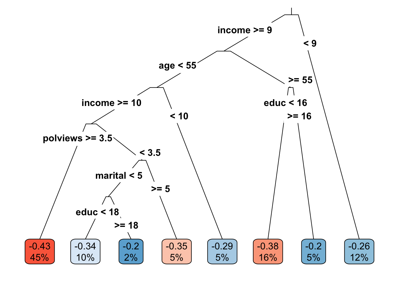
Figure 4.1: Learned causal tree
The next snippet tests if the treatment effect in leaves \(\geq 2\) is larger than the treatment effect in the first leaf. The code follows closely what we saw in the previous subsection.
# This is only valid in randomized datasets.
fmla <- paste0(outcome, ' ~ ', paste0(treatment, '* leaf'))
if (num.leaves == 1) {
  print("Skipping since there's a single leaf.")

} else if (num.leaves == 2) {
  # if there are only two leaves, no need to correct for multiple hypotheses
  ols <- lm(fmla, data=transform(data[indices$est,], leaf=leaf))
  coeftest(ols, vcov=vcovHC(ols, 'HC2'))[4,,drop=F]

} else {
  # if there are three or more leaves, use Romano-Wolf test correction
  ols <- lm(fmla, data=transform(data[indices$est,], leaf=leaf))
  interact <- which(sapply(names(coef(ols)), function(x) grepl(paste0(treatment, ":"), x)))
  summary_rw_lm(ols, indices=interact, cov.type = 'HC2')
}
## Estimate Std. Error Orig. p-value Adj. p-value
## w:leaf2 0.05040852 0.02440592 3.890905e-02 0.0738
## w:leaf3 0.07907858 0.03899044 4.257138e-02 0.0738
## w:leaf4 0.08865414 0.02985891 2.993876e-03 0.0104
## w:leaf5 0.13868109 0.03845349 3.119280e-04 0.0022
## w:leaf6 0.16486039 0.02745531 1.984518e-09 0.0000
## w:leaf7 0.22364735 0.04148511 7.166810e-08 0.0000
## w:leaf8 0.22927441 0.06638977 5.557623e-04 0.0025In the chapter Introduction to Machine Learning, we cautioned against interpreting the decision tree splits, and the same is true for causal tree splits. That a tree splits on a particular variable does not mean that this variable is relevant in the underlying data-generating process – it could simply be correlated with some other variable that is. For the same reason, we should not try to interpret partial effects from tree output.
However, similar to what we have done in previous chapters, we can try to understand how the joint distribution of covariates varies for subgroups with different estimated treatment effects. Figure 4.2 shows the average value of each covariate within each leaf. Leaves are ordered from lowest to highest treatment effect estimate. The color is a normalized distance of each leaf-specific covariate mean from the overall covariate mean, i.e.., \(\smash{\Phi^{-1}\left((\widehat{\text{E}}[X_i|L_i] - \widehat{\text{E}}[X_i])/\widehat{\text{Var}}(\widehat{\text{E}}[X_i|L_i])\right)}\). The rows are in descending order of variation, measured by \(\widehat{\text{Var}}(\widehat{\text{E}}[X_i|L_i])/\widehat{\text{Var}}(X_i)\).
df <- mapply(function(covariate) {
      # Looping over covariate names
      # Compute average covariate value per leaf (with correct standard errors)
      fmla <- formula(paste0(covariate, "~ 0 + leaf"))
      ols <- lm(fmla, data=transform(data[indices$est,], leaf=leaf))
      ols.res <- coeftest(ols, vcov=vcovHC(ols, "HC2"))

      # Retrieve results
      avg <- ols.res[,1]
      stderr <- ols.res[,2]

      # Tally up results
      data.frame(covariate, avg, stderr, leaf=paste0("Leaf", seq(num.leaves)),
                 # Used for coloring
                 scaling=pnorm((avg - mean(avg))/sd(avg)),
                 # We will order based on how much variation is 'explain' by the averages
                 # relative to the total variation of the covariate in the data
                 variation=sd(avg) / sd(data[,covariate]),
                 # String to print in each cell in heatmap below
                 labels=paste0(signif(avg, 3), "\n", "(", signif(stderr, 3), ")"))
}, covariates, SIMPLIFY = FALSE)
df <- do.call(rbind, df)

# a small optional trick to ensure heatmap will be in decreasing order of 'variation'
df$covariate <- reorder(df$covariate, order(df$variation))

# plot heatmap
ggplot(df) +
    aes(leaf, covariate) +
    geom_tile(aes(fill = scaling)) +
    geom_text(aes(label = labels)) +
    scale_fill_gradient(low = "#E1BE6A", high = "#40B0A6") +
    ggtitle(paste0("Average covariate values within each leaf")) +
    theme_minimal() +
    ylab("") + xlab("") +
    theme(plot.title = element_text(size = 12, face = "bold"),
          axis.text=element_text(size=11))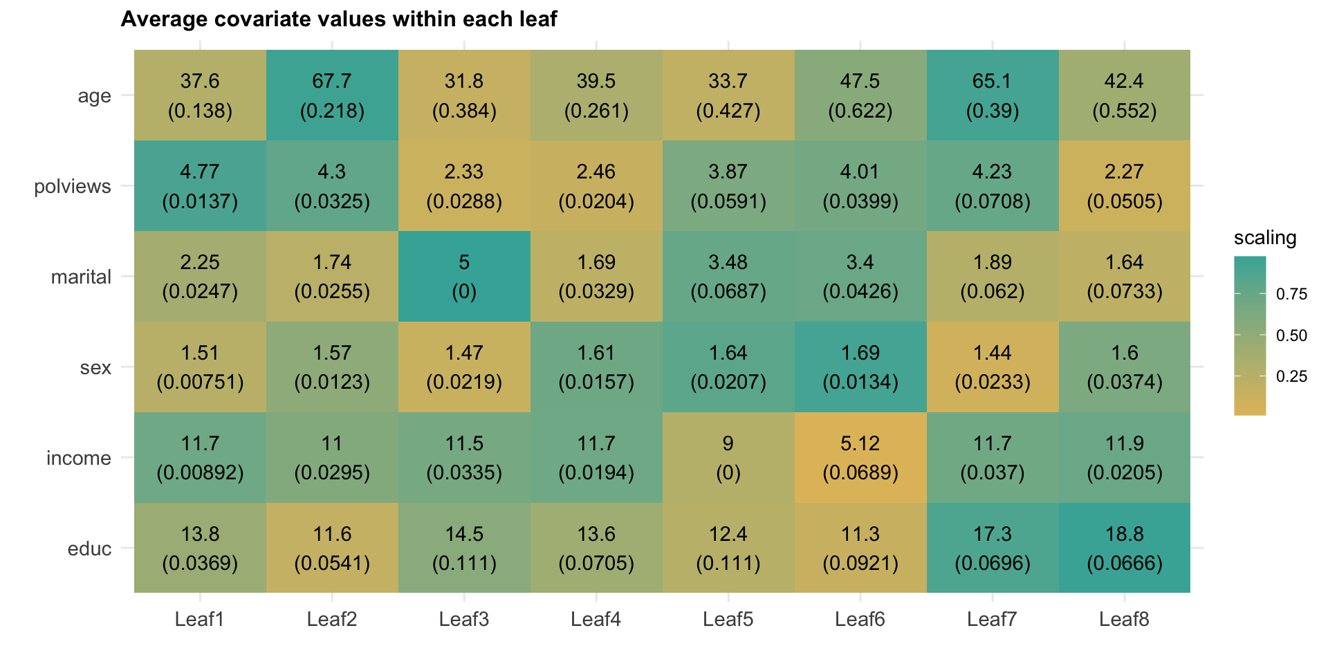
Figure 4.2: Average covariate values within each leaf
Interpret the heatmap above. What describes the subgroups with strongest and weakest estimated treatment effect?
4.2.2 Via grf
The function causal_forest from the package grf allows us to get estimates of the CATE (4.1).
# Get predictions from forest fitted above.
tau.hat <- predict(forest.tau)$predictions  # tau(X) estimates
Having fit a non-parametric method such as a causal forest, a researcher may (incorrectly) start by looking at the distribution of its predictions of the treatment effect as in Figure 4.3. One might be tempted to think: “if the histogram is concentrated at a point, then there is no heterogeneity; if the histogram is spread out, then our estimator has found interesting heterogeneity.” However, this may be false.
# Do not use this for assessing heterogeneity. See text above.
hist(tau.hat, main="CATE estimates", freq=F, las=1)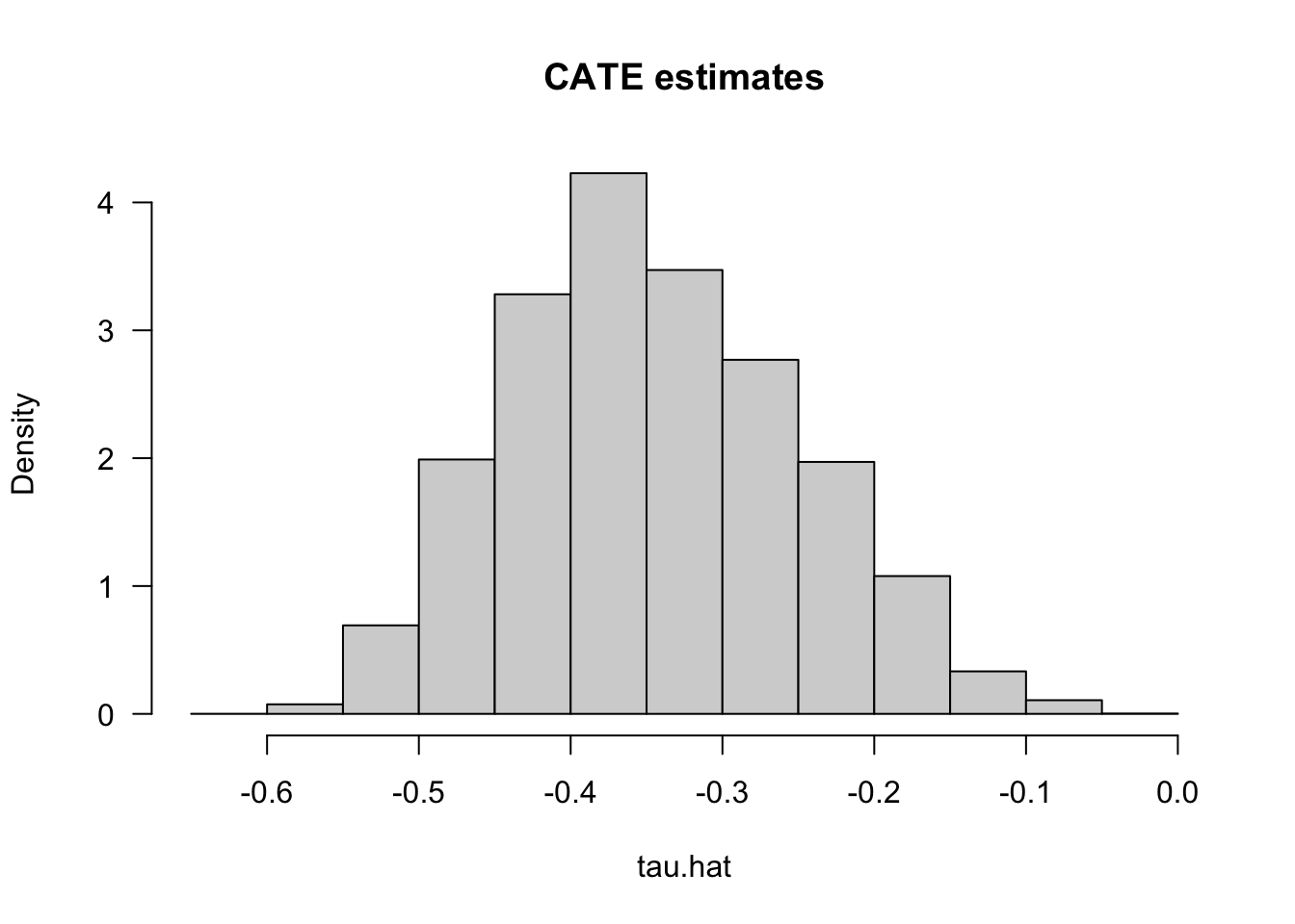
Figure 4.3: CATE Estimates
If the histogram is concentrated at a point, we may simply be underpowered: our method was not able to detect any heterogeneity, but maybe it would detect it if we had more data. If the histogram is spread out, we may be overfitting: our model is producing very noisy estimates \(\widehat{\tau}(x)\), but in fact the true \(\tau(x)\) can be much smoother as a function of \(x\).
The grf package also produces a measure of variable importance that indicates how often a variable was used in a tree split. Again, much like the histogram above, this can be a rough diagnostic, but it should not be interpreted as indicating that, for example, variable with low importance is not related to heterogeneity. The reasoning is the same as the one presented in the causal trees section: if two covariates are highly correlated, the trees might split on one covariate but not the other, even though both (or maybe neither) are relevant in the true data-generating process.
var_imp <- c(variable_importance(forest.tau))
names(var_imp) <- covariates
sorted_var_imp <- sort(var_imp, decreasing = TRUE)
sorted_var_imp[1:5]  # showing only first few
## polviews income age educ marital
## 0.39634676 0.39142821 0.09449726 0.07052915 0.040179174.2.2.1 Data-driven subgroups
Just as with causal trees, we can use causal forests to divide our observations into subgroups. In place of leaves, we’ll rank observation into (say) quintiles according to their estimated CATE prediction; see, e.g., Chernozhukov, Demirer, Duflo, Fernández-Val (2020) for similar ideas.
There’s a subtle but important point that needs to be addressed here. As we have mentioned before, when predicting the conditional average treatment effect \(\widehat{\tau}(X_i)\) for observation \(i\) we should in general avoid using a model that was fitted using observation \(i\). This sort of sample splitting (which we called honesty above) is one of the required ingredients to get unbiased estimates of the CATE using the methods described here. However, when ranking estimates of two observations \(i\) and \(j\), we need something a little stronger: we must ensure that the model was not fit using either \(i\) or \(j\)’s data.
One way of overcoming this obstacle is simple. First, divide the data into \(K\) folds (subsets). Then, cycle through the folds, fitting a CATE model on \(K-1\) folds. Next, for each held-out fold, separately rank the unseen observations into \(Q\) groups based on their prediction (i.e., if \(Q=5\), then we rank observations by estimated CATE into “top quintile”, “second quintile”, and so on). After concatenating the independent rankings together, we can study the differences in observations in each rank-group.
This gist computes the above for grf, and it should not be hard to modify it so as to replace forests by any other non-parametric method. However, for grf specifically, there’s a small trick that allows us to obtain a valid ranking: we can pass a vector of fold indices to the argument clusters and rank observations within each fold. This works because estimates for each fold (“cluster”) trees are computed using trees that were not fit using observations from that fold. Here’s how to do it.
# Valid randomized data and observational data with unconfoundedness+overlap.
# Note: read the comments below carefully.
# In randomized settings, do not estimate forest.e and e.hat; use known assignment probs.

# Prepare dataset
fmla <- formula(paste0("~ 0 + ", paste0(covariates, collapse="+")))
X <- model.matrix(fmla, data)
W <- data[,treatment]
Y <- data[,outcome]

# Number of rankings that the predictions will be ranking on
# (e.g., 2 for above/below median estimated CATE, 5 for estimated CATE quintiles, etc.)
num.rankings <- 5

# Prepare for data.splitting
# Assign a fold number to each observation.
# The argument 'clusters' in the next step will mimick K-fold cross-fitting.
num.folds <- 10
folds <- sort(seq(n) %% num.folds) + 1

# Comment or uncomment depending on your setting.
# Observational setting with unconfoundedness+overlap (unknown assignment probs):
# forest <- causal_forest(X, Y, W, clusters = folds)
# Randomized settings with fixed and known probabilities (here: 0.5).
forest <- causal_forest(X, Y, W, W.hat=.5, clusters = folds)

# Retrieve out-of-bag predictions.
# Predictions for observation in fold k will be computed using
# trees that were not trained using observations for that fold.
tau.hat <- predict(forest)$predictions

# Rank observations *within each fold* into quintiles according to their CATE predictions.
ranking <- rep(NA, n)
for (fold in seq(num.folds)) {
  tau.hat.quantiles <- quantile(tau.hat[folds == fold], probs = seq(0, 1, by=1/num.rankings))
  ranking[folds == fold] <- cut(tau.hat[folds == fold], tau.hat.quantiles, include.lowest=TRUE,labels=seq(num.rankings))
}
The next snippet computes the average treatment effect within each group defined above, i.e., \(\mathop{\mathrm{E}}[Y_i(1) - Y_i(0)|G_i = g]\). This can done in two ways. First, by computing a simple difference-in-means estimate of the ATE based on observations within each group. This is valid only in randomized settings.
# Valid only in randomized settings.
# Average difference-in-means within each ranking

# Formula y ~ 0 + ranking + ranking:w
fmla <- paste0(outcome, " ~ 0 + ranking + ranking:", treatment)
ols.ate <- lm(fmla, data=transform(data, ranking=factor(ranking)))
ols.ate <- coeftest(ols.ate, vcov=vcovHC(ols.ate, type='HC2'))
interact <- which(grepl(":", rownames(ols.ate)))
ols.ate <- data.frame("ols", paste0("Q", seq(num.rankings)), ols.ate[interact, 1:2])
rownames(ols.ate) <- NULL # just for display
colnames(ols.ate) <- c("method", "ranking", "estimate", "std.err")
ols.ate
## method ranking estimate std.err
## 1 ols Q1 -0.4362706 0.011106313
## 2 ols Q2 -0.3972095 0.011096655
## 3 ols Q3 -0.3714506 0.010749505
## 4 ols Q4 -0.3202576 0.010258613
## 5 ols Q5 -0.2087169 0.009553874Another option is to average the AIPW scores within each group. This valid for both randomized settings and observational settings with unconfoundedness and overlap. Moreover, AIPW-based estimators should produce estimates with tighter confidence intervals in large samples.
# Computing AIPW scores.
tau.hat <- predict(forest)$predictions
e.hat <- forest$W.hat # P[W=1|X]
m.hat <- forest$Y.hat # E[Y|X]

# Estimating mu.hat(X, 1) and mu.hat(X, 0) for obs in held-out sample
# Note: to understand this, read equations 6-8 in this vignette:
# https://grf-labs.github.io/grf/articles/muhats.html
mu.hat.0 <- m.hat - e.hat * tau.hat        # E[Y|X,W=0] = E[Y|X] - e(X)*tau(X)
mu.hat.1 <- m.hat + (1 - e.hat) * tau.hat  # E[Y|X,W=1] = E[Y|X] + (1 - e(X))*tau(X)

# AIPW scores
aipw.scores <- tau.hat + W / e.hat * (Y -  mu.hat.1) - (1 - W) / (1 - e.hat) * (Y -  mu.hat.0)
ols <- lm(aipw.scores ~ 0 + factor(ranking))
forest.ate <- data.frame("aipw", paste0("Q", seq(num.rankings)), coeftest(ols, vcov=vcovHC(ols, "HC2"))[,1:2])
colnames(forest.ate) <- c("method", "ranking", "estimate", "std.err")
rownames(forest.ate) <- NULL # just for display
forest.ate
## method ranking estimate std.err
## 1 aipw Q1 -0.4366356 0.010819491
## 2 aipw Q2 -0.3947874 0.010575689
## 3 aipw Q3 -0.3716891 0.010424815
## 4 aipw Q4 -0.3209138 0.010030421
## 5 aipw Q5 -0.2052282 0.009090236Figure 4.4 plots the estimates.
# Concatenate the two results.
res <- rbind(forest.ate, ols.ate)

# Plotting the point estimate of average treatment effect
# and 95% confidence intervals around it.
ggplot(res) +
  aes(x = ranking, y = estimate, group=method, color=method) +
  geom_point(position=position_dodge(0.2)) +
  geom_errorbar(aes(ymin=estimate-2*std.err, ymax=estimate+2*std.err), width=.2, position=position_dodge(0.2)) +
  ylab("") + xlab("") +
  theme_minimal() +
  theme(legend.position="bottom", legend.title = element_blank())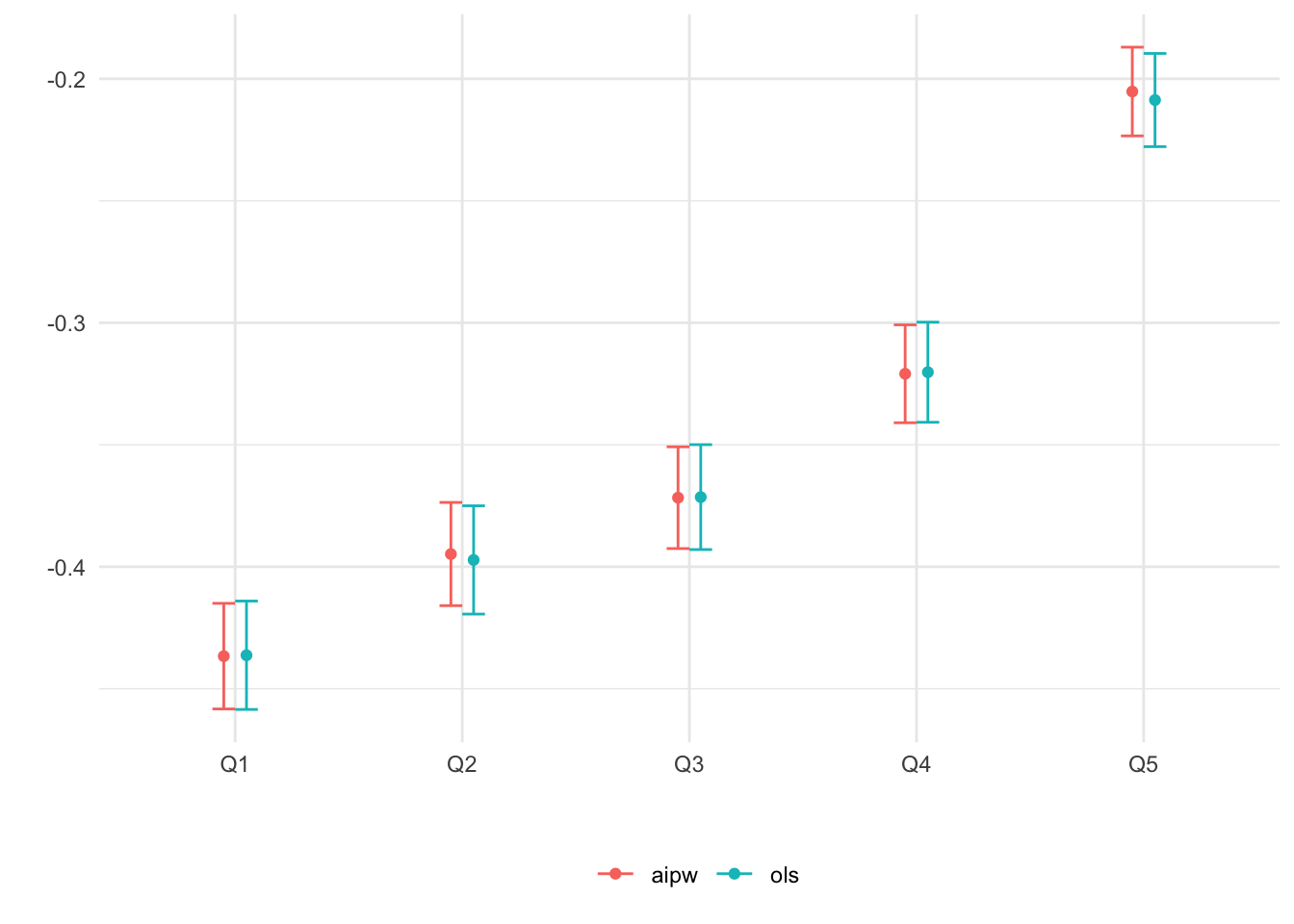
Figure 4.4: Average CATE within each ranking as defined by predicted CATE
When there isn’t much detectable heterogeneity, the plot above can end up being non-monotonic. This can mean that the number of observations is too small for us to be able to detect subgroups with relevant differences in treatment effect.
As an exercise, try running the previous two snippets on few data points (e.g., the first thousand observations only). You will likely see the “non-monotonicity” phenomenon just described.
Next, as we did for leaves in a causal tree, we can test e.g., if the prediction for groups 2, 3, etc. are larger than the one in the first group. Here’s how to do it based on a difference-in-means estimator. Note the Romano-Wolf multiple-hypothesis testing correction.
# Valid in randomized settings only.

# y ~ ranking + w + ranking:w
fmla <- paste0(outcome, "~ ranking + ", treatment, " + ranking:", treatment)
ols <- lm(fmla, data=transform(data, ranking=factor(ranking)))
interact <- which(sapply(names(coef(ols)), function(x) grepl(":", x)))
res <- summary_rw_lm(ols, indices=interact)
rownames(res) <- paste("Rank", 2:num.rankings, "- Rank 1") # just for display
res
## Estimate Std. Error Orig. p-value Adj. p-value
## Rank 2 - Rank 1 0.03906113 0.01447315 6.961476e-03 0.0072
## Rank 3 - Rank 1 0.06482004 0.01444196 7.205900e-06 0.0000
## Rank 4 - Rank 1 0.11601303 0.01444153 9.837446e-16 0.0000
## Rank 5 - Rank 1 0.22755377 0.01445160 1.230162e-55 0.0000Here’s how to do it for AIPW-based estimates, again with Romano-Wolf correction for multiple hypothesis testing.
# Valid in randomized and observational settings with unconfoundedness+overlap.

# Using AIPW scores computed above
ols <- lm(aipw.scores ~ 1 + factor(ranking))
res <- summary_rw_lm(ols, indices=2:num.rankings)
rownames(res) <- paste("Rank", 2:num.rankings, "- Rank 1") # just for display
res
## Estimate Std. Error Orig. p-value Adj. p-value
## Rank 2 - Rank 1 0.04184819 0.01443394 3.742807e-03 0.0036
## Rank 3 - Rank 1 0.06494646 0.01442787 6.774442e-06 0.0001
## Rank 4 - Rank 1 0.11572183 0.01443515 1.126089e-15 0.0000
## Rank 5 - Rank 1 0.23140742 0.01442908 1.219519e-57 0.0000Finally, in Figure 4.5, we check if different groups have different average covariate levels across rankings.
df <- mapply(function(covariate) {
      # Looping over covariate names
      # Compute average covariate value per ranking (with correct standard errors)
      fmla <- formula(paste0(covariate, "~ 0 + ranking"))
      ols <- lm(fmla, data=transform(data, ranking=factor(ranking)))
      ols.res <- coeftest(ols, vcov=vcovHC(ols, "HC2"))

      # Retrieve results
      avg <- ols.res[,1]
      stderr <- ols.res[,2]

      # Tally up results
      data.frame(covariate, avg, stderr, ranking=paste0("Q", seq(num.rankings)),
                 # Used for coloring
                 scaling=pnorm((avg - mean(avg))/sd(avg)),
                 # We will order based on how much variation is 'explain' by the averages
                 # relative to the total variation of the covariate in the data
                 variation=sd(avg) / sd(data[,covariate]),
                 # String to print in each cell in heatmap below
                 labels=paste0(signif(avg, 3), "\n", "(", signif(stderr, 3), ")"))
}, covariates, SIMPLIFY = FALSE)
df <- do.call(rbind, df)

# a small optional trick to ensure heatmap will be in decreasing order of 'variation'
df$covariate <- reorder(df$covariate, order(df$variation))

# plot heatmap
ggplot(df) +
    aes(ranking, covariate) +
    geom_tile(aes(fill = scaling)) +
    geom_text(aes(label = labels)) +
    scale_fill_gradient(low = "#E1BE6A", high = "#40B0A6") +
    theme_minimal() +
    ylab("") + xlab("CATE estimate ranking") +
    theme(plot.title = element_text(size = 11, face = "bold"),
axis.text=element_text(size=11)) 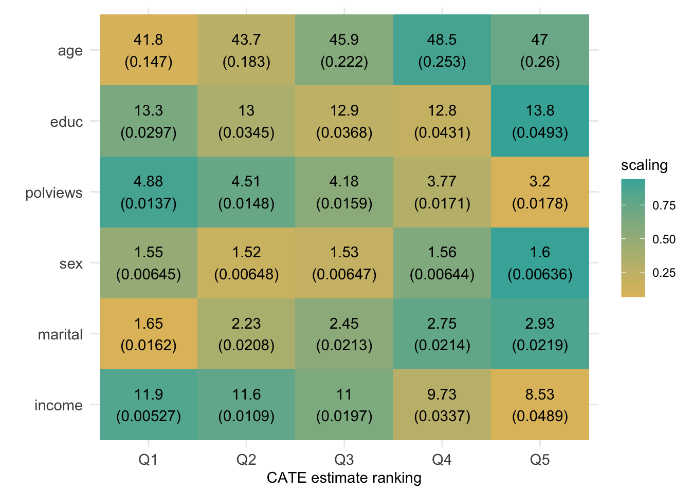
Figure 4.5: Average covariate values within group (based on CATE estimate ranking)
Interpret the heatmap above. What describes the subgroups with strongest and weakest estimated treatment effect? Are there variables that seem to increase or decrease monotonically across rankings?
4.2.2.2 Best linear projection
This function provides a doubly robust fit to the linear model \(\widehat{\tau}(X_i) = \beta_0 + A_i'\beta_1\), where \(A_i\) can be a subset of the covariate columns. The coefficients in this regression are suggestive of general trends, but they should not be interpret as partial effects – that would only be true if the true model were really linear in covariates, and that’s an assumption we shouldn’t be willing to make in general.
# Best linear projection of the conditional average treatment effect on covariates
best_linear_projection(forest.tau, X)
##
## Best linear projection of the conditional average treatment effect.
## Confidence intervals are cluster- and heteroskedasticity-robust (HC3):
##
## Estimate Std. Error t value Pr(>|t|)
## (Intercept) -0.15742589 0.04139754 -3.8028 0.0001434 ***
## age 0.00145106 0.00030409 4.7717 1.835e-06 ***
## polviews -0.03597393 0.00357150 -10.0725 < 2.2e-16 ***
## income -0.02102617 0.00195085 -10.7780 < 2.2e-16 ***
## educ 0.00782429 0.00166437 4.7010 2.600e-06 ***
## marital 0.01054544 0.00325401 3.2408 0.0011935 **
## sex -0.00876975 0.00983439 -0.8917 0.3725380
## ---
## Signif. codes: 0 '***' 0.001 '**' 0.01 '*' 0.05 '.' 0.1 ' ' 14.2.2.3 Assessing heterogeneity
The function test_calibration computes an estimate of the best linear predictor of true CATE based on out-of-bag predictions \(\hat{\tau}^{-i}(\cdot)\). The exact implementation seeks to fit the following linear model:
\[\begin{equation}
Y_{i} - \hat{m}^{-i}(X_{i}) = \alpha\bar{\tau}\left(W_{i} - \hat{e}^{-i}(X_{i})\right) + \beta \left(\hat{\tau}^{-i}(X_{i}) - \bar{\tau} \right) \left(W_{i} - \hat{e}^{-i}(X_{i}) \right) + \epsilon,
\end{equation}\]
where \(\bar{\tau} := n^{-1}\sum_{i=1}^{n} \hat{\tau}^{-i}(X_{i})\). The coefficients \(\alpha\) and \(\beta\) allow us to evaluate the performance of our estimates. If \(\alpha = 1\), then the average prediction produced by the forest is correct. Meanwhile, if \(\beta = 1\), then the forest predictions adequately capture the underlying heterogeneity.
The slope \(\beta\) is a measure of how the CATE predictions covary with true CATE. Therefore, the p-value on the estimate of coefficient also acts as an omnibus test for the presence of heterogeneity. If the coefficient is significantly greater than zero, then we can reject the null of no heterogeneity. However, coefficients smaller than 0 are not meaningful and show not be interpreted.
##
## Best linear fit using forest predictions (on held-out data)
## as well as the mean forest prediction as regressors, along
## with one-sided heteroskedasticity-robust (HC3) SEs:
##
##                                Estimate Std. Error t value    Pr(>t)
## mean.forest.prediction         1.001451   0.013498  74.195 < 2.2e-16 ***
## differential.forest.prediction 0.908583   0.047100  19.290 < 2.2e-16 ***
## ---
## Signif. codes:  0 '***' 0.001 '**' 0.01 '*' 0.05 '.' 0.1 ' ' 1
Interpret the test above. Is the forest producing correct estimate of the average treatment effect? Is it capturing the underlying heterogeneity?
4.2.2.4 Partial dependence
It may also be interesting to examine how our CATE estimates behave when we change a single covariate, while keeping all the other covariates at a some fixed value. In Figure 4.6, we evaluate a variable of interest across quantiles, while keeping all other covariates at their median.
It is important to recognize that by keeping some variables at their median we may be evaluating the CATE at \(x\) values in regions where there are few or no data points. Also, it may be the case that varying some particular variable while keeping others fixed may just not be very interesting.
In what follows we’ll again use causal_forest predictions, along with their variance estimates (set estimate.variances=TRUE when predicting to we get estimates of the asymptotic variance of the prediction for each point). Since grf predictions are asymptotically normal, we can construct 95% confidence intervals in the usual manner (i.e., \(\hat{\tau}(x) \pm 1.96\sqrt{\widehat{\text{Var}}(\hat{\tau}(x))}\)).
selected.covariate <- "polviews"
other.covariates <- covariates[which(covariates != selected.covariate)]

# Fitting a forest
# (commented for convenience; no need re-fit if already fitted above)
fmla <- formula(paste0("~ 0 + ", paste0(covariates, collapse="+")))
# Note: For smaller confidence intervals, set num.trees ~ sample size
# X <- model.matrix(fmla, data)
# W <- data[,treatment]
# Y <- data[,outcome]
# forest.tau <- causal_forest(X, Y, W, W.hat=.5)  # few trees for speed here

# Compute a grid of values appropriate for the selected covariate
grid.size <- 7
covariate.grid <- seq(min(data[,selected.covariate]), max(data[,selected.covariate]), length.out=grid.size)

# Other options for constructing a grid:
# For a binary variable, simply use 0 and 1
# grid.size <- 2
# covariate.grid <- c(0, 1)

# For a continuous variable, select appropriate percentiles
# percentiles <- c(.1, .25, .5, .75, .9)
# grid.size <- length(percentiles)
# covariate.grid <- quantile(data[,selected.covariate], probs=percentiles)

# Take median of other covariates
medians <- apply(data[, other.covariates, F], 2, median)

# Construct a dataset
data.grid <- data.frame(sapply(medians, function(x) rep(x, grid.size)), covariate.grid)
colnames(data.grid) <- c(other.covariates, selected.covariate)

# Expand the data
X.grid <- model.matrix(fmla, data.grid)

# Point predictions of the CATE and standard errors
forest.pred <- predict(forest.tau, newdata = X.grid, estimate.variance=TRUE)
tau.hat <- forest.pred$predictions
tau.hat.se <- sqrt(forest.pred$variance.estimates)

# Plot predictions for each group and 95% confidence intervals around them.
data.pred <- transform(data.grid, tau.hat=tau.hat, ci.low = tau.hat - 2*tau.hat.se, ci.high = tau.hat + 2*tau.hat.se)

ggplot(data.pred) +
  geom_line(aes_string(x=selected.covariate, y="tau.hat", group = 1), color="black") +
  geom_errorbar(aes_string(x=selected.covariate, ymin="ci.low", ymax="ci.high", width=.2), color="blue") +
   ylab("") +
  ggtitle(paste0("Predicted treatment effect varying '", selected.covariate, "' (other variables fixed at median)")) +
  scale_x_continuous("polviews", breaks=covariate.grid, labels=signif(covariate.grid, 2)) +
  theme_minimal() +
theme(plot.title = element_text(size = 11, face = "bold")) 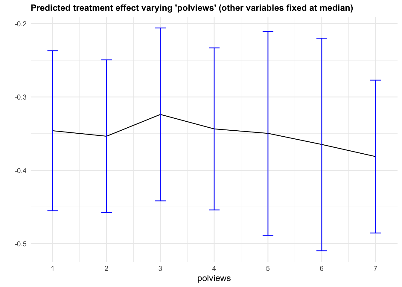
Figure 4.6: Predicted treatment effect varying one variable
Note that, in this example, we got fairly large confidence intervals. This can be explained in two ways. First, as we mentioned above, there’s a data scarcity problem. For example, even though the number of observations with polviews equal to 6 is not small,
## [1] 0.1489605there’s a much smaller fraction of individuals with polviews equal to 6 and (say) age close to the median age,
## [1] 0.02166454and an even smaller fraction of observations with polviews equal to 6 and every other variable close to the median. The second cause of wide confidence intervals is statistical. Since grf is a non-parametric model, we should expect fairly wide confidence intervals, especially in high-dimensional problems – that is an unavoidable consequence of avoiding modeling assumptions.
As documented in the original paper on generalized random forests (Athey, Tibshirani and Wager, 2019), the coverage of grf confidence intervals can drop if the signal is too dense or too complex relative to the number of observations. Also, to a point, it’s possible to get tighter confidence intervals by increasing the number of trees; see this short vignette for more information.
We can vary more than one variable at a time. Figure 4.7 shows predictions and standard errors varying two variables.
x1 <- 'polviews'
x2 <- 'age'
selected.covariates <- c(x1, x2)
other.covariates <- covariates[-which(covariates %in% selected.covariates)]

# Compute a grid of values appropriate for the selected covariate
# See other options for constructing grids in the snippet above.
x1.grid.size <- 7
x2.grid.size <- 5
x1.grid <- seq(min(data[,x1]), max(data[,x1]), length.out=x1.grid.size)
x2.grid <- seq(min(data[,x2]), max(data[,x2]), length.out=x2.grid.size)

# Take median of other covariates
medians <- apply(data[, other.covariates, F], 2, median)

# Construct dataset
data.grid <- data.frame(
                sapply(medians, function(x) rep(x, grid.size)),
                expand.grid(x1.grid, x2.grid))
colnames(data.grid) <- c(other.covariates, selected.covariates)

# Expand the data according to formula used to fit forest
X.grid <- model.matrix(fmla, data.grid)

# Forest-based point estimates of CATE and standard errors around them
forest.pred <- predict(forest.tau, newdata = X.grid, estimate.variance=TRUE)
tau.hat <- forest.pred$predictions
tau.hat.se <- sqrt(forest.pred$variance.estimates)

# A vector of labels for plotting below
labels <- mapply(function(est, se) paste0(signif(est, 3), "\n", "(", signif(se, 3), ")"), tau.hat, tau.hat.se)
df <- data.frame(X.grid, tau.hat, labels)

# Plotting
ggplot(df) +
    aes(age, polviews) +
    geom_tile(aes(fill = tau.hat)) +
    geom_text(aes(label = labels)) +
    scale_fill_gradient(low = "blue", high = "orange") +
    scale_y_continuous("polviews", breaks=x1.grid, labels=signif(x1.grid, 2)) +
    scale_x_continuous("age", breaks=x2.grid, labels=signif(x2.grid, 2)) +
    ggtitle(paste0("Predicted treatment effect varying '", x1, "' and '", x2, "' (other variables fixed at median)")) +
    theme_minimal() +
theme(plot.title = element_text(size = 10, face = "bold")) 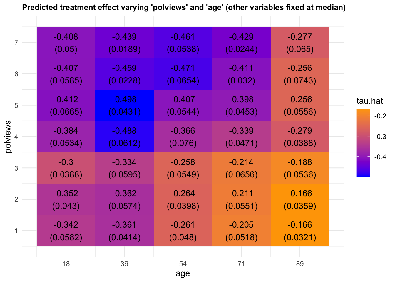
Figure 4.7: Predicted treatment effect varying two variables
4.3 Assessing heterogeneity with RATE
This section gives a brief introduction to how the Rank-Weighted Average Treatment Effect (RATE) available in the grf function rank_average_treatment_effect can be used to evaluate how good treatment prioritization rules (such as conditional average treatment effect estimates) are at distinguishing subpopulations with different treatment effects, or whether there is any notable heterogeneity present. For complete details we refer to the RATE paper.
4.3.1 Treatment prioritization rules
We are in the familiar experimental setting (or unconfounded observational study) and are interested in the problem of determining which individuals to assign a binary treatment \(W=\{0, 1\}\) and the associated value of this treatment allocation strategy. Given some subject characteristics \(X_i\) we have access to a subject-specific treatment prioritization rule \(S(X_i)\) which assigns scores to subjects. This prioritization rule should give a high score to units which we believe to have a large benefit of treatment and a low score to units with a low benefit of treatment. By benefit of treatment, we mean the difference in outcomes \(Y\) from receiving the treatment given some subject characteristics \(X_i\), as given by the conditional average treatment effect (CATE)
\[\tau(X_i) = E[Y_i(1) - Y_i(0) \,|\, X_i = x],\] where \(Y(1)\) and \(Y(0)\) are potential outcomes corresponding to the two treatment states.
You might ask: why the general focus on an arbitrary rule \(S(X_i)\) when you define benefit as measured by \(\tau(X_i)\)? Isn’t it obvious that the estimated CATEs would serve the best purpose for treatment targeting? The answer is that this general problem formulation is quite convenient, as in some settings we may lack sufficient data to power an accurate CATE estimator and have to rely on other approaches to target treatment. Examples of other approaches are heuristics derived by domain experts or simpler models predicting risk scores (where risk is defined as \(P[Y = 1 | X_i = x]\) and \(Y \in \{0, 1\}\) with \(Y=1\) being an adverse outcome), which is quite common in clinical applications. Consequently, in finite samples we may sometimes do better by relying on simpler rules which are correlated with the CATEs, than on noisy and complicated CATE estimates (remember: CATE estimation is a hard statistical task, and by focusing on a general rule we may circumvent some of the problems of obtaining accurate non-parametric point estimates by instead asking for estimates that rank units according to treatment benefit). Also, even if you have an accurate CATE estimator, there may be many to choose from (neural nets/random forests/various metalearners/etc). The question is: given a set of treatment prioritization rules \(S(X_i)\), which one (if any) should we use?
The tool we propose to employ in this situation is a RATE metric. It takes as input a prioritization rule \(S(X_i)\) which may be based on estimated CATEs, risk scores, etc, and outputs a scalar metric that can be used to assess how well it targets treatment (it measures the value of a prioritization rule while being agnostic to exactly how it was derived). A RATE metric has two components: the “TOC” and the area under the TOC, which we explain in the following section.
4.3.2 Quantifying treatment benefit: the Targeting Operator Characteristic
As outlined in the previous section, we are interested in the presence of heterogeneity and how much benefit there is to prioritizing treatment based on this heterogeneity using a targeting rule \(S(X_i)\). By “benefit” we mean the expected increase in outcomes from giving treatment to a fraction of the population with the largest scores \(S(X_i)\) as opposed to giving treatment to a randomly selected fraction of the same size.
As a first step towards a suitable metric that helps us asses this, some visual aid would be nice. One reasonable thing to do would be to chop the population up into groups defined by \(S(X_i)\), then compare the ATE in these groups to the overall ATE from treating everyone, then plot this over all groups. This is what the Targeting Operator Characteristic (TOC) does, where each group is the top q-th fraction of individuals with the largest prioritization score \(S(X_i)\).
Let \(F\) be the distribution function of \(S(X_i)\) and \(q \in (0, 1]\) the fraction of samples treated, the TOC at \(q\) is then defined by
\[\begin{equation*} \begin{split} &\textrm{TOC}(q) = E[Y_i(1) - Y_i(0) \,|\, S(X_i) \geq F^{-1}_{S(X_i)}(1 - q)]\\ & \ \ \ \ \ \ \ \ \ \ \ \ \ \ \ \ - E[Y_i(1) - Y_i(0)], \end{split} \end{equation*}\]
where \(F_{S(X_i)}\) is the distribution function of \(S(X_i)\). The TOC curve is motivated by the Receiver Operating Characteristic (ROC), a widely used metric for assessing the performance of a classification rule.
As a toy example, suppose we let \(\tau(X_i) = X_1\) where \(X_1 \sim N(0, 1)\). Then the TOC curve when prioritizing using \(S(X_i) = \tau(X_i)\) looks like:
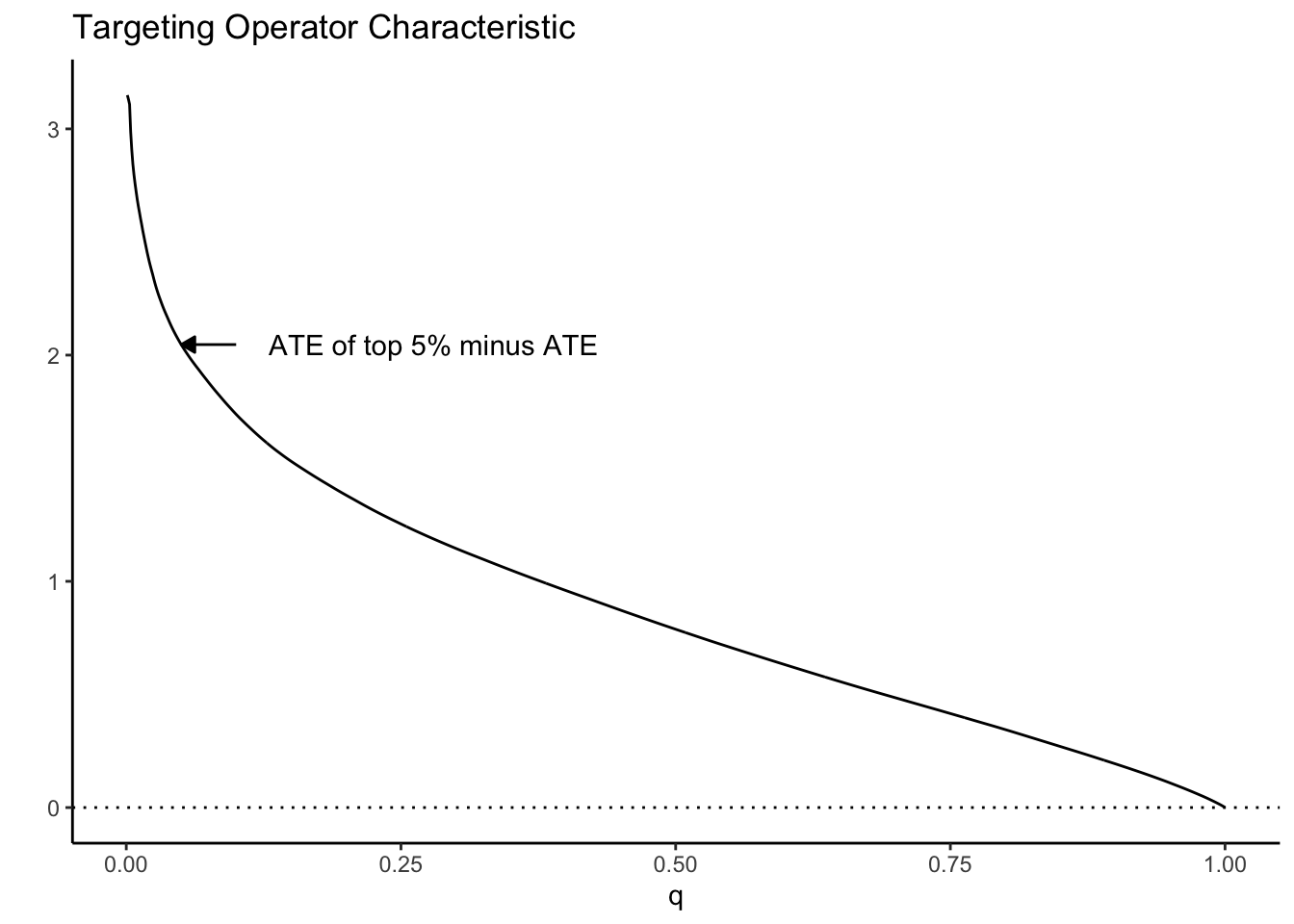
Note how high the TOC is for the first few units treated. This is intuitive since our toy CATEs are normally distributed with mean zero; if we identify and treat only the top 5% of units with treatment effects greater than \(z_{0.95}\), the benefit over treating everyone (0) is large. As we move further along, mixing in more people with lower treatment effect, we get closer to the ATE, until at \(q=1\) we equal it.
4.3.3 RATE: The area under the TOC
This picture suggests a quite natural way to summarize the TOC curve in terms of the ability of \(S(X_i)\) to rank individuals by treatment benefit: sum up the area under the curve. This is exactly how the RATE is defined, it is the Area Under the TOC (“AUTOC”)
\[\textrm{RATE} = \int_0^1 \textrm{TOC}(q) dq .\] If there is barely any heterogeneity in \(\tau(X_i)\) this area will be vanishingly small and in the special case where \(\tau(X_i)\) is constant, it’s zero. Thinking one step ahead, if our estimated rule \(S(X_i)\) does well in identifying the individuals with very different benefits of treatment, we would expect this metric to be positive. Conversely, if it does badly, or there are barely any benefits to stratifying treatment, we would expect it to be negative or close to zero, respectively.
There are different ways this area can be summed up, which gives rise to different RATE metrics. We refer to the integral above as the “AUTOC”. This places more weight on areas under the curve where the expected treatment benefit is largest. When non-zero treatment effects are concentrated among a small subset of the population this weighting is powerful for testing against a sharp null (AUTOC = 0).
Another way to sum this area would be to weight each point on the curve by \(q\): \(\int_0^1 q \textrm{TOC}(q) dq\). We refer to this metric as the “QINI” (Radcliffe, 2007). This weighting implies placing as much weight on units with low treatment effects as on units with high treatment effects. When non-zero treatment effects are more diffuse across the entire population, this weighting tends to give greater power when testing against a null effect.
Another thing to note is that the “high-vs-low” out-of-bag CATE quantile construction used in Athey and Wager (2019) can also be seen as a kind of RATE, where in place of Qini’s identity weighting it would have point mass at q = a given quantile.
4.3.4 Estimating the RATE
The overview in the previous section gave a stylized introduction where we imagined we knew \(\tau(X_i)\). In practice these have to be estimated and the appropriate feasible definition (using \(S(X_i) = \hat \tau(X_i)\) as an example) is: the TOC curve ranks all observations on a test set \(X^{test}\) according to a CATE function \(\hat \tau^{train}(\cdot)\) estimated on a training set, and compares the ATE for the top q-th fraction of units prioritized by \(\hat \tau^{train}(X^{test})\) to the overall ATE:
\[\begin{equation*} \begin{split} &\textrm{TOC}(q) = E[Y^{test}_i(1) - Y^{test}_i(0) \,|\, \hat \tau^{train}(X^{test}_i) \geq \hat F^{-1}(1 - q)]\\ & \ \ \ \ \ \ \ \ \ \ \ \ \ \ \ \ - E[Y^{test}_i(1) - Y^{test}_i(0)], \end{split} \end{equation*}\]
where \(\hat F\) is the empirical distribution function of \(\hat \tau^{train}(X^{test})\). The rank_average_treatment_effect function delivers a AIPW-style doubly robust estimator of the TOC and RATE using a forest trained on a separate evaluation set. For details on the derivation of the doubly robust estimator and the associated central limit theorem, see Yadlowsky et al. (2021).
4.3.5 An example
In this example we use a causal forest to estimate CATEs on a training set, then use RATE to assess how well these CATEs rank observations on an evaluation set according to treatment benefit. A significant RATE suggests there is HTE present. Note that a null effect can be attributed to a) low power, as perhaps the sample size is not large enough to detect HTEs, b) that the HTE estimator does not detect them, or c) the heterogeneity in the treatment effects along observable predictor variables are negligible.
# Train a causal forest to estimate a CATE based priority ranking
train <- sample(1:nrow(X), nrow(X) / 2)
cf.priority <- causal_forest(X[train, ], Y[train], W[train])

# Compute a prioritization based on estimated treatment effects.
priority.cate <- predict(cf.priority, X[-train, ])$predictions

# Estimate AUTOC on held out data.
cf.eval <- causal_forest(X[-train, ], Y[-train], W[-train])
rate <- rank_average_treatment_effect(cf.eval, priority.cate)
rate
## estimate std.err target
## 0.1296286 0.1261844 priorities | AUTOCWe can plot the TOC curve using the command below.
4.4 Further reading
A readable summary of different method for hypothesis testing correction is laid out in the introduction to Clarke, Romano and Wolf (2009).
Athey and Wager (2019) shows an application of causal forests to heterogeity analysis in a setting with clustering.
Yadlowsky, Steve, Scott Fleming, Nigam Shah, Emma Brunskill, and Stefan Wager. Evaluating Treatment Prioritization Rules via Rank-Weighted Average Treatment Effects. arXiv preprint arXiv:2111.07966 (arxiv)