Chapter 7 Causal Panel Data
Source RMD file: link
In this chapter, we consider a balanced panel data with \(N\) units and \(T\) time periods, where the outcome for unit \(i\) in period \(t\) is denoted by \(Y_{it}\) and the exposure to binary treatment is denoted by \(W_{it}\in \{0,1\}\).
# To install synthdid package, uncomment the next lines as appropriate.
# install.packages("devtools")  # if you don't have this installed yet.
# devtools::install_github("synth-inference/synthdid")

library(RCurl)
library(did) # DID
library(Synth) # SC
library(synthdid) # SDID
library(cowplot) # summary stats grids
library(ggplot2) # plots
library(R.matlab) # data for SDID
library(dplyr) # piping
library(tinytex) # knitting the file
library(bookdown) # knitting
library(tidyr) # converting from long to wide dataset
library(estimatr) # for lm_robust
library(fBasics) # summary stats table
library(knitr) # kable
library(plm) # linear panel data
library(tidyverse)
library(broom)
library(magrittr)
library(lmtest) # for coef_test() and robust std error calculation
library(multiwayvcov) #calculate std error TWFE
7.1 Data Setup
As a running example, we’ll be using the California smoking cessation program example of Abadie, Diamond, & Hainmueller (2010) throughout this chapter. The goal of their analysis was to estimate the effect of increased cigarette taxes on smoking in California. The panel contains data from 39 states (including California) from 1970 through 2000. California passed Proposition 99 increasing cigarette taxes from 1989 onwards. Thus, we have 1 state (California) that is exposed to the treatment (increased cigarette taxes) and 38 states that were not exposed to the treatment; 19 pre-treatment periods (1970-1988) and 12 post-treatment periods (1989-2000). First, let’s set up the data.
The columns in our data are:
state: 39 statesyear: annual panel data from 1970 to 2000cigsale: per-capita cigarette sales in packslnincome: per-capita state personal income (logged)beer: per-capita beer consumptionage15to24: the percentage of the population age 15-24retprice: average retail price of cigarettes
Other things to note about our data is:
- The outcome variable of interest is
cigsale. - Our predictors are
lnincome,beer,age15to24, andretprice. - The states excluded are: Massachusetts, Arizona, Oregon, Florida, Alaska, Hawaii, Maryland, Michigan, New Jersey, New York, Washington, and the District of Columbia.
# Data Setup for Diff-In-Diff and Synthetic Control

# read in data
data <- read.csv("https://drive.google.com/uc?id=1wD8h8pjCLDy1RbuPDZBSa3zH45TZL7ha&export=download")
data$X <- NULL  # removing X column

# fill out these by hand
# these variables are important for summary plots and analysis
outcome.var <- "cigsale"
predictors <- c("lnincome", "beer", "age15to24", "retprice") # if any
time.var <- c("year")
unit.var <- c("state")
treatment.year <- 1989
treated.unit <- 3
pretreat.period <- c(1970:1988)
time.period <- c(1970:2000)
control.units <- c(1, 2, 4:39)

# if using special predictors which are
# certain pretreatment years of the outcome variable used to
# more accurately predict the synthetic unit
special.years <- c(1975, 1980, treatment.year)
special.predictors <- list(
    list("outcome", special.years[1], c("mean")),
    list("outcome", special.years[2], c("mean")),
    list("outcome", special.years[3], c("mean"))
    )

# rename variables in the dataset
data <- data %>% rename(outcome = !!sym(outcome.var),
                time = !!sym(time.var),
                unit = !!sym(unit.var))
# now the outcome, time, and unit variables are:
outcome.var <- "outcome"
time.var <- c("time")
unit.var <- c("unit")

allvars <- c("outcome", predictors)
# Data Setup for Synthetic Diff-in-Diff (synthdid package requires us to change the data structure)
# set up empty dataframe
data.sdid <- data.frame()
# first row = numbers for each unit
data.sdid <- data.frame(unit.no = unique(data$unit))
# next is covariate data = predictors and special predictors
# predictors
# will save each dataset later
for (i in 1:length(predictors)){
covariate_column <- data %>%
group_by(unit) %>%
summarize(predictor_mean = mean(!!sym(predictors[i]), na.rm = T)) %>%
dplyr::select(predictor_mean)
data.sdid <- cbind(data.sdid, covariate_column)
}
# special.predictors
special_predictors_data <- data %>%
dplyr::filter(time %in% special.years) %>%
dplyr::select(unit, time, outcome)
# convert from long to wide dataset
special_predictors_data <- spread(special_predictors_data, time, outcome)[,-1]
data.sdid <- cbind(data.sdid, special_predictors_data)
# next is the outcome variable for each state in the time period
outcome_data <- data %>% dplyr::select(unit, time, outcome)
outcome_data <- spread(outcome_data, time, outcome)[,-1]
data.sdid <- cbind(data.sdid, outcome_data)
# transpose data
data.sdid <- t(data.sdid)
# add other data setup variables for SDID
UNIT <- data.sdid[1,] # unit numbers
X.attr <- t(data.sdid[2:8,]) # covariate data
Y <- t(data.sdid[9:39,]) # outcome variable data
colnames(Y) <- time.period # colname = year
rownames(Y) <- UNIT # rowname = unit number
units <- function(...) { which(UNIT %in% c(...)) }
Y <- Y[c(setdiff(1:nrow(Y), units(treated.unit)), units(treated.unit)), ] # make sure treated unit is in the last row
T0 <- length(pretreat.period) # number of pre-treatment years
N0 <- nrow(Y)-17.1.1 Summary Statistics
Here are some quick summary stats about our panel data:
# To create this summary statistics table, we use fBasics, knitr
# Make a data.frame containing summary statistics of interest
summ_stats <- fBasics::basicStats(within(data, rm(unit, time)))
summ_stats <- as.data.frame(t(summ_stats))

# Rename some of the columns for convenience
summ_stats <- summ_stats[c("Mean", "Stdev", "Minimum", "1. Quartile", "Median",  "3. Quartile", "Maximum")] %>%
  rename("Lower quartile" = '1. Quartile', "Upper quartile" = "3. Quartile")

# Print table
summ_stats
## Mean Stdev Minimum Lower quartile Median Upper quartile Maximum
## outcome 118.893218 32.767404 40.700001 100.900002 116.300003 130.500000 296.200012
## lnincome 9.861634 0.170677 9.397449 9.739134 9.860844 9.972764 10.486617
## beer 23.430403 4.223190 2.500000 20.900000 23.299999 25.100000 40.400002
## age15to24 0.175472 0.015159 0.129448 0.165816 0.178121 0.186660 0.203675
## retprice 108.341936 64.381986 27.299999 50.000000 95.500000 158.399994 351.200012Before moving further, we need to check if our panel data is properly balanced. Panel data can be balanced or unbalanced. Balanced panel data means that each unit is observed every time period such that:
\[n=N \times T\]
where \(n\) is the total number of observations, \(N\) is the number of units, and \(T\) is the number of time periods. We need to test this before moving forward with our analysis.
# number of observations
n <- dim(data)[1]
# number of units
N <- length(unique(data$unit))
# number of time periods
T <- length(unique(data$time))

# check that n = N x T
# if TRUE, then the data is balanced
# if FALSE, then the data is unbalanced
n == N*T
## [1] TRUETo further verify this, we can check that our data contains N units for T time periods. Let us start with the time periods. We should have N units for each year, which in this case would be 39 units.
##
## 1970 1971 1972 1973 1974 1975 1976 1977 1978 1979 1980 1981 1982 1983 1984 1985 1986 1987 1988
##   39   39   39   39   39   39   39   39   39   39   39   39   39   39   39   39   39   39   39
## 1989 1990 1991 1992 1993 1994 1995 1996 1997 1998 1999 2000
##   39   39   39   39   39   39   39   39   39   39   39   39
Then let us check the units. We should have T time periods for each unit, which would be 31 periods in this case.
##
##  1  2  3  4  5  6  7  8  9 10 11 12 13 14 15 16 17 18 19 20 21 22 23 24 25 26 27 28 29 30 31 32
## 31 31 31 31 31 31 31 31 31 31 31 31 31 31 31 31 31 31 31 31 31 31 31 31 31 31 31 31 31 31 31 31
## 33 34 35 36 37 38 39
## 31 31 31 31 31 31 31
We can also use a function in the plm package to check whether the data is balanced as well.
# This functions comes from the plm package.
# If TRUE, then the data is balanced.
# If FALSE, then the data is unbalanced.
is.pbalanced(data)
## [1] TRUEIf TRUE, then we can proceed with our analysis. If FALSE, then the data needs to be examined for duplicates, missing unit or time observations, or other issues.
Since we confirmed that our panel data is balanced, we can now look at the distributions of the outcome variable and the covariates.
distributions <- list()

for (i in 1:length(allvars)) {
  distributions[[i]] <- ggplot(data) +
  aes(x = !!sym(allvars[i])) +
  geom_histogram(fill = "#D55E00") +
  labs(title = paste0("Distribution of \n ", allvars[i])) +
  theme(plot.title = element_text(size=20, hjust = 0.5, face="bold"),
         axis.text=element_text(size=20),
         axis.title=element_text(size=20,face="bold"))
}

plot_grid(distributions[[1]], distributions[[2]],
          distributions[[3]],distributions[[4]],
          distributions[[5]])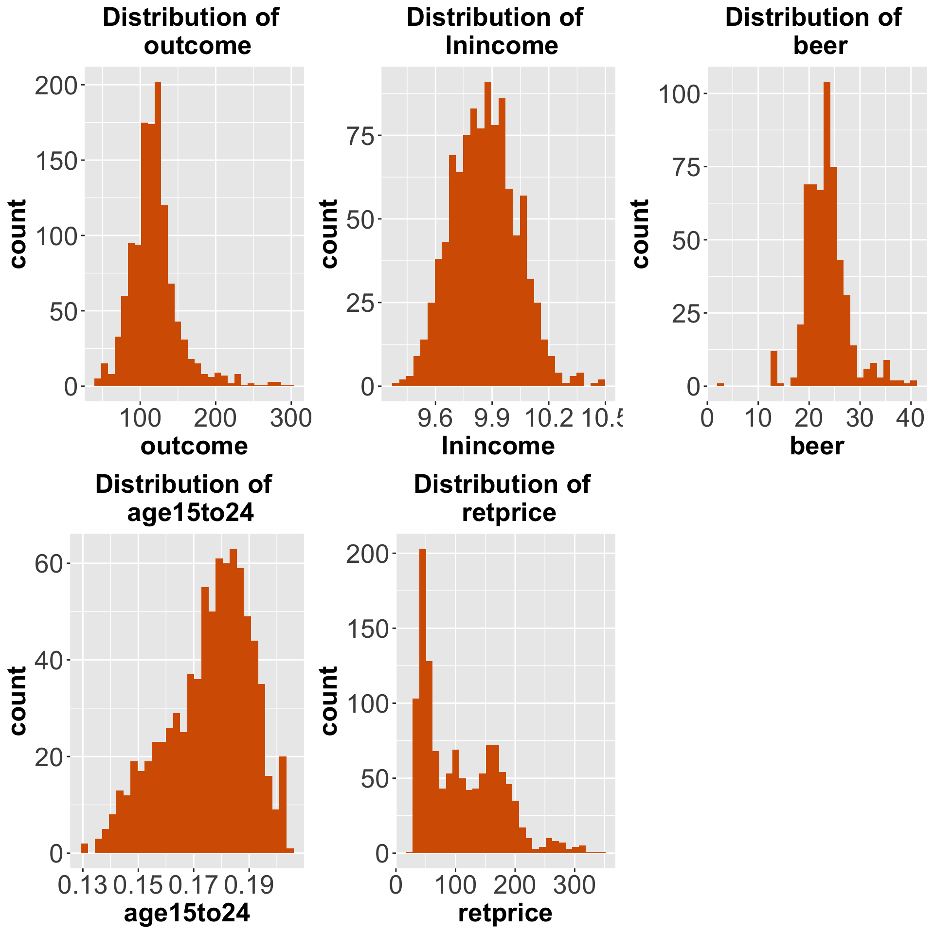
Figure 7.1: Distributions of the outcome and the covariates
And here are some additional plots of each covariate vs the outcome variable.
pred.vs.outcome <- list()

for (i in 1:length(predictors)){
  pred.vs.outcome[[i]] <-
    ggplot(data,
           aes(x = !!sym(predictors[i]),
               y = outcome)) +
    geom_point(aes(color = time)) +
    geom_smooth() +
  labs(title = paste0("Outcome vs ", predictors[i])) +
  theme(plot.title = element_text(size=20, hjust = 0.5, face="bold"),
         axis.text=element_text(size=20),
         axis.title=element_text(size=20,face="bold"))
}

plot_grid(pred.vs.outcome[[1]], pred.vs.outcome[[2]],
          pred.vs.outcome[[3]], pred.vs.outcome[[4]] )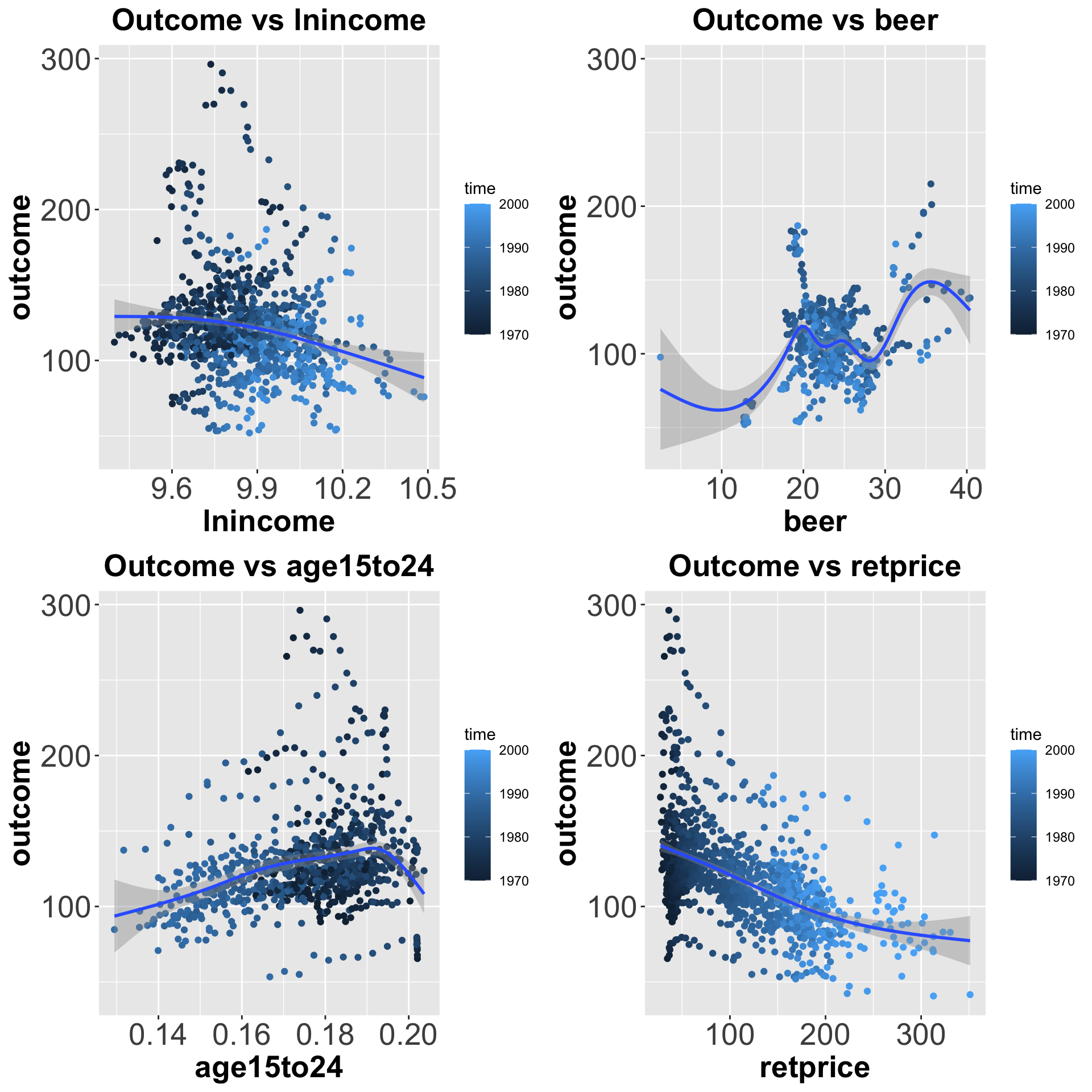
Figure 7.2: Distributions of each covariate vs outcome
And here we show how the outcome variable changes over time for the treated unit, an average of the control units, and each of the control units with the red line representing the time the treatment started.
# Treated Unit
p1 <- data %>% dplyr::filter(unit == treated.unit) %>%
  ggplot(.,aes(x = time, y = outcome)) +
  geom_line() +
  geom_vline(xintercept = treatment.year, color = "red") +
  labs(title = "Outcome of Treated Unit \n Over Time") +
  theme(plot.title = element_text(size=20, hjust = 0.5, face="bold"),
         axis.text=element_text(size=20),
         axis.title=element_text(size=20,face="bold"))

# Average of Control Units
p2 <- data %>% group_by(time) %>% dplyr::filter(unit != treated.unit) %>%
  mutate(avg.outcome.var = mean(outcome)) %>%
  ggplot(., aes(x = time, y = avg.outcome.var)) +
  geom_line() +
  geom_vline(xintercept = treatment.year, color = "red") +
  labs(title = "Average Outcome of Control Units \n Over Time") +
  theme(plot.title = element_text(size=20, hjust = 0.5, face="bold"),
         axis.text=element_text(size=20),
         axis.title=element_text(size=20,face="bold"))

# Control Units
p3 <- data %>% dplyr::filter(unit != treated.unit) %>%
  ggplot(., aes(x = time, y = outcome,
                      color = unit, group = unit)) +
  geom_line() +
  geom_vline(xintercept = treatment.year, color = "red") +
  labs(title = "Outcome of All Control Units \n over Time") +
  theme(plot.title = element_text(size=20, hjust = 0.5, face="bold"),
         axis.text=element_text(size=20),
         axis.title=element_text(size=20,face="bold"))

plot_grid(p1, p2, p3)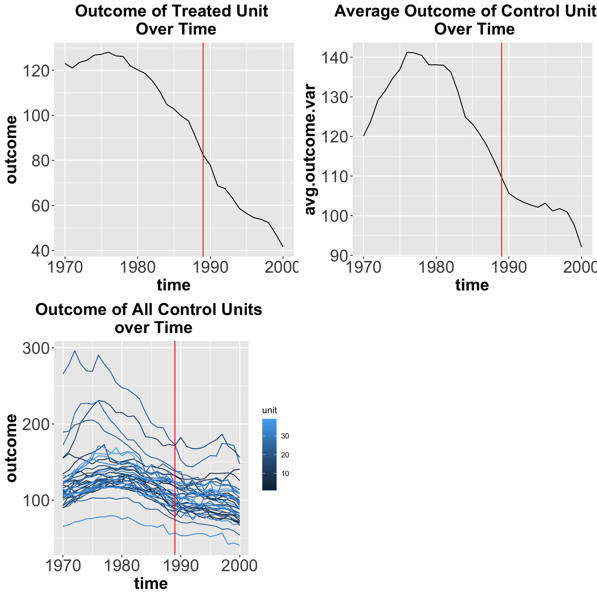
Figure 7.3: Outcome variable over time
7.2 Alternative methods
7.2.1 Methods designed for cross-sectional data with unconfoundedness
In Chapter 3.1, we discussed an assumption that is used for ATE estimation. That assumption was called unconfoundedness.
\[\begin{equation} Y_i(1), Y_i(0) \perp W_i \ | \ X_i. \end{equation}\]
Unconfoundedness, also known as no unmeasured confounders, ignorability or selection on observables, says that all possible sources of self-selection, etc., can be explained by the observable covariates \(X_i\). This has become a big part of the causal effects literature since Rosenbaum and Rubin (1983) which looked at the role of the propensity score in observation studies for causal effects.
The most common methods for estimation under unconfoundedness are matching (Rosenbaum, 1995; Abadie and Imbens, 2002), inverse propensity score weighting (Hirano, Imbens, & Ridder, 2003), and double robust methods. For surveys of these methods, see Imbens (2004) and Rubin (2006).
7.2.2 Difference-in-Differences
Difference-in-differences (DID) is one of the most common methods in causal inference. Under the parallel trends assumption, it estimates the Average Treatment Effect on the Treated (ATT), which is the difference between the change in an outcome before and after a treatment using a treatment group and a control group:
\[ \hat{\delta}_{tC} = (\bar{y}_t^{post(t)} - \bar{y}_t^{pre(t)}) - (\bar{y}_C^{post(t)} - \bar{y}_C^{pre(t)}) \]
where
- \(\hat{\delta}_{tC}\) is estimated average treatment effect for the treatment group,
t - \(\bar{y}\) is the sample mean for the treatment group,
t, or the control group,C, in a particular time period.
The parallel trends assumption says that the path of outcomes the units in the treated group would have been experienced if they hadn’t been treated is the same as the path of outcomes the units in the control group actually experienced. In its simplest form, DID can be estimated with the interaction of a treatment group indicator variable and a post-treatment period indicator variable in the following equation:
\[\begin{equation} Y_{it} = \gamma + \gamma_{i.}TREAT_i + \gamma_{.t}POST_t + \beta TREAT_i \times POST_t + \varepsilon_{it} \end{equation}\]
First, we have to create the indicator variables for the treated unit and for the post treatment period. The coefficient for ‘treat:post’ is an estimate of average treatment effect for the treated group.
# add an indicator variable to identify the unit exposed to the treatment
data$treat <- ifelse(data$unit == treated.unit, 1, 0)
# add an indicator to identify the post treatment period
data$post <-  ifelse(data$time >= treatment.year, 1, 0)

# running the regression
# the independent variables are treat, post, and treat*post
did.reg <- lm_robust(outcome ~ treat*post, data = data)

# print the regression
did.reg
## Estimate Std. Error t value Pr(>|t|) CI Lower CI Upper DF
## (Intercept) 130.56953 1.216885 107.298149 0.000000e+00 128.18208 132.956978 1205
## treat -14.35900 2.943580 -4.878075 1.214598e-06 -20.13411 -8.583891 1205
## post -28.51142 1.643491 -17.348085 2.357062e-60 -31.73584 -25.286994 1205
## treat:post -27.34911 4.695855 -5.824096 7.358702e-09 -36.56207 -18.136151 1205And here we create a plot to observe the DID estimate:
# use the regression cofficients to calculate the means of the outcome
# source: https://mixtape.scunning.com/difference-in-differences.html
# mean outcome for treated unit in the pre-treatment period
before_treatment <- as.numeric(did.reg$coefficients['(Intercept)'] + did.reg$coefficients['treat']) # preperiod for treated
# mean outcome for treated unit in the post-treatment period
after_treatment <- as.numeric(sum(did.reg$coefficients))
# diff-in-diff estimate
diff_diff <- as.numeric(did.reg$coefficients['treat:post'])


# creating 2x2 DID table for the plot
data_diff <- data %>%
  group_by(post, treat) %>%
  summarize(mean_outcome = mean(outcome))

# plot the means of the outcome for pre-treatments and post-treatment periods and for the treated and control group
# then use annotate() to create a dashed line parallel to the control group,
# a dotted blue line for the size of the treatment effect,
# and the treatment estimate label ATT
# source: https://api.rpubs.com/andrewheiss/did
ggplot(data_diff, aes(x = post, y = mean_outcome, color = as.factor(treat))) +
  geom_point() +
  geom_line(aes(group = as.factor(treat))) +
  annotate(geom = "segment", x = 0, xend = 1,
           y = before_treatment, yend = after_treatment - diff_diff,
           linetype = "dashed", color = "grey50") +
  annotate(geom = "segment", x = 1, xend = 1,
           y = after_treatment, yend = after_treatment - diff_diff,
           linetype = "dotted", color = "blue") +
  annotate(geom = "label", x = 1, y = after_treatment - (diff_diff / 2),
           label = "ATT", size = 3)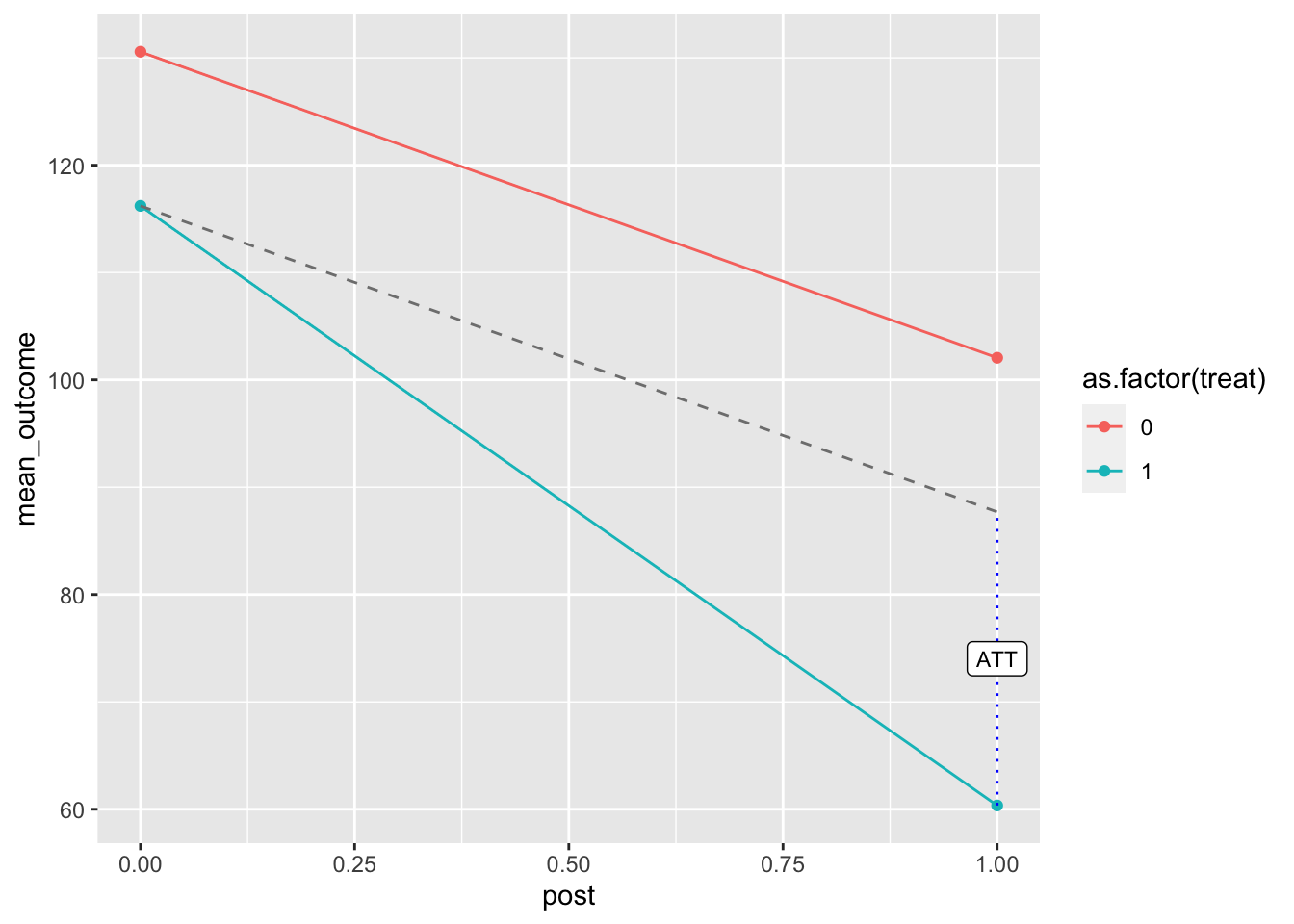
Figure 7.4: DID estimate
We can also compute the difference-in-differences using the did package
# added a column to identify when the treatment first started
data$first.treat <- ifelse(data$unit == treated.unit, treatment.year, 0)

# estimating group-time average treatment effects without covariates
out <- att_gt(yname = "outcome", # outcome variable
              gname = "first.treat", # year treatment was first applied aka the group identifier
              idname = "unit", # unit identifier
              tname = "time", # time variable
              xformla = ~1,
              data = data, # data set
              est_method = "reg")

# summarize the results
# shows the average treatment effect by group and time
summary(out)
##
## Call:
## att_gt(yname = "outcome", tname = "time", idname = "unit", gname = "first.treat",
## xformla = ~1, data = data, est_method = "reg")
##
## Reference: Callaway, Brantly and Pedro H.C. Sant'Anna. "Difference-in-Differences with Multiple Time Periods." Journal of Econometrics, Vol. 225, No. 2, pp. 200-230, 2021. <https://doi.org/10.1016/j.jeconom.2020.12.001>, <https://arxiv.org/abs/1803.09015>
##
## Group-Time Average Treatment Effects:
## Group Time ATT(g,t) Std. Error [95% Simult. Conf. Band]
## 1989 1971 -5.7789 0.8358 -8.0602 -3.4977 *
## 1989 1972 -2.8158 1.2173 -6.1385 0.5069
## 1989 1973 -1.4605 1.0058 -4.2059 1.2849
## 1989 1974 -0.8290 0.5462 -2.3199 0.6620
## 1989 1975 -1.8632 0.5893 -3.4718 -0.2545 *
## 1989 1976 -3.4289 0.7514 -5.4799 -1.3780 *
## 1989 1977 -1.4289 0.6326 -3.1556 0.2977
## 1989 1978 0.3158 0.8647 -2.0445 2.6761
## 1989 1979 -1.8132 0.6435 -3.5695 -0.0568 *
## 1989 1980 -1.7026 0.5939 -3.3236 -0.0816 *
## 1989 1981 -1.4974 0.4874 -2.8277 -0.1670 *
## 1989 1982 -1.5079 0.5966 -3.1365 0.1207
## 1989 1983 0.4447 0.5969 -1.1847 2.0741
## 1989 1984 0.3474 0.8308 -1.9205 2.6152
## 1989 1985 -0.2132 0.6248 -1.9185 1.4922
## 1989 1986 -0.5790 0.5795 -2.1607 1.0028
## 1989 1987 0.8079 0.6840 -1.0592 2.6750
## 1989 1988 -3.6368 0.8382 -5.9249 -1.3488 *
## 1989 1989 -3.5395 0.5681 -5.0901 -1.9888 *
## 1989 1990 -4.1421 1.3202 -7.7456 -0.5386 *
## 1989 1991 -11.9184 1.4209 -15.7969 -8.0400 *
## 1989 1992 -12.1711 1.6231 -16.6013 -7.7408 *
## 1989 1993 -15.5710 1.6081 -19.9604 -11.1817 *
## 1989 1994 -19.7947 1.8750 -24.9128 -14.6767 *
## 1989 1995 -23.0342 1.8936 -28.2030 -17.8654 *
## 1989 1996 -22.9605 2.0257 -28.4900 -17.4311 *
## 1989 1997 -24.2658 2.1092 -30.0231 -18.5085 *
## 1989 1998 -24.9342 2.0170 -30.4398 -19.4286 *
## 1989 1999 -26.6711 2.1475 -32.5329 -20.8092 *
## 1989 2000 -26.8105 2.2048 -32.8287 -20.7923 *
## ---
## Signif. codes: `*' confidence band does not cover 0
##
## P-value for pre-test of parallel trends assumption: 0
## Control Group: Never Treated, Anticipation Periods: 0
## Estimation Method: Outcome RegressionThen we can show the group-time treatment effect by plotting it.
# plot the results
# set ylim so that it is equidistant from zero
ggdid(out, ylim = c(-40, 40), xgap =3)
Figure 7.5: Group-time treatment effect
The red dots are the pre-treatment group-time average treatment effects while the blue dots are the post-treatment group-time average treatment effects. Both have 95% confidence intervals. This plot shows the effect of the sale of cigarette packs due to increasing the price of those packs.
Now, estimate the treatment effect with covariates. Since there should be no missing data with the variables in xformla, we will be using retprice.
# estimating group-time average treatment effects with covariates
out.X <- att_gt(yname = "outcome", # outcome variable
              gname = "first.treat", # year treatment was first applied aka the group identifier
              idname = "unit", # unit identifier
              tname = "time", # time variable
              xformla = ~retprice, # can use another covariate if needed
              data = data, # data set
              est_method = "reg")
## Warning in pre_process_did(yname = yname, tname = tname, idname = idname, : Be aware that there are some small groups in your dataset.
## Check groups: 1989.
Figure 7.6: Group-time treatment effect with covariates
Simple Aggregation
# calculates a weighted average of all group-time average treatment effects
# with the weights proportional to the group size
out.simple <- aggte(out.X, type = "simple")
summary(out.simple)
##
## Call:
## aggte(MP = out.X, type = "simple")
##
## Reference: Callaway, Brantly and Pedro H.C. Sant'Anna. "Difference-in-Differences with Multiple Time Periods." Journal of Econometrics, Vol. 225, No. 2, pp. 200-230, 2021. <https://doi.org/10.1016/j.jeconom.2020.12.001>, <https://arxiv.org/abs/1803.09015>
##
##
## ATT Std. Error [ 95% Conf. Int.]
## -18.0675 1.5552 -21.1157 -15.0194 *
##
##
## ---
## Signif. codes: `*' confidence band does not cover 0
##
## Control Group: Never Treated, Anticipation Periods: 0
## Estimation Method: Outcome RegressionDynamic Effects and Event Study Plot
# averages the group-time average treatment effects
# into average treatment effects at different lengths of exposure to the treatment
out.dynamic <- aggte(out.X, type = "dynamic")
summary(out.dynamic)
##
## Call:
## aggte(MP = out.X, type = "dynamic")
##
## Reference: Callaway, Brantly and Pedro H.C. Sant'Anna. "Difference-in-Differences with Multiple Time Periods." Journal of Econometrics, Vol. 225, No. 2, pp. 200-230, 2021. <https://doi.org/10.1016/j.jeconom.2020.12.001>, <https://arxiv.org/abs/1803.09015>
##
##
## Overall summary of ATT's based on event-study/dynamic aggregation:
## ATT Std. Error [ 95% Conf. Int.]
## -18.0675 1.4292 -20.8687 -15.2663 *
##
##
## Dynamic Effects:
## Event time Estimate Std. Error [95% Simult. Conf. Band]
## -18 -4.7377 0.8005 -6.9054 -2.5701 *
## -17 -1.1424 1.2142 -4.4303 2.1454
## -16 -1.2214 0.8655 -3.5651 1.1223
## -15 -0.8260 0.5012 -2.1832 0.5313
## -14 -1.6451 0.4850 -2.9585 -0.3318 *
## -13 -3.1881 0.6273 -4.8867 -1.4895 *
## -12 -1.9876 0.4475 -3.1992 -0.7759 *
## -11 -0.3344 0.5810 -1.9075 1.2387
## -10 -3.8372 0.5835 -5.4173 -2.2572 *
## -9 -3.2999 0.6062 -4.9413 -1.6586 *
## -8 -2.0229 0.6209 -3.7042 -0.3417 *
## -7 -1.6589 0.6768 -3.4917 0.1739
## -6 -0.3748 0.6271 -2.0728 1.3231
## -5 -1.5146 0.8988 -3.9484 0.9192
## -4 -0.6642 0.7612 -2.7253 1.3969
## -3 -0.4718 0.5673 -2.0081 1.0644
## -2 0.3814 0.6790 -1.4571 2.2200
## -1 -3.8589 0.9022 -6.3019 -1.4158 *
## 0 -3.5289 0.5794 -5.0978 -1.9600 *
## 1 -4.1846 1.2444 -7.5542 -0.8150 *
## 2 -11.9492 1.4954 -15.9986 -7.8999 *
## 3 -12.1840 1.6807 -16.7350 -7.6330 *
## 4 -15.6193 1.7849 -20.4526 -10.7859 *
## 5 -19.7892 1.8407 -24.7735 -14.8048 *
## 6 -23.1193 1.8465 -28.1194 -18.1193 *
## 7 -23.1104 2.1590 -28.9566 -17.2642 *
## 8 -24.5561 1.9687 -29.8869 -19.2253 *
## 9 -25.1606 1.9735 -30.5044 -19.8168 *
## 10 -26.7797 2.1074 -32.4862 -21.0732 *
## 11 -26.8289 2.0300 -32.3259 -21.3320 *
## ---
## Signif. codes: `*' confidence band does not cover 0
##
## Control Group: Never Treated, Anticipation Periods: 0
## Estimation Method: Outcome Regression
Figure 7.7: Dynamic
7.2.3 Synthetic Control
Synthetic Control is also a method that has become important in causal inference. It is especially important in policy evaluation literature not only in economics but in other fields such as the biomedical industry and engineering.
This method estimates the treatment effect of an intervention by using a synthetic control unit to compute the counterfactual of an outcome. We create a synthetic counterfactual unit for the treatment unit, which is a weighted combination of the control units. The control units would be states in this case, but could be cities, regions, or countries. Letting \(Y_{NT}\) be the outcome the treated unit (unit \(N\)) at time \(T\), we will try to predict \(Y_{NT}(0)\) based on observed values \(Y_{it}(0)\) for \((i,t) \neq (N, T)\).
Abadie, Diamond, & Hainmueller (ADH) suggest using a weighted average of outcomes for other states:
\[ \hat{Y}_{NT}(0)= \sum_{j=1}^{N-1} \omega_j Y_{jT}.\]
They restrict the weights \(\omega_j\) to be non-negative and restrict them to sum to one.
So how do we find the optimal weights? Let \(Z_i\) be the vector of functions of covariates \(X_{it}\), including possible some lagged outcomes \(Y_{it}\) for pre-\(T\) periods. Let the norm be \(||a||_V = a'V^{-1}a\). ADH first solve
\[\omega(V) = \arg\min_\omega ||Z_N - \sum_{i=1}^{N-1} \omega_i \cdot Z_i||_V.\]
This finds, for a given weight matrix \(V\), the optimal weights. But, how do we choose V?
ADH find positive semi-definite \(V\) that minimizes
\[\hat{V} = \arg \min_V || Y_{N,L} -\sum_{i=1}^{N-1} \omega_i(V)\cdot Y_{i,L} ||\]
where \(Y_{i,L}\) is the lagged values \(Y_{i,t}\) for \(t<T\).
Then
\[\omega^*= \omega(\hat{V}) = \arg\min_\omega||Z_N - \sum_{i=1}^{N-1} \omega_i \cdot Z_i||_{\hat{V}}.\]
Now, suppose \(Z_i=Y_{i,L}\) simply the lagged outcomes, then:
\[\omega = \arg\min_\omega ||Y_{N,L} - \sum_{i=1}^{N-1} \omega_i \cdot Y_{i,L}||= \arg\min_{\omega} \sum_{t=1}^{T-1} (Y_{N,t}- \sum_{i=1}^{N-1}\omega_i \cdot Y_{i,t} )^2\]
subject to
\[\omega_i \geq 0, \sum_{i}^{N-1} \omega_i =1.\]
7.2.3.1 Synthetic Control Estimates
To get synthetic control estimates, we can use the following functions from synth package:
dataprep()for matrix-extractionsynth()for the construction of the synthetic control groupsynth.tab(),gaps.plot(), andpath.plot()to summarize the results
# Create the X0, X1, Z0, Z1, Y0plot, Y1plot matrices from panel data
# Provide the inputs needed for synth()
dataprep.out <-
  dataprep(
  foo = data,                  # dataframe with the data
  predictors = predictors,
  predictors.op = c("mean"),        # method to be used on predictors
  dependent = "outcome",         # outcome variable
  unit.variable = "unit",       # variable associated with the units
  time.variable = "time",        # variable associated with time
  special.predictors = special.predictors,  # additional predictors
  treatment.identifier = treated.unit,         # the treated unit
  controls.identifier = control.units, # other states as the control units
  time.predictors.prior = pretreat.period, # pre-treatment period
  time.optimize.ssr = pretreat.period, # MSPE minimized for pre-treatment period
  time.plot = time.period       # span of years for gaps.plot and path.plot
  )
Now we can see the weights for the predictors and units.
# identify the weights that create the
# best synthetic control unit for California
synth.out <- synth(dataprep.out)
##
## X1, X0, Z1, Z0 all come directly from dataprep object.
##
##
## ****************
## searching for synthetic control unit
##
##
## ****************
## ****************
## ****************
##
## MSPE (LOSS V): 4.579159
##
## solution.v:
## 0.001054407 0.01917047 0.06461992 0.04083425 0.344805 0.5083373 0.02117867
##
## solution.w:
## 8.9646e-06 7.6442e-06 0.1612707 0.1429358 7.5605e-06 7.727e-06 0.09102254 2.25733e-05 7.0655e-06 2.45072e-05 2.03578e-05 3.5495e-06 1.51799e-05 7.8407e-06 6.31316e-05 7.6346e-06 8.399e-06 5.58362e-05 1.55771e-05 0.2251505 4.3505e-06 0.1204327 7.8723e-06 7.384e-07 8.2779e-06 2.68386e-05 9.3597e-06 1.19329e-05 5.779e-06 2.08296e-05 6.4732e-06 4.69023e-05 0.2586982 1.05581e-05 8.36e-06 8.36e-06 1.10162e-05 1.84057e-05## w.weight
## 1 0.0000
## 2 0.0000
## 4 0.1613
## 5 0.1429
## 6 0.0000
## 7 0.0000
## 8 0.0910
## 9 0.0000
## 10 0.0000
## 11 0.0000
## 12 0.0000
## 13 0.0000
## 14 0.0000
## 15 0.0000
## 16 0.0001
## 17 0.0000
## 18 0.0000
## 19 0.0001
## 20 0.0000
## 21 0.2252
## 22 0.0000
## 23 0.1204
## 24 0.0000
## 25 0.0000
## 26 0.0000
## 27 0.0000
## 28 0.0000
## 29 0.0000
## 30 0.0000
## 31 0.0000
## 32 0.0000
## 33 0.0000
## 34 0.2587
## 35 0.0000
## 36 0.0000
## 37 0.0000
## 38 0.0000
## 39 0.0000## lnincome beer age15to24 retprice special.outcome.1975 special.outcome.1980
## Nelder-Mead 0.0011 0.0192 0.0646 0.0408 0.3448 0.5083
## special.outcome.1989
## Nelder-Mead 0.0212# uncomment if you want to see all the results from synth.out
# synth.tables <- synth.tab(
# dataprep.res = dataprep.out,
# synth.res = synth.out)
# print(synth.tables)Now here is what the synthetic unit looks like in comparison to the treated unit.
## plot in levels (treated and synthetic)
# dataprep.res is a list from the output of dataprep call
# synth.res is a list from the output of the synth call
path.plot(dataprep.res = dataprep.out,
          synth.res = synth.out,
          tr.intake = treatment.year,      # time of treatment
          Ylab = c("per-capita cigarette sales (in packs)"),
          Xlab = c("Year"),
          Ylim = c(0, 140),
          Legend = c("Treated Unit", "Synthetic Unit"))
Figure 7.8: Synthetic unit
7.2.4 Synthetic Differences-in-Differences
In this subsection, we look at Synthetic Difference-in-Differences (SDID) which is proposed by Arkhangelsky et al. (2021). SDID can be seen as a combination of the Synthetic Control and Difference-in-Differences methods.
Like with Synthetic Control methods, we start by finding weights \(\hat{\omega}^{sdid}\) that align pre-exposure trends in the outcome of unexposed units with those for the exposed units. Then we find time weights \(\hat{\lambda}^{sdid}\) that balance pre-exposure time periods with post-exposure ones. Then we use these weights in a basic two-way fixed effects regression to estimate the average causal effect of exposure (denoted by \(\tau\)):
\[ (\hat{\mu}, \hat{\alpha}, \hat{\beta}, \hat{\tau}^{sdid}) = arg min_{\mu, \alpha, \beta, \tau} \sum_{i=1}^{N} \sum_{t=1}^{T} (Y_{it} - \mu - \alpha_i - \beta_t - W_{it}\tau)^2 \hat{\omega}_i^{sdid} \hat{\lambda}_t^{sdid} \]
where
- \(\omega_i\) – unit weight
- \(\lambda_t\) – time weight
- \(\alpha_i\) – unit fixed effect
- \(\beta_t\) – time fixed effect
- \(W_{it}\) - treatment indicator
Time weights \(\hat{\lambda}_t\) satisfy
\[\hat{\lambda}= \arg \min _{\lambda} \sum_{i=1}^{N-1} (Y_{iT} - \sum_{t=1}^{T-1}\lambda_t Y_{it})^2 + \text{regularization term},\]
subject to
\[\lambda_t \geq 0, \sum_{t=1}^{T-1} \lambda_t =1.\]
In comparison, the DID estimates the effect of treatment exposure by solving the same two-way fixed effect regression problem without either time or unit weights:
\[ (\hat{\mu}, \hat{\alpha}, \hat{\beta}, \hat{\tau}^{did}) = arg min_{\mu, \alpha, \beta, \tau} \sum_{i=1}^{N} \sum_{t=1}^{T} (Y_{it} - \mu - \alpha_i - \beta_t - W_{it}\tau)^2.\]
On the other hand, the Synthetic Control estimator omits the unit fixed effect and the time weights from the regression function:
\[ (\hat{\mu}, \hat{\beta}, \hat{\tau}^{sc}) = arg min_{\mu, \beta, \tau} \sum_{i=1}^{N} \sum_{t=1}^{T} (Y_{it} - \mu - \beta_t - W_{it}\tau)^2 \hat{\omega}_i^{sc}.\]
7.2.4.1 SDID Estimates
Now we use the same data to compute the SDID using synthdid_estimate() function from synthdid package. From this we can get the estimate of the treatment effect, standard error, time weights, and unit weights.
## $estimate
## [1] -15.60383
##
## $se
##      [,1]
## [1,]   NA
##
## $controls
##    estimate 1
## 21      0.124
## 22      0.105
## 5       0.078
## 6       0.070
## 4       0.058
## 9       0.053
## 20      0.048
## 19      0.045
## 34      0.042
## 23      0.041
## 16      0.039
## 38      0.037
## 37      0.034
## 24      0.033
## 8       0.031
## 26      0.031
## 15      0.028
## 11      0.026
##
## $periods
##      estimate 1
## 1988      0.427
## 1986      0.366
## 1987      0.206
##
## $dimensions
##           N1           N0 N0.effective           T1           T0 T0.effective
##        1.000       38.000       16.388       12.000       19.000        2.783
Alternatively, we can print out the time and unit weights separately. The following command will give us the weights for years with non-zero values in descending order.
##      estimate 1
## 1988      0.427
## 1986      0.366
## 1987      0.206
The following command can be used to print the weights for all pre-treatment years.
##  [1] 0.0000000 0.0000000 0.0000000 0.0000000 0.0000000 0.0000000 0.0000000 0.0000000 0.0000000
## [10] 0.0000000 0.0000000 0.0000000 0.0000000 0.0000000 0.0000000 0.0000000 0.3664706 0.2064531
## [19] 0.4270763
Next, we print out the unit weights. Similarly to above, the following command will give us the unit weights with non-zero values in descending order.
##    estimate 1
## 21      0.124
## 22      0.105
## 5       0.078
## 6       0.070
## 4       0.058
## 9       0.053
## 20      0.048
## 19      0.045
## 34      0.042
## 23      0.041
## 16      0.039
## 38      0.037
## 37      0.034
## 24      0.033
## 8       0.031
## 26      0.031
## 15      0.028
## 11      0.026
Again similarly, the following command can be used to print weights for all units.
##  [1] 0.000000000 0.003441829 0.057512787 0.078287289 0.070368123 0.001588411 0.031468210
##  [8] 0.053387822 0.010135485 0.025938629 0.021605171 0.000000000 0.000000000 0.028211016
## [15] 0.039494644 0.000000000 0.007802504 0.045135208 0.047853191 0.124489228 0.105047579
## [22] 0.040568268 0.032805180 0.000000000 0.031460767 0.000000000 0.015352149 0.001041588
## [29] 0.000000000 0.004087093 0.000000000 0.009777530 0.041517658 0.000000000 0.000000000
## [36] 0.033569113 0.036667085 0.001386442
We use those estimates to create the following plots. Figure 7.9 is the Unit Control Plot which shows the state-by-state outcome differences with the weights indicated by dot size. Observations with zero weight are donated an x-symbol. The weighted average of these differences, the estimated effect, is indicated by a horizontal line.
Figure 7.9: Unit control
Figure 7.10 is a plot comparing the synthetic unit to the treated unit. The vertical line at 1989 indicates the onset of treatment. At the bottom of the graph, we can see the time weights on pre-treatment years that were used to create the synthetic unit. As we saw earlier, the only non-zero values are in 1986, 1987, and 1988. The blue segment shows the change from the weighted pre-treatment average to the post-treatment average California. The red segment shows the same for the synthetic control group. Absent treatment, California would change like the synthetic control. So from California’s pre-treatment average, we draw a dashed segment parallel to the control’s red segment. Where it ends is our estimate of what we would have observed in California had it not been treated. Comparing this counterfactual estimate to what we observed in the real world, we get a treatment effect. We show it with a black arrow.
# Synthetic Unit vs Treated Unit Plot
synthdid_plot(list(sdid=sdid), facet.vertical=FALSE, control.name='sdid control', treated.name='treated unit', lambda.comparable=TRUE,
    trajectory.linetype = 1, trajectory.alpha=.8, effect.alpha=1, diagram.alpha=1, effect.curvature=-.4, onset.alpha=.7) +
    theme(legend.position=c(.90,.90), legend.direction='vertical', legend.key=element_blank(), legend.background=element_blank())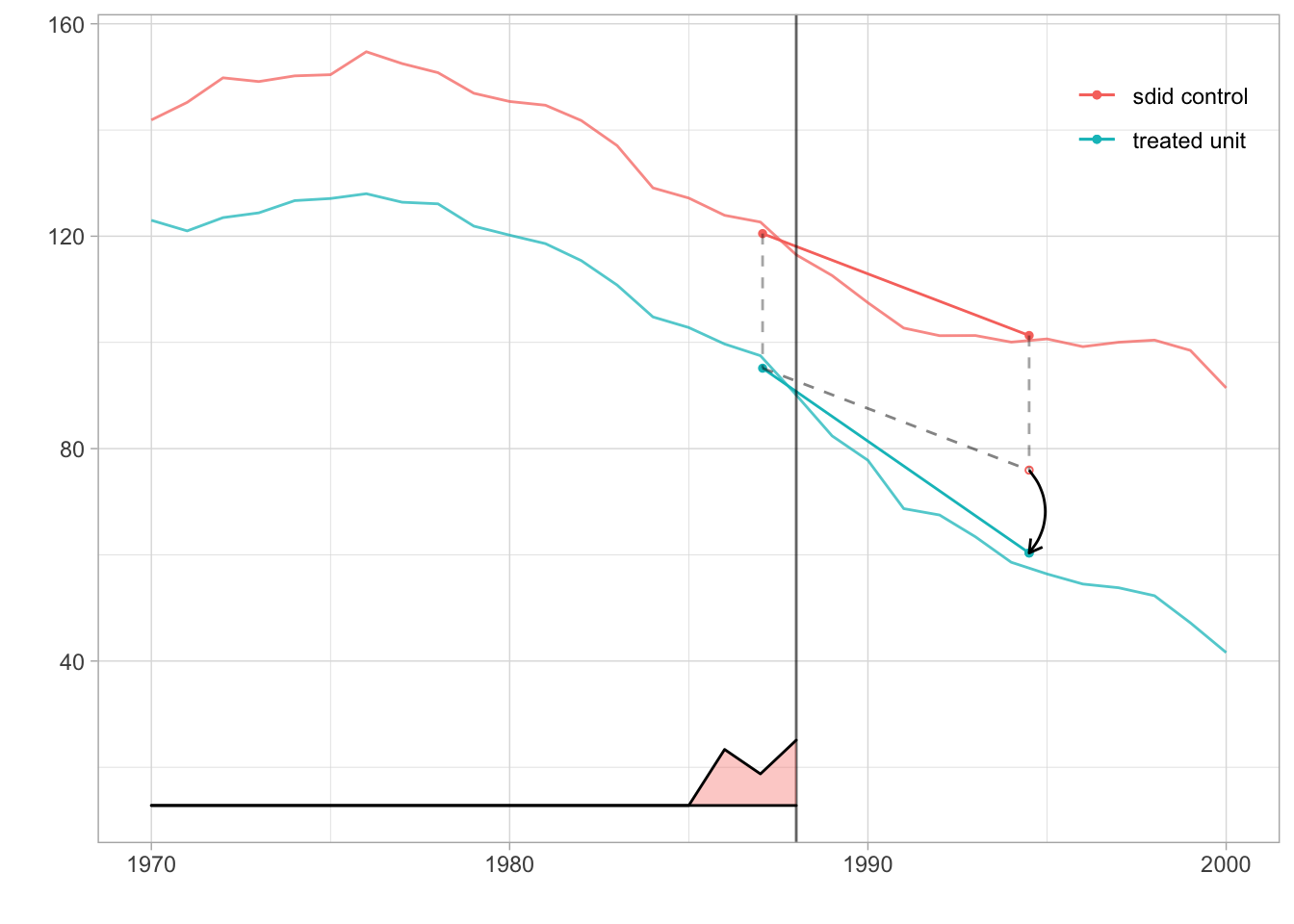
Figure 7.10: Synthetic unit and treated unit
7.2.4.2 Comparing SDID to DID and Synthetic Control
We can also compare this estimator to the DID and Synthetic Control estimators. For this we use did_estimate() and sc_estimate() functions from synthdid package. Figure 7.11 reproduces Figure 1 of Arkhangelsky et al. (2021). On top of the SDID graph in Figure 7.10, we plot DID and Synthethic Control estimates. We can see that the time weight for pre-treatment years is constant for the DID and that there is no time weight for the Synthetic Control.
tau.did <- did_estimate(attr(sdid, 'setup')$Y, attr(sdid, 'setup')$N0, attr(sdid, 'setup')$T0)
tau.sc <- sc_estimate(attr(sdid, 'setup')$Y, attr(sdid, 'setup')$N0, attr(sdid, 'setup')$T0)
estimates <- list(tau.did, tau.sc, sdid)
names(estimates) <- c('Diff-in-Diff', 'Synthetic Control', 'Synthetic Diff-in-Diff')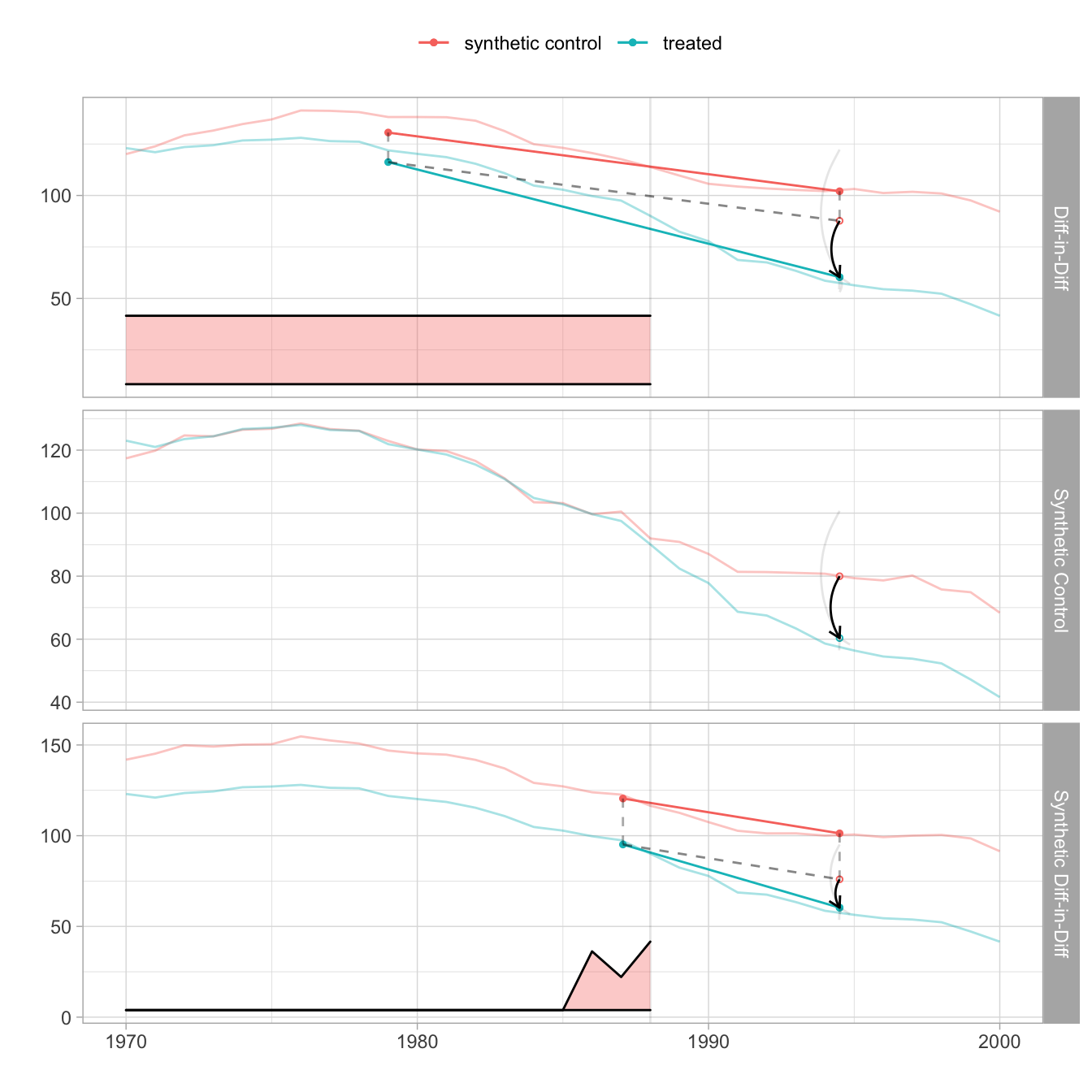
Figure 7.11: Comparing SDID to DID and Synthetic Control
7.3 Further reading
There are many excellent online resources on panel data methods such as the following:
- Causal Inference: The Mixtape
- Liu, L., Wang, Y., & Xu, Y. (2022). A Practical Guide to Counterfactual Estimators for Causal Inference with Time‐Series Cross‐Sectional Data. American Journal of Political Science.
- Roth, J., Sant’Anna, P. H., Bilinski, A., & Poe, J. (2022). What’s trending in difference-in-differences? A synthesis of the recent econometrics literature. arXiv preprint arXiv:2201.01194.
- De Chaisemartin, C., & d’Haultfoeuille, X. (2022). Two-way fixed effects and differences-in-differences with heterogeneous treatment effects: A survey