3 Exploring and Transforming Data
Chapter section list
Table of content (TOC)
- Examing distribution (Section 3.1)
- Histograms (Section 3.1.1)
- Density estimation (Section 3.1.2)
- Quantile-comparison plots (Section 3.1.3)
- Boxplots (Section 3.1.4)
- Examing relationships (Section 3.2)
- Scatterplots (Section 3.2.1)
- Parallel boxplots (Section 3.2.2)
- More on the plot function (Section 3.2.3)
- Examining multivariate data (Section 3.3)
- Three-dimensional plots (Section 3.3.1)
- Scatterplot Matrices (Section 3.3.2)
- Transforming data (Section 3.4)
- Logarithms (Section 3.4.1)
- Power transformations (Section 3.4.2)
- Transformations and Exploarative Data Analysis (EDA) {Section 3.4.3}
- Transforming resticted-range variables (Section 3.4.4)
- Other transformations (Section 3.4.5)
- Point labelling and identification (Section 3.5)
- The identify() function (Section 3.5.1)
- Automatic point labelling with car::showLabels() (Section 3.5.2)
3.1 Examing distributions
3.1.1 Histograms
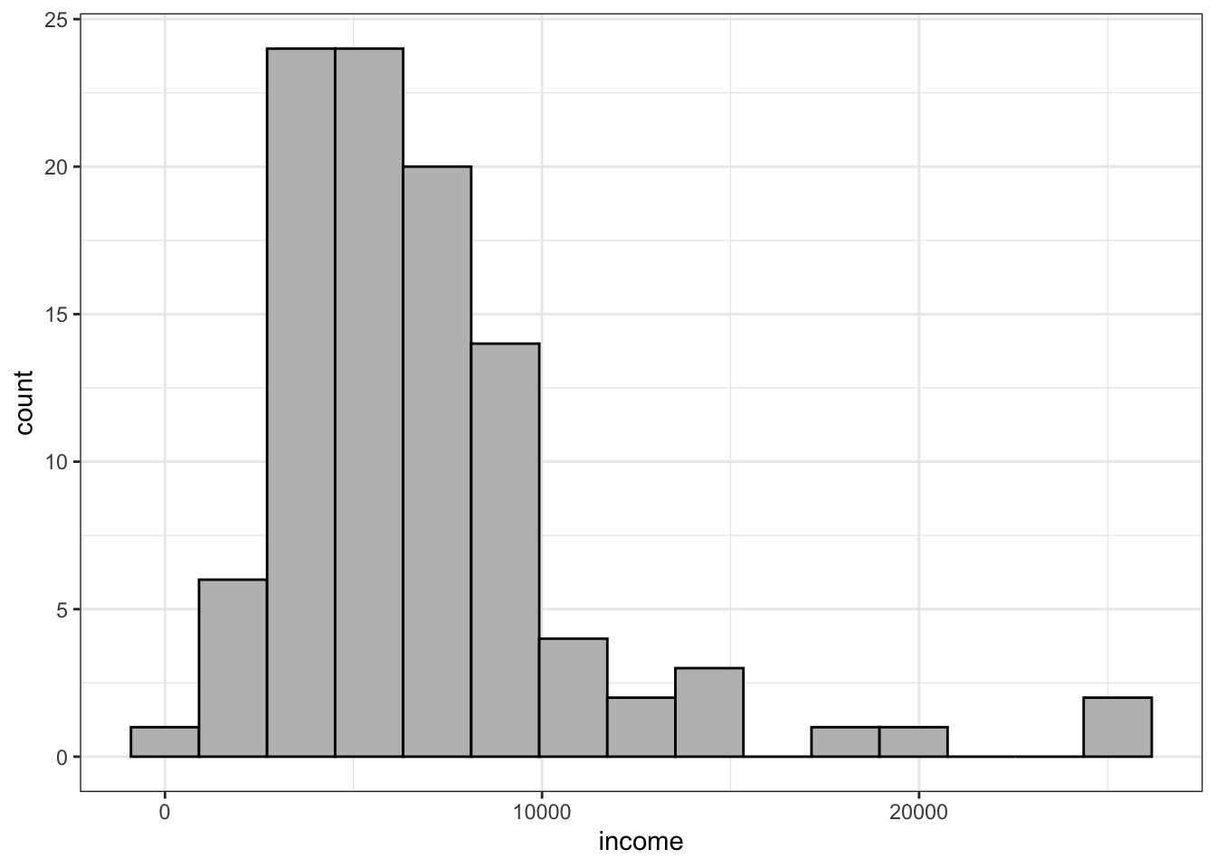
The shape of the histogram is determined in part by the number of bins and the location of their boundaries. With too few bins, the histogram can hide interesting features of the data, while with too many bins, the histogram is very rough, displaying spurious features of the data.
The help page for ggplot2::geom_histogram() recommends: “You should always override this default value, exploring multiple widths to find the best to illustrate the stories in your data.”
There are several algorithm to calculate an optimal number of bins depending of the sample size and distribution. Fox/Weisberg mention the rule by Freedman and Diaconis (1981):
\[ \frac{n^\frac{1}{3}(max-min)}{2(Q_{3}-Q_{1})} \tag{3.1}\]
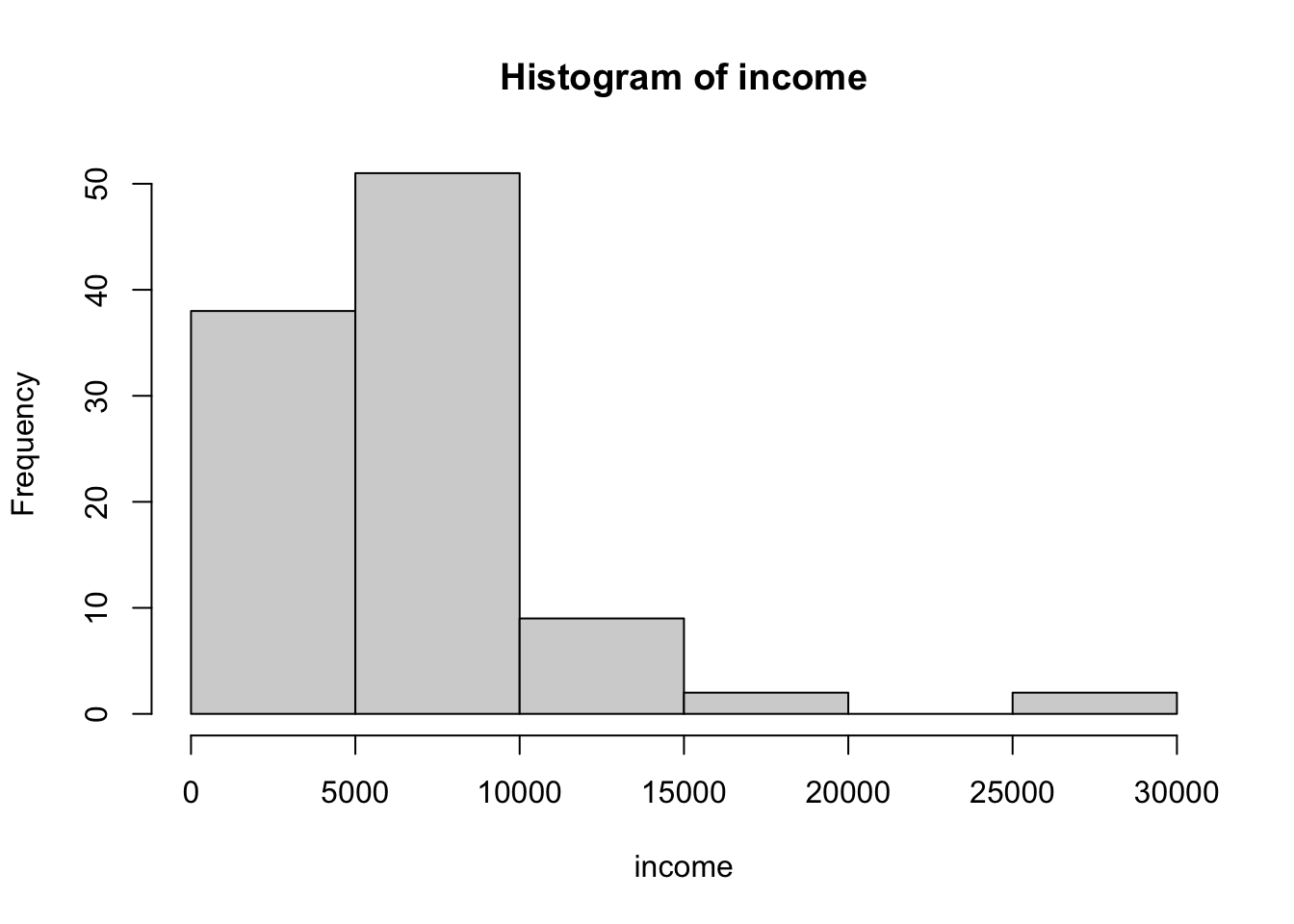
Example 3.1 : Histograms
R Code 3.1 : Default base R histogram
R Code 3.2 : Compute number of bins with the Freedman-Diaconis rule (1981)
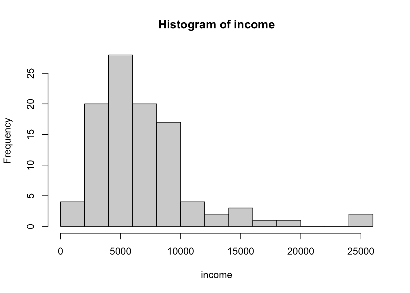
R Code 3.4 : Histogram with {ggplot2} (30 bins default)
Code
Prestige |>
    ggplot2::ggplot(
        ggplot2::aes(x = income)
    ) +
    ggplot2::geom_histogram(
        fill = "grey",
        color = "black"
        )
#> `stat_bin()` using `bins = 30`. Pick better value with `binwidth`.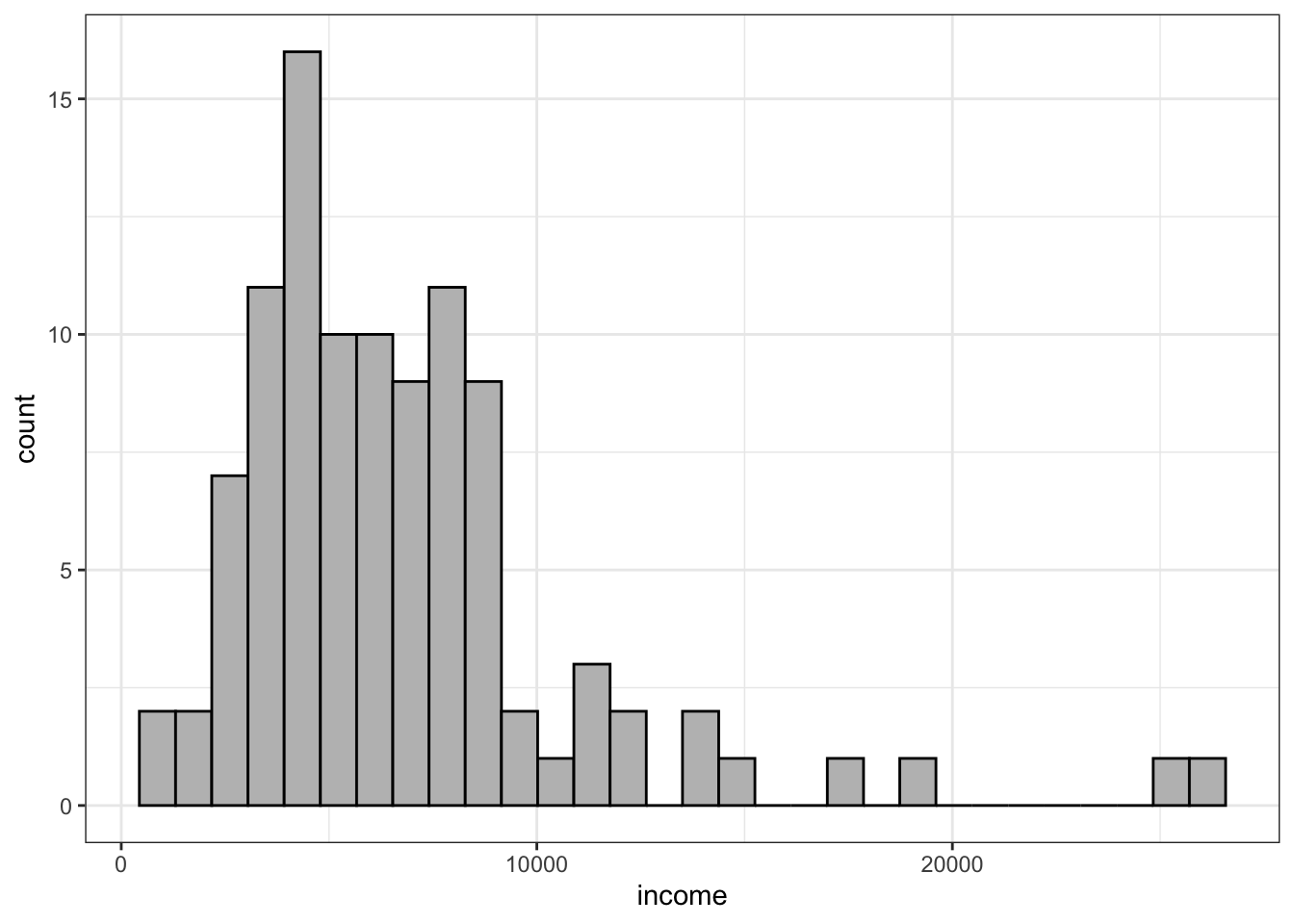
R Code 3.5 : Histogram with {ggplot2} with bin number computed after Freedman & Diaconis
Code
Prestige |>
    ggplot2::ggplot(
        ggplot2::aes(x = income)
    ) +
    ggplot2::geom_histogram(
        fill = "grey",
        color = "black",
        bins = grDevices::nclass.FD(Prestige$income)
        )
A special type of histograms are stem-and-leaf displays, which are histograms that encode the numeric data directly in their bars. I do not find them very usefull, because they are different to interpret and do not have essential advantages. They may be helpful for small data sets as a kind of paper-and-pencil method for visualizing.
Stem-and-leaf graphs can be produced with the graphics::stem() function or using the aplpack::stem.leaf() function.
Resource 3.1 : Another Plot Package {aplpack}
3.1.1.0.1 Functions for drawing some special plots
Besides plotting stem-and-leaf graphs with aplpack::stem.leaf() from the {aplpack} package, I noticed that there are some other interesting graphic functions in this package, which I should explore.
For instance aplpack::plotsummary() is an interesting function that shows important characteristics of the variables of a data set. For each variable a plot is computed consisting of a barplot, an ecdf, a density trace and a boxplot.
See Package Profile A.2.
3.1.2 Density Estimation
Nonparametric density estimation often produces a more satisfactory representation of the distribution of a numeric variable than a traditional histogram. Unlike a histogram, a nonparametric density estimate is continuous and so it doesn’t dissect the range of a numeric variable into discrete bins.
Kernel density estimation (KDE) is the application of kernel smoothing for probability density estimation. The bandwith controls the degree of smoothness of the density estimate:
The bandwidth of a density estimate is the continuous analog of the bin width of a histogram: If the bandwidth is too large, then the density estimate is smooth but biased as an estimator of the true density, while if the bandwidth is too small, then bias is low but the estimate is too rough and the variance of the estimator is large.
The adaptiveKernel() function in the {car} package employs an algorithm that uses different bandwidths depending on the local observed density of the data, with smaller bandwidths in dense regions and larger bandwidths in sparse regions.
Example 3.2 : Density estimation
R Code 3.6 : Nonparametric fixed-bandwidth and adaptive-bandwidth kernel density estimates (adjust = 1)
Prestige data set; a density histogram of income is also shown. The rug-plot at the bottom of the graph shows the location of the income values.
Code
with(Prestige, {
    hist(
        income,
        freq = FALSE,
        ylim = c(0, 1.5e-4),
        breaks = "FD",
        main = ""
    )
    lines(density(income, from = 0), lwd = 3, lty = 2)
    lines(car::adaptiveKernel(income, from = 0, adjust = 1),
          lwd = 2,
          lty = 1) # solid line
    rug(income)
    legend(
        "topright",
        c("Fixed bandwidth", "Adaptive bandwidth"),
        lty = 2:1, # dashed with proportion 2:1
        lwd = 2,
        inset = .02
    )
    box()
})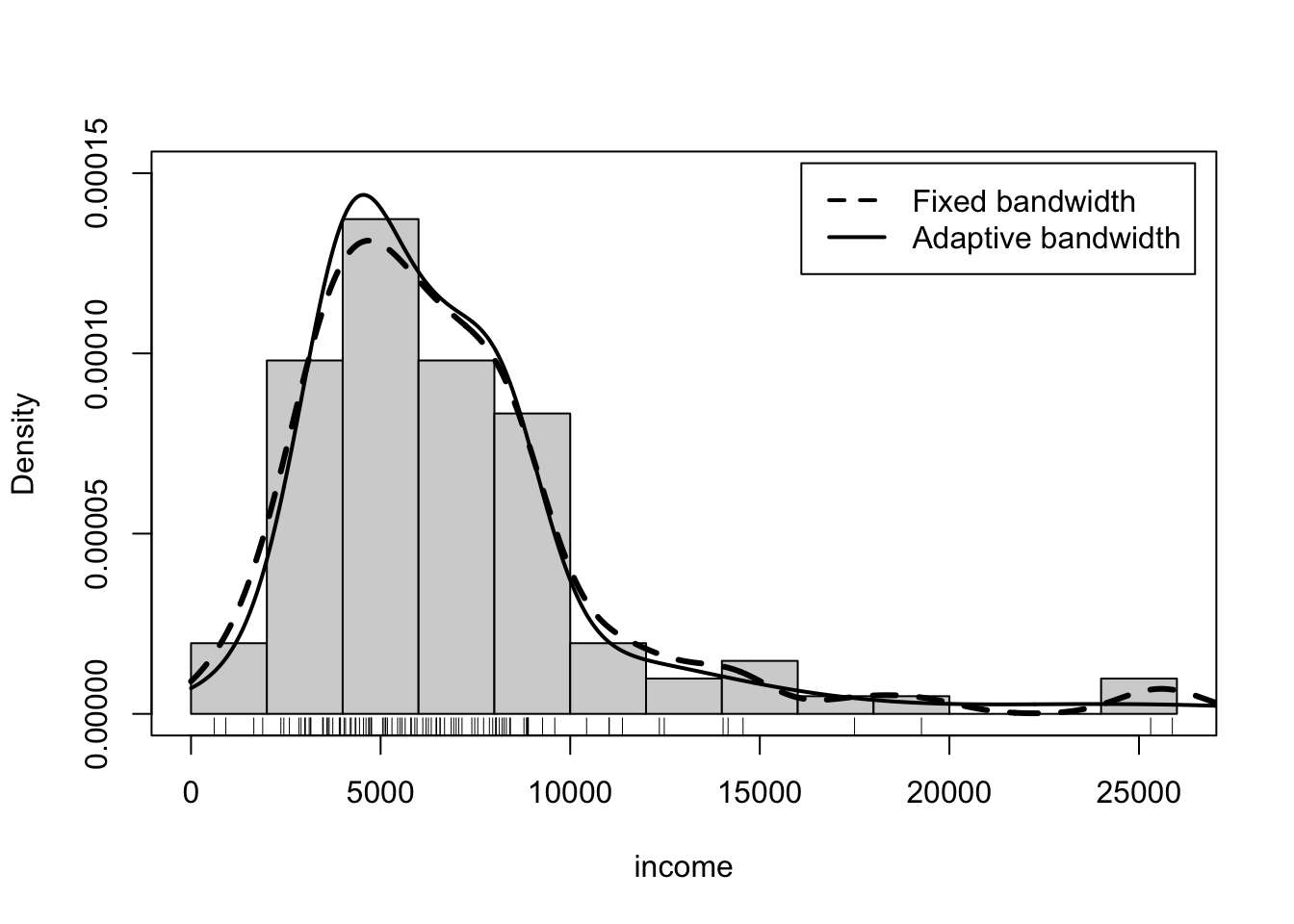
The command to draw the graph in Listing / Output 3.6 is relatively complicated and thus requires some explanation:
- The
base::with()function is used as usual to pass the data framePrestigeto the second argument. Here the second argument is a compound expression consisting of all the commands between the initial { and the final }. - The call to
graphics::hist()draws a histogram in density scale, so the areas of all the bars in the histogram sum to 1. - The argument
main=""suppresses the title for the histogram. - The
ylimargument sets the range for the y-axis to be large enough to accommodate the adaptive-kernel density estimate. The value 1.5e-4 is in scientific notation, 1.5 × 10−4 = 0.00015. - The fixed-bandwidth and adaptive-bandwidth kernel estimates are computed, respectively, by
stats::density()andcar::adaptiveKernel(). - In each case, the result returned by the function is then supplied as an argument to the
graphics::lines()function to add the density estimate to the graph. - The argument
from = 0to bothdensity()andadaptiveKernel()ensures that the density estimates don’t go below income = 0. - The call to
graphics::rug()draws a rug-plot (one-dimensional scatterplot) of the data at the bottom of the graph. - The remaining two commands add a legend and a frame around the graph.
Both nonparametric density estimates and the histogram suggest a mode at around $5,000, and all three show that the distribution of income is rightskewed. The fixed-bandwidth kernel estimate has more wiggle at the right where data are sparse, and the histogram is rough in this region, while the adaptive-kernel estimator is able to smooth out the density estimate in the low-density region.
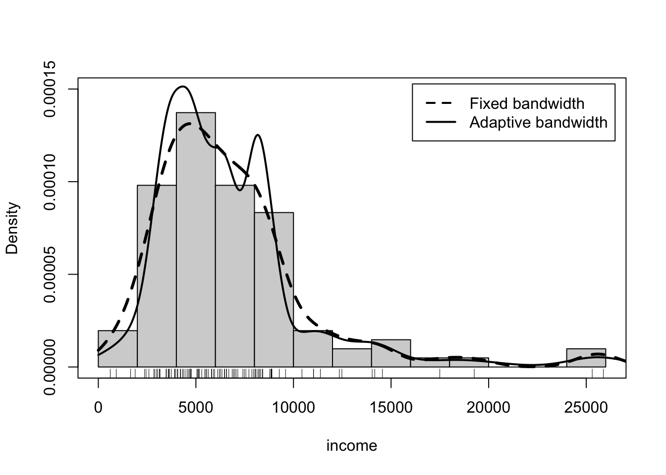
R Code 3.7 : Nonparametric fixed-bandwidth and adaptive-bandwidth kernel density estimates (adjust = 0.5)
income in the Prestige data set; a density histogram of income is also shown. The rug-plot at the bottom of the graph shows the location of the income values.
Code
with(Prestige, {
    hist(
        income,
        freq = FALSE,
        ylim = c(0, 1.5e-4),
        breaks = "FD",
        main = ""
    )
    lines(density(income, from = 0), lwd = 3, lty = 2)
    lines(car::adaptiveKernel(income, from = 0, adjust = 0.5),
          lwd = 2,
          lty = 1) # solid
    rug(income)
    legend(
        "topright",
        c("Fixed bandwidth", "Adaptive bandwidth"),
        lty = 2:1, # dashed with proportion 2:1
        lwd = 2,
        inset = .02
    )
    box()
})
R Code 3.8 : Histogram, rug and smoothed density estimate
income values from the Prestige dataset.
Code
Prestige |>
    ggplot2::ggplot(
        ggplot2::aes(x = income)
    ) +
    ggplot2::geom_histogram(
        ggplot2::aes(y = ggplot2::after_stat(density)),
        color = "black",
        fill = "grey",
        bins = grDevices::nclass.FD(Prestige$income)
    ) +
    ggplot2::geom_density(
        adjust = 1,
        kernel = "gaussian",
        color = "red",
        linewidth = 1
    ) +
    ggplot2::geom_rug()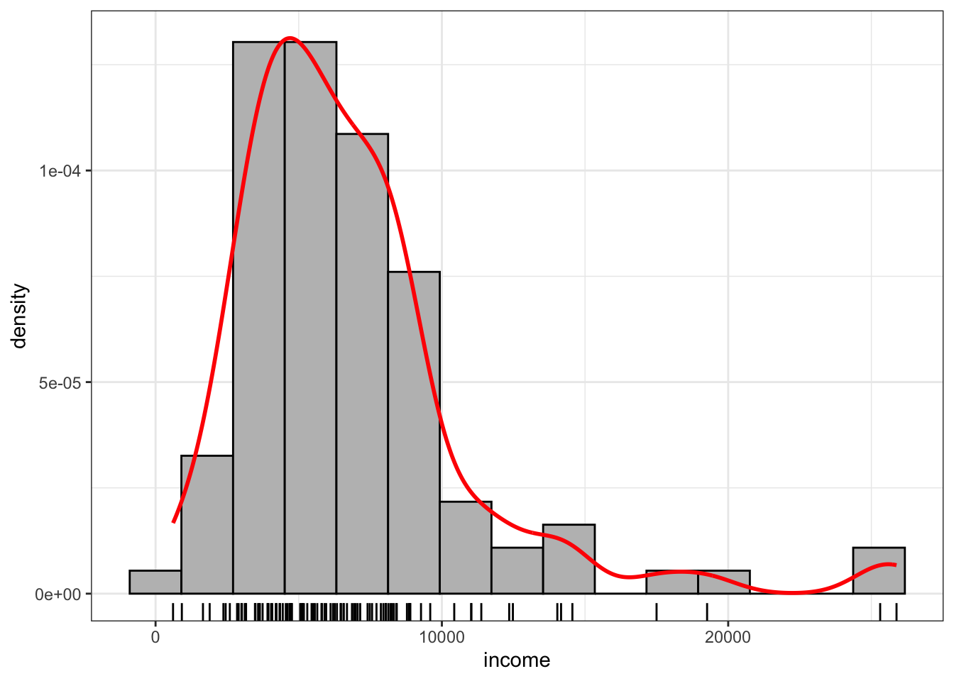
Warning 3.1: Don’t know how to inlcude adaptive kernel density estimation
The {car} package has with car::densityPlot() an additional function, that both computes and draws density estimates with either a fixed or adaptive kernel. I do not know how to include the adaptive kernel density estimation from the {car} package to get a full reproduction of book’s Figure 3.3 with {ggplot2}.
R Code 3.9 : Using my own function to create a histogram with density estimate and overlaid dnorm curve
Code
my_hist_dnorm(Prestige, Prestige$income)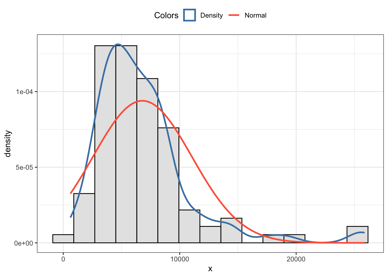
I have my own function my_hist_dnorm() adapted by supplying the Freeman-Diaconis rule (1981) as default value for the number of bins.
Additionally I have written with my_nbins() another small functions which returns the number of bins according to the Freeman-Diaconis rule.
3.1.3 Quantile-comparison plots
A quantile-comparison plot, or quantile-quantile plot (Q-Q-plot), provides an effective graphical means of making the comparison, plotting the ordered data on the vertical axis against the corresponding quantiles of the reference distribution on the horizontal axis. If the data conform to the reference distribution, then the points in the quantile-comparison plot should fall close to a straight line, within sampling error.
Example 3.3 : Quantile-quantile plots
R Code 3.10 : Base R: Quantile-Quantile Plot
income from the Prestige dataset.
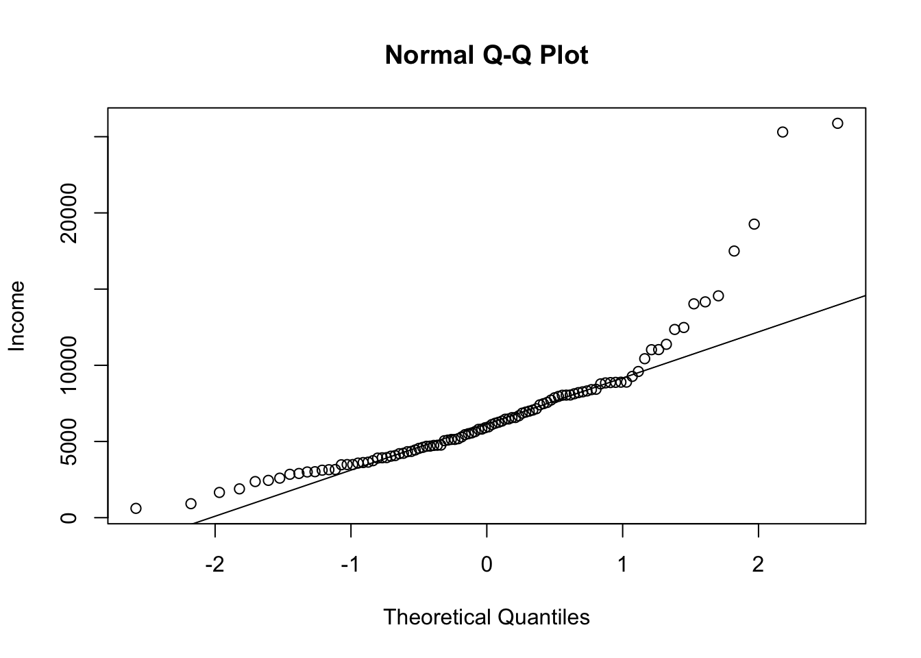
Many points, especially at the right of the graph, are far from the line of the theoretical quantiles. We have therefore evidence that the distribution of income is not like a sample from a normal population.
R Code 3.11 : car: Quantile-quantile plot
income.
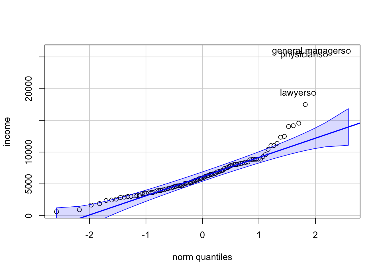
The broken lines give a pointwise 95% confidence envelope around the fitted solid line. Three points were labeled automatically. Because many points, especially at the right of the graph, are outside the confidence bounds, we have evidence that the distribution of income is not like a sample from a normal population.
The function car::qqPLot() has several advantages:
- It produces a pointwise 95% confidence envelope around the fitted solid line.
- It labels the most extreme data points.
- The
car::qqPlot()function can be used to plot the data against any reference distribution.
R Code 3.12 : Q-Q-plot using my own function applying {ggplot2}
Code
my_qq_plot(Prestige, Prestige$income)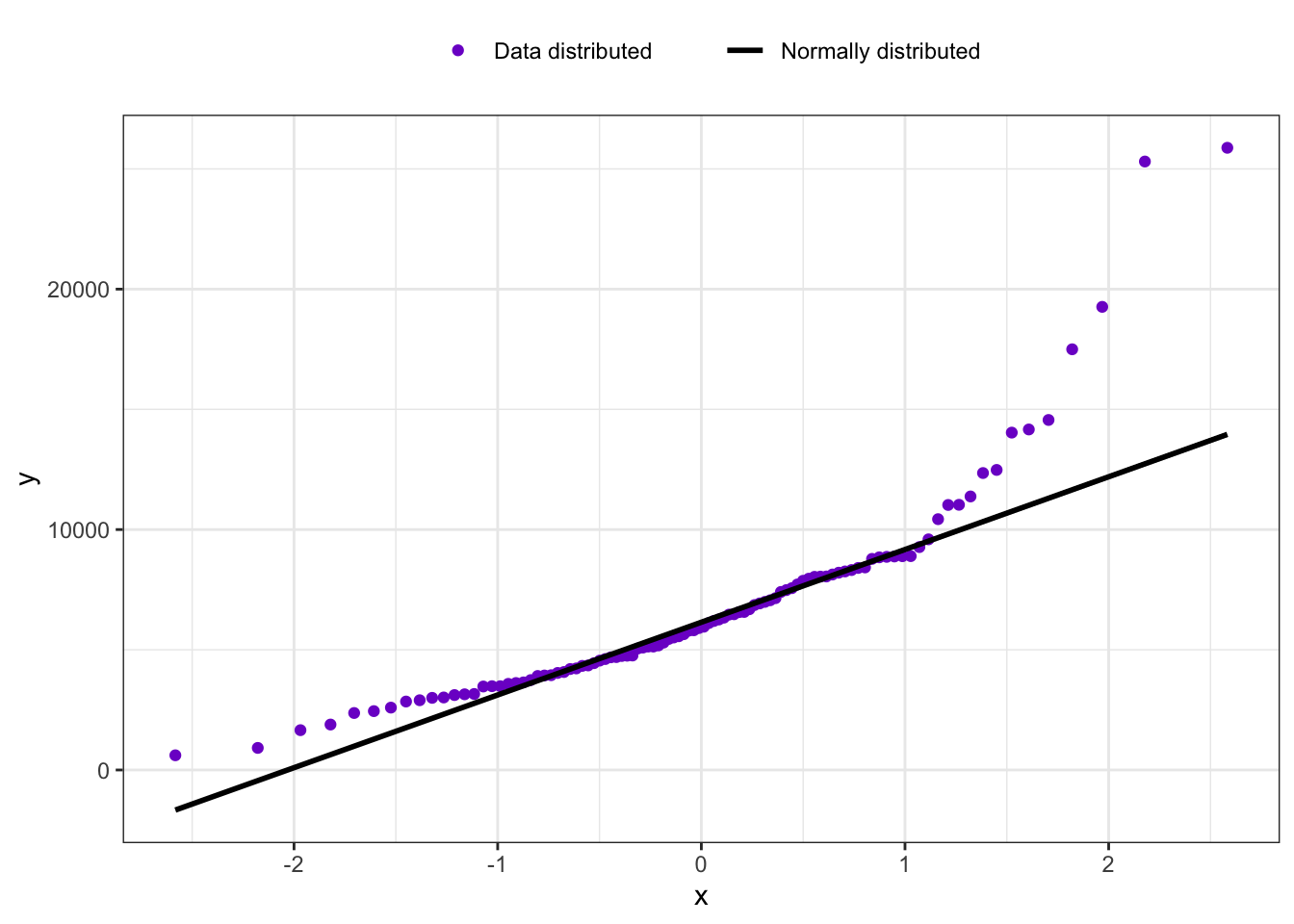
My own function lacks the confidence interval cannot label the most extreme points. I have to think if and how I could add these features to my_qq_plot().
R Code 3.13 : car::qqPlot: Chi-square illustration
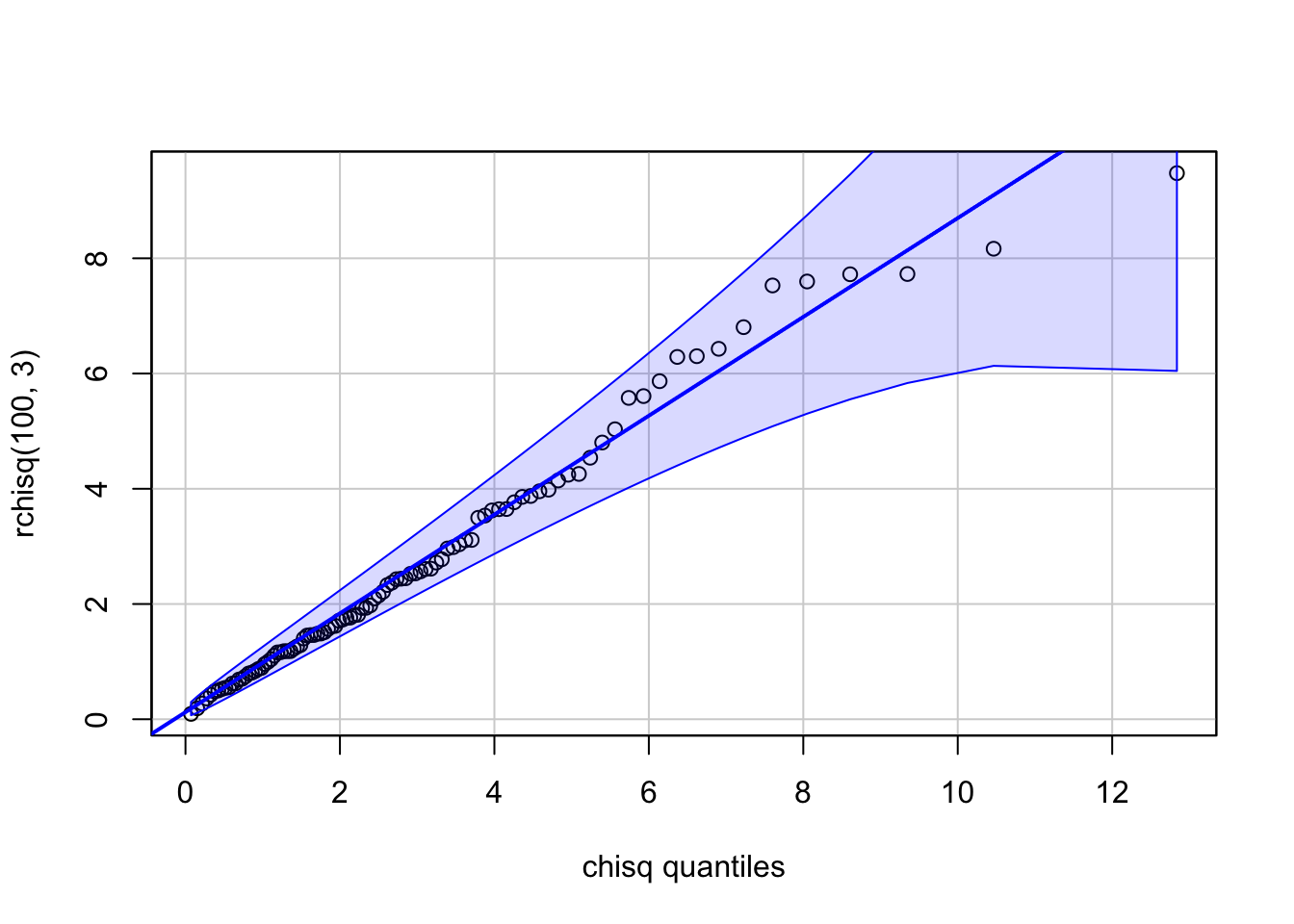
The argument df = 3 to car::qqPlot() is passed by it to the stats::dchisq() and stats::qchisq() functions. The points should, and do, closely match the straight line on the graph, with the fit a bit worse for the larger values in the sample. The confidence envelope suggests that these deviations for large values are to be expected, as they reflect the greater variability of sampled values in the long right tail of the \(X^2(3)\) density function.
The car::qqPlot() function can be used to plot the data against any reference distribution for which there are quantile and density function in R. You have simply to specify the root word for the distribution. For example, the root for the normal distribution is “norm”, with density function stats::dnorm() and quantile function stats::qnorm(). See also chapter 8 of the the Quarto manual of An Introduction to R. (R Core Team 2024)
An illustration is shown with Listing / Output 3.13: The rchisq() function is used to generate a random sample from the chi-square distribution with three df (degrees of freedom) and then plotted the sample against the distribution from which it was drawn.
3.1.4 Boxplots
Although boxplots are most commonly used to compare distributions among groups, they can also be drawn to summarize the distribution of a numeric variable in a single sample, providing a quick check of symmetry and the presence of outliers.
Example 3.4 : Boxplots
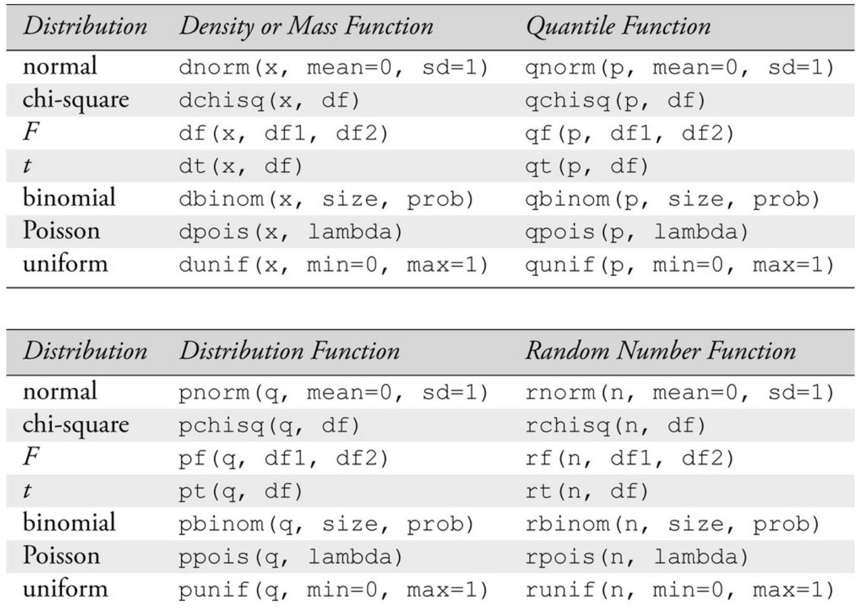
R Code 3.14 : graphics::boxplot(): Boxplot of income
graphics::boxplot()
Code
graphics::boxplot(Prestige$income)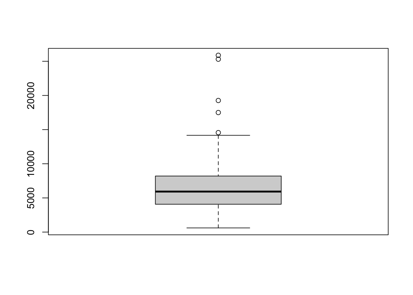
R Code 3.15 : car::Boxplot(): Boxplot of income
car::Boxplot(). Several outlying cases were labeled automatically.
Code
car::Boxplot(~ income, data = Prestige)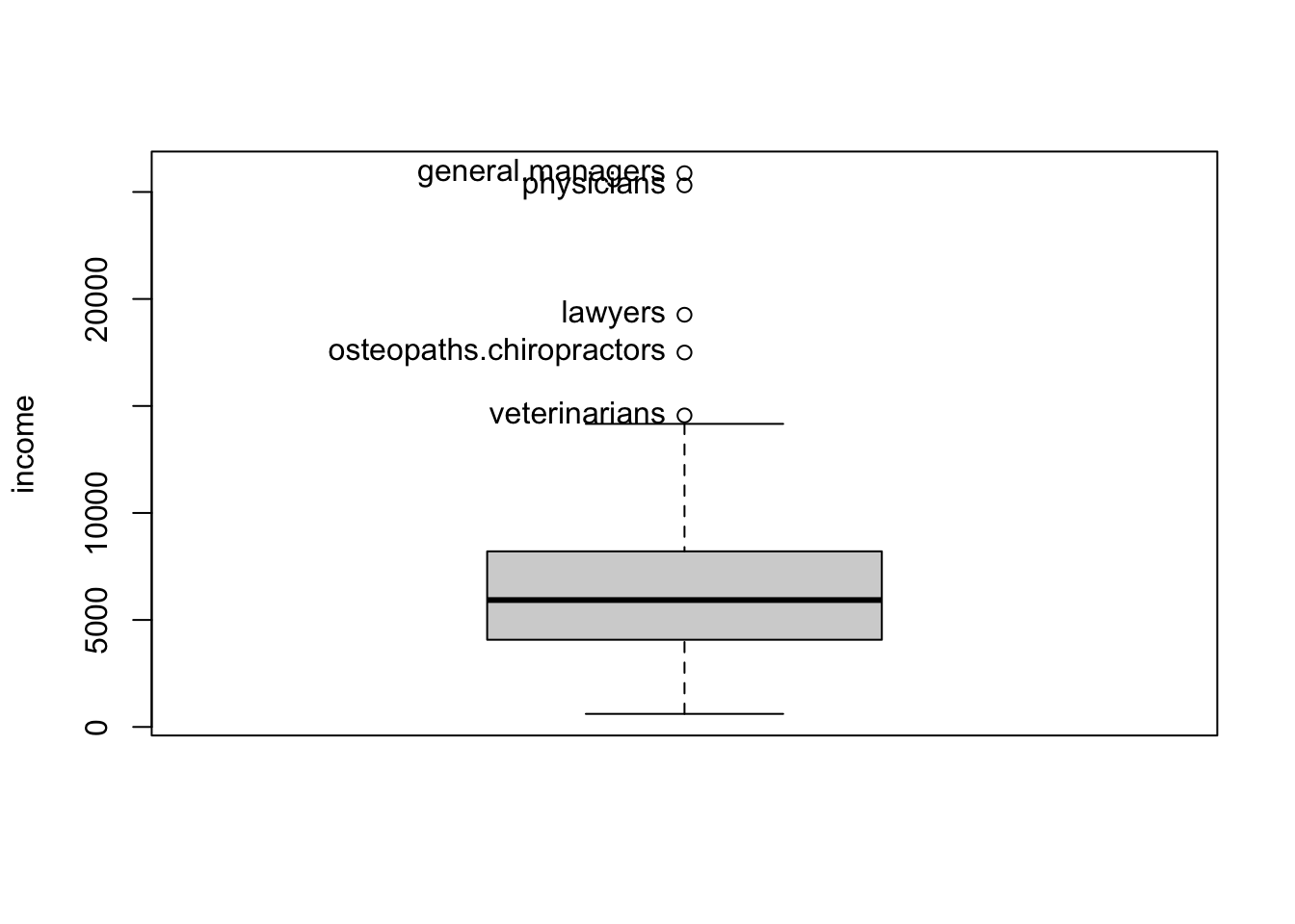
#> [1] "general.managers"         "lawyers"
#> [3] "physicians"               "veterinarians"
#> [5] "osteopaths.chiropractors"
car::Boxplot() adds automatic identification of outlying values (by default, up to 10), points that are shown individually in the boxplot. Points identified as outliers are those beyond the inner fences, which are 1.5 times the interquartile range below the first quartile and above the third quartile.
The names shown in the output are the cases that are labeled on the graph and are drawn from the row names of the Prestige data set.
The ggplot2::geom_boxplot() draws boxplots but has no options to label the outliers. To reproduce Figure 3.6 I need to add some code to the compute the outliers and label them with {ggrepel}.
Experiment 3.1 : {ggplot2} boxplot with outlier labelled
R Code 3.16 : Boxplot of income (default)
ggplot2::geom_boxplot()
Code
Prestige <- carData::Prestige

Prestige |>
    ggplot2::ggplot(
        ggplot2::aes(y = income)
    ) +
ggplot2::geom_boxplot() 
R Code 3.17 : Boxplot of income with outliers labelled
ggplot2::geom_boxplot() and using ggrepel::geom_text_repel()
Code
my_find_boxplot_outlier <- function(x) {
  return(x < quantile(x, .25) - 1.5*IQR(x) | x > quantile(x, .75) + 1.5*IQR(x))
}


prestige1 <- Prestige |>
  dplyr::mutate(outlier = my_find_boxplot_outlier(income)) |>
  tibble::rownames_to_column(var = "ID") |>
  dplyr::mutate(outlier =
        dplyr::case_when(outlier == TRUE ~ ID,
                         outlier == FALSE ~ "")
  )

set.seed(42)

prestige1 |>
    ggplot2::ggplot(
        ggplot2::aes(y = income)
    ) +
    ggrepel::geom_text_repel(
      ggplot2::aes(
        x = 0,
        label = outlier
        ),
      nudge_x      = 0.05,
      direction    = "y",
      hjust        = 0,
    ) +
    ggplot2::geom_boxplot()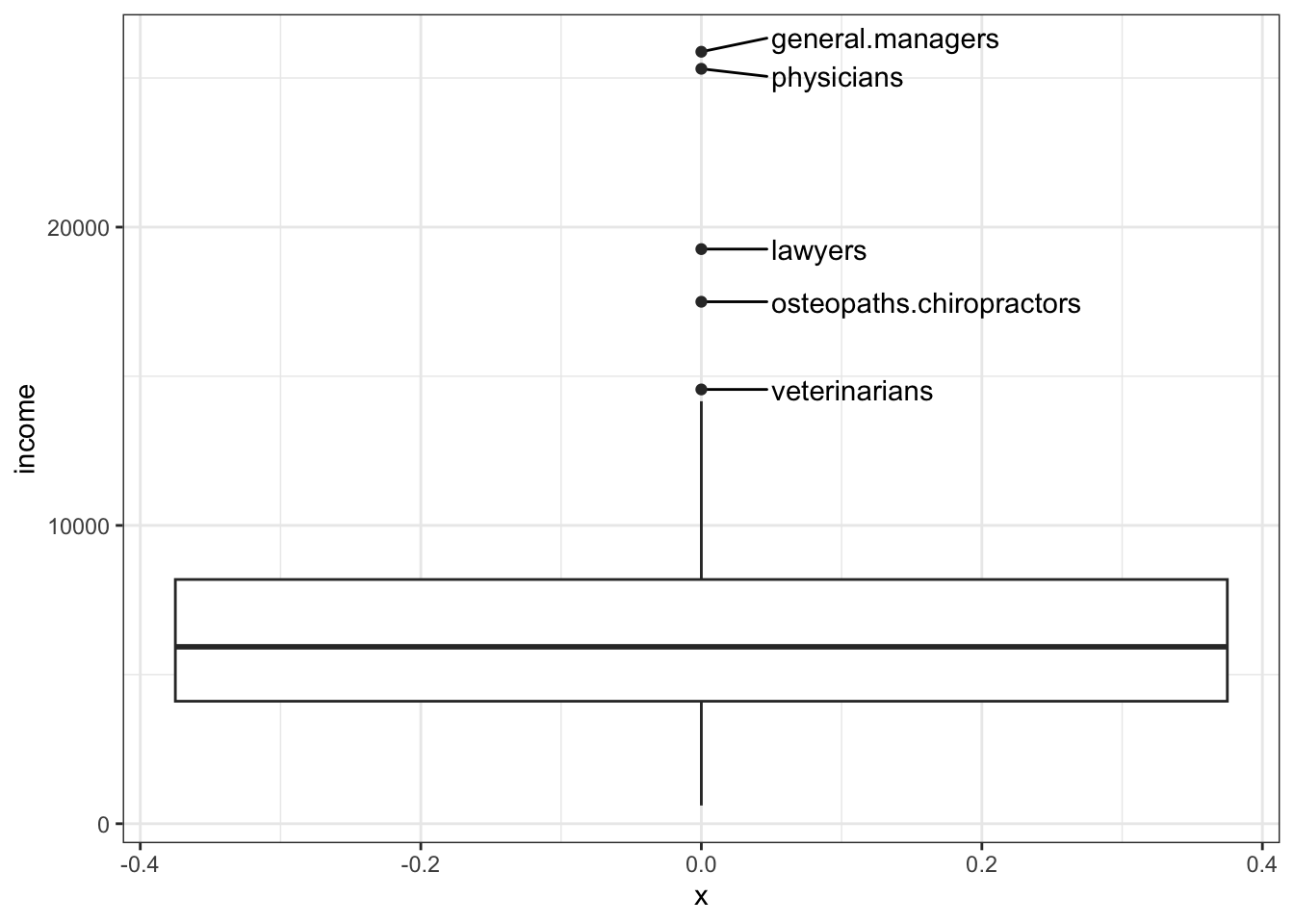
3.2 Examing relationships
3.2.1 Scatterplots
Understanding and using scatterplots is at the heart of regression analysis!
Scatterplots are useful for studying the mean and variance functions in the regression of the y-variable on the x-variable. In addition, scatterplots can help identify outliers, points that have values of the response far different from the expected value, and leverage points, cases with extremely large or small values on the x-axis.
Example 3.5 : Scatterplots
R Code 3.18 : Simple scatterplot using base R graphics::plot() function
prestige versus income for the Canadian occupational-prestige data
Code
graphics::plot(prestige ~ income, data = Prestige)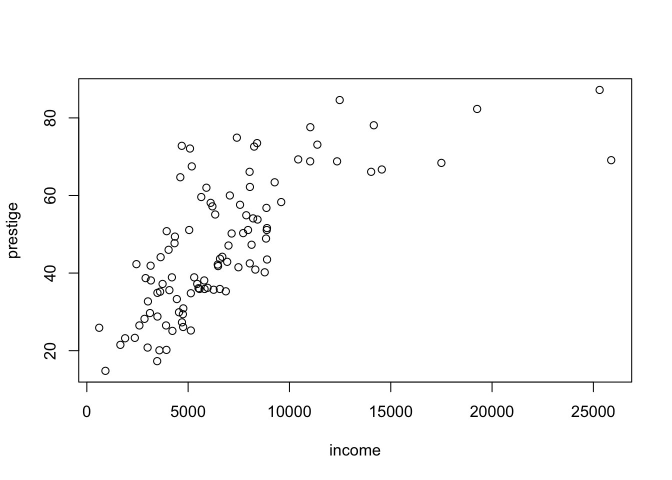
The scatterplot in Listing / Output 3.18 is a summary graph for the regression problem in which prestige is the response and income is the predictor. As our eye moves from left to right across the graph, we see how the distribution of prestige changes as income increases. In technical terms, we are visualizing the conditional distributions of prestige given the value of income.
The overall story here is that as income increases, so does prestige, at least up to about $10,000, after which the value of prestige stays more or less fixed on average at about 80.
R Code 3.19 : Enhanced scatterplot with car::scatterplot()
car::scatterplot() function. Four points were identified using the id argument.
Code
car::scatterplot(
    prestige ~ income,
    data = Prestige,
    id = list(n = 4)
    )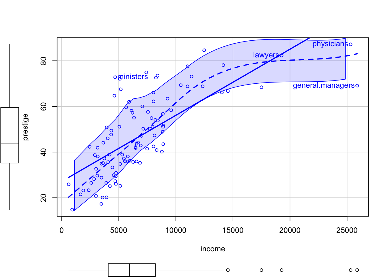
#> general.managers          lawyers        ministers       physicians
#> 2 17 20 24-
Points correspond to the pairs of (
income,prestige) values in the Prestige data frame, which is supplied in the data argument. -
The thick solid straight line in the scatterplot is the simple linear regression of
prestigeonincomefit by ordinary least squares (OLS). - The dashed line is fit using a nonparametric scatterplot smoother, and it provides an estimate of the mean function that does not depend on a parametric regression model, linear or otherwise.
- The two dash-dotted lines provide a nonparametric estimate of the square root of the variance function (i.e., the conditional standard deviation of the response), based on separately smoothing the positive and negative residuals from the fitted nonparametric mean function.
- Also shown on each axis are marginal boxplots of the plotted variables, summarizing the univariate distributions of x and y.
- The only optional argument is
id=list (n=4), to identify by row name the four most extreme cases, where by default “extreme” means farthest from the point of means using Mahalanobis distances.
All these features, and a few others that are turned off by default, can be modified by the user, including the color, size, and symbol for points; the color, thickness, and type for lines; and inclusion or exclusion of the least-squares fit, the mean smooth, variance smooth, and marginal boxplots. See help (“scatterplot”) for the available options.
In Listing / Output 3.19 the least squares line cannot match the obvious curve in the mean function that is apparent in the smooth fit. So modeling the relationship of prestige to income by simple linear regression is likely to be inappropriate.
Resource 3.2 : Nonparametric regression as an appendix to the R Companion
Listing / Output 3.19 uses as an plot enhancement in the {car} package a smoother, designed to help us extract information from a graph.
Nonparametric regression, in which smoothers are substituted for more traditional regression models, is described in an online appendix to the R Companion.
R Code 3.20 : Scatterplot with ggplot2::geom_point()
prestige versus income produced by different functions of the {ggplot2} package.
Code
gg_Prestige <- carData::Prestige |>
    ggplot2::ggplot(
        ggplot2::aes(
            x = income,
            y = prestige
        )
    ) +
    ggplot2::geom_point(
        shape = "circle open",
        size = 2
    ) +
    ggplot2::stat_smooth(
        formula = 'y ~ x',
        method = "loess",
        span = .75,
        level = 0.95
    ) +
    ggplot2::stat_smooth(
        formula = 'y ~ x',
        method = "lm",
        se = FALSE
    ) +
    ggplot2::coord_cartesian(
      xlim = c(0, 26000),
      ylim = c(10, 90),
      expand = TRUE,
      default = FALSE,
      clip = "on"
    )

save_data_file("chap03", gg_Prestige, "gg_Prestige.rds")

gg_Prestige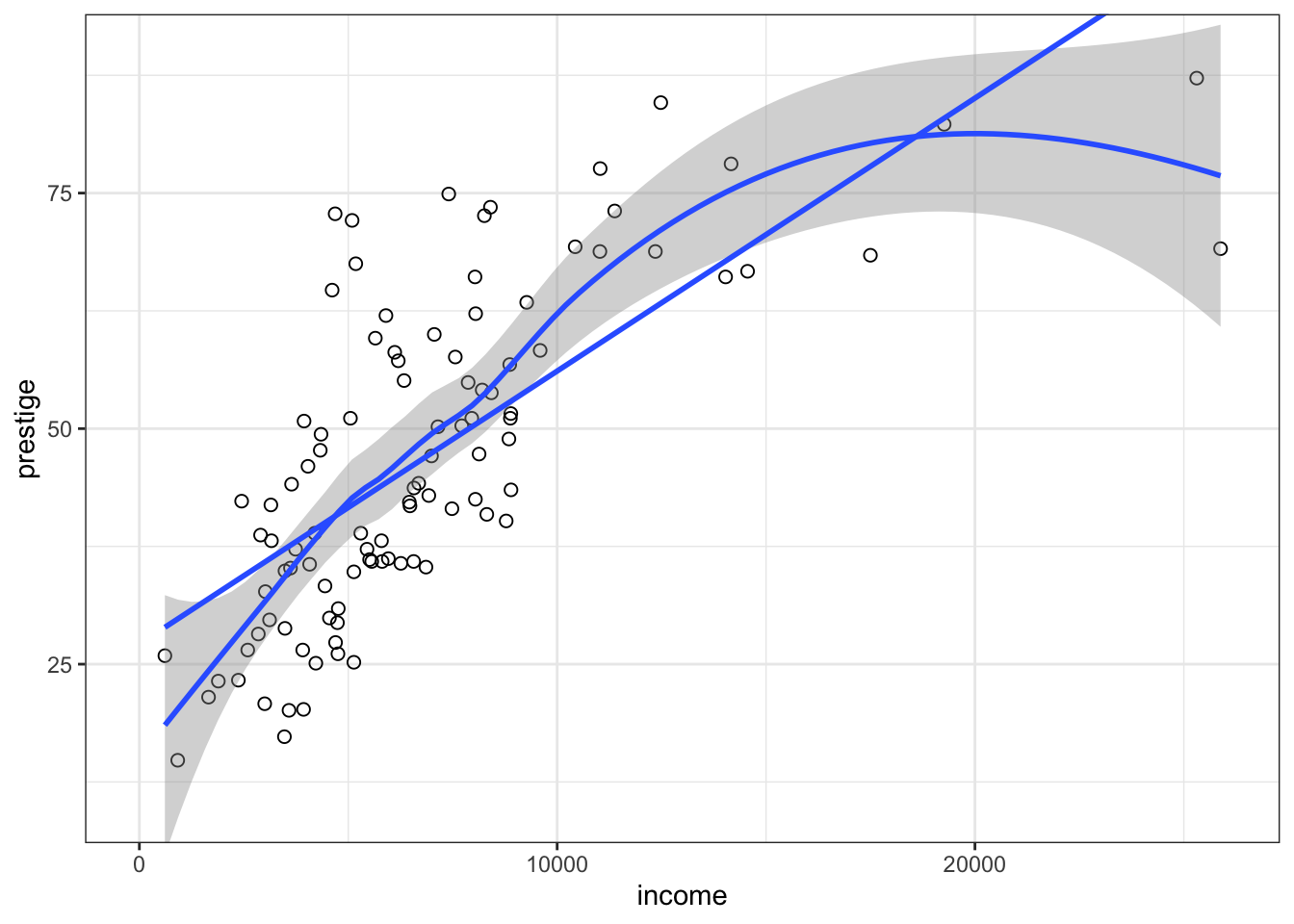
The default smoother employed by ggplot2::geom_smooth() depends on the size of the largest group. stats::loess() would have been used here because we have less than 1,000 observation. But I have applied the loess()function explicitly to prevent a warning message.
The span in loess is the fraction of the data used to determine the fitted value of y at each x. A larger span therefore produces a smoother result, and too small a span produces a fitted curve with too much wiggle. The trick is to select the smallest span that produces a sufficiently smooth regression mean function. The default span of 2/3 works well most of the time but not always
Besides the labelled points and the marginal boxplots, I could not create smoother with the similar width as in the {car} example. I assume it has to do with “the nonparametric estimate of the square root of the variance function (i.e., the conditional standard deviation of the response), based on separately smoothing the positive and negative residuals from the fitted nonparametric mean function.”
R Code 3.21 : Conditioning on a categorical variable
prestige versus income, coded with {car} by type of occupation. The span of the loess smoother is set to 0.9.
Code
Prestige$type <- factor(Prestige$type, levels = c("bc", "wc", "prof"))
car::scatterplot(
    prestige ~ income | type,
    data = Prestige,
    legend = list(coords = "bottomright", inset = 0.1),
    smooth = list(span = 0.9),
    col = ggokabeito::palette_okabe_ito(c(1, 3, 5))
)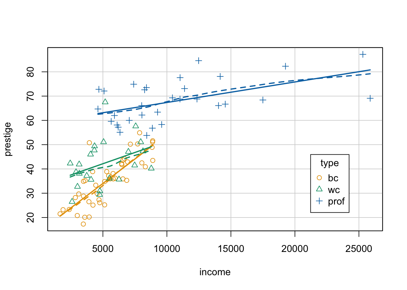
Code
xtabs( ~ type, data = Prestige)#> type
#> bc wc prof
#> 44 23 31Code
glue::glue(" ")Code
glue::glue("bc = blue color, wc = white color, prof = professional")#> bc = blue color, wc = white color, prof = professional-
The variables for the coded scatterplot are given in a formula as
y ~ x | g, which is interpreted as plotting y on the vertical axis, x on the horizontal axis, and marking points according to the value of g (or “y versus x given g”). - The legend for the graph, automatically generated by the scatterplot () function, is placed by default above the plot; we specify the legend argument to move the legend to the lower-right corner of the graph.
- We select a larger span, span=0.9, for the scatterplot smoothers than the default (span=2/3) because of the small numbers of cases in the occupational groups.
- As color palette I used the colorblind friendly Okabe Ito scale from {ggokabeito} instead of the default colors from {car} .
The default smoother employed by car::scatterplot() is the loess smoother. The span in loess is the fraction of the data used to determine the fitted value of y at each x. A larger span therefore produces a smoother result, and too small a span produces a fitted curve with too much wiggle. The trick is to select the smallest span that produces a sufficiently smooth regression mean function. The default span in {car} of 2/3 works well most of the time but not always. (In {ggplot2} the default span is 3/4.)
The nonlinear relationship in Listing / Output 3.19 has disappeared, and we now have three reasonably linear regressions with different slopes. The slope of the relationship between prestige and income looks steepest for blue-collar occupations and least steep for professional and managerial occupations.
R Code 3.22 : Numbered R Code Title
prestige versus income, coded with {ggplot2} by type of occupation. The span of the loess smoother is set to 0.95.
Code
Prestige |>
    tidyr::drop_na(type) |>
    ggplot2::ggplot(
        ggplot2::aes(
            x = income,
            y = prestige,
            group = type,
            color = type,
            shape = type
        ),
    ) +
    ggplot2::geom_point(
        size = 2
    ) +
    ggplot2::stat_smooth(
        formula = 'y ~ x',
        method = "lm",
        se = FALSE
    ) +
    ggplot2::stat_smooth(
        linetype = "dashed",
        formula = 'y ~ x',
        method = "loess",
        se = FALSE,
        span = .95,
    ) +
    ggokabeito::scale_color_okabe_ito(
        order = c(1, 3, 5, 2, 4, 6:9)
    ) +
    ggplot2::scale_shape_manual(values = 1:3)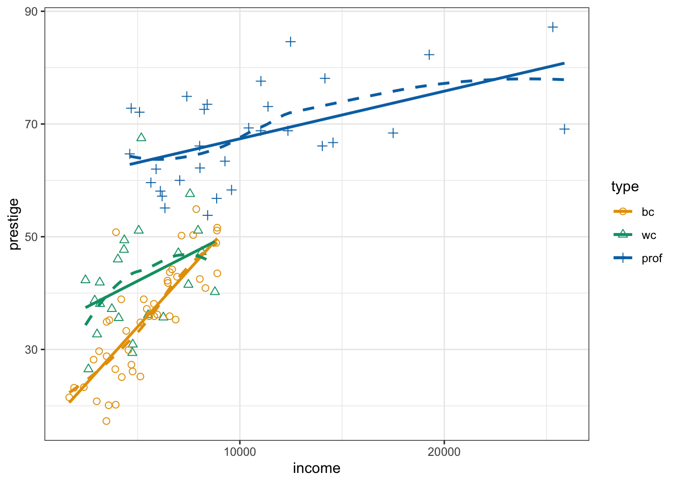
TODO: Better legend inside graphic panel
- Add legend for linetype
- Create legend of occupation type without line, just the shape
- Put legend bottom right inside the graph panel
R Code 3.23 : Scatterplots of vocabulary by education using {car}
Code
Vocab <- carData::Vocab

car::scatterplot(vocabulary ~ education, data = Vocab, main = "(a)")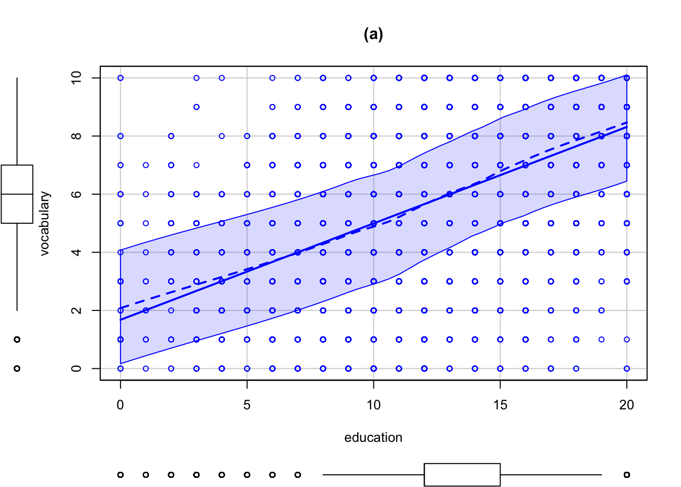
Code
car::scatterplot(
  vocabulary ~ education,
  data = Vocab,
  jitter = list(x = 2, y = 2),
  cex = 0.01,
  col = "darkgray",
  smooth = list(
    span = 1 / 3,
    col.smooth = "black",
    col.spread = "black"
  ),
  regLine = list(col = "black"),
  main = "(b)"
)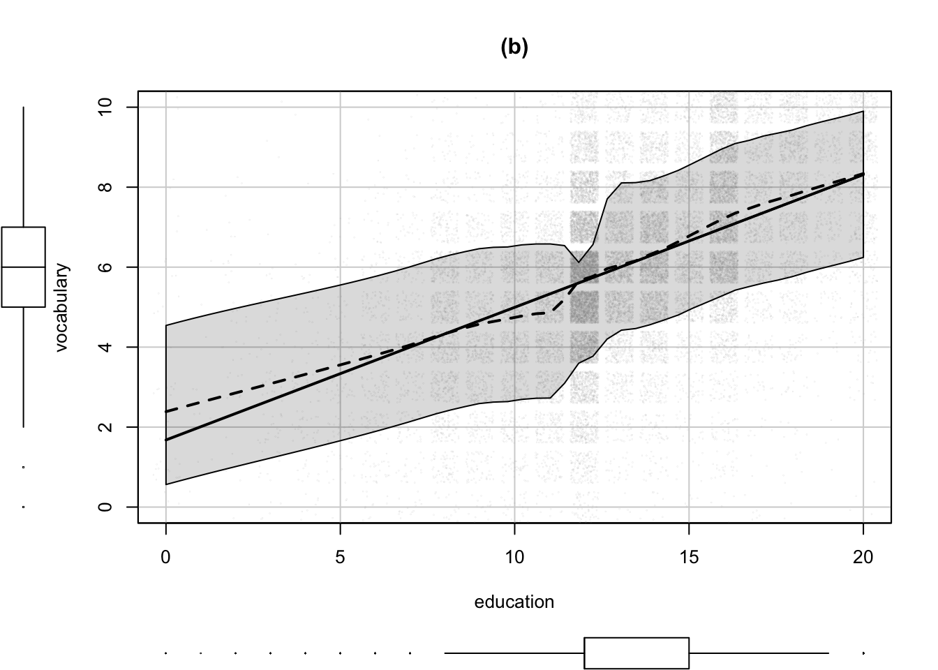
- The argument
jitter=list (x=2, y=2)adds small random numbers to the x and y coordinates of each plotted point. The values x=2 and y=2 specify the degree of jittering relative to the default amount, in this case twice as much jittering. The amounts of jitter used were determined by trial and error to find the choices that provide the most information. - The argument
cex=0.01reduces the size of the circles for the plotted points to 1% of their normal size, andcol="darkgray"sets their color to gray, more appropriate choices when plotting more than 30,000 points. As a consequence of jittering and using smaller and lighter plotting symbols, we see clearly that the density of points for education = 12, high school graduates, is higher than for other years, and that the data for education < 8 are very sparse. - We use the smooth argument to set the span for the default loess smoother to 1/3, half the default value of 2/3. Setting a smaller span uses less data to estimate the fitted curve at each value of education, allowing us to resolve greater detail in the regression function. Here we observe a dip in the regression function when education ≈ 11, so individuals who just missed graduating from high school perform somewhat worse than expected by a straight-line fit on the vocabulary test. Similarly, there is a small positive bulge in the regression function corresponding to college graduation, approximately 16 years of education. The specifications
col.smooth="black"andcol.var="black"set the color of the loess and variability lines, making them more visible in the graph; the default is the color of the points, now gray. - Finally, as before, the main argument sets the title of the graph.
R Code 3.24 : Scatterplots of vocabulary by education using {ggplot2
Code
Vocab <- carData::Vocab

Vocab |>
    ggplot2::ggplot(
        ggplot2::aes(
            x = education,
            y = vocabulary
        )
    ) +
    ggplot2::geom_jitter(
        color = "grey",
        size = .01,
        alpha = 0.2
    ) +
    ggplot2::stat_smooth(
        formula = 'y ~ x',
        method = "loess",
        span = .7,
        level = 0.95
    ) +
    ggplot2::stat_smooth(
        formula = 'y ~ x',
        method = "lm"
) 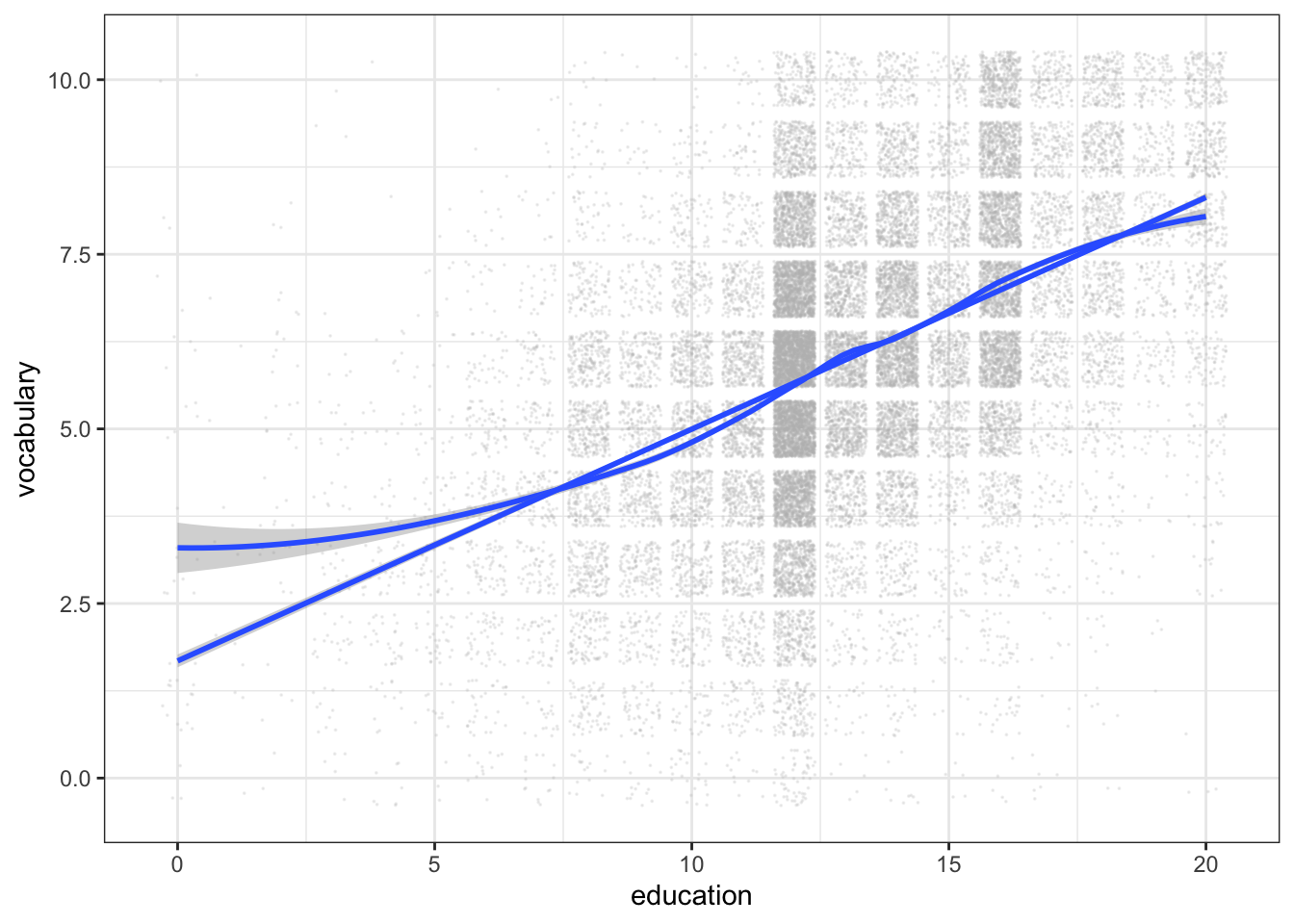
At first, using span = 0.33 as in Listing / Output 3.23 I’ve got many warnings that I do not understand. (The same happened with the {car} approach, but these warnings did not appear in the outcome.) It seems that these warnings come when there are too many identical values, e.g. when the variable behaves more like a discrete variable than a continuous variable as it would be required for a proper smoothing (see: ).
Despite the advice in a StackOverflow posting R warnings, simpleLoess, pseudoinverse etc. I changed span to 0.7 and the warnings disappeared.
Increasing the
spanparameter has the effect of “squashing out”, … the piles of repeated values where they occur. … I would definitely not increase span to achieve the squashing: it is a lot better to use a tiny amount of jitter for that purpose; span should be dictated by other considerations….
Changing the width and/or height of jitter didn’t remove the warnings, but I got the advise in the warnings that I should enlarge span.
The {car} packages has the ability to display “extreme” points, mostly defined by the Mahalanobis distance. Unlike simple Euclidean distances, which are inappropriate when the variables are scaled in different units, Mahalanobis distances take into account the variation and correlation of x and y.
The Mahalanobis distance (MD) is the distance between two points in multivariate space. In a regular Euclidean space, variables (e.g. x, y, z) are represented by axes drawn at right angles to each other; The distance between any two points can be measured with a ruler. For uncorrelated variables, the Euclidean distance equals the MD. However, if two or more variables are correlated, the axes are no longer at right angles, and the measurements become impossible with a ruler. In addition, if you have more than three variables, you can’t plot them in regular 3D space at all. The MD solves this measurement problem, as it measures distances between points, even correlated points for multiple variables. (Glenn 2017)
3.2.1.1 Scatterplots enhanced with marginal plots
To reproduce the marginal boxplots without {car} and using the {tidyverse} approach I learned about the {ggExtra} package. It now only allows scatterplots with marginal boxplots but also with histograms, density, densigram (a histogram overlaid with a density distribution) and violins.
Experiment 3.2 : Using {ggExtra} for adding marginal graphs to scatterplots
R Code 3.25 : Scatterplot of prestige versus income with marginal boxplots
prestige versus income with marginal boxplots
Code
gg_Prestige <- base::readRDS("data/chap03/gg_Prestige.rds")


ggExtra::ggMarginal(gg_Prestige, type = "boxplot")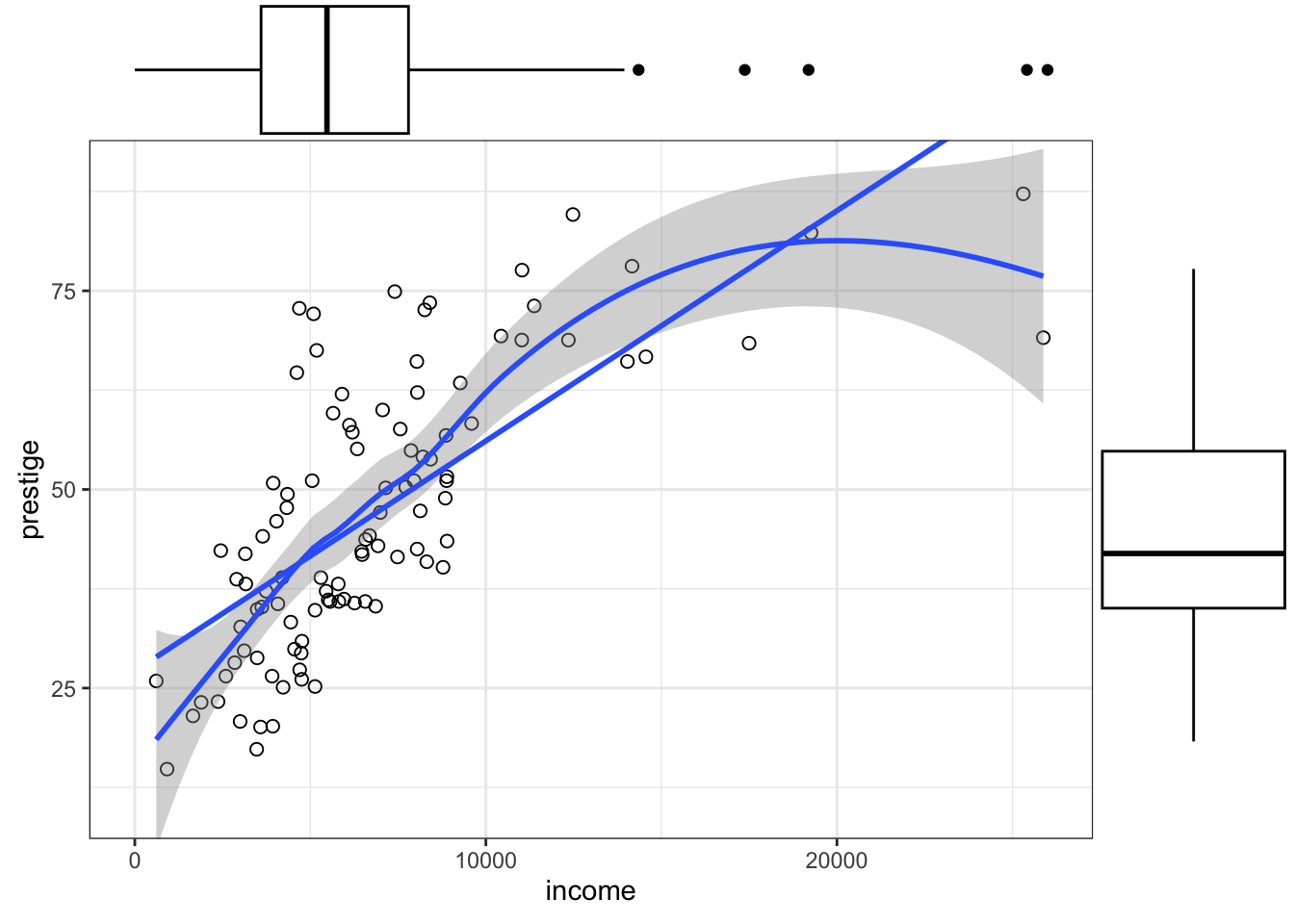
R Code 3.26 : Scatterplot of prestige versus income with marginal histograms
prestige versus income with marginal histograms
Code
gg_Prestige <- base::readRDS("data/chap03/gg_Prestige.rds")


ggExtra::ggMarginal(gg_Prestige, type = "histogram")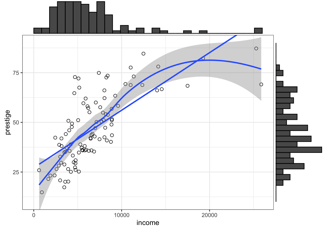
R Code 3.27 : Scatterplot of prestige versus income with marginal density distribution
prestige versus income with marginal density distribution
Code
gg_Prestige <- base::readRDS("data/chap03/gg_Prestige.rds")


ggExtra::ggMarginal(gg_Prestige, type = "density")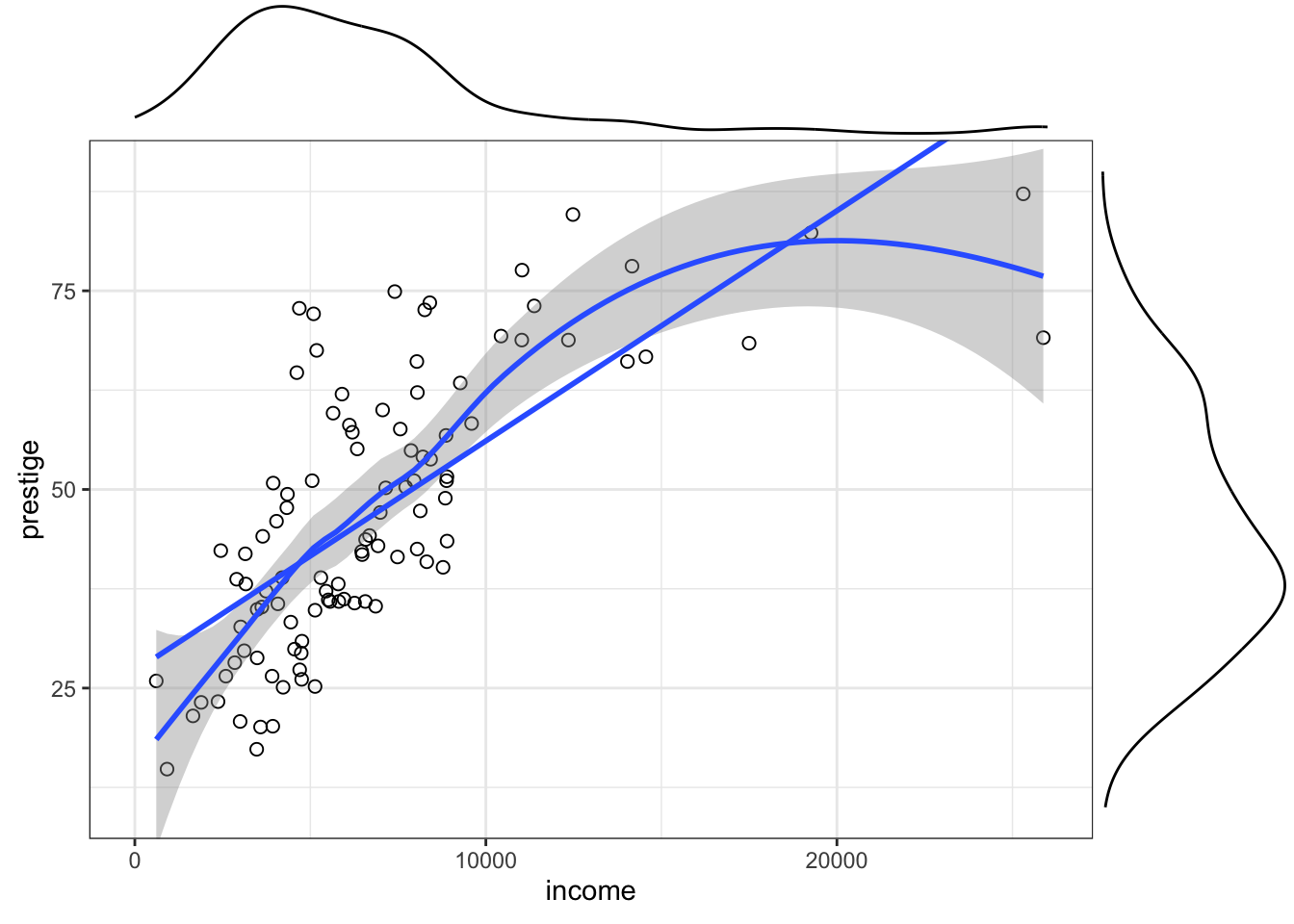
R Code 3.28 : Scatterplot of prestige versus income with marginal densigrams
prestige versus income with marginal densigrams
Code
gg_Prestige <- base::readRDS("data/chap03/gg_Prestige.rds")


ggExtra::ggMarginal(gg_Prestige, type = "densigram")
#> Warning: The dot-dot notation (`..density..`) was deprecated in ggplot2 3.4.0.
#> ℹ Please use `after_stat(density)` instead.
#> ℹ The deprecated feature was likely used in the ggExtra package.
#> Please report the issue at <https://github.com/daattali/ggExtra/issues>.
I reported that ..density.. was deprecated since {ggplot2} 3.4.0. (See my comment)
R Code 3.29 : Scatterplot of prestige versus income with marginal violin plots
prestige versus income with marginal violin plots
Code
gg_Prestige <- base::readRDS("data/chap03/gg_Prestige.rds")


ggExtra::ggMarginal(gg_Prestige, type = "violin")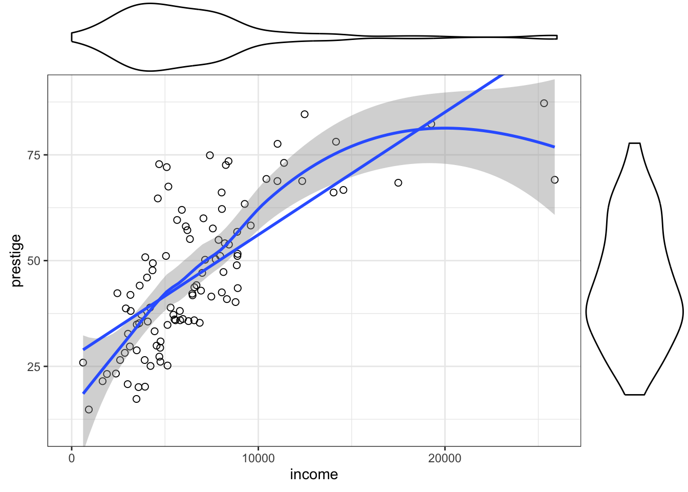
3.2.1.2 Scatterplot enhanced with point labelling
The car::scatterplot() function can draw scatterplots with a wide variety of enhancements and options. One enhancement is to include marginal plots as I have done with the use of {ggExtra} in the previous section Section 3.2.1.1.
Another enhancement is to label “extreme” points with different measures and in different conditions. I have already developed this enhancement for
- Outliers in boxplots using 1.5 times the IQR subtracting to the lower quartile (.25) and adding to the upper quartile (.75) (see: Listing / Output 3.17) and for
- Mahalanobis distances using p-values < .001 (see: Listing / Output 4.11).
Here now I will not use the p-value for the Mahalanobis distances but a fix amount of points to label. To go conform with the example I will at first apply a fixed n = 4 but in the next challenge I will try to develop a general function that distinguishes between type (scatterplot, boxplot) and method (p-value, fixed number of points).
Experiment 3.3 : Label 4 points of farest Mahalanobis distances in scatterplots
R Code 3.30 : Scatterplot of prestige versus income with four points identified
Code
set.seed(420)
df_temp <- carData::Prestige |>
  dplyr::select(prestige, income) |>
  tidyr::drop_na()

df <- df_temp |>
  dplyr::mutate(mahal =
        {
          stats::mahalanobis(
                df_temp,
                base::colMeans(df_temp),
                stats::cov(df_temp)
                )
        }
  ) |>
  dplyr::mutate(p =
    pchisq(
      q = mahal,
      df = 1,
      lower.tail = FALSE
      )
    ) |>
  tibble::rownames_to_column(var = "ID") |>
  dplyr::mutate(label = "") |>
  dplyr::arrange(desc(mahal)) |>
  dplyr::mutate(label =
      dplyr::case_when(dplyr::row_number() <= 4 ~ ID)
)

gg_enhanced <- df |>
  ggplot2::ggplot(
        ggplot2::aes(
                x = income,
                y = prestige
        )
  ) +
  ggplot2::geom_point(
    shape = 1,
    size = 2
  ) +
  ggrepel::geom_text_repel(
    ggplot2::aes(label = label),
    na.rm = TRUE
  ) +
  ggplot2::stat_smooth(
    ggplot2::aes(linetype = "solid"),
    formula = y ~ x,
    method = lm,
    se = FALSE,
    color = "black"
  ) +
    ggplot2::geom_smooth(
      ggplot2::aes(
          linetype = "dashed"
        ),
      formula = y ~ x,
      method = loess,
      se = TRUE,
      color = "black"
  ) +
  ggplot2::scale_linetype_discrete(
    name = "",
    label = c(
      "Least Squares",
      "Unbiased Reporting   "
    )
  ) +
  ggplot2::guides(
    linetype = ggplot2::guide_legend(position = "inside")
  ) +
  ggplot2::theme(
    legend.title = ggplot2::element_blank(),
    legend.position.inside = c(.8, .15),
    legend.box.background = ggplot2::element_rect(
                              color = "black",
                              linewidth = 1
                              )
                 )

ggExtra::ggMarginal(p = gg_enhanced, type = "boxplot")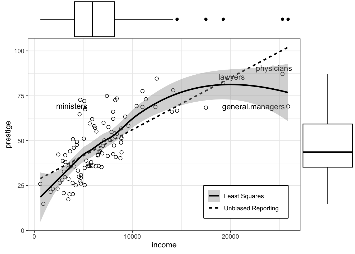
This is my attempt to replicate book’s Figure 3.8. Instead of using functions of tthe he {car} package I used packages from the {tidyverse} approach: {gplot2} with {ggrepel} and {ggExtra} (see Package Profile A.9 and Package Profile A.6).
Using the p-value of .001 we would get 5 (instead of 4) points labelled.
Still to do!
R Code 3.31 : Numbered R Code Title
Code
my_find_boxplot_outlier <- function(df) {
  return(df < quantile(df, .25) - 1.5*IQR(df) | df > quantile(df, .75) + 1.5*IQR(df))

my_find_boxplot_outlier(carData::Prestige$income)

prestige1 <- Prestige |>
  dplyr::mutate(outlier = my_find_boxplot_outlier(income)) |>
  tibble::rownames_to_column(var = "ID") |>
  dplyr::mutate(outlier =
        dplyr::case_when(outlier == TRUE ~ ID,
                         outlier == FALSE ~ "")
  )

}

# label_points <-  function(
#     df,
#     n = 2,
#     type = c("scatterplot", "boxplot"),
#     output = c("dataframe", "labels", "both")
#     ) {
#     if (type == "scatterplot") {
#           df |>
#           dplyr::mutate(mahal =
#                 {
#                   stats::mahalanobis(
#                         df,
#                         base::colMeans(df),
#                         stats::cov(df)
#                         )
#                 }
#           )
#       } |>
#     if (n == 0) ( {
#         dplyr::mutate(p =
#           pchisq(
#             q = mahal,
#             df = 1,
#             lower.tail = FALSE
#             )
#           )
#       } ) |>
#       tibble::rownames_to_column(var = "ID") |>
#       dplyr::mutate(label = "") |>
#       dplyr::arrange(desc(mahal)) |>
#       if (n != 0) (
#         dplyr::mutate(
#           label = dplyr::case_when(dplyr::row_number() <= 4 ~ ID)
#           )
#       )
# }


set.seed(420)
df_temp <- carData::Prestige |>
  dplyr::select(prestige, income) |>
  tidyr::drop_na()

test <-  label_points(
  df = df_temp,
  n = 4,
  type = "scatterplot",
  output = "dataframe")
3.2.2 Parallel boxplots
Example 3.6 : Parallel boxplots
R Code 3.32 : Parallel boxplots with graphics::boxplot()
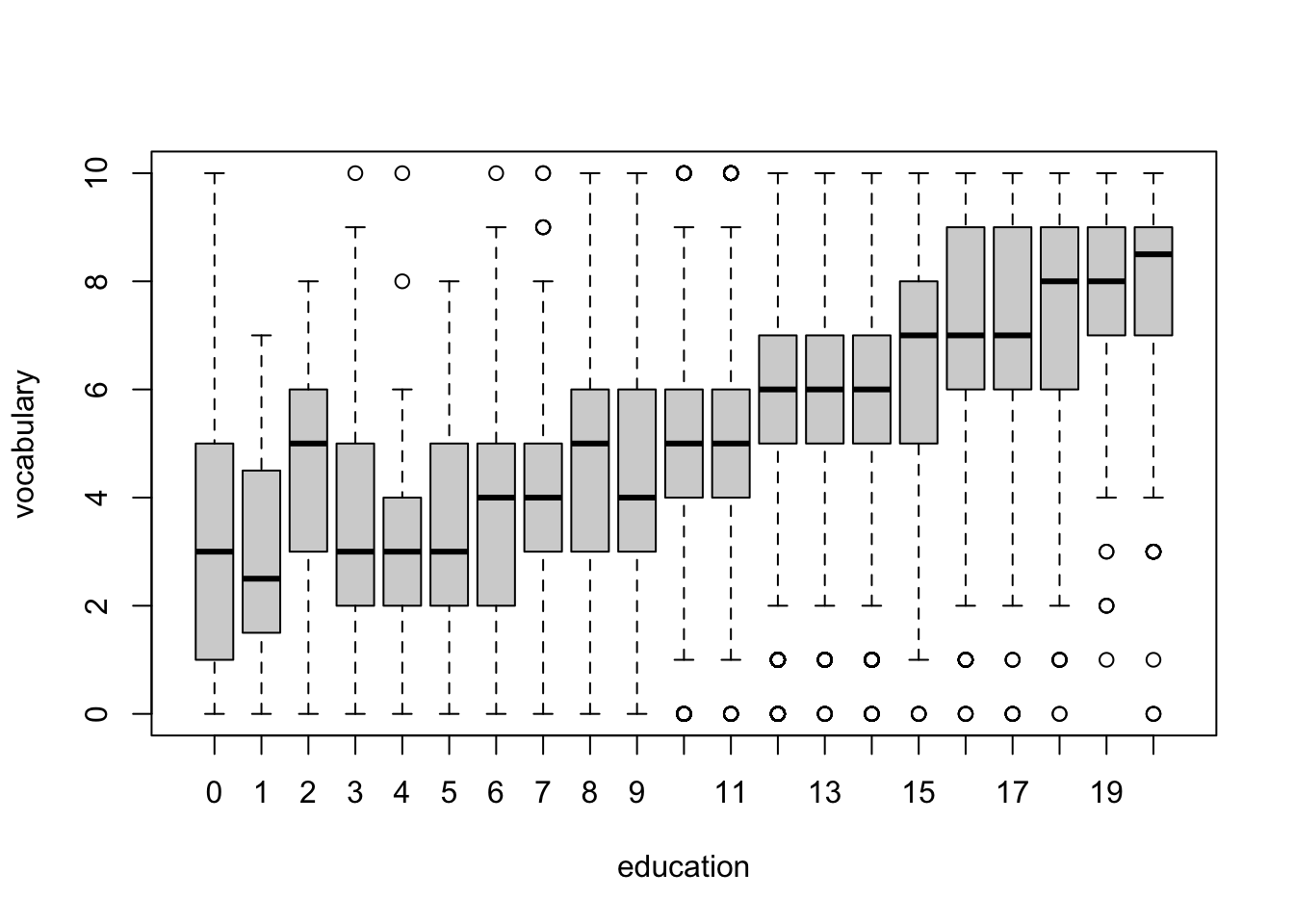
graphics::boxplot() of vocabulary separately for each value of years of education.
R Code 3.33 : Parallel boxplots with car::Boxplot()
car::Boxplot() of vocabulary separately for each value of years of education.
Code
car::Boxplot(vocabulary ~ education, data = Vocab, id = FALSE)
This command draws a separate boxplot for vocabulary for all cases with the same value of education, so we condition on the value of education. The formula has the response variable on the left of the ~ and a discrete conditioning variable — typically, but not necessarily, a factor — on the right.
Setting id = FALSE prevents labelling up to ten outliers, which would be very distracting because of the many boxplots. Therefore we get using car::Boxplot() an identical graph as in Listing / Output 3.32 with the base R version of graphics::boxplot().
With xtabs(~ education, data = Vocab) we get the distribution of education:
Code
xtabs(~ education, data = Vocab)#> education
#> 0 1 2 3 4 5 6 7 8 9 10 11 12 13 14 15
#> 43 12 44 78 106 137 335 361 1188 894 1335 1726 9279 2591 3447 1416
#> 16 17 18 19 20
#> 4090 954 1150 451 714In this example, the conditioning predictor education is a discrete numeric variable. For the subsamples with larger sample sizes, 8 ≤ education ≤ 18, rather than a steady increase in vocabulary with education, there appear to be jumps every 2 or 3 years, at years 10, 12, 15, and 18.
R Code 3.34 : Interlocking directorates among 248 major Canadian corporations
The variables in the data set include the assets of each corporation, in millions of dollars; the corporation’s sector of operation, a factor with 10 levels; the factor nation, indicating the country in which the firm is controlled, with levels “CAN” (Canada), “OTH” (other), “UK”, and “US”; and interlocks, the number of interlocking directorate and executive positions maintained between each company and others in the data set.
R Code 3.35 : Parallel boxplots of interlocks by nation of control
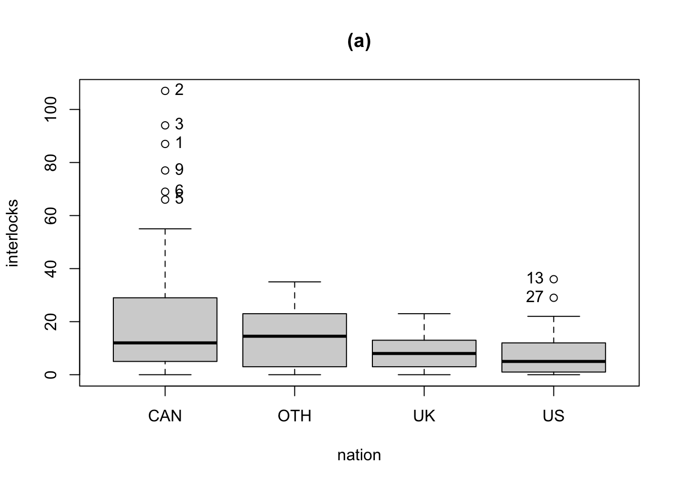
Because the names of the companies are not given in the original data source, the points are labeled by case numbers. The firms are in descending order by assets, and thus the identified points are among the largest companies.
R Code 3.36 : A mean/standard deviation plot
Code
means <- car::Tapply(interlocks ~ nation, mean, data = Ornstein)
sds <- car::Tapply(interlocks ~ nation, sd, data = Ornstein)

plotrix::plotCI(
  1:4,
  means,
  sds,
  xaxt = "n",
  xlab = "Nation of Control",
  ylab = "interlocks",
  main = "(b)",
  ylim = range(Ornstein$interlocks)
)
lines(1:4, means)
axis(1, at = 1:4, labels = names(means))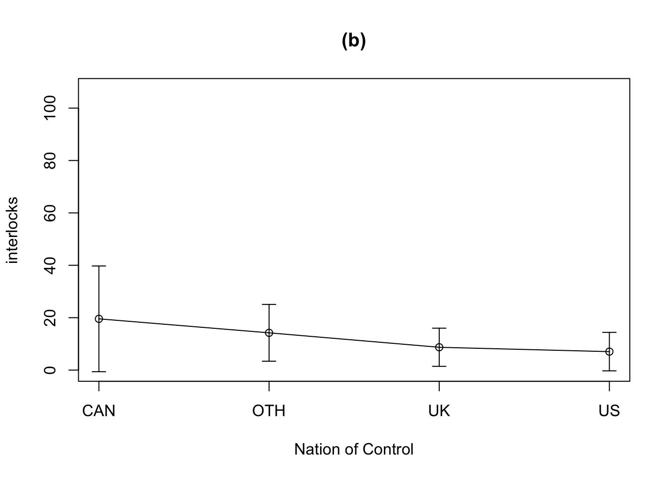
- The
car::Tapply()function adds a formula interface to the standardbase::tapply()function. - The first call to
car::Tapply()computes the mean of interlocks for each level of nation, and the second computes within-nation standard deviations. - The basic graph is drawn by
plotrix::plotCI(). The first argument to this function specifies the coordinates on the horizontal axis, the second the coordinates on the vertical axis, and the third the vector of SDs. - The standard graphical argument
xaxt="n"suppresses the x-axis tick marks and labels, and the ylim argument is used here to match the vertical axis of panel (b) to that of panel (a). - The
graphics::lines()function joins the means, and thegraphics::axis()function labels the horizontal axis with the names of the groups. - The first argument to
graphics::axis()specifies the side of the graph where the axis is to be drawn:side = 1(as in the example) is below the graph, 2 at the left, 3 above, and 4 at the right.
We discourage the use of bar charts for means because interpretation of the length of the bars, and therefore the visual metaphor of the graph, depends on whether or not a meaningful origin (zero) exists for the measured variable and whether or not the origin is included in the graph.
The error bars can also lead to misinterpretation, because neither standard-error bars nor standard-deviation bars are the appropriate measure of variation for comparing means between groups: They make no allowance or correction for multiple testing, among other potential problems.
So is the mean/SD graph misleading because rather than showing the outliers, the graph inflates both the means and the SDs, particularly for Canada, and disguises the skewness that is obvious in the boxplots.
3.2.3 More on the graphics::plot() command
- There are different option to call the plot() function:
-
Basic scatterplot:
plot(y ~ x)orplot(x, y)with x on the horizontal and y on the vertical axis. -
Including reference to data:
plot(y ~ x, data = D),plot(D$x, D$y), orwith(D, plot(x, y). -
Index plot:
plot(x)produces a scatterplot with x on the vertical axis and case numbers of the horizontal axis. -
Boxplot:
plot(y ~ factor)is the same asboxplot(y ~ factor)using the standardgraphics::boxplot()function and notcar::Boxplot(). -Model plots: Depending on the type of object, for instance with alm-objectplot(model-object)draws several graphs that are commonly associated with linear regression models fit by least squares. In contrast,plot(density(x))draws a plot of the density estimate for the numeric variable x.
-
Basic scatterplot:
The plot() function can take many additional optional arguments that control the appearance of the graph, the labeling of its axes, the fonts used, and so on. We can set some of these options globally with the par() function or just for the current graph via arguments to the plot() function. But the parameter names are not very intuitive (e.g., cex (magnifying plotting text and symbols, or crt rotating of single characters etc.)
Plots can be built up sequentially by first creating a basic graph and then adding to it.
Note 3.1
Generally I prefer the {ggplot2} over the base R plot() function. But it is important to be able to understand graphs developed with graphics::plot() as they appear quite often in examples and textbooks.
3.3 Examining multivariate data
Because we can only perceive objects in three spatial dimensions, examining multivariate data is intrinsically more difficult than examining univariate or bivariate data.
3.3.1 Three-dimensional plots
Perspective, motion, and illumination can convey a sense of depth, enabling us to examine data in three dimensions on a two-dimensional computer display. The most effective software of this kind allows the user to rotate the display, to mark points, and to plot surfaces such as regression mean functions. The {rgl} package (Murdoch and Adler (2024)) links R to the OpenGL threedimensional graphics library often used in animated films. The car::scatter3d() function {rgl} to provide a three-dimensional generalization of the car::scatterplot() function.
R Code 3.37 : Three-dimensional scatterplot
Warning 3.2
The graph with the proposed code of the book is in my macOS installation shown with an extra XQuartz window only inside RStudio.
Solution 3.1. : How to embed 3d graphics into Quarto
I found a solution from a StackOverflow post to embed the 3D-graph into the Quarto document. The post refers to a R Markdown document. Reading the comments I learned that there may be some glitches with Quarto. But luckily I did not experience these mentioned problems.
My solution:
-
options(rgl.useNULL = TRUE)to prevent opening an extra window with Xquartz. - using
rgl::rglwidget()after the code for the 3D-plot.
(I did not try the option with calling rgl::setupKnitr(autoprint = TRUE) as the first line.)
The graph shows the least-squares regression plane for the regression of the variable on the vertical or y-axis, prestige, on the two variables on the horizontal (or x- and z-) axes, income and education; three cases (minister, conductor, and railroad engineer) are identified as the most unusual based on their Mahalanobis distances from the centroid (i.e., the point of means) of the three variables. The three-dimensional scatterplot can be rotated by left-clicking and dragging with the mouse. Color is used by default, with perspective, sophisticated lighting, translucency, and fog-based depth cueing.
The car::scatter3d() function
- can also plot other regression surfaces (e.g., nonparametric regressions),
- can identify points interactively and according to other criteria,
- can plot concentration ellipsoids, and
- can rotate the plot automatically.
Because three-dimensional dynamic graphs depend on color, perspective, motion, and so on for their effectiveness, it is important to read the help file for car::scatter3d() and to experiment with the examples therein.
Resource 3.3 : 3-dimensional graphic packages in R
Besides several functions for 3D graphics in {car} there are also facilities in R for drawing static three-dimensional graphs:
-
graphics::pers()draws perspective plots of a surface over the x–y plane. - {lattice} has generic functions to draw static 3d scatter plot and surfaces
cloud()andwireframe()
{rggobi} is also mentionded and should link R to the GGobi system for visualizing data in three and more dimensions. See also the GGobi book. But I believe that {rggobi} and the GGobi system is outdated, because {rggobi} is archived and not at CRAN anymore and links from the GGobi page are rotten. But maybe GGally is the successor, because it is on the same GitHub account and the URL stats with “ggobi”.
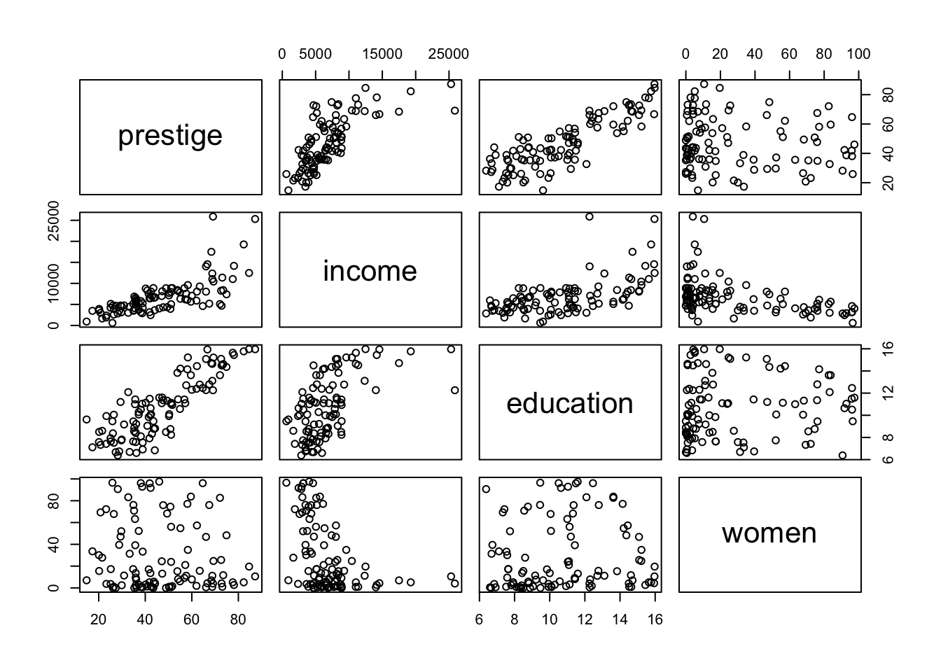
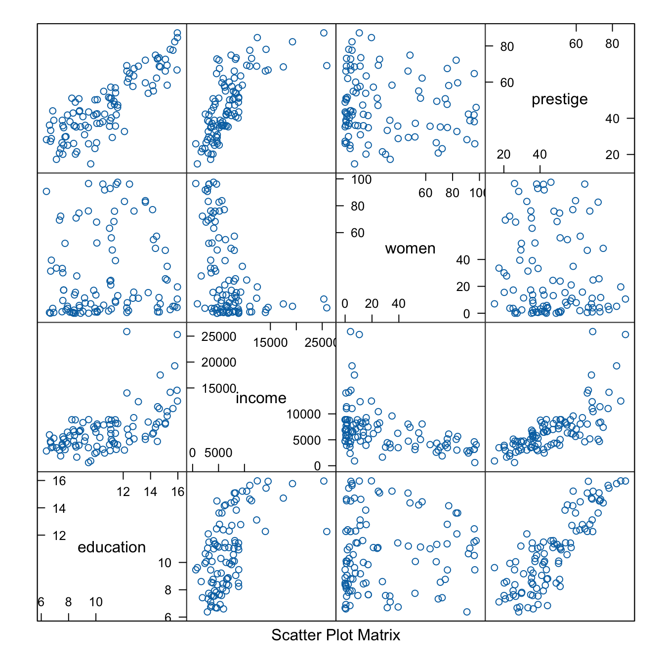
3.3.2 Scatterplot matrices
Scatterplot matrices are graphical analogs of correlation matrices, displaying bivariate scatterplots of all pairs of numeric variables in a data set as a twodimensional graphical array. Because the panels of a scatterplot matrix are just two-dimensional scatterplots, each panel is the appropriate summary graph for the regression of the y-axis variable on the x-axis variable.
Example 3.7 : Scatterplot Matrices
R Code 3.38 : Scatterplot matrices with graphics::pairs()
graphics::pairs()
R Code 3.39 : Scatterplot matrices with lattice::splom()
lattice::splom()
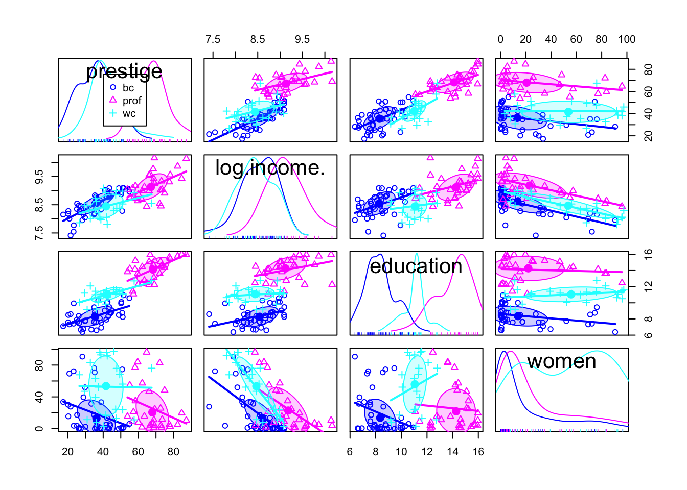
R Code 3.40 : Scatterplot matrices with car::scatterplotMatrix()
car::scatterplotMatrix() with density estimates on the diagonal
Code
car::scatterplotMatrix( ~ prestige + income + education + women,
                   data = carData::Prestige)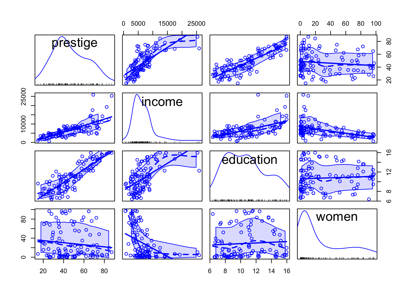
As in car::scatterplot() (Listing / Output 3.19), mean and variability smoothers and a least-squares regression line are added by default to each panel of a scatterplot matrix and are controlled respectively by optional smooth and regLine arguments. (The car::scatterplot() and car::scatterplotMatrix() functions have many other arguments in common.)
The id argument for marking points is also the same for both functions, except that interactive point-marking isn’t supported for scatterplot matrices.
The diagonal argument to car::scatterplotMatrix() controls the contents of the diagonal panels. ()
R Code 3.41 : Scatterplot matrices with `GGally::ggpairs()
GGally::ggpairs() with density estimates on the diagonal and correlation coefficients on the upper half of the panel.

In contrast to the car::scatterplotMatrix() function GGally::ggpairs() also shows the correlation coefficients instead of reverting x/y axis for the other half of the scatterplots.
Resource 3.4 : Scatterplot matrices with {GGally}
- For theroetical background see “The Generalized Pairs Plot” (Emerson et al. 2013).
- For practical usage: Extra - Scatterplot Matrices With GGally
- For the general function
GGally::ggmatrix()for managing multiple plots in a matrix-like layout: ggmatrix(): Plot matrix
3.4 Transforming data
3.4.1 Logarithms
3.4.1.1 Introduction
Logarithmic scale corresponds to viewing variation through relative or percentage changes, rather than through absolute changes. In many instances humans perceive relative changes rather than absolute changes, and so logarithmic scales are often theoretically appropriate as well as useful in practice (Varshney and Sun 2013).
- The log of a positive number x to the base b (where b is also a positive number), written \(log_{b}x\), is the exponent to which b must be raised to produce x. That is, if \(y = log_{b}x\), then \(b_{y} = x\).
- Thus, for example,
- \(log_{10} 100 = 2\) because \(10^2 = 100\);
- \(log_{10} 0.01 = −2\) because \(10^{−2} = 1/10^2 = 0.01\);
- \(log_{2} 8 = 3\) because \(2^3 = 8\); and
- \(log_{2} 1/8 = −3\) because \(2^{−3} = 1/8\).
- So-called natural logs use the base \(e \approx 2.71828\).
- Thus, for example, \(log_{e} e = 1\) because \(e^1 = e\).
- Logs to the bases 2 and 10 are often used in data analysis, because powers of 2 and 10 are familiar. Logs to the base 10 are called common logs.
- Regardless of the base b, \(log_{b} 1 = 0\), because \(b^0 = 1\).
- Regardless of the base, the log of zero is undefined (or taken as log 0 = −∞), and the logs of negative numbers are undefined.
Summarizing we can say that there are different types of logarithms (abbreviated as “logs”):
- Natural logs have as base \(e \approx 2.718\).
- Common logs have as base 10.
- Others, for instance with base 2.
The R functions base::log(), base::log10(), and base::log2() compute the natural, base-10, and base-2 logarithms, respectively.
Some examples with 7
- Natural log =
log(7)= 1.9459101. - Common log =
log10(7)= 0.845098. - Base 2-log =
log2(7)= 2.8073549. - General form =
log(x, base = exp(1))orlogb(x, base = exp(1))for instance:-
log10(7) = log(x = 7, base = 10) = log(7,10)= 0.845098
-
- The exponential function
base::exp()computes powers of \(e\), and thusexp(1)= \(e\) = 2.7182818. - Exponentiating is the inverse of taking logarithms, and so the equalities
x = exp(log(x))=log(exp(x))hold for any positive number x and base b, for instance-
exp(log(50))= 50, -
log(exp(50))= 50, -
10^(log10(50))= 50 -
log10(10^50)= 50
-
The various log functions in R can be applied to numbers, numeric vectors, numeric matrices, and numeric data frames. They return
- NA for missing values,
- NaN (Not a Number) for negative values, and
- -Inf (-\(\infty\)) for zeros.
Important 3.1: A rule for using logarithms
Although it isn’t necessarily true that linearizing transformations also stabilize variation and make marginal distributions more symmetric, in practice, this is often the case.
For any strictly positive variable with no fixed upper bound whose values cover two or more orders of magnitude (that is, powers of 10), replacing the variable by its log is likely to be helpful.
Conversely, if the range of a variable is considerably less than an order of magnitude, then transformation by logarithms, or indeed any simple transformation, is unlikely to make much of a difference.
Variables that are intermediate in range may or may not benefit from a log or other transformation.
For many important aspects of statistical analyses, such as fitted values, tests, and model selection, the base of logarithms is inconsequential, in that identical conclusions will be reached regardless of the base selected.
The interpretation of regression coefficients, however, may be simpler or more complicated depending on the base. For example, increasing the log base-2 of x by 1 implies doubling x, but increasing the natural log of x by 1 implies multiplying x by e.
3.4.1.2 Practice
Example 3.8 : Log transformations
R Code 3.42 : Distribution of assets in the Ornstein data set
Code
graphics::par(mfrow = c(1, 2), mar = c(5, 4, 6, 2) + 0.1)

car::densityPlot( ~ assets,
             data = carData::Ornstein,
             xlab = "assets",
             main = "(a)"
             )
car::densityPlot(
          ~ base::log10(assets),
          data = carData::Ornstein,
          adjust = 0.65,
          xlab = base::expression(log[10] ~ "(assets)"),
          main = "(b)"
          )
car::basicPowerAxis(
      0,
      base = 10,
      side = "above",
      at = 10 ^ (2:5),
      axis.title = ""
      )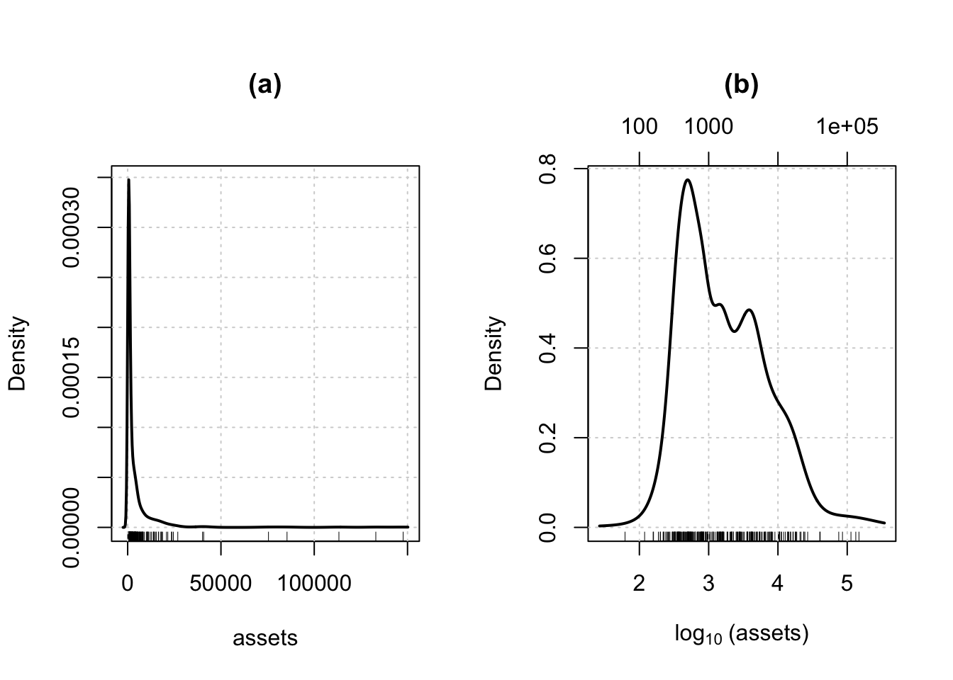
- The command
graphics::par(mfrow=c (1, 2))sets the global graphics parametermfrow, which divides the graphics window into an array of subplots with one row and two columns. - We also set the
mar(margins) graphics parameter to increase space at the top of the plots and - call the
car::basicPowerAxis()function to draw an additional horizontal axis at the top of panel (b) showing the original units of assets. - The
xlabargument in the second command is set equal to an expression, allowing us to typeset 10 as the subscript of log.
R Code 3.43 : Distribution of assets in the Ornstein data set
Code
gg1 <- carData::Ornstein |>
  ggplot2::ggplot(
    ggplot2::aes(x = assets)
  ) +
  ggplot2::geom_density() +
  ggplot2::ylab("Density") +
  ggplot2::geom_rug() +
  ggplot2::ggtitle("(a)") +
  ggplot2::theme_bw()

gg2 <- carData::Ornstein |>
  ggplot2::ggplot(
    ggplot2::aes(x = base::log10(assets))
  ) +
  ggplot2::geom_density(
    adjust = 0.65
  ) +
  ggplot2::labs(
    y = "Density",
    x = base::expression(log[10](assets))
  ) +
  ggplot2::geom_rug() +
  ggplot2::scale_x_continuous(
    sec.axis = ggplot2::sec_axis(
      transform = ~ 10^.,
      breaks = c(100, 1000, 1e+5),
      labels = \(x) ifelse(x <= 1000, x, scales::scientific(x))
      )
    ) +
  ggplot2::theme_bw()


gridExtra::grid.arrange(gg1, gg2, ncol = 2)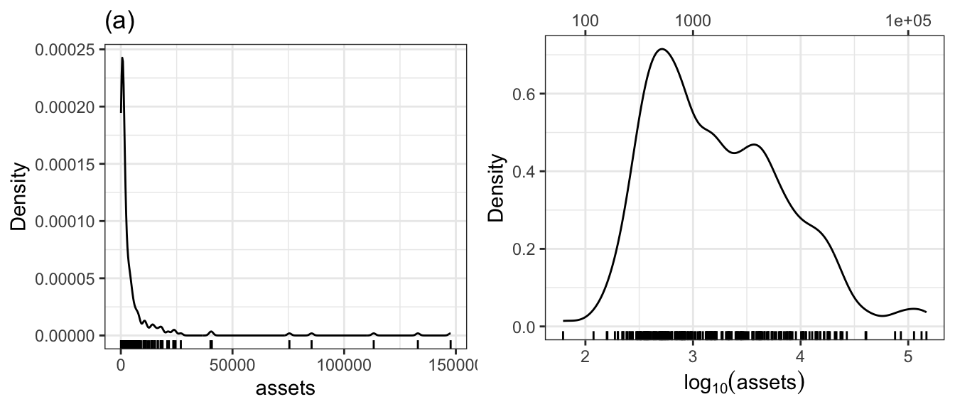
Listing / Output 3.43 is my try to replicate Figure 3.15 with {ggplot2}. At first I didn’t succeed because I used as formula for the transformation .^10 instead of 10^.. I have to confess that this was not a typo as the answer in SO supposed, but I didn’t understand what the formula effectively meant.
R Code 3.44 : Infant mortality rate and gross domestic product per capita, from the UN data set, produced with {car}
Code
car::scatterplot(
  infantMortality ~ ppgdp,
  data = carData::UN,
  xlab = "GDP per Capita",
  ylab = "Infant Mortality Rate (per 1000 births)",
  main = "(a)"
)
Code
car::scatterplot(
  infantMortality ~ ppgdp,
  data = carData::UN,
  xlab = "GDP per capita",
  ylab = "Infant Mortality Rate (per 1000 births)",
  main = "(b)",
  log = "xy",
  id = list(n = 3)
)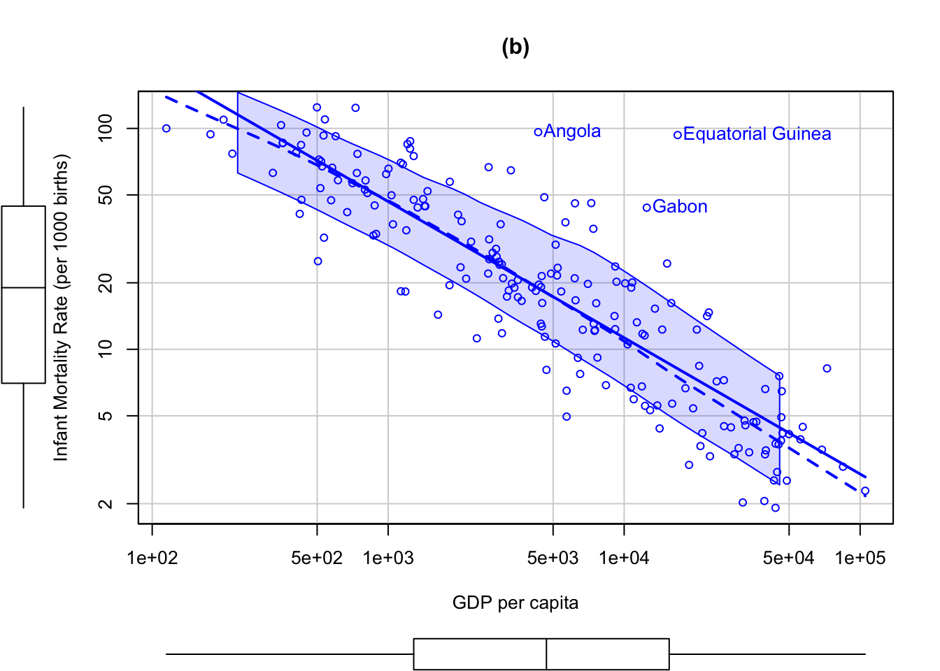
#>            Angola Equatorial Guinea             Gabon
#>                 4                54                62
The UN data set in the {carData} package, for example, contains data obtained from the United Nations on several characteristics of 213 countries and other geographic areas recognized by the UN around 2010; the data set includes the infant mortality rate (infantMortality, infant deaths per 1,000 live births) and the per-capita gross domestic product (ppgdp, in U.S. dollars) of most of the countries.
There are only 193 countries in the UN data set with both variables observed. The R commands used here automatically reduce the data to the 193 fully observed cases on these two variables.
- The argument
log="xy", which also works withgraphics::plot()andcar::scatterplotMatrix(), uses logs on both axes but labels the axes in the units of the original variables. - The optional argument
id=list(n=3)causes the three most “unusual” points according to the Mahalanobis distances of the data points to the means of the two variables to be labeled with their row names. These are three African countries that have relatively large infant mortality rates for their levels of percapita GDP. The names of the identified points and their row numbers in the data set are printed in the R console.
R Code 3.45 : Infant mortality rate and gross domestic product per capita, from the UN data set, produced with {ggplot2}
Code
gg1_un <- carData::UN |>
  ggplot2::ggplot(
    ggplot2::aes(
      x = ppgdp,
      y = infantMortality
    ),
  ) +
  ggplot2::geom_point(na.rm = TRUE) +
  ggplot2::geom_smooth(
    formula = y ~ x,
    na.rm = TRUE,
    se = TRUE,
    method = "lm"
  ) +
    ggplot2::geom_smooth(
    formula = y ~ x,
    na.rm = TRUE,
    se = TRUE,
    method = "loess"
  ) +
  ggplot2::labs(    title = "(a)") +
  ggplot2::xlab("GDP per Capita") +
  ggplot2::ylab("Infant Mortality Rate (per 1000 births)") +
  ggplot2::scale_y_continuous(
    limits = c(0, 120),
    breaks = seq(0, 120, by = 20)
    ) +
  ggplot2::scale_x_continuous(
    limits = c(0, 1e+05),
    breaks = seq(0, 1e+05, by = 2e+04)
    )

gg2_un <- carData::UN |>
  ggplot2::ggplot(
    ggplot2::aes(
      x = log(ppgdp),
      y = log(infantMortality)
    ),
  ) +
  ggplot2::geom_point(na.rm = TRUE) +
  ggplot2::geom_smooth(
    formula = y ~ x,
    na.rm = TRUE,
    se = TRUE,
    method = "lm"
  ) +
    ggplot2::geom_smooth(
    formula = y ~ x,
    na.rm = TRUE,
    se = TRUE,
    method = "loess"
  ) +
  ggplot2::labs(title = "(b)") +
  ggplot2::xlab("GDP per Capita") +
  ggplot2::ylab("Infant Mortality Rate (per 1000 births)") +
  ggplot2::theme(
    axis.title.y.right = ggplot2::element_blank(),
    axis.ticks.y.right = ggplot2::element_blank()
  ) +
  ggplot2::scale_y_continuous(
    position = "right",
    breaks = base::log(c(2, 5, 10, 20, 50, 100)),
    labels = NULL,
    sec.axis = ggplot2::sec_axis(
      name = ggplot2::derive(),
      transform = ~ base::exp(1)^ .,
      breaks = c(2, 5, 10, 20, 50, 100)
    )
  )  +
  ggplot2::scale_x_continuous(
    position = "top",
    breaks = log(c(100, 500, 1000, 5000, 10000, 50000, 100000)),
    labels = NULL,
    sec.axis = ggplot2::sec_axis(
      name = ggplot2::derive(),
      transform = ~ exp(1)^ .,
      breaks = c(100, 500, 1000, 5000, 10000, 50000, 100000)
    )
  )


gg1 <- ggExtra::ggMarginal(gg1_un, type = "boxplot")
gg2 <- ggExtra::ggMarginal(gg2_un, type = "boxplot")

gridExtra::grid.arrange(gg1, gg2, nrow = 2)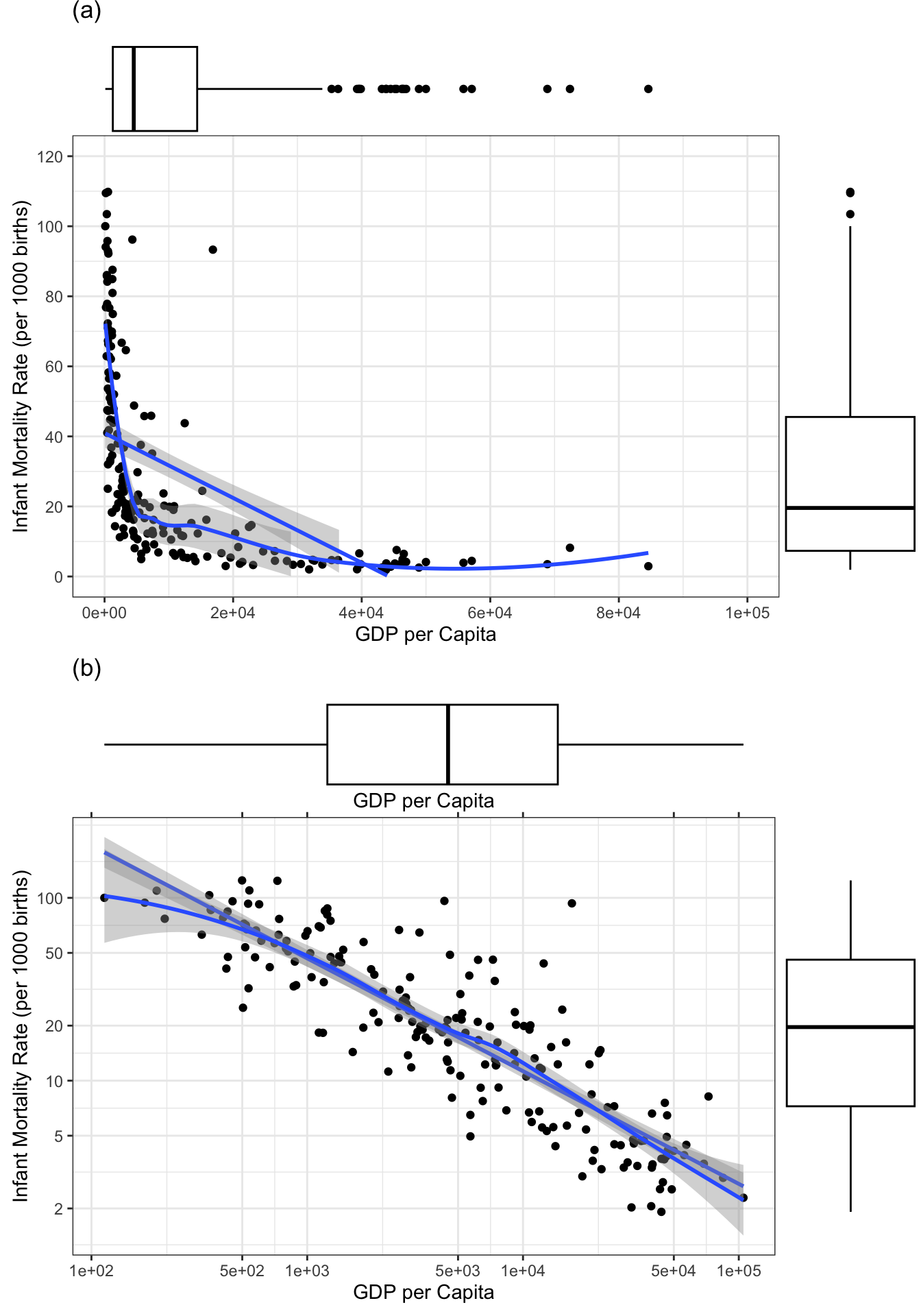
With the exception of showing the most interesting points is this my replication of Figure 3.16 or here in my notes of Listing / Output 3.44.
To replicate Figure 2.16 I had to learn new things. Most of them was maninly an exercise in adapting the axes. I learned several things:
- adding a second axis with transformed values
- adapting axis title and ticks
- setting breaks and labels
- positioning axes
- learning about the many detailed parameters of the
ggplot2::theme()function
R Code 3.46 : Fitting the linear regression model to the log-transformed data
Larger values of ppgdp are associated with smaller values of infantMortality, as indicated by the negative sign of the coefficient for log(ppgdp).
Take for instance a hypothetical increase in ppgdp in a country of 1%, to \(1.01 \times ppgdp\), the expected infantMortality would be (approximately):
\[ \alpha_{0}(1.01 \times ppgdp)^{\beta_{1}} = 1.01^{\beta_{1}} \times \alpha_{0}(ppgdp^{\beta_{1}}) \]
For the estimated slope \(b^1 = −0.617\), we have $1.01−0.617 = 0.994%, and so the estimated infantMortality would be 0.6% smaller — a substantial amount.
3.4.2 Power transformation
3.4.2.1 Introduction
Transformations have four different goals:
- Approximating linearity as demonstrated in Listing / Output 3.44 and Listing / Output 3.45. Particularly in multiple linear regression, data with approximately linear mean functions for all 2D plots of the response and regressors, and among the regressors, are very useful.
- Smoothing variablity, again seen in Listing / Output 3.44 and Listing / Output 3.45.
- Inducing a simpler structure to get a better understanding of the model. See later examples.
- Approaching normality so that the transformed data are as close to normally distributed as possible. This can be useful for statistical methods such as factor analysis that depend on multivariate normality for their justification.
Simple Power Transformation
We define a simple power transformation as the replacement of a variable x by \(x^λ\), where, in the current general context, x can be either a response variable or a numeric predictor variable, and where λ is a power to be selected based on the data, usually in the range [−1, 1] but occasionally in the range [−3, 3]. The simple power transformations require that all elements of x be strictly positive, x > 0.
This use of power transformations is distinct from polynomial regression. In polynomial regression, the highest-order power, say p, is a small positive integer, usually 2 or 3, and rather than replacing a predictor x by \(x^p\), we also include all lower-order powers of x in the regression model. For example, for p = 3, we would include the regressors x, \(x^2\), and \(x^3\) . Polynomial regression in R can be accomplished with the stats::poly() function.
The power \(λ = −1\) is the reciprocal or inverse transformation, 1/x. If, for example, x represents the time to completion of a task (e.g., in hours), then \(x^{−1}\) represents the rate of completion (tasks completed per hour). The power λ = 1/3 can convert a volume measure (e.g., in cubic meters) to a linear measure (meters), which may be appropriate in some problems. Likewise, λ= 3 can convert a linear measure (meters) to a volume (cubic meters); λ= 1/2, an area (square meters) to a linear measure (meters); and λ = 2, a linear measure (meters) to an area (square meters).
Scaled Power Transformations
Formula 3.1 : Scaled Power Transformation by Box & Cox
\[ \begin{align*} T_{BC}(x, \lambda) = x^{(\lambda)} =& \\ =& \frac{x^{\lambda}-1}{\lambda} \text{when }\lambda \ne 0 \\ =& log(x) \text{when } \lambda = 0 \end{align*} \tag{3.2}\]
BC stands for Box-Cox power transformation (Box and Cox 1964).
- For \(\lambda \ne 0\), the scaled power transformations are essentially \(x^{\lambda}\), because the scaled-power family only subtracts 1 and divides by the constant \(\lambda\).
- One can show that as \(\lambda\) approaches zero, \(T_{BC}(x, \lambda)\) approaches log(x), and so the scaled-power family includes the log transformation when λ = 0, even though the literal zeroth power, \(x^0 = 1\), is useless as a transformation.
- Also, the scaled power \(T_{BC}(x, \lambda)\) preserves the order of the x-values, while the basic powers preserve order only when λ is positive and reverse the order of x when λ is negative.
The scaled power family is generally called the Box-Cox power family. Usual practice is to use the Box-Cox power family to estimate the λ parameter of the transformation, but then to use in statistical modeling the equivalent simple power xλ if the selected value of λ is far from zero, and log(x) for λ close to zero. This estimation method is similar to the method of maximum likelihood.
3.4.2.2 Practice
Example 3.9 : Power transformations
R Code 3.47 : Demonstration of a transformation of the Box-Cox power family
infantMortality in the UN data
Code
p1 <- car::powerTransform(
  infantMortality ~ 1,
  data = carData::UN,
  family = "bcPower")
summary(p1)
#> bcPower Transformation to Normality
#> Est Power Rounded Pwr Wald Lwr Bnd Wald Upr Bnd
#> Y1 0.0468 0 -0.0879 0.1814
#>
#> Likelihood ratio test that transformation parameter is equal to 0
#> (log transformation)
#> LRT df pval
#> LR test, lambda = (0) 0.4644634 1 0.49555
#>
#> Likelihood ratio test that no transformation is needed
#> LRT df pval
#> LR test, lambda = (1) 172.8143 1 < 2.22e-16- The first argument to
car::powerTransform()is a formula, with the variable to be transformed on the left of the ~ symbol and the variables, if any, for conditioning on the right. In this instance, there are no conditioning variables, indicated by 1 on the right, so we are simply transforminginfantMortalityunconditionally. - The argument
family = "bcPower", to specify the Box-Cox power family, isn’t strictly necessary because “bcPower” is the default. - Other transformations are: “bcnPower” for a two-parameter modification of the Box-Cox family that allows negative responses (Hawkins and Weisberg 2017), and the “yjPower” family (Yeo and Johnson 2000), another modifiation of the Box-Cox family that allows a few negative values.
- All three families are documented at Box-Cox, Box-Cox with Negatives Allowed, Yeo-Johnson and Basic Power Transformations.
The first part of the output gives information about the estimated power.
- Est Power: The value under “Est Power” is the point estimate found using the procedure suggested by Box and Cox.
- Rounded Pwr: The second value, labeled “Rounded Pwr”, is a rounded version of the estimate.
- Wald Lwr Bnd / Wald Upr Bnd: The remaining two values are the bounds of the 95% Wald confidence interval for λ. The confidence interval includes \(\lambda = 0\), which in turn suggests using a log-transform because of our preference for simple transformations. In the example, zero is included in the confidence interval, suggesting the use in practice of the log transformation.
-
Tests: The remainder of the output provides tests concerning λ, first testing
H0: λ= 0for the log transformation and then testingH0: λ= 1, which is equivalent to no transformation. The test for the log transformation has a very large p-value, indicating that the log transformation is consistent with the data, while the tiny p-value for λ = 1 indicates that leavinginfantMortalityuntransformed is inconsistent with the goal of making the variable normally distributed.
R Code 3.48 : Test UN data for trasnformation \(\lambda = .5\)
Code
car::testTransform(p1, lambda = 1/2)#> LRT df pval
#> LR test, lambda = (0.5) 41.95826 1 9.3243e-11The very small p-value for the test of λ = 1/2 suggests that we shouldn’t use this transformation.
R Code 3.49 : Add transformed variable to data set
Code
| Name | UN |
| Number of rows | 213 |
| Number of columns | 8 |
| _______________________ | |
| Column type frequency: | |
| factor | 2 |
| numeric | 6 |
| ________________________ | |
| Group variables | None |
Variable type: factor
| skim_variable | n_missing | complete_rate | ordered | n_unique | top_counts |
|---|---|---|---|---|---|
| region | 14 | 0.93 | FALSE | 8 | Afr: 53, Asi: 50, Eur: 39, Lat: 20 |
| group | 14 | 0.93 | FALSE | 3 | oth: 115, afr: 53, oec: 31 |
Variable type: numeric
| skim_variable | n_missing | complete_rate | mean | sd | p0 | p25 | p50 | p75 | p100 | hist |
|---|---|---|---|---|---|---|---|---|---|---|
| fertility | 14 | 0.93 | 2.76 | 1.34 | 1.13 | 1.75 | 2.26 | 3.54 | 6.92 | ▇▃▂▂▁ |
| ppgdp | 14 | 0.93 | 13011.95 | 18412.44 | 114.80 | 1282.95 | 4684.50 | 15520.50 | 105095.40 | ▇▁▁▁▁ |
| lifeExpF | 14 | 0.93 | 72.29 | 10.12 | 48.11 | 65.66 | 75.89 | 79.59 | 87.12 | ▂▂▂▇▅ |
| pctUrban | 14 | 0.93 | 57.93 | 23.43 | 11.00 | 39.00 | 59.00 | 75.00 | 100.00 | ▅▆▇▇▆ |
| infantMortality | 6 | 0.97 | 29.44 | 28.75 | 1.92 | 7.02 | 19.01 | 44.48 | 124.53 | ▇▂▁▁▁ |
| infantMortality.tran | 6 | 0.97 | 1.15 | 0.06 | 1.03 | 1.10 | 1.15 | 1.19 | 1.25 | ▃▅▇▅▅ |
- The updated UN data set contains all the variables in the original data set plus an additional variable called
infantMortality.tran. - The value of
p1$lambdaininfantMortality^p1$lambdais the estimated power transformation parameter.
R Code 3.50 : Mutivariate transformation
income and education toward bivariate normality
Code
base::summary(p2 <- car::powerTransform(
  base::cbind(income, education) ~ 1,
  data = carData::Prestige,
  family = "bcPower"
  )
)
#> bcPower Transformations to Multinormality
#> Est Power Rounded Pwr Wald Lwr Bnd Wald Upr Bnd
#> income 0.2617 0.33 0.0629 0.4604
#> education 0.4242 1.00 -0.3663 1.2146
#>
#> Likelihood ratio test that transformation parameters are equal to 0
#> (all log transformations)
#> LRT df pval
#> LR test, lambda = (0 0) 7.694014 2 0.021344
#>
#> Likelihood ratio test that no transformations are needed
#> LRT df pval
#> LR test, lambda = (1 1) 48.87274 2 2.4402e-11Let \(λ = (λ1, λ2)\) represent the vector of power transformation parameters. Looking at the likelihood-ratio tests, untransformed variables, corresponding to \(λ = (1, 1)′\), and all logarithms, corresponding to \(λ = (0, 0)′\), both have small p-values, implying that neither of these choices is appropriate.
The suggested procedure is to use the rounded values of the power parameters (1/3, 1) in further work.
The multivariate extension of Box-Cox power transformations was provided by Velilla (1993) and is also implemented by the car::powerTransform() function.
A useful early step in any regression analysis is considering transformations toward linearity and normality of all the quantitative predictors, without at this point including the response.
R Code 3.51 : Test UN data for transformation \(\lambda = .33\) and log (0, 1)
Code
glue::glue(" ")
glue::glue("############################################################")
glue::glue("test transformation with lambda = 0.33")
car::testTransform(p2, lambda = c(1/3, 1))

glue::glue(" ")
glue::glue("############################################################")
glue::glue("test log transformation with lambda = (0, 1)")

car::testTransform(p2, lambda = c(0, 1))
#>
#> ############################################################
#> test transformation with lambda = 0.33
#> LRT df pval
#> LR test, lambda = (0.33 1) 2.447366 2 0.29414
#>
#> ############################################################
#> test log transformation with lambda = (0, 1)
#> LRT df pval
#> LR test, lambda = (0 1) 9.278189 2 0.0096664The nominal p-value is about 0.3, but interpreting this result is complicated by the use of the observed data to select the null hypothesis. As with a one dimensional transformation, the value of estimation and of the rounded estimates are stored respectively in p2$lambda (p2[[“lambda”]][[“income”]], p2[[“lambda”]][[“education”]] = 0.262, 0.424) and p2$roundlam (p2[[“roundlam”]][[“income”]], p2[[“roundlam”]][[“education”]] = 0.33, 1).
Because we generally prefer logarithms we have also tried \(\lambda = (0, 1)\).
Interpretation of the p-values is again difficult because the data were used to generate the hypothesis.
The relatively small p-value suggests that the choice of \(λ = (1/3, 1)\) is to be preferred to \(λ = (0, 1)\).
R Code 3.52 : Log transformation of income
income.
Code
car::scatterplotMatrix(
  ~ prestige + log(income) + education + women,
  smooth = list(span = 0.7),
  data = carData::Prestige
)![]()
The panels in this scatterplot matrix show little nonlinearity, although in the plot of prestige versus log(income) the two occupations with the lowest incomes appear not to fit the pattern in the rest of the data.
R Code 3.53 : Cube transformation of income
income.
Code
car::scatterplotMatrix(
  ~ prestige + income^3 + education + women,
  smooth = list(span = 0.7),
  data = carData::Prestige
)![]()
The variable type in the Prestige data set is a factor that divides occupations into blue-collar (“bc”), white-collar (“wc”), and professional/managerial (“prof”) categories. Examination of the data suggests that the distributions of the numeric variables in the data set vary by occupational type. We can then seek transformations of the numeric variables that make their within-group distributions as close as possible to multivariate normal with common covariance structure (i.e., similar variances and covariances within types of occupations).
R Code 3.54 : Conditioning on groups
Code
summary(p3 <- car::powerTransform(cbind(income, education) ~ type,
                             data = carData::Prestige))
#> bcPower Transformations to Multinormality
#> Est Power Rounded Pwr Wald Lwr Bnd Wald Upr Bnd
#> income -0.0170 0 -0.2738 0.2398
#> education 0.7093 1 0.1318 1.2867
#>
#> Likelihood ratio test that transformation parameters are equal to 0
#> (all log transformations)
#> LRT df pval
#> LR test, lambda = (0 0) 5.722797 2 0.057189
#>
#> Likelihood ratio test that no transformations are needed
#> LRT df pval
#> LR test, lambda = (1 1) 64.01958 2 1.2546e-14Code
car::testTransform(p3, c(0, 1))#> LRT df pval
#> LR test, lambda = (0 1) 0.9838051 2 0.61146R Code 3.55 : Revised scatterplot matrix
Code
car::scatterplotMatrix(
  ~ prestige + log(income) + education + women | type,
  data = carData::Prestige,
  smooth = FALSE,
  ellipse = list(levels = 0.5),
  legend = list(coords = "center")
)
- We suppress the loess smooths with the argument
smooth = FALSEto minimize clutter in the graph. - We move the legend from its default position in the top-right corner of the first diagonal panel to the center of the panel.
- We set the argument ellipse=list (levels=0.5) to get separate 50% concentration ellipses for the groups in the various off-diagonal panels of the plot (see, e.g., (Friendly, Monette, and Fox 2013)). — If the data in a panel are bivariately normally distributed, then the ellipse encloses approximately 50% of the points.
- Approximate within-group linearity is apparent in most of the panels.
- The size of the ellipse in the vertical and horizontal directions reflects the standard deviations of the two variables, and its tilt reflects their correlation. The within-group variability of prestige, log (income), education, and women is therefore reasonably similar across levels of type; the tilts of the ellipses in each panel are somewhat more variable, suggesting some differences in within-group correlations. -The least-squares lines in the panels also show some differences in within-group slopes.
- The plotted points are the same in Listing / Output 3.52 resp. Listing / Output 3.53 and Listing / Output 3.55. Only the symbols used for the points, and the fitted lines, are different. In particular, the two points with low income no longer appear exceptional when we control for type.
- A small difference between the two graphs is that type is missing for four occupations, and thus Listing / Output 3.55 has only 98 of the 102 points shown in Listing / Output 3.52 and Listing / Output 3.53.
We may wish to apply the Box and Cox transformation methodology to a variable with a small number of zero or even negative values. For example, 28 of the 240 companies in the Ornstein data set maintained zero interlocking directors and officers with other firms; the numbers of interlocks for the remaining companies were positive, ranging between 1 and 107.
The Box-Cox family with negatives (Hawkins and Weisberg 2017) is defined to be the Box-Cox power family applied to z(x,γ) rather than to x: \(T_{BCN} (x, λ,γ) = T_{BC} (z(x,γ),λ)\). If x is strictly positive and γ = 0, then z(x, 0) = x and the transformation reduces to the regular Box-Cox power family. The Box-Cox family with negatives is defined for any γ > 0 when x has nonpositive entries.
The important improvement of this method over just adding a start is that for any γ and large enough x, the transformed values with power λ can be interpreted as they would be if the Box-Cox family had been used and no nonpositive data were present.
R Code 3.56 : Transformations With a Few Negative or Zero Values
car:::bcnPower() function
Code
p4 <-
  car::powerTransform(
    interlocks ~ 1,
    data = carData::Ornstein,
    family = "bcnPower")
summary(p4)
#> bcnPower transformation to Normality
#>
#> Estimated power, lambda
#> Est Power Rounded Pwr Wald Lwr Bnd Wald Upr Bnd
#> Y1 0.2899 0.33 0.2255 0.3543
#>
#> Location gamma was fixed at its lower bound
#> Est gamma Std Err. Wald Lower Bound Wald Upper Bound
#> Y1 0.1 NA NA NA
#>
#> Likelihood ratio tests about transformation parameters
#> LRT df pval
#> LR test, lambda = (0) 86.82943 1 0
#> LR test, lambda = (1) 328.12358 1 0Employing the “bcnPower” family estimates both the power λ and the shift γ transformation parameters using Box and Cox’s maximum-likehood-like method.
As is often the case with the “bcnPower” family, the estimate of the shift γ is very close to the boundary of zero, in which case car::powerTransform() fixes γ = 0.1 and then estimates the power λ. In the example, it is close to the cube root. The tests shown in the output are for the fixed value of γ = 0.1; had γ been estimated, the tests would have been based on the log-likelihood profile averaging over γ.
3.4.3 Transformations and EDA
3.4.3.1 Introduction
Exploratory Data Analysis (ExDA) proposed by Tukey and Mosteller (Tukey 1977; Mosteller and Tukey 2019), is a collection of method that can be used to understand data, mostly without requiring models.
The {car} package implements some methods for selecting a transformation. These methods are of some continuing utility, and they can also help us to understand how, why, and when transformations work.
Mosteller and Tukey characterize the family of power transformations \(x^λ\) as a ladder of powers and roots, with no transformation, λ = 1, as the central rung of the ladder. Transformations like λ = 1/2 (square root), λ = 0 (taken, as in the BoxCox family, as the log transformation), and λ = −1 (the inverse transformation) entail moving successively down the ladder of powers, and transformations like λ = 2 (squaring) and λ = 3 (cubing) entail moving up the ladder.
3.4.3.2 Transforming for symmetry
Transformation down the ladder of powers serves to spread out the small values of a variable relative to the large ones and consequently can serve to correct a positive skew. Negatively skewed data are much less common but can be made more symmetric by transformation up the ladder of powers. The symbox() function in the {car} package implements a suggestion of Tukey and Mosteller to induce approximate symmetry by trial and error.
See: Listing / Output 3.57.
3.4.3.3 Transforming toward linearity
If a relationship is nonlinear but monotone (i.e., strictly increasing or strictly decreasing) and simple (in the sense that the curvature of the regression function is relatively constant), then Mosteller and Tukey’s bulging rule, illustrated in Figure 3.20, can guide the selection of linearizing power transformations of the two variables.
When the bulge of the regression function in a scatterplot points down and to the right, for example — as suggested by the line in the lower-right quadrant of Figure 3.20 we move y down the ladder of powers, x up the ladder of powers, or both, to straighten the relationship between the two variables. The bulging rule generalizes to the other quadrants of Figure 3.20.
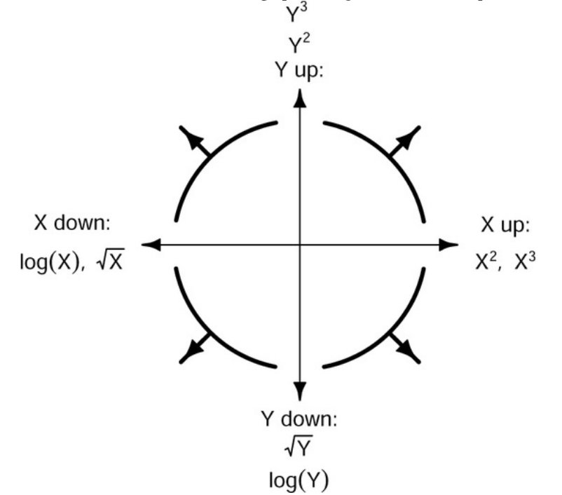
To illustrate, let’s inspect Listing / Output 3.44 once more:
- The nonlinear relationship between
infantMortalityandppgdpListing / Output 3.44 (a) is simple and monotone. - The bulge in the scatterplot points down and to the left, suggesting the transformation of
infantMortalityorppgdp, or both, down the ladder of powers. - In this case, the log transformation of both variables produces a nearly linear relationship, as shown in Listing / Output 3.44 (b).
3.4.3.4 Transforming to equalize spread
In Listing / Output 3.33, we examined the relationship between number of interlocks and nation of control among the 248 large Canadian corporations in Ornstein’s interlocking-directorate data.
That graph revealed an association between level and spread: Nations with a relatively high level of interlocks (Canada, other) evidence more variation than nations with fewer interlocks on average (United States, United Kingdom). The term level is meant to imply an average or typical value, such as the mean, and spread is meant to imply variability, as measured, for example, by the SD.
These terms are used in exploratory data analysis in place of more technical terms such as mean and SD because level and spread may be measured using other statistics that are resistant to outlying values.
A spread-level plot (Tukey 1977) is a scatterplot of the logarithm of the interquartile range, which measures spread, versus the logarithm of the within-group median, which measures level. Interquartile ranges and medians are insensitive to a few outliers, and so the spread-level plot provides a robust representation of the dependence of spread on level.
- If there is an association between spread and level in the spread-level plot, Tukey suggested fitting a straight line to the plot, with estimated slope \(b\), and then transforming the response variable \(y\) by the power transformation \(y^{1−b}\).
- If \(b \approx 1\), then a log transformation is used.
See: Listing / Output 3.58.
3.4.4 Transforming restricted-range variables
Variables with ranges bounded both below and above may require different transformations because of ceiling or floor effects, in which values tend to accumulate near the boundaries of the variable.
The most common kinds of restricted-range variables are percentages and proportions, but other variables, such as the number of questions correct on a test of fixed length, are also “disguised proportions.”
Because small changes in a proportion near zero or 1 are potentially much more important than small changes near 0.5, promising transformations spread out both large and small proportions relative to proportions near 0.5. If a proportion has a more limited observed range, say between 0.25 and 0.75, transformations are unlikely to be helpful. The idea is to transform proportions so the transformed values behave more like a sample from a normal distribution. Usual methods of statistical inference for normally distributed data can then be used with the transformed proportions as the response.
Statistical models specifically designed for proportion data — for example, logistic-regression and loglinear models (discussed in ?sec-chap06) — are the preferred methods for working with proportions, and so transformation for normality is now rarely used with proportion response variables if the counts on which the proportions are based are available.
Transforming predictor variables that are expressed as proportions or percents may prove useful. Suppose that \(u_{i}\) is a sample count of number of “successes” for the \(i\)th of \(n\) cases and that \(N_{i}\) is the corresponding number of trials. Each \(u_{i}\) can have its own probability of success \(θ_{i}\). From the binomial distribution, the standard deviation of the sample proportion \(x_{i} = u_{i} / N_{i}\) is ????, and therefore varies depending on the value of \(θ_{i}\). If we transform \(x_{i} = u_{i} / N_{i}\) using the arcsine square root, then the SD of the transformed variable is approximately for any value of \(θ_{i}\), and hence, \(T_{asinsqrt}(x)\) is a variance-stabilizing transformation.
Logistic regression uses a different transformation of a proportion called the logit or log-odds transformation. The logit transformation is not defined for sample proportions exactly equal to zero or 1, however1.
We can get around this limitation if we want to use sample logits in a graph or statistical analysis by remapping proportions from the interval [0, 1] to [0.025, 0.975], for example, taking the logit of \(0.025 + 0.95 \times x\) rather than the logit of x. The logit() function in the {car} package takes care of remapping proportions or percentages when there are zeros or ones—or 0% or 100% for percentage data — printing a warning if remapping is required.
See: Listing / Output 3.60.
This restriction does not affect logistic regression, where it is the probability of success θ, and not the observed sample proportion of successes x, that is transformed. Even better, if we have access to the original data from which the proportions are calculated, we can avoid proportions of zero or 1 by computing empirical logits, \(log[(u + 1/2)/(N + 1)]\), where, as before, \(u\) is the number of successes in \(N\) trials.
To illustrate, we apply the logit and arcsine-square-root transformations to the distribution of the gender composition of occupations (percentage women) in the Prestige data set: See: Listing / Output 3.61.
Example 3.10 : Transformation and Exploratory Data Analysis
R Code 3.57 : Transforming for symmetry
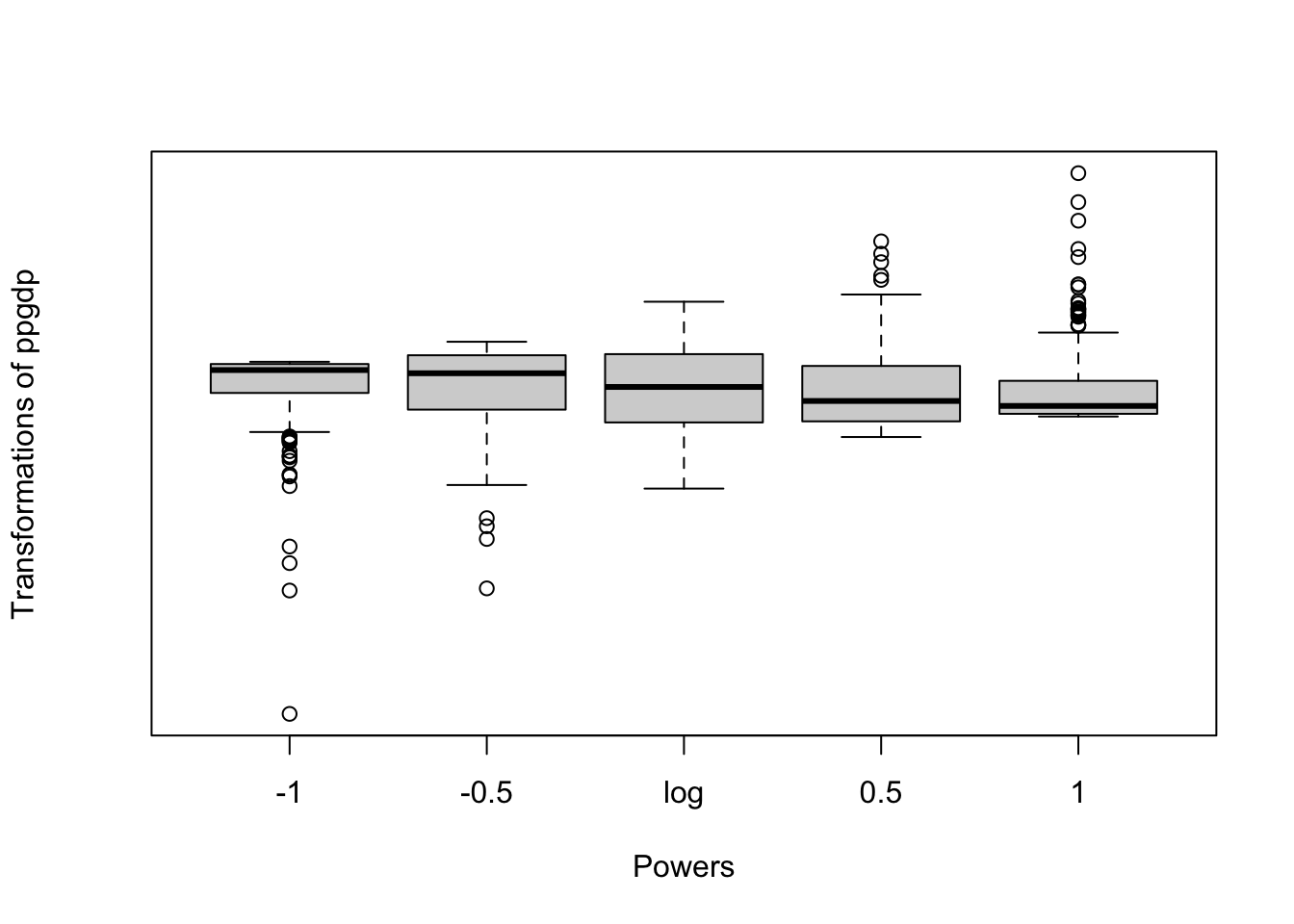
By default, car::symbox() uses the function car:::bcPower() and displays boxplots of the transformed variable for several transformations down the ladder of powers.
The graphic shows that the ubiquitous log transformation of ppgdp does the best job of making the distribution of the variable symmetric.
R Code 3.58 : Spread-level plot
Code
car::spreadLevelPlot(
  interlocks + 1 ~ nation,
  data = carData::Ornstein)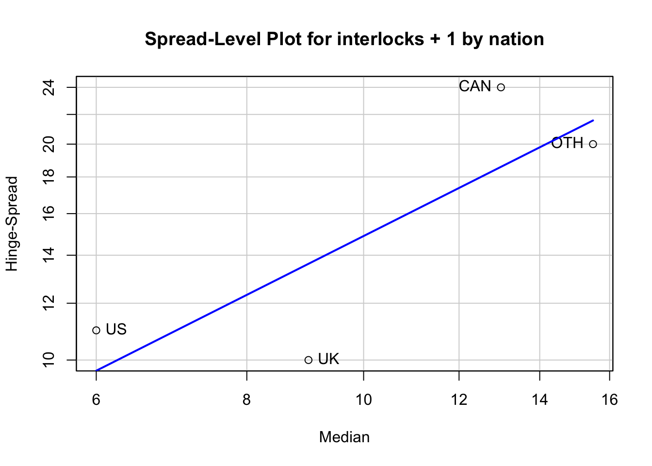
#>     LowerHinge Median UpperHinge Hinge-Spread
#> US           2    6.0         13           11
#> UK           4    9.0         14           10
#> CAN          6   13.0         30           24
#> OTH          4   15.5         24           20
#>
#> Suggested power transformation: 0.1534487- Because Tukey’s method requires a strictly positive response variable, we add a start of 1 to interlocks to avoid zero values.
- In addition to drawing a graph, the
car::spreadLevelPlot()function prints a table showing the first quartile (Tukey’s lower hinge), median, third quartile (upper hinge), and interquartile range (hinge spread ) in each group, along with the suggested power transformation of interlocks + 1.
In the example, the suggested power is p = 0.15, close to the log transformation.
R Code 3.59 : Parallel boxplots for the log-transformed Ornstein data
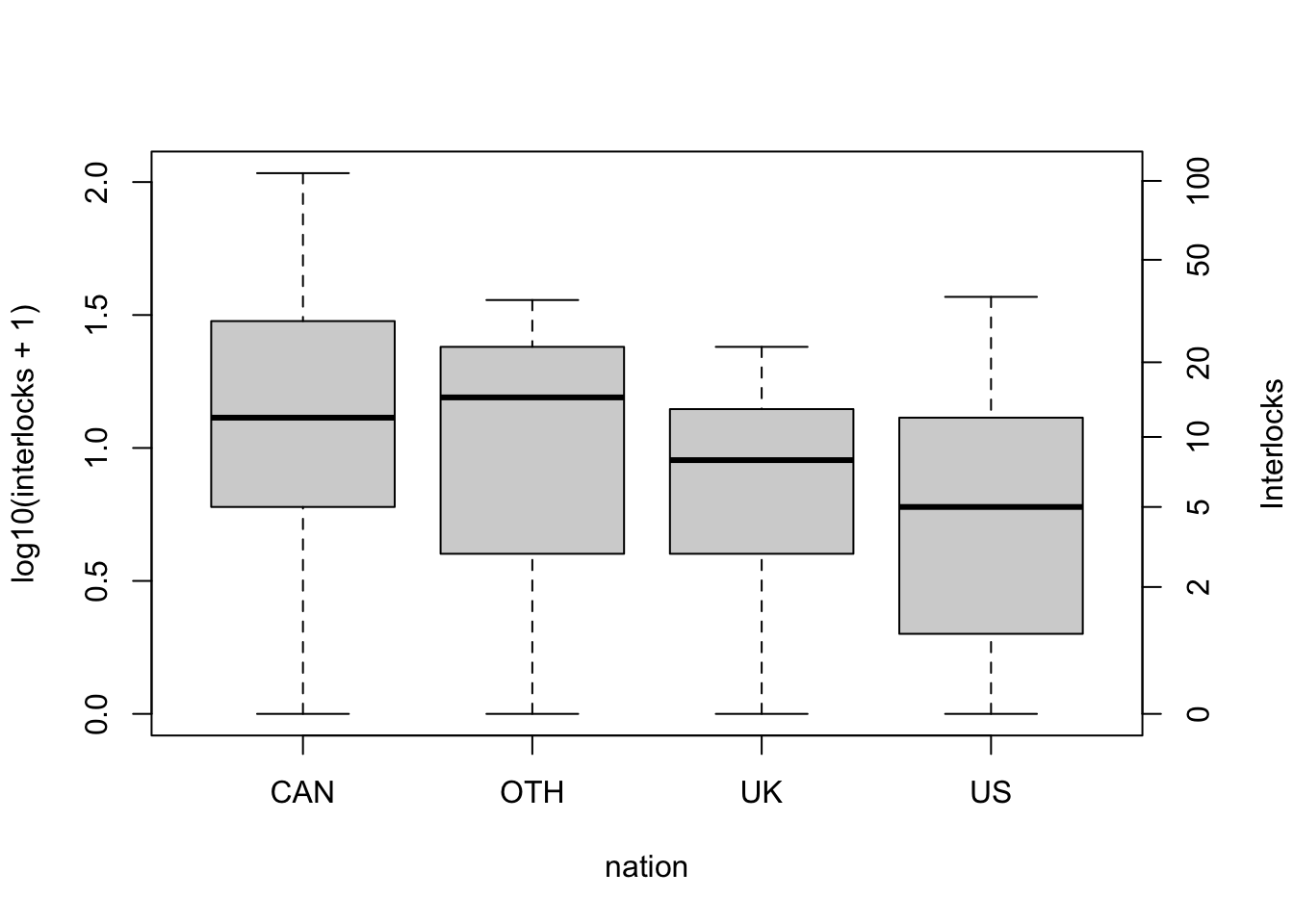
- Many global graphics parameters in R are set or queried by the base::par() function.
- The “mar” setting is for the plot margins as a numberical vector of the form
c(bottom, left, top, right)which gives the number of lines of margin to be specified on the four sides of the plot. The default isc(5, 4, 4, 2) + 0.1. - We specify two arguments in the call to
car::Boxplot():- a formula with the base-10 logarithm of interlocks + 1 on the left-hand side and the factor nation on the right-hand side, and
- the argument data = carData::Ornstein, supplying the data frame in which these variables reside.
- The remaining commands make the graph more elaborate, first by increasing the right-side margin of the plot and then by adding a second axis on the right, labeled in the original units of interlocks, produced by the
car::basicPowerAxis()function2.- The argument
power = 0tocar::basicPowerAxis()specifies the log transformation; -
base = 10gives the base used for the logs; -
at = c(1, 3, 6, 11, 21, 51, 101)indicates where the tick marks are to appear on the interlocks + 1 scale; and -
start = 1gives the start that was used, so that the tick labels can be adjusted to the original interlocks-scale.
- The argument
The spreads in the transformed data for the four groups are much more similar than the spreads in the untransformed data (shown in Listing / Output 3.35).
R Code 3.60 : Logit transformation
Code
glue::glue(" ")
glue::glue("############################################################")
glue::glue("Logit transformation for the range 0.1 to 0.9")
glue::glue("############################################################")
car::logit(base::seq(0.1, 0.9, 0.1))
glue::glue(" ")
glue::glue("############################################################")
glue::glue("Logit transformation for the range 0 to 1")
glue::glue("############################################################")
car::logit(base::seq(0, 1, 0.1))
#> Warning in car::logit(base::seq(0, 1, 0.1)): proportions remapped to (0.025,
#> 0.975)#>
#> ############################################################
#> Logit transformation for the range 0.1 to 0.9
#> ############################################################
#> [1] -2.1972246 -1.3862944 -0.8472979 -0.4054651 0.0000000 0.4054651 0.8472979
#> [8] 1.3862944 2.1972246
#>
#> ############################################################
#> Logit transformation for the range 0 to 1
#> ############################################################
#> [1] -3.6635616 -1.9924302 -1.2950457 -0.8001193 -0.3846743 0.0000000
#> [7] 0.3846743 0.8001193 1.2950457 1.9924302 3.6635616R Code 3.61 : Transformation of restricted-range Variables
Code
graphics::par(mfrow = c(1, 3))

car::densityPlot(
  ~ women,
  data = carData::Prestige,
  from = 0,
  to = 100,
  main = "(a) Untransformed"
  )

car::densityPlot( ~ car::logit(women),
             data = carData::Prestige,
             adjust = 0.7,
             main = "(b) Logit"
             )
#> Note: largest value of p > 1 so values of p interpreted as percents#> Warning in car::logit(women): proportions remapped to (0.025, 0.975)Code
car::densityPlot( ~ base::asin(base::sqrt(women / 100)),
             data = carData::Prestige,
             adjust = 0.7,
             main = "(c) Arcsine square-root"
)![]()
3.4.5 Other transformations
The discussed transformation methods are my no means a complete catalogue. There are many other possible transformationsd, such as:
- People’s height in cm and weight in kg are often combined in the body mass index, \(BMI = weight / (height^2)\), which is intended to approximate body composition in units of \(kg/cm^2\).
- A variable like month.number can be replaced in a regression model by two regressors,
sin(month.number/12)andcos(month.number/12), to model seasonal time trends. - In a study of highway accident rates, a variable giving the number of traffic signals in a highway segment is converted to the number of signals per mile by dividing by the length of the segment.
Important 3.2: Lesson learned about transformations
One should think carefully about how variables are expressed in the substantive context in which they are used in research.
As a general rule, measures of total size often need to be converted to size per unit, for example converting GDP to a per-capita basis by dividing by population.
Transformations are very important and there are many different options. The {car} package provides some tools to learn not only about the optimal method of transformations but also about parameters for it’s application.
3.5 Point labelling and identification
Identifying extreme points can be especially valuable in graphs used for model building and diagnostics.
3.5.1 The graphics::identify() function
The graphics::identify() function in base R has a (clumsy) interface for interactive marking of interesting points.
Procedure 3.1 : Displaying interesting points with graphics::identify()
graphics::identify() is interactive, so you can’t use it conveniently in R Markdown or Quarto documents.
- Enter the plot command to create the graphics where you want to label interesting points. You have to do this at the console! For instance:
with(carData::Freedman, plot(density, crime)). This command produces the graphic in the RStudio “Plots” tab. - Enter at the console the command for
graphics::identify(). It needs at least three arguments: The x/y coordinates for the points and a vector with the labels. If the label vector is missingidentify()uses the row number. The RStudio “Plots” tab is now interactive. You can see this as the message “Locator active (Esc to finish)” appears at the upper left of the RStudio “Plots” tab and a button “Finish” at the upper right. Additionally you see two icons at the upper right of the console window. When you hover over the green circle with the \(\infty\) sign a tool tip appears: “Session suspend timeout paused: Waiting for event: locator_ completed R is executing”. The other icon is a stop sign. - Click at (or near) the points you want to label.
- A “pin” icon flashes momentarily near the point, but point labels aren’t shown until you exit from point identification mode.
- After you have clicked on all points you are interested in, press “Esc” or the “Finish” button.
- The labels appear near the clicked positions and the console prints the row numbers of the points.
- To include the plot with the labelled points in your report you have either export the graph with the options “Save as image…”, “Save as PDF… or”Copy to clipboard…” or to create the graph programmatically (for instance using {ggplot2} and {ggrepel}).
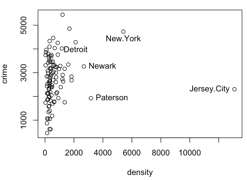
3.5.2 Automatic point labelling with car::showLabels()
The graphics functions in the {car} package employ a common general mechanism for point identification, using the car::showLabels() function to identify potentially noteworthy points.
: Arguments of car::showLabels() function
-
Point identification is controlled by the
idargument, which takes the values TRUE, FALSE, or a detailed list of specifications. In most cases, the user only needs to setid = TRUEor to specify the number of points to be identified, for example,id = list(n = 5). - labels: By default, points are labeled with a data frame’s row labels or by row numbers if there are no row labels. You can use whatever point labels you like by setting labels to a character vector with the same number of elements as there are data points.
- n: the number of points to label.
- cex: the relative size of the labels; cex=0.5, for example, produces labels half the default size.
-
col: the color of the labels; if not set, the color is determined automatically. -location: where the labels are drawn. The default is
location = "lr"to draw labels to the left of points in the right half of the graph and to the right of points in the left half. Another option islocation="ab", to draw labels above points below the middle of the graph and below points above the middle. Finally,location="avoid"tries to avoid overplotting labels. -
method: Setting
method = "identify"(the default) enables interactive point identification, as withgraphics::identify(). Several automatic methods are available for determining how interesting points are to be identified. For example, incar::scatterplot(), the default ismethod = "mahal", in which the Mahalanobis distance of each point to the centriod (point of averages) is computed, and the identified points are those with the largest Mahalanobis distances. Forcar::residualPlot(), the default ismethod = "r", selecting noteworthy points according to the absolute values of their vertical coordinates (i.e., the residuals) and labeling the points with the largest values. There are many other options for the method argument; see help (“showLabels”) for their description and the help pages for particular car graphics functions for how they usecar::showLabels().
Important 3.3: Developing my own show_labels() command
I am trying to replicate the labelling of interesting points with {ggplot2}. The main idea for this additional work is to use the {tidyverse} approach and to stick with the more exhaustive functionality of the grammar of graphics.
This is not only programmatically a challenge but I have to learn and understand what type of graphics shows what type of “interesting” points (outliers, extreme values, high-leverage points) and how to compoute these points.
So far I have code proposals for
- all outliers in boxplots (Listing / Output 3.17) and
- Mahalanobis distances with p-value of .001 in a linear model (Listing / Output 4.11)
I am still missing the option to display a certain number of extreme points.
This restriction does not affect logistic regression, where it is the probability of successθ, and not the observed sample proportion of successes x, that is transformed.↩︎
The functions
car:::bcPowerAxis(),car:::bcnPowerAxis(), andcar:::probabilityAxis()may be used similarly to produce axes on the untransformed scale corresponding to Box-Cox, Box-Cox with negatives, and logit transformations.↩︎