3 Redding
3.1 How’m I doin’?
Former (three term) Mayor of New York City Ed Koch famously quipped “How’m I doin’?” regularly for the cameras. He genuinely wanted to know what the body politic thought of how he was managing New York City.
I keep thinking: How is Redding doing? How many cases have been identified in the last few days, and what is the trend? How do we compare to nearby towns?
One of the metrics used to gauge how a town is faring in the fight against the virus is the rolling average rate of (known) cases. Authorities in various locales use a 14-day rolling average per 100,000 residents (including Connecticut see “Community COVID-19 Cases and Tests in the Past 2 Weeks”) to normalize5, “scale up,” and “smooth”6 the “signal.” I could not find a 14-day rolling average nor one per 100,000 residents for Redding (or any other town in CT), so I decided to create it7.
3.2 Table: Redding COVID-19 Cases over the last 14 days
This is some of the data that goes into the charts below. I arbitrarily chose 14 days to display counts of COVID cases and added the change from the previous day and the 14-day rolling average (see below) to the data provided by the State of Connecticut.8
| date | 14-day Rolling Average | Total Cases | Change |
|---|---|---|---|
| 2021-07-22 | 0.00 | 564 | 0 |
| 2021-07-22 | 0.00 | 564 | 0 |
| 2021-07-23 | 0.00 | 564 | 0 |
| 2021-07-23 | 0.00 | 564 | 0 |
| 2021-07-24 | 0.00 | NA | 0 |
| 2021-07-24 | 0.00 | NA | 0 |
| 2021-07-25 | 0.00 | NA | 0 |
| 2021-07-25 | 0.00 | NA | 0 |
| 2021-07-26 | 0.14 | 566 | 2 |
| 2021-07-26 | 0.14 | 566 | 2 |
| 2021-07-27 | 0.21 | 567 | 1 |
| 2021-07-27 | 0.21 | 567 | 1 |
| 2021-07-28 | 0.43 | 570 | 3 |
| 2021-07-28 | 0.43 | 570 | 3 |
3.3 Redding Cumulative Cases
The first chart below displays total cases over time. This is a very common and simple-to-create chart. The reader can “see” the cases increase over time, and consider the slope of the chart to “see” when cases are increasing quickly. The scale of the day-to-day changes, however, becomes smaller as the case count increases.9 Note cases from previous months do not help gauge if and how much infection is spreading now, hence Figure 3.2.
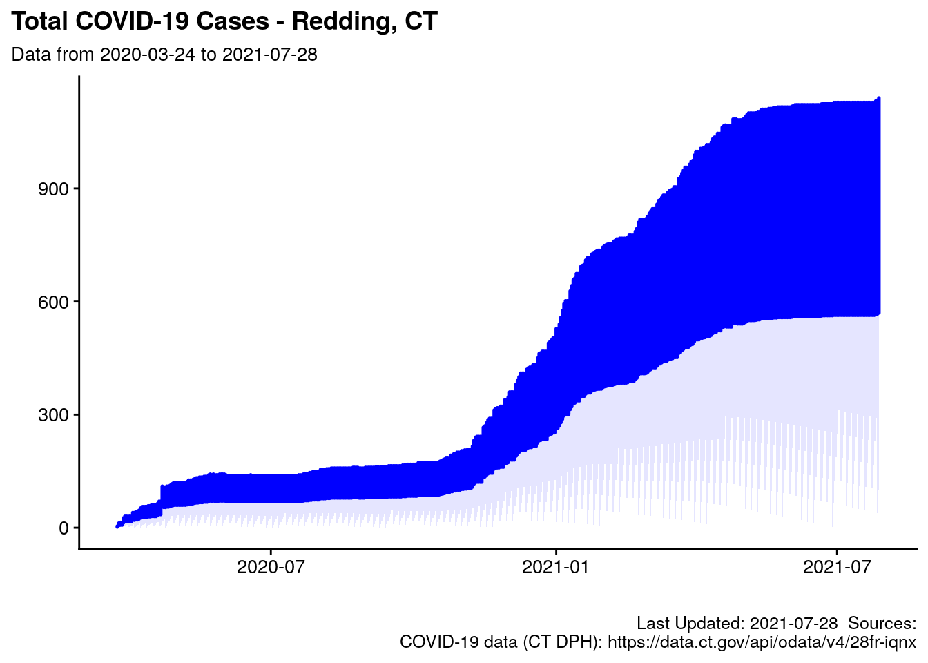
Figure 3.1: Cumulative Total Cases in Redding, CT
3.4 Redding 14-day rolling average
Below is the day-by-day difference in the total cases, which is averaged over 14 days. By charting the difference in cases, we eliminate the problem of the ever-growing scale from the chart above.
The chart below explained: Cases are counted for the 14 previous days and then divided by 14 to “average it out.” The days are connected with a line. The line will return to zero when there have been no cases in a 14 day period. A one day spike in cases can move the curve up, but the effect is “muted” by the other 13 days in the sample. The rolling average will drift back down if a spike in cases is not sustained. (See the “jump” from April 22 to May 6, after the state cleared a backlog of test results on one day.)
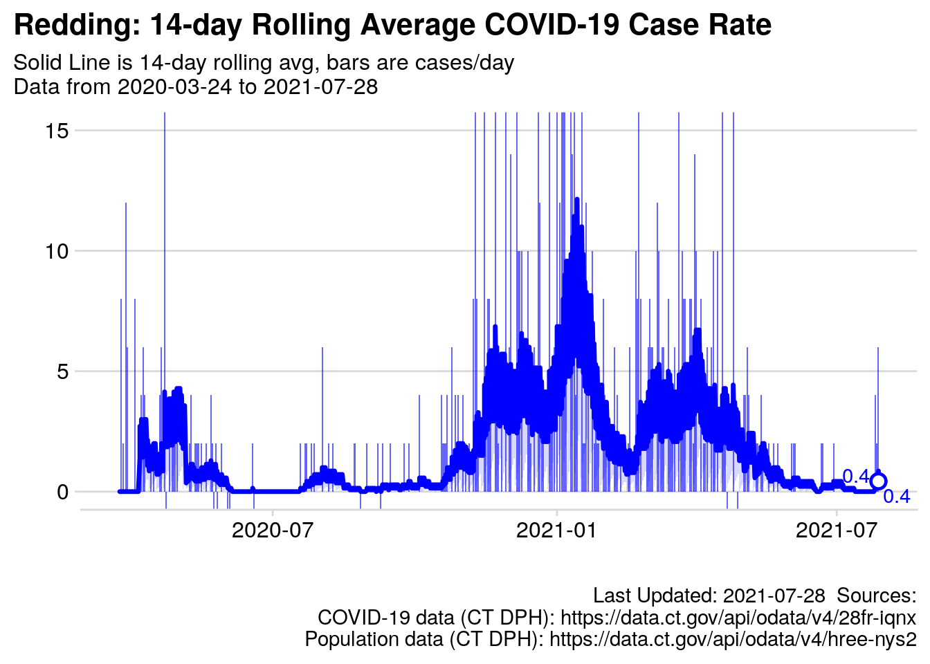
Figure 3.2: Rolling Average cases per day
Note the y-axis is limited to 15 in Figure 3.2: The State of Connecticut released a backlog of 20 positive COVID test results on April 22. That 20 case “spike” distorted the scale for the “accurate” measurements, so I have “zoomed in on” the graph. Those 20 cases also temporarily “spiked” the 14-day moving average.
3.5 Percent Positive Tests
14-days of positive test results are added together and divided by the sum of positive plus negative tests for the same 14 days in the chart below. I have also included the daily positive test results with bars for the values for each day (the “input data” in graphical form).
Note CT’s DPH data is different from this number due to additional “cleaning” of the data by the State Department of Health, follow the link to learn more. The black line is the State’s “cleaned” data, which is updated weekly, and lags the orange line. The orange line is updated daily, but is “messier” or less precise.
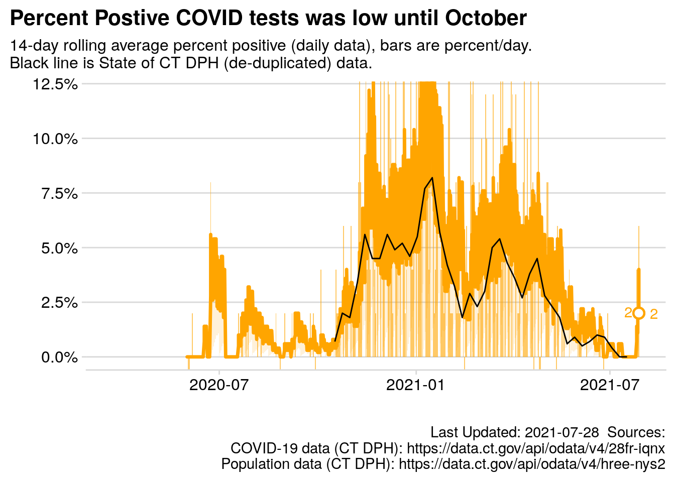
Figure 3.3: 14 day rolling average percent positive test results
3.5.1 Top 20 days
Below are the dates with the 20 highest individual case counts for Redding, CT. These would be the days with the 20 highest bars in the chart above (and steepest slopes in Fig. 3.1).
| Date | Week Day | 14-day Avg | Total Cases | Daily Change |
|---|---|---|---|---|
| 2020-04-22 | Wed | 2.07 | 55 | 20 |
| 2020-04-22 | Wed | 2.07 | 55 | 20 |
| 2021-01-10 | Sun | 4.93 | 314 | 13 |
| 2021-01-10 | Sun | 4.93 | 314 | 13 |
| 2020-11-15 | Sun | 2.21 | 133 | 12 |
| 2020-11-15 | Sun | 2.21 | 133 | 12 |
| 2021-01-01 | Fri | 3.43 | 264 | 12 |
| 2021-01-01 | Fri | 3.43 | 264 | 12 |
| 2020-11-22 | Sun | 3.43 | 156 | 11 |
| 2020-11-22 | Sun | 3.43 | 156 | 11 |
| 2020-12-27 | Sun | 2.50 | 245 | 11 |
| 2020-12-27 | Sun | 2.50 | 245 | 11 |
| 2021-03-21 | Sun | 2.43 | 463 | 11 |
| 2021-03-21 | Sun | 2.43 | 463 | 11 |
| 2020-12-06 | Sun | 2.43 | 190 | 10 |
| 2020-12-06 | Sun | 2.43 | 190 | 10 |
| 2021-01-17 | Sun | 5.50 | 347 | 10 |
| 2021-01-17 | Sun | 5.50 | 347 | 10 |
| 2020-11-29 | Sun | 2.64 | 170 | 9 |
| 2020-11-29 | Sun | 2.64 | 170 | 9 |
| 2020-12-20 | Sun | 2.50 | 225 | 9 |
| 2020-12-20 | Sun | 2.50 | 225 | 9 |
| 2021-01-04 | Mon | 3.43 | 279 | 9 |
| 2021-01-04 | Mon | 3.43 | 279 | 9 |
| 2021-01-05 | Tue | 4.00 | 288 | 9 |
| 2021-01-05 | Tue | 4.00 | 288 | 9 |
| 2021-01-06 | Wed | 4.50 | 297 | 9 |
| 2021-01-06 | Wed | 4.50 | 297 | 9 |
| 2021-04-25 | Sun | 2.21 | 542 | 9 |
| 2021-04-25 | Sun | 2.21 | 542 | 9 |
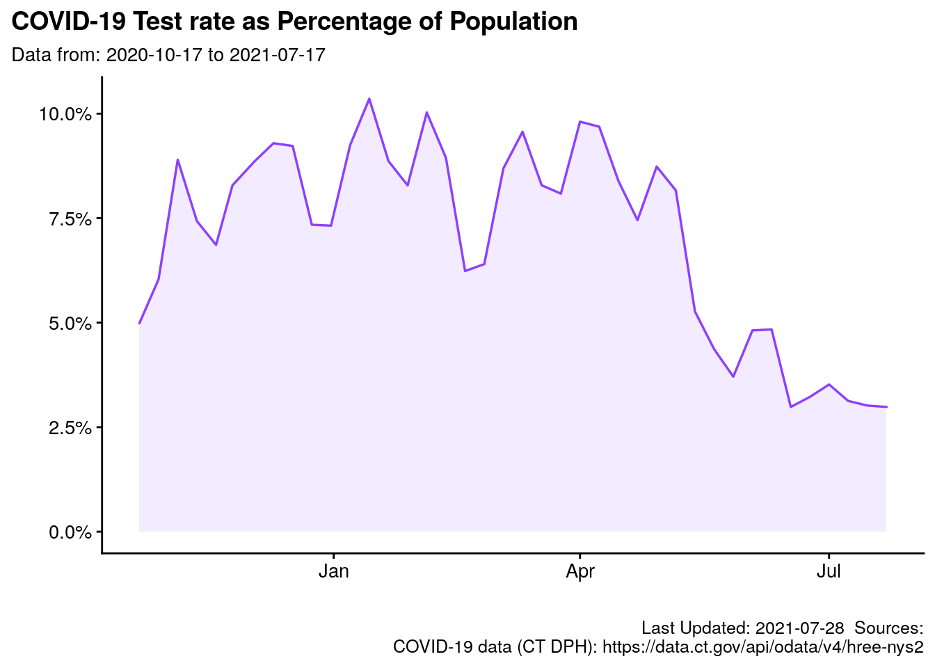
3.6 Proportion of Population tested
What is Redding’s testing “intensity?” Are we testing a consistent percentage of the population? Note: This number does not indicate if we are testing different people each week, or the same people each week. For instance, First Responders may be tested regularly, whereas other constituencies may not be tested with any cadence. Regardless, this is the number of tests, as a percent of population, according to Archambault (2020a).
3.7 Redding and Neighbors
Redding and 8 surrounding towns are displayed in “thumbnail” charts to facilitate comparison of selected metrics.
3.7.1 Normalized cases for 9 selected towns
The 14-day rolling average per capita is shown below and includes some surrounding towns, so we can gauge the number of known cases (again, per capita) versus our neighbors. The State of Connecticut Department of Public Health has estimated Redding’s population to be 9116 for 2019. More information regarding town population is available in the Appendix.
Note the scale is common to all panels, so Redding’s chart is relatively “short” because other towns have more cases on per capita (and absolute) basis.
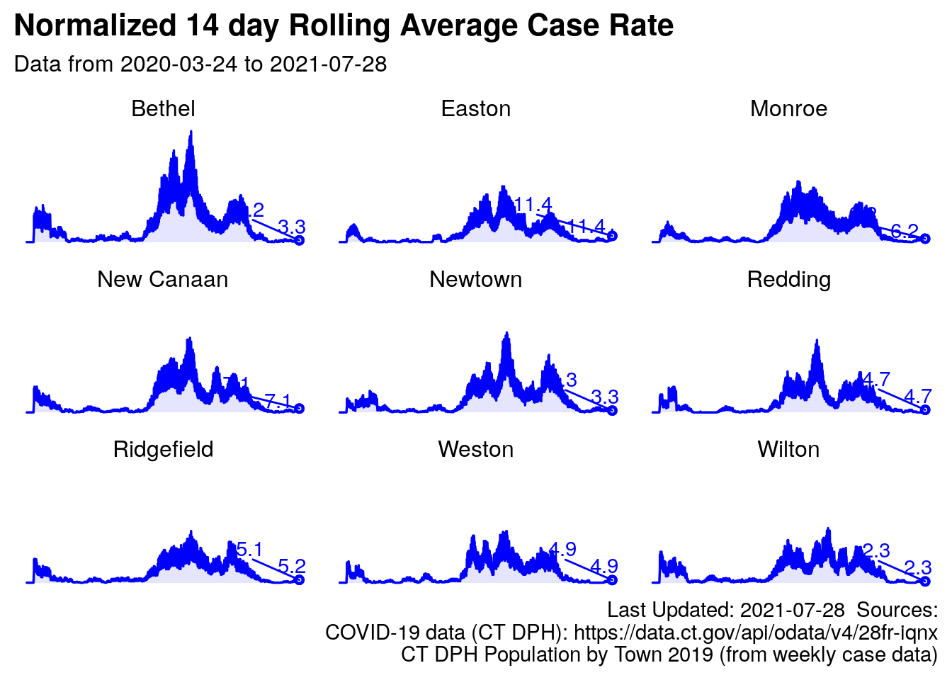
Figure 3.4: Redding and surrounding towns, normalized rolling average
3.7.2 Positivity Rate for 9 selected towns
Similarly, the rolling average positive test rate is below. I will soon add the black line for the state’s positivity rate, like the chart above for Redding alone.
Jan 14th, 2021: Please note the chart below has been revised. The wrong metric was displayed on this graph before today.
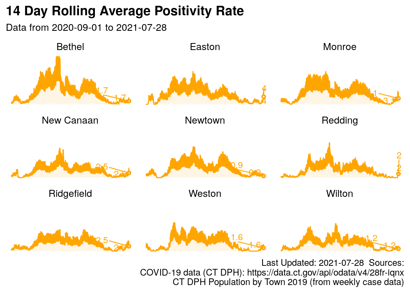
Figure 3.5: Redding and surrounding towns, rolling percent positive
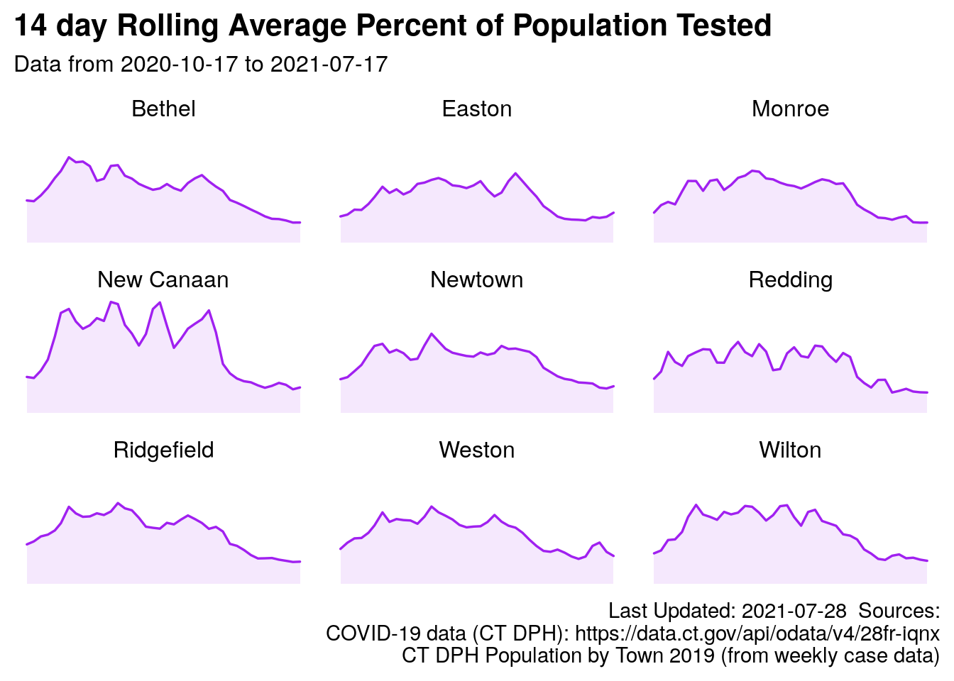
3.7.3 Test Rate
Comparing test rates to nearby towns can be helpful as we interpret the case rate numbers above. If you are curious about the number of positive cases and how it could affect you, you might also likely be curious about the number of tests as a proportion of population, versus neighboring communities, a comparison is below. See Archambault (2020a) for test rate, and Kleykamp (2010) for population data.
*Please note: This is the number of tests as a proportion of the popluation, the data likely includes mulitple tests for one person. It is possible for this number to be greater than 100% because the data is not “de-duplicated,” or it is not indicating the percentage of people who have been tested. It is the total number of tests divided by the population times 100.
3.8 Redding and Neighbors (one plot)
Next, the towns are all shown on one chart, with color to differentiate between towns. Redding is the bold blue line.
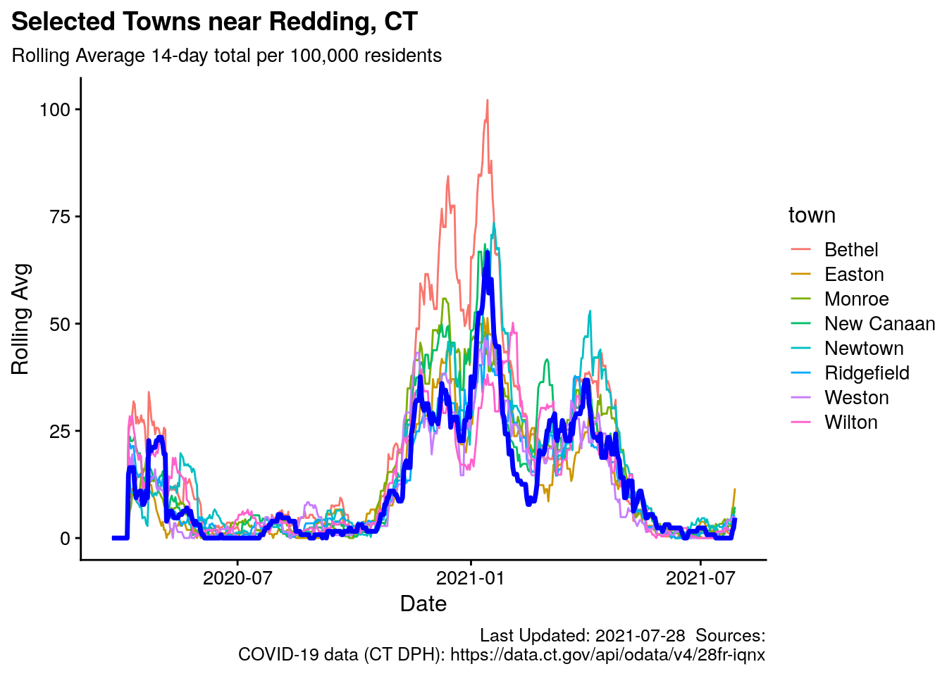
Figure 3.6: Redding and surrounding towns, rolling average
3.8.1 Dynamic Plot of Surrounding Towns
Same chart as above, but as a dynamic plot: Hover your mouse over the chart, and over the “buttons” that appear when your pointer is on the image. Note you can toggle towns off and on (make the disappear and re-appear) by clicking them in the legend.
Note this chart will not be visible if you are viewing the file in epub (can view on ereader, or a phone, etc.) or PDF format.
3.9 Normalized 14-day Rolling Average per 100,000 residents
The New York Times scales the number of COVID cases to per 100,000 residents to facilitate comparing locales with different populations.10 Redding’s population (in 2019) is estimated to be 9116, so the actual 14-day average number of cases is multiplied by \(\frac{100000}{9116} = 10.97\). More information regarding town population is available in the Appendix.
Lines have been added to mark the “zones” identified by the State of Connecticut with 5 cases per 100,000 people being “yellow,” 10 as “orange” and 15+ “red.”
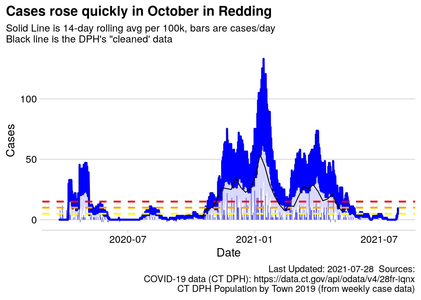
Figure 3.7: Redding 14-day Rolling Average
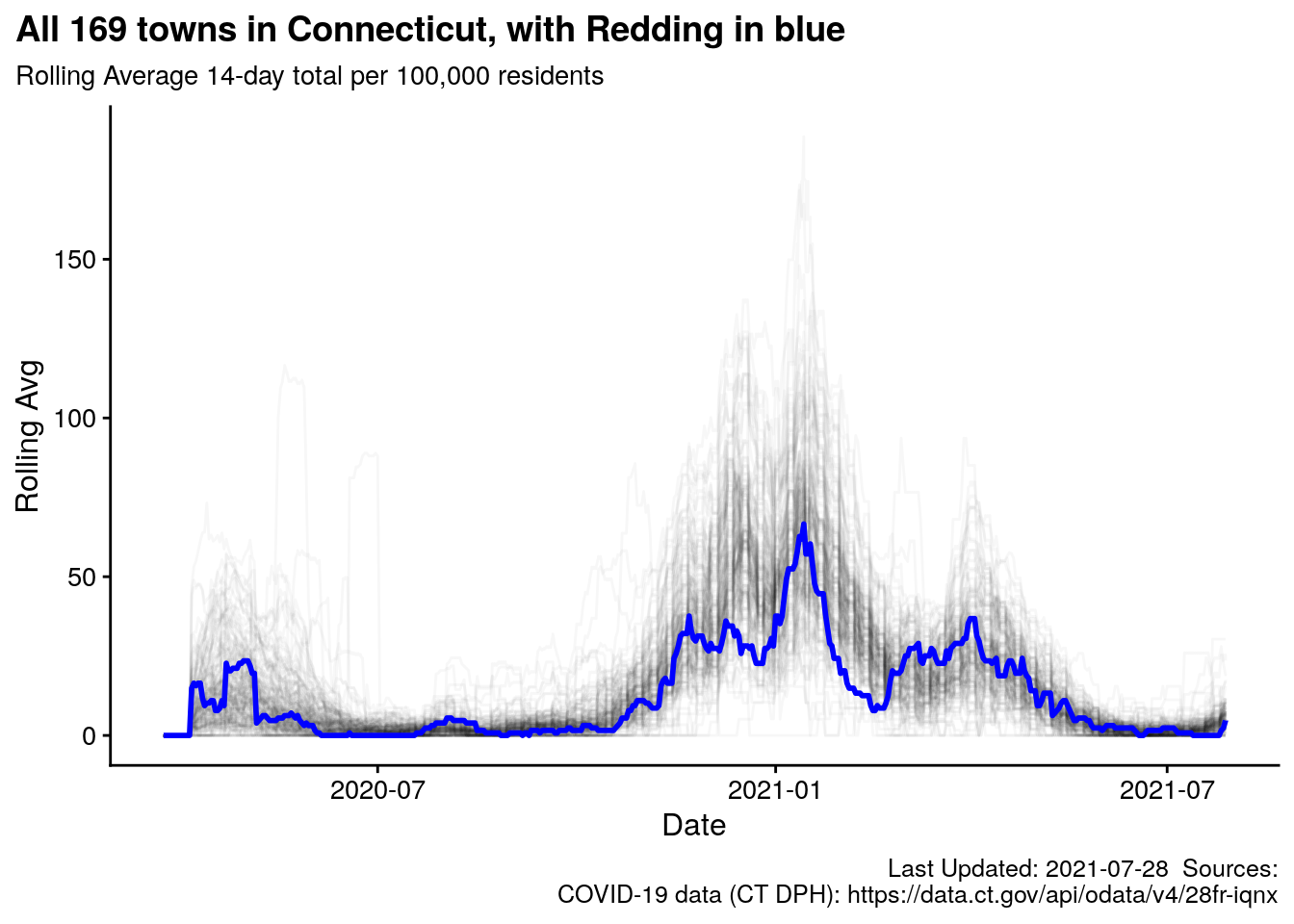
3.10 Redding Case Rate versus all 169 towns in Connecticut
Redding’s rolling average case rate is plotted against all other towns in CT. Towns vary greatly in population, demographics, population density, etc. but this provides some context for Redding versus the other towns in Connecticut.
This would be akin to plotting every other town in Connecticut, and drawing very lightly with a pencil, then putting a clear overlay on top, and plotting Redding with a blue Sharpie.
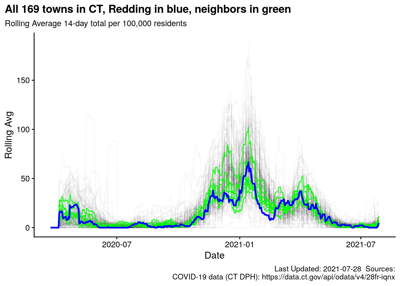
3.10.1 With neighboring towns
The green lines are our neighboring towns: Easton, Weston, Ridgefield, Wilton, Redding, Bethel, Newtown, Monroe, New Canaan
3.11 Percentile Rank Redding and Neighboring towns (plus Danbury and Stamford)
This table is ranked by 14-day rolling average cases per day. I would expect the Percentile Rank to be a little “noisy” from day-to-day, a few cases could send a town up and down the list as the numbers are quite close in many “positions.”| town | updated | Rolling Avg per 100k | Percentile Rank |
|---|---|---|---|
| Wilton | 2021-07-28 | 2.33 | 17 |
| Wilton | 2021-07-28 | 2.34 | 17 |
| Danbury | 2021-07-28 | 2.36 | 18 |
| Danbury | 2021-07-28 | 2.36 | 18 |
| Bethel | 2021-07-28 | 3.25 | 25 |
| Bethel | 2021-07-28 | 3.26 | 25 |
| Newtown | 2021-07-28 | 3.33 | 26 |
| Newtown | 2021-07-28 | 3.34 | 26 |
| Redding | 2021-07-28 | 4.70 | 36 |
| Redding | 2021-07-28 | 4.70 | 36 |
| Weston | 2021-07-28 | 4.88 | 38 |
| Weston | 2021-07-28 | 4.88 | 38 |
| Ridgefield | 2021-07-28 | 5.14 | 43 |
| Ridgefield | 2021-07-28 | 5.15 | 44 |
| Monroe | 2021-07-28 | 6.24 | 52 |
| Monroe | 2021-07-28 | 6.25 | 53 |
| New Canaan | 2021-07-28 | 7.06 | 67 |
| New Canaan | 2021-07-28 | 7.07 | 68 |
| Stamford | 2021-07-28 | 8.42 | 79 |
| Stamford | 2021-07-28 | 8.43 | 80 |
| Easton | 2021-07-28 | 11.40 | 94 |
| Easton | 2021-07-28 | 11.40 | 94 |
3.12 Percentile Rank of towns by 14-day rolling average per 100k
The same information as the table above, but for the Top 50 towns in CT (ranked by lowest 14-day rolling average case rate)| town | updated | Rolling Avg per 100k | Percentile Rank |
|---|---|---|---|
| Sharon | 2021-07-28 | 0.00 | 1 |
| Sharon | 2021-07-28 | 0.00 | 1 |
| Pomfret | 2021-07-28 | 0.00 | 1 |
| Pomfret | 2021-07-28 | 0.00 | 1 |
| Kent | 2021-07-28 | 0.00 | 2 |
| Kent | 2021-07-28 | 0.00 | 2 |
| Franklin | 2021-07-28 | 0.00 | 2 |
| Franklin | 2021-07-28 | 0.00 | 2 |
| Bridgewater | 2021-07-28 | 0.00 | 3 |
| Bridgewater | 2021-07-28 | 0.00 | 3 |
| Voluntown | 2021-07-28 | 0.00 | 3 |
| Voluntown | 2021-07-28 | 0.00 | 3 |
| Norfolk | 2021-07-28 | 0.00 | 4 |
| Norfolk | 2021-07-28 | 0.00 | 4 |
| Colebrook | 2021-07-28 | 0.00 | 4 |
| Colebrook | 2021-07-28 | 0.00 | 4 |
| Woodstock | 2021-07-28 | 0.00 | 5 |
| Woodstock | 2021-07-28 | 0.00 | 5 |
| Canaan | 2021-07-28 | 0.00 | 5 |
| Canaan | 2021-07-28 | 0.00 | 5 |
| Barkhamsted | 2021-07-28 | 0.00 | 6 |
| Barkhamsted | 2021-07-28 | 0.00 | 6 |
| Scotland | 2021-07-28 | 0.00 | 6 |
| Scotland | 2021-07-28 | 0.00 | 6 |
| Union | 2021-07-28 | 0.00 | 7 |
| Union | 2021-07-28 | 0.00 | 7 |
| Burlington | 2021-07-28 | 0.74 | 7 |
| Burlington | 2021-07-28 | 0.74 | 7 |
| Woodbridge | 2021-07-28 | 0.81 | 8 |
| Woodbridge | 2021-07-28 | 0.82 | 8 |
| Brooklyn | 2021-07-28 | 0.86 | 8 |
| Brooklyn | 2021-07-28 | 0.86 | 8 |
| Killingworth | 2021-07-28 | 1.12 | 9 |
| Killingworth | 2021-07-28 | 1.12 | 9 |
| Willington | 2021-07-28 | 1.21 | 9 |
| Willington | 2021-07-28 | 1.22 | 9 |
| Harwinton | 2021-07-28 | 1.32 | 10 |
| Harwinton | 2021-07-28 | 1.32 | 10 |
| Ashford | 2021-07-28 | 1.68 | 10 |
| Ashford | 2021-07-28 | 1.68 | 10 |
| Lisbon | 2021-07-28 | 1.68 | 11 |
| Lisbon | 2021-07-28 | 1.69 | 11 |
| Branford | 2021-07-28 | 1.79 | 11 |
| Branford | 2021-07-28 | 1.79 | 11 |
| Sterling | 2021-07-28 | 1.89 | 12 |
| Sterling | 2021-07-28 | 1.89 | 12 |
| Sherman | 2021-07-28 | 1.97 | 12 |
| Madison | 2021-07-28 | 1.97 | 12 |
| Sherman | 2021-07-28 | 1.98 | 13 |
| Madison | 2021-07-28 | 1.98 | 13 |
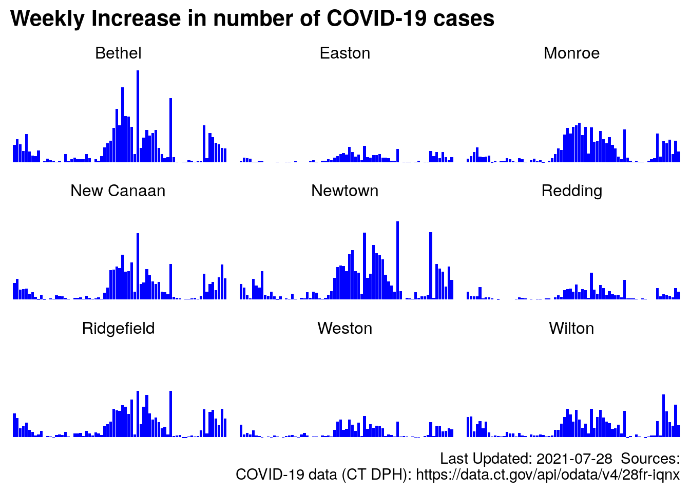
3.13 Redding and Neighbors Summarized by week
I wanted to see a simple bar chart of cases for the 8 neighboring towns plus Redding, but the bars started to get very thin (there are over 200 days of data per town), so I generated chart of total cases per week, see below. I believe the overall bearing of the case count is valid as it is preserved as we “zoom out” to a weekly count, versus daily.
Normalizing numbers allows us to compare communities of different sizes.↩︎
Transient spikes of cases are combined with other days and “averaged” into one number. 14 days are still a little “noisy,” but that has to be balanced with the length of relevance of the data itself. The number of days where a person might spread the virus is the important piece of information. A 50-day rolling average would be less noisy, but also less informative↩︎
And here we are with a brandy-new website!↩︎
The data from the State of Connecticut begins on March 24, 2020, but I am only showing the last 14 days here.↩︎
The scale of a graph becomes compressed as cases mount, making short term fluctuations harder to “see.” For instance, a small town like Redding would be interested if 5 positive cases appeared in a day. However, 5 positive cases would be harder to see and gauge if a chart includes a total of 200 cases. The day-to-day number of cases, by definition, are smaller than the total case count.↩︎
For example: If a given town has 100,000 people the number calculated above will be scaled by a factor of 1 (no change) because \(\frac{100,000}{100,000} = 1\). Similarly, if a town has 50,000 people, the number of cases will be multiplied by 2 (\(\frac{100,000}{50,000} = 2\)) . If a town has 10,000 people, the 14 day average will be multiplied by 10.↩︎