2 Data
As of this writing, all data in these analyses are sourced from The State Of Connecticut, see below for more information. I describe below the process of importing the data, then preparing (known as “Wrangling” in data science circles) it for generating charts and graphs.
2.1 Caveat Emptor: Data is preliminary
The primary dataset used in these analyses (Archambault 2020b) is explicitly identified as preliminary by the State of Connecticut, who notes:
COVID-19 cases, tests, and associated deaths from COVID-19 that have been reported among Connecticut residents. All data in this report are preliminary; data for previous dates will be updated as new reports are received and data errors are corrected.
Emphasis mine. I exchanged a few emails with a representative from CT DPH who explained the data which is published daily and will include duplicate information. The challenge for the state is to publish data that is both useful and current. The state aggregates data from multiple sources, and data is occasionally duplicated. There is a continuous effort to “de-duplicate” information, leading to revisions of daily case count data.
De-duplication efforts are manifest in differences in cases rates which I calculated from daily reports (Archambault 2020b) versus a weekly report issued by CT DPH which is generated from “cleaned” data (hence the weekly publication schedule) see Archambault (2020a) for more information.
library(RSocrata)
library(plotly)
library(tibbletime)
library(lubridate)
library(kableExtra)
library(tidyverse)
library(cowplot)
library(patchwork)
library(gganimate)
library(DT)
library(ggrepel)

theme_set(theme_cowplot(12) )

theme_update(
  plot.title.position = "plot"
)

# Clear workspace
rm(list = ls())

# pct positive branch added 09DEC20

# population by town - UCONN projections
pop_url   <- "https://data.ct.gov/api/odata/v4/spwv-a9en"

# housing units by town
#reference: @cthousing2010
house_url <- "https://data.ct.gov/resource/igy9-udjm.csv"

# COVID-19 data by town
covid_url <- "https://data.ct.gov/api/odata/v4/28fr-iqnx"

# Learning Model data
learn_model_url <- "https://data.ct.gov/Education/Learning-Model-by-School-District/5q7h-u2ac"

# db with positiverate and caserate, but updated weekly... might be better to
# only look weekly, but people want to know each day.
ct_case_pos_rates_url <- "https://data.ct.gov/api/odata/v4/hree-nys2"

# our_towns neighboring towns  (Thorton Wilder in the house now!)
our_towns <- c("Easton",
               "Weston",
               "Ridgefield",
               "Wilton",
               "Redding",
               "Bethel",
               "Newtown",
               "Monroe",
               "New Canaan")


base_color <- "blue"

my_caption.0      = paste0("Last Updated: ", today(), "  Sources:")
my_caption.covid1 = paste0("\nCOVID-19 data (CT DPH): ", covid_url)
my_caption.covid2 = paste0("\nCOVID-19 data (CT DPH): ", ct_case_pos_rates_url)
my_caption.pop1   = paste0("\nPopulation data (CT DPH): ", ct_case_pos_rates_url)
my_caption.pop2   = "\nCT DPH Population by Town 2019 (from weekly case data)"
2.2 Land Area data from ctdata.org
Used a dataset from data.ct.gov(Cuerda 2020) for land area by town, which was used to generate population density charts in “The Workshop,” see charts by population density.1
# Land Area by town
landareabytown <- read_csv("tmp/landareabytown.csv") %>%  # read downloaded data
  filter(Year == "2010", # use latest data
         Value < 4000) %>% # eliminate line for entire state of CT
  select(town = Town, sq_mi = Value)%>%  # grab & renmae columns needed
  mutate(town = str_trim(str_squish(town))) # clean names
##
## ── Column specification ────────────────────────────────────────────────────────
## cols(
## Town = col_character(),
## FIPS = col_character(),
## Year = col_double(),
## `Measure Type` = col_character(),
## Variable = col_character(),
## Value = col_double()
## )2.3 Data from data.ct.gov
The State of Connecticut publishes data for COVID-19 by town on its open data portal, see Archambault (2020b) for more information.
# Housing by town from 2010 Census - reference: @cthousing2010
housing <- read_csv(file = house_url)

# COVID data
covid_data <- read.socrata(url = covid_url)

# Population data
pop_data_uconn   <- read.socrata(url =   pop_url)

# CT Cases & Positivity updated weekly
ct_case_pos_rates <- read.socrata(ct_case_pos_rates_url)

ct_case_pos_rates <-  ct_case_pos_rates %>%
  as_tibble() %>%
  left_join(x = ., y = landareabytown, by = "town")

ct_case_pos_rates <- ct_case_pos_rates%>%
  mutate(pop_dens = pop/sq_mi) %>%
  mutate(pop_dens_category = paste0("Quintile ", ntile(pop_dens, n = 5)))

# placeholder tibble for bind_rows
# df.t <- tibble("town" = character(), "population" = double())


# get the data from DPH (published in Excel File)
t <- readxl::read_excel(path = "tmp/pop_towns2019.xlsx",
                        n_max = 44,
                        .name_repair = "universal",
                        skip = 10)

# Clean and Rename columns in Dataset from UCONN
pop_data_uconn <- pop_data_uconn %>%
  mutate(town = str_squish(town)) %>%
  select(town, est_pop_UCONN = X_2020_total)

# Join UCONN to DPH data
pop_data <- bind_rows(t[,1:2], t[,3:4],t[,5:6],t[,7:8]) %>%
  drop_na() %>%
  janitor::clean_names() %>%
  mutate(town = str_squish(town)) %>%
  left_join(x = ., y = pop_data_uconn, by = "town")
2.4 Custom Functions
All custom functions are documented here in case a reader wishes to critique or challenge the “analysis” (and please do!).2
# Rollify a 14 unit mean: Make a function which generates a mean from last 14
# elements in a list of numbers
roll14 <- tibbletime::rollify(.f = mean, window = 14, na_value = 0)
sum14  <- tibbletime::rollify(.f = sum, window = 14, na_value = 0)


#### Make a rolling average case rate
# roll_avg_rates14.f <- function(df, town) {
#   df.t <- tibble(updated = seq.Date(from = ymd(min(df$updated)),
#                                     to = ymd(max(df$updated)),
#                                     by = "day"))
#
#   t <- df %>%
#     filter(town == {{town}}) %>%
#     select(town, updated, everything()) %>%
#     arrange(updated) %>%
#     mutate(case_diff = towntotalcases - lag(towntotalcases),
#            test_diff = numberoftests - lag(numberoftests),
#            neg_diff  = numberofnegatives - lag(numberofnegatives),
#            posi_diff = numberofpositives - lag(numberofpositives),
#            daily_pct_pos = posi_diff/(neg_diff + posi_diff))%>%
#     right_join(df.t)%>%
#     arrange(updated) %>%
#     mutate(case_diff     = replace_na(case_diff, 0),
#            test_diff     = replace_na(test_diff, 0),
#            neg_diff      = replace_na(neg_diff, 0),
#            posi_diff     = replace_na(posi_diff, 0),
#            daily_pct_pos = replace_na(daily_pct_pos, 0)) %>%
#     mutate(roll_avg_case_rate     = roll14(case_diff),
#            roll_avg_neg_rate      = roll14(neg_diff),
#            roll_avg_posi_rate     = roll14(posi_diff),
#            roll_avg_daily_pct_pos =
#              round(100*roll_avg_posi_rate/(roll_avg_posi_rate+roll_avg_neg_rate),
#                    1)) %>%
#     fill(town) %>%
#     mutate(WeekDay = wday(updated, label = T, abbr = T))
#
#   return(t)
# }


roll_avg_rates14.f2 <- function(df, town) {
  df.t <- tibble(updated = seq.Date(from = ymd(min(df$updated)),
                                    to = ymd(max(df$updated)),
                                    by = "day"))

  t <- df %>%
    filter(town == {{town}}) %>%
    select(town, updated, everything()) %>%
    arrange(updated) %>%
    mutate(case_diff = towntotalcases - lag(towntotalcases),
           test_diff = numberoftests - lag(numberoftests),
           neg_diff  = numberofnegatives - lag(numberofnegatives),
           posi_diff = numberofpositives - lag(numberofpositives),
           daily_pct_pos = posi_diff/(neg_diff + posi_diff))%>%
    right_join(df.t)%>%
    arrange(updated) %>%
    mutate(case_diff     = replace_na(case_diff, 0),
           test_diff     = replace_na(test_diff, 0),
           neg_diff      = replace_na(neg_diff, 0),
           posi_diff     = replace_na(posi_diff, 0),
           daily_pct_pos = replace_na(daily_pct_pos, 0)) %>%
    mutate(roll_avg_case_rate     = roll14(case_diff),
           roll_avg_neg_rate      = roll14(neg_diff),
           roll_avg_posi_rate     = roll14(posi_diff),
           roll_avg_daily_pct_pos =
             round(100*roll_avg_posi_rate/(roll_avg_posi_rate+roll_avg_neg_rate),
                   1)) %>%
    mutate(roll_avg_daily_pct_pos =
             if_else(condition =  roll_avg_daily_pct_pos < 0,
                     true      =  0 ,
                     false    =  roll_avg_daily_pct_pos),
           roll_avg_case_rate =
             if_else(condition = roll_avg_case_rate < 0,
                     true = 0,
                     false = roll_avg_case_rate)
           ) %>%
    fill(town) %>%
    mutate(WeekDay = wday(updated, label = T, abbr = T))

  return(t)
}


# area_bar_chart()  -  06DEC20
#
# Generate standard charts, just feed it the metadata
#
#

area_bar_chart <- function(df, xarg, yarg_area, yarg_bar, base_color, myTitle, mySubTitle, myCaption, Xlabel, Ylabel) {

  df %>%
    # filter(town == "Redding") %>%  # Data needs to be filtered, or add as arg
    ggplot(data = ., mapping = aes(x = {{xarg}},
                                   y = {{yarg_area}})) +
    geom_bar(stat = "identity",
             fill = base_color, # arg, global environment, set a default?
             alpha = 0.6,
             mapping = aes(x = {{xarg}}, y = {{yarg_bar}}))+

    geom_area(alpha = 0.15, color = base_color, fill = base_color, size = 1.2) +
    labs(title = myTitle,
         subtitle = mySubTitle,
         caption = myCaption,
         x = Xlabel,
         y = Ylabel) +
    coord_cartesian(
      xlim = NULL,
      ylim = NULL, # c(0,50), # Make smart to scale to 1.2*max({{yarg_area}})
      expand = TRUE,
      default = FALSE,
      clip = "on"
    )+
    theme_minimal_hgrid()+
    theme(plot.title.position = "plot" )

  # Example call
  #
  # area_bar_chart(df = filter(covid_data.2,
  #                          town =="Redding"),
  #              xarg = updated,
  #              yarg_area = roll_daily_per_100k,
  #              yarg_bar = case_diff,
  #              base_color = "orange",
  #              myTitle = "Cases rose quickly in October in Redding",
  #              mySubTitle = "Solid Line is rolling Avg, bars are cases/day",
  #              myCaption = NULL,
  #              Xlabel = "Date",
  #              Ylabel = "Cases")

}

# area_bar_chart2 - same as above, but labels last point
area_bar_chart2 <- function(df, xarg, yarg_area, yarg_bar, base_color, myTitle, mySubTitle, myCaption, Xlabel = "", Ylabel = "") {

  df2 <- filter(df, {{xarg}} == max({{xarg}}))
  # df2 <- filter(df, updated == max(updated))

  df %>%
    # filter(town == "Redding") %>%  # Data needs to be filtered, or add as arg
    ggplot(data = ., mapping = aes(x = {{xarg}},
                                   y = {{yarg_area}})) +
    geom_bar(stat = "identity",
             fill = base_color, # arg, global environment, set a default?
             alpha = 0.6,
             mapping = aes(x = {{xarg}}, y = {{yarg_bar}}))+
    geom_area(alpha = 0.15,
              color = base_color,
              fill = base_color,
              size = 1.2) +
    geom_point(data = df2,
               color = base_color,
               fill = "white",
               size = 3,
               shape = 21,
               stroke = 1.2)+
    geom_text_repel(data = df2,
                    aes(label = round({{yarg_area}}, digits = 1)),
                    nudge_x = 2,
                    # nudge_y = 2,
                    color = base_color)+
    labs(title = myTitle,
         subtitle = mySubTitle,
         caption = myCaption,
         x = Xlabel,
         y = Ylabel) +
    # coord_cartesian(
    #   xlim = NULL,
    #   ylim = NULL, # c(0,50), # Make smart to scale to 1.2*max({{yarg_area}})
    #   expand = TRUE,
    #   default = FALSE,
    #   clip = "on"
    # )+
    theme_minimal_hgrid()+
    theme(plot.title.position = "plot" )

}


# Function - returns ggplot2 object, faceted over a variable, showing
# sparkkline-type charts in a facet_wrap()
#
numTrend <- function(df,         # = covid_data.2,
                     xarg,       # = updated,
                     # subset,     # = our_towns,
                     yarg,       # = roll_daily_per_100k,
                     base_color, # = base_color,
                     title,      # = "Normalized 14-day Rolling Average COVID-19 cases"
                     mysubtitle,   # = red_subtitle,
                     capstart,   # = my_caption.0,
                     capend1,    # = my_caption.covid1,
                     capend2,    # = my_caption.pop2
                     ...         #facet_var,  # = town,
                     ){
  p1 <- df %>%
    ggplot(mapping = aes(x = {{xarg}},
                         y = {{yarg}})) +
    geom_area(alpha = 0.1,
              color = base_color,
              size = .6,
              fill = base_color) +
    panel_border()+
    facet_wrap(vars(...))+
    labs(title = title, #"Normalized 14-day Rolling Average COVID-19 cases",
         subtitle = mysubtitle,
         caption = paste0(my_caption.0, my_caption.covid1, my_caption.pop2),
         x = "Date",
         y = "14-day Rolling Average total per 100,000 residents") +
    theme_map()


  return(p1)
}


# Function - adds Y value to max X data point, given a df and ggplot object,
# along with color and Y variable.
add_maxes <- function(df, plot, base_color, y_value) {
  {{plot}}+
    geom_point(data = df,
               # data = filter(.data, updated == max(updated) &
               #                        town %in% our_towns),
               color = base_color,
               fill = "white",
               size = 1,
               shape = 21,
               stroke = 1.2)+
    geom_text_repel(data = df,
                     aes(label = round({{y_value}},
                                       digits = 1)),
                     nudge_x = 10,
                     # nudge_y = 20,
                     # xlim = ymd("2021-03-01"),
                     color = base_color)+
    expand_limits(x = ymd("2021-06-10"))
}
2.5 Wrangle
Wrangle is commonly used in data science circles to describe the process of capturing data “in the wild,” then cleaning and regulating it for use in downstream analyses.3 (Note I will use footnotes like that one in this paragraph to either dive a little deeper into a topic, and/or squirrel away technical gibberish at the bottom of a page.)
The data from the State of CT is great to have access to, but needed a few changes before generating charts and graphs. Those steps are documented here.4
2.6 Dataset: covid_data.2
I started to document the changes I made to the data that came from the State, but have not finished, I will return to this section later, as I had since added/removed some of the variables since I first captured them here.
Added new variables:
case_diff: Change in cases from previously reportedtowntotalcases(from the state’s data).roll_avg_case_rate: Rolling average 14-day case rateest_pop: Town population joined from population database.roll_daily_per_100k: Normalized rolling average.
# add column with better date data type, move to first column
covid_data.1 <- covid_data %>%
  mutate(updated = lubridate::ymd(lastupdatedate)) %>%
  select(updated, everything())

# add series of dates - state does not have data for every day
# but need all dates to calculate rolling 14 day average
# add zeroes for days with no data
df.t <- tibble::tibble(updated = seq.Date(from = ymd(min(covid_data.1$updated)),
                                          to = ymd(max(covid_data.1$updated)),
                                          by = "day"))
#### HERE ####
covid_data.2 <- tibble()

# run each town's data through function to crate 14 day rolling average
# seq_along(unique(covid_data$town))
for (town_i in unique(covid_data.1$town)){

  covid_data.2  <- bind_rows(covid_data.2,
                             roll_avg_rates14.f2(df = covid_data.1,
                                                 town = town_i)
                             )

}


# clean white space from town names
pop_data <- pop_data %>%
  mutate(town = str_trim(str_squish(town)))


# add population
covid_data.2 <- left_join(x = covid_data.2, y = pop_data, by = "town") %>%
  # make room for more current population estimate, from DPH
  rename(est_pop_2019 = est_pop) %>%
  # Grab pop (population) from the weekly case data (ct_case_pos_rates), then join
  # it to covid.data.2

  left_join(y = distinct(select(ct_case_pos_rates, town, est_pop = pop)),
            by = "town")


# add land area
covid_data.2 <- left_join(x = covid_data.2, y = landareabytown, by = "town")

covid_data.2 <- covid_data.2 %>%
  mutate(roll_daily_per_100k = roll_avg_case_rate*1e5/ est_pop) %>%
  mutate(pop_density = est_pop/sq_mi)

start_date <- min(covid_data.2 %>% select(updated) %>% pull() )
end_date <- max(covid_data.2 %>% select(updated) %>% pull() )


start_date_redding <- min(covid_data.2 %>% filter(town == "Redding") %>% select(updated) %>% pull() )
end_date_redding <- max(covid_data.2 %>% filter(town == "Redding") %>% select(updated) %>% pull() )
2.7 Tables and Charts
2.7.1 Table: Last 14 days of cases in Redding
table_14days <- covid_data.2 %>%
  filter(town == "Redding") %>%
  tail(n = 14) %>%
  mutate(roll_avg_case_rate = scales::number(roll_avg_case_rate, accuracy = .01)) %>%
  select(date = updated,
         "14-day Rolling Average" = roll_avg_case_rate,
         "Total Cases" = towntotalcases,
         "Change" = case_diff) %>%
  kbl(caption = "Redding COVID Cases with Change and 14-day Rolling Average") %>%
  kable_styling(bootstrap_options = c("striped", "hover", "condensed", "responsive"),
                full_width = F) %>%
  column_spec(4, bold = T)

table_14days| date | 14-day Rolling Average | Total Cases | Change |
|---|---|---|---|
| 2021-07-22 | 0.00 | 564 | 0 |
| 2021-07-22 | 0.00 | 564 | 0 |
| 2021-07-23 | 0.00 | 564 | 0 |
| 2021-07-23 | 0.00 | 564 | 0 |
| 2021-07-24 | 0.00 | NA | 0 |
| 2021-07-24 | 0.00 | NA | 0 |
| 2021-07-25 | 0.00 | NA | 0 |
| 2021-07-25 | 0.00 | NA | 0 |
| 2021-07-26 | 0.14 | 566 | 2 |
| 2021-07-26 | 0.14 | 566 | 2 |
| 2021-07-27 | 0.21 | 567 | 1 |
| 2021-07-27 | 0.21 | 567 | 1 |
| 2021-07-28 | 0.43 | 570 | 3 |
| 2021-07-28 | 0.43 | 570 | 3 |
2.7.2 Chart: Total Cases
red_subtitle <- paste0("Data from ", start_date_redding, " to ", end_date_redding)

p.tot_cases <- covid_data.2 %>%
  filter(town == "Redding") %>%
  fill(towntotalcases) %>%
  ggplot(data = ., mapping = aes(x = updated,
                                 y = towntotalcases)) +
  geom_area(alpha = 0.1, color = base_color, fill = base_color, size = .9) +
  # theme_cowplot(12)+
  labs(title = "Total COVID-19 Cases - Redding, CT",
       subtitle = red_subtitle,
       caption = paste0(my_caption.0, my_caption.covid1),
       x = "",
       y = "")

p.tot_cases 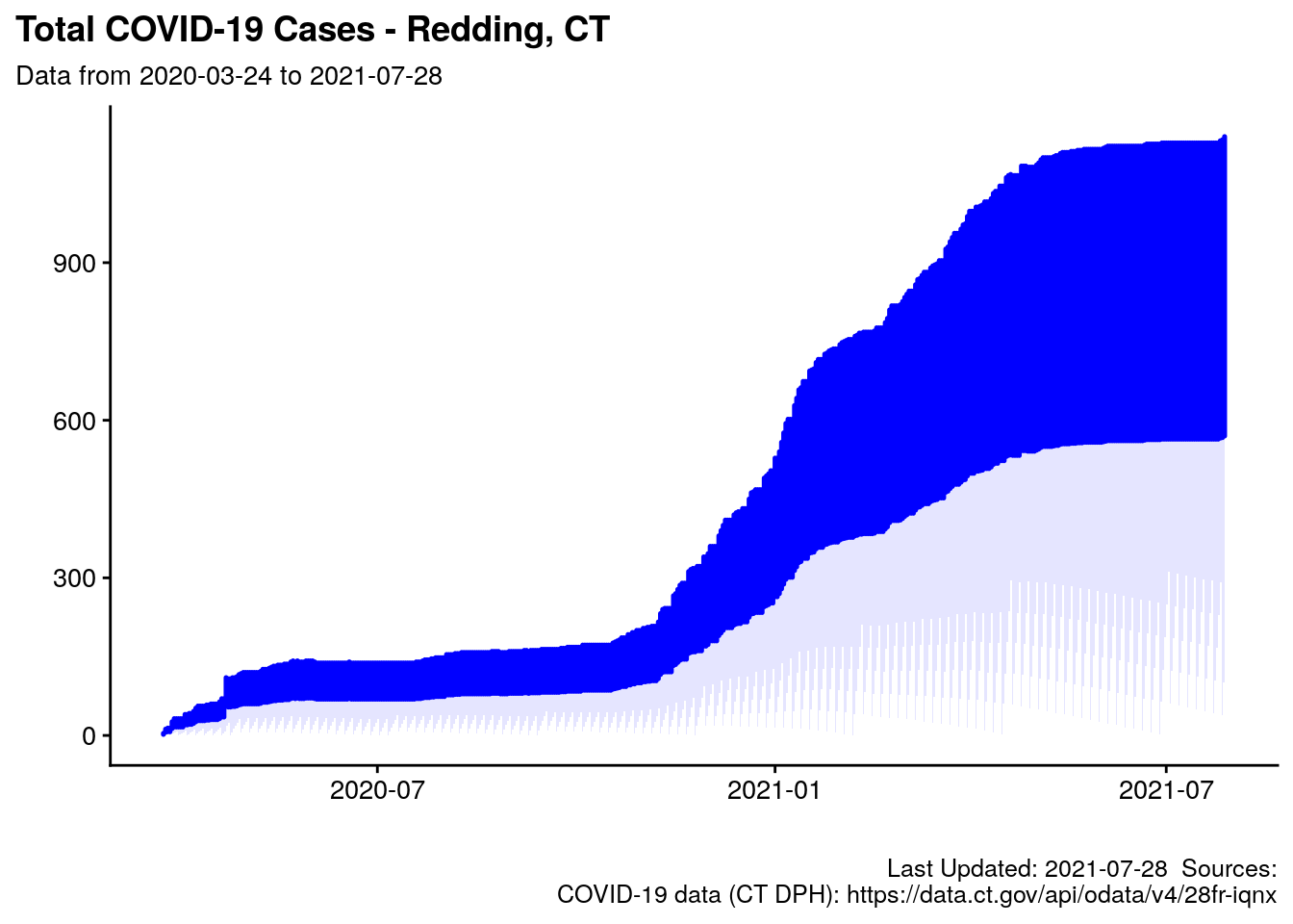
2.7.3 Chart: 14-day Rolling Average Case Rate
t0 <- filter(ct_case_pos_rates, town == "Redding") %>%
  select(date = reportperiodenddate, percentpositive, caserate)

p.14day_roll_avg <- area_bar_chart2(df = filter(
  covid_data.2,
  town =="Redding"),
  xarg = updated,
  yarg_area = roll_avg_case_rate,
  yarg_bar = case_diff,
  base_color = base_color,
  myTitle = "Redding: 14-day Rolling Average COVID-19 Case Rate",
  mySubTitle = paste0("Solid Line is 14-day rolling avg, bars are cases/day\n",
                      red_subtitle),
  myCaption = paste0(my_caption.0,
                     my_caption.covid1,
                     my_caption.pop1))+
  # ,
  #                                     Xlabel = "Date",
  #                                     Ylabel = "Cases") +
  coord_cartesian(
    xlim = NULL,
    ylim = c(0,15), # c(0,50), # Make smart to scale to 1.2*max({{yarg_area}})
    expand = TRUE,
    default = FALSE,
    clip = "on"
  )

p.14day_roll_avg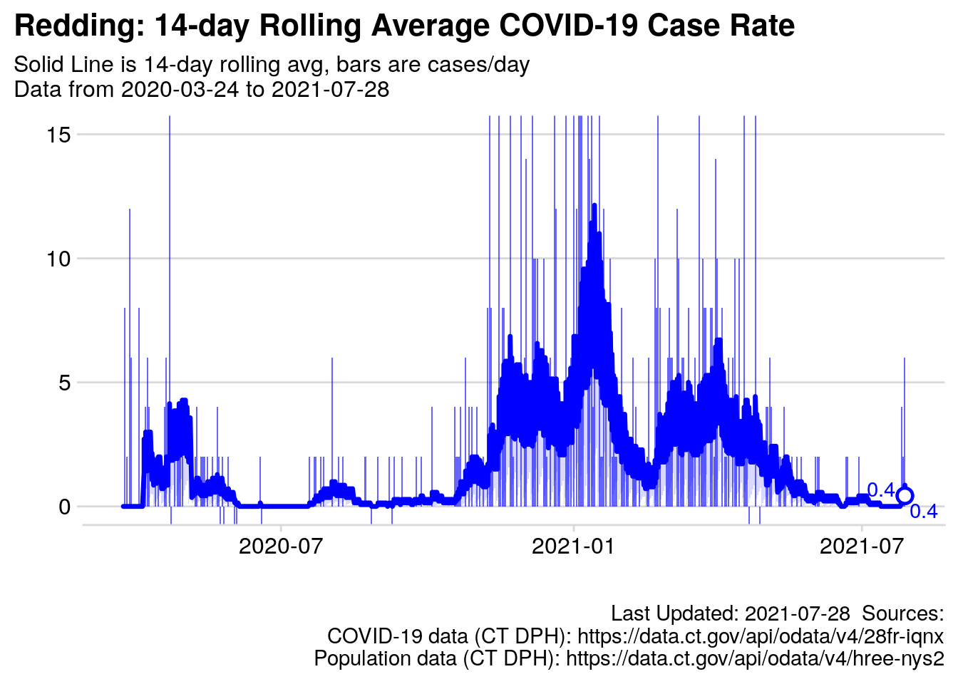
Figure 2.1: Rolling Average cases per day
2.7.4 Chart: Rolling Average Daily Percent Positive
p.daily_pct_pos <- area_bar_chart2(df = filter(covid_data.2,
                           town =="Redding"),
               xarg = updated,
               yarg_area = roll_avg_daily_pct_pos,
               yarg_bar = posi_diff,
               base_color = "orange",
               myTitle = "Percent Postive COVID tests was low until October",
               mySubTitle = paste0("14-day rolling average percent positive (daily data), bars are percent/day.\nBlack line is State of CT DPH (de-duplicated) data."),
               myCaption = paste0(my_caption.0, my_caption.covid1, my_caption.pop1 ))+
  coord_cartesian(
  xlim = NULL,
  ylim = c(0,12), # c(0,50), # Make smart to scale to 1.2*max({{yarg_area}})
  expand = TRUE,
  default = FALSE,
  clip = "on"
)+
  geom_line(data = t0, mapping = aes(x = ymd(date), percentpositive))+
  scale_y_continuous(labels = scales::label_percent(scale = 1))

p.daily_pct_pos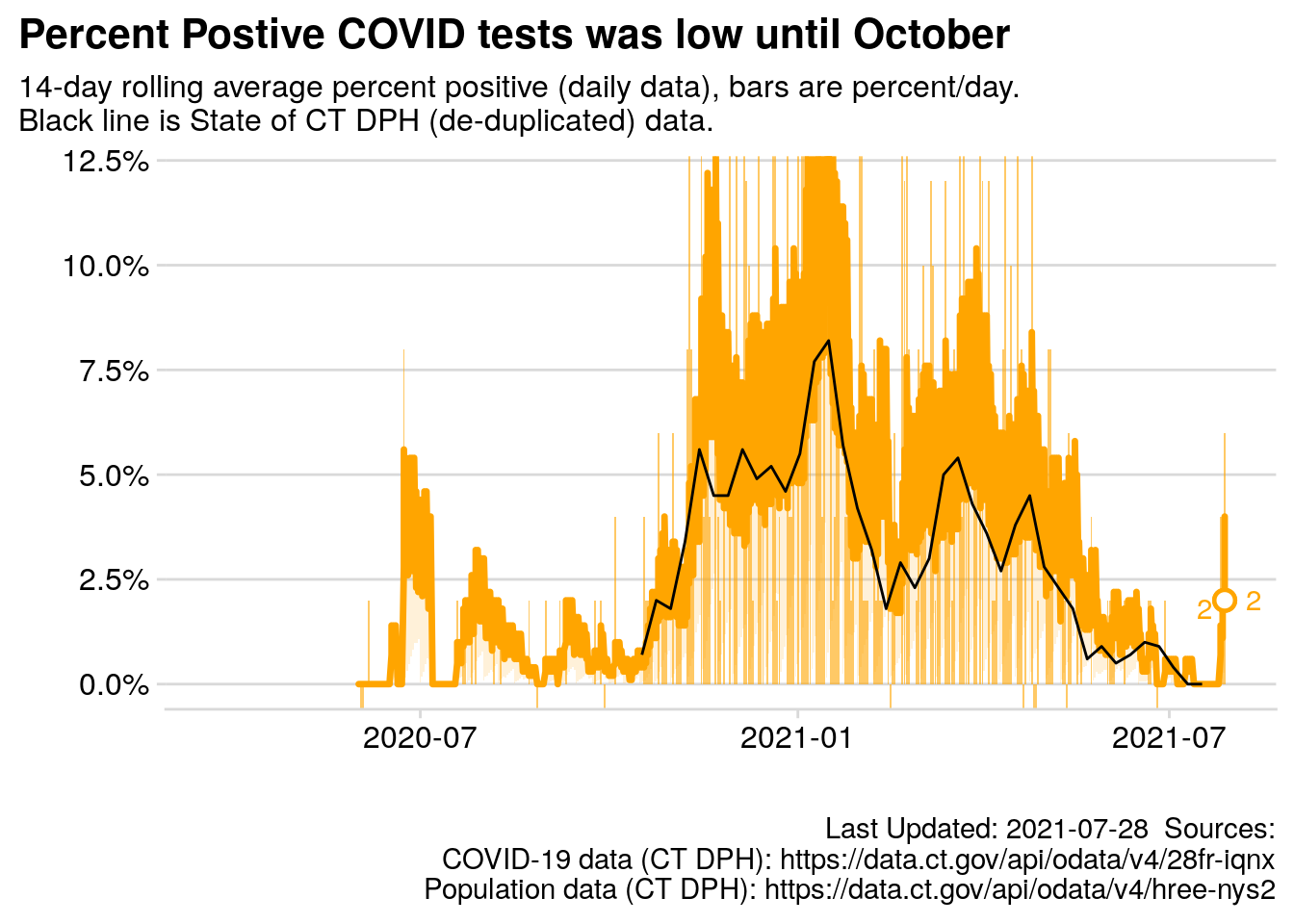
Figure 2.2: 14 day rolling average percent positive test results
2.7.5 Table: 20 Highest Days for new COVID-19 Cases in Redding
t.top20 <- covid_data.2 %>%
  filter(town == "Redding") %>%
  slice_max(n = 20, order_by = case_diff) %>%
  mutate("Week Day" = lubridate::wday(label = T ,abbr = T, updated),
         roll_avg_case_rate = scales::number(roll_avg_case_rate, accuracy = .01)) %>%
  select("Date" = updated,
         'Week Day',
         "14-day Avg" = roll_avg_case_rate,
         "Total Cases" = towntotalcases,
         "Daily Change" = case_diff) %>%
  kableExtra::kbl(caption = paste("20 highest daily cases counts with highest case counts since ", start_date,  paste0(my_caption.0, my_caption.covid1))) %>%
  kableExtra::kable_styling(full_width = F) %>%
  column_spec(5, bold = T)

t.top20| Date | Week Day | 14-day Avg | Total Cases | Daily Change |
|---|---|---|---|---|
| 2020-04-22 | Wed | 2.07 | 55 | 20 |
| 2020-04-22 | Wed | 2.07 | 55 | 20 |
| 2021-01-10 | Sun | 4.93 | 314 | 13 |
| 2021-01-10 | Sun | 4.93 | 314 | 13 |
| 2020-11-15 | Sun | 2.21 | 133 | 12 |
| 2020-11-15 | Sun | 2.21 | 133 | 12 |
| 2021-01-01 | Fri | 3.43 | 264 | 12 |
| 2021-01-01 | Fri | 3.43 | 264 | 12 |
| 2020-11-22 | Sun | 3.43 | 156 | 11 |
| 2020-11-22 | Sun | 3.43 | 156 | 11 |
| 2020-12-27 | Sun | 2.50 | 245 | 11 |
| 2020-12-27 | Sun | 2.50 | 245 | 11 |
| 2021-03-21 | Sun | 2.43 | 463 | 11 |
| 2021-03-21 | Sun | 2.43 | 463 | 11 |
| 2020-12-06 | Sun | 2.43 | 190 | 10 |
| 2020-12-06 | Sun | 2.43 | 190 | 10 |
| 2021-01-17 | Sun | 5.50 | 347 | 10 |
| 2021-01-17 | Sun | 5.50 | 347 | 10 |
| 2020-11-29 | Sun | 2.64 | 170 | 9 |
| 2020-11-29 | Sun | 2.64 | 170 | 9 |
| 2020-12-20 | Sun | 2.50 | 225 | 9 |
| 2020-12-20 | Sun | 2.50 | 225 | 9 |
| 2021-01-04 | Mon | 3.43 | 279 | 9 |
| 2021-01-04 | Mon | 3.43 | 279 | 9 |
| 2021-01-05 | Tue | 4.00 | 288 | 9 |
| 2021-01-05 | Tue | 4.00 | 288 | 9 |
| 2021-01-06 | Wed | 4.50 | 297 | 9 |
| 2021-01-06 | Wed | 4.50 | 297 | 9 |
| 2021-04-25 | Sun | 2.21 | 542 | 9 |
| 2021-04-25 | Sun | 2.21 | 542 | 9 |
2.7.6 Chart: Percent Tested
#### testing as % of population ####
t <- ct_case_pos_rates %>%
    mutate(testrate = 100*totaltests/pop)

p.pct_tested <- t %>%   # filter(town %in% our_towns) %>%
  filter(town %in% c("Redding")) %>%
  mutate(testrate = 100*totaltests/pop) %>%
  ggplot(data = ., mapping = aes(x = updatedate,
                                 y = testrate,
                                 group = town)) +
  geom_area(alpha = 0.1,
            color = "#8c40ff",
            size = .6,
            fill = "#8c40ff") +

  # theme_cowplot(12) +
  # panel_border()+
  labs(title = "COVID-19 Test rate as Percentage of Population",
       subtitle = paste0("Data from: ",
                         min(t$reportperiodenddate),
                         " to ",
                         max(t$reportperiodenddate)),
       # subtitle = red_subtitle,
       caption = paste0(my_caption.0, my_caption.covid2),
       x = "",
       y = "")+
  cowplot::theme_minimal_hgrid()+
  theme_update(plot.title.position = "plot")+
  scale_y_continuous(labels = scales::label_percent(scale = 1))

# p1

p.pct_tested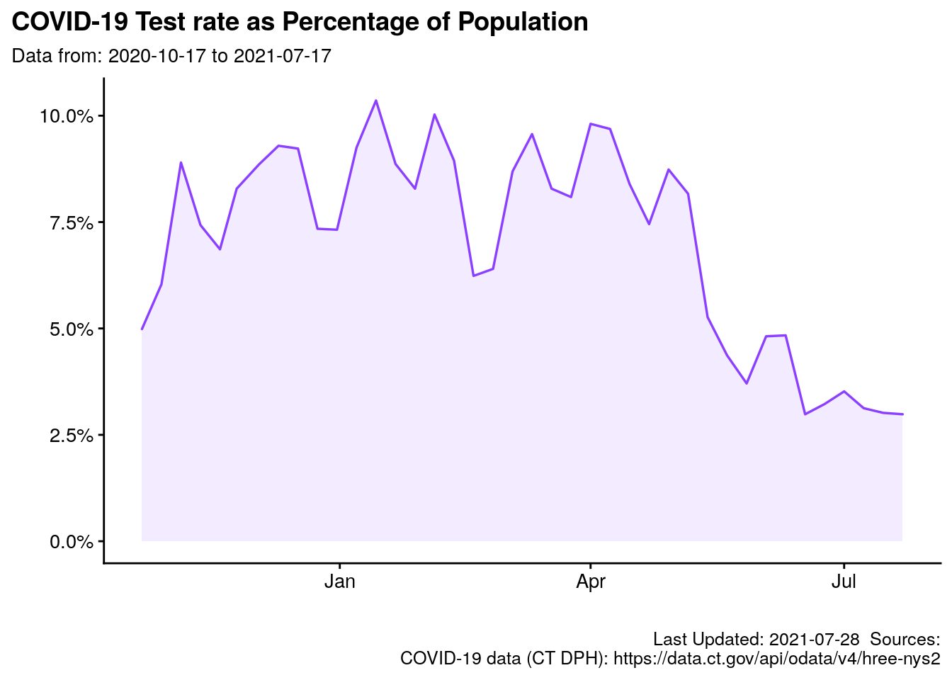
I could not open the Excel file provided by the State of Connecticut here.↩︎
A tool named
rollify(seriously, that is what is is called) from a package calledtibbletimewas helpful, it feeds arbitrary tools/functions into a “window” of observations of arbitrary length. For instance,mean()is a standard function to generate a mean (average) from a list of numbers.rollify(.f = mean, window = 14)will generate a rolling mean of 14 observations. If I need a rolling average for 7 observations, I simply userollify(.f = mean, window = 7)etc. See Vaughan and Dancho (2020) for more information.↩︎Wrangling is often said to compromise about 80% of a Data Scientist’s time/effort. I assure you, that is fairly accurate.↩︎
Add a date column, include all dates between first and last observation (not just dates with cases reported), add (calculate) rolling average case rate for all dates (not just dates reported).↩︎