Session 9 Introduction to plotting
9.1 Data visualisation
Now that we have transformed our data in such a way that we are ready to explore its properties, data visualisation is a key step to understanding the data itself. There are in-built functions as well as purpose-built packages which can be used to plot. Here, we will begin by introducing some of the in-built functions. We will then look at the ggplot2 package which can be used to produce publication standard plots.
For the purpose of demonstration, let’s look at the swiss in-built data.
swissSuppose our primary interest is in the variable `Fertility’. We can look at a scatter plot of the data points:
plot(swiss$Fertility)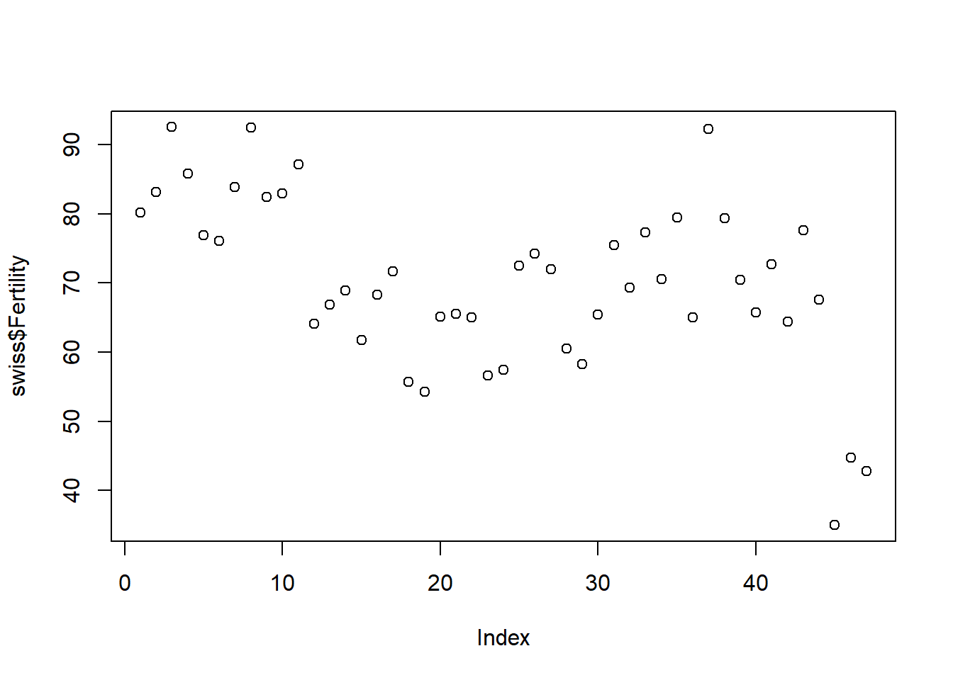
This is, however, a little misleading since one may mistakenly take the positioning on the x-axis to be meaningful when this isn’t the case. We also lose the information of the names of the provinces. Instead, we could look at a bar chart of the data:
barplot(swiss$Fertility)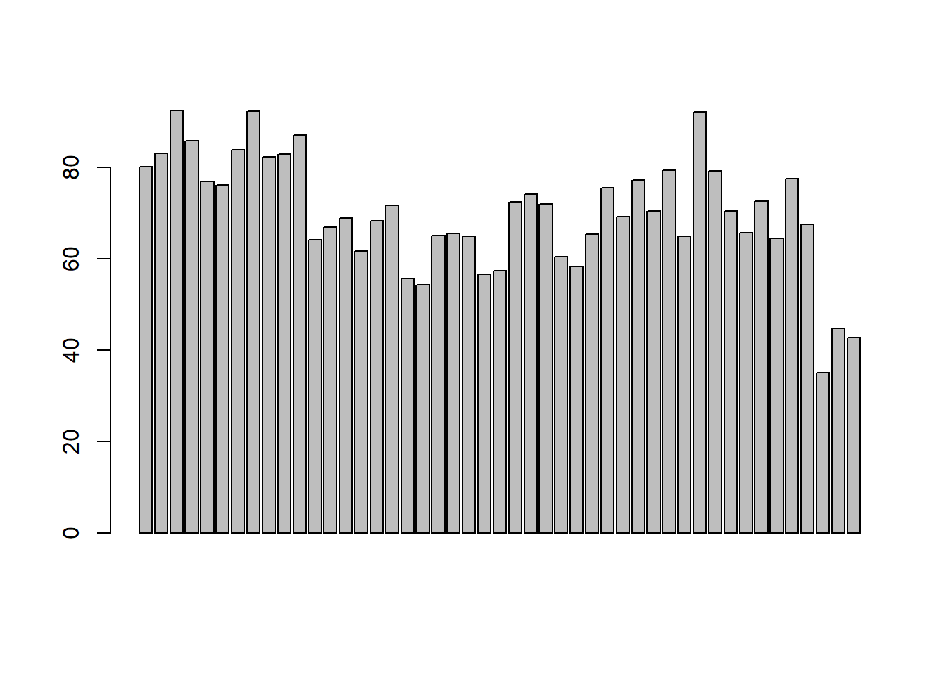
Again, this isn’t the prettiest and because we have so many groups, even when we try and include the names, they do not all appear:
barplot(swiss$Fertility, names.arg = rownames(swiss))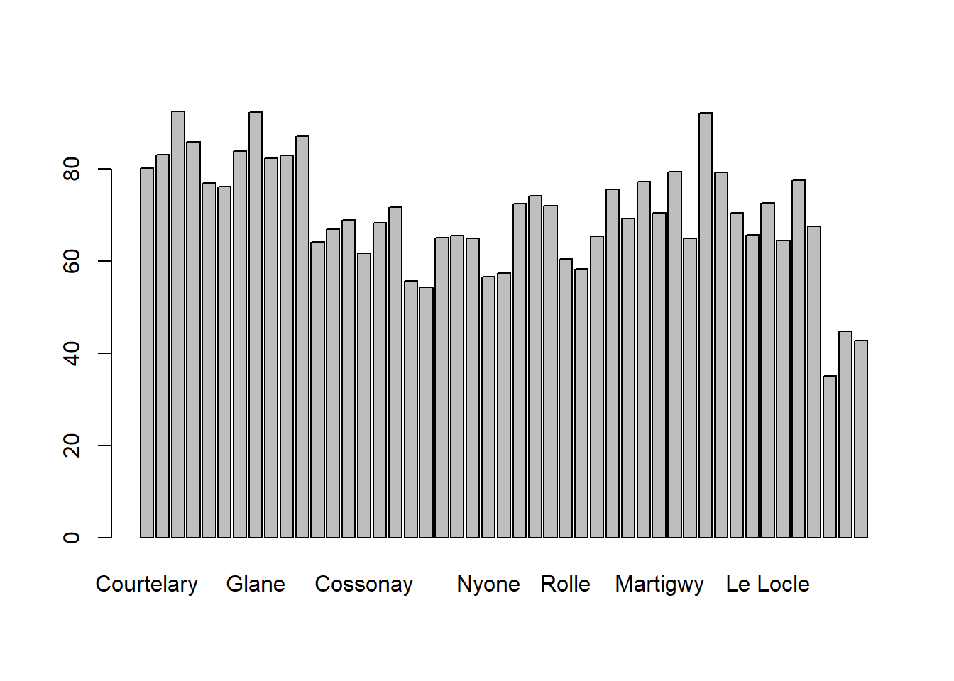
In addition, it is hard to interpret much apart from the minimum and maximum values. A different kind of plot could be useful to give us more information, e.g. a boxplot of the data:
boxplot(swiss$Fertility)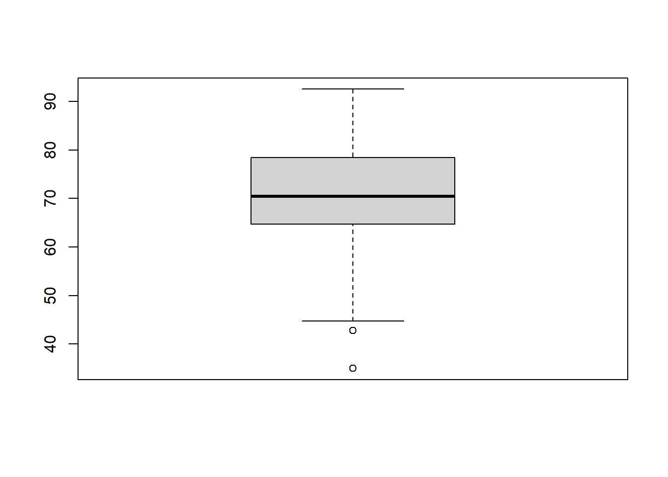
Here we can see that the data is roughly symmetrical with a median around 70. The box represents the middle 50% of the data and the two points at the bottom represent outliers. This is a useful plot to visualise the spread of the data quickly. Another way to do this is to look at a histogram of the data.
hist(swiss$Fertility)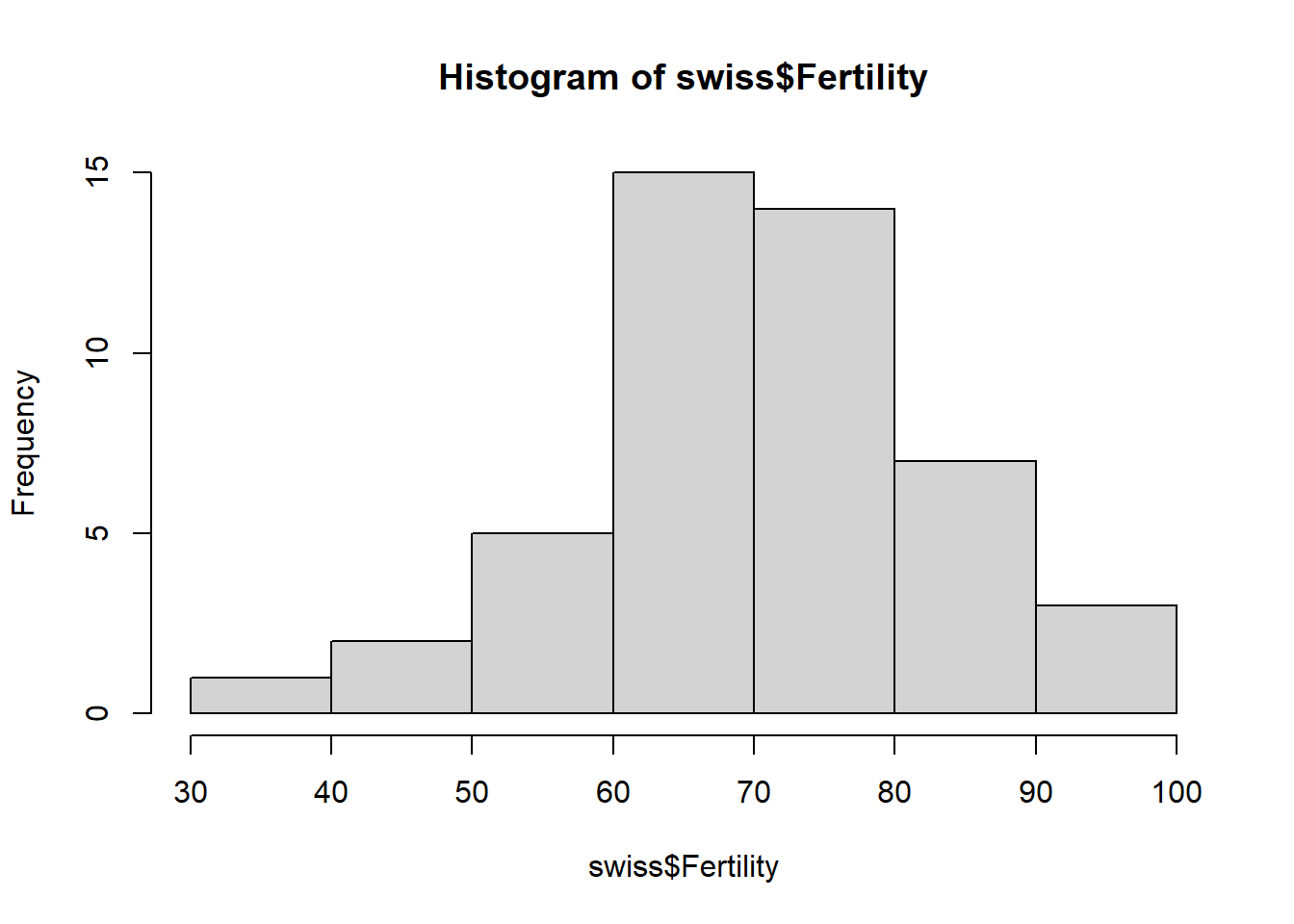
Again we can see that the data is roughly symmetric but here we can get a better idea of the shape of the distribution. If we preferred to look at a smooth line version of this, we could look at a density plot. This has the slight difference in the y-axis being density rather than frequency. Note the density can also be used for the y-axis on the histogram by setting the variable freq=FALSE, i.e.,
hist(swiss$Fertility, freq = FALSE)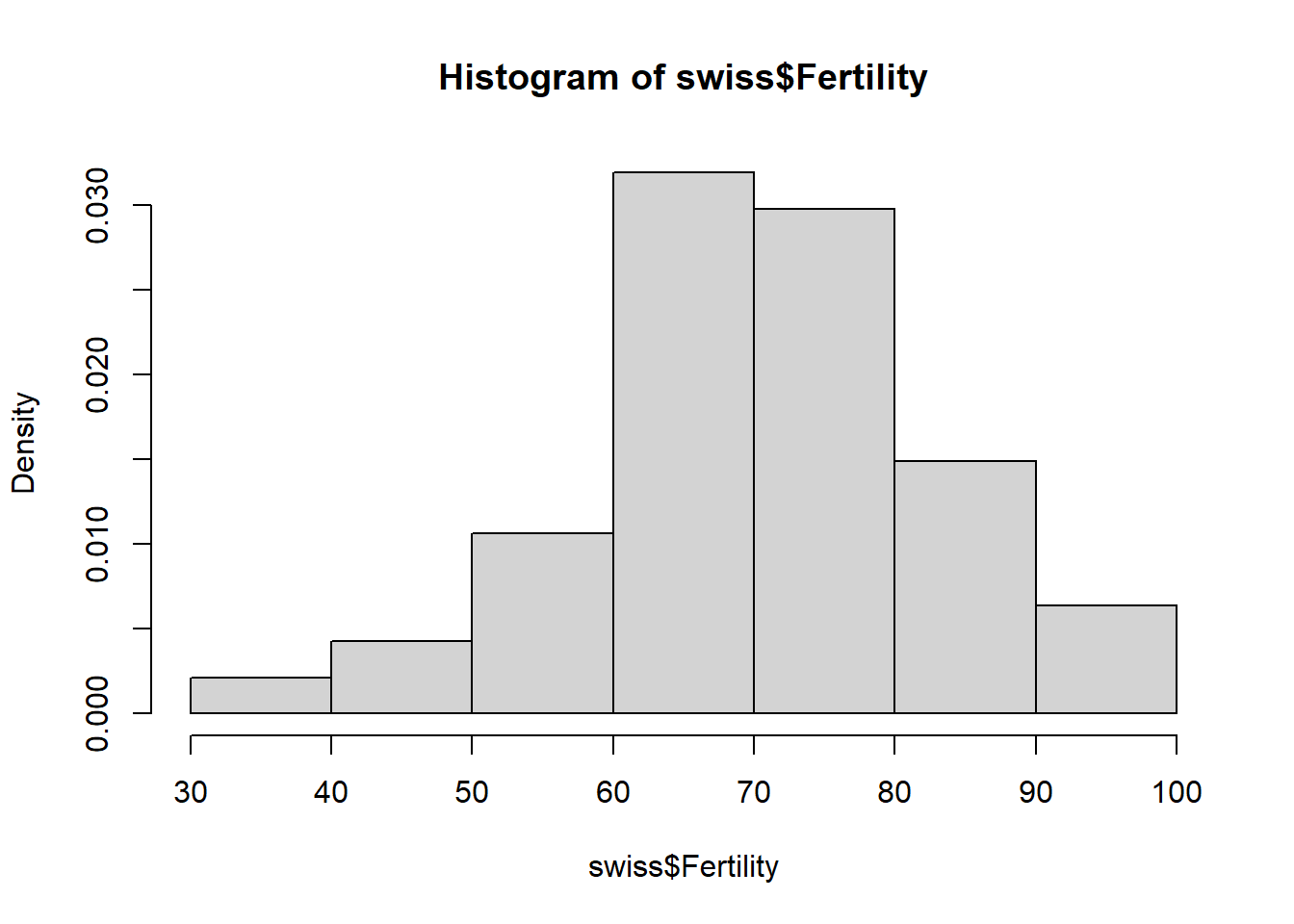
plot(density(swiss$Fertility),type="l")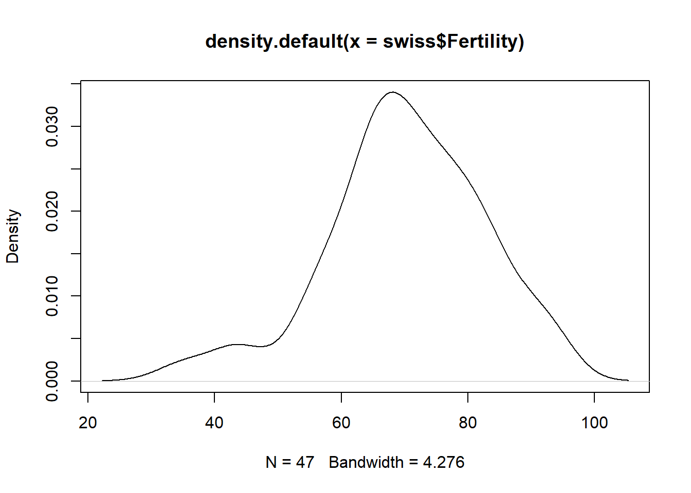
In order to plot the density, we simply used the plot function, making use of the density function already built in to R. We also change from a scatter plot to a line plot using the argument type="l".
Exercise: Take a look at all the different values that can be used for type using the help manual.
We can also look at the relationships between multiple variables. For example, if we wanted to look at the relationship between fertility and % with education beyond primary school, we would first simply plot them against one another, again with a scatter plot.
plot(swiss$Education, swiss$Fertility)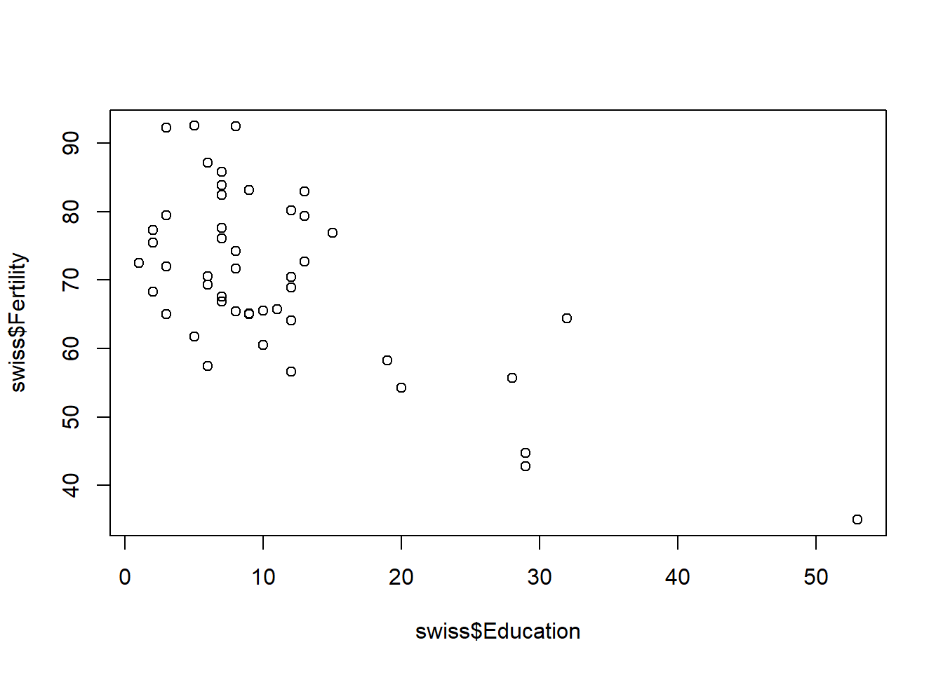
Although not the prettiest of plots, we can still interpret that there appears to be an association between the two variables. If we wanted to look at all combinations of variables, we could simply use the command
plot(swiss)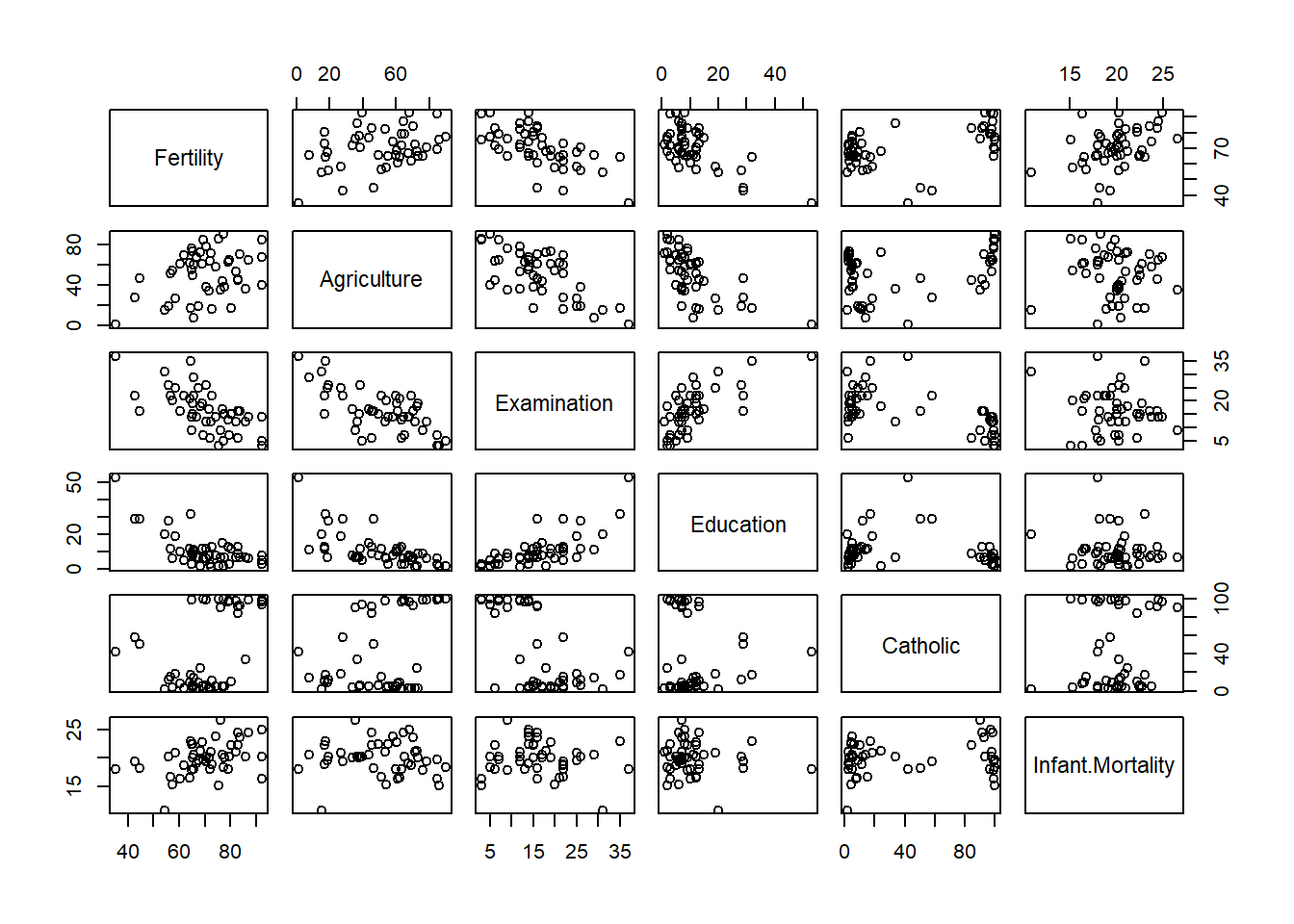
Exercise: Choose another data set and recreate these plots for variables of your choice.
Exercise: Try and work out how to change the title of the plot.
9.2 Saving plots as images
When we are happy with the plots we have created, we may wish to save them as images or pdfs. In order to do this, we can use the Export button in the plot pane as shown below.

Whether you choose pdf of image, a window will pop up which allows you to choose the file format, dimensions and filename to save the image as.

Note that if you plan on writing documents in Word, it is likely that saving as an image will be easier for formatting. Alternatively, you can save images to an external file with R graphic devices R graphic devices