3 Basic Exploratory Data Analysis
#note; In real world analysis, EDA will be done before handling missing values
#Import Data with Missing Values

data<-read.csv("data/CleanedData.csv",header = T,colClasses=c("NULL", rep(NA, 13)))
# Single Plot
#subset Hepatitis and Healthy Blood
hepatitis = subset(data, Category==1)
healthyBlood = subset(data, Category==0)
#hepatitis and HealthyBlood for AST
ggplot() + geom_density(aes(x=AST), colour="red", data=hepatitis) +
geom_density(aes(x=AST), colour="Green", data=healthyBlood) +
ggtitle(" Density Plot of Category VS. AST") +
theme(plot.title = element_text(hjust = 0.5))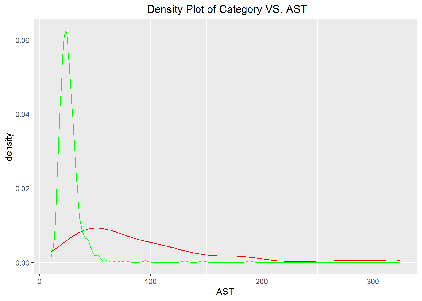
3.1 Density Plot
Plot can be done by adding more layers to the geom density
#Fuction for plotting density plot among the columns--can be donw with clot plot

plot_against <- function(data, column_vars) {
  plots <- list()

  for (col in column_vars) {
    hepatitis <- filter(data, Category == 1)
    healthyBlood <- filter(data, Category == 0)

    p <- ggplot() +
      geom_density(data = hepatitis,
                   aes(x = .data[[col]],
                   y = after_stat(density)),
                   colour = "red") +
      geom_density(data = healthyBlood,
                   aes(x = .data[[col]],
                   y = after_stat(density)),
                   colour = "green") +
      ggtitle(paste("Density Plot of", col, "against Category")) +
      theme(plot.title = element_text(hjust = 0.5))

    plots[[col]] <- p
  }

  grid.arrange(grobs = plots, ncol = 2)
}


plot_against(data, column_vars = names(data)[3:6])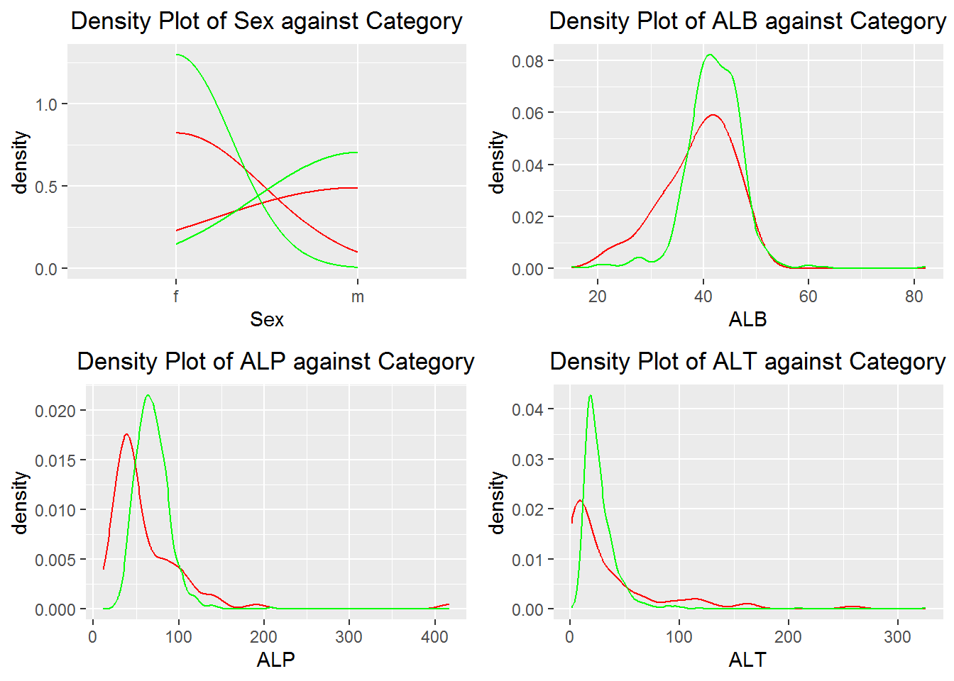
3.2 Interactive Plot Among the columns
Explore the relationships between different columns by hovering over the data points or zooming in and out on the plot
interactive_relationship_plot <- function(data) {
  p <- plot_ly(data, type = "scatter", mode = "markers", marker = list(size = 8))

  # Create the scatter plot matrix
  for (i in 1:(ncol(data) - 1)) {
    for (j in (i + 1):ncol(data)) {
      p <- p %>% add_trace(x = ~data[, i], y = ~data[, j], name = colnames(data)[j])
    }
  }

  # Set the axis labels
  axis_labels <- colnames(data)
  p <- p %>% layout(
    xaxis = list(title = axis_labels),
    yaxis = list(title = axis_labels),
    title = "Interactive Scatter Plot Matrix",
    showlegend = TRUE
  )

  return(p)
}

interactive_relationship_plot(data)
3.3 Outlier Detection
The model is fitted with the trained healthy blood donors and predictions was made on the Hepatis C data.The ID’s considered as outliers are 206 534 537 538 539 540
#Outlier detection
library(isotree)
hep<-data[data$Category==1,]                          #Data for Hepatitis C patient
healt.bd<-data[data$Category==0,]                     #Data for Healthy blood donors

#ignore categorical variables

fit.isoforest <- isolation.forest(hep[,-c(1,3)])
pred <- predict(fit.isoforest, newdata= healt.bd[,-c(1,3)])
## NULL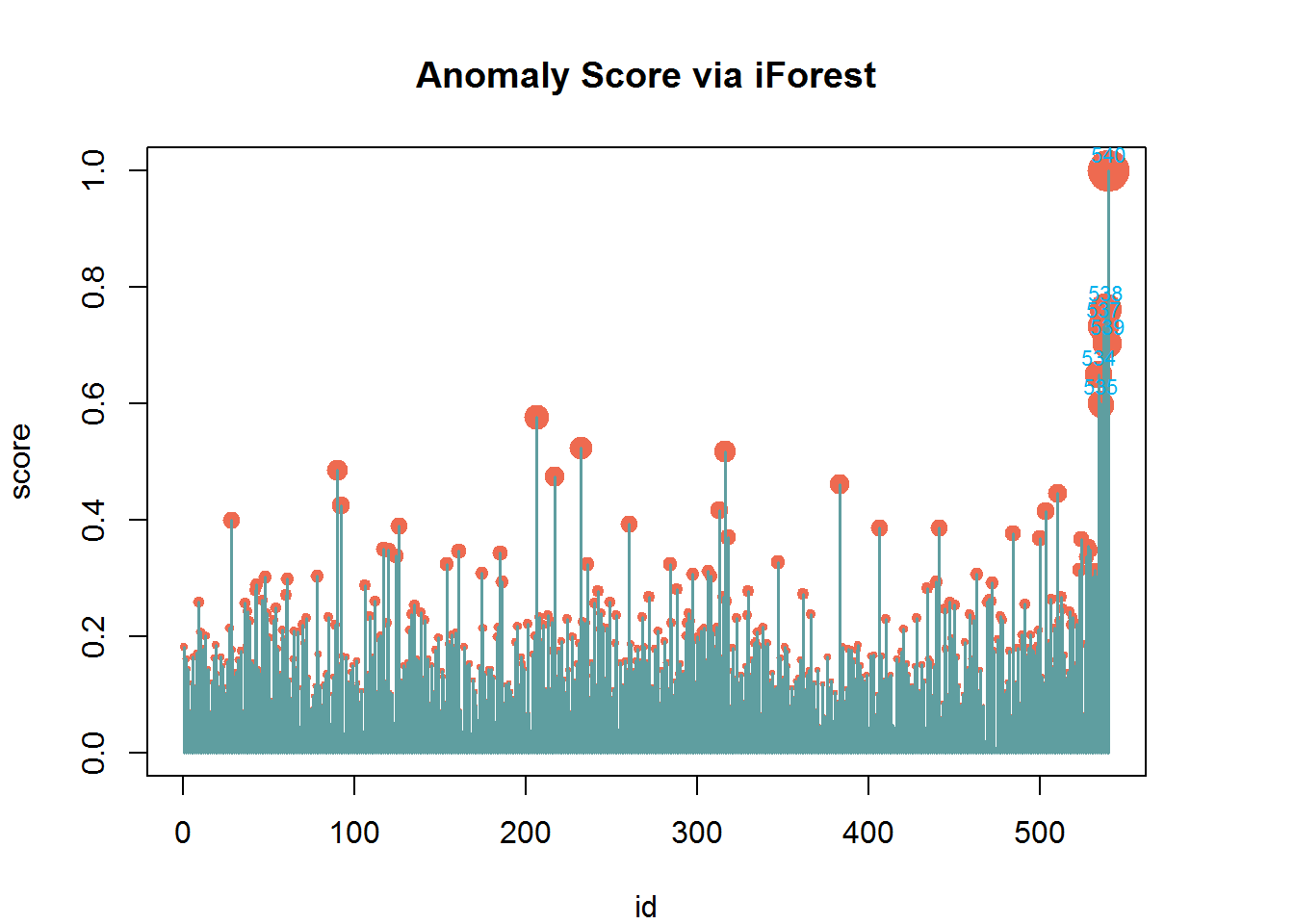
## [1] 534 535 537 538 539 540