Chapter 4 Handout 2: Subsets and Plots
This handout introduces subsetting dataframes, an operation that the tidyverse (luckily) does both easily and in a very readable fashion. We’ll also apply the pipe we learned from Handout 1, as well as introduce ggplot2, the tidyverse’s plotting package.
4.1 Subsetting Data
To prepare, let’s read in our data and load the tidyverse package.
library(tidyverse) # loads the tidyverse into your R environment
data <- mtcars # this is a dataset about cars
head(data)
## mpg cyl disp hp drat wt qsec vs am gear carb
## Mazda RX4 21.0 6 160 110 3.90 2.620 16.46 0 1 4 4
## Mazda RX4 Wag 21.0 6 160 110 3.90 2.875 17.02 0 1 4 4
## Datsun 710 22.8 4 108 93 3.85 2.320 18.61 1 1 4 1
## Hornet 4 Drive 21.4 6 258 110 3.08 3.215 19.44 1 0 3 1
## Hornet Sportabout 18.7 8 360 175 3.15 3.440 17.02 0 0 3 2
## Valiant 18.1 6 225 105 2.76 3.460 20.22 1 0 3 1As we saw in Handout 2, subsetting in base R is a pretty involved process. For example, let’s say we wanted to create a subset of the data where mpg > 20. In base R, we have:
data_subset <- data[data$mpg > 20, ]Instead, in the tidyverse, we have what we call “dplyr verbs” (dplyr is the name of the sub-package that handles data manipulation, pronounced “dee-ply-R”). In particular, for subsets, we use the filter() verb.
The filter() verb does exactly what we think: it filters a dataset based on any conditions we apply to it. The benefit of the dplyr verbs is that it remembers what dataset you’re referring to, so you don’t need to write the $ sign. For example, to do the same exact filter above:
# same exact result as above!
data_subset <- filter(data, mpg > 20)
Once we start adding additional filters, we see why the pipe operator %>% from before is useful in the tidyverse. For example, what if we wanted all cars with an mpg > 20 but mpg < 30? In base R:
data_subset_2 <- data[data$mpg > 20 & data$mpg < 30, ]In the tidyverse:
# exercise: what is happening with the pipes?
data_subset_2 <- data %>%
  filter(mpg > 20) %>%
  filter(mpg < 30)
See how the pipes work alongside dplyr: the original data frame data is piped into the first filter(). Then, the result of that filter() is piped into the second filter(). Together, the entire system does the same exact thing as what we did above.
Note the benefits of this approach as well: the code is much more readable, and we no longer have to deal with a lot of R’s symbolic messes (commas, &’s, $’s, etc).
4.2 Introduction to ggplot2
ggplot2 is the tidyverse’s plotting package. In some ways, it’s harder to understand than base R’s plotting package, but the main benefit is that it produces much prettier graphics (especially for a JP or thesis or something).
Let’s start with the base R density plot. In Handout 2, we plot a density plot as follows:
# density of mpg values for cars
plot(density(data$mpg))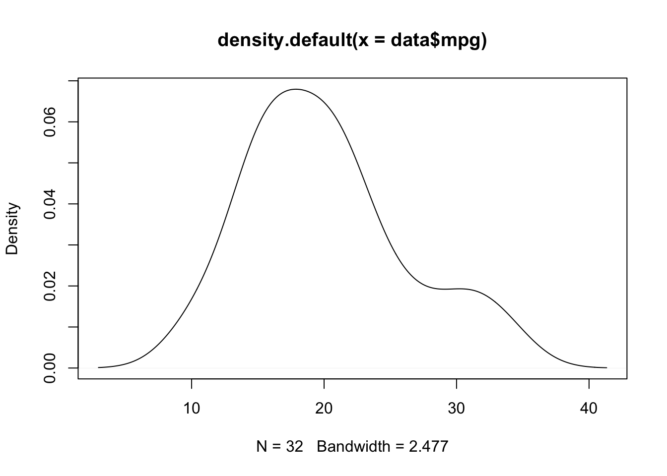
Not bad, but let’s see what ggplot can do.
ggplot objects are built step-by-step, so we’ll introduce it step-by-step as well.
First, we start with the ggplot command, along with the dataset in question:
ggplot(data)Next, we add what we call the “aesthetic” layer, using the command aes(). This has a few settings, but for now, all we need to know is that aesthetics determine the x- and y-variables. Also note that since it’s tidyverse, it will remember the dataframe, so no $ signs are needed.
# notice, this creates a plot with the variable ready
ggplot(data, aes(x = mpg))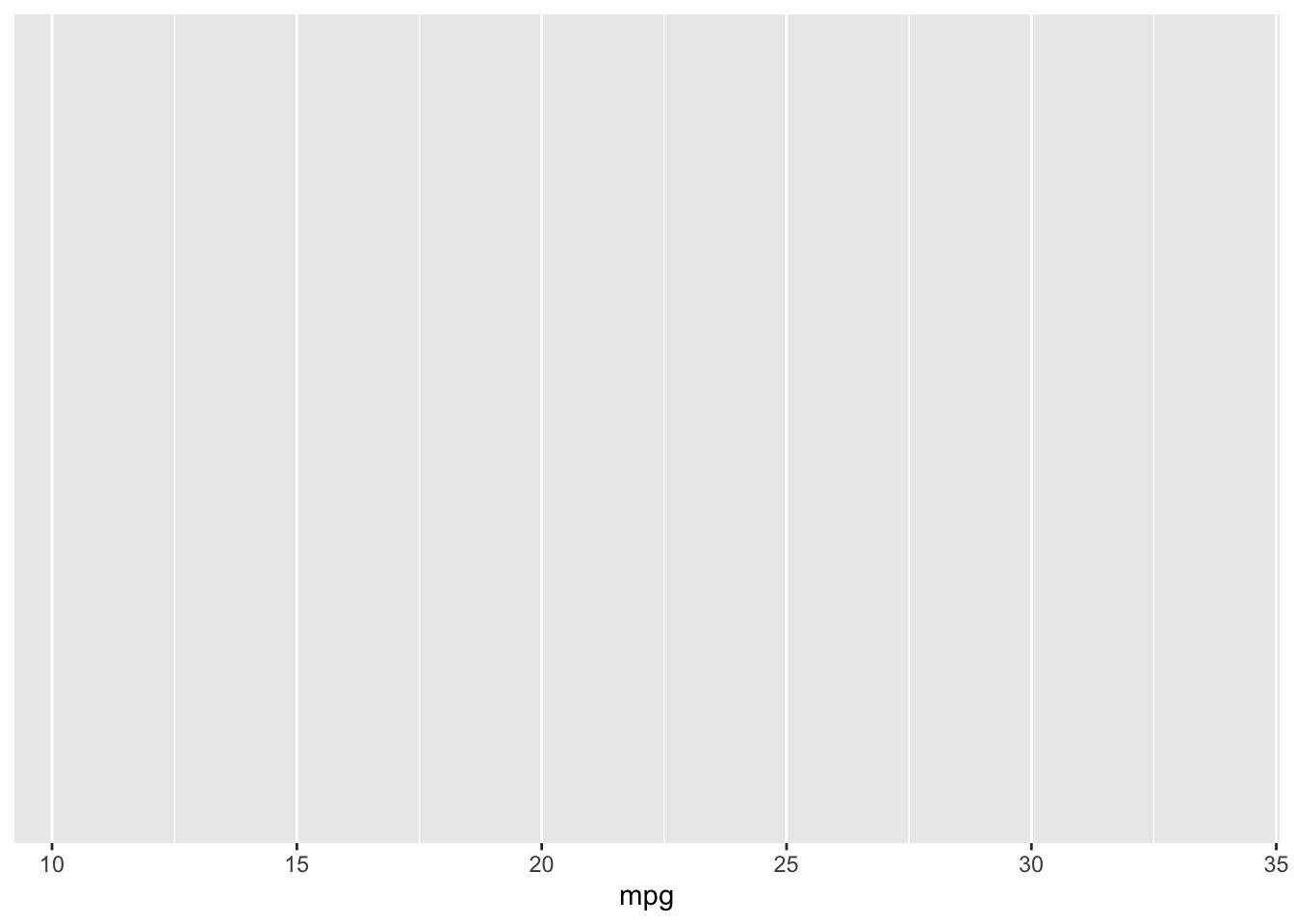
Now, we add what we call the “geom” layers. The geom determines what type of plot it is; in this case, we want a density plot, so we add the geom_density() layer. We add geom layers using a plus sign!
# our density plot is created!
ggplot(data, aes(x = mpg)) +
  geom_density()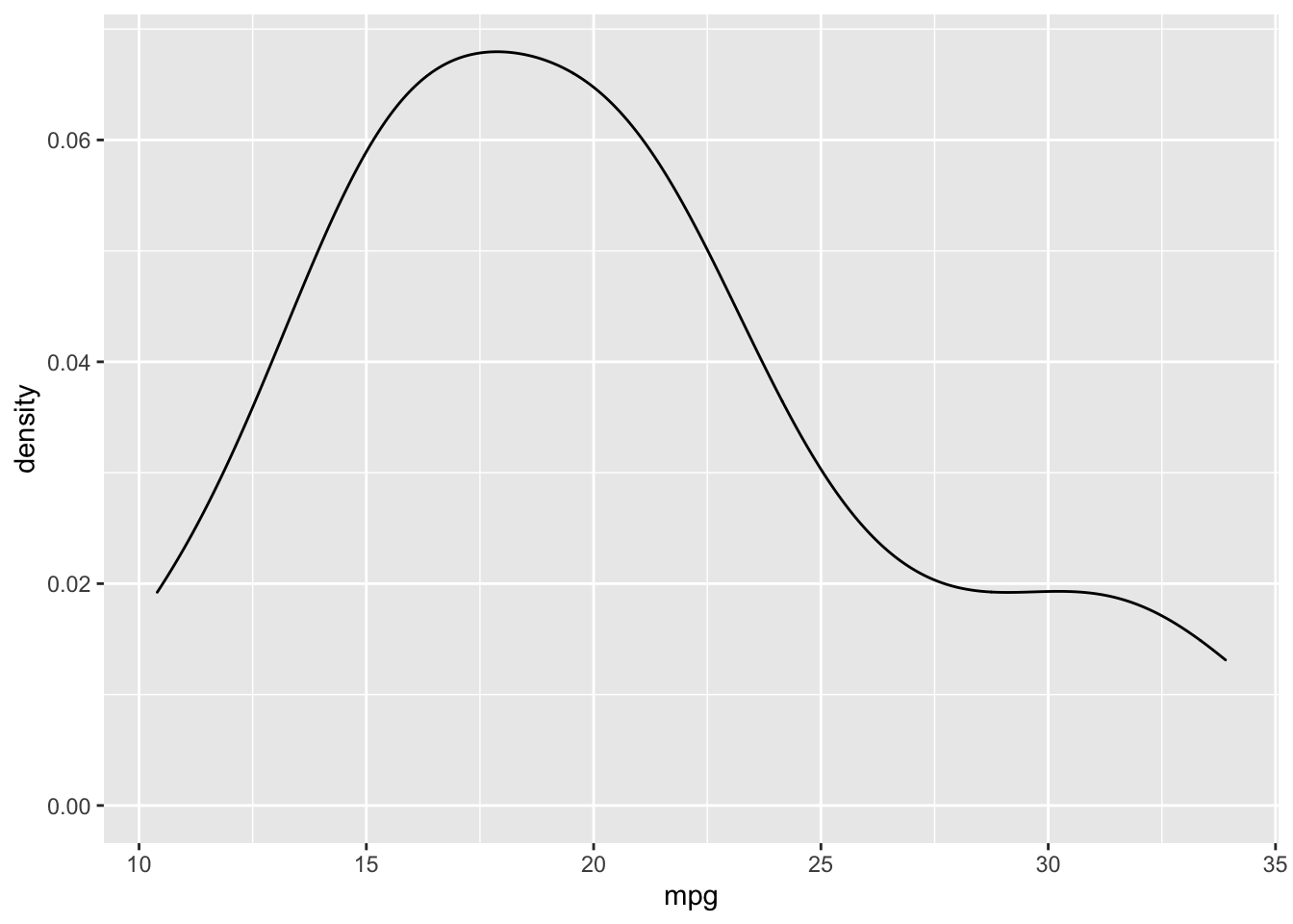
Clearly, there are some advantages: the plot is prettier, the labels are neater, and ticks are already added.
Finally, as a matter of personal preference, I think the grey background is a bit much, so I want to use a different theme. Just like there are geom layers to ggplots, there are also theme layers; theme layers are added in the exact same way (using a plus sign). In this case, I want to use the minimal theme (my personal favorite), so let’s try that:
# make it pretty!
ggplot(data, aes(x = mpg)) +
  geom_density() +
  theme_minimal()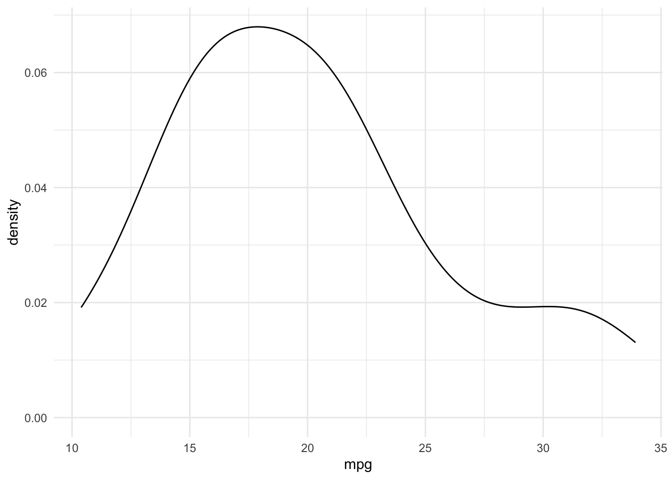
I appreciate this was very rushed; this is on purpose. For many people, you may prefer to simply use the base R plotting package; the real benefits of ggplot are its customization and aesthetics, not ease of use. I encourage you to explore more geoms and aesthetics should you decide to pursue using ggplot further!