Chapter 6 Handout 4: ggplot2, Revisited
Handout 4 covers linear regression, which works no different in the tidyverse (the tidyverse focuses on data processing, not the analysis itself). So, this chapter is dedicated to how linear regression is represented on a ggplot.
You may want to refer back to Handout 2 for a reminder on the basics of ggplot.
6.1 Review of Regression
You know the drill!
library(tidyverse) # loads the tidyverse into your R environment
data <- mtcars # this is a dataset about cars
head(data)
## mpg cyl disp hp drat wt qsec vs am gear carb
## Mazda RX4 21.0 6 160 110 3.90 2.620 16.46 0 1 4 4
## Mazda RX4 Wag 21.0 6 160 110 3.90 2.875 17.02 0 1 4 4
## Datsun 710 22.8 4 108 93 3.85 2.320 18.61 1 1 4 1
## Hornet 4 Drive 21.4 6 258 110 3.08 3.215 19.44 1 0 3 1
## Hornet Sportabout 18.7 8 360 175 3.15 3.440 17.02 0 0 3 2
## Valiant 18.1 6 225 105 2.76 3.460 20.22 1 0 3 1What if we wanted to see the effects of having a higher horsepower (hp) car on the car’s miles-per-gallon (mpg)? We can use a linear regression (with a pipe, because why not?):
# takes the results of lm and applies summary() to it
lm(mpg ~ hp, data = data) %>%
  summary()
##
## Call:
## lm(formula = mpg ~ hp, data = data)
##
## Residuals:
## Min 1Q Median 3Q Max
## -5.7121 -2.1122 -0.8854 1.5819 8.2360
##
## Coefficients:
## Estimate Std. Error t value Pr(>|t|)
## (Intercept) 30.09886 1.63392 18.421 < 2e-16 ***
## hp -0.06823 0.01012 -6.742 1.79e-07 ***
## ---
## Signif. codes: 0 '***' 0.001 '**' 0.01 '*' 0.05 '.' 0.1 ' ' 1
##
## Residual standard error: 3.863 on 30 degrees of freedom
## Multiple R-squared: 0.6024, Adjusted R-squared: 0.5892
## F-statistic: 45.46 on 1 and 30 DF, p-value: 1.788e-076.2 Plotting Univariate Regressions
To plot the above linear regression in base R, we use the following code:
plot(data$hp, data$mpg, xlab = "hp", ylab = "mpg", pch = 19)
abline(lm(data$mpg ~ data$hp))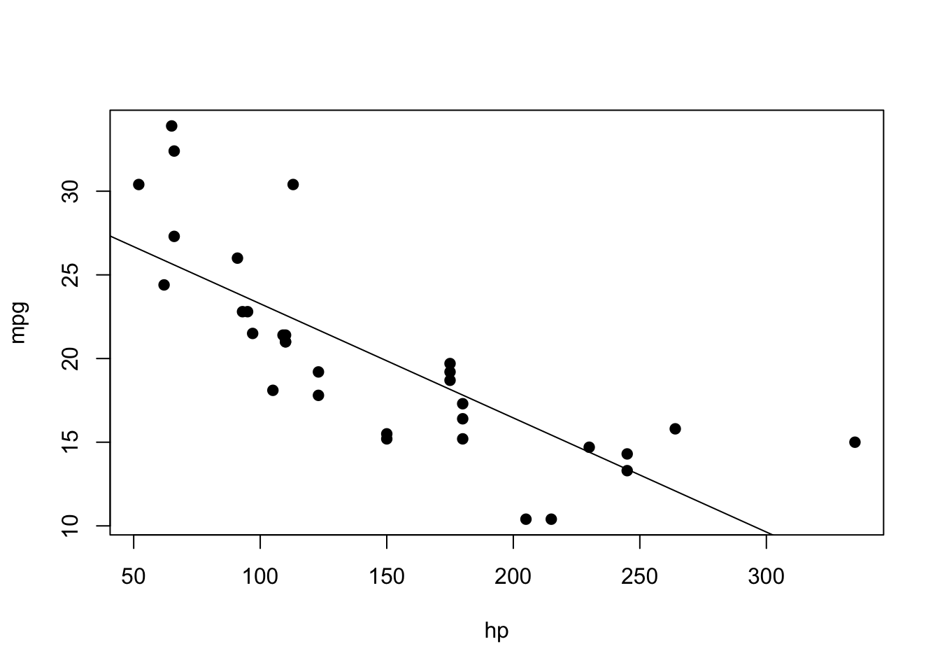
Now, let’s try ggplot, step by step again.
First, create the ggplot object:
ggplot(data)Specify the x- and y-variables in the aesthetics:
ggplot(data, aes(x = hp, y = mpg))
Next, add in a geom layer to display the points:
ggplot(data, aes(x = hp, y = mpg)) +
  geom_point()
Then, add in the linear regression geom. This is specified as geom_smooth(method = "lm")
ggplot(data, aes(x = hp, y = mpg)) +
  geom_point() +
  geom_smooth(method = "lm")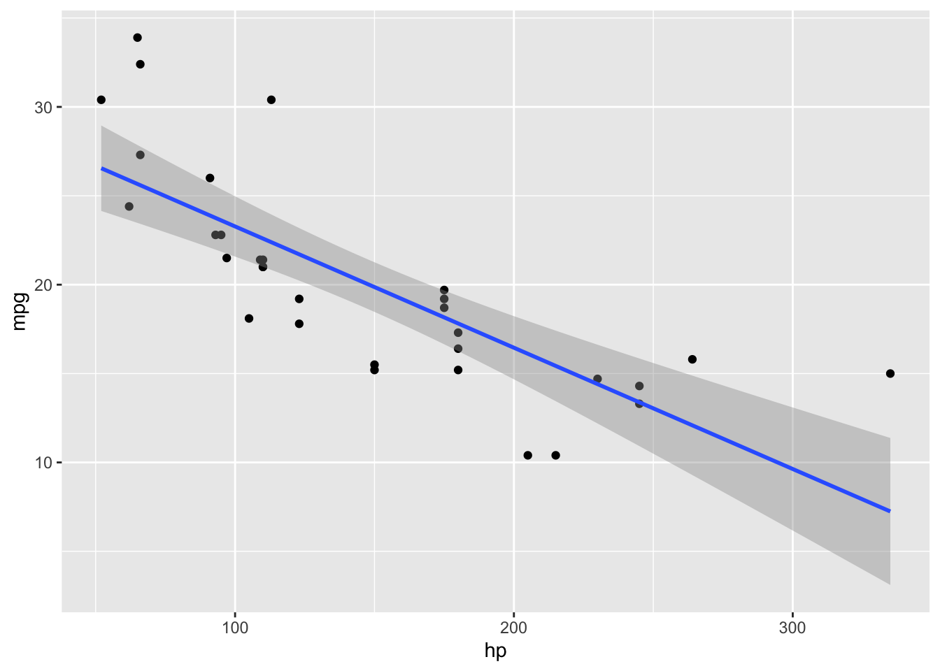
Note that the procedure was largely the same as before: ggplots are very consistent, since the only thing that is really changing is the geom layer. Finally, we can add some added touches to make it prettier. In particular, labs() specifies the labels:
ggplot(data, aes(x = hp, y = mpg)) +
  geom_point() +
  geom_smooth(method = "lm") +
  labs(x = "Horsepower", y = "MPG", title = "Miles per Gallon vs. Horsepower") +
  theme_minimal()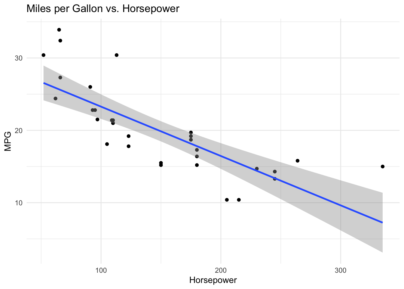
Again, once you understand the basics of ggplot, getting skilled at ggplot involves mainly learning about the various geoms, themes, and customizations out there.