Chapter 8 Intermediate plotting in R (GGPLOT2)
This was hopefully all very straight forward and the code was easy to read. In the R universe new packages are created all the time GGPLOT2 is THE data viz package in R More customisable ways of plotting - in R people use a package called ‘ggplot2’ we can add layer, upon layer of extra info and change transparency and colours in a nutshell we have
- DATA,
- AESTHETICS,
- GEOMETRIES.
Let’s have a look at what this means in practice.
8.1 Adding transparency
## Warning: Removed 580 rows containing missing values (geom_point).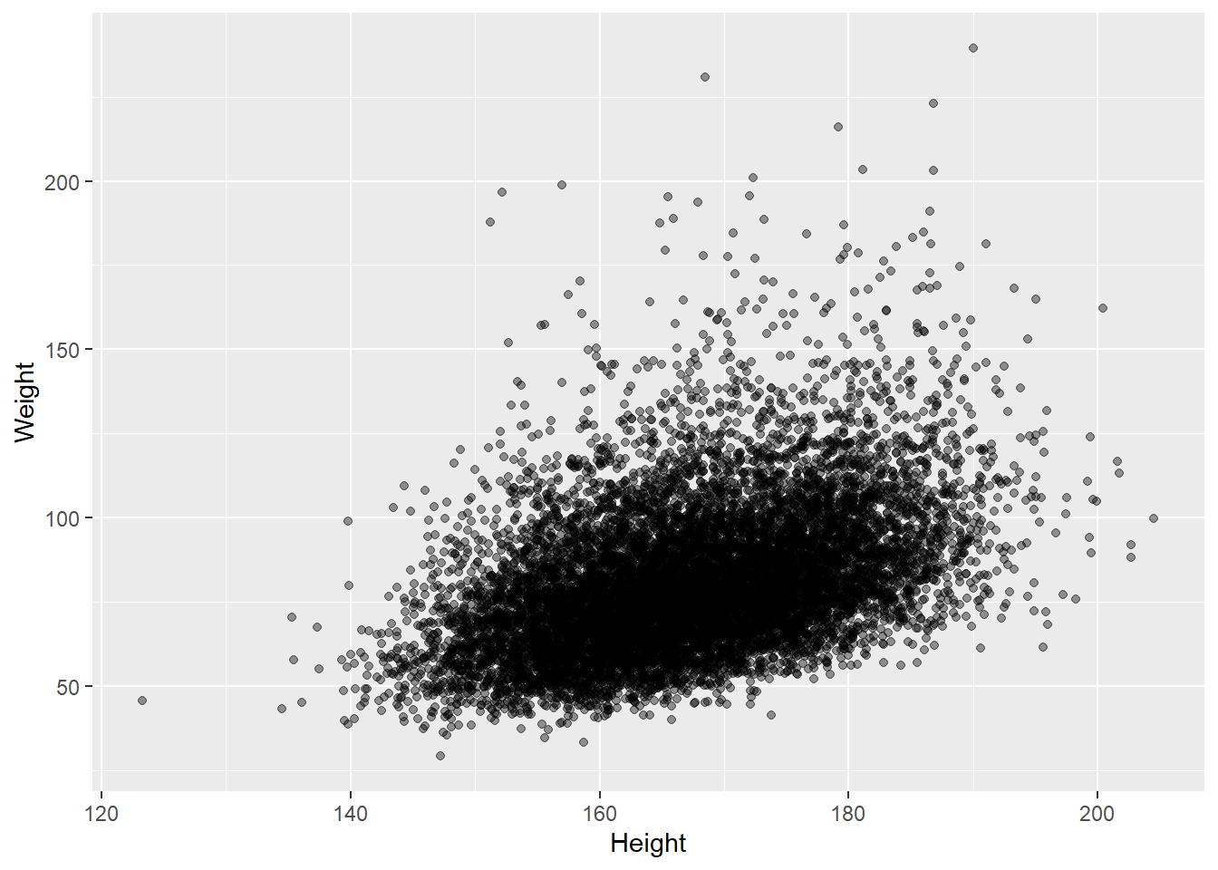
8.2 Adding automatic line of best fit
# 2.2 scatter plot with automatic line of best fit
ggplot(data = adults, aes(x = Height, y = Weight)) +
  geom_point(alpha = 0.4) +
  geom_smooth(method = "lm", se = FALSE) # se = TRUE would show standard error bars along the line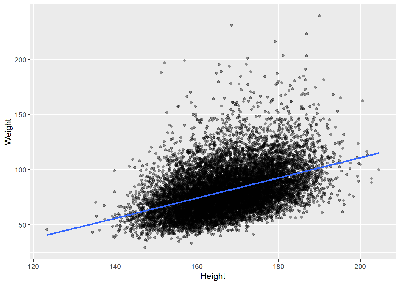
8.3 Adding colours
Other cool things you can easily / automatically do with ggplot include colouring by category:
# Define default colour scale suitable for colour-blind users

scale_colour_discrete <- ggthemes::scale_color_colorblind
# plot in different colours based on the Gender variable
ggplot(data = adults, aes(x = Height, y = Weight, colour = Gender)) +
geom_point(alpha = 0.4)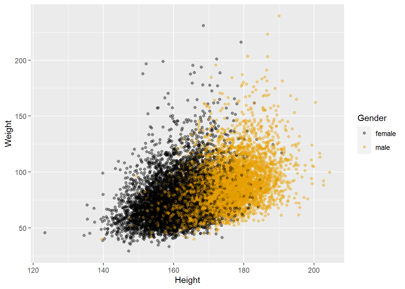
8.4 Fitting a line of best fit for each group of a categorical variable
# 2.4 get best fit line by Species
ggplot(data = adults, aes(x = Height, y = Weight, color = Gender)) +
  geom_point(alpha = 0.4) +
  geom_smooth(method = "lm", se = FALSE)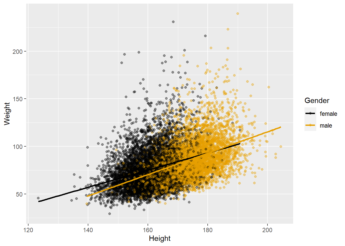
8.5 Exercise: Brief in-class practice of making charts
Try out the simple commands for the charts that you most frequently produce in SPSS / SAS.
Then choose a variable of interest that is continuous (e.g. Height or Pulse) and produce a box plot showing a break-down of distribution by a categorical variable of interest (e.g. HealthGen, MaritalStatus).
8.6 ggplot cheat sheet
If you’re lost or want to explore more options for plotting charts, you can consult a ggplot cheat sheet, e.g. https://www.rstudio.com/wp-content/uploads/2016/11/ggplot2-cheatsheet-2.1.pdf