Association Analysis
Data Analytics Module
Lecturer: Hans van der Zwan
Lab 04
Topic: asscociation analysis
EXERCISE 4.1
The RDWregr.xlsx file contains data of a number of vehicles.1 Open this file in Excel.
- Analyse the relationship between the variables BRAND and COLOR.
- Analyse the relationship between PRICE and BRAND.
- Analyse the relationship between MASS and BRAND.
EXERCISE 4.2
The RDWregr.xlsx file contains data of a number of vehicles including the mass and the selling price.
- Generate a table with the most important statistics concerning the two variables.
- Create boxplots.
It may be assumed that there is a relationship between mass and selling price.
- Create a scatterplot; examine the outliers; does the graph support the assumption about a relationship between mass and selling price.
- The strength of the relationship can be measured with the correlation coefficient r (see below); what’s the value of r (use Excel function correl() )?
- The relationship can be described by a mathematical equation; right click on the dots in the graph and choose the option to plot the best fitting line and display the equation on chart.
EXERCISE 4.3
The file 20191126_forsale_berlin.csv contains information about properties for sale in Berlin on November 26, 2019 (source: https://www.immobilienscout24.de). Open the data file in Excel. Inspect the data and perform some datacleaning:
- remove the observations for which the price is given in a certain range
- create a couple of numerical variables:
- the area in square meters
- the number of rooms
- the price in euro
- the area in square meters

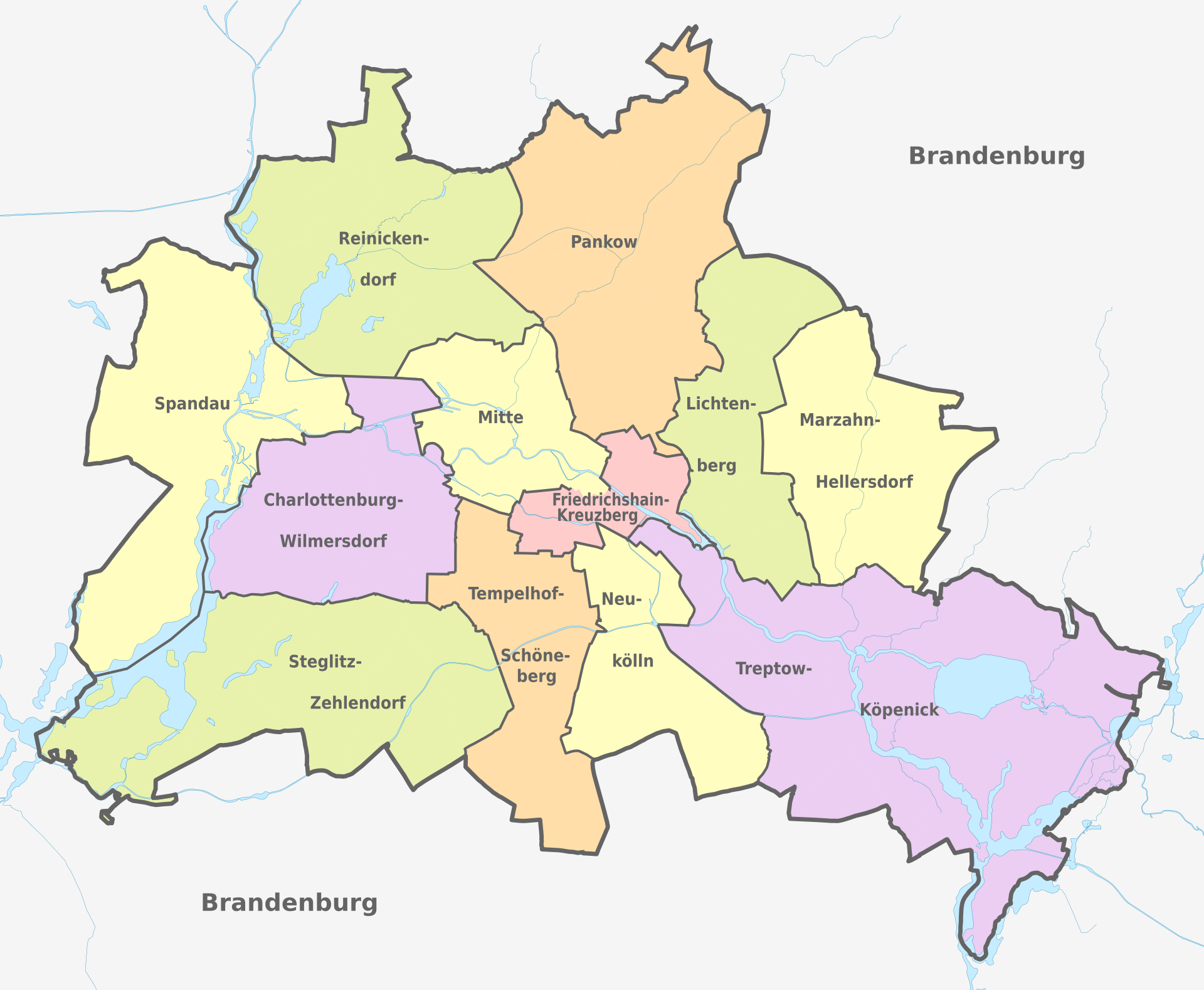
Figure 1. The districts of Berlin. Source: https://en.wikipedia.org/wiki/Boroughs_and_neighborhoods_of_Berlin.
- In which area do you expect the highest house prices?
- Create a table with summary statistics for the house prices per district.
- Create a scatterplot with PRICE as Y-variable and AREA as X-variable.
- Generate a regression model with PRICE as response and AREA as explanatory variable.
- Assess the regression model.
The data set is not a random sample from all registered cars in the Netherlands; it is a random sample from registered cars from three brands, KIA, BMW and AUDI; because of didactic reasons, KIA PICANTO’s are excluded from the sample.↩