3 Simulation
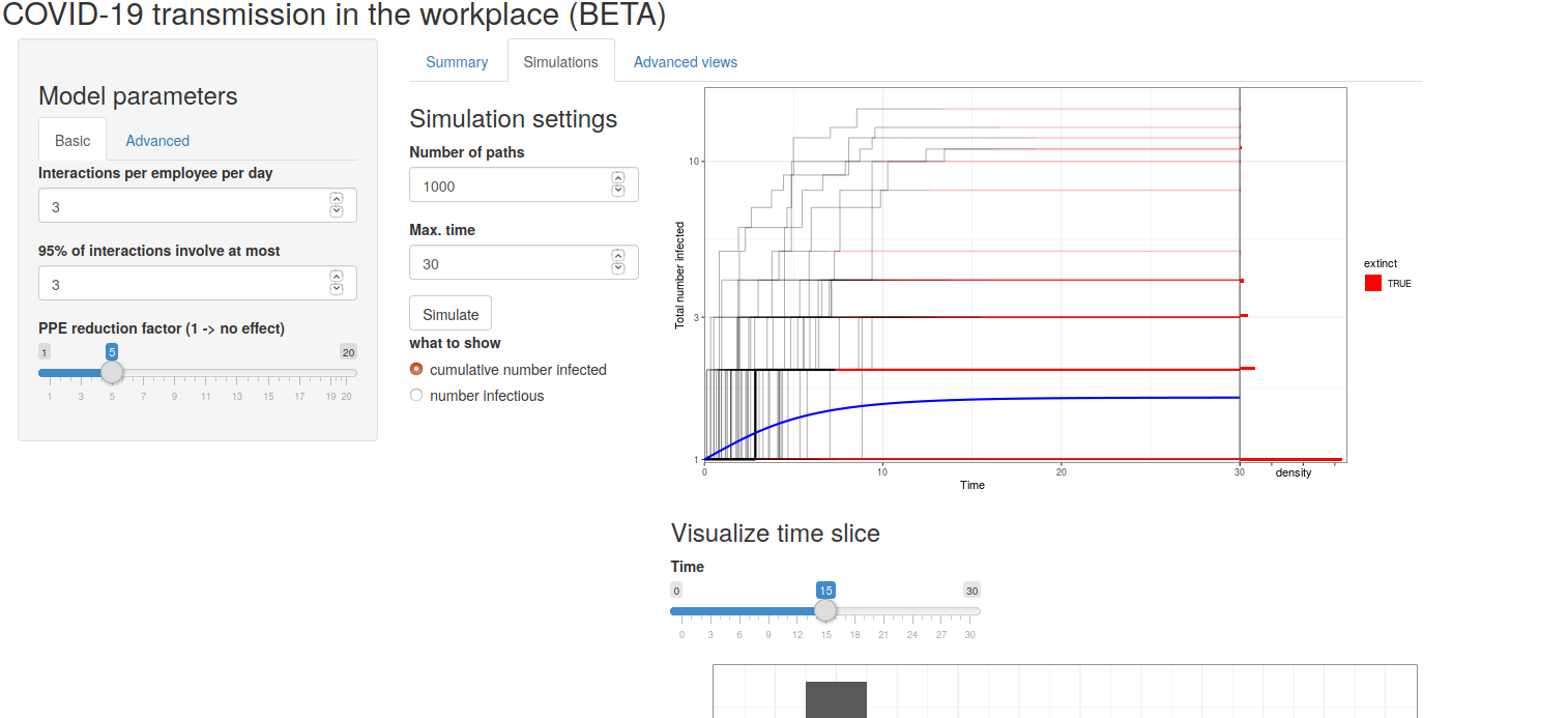
On the landing page, the user can select the simulation tab which generate the view shown in figure 1. The display shows the results of a Monte Carlo simulation using the model inputs chosen by the user.

Figure 1: Simulation landing page
3.1 Simulation settings
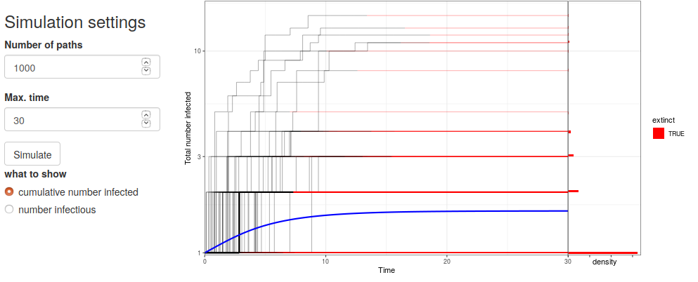
The simulation settings allows the user to choose the Monte Carlo scenarios. The Number of Paths option generates the number of simulation histories and stores the result. The Max. time option sets the maximum of the time window of interest. The defaults are 1000 paths and 30 days respectively. The figure only shows 10 path regardless of the number selected so that the figure appears “clean”. The data is stored in the app for other simulation analysis results.
The user can choose to view either the total number infected over the course of the infection or the instantaneous number infected by selecting the appropriate radio button.

Figure 2: Simulated paths
3.2 Time slice
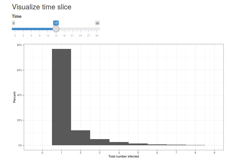
The plot gives sample paths of possible histories along with the average path as indicated in blue. But for risk assessment purposes, the user might wish to know the distributional properties of the number infected at a point in time. In figure 3 we see the distribution of the total number infected at 15 days which is halfway through the time window chosen in the simulation. We see that 90% of the paths have only one infected person at day 15 but that about 3% have 5 people infected. The user can change the day of interest to see the range of possibilities on that day. As a risk tool, the user can look at ranges in the simulation for an outbreak that has progressed for a specific number of weeks.

Figure 3: Time slice