3 The Structure of Scientific Writing
Learning Objectives
Understand the basic sections of scientific papers.
Develop a plan for how to read science and write your paper.
3.1 Pieces of Papers
There are millions of scientific papers in published journals and thousands of university lab courses that require scientific papers in some form. The vast majority have these sections:
- Title
- Abstract
- Introduction
- Methods
- Results
- Discussion
- References
- Tables
- Figures
Later chapters of this book will discuss each of these in detail. In this chapter, we briefly introduce each section and then provide a guide for how to approach your writing project so that these rigid sections become a fluid and interesting scientific story. The lecture for this section is here: Lecture Link
Title
- Short and descriptive
Abstract
- One or two sentences that introduce the topic.
- One sentence that states your hypothesis.
- One sentence that briefly states what you did for methods.
- Two-three sentences of the main results with some quantitative information as needed (but no p-values).
- One or two sentences that summarize the main finding.
Introduction
- What big question are you going to answer for us?
- Why is this question important?
- Lots of references
- 4-5 paragraphs is usually plenty.
Methods
- What did you do to answer this important question?
- How did you analyze your data?
- Write what you did in a way that other people could repeat it.
- Doesn’t matter that your instructor knows what you did. It just matters that other scientists could understand it.
- Few references.
- 2-8 paragraphs is usually plenty.
Results
- Write what you discovered.
- Clear and simple and quantitative.
- Don’t interpret anything. Just report the basic results.
- Usually zero references here.
- 1-4 paragraphs is usually plenty.
Discussion
- Now you can interpret
- The most important result of this study was…
- Lots of references.
- 4-6 paragraphs is usually plenty.
References
- What is known and unknown?
- Establishes trust between writer and reader.
- Gives credit to other ideas.
- Pick one format (there are lots of ways to write citations) and stick to it.
Tables
- Summary statistics or raw data
Figures
- Make the font readable
- Make them as simple as possible
- The reader should be able to guess what the figure axes will be based on the written sections above. No surprises.
3.2 Putting it all together
You are probably familiar with some or all of these sections of a scientific paper. The next challenge is harder - finding a way to put these sections together so that they result in an understandable and perhaps even enjoyable thing to read. That is the hard part, and it’s why you’re taking this class or reading this book. Here are some tips to get you started.
- Hourglass Structure
Think of a scientific paper as having a beginning that sets out the broad ideas, a middle that has all of the technical details, and an end that leaves you with a core take-home message. A common way to visualize that is with an hourglass in which each each section of the paper moves from top to bottom (Fig. 1). The narrower sections have technical details that are relevant to your specific study. The broader sections relate those details to broader ideas. Often it can be easier to write the middle parts first.
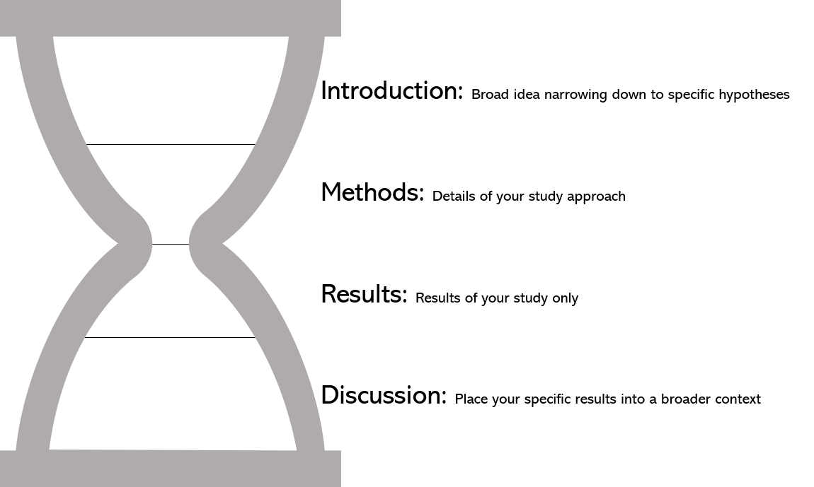
Figure 3.1: The hourglass structure of a scientific paper. The width of the hourglass reflects the purpose of each secion. The overall paper leads the reader from a broad concept to specific methods and results. Then it tells the reader how those specific results have changed our understanding of the broader concept in the introduction.
- Figures First
One of our favorite ways to start writing a paper is to not write at all, but instead to work on the figures first. By figures, we mean the plots (or charts or data visualizations, etc) that show your scientific results.
Here’s an example using a manuscript that one of us wrote (Wesner et al. 2020).
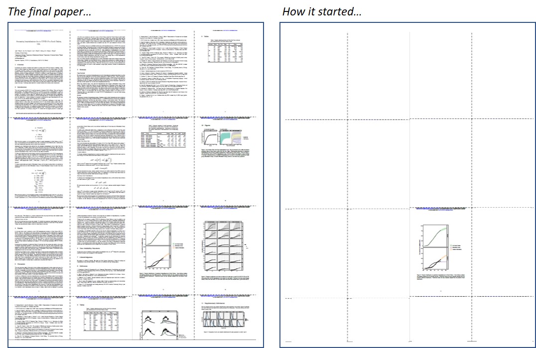
Figure 3.2: The final paper for Wesner et al. 2020 had lots of technical details and broader context about COVID hospitalizations (left). But it started with only a single figure (right).
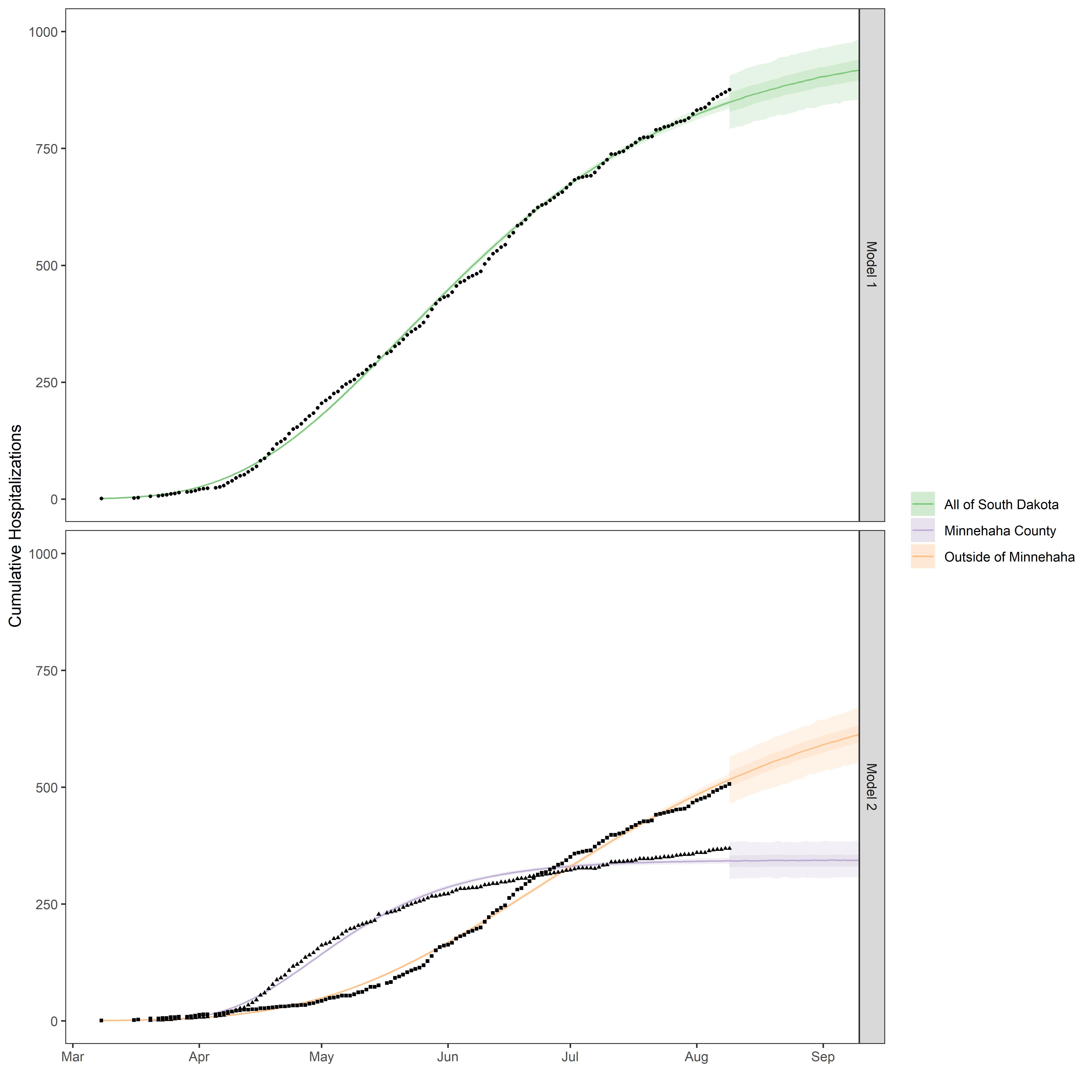
Figure 3.3: The initial figure. We made this first and then wrote the rest of the paper around it.
We spent a lot of time thinking about how to make this figure, because we used it to guide our writing. A well-made figure is more than just a visualization. It it also an outline for the paper itself. Here are some examples, linking parts of the graph to sections of the written text.
y-axis The y-axis says “Cumulative Hospitalizations”. As a reader, if this figure was all we had seen, we could deduce that the paper had something to do with hospitalization trends over time. That’s not trivial. There are millions of scientific papers published each year on a vast array of disciplines (biology, physics, math, sociology, etc). With just the y-axis here, we now know that this paper is probably in the field of medicine or public health. The axis also starts at zero, so we can surmise that this study is measuring hospitalizations at the beginning of whatever is causing them.
x-axis The x-axis has abbreviations for seven months, so we can assume that one predictor variable here is time and that the duration of the study is less than one year.
key There are three time trends presented. One of them is for All of South Dakota. The others are for a county (Minnehaha County) and everything Outside of Minnehaha County. As a reader, we would use this information to guide us by finding the definitions of these groups in the text.
panels The three time trends are presented across two models (Model 1 and Model 2), shown in the upper and lower panels. We can’t tell much about those models from the plot alone, but this gives us something to search for in the text.
data The plot appears to show individual data points, presumably of the number of cumulative hospitalizations on each day. If we counted them all up, we could know exactly how many data points are in the analysis.
fitted lines Corresponding to the data are a green, orange, or purple line with some shading. It is not clear from the plot along what these represent, and there is an odd-looking change in the shading after the data points.
Even from this seemingly simple plot, we can glean a lot about the study before we’ve ever read a word of the paper. But there is a lot we still don’t know. Who is being hospitalized? What are they being hospitalized for? What are the two models? What’s up with the change in shading after the data end? As a writer, it is your job to explain these things in the text.
A well-written paper provides details and context in the written sections of the paper that make it clear why the study was done (and why the plot is important to understand). Here are some examples.
Title: Forecasting hospitalizations due to COVID-19 in South Dakota, USA. The title sheds a lot of light on the figure. We can assume that the y-axis in the figure is probably hospitalizations of COVID-19 patients in South Dakota.
Abstract:
Anticipating the number of hospital beds needed for patients with COVID-19 remains a challenge. Early efforts to predict hospital bed needs focused on deriving predictions from SIR models, largely at the level of countries, provinces, or states…
The first two sentences of the abstract give further clues as to why the y-axis in the figure is important to know about. We want to know about hospitalizations COVID-19 so that we can better anticipate the health care infrastructure that might be needed. According to the authors, doing that is a “challenge”, and other studies have addressed that challenge in varying ways.
- Introduction:
Here are the first sentences of each paragraph of the introduction.
The novel coronavirus (SARS-CoV-2) was first detected in December 2019 in Wuhan, China and has since spread globally. The disease is caused by SARS-CoV-2…
Predicting hospitalization needs due to COVID-19 may be particularly challenging in rural areas. For example, relative….
To our knowledge, there are no published studies that model hospitalizations due to COVID-19 in rural and low resource settings.
Here, we modeled cumulative hospitalizations in an urban (Minnehaha) versus rural population within South Dakota using a Bayesian non-linear Weibull function. Because early predictions…
From skimming just the first sentences of the introduction, we’ve discovered that the study is important (according to the authors, anyway) because it represents hospitalization trends in an urban (Minnehaha) and rural setting. This helps to explain the key in the plot above. We shouldn’t just take the author’s word for it. If we were skeptical about why this is important to study, then we could find more justifications in the rest of the introduction. But scanning the first sentences gives us a quick way to judge the paper’s context.
- Methods:
We fit the Weibull function to two sets of data that describe 1) the cumulative hospitalizations for the state of South Dakota and 2) the cumulative hospitalizations for subgroups of Minnehaha County and the rest of South Dakota.
This sentence from the methods resolves the two panels. Now we know that the authors fit the data in two ways and that model 2 appears to use data that are subgroups of model 1.
- Results:
At the state level, model 1 predicted a total of 876 hospitalizations (median) in South Dakota (90% CrI: 834-926, Table 2). The inflection point was predicted at 37 days after the first hospitalization, suggesting that the peak rate of hospitalizations occurred around April 20, 2020 (Table 2). In contrast, the model with group-level effects clearly showed that hospitalizations trends differed in Minnehaha County verses the rest of South Dakota…
The results section here is three paragraphs long, and we’ve only pasted a few sentences from it. In the results, we can expect to find quantitative summaries that describe what we see in the graph.
- Discussion:
The most important result of this study is that modeling trends separately in urban versus rural parts of a state population reveal different projections of cumulative hospitalizations than if modeled only using state-level data. In particular, the model…
The discussion continues to provide context for the details in the rest of the paper. Now we can see what the authors think is the most important result, and how the patterns in the plot reinforce that result. We don’t have to agree with this. There are other parts to the paper and maybe we think those are more important…or that the paper is not really interesting at all. That is all fine. The main point is that we are able to judge the work based on clearly written text.
This method - Figures First - is helpful in two ways. 1) It helps us to organize our writing, and 2) It helps us to quickly read and understand other scientific papers. Try it out!
3.3 How to Read a Scientific Paper
The same features that help you write a scientific paper can also help to read one. Here are some tips that no one ever told us as undergraduates:
You don’t need to start at the beginning
Just because a scientific paper starts with an Introduction doesn’t mean you need to read that part first. In our own reading, we often do this:
Read the abstract and look for the main conclusions
Look at the figures or tables. Are the main conclusions obvious in the figures or tables? If not, there is reason to worry. For example, if the abstract says “Insect abundance declined by 40% in the acid treatment relative to the control”, then we better be able to find a figure that shows insect abundance on the y-axis and the two treatments (control and acid) on the x-axis. If we see instead a figure with insect diversity on the y-axis and three treatments on the x-axis, then we know this paper is going to be difficult to understand. Maybe we should move on.
After checking the abstract and the figures, we then read the introduction. It should tell us why the authors think this study is important. If we were reading the paper to learn about gene methylation, but the introduction is focused on a statistical procedure, then perhaps this paper isn’t going to answer the question we thought. Maybe we should move to a different paper.
If we’ve committed to the paper, then we read the main results section and perhaps skim the discussion, looking for clues as to what the most important findings are and how they generate new knowledge.
Finally, we parse the methods and analyses. Do we agree with these methods? Did they reflect the goals of the study? Do the analyses make sense? Sometimes we discover that the methods are faulty, even if the paper is in a peer-reviewed journal. If we like the conclusion, but disagree with the methods, then maybe the conclusion is wrong, too.
If all of the above boxes check out, then we can decide to use that paper in our own work and cite it.
It doesn’t need to take forever to read a paper
Once you get a feel for parsing papers, then you can usually proceed through the steps above pretty quickly. Often we might skim 4-5 papers before finally finding one that reports on a topic we’re interested in. Of those, we might fully read only a handful of the most relevant papers. The whole process of deciding on a paper can take just a few minutes. In fact, you can probably tell within 30-seconds whether you want to commit more time to the paper or move on.
You don’t need to understand every word
You will rarely read a scientific paper in which you understand everything right off the bat. For one of us (Wesner), our field of study is insect and fish ecology. When reading papers in our expertise, we can usually understand them pretty easily, but only after doing it repeatedly over 15 years. But every other paper in a new discipline has new terminology. It’s slower for us. That’s OK. Don’t get caught up in the jargon. You can learn that later. If it seems important to know right away, then just look it up. Otherwise, get comfortable with not knowing everything. When reading a paper, focus on the broad picture. Look at the discussion to see what the authors thought was important. If it isn’t clear from the discussion, then maybe the authors themselves don’t actually know what was important. Move on to a different paper and come back again later.